Restore, renew, refresh, rejuvenate—RE—?

Merry Happy Holiday extravaganzas!! Now—on to the next step in the design progression of the year. I have written before about my take on the cycles of design—the seasonal influences by temperature and responses to other recent colors schemes. It’s all about reactions. Reacting to temperature, tradition, and changing from previous periods of color. It’s the yin and yang of  color swings. This is true of more broad-sweeping color trends too. They are invariably a reaction to having had a scheme in place for too long—people need a change. Opposites represent a radical change.

It is also key to capitalism and keeping the economy on the move with consumers needing to own that new thing—that new color scheme. Participating in the practice of changing trends is motivational—its big money.  But I digress…

As we set forth  to change our displays at the shop, Christmas shop window 2105 it is always a representation of what makes us feel good. So ask yourself—what do you need? Not things, but environmentally…what would feel good and what represents a change for the new season and the New Year?

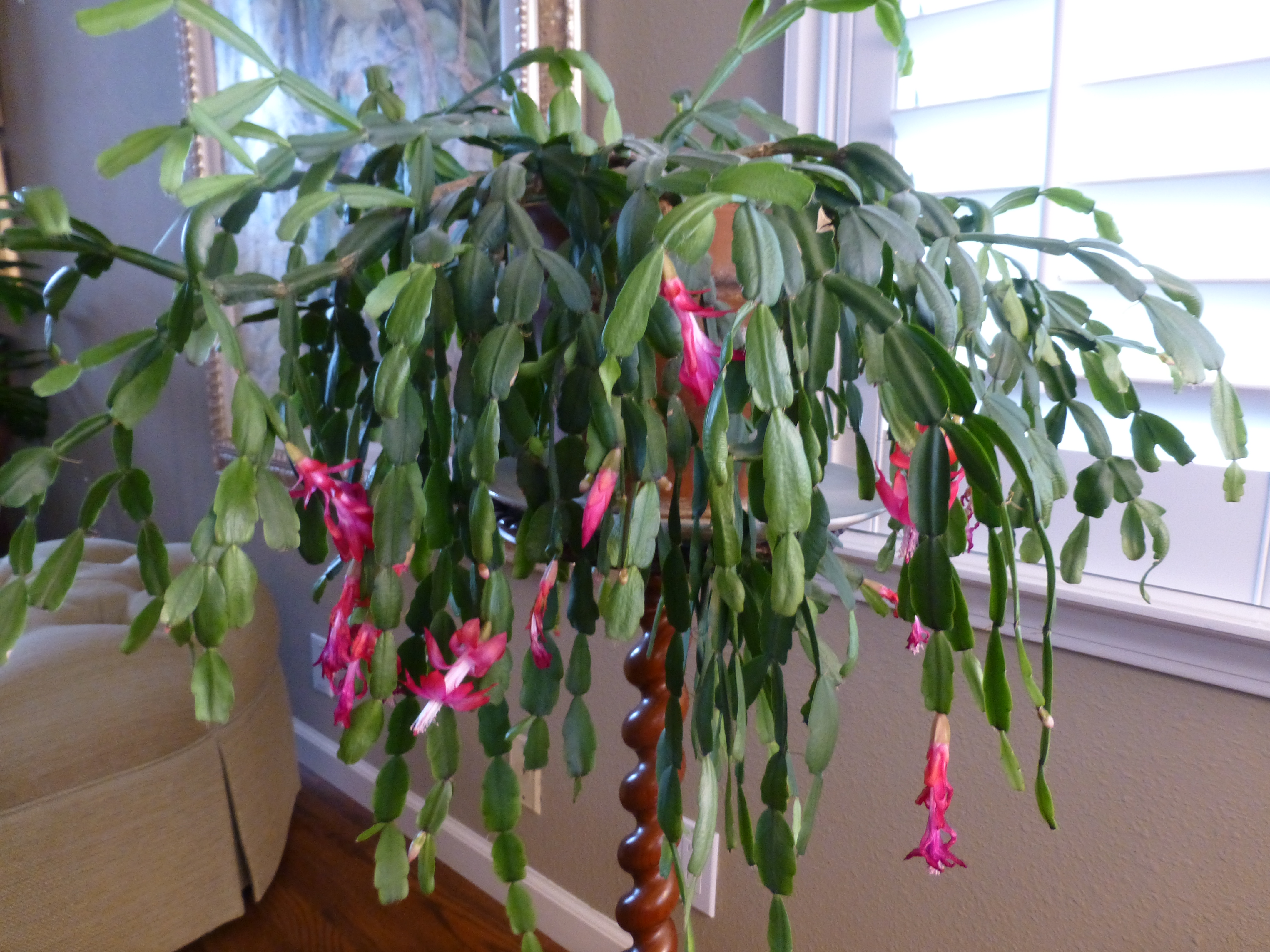
Ok—so its freezing outside and you want a tropical escape—that’s not what I mean. I mean despite the temperature outside—but perhaps to compliment it too, what would feel good after the colors of fall? 20151126_093945 
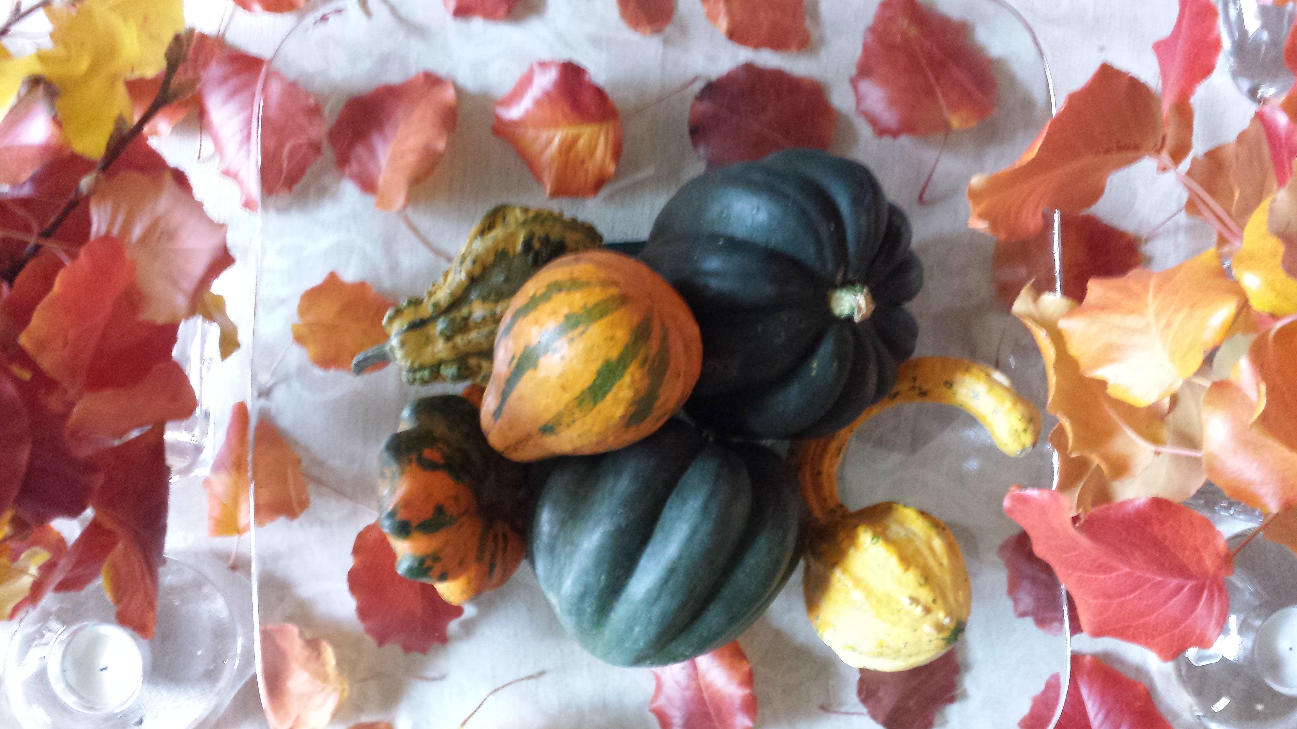
Inspired by the changing leaves, produce of the season—the results are a last burst of strength of warm oranges, golds, rusty reds, and of course the resignation of the fading vestiges of summer leaves…tired comfortable olives. Followed by Christmas, often before Thanksgiving has graced the turkey laden tables—the seasonal colors and decorative clutter insert themselves into our lives whether we like it or not.

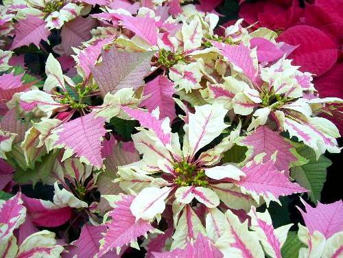
We transition into Christmas with reds and greens—poinsettias, evergreen boughs and branches, all represented in fabrics, and ribbons, lights and decorative accessories. Red_Christmas_Ribbon_with_Pine_Branches_PNG_Clipart_Image Punctuated with gold and silver…perhaps to symbolize opulence and riches…for adoration and celebration.

So again—I ask you to review those recent schemes and ask yourself—What do you need to restore, renew, refresh, rejuvenate—RE—?

As we de-cluttered the shop and dismantled the Christmas displays, we began assembling things that felt restorative and cleansing. We collectively were drawn to the refreshing cool tones of icy aquas and the fresh clean bling of silver. 20151222_145149_resized_1 We are not going to deny the frigid temperatures (although this is not true for everyone) of winter, but it is also true of purging the heavy colors of fall and the holidays to refresh with something that is opposite of all the warm tones.

I must say, at this juncture in my theory, that Hanukkah jumps the gun with refreshing cool color following the heavy warm tones of fall and amidst the traditional colors of Christmas. Hanukkah presents a refreshing color scheme smack dab in the middle of the full force of the red and green. 91587677_4 The blue and white might be the choice of the celebrations because of the Israeli flag, but as Amanda Green writes in Mental Floss: “Blue and white come with universal associations, too. White suggests purity, peace, and light. Blue is associated with the sky, faith, wisdom, and truth. (The expression isn’t “true blue” for nothing.)” We also see silver punctuating the festivities in Hanukkah decorations. Ms Green writes…”some people think the holidays call for a little more sparkle, not to mention the popularity of silver menorahs. Blue and white clearly aren’t just the colors of Hanukkah. They’re symbolic all year long.” True too is the fact that blue and white are a classic  color combination in interior design for many cultures over many centuries.

So if it feels good…guess it means that changes are supposed to be for the good. Positive, restorative change…renewing, refreshing, rejuvenating—RE!

About the prefix from  the Online Etymology dictionary:  http://www.etymonline.com/index.php?term=re-

“word-forming element meaning “back to the original place; again, anew, once more,” also with a sense of “undoing,” c. 1200, from Old French and directly from Latin re- “again, back, anew, against,” “Latin combining form conceivably from Indo-European *wret-, metathetical variant of *wert- “to turn” [Watkins]. Often merely intensive, and in many of the older borrowings from French and Latin the precise sense of re- is lost in secondary senses or weakened beyond recognition. OED writes that it is “impossible to attempt a complete record of all the forms resulting from its use,” and adds that “The number of these is practically infinite ….” The Latin prefix became red- before vowels and h-, as in redactredeemredolentredundant.”

Cleansing aqua, white, silver…preparing for a refreshing Happy New Year!!!

20151222_145826_resized_1


Stage Sets, Christmas and Cozy Fires

Old movies provide an extraordinary view into periods of history, social norms, and the interior design of the times. Watching old movies exposes lifestyles and context like a text book. Whether capturing modest environments or posh extravagances, they depict with accuracy – if not exaggeration – exciting opportunities to transport the viewer into another world.

From my perspective, I drink in all of this creativity as I scan the sets, peek around the actors and study the minutia of the many varied interiors. I marvel at the sensitivity and attention to detail and decorative arts required to create effective set designs.

When movies are in color they illustrate such interesting decisions for artistic contrast and combinations; but in black and white, the imagination must fill in the blanks. The emphasis on the chiaroscuro adds a very  different focus. Scenes in color are often exaggerated realism stretching the art. While black and white scenes are rich with tonal values, shading and bathed with the art and drama of lighting.

Perfect for this season the 1942 classic film Holiday Inn, with Bing Crosby and Marjorie Reynolds shown here by the fireside, allows the viewer to feel the cozy setting,  the warmth and take in the details of the room all without benefit of color. It’s fun to wonder what is the color of the walls, fabrics, accessories and other accents could be. The possibilities are endless – but probably not really  – if one is to design with accuracy for the time period.  movie Holiday Inn Bing Crosby Marjorie Reynolds   
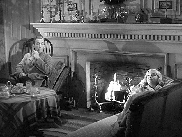
Try it with this still shot from the movie…imagine the colors…it’s fun!

Tis the season to light fireplaces and enjoy the flickering light, golden white colors sparked with jewel-toned color bursts, the visual and physical warmth that come in many forms. Step into the scene and feel the temperature, textures…see the colors and combinations.

I recently said – as sexist as it might sound – that I would never have a gas-log fireplace as long as there was a physically capable, self-respecting man around to fetch the wood and haul it home and stack it up, go outside in the frigid air to lug in the logs and of course clean it out from all the wonderful timber turned ashes.  Spoiled? Yes. I love a REAL fire in a fireplace – you bet…the crackle and smoky aroma of distinctly different species, real fire dancing and real wood “combusting” – natural elements that create a concert of sensory experiences and evoke so many memories. Is it working? Can you imagine it?

Fantasy mirroring reality, with the creativity of set design replicating accurate portrayals of life, provides another tool for historical markers and study outside of a museum setting. Perhaps you will find yourself scanning the sets and peering around the actors to see what you can discover surrounding and beyond the action.

And as this movie has so emblazoned in our holiday  traditions…I’m dreaming of a white Christmas. Thank you Bing.

National Poinsettia Day and Cuttings to Carry into the Future

Thank you Joel Roberts Poinsett for bringing this brilliant red and green explosion of color and such a perfect plant to represent the colors of the Christmas season to our northern climes! Upon learning that today was National Poinsettia Day, I set forth to learn a bit about why…P1110598

You too can Google it, but in a nutshell, back in the early 1800s, this observant amateur botanist was our first Ambassador to the new Republic of Mexico! Not to mention, his day job was that of a doctor and a soldier! Busy well-rounded guy it seems!

Poinsett sent cuttings of this spectacular and exotic flowering plant from where he was visiting in the Taxco region of Mexico, to his home in Charleston, South Carolina. Once he returned to Charleston, he spread the joy and sent other clippings of his magnificent discovery to friends including a Mr. Buist in Philadelphia who gave a piece to Mr. James McNab who took it to the Botanical Garden of Edinburgh, Scotland founded in 1670. (From “Paxton’s Magazine of Botany” 1837)

The initial botanical name Euphorbia pulcherrima was actually assigned by a German botanist, Wilenow, in 1833, but within 4 years it was renamed Poinsettia Pucherrima by William Hickling Prescott a historian and gardener who had been asked, by someone in authority, to rename it. He did so by selecting to honor Joel Poinsett for his numerous achievements in both government and horticulture.

This dramatic flowering plant comes in many colors – the familiar and original red to creamy off-whites, chartreuse, pinks and various variegated versions such as this fabulous marbled specimen called strawberries and cream.strawberries n cream poinsettia

Poinsett retired from his career in public service as Secretary of War in 1841. He became one of the founders of the National Institute for the Promotion of Science and the Useful – which later became the Smithsonian Institute. I was born in D.C. and raised inside the Beltway and never knew that the Smithsonian which was a memorably mandatory field trip nearly every year of my childhood, was originally named the wordy National Institute for the Promotion of Science and the Useful – but it certainly describes it all in one fell swoop!!

There are many legends and folk stories centering around this “flor de Nochebuena” in Mexico but the thread of this story that has personal interest to me is that the same poinsettia cutting taken to Edinburgh by James McNab is still producing and flowering annually in the Royal Botanical Garden in Scotland to this day.

As I read this history, I was excited about this remarkable tracing of the original cuttings.  In our family we have what my grandmother , Dee Dee, always referred to as “the family cactus.” This rounded, smooth leafed variation (some have pointy, spiked leaves)with its hot pink blooms is our cactus.P1110601

Dee Dee, Anna Ives Wagner, was born in 1892 in Youngstown, New York.  She arrived at our house to live with us in the late 1950s. She brought with her a very special plant. It was a cutting off of the original plant that was in her ancestral home – the Root Home, Twin Pines – 830 River Road – then Main Street, Youngstown.

Dee Dee remembered that plant from her childhood and had heard from her mother and aunts that it was there in theirs as well – which without complicated math puts it in the house since the mid 1800s. Unfortunately we don’t know when it started…but the house dates back to our great, great, great grandfather, Dr. Benjamin Root c.1840. The house stayed in our family, passing finally to my  grandmother’s aunt Helen Root who lived there with an original cutting of the plant until the 1950s when she moved to Elmira with her niece and her husband, Edith and Ray Hulbert.

We grew-up with the family cactus bursting forth with wild fuscia blooms every fall into winter. It was always an exciting and exotic flowering extravaganza in the colder dark months of the season. It brought a sense of life, growth, and color that was a spectacular contrast to the otherwise drab, dull, dormancy of winter.P1110609

I guard my plants, given to me as a cutting by Dee Dee when I first moved to New Mexico, with great responsibility and appreciation.

Last year my Mother’s large family cactus withered before our very eyes…she was so protective of it that she perhaps neglected to give it new soil and nutrients instead favoring watering a bit too much which  resulted in its demise. As she witnessed and worried about the failing plant, we carefully cultivated clippings and as weak and depleted as they were – nurtured them in water losing a couple but saving a few so that they now are flourishing in a clay pot in a window with the soft daylight of  northern exposure displaying a resiliency, hope, and celebration of life that continues to greet each day. Perhaps  metaphors for procreation, family traditions, aging in place…

My mother is 93 and her mother, Dee Dee, lived to be three weeks shy of her 101st birthday.

Joel Poinsett died on December 12, 1851 at the age of 72 – one hundred and sixty four years ago today! Happy Poinsettia Day!! Merry Christmas Joel Poinsett!


Open Your Cupboards to the Eclecticism That You Have Collected

When I first moved to New Mexico I was enchanted (well…it IS The Land of Enchantment) by so many new things that were woven throughout people’s homes, flea markets and quaint little shops in various pockets of town. I began to collect and seek these vessels and fabrics to incorporate into my new world. Interestingly, these treasures were not and still are not featured – much less celebrated, in more trendy, stylish shops that might do well to focus on these regional functional art-forms as a means to honor our unique multi-cultural influences. We, at PATRICIAN DESIGN, enjoying offering interesting hand-built pieces in our shop for a truly one-of-a-kind collection of home decor, wearable art and  unique gift items.

The first piece of this new influence I bought back in the late 70s. It was this fabulous squat casserole,   P1110590   
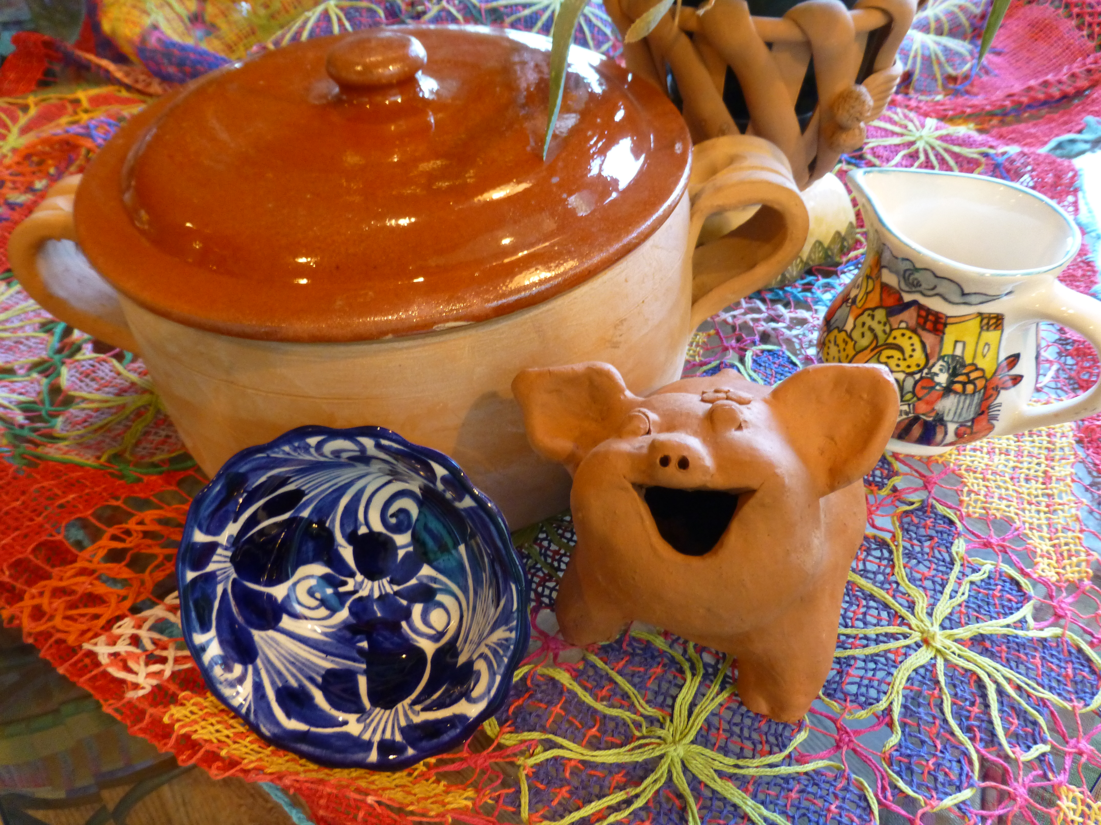
to which  I have added many various colors and textures that I enjoy using throughout the year.  Christmas is notoriously red and green accented with the bling of silvers and golds. Chanukah is blue and white…but I enjoy all of the colors to celebrate every occasion! So  the many hues of the season can be found in the collection of colorful containers and serving pieces, accents and textiles that I often meld to create the festive celebration of the seasons. P1110594

Everyone who knows me – both clients and friends – know that I love color, pattern and texture. I love contrasts and combinations. Design by eclectic assembly of things that you love and that evoke memories, things that make you smile and feed your soul, results in the most successful and interesting design.  The rich color of terracotta and history of it as a medium for making cooking vessels goes back to Old Mexico and Spain across the water. Spanish terracotta is steeped in centuries of tradition and the Mexican versions closer to home are similarly beautiful and generations old. Other cultures such as Italian and Portuguese also have crafted beautiful terracotta – as is often true, the common features, textures, and colors all share a common denominator of warmth, hand-built art, craft and natural, raw beauty.  P1110596  
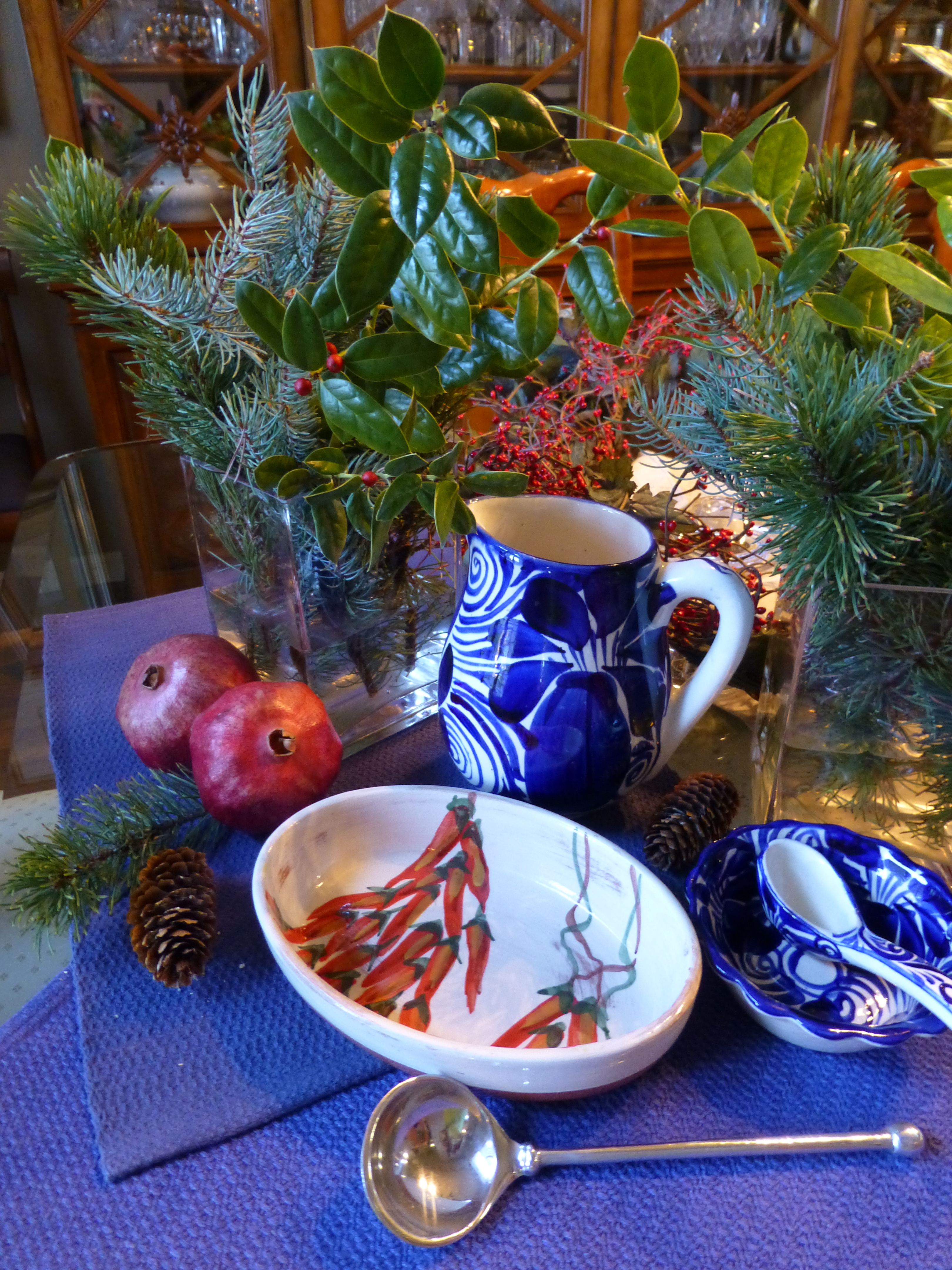
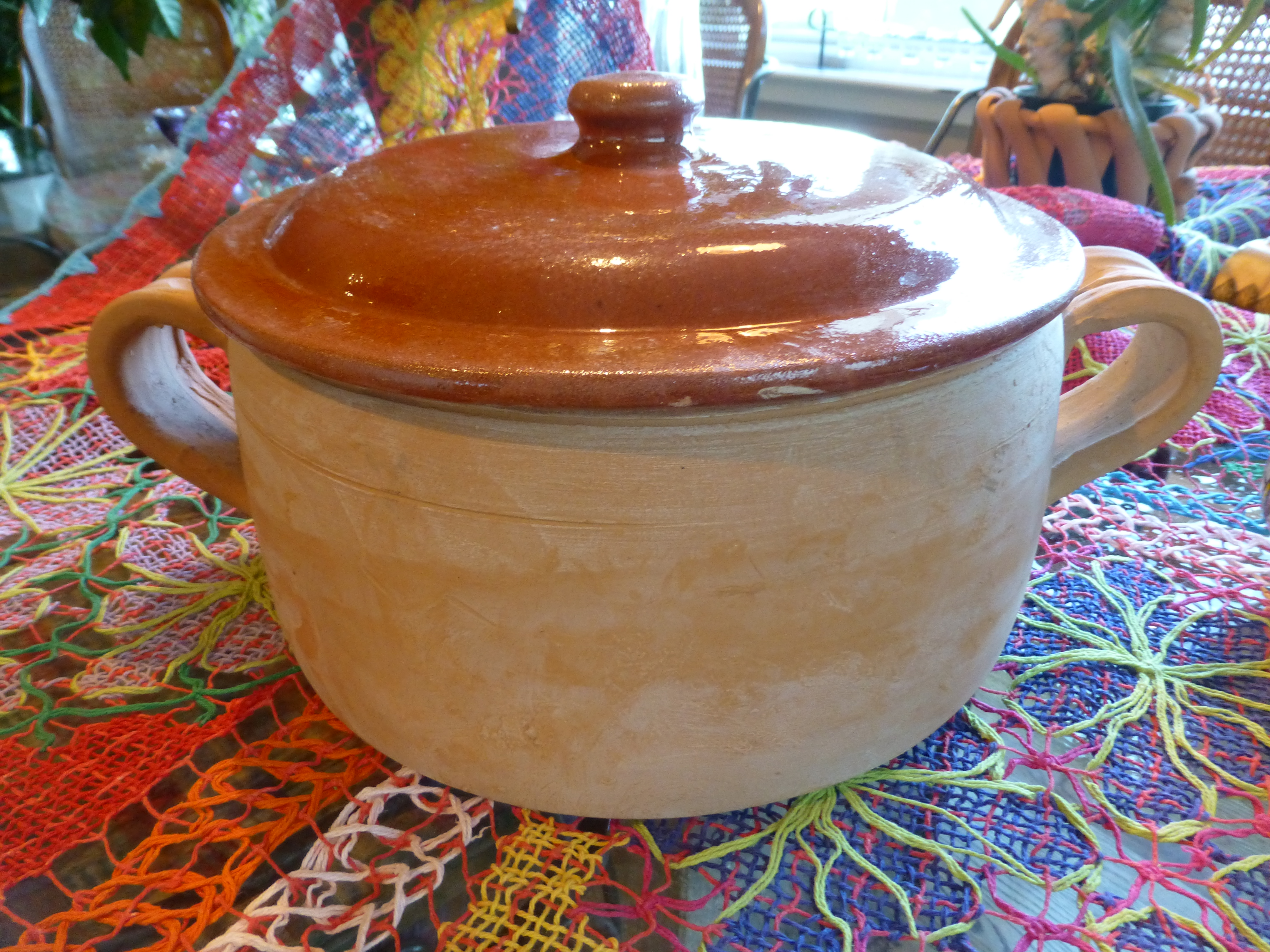
Notice here, the brilliant colors and intricate open-weaving of the Brazilian lace.

Raw clay colors contrasting with brilliant and rich glazes, fabulous fiber art, wood and other organics all radiating the joy of life and the festivities around food, friends  and family of these varied cultural traditions and  rich indigenous heritages. Functional art at its finest – most honest and humbly celebrated in useful daily pieces – show them, open your cupboards, let them sing.