Effective Staging & Improvments Clinch the Deal

We staged a house this week.  We TRANSFORMED IT! Wonderful clients for several years, who I regard as friends too, called to say they were moving out-of-state and they needed to quickly  get their house ready for sale. So many things that we had planned to do and more, deferred due to life getting in the way, all of a sudden got put on the fast-track to get finished in less than a month!

When you think of staging a house for sale, you might think of a fall scene scented with stove-top cinnamon sticks warming in a pan. In the spring, as it is now, fresh flowers with floral fragrances wafting on breezes through open windows and doorways.  We had the floral bouquets – just a couple – as centerpieces in the dining room and another game table in the family room.

But in order to really make this house attractive to the prospective buyers – millennials and their families – experience tells me that we needed to install profound punctuations of exciting  new trendy finishes and colors.

I critiqued the kitchen for its old but good-as-new solid surface countertops with a dated, tell-tale sandwich of speckled forest green in between the bull-nosed edge of solid white. The cabinets were plain slab birch yellowed by time, with hand-crafted wooden handles. To place the emphasis where we would get the most “bang for the buck,” we kept the countertops, refinished the cabinets and added new mosaic tile and paint accents. 20160424_162546

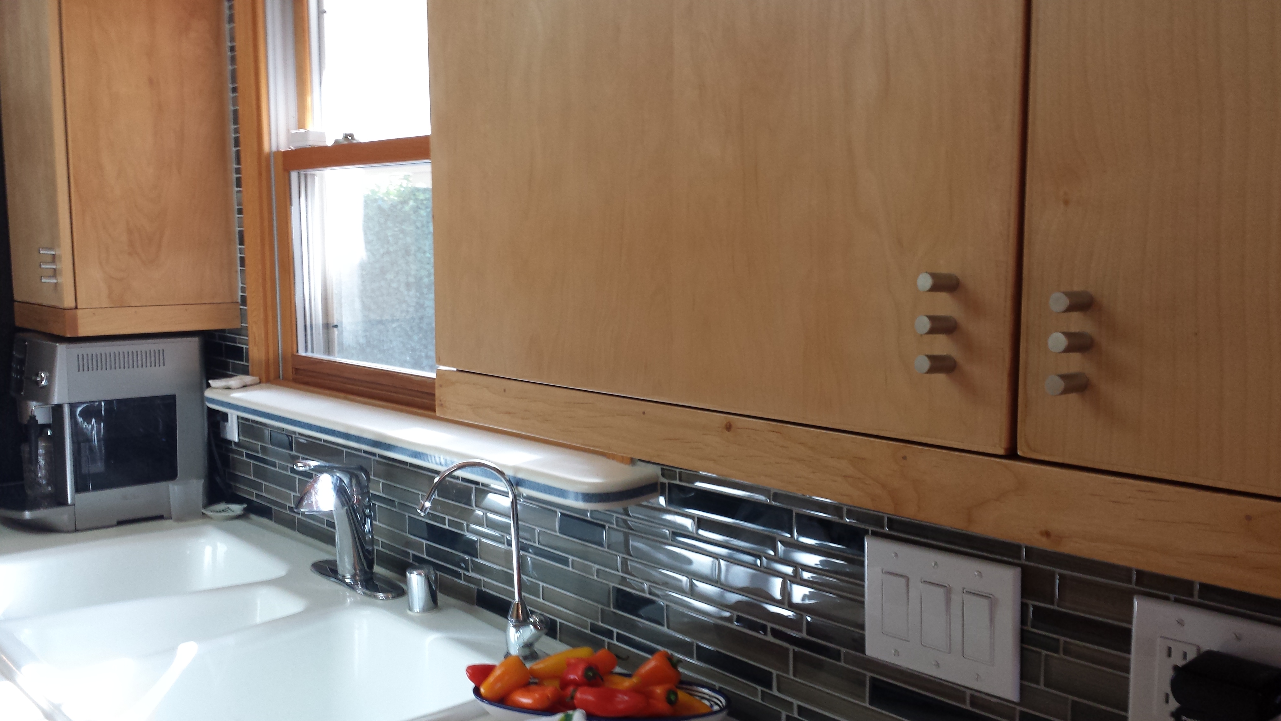
A few years earlier, we had stripped adjacent identical cabinets in the dining area and re-finished them with multiple clear-coats of conversion varnish. In place of the two-screwed wooden handles, we installed three small conical-shaped  brushed stainless pulls. By adding the third holes at each, between the existing two of the wooden pulls, the detail looked intentional and contributed to a modernized interpretation of the cabinet design.  We now finished the kitchen cabinets to match which had been  slated for the same improvements, but put on the back-burned until now. P1140111

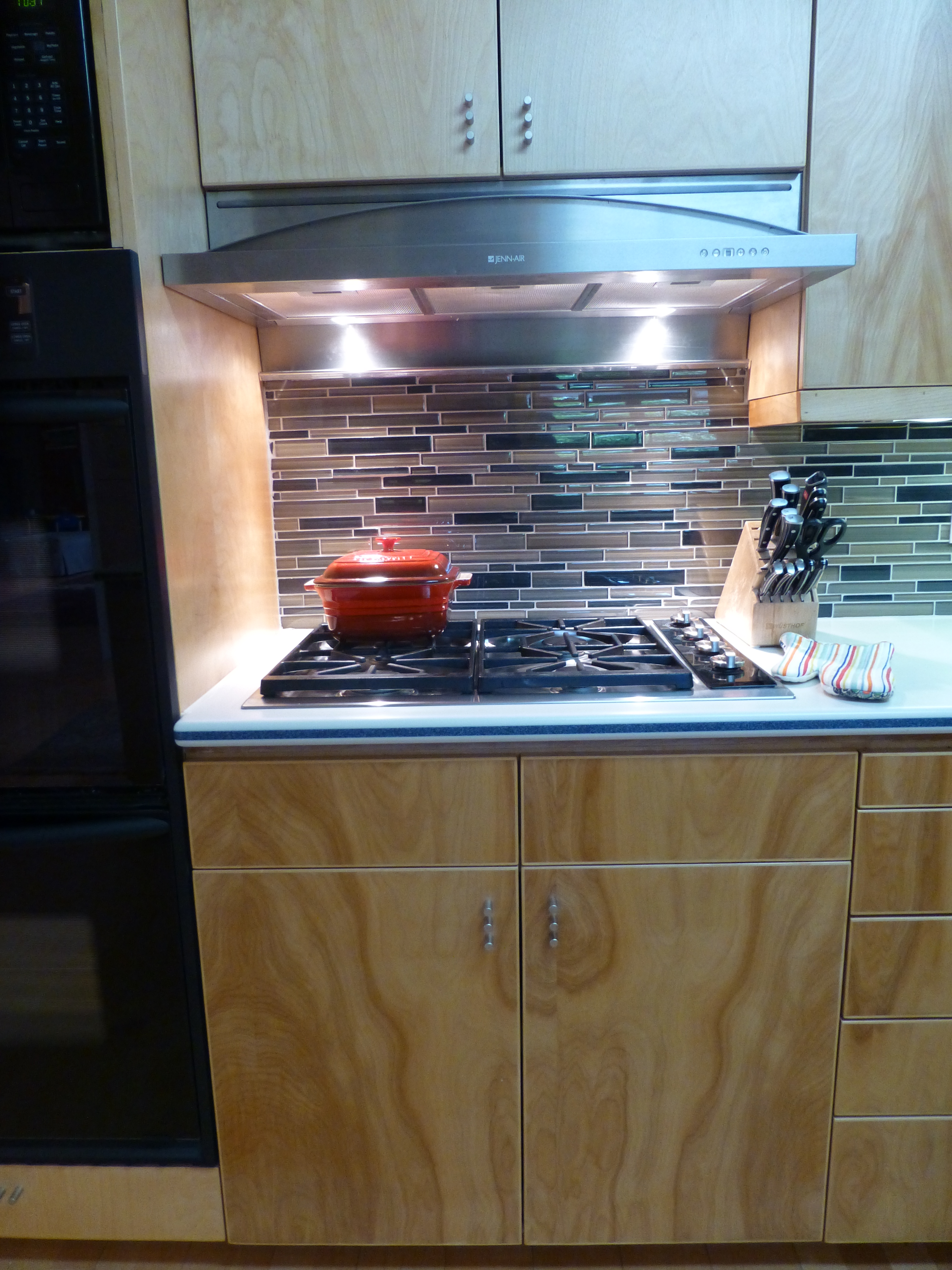
The end wall of the kitchen, with a large pass-through opening into the dining room, leaving no significant wall space for art or other accessorizing, was the perfect element for a dramatic, eye-catching full-wall treatment. A mosaic of horizontal glass tiles in earthen blacks and beiges balanced the warm cabinets and maple flooring with a strength, pattern, interest and glossy bling.  The same mosaic tile wrapped the room filling the back-splash  between countertops and upper cabinets. 20160424_162701

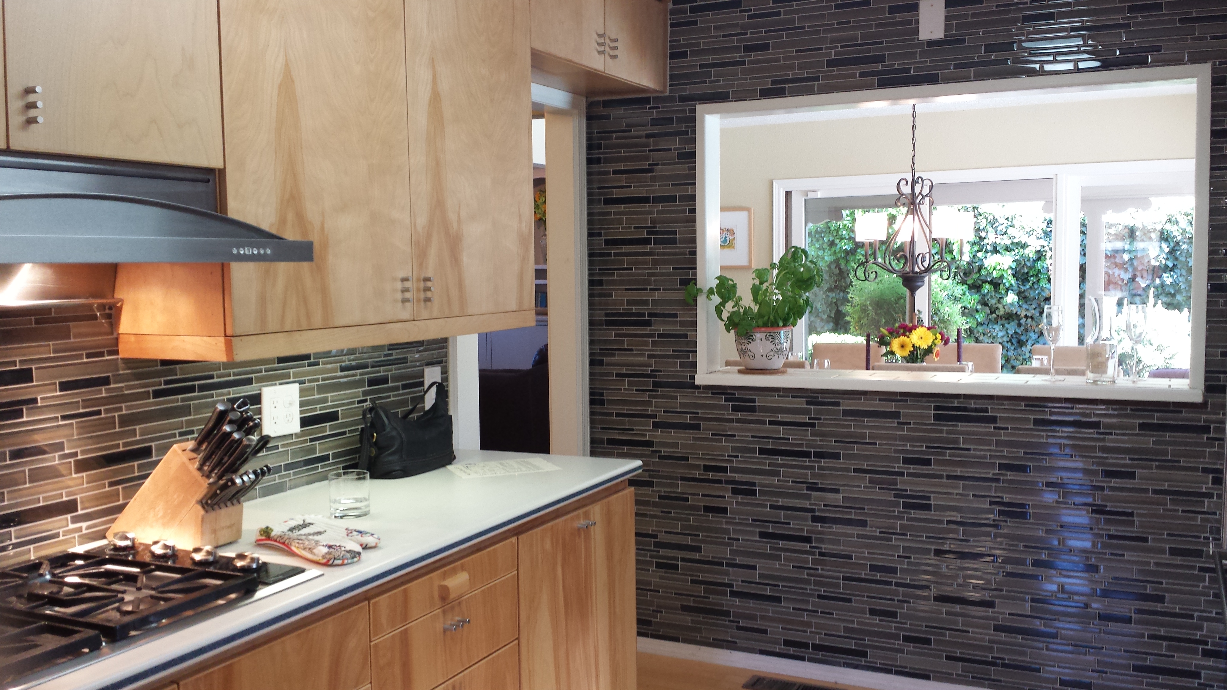
Outside we painted the garage doors, wall sconce and patio trim with a new organic neutral mushroom green shade. The landscaping was enhanced with new river rock and a couple of large ceramic planters were placed by the front entry with mature plants creating a sense of establishment. The plain concrete entry porch was tiled with a dark earthy porcelain continuing up the step and into the entry foyer replacing the burnt  orange tile that had been  neglected from the decades old original finishes. 20160424_164027

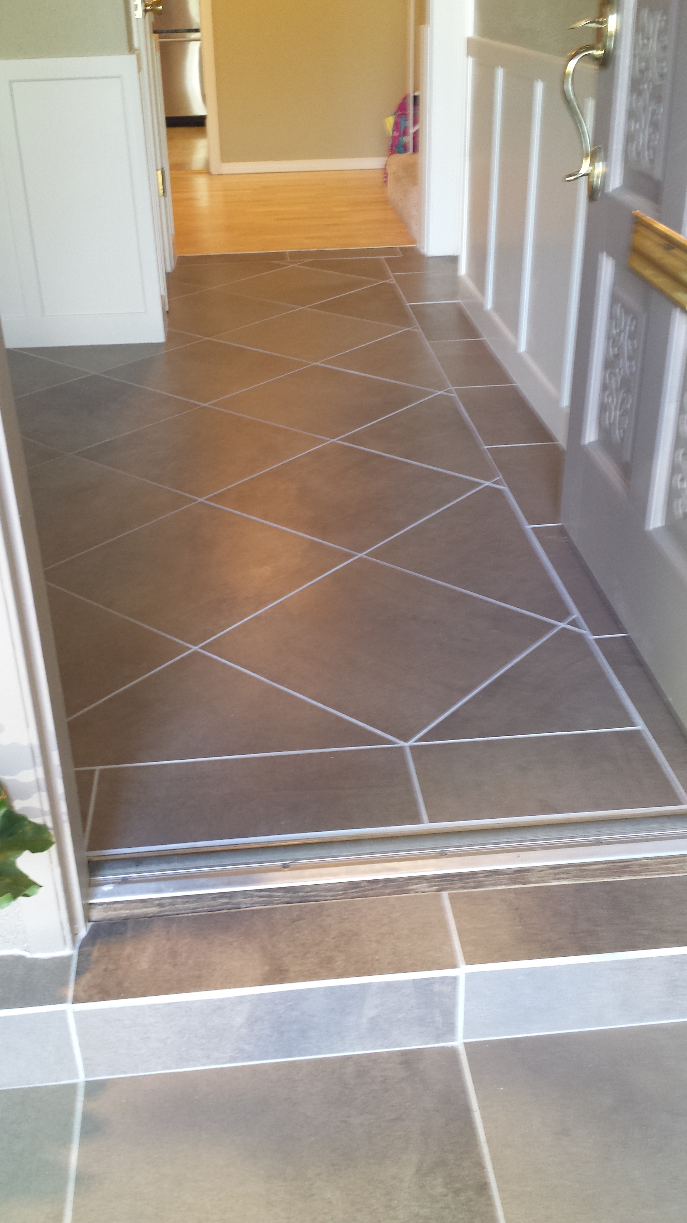
Additional planters were purchased to scatter about – but a more effective idea to have a strong showing of them at the end of the pool anchored that setting with a stunning blue ceramic colonnade bursting forth with brilliant contrasting yellow Celtic Broom. Massing things can often create more powerful statements rather than sparse, weak distributions of the same.

The master bedroom suite had been remodeled a couple of years prior. Pre-fabricated white melamine closet components were replaced with custom fabricated birch closets and cabinetry to continue the theme of the original cabinets in the main level of the home. Updated granite countertops, new lighting and mosaic tiles jazzed the dressing scene and brought order for the young parents running this busy family.

Staging a home requires thinking about clearing the clutter and dressing the scene. But beyond that, looking at more powerful elements to repair and update can make an enormous difference in the appeal to potential buyers. This was evidenced by the comments that we overheard specifically about the more dramatic installations like the new mosaic wall, welcoming entry tile and effective row of blue patio planters that we decided to employ really clinched the deal.


The Art of Anime and a trip to the Marukai Japanese Market

Design through the eyes of a 13 year old. A 13 year old girl having had her birthday just last weekend and who is immersed in the world of anime. Anime is a style of Japanese illustration and animation. An exciting world of fantasy and action, good versus evil all wrapped in color and remarkable edgy design.  Simply stated in her words “anime is a style of Japanese cartoons of many genre.” Her current favorite is Magi and the Labyrinth of Magic. Anime Magi-The-Labyrinth-of-Magic The characters have large saucer-like eyes belying their Japanese origin. Their story-lines appeal on many levels for all ages.

Katarina loves to watch the cartoons, draw the characters and learn about the world from which they originate. So one of her birthday to-dos was a visit to the Marukai Market in San Diego. Instantly, upon entering “Tokyo Central” colors and forms scream from floor to ceiling producing a sensory over-load that made me take a breath. Katarina beamed at my reaction. She said  with her subtle delivery “See?  I told you.” 2016-04-16 San Diego Hoech P1130765

It is a startling graphic design extravaganza of cellophane wrapped brands, foil metallic labels, signs and glitz and packaging that suggests advanced art classes on the subject.   2016-04-16 San Diego Hoech P1130764 
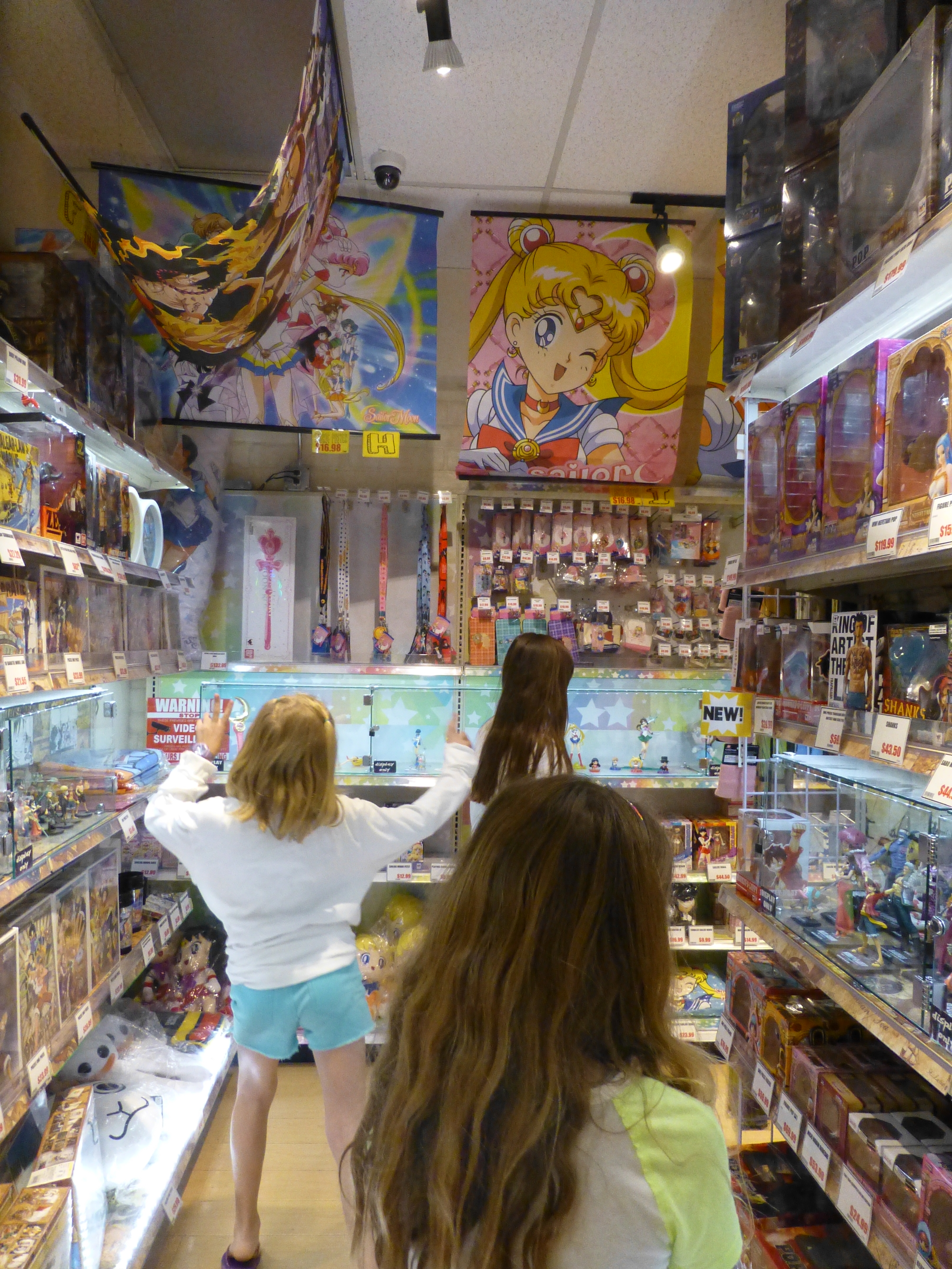
From over-sized dangling flowers to disco balls sparkling from the rafters, the place is alive with static animation. Well, monitors too airing the vary anime of this initial topic!

The merchandise is displayed in such multiples that they are a design of their own. The patterns and redundancy, characters and faces peeking from every inch of space. Row upon row of stuffed animals each with adorable expressions begging to be taken home.2016-04-16 San Diego Hoech P1130767

But it’s the design on EVERYTHING that is so amazing. To see such an emphasis on design. The importance and effect on every package. When comparing to like-kind of variety stores in the U.S., this is product design gone wild. The edifice itself is  but a box. Simple, clean and attractive from the outside,  inside is nothing but raw retail finishes. But it doesn’t matter because the back-drop is invisible. It is impossible for the eye to go beyond the products. It is impossible to see anything of the space other than its intense collections of contents.

2016-04-16 San Diego Hoech P1130773
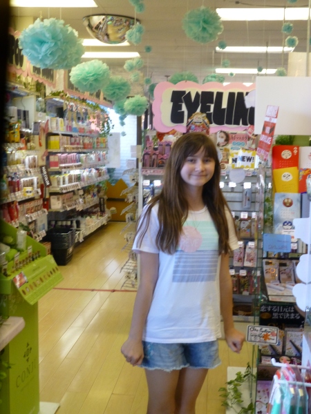
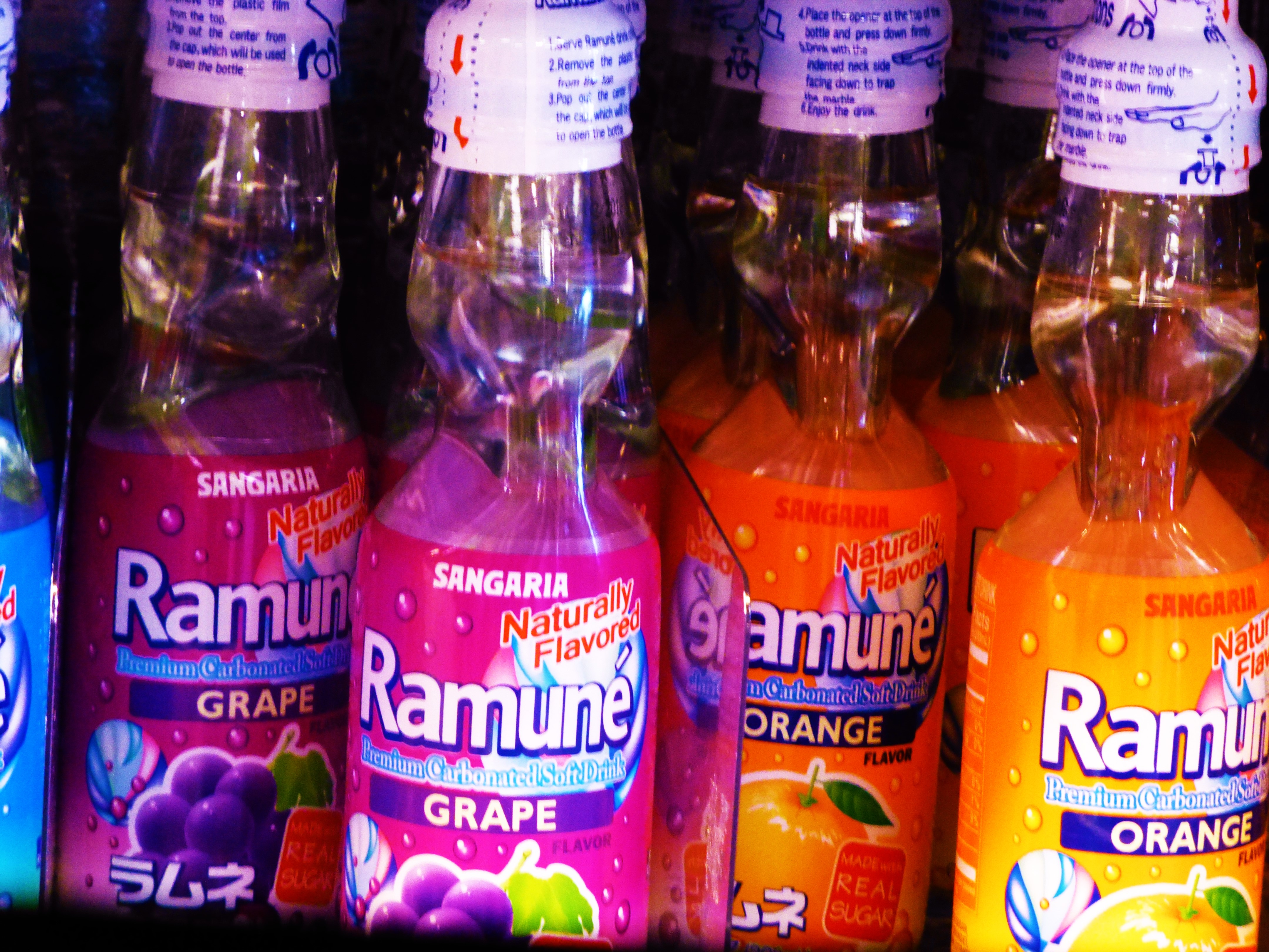
From beverage bottles to bears, pink kitties to hair and make-up lotions and potions, games and costumes – yes you too can dress-up like a bowl of Ramen Noodles or an egg yolk named Gudetama.

Although this amazing chain of markets is concentrated in California and Hawaii, it is worth investigating the Asian Markets in your area especially with an emphasis on Japanese products to see these colorfully artful expressions of graphic design, inspiration and imagination. 2016-04-16 San Diego Hoech P1130775 Thank you Katrink for this amazing experience we shared for your birthday!!!

E-design…Is It for YOU?

An article from the Washington Post came across my desk a couple of weeks ago by Bonnie McCarthy “E-decorators” draw cost-conscious clients. In this article she identifies what she calls the “modern trappings of online interior designers – designers who by her estimation are “renovating the process of how style comes home.” 20160416_103139_resized

In this writing she interviews interior designers about their various methods of providing services to their clients and certainly the newer way is more virtual than hands-on in-person. But think about it – designers have always had to deal with virtual conditions. Working from plans is just that!

With the new generation of consumers – millennials and those to follow –  computers are an appendage. Everything is referenced or accessed via a computer, tablet or smart phone. So it’s natural for them to utilize these tools for design inspiration or consultation. The article however is noting this new approach for everyone who expects a designer to be an expensive on-site investment.

Throughout the article it references the “new” e-design approach as a now more cost-effective, affordable exchange with interior designers. I think that sounds like a gimmick. The time spent is the time spent – the ideas provided are just that and the fees are the fees. Now, if these e-designers or unlicensed decorators are lowering their fees – well then that’s part of the story. However, I do not get the feeling that they are. Rather, I get the feeling that they are merely marketing to a broader audience than those found in their immediate physical locations. Smart. There’s another part of the story. Selling the idea that this is cost-effective over having to meet live with a designer and thereby getting those customers and also broadening the reach to those potential clients is a gimmick that seems to be working.

The fact that the article suggests that this new “e-design” consultation is more cost-effective than live and in-person versions of the same is interesting. Maybe it is – maybe not. It would save transportation time for the designer and they might pass that savings on to their clients – or they might just have higher fees and more profit for their time involved. Difficult to know – hourly consultation rates vary according to location and market price.

For the designers or firms that have established a formula and template for their clients, this seems fairly efficient. On-line information forms quiz clients on their likes and dislikes, personality and requirements. However,this can also be can occur on a local level at the outset of an in-person consultation. The combination of digital communication and in-person, on-site design consults might just be the best process. A client’s form might even be filled out in advance of the first meeting via email to give the designer an intro to the project. Digital images of the space in question can be uploaded for the designer to review, evaluate, and critique. What once was the method of clients snipping magazine articles and photos for review and discussion, sites like Pinterest allow for a place where designer and client can “pin” their ideas for visual communication and discussion.

So is it the cost? Is it the seeming efficiency? Is it the working at your own convenience after hours? What makes the e-design attractive? Why is it better than having a designer come to your residence and discuss on-site with images and tangible samples what you want and the designer recommends?

Tangible samples…I don’t even like or trust what I see on-line regarding fabrics and carpets – anything textile for sure is impossible on a monitor. Tangible samples that you can touch and feel, press and fold, rub and caress are invaluable features of the selection process. Therefore, the sensory deprivation of e-design is one negative. Yes, samples can be mailed – but there is a lag-time there too.

The myriad choices made available online now for home decor shopping has opened up the entire world of possibilities for the consumer. But that same client exposed to these limitless wonders of the world cannot cull their finds with confidence to bring together a cohesive design. In this design process, some things have to be forfeited and others embraced and incorporated. It’s all about making the right decisions. The designer aids in and facilitates making those right decisions and bringing in even more ideas to the project with their expertise and experience.

With thorough websites, designers can present their work and potential clients can research until they find one that they think meets their expectations. Once that has been established, the client can even interview a few designers to make sure that the in-person chemistry is there between them. Or…there’s face-time!!

So back to the e-design. It’s not new – the methods are – but design across the miles has been going on for decades. Plans mailed, faxed and now digitally shot over the globe. Prior to a building being built – it is a virtual place designed diagrammatically, built in models, illustrated, and sketched – by hand or CAD it only exists in the mind’s eye of the designers and those to whom they are conveying these concepts. ILLUSTRATION RESI CROP P1030518  
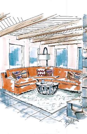
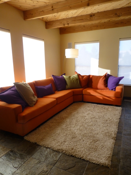
Selecting the interior furnishings and finishes for these edifices has always been similarly virtual. Until something is built and furnishing  installed, the designs are all “virtual.”

So “e-design” is on another plane of communication with the client with new tools to facilitate and communicate. But the advantages or lack thereof are many and seem to be more applicable to a client in a remote location without benefit of good local designers.

I knew an incredibly creative and adventurous couple who, back in the 60s and 70s, established a private resort on an island where everything was selected and obtained via mail-order catalogs, shipped across the water, received in docks, transported to local delivery vessels and dropped on a beach weeks later. Not so different today for those located far from the modern conveniences but connected now to the  world via the internet, fast jets of Federal Express, DHL, UPS and all the trucks, sea trains and land rails that move goods around the world. That’s when this instantaneous assistance for decision-making with a designer over the miles can be extremely advantageous – you have no other means of getting together and the framework is in place to do it all remotely.

So if you fancy the idea of having an LA designer consult for your condo in Dupont Circle or a Denver designer make their recommendations for you in Boston, so be it.  Yet, I say investigate your local interior designers, visit their websites, contact their references,  and see how their fees and talents compare between each other, and then compare to them to the e-offerings on-line and go with what works best for you!


Public Restrooms – Design Matters

A conversation between stalls, in the women’s room in the lower level of a fabulous church building, centered around the unattractive condition of the bathroom itself. These commiserating women agreed then and there that this restroom needed  improvement.

This lovely little campus in Virginia has a magnificent combination of historic and new architecture. Modest yet appreciated improvements have been done recently to perk-up the tired corridors of the administrative areas and restrooms on that level. Here below, where classes are held and the social gatherings take place, these other two restrooms have been sadly neglected.

The thing is, design matters – even on such a simple, basic level. This doesn’t mean ground-breaking design or startlingly award-winning design – but basic selections for attractive finishes  and colors in the context in which they occur.  It’s also about maintenance – what once was attractive wall-covering, now peeling and worn in places, dated light fixtures, dusty faded silk flowers in a plastic container – someone’s attempt at “decorating,” – an odd, green vinyl chair at the dressing counter, worn faucets and surfaces…all contribute to an uncomfortable sense of neglect and even lack of cleanliness that these women were observing. 20140929_132712 20140929_132655

Funny though that these photos do not begin to convey the real feel and appearance of this restroom!! Doesn’t look so bad here! So much for my illustration! (Hopefully soon we will see improvements that will effectively contrast.)

So just for grins, I’ll insert this shot of a anonymous, barren,  anemic restroom that could easily be improved – starting with picking up the towels! public-restroom

While on the subject of restrooms, a talented chef in a chic eatery in Santa Fe dished delicious presentations of sensational food but failed to recognize the importance of the appearance and maintenance of his restrooms.  It’s funny that you can attend a popular place and enjoy fine cuisine and dine in a beautiful, creative  atmosphere and never visit the restrooms. When once you do, especially after having enjoyed the dining experience more than once, the unpleasant realization that this does not matter to the establishment and in this case the chef/owner, is disappointing if not astonishing.

We initially thought, surely he must have a restroom in the back of the house and may not even venture into these two reserved for his guests ,relying on staff to do their jobs. But when we brought this to his attention, he said in an off-hand fashion, “guys don’t care” (really?) and he directed a waitress to wipe the basin in the women’s room – which was the tip of the iceberg – he had no clue.

It is a reflection on the business on many levels…conscientiousness, concern for the comfort of the patrons, respect for the patrons…the list of “why” goes on…The design should continue with the same thread of the theme. here are some fabulous examples:

Perhaps the budget is limited and it is the wall color that flows into the restrooms but a touch of design and cleanliness is paramount. Odors and horrible masking room scents are equally as offensive as neglected design.

We took that otherwise delightful dining venue off of our list as there were many other choices that we felt made us more comfortable in that department.

Clean, well-maintained design matters. These aforementioned establishments don’t realize the negative impression and unpleasant sensation that such conditions evoke and serve to remind. It can be bad for business.


The Drama of Dark

It seems counter intuitive – and that is why so many people ask me about the effect of dark wall colors – “won’t it make it look small?” and I assure them – “no,” and they are still not so sure. The most recent example of this was in an expansive home  where we were talking about accent walls – not willy nilly mind you, but in an architectural recess behind the stately china cabinet in the dining room and a doorway recess in another room. In this case, using neutral, warm grey tones – shades of same hue – value shifts for depth and architectural enhancement. Not yet painted, check out our website in a few weeks for befores paired with afters to see this example. Here though is another example Corine-Maggio_La-Jolla-Shores_1.jpg.rend.hgtvcom.1280.1280

The above photograph for CM Natural Designs by Chipper Hatter.

If a dark color was to make anything look small – why would one want to paint it in a tiny space? There is the more specific, counterintuitive question. The answers is that there are illusions of space. A dark color in a small space can actually read as though there is more depth to the space. Where it can be close and cozy, it is also a subtle enhancer of depth and therefore size. dark-room-collage3_large_jpg

So in another example currently in a state of remodel, a petite powder room previously papered in a dark green patterned wall-covering, now was being refreshed. There are no rules – it could have been bright, light, bold or dark…flat, glossy, organic or metallic – the possibilities are endless. But the previous rendition of this space was pleasing for its dark tones and therefore a decision was made to select a deep-toned paint for the re-do.

Dark colors, contrasts and lighting all can have dramatic effects on the perception of a space. Dark colors actually recede. Therefore, in many situations, if  the application of a dark color will convey a sense of depth and additional space it’s an intriguing experiment. Black-Feature-Wall-for-Bedroom
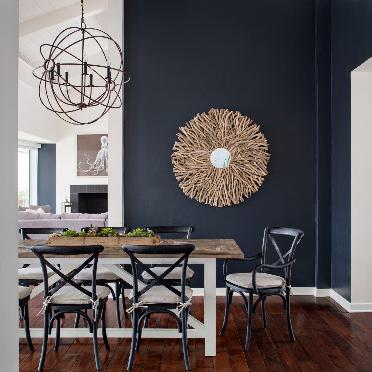
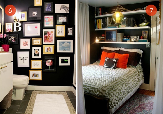
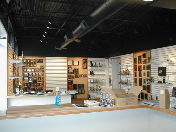
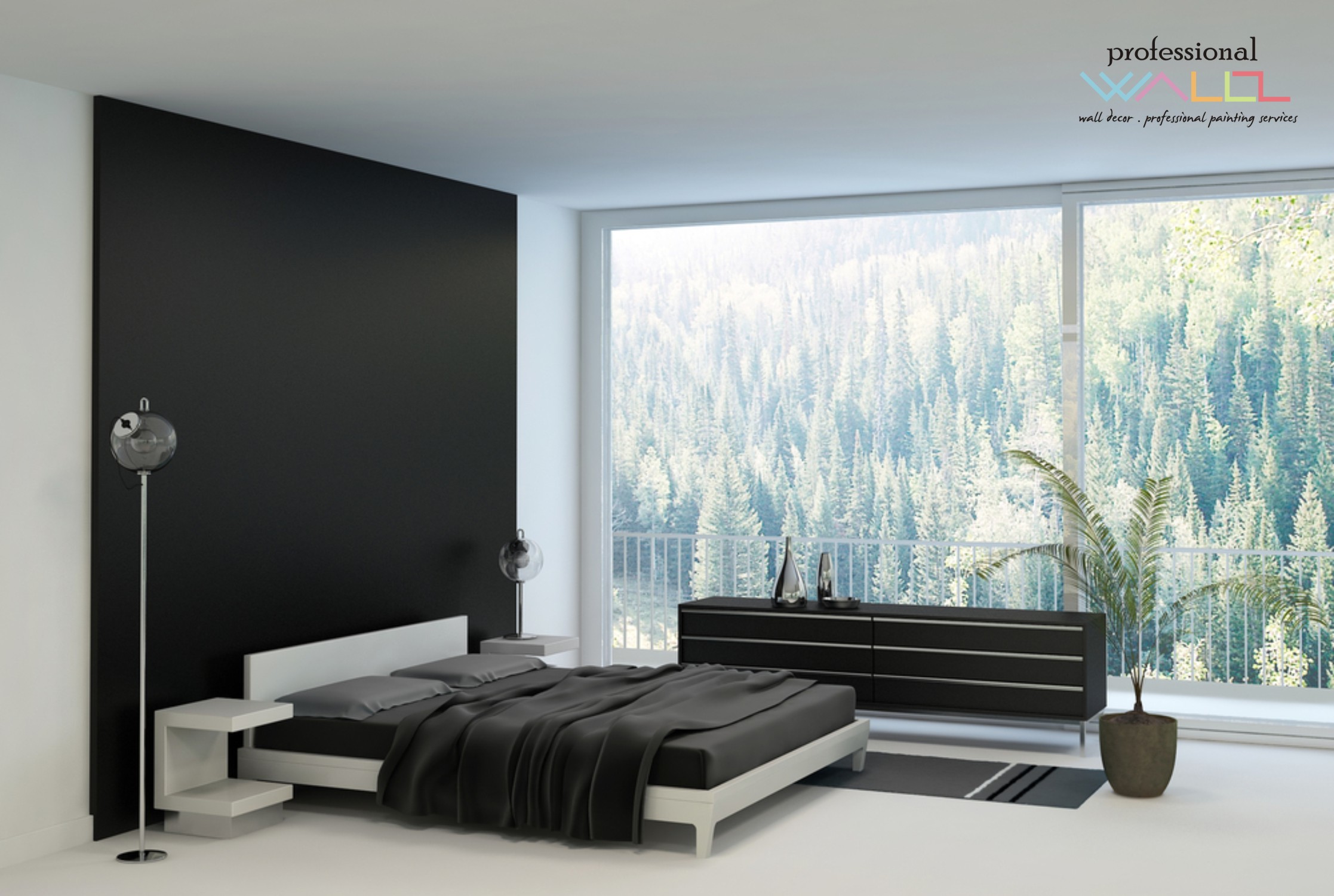
Like reaching into a hole or looking into space, and not seeing the boundaries well. It s a brain thing. If the brain reads dark, it suggests  a depth of space and therefore more than is really apparent. This is often used in ceiling treatments. Having a low ceiling appear higher, when painted dark, due to the illusion of depth.

OLYMPUS DIGITAL CAMERA

It is also effective to make something go away. An exposed mechanical or white lay-in acoustical ceiling can be institutional looking and not desirable in certain settings. Painting it black or another dark value of color, while sacrificing a bit of acoustical rating,  the ceiling will seem higher, less distinguishable and not as imposing upon the decor of the space.

So the petite powder room currently being re-floored with dark tile, re-painted with Benjamin Moore HC-166 Kendall Charcoal, new dark matrix granite vanity top and cabinet, new lighting and mirror…will soon be finished and we will post the drama of dark in before and after shots!