The Art & Architecture of Gingerbread Houses

Art and architecture meet all the time. Sculptural forms, building models, buildings themselves, sketches…but at this time of year, the fanciful world of gingerbread houses takes the spotlight and, in this recent scene we encountered, offered a beautiful fund-raiser while at it!!!

20161220_080440

As we pulled away in the pre-dawn hours of the  morning…we felt the chill in the air and the glow over the mountain sending us on our way.

We traversed across the terminal and before cutting over left to the escalator, we spied—at the same time—a wondrously tall Christmas tree adorned with airplanes and ribbon…and surrounded by an amazing collection of ginger bread houses on display in some sort of fund-raiser fashion.

20161220_080515

Upon closer inspection, the fantasy became tangible. The individual structures took on a form of expressive life in their individual attention-getting style. Each one was quite unique incorporating rivers and ponds, vehicles and foliage of all manner.

It is a Christmas tradition to create a gingerbread house full of fantasy and fear, hope and salvation. From the simple joy of baking traditions for Christmas, to the many versions of fairy tales that save children from the wicked ones in the woods creating and story-telling surrounding these magical edifices makes gingerbread houses a staple of the winter holidays – all the while offering architectural design and  construction projects for all ages. Below, see the Hanukkah version of this adorable house.

I just read a great piece by Tori Avey in which she summarized the history of gingerbread. http://toriavey.com/?s=gingerbread

She references architectural design with the fact that: Elaborately decorated gingerbread became synonymous with all things fancy and elegant in England. The gold leaf that was often used to decorate gingerbread cookies led to the popular expression ‘to take the gilt off of gingerbread.’ The carved, white architectural details found on many colonial American seaside homes is sometimes referred to as ‘gingerbread work’.

Having been raised on the east coast, describing houses with ornate “gingerbread” detailing was part of our vocabulary. I now see it in Rocky Mountain Victorians and California seaside cottages. It always conveys a quaint, welcoming feeling.

Avey further states: Gingerbread houses originated in Germany during the 16th century. The elaborate cookie-walled houses, decorated with foil in addition to gold leaf, became associated with Christmas tradition. Their popularity rose when the Brothers Grimm wrote the story of Hansel and Gretel, in which the main characters stumble upon a house made entirely of treats deep in the forest. It is unclear whether or not gingerbread houses were a result of the popular fairy tale, or vice versa.

Recently the record for world’s largest gingerbread house was broken. The previous record was set by the Mall of America in 2006. The new winning gingerbread house, spanning nearly 40,000 cubic feet, was erected at Traditions Golf Club in Bryan, Texas.

Everything is bigger in Texas!!!

The house required a building permit and was built much like a traditional house. 4,000 gingerbread bricks were used during its construction. To put that in perspective, a recipe for a house this size would include 1,800 pounds of butter and 1,080 ounces of ground ginger. Sounds more like a gingerbread resort!

So as we walked around this wonderful display at the ABQ Sunport and marveled at the colorful creativity, I knew this was the story for today.

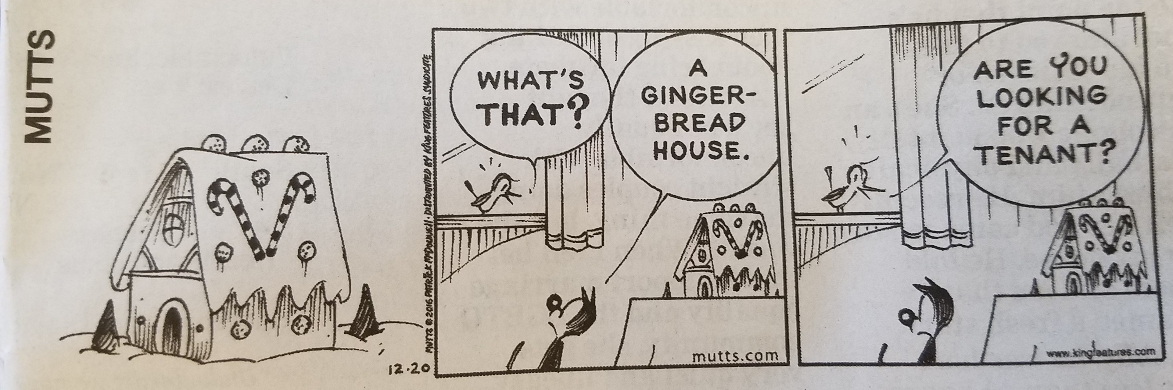
The cartoon in the paper that morning also found  humor in the subject.

20161220_083319

And to further galvanize that thought, we arrived in San Diego to find Keira proudly presenting their half-eaten, already picked apart gingerbread project in the center of the kitchen table. T’was the joy of gingerbread houses—post construction, eating them!!!

20161220_112922

Color of the Year 2017 Greenery!!

Ta Da! Pantone announces its color of the year for the coming 2017…drum roll please…and the color is Greenery!! Yay!!! Last year there were two  – yes, imagine that – they couldn’t decide so they slurried Rose Quartz and Serenity resulting in a pale, cool, wimpy blend of soft rose and lavenderesque shades into a blended wispy pastel dream. Non-committal, in my opinion…lacking confidence.  Last year the rationale was stated by Pantone’s Executive Director, Leatrice Eiseman as…

pantone-color-of-the-year-lee-eiseman-quote-2016

But this year they have it with this fresh organic hue in a yellow-ish shade primed for this year’s rationale from Ms. Eiseman which is:

pantone-color-of-the-year-lee-eiseman-quote-2017

I have always loved green. I grew up in a Virginia jungle of a suburban neighborhood inside the Beltway surrounding my hometown of Washington DC. where the first signs of spring were the tiny tips of dogwood leaves poking forth from the delicate branches of those beautiful under-growth trees. The dogwoods were the graceful, human-scale layer beneath the towering canopy of the immense, rigid, vertical tulip poplar and white oak trees that commanded the woods.

Soft mosses, lacey ferns and perky lily of the valley carpeted the hidden pockets of our backyard. New growth is that prediction of amazing renewal and promise of the start of summer. So it is a prime observation that as Eiseman states in her 2017 rationale “greenery…bursts forth…with a reassurance we yearn for…” although I do not feel this is peculiar to this year as winter always makes me yearn for greenery and the reassurance  that spring and summer will return.

My mother also loved green and that probably influenced my childhood perception of comfort and context of it in interior design. She had and still has an eye for color. In 1959 she selected an amazing sculpted wool pile carpet in a warm, dark, neutral, taupe tone and built upon it a color scheme of pinks and greens that was subtle and relaxing, organic and contrasting, blending beautifully in our wooded setting of verdant lushness in which we were cozily situated.

That was upstairs where we felt like we lived in a flowering tree house amidst the dense collection of green leafy between the trees and surrounded by all shades of pink and white azaleas. Downstairs, where we retreated in the winter months, her greens were mixed with gold tones creating a warm interpretation of the greenery around us.

When so many in that era, between the 60s and 70s, were styling interiors with heavy oranges, browns and golds,

orange-and-brown-f934b00ae8a8aabb9fa7d7d8e3ccec30

my mother gravitated toward Lily Pulitzer’s fresh, tropical palette of lime green and hot pinks, clean crisp turquoise and citrusy lemon yellow – both in her wardrobe and her interior accent colors.

most-popular-lilly-pulitzer-prints-no-names

Our beach house was turquoise and teal, navy and tan – the sea and the sand.

Following color trends is a slippery slope. I have blogged about it in the past. Adopting that which is often a combination of colors instantly records a place in time when everything from bath towels and shower curtains, bed dressings to draperies appears in the marketplace and inserts its predetermined obsolescent combinations into the lives of so many who would rather catch the wave – often behind the crest – to own and participate in what is conveyed by the market to be the “in” thing to do and to have.

It is best not to embrace and adopt the combinations that the market presents. It is better to select color and combinations that transcend the trends – skirt them so as not to fall into the trap of dated color schemes and tired combinations. Some avoid the trap by staying neutral. The safe, timeless colors of whites and grays mushrooms and taupes- but where is the risk and fun in that?

“Too bad for them” I often remark. It is such a missed opportunity…a limitation to select colors that you think you are supposed to like rather than those that truly bring you joy. I say “go for joy every time.” Color is such personality. It is a stage-setting element. It is a backdrop or foreground. It is a theme. It is an atmosphere.

With all that having been said, I for one am thrilled with this fresh selection for the new year. A bright beginning full of hope and new growth, fresh starts and positive forward movement – organic and life-affirming. So seek the colors that brings you joy and go forth with color in this new 2017 soon to arrive. My personal schemes will always have greenery!!!

Fun with PERF!

Currently finishing a project that has provided a great theme for incorporating metal, it seemed a worthy blog subject for it’s fun and flexibility! Perf is the product – a perforated steel that comes in several percentages of perforation.

We have used this many times for rolling window shades in a flexible coated nylon material. It is great for filtering for sunlight and privacy while allowing a certain amount of “see-through.” It has been used as an architectural screening material for years. You have probably seen it and not realized it on building storefronts and bus wraps – the perforated vinyl coatings are often used for advertisement because they read as though a solid from the one side and are transparent from within.

Here we are playing around with the steel to create cool elements that compliment the theme of this new taproom. The theme is silver and what material does bring to mind? Metallic. So by dressing raw steel with paint – we apply the silver finish and there we have it!

The required outside patio fencing was constructed with very generic square stock. I called it a hamster cage. It was a bland beige when we first arrived and, without notice, the shopping center management had it and the other structural columns lining the canopy/portico painted chocolate brown.

The plan had been to screen it with perforated panels. The darker paint color created a little better contrast and aided in providing a depth of detail to set-off the silver painted perf.

Inside we needed to fill the volume of this most uninteresting dropped ceiling. Already painted black and looking quite voluminous – but not in a good way – the empty space needed some mass. So in one of those restless, middle-of-the-night design sessions of insomnia the idea to create large drums for lighting shades came to mind.

Drums have been in vogue for several years now. Nothing original from the initial use for table lamp shades except their use was broadened to include suspended fixtures and halved for wall sconces. You’ve seen them – hip and happening – and these were quite over-sized and carried the space.

We needed to fill the void of the 12′ high ceilings in this room that had little or no comfort. All hard surfaces, it was a challenge to maintain the silver theme and edginess of a popular taproom while creating comfort. Seemed an oxymoron of a task. But the mass of the perforated drums in three different sizes grouped in the near center of the room did just that.

The addition of multiple warm white lamps inside will be the crowning touch. (photo to be added here in a week or so)

Then a third use of the perforated material came in the idea for a room-divider/hostess station.

img_2342

We needed a place to create a point of arrival. Whether manned or unmanned, this unit can have a chalkboard or other signage identifying special events or beer tastings, with a podium in front creates a translucent backdrop to partially cordon off the rest of the space until the customers are greeted and it also can divide the space for special events and table groupings. to accomplish all of those various purposes we designed it with heavy duty commercial casters complete with brakes so that it could be moved easily for its grand height and weight and  placed where needed for the best advantage.

Stay tuned for the complete un-veiling of this cool new interior in the coming weeks. And meanwhile dream of all the fun you can have with perf!