Drama, Discretion and the Element of Surprise – Concealing & Revealing

Have you ever had someone ask you to cover your eyes and then there is an anticipatory pause as you stand there anxiously or they guide you – no peeking – in your temporary darkness, to a point where they say “you can look now!” and you do so with great anticipation? The elements of surprise and discovery are put into play to create drama. Hopefully, the unveiling is met with the positive reaction that the presenter had in mind.

Recently I was called to the home of a wife and mother with a dog. Only she was in evidence and present for this meeting.

Her initial contacting our office and brief correspondence prior to meeting was done via email regarding her introduction and retaining me to assist her with her newly acquired home. Her first concern, conveyed even before we met in person, was one of achieving a “cozy” interior.

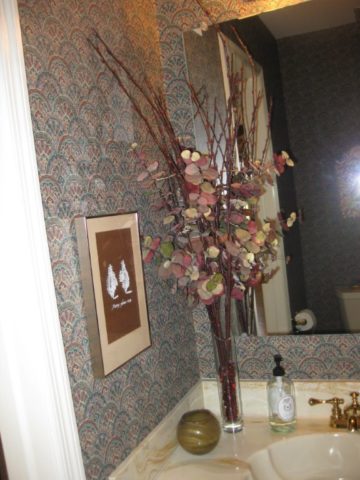
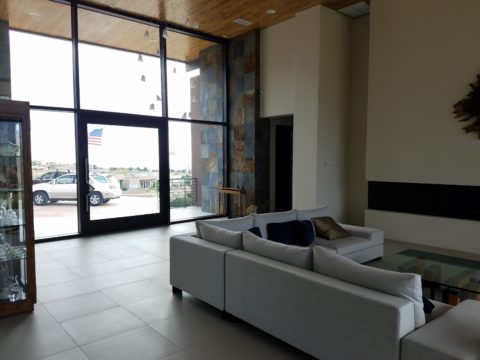
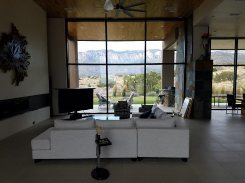
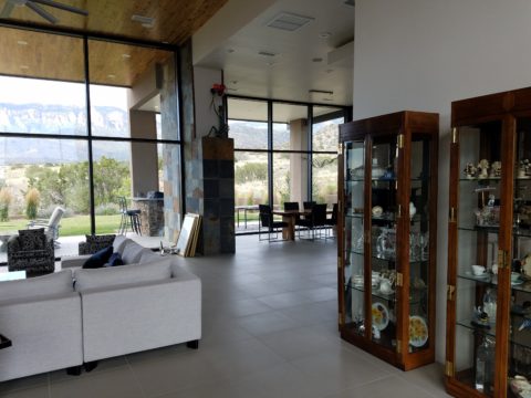
The home’s contents were partially dismantled as the original owners were in the process of boxing up and moving out. In all fairness, despite the unfurnished state, it was devoid of mystery or interest. It did offer a commanding view of the mountains seen very closely through an expansive north facing wall of glass. But as magnificent as the unrestrained scene was, the drama might better have been revealed by invitation rather than seen in its entirety, from outside the un-obscured glass front door and large flanking sidelights straight through the house and without interruption. This presented an exciting opportunity.

By invitation, I mean selecting who sees into your home and how far. Who sees the intimacy of the interior and the would-be personal vantage-point of the dramatic scene. The opportunity was to control this drama and give it even greater impact by concealing and revealing.  The opportunity to create a design which offered privacy,  bit of mystery and discretion – with the ultimate revelation of the startling glass wall and jaw-dropping view.

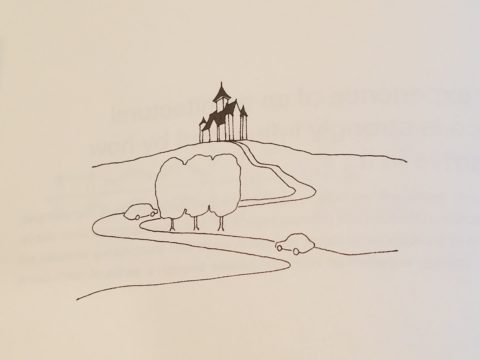
This sketch by architect Matthew Frederick illustrates the effective use of “denial and reward” to enrich the approach to the ultimate unveiling of the destination.


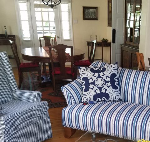
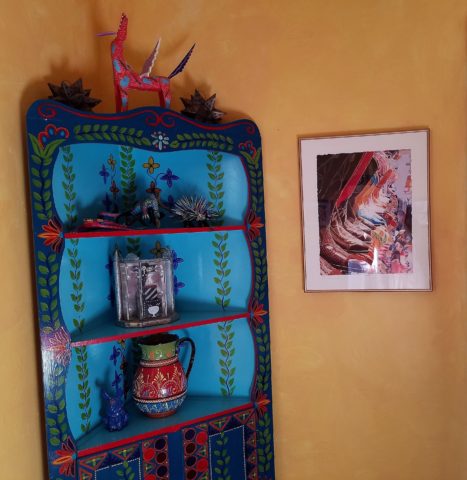
This home I’m describing offered little or none of these characteristics to entice the guest/viewer and, with that, certainly defied the word cozy.

The objective, as originally stated by my client, was to achieve a cozy interior. Presented with all hard surfaces of stone, tile, steel and glass, the problem seemed obvious, offering possible solutions was my task.

When I suggested a partial-height point-of-arrival wall be constructed inside the entry to stop the view and allowing one to assess and receive the guest and/or conduct a transaction, I was instantly met with “Oh, but it’s that view that my husband loves! He wouldn’t go for that.” And I’m thinking…but seeing all from outside the front of the house straight through and out the other side?

First roadblock. He who has strong opinion and, in his absence, is inserted into the conversation, without benefit of thoughtful exchange, strongly suggested that further evaluation of this option seemed moot. This through-space seen in its entirety, without interruption from outside the front door to the back of the house, was totally transparent and the representative (she) of the team was referencing his seemingly over-riding preference, in contrast to her stated concerns…cozy. Not to mention private.

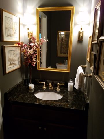
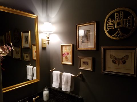
To create a successful design, it is important to consider contrasting elements. All hard surfaces begged for softening counter-balance.  Transparency suggested the need for partial obscurity – at least at the point-of-arrival.

Wouldn’t it be interesting to obscure some of that magnificent view from anyone who approached the door and rather invite those so chosen to discover the mystery and drama once they’re brought into the space?  This addresses both privacy and drama with greater sensitivity while beginning to address cozy, by concealing the living space from public view.

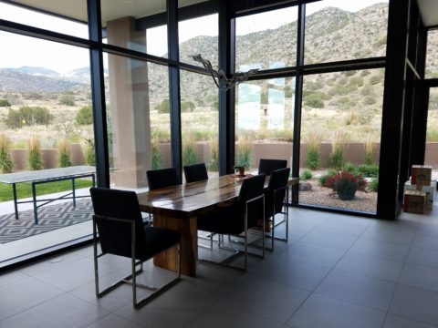
Un-obscured glass on the back of the house is the private drama.  Seeing the view from inside and connecting the outside to inside, for personal enjoyment is unique. By allowing only family and guests be given that vantage point, from the interior and private backyard exterior to the inside, is the privacy bonus. Drama and privacy achieved.

As with most things in life, you get more punch from the element of surprise. To have guests arrive, be received and then invited to proceed, to experience the drama, is far more effective than seeing it all without the heightened expectation or even unexpected surprise.


Color Schemes and the Complex Simplicity of It All

Color schemes are many. Color schemes evoke a mood or convey an atmosphere. They certainly can and often are responsible for imagined temperatures and/or seasonal sensations. What constitutes a pleasing color scheme? What constitutes pleasing? It all comes down to balance, layering and subsequent interest. It takes a enlightened eye and usually cannot be achieved by accident.

We are nearing completion of a living room that incorporates many design elements. Family heirloom antiques add a vintage touch along with the architectural style of the bungalow home.  Contrasting these pieces is a sleek-lined, modern, sofa that we found and reupholstered. And while not driven or influenced by current color trends, we selected a scheme derived from the existing Persian rugs. By extracting the blue and white from the patterns to refresh the interior – a classic, timeless color combination – we blended a wonderful scheme. Finding the common denominator(s) blue and white, we sought to anchor all with this consistent theme. Differing patterns provided additional layering and interest.

Then, just last week while dashing through the DCA terminal for SWA, my eye caught the attention of several magazine covers all featuring blue and white schemes!  Always in vogue, but not always featured as the cover story, this coincidental (or not) collection of blue and white photo images was a riot! I was forced to snap a few shots to send to my happy blue and white client.

If I described a new master bath remodel project as all white, I wonder what might come to mind. All whites are not created equal and the variation is startling when you see them in context, adjacent to one another. So here is the easiest example. A fan-deck from Sherwin Williams shows a collection of whites. They “read” very differently from one to the next. Yet taken one at a time – isolated from the rest – each would seem to be just plain white. Notice too how they differ from the white paper upon which they are printed – it is the spacing between the color chips – and even the white fabric upon which they were placed for the photo!

But there is really no such thing as “just plain white.” Once seen next to another, their unique qualities of hue come into play. A yellow white is creamy, while a cool white reads blue. It’s the context that makes the  color more legible. Without that they could be assumed and accepted to be merely “white.”

So, in this recent color scheme nearing completion, whites in context show their many colors. At first glance and if asked, one would say “the room is all white.”

Upon closer inspection (photos taken from a different angle seconds apart), that simplicity is replaced by a more complex, heightened level of awareness. This complexity is what adds interest and results in a better finished product than a true monochrome. What was a collection of white materials, in this master bath, is truly revealed as shades of white varying from ever so soft celadon to cream and grey to what might be read as actual “white” white.


Don’t trust your eye when it comes to color. Discover how paint on walls changes all through the day. Artificial light-sources alter the way a color appears.  Context with other colors alters the way one perceives color. Color is fun! Colors are fun! When designing interiors, enjoy the process of layering and the varying effects colors have on each other. Simplicity is usually not really simple. That term can be deceptive. Making it look that way is an art. Encourage the enjoyment of discovery.

Moody Blues – Moody Rooms

What’s more trendy than an existing word that comes into the mainstream with a new relevance or targeted use? I’m sure you will giggle a bit thinking about some of the trendy words – original or re-constituted – that have come and gone. How do they get inserted in our popular culture? Who started it? How quickly did it catch-on and how? I will have fun with a variety of trending design words in coming blogs – enjoy expanding your design vocabulary with these if they are not already a part of your vernacular.

I’ve written about dark rooms and dark colors in the past…don’t be afraid of the dark! But to now discover that the use of the word “moody” has surfaced and playing a role in describing such spaces is novel. Trending now – “moody” rooms. Or at least describing dark spaces as “moody.”

We recently gave a face-lift to a tiny powder room. It was dark-ish before, but with a printed wallcovering from the 80s. It had stood the test of time and served the owners well, but it was time for new cabinets, countertop, hardware and fixtures.

We decided to run new floor tile from the entry through to this room. It was a large format dark porcelain. This dark chocolate leather-like look was a deep and “moody” selection to recede and add depth  to the space.

Yes, it creates a decided “mood.” A mood of somber elegance. The quiet space is perfect for the duty it performs. As a powder room, it is visited quickly and by many. We selected a velvety dark wall paint Benjamin Moore HC 166 Kendall Charcoal rather than replacing the wall-covering with new.


For interest, instead of one large commanding piece, we  gathered a collection of complimentary wall art from other rooms and even some clever thrifting (always an entertaining and satisfying treasure hunt) to create an interesting grouping to be enjoyed from the intimate vantage point.

The new lighting flanking the mirror rather than coming from a bar above is soft and  in keeping with the  colonial decor of the home located inside the beltway of our Nation’s Capital. New granite is dark and rich, white porcelain adds a crisp contrast and new cabinets coordinate with other renovated casework in the home.

When surfing the internet for design inspiration and subsequently speaking with design professionals, be clear. Picking up new ways of expressing design ideas is fun – but the simple truth is just that – simple. Keep it simple, explain your goals, go dark if you like, be a bit moody if it is the effect that you wish to achieve. Have fun and don’t be afraid of the dark!!


Regional Design Fun!

So many regions, so little time!!!! All the design directions available based upon where you are and what you love – just think!! Regional design provides a strong connection to the surrounding environs. From selecting artwork to color schemes, decorative accessories and even room scents, creating regionally specific interiors is a fun way to go. Often reserved for second homes, the novelty of focusing  on the design theme specific to the region does not always reflect real life.

Real life is usually comprised of a variety  of experiences, tastes, acquired objects, interests etc…designing around a specific regional theme is more deliberately focused and therefore not as eclectic as a person’s true life experiences and resulting accumulation of possessions and reflection of varied interests.

Seaside design would incorporate decorative accessories, fabrics and colors to represent the surroundings such as nautical themes and the elements of the natural scene incorporating seashells, seascapes, etc…

Therefore, the primary place of residence in such a locale would reflect that context but not necessarily be completely designed around it. The second home would have the novelty of centering the design exclusively on that seaside theme.

Here is a stunning example of the Americana By the Sea Bungalow! A spritz or burning of Votivo’s White Ocean Sands in this scene – oh heck – why? Just open the windows and breathe in the salty sea air!!!

While in the metropolitan Washington area, one can’t help but notice the architectural influence of colonial times and the interiors which reflect the same.

Steeped in the history of our relatively young country and the pre-colonial decorative arts that came across the water to the New World, the antiques, reproductions and embellishments are telling.

This whimsical casita in Santa Fe illustrates the colorful folk-art of both old and New Mexico, bold paint colors, graphic transitions, and the enchanting architecture of adobe charm. As a second home, the extravagance of collecting and displaying in a fanciful setting is a fun, on-going project!

A corner cabinet by acclaimed folk-art painter Barbara Peabody makes a bold statement housing additional collectibles from Old and New Mexico. A giclee print of a fabulous watercolor by Susan Weeks – the art of decoratively detailed cowboy boots.

Where do YOU live? What themes from your area do you incorporate in your interior design? Get out there are soak it in, gather ideas, start collections, buy local and have fun!!!!!!