Entrepreneurs! Getting Started with Design!

Starting out with your first brick and mortar business, the tasks are many. After homing in on your business specifics, selecting a name, designing a logo, deciding colors…you have your license and your business plan, you’ve found a place and then you need to present your business to the world!

A few weeks ago, we began a new project that is just what I have described…an exciting first-timer in the business world, having worked for others is now ready to do her own thing, be her own boss, make her own decisions and assume the risks necessary to take this leap into entrepreneurial adventure.

It’s exciting and scary, daunting at times and fun too. And it should be fun. Finding something that you enjoy, something you believe in and believe that you can do as well as, if not (hopefully) better than, anyone else in your market.

With inventory determined, name and logo designed the last task was to create the space to present her concept. We won’t divulge that today, the project is yet to be presented, but the framework is on what I want to comment.

We began compiling some finish options…paint, upholstery, privacy curtains, carpet and a little brushed aluminum bling!! We want to reinforce her brand with key colors and finishes.

Knowing the terms of the lease agreement – what is the landlord’s responsibility, what is grandfathered-in, what can be changed, any spending allowances amortized into the lease…these are all things that are necessary to determine how to go about designing the interior. It is necessary to establish costs within the over-all start-up budget. Having helpful, knowledgeable, creative people around you with whom to assemble your team is imperative.

We arrived at the site to find a very clean slate. Located in a retail strip center, it was a white box.

We instantly decided the flooring would be a combination of polished concrete and broadloom carpeting, some lights stay and some go, spots will be added, colors will reinforce her brand.

Toward the back, a break-room kitchen area needed demolition. This pocket would become fitting rooms.

There was existing ceramic tile on the floor that also needed to be removed. These were things that our client could attack herself – saving money and getting to know her space.

We learned that the restrooms were grandfathered in and did not require any additional improvements – other than cosmetic.

We learned that we could make changes and additions to the lights and only needed a permit for electrical portion of the work.

Many of these discoveries were of pleasant surprise to our client who had been miss-directed a bit and was in a state of frustration and near defeat. Gathering good information is imperative, in order to save time and money, make good decisions and know your options. Get out there and get busy!!!!!

Soon to bee completed, watch for this transformation in coming weeks.

Easter Art Encounters

Toodling around Tucson today this Easter eve, we came upon some fun seasonal art!! From antique to modern masterpieces made today, it was quite a diverse array!

An antique Lalique French crystal bowl was an elegant vessel to present these hand-painted pastel wooden eggs.  Mixing refined with folk-art is a wonderful contrast in style!

Potter Robin Chlad designs and builds these  stunning three-dimensional crosses. Adorned with birds and flowers, no two are alike and the brilliant colors are fabulous!

We hopped past these adorable bunnies! So many colors of fine metal-craft each. What a whimsical collection by artist Jeffie Brewer!! And his subject matter is well beyond bunnies!!!!

Explosions of spring cactus are in bloom from nature’s statement in these vivid coral barrel cacti we encountered in a xeric garden,

to the artist Lucky Coleman’s fanciful  interpretations using brilliant combinations of glazes on dazzling sculptures of clay! The beauty of nature to the fantasy of an artist’s creativity, we witnessed magnificent blooms! A time of rebirth and new life  – spring is in the air!

Happy EASTER!!!! Happy SPRING!!!!!


Custom Designed Art for Branding in Commercial Interiors

Designing artwork for commercial interiors offers an opportunity to connect to the brand. It means that we take into consideration the artwork as relates to the business and its identity. You might remember a blog from last year about the can wall. It was designed for a taproom. The theme was beer. The name was “Silver” and we considered that a natural off-shoot of that was the silver color of aluminum beer cans – as a wall treatment!

For that same project (in two locations) we further emphasized the brand with photos we took of their own products transferred to and stretched on canvas stretchers to be the “art” on the surrounding walls.


Fast forward to a conference room for an energy company home-based in Albuquerque – the iconic Sandia mountain being the earth’s monument – the familiar, perfect image to represent the company and the connection to the earth and its resources. For this  project, we were asked to build 27′ of custom , cabinetry and dress the wall above it.

The tall ceilings required a vertical element, but the length of the wall also begged for horizontal space-filling. As a cost-effective solution to such a large space, we decided to take a photo of the majestic mountain, separate it into 5 sections and have it enlarged and transferred onto aluminum panels for light weight and rigidity. The reviews were sensational as everyone loves and relates to the familiar scene – seen in such a colorfully explosive and expansive installation.

In response to the success of that solution, the client asked for a complimentary treatment for the opposing wall. Again, the wall was 27′ long and had the same ceiling height so we used multiple fragments in 3 groupings to center across the entire expanse. “Elemental Fragments” was born of the concept to have just that – fragments of elements in an orderly fashion – uniform yet random, to contrast against its formal geometry in response to the amorphous photographic landscape. Colors were derived from the blue, green and yellow in the scenic panorama interspersed in a field of silver.

Last week, on the day of the installation, colorful creative chaos – resulting from unwrapping the individually hand-crafted compositions and scattering them across the conference table – was part of the fun, of the scene.

The tedious work of aligning all just right, with perfect spacing and level mounting, added to the anticipation of realizing the finished product.

The luminous glass against the rich, stained wood punctuated with the  brushed stainless fasteners made a striking assembly.

Modern engineering and production, worldwide energy collaborations and shared technology coming together in a grounded environment of people and their place on the planet. A daunting system of assembling fragments of many elements that make things work to bring gas to the end users. The artwork makes the concept look easy. The result of the many facets, of the actual work and the artwork representing it, is not only effective, it is triumphal.

It’s creative fun to custom design pieces to relate to the brand, the business and the culture of a project. Bringing joy, pride and a sense of confidence in the focus of the work, to the employees and guests, is a successful finale.

Bring us your design challenge and we will design a solution specifically and especially for YOU!!!


Inspiration Discovered in Familiar Materials Used in New Ways

While at the stop light, I found myself behind this gorgeous fire truck and by the time I thought I should take it’s photo, it was pulling away and I was making a U-turn! So I quickly grabbed the phone, fumbled for the camera icon, and snapped this shot over the dash through the windshield as it powered up the street.

I have zoomed in on this spotlessly, shiny, magnificent machine for the effect of today’s story subject. This wonderful, patriotic, service – truck struck me not only because it was colorful and sparkling, but much of the high contrast and bling came from the diamond tread wrapping the handsome body.

Earlier in the week a client casually mentioned how cool it would be to use some of this material as an interior design element! Little did he know that his simple off-the-cuff comment inspired me to investigate and plan to do just that! I was minutes from presenting to this very client when this photo op occurred. Serendipitous perhaps?

What sparks the imagination? How do things evolve? What fun it is, as a part of the Creative Process, to explore the possibilities of unexpected materials used in new ways. In this case, the material is perfect to promote the theme of the brand – a successfully growing business related to cars and the repair and restoration thereof.

I won’t reveal the business just yet – it will be a dramatic unveiling soon-to-come. Suffice it to say, I am enjoying the process, with a great team, of expressing and furthering their well-established brand, in the development of the interior and exterior design.

Back to the diamond tread. You’ve seen this used on fire trucks, tool boxes, tailgates, flooring, trap doors…and much more. It comes in glossy aluminum as shown here with its brilliant, bright, bling – also in stainless steel (a bit more expensive), and a dark carbon version. It comes in large sheets – a couple of different sizes and thicknesses.

I have also discovered here, while on the search for materials for this project, a dark iridescent porcelain tile with a bas relief pattern simulating this amazing tread. This material like other faux finishes has it’s practical purposes – but like porcelain wood or porcelain stone – it is NOT the real deal. I have elected not to present this, for use on this project.

So stay tuned to the exciting insertion of this sheet metal in our new interior design. Just enough  – not too much – right where it will be effective – and make the best statement.

The takeaway is that the excitement of introducing different materials effectively – not gratuitously – but with a purpose – is part of the fun of design. The daily inspiration that comes from new projects and people, ideas and opportunities!!!

And in light of our holiday weekend – a perfect time to feature the shiny red truck that inspires and represents the outstanding individuals in the service and rescue fields – Happy Labor Day!

Designing with Balance and the Creation of the Can Wall!

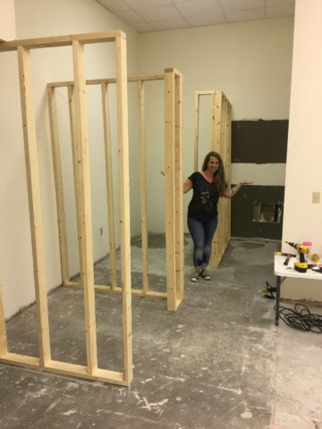
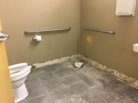
Given the opportunity to improve upon a recently completed taproom, we instantly realized that painting the entire interior would be the best quick-fix. But that instant gratification was not enough to give this needy/hungry interior some meat to get it off and running.

Atmosphere in interiors is so much a part of the brand, the identity, and the success of a business. Popularity is based upon a certain comfort level, the clientele who gravitate there and the product that they are effectively providing. Whether that is food or drink or both, the atmosphere, (including lively enjoyment by clientele), service and food/beverage – all contribute to a successful establishment.

This does not mean high-end, elegant, fancy or even simply hip – although the definition of hip can vary from spare unpretentious and un-self-conscious funky, to studied funky, to affected stylized, to trendy hip and happening,…but, it does NOT always have to represent expensive interior design.

Yet a strip center generally lacks pizzazz and to install a taproom into that generic scene takes some creativity. That does not mean money – it means just what I said, creativity.  And creative interior design is all about ingenuity and balance.

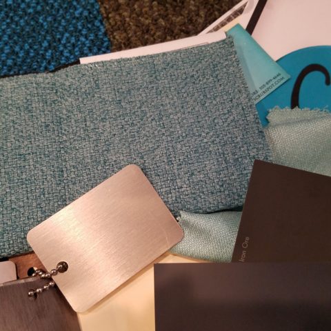
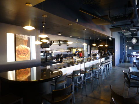
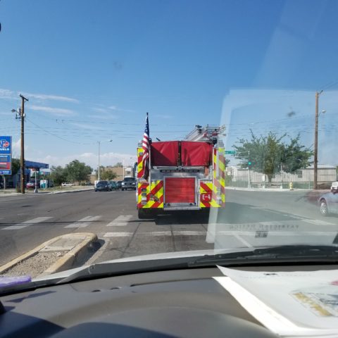
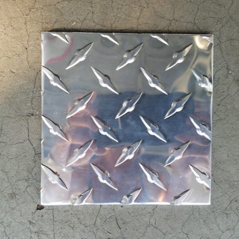
Balance in interior design is key. This interior was filled with hard, cold surfaces – concrete floors, silver-grey laminate table tops, brilliant silver table bases, grey chairs, polished white granite bar top, silver laminate bar face, silver metallic wall sconces, glistening silver under-scaled chandeliers, white walls with cobalt blue accent wall. Brrrrrrr….makes me chilly just recounting the scene. And this was summer! Imagine this setting with crisp cold wind blowing outside and snow blanketing the mountain – not the place you want to gather for a beer in the wintertime!!

20160901_160828

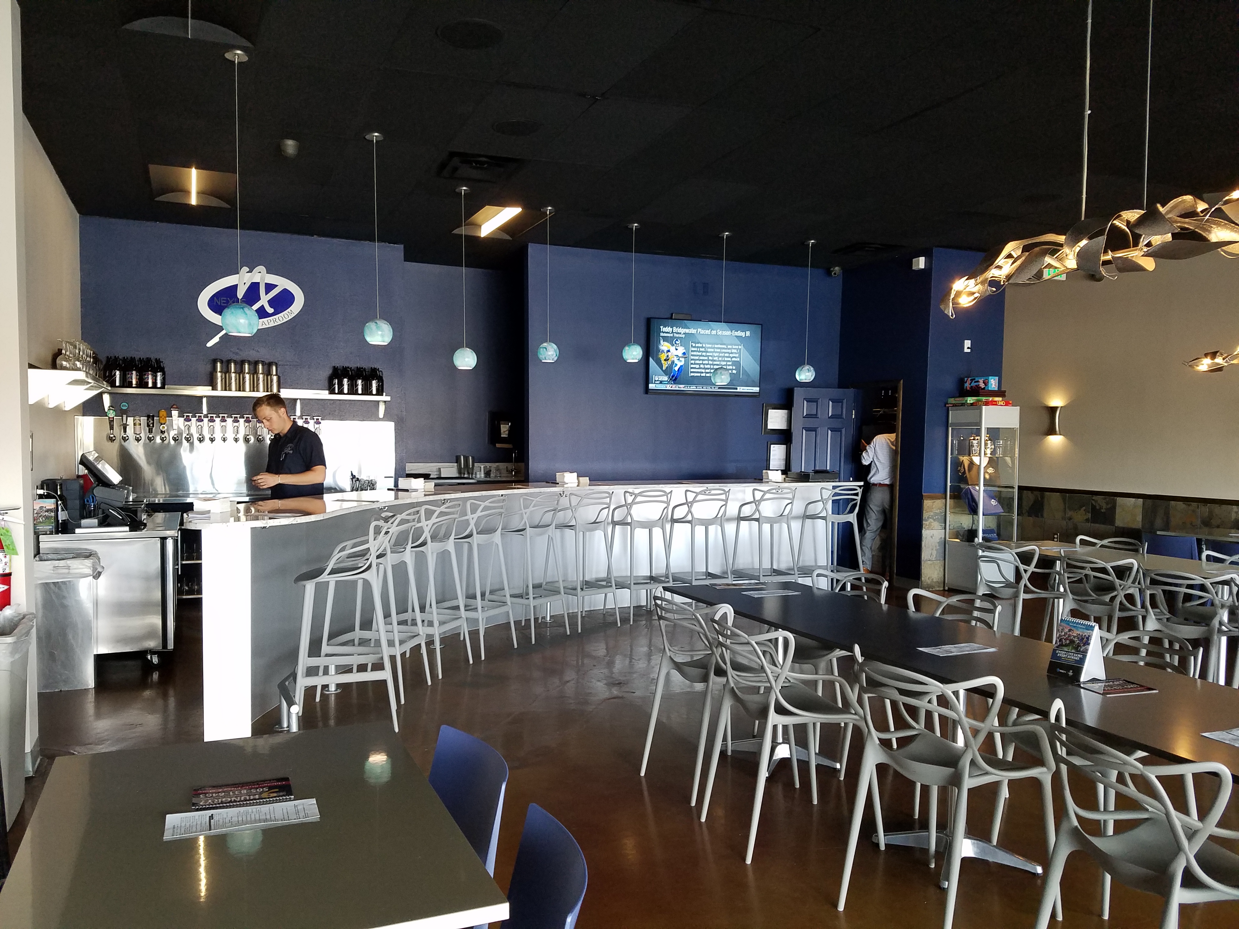
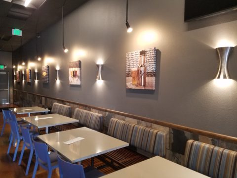
To instantly soften and add warmth, we painted all walls a dark taupe. The soft, mousy grey/brown color pulled from the existing slate wainscoting to tie the two wall parts into a unified “read.” It gave the silver elements (especially the sconces) a contrast – which results in “interest.”

20161103_091444

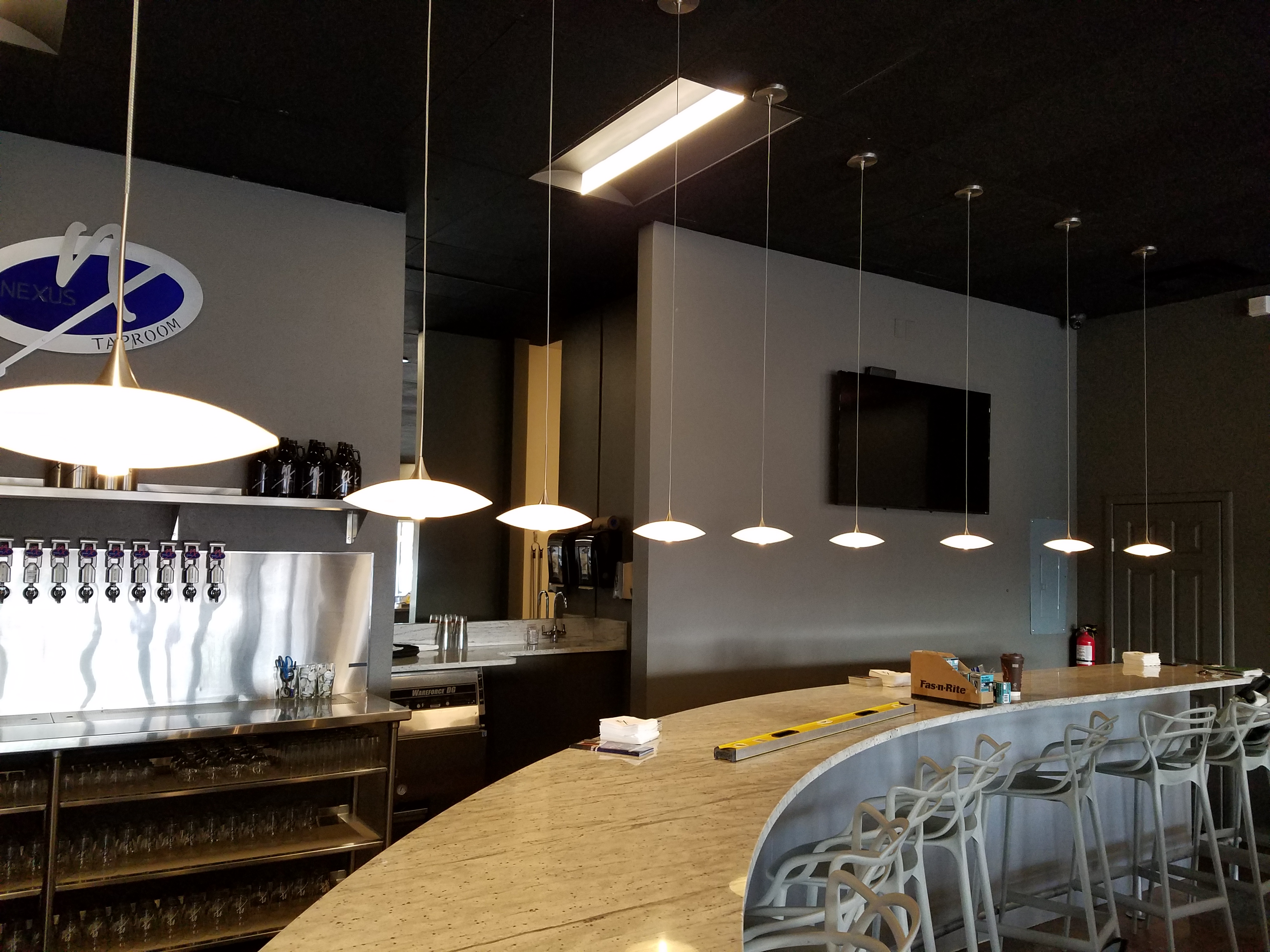
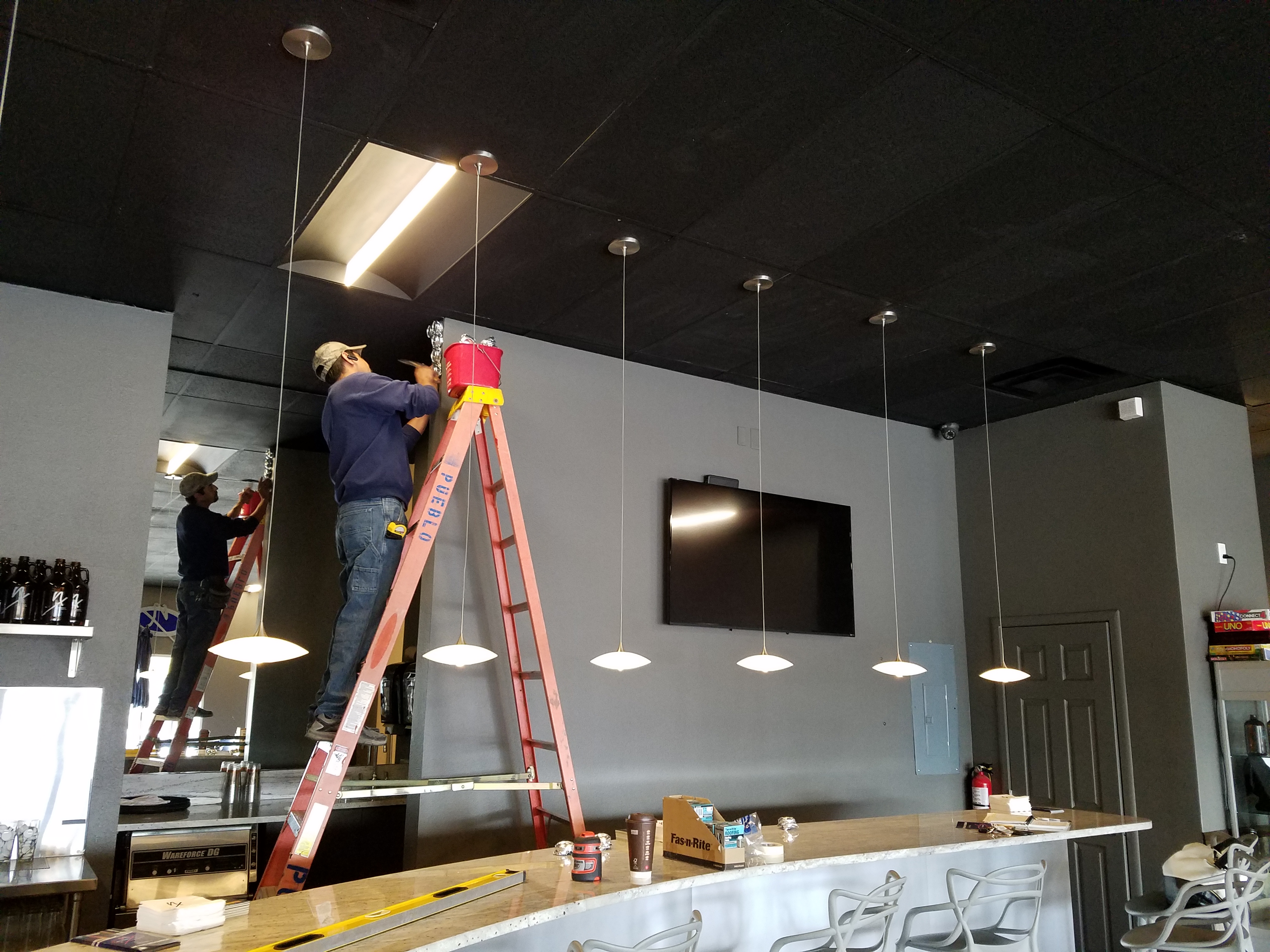
The back bar was bland even with the new paint color and to add dimension and animation we mirrored the rear center section. This illusion added depth and interest to carry the ceiling through and add a mirrored storefront and exterior reflection which created an illusion of space and character where there had been nothing.

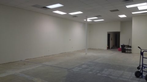
But unlike most back-bars, this area was conspicuously naked. A couple of stainless shelves housing stemmed wine glasses, and growlers felt spare. Plus the right side of the back bar was closer to the bar and the patrons were a mere few feet from a plain, painted sheet-rock wall. Yes, there was a large format TV screen above, but straight ahead – it was just blank wall.

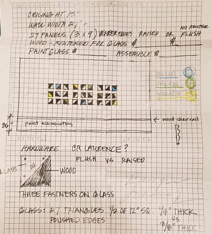
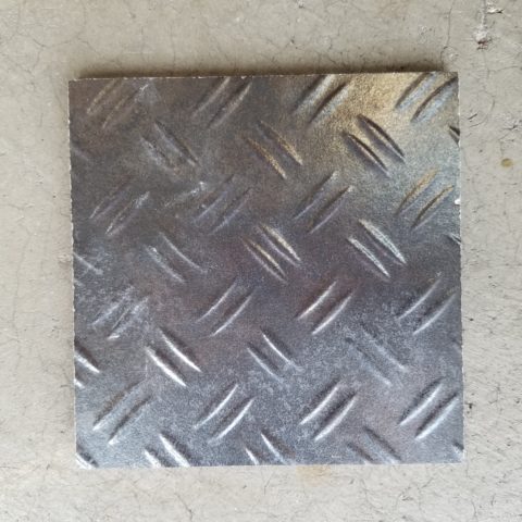
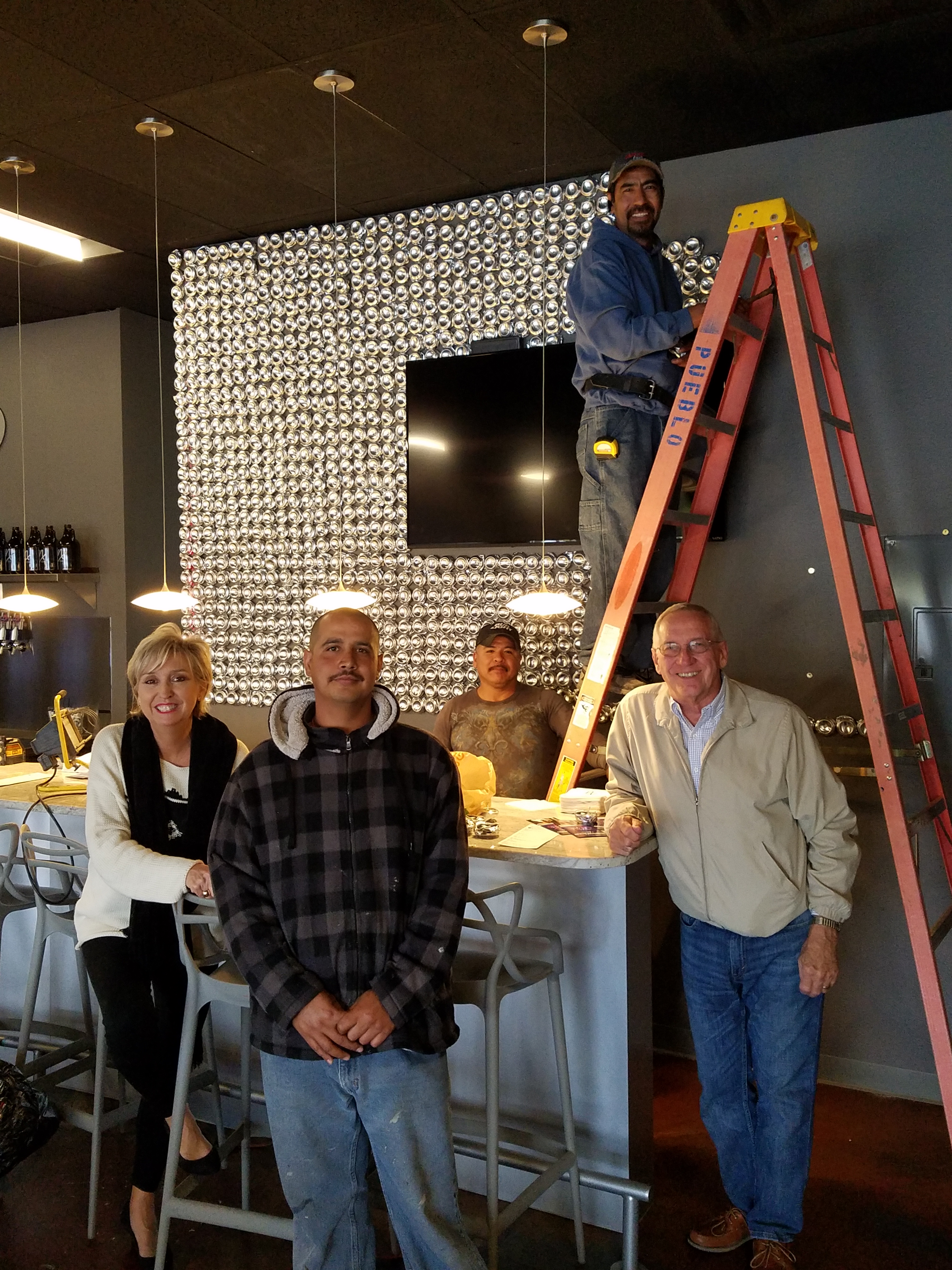
In the wee hours of the morning, as I tossed and turned for a variety of reasons, I jumped from thought to thought, project to project, and personal concerns pelting all the while in a seemingly endless stream of insomnia. Yet, it was during the angst that the idea of the taproom being named “Silver”…silver…beer cans are silver/aluminum…beer cans crushed and nailed to a wall…texture, silver (theme of the taproom) interest – maybe?- all converged into one of those light-bulb moments of revelation.

And yet you might say – “silver…aluminum…more cold and hard. Why would this be an asset to this interior?” I felt that the texture and dimension of the cans would add more interest than the perceived cold and hard of them. The pockets of folded shadows and the relief off from the wall, paired with the over-all massive full-wall of pattern, would all contribute a positive design element to the scene.

As I pictured the wall of circularly flattened aluminum cans in my in my  mind’s eye (a tool that I employ daily while envisioning concepts and finished products well in advance of their fruition), I furthered the concept to encompass possible bar games. Yes, derived from this perfect grid of circular aluminum discs, I began creating games in my head. A bar is often animated by bar games and this was just another opportunity to interact using this unique wall-scape. Since that initial concept, I have created 3 different versions of the animated interaction in the form of games, on this fantastic Can Wall.

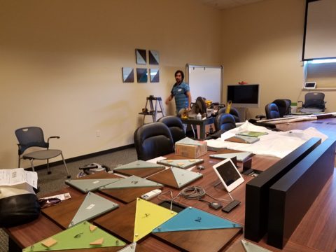
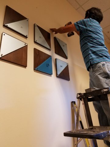
So with great patience, Enrique planned the layout with literally laser precision in a perfect grid. We counted the expected number of cans vertically and horizontally aligning with the brilliant red light beams. The previously crushed cans were laid out on a table – well a handful of the 3,200 that we had prepared for the wall. It was determined that punching the nails into the cans prior to installation would expedite the process of affixing them to the Can Wall. Labor intensive from start to finish, this wall was a great accomplishment for a devoted few.

20161103_094518

As the cans were laid out on the table – initially upside down exposing the crinkly open side (devoid of tops), I instantly LOVED the complexity of the depth, texture and shadows. A tight, random application of them would have resulted in a fabulously complex matrix of design. But upon closer inspection, the “texture” was really raw, with sharp threatening edges that were not possibly reasonable within close contact with people brushing by. So, lacerating the staff was not an option – even for a really cool textural metallic wall treatment. Perhaps this application will surface in a more appropriate location away from human flesh in the not-too-distant-future!

Like hubcaps fastened to the broad side of a country barn at dusk, the reflective silver discs pop in the flanking darkness.

20161104_140152


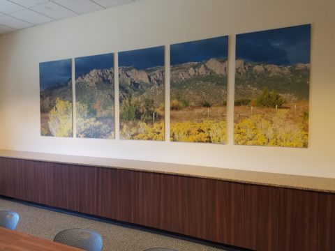
The process is nearing completion and I will save for another blog sharing the fun and games emanating from the Can Wall,  and the entire finished project complete with new warm white pendant discs over the bar and soon-to-install enormous perforated drum light fixtures suspended from the ceiling, over-sized photo images of the brewery behind the scenes and tantalizing signature dishes in the unique category of the Nexus New Mexico Soul Food.


Meanwhile, the take-away here is…balance cold and rigid with warm and textural – along with all the other opposites that attract – when designing be balanced.


Discovering Design Dangling Three Dimensionally in Space at the Estudio Cafe

They hung from the exposed structure of the portico that ran the length of the house over-looking the marina and the tropical glistening scene that surrounded the estudio-cafe. Gently twirling blades of colorful aluminum balanced and counter-balanced on wire and suspended from nearly invisible filament. Petals of flowers, leaves, triangles, they dangled and spun in the gentle movement of air. What local artist created such magical sculptures that added such color and dimension to the various heights of space both inside and out ? I must find this fanciful person.P1040400
I discovered he was not a local, rather a visitor del norte. Yes, an American snow-bird escaping the chilly climes and bringing his art, as he vacationed in the southern resort of Puerto Vallarta, for others to share. There was a kismet, a chemistry between the two men, the host and the new-comer. Both teeming with artistic juices looking for challenging means of expression in a variety of media. The host was more than willing to share his space to exhibit these delicate yet powerful pieces. The new-comer when describing his work references “poetic spaces and meaningful places” and nothing could better describe where he found himself and his new venue, the estudio-cafe.20140118_125532
Having enjoyed for years the magic of the estudio-cafe with it’s perfect waterside setting and continuous collection of artists presenting exquisite musical talent and fine art of all manner, engaging conversation in an ever stimulating artistic dynamic, it was this day with the sun-bathed ochre stucco walls and shadows cast by the progression of the day with soft breezes wafting through the architecture, that I was moved once again by the composition of it all.
A three-dimensional collage of color and style, form and scale, art both created and spontaneous – an unselfconscious collection of rare confluence that cannot be created – but happens. This is an incredible experience. And it was with this overwhelming experience that first introduced us to our host and has since brought so many fascinating people into our lives.20140125_131409
This was the beginning of the friendship, spawned by the love of art, related color and shapes, that brought Terry Welker’s work to New Mexico. After a couple of years admiring the enchantment and thrill of his mobiles at the estudio-cafe, I made the call that connected our common love of design and resulted in a premiere exhibit of spectacular, yet modest sized kinetic pieces a our boutique gallery in downtown Albuquerque.A0968D4A-813E-4E75-86B9-71807134DAA5 As he says of his work, “he animates space with sculpture.”
Come to PATRICIAN DESIGN to see these fantastic suspended sculptures and smile at the joy they bring. And also the “host.” This wonderful artist, Federico Leon de la Vega, who by warmly embracing family and friends has created a nurturing atmosphere of love and friendship, limitless talent and sensitivity and who has also generously exhibited his magnificent oil paintings at PATRICIAN DESIGN.20150117_121847 We invite you to experience these two outstanding artists brought together by a remarkable union of creative energy and goodwill.