A Designer’s Eye

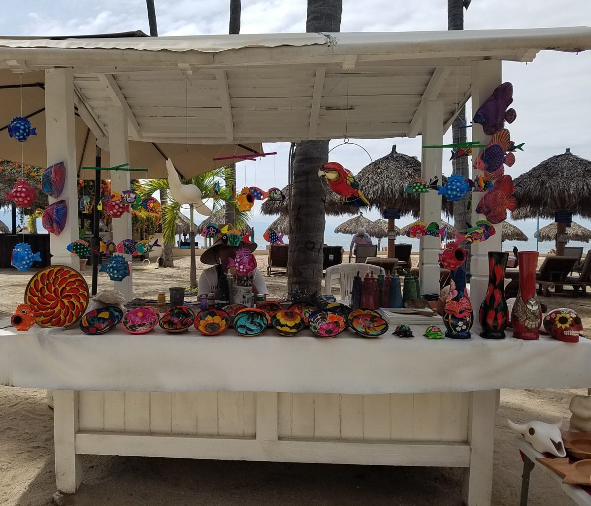
Hidden genius can be found amidst seemingly redundant arts and crafts.  Walking by you might not notice. Passing by many beach stands, they begin to look alike – very repetitive. The colorful wares and handcraft are striking and eye-catching and full of fiesta, yet if you pay attention you will notice the nuances. Discovering the true designer/artist.
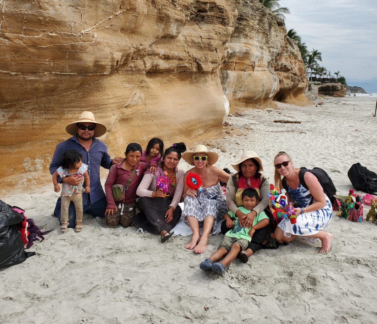
An escape to the tropics and especially to another country offer a reprieve from the cold and add an exotic element to getting out-of-town. Discovering the many indigenous art forms that come from all over Mexico is fun and exciting. Getting to know the makers and the distinctions in their work is another exciting level of appreciation.
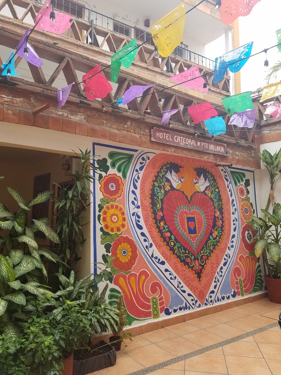
As is true with so many things, detail and design matter. I buy a smattering of things for my gallery/gift boutique. I like to support the local vendors and makers that produce these fantasy-filled folk-art pieces.  From fabrics to stuffed animals, painted pottery to murals and mosaics, the art is abundant and deserves to be examined.
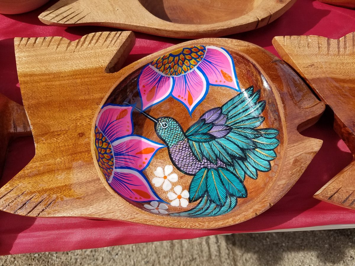
As an example, I am focusing on Victor Rivera. Victor is an artist and more so, an incredibly gifted designer.  His sense of pattern and imagery is exquisite. It reminds me of my mother’s love of Marimekko and Lily Pulitzer in the 60s and 70s. Her appreciation was a tremendous influence on me. The joy of color and pattern was a exhilarating celebration to wear and accessorize your home. Victor seems to possess a like-kind of innate sensibility and talent for devising and executing sensational color, pattern, motif and resulting design. He is currently creating, from a modest beach stand, what I believe is clearly different from others doing what might be thought to be similar work.

Like Maija Isola – a peer of my mother’s, having been born in the 20s her designs transcend the many decades in which she influenced color, pattern and bold imagery. Her work continues to live and influence the evolution of Scandinavian artistic direction and its impact on the world of design.  https://www.marimekko.com/com_en/world-of marimekko/design/designers/maija-isola

Similarily, architect Josef Frank contributed greatly to the design world through his architectural work and also his love of his limitless artistic expression through color and pattern. https://www.architecturaldigest.com/gallery/josef-frank-fabrics-london-exhibition
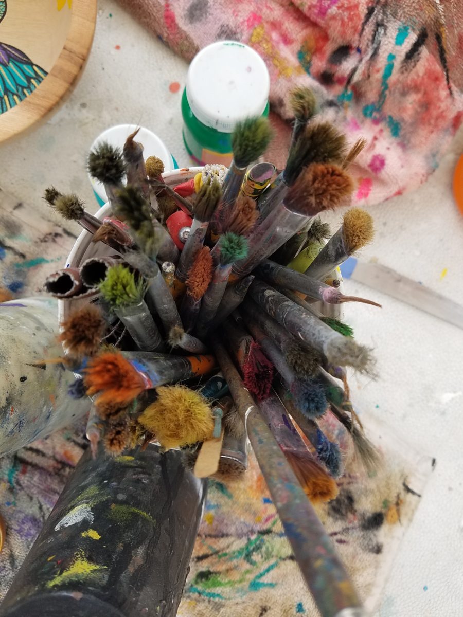
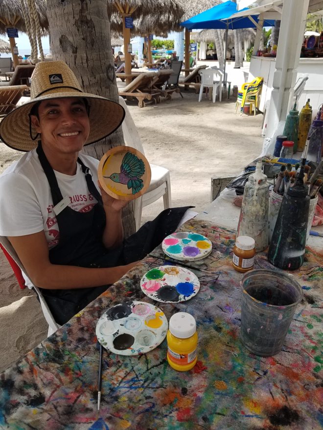
Watching Victor select his brushes, for the various applications and control on his designs, is fascinating and amazing.

The sense of pattern and design is a different category of artistic talent, in my observation and estimation. A master, of pattern, form, design detail and art, is an artist. However, the focus on the repetition and integral connection of patterns – for this purpose in a one-dimensional application – is an intensely different pocket of an artistic brain.
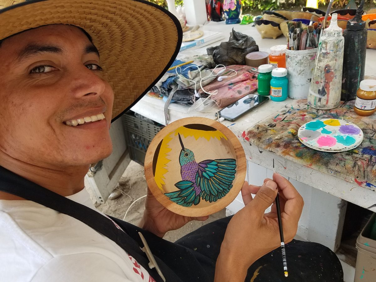
And this brings me back to Victor. I want someone in a position to embrace and promote him, in the world  of fabric design and influence, to catapult him to the level to which he can and should aspire. Shout-out to Alegreea and the fabulous designers at Pineda Colavin!!!!!!!
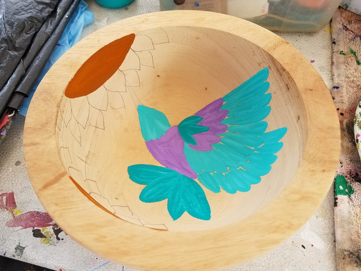
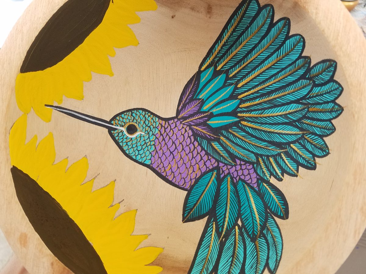
His hummingbirds begin with a pencil drawing and basic “fill” colors at the start.
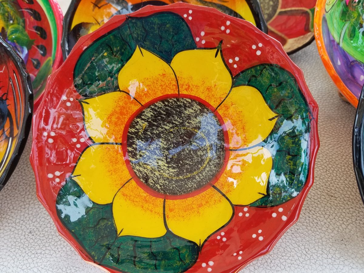
Working on both clay and wood prefabricated bowls by other artisans, his many layers of colors and details take shape.

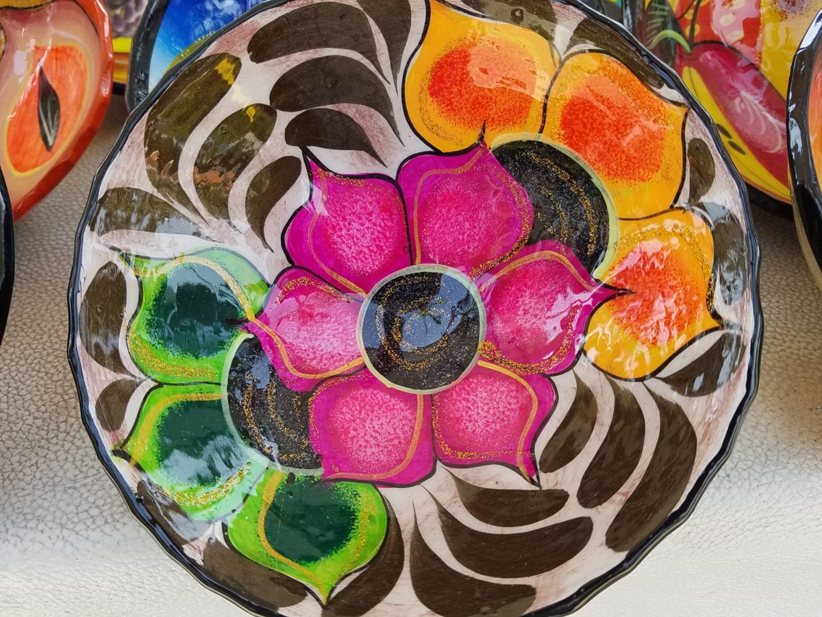
With myriad, mostly monotonous, Mexican street/beach artists, Victor is a beacon of light that stands out among the throngs. Once you stop to notice – the work he is creating is astonishingly  unique and beautiful. His designs are laced with meticulous detail, outstanding color combinations captivating and beautiful.
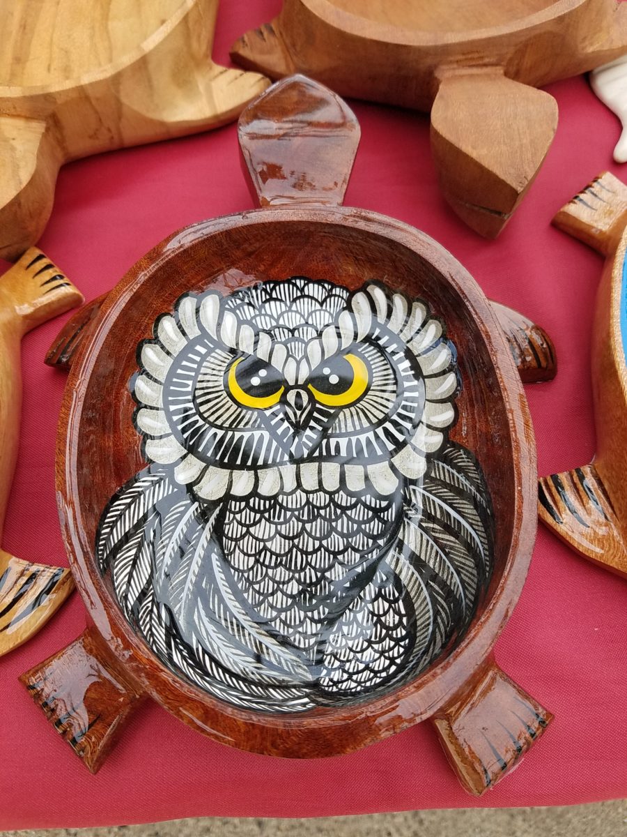
He will paint expeditiously simple works to satisfy the tourists and keep an inventory at the ready for spontaneous purchase – but when he has quiet time and is caught-up on his table of offerings, he creates amazing pieces that are truly remarkable. It is important to note though, that his more expeditious pieces still have a color combination with strokes of accents that still are above and well beyond the common.
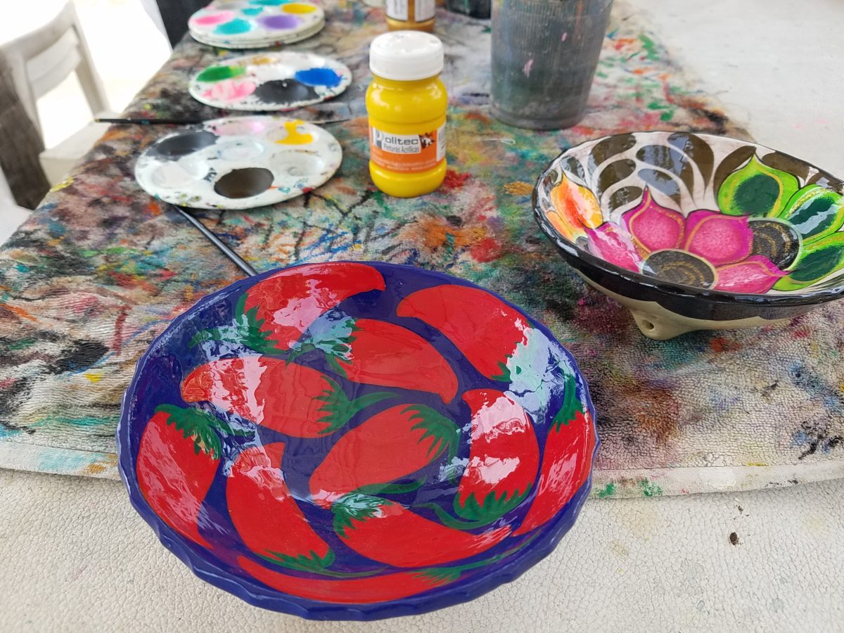
He will paint commissions all day long – but left to  his own devices, his creativity is boundless. And, referencing back to the Scandinavian designers, his floral designs are outstanding!
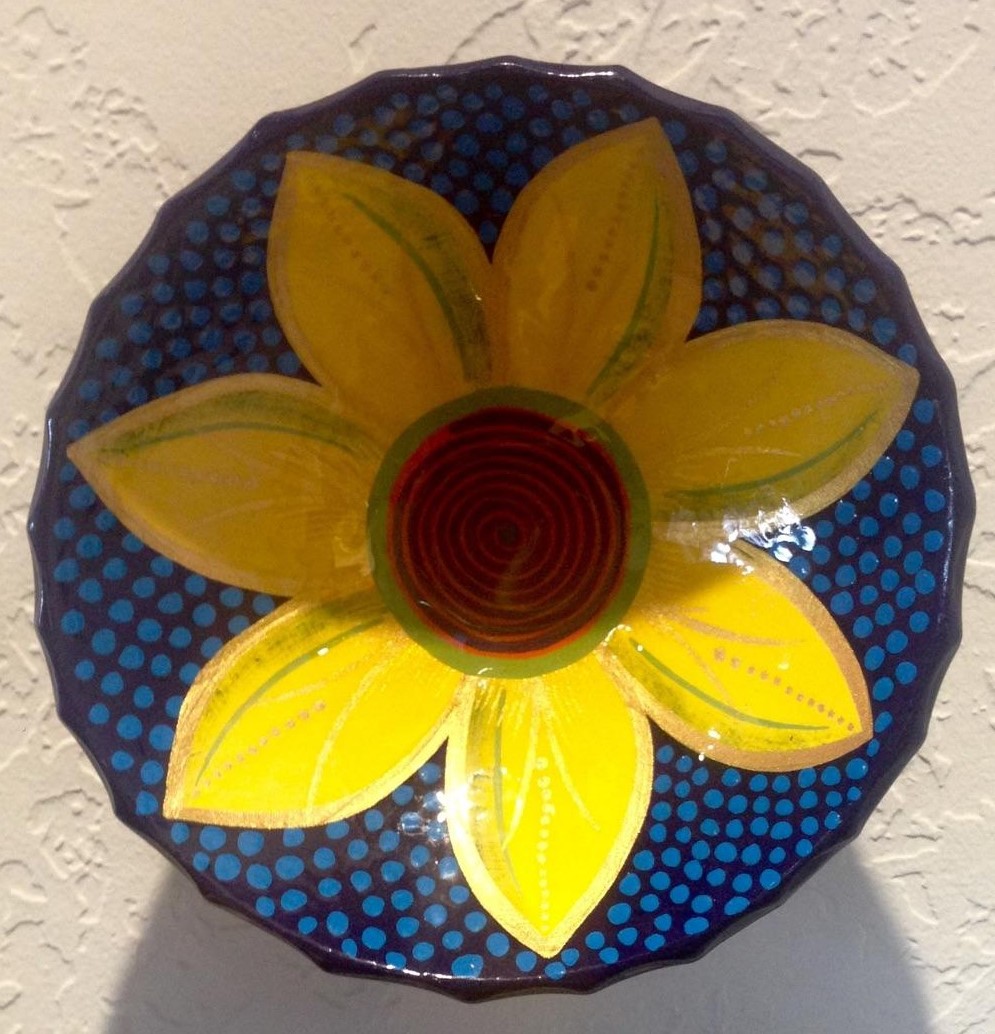
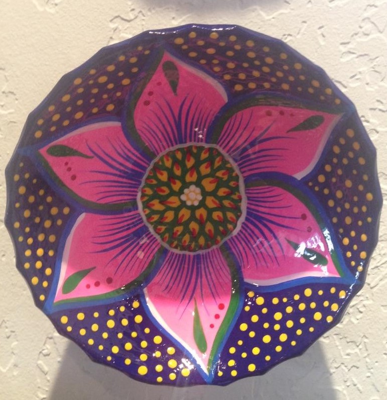
Taking time to examine the world around you and the beauty of detail that awaits, is a joyful experience of great discovery and satisfaction! Not to mention great fun!!!
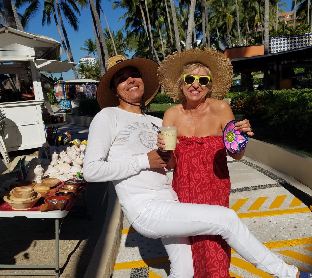
Fun with Victor, art and design!!!!!
Taking Time to Observe Intimate Details – Observations from Nature

Had I planned this blog, I assure the readers that it would have been more thoughtfully compiled. However, as it is a pure reaction to recent exciting experiences, I am without much fodder that, although was before me, I neglected to document. Such as card racks full of Georgia O’Keefe greeting cards featuring prints of her magnificent work and exact pairings of the amazing landscapes we witnessed with her paintings and her magnified flowers too. Dashing in and out of her distinctive museum just off the Santa Fe Plaza bearing her name and thoughtful work (a MUST see when visiting Santa Fe), to stepping up the steps at the Ghost Ranch Abiquiu property, I didn’t document as I was too busy looking at and absorbing – so much.  Yet without prior planning, I seem to have assembled enough that surprises me and therefore has become the body of this blog, about taking time to look

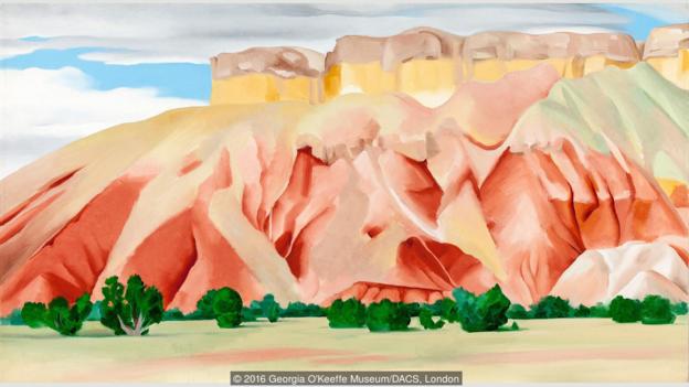
The striations of color are as though painted – nature and its creator – amazing art and artist.

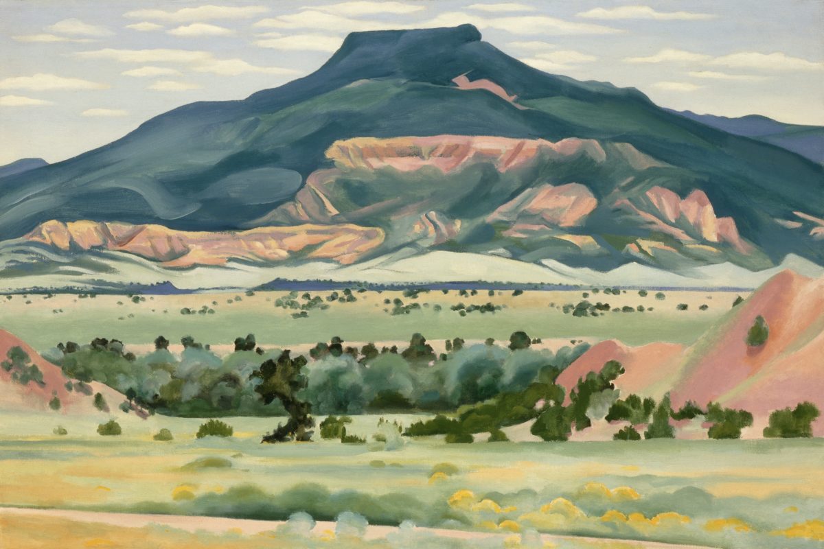
On this recent road trip and surrounding days in our immediate environs, I experienced inspiring images and pairings, beauty and detail, color and form…that evolved into this blog featuring the landscape and expressive paintings of Georgia O’Keefe. Captivated by the remarkable light and surreal landscape as have been so many artists, O’Keefe settled into the colorful backdrop of Abiquiu where the formations of color, sand, rock, and sky were interwoven with sparse, but all the more beautiful vegetation and flowing water carving its way through the enchanting scenery.  

Georgia O’Keeffe. My Front Yard, Summer, 1941. Oil on canvas, 20 1/16 x 30 1/8 inches. Georgia O’Keeffe Museum. Gift of The Georgia O’Keeffe Foundation. © Georgia O’Keeffe Museum. [2006.5.173] Although we did not photo this exact scene, the landscape was just as magical all around us.

Those of you who enjoy taking photos, capturing moments, items and scenes will appreciate the exhilaration and awestruck sense of this humble presentation.

An iconic land form Abiqui, New Mexico

Art and nature. Design and nature. Nature inspires artists and designers with color and proportion. The natural world is a limitless collection of examples of perfection, majesty, detail and form. Living in New Mexico presents amazing opportunities for studying so many offerings from the natural world – verdant valleys and lush bosques to towering mountains, contoured mesas, golden plains, glistening rivers and rainbows of geology rising up from the earth. The sculptural land formations are  what seem other-worldly.  And yet there they are – majestic sculptures against the sky. 

O’Keefe was keenly aware of the extraordinary world she encountered and she captured it through her eyes and expressed through her strokes with fluid sensitivity and sense of color.

Georgia O’Keefe loved and appreciated around the world for her sensitivity and ability, to capture and convey her enchanting surroundings.

Very real and hauntingly beautiful landscape of Ghost Ranch – Abiquiu, New Mexico translated into the sharp, crisp, colors and forms of O’Keefe’s paintings.

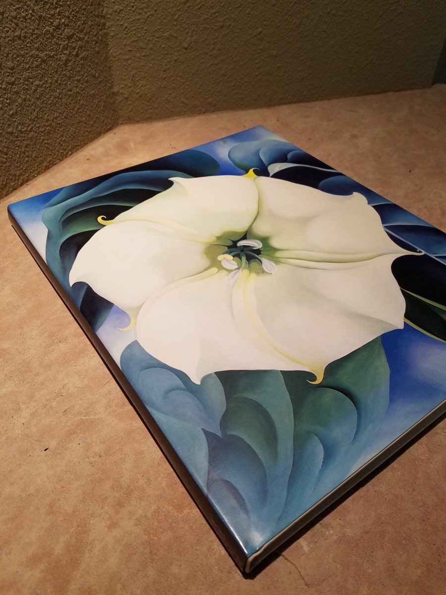
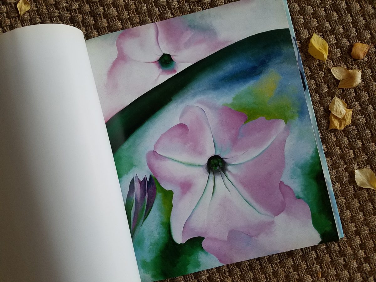
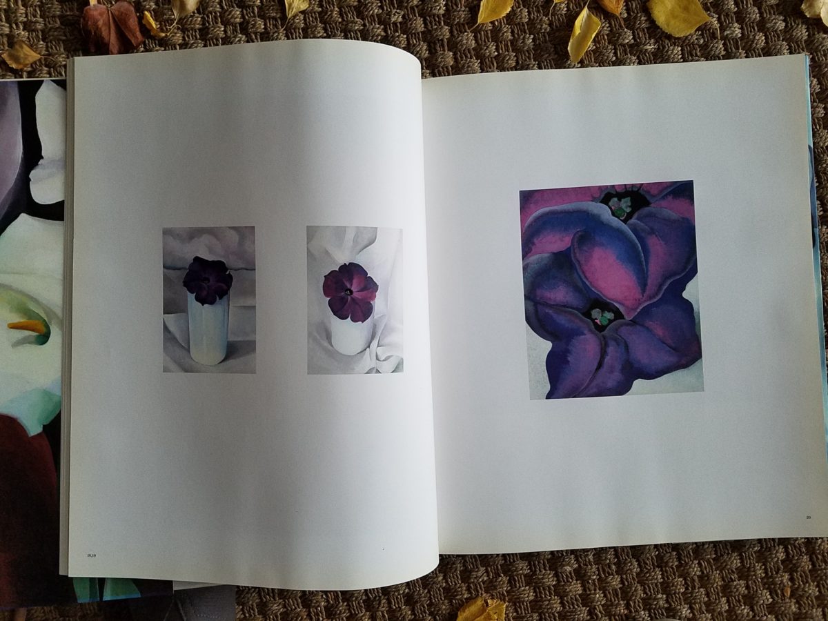
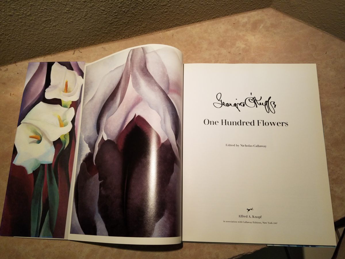
Years ago a very dear friend gave me an exceptional gift, of a book. The farther along I progress in this world and enjoy the vast opportunities to appreciate the beauty of nature, limitless boundaries of design, art and all that is produced by talented, creative, observers, treasures such as this have increasingly greater meaning. One Hundred Flowers a 1987 masterpiece collaboration of photographer, publisher, editor and scholars presents an outstanding collection representing this significant subject matter – flowers – that she took time to observe.

Up close and personal…in intimate detail she saw and rendered sensational studies of flowers. Expanded to enormous scale well beyond their reality, these explosions of color and contrast, fluid form and detail are amazing to encounter. Even in the pages of this stunning book her work is startling. In person it is awe-inspiring.

Upon returning from the Abiquiu visit, I retrieved  my beautiful book. I took great joy in the dust cover – suitable for framing. A brilliant white squash blossom captivates, before even opening the cover. As I leafed through these large format pages in this lovely, exquisitely bound tome, I realized that, within a week prior to this O’Keefe familiarization trip, I have taken photos of flowers for a similar reason as she  – stopping to look and observe their singular beauty amidst all else in the surrounds. 

Unknowingly, a couple of days earlier I captured this spectaculalr squash blossom that had survived our first frost.

Just a few days prior to the Abiqui visit, while walking among the petroglyphs at the base of the dramatic black volcanic rock rubble of our west mesa, we came upon a singular, stellar squash blossom. Having survived recent frosts, this one was luminous and brilliant among so many other spent blossoms dried and shriveled away for the season. It was irresistible.

Little did I know, at the time we encountered this beauty of a squash blossom, that I would soon revisit O’Keefe’s studies of this wild and magnificent bloom.

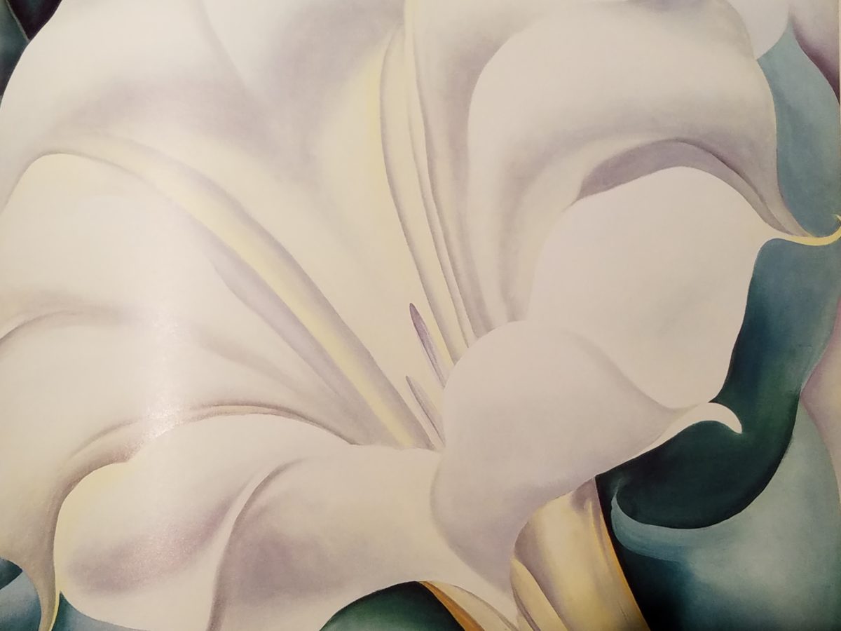
Here more studies from the One Hundred Flowers book featuring this dazzling white squash blossom.

In the design world, we often quote architect and furniture designer Ludwig Mies Van Der Rohe (1886-1969), one of the founders of modern architecture and an advocate for the simplicity of style with his popular phrase “less is more.”  I felt that O’Keefe’s interpretations distilled the forms of her subjects to the essential elements that best conveyed them in a manner of simplicity. Her flowers are bold and clear sweeps and contours, of the design of each. Distilling to these essential elements is the practice of “less is more.”

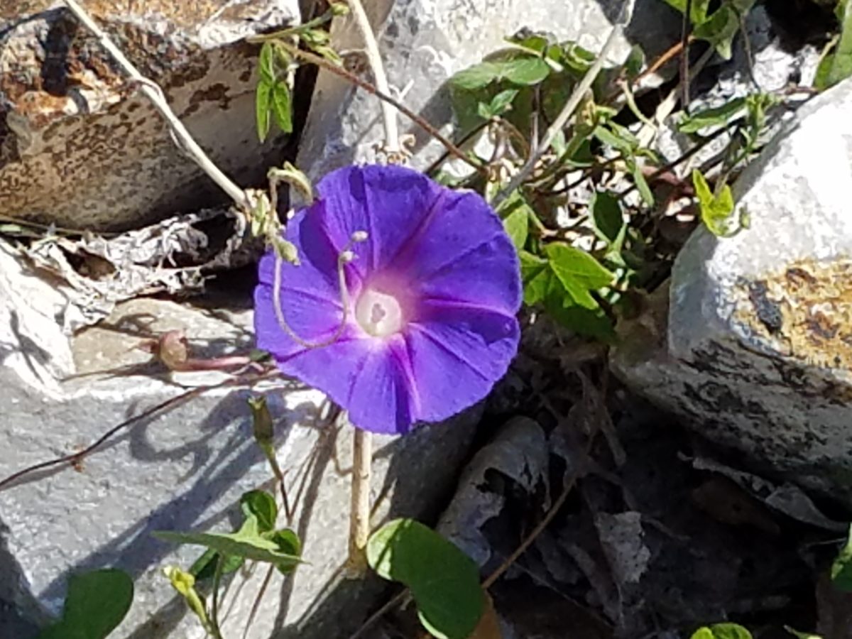
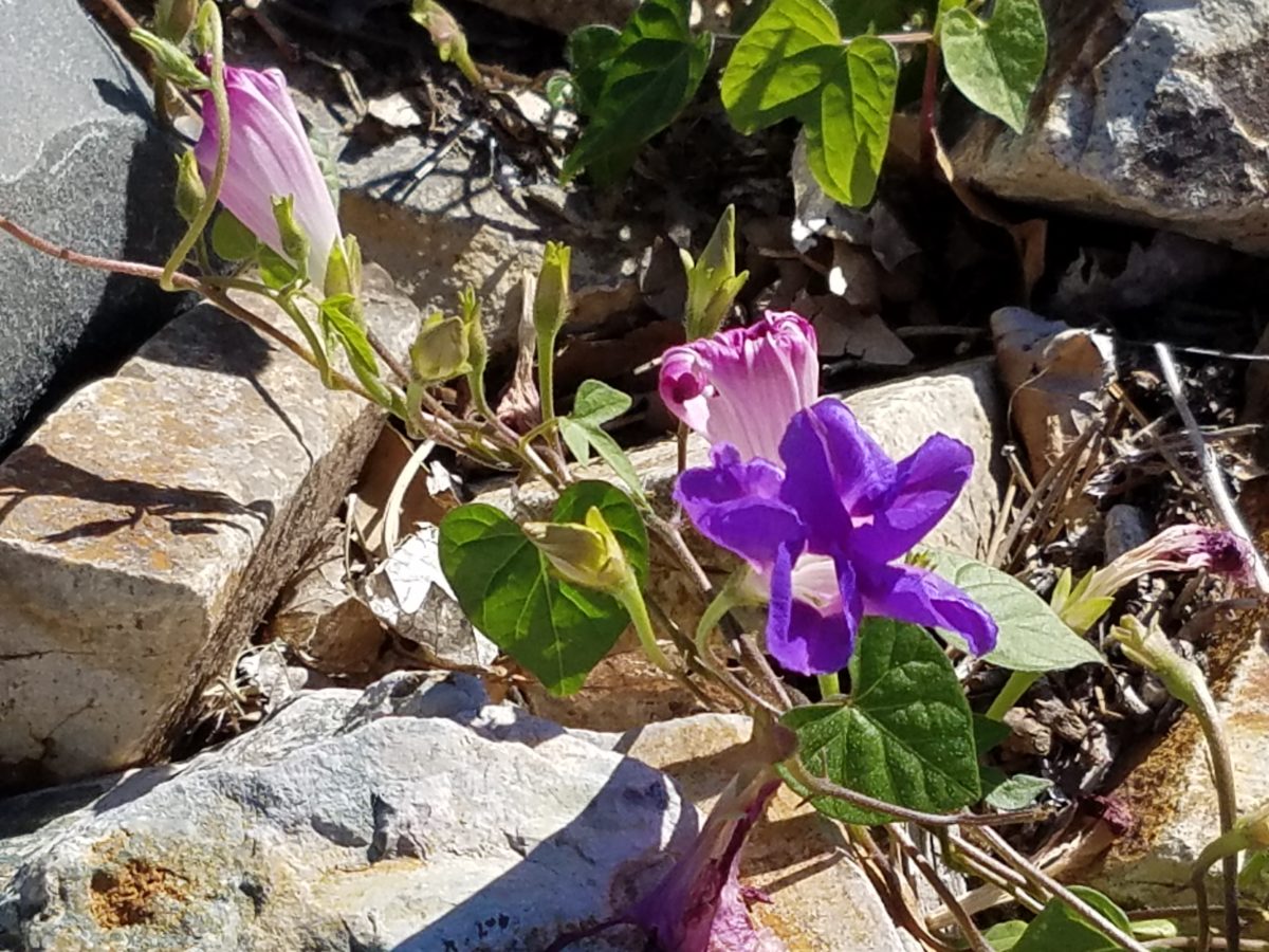
Her bell-flower trumpets of petunias and hollyhocks in purples, pinks and even arresting blacks reminded me of a photo that I took less than two weeks prior to enjoying my book for this study.

However, she was not sparing with color nor scale. Fabulously daring color combinations and contrasts are signatures of her interpretations along with her magnificent sense of magnification – presenting bold gifts to we, her viewers.  

The opening of the book quotes O’Keefe about her profound appreciation for a flower.

“A flower is relatively small. Everyone has many associations with a flower – the idea of flowers. You put out your hand to touch the flower – lean forward to smell it – maybe touch it with your lips almost without thinking – or give it to someone to please them. Still – in a way – nobody sees a flower – really – it is so small – we haven’t time – and to see takes time like to have a friend takes time. If I could paint the flower exactly as I see it no one would see what I see because I would paint it small like the flower is small. So I said to my self – I’ll paint what I see – what the flower is to me but I’ll paint it big and they will be surprised into taking time to look at it – “   Georgia O’Keefe “About Myself,”  1939

Be surprised. Be inspired. Be aware of your surroundings, for all the beauty of nature and its influence.  Embrace color and contrast, punctuations and accents. Take time. How might your next design project reflect observations from nature?

Enjoying Creativity – How Do You Exercise/Express Your Creative Juices?

Have you ever had a moment or period of time when you longed to create something just for fun? It might be to crochet a blanket or knit a scarf.  It might be to build a model plane or learn how to cast a bronze. What have you longed to create?

It seems that everyone needs a creative outlet even though they might not recognize it as creativity. When speaking to a guy  about his interest in working on cars, he didn’t consider his work “creative.” To work on a car for purposes of enhanced performance, restoration, maintenance or repair all takes a certain amount of creativity. The thought process of problem solving and taking action requires creative thinking.

Gardening, painting, sculpting, carving, pottery, collage…there are so many outlets for relaxing creativity. The idea is to not do it under pressure. Lest one defeat the purpose of the relaxing aspect – just for fun – pure joy.

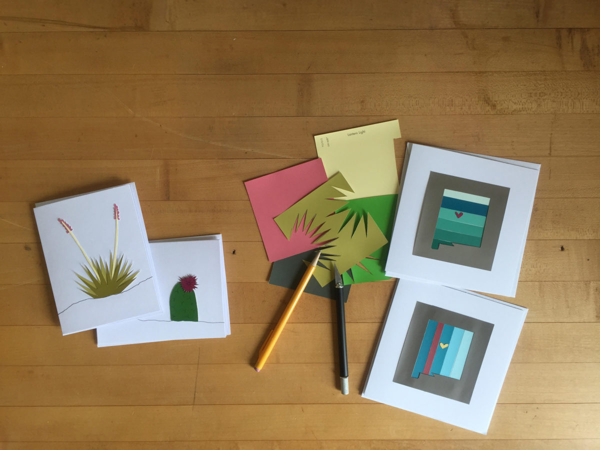
Yesterday I spoke to an architect who said that her creative juices needed exercising. Despite the fact that her daily work required lots of creative thought, it was not pure pleasure. It was not all fun. She wanted/needed another outlet. So she set forth, to do some creative design time, purely for her leisure. She started creating desert floral collages, in a size that could be shared, as greeting cards. She brought them to show me, with a modest timidity, and was most surprised and thrilled when I received her work with great enthusiasm!

Rebecca has found the medium of paper to be quite satisfying, It is clean and precise, crisp and conveys her intent. She loves flowers, lives in the high desert and communes with cacti and appreciates all flowers – and with that her exciting, yet quiet, introspective, personally satisfying, creative expression has found an outlet.

With positive feedback from several people, she wants to launch a re-sale card line! Now the creative process goes another step. She needs to establish a brand – at least a name for her card line. Will she want a logo? What about her entire experience can she list in words and cull and distill to result in the perfect identity?

There are two parts to this situation and the first is to recognize the need for and find an outlet for the relaxing exercise of expressing creative juices and the second is receiving positive reinforcement for your efforts. Inasmuch as the second might seem  unnecessary, it is a great affirmation and valid “feel good” feeling to create for the fun of it and have your work appreciated!

It need not be commercial  – but “selling” your idea or creative project is even MORE flattering.  Although, it is usually not for compliment much less profit.

Creativity can be relaxing, if it is not in a demanding framework. It’s therapeutic. In pondering this subject, I wanted to know more. Seems that this is a complex topic that deserves more investigation. So,  I did a bit of reading…I found the Handbook of Creativity edited by Robert J. Sternberg from the Cambridge University Press 1999. In the first section – The Concept of Creativity: Prospects and Paradigms by Robert J. Sternberg and Todd I. Lubart it states “If one wanted to select the best novelist, artist, entrepreneur, or even chief executive officer, one would most likely want someone who is creative.”

It is true for those of us doing hiring – looking for that spirit that can see beyond…create…are desirable traits. Yet everyone has a certain creative element in their person. It is the degree to which they have it and in what capacity or direction which might be more applicable or desirable, for consideration  in a certain position over another.

The Concept of Creativity  further states that “Creativity is the ability to produce work that is both novel (i.e., original, unexpected) and appropriate (i.e., useful, adaptive concerning task constraints) (Lubart, 1994: Ochse, 1990; Sternberg, 1988a; Sternberg & Lubart, 1991, 1995, 1996).

The aforementioned seems obvious.

So is creativity a divine gift?  One that makes it difficult to study much less quantify or discern from another? That is not the purpose of his blog…but to not mention that query would be leaving something that one might ask – out.

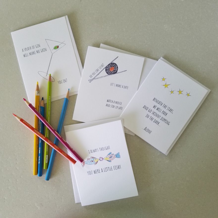
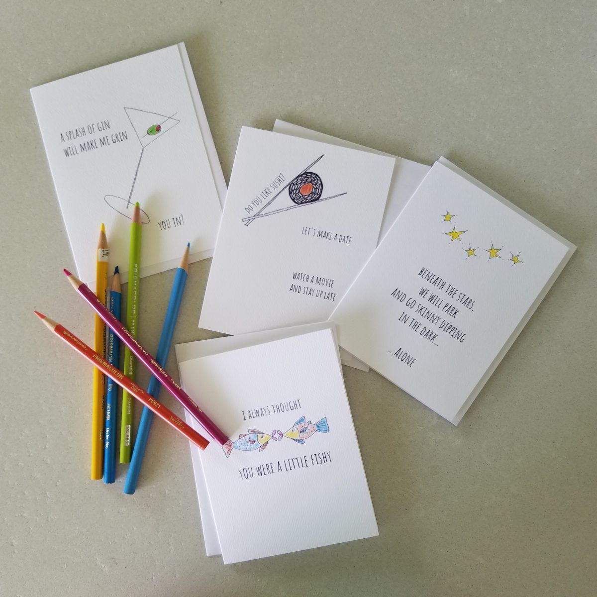
As a professional designer, creativity is part of the daily job description. Yet you will find most designer’s exercise creative outlets that are different from their work. This spring I too launched a greeting card line. It was spawned from hours on the road between San Diego and Albuquerque, with the practice of harnessing myriad ditties that continually race thorough my thoughts. A sudden lightning bolt on one of those trips suggested that I doodle to accompany my ditties. Hence, DATE NITE CARDS were born in March of this year.   Little ditties and doodles to bring a smile, start a conversation, set a date, make new friends, rekindle the spark, celebrate friends, love, anniversaries, romance…

Time to Remodel – Finding a Theme

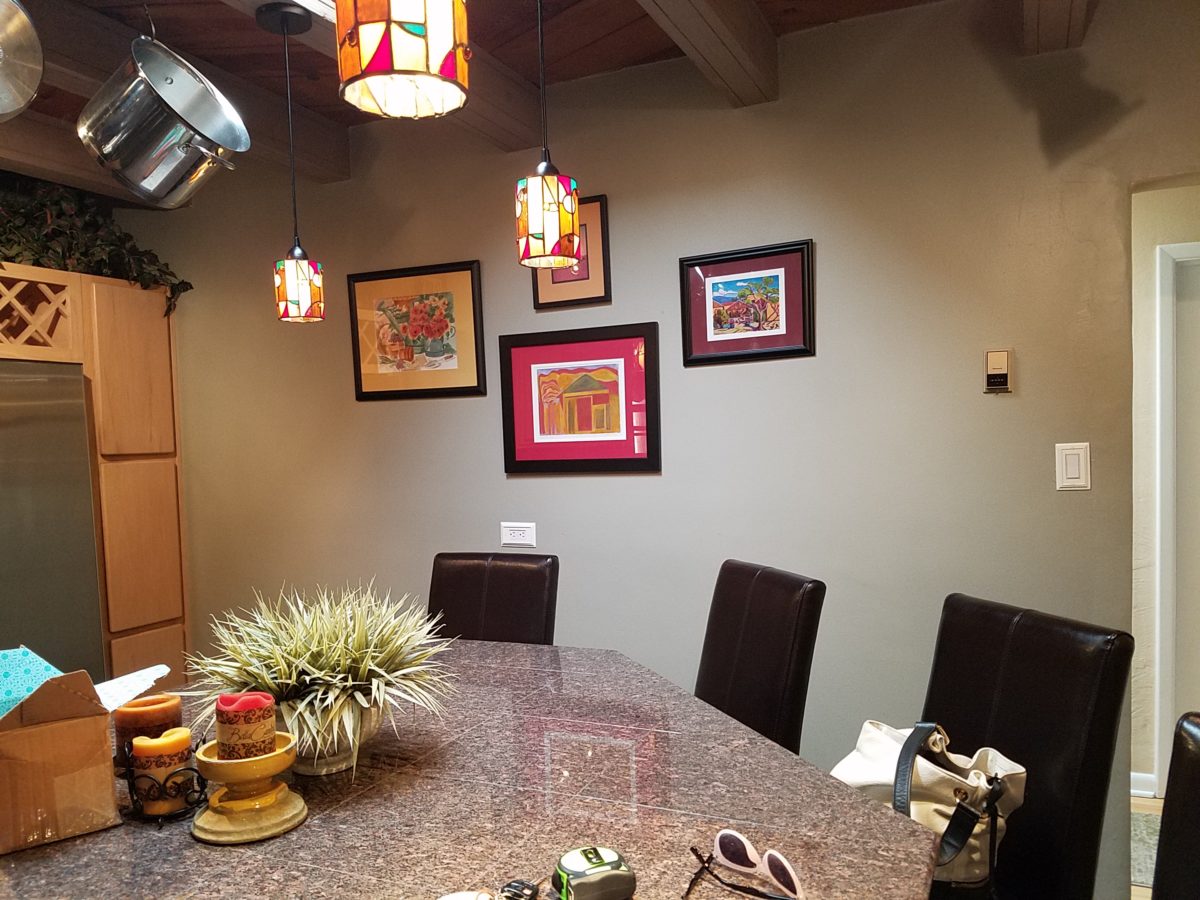
Time to remodel the kitchen!! This charming little bungalow had already experienced its share of remodeling – well, not so much structural – although, many interior design transformations had occurred over the decades. In the mix, the well-used and enjoyed kitchen was feeling a quite tired and dated.
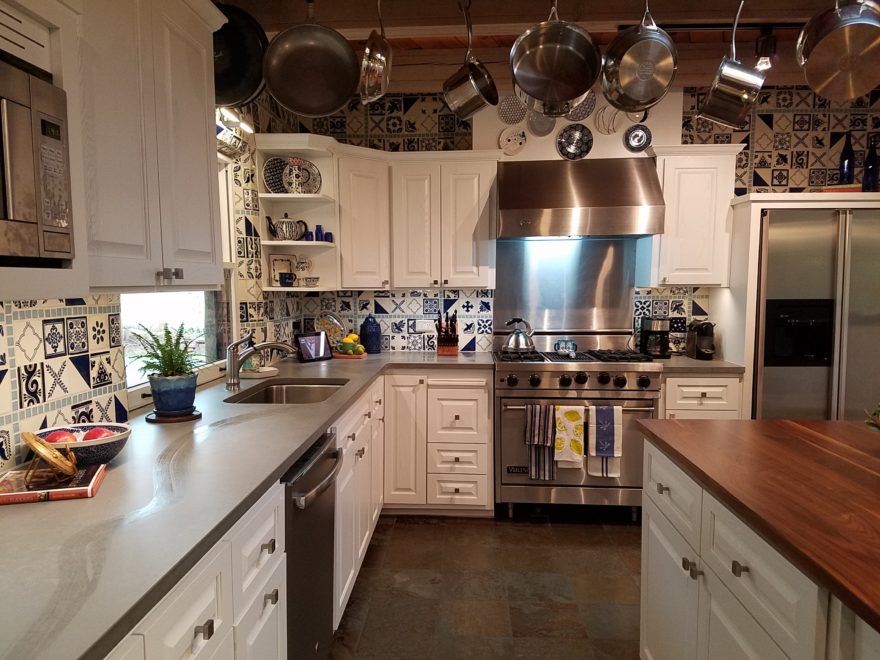
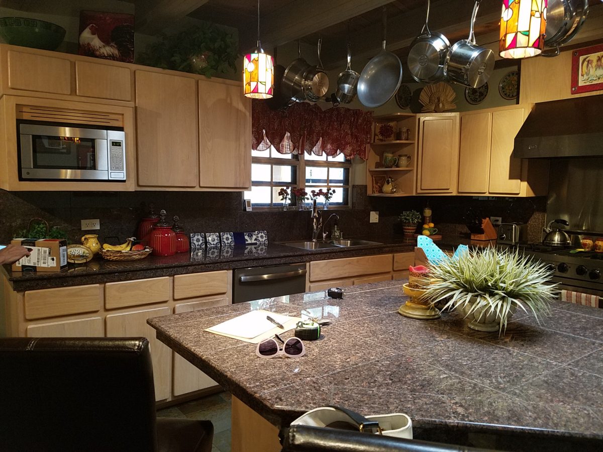
You might remember I have used this now completed project, in the last few months, during its transformation process to identify certain features and design practices. Here is the as-promised unveiling of the before and after photos for further discussion about the design process, intent and results.

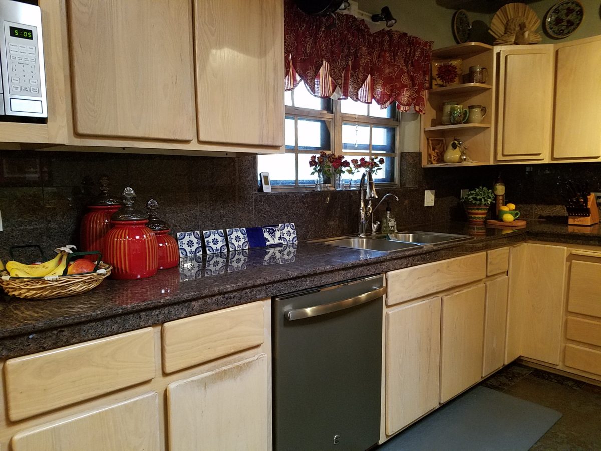
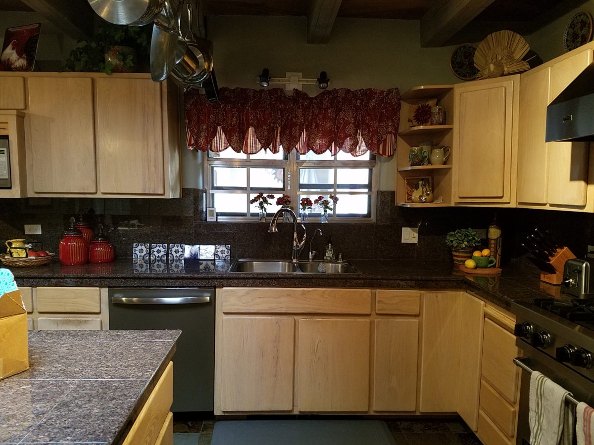
We loved the mottled color and organic character of the existing slate floors and opposing green-grey beams with spanning boards of a caramel stain. These were the two elements that went well together as though intentionally planned. Yet in between, the pale, peachy pickled oak cabinets with their radius detailing and red-rose/black matrix of the tiled granite counter-tops, didn’t seem to speak at all well with the ceiling treatment and slate floor’s greens, rusts and charcoal tones. It was a dark, confused space.  

When observing and “listening to” the house, it was evident that the current kitchen, in addition to being poorly coordinated, had absolutely nothing to do with the original architectural intent. The new owners had brought a few very fine antique pieces into the home. The mid-century circa 1964 age of the house accepted them on its original hardwood floors also adorned with their fine antique rugs…but something was missing. There was no cohesive thread running through the house. Over the years finishes and decorative elements had been selected and installed without any consideration for original materials or an attempt to introduce compatible and harmonious materials for the good of the home’s overall theme.

In all fairness, had the entire interior been gutted and a contemporary interior been uniformly installed into the framework/shell of the structure, I might have considered it a success. However, this multiple decade decor was a mix of disparate trends and preferences that had no commonality.

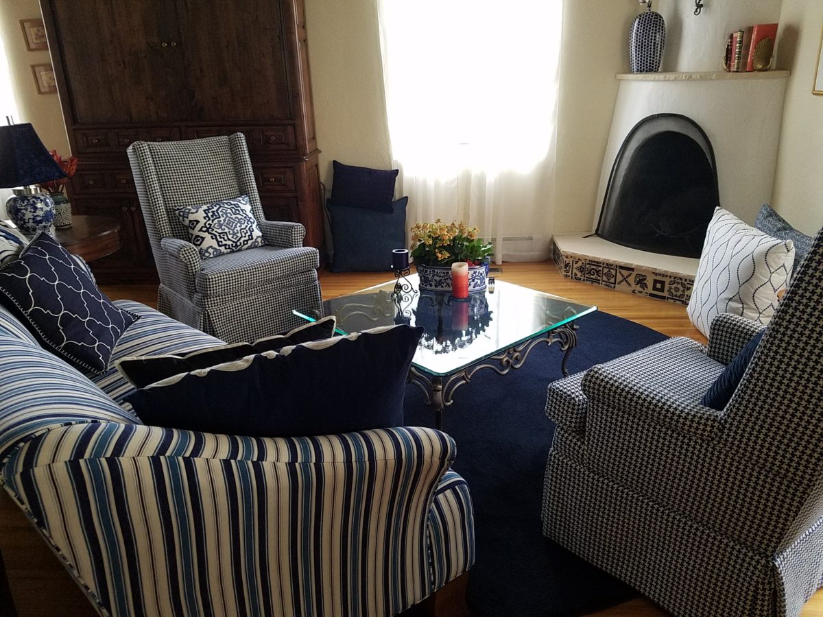
To begin the process of bringing this home into a cohesive design last year, we had redesigned the living room. There we introduced a classic blue and white color scheme derived from the Persian rug in the adjacent dining room.

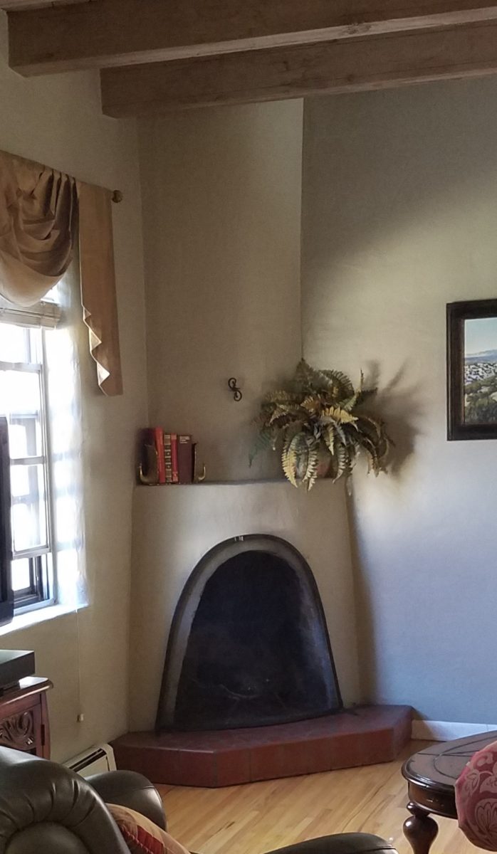
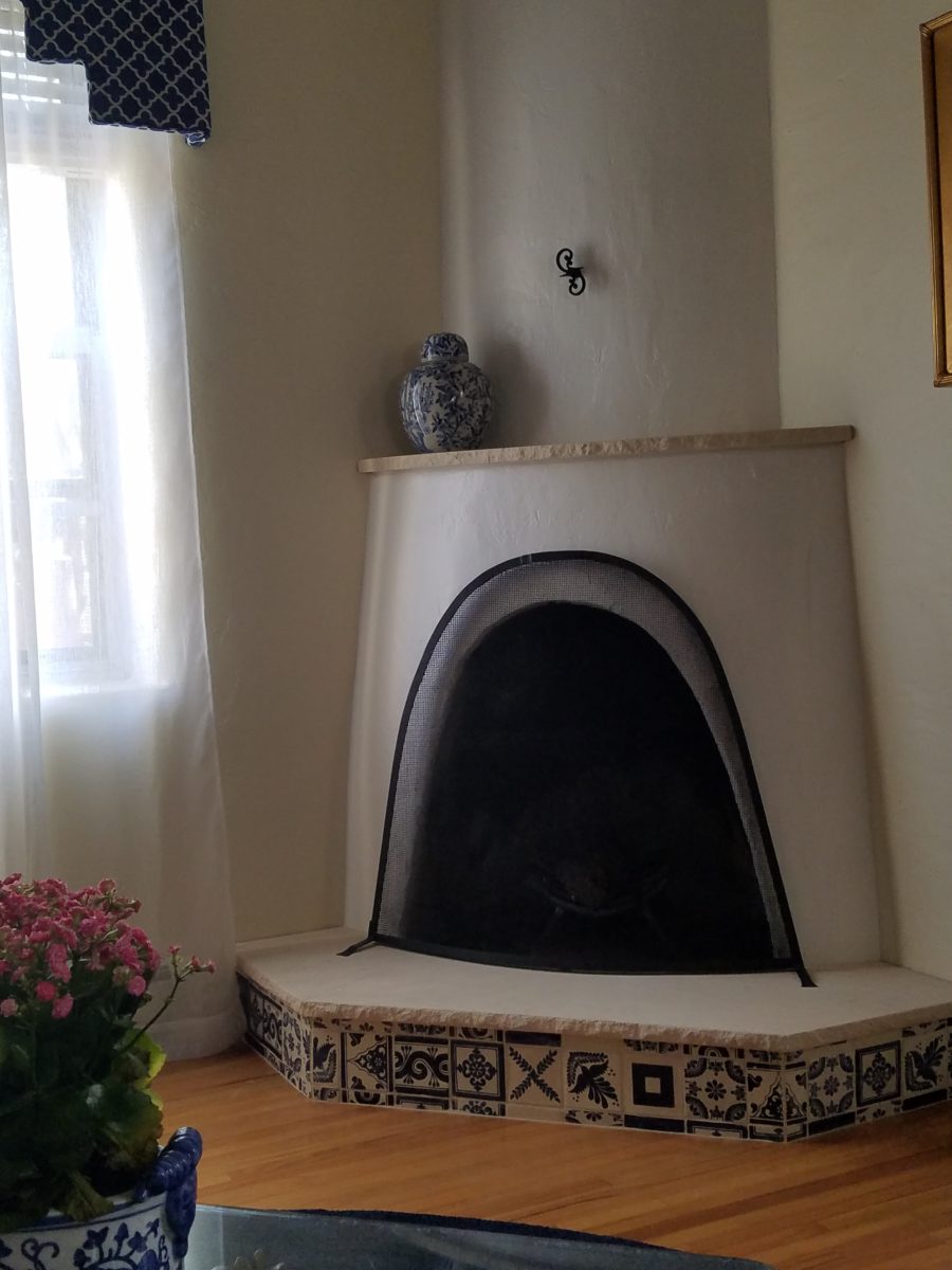
To the corner kiva fireplace, we added a sandstone hearth and mantle with just enough blue and white Talavera tile trim at the base of the hearth to subtly coordinate with the new scheme. The Talavera was an appropriate material for this New Mexican bungalow.

The original fireplace had a dark, broken brick quarry tile hearth and no cap on the mantle.
The face-lift replaced the hearth material with broken-edged sandstone slab and matching mantle cap with Talavera detailing at the bottom.

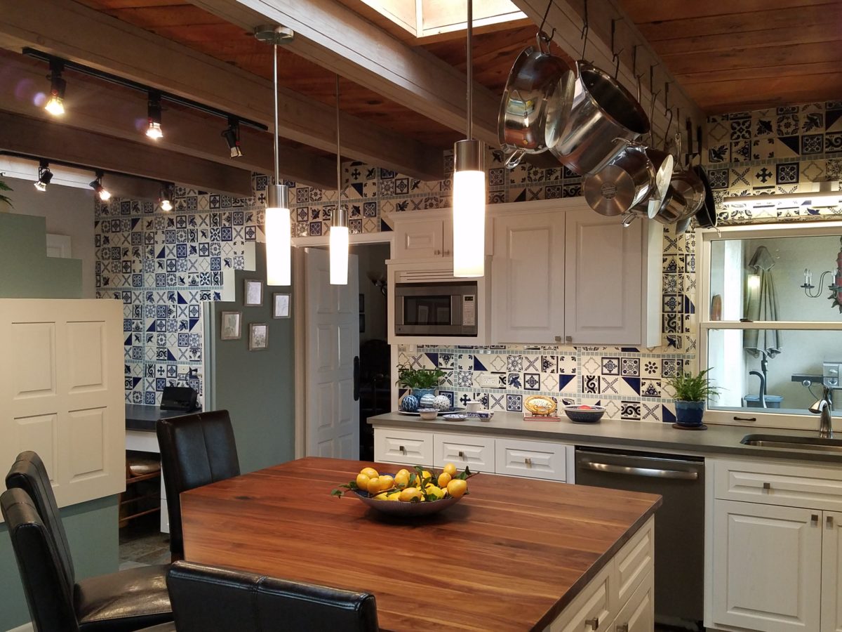
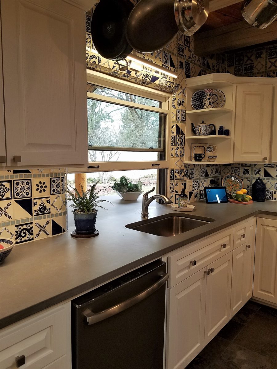
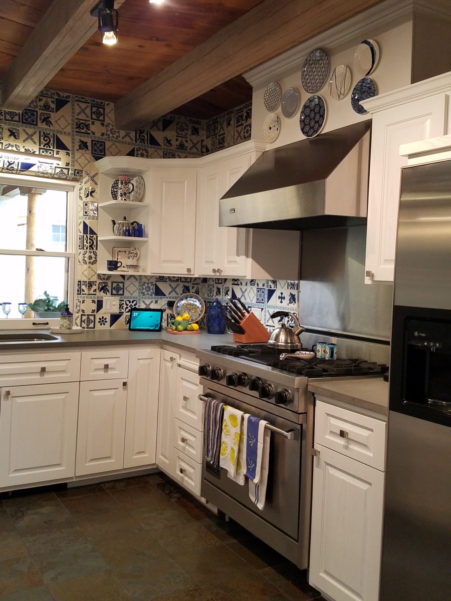
With this living room having been so successfully re-designed, the obvious thought came into the discussion to continue the vernacular of the blue and white Talavera into the kitchen. As a bit of a purist when it comes to application and termination of materials, I was not content for a mere back-splash.  No, if the tile were to be effective and commandeer the stage, it had to be used wall-to-wall as though an entire wall treatment.

Treating the Talavera tile as wall-covering, it continues from the kitchen, into the adjacent pocket-space housing a desk and laundry machines.

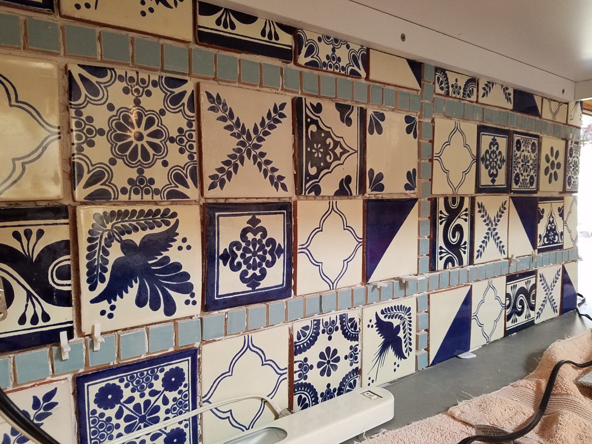
But wait! The addition of an earthy aqua handmade tile from Spain offered an appealing and unexpected accent woven intermittently through the Talavera. It created a coordinating thread from the colors found in the mottled slate floors and ceiling beams.  
Pre-grout shot shows the individually cut 1″ pieces inserted as mosaics into the random field of Talavera

The cabinets were in excellent condition, but the doors were sadly dated and in no way spoke to the home’s other cabinets, doors and finish carpentry.

The confused interior finishes we in need of a transformation!

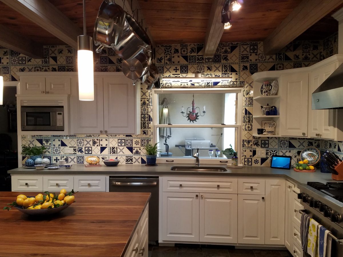
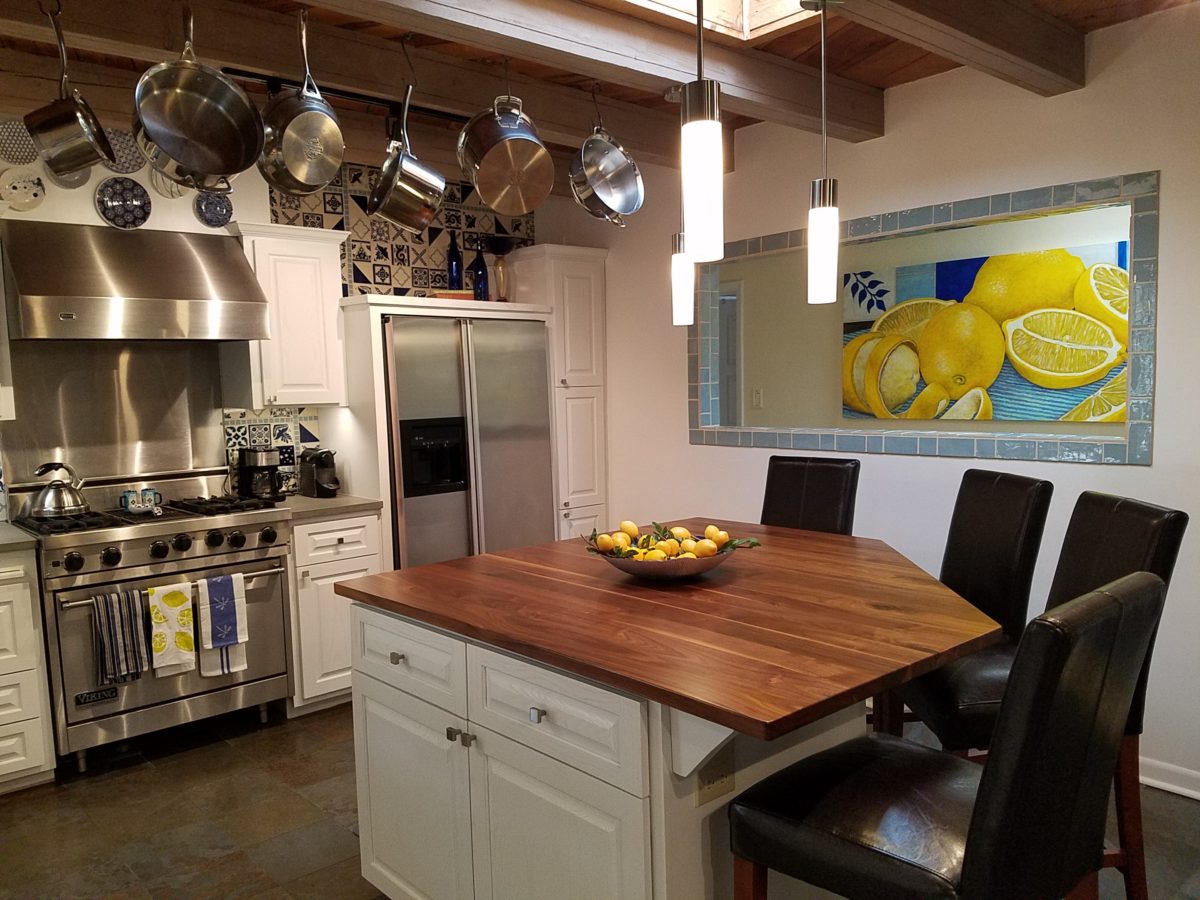
With the white raised panel theme throughout the home’s original appointments, we elected to salvage the cabinet boxes and replace the doors and drawer fronts with a similar raised panel detail. The same red oak was used and, with a glossy white paint applied, the grain “read-through” with a very intentional yet subtle moiré-like pattern. The new raised panel white doors and drawers, with crowning top molding provided a crisp, timeless motif. The random patterned Talavera used as an entire wall-covering was very effective. The kitchen was quite gussied-up!!

The transformation was dramatically successful!

The existing slate floor was beautifully organic and I felt, from a design standpoint, was a must to salvage. Making it look like an intentional selection – part of the new scheme – was imperative. Therefore, selecting a counter-top that communed with the tones in the floor resulted in a selection of concrete-like engineered Italian quartz material – balancing the floor with the next horizontal plane and ultimately with the stained and green-grey boards of the existing ceiling treatment.

The new concrete-like Italian quartz counter-tops coordinate well with the other materials.

Another asset was the connection to the outdoors, however the existing window over the sink was high and small.

The window over the sink was high and small…

By bucking the warranty of the Pella people, we had a new double-hung window made to close down onto the new counter-top that passed through from inside to out. They would not fabricate the window to do what we intended, so we had the contractor remove the bottom of the new window frame, thus rendering the warranty null and void, in order to have a completely open, uninterrupted pass-through when raised.

Amusing and interesting…existing family pieces of blue and white ceramics are being discovered and used as decorative accessories in the new kitchen!

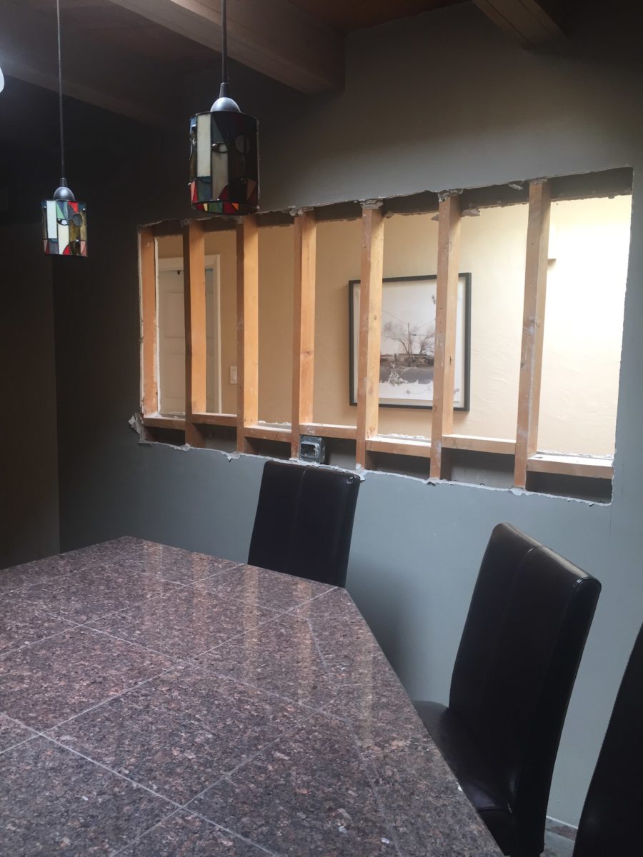
We also captured the opportunity to open the opposing wall into the hallway adding pass-through light and dimension to the space. This exponentially expanded the space and made the encapsulated kitchen feel much less confined.

Before, the kitchen felt small and dark…
Opening the wall into the hallway brought in additional light and dimension.

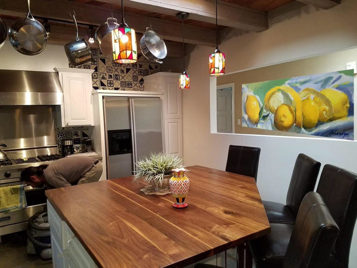
To add drama to the newly created dimension, we discussed having a painting commissioned to pop an accent of yellow into the blue and white scheme on the far hallway wall. Lemons, a perfect citrus for the kitchen, was decided for the theme.  

A miniature oil painting by Federico Leon de la Vega was used to Photoshop into the scene to inspire and convey the design intent.

The additional POP of yellow is a dramatically effective contribution to the overall composition. After consideration, the owners selected a local artist to paint the full-scale painting.

A local Albuquerque artist, Thomas Tomlinson rendered the lemons in acrylic with blue and white tile details.

In summary…keeping the original slate floor, existing cabinet boxes (replacing door and drawer-fronts only), with a bling of new chrome cabinet pulls, switching out the stained glass pendants, replacing the island’s surface with a handsome solid walnut top and a new coordinating concrete-like counter-tops on the periphery, with the decorative embellishment of the Talavera tile continued from the subtle introduction at the living room’s kiva fireplace, the transformation of the kitchen is stunning – not trendy – and was truly, uniquely designed for the architecture and forward, on-going contextual design conversation of the home.

Uniquely designed…

Look around and listen to the environment for and in which you are designing. What makes the best sense for the design direction considering the function and context of your project?

Animating Interiors – for Fun!

The total sum of an interior…comprised of the shape and volume of a space, the colors and textures, architectural details…then layer the lighting, furnishings and decorative accessories and ta-da! But is that all there is?

The beauty and intrigue of interiors is what keeps us discovering and creating. Yes, finding intimate pockets or grand expanses that please and dazzle.

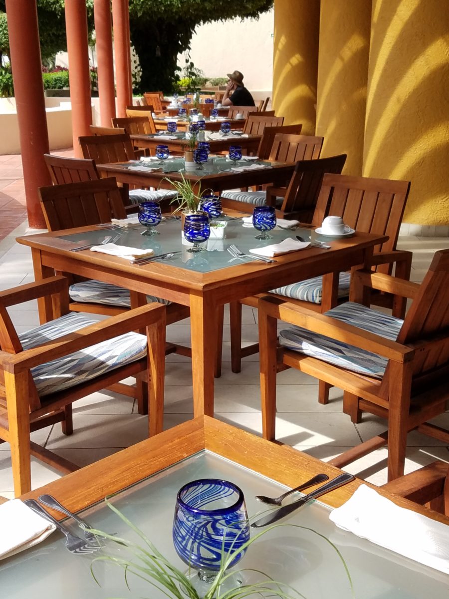
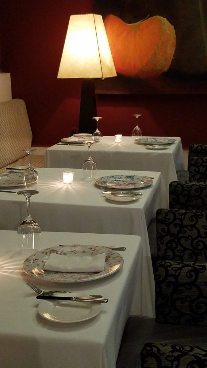
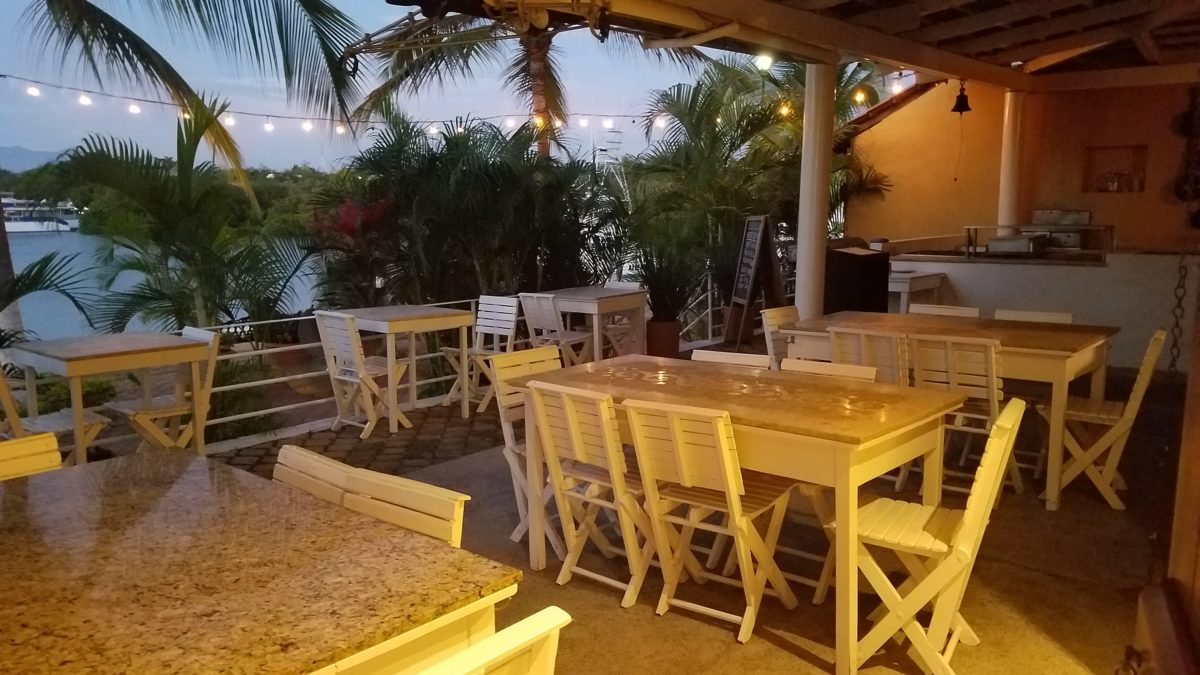
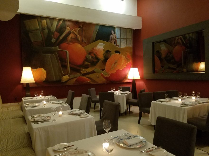
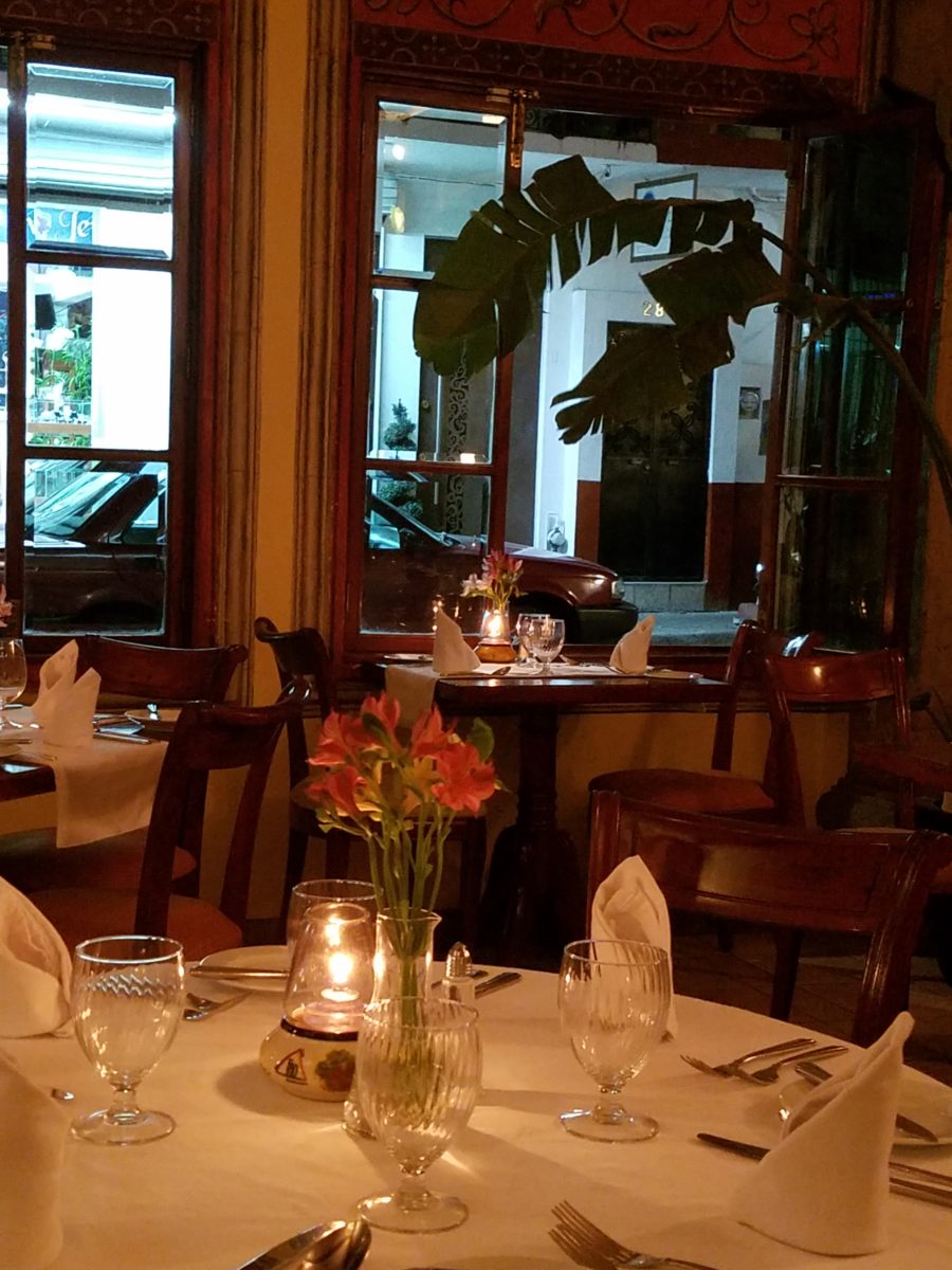
The romance of this setting caught my eye…the far table by the window – set for two seemed a likely scene for a tete e tete to take place!

While traveling in the tropics these last few weeks, I discovered many interesting places. Oddly, while experiencing all the sights and sounds flavors and colors of this paradise, I immersed myself in the unlikely and completely opposite world of early 20th century Russia with A Gentleman in Moscow.

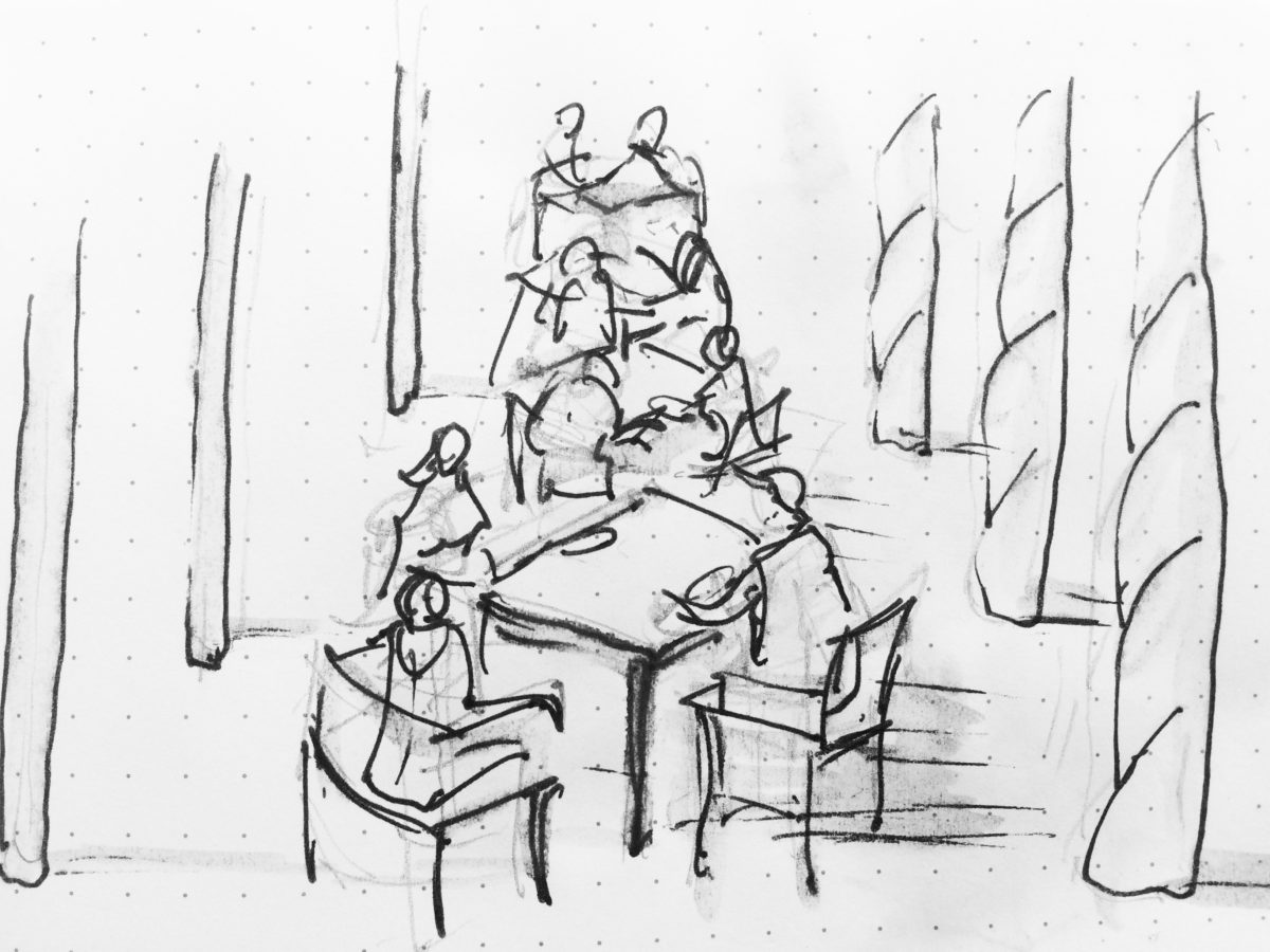
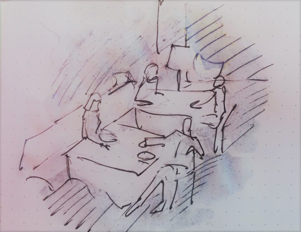
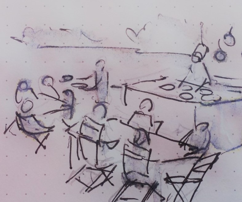
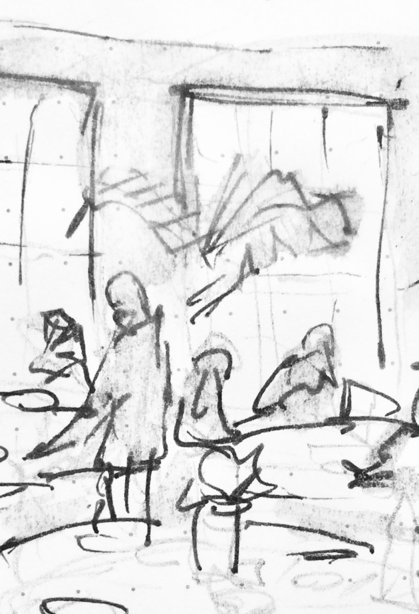
Just for fun, I sat with Federico Leon de la Vega today as he did 4 – minute sketches of some of my photos…needless to say, proper illustrations would have proved more telling of my romanticizing the talents of artists conveying imaginary activities in interiors…but it was fun to play with this today!

The beautifully and artistically articulate writing style of Amor Towles held me captive. And what a dichotomy to play ping-pong with my brain as I digest the restricted realm of Count Alexander Ilyich Rostov while basking in the warm sunshine with fresh sea air and palms rustling overhead…It seems that the extremes of this pairing suited me well as it was a dual escape – a vacation getaway while taking me further into fantasy with another dimensional experience of this incredibly great read!

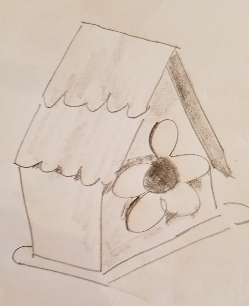
Although there were many fascinating observations made by the author, it was this passage regarding the Count encountering a young artist/architect that prompted this subject for this week’s blog. The architect, finding himself in Moscow in the post Czar age of socialistic experimentation and implementation, bemoans the lack of work “The way things stand, I’d be happy to design a birdhouse.”

“The way things stand, I would be happy to design a birdhouse!” Sketch by PH

The mayor of Moscow has made an observation espousing the birth of  “the golden age of the prefabrication, cement-walled, five-story apartment building”  – with the very practical  “four-hundred-square-foot living spaces with ready access to communal bathrooms boasting four-foot tubs (after all. who has time to lie down in a bath when your neighbors are knocking at the door).” The mayor further emphasizes and rationalizes “So let us not get bogged down with elaborate designs or bow to aesthetic vanities. Let us apply ourselves instead to a universal ideal that is  fitting for our times.” A horribly inhuman decree in my opinion, rather than a should-be, truly magnanimous spirit. Humans are designed to design!!

The sentiments of the new regime left the architect with having to find avenues to utilize his talents – specifically sketching as he set forth to illustrate a brochure of the city’s finest hotels as retained by the Intourist department. How sad to possess the talent and passion and be reduced to capturing the grandeur without having the opportunity to design??!!

So three things struck me about this situation…one – that the artist was practicing only a portion of his talents and not the true, complete creativity that beckoned him to pursue his career…two – that renderings not only offer the opportunity to preview the proposed design of a space, but they can use artistic license to animate the space for its intended function and three – that spaces are not truly realized until they are filled with the people that are intended to occupy them.

So much so is a room not really finished until it is occupied by the inhabitants for whom it was intended to function, but Towles observes through the renewed appreciation by his architect, “I suppose a room is the summation of all that has happened inside it.” And that is what I enjoyed being revealed as a result of this simple exchange in this one of many experiences in this remarkable storyline .

Humans are designed to design. Rooms are intended to perform a function. They cannot function until they are animated with whatever they were intended to serve. Sketches allow the preview. Sketches are more spontaneous and artfully creative than computer generated versions of the same. Celebrate beauty, creativity and artists!

Designing is like Cooking…

Designing is like cooking – I guess cooking is a form of design. Yes, it certainly is. Whether it is graphic design, fashion design, architecture, musical composition, poetry, landscape or interior design – artists of all media – the art of creating, designing, composing, it is all about the right ingredients in the right amount to balance the scene. Proportion.

Even though I will be focusing on interior design, the”scene” could be the sheet music, the canvas, the poet’s screen or paper…the “scene” is the window that frames/encompasses the finished product. To compare these artistic endeavors, to the art of cooking, is so obvious to me.

Everyone must cook something. Whether it is merely heating up beanie weenies, with a sliced dill pickle tossed in, chased with a gin on the rocks, it is a composition that must result in a tasty scene – for someone. Having said that, we must also note that “beauty is in the eye of the beholder.”  The more successful compositions appeal to a greater number of aficionados.  

To cook, one must combine the right ingredients, in the right proportions, to combine to result in the best finished product. When I design, as with cooking, it is often “create as you go”…it is important to add an element and taste…re-think…evaluate…

Assembling ingredients and considering the balance of them in the finished product. 

At a glance, the significant distinctions between cooking and interior design is that in cooking, the finished product might be gorgeous, but taste terrible. Interior design is all visual – on the surface…or so you might think…until you evaluate function. A beautiful cake needs to taste as good as it looks. An interior must function as well as it looks.  Both are dependent on the subliminal factors that result in a truly successful finish product.

Successful is also in the eye of the beholder…25+ years ago my mother and I went shopping for a leather sofa. She, at 5′ 3″, was a bit on the “vertically challenged” side of the ergonomic spectrum. Therefore, actually sitting in the contenders was important so that her feet comfortably rested on the floor and her back against the back – no propping up with throw pillows to make the fit. So we searched and sat and searched and sat until one day, like Goldilocks, we found one that was “just right.”  

A few weeks later, having waited anxiously for this perfect sofa to arrive, Mom excitedly called me and said “they’re delivering my sofa today!” I told her I would be by after work to see it. But before I could finish my day and see this long-awaited focal piece, she called again exclaiming “It’s the wrong sofa!” To which I replied “hang on – I’ll be right there.”

Sure enough, I watched her as she sat on her beautiful new leather sofa and looked like Lily Tomlin doing Edith Ann! Her legs shot straight out and even with a scoot forward, her feet dangled in mid-air. We knew something was wrong. It looked like the right sofa, but we didn’t have the intended dimensions of what we ordered. So all we could do was go back to the showroom and hope the sofa that we thought we had ordered was still on the floor and go from there…

With great relief, we found the showroom model…Mom crossed the room and took a seat. A very comfortable seat. Everything fit just right. So what was with the sofa that was delivered earlier today? As it turned out, it was the right sofa, only hers was brand new. The one on the floor had been sat upon for months and by a thousand fannies…the answer was simple prompted by a simple question. Would they exchange the brand new cushion filling for the broken down stuffing that was in the floor model? And with that – voila! Her new sofa was modified to be the perfect fit – old, broken-down cushions and all!!!!! She still sits comfortably on that sofa today.  Function. The outside looked great – the ingredients were a bit off. Ingredients make the difference.

I used this example with a client recently when she had a chair reupholstered. Per her request, the stuffing was not changed – but the upholsterer thought that the collapsed appearance was not good and would reflect a lack of attention on his part. So he plumped and made more firm the stuffing inside his new, tighter envelopes.  She was not pleased and thought all was lost. I assured her that it was an easy fix and asked that it be redone. He is in the process of modifying the fill to accomplish the comfort she remembers. The chair looks great – but the ingredients/details are not creating the function that would make it a truly successful design.

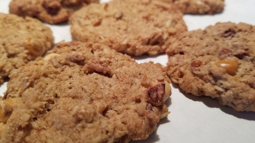
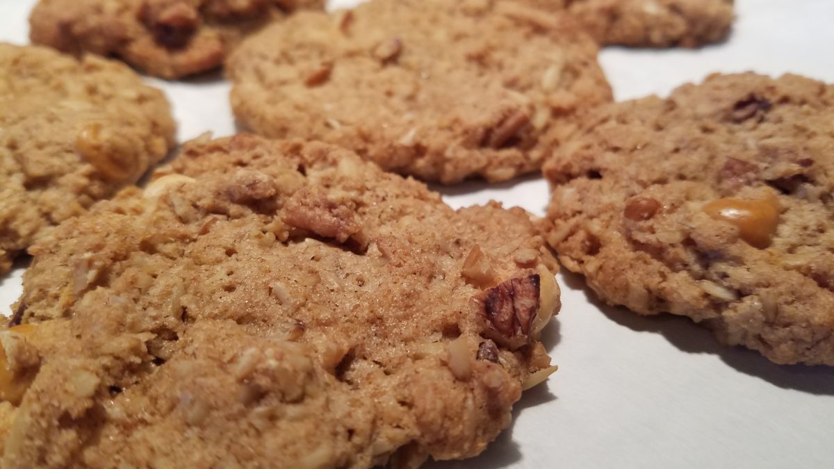
As a designer, we often (especially in bidding environments) are faced with “or equal” substitutions to our design selections. The specifications have to be within a certain tolerance, but the results can radically change the complexion, success, look and effectiveness of the design. Imagine how this could affect a recipe?  Well,sometimes great new recipes come from unintentional substitutions….take these cookies I baked last weekend.


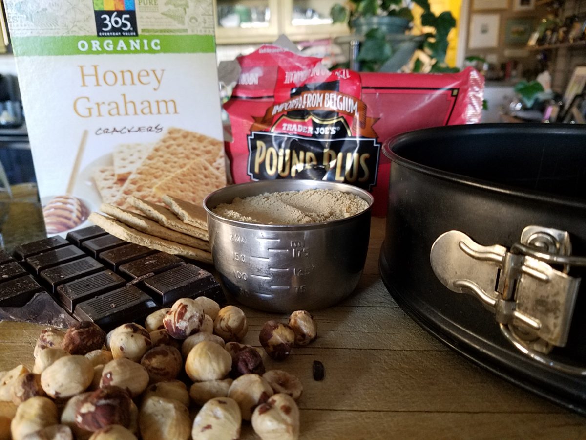
Barbara Bush’s popular Cowboy Cookies – unplanned, I had a wild hair to bake cookies. I can count on one hand how often that has happened in the last 20 years!! So having had these fabulous cookies recently (thanks Feath), I rummaged through the pantry for the ingredients. Well, I had wholewheat flour, not all purpose, I had a few butterscotch morsels and a few more white chocolate chips. I had no chocolate chips nor coconut. I had steel cut oats not rolled oats. Too lazy to run to the store, I thought that the worst that could happen was that my cookies would be terrible and I would have wasted the ingredients and a couple hours of time…However, I am pleased to report that they are wonderful and resulted in a new oatmeal cookie worth sharing. Substitutions can work, but the harmony of ingredients is the key.

Another issue that can challenge a good design is when there are too many chefs in the kitchen. The ingredients can become imbalanced and substitutions can be made that alter if not spoil the intended results. In some projects, the”lead” shifts. The contractor, subs, and owner can all insert changes that alter the design. This usually occurs without regard for the design as a whole. Each person has their field of vision, their focus of expertise or special interest.  Sweet, salty, acidic…each has its place – balance. A disregard for any of the ingredients, poor substitutions or imbalanced quantities – will alter the results.

Yin and Yang – the balance of our known universe – is all at the root of the balance of good design. Balance and the relationships of scale (which are also forms of balance). Rough/Smooth, Shiny/Dull, Dark/Light, Soft/Hard are all ingredients of good design. The balance of these are the equation of successful solutions. And this doesn’t even include the magic of color its balance and compliments.

Many people are good cooks. They have an innate sense of what works. Many people have an innate sense of good design. They often take it for granted. They might not be able to articulate it – but they can create it, they know it when they see it and they employ the rules of balance whether they realize it or not. In both of these cases, theses innately talented people often need reinforcement or encouragement – validation  – affirmation.

From dinner guests to friends coming over to see the new furniture arrangement, talented cooks and decorators can get the job done – as with all professional chefs and designers – with the support and contribution of the talents around them.

Da Vinci, The Genius

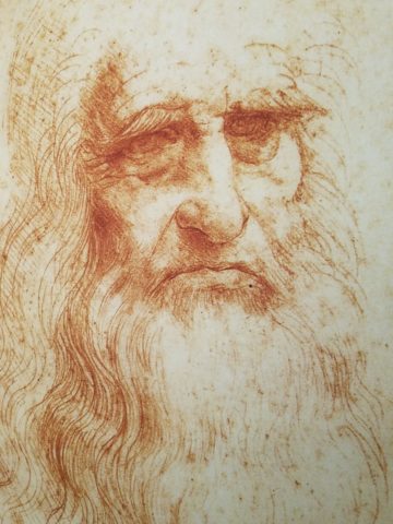
When you hear the name da Vinci, Leonardo da Vinci, its undeniably familiar. You might instantly call-up a synonym – genius. But what do you really, other than the Mona Lisa, recognize? And what do you even know about her and the painting itself? For the past several months now nearing the end of its run, the exhibition Da Vinci, The Genius, at the Albuquerque Natural History Museum, presented by Grande Exhibitions of Victoria, Australia in collaboration with the Museo Leonardo da Vinci , Rome and the French Scientific engineer Pascal Cotte is an amazing consolidation of information on this singularly remarkable man.

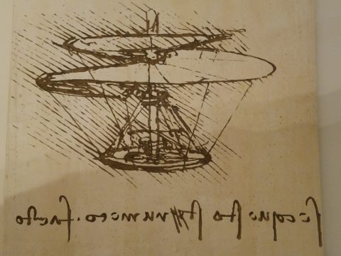
An artist or even designer are such understated titles for this man of extraordinary inventions, concepts, engineering, art and science, because he was the true Renaissance Man! He touched so many things to advance countless trades and disciplines many of which are the basis of machinery and equipment in use today. But as brilliant as the universal exploits of this amazing polymath are, this would be a tedious blog if I focused on the many pulley systems, gadgets, mirrors, SCUBA suits and even flying machines that he created in his lifetime.

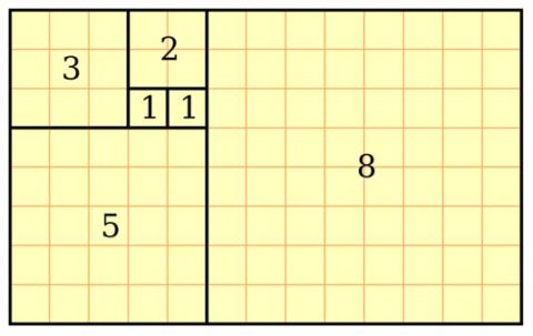
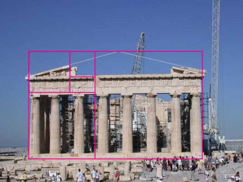
Rather, I would like to use this fascinating field trip that I just experienced to examine how I as a designer have been influenced by da Vinci – specifically, the spectacular rendition of the Golden Mean – nature’s perfect ratio that occurs in nearly everything around us. This common mathematical ratio is used to create subliminal perfection and pleasing compositions that mimic the perfect ratio found in nature and specifically, for my purposes, in design.

If you remove this square from the rectangle, you’ll be left with another, smaller Golden Rectangle. This could continue infinitely.

I have written about this previously in greater depth. It is a subject that has no limits as the application of this ratio helps assure good compositions whether you realize it or not. For graphic designers it is a must. For interior designers and architects it the formula for so many aspects of their work. People in art and design have employed the use of this perfect ratio for thousands of years. If you apply it – it is foolproof.


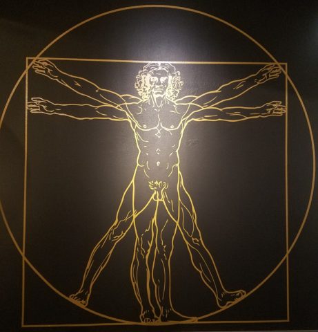
But back to the exhibit…there he was – the iconic man rendered in gold on black. You’ve seen it. But to know him is to see the perfection in the proportions that da Vinci used to create this perfect figure.

Right there in a commanding focal point was da Vinci’s drawing of Vitruvian Man. The accompanying video explained the relationship of all the dimensions as they related to the perfection of the Golden Ratio. Time and time again it is evident in the sections of this perfect anatomy.

Da Vinci correlated that the perfection of the proportions should be applied to represent the perfect human anatomical body and that it was an analogy for the entire workings of the universe.

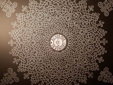
His magnificent study of knots became sought-after for luxury fabrics used in 15th century fashion – many of which costumes and finery he designed. Interpretations as lover’s knots – the bond between them was a popular notion of his time and afterward.


It is an exhibition worth seeing. Even if you have stood in front of the real Mona Lisa and have visited sites exhibiting his vast creations and noted observations, this exhibition is worth a visit!

HOME – An Artist’s Perspective

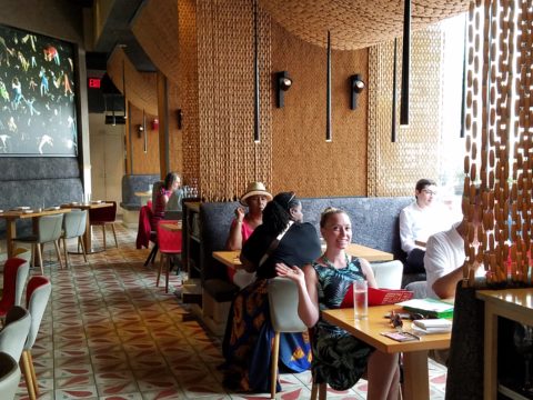
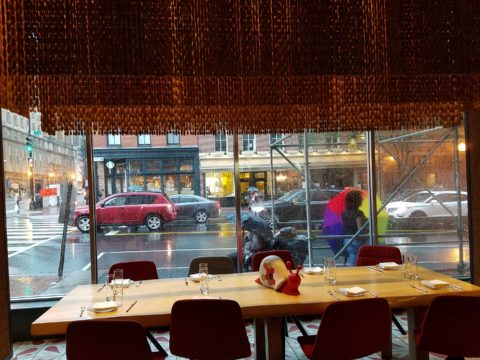
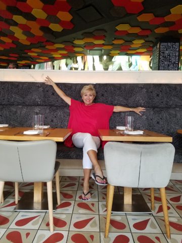
It was quite by accident that we ran into SAAM! Truly, our destination and plan for the afternoon was to catch a bite at the hip and artsy Jaleo tapas restaurant and head to the Bible Museum to see some cool film of all of the buildings in downtown DC that feature biblical quotes on their facades – or something to that effect. But as we sat there in this trippy Spanish-themed interior, right next to the window, we

watched the staff bring in umbrellas from the sidewalk seating areas as the wind picked-up and the sky darkened. Our plans soon began to change. We dawdled at the table well past our tantalizing tapas feast and watched the rain come down in sheets.

As the time past, it became apparent that the Bible Museum was too daunting a task to embark on after the storm subsided. So we dashed between the drops to the nearby Smithsonian American Art Museum – SAAM!

Having never been there before and not having planned this outing, we entered without a clue as to what we might find – except perhaps the portraits of the Presidents – cool enough. Yet inasmuch as the exhibits were wonderful and many faceted, I want to focus on one inspired installation that pertains directly to architecture and design.

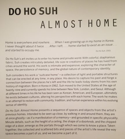
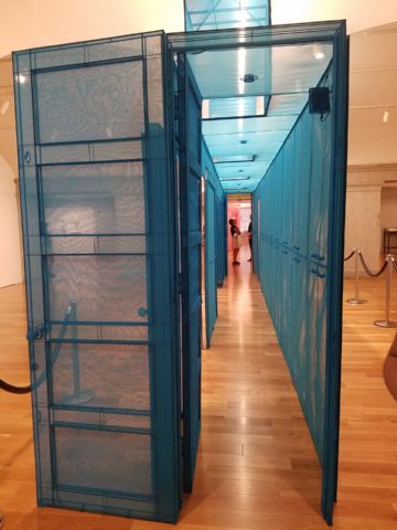
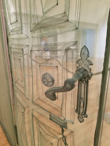
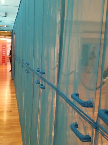
Considered to be perhaps the most compelling architectural artists around today, Do Ho Suh takes nostalgia for “home” to a whole new dimension. He figured out that he didn’t need to wait for enchanted ruby red slippers – no, he re-creates memories of “home” and makes them transportable all over the planet. And by whole new dimension, I mean we walked through fine translucent fabrics – taught and stitched – over concealed stainless steel frames creating hallways of houses where he had formerly lived around the world.

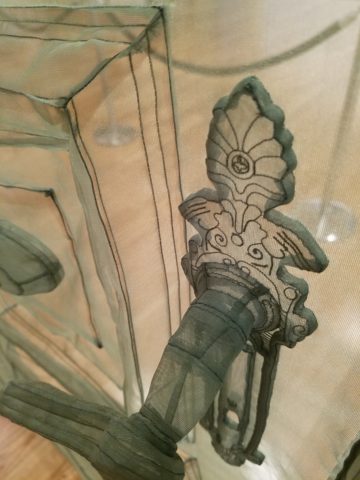
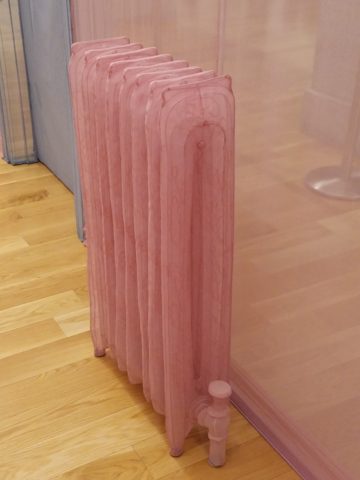
With great attention to detail, he stitched door hardware, radiators, and wood trim details. It was remarkable.

This interactive immersion was thought provoking. I think it is impossible to pass through this presentation without experiencing a few fleeting personal memories of the your own past homes. As Dorothy taught us,”There’s no place like home.”

It was as though the sheer polyester fabric was misty or ethereal as though not really there – a very effective medium to suggest a thought or memory. How fascinating to render a structure with such a diaphanous, fragile sense – tangible yet not.  “Almost Home.” There, but not quite.

The time it must have taken to create this tedious textile architectural art-piece, of delicately painstaking work, surely proves his love for these past dwellings.

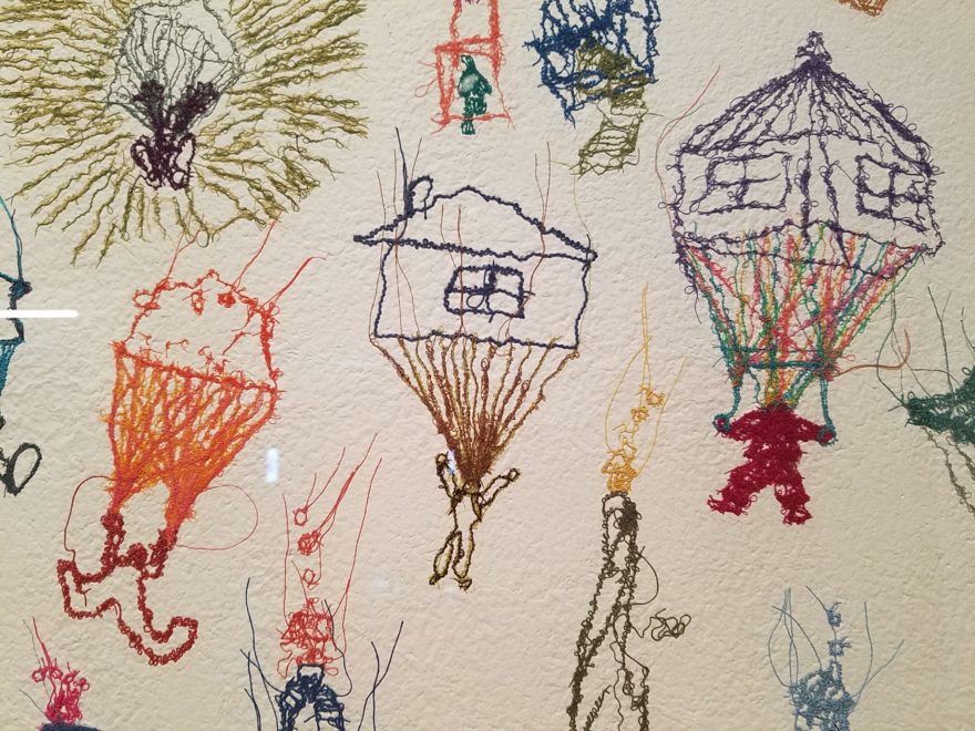
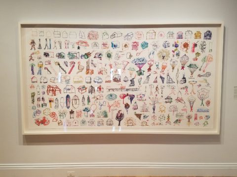
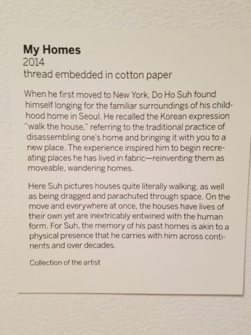
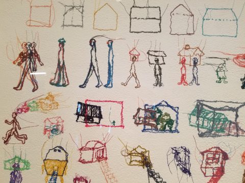
This presentation will be the most comprehensive of Do Ho Suh’s work ever shown on the East Coast. And wait – there’s more! After having navigated the Twilight Zone of Do Ho Suh’s recollections, I was even more strongly drawn to this large-scale piece of stitched textile work mounted on the wall! It was a colorful and beautifully complex collection of images of people and homes in various states of movement and fantasy.


Colorful threads intentionally strewn from the stitched images of human figures, some sporting houses on their heads, another running with memories flying behind his head…taking the home (s) through life’s stages – memories…home is where the heart is…taking their memories with them…

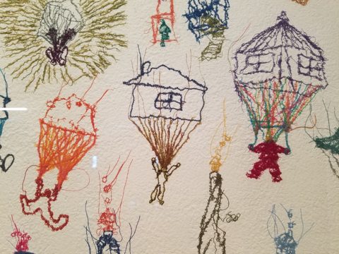
People parachuting with houses floating through the air…pitched roofs and domes – all manner of interpretations of “home.”

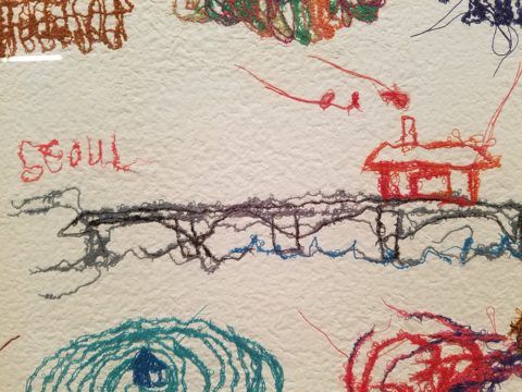
There is a stitched reference to Seoul and a house on a jetty suspended above a wild, choppy sea.

Live – dwell – reside – inhabit…Be quick – it’s only there until the 5th of August.

Drama, Discretion and the Element of Surprise – Concealing & Revealing

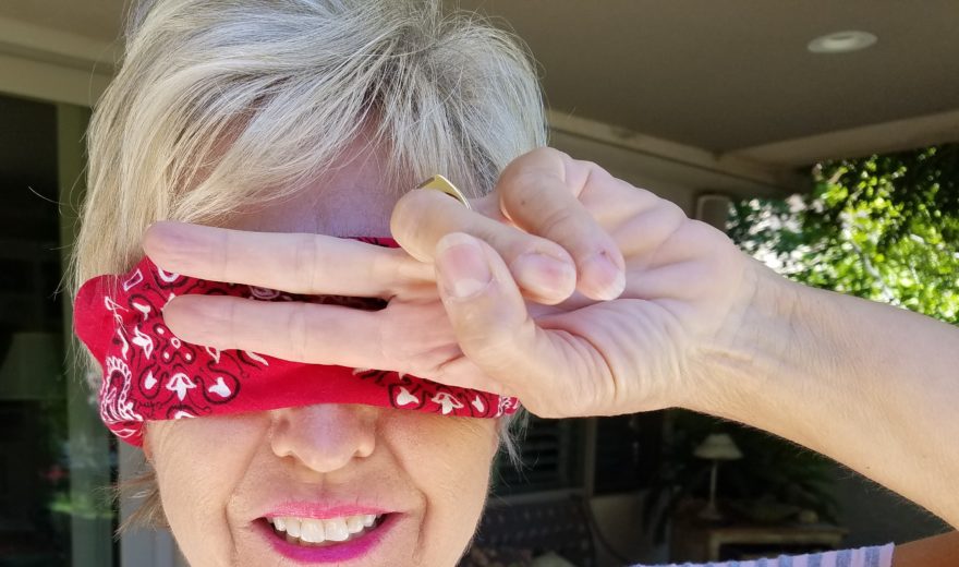
Have you ever had someone ask you to cover your eyes and then there is an anticipatory pause as you stand there anxiously or they guide you – no peeking – in your temporary darkness, to a point where they say “you can look now!” and you do so with great anticipation? The elements of surprise and discovery are put into play to create drama. Hopefully, the unveiling is met with the positive reaction that the presenter had in mind.

Recently I was called to the home of a wife and mother with a dog. Only she was in evidence and present for this meeting.

Her initial contacting our office and brief correspondence prior to meeting was done via email regarding her introduction and retaining me to assist her with her newly acquired home. Her first concern, conveyed even before we met in person, was one of achieving a “cozy” interior.

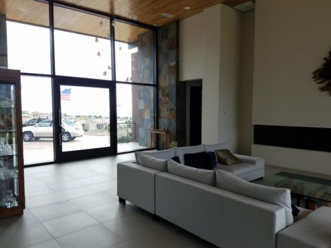
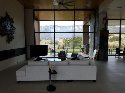
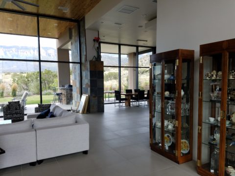
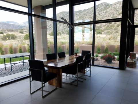
The home’s contents were partially dismantled as the original owners were in the process of boxing up and moving out. In all fairness, despite the unfurnished state, it was devoid of mystery or interest. It did offer a commanding view of the mountains seen very closely through an expansive north facing wall of glass. But as magnificent as the unrestrained scene was, the drama might better have been revealed by invitation rather than seen in its entirety, from outside the un-obscured glass front door and large flanking sidelights straight through the house and without interruption. This presented an exciting opportunity.

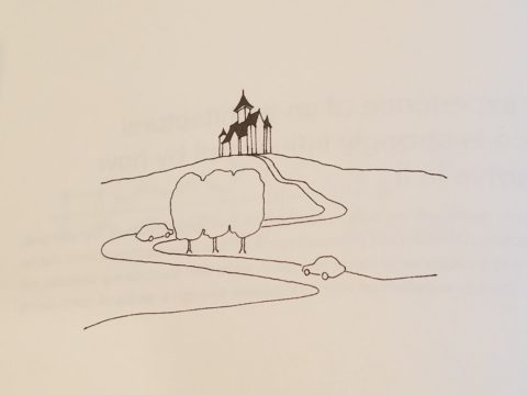
By invitation, I mean selecting who sees into your home and how far. Who sees the intimacy of the interior and the would-be personal vantage-point of the dramatic scene. The opportunity was to control this drama and give it even greater impact by concealing and revealing.  The opportunity to create a design which offered privacy,  bit of mystery and discretion – with the ultimate revelation of the startling glass wall and jaw-dropping view.

This sketch by architect Matthew Frederick illustrates the effective use of “denial and reward” to enrich the approach to the ultimate unveiling of the destination.


This home I’m describing offered little or none of these characteristics to entice the guest/viewer and, with that, certainly defied the word cozy.

The objective, as originally stated by my client, was to achieve a cozy interior. Presented with all hard surfaces of stone, tile, steel and glass, the problem seemed obvious, offering possible solutions was my task.

When I suggested a partial-height point-of-arrival wall be constructed inside the entry to stop the view and allowing one to assess and receive the guest and/or conduct a transaction, I was instantly met with “Oh, but it’s that view that my husband loves! He wouldn’t go for that.” And I’m thinking…but seeing all from outside the front of the house straight through and out the other side?

First roadblock. He who has strong opinion and, in his absence, is inserted into the conversation, without benefit of thoughtful exchange, strongly suggested that further evaluation of this option seemed moot. This through-space seen in its entirety, without interruption from outside the front door to the back of the house, was totally transparent and the representative (she) of the team was referencing his seemingly over-riding preference, in contrast to her stated concerns…cozy. Not to mention private.

To create a successful design, it is important to consider contrasting elements. All hard surfaces begged for softening counter-balance.  Transparency suggested the need for partial obscurity – at least at the point-of-arrival.

Wouldn’t it be interesting to obscure some of that magnificent view from anyone who approached the door and rather invite those so chosen to discover the mystery and drama once they’re brought into the space?  This addresses both privacy and drama with greater sensitivity while beginning to address cozy, by concealing the living space from public view.

Un-obscured glass on the back of the house is the private drama.  Seeing the view from inside and connecting the outside to inside, for personal enjoyment is unique. By allowing only family and guests be given that vantage point, from the interior and private backyard exterior to the inside, is the privacy bonus. Drama and privacy achieved.

As with most things in life, you get more punch from the element of surprise. To have guests arrive, be received and then invited to proceed, to experience the drama, is far more effective than seeing it all without the heightened expectation or even unexpected surprise.