Inspiration Aroused in a Fantasy Pleasure Ground

Like gardens? Like ornate, ornamental, architectural fantasy structures? Do magical forms and colorful design elements arouse your creative juices?

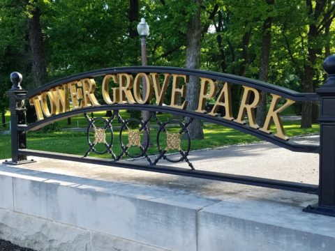
Memorial Day and the holiday weekend offers festivities with family and friends, time to honor in memory those who have performed with honor to preserve and protect our freedom, reflective moments away from the rigors of the work-week, and in our case this weekend an extraordinary encounter with one of the country’s most magnificent “pleasure grounds!” Yes, an introduction to Tower Grove Park (thank you Ali-bali) and the awesome written description of its inception and extraordinary design in the 1860s was our sensational, design stimulating, multi-sensory, experience.

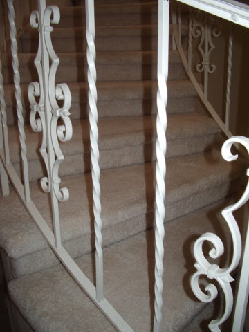
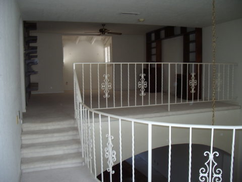
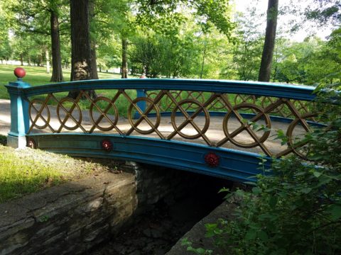
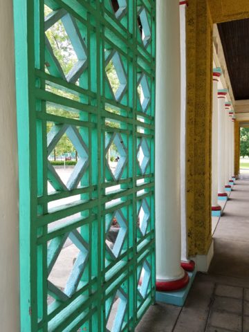
Perhaps these photos will provide ideas for your fence or railing detail or even a backyard gazebo!


If you would like to enjoy the language of the beautifully written original intent of this property in a manner and style that is not often experienced, please follow this link and be enchanted with great vision, joyful optimism and intimate appreciation.

https://www.towergrovepark.org/mcadams1

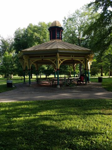
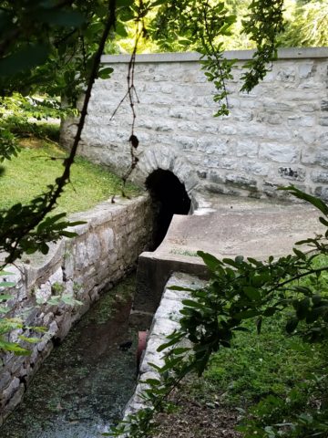
Art and nature intertwine in these magnificent verdant grounds of Tower Grove Park with its wonderful gardens, charming Victorian pavilions and significant statuesque monuments. Conceived and donated by the visionary, Henry Shaw, in 1866. The writings of David MacAdam (found in the above referenced link) reference taking “ramblings” in the park – originally designed for driving in and through but with emphasized encouragement to go afoot to observe closely, in one’s casual time, these wondrous fields and arbors, around ponds and through gardens.

He writes “A visitor who takes a summer ramble in the park starting from the east entrance and noting the objects of interest we have mentioned, must certainly admit it is a most interesting and agreeable place. Every few steps will open a different view, ornamental structure or some work of art.”

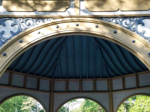
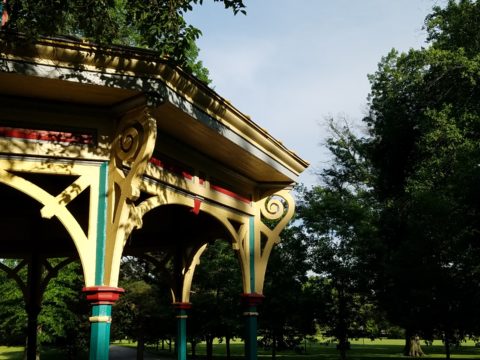
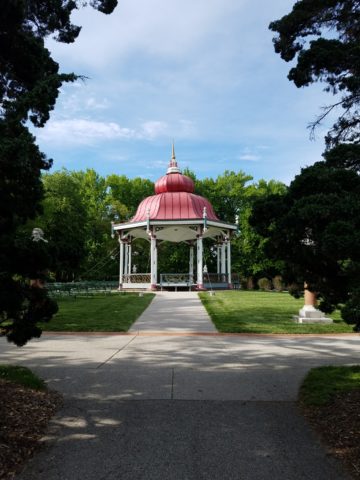
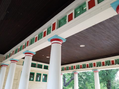
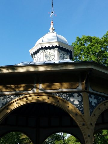
Peeking from pockets of this enchanted scene are fanciful pavilions each with a singular identity.

We hear that winter scenes in the park present a wonderland of snow frosted evergreen trees, quiet pavilions, sculptural dark trunks, statuesque bronze figures and serene blankets of white dotted with the dormant shrubbery that comes alive once again each spring.

MacAdam further notes, “The artist of the graceful and cultivated style pursues, then, a middle course between the picturesque and the formality of the purely artificial, aiming always to preserve the harmony of natural forms and scenes.”

While the landscaping is magnificent, the architectural detail is captivating – conjuring up fairy tale scenes of dancing and romance. MacAdam writes further, in thoughtful detail, about the concept of encouraging the public to experience this grand property with all of its engaging ornament and ultimate beneficial consequence.  “To do this thoroughly they can hardly avoid walking a part of the distance, and the attractions of the place should induce them to do this contentedly, recollecting that one of the objects for which it exists is to invite persons of sedentary habits to healthful exercise. ”

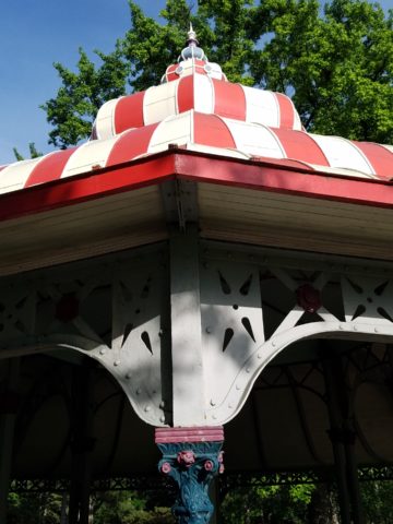
I was so excited about the fretwork and fancy  details – the sunlight dappled across the frames of these sturdy yet delicate structures.

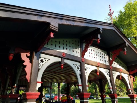
Inspiration around every corner with design elements that are timelessly graceful. Grill-work and column lines present powerful progressions.

It was as though these structures were attempting to emulate giant confections of fondant and frosting, carving and detail just shy of excess.

Realizing these structures are over a century and a half old, preserved by the enjoyment and appreciation of their patrons – which are all the people of St. Louis.

“The worrying command, “keep off the grass,” writes MacAdam “when the feet are aching to tread the carpet of youth’s memories, does not harass the visitor by springing out on his eye as he turns each curve. Music too is thrown in free in summertime, and thus all elements of pleasure and beauty are woven together in lightness and brightness for the general good. It is on the fact of this freedom in the use of a public park, the hopefulness it indicates in human nature, an the equal consideration it shows for all classes, is based in faith of those who believe in its refining and elevating influence. Such a place does not sermonize dogmatically, nor does nature. She exhibits a truth instead of voicing a doctrine. It unfolds fair spectacles, without restraint or an air of patronage, for all who care to see, and it thus tends to refute the selfish theories of either extremes of society, to reconcile  divergent elements, to encourage the gentler ideas and tastes, and to promote innocent recreations and purer manners. The poor are forced to see that wealth beyond their control, and without their asking, has created a resort free for the enjoyment of all, and the rich, by the equality in its use, are reminded of the artificial origin of class and the everlasting kinship of man.”

It was a glorious afternoon of optimism, inspiration and enjoyment. Happy Memorial Day weekend to all and may you find art and inspiration around every corner!

The Seeds Which Result in Enthusiastic Inspiration.

When is the seed planted for a child who might just pursue a career in the arts, architecture or related design fields? How did the aptitude and interest first present itself? When are varied interests honed into a focused passion? If you’re reading this as a “creative,” do you remember the earliest exercises flexing your creativity?

As an budding interior designer, I always enjoyed changing my room and futzing around the  house arranging accessories and still-life groupings. Color was always important as were patterns and textures.  Balance seemed intuitive too. I loved visiting art galleries and I became aware that I noticed and possessed an appreciation for art in its many forms, styles and media.  I derived great joy from recognizing beauty, potential and the creative process.  It followed to the out-of-doors too as I loved the gardens, layers of trees  and made truly organic “forts” in the log pile nestled in the fallen oak and tulip poplar leaves of my childhood.

I also practiced landscape design – trimming English ivy meticulously from underneath so as not to whack off the front edges. I created exotic fern gardens by finding indigenous ferns in the woods and bringing them into the less wild pockets of our wooded backyard – arranging and placing them just right. Spider plants procreated their dangling off-spring that I trimmed and rooted in multiple clay pots lining our patio wall waiting to mature over the summer and be presented as gifts to admiring plant lovers.

Upon returning from a lively Padres and Cardinals baseball game last night, we were greeted by a spot-lit city and pompous parallel parade.  Our boldly preciously precocious 7 year granddaughter

had created a magical world with all manner of pets, creatures, super heroes and trinkets  adorning the architecture and riding in the parade of colorful vehicles.


The lighting was particularly effective as it cast shadows and illuminated the many elements and characters that animated the scene. This is the perfect temptation for rival siblings to destroy. One sweeping sword  or outstretched arm would send this amazing project to rubble. Tonight however there was no such rivalry resulting in destruction. Rather it was protected and revered until we arrived home for the presentation.

“You like my  city, don’t you?” was the confident query – set-forth with an affirmative assumption – regardless of the questioning format, of the comment she delivered. Yes the city and parallel parade was quite exceptional. So much so that it inspired thoughtful observation and examination including this writing today.

As I knelt down and captured various angles of the structures, towers, tiers, columns, pediments and facades with my trusty phone, I realized that this took a tremendous amount of material.  The raw wooden building blocks were nostalgically familiar – the very same blocks, triangles, square and round columns, bricks and cubes with which I had built towering structures as a child. Creativity can certainly be spawned with limited resources and often results in remarkably ingenious results, but as  looked around this particular scene, I discovered baskets, bins, boxes and piles of things. Things with which  to create a limitless fantasy world.

These, paired with her wonderful imagination, were the tools of this creative child who had a treasure trove of parts and pieces, characters and vehicles providing countless components waiting for the imagination to assemble into this and other amazing scenes. Singing while she works, it is evident that this child is over-flowing with artistic expression.

The fantastic architecture and design we admire today was spawned by creative minds using existing tools or inventing new elements to create and ultimately construct seemingly unimaginable buildings around the world.  Yet they were imagined and they became realities from fantastic dreams and ideas, bravery and determination. A creative will that was once a seed of enthusiastic inspiration.

Happy Mother’s Day to all, with a particular emphasis on mine for all of her creativity and encouragement though the years, of my many phases of artistic exploration, appreciation and expression.


Ten Tips on Mixing Metals – Making Sense of It All

How to mix and not mix metals….that is the question. Is it nobler to stick with one throughout or might I venture into a mix of metallic material? From switch plates to chandeliers, this question comes up all the time – and it’s fair. With all the options and the TRENDS saying one thing or another (probably to sell you something or to stand with a current trend fearful of venturing forth), it is a common dilemma. Here are a few tips to give you confidence in the  metal mixing mêlée.

  1. IF the door hinges are one thing – the handles should match. We often see pre-hung doors with brass hinges and a retro-fit of brush chrome or bronze – that is a no-no. 
  2. Is brass finish out – should I change all my hinges and door handles? In – out…no sooner does one hear that a finish is passé or they think they themselves are stuck with a less than new and trendy finish – be calm and carry on – to quote a couple of “trendy” phrases that drive me up a wall – it’s all good.
  3. If you have brass – embrace it! Fear not – it is all about the manner in which you present it – in what context you design with it. 
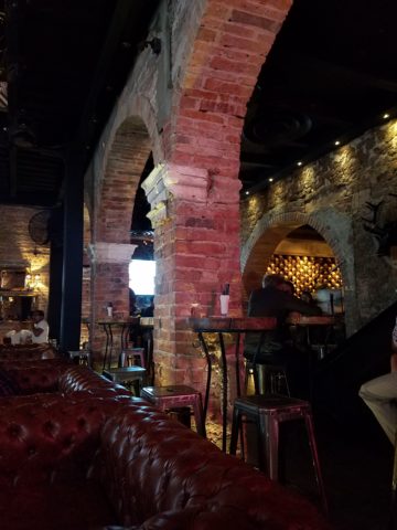
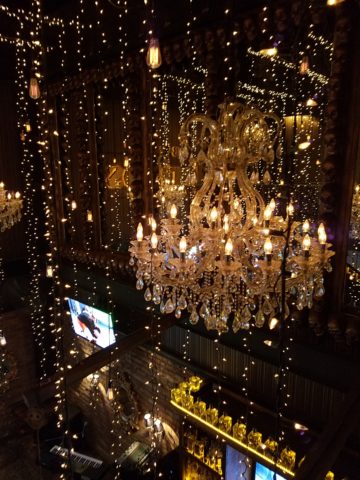
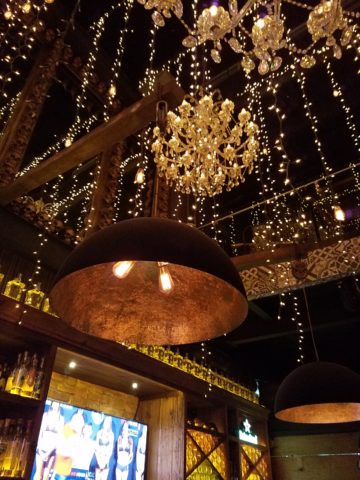
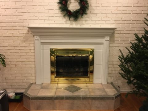
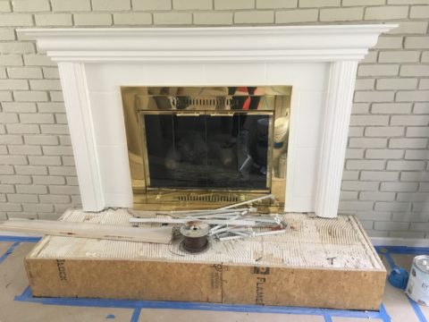
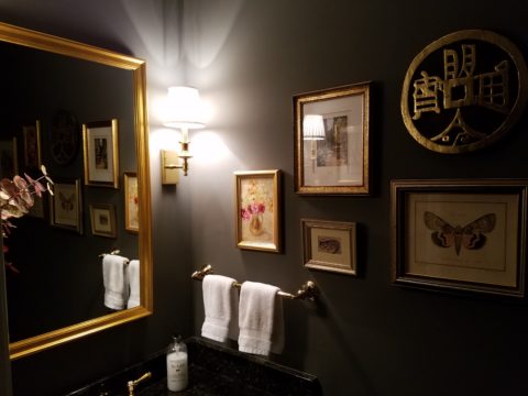
Following trends can be costly, unnecessary and unimaginative. Gold/brass finishes have been making a come-back in recent years. Sometimes it takes time for it to trickle into your purview. But the point is – good design is good design. So it’s not so much about if it is perceived to be good enough or right or wrong…it is if you can design around it and make it great. 
  4. Should you mix a bright brass chandelier with brushed stainless door hardware? 
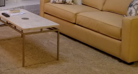
Probably not, but it is not so much about the mixing – it is that to make something like that REALLY work, the overall design would have to be so intentionally mixed that it in itself (the intentional mixing) is an art-form. 
  5. If a kitchen has brushed chrome detailing (appliance trim, faucet, etc…), may I use brass cabinet pulls?  
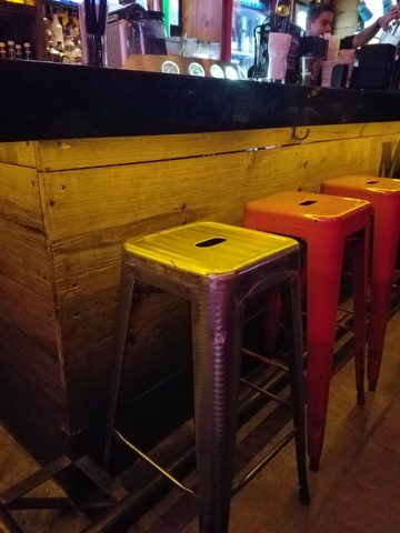
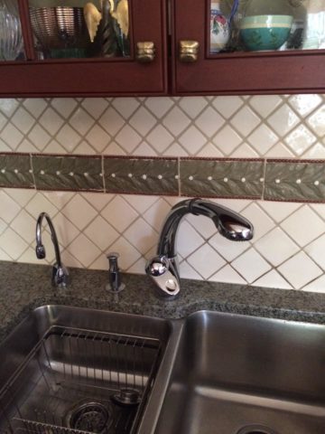
The answer is YES. In some contextual situations, the language of the materials speaks in vernaculars that separate certain groups from others as though allowed to be intentionally different – as they ARE different. 
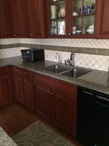
The great thing about knowing when to make statements in contrast – not conflict, is just that – knowing.
  6. The old world and contrasting contemporary look of Bronze, the stalwart wrought iron read of Black, the bling of Polished Chrome, the modern softening of the silver with Brushed Chrome or Stainless, the traditions and suggested opulence of Brass and Gold, the warm median balance of brushed nickel – guess what? They all have their place depending upon the context of design. 
  7. New finishes for appliances rule the kitchen. We thought we had it made when Sub Zero and others offered slots for panels for the fronts of appliances to enable matching of the flanking cabinets. But for those who wanted off-the-shelf units, beyond the merry-go-round colors from harvest gold to avocado green, burnt orange to basic white – the colors of the past were challenged by bold black and brushed stainless finishes – the new fab. 
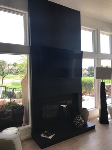
But now we are seeing matte black – and oh is that hot! Complimenting the concrete finishes and raw steel – contrasting with the brushed stainless – punctuating the trend of the clean commercial kitchen style of design. It is a bold yet soft new option for the edgy everyday kitchen.                                    http://www.foodandwine.com/cooking-techniques/look-these-beautiful-matte-black-major-appliances-refrigerator-ranges-ovens-and
  8. Ceiling fans present the same conundrum. Do they match the ceiling and go away? Do they hang suspended like a giant menacing propeller threatening to decapitate anyone who comes near? A black fan against a white ceiling might. A bronze fan in the middle of everything might appear a bit top-heavy. Ceiling height makes a difference. Surrounding decor makes a huge difference. Whether it is to be noticed or quietly disrupt the air for refreshing breezes without screaming their source – those are compelling questions. I cannot even address whether it should match the door handles – it makes me crazy. Unless it is an intentional focal point – like palm-frond paddles in a tropical bar – or industrial mechanisms intended to further that contextual theme, I think nearly all of them should visually go away.  Who wants the focal point of a room to be a fan centered and suspended from the ceiling to hover overhead and command the visual impact of a nose-diving airplane? Unless of course – that is the theme.  The fan designers would argue.

    Oh my – brass, chrome, bronze…where is the focal point? My eyes are darting everywhere!

  9. Fireplace grills…often found in polished brass – they can stay or be painted out – with a flat black that makes them fade into the void of the opening or simulate a cast-iron grate. They can be painted with a faux-rust finish – there are many possibilities – maybe even fire-engine red. The point is, once again, it is the context that makes it successful or appropriate – there is really no right or wrong answer here. 
  10. Tip # 10 is to take each offered finish as it comes, evaluate the context, find your focal point(s), what is the most cost-effective to change? All the door handles and hinges or the light fixture over the dining table? I say it in so many blogs…do not let trends rule your life. Have confidence in your own likes and comfort and go with it – good design never goes out of style. 
  11. BONUS TIP!! Do all my picture frames have to be the same finish? Do I have to re-frame my gold frames or change my maple to chrome or go black on all of them?  
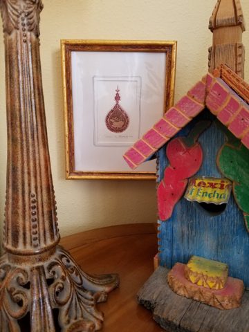
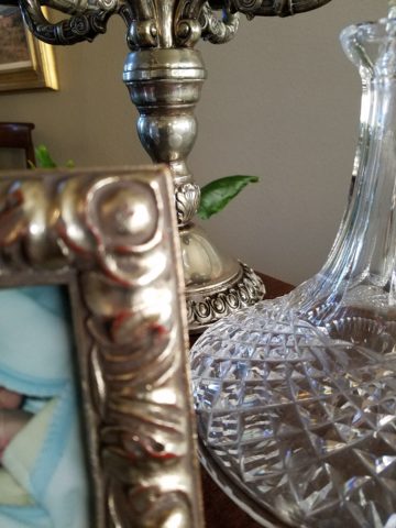
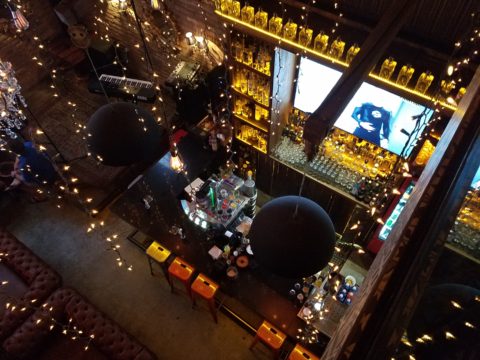
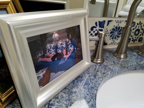
Have I ever mentioned context? Eclectic mixes can be quite fun and interesting.  
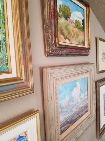
Groupings of identical moldings can be effective.    Random pieces scattered throughout can each be singularly nice. So don’t rush out and re-frame all your art. See how you intend to use it, group it, where and with what else. Be sensible and creative – be brave and do what you like! That makes sense!!!!!


Remodeling? How to Embrace Existing Conditions – Celebrate the Story

This happening scene provided fabulous fodder, to observe existing conditions being incorporated into a design, for great benefit on many levels. Applicable to all remodel projects – see what you think!

In this case, Night Club design. The styles are many, but the concept is of a  commonality comprised of a few basic functions – a fun place to socialize, meet people and enjoy the entertainment of the overall scene often including live performances. We probably all picture the image of a flashy, glitzy environment.

We were recently in a most unusual space that combined the glitz and bling you might expect with a “nightclub” atmosphere, but juxtaposed with rustic finishes that were unique to the original architecture. This brick expressed in some of the remaining structural elements – walls and column/arched spans of structure – was warm and rich providing an unexpected pleasing combination that so easily might have been eliminated – concealed behind slick new finishes.

To play-up the vintage aspects of the space, ornate traditional chandeliers were suspended amidst myriad dangling strands of sparkling, golden LED lights. These provided a glittering glow of ambient light in the upper reaches of the space effecting both the downstairs and upper level of the club. This mixed lighting treatment was obviously the eye-catching  emphasis of the interior.

Ample light was provided by the luminous chandeliers and thousands of dangling LED pin-dot lights along with the indirect lighting of the back-bar shelves. Therefore, the large steel domes that hung suspended over the bar needed not to contribute ambient light, but were limited to effectively cast direct downward light on the bar surface. Their golden interiors provided a warm glow while the exterior surface disappeared into the darkness.

The bar was quite simple and raw, yet read in enough of an interesting and complex fashion, to compliment the scene. The design was sufficient in its components and indirect lighting worked well with all the other design decisions.

The simple Tolix-styled stools were an understated easy fit with the other surprisingly raw materials of the bar.

To answer the need for friendly group conversations, there were comfortable places to gather with zoned seating areas of tufted leather sofas and leopard-patterned rugs,  wooden grouping tables, then hi-top tables with stools and finally barstools along the length of the bar. The various areas provided options for patrons to pick the most inviting or appropriate spot to enjoy the atmosphere with friends.

Having choices in any hospitality setting is invaluable. It allows the patrons to make their own decision how best to utilize and enjoy the space. It answers different needs and appeals to different people for different reasons, therefore inviting a variety of patrons to invest their time and money in the establishment. A broader reach of clientele.  A broader client base.

I’ve mentioned more than once that having restroom design follow the theme and quality, of the rest of the interior, is imperative. As it relates to night clubs, it is often the meeting-ground for dating, meeting new people, attracting new people and therefore,  the restroom should promote attractive feelings of approval and confidence in the guests.

Jazzing up the restrooms in keeping with the jazzy feeling of the club environment should be a natural continuation of the design scheme. That means mirrors – full length – not merely above the sinks,  good lighting without down-lights to cast unappealing shadows on the guests.

Here the placement of sinks outside the restrooms frees up space in the stall areas, while adding interest to the extended restroom area. The design theme presents free-standing bureaus for the sink cabinets. Often shared sinks are used in these anti-room set-ups, but in this case opposing sides of the vestibule provided an attractive vanity area for men and a separate one for women.

What was so inspiring and interesting as we scanned the interior were the various zones all within this complex mix of original, traditional architectural elements and adding traditional if not vintage lighting fixtures paired with modern high-tech lighting effects and large brilliant monitors featuring exotic, playful, getaway beach videos. It worked.

Have you ever encountered a structure that at first glance did not comply with the supposed new program? Awkward supports, raw materials, exposed mechanical…so ,many “unfortunate” things to get in the way of your design. Often the “imagined” design over-rides the reality of the moment. The challenge is to allow the moment – the reality of the existing conditions – to participate in the process rather than being briskly eliminated without thorough consideration.

And the additional bonus might often be cost-savings and budget stretching while not betraying that benefit at expense of the finished design. Brilliant to have incorporated the “whatever it is” – wasn’t that creative and hence, interesting!! OK – I’ll take that!

To have concealed or negated the architecture would have been almost criminal – certainly a loss of architectural integrity and textural interest.

The crime of missing opportunities like the seemingly conflicting traditional elements with the need to be glitzy and modern is to be too one-directional . It’s like having “design-blinders” on that direct and focus a theme without recognizing the value of thoughtful salvage of  content, contrast and context.

All of what we observed applies to both residential and commercial design. The takeaway is to consider existing conditions and, if applicable, embrace them. Give thoughtful consideration to the opportunities before glossing over them, concealing them or eliminating them altogether. Try to appreciate the gifts that might escape you if you insist on unnecessarily hammering and manipulating a space into submission – design submission. Rather, let it tell a story and contribute to the design process – which would more than likely result in a more unique and creative end project for that thoughtful integration of the existing elements.

DIY…Do It Yourself Beachfront Getaways or DWI…Designing While Intoxicated!!

Not as the title suggests…tequila shots and all – but another kind of intoxication…an intoxication from unexpected beauty, sensory overload, inspiration as seen in the following photographs.

Those of you bundled up against the elements this time of year…freezing your booties off in the icy winter climes. Enjoy this escape into your unbridled imagination of design and lifestyle gone wild!

Thought a beachfront condo was out of reach? Think again. With all the DIY out there on the internet today, anything is possible. As evidenced by the inspiring framework of architecture that I have encountered just this week alone, consider the possibilities and have a little fun!!!

Very simple things trigger design concepts. Beyond the fascination I have had with these beach structures, this particular photo was bathed in late afternoon light. The glow of the orange towels was emitting a warmth that was so tropical, had it not been on a tropical beach, finding the same boldly colored and textured structure in a snow storm would have elicited a startling, contrasting feeling of the same tangible warmth.

This make-shift west-facing beachfront was so beautiful, in its simplicity, that it spurred ideas of bold fresh color, basic found-material furniture possibilities, fabric design and organic architectural solutions for patios both commercial and residential.

Imagine raw elements  incorporated  with concealed structural support to convey the feeling of spontaneous simplicity.

Then there’s that general calling that speaks to “the natural integrity of the materials.” You realize it is a grounding.  It is a starting point of reference to all the embellishments, layers, machinations and manipulations that are possible.

Wood is wood until it is stained, painted,  appliquéd…when does it lose its “natural integrity?”  Even raw, man-made cinder block – CMU – concrete masonry units have their own natural character. Then stained in the aggregate or applied color, thickly coated…it alters it’s state – losing its material’s natural integrity.

What ignites design thrills? The fireworks of ideas that burst onto the scene illuminating so much that was previously obscured. It doesn’t have to be a remote and seemingly inaccessible tropical beach…it’s everywhere. Look around. See texture and color, shape and frame. Urban, suburban and rural settings in any climate all offer inspiration that can be isolated and appreciated. Design inspiration can be intoxicating.

Why is designing so exciting? Why is it often such a rush? You never know when an idea will appear or from where.

The world around you is a constant stimulation of ideas, inspirations and possibilities. You are thirsty for  whatever is out there…whatever is waiting to be discovered, implemented… quench those longings.  It is all about the freedom to allow ideas to be spawned from anything around you or in intertwined with your own imagination.

What fun to have come upon these simple structures on a glorious and sparsely populated beach. What fanciful design ideas and story-lines were prompted by the imaginary occupants, their creativity, resourcefulness and problem-solving simplicity.  Lest you think they house the homeless adventurers, they are actually sun-shades for creative surfers and affluent sun-bathers seeking a primitive beach experience.

How might these primitive structural solutions play into a future project? Watch for design trends to incorporate more organic materials and nature’s inspirations!

I’m ready to explore the possibilities. Are YOU?

TRENDS DIE – What’s New for 2018?

I was surfing for fodder about the new color trends to kick-off this first mindful missive for the New Year and the color trends were all over the place – no consistency at all. From Ben Moore selecting Caliente AF290,

“Caliente is the signature color of a modern architectural masterpiece; a lush carpet rolled out for a grand arrival; the assured backdrop for a book-lined library; a powerful first impression on a glossy front door. The eye can’t help but follow its bold strokes. Harness the vitality.” 

—Ellen O’Neill, Benjamin Moore & Co.

to Sherwin Williams in a totally opposite direction proclaiming Oceanside SW 6496 their color of the year.

“A collision of rich blue with jewel-toned green, a color that is both accessible and elusive… A complex, deep color that offers a sense of the familiar with a hint of the unknown, Oceanside, bridges together a harmonious balance of blues and greens that can be found in what’s old and new.”

What? Are we straddling now?  Do we have one foot in one color trend while the other stretches across the color wheel and causes us to nearly do the splits trying desperately to hang on?

The walls of my east gallery space were a spicy version of Caliente for nearly 20 years! Bold at the time and unheard-of for  gallery walls – it was not to be changed for nearly 2 decades!!!

Whew – that was a run. I even named the retail space “Caliente.” And the color-band between the crown and picture molding at the back was a version of Oceanside – a lighter value of the blue-green hue.

The Grand Re-Opening July 2016 presented a dramatic transformation to a pale aqua resulting in a diametrically opposed feeling – a cleansing from what was crowded and hot to spare and cool.

But I digress…

Annoyed by the seeming authority, but weak contrasting rationale that I encountered with the wide range of picks and opinions, I left the paint companies and clicked over to the Pantone site. There I encountered their authoritative, ethereal color forecast of the year – Ultra Violet!!!!!

Yikes – they were coming at me from every conceivable direction!!! How on earth is any eager apartment dwelling or home-owning individual supposed to know how to go forward in sprucing up their space without fear?

Then  I came upon a piece by Mehgan Nesmith Ugh, What’s With These Generational Color “Trends”? From observing the broad reaching trend surrounding millennial pink to snippets from other sources,  I scanned the paragraphs amused, but still not satisfied. Until I arrived at paragraph 6 and there it was – the true fact that keeps the world moving forward – for better or worse – TRENDS DIE.

Yes they do and for good reason. I’ve said it before, take care in making costly selections that will stay with you past their prime. Trends are there for a reason. Designers dabble in creativity every day of the year to come up with things to tantalize, inspire, evoke, and entertain – and most importantly, SELL. Some of these trends stick. Then they are no longer trends, they transition and become classics. But to transcend the fleeting status of trend, “it” must have something very solid about its being.

And when it comes to interior design, with all the style trends for furniture, fabrics, architectural elements, finishes and decorative accessories – colors race through history like no other design element has or will. Colors rule and when they are good, they are very very good, but when they are bad, they are horrid!!!!! Thank you Mr. Longfellow!!

Take the massively graceful modern art piece suspended from the ceiling of the East Wing of the National Art Gallery in Washington, D.C. – classic – both in form and color. Red and black. Strong and simple. Bold and brilliant. Imagine if it were this year’s Pantone pick Ultra Violet  Aghhhh!!!!!!!

Actually, methinks I protest too much. The shade of purple picked, by Pantone, is heavy on the blue rather than the red.  The blue cast gives it a calm. Not whacky like Barney screaming purple – but, rather a royal shade.  Nonetheless, it is better served as an accent – don’t buy  wallpaper in it. Go ahead and paint the walls and have your fun – but know that you can change it without peeling off hundreds, if not thousands of dollars of wall-covering or re-upholstering your sofa like Meghan was tempted to do!!

It’s a color that stands alone – plays better by itself than with friends – like the child’s report card where the box that says “plays well with others” is not checked.  In my estimation, it will read well with clean, crisp white.  However, like Ms. Nesmith aptly says in her piece “if you are  still curious about that Gen Z yellow, buy a vase!”

That’s how we play with  colors and create a bit  of collision, unexpected off-key harmony, intrigue and suspense. But it is not for the faint of heart and the chance of tiring of it is paramount. Trends die and colors are tricky.

So Happy New Year and Happy New Colors in your world to refresh and renew!! Thank you Meghan, for your lively contribution to today’s story.


COMFORT & JOY with ART

A few years ago I gave a talk. The title was  something like “I Need a Piece of Art to Go with My Red Sofa.”  It was a defensive argument giving liberty to those who sought artwork for decorative purposes rather than an esoteric rationale. As an interior designer surrounded by artistic influences and drawn to the limitless styles, pieces, concepts and movements of the art world, I see and appreciate both sides of this controversial coin.

Federico Leon de la Vega’s Pomogranates

In my opinion art should bring joy. And that is not to discount art as a social commentary, honest statement of artistic philosophy, opinion, or personal expression. As an interior designer, my simple philosophy is that joy is a goal of interior habitats – function and joy simultaneously. For me, there is a synonym for beauty in there. Oh – and how apropos – it’s Christmas time and the carol God Rest Ye Merry Gentlemen specifically identifies bringing “tidings of comfort and joy.”

In this  month’s December 2017 issue of AD “Architectural Digest” Living with Art, architect Luis Laplace offers that he doesn’t really know about beauty in art. He sounds modest and self-effacing.  “I say I don’t know beauty. When I see that something works, then I see beauty.”  I say that is saying a lot about context. But inasmuch as I can see context being so perfect to showcase a piece that it validates it somehow, it seems lacking in the department of honest personal appreciation or criticism. Surely he must find beauty in art before it is placed.

I can see admitting that something having potential is a valid “wait and see” position to take when allowing a piece to be placed to its best advantage, prior to judging it too harshly – but that seems reserved for pieces about which one is trying to give them the benefit of the doubt! It sounds a bit like tap-dancing…making excuses. Excuses for not having an initial opinion or spontaneous reaction – much less appreciation – much less, joy.

Festive boat bringing JOY at the San Diego harbor parade last week.

Another comment that Laplace makes in this article “High Art” is that “We never use art as a decoration,” he declares. “We design for installation and rotation.” And I am sure in his world, that is exactly what he does. But let’s get down to earth and acknowledge that it’s a chicken and egg thing – the luxury to design expressly for the presentation of magnificent rotating works of art versus finding joy in a piece to decorate your world – with or without rotation. He makes decoration sound like a bad word. And perhaps he thinks it is – but why? Adornment, decoration, enhancement, emphasis – all superlatives, in my estimation.

Federico Leon de la Vega’s Script on Blue

In a completely opposite place on the planet both figuratively and physically, Robert Downey Jr, in this same issue of AD, expresses an explanation for their selections and design direction. “We didn’t set out to do something conspicuously whacky.” He obviously gets great joy and a kick in the pants out of his approach which he cements, with the following comment: “We just enjoy a bit of whimsy and fun.”  And then a negative nod to separate him from the more cerebral art enthusiasts – “We definitely don’t like boring.”

But that is a direct comment on the joy thing and one of my oft borrowed quotes “One man’s trash is another man’s treasure.” Here, a tangible example that I created for my grandson, Liam a few years ago. Debris he and I collected while on a walk one day, I assembled into a collage and had it framed for him with the plaque to remind him to look at things and regard things from all angles.

From what one person derives joy, another might find boring and uninteresting. And that oddly seems to return to the Luis Laplace comment about not seeing beauty until it is placed and then can be recognized. Hmmmm…Yet, I am saying that it might be of value to study things and  think about things differently than face value at a quick glance…spontaneity is valid and so is “love at first sight,” but often things are missed because their context s not serving them well. That space above your red sofa might be just the context and proper setting to showcase the “whatever it is” piece which might be far less interesting otherwise.

Which is why, in this time of international commerce delivering things from all over the planet with an almost instant gratification speed, we still have difficulty making decisions about what to chose to have in our world. Which fabric, which furniture, which art…the choices are at our fingertips and delivered to our doorsteps without leaving our living rooms, but fear of costly mistakes, second guessing trends and how to make good investments still remain the dilemma shared by most. Fear of trusting your own joy. Or, better yet, discovering and defining your personal joy.

Which brings me to the last quote I extracted from the December  2017 issue of AD by an artist, Brian Donnelly, speaking about his own residence and art collection, and that is  “I don’t buy art to put in specific places. I just collect what I love and hope to find a place for it.” Sounds like spontaneous joy to me!!

Closing with best wishes for a Merry Christmas and “tidings of comfort and joy.”


SPANISH STYLE BRINGS INTERIOR SPICE

Fabulous clients – turned great friends – bought a good-sized townhome in Phoenix. It was plain vanilla inside with wall-to-wall broadloom and everything painted the same creamy neutral. They stood in the center of this bland slate and called me saying we think we want to clean this up and go with a mission-style simplicity.

They saw the ornate cream-painted wrought iron ascending the curved staircase and wanted it gone!

I flew over and saw for myself this dated interior with very good bones. Layout had great flow, nice lines, handsome coffered ceiling and other interesting features. I pondered the elements and the context of the exterior architecture. It was stucco with red clay tile roof, and iron railing details. Sure, we could slick it up, remove the embellishments…but should we?

The desert heat can be oppressive.  Some choose to embrace the glories of the sunshine and design bright airy interiors with plenty of refrigerated air to compensate for nature’s blistering temperatures.  This approach we were about to take was to be quite different, in that it offered a shady reprieve from the elements.

Therefore, despite the initial suggestion, for the style of the remodel, by my clients I offered another design direction . Why not spice it up with Spanish? Here we are in Phoenix, with architecture suggesting this genre. Knowing their bent for traditional interiors, from two past residences that we had designed together, and with a detailed discussion of the possibilities and evaluation of the elements, we agreed on the Spanish theme and began the transformation.

This is a perfect example of isolating the existing features and determining what to salvage and what to remove. Of the things to be salvaged, how can they be revitalized? So, with that in mind, the staircase was stripped of its carpeting and solid wood treads were added with custom-designed glazed ceramic tile, for the risers. A Moorish influence was the basis for the geometric motif.  The staircase’s semi-ornate railing  was  painted a dark, nearly black, charcoal. The result was startling.

Throughout the home, colors changed, stone columns and fireplace details were added, a wet bar was abandoned in favor of opening into the kitchen. Travertine stone floors were installed throughout the lower level with hardwood upstairs.

An open loft area was compartmentalized into a narrow gallery-bookcase with isolated and fully closed office beyond. Bold colors over-lap and contrast on layers of interior planes.


The result is a cozy retreat from the desert heat incorporating design elements suggestive of Spanish Colonial, transitioning to other modern elements complementing the overall design. To begin a remodel, look at the existing elements, the style of the architecture, the context of the structure and see if you can find a story.

This house now tells a story of intentional decisions, cohesive finishes, a directional theme and a finished product that represents the owners’ giving personal identity to their home.


The Importance of Color in Design – How to Begin

This last week I was inspired by a rainbow that appeared over our great Sandia Mountain and within 3 minutes I nearly tripped over a bed of flowers presenting the same rainbow of colors. With this pairing of color coincidence, I felt compelled to write this week’s blog about color.

Color can be difficult. It is so critical to effective design decisions whether graphic design, fashion design, interior design or architecture.  It might be used for a logo to brand a business , a room scheme or the exterior of a monumental building…how do you begin to select a color or a color scheme?

Well first you have to consider your client. What are their needs and desires? Once narrowed, the search for the perfect colors to convey their project’s personality begins.

Computers aid designers in finding fine nuances between colors. Exploring the range of values in a hue – the range of light to dark of a specific color and the adjacent colors that meld from one to the next has become easier.

It all comes down to the color wheel. It’s a circle illustrating the colors of the spectrum. The relationship of these colors are the building blocks of all the colors. Sir Isaac  Newton – the same of the apple and gravity fame – devised this understanding of the rainbow of colors back in the 1600s using a prism to identify the components.

As children we are taught about the rainbow of colors comprising ROY G BIV – the easy to remember name that represents the colors RED ORANGE YELLLOW GREEN BLUE INDIGO VIOLET

Decisions regarding the selection of colors and the resulting schemes are identified by the following relationships:

Complimentary –  two opposite colors on the color wheel

Monochromatic – three different values of the same color

Analogous –  three adjacent colors on the color wheel

Split Complements –  one color and the two adjacent tertiary colors of its complement

Triadic – three evenly spaced colors on the color wheel

Tetradic – two complimentary pairs of colors

As I pursued this topic today, I encountered an interesting site by a guy Jason Cohen. If you are curious to know more on the subject,  check out  https://blog.asmartbear.com/color-wheels.html

This last week, over the course of 2 days, I encountered several examples of these colors all around me. From the rainbow to the flowers and myriad balloons. It didn’t hurt that it was during the International Balloon Fiesta http://www.balloonfiesta.com/ which is one of the most colorful events in the world.


Unless we have a limitless budget affording custom design materials, it is best to begin with the materials that offer the fewest colors. I have mentioned this in the past, there are more paint colors than there are carpet colors, fabric colors, or solid surface materials. Therefore, selecting your color scheme based upon the selection of a material with fewer color options is the best start…you build from there…paint being the easiest component to finish the scheme.

Color affects mood, perceived temperature, individual’s reaction to seasonal cues, and all manner of context. Pastels in springtime and warm tones in the fall – color makes powerful suggestions and should be used as a tool with that power in mind. The power of suggestion. What are you suggesting? What are you trying to convey?

With your best intentions, colors will change with light sources, time of day, adjacent colors and people’s own perceptions. It is not a perfect science when you consider all those variables. Take caution to select colors based upon the conditions that will occur in the final location/presentation. Without fear, pick your color schemes and beware, but don’t be afraid!

Fireplace Facelifts

The warmth of summer is still here…but it’s time to plan for fireplace season!! Officially fall begins on September 22 – just a few more days. It will be too late once the chill is in the air – so, be ready! If your fireplace needs a facelift – start thinking now!! The materials available, the accents and pizzazz, dimensional modifications and trim carpentry all contribute to the array of options to make your fireplace a fabulous focal point.

Whether a traditional-ish style, a southwestern kiva or a contemporary statement, there are certain steps that will transform instantly…or reasonably soon!!

Here are some examples of finished products AND works in progress…perhaps some ideas for your lifestyle!!! First we have a fairly contemporary home that was recently acquired and needed an update. The fireplace wall was flat and had no dimension or personality. Usually viewed as a focal point, a fireplace should command some respect.


This flat, non-dimensional, facade was weak at best. Under the guise of upscale, the granite surround provided little impact – if any. It was a non-commitment, to making a statement.  In order to give it some presence, we brought it forward – just a touch – only a couple of inches, to provide dimension and mass.


By encapsulating it in black porcelain tile, it added strength and emphasis. The blank wall above it – with the outlet – probably housed a TV. Naked – it was surrounded by white painted sheet-rock walls above the weak granite surround.

To have added the dimension and contrast of materials and to have COMMITTED to the entire wall – it now commands respect. It has structure. Not to mention, the black TV melds into the facade and is not naked in the room.

In a completely different scenario, this quiet corner kiva was simple, yet lacked detail. The original 40+ year-old broken red quarry hearth was a bit dingy in its newly refreshed interior.

The new color scheme is blue and white and therefore, with the New Mexico context, we added Mexican Talavera tile to the face of the hearth (could have been Portuguese or Greek – classic navy and white is worldwide in its history of classic style). In addition, for depth and detail, we placed a creamy, broken edged sandstone on the top of the hearth and also on the upper mantle ledge.

The result is fresh and classic – a simple, timeless update that will stand nicely for decades to come.

This next example is still in the process of transformation.  An attempt at a traditional statement of wood molding –  the golden oak, insipid tile and flanking brick were in dire contrast – not the good kind of contrast. The entire statement was weak, yet screaming in its ability, to call attention as the focal point that it was, to command the space – albeit, ineffectively.

To begin – as a band-aid for a temporary fix, we painted the wooden mantle and surround and even the inset tile. Knowing this was temporary, it was an inexpensive, non-structurally modified, place-holder.


This project is currently taking another step to modify the fireplace. As time and budget allowed, the hearth was squared – eliminating the angels and some of the over-generous depth. Flanking brick walls were painted a contrasting gray.

Soon to be completed….watch for this finished product.

The idea of this missive is that there are subtle changes that can take the “curse” off of a design dilemma. And there are certainly many transformative changes that will take things up a notch.

The next challenge in this department of fireplace facelifts will transform this dated design element. Currently in the design phase, this flat-faced and dated surround has great promise. The modifications will be remarkably easy and dramatically effective.

How does your fireplace speak about your interior design and living area’s focal point? Stay tuned!!!!