What’s YOUR Favorite Color? A Little Project for Fun!

Pick a color. What’s your fav? Do you HAVE a favorite color? I was asked the other day that very question and I was really at a loss…I looked at her, furrowed my brow and cocked my head.  I wanted to have an answer – a simple answer that stated a definitive preference for a color – my most favorite. Rather than producing a quick sure pick, I faltered as she stepped in and said – I’ll bet it’s purple!

Well, actually I can definitively say that purple is NOT my favorite color, but the funny thing is I can love purple, in certain context. The real answer is that I love nearly any color in a certain context.

When I ponder the question a bit more, I can assertively say bright pinks, cornflower blues, golden yellows, chartreuse and brilliant orange. But the truth is, I love so many colors that I am hard-pressed to select just one! It sounds like a Lilly Pulitzer color board.

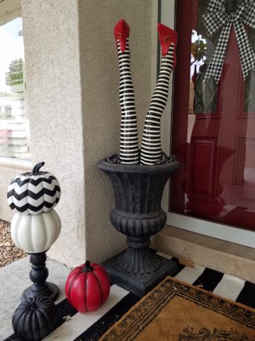
So I thought of a little exercise. I decided to pick a color at random. Then overwhelmed with the myriad colors that might produce one random pick, I fine-tuned random and said to myself, perhaps a color of the season. To me that was currently and boldly orange. So the idea was that I would walk in and around my house today and capture things that were orange.

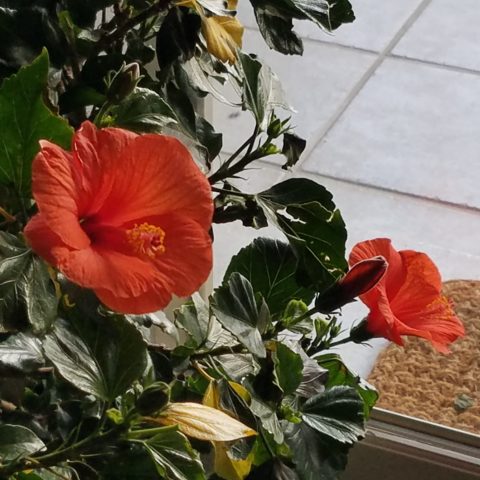
This screaming orange hibiscus just came in from the patio to escape the chilling temperatures that have swept down in the last couple of days…happy to transition indoors for the winter!

Try it. Pick a color – not necessarily your favorite – but certainly one you like and walk inside and outside of your house and see how many examples you can find, of that color, in your immediate world. Photograph things that have that color – all or in part, even little details – anyplace that color occurs.  It’s fun and very interesting to see what you discover!!

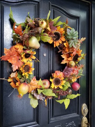
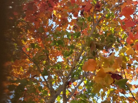
Autumn is loaded with vibrant colors, but orange is one of the most fiery.

So I selected orange as my color today. I dashed around the house and collected a variety of things that were orange. I was actually astonished at how many I discovered.

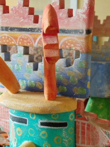
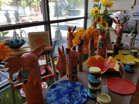
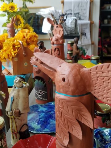
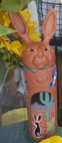
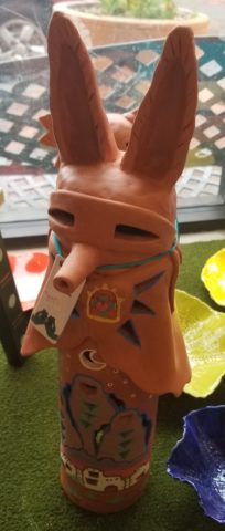
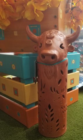
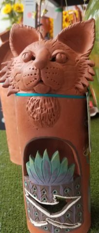
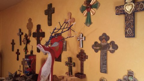
This dramatic Hopi – influenced kachina by Gregory Lomayesva sports stylized antlers in a flat but brilliant orange.

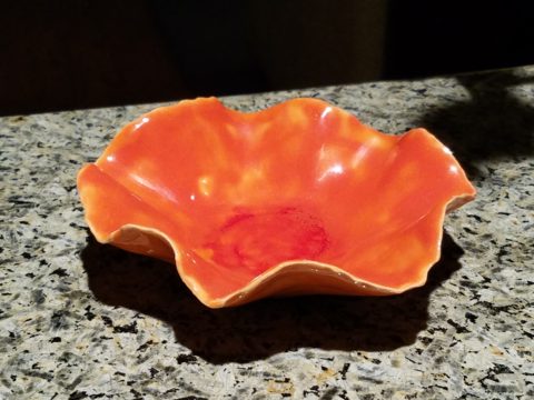
Festive ceramics by Ann Marie Werner Smith – here a graceful orange bowl that sits on the counter…it pops against the contrasting granite.

It is interesting because I know my world is not heavily orange, but I found so many wonderful splashes of it throughout my interior and even startling exterior, in the way of the leaves on the Bradford Pear tree.

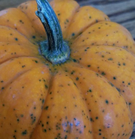
From fresh mini pumpkins and flowers…

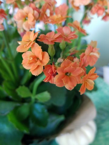
A succulent orange flowering Kalanchoe is our seasonal centerpiece on the kitchen table.

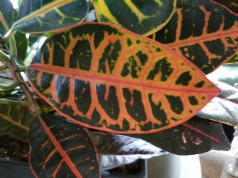
A variegated Croton plant has lacy veining of bright orange, pink and yellow contrasted against it dark green background.

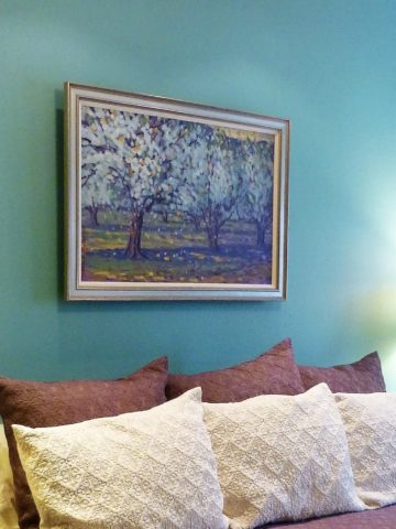
to artwork with swaths of orange streaking through them.

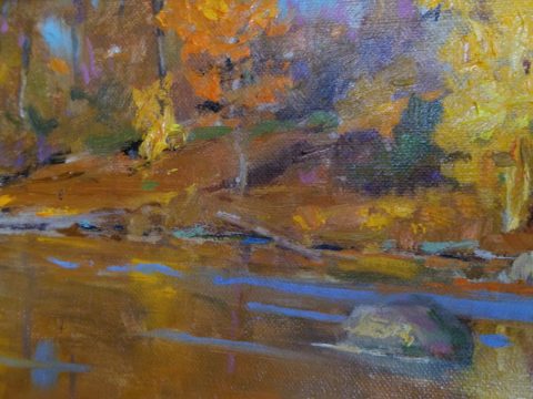
A lovely little oil painting by Jeff Otis depicts a very autumnal New Mexico river scene.

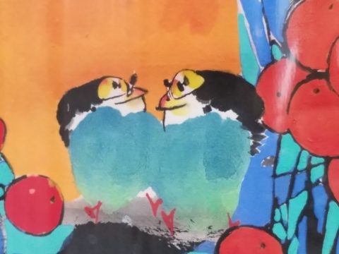
At the last minute, while waiting in the Bejing airport, I found this precious little painting of birds and berries. The background is a vibrant orange. Notice the fresh blues adjacent to the orange. This is a detail of the much larger piece.

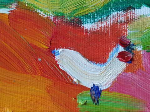
Peggy Zuris really knew color. Her bold and confident brush strokes applied in luscious swaths placed adjacent colors perfectly juxtaposed creating uplifting renditions of daily life. This little chicken is a detail of a fanciful rural scene.

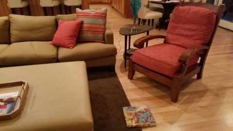
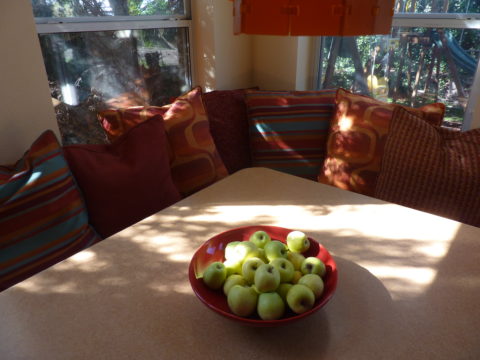
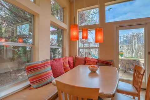
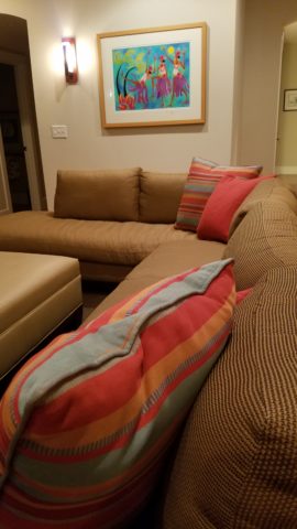
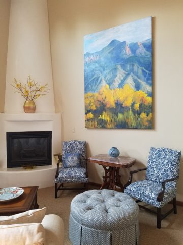
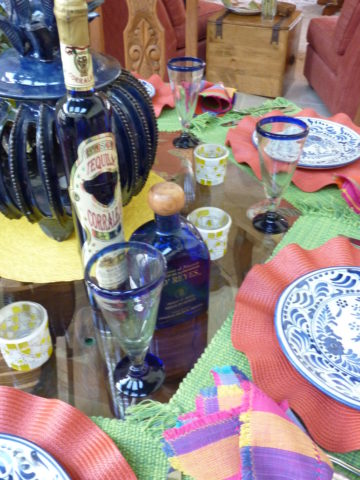
The balance of color was so interesting. Where I found orange, I nearly always found blue – unless it was a stand-alone like the glass bowl of oranges – or my coral necklace with its nuggets of bright orange coral.

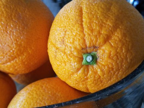
Fresh oranges with their intricately textured rinds fill a glass bowl on the kitchen counter.

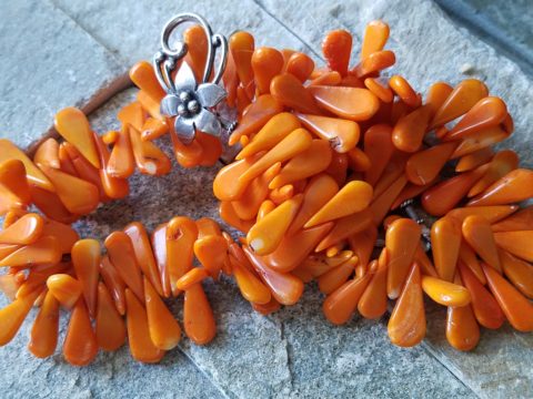
Nuggets of coral look like candy corn tightly beaded on this delicious necklace I wore too Santa Fe today!!

Colors balance and contrast.

Even the coasters that attracted my attention last weekend at a bar. I was so taken by them that I brought them home and had them sitting on the kitchen counter. They were intriguing and offered interest and visual stimulation to my graphic art sensibilities.

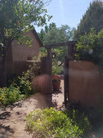
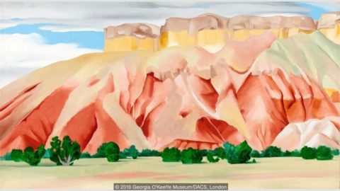
I began this story earlier today, then took a break and tootled up to Santa Fe where I came across a couple more bright orange pieces…

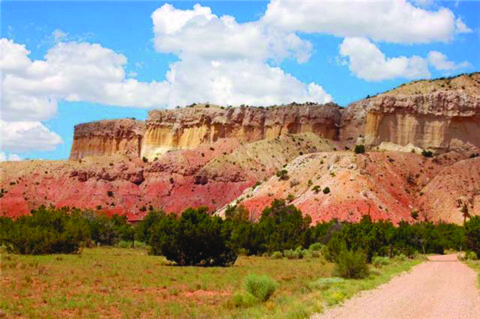
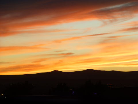
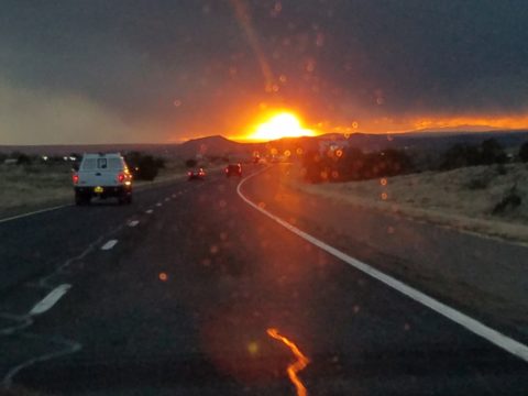
And on the way home, I was even blinded by an orange fireball glowing beneath the stormy sky silhouetting the dark mesas and glistening off the wet pavement. It’s intense heat contrasting with the cold, damp asphalt that was a result of our first seasonal snow seen here spitting at the windshield.

Gather your collection of photos of your color today. Ponder how they and the color make you feel. Do you get joy from the color and the things you have discovered? Was this not your thought-to-be favorite color and if not, might it be one of them? How do YOU answer the question, what is your favorite color and having determined that, ask yourself:  Do I wear it a lot? Would I paint my walls that color? Do I have upholstery that color? When is a favorite color an accent? Is the joy in the little spots of punctuation? Are they intense, but small, elements of joy without over-doing it? I see a collection of abstract images, details of things – some of which can be cropped more – to create an abstract collage of wall art. Voila!

Color – an amazing facet of design and it’s most versatile component. It’s been a fun test and a compelling story. So what’s YOUR favorite color?

Seasonal Shifts in Design – When Do YOU Make the Transitions Between Seasons?

I am often asked, “When should I make seasonal changes and how?” This can come from retailers debating their front window displays to individuals wondering when, to change the wreath on the front door and on into their interior decor, to reflect the seasons.

The answer is a combination of things. It’s personal – probably starting with where you live. And for me, it is more than just decorative accents, it’s food and drink and clothing for sure. Clothing though might have real, practical adjustments for temperature, but fashion design and seasonal changes are part of the fun!

So to kick-off fall, I shifted into my seasonal drinking modification  – dark drinks – moving from citrus embellishments to the delightful, succulent, marinated cherry at the bottom of a well crafted Manhattan. The perceived warmth of darker drinks is real for me. I would never select a Manhattan in the summer. But I must admit, a vodka martini with a twist is a 365 fall-back beverage for any festive situation.

The rich warmth of a well crafted Manhattan…

Clothing and the opportunity to make design statements that reflect the seasonal shift are also fun to embrace! Along with the Manhattan last Friday night, I transitioned into a felted wool tunic with a local artist’s hand-woven black chenille over-sized scarf. Still sleeveless – as the shift is still a bit of a struggle to let go of summer, it was a decidedly seasonal reality nod!

Truth be known, the wide expanse of floor to ceiling folding glass panel doors were wide open right behind us as we sat at the bar allowing a direct connection with the crowds gathered on the patio beneath the high-hat heaters. Truly a straddling of the seasonal shift – not quite ready to let go of al fresco dining???!!!

Seasonal shifts in weather will be a sure way to respond to a want to change decorative elements. And even being a bit pro-active can be a good thing – but when is too early – too early?

Most of us cringe when we hear Christmas music in October or see the merchandise out that early – combining Halloween costumes and candy corn with Christmas trees and all the ornaments. Awful!!!!!!

Across the country, we have experienced a delay in the autumnal shift this year. Summer kept clinging. Warm weather belied the calendar. But when the weather shifts…and the temperature drops…we want to hunker down and cozy up. Perhaps in addition to the decorative items, you might simmer cinnamon sticks on the stove or light candles with spicy scents. How about a hearty beef stew for dinner?

Here we are in mid-October and summer was here yesterday and gone today with the incoming storms, cool drizzle and cloudy skies.

I just got off the phone with Victoria up and over in Fairfield and she bemoaned the fact that last week she was attending classes in shorts and today she is bundled up in a Patagonia fleece jacket not wanting to leave her bed! The seasons have shifted like a slap in the face!

Color is a key element in expressing the seasons. Between summer and fall, golden yellows bridge the gap. Leaves on our red bud tree change from brilliant lime green of summer to brilliant lemon yellow as fall sets in…lime to lemon – a brilliant color statement!

From late summer sunflowers to early autumn chrysanthemums, the brilliant golden yellow satisfies the transition between seasons.

As fall proceeds, the darker tones of rust and caramels suggest the waning season…crunchy, dried leaves and final wisps of foliage going dormant for the winter.

I’m hanging my Black-eyed Susan wreath today out on the front door! I might even leap to the addition of a funky black cat that I have to welcome Halloween. But it has not been a gradual expression of acknowledging the change in seasons, it has been summer…bam – fall.

DIY – I made this and one for Mom a few years ago – they last. Get a grapevine wreath, select your favorite leaves, fruit and flowers, grab your glue gun and wire clippers – Voila!

What spurred this subject for this week’s blog was seeing my neighbor’s witch’s legs a few days ago sticking out from the elegant planter by her front door. I first thought – what a riot! Then I realized, it’s mid-October and I have yet to accept that!

I am very reluctant to release summer. I’m a warm weather one for sure. I cling to the last vestiges of sunlight as it tracks around out house…less evident, less accessible…shorter days…darker mornings and evenings… NO!!!!!!! I resist, but must succumb. There’s no escaping it. The seasons change and time marches on….The happy fuchsia and pink vinca in our front yard might not make it another day with night temperatures threatening to drop.

The happy pinks and greens of vinca out by the mailbox are about to get nipped!!!

Decorative accessories punctuate the landscape of autumnal interior design. From real pumpkins and gourds, squashes and mums, to their artificial counterparts made from many media. Glass and pottery, papier-mâché and straw-like wraps, silk flowers and faux fall leaves, the possibilities are endless.

This year some outstanding hand-built pottery figurines caught my eye. Artist Robyn Chlad of Tucson, Arizona has designed and created a collection of wonderful statuary luminarias that are an extraordinary design decree for this and all seasons! Kachina-like, these art-pieces make a fabulously functional statement!

This proud raven holds a berry in his beak!

At first I was attracted to their vertical shape and fine detailing. The characters had personality – rigid in their cylindrical forms, yet very animated of expression and fine features.

Chlad has depicted regional animals with a bit of folkloric whimsy (in the jackalope – half jack rabbit/half horned antelope) to  present a collection of irresistible characters to gather at your dining table, or greet you on your entry console, perk-up your powder room, collect on your cocktail table, grace your patio, or animate your kitchen!!! How fun are they?

A caped coyote – the masked bandit!

They each are pierced with designs, to allow the light to glow from inside, that depict the landscape or regional architecture in and around which these creatures roam. Illuminated by electrical lamps, battery bulbs, or candles, they are fantastic!


Functional art – these pottery luminarias are exciting art pieces to add a joyful glow to your shorter days and darker hours….

The raw terracotta clay contributes to their natural beauty and complimentary color with a fall palette.  It is a strong statement, yet the surfaces are smoothly burnished and have a soft read. The touches of matte glazes add just enough adornment enhancing the statues with soft earthen color accents.


Embrace the seasons and have fun selecting your personal design statements as you transform between seasons!!!

Urban “Pieced Work” – an artistic narrative

We are excited to have the opportunity to bring a design installation(s) into a new project that will serve to support the brand with a twist. A nearly completed new smokehouse is coming to Albuquerque. This home-grown eatery blends family history and southern roots with southwestern barbecue flavors including indigenous  wood and iconic chile blends. But this is not about their cooking profile. It is about how we have arrived at a design theme that will define and further the identity in this new, specialized smokehouse department of this larger local brand.

To accomplish this task, we examined the concept the owner had  to remodel an existing facility that had been a popular gathering post serving this community for decades. The fringe barrio location was of a demographic primarily comprised of Mexican/Americans. Decades past it was home to a heavily black community. The fabric of these cultural combinations suggested a mosaic of color and vibrant heritages.

The spark of cultural references lead to discussion of the popular artistic expression of urban mural painting.


When we began the dialogue, the decision to have a mural painted by local neighborhood kids, with a mentor to design and supervise the work,  seemed to be the direction we were headed. After subject matter debate and development, I veered off on another tangent that might take a less subjective approach, be weather-proof and more durable for a patio location – mosaic.

This new more impervious and durable medium still offered the opportunity to engage the community, but with less focus on a specific subject and more about geometric color and texture. We discussed the details of installation so as to keep it simple for kids to participate using whole tiles – minimize cutting, if any, for starters.

Inspiration came from several other installations such as the Albuquerque Convention Center’s on-going mosaic mural project wrapping many sections of the buildings with intricate scenes of New Mexican lifestyle and cultural diversity. The colorful mosaic is an elegant and sophisticated contribution to our city’s cultural aesthetic.

Helen Atkins, manager of consignment art at PATRICIAN DESIGN’s downtown boutique gallery and the lead on their current restaurant mural project, has worked on several phases of the Convention Center’s mural project.

We have incorporated mosaic into several of our own design projects such as last week’s blog https://patriciandesign.com/trust-and-custom-designs/about a residential kitchen installation.

Here, in another installation, a fireplace surround of mosaic adds movement, color and textural interest to the room.

Ultimately, one of Helen Atkin’s personal photographs cemented the approach. It was decided that a geometry of different sizes and disparate glazes and designs of tiles pieced together in a colorful, textural  panel would be our design theme.

Helen Atkins, a recognized artist in many media, captured this in passing while visiting New Zealand. It’s crisp, yet irregular composition was intriguing and pleasing. It became the springboard for the concept for a geometric mosaic panel to anchor the theme of this new New Mexico eating establishment.

The idea became more exciting as we began gathering material from local tile distributors and our own personal inventories of favorite treasures saved for a special project. Here it was.  It seemed such a strong design element and therefore offered a new direction for the actual brand of this establishment. We embraced the idea and brought it into the interior and distributed murals throughout the space.

Still under construction, we will not divulge the identity or locations of this project just yet. But suffice it to say, the murals are an exciting part of this interior design scheme.

As we further discussed the plans to implement this project, school started and the ease of coordinating the assistance of neighborhood kids became more difficult. Helen lead the project as primary installer, coordinator and supervisor. She enlisted the assistance of a couple of people – one experienced and the other not at all.

We have named this series, Urban Pieced Work – an artistic narrative. Here we are interpreting generations old sewing patchwork using ceramic, glass and pottery pieces rather than the traditional fabric patches. The original folk art needlework has been in the American vernacular for ages.  In these installations, this up-cycled  use of discarded or discontinued tiles is similar to patchwork fabrics, re-purposed to make clothing, wall decor, window treatments and bed dressing when times were tough – often referred to as “pieced work.”

My paternal grandmother in New Mexico made this twin quilt for my bed when I was a child in Virginia.


My same grandmother made this and was given to me by my cousin, her only other granddaughter.

Mosaic is often, like fabric patchwork, a practical art form that puts scrap, shards and fragments to good use in an artistic fashion. Note though that more sophisticated mosaics have been designed more intentionally for centuries not merely as salvaged material. These masterpieces both in contemporary work and antiquities represent many periods in history and movements in artistic expression.


This mosaic version connects with the history of the restaurant’s roots and southern heritage. The panels’ mural nature speaks to the urban murals found throughout the community.

Located strategically throughout the interior, these murals have become a strong design element and anchor for this facet of the brand.


Another shot of the spectacular cultural story murals at the Albuquerque Convention Center.

We have woven a meaningful artistic statement throughout the interior and also on the exterior of the building. In addition, we will be inserting a graphic version into the signage and logo design.


Urban Pieced Work – an artistic narrative, of a New Mexican Smokehouse, will provide pleasing design visuals throughout this new interior, provoke conversation and interaction, weave an element of history and context with the southern roots of this exciting new eatery!

Join the conversation and watch for the first succulent flavors to come out of the smokers later this year.


Relocating – Making a new house a HOME

Thirteen or so years ago we designed the interior of a home for a young family complete with a toddler. The desire was to bring color and modern accents while still selecting durable materials and hopefully timeless elements.

Fast forward these many years later and this same family now with two beautiful daughters is relocating to another city, another state and a new home. This home was well furnished and much, of what was shown, stayed with the house. The trick was, after having adopted so much from the previous owners, how would they make this house their home?

The point of arrival – the front door – was a tasteful charcoal grey, but by changing it to a bit lighter smoky green, it made a significant difference.

It’s tough to be up-rooted anytime in your school years…these girls missed the only home they had ever had, friends, activities, groups and familiar environs. This challenge was to help all four of them – parents and kids – get settled and assist in making this new house their true home.

As I flew to consult with them, I imagined the scene having seen photos to get somewhat oriented. I made the natural assumption that paint would make new statements to alter the previous owner’s selections and introduce the new family’s preferences. However, despite the change we made to the front door, it wasn’t all about paint once I arrived.

In the previous residence all those many years ago, we punctuated the interior with paint accents. Good design transcends trends and the years. Who would think that this interior was created thirteen years ago?


The dining room in the new home was painted entirely charcoal – trim and walls. Oppressive was an understatement and before I even got there they painted all the trim white to match the rest of the home.  However, they left the fireplace charcoal – waiting for a discussion as to how to proceed.


Notice the dining room furniture having moved from one home into the next. We decided to paint all the wood trim surrounding the fireplace area white to match the rest. But it produced a startling brightness that will be absorbed once a new painting is selected for above the mantle.

They inherited the chandalier with the home and although it is quite different from their previous dining room fixtures, they are making it their own by mixing their chairs, table, rug and sideboard.

The framed lounge chair found a home in the new living room alongside the large sectional that they acquired from the previous owners of the house.

Here in the previous home, the painting over the fireplace has a prominent position, yet also has a place of prominence in the new home along with the chair and a half and the arm chair in the foreground.


Checking out a sample of a rug to add further color to the otherwise neutral scene.

The simple placement of custom throw pillows initially designed for the banco in the kitchen are now colorful accents in the living room, on the newly acquired sectional left by the previous owners, are a remarkable save.


These pillows had seen their share of spilled milk and ground-in cereal over the years. But with periodic cleaning, they maintained their appearance perfectly.

Here the pillows are the perfect accent on the camel-colored sectional that came with the new house. The painting has been a family favorite for years.

The rest of the collection of throw pillows from that original breakfast nook are being re-purposed on the sectional in the lower level media room/office.   They add the necessary splash of color in this neutral scene.

The fully upholstered chair-and-a-half also transferred from old to new. Previously in the family room, now in the music room/office. The master bedroom transferred completely. The girls’ rooms have a mix of their things and some new features. All in all it is beginning to take shape.

It pays to buy good materials that maintain well and take proper care of them. Not only will they offer years of enjoyment, in this case they bring the familiarity, to the new house, that is beginning to make it feel like “home.”

Sure, some might like the opportunity to start new without remnants of the previous life – but in this case, they cling to that which was comforting, familiar and theirs. Moving to a new home and being able to mix existing pieces so well with new ones to make this new house a home is a design success story!


Paper Airplanes – Happy Joy

This week, upon arrival at the Denver airport, as I navigate this architecturally dramatic facility, I’m funneled with the masses making our way, from the gate area, to the trains, to the terminal. When suddenly, gracefully overhead as we ascend the escalator, large versions of paper airplanes hover above. Probably steel, but with the familiar fold and form of the simple paper origami originals, they were a whimsical attention divergence.


When I arrived at the top of the escalator, I realized that they were also above the escalator across the way so I walked over there (to the surprise of the masses with whom I had been funneling along). A couple in the crowd even called out “hey” or “ma’am” …I turned to see some were concerned that I had lost my way and expressed concern that I follow the pack. I waved to these helpful strangers indicating with my phone in hand that I was stopping to take a photo of these wonderful suspended planes.

This ignited a curiosity that led me to investigate a bit more. I have since learned that they are part of the Denver International Airport’s Arts & Venues Denver: Public Art Program 1994. There are 140 of these suspended would-be-paper (steel alloy) planes and they are the work of artist Patty Ortiz titled Experimental Aviation. A well-recognized artist and curator of contemporary art with decades of art management experience she “believes that art intrinsically is a social object and when placed as an action in relationship with the viewer ad participant that art carries a profound interconnectedness within real experience.” And there I was experiencing the simple loveliness and joy that these airplane sculptures conveyed, in context with the often monotonous air travel experience.

Kids who love paper airplanes never seem to grow up. I’ve written about this before, in the blog about Federico Leon de la Vega’s TEDx Talks a couple of years ago. Watch his Talk and see the final scene as the planes fly through the audience. https://www.youtube.com/watch?v=H9j_pLgCr1U

Paper airplanes are timeless tools of communication set flying from one person to another often with a secret note inside. Unfold and discover the message. Like passenger pigeons of days gone by…but unlike their obsolete and ultimately extinct message-delivering cousins, paper airplanes are timeless.

Never taking up the art, it has fascinated me forever. Origami seems to be originated from the Japanese word for folding – ori – and paper – kami = Orikami. Japanese art is so fine in all of its forms. And back to the paper airplanes, San Francisco hosted a competition Origami-Palooza complete with education and presentation of many facets of origami work including the Paper Airplane Challenge. Last month “The Paper Airplane Guy,” John Collins, the world record holder for paper airplane distance was there to assist in honing your paper airplane folding skills to insure greater success with your paper airplane flying! https://japancentersf.com/events/origami-palooza-great-paper-airplane-contest/

My happy observation of this past week and my advice with it – grab a piece of paper and try your hand at folding and flying a paper airplane!!!!!

Da Vinci, The Genius

When you hear the name da Vinci, Leonardo da Vinci, its undeniably familiar. You might instantly call-up a synonym – genius. But what do you really, other than the Mona Lisa, recognize? And what do you even know about her and the painting itself? For the past several months now nearing the end of its run, the exhibition Da Vinci, The Genius, at the Albuquerque Natural History Museum, presented by Grande Exhibitions of Victoria, Australia in collaboration with the Museo Leonardo da Vinci , Rome and the French Scientific engineer Pascal Cotte is an amazing consolidation of information on this singularly remarkable man.

An artist or even designer are such understated titles for this man of extraordinary inventions, concepts, engineering, art and science, because he was the true Renaissance Man! He touched so many things to advance countless trades and disciplines many of which are the basis of machinery and equipment in use today. But as brilliant as the universal exploits of this amazing polymath are, this would be a tedious blog if I focused on the many pulley systems, gadgets, mirrors, SCUBA suits and even flying machines that he created in his lifetime.

Rather, I would like to use this fascinating field trip that I just experienced to examine how I as a designer have been influenced by da Vinci – specifically, the spectacular rendition of the Golden Mean – nature’s perfect ratio that occurs in nearly everything around us. This common mathematical ratio is used to create subliminal perfection and pleasing compositions that mimic the perfect ratio found in nature and specifically, for my purposes, in design.

If you remove this square from the rectangle, you’ll be left with another, smaller Golden Rectangle. This could continue infinitely.

I have written about this previously in greater depth. It is a subject that has no limits as the application of this ratio helps assure good compositions whether you realize it or not. For graphic designers it is a must. For interior designers and architects it the formula for so many aspects of their work. People in art and design have employed the use of this perfect ratio for thousands of years. If you apply it – it is foolproof.


But back to the exhibit…there he was – the iconic man rendered in gold on black. You’ve seen it. But to know him is to see the perfection in the proportions that da Vinci used to create this perfect figure.

Right there in a commanding focal point was da Vinci’s drawing of Vitruvian Man. The accompanying video explained the relationship of all the dimensions as they related to the perfection of the Golden Ratio. Time and time again it is evident in the sections of this perfect anatomy.

Da Vinci correlated that the perfection of the proportions should be applied to represent the perfect human anatomical body and that it was an analogy for the entire workings of the universe.

His magnificent study of knots became sought-after for luxury fabrics used in 15th century fashion – many of which costumes and finery he designed. Interpretations as lover’s knots – the bond between them was a popular notion of his time and afterward.


It is an exhibition worth seeing. Even if you have stood in front of the real Mona Lisa and have visited sites exhibiting his vast creations and noted observations, this exhibition is worth a visit!

Decorative Wallcovering – Fun with Tile

When you think about finishing a wall, you probably think about paint colors…you might think about a wallcovering – wallpaper, or even a mirror – I’ve previously noted how mirroring an entire wall can exponentially expand a room – a dimensional effect/illusion that suggests the room extends well beyond its actual size. But another wall treatment, with which I LOVE to play, is tile!

All over the world, the art of designing and creating decorative finishes with tile has been evolving for centuries. All cultures have utilized mud and clay, glazes and fire to bake beautiful patterns and colors onto geometric slabs. Shapes of rectangular, square, octagonal, dots or diamonds – the geometric shapes are many and the designs are limitless.

As is true with other wall treatments, I prefer not to stop on an outside corner. I believe that the color or material should suggest a built mass – part of the architecture. To stop on an outside corner suggests a veneer. It proves that the finish on the element is not a structural/integral part of a built mass. When you paint into an inside corner and stop, it allows the mass the read as though solid and not merely superficially treated. The same is true with tile. Don’t stop it until you get to an inside corner – if possible. There are situations that force a finished edge on the flat plain of a wall – but avoid outside corners at all cost!!

This entire shower is tiled floor to ceiling, around the pony wall, bench…no door…it reads like a built environment of stone tile.

Think of the surface as an architectural element. Tile from floor to ceiling, inside corner to inside corner – wrapping corners, if needed, along the way.

Take a backsplash…customarily used to do just that – catch splashes at the back wall of a wet area (sink) countertop…bathrooms and kitchens, behind sinks and between upper and lower cabinets – but why stop there?

The entire back wall of this kitchen is mosaic marble tiles in a herringbone pattern.

Think of it as a true wallcovering – wallpaper. Commit to the entire surface. Here are more effective examples…

The backsplash and entire adjacent wall were covered in glass mosaic tiles. It “reads” like wallpaper.

here again, the classic blue and white Talavera tile backsplash is continued along the entire wall from floor to ceiling.

We are currently working on a couple of kitchen projects that will soon be completed. They both use tile liberally. Each quite different from the other. Stay tuned for the finished products!

In bathrooms, the area around a mirror can be more than merely the backsplash. Embed the mirror into the tile surround or tile the entire wall and hang a mirror on top of the tile surface.

This mirror is flush with the surrounding tile, suggesting that it is embedded into a tile wall.


Planning this transformation, the mosaic vase was the inspiration. Then loose tiles were scattered on the countertop and the concept began. Note, the existing mirror was attached to wall with light fixture mounted above it and a medicine cabinet off to the side.


The transformation involved removing the medicine cabinet, taking the floor tile up the wall and wrapping it floor to ceiling. It was also cut into smaller squares to use behind the sink as a “full-wall backsplash.” Then punctuated with glass and glazed tiles to create an updated design. Relocating electrical to flanking the mirror for a pair of new sconces and a new countertop, faucet and sink with existing cabinets painted resulted in a cost-effective design.


Here a mirror is mounted on top of the fully tiled wall. Inside and outside of the shower enclosure the tile is a true wall treatment.

I recently received this advertisement in my email. It was such a spectacular collection that it caught my eye and I share here one of the patterns and context shots as the backdrop to a range.

Mosaic assemblages can be fun! Here is a fireplace surround.

The addition of three-dimensional pieces adds interest.


This exterior fireplace surround tolerates the elements – an all-season installation.

Here is a mosaic mural of a dynamic geometric abstraction  discovered in New Zealand. We are using this inspiration to establish a theme in a current restaurant project. An interpretation of this in the form of geometric tiles of various sizes, colors and patterns  will  be used to create a cohesive repeated design element through various areas of the restaurant – both inside and out. Watch for this completed project in coming months.

Commercial restrooms can benefit from full-wall tile treatments too. Not only does it look complete, but it is an ease of maintenance consideration.

Three dimensional tiles add interest to this cactus motif!


Fun with color and texture, tile are also easy too keep clean – terrific for public restrooms.

Murals are also terrific ways to use tile as art in your  interior/exterior designs!

This is embedded into the stucco for an integral installation.

When using outside though, remember to consider the range of temperature and moisture to which  it will be exposed. Porcelain is the most durable in areas where the temperatures get to and below freezing. Freezing and thawing can destroy tile. Many murals are made from clay that is not suitable in cold climates!

Inset into the tile wall treatment is this stunning glass mosaic abstract mural.

Tile – it’s a nearly limitless medium. So consider the possibilities for your next project! As a piece of art, an accent wall or an entire installation – full-wall treatments make a statement! Have fun with tile!


Southwest Style – What is it?

Arriving for the first time in our American Southwest, one might feel like they have entered a different country, if not a different world!! To fly from anywhere else where there are rolling green hills, or green fields or dense green wooded landscapes, not to mention tropical environs and cruise over America’s Southwest, it looks like the moon – or some barren planet. Everyone remembers their first impression. Whether exotic or scary, lonely or seemingly uninhabitable, once you get on the ground and explore the beauty and variety of what’s here, you’re bitten – even smitten.

In all fairness, this is a completely defoliated winter shot!! Many now know how lush this magnificent Sandia Mountain can be at the top, in the summer. Yes, I said lush.

No other region has the distinct architecture and tri-cultural identity of what has become the elemental design style and flavor of this magical place. From “sea to shining sea” New England to Southern California you will find nuances of regional distinction – but not to the degree that the American southwest is set apart. Architectural influences from colonization have been the standard guiding style nationwide. Yet the ancient, practical elements, of civilization that long preceded the Europeans discovering the New World, is at the roots of this enchanting design style.

Tri-cultural architecture and interior design results from the remarkable history combining Native Americans carving out of stone walls, building with mud (adobe) bricks, devising simple, practical designs to capture heat and insulate in cold while minimizing solar gain in the warm weather months, with the conquering Spaniards and their colonial influences, and finally the pioneers from the east with their colonial English influences.  Now more often replicated, with frame construction and stucco facades, this unique melding is the core of Southwestern architectural design.

When one hears the term “earth tones” setting a design trend in the 70s, it suggests the brown, tan, orange palette that was terribly limiting. Certainly to label it earth tones, it became a curse of a color scheme. Sadly to link it to a representation of southwestern design was misplaced and unfortunate. And how sad to think that it was so broadly accepted – like lemmings following blindly – everyone adopted this as a truism. So often the case with trends.   The 70’s also spawned a diametrically opposite color scheme of blues and greens to refresh that which had been so mired in the “earth-tone” movement.

However, real earth tones are limitless. Earth tones are all colors…look down…look around. Even if you confine your interpretation to the dirt beneath your feet – the colors are vastly more than the brown, tan, rust, orange that became the rage. Soft pinks and grays, pale blue and whites…look at dirt. It might be more clay, might be more peat – from soft terracotta to dark espresso – dirt is earth and the colors and tones are limitless.

Tom Glover captured the beauty of the natural landscape through his artistic photographic medium that Georgia O’Keeffe and others have depicted through their artistic media.


Georgia O’Keeffe saw it and captured it in her own enduring style.

Nature offers color. Natural dyes have riddled that art world through time. Synthetic dyes took it a level further. But nature is at the core of all we have in this world.

http://www.quilthistory.com/dye.htm

Turquoise being a natural mineral in the American Southwest became a signature accent color punctuating the soft earthen tones of the adobe design palette.

Artist Victoria Martinez Rodgers paints a valley apple orchard and the turquoise wall is the perfect backdrop.

Color was always there for those who cared to notice. The great painters of this region presented it well. Their recordings of everything from the many colors of the rugged windswept landscapes to lush green mountain forests with shimmering golden aspen groves – and bosque cottonwoods screaming with yellow brilliance capture and convey so much more.

In autumn, bosque cottonwoods explode with color sending a streak of brilliant yellow all along the Rio Grande. Federico Leon de la Vega create this commissioned oil painting from a photo provided by his clients.

There are the natural and also synthetic dyes that were woven through the magnificent textiles of the Native Americans – blankets and articles of clothing were not limited to buckskin animal hides.

Ernest Blumenschein was the founder of the Taos Society of Artists capturing the color and textures of the realities that he encountered in this Land of Enchantment.

Sunsets everywhere play a part in the imagery of the landscape – here we see vast landscapes with brilliant fiery skies and those exciting corals and lavenders, soft pink and blue wisps provide inspiration for wall colors and backdrops to our richly embellished interior designs.

Yet spare, understated neutral interpretations also offer elegant representations of southwestern style.

So what do you visualize when you think of Southwestern Design? Please don’t say a turquoise wooden cutout of a howling coyote! Death by Southwestern Style – the overdose resulting from overdone clichés and trends that have spoiled the real art and beauty.

It doesn’t have to be all about cow skulls and pelts…but these cow hide butterfly chairs are pretty  cool!!!

Perhaps you see a Mexican influence which is also part of the melding of the regional style – like food, we have a fine line sometimes with certain traditional dishes that when adopted and adapted by American Southwest kitchens took on a unique identity all its own – differing between Texas, New Mexico, Arizona and California. We all enjoy bringing art and craft from our southern neighbors into our designs.

Borrowing, sharing, combining so many design elements such as adobe architecture, colonial wood trim detailing, fired brick technology, Mexican Talavera tile and pottery,

Native American textiles and so many other handcrafts

The owners of this interior have an intimate relationship with each of the artists that they have collected down to this magnificent mount of a buffalo. They knew him and his name and why he was put down.

from punched and tooled tin, paintings and pottery – southwestern interior design is rich with color, texture, artistic detailing and true soul. The connection to the earth is undeniable and nature always plays a key role.

So how might you introduce southwestern influences into YOUR design scheme? You could tile the wall(s) of a powder room in Talavera Tile. Maybe just a mirror surround?

You might paint an accent wall – or all walls in a room or some other bold color inspired by a regional image

Mango watercolor by Susan Weeks splashes coral against the golden yellow wall with a lime green lighted cabinet showcasing old, traditional, low-fire Talavera tableware. classic Talavera blue and white tile frame the bar opening and on through out the kitchen.

and collect art pieces such a punched tin crosses, wood and straw,

landscape or still life painting, hang a blanket or drape a bed with a beautiful woven textile…introducing different styles speaks to last week’s story about eclecticism. Don’t be afraid to mix things that you like. What brings you joy?


Eclecticism in Design – What Does it Mean? What Does it Say?

Looking back (to both sides of the turn of the 20th century), eclectic interiors were only cultivated by the very rich. Those who had the discretionary income to take vacations abroad, had diplomatic ties or nomadic adventuresome types who took precious time off to explore different locations and  cultures other than from whence they came. Others of means might have merely hired decorators to create interiors that suggested such adventure and access, without leaving their drawing rooms. Expensive eclecticism catapulted status.

Leaf through decades of Architectural Digest – THE authority on design for examples and inspiration of fabulously eclectic interiors among all the varied styles they have documented for us!

A surge in eclecticism occurred with the many military personnel and their families who were stationed overseas and were able to transport containers of belongings along the way.

Recognize a meter tray? A meter size diameter of solid brass tooled with hand detailing and pressed/formed/hammered designs. From table tops to wall hangings, they are statement pieces!

They brought back fine and fun arts and crafts from around the globe. These homes were distinctively punctuated with art that was recognizable in those circles – you could tell where people had been stationed by the decorative elements in their homes.

A souvenir from 1970s South Vietnam! Ceramic elephants were the rage!!! From stand-alone accents to end tables and bases for larger cocktail tables supporting glass slabs, these animated novelties of artistic expressions continue to bring joy decades later!

As the original owners handed down these nostalgic treasures, the history of the discoveries was diluted if not lost but the appreciation for many of the collectibles remained and was passed down to younger generations starting their homes. Inherited interiors spawns eclecticism.

Antique collection Rose Medallion passed down in a family.

Many homes have been assembled with the elements gifted by others resulting in a nostalgic, familiar collage of decorative accessories.

Vintage pink glass salad plates, family antique chairs, and a china cabinet of new and old collectibles used and mixed with love and affection.

Pier One capitalized on this decades ago. Their slogan was something like “we shop the world so you don’t have to.” In lieu of experiencing great world travels, the buyers sought exotic, interesting, affordable, mass-produced items and eclecticism expanded exponentially. They actually set seasonal decor trends with their ability to influence the market with their sweeping design reach to international artisans and fabricators, massive buying power, focused design team and extensive marketing campaigns.

Some, in order to create that sense of eclecticism, haunt thrift stores and antique markets. “Thrifting” is today’s trend for gathering eclectic “finds.” From antiques to current cast-offs, the sport can be quite satisfying, cost-effective and can result in some amazing acquisitions!

“Thrifted” antique table and eclectic crystal decanters contrast sweeping contour of limestone hearth.

Eclecticism means varied interests and experiences, an appreciation for what is good and fun rather than merely coordinating. It suggests independence, personal taste and style, with a freedom from convention and changing trends. A successful eclectic interior still requires balance and proper placement and distribution of the varied objects. Have what you like. Be surrounded by things that make you feel good, productive and bring you joy.

HOME – An Artist’s Perspective

It was quite by accident that we ran into SAAM! Truly, our destination and plan for the afternoon was to catch a bite at the hip and artsy Jaleo tapas restaurant and head to the Bible Museum to see some cool film of all of the buildings in downtown DC that feature biblical quotes on their facades – or something to that effect. But as we sat there in this trippy Spanish-themed interior, right next to the window, we

watched the staff bring in umbrellas from the sidewalk seating areas as the wind picked-up and the sky darkened. Our plans soon began to change. We dawdled at the table well past our tantalizing tapas feast and watched the rain come down in sheets.

As the time past, it became apparent that the Bible Museum was too daunting a task to embark on after the storm subsided. So we dashed between the drops to the nearby Smithsonian American Art Museum – SAAM!

Having never been there before and not having planned this outing, we entered without a clue as to what we might find – except perhaps the portraits of the Presidents – cool enough. Yet inasmuch as the exhibits were wonderful and many faceted, I want to focus on one inspired installation that pertains directly to architecture and design.

Considered to be perhaps the most compelling architectural artists around today, Do Ho Suh takes nostalgia for “home” to a whole new dimension. He figured out that he didn’t need to wait for enchanted ruby red slippers – no, he re-creates memories of “home” and makes them transportable all over the planet. And by whole new dimension, I mean we walked through fine translucent fabrics – taught and stitched – over concealed stainless steel frames creating hallways of houses where he had formerly lived around the world.

With great attention to detail, he stitched door hardware, radiators, and wood trim details. It was remarkable.

This interactive immersion was thought provoking. I think it is impossible to pass through this presentation without experiencing a few fleeting personal memories of the your own past homes. As Dorothy taught us,”There’s no place like home.”

It was as though the sheer polyester fabric was misty or ethereal as though not really there – a very effective medium to suggest a thought or memory. How fascinating to render a structure with such a diaphanous, fragile sense – tangible yet not.  “Almost Home.” There, but not quite.

The time it must have taken to create this tedious textile architectural art-piece, of delicately painstaking work, surely proves his love for these past dwellings.

This presentation will be the most comprehensive of Do Ho Suh’s work ever shown on the East Coast. And wait – there’s more! After having navigated the Twilight Zone of Do Ho Suh’s recollections, I was even more strongly drawn to this large-scale piece of stitched textile work mounted on the wall! It was a colorful and beautifully complex collection of images of people and homes in various states of movement and fantasy.


Colorful threads intentionally strewn from the stitched images of human figures, some sporting houses on their heads, another running with memories flying behind his head…taking the home (s) through life’s stages – memories…home is where the heart is…taking their memories with them…

People parachuting with houses floating through the air…pitched roofs and domes – all manner of interpretations of “home.”

There is a stitched reference to Seoul and a house on a jetty suspended above a wild, choppy sea.

Live – dwell – reside – inhabit…Be quick – it’s only there until the 5th of August.