TRENDS DIE – What’s New for 2018?

I was surfing for fodder about the new color trends to kick-off this first mindful missive for the New Year and the color trends were all over the place – no consistency at all. From Ben Moore selecting Caliente AF290,

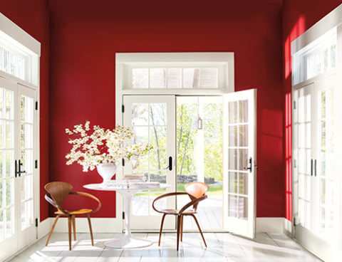
“Caliente is the signature color of a modern architectural masterpiece; a lush carpet rolled out for a grand arrival; the assured backdrop for a book-lined library; a powerful first impression on a glossy front door. The eye can’t help but follow its bold strokes. Harness the vitality.” 

—Ellen O’Neill, Benjamin Moore & Co.

to Sherwin Williams in a totally opposite direction proclaiming Oceanside SW 6496 their color of the year.

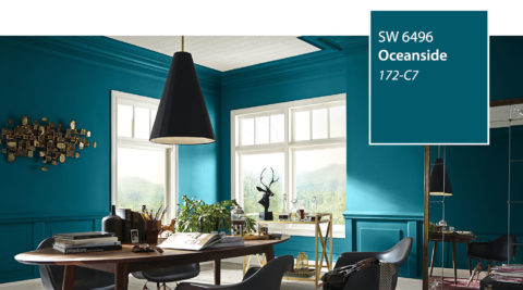
“A collision of rich blue with jewel-toned green, a color that is both accessible and elusive… A complex, deep color that offers a sense of the familiar with a hint of the unknown, Oceanside, bridges together a harmonious balance of blues and greens that can be found in what’s old and new.”

What? Are we straddling now?  Do we have one foot in one color trend while the other stretches across the color wheel and causes us to nearly do the splits trying desperately to hang on?

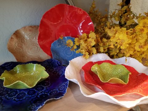
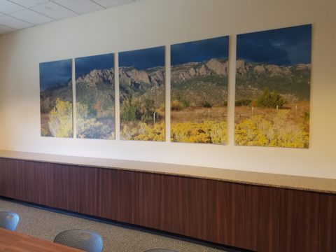
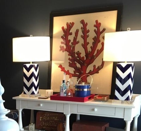
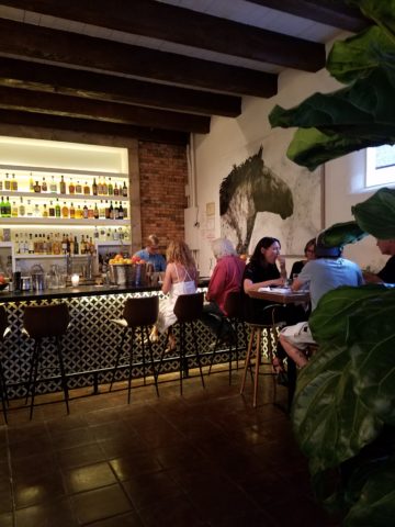
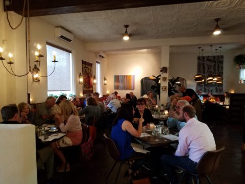
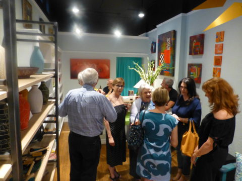
The walls of my east gallery space were a spicy version of Caliente for nearly 20 years! Bold at the time and unheard-of for  gallery walls – it was not to be changed for nearly 2 decades!!!

Whew – that was a run. I even named the retail space “Caliente.” And the color-band between the crown and picture molding at the back was a version of Oceanside – a lighter value of the blue-green hue.

The Grand Re-Opening July 2016 presented a dramatic transformation to a pale aqua resulting in a diametrically opposed feeling – a cleansing from what was crowded and hot to spare and cool.

But I digress…

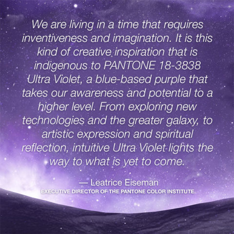
Annoyed by the seeming authority, but weak contrasting rationale that I encountered with the wide range of picks and opinions, I left the paint companies and clicked over to the Pantone site. There I encountered their authoritative, ethereal color forecast of the year – Ultra Violet!!!!!

Yikes – they were coming at me from every conceivable direction!!! How on earth is any eager apartment dwelling or home-owning individual supposed to know how to go forward in sprucing up their space without fear?

Then  I came upon a piece by Mehgan Nesmith Ugh, What’s With These Generational Color “Trends”? From observing the broad reaching trend surrounding millennial pink to snippets from other sources,  I scanned the paragraphs amused, but still not satisfied. Until I arrived at paragraph 6 and there it was – the true fact that keeps the world moving forward – for better or worse – TRENDS DIE.

Yes they do and for good reason. I’ve said it before, take care in making costly selections that will stay with you past their prime. Trends are there for a reason. Designers dabble in creativity every day of the year to come up with things to tantalize, inspire, evoke, and entertain – and most importantly, SELL. Some of these trends stick. Then they are no longer trends, they transition and become classics. But to transcend the fleeting status of trend, “it” must have something very solid about its being.

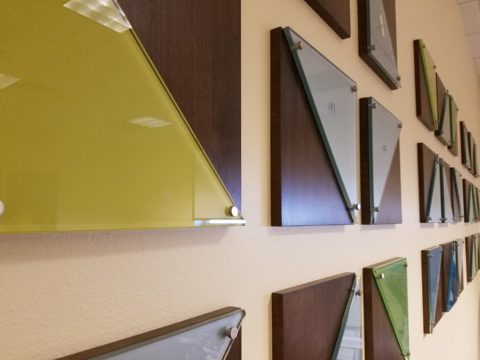
And when it comes to interior design, with all the style trends for furniture, fabrics, architectural elements, finishes and decorative accessories – colors race through history like no other design element has or will. Colors rule and when they are good, they are very very good, but when they are bad, they are horrid!!!!! Thank you Mr. Longfellow!!

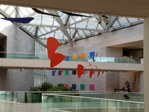
Take the massively graceful modern art piece suspended from the ceiling of the East Wing of the National Art Gallery in Washington, D.C. – classic – both in form and color. Red and black. Strong and simple. Bold and brilliant. Imagine if it were this year’s Pantone pick Ultra Violet  Aghhhh!!!!!!!

Actually, methinks I protest too much. The shade of purple picked, by Pantone, is heavy on the blue rather than the red.  The blue cast gives it a calm. Not whacky like Barney screaming purple – but, rather a royal shade.  Nonetheless, it is better served as an accent – don’t buy  wallpaper in it. Go ahead and paint the walls and have your fun – but know that you can change it without peeling off hundreds, if not thousands of dollars of wall-covering or re-upholstering your sofa like Meghan was tempted to do!!

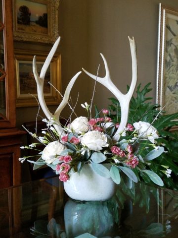
It’s a color that stands alone – plays better by itself than with friends – like the child’s report card where the box that says “plays well with others” is not checked.  In my estimation, it will read well with clean, crisp white.  However, like Ms. Nesmith aptly says in her piece “if you are  still curious about that Gen Z yellow, buy a vase!”

That’s how we play with  colors and create a bit  of collision, unexpected off-key harmony, intrigue and suspense. But it is not for the faint of heart and the chance of tiring of it is paramount. Trends die and colors are tricky.

So Happy New Year and Happy New Colors in your world to refresh and renew!! Thank you Meghan, for your lively contribution to today’s story.


COMFORT & JOY with ART

A few years ago I gave a talk. The title was  something like “I Need a Piece of Art to Go with My Red Sofa.”  It was a defensive argument giving liberty to those who sought artwork for decorative purposes rather than an esoteric rationale. As an interior designer surrounded by artistic influences and drawn to the limitless styles, pieces, concepts and movements of the art world, I see and appreciate both sides of this controversial coin.

Federico Leon de la Vega’s Pomogranates

In my opinion art should bring joy. And that is not to discount art as a social commentary, honest statement of artistic philosophy, opinion, or personal expression. As an interior designer, my simple philosophy is that joy is a goal of interior habitats – function and joy simultaneously. For me, there is a synonym for beauty in there. Oh – and how apropos – it’s Christmas time and the carol God Rest Ye Merry Gentlemen specifically identifies bringing “tidings of comfort and joy.”

In this  month’s December 2017 issue of AD “Architectural Digest” Living with Art, architect Luis Laplace offers that he doesn’t really know about beauty in art. He sounds modest and self-effacing.  “I say I don’t know beauty. When I see that something works, then I see beauty.”  I say that is saying a lot about context. But inasmuch as I can see context being so perfect to showcase a piece that it validates it somehow, it seems lacking in the department of honest personal appreciation or criticism. Surely he must find beauty in art before it is placed.

I can see admitting that something having potential is a valid “wait and see” position to take when allowing a piece to be placed to its best advantage, prior to judging it too harshly – but that seems reserved for pieces about which one is trying to give them the benefit of the doubt! It sounds a bit like tap-dancing…making excuses. Excuses for not having an initial opinion or spontaneous reaction – much less appreciation – much less, joy.

Festive boat bringing JOY at the San Diego harbor parade last week.

Another comment that Laplace makes in this article “High Art” is that “We never use art as a decoration,” he declares. “We design for installation and rotation.” And I am sure in his world, that is exactly what he does. But let’s get down to earth and acknowledge that it’s a chicken and egg thing – the luxury to design expressly for the presentation of magnificent rotating works of art versus finding joy in a piece to decorate your world – with or without rotation. He makes decoration sound like a bad word. And perhaps he thinks it is – but why? Adornment, decoration, enhancement, emphasis – all superlatives, in my estimation.

Federico Leon de la Vega’s Script on Blue

In a completely opposite place on the planet both figuratively and physically, Robert Downey Jr, in this same issue of AD, expresses an explanation for their selections and design direction. “We didn’t set out to do something conspicuously whacky.” He obviously gets great joy and a kick in the pants out of his approach which he cements, with the following comment: “We just enjoy a bit of whimsy and fun.”  And then a negative nod to separate him from the more cerebral art enthusiasts – “We definitely don’t like boring.”

But that is a direct comment on the joy thing and one of my oft borrowed quotes “One man’s trash is another man’s treasure.” Here, a tangible example that I created for my grandson, Liam a few years ago. Debris he and I collected while on a walk one day, I assembled into a collage and had it framed for him with the plaque to remind him to look at things and regard things from all angles.

From what one person derives joy, another might find boring and uninteresting. And that oddly seems to return to the Luis Laplace comment about not seeing beauty until it is placed and then can be recognized. Hmmmm…Yet, I am saying that it might be of value to study things and  think about things differently than face value at a quick glance…spontaneity is valid and so is “love at first sight,” but often things are missed because their context s not serving them well. That space above your red sofa might be just the context and proper setting to showcase the “whatever it is” piece which might be far less interesting otherwise.

Which is why, in this time of international commerce delivering things from all over the planet with an almost instant gratification speed, we still have difficulty making decisions about what to chose to have in our world. Which fabric, which furniture, which art…the choices are at our fingertips and delivered to our doorsteps without leaving our living rooms, but fear of costly mistakes, second guessing trends and how to make good investments still remain the dilemma shared by most. Fear of trusting your own joy. Or, better yet, discovering and defining your personal joy.

Which brings me to the last quote I extracted from the December  2017 issue of AD by an artist, Brian Donnelly, speaking about his own residence and art collection, and that is  “I don’t buy art to put in specific places. I just collect what I love and hope to find a place for it.” Sounds like spontaneous joy to me!!

Closing with best wishes for a Merry Christmas and “tidings of comfort and joy.”


When is Too Much, Not Quite Enough?

Perhaps – when you are an avid collector, limitless treasure-hunter and lover of basic Americana (comprised of the appreciation of indelible graphic design and branding mixed with a healthy dose of green chile cheeseburgers, bodacious bbq and good fun) – it’s never enough! We’re in Hatch, New Mexico at Sparky’s once again!!!! The sensational roadside attraction – Sparky’s burger bastion MUST know when too much is not enough!

Nine and a half years ago Teako made a statement and the word has been spreading ever since!

The opening of this fun and funky establishment started out with a few outrageous signs and vintage mascots like the Colonel Saunders on a bench, Ronald McDonald as the un-official greeter

and a dedication to signature green chile cheeseburgers and mouthwatering bbq. Now both sides of the street (and scattered around town) are towering, larger-than-life icons of days gone by and travelers from all over the world stop to experience this unique site.

But inside, the treasures also abound! With each visit we discover new surprises and exciting additions. Because its Christmas, we were enticed by the “Say Queso” photo scene. We donned funky antlers and cozied up to the decked-out tree, with a backdrop of sparkle and ornament, beneath dangling snowflakes,

flanked by a towering toy soldier and Jolly Old Saint Nick himself!

The stockings were hung in clustered abundance over the entryway to the dining room. No such thing as too many or too much here!!!

The walls are plastered with iconic paraphernalia.

Patina etched tin painted and pitted, with pocks of rust and tarnish – weathered through many storms adding further character to the familiar and not-so familiar pieces, until finding safe haven here in this magical collection.

Camp art un-selfconsciously curated on every square inch of interior space.  A nostalgic presentation and preservation of graphic design and branding.

If you’re a “picker,” a graphic designer, a nostalgia buff, burger and bbq connoisseur or just a kid looking for a memorable bite on the side of the road,

Sparky’s unintentional museum, of the colorfully entertaining and eclectic, will not disappoint! It is a must-see landmark in this our Land of Enchantment.

Be enchanted at Sparky’s! Thanks for the memories!!!!! Keep ’em coming!!!


How Long Did It Take You to Do That?”

Recently chatting with a wonderfully multi-talented mixed-media artist of many colors, Laura Balombini and I commiserated on the Creative Process. A few weeks ago I blogged about the Creative Process as relates to client and designer interaction. Some people enjoy the detailed nature of the process and some prefer to be spared that enjoyment.

This recent conversation explored the hidden facets of the Creative Process. The light bulbs that go off in the wee hours of a sleepless night, the honing over time combinations and details, and the tapestry of life experiences that become the personal library of resources from which creativity is drawn.  Sitting in traffic can even result in an unexpected, seemingly unrelated epiphany!

Often called the inelegant “brain fart,” ideas bombard. They pop out often uninvited – when one is NOT even focusing and trying to come up with a solution. They come about without prompt or foresight. They happen.

Creative minds can rarely unplug. Downtime takes a concerted effort. Even those rare moments of attempted escape are invariably interrupted by unwanted, but often valuable, ideas. Not that the ideas are unwanted, but the spontaneous interruptions can be unavoidably annoying.

Yet, it is exciting. Having ideas and bringing them to fruition is greatly satisfying.  Balombini was bemoaning a similar quandary. Often asked “How long did it take you to paint that?” She said to me that the answer was obvious, but not what the observer wants to hear. Sometimes it takes minutes and other times it takes months. How can one charge the same square inch price or similar range of value for one piece that takes little time and something that takes much longer?  She lamented that she wished curious observers would direct their questions more toward a genuine interest in the “process.” Such as, “How did you come to select that color combination?” or “What inspired this assemblage?”


Inspiration is not a straight line. It is trial and error. It is a combination and accumulation of layers of ideas and fragments of many experiences. It is an illuminating and distilling of observations – all stored in the many compartments of the creative mind to be extracted and applied as the opportunities warrant.

Where she and I differ is that she, as an artist, creates constantly as a part of her process – as a necessity of her creativity and/or in hope of attracting a buyer (unless it is a commission – in which case, she hopes to satisfy the buyer) and I, as an interior designer, provide clients a service of creative ideas, solutions, suggestions and opinions toward an end. The ideas are selected, dismissed, modified and ultimately executed resulting in a finished design that is the product of the Creative Process. The creative services should provide effective solutions and be unique and thoughtfully custom-tailored for the client’s individual requirements and desires. The solutions are a result of many educated elements, collected life experiences and observations.

To appreciate what it takes to create is to take an interest in the complexities of the “process”. What might take minutes, to convey or even execute, results from a thought process and observations that are without boundary. The cumulative collection of experiences is what enable the designer or artist to find creative solutions, offer a variety of ideas and possibilities. This is the shared commonality of our discussion.

How often have you strolled through a museum or art gallery and thought, “I could do that!”

Have you ever attended a wine and paint event and tried to render the subject and watched as other of your fun-loving companions struggle to do the same, with as many different results as there are participants at the party? Copying is not easy, but it is very different from originating.

As I pondered this blog’s subject yesterday, in advance of putting it into print, another remarkably related and coincidental exchange took place. There I stood in the company of two co-workers of a business office for which I had designed the interior. They, having arrived after the project had been completed, were not privy to the details of the design elements and the process over months that took place. One asked the origin of the art series punctuating the east wall of the reception area. It was a collection of contiguous abstracted landscapes with rough dashes of brush strokes and stacked layers of color.  She asked if it was a result of a wine and paint party. I was aghast.

But upon further conversation it was clear that they recognized the same sized images, with a similar subject matter on each and the same color palette – not thinking beyond to the technically un-selfconscious (I like that word) process and ultimate application and execution. As we looked more closely and discussed the complexity of the texture and layering they came to understand that had they or I tried to copy it, we would not have had that remarkably un-selfconscious effect.  Ours would be more tense and rigid, in the attempt to be relaxed, loose and seemingly simple.  A new appreciation was realized. I had initiated an artistically creative commission from the very talented Federico Leon de la Vega as a solution for a long expanse with a splash of colorful, original, sophistication.

Artistic creativity is nebulous like a blond grabbing at the air…collecting her thoughts!!! Yet that nebulous creativity results in concrete solutions. Commission a painting, ask questions, buy one spontaneously when you like it, retain an interior designer and appreciate the Creative Process. Be creative and have a little fun. Try not to let it interfere with, or usurp, your attempts at some relaxing downtime.

The thickly applied paint on the canvas of the feature image, for this story, is by Ron Cheek. Incredible color balance, generous application of oil paint and loose strokes layered to present a powerful landscape. How long did it take him to do that? A lifetime up to that point.

Please visit our boutique gallery/design studio in downtown Albuquerque to see work by  these fine artists and others!

COOK + PARTY: Set the Stage for Style with Art in Daily Life

Having art woven through the daily activities of your world is stimulating, satisfying and inspirational. It stimulates the imagination, satisfies with the knowledge that is was created by an individual artist and inspires to spur the creativity we each have to express – whether we know it or not. It encourages appreciation.

Functional art is a cornerstone of the work we offer at PATRICIAN DESIGN. As a novel promotion of the various artists who create and produce exciting food-safe serving pieces on display and for sale in our shop and affirmation, of the belief we have that art should set the stage for style in daily life, we began our series – Patti’s COOK + PARTY. We like to party and we love art – so we party with art at the  center of the  festivities!!!! Let’s get this party started!!!!!

Six months ago, we began our series and followed the seasons as we progressed. By Fourth of July we featured festive party parfaits in expected red, white and blue! Our martini glasses were placed upon colorful cocktail coasters hand dyed and pieced into pretty patchwork squares by fiber artist, Rebecca Speakes!

Micheladas were given a twist with plump yellow heirloom tomatoes! Alongside was a fresh guacamole featured in a rippled-edged undulating little piece of pottery by artist Anne Marie Werner Smith.

Her collection is wonderful and we continue to feature key pieces in our weekly recipe pairings.

The pairing of recipes, with handmade art pieces on which to present and serve is inspiring. Here is a New York Strip steak bathed in a crazy fresh, from the garden, combination of pesto/chimichurri (yes, we created some crazy combinations of the two) sauce presented on a fanciful leaf platter by artist Robin Chlad!

Seeing examples of fun recipe ideas displayed on functional art creations is an unbeatable combination. Just tell Guy Fieri that for his Next Big Project!!! Rooting out artist’s studios in every pocket of the country and discovering great work and pairing it with great food – fantastic!

The colorful drawings and painterly style of Mariana Gasteyer’s pottery is whimsical and festive! Here a couple of examples and a fabulous featured recipe of a paired pear salad – half roasted and half freshly sliced – the combination was divine and the presentation on the platter was perfection!

A summer road trip took us too Tucson where we featured a huge lotus platter by artist Penne Roberts. Here we featured a vintage Shrimp Louis Salad.


As fall progressed, we hiked Tent Rocks to photo this amazing platform piece by Jenn Dipaolo.

Upon the platform we placed a pair of sweet and savory mini pumpkin pots de creme.

This past week we featured a dazzling, luminous glass sunflower bowl Margaret Hidalgo Vanderheyden.

This spectacular fused glass assemblage frames our pecan crusted cheese ball perfectly.  Fall colors with holiday flair, this bowl makes a statement!!!

Supporting local artists, showcasing their pieces by pairing with food is the  bomb!

Start family traditions with signature art pieces, build collections and shop  small supporting local artists in your community!!!

If you would like to receive our weekly Patti’s COOK + PARTY recipes and pairings with our functional art finds, let us know what you think and sign-up with your email address!!

Custom Designed Art for Branding in Commercial Interiors

Designing artwork for commercial interiors offers an opportunity to connect to the brand. It means that we take into consideration the artwork as relates to the business and its identity. You might remember a blog from last year about the can wall. It was designed for a taproom. The theme was beer. The name was “Silver” and we considered that a natural off-shoot of that was the silver color of aluminum beer cans – as a wall treatment!

For that same project (in two locations) we further emphasized the brand with photos we took of their own products transferred to and stretched on canvas stretchers to be the “art” on the surrounding walls.


Fast forward to a conference room for an energy company home-based in Albuquerque – the iconic Sandia mountain being the earth’s monument – the familiar, perfect image to represent the company and the connection to the earth and its resources. For this  project, we were asked to build 27′ of custom , cabinetry and dress the wall above it.

The tall ceilings required a vertical element, but the length of the wall also begged for horizontal space-filling. As a cost-effective solution to such a large space, we decided to take a photo of the majestic mountain, separate it into 5 sections and have it enlarged and transferred onto aluminum panels for light weight and rigidity. The reviews were sensational as everyone loves and relates to the familiar scene – seen in such a colorfully explosive and expansive installation.

In response to the success of that solution, the client asked for a complimentary treatment for the opposing wall. Again, the wall was 27′ long and had the same ceiling height so we used multiple fragments in 3 groupings to center across the entire expanse. “Elemental Fragments” was born of the concept to have just that – fragments of elements in an orderly fashion – uniform yet random, to contrast against its formal geometry in response to the amorphous photographic landscape. Colors were derived from the blue, green and yellow in the scenic panorama interspersed in a field of silver.

Last week, on the day of the installation, colorful creative chaos – resulting from unwrapping the individually hand-crafted compositions and scattering them across the conference table – was part of the fun, of the scene.

The tedious work of aligning all just right, with perfect spacing and level mounting, added to the anticipation of realizing the finished product.

The luminous glass against the rich, stained wood punctuated with the  brushed stainless fasteners made a striking assembly.

Modern engineering and production, worldwide energy collaborations and shared technology coming together in a grounded environment of people and their place on the planet. A daunting system of assembling fragments of many elements that make things work to bring gas to the end users. The artwork makes the concept look easy. The result of the many facets, of the actual work and the artwork representing it, is not only effective, it is triumphal.

It’s creative fun to custom design pieces to relate to the brand, the business and the culture of a project. Bringing joy, pride and a sense of confidence in the focus of the work, to the employees and guests, is a successful finale.

Bring us your design challenge and we will design a solution specifically and especially for YOU!!!


Loved Loving Vincent!!!!

Last night was a crystal clear starry starry night as we strolled down the quiet urban sidewalk, between the building facades, on our way to what we soon came to realize was an event we would never forget. Once settled in our seats and after way too many previews, the magic began and we were instantly mesmerized by the millions of brushstrokes of over 100 artists recreating the world immediately before and for a year after the death of Vincent Van Gogh.

There, in a cozy theater downtown, we experienced a wondrous film, Loving Vincent. We embarked on a extraordinary journey and were lost in this fanciful world of brilliant color and bold movement as the movie unfolded with an animation unlike we had ever experienced. It was a though we were watching Van Gogh paint this film. The rough deliberate strokes were actually moving as the scenes unfolded – the scenes were alive with the movement of the animation.

http://lovingvincent.com/

This remarkable delivery vehicle to convey a portion of Van Gogh’s world brought colors dancing – even screaming – across the screen in familiar swirls, and deliberate marks that were so identifiably his. What the artists were able to accomplish was astonishing. The focal surface of the theater was busy with the seemingly live brushstrokes of Vincent Van Gogh. Borrowing from his actual paintings, the viewer is transported into the world of his interpretation from street scenes where he experienced the corner with the yellow house to capturing individual’s who appeared throughout the film such as The Zouave in his red hat distinctive of his French military service, to the bearded postman, Joseph Roulin, who was so key in the intimate, mysterious and different story line, the expansive scenery of Provence and the intimate details of daily life.

As a true Van Gogh fan, it  was love at first sight – do you remember where you were when first introduced to his magic? Having grown-up in Washington, D.C. I was fortunate to have had family visits and school field trips to the magnificent National Gallery of Art where, upon each visit starting at a very young age, I would scour the gift shop for postcards of my favorite images – taking home with me memories of the beautiful influences that have continued to shape my appreciation for color and composition, balance and light, contrast and context, subject matter and the power of observation. I must credit my  mother and grandmother for instilling in me this awareness of things of beauty and their importance in our lives.

Fast-forward a bit…way back when…dare I admit…when first studying art history in college, the bible was HW Janson’s HISTORY OF ART. A daunting tome filled with the overview of all that is art as we knew it at the time. Van Gogh and his impressionist colleagues were sprinkled throughout latter portion of the book.

There his genius was once again presented to me stirring a wild appreciation for his rebellious disregard for conventional painting styles. He possessed and fed his own passionate, if not desperate, need to apply paint to surfaces, capturing life and telling stories from his unique and insightfully perceptive vantage point.  The Impressionists have always stirred a passion for the boldly colorful, adventuresome, romantic and sensitively sensual expressions of life for me.

Years later my husband and I were fortunate to attend the National Gallery’s exhibit Masterpieces from the Van Gogh Museum Amsterdam.

It was the fall of 1998 and we were thrilled to be walking toward the oh so familiar edifice with great eagerness for what awaited.

The line wrapped the building, but moved along with efficient, orderly procession as the anticipation grew with each forward step.

Inside we purchased the audio tour tapes and, with headsets on, immersed ourselves for the next few hours in the dazzling world of this remarkable artist.

His unique undaunted expression of the scenes, people and details around him, through his own unschooled techniques, was awe-inspiring.

Tormented and tested he discovered his passion and for a very few years carving out an indelible place that will live, breathe and be enjoyed forever.

The people in their joys and sorrows, fashion of the time, landscapes of bountiful beauty, interiors of keenly observed detail all expressed through his sensitive eye and brought to generations of viewers – a priceless gift to the world.

The take-away…embrace bold expression, fear not color in your world, appreciate the details, and go see this film, Loving Vincent, before it leaves a theater near YOU!!!!

Regional Design Fun!

So many regions, so little time!!!! All the design directions available based upon where you are and what you love – just think!! Regional design provides a strong connection to the surrounding environs. From selecting artwork to color schemes, decorative accessories and even room scents, creating regionally specific interiors is a fun way to go. Often reserved for second homes, the novelty of focusing  on the design theme specific to the region does not always reflect real life.

Real life is usually comprised of a variety  of experiences, tastes, acquired objects, interests etc…designing around a specific regional theme is more deliberately focused and therefore not as eclectic as a person’s true life experiences and resulting accumulation of possessions and reflection of varied interests.

Seaside design would incorporate decorative accessories, fabrics and colors to represent the surroundings such as nautical themes and the elements of the natural scene incorporating seashells, seascapes, etc…

Therefore, the primary place of residence in such a locale would reflect that context but not necessarily be completely designed around it. The second home would have the novelty of centering the design exclusively on that seaside theme.

Here is a stunning example of the Americana By the Sea Bungalow! A spritz or burning of Votivo’s White Ocean Sands in this scene – oh heck – why? Just open the windows and breathe in the salty sea air!!!

While in the metropolitan Washington area, one can’t help but notice the architectural influence of colonial times and the interiors which reflect the same.

Steeped in the history of our relatively young country and the pre-colonial decorative arts that came across the water to the New World, the antiques, reproductions and embellishments are telling.

This whimsical casita in Santa Fe illustrates the colorful folk-art of both old and New Mexico, bold paint colors, graphic transitions, and the enchanting architecture of adobe charm. As a second home, the extravagance of collecting and displaying in a fanciful setting is a fun, on-going project!

A corner cabinet by acclaimed folk-art painter Barbara Peabody makes a bold statement housing additional collectibles from Old and New Mexico. A giclee print of a fabulous watercolor by Susan Weeks – the art of decoratively detailed cowboy boots.

Where do YOU live? What themes from your area do you incorporate in your interior design? Get out there are soak it in, gather ideas, start collections, buy local and have fun!!!!!!

Design Inspirations in the City Different

Do YOU know the way to Santa Fe, to play off of a song by another title? Up the hill and beneath a brilliant blue sky, the thunder clouds scatter with dramatic splendor. Past the cedar dotted landscape with punctuation of piñon the seasonal monsoonal green is blanketing the desert. A thrilling view passing swiftly, outside the window, like a series of paintings capturing  surreal scenes – always picturesque.

It’s July in The Land of Enchantment and a weekend getaway, in Santa Fe, promises stimulating design treats and artistic inspiration! Every visit is familiar – yet new. Around every corner, there is detail and color, decoration and un-selfconscious art.

Just when you think the Santa Fe market is saturated with myriad fabulous dining options, Paloma hits the ground running, on Guadalupe Street, to shake things up a bit!

The joy of experiencing the very new restaurant of an amazing friend was exhilarating! Marja Martin, la propietaria of this great new venue Paloma, brings limitless talent, outstanding vision and distinctive creativity to everything she touches.

The quite well-seeded Santa Fe dining scene is recipient of her newest endeavor. Already a well-established and well loved caterer, her artistic sensitivity and smart culinary concepts – that have been her signature – now result in a presentation of stunning unpretentious decor and exceptional  flavors. She’s giving patrons bold flavors and creative combinations inspired by true dining experiences, with our many-faceted Mexican neighbor’s to the south. The result is fun and transporting, in its authenticity.

Walking home, to the lovely casita of dear friends, the gates and doorways, patterns and particulars – uniquely New Mexican in their expression of design offer photographic treats. It’s magic. It’s exciting. It should be on everyone’s list to take the time to explore.

It’s as though history and current trends collide to create a patchwork of texture and color all to stimulate the senses. Exotic flavors and international everything all presented in the confines and context of this extraordinary place.

Interior design and exterior design bombarding from every pocket including this provocative little prose to ponder at Sonder. Get out there are feed your senses!


DIY – Inspiration is All Around!

DIY is so in vogue. Where it used to be chic to hire someone to do everything in your world, now practicality rules! The savings and fun of doing things yourself is huge. There are so many inspirations on-line. Ideas overflow-ith and the possibilities are endless.

Where do you get YOUR inspiration? It’s all around us. I had been contemplating a shower/wedding gift. I always prefer to find something unique rather than picking from a registry at Nordstrom’s or William Sonoma…but this one was a challenge.

Recently, my inspiration came from taking a morning walk through the desert.

The decorative graphic on the invitation was a floral arrangement of soft pastels and antlers. Yes, antlers. This bride-to-be is a hunter. A long, lanky, beautiful, feminine, crack shot! I’ve known her since she was a toddler. I had been picturing that graphic in my mind in an effort to divine some special gift that related to that theme…something uniquely memorable and lasting.

As I walked through the rough desert grasses and around piles of dead tumbleweeds I regarded them with a new-found appreciation. They had such an interesting structural framework that I realized that they clearly resembled antlers.

They became the springboard for a floral arrangement that would replicate the theme of the invitation and, with that, I began selecting them and carefully carrying their rotund prickly selves back to the car.

Next step – what else will make this a successful rendition of the theme I was trying to emulate? Off to the craft stores! I selected delicate, creamy-white wooden roses, soft pink mini silk roses and some fill from both Michael’s and Hobby Lobby. The PERFECT ceramic vessel presented itself in an soft, oval shape glazed in a powder blue, but with edges and character that offered attractive, desirable, intentional imperfection.

As I have mentioned in past stories, a successful designer has a good team. Building a team to realize your dreams is the key to that success and I called on my very special and exquisitely talented floral designer to assemble my gatherings into the image of my intent. Melba has made my dreams come true for years. She gets into my head and interprets my words and elements to create a finished product that has hit the nail on the head over and over again.

I pulled out the many materials that I had purchased. She evaluated each, talked to me about my concept, and studied the combinations that were laid out on the table.

This piece exceeded my expectations. The fine branches of the tumbleweeds were the delicate punctuation amidst the flowers.

When she actually ordered real, bleached deer antlers that became the statuary of the piece, I was thrilled! Not only was the finished arrangement perfection, I didn’t think it was realistic to expect to get real antlers and incorporate them into this design in such short notice. She had less than 2 weeks! It was spectacular.

DIY inspiration is all around – even in dead, dried tumbleweeds. Creativity begins with a concept and progresses with the fun of making it uniquely yours. Team DIY!