Conquering the Fear of Color – A Q&A Interview with Patti

The serenity of neutral color schemes has a significant place in interior design. However, it is more about the fear of color that I approach this article today. Committing to color arrests most people – they want it and admire it but are fearful about selecting and committing to bold colors.

Beautiful neutrals are a color all to themselves. Layers of whites, creams, grays offer sophisticated schemes.

However, that is not all that causes clients to reach out for assistance. Even if they have made a decision about taking the leap, it is how much, where and with what or to what the color is applied or occurs.

A white kitchen receives a patchwork of blue and white Talavera tile as a backdrop adding depth and interest.
In addition, upon closer inspection, we have incorporated a fine detail of an aqua glazed Spanish tile running horizontally and vertically through the patterned tiles.

I remember when architect Antoine Predock’s project for United Blood Services in Albuquerque https://bit.ly/3LBQbDv made a splash – a really RED splash when he stuccoed the entire exterior brazenly brilliant, bold, blood red! It was astonishing – astonishingly effective!!! https://bit.ly/3NNQihd If a picture speaks a thousand words, color is right there in conveying remarkable communications.

From branding to personal style, color is key.

The addition of our tongue and groove walnut wall established the theme for the rest of the furniture in this interior.


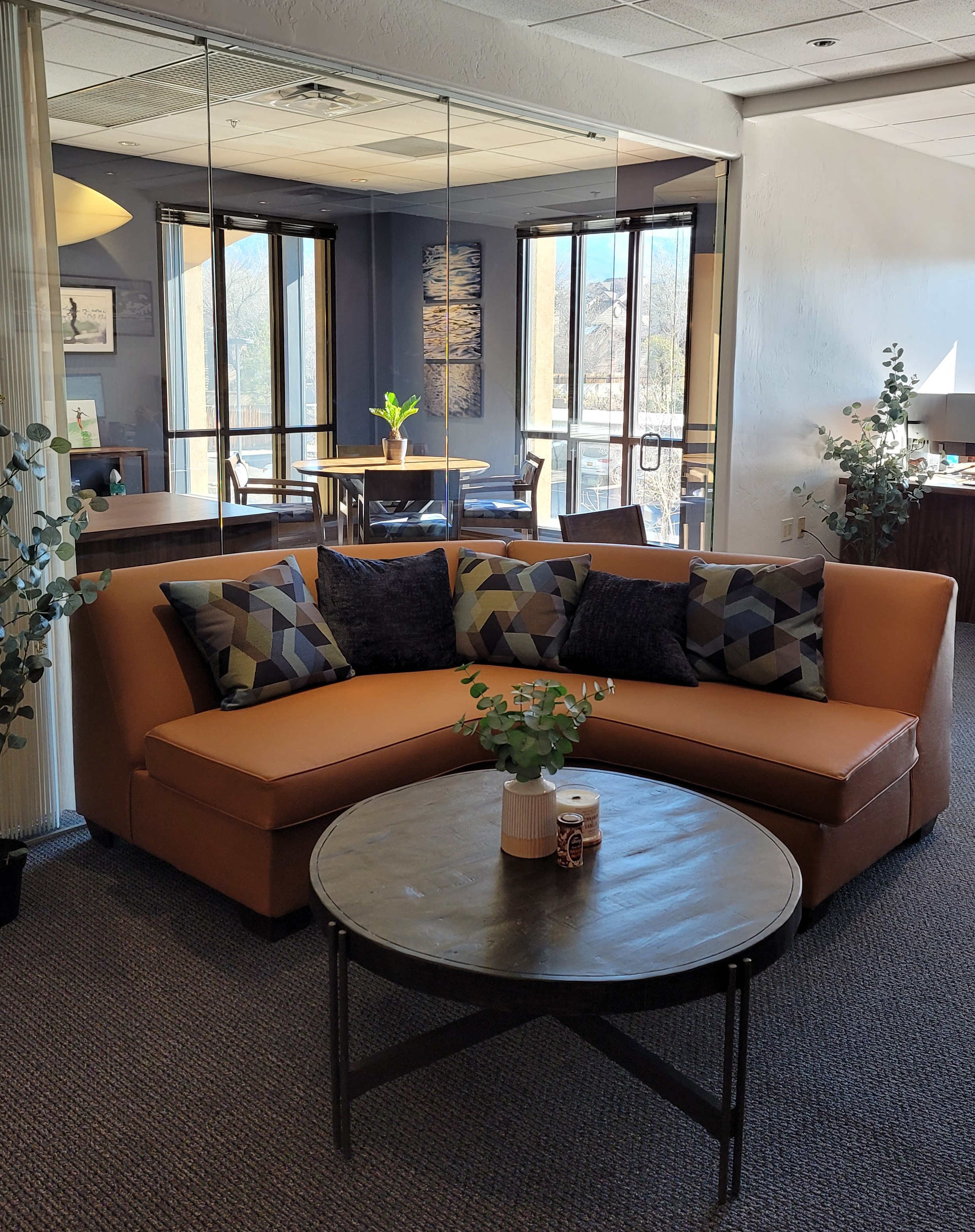
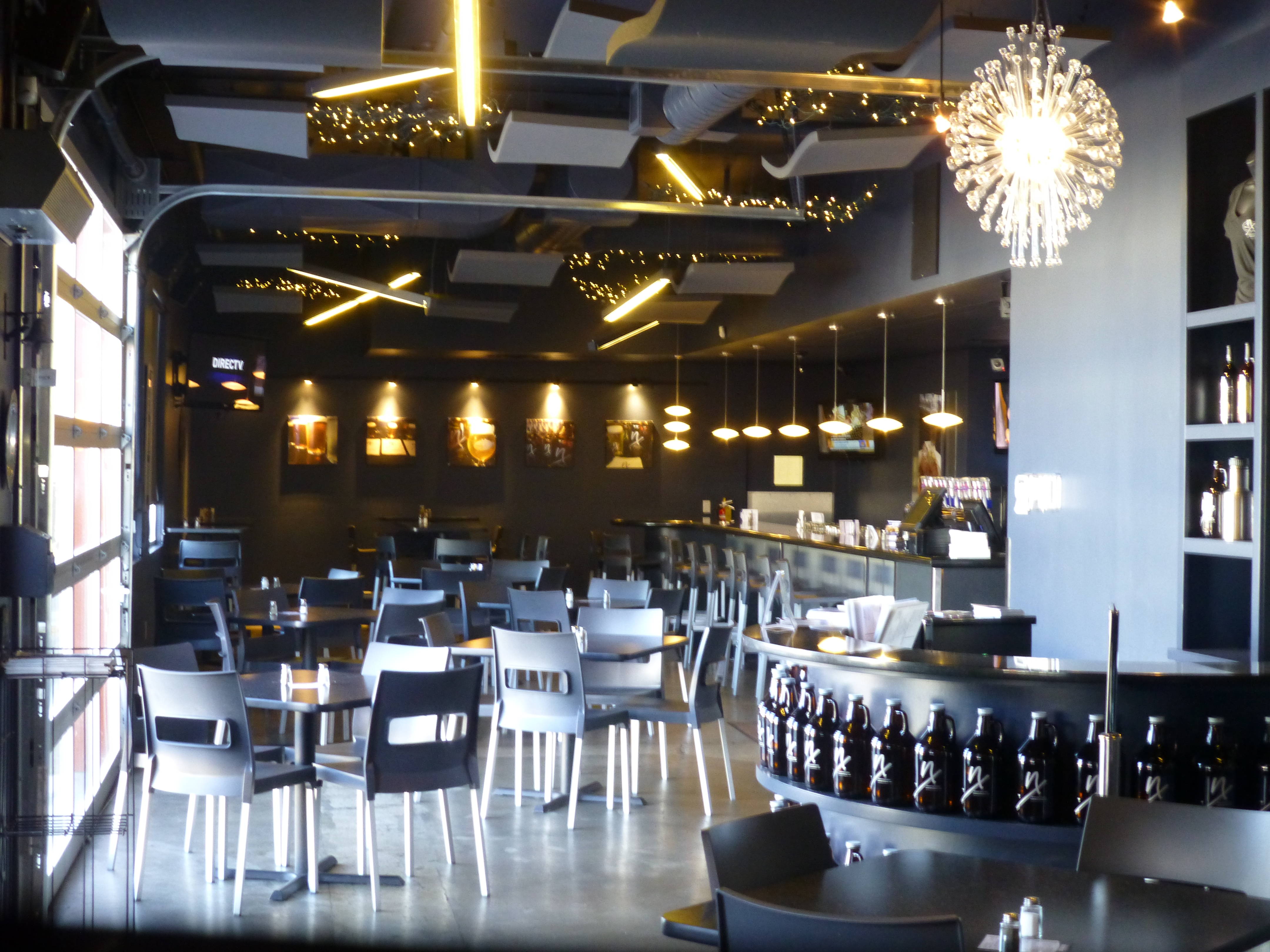
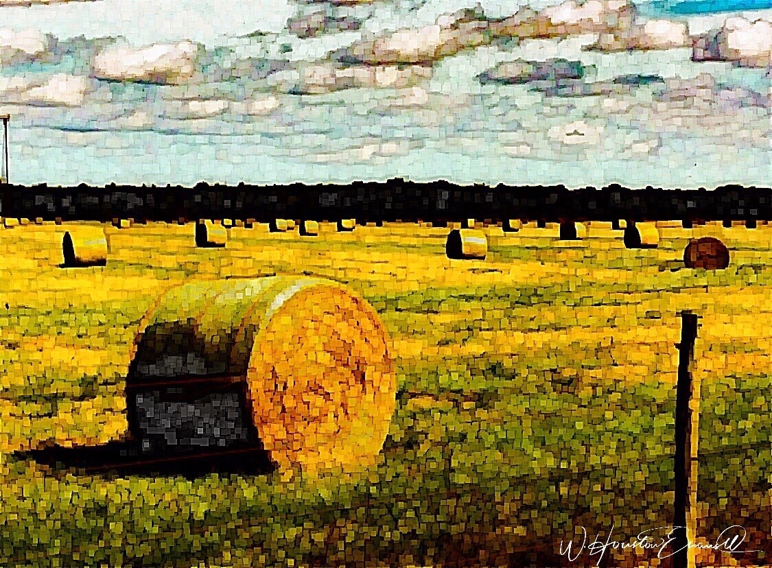
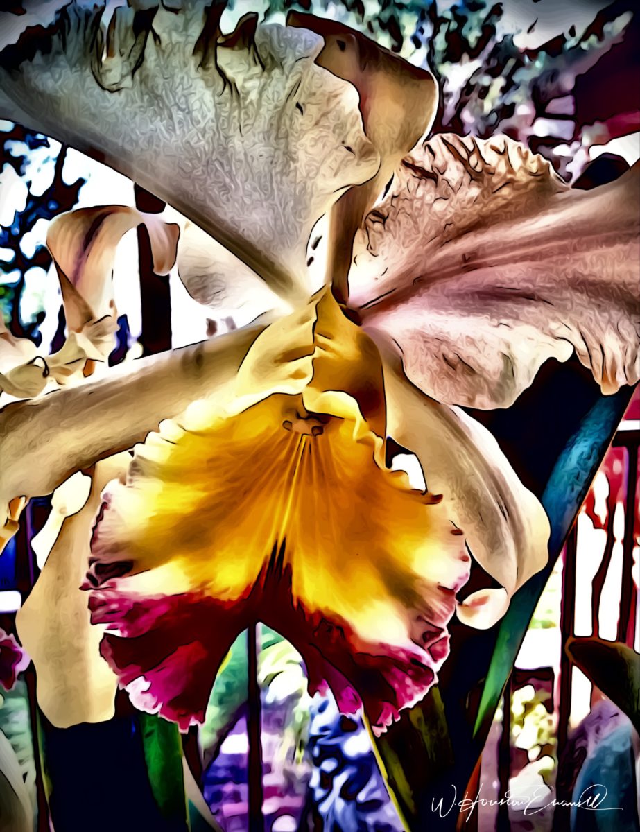
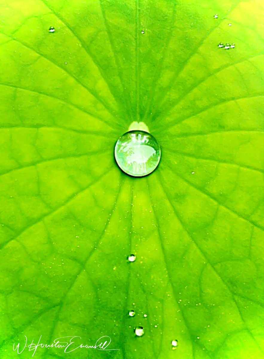
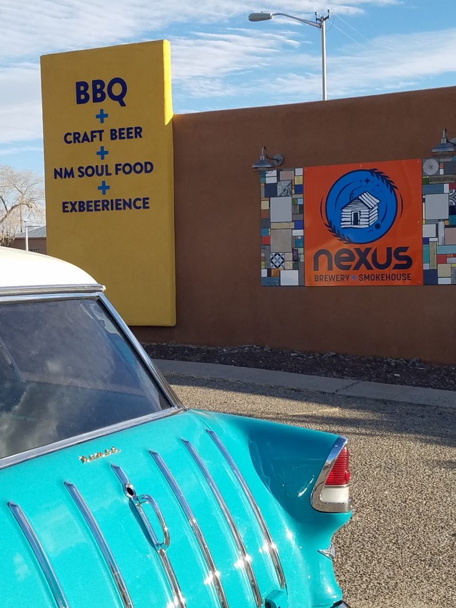
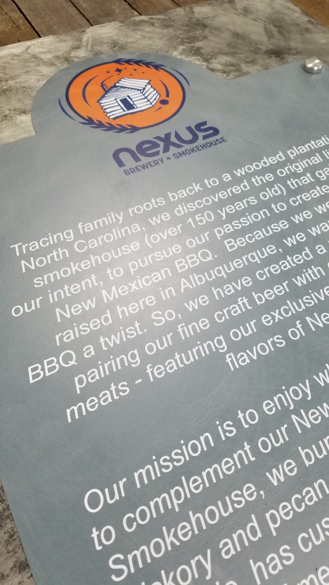
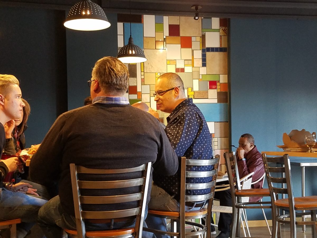
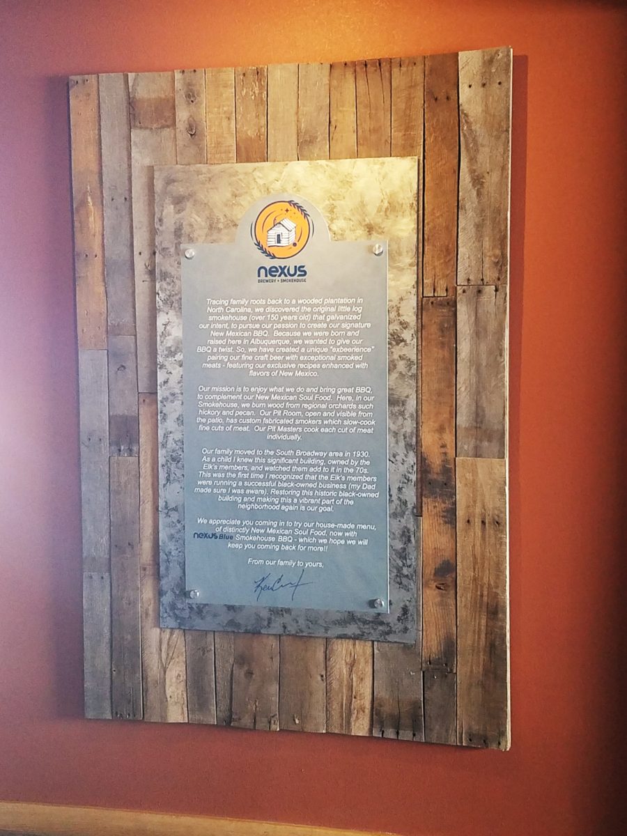
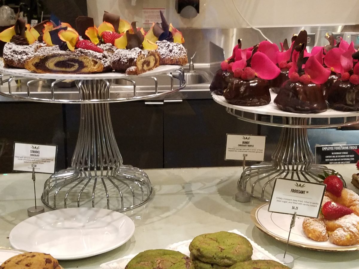
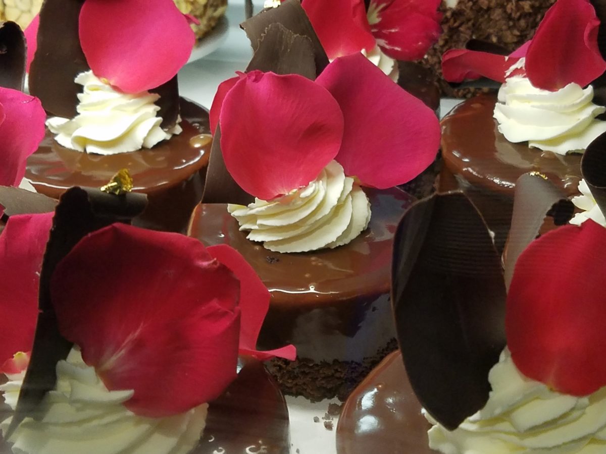
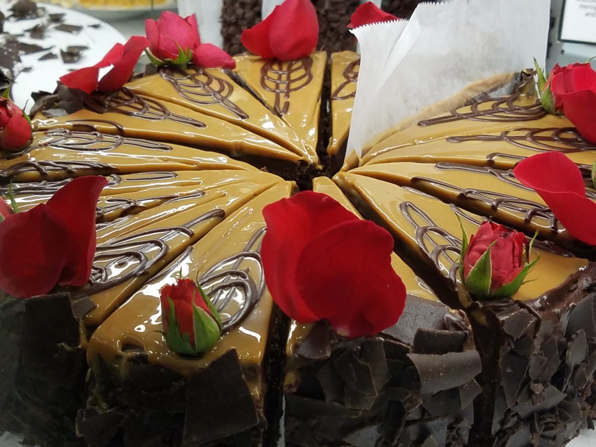
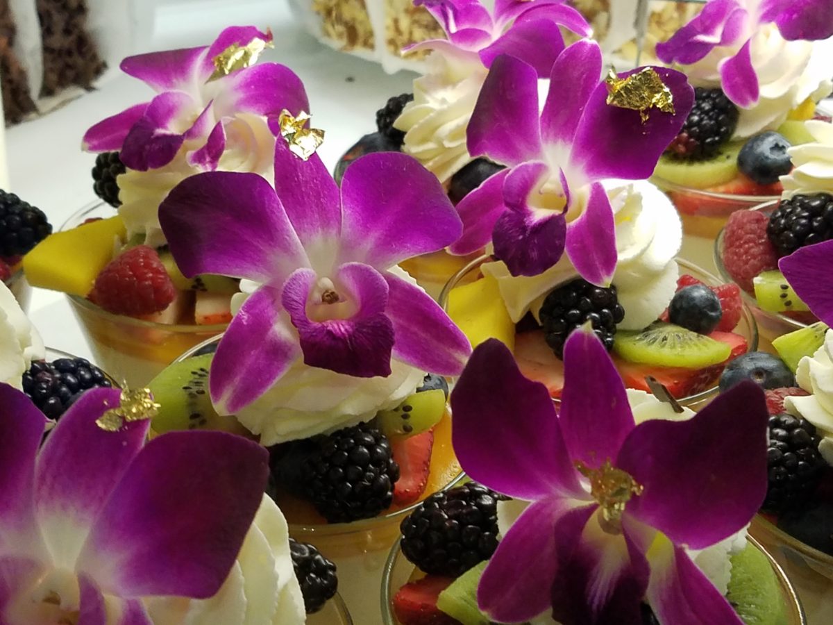
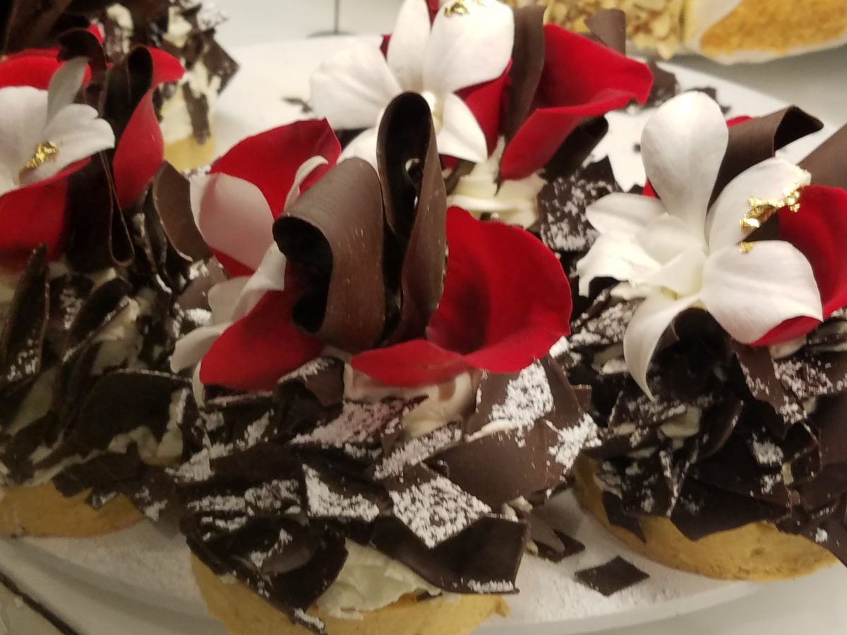
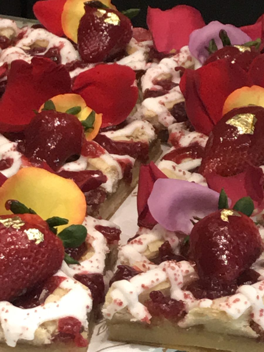
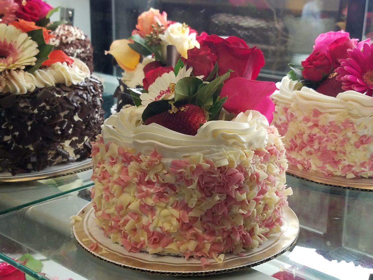
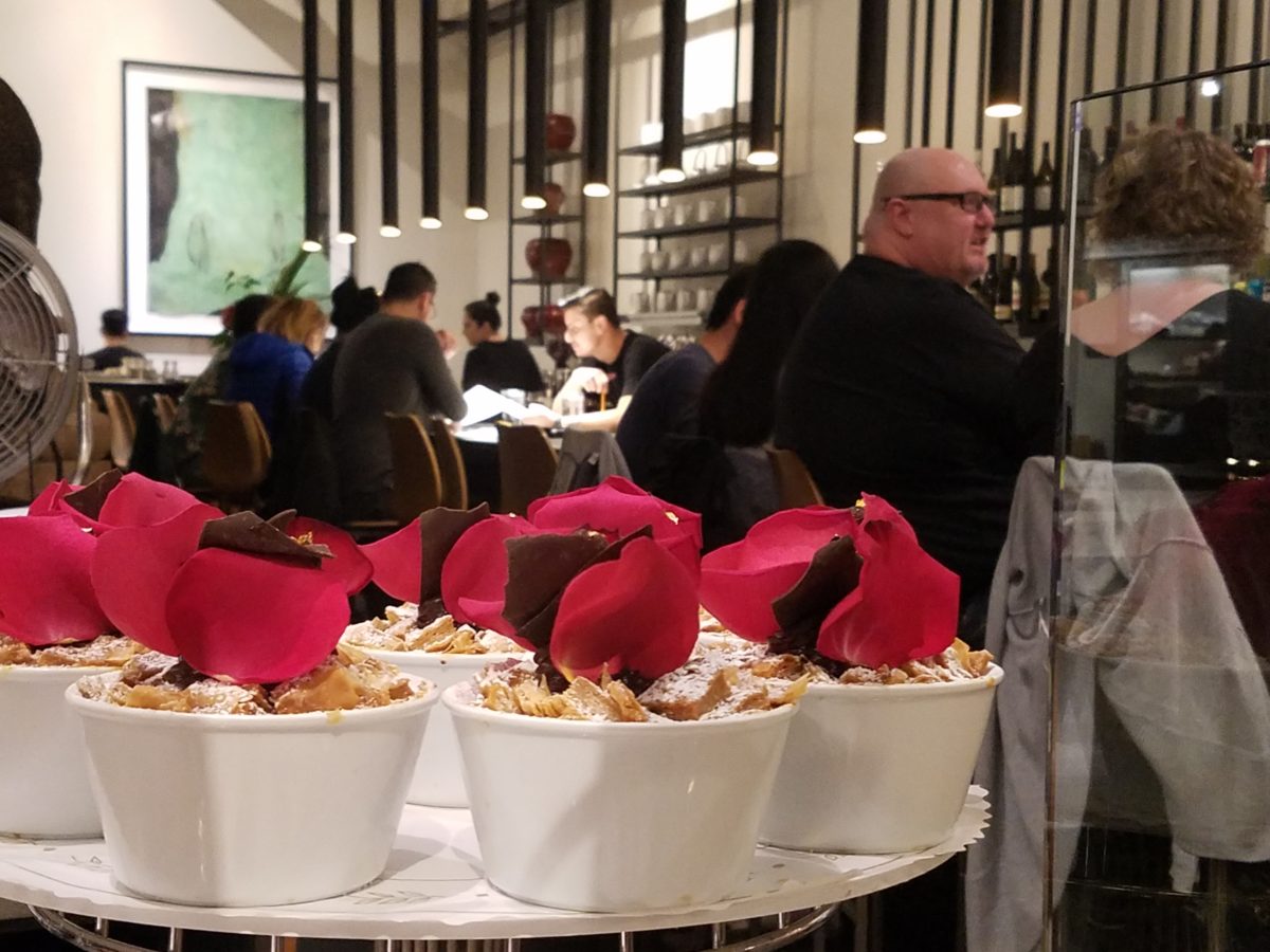
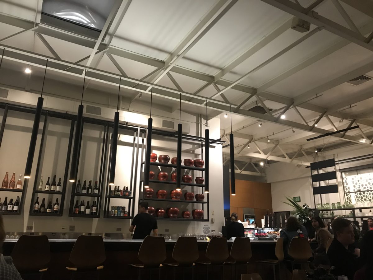
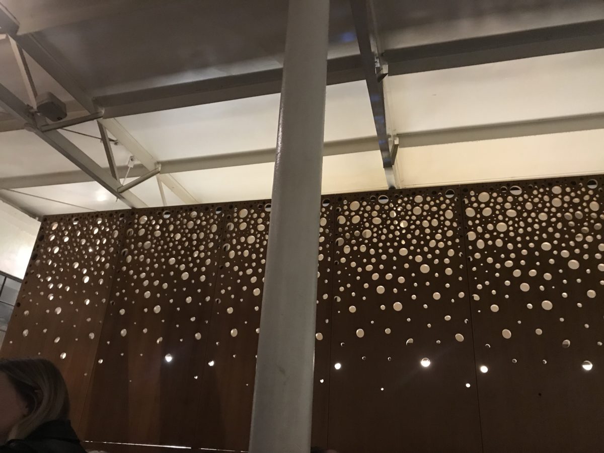
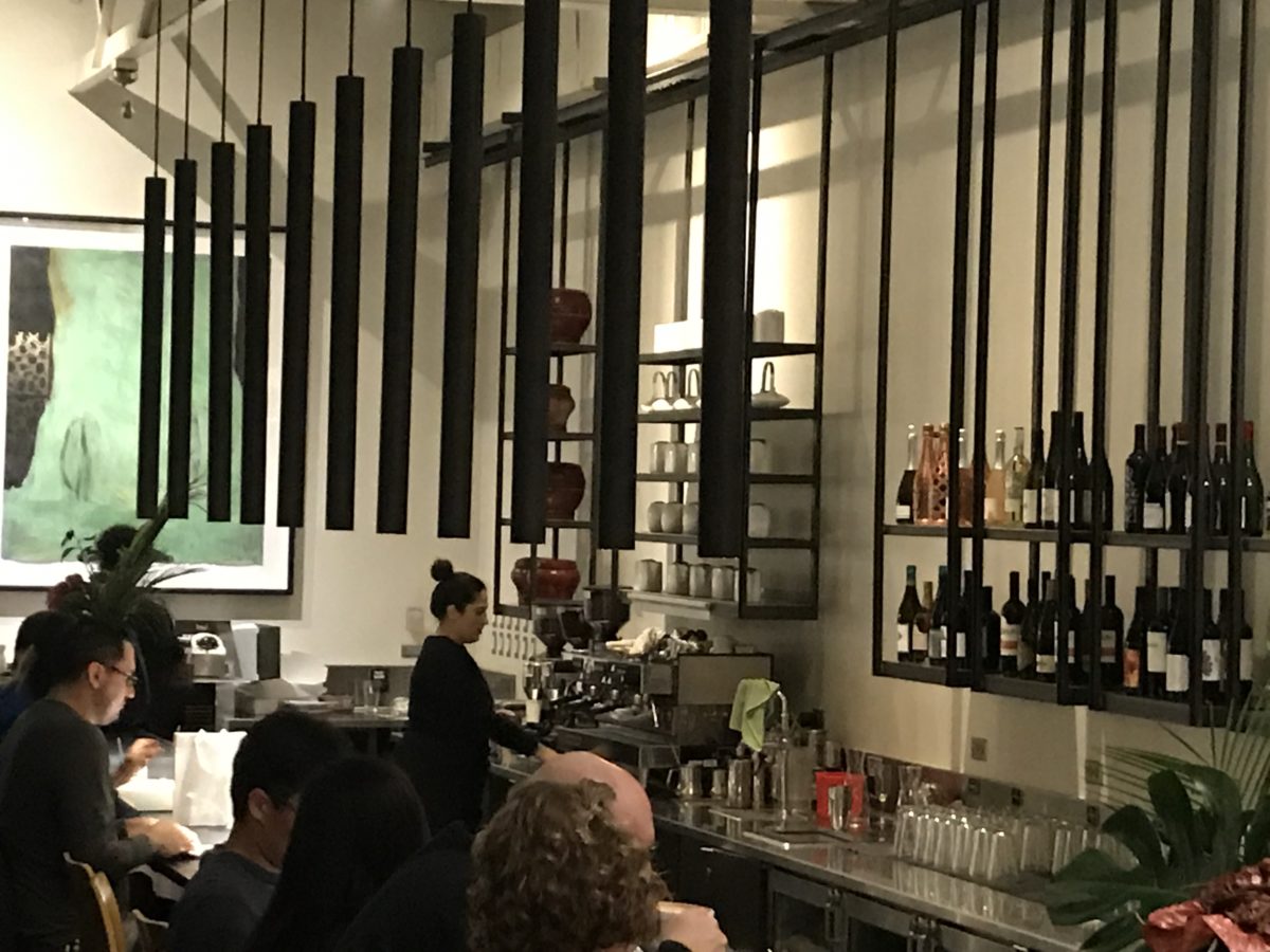
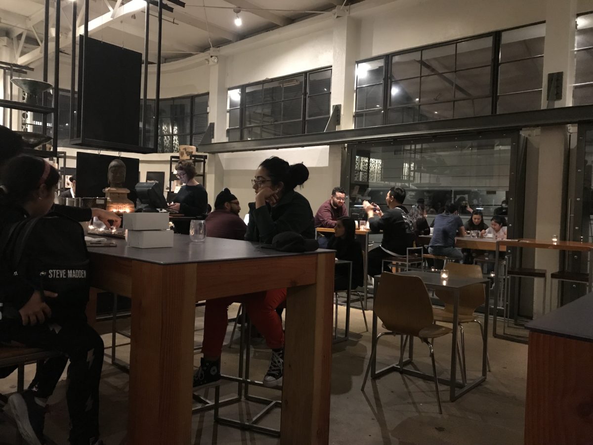
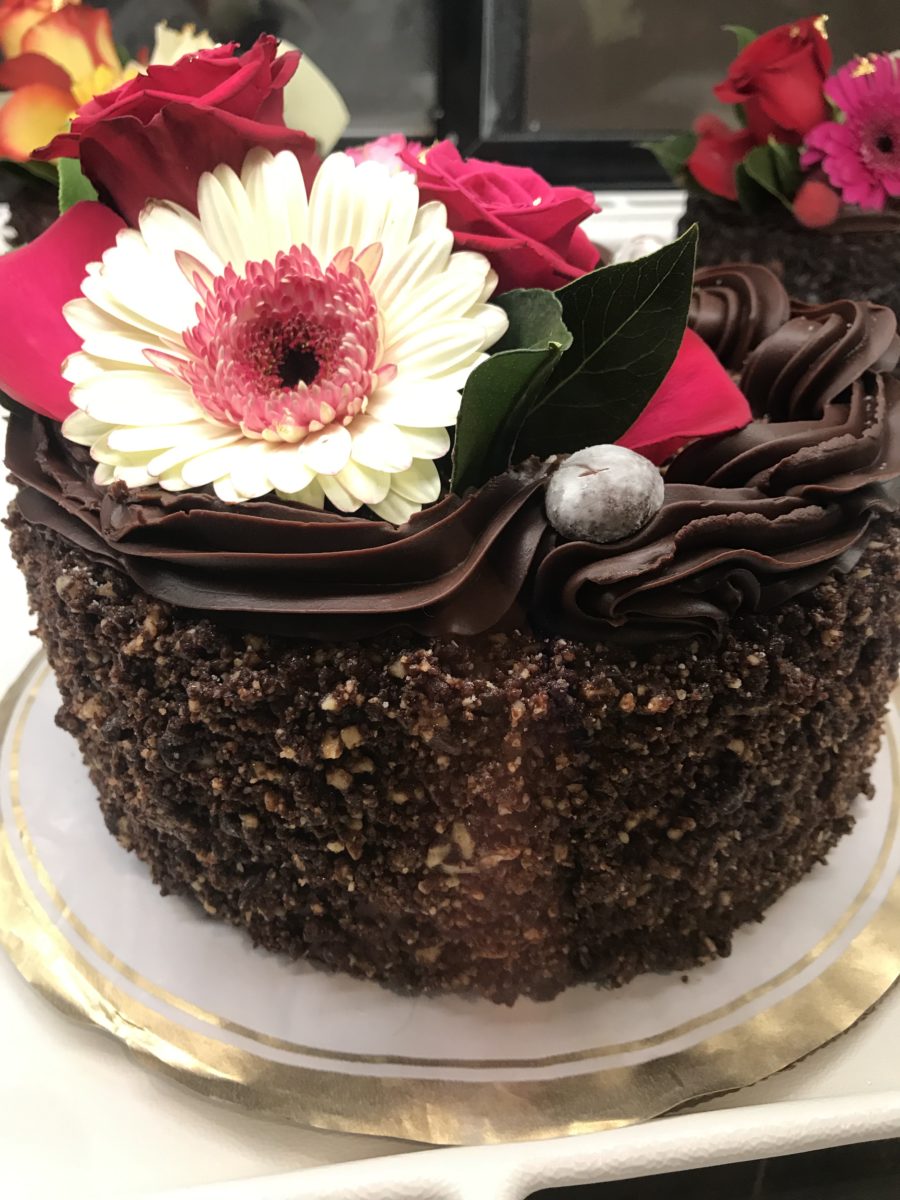
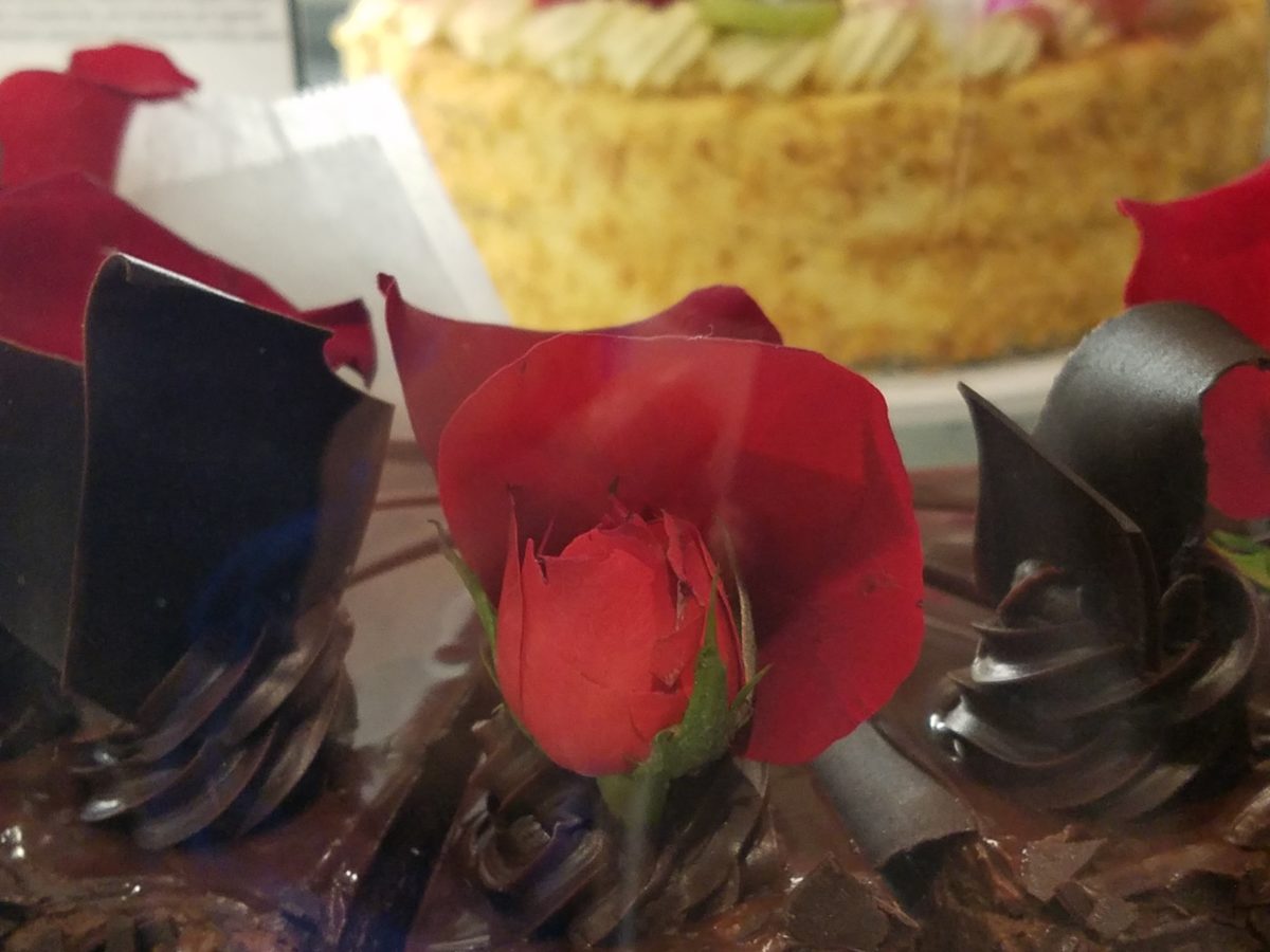
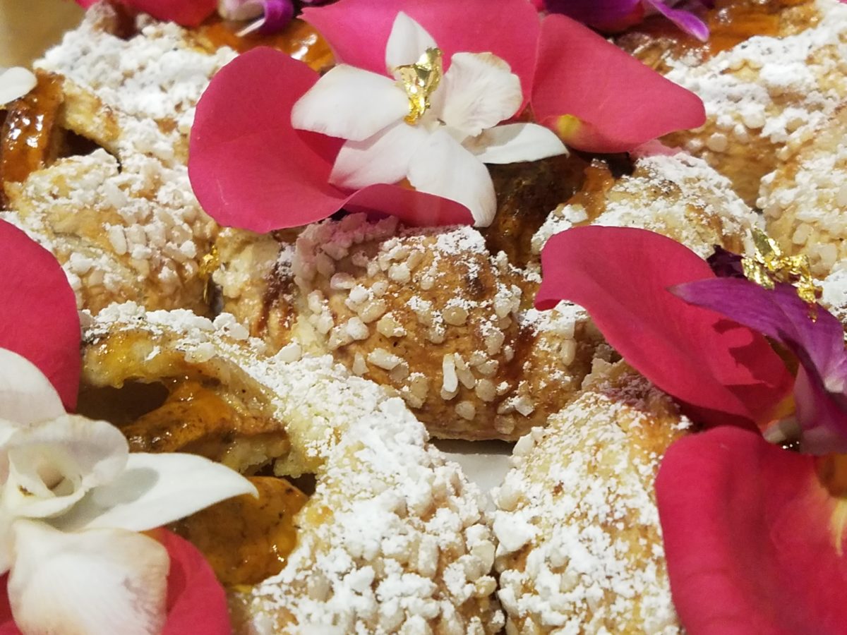
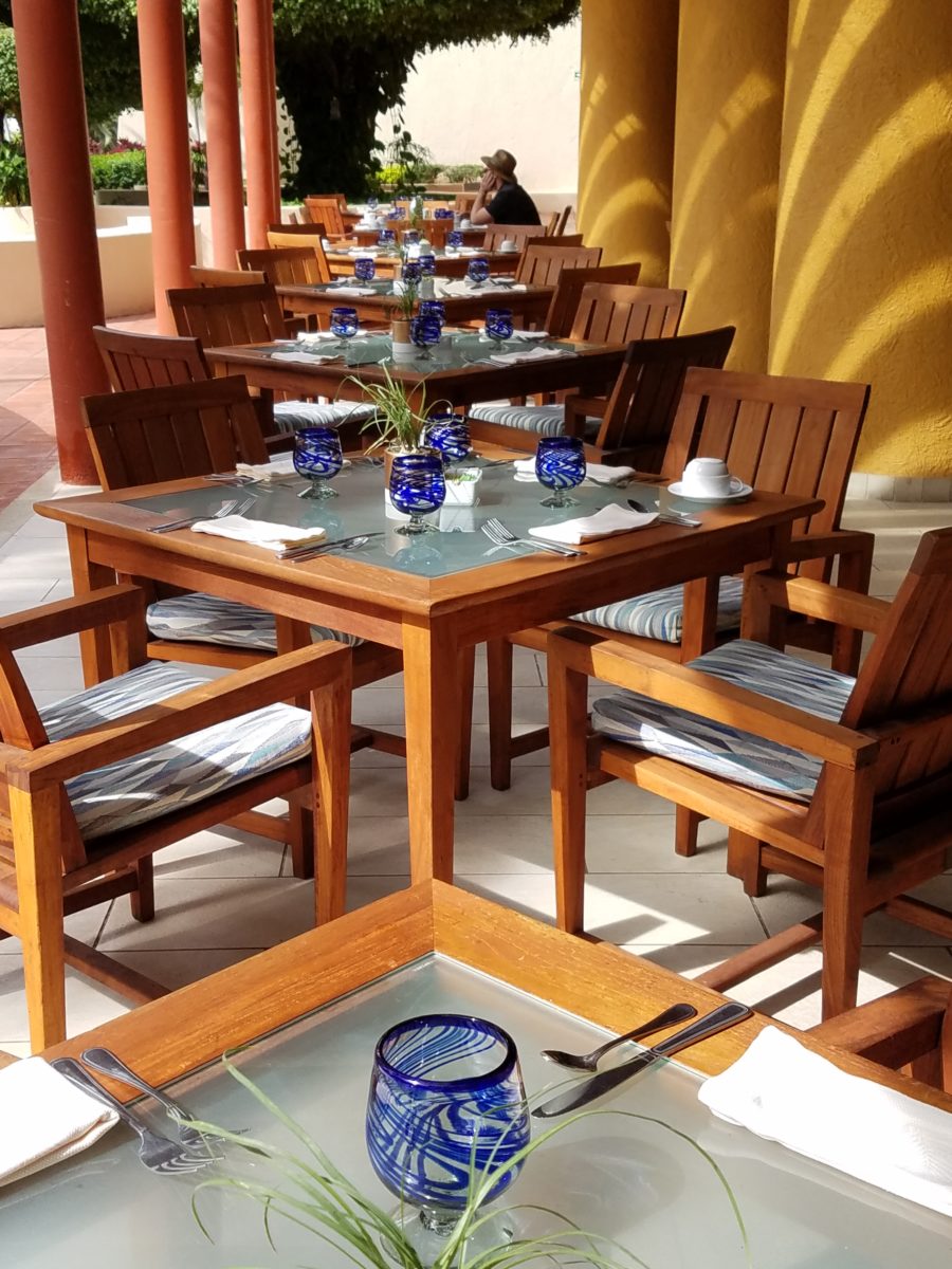
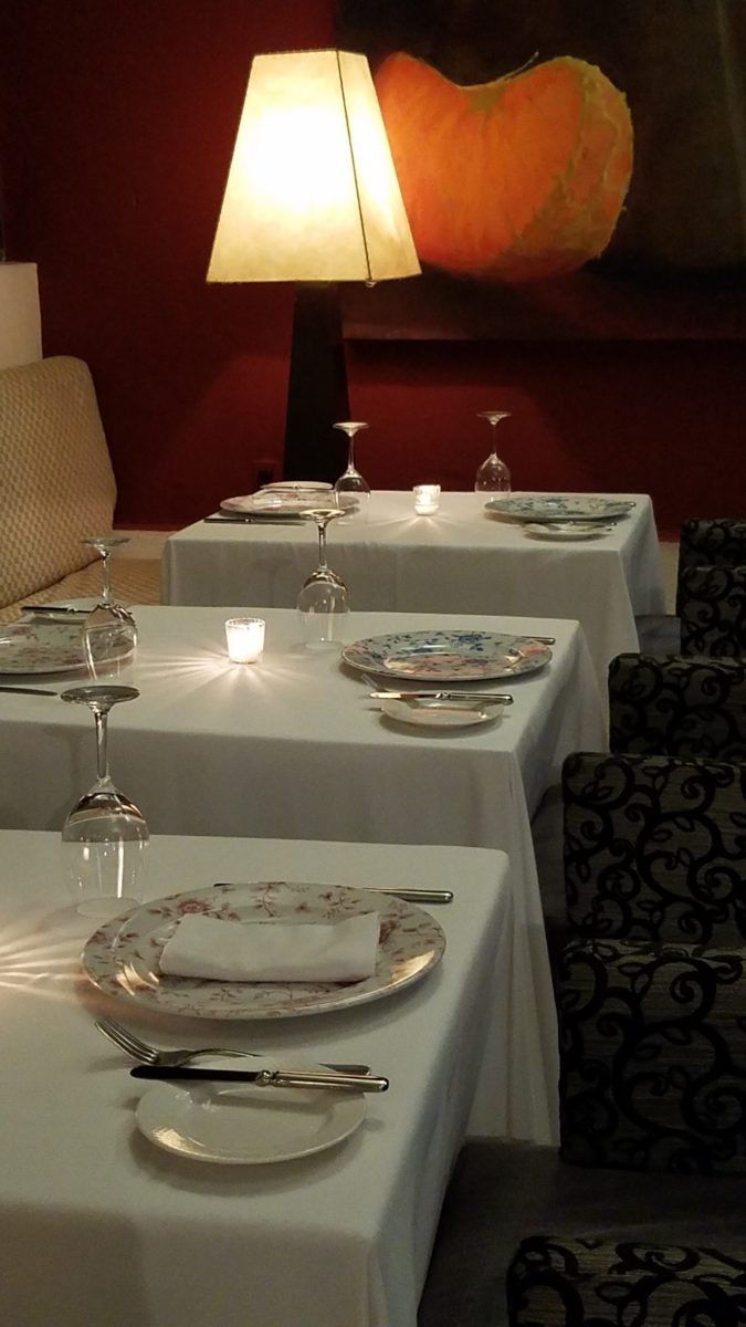
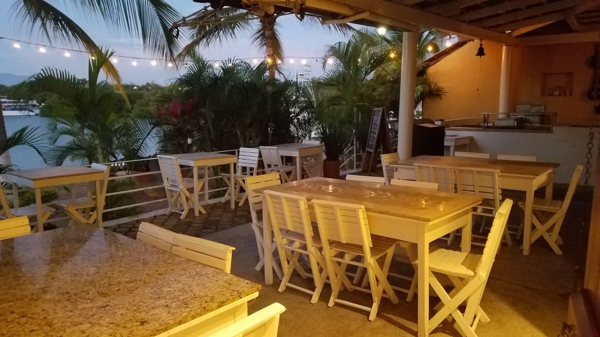
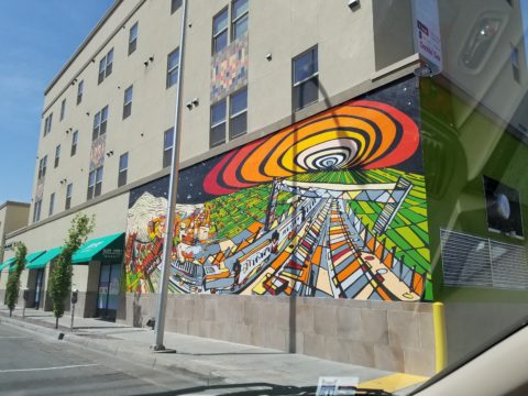
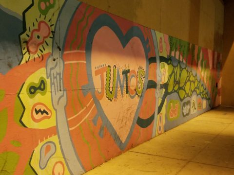
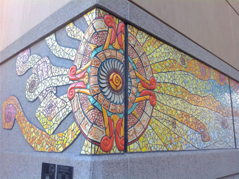
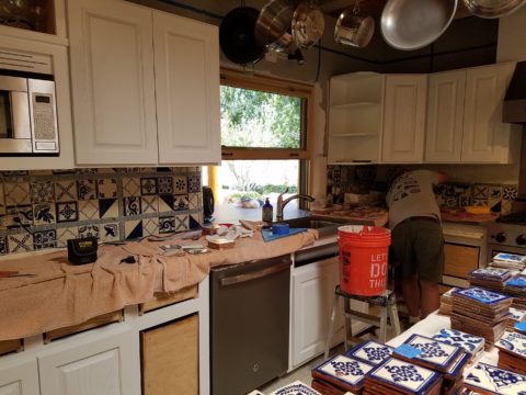
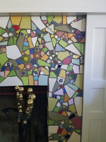
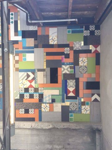
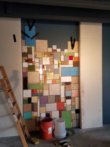
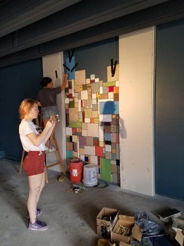
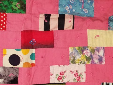
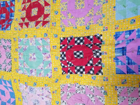
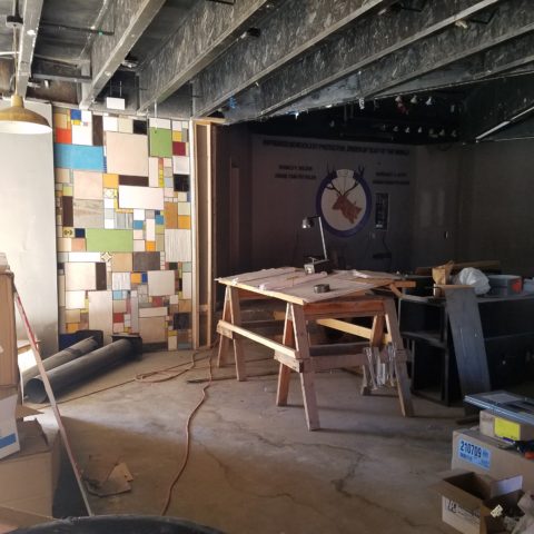
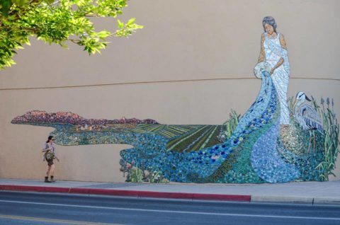
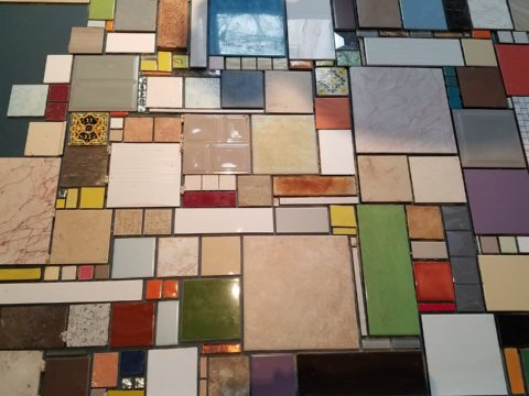
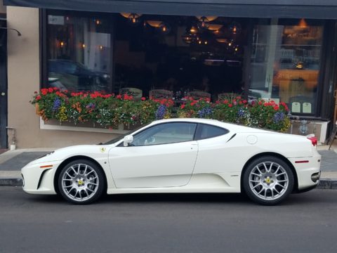
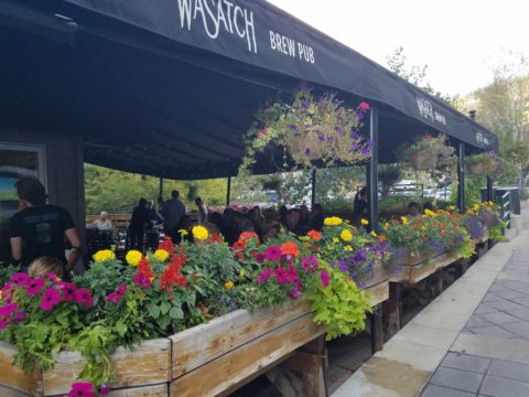
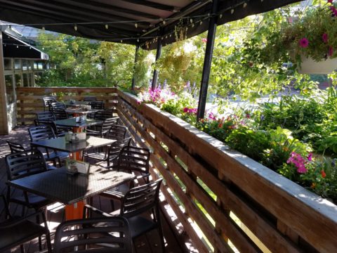
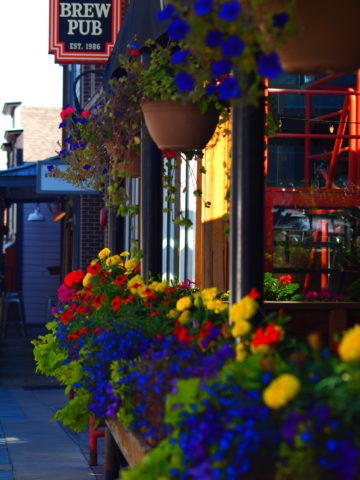
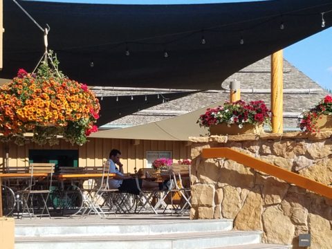
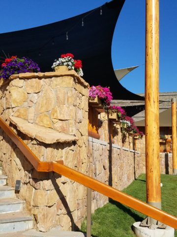
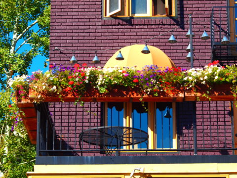
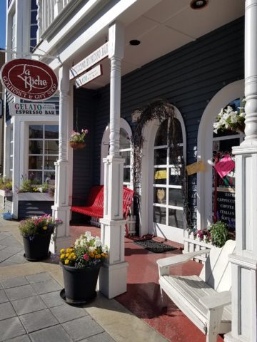
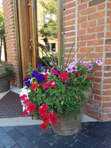
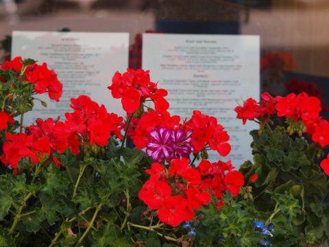
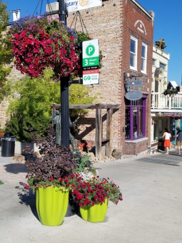
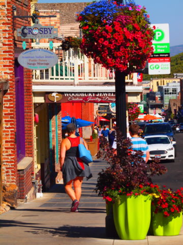
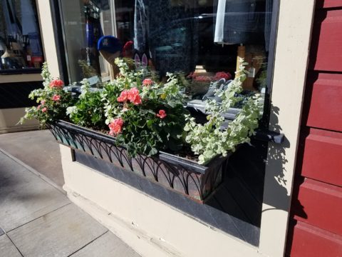
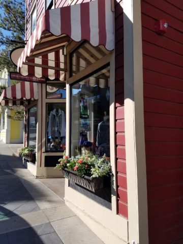
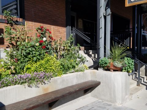
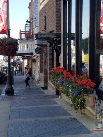
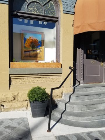
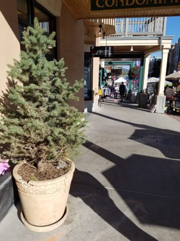
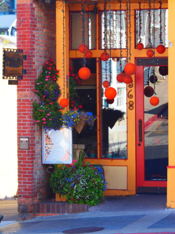
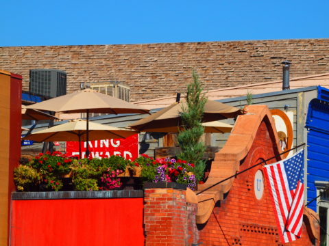
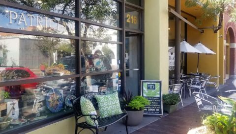
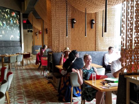
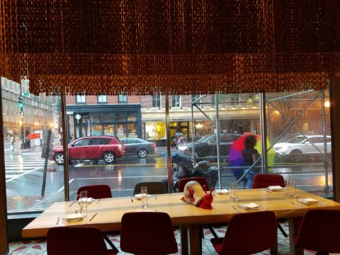
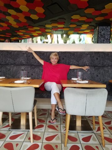
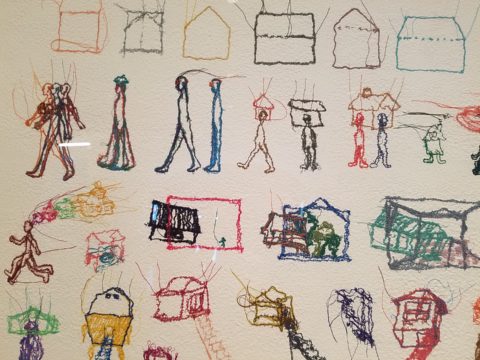
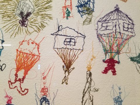
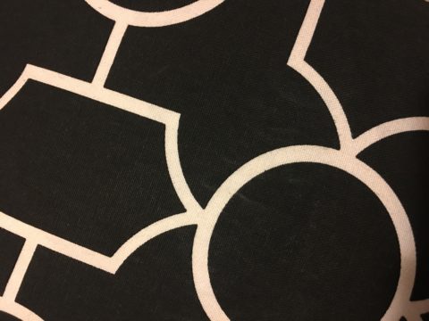
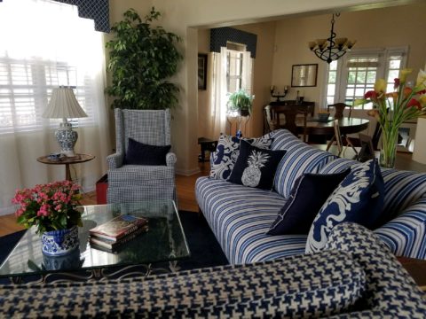
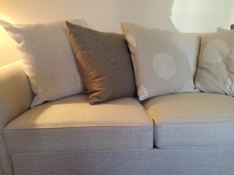
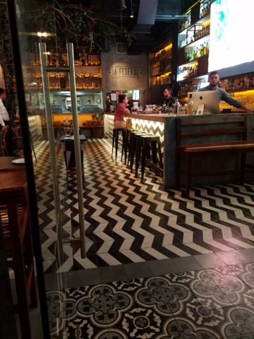
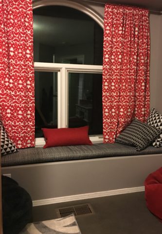
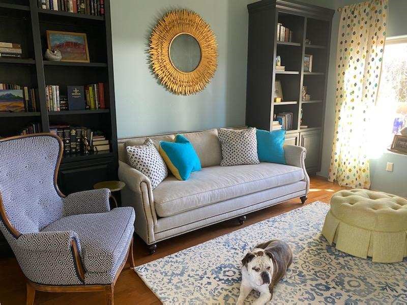
My staff recently investigated information from projects. They posed questions and gathered observations regarding my use of color. Photos, at the end illustrate some specific color decisions and why. The resulting questions and answers are as follows:

Patti Hoech‘s design practice has been and continues to be an exploration and emphasis of the subtleties and strengths of color. It is an integral part of her work. We wanted to know why and when she discovered this specialization in her design sensitivity and how it relates to her approach to effective design decisions.  We are asking clients and colleagues to pose questions to get the answers.

Why is color so important?

Patti Says: Color is power and peace. Color is important on so many levels – personal joy (or aversion), perceived temperature, brand identification, seasonal interactions, emphasis, and contrast. Color is everywhere. Understanding and harnessing it for specific purposes is key.

This new backsplash had a specific purpose, which was to acknowledge the existing rust-colored porcelain sink and the intensely green marble stone countertops. By pulling those two colors into the tile selection so strongly and interspersing other colors that complemented the palette, the result was an effectively unifying design detail.

How do you determine the color specifics for your projects?

Patti Says: What color brings you joy? What color tells your story? Interviewing clients about their color preferences – being an important question begins the dialog regarding what colors to incorporate and why. This can be personal preferences or aversions or specific colors relating to branding whether it is new or existing. Also, existing fixed design/architectural elements might also play a significant part in developing an effective color scheme.

Do you believe color affects the lives of your clients in their homes and workplaces?

Patti Says: Absolutely!! Color can insert many subliminal effects that impose on people’s perception of a space or graphic. Color can evoke emotion, instill comfort or agitation, rekindle memories, spur appetite, affect perceived temperature. It can embed recall for commercial brands. Color can be a clever tool.

In this interior for Boba Tea, we played with the colors of the flavors and the multi-colored tiles to correlate to the fun experience of sucking the tapioca pearls.  

How do you navigate color trends?

Patti Says: Trends are necessary to keep our market moving. Capitalism is based on consumer activity, and nothing generates purchasing frenzies like stimulating new trends in the market. However, basing design decisions on trends must take into consideration the intended longevity of the design.  Much of color trends are based upon pairings and combinations of color.  It is those combinations that can “date” a color scheme – not so much a specific color. It is how, where and with what it is used that pegs it.

A classic, well-balanced color combination of blue, white, and yellow is a comfortable warm and cool with a neutral that transcends trends. Fabrics and finishes contribute to how one updates a classic color scheme.

Do you feel you are a forecaster or influencer?

Patti Says: I believe that I have imparted and am still providing thoughtful, challenging color consultation to my commercial and residential clients.  Having prospective clients request designs based upon others that we have produced is telling and flattering. It means they have confidence in the decisions regarding long-lasting color schemes – if not timeless, in some cases. However, it must be said that design elements that present the color often determine – in many ways – how well a selected color or color scheme “holds up” over time. Considerations regrading patterns, materials, and elements can and might be either improved or modified over time while maintaining the same color scheme. Forecasting anticipates color trends. I have successfully influenced clients to make selections based upon an anticipation of future color directions in the market or merely go with classic combinations that have been proven over time. . .

What has influenced your appreciation for and interpretation of color in design?

Patti Says: It started at an early age. Observing the world around me. Nature, architecture, decorative arts (china, textiles, artwork), fashion, logos/brands, trends, regional colors, seasonal colors, cycles of color…Pinks, turquoises, yellows of buildings in the West Indies, bold color statements of Mexico…Color is profoundly important and signature in its application. From fish to birds, flowers to leaves – color captivates me and urges me to find words to express it and continue to have it a primary part of my descriptive vocabulary.  As an omnipresent element in the design process, color is unavoidable, but to enjoy it so fully and embrace the limitless range of options is an exciting artist’s pallet of possibilities which stimulates me at every turn.

The magic of color on architectural exteriors can be amazing. Here in Burano, Italy my dear friend captured the colors! Similar to what we see in Guanajuato, Mexico and the sunny islands of the West Indies.

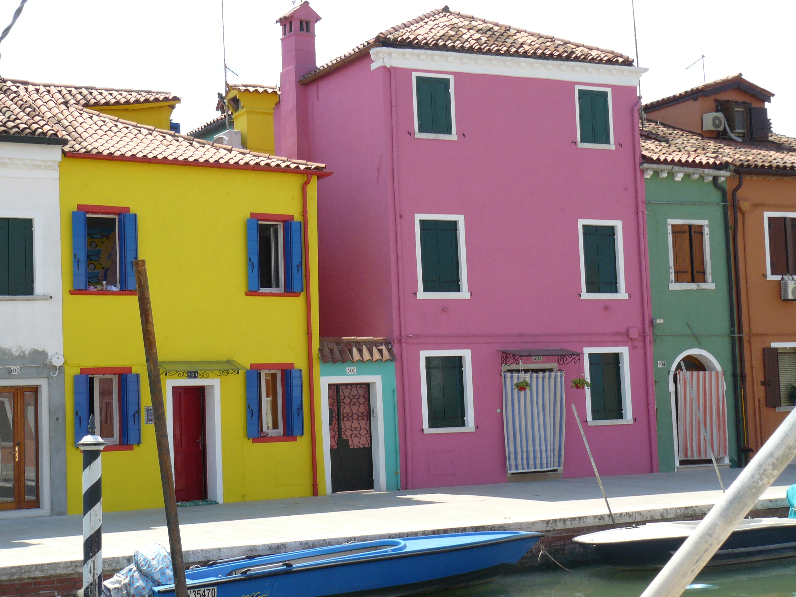
I attribute much of my color awareness to my mother. I remember being greatly influenced by her sense of color and design. Her sensitivity and talent were innate. She selected fabrics that had unusual color and pattern combinations. When orange, avocado, brown, and gold prevailed in the 60s and 70s, she selected the olives with chartreuse and gold for the less formal areas of our lives and leaned into Lily Pulitzer’s dynamic colors and patterns for her clothing and a pastel version of soft pinks and verdant greens for our more formal areas. The master suite was primarily yellow with beautiful bits of blues. Beach scenes always emphasized blues and greens. Nothing in our world was on common trend, but an artful interpretation of color combinations, eclecticism and comfort. Pairings of orange and brown were never her happy place nor was gold and brown.  But orange and PINK – YES! Pink and green especially! And browns were recognized in context with stone shades of greys and tans.  I believe that sense was greatly influenced by richly organic, textured stone walls of the West Indies – Danish architecture in the tropics where limitless colors of greens and blues punctuated with flowers were all around.

As a result of this of this early introduction to the value of color, my personal spaces reflected similar sensitivities. Beginning with pink in the early years I graduated into blues, turquoise and greens for my teen years. The final scheme, in my room in the home in which I grew up, was a dusty pink, clay, and mocha-rose. No one in my world had that color scheme in the late 70s and it was difficult to assemble. It helped that I worked part time in a design showroom in Georgetown where handling the amazing abundance of fabulous fabrics was a daily inspiration. Throughout my life experiences color has been a constant distraction. Not in a bad way, but rather a noticeable, unavoidable interruption that causes me to pause and take note. Ask anyone who knows me – I stop and remark about color at every turn.  For better or worse, I comment on color. It is a deep appreciation that I enjoy sharing. And the most rewarding is discovering color for clients who yearn for it but don’t quite know how to find and use that which would make them feel the joy of color!

A dear friend in Mexico recently took a leap in selecting an accent color for his seaside villa. Once an all white interior, which was lovely and fresh, he wanted a new look that provided contrast and strengthened his color theme. The yellow accents made me smile when he unveiled his new look!

Color plays a major role in discovering and expressing personal style.  Fear not – color is your friend. Find your style. Live your style. Love your Style.

Hidden Talent Exposed

Hidden talent – that remarkable artwork that appears (seemingly) out of nowhere, on a par with great masters of the medium. I considered this element of surprise – looking back several decades to a local painter, Wilson Hurley, who had more than one very different, distinguished career and diverse life experiences before he delved deeply into his passion for painting in his 40s. Once exposed, his paintings revealed his extraordinary talents and he become a nationally recognized treasure for his sweeping landscapes and a variety of other subjects.  

On that note, I have just gotten off the phone with a very good friend, in Florida, Houston Evans. I have recently learned that he is a passionate weekend photographer! An amazing photo appeared in a Facebook post and I was astonished by the enchanting image, color and composition. I was instantly captivated – and curious. Upon closer inspection, his stylish swashbuckling  signature made me realize that this hobby was subtly becoming more than that – yes, he had his mark digitally mastered and is probably THE perfect brand for his diverse and stunning work.

“Star Power” is the luminous celebration of a pineapple.

As I quizzed him about his interest in photography, I learned that he attributes his eye for art, color and design to his mother who’s side of the family has spawned other talented artists, in his generation. He has been posting on Instagram for quite some time – hundreds of images. I didn’t know. I didn’t “follow.” He is modest about his photos and does it for his own amusement, pure pleasure and personal enjoyment – that he likes to share. “I don’t do it to imagine it on someone’s wall.” Yet this observer believes that there is where it absolutely should be! Many walls…many places! #houstonevansphotography

He plays with the medium and all the tools and tricks of the trade. He enjoys the freedom of experimentation. The results are controlled, yet spontaneous. From high resolution to fuzzy pixels that require distance to assimilate. Up close for precise detail and soft smears for imagination to take hold, the variety of clarity or lack thereof are a part of the experience and expression.  

“Makin’ Hay” has an enhanced pointillist treatment – a Van Gogh-esque subject with a twist.

From my interior designer’s perspective, his bold images would be key focal points in the drama of architectural spaces – interiors from Miami to Honolulu and on around the world!!! I can see the towering orchids in hotel lobbies, bars, restaurants and swanky condos everywhere!!! I am eager to find a project, for which his work would be the key to the scheme, unveiling a spontaneous design resulting from the inspiration of the image.

“Oblique Orchid” screams floral superiority as a commanding focal image.
“Shooting the Bird” speaks to paradise revisited!!!

In the beginning, the photos stood on their own merits. Evans keeps his originals – some of which remain just that – in their original form, while others are tweaked or more radically manipulated to create stunning subjects and compositions.

This brilliant, fresh simplicity of “Aqua Eye” observes the droplet’s reflection in the center of the cheery chartreuse petal.
Coming upon a cool caddie “Daddy Long Legs.”

I can see his limitless fantasies contributing to the imaginative narrative of Meow Wolf, gracing hotel lobbies with larger-than-life orchid explosions and commanding condo walls with magical statements of tropical color, subject and form. Translucent installations of LED illumination could result in magnificent walls of design influence.

“No Flies on Me” is a fantasy of oozing colors and form melting and melding around the psychedelic dragon fly.

The digital age is advancing with such a pace that we are all caught-up in photos of food, whacky selfies and sunsets on fire…but having an artist’s eye, to truly see the potential and master the tools that are now available – using them to create valid and valued masterpieces of art, is extraordinary.

“Copy Cat” reflections mirror a chorus of color from sky to watery impressionistic likeness.
This “Roadside Attraction” must have been a startling scene to distract dazzled drivers.

I truly believe that his work is exceptional – full of heart and soul – and spectacular fun!!!!!!!! I’m thrilled to learn of these images and now enjoy the continued progress of his discoveries and creations. Let’s see where this goes!!!!! He just might be coming out of hiding!!

Yes, his selfie – “Prickled!”

Designing with Your Story in Mind

Is your story important? Does anyone care about your story? And what does this have to do with interior design?

Whether you are marketing yourself or your business, your story has merit. It is about identity, branding and connecting. It is about letting people in a bit. It is about sharing history, experiences and process. It is about your unique reason for doing what you do.

For the past several months, I have been working with a client on a combination of interior design, graphic design, exterior design…it is all intertwined. A successful design laces together all these design elements. And that brings me to “the story.”

Even Facebook features a section to tell “your story.”  Yet, my client resisted presenting/using the story of this new business venture as a part of the design. He told me that was “so seventies.” That he had read that it was a dated concept that was no longer relevant. I begged to differ. For months I begged to differ! We agreed to disagree.

I believe that this is similar to many interpretations of design. What might be considered “dated” is often the manner in which it is used or done – not the thing itself. Whether a color,  a font, a style of furniture, a wall tile or wallpaper, an architectural detail or form…so many design elements are considered dated due to their context. Often, this is fair to observe. But, mix it up a bit and use things differently or with other different elements than the original trend presented and – Voila! You have a perfectly valid, even fabulous design – think outside the box!

The idea of a “story” is not unlike the “mission statement” which became a standard feature decades ago in every company’s presentation on printed media, lobby plaques, conference room walls, break rooms… Some say it is passe, but when something is good and has meaning – re-consider. Like “the story”, “the mission statement” identifies goals and intent…when paired with the story, it provides an overview of the who, what, why that inquiring patrons want to know.

So back to the story…about “the story.”  When a business or any concept is respected or liked, revered or praised, it is natural for people to wonder “How did they get started?” “How did they come up with this idea?” “What is their history in this business?” These are common questions that clever ideas or designs invite. So why not satisfy that interest, create a buzz…Let’s give them something to talk about!!!

In this world of disconnection, making connections seem all the more important. What used to be a natural exchange – of communication, ideas, sharing – is now something that has to be inserted with greater intention.

So this new business, for which I have been designing, is a barbeque establishment. There are a million. They have certain things in common. Without my enumerating them here – can you envision some common denominators that you might connect with barbeque joints? As is true with any venture, I asked: “What makes this one different? Better barbeque? Maybe. Cool interior? Hopefully. Are those the only unique traits? Is that the memorable take-away?  It certainly isn’t a bad one – the idea is to have great food – and a fun environment, but what else might contribute to the experience of this barbecue being unforgettable? What might you have, to tell your friends, to spread the word?”

My opinion was a  combination of an intriguing brand and “the story.” But before I go further, they coined a word to express their beer brewing prowess – exbeerience!  This will enter into the story as we go along.

Now maybe my opinion about their story was so worthy of consideration because there was so much to this story. That certainly helps. It happens to be a great story with layers of interesting twists and turns – riddled with history and significance. Plus, it had a local interest angle that has the potential to create a buzz far beyond their actual location.  

To begin to tell the story, I encouraged the development of a unique logo for this specific branch of the brand. Taking the lead to design it,  and incorporating it into interior/exterior design was part of my vision for a complete design package and presentation. Extracting from the story to create the logo seemed natural. The private persona was becoming public.

As we developed the logo, featuring a wood-carved graphic of an original log cabin/smokehouse, the story was recorded and edited down to a summarized version.

It was available for printed material, social media, and as art to be presented on walls. Yes, it was intended to become a decorative element too.

The Story became a focal piece in the interior along with authentic, original photos of the log smokehouse and an interpretation of patchwork quilts entitled Urban Piecework made from leftover ceramic and porcelain tiles, glass and clay assembled in wall-mounted panels throughout the interior and exterior spaces. 

Photos of the original smokehouse in North Carolina will soon be presented to further reiterate the story on the interior walls.
Urban Piecework commands the interior with bold mosaics reminiscent of patchwork quilts – an intriguing backdrop installed both inside and out.

Connecting with patrons, followers, clients, friends, family and acquaintances is valuable. As a business, it wraps who and those elements that are important to you in a familiar cocoon of context. It can instill a level of comfort and confidence in addition to sparking additional interest that might have taken longer to establish, without the introduction of your story.

The final multi-dimensional and multi-textural wall-piece featuring the story and mission is a striking 4’x6′ multi-textural panel. It offers patrons an opportunity to get a few questions answered as they enjoy their “exbeerience” at BLUE.

It was a privilege to promote, extract and produce this story and contribute such an important and valuable element to this business’s marketing and solidifying it’s new, exciting chapter of their brand.

Consider your story. Own it. Share it. Celebrate the uniqueness of your story. Design with your story in mind.

When Extraordinary is an Understatement.

A few years ago, awesome crept into our vernacular and took over. It stole our ability to select options for descriptive excess or exception. Everything from accolades for a job well done, positive reinforcement for anything, to a spectacular sunset, a great new outfit or a startling meteor shower – everything from a tad past the norm…to something truly fantastic – became awesome.   Our language offers so many superlatives, yet we have gotten so lazy.

At the expense of sounding like an advertisement or otherwise paid spokesperson, I write today of a late-night confection experience that is truly like no other. An experience so artful that I could not take enough photos. Artistic delights at a bustling urban eatery where flowers and gold leaf adorn each piece of fanciful frosted awesomeness. Ha -there it is! Had to add more to the mere “awesome,” though!

Extra ordinary – extraordinary – beyond the norm – beyond ordinary, yes, that is an understatement for what I am about to reveal. Yet, that is the moniker of this extraordinary establishment – Extraordinary Desserts!

Several years ago we were treated to a late night surprise. Not knowing our intended destination, we were taken winding through the streets and came upon this little structure the read like an Asian garden. Twinkling lights peeking through wooden slats softened by lush tropical vegetation – the scene was magic. Once we realized the focus of this cozy pocket, we were enchanted. Patrons stood in line to pass along the “extraordinary” dessert cases displaying all manner of outrageously beautiful desserts. Once they decided and paid for their selection, they gathered in intimate twosomes or small groups to savor the delectable delights they had chosen.

Last night, we decided to rediscover this uniquely sweet spot and Googled our way into downtown San Diego. What we found, by happy accident, was a second location – an urban edifice presented on a crowded sidewalk packed with people waiting eagerly to be seated and begin their indulgences.

After leaving our name with the greeters at the podium, we squeezed through the throngs to get a peek at the cases full of magical wonders. Ok – you think I exaggerate…so now begins the photos…

When extraordinary is an UNDERSTATEMENT, you  know you are in the presence of something quite special.  Maybe that’s why people invent words like splendiferous or supercalifragilisticexpialidocious!

The rich velvety and textured frostings and layers of fabulous flavors awaited us as we scanned the displays.

Floribunda- yes, gilding the lilies (orchids as it were) – nothing was too over-the-top!   The rich velvety and textured frostings and layers of fabulous flavors awaited us as we scanned the displays.

Seeing so many astonishingly spectacular desserts in one place all for the spontaneous taking is almost too much to bear. You mean I can HAVE that right now??? I can have a piece of many of them – RIGHT NOW?????

Emulating fine Cerelene Limoges, the would-be doilies of parchment paper rimmed with gold detailing and lettered with Extraordinary the details were dazzling!  No stone left un-turned, they thought of everything to make this a tantalizing treat and patrician presentation!

The interior offers seating at the bar and tables organized throughout. Two tops or ganged together for a crowd, everyone was so focused on their prizes – beauty set before them – animated chatter wafted through the sugar-spun air!  Some chose to sample several knowing that they would take a goodly portion home. Others savored a single serving of a beautifully flavorful masterpiece.

And yes, there’s a book about the cakes – Karen Krasne – appears to be the brain behind this bounty.   I look forward to meeting her. She has an amazing machine with a well-oiled staff. Everyone was efficient and friendly and shared in the enthusiasm that was being expressed all around.

The shelves are filled with teas and other sweet temptations, interesting vessels and serving pieces.

The lighting is dim and the structure envelopes the interior with white-washed frosting of voluminous space punctuated with dark cylindrical pendant lights and pierced bubble-like panels back-lit for added interest, subtle luminosity and dimension.

Raw, polished concrete floors, steel tables and molded wood chairs give a nice balance of warm and cool, rigid and suave – while clean and almost hygge in feel.

Perhaps, in the world of custom confections and TV foodie competitions, these desserts might be within some semblance of a norm – but only from the finest of creatives, in circles of which we usually do not run.

But having cavorted last night through the cheerful melee of confection connoisseurs – albeit one doesn’t have to be clubbed over the head or knighted by the cooks of the kingdom to appreciate what we experienced –  we are sufficiently spoiled both visually and flavor-wise to be tough to ever satisfy again. Good design. Great design. Extraordinary design is often still an understatement!

Animating Interiors – for Fun!

The total sum of an interior…comprised of the shape and volume of a space, the colors and textures, architectural details…then layer the lighting, furnishings and decorative accessories and ta-da! But is that all there is?

The beauty and intrigue of interiors is what keeps us discovering and creating. Yes, finding intimate pockets or grand expanses that please and dazzle.

The romance of this setting caught my eye…the far table by the window – set for two seemed a likely scene for a tete e tete to take place!

While traveling in the tropics these last few weeks, I discovered many interesting places. Oddly, while experiencing all the sights and sounds flavors and colors of this paradise, I immersed myself in the unlikely and completely opposite world of early 20th century Russia with A Gentleman in Moscow.

Just for fun, I sat with Federico Leon de la Vega today as he did 4 – minute sketches of some of my photos…needless to say, proper illustrations would have proved more telling of my romanticizing the talents of artists conveying imaginary activities in interiors…but it was fun to play with this today!

The beautifully and artistically articulate writing style of Amor Towles held me captive. And what a dichotomy to play ping-pong with my brain as I digest the restricted realm of Count Alexander Ilyich Rostov while basking in the warm sunshine with fresh sea air and palms rustling overhead…It seems that the extremes of this pairing suited me well as it was a dual escape – a vacation getaway while taking me further into fantasy with another dimensional experience of this incredibly great read!

Although there were many fascinating observations made by the author, it was this passage regarding the Count encountering a young artist/architect that prompted this subject for this week’s blog. The architect, finding himself in Moscow in the post Czar age of socialistic experimentation and implementation, bemoans the lack of work “The way things stand, I’d be happy to design a birdhouse.”

“The way things stand, I would be happy to design a birdhouse!” Sketch by PH

The mayor of Moscow has made an observation espousing the birth of  “the golden age of the prefabrication, cement-walled, five-story apartment building”  – with the very practical  “four-hundred-square-foot living spaces with ready access to communal bathrooms boasting four-foot tubs (after all. who has time to lie down in a bath when your neighbors are knocking at the door).” The mayor further emphasizes and rationalizes “So let us not get bogged down with elaborate designs or bow to aesthetic vanities. Let us apply ourselves instead to a universal ideal that is  fitting for our times.” A horribly inhuman decree in my opinion, rather than a should-be, truly magnanimous spirit. Humans are designed to design!!

The sentiments of the new regime left the architect with having to find avenues to utilize his talents – specifically sketching as he set forth to illustrate a brochure of the city’s finest hotels as retained by the Intourist department. How sad to possess the talent and passion and be reduced to capturing the grandeur without having the opportunity to design??!!

So three things struck me about this situation…one – that the artist was practicing only a portion of his talents and not the true, complete creativity that beckoned him to pursue his career…two – that renderings not only offer the opportunity to preview the proposed design of a space, but they can use artistic license to animate the space for its intended function and three – that spaces are not truly realized until they are filled with the people that are intended to occupy them.

So much so is a room not really finished until it is occupied by the inhabitants for whom it was intended to function, but Towles observes through the renewed appreciation by his architect, “I suppose a room is the summation of all that has happened inside it.” And that is what I enjoyed being revealed as a result of this simple exchange in this one of many experiences in this remarkable storyline .

Humans are designed to design. Rooms are intended to perform a function. They cannot function until they are animated with whatever they were intended to serve. Sketches allow the preview. Sketches are more spontaneous and artfully creative than computer generated versions of the same. Celebrate beauty, creativity and artists!

WHITE by Design…

With all the New Year buzz about the new color forecasts…I started taking notice of the seeming non-color, white. It is often considered the absence of color when in fact it is a very complex color of many shades and values. Just try to select a white and you will know what I mean.

When you look at white paint samples, you will notice the nuances. There are pink whites and blue white, grey whites and yellow whites. Each white is off-set and contrasting to another. You see the differences by comparison and by context. You think you have just the right white until you place it against another sample and see that it is grey or cream and then second guess yourself again…and again…How do you know which white is right?

Dunn Edwards groups their whites and pastels in a separate section of their fan deck as do other paint companies. What is interesting here is that the background is a sheet of white copy paper. Notice how is reads against the colors in the samples…it seems to be a purple blue color. This shot was taken under a full-spectrum LED lamp. The colors should be true. The range of “white” is amazing.

To intentionally design with white is bold. To have the confidence, to decide that white IS the color and that white IS the scheme, is challenging. To effectively design with white, you not only have to select the right white(s), but you have to know just how much of anything else might be effective yet not detract.

Le Leche in Puerto Vallarta is a fabulous example of designing exclusively with white. Only with minimal punctuation with black lettering on the wall of containers and also by allowing shadows is the white interrupted. But the blacks’ minor interruptions gives depth and fine detail.

White design can be cold or warm. Depending upon the desired effect, mood or function of the space, the whites need to be carefully selected. This is true with lighting as well. Warm whites or cool whites…what gives you the desired result?

Popular white string lights add festivity and a warm glow to an evening scene.
See how many lighting colors you can identify in this scene…Starting on the left, a cool pocket glows through the underbrush. The walkway has a warm pink-ish light. The very cool blues of the pool area give a dramatic read. A bold yellow accent peeks from the far left and also over on the right. The palm trees are wrapped in a warm white tube lights while the far right side illuminates the entry to the dining palapa with a cool white light source. The foam of the surf on the beach is captured with a cool white spotlight that maintains its naturally expected white color.

Knowing when to add color to a white scene to achieve an intentional POP is an art. The color itself, the amount and placement is all part of the success of a good design result. From the fine black detailing in the previous shot of La Leche to this still-life composition of a tropical cocktail that I propped the other day, the minimal punctuation of color is key.

White mosaic shards of tile in the background of this composition featuring a peeled coconut and the POP of a pretty pink party umbrella result in a white-on white scene. Yes, this shot says PARTY with a perky smile!

The bench which served as the backdrop for the coconut cocktail is a dramatic serpentine sculpture of site furniture that plays with the white-on-white of the tile and grout.

Contrasting against the organic wood decking, this white monolithic bench snakes around the periphery of this outdoor lounge area. The sunset is casting a soft pink wash over the all white glazed tile.

Beach settings using white materials compliment the white sand and greenery of the tropical plants. From wood frame platform cabanas to the sprinkling of umbrellas, white is a wonderful, fresh color for a crisp clean scene.

Whites on whites…creamy sand colors to crisp white terrycloth, the white-on-white scheme is soft, inviting and clean.
Greenery compliments the white umbrellas and sunning beds on the lawn by the beach.
Palm trunks and other fruit trees are often painted white to protect against insects and what insects insist on climbing the surface are easily spotted by birds who appreciate the help to capture a snack! In this case, they contribute to the white design theme.

The soft creamy off-white folds of fabric offer a soft, inviting scene.

Shadows in the creases and depths of the folds add the dimension to the luxurious feel of the cotton damask fabric.
White stucco is dappled by shadows and greenery while given a warm, strong base by the brick pavers. White as an architectural finish is only successful if the context compliments it. This is true in all design.

Architectural color and texture of surfaces is a moving target. A recent discussion about a white building with black detailing would not have proved right for this particular use of white. The hard, commercial read would have been too severe for the intended effect. Yet that same project, with a warm white and an ochre accent, will be just the right combination to achieve the desired result. Watch for this project to be featured in a few months.

Architectural surfaces incorporating tones and textures of white provide interesting opportunities

Block and crumbled edge accent bands on the facade of an exterior wall.

White in design is an exciting selection. Knowing how, when and why to use it is a test of your creativity. Picking the right white is the challenge.

The limitless colors of white found in a pile of gravel…..

So the next time you think white, think a lot about it. Study the context and what you are trying to accomplish. Feel freed by the fact that white is a color to express and enjoy.

Urban “Pieced Work” – an artistic narrative

We are excited to have the opportunity to bring a design installation(s) into a new project that will serve to support the brand with a twist. A nearly completed new smokehouse is coming to Albuquerque. This home-grown eatery blends family history and southern roots with southwestern barbecue flavors including indigenous  wood and iconic chile blends. But this is not about their cooking profile. It is about how we have arrived at a design theme that will define and further the identity in this new, specialized smokehouse department of this larger local brand.

To accomplish this task, we examined the concept the owner had  to remodel an existing facility that had been a popular gathering post serving this community for decades. The fringe barrio location was of a demographic primarily comprised of Mexican/Americans. Decades past it was home to a heavily black community. The fabric of these cultural combinations suggested a mosaic of color and vibrant heritages.

The spark of cultural references lead to discussion of the popular artistic expression of urban mural painting.


When we began the dialogue, the decision to have a mural painted by local neighborhood kids, with a mentor to design and supervise the work,  seemed to be the direction we were headed. After subject matter debate and development, I veered off on another tangent that might take a less subjective approach, be weather-proof and more durable for a patio location – mosaic.

This new more impervious and durable medium still offered the opportunity to engage the community, but with less focus on a specific subject and more about geometric color and texture. We discussed the details of installation so as to keep it simple for kids to participate using whole tiles – minimize cutting, if any, for starters.

Inspiration came from several other installations such as the Albuquerque Convention Center’s on-going mosaic mural project wrapping many sections of the buildings with intricate scenes of New Mexican lifestyle and cultural diversity. The colorful mosaic is an elegant and sophisticated contribution to our city’s cultural aesthetic.

Helen Atkins, manager of consignment art at PATRICIAN DESIGN’s downtown boutique gallery and the lead on their current restaurant mural project, has worked on several phases of the Convention Center’s mural project.

We have incorporated mosaic into several of our own design projects such as last week’s blog https://patriciandesign.com/trust-and-custom-designs/about a residential kitchen installation.

Here, in another installation, a fireplace surround of mosaic adds movement, color and textural interest to the room.

Ultimately, one of Helen Atkin’s personal photographs cemented the approach. It was decided that a geometry of different sizes and disparate glazes and designs of tiles pieced together in a colorful, textural  panel would be our design theme.

Helen Atkins, a recognized artist in many media, captured this in passing while visiting New Zealand. It’s crisp, yet irregular composition was intriguing and pleasing. It became the springboard for the concept for a geometric mosaic panel to anchor the theme of this new New Mexico eating establishment.

The idea became more exciting as we began gathering material from local tile distributors and our own personal inventories of favorite treasures saved for a special project. Here it was.  It seemed such a strong design element and therefore offered a new direction for the actual brand of this establishment. We embraced the idea and brought it into the interior and distributed murals throughout the space.

Still under construction, we will not divulge the identity or locations of this project just yet. But suffice it to say, the murals are an exciting part of this interior design scheme.

As we further discussed the plans to implement this project, school started and the ease of coordinating the assistance of neighborhood kids became more difficult. Helen lead the project as primary installer, coordinator and supervisor. She enlisted the assistance of a couple of people – one experienced and the other not at all.

We have named this series, Urban Pieced Work – an artistic narrative. Here we are interpreting generations old sewing patchwork using ceramic, glass and pottery pieces rather than the traditional fabric patches. The original folk art needlework has been in the American vernacular for ages.  In these installations, this up-cycled  use of discarded or discontinued tiles is similar to patchwork fabrics, re-purposed to make clothing, wall decor, window treatments and bed dressing when times were tough – often referred to as “pieced work.”

My paternal grandmother in New Mexico made this twin quilt for my bed when I was a child in Virginia.


My same grandmother made this and was given to me by my cousin, her only other granddaughter.

Mosaic is often, like fabric patchwork, a practical art form that puts scrap, shards and fragments to good use in an artistic fashion. Note though that more sophisticated mosaics have been designed more intentionally for centuries not merely as salvaged material. These masterpieces both in contemporary work and antiquities represent many periods in history and movements in artistic expression.


This mosaic version connects with the history of the restaurant’s roots and southern heritage. The panels’ mural nature speaks to the urban murals found throughout the community.

Located strategically throughout the interior, these murals have become a strong design element and anchor for this facet of the brand.


Another shot of the spectacular cultural story murals at the Albuquerque Convention Center.

We have woven a meaningful artistic statement throughout the interior and also on the exterior of the building. In addition, we will be inserting a graphic version into the signage and logo design.


Urban Pieced Work – an artistic narrative, of a New Mexican Smokehouse, will provide pleasing design visuals throughout this new interior, provoke conversation and interaction, weave an element of history and context with the southern roots of this exciting new eatery!

Join the conversation and watch for the first succulent flavors to come out of the smokers later this year.


FLOWER POWER – A Marketing Imperative

While in Park City this weekend, I pondered what might the subject of this week’s story be. Dazzled by the smart presentation of this hidden little jewel of a town, I was continuously remarking about the fresh abundance of flowers, well maintained facades, manicured lawns and medians and the obviously collective appreciation for what draws patrons to want, if not need, to invest in property, art, clothing, home decor and food! Yes, need – it can become an imperative!

Here a restaurant has dressed their facade with brilliant red flowering boxes beneath the sidewalk window.

Oh – oops…do you think it might have been the Ferrari that was drawing attention?

Imagine your patrons being drawn into your establishment as an imperative – a must see, or must buy here, or must try this place, or must check out their wares, or must taste their food or drink their craft beer!

The patio of this brew pub is surrounded by fresh flowers in rustic wooden boxes.

Preparing to open for the day, this pub also has light strings to animate the patio at night.

You see this charming presentation potential in small resort communities and those who have cultivated their assets to the max, reap the benefits of their vision, smart development and on-going maintenance.

 Another brew pub sees value in an eye-catching floral frontage. Courtesy – Heather Harrell

The architecture is decidedly mountain themed, vintage 19th century colorful and textural, but interestingly punctuated by modern elements and fresh ideas. The practical pitched roofs, quaint scale, textural wood trim and detailing, all contribute to this charming scene.

Courtesy – Heather Harrell

To dismiss the value of flowers in marketing is to ignore the Flower Power!

Some places take a little more work to grow seasonal sprays of abundant color in pots, buckets,  bowls, barrels and boxes, but the effect of drawing people is undeniable.

 Courtesy – Heather Harrell

From Key West to Anchorage, the results are proven. Beauty, color, nature sells.

It’s a combination of color being a visual POP amidst concrete and brick, but it is also the positive life-affirming statement that it projects.

We know color in advertising is a draw and we know that anything that adds animation is a draw – flowers colorfully animate the street-scape and draw customers to them.

Here the passers-by are drawn to the menus posted in the window by the red geraniums that brilliantly are placed in planters in front of them.


Courtesy – Heather Harrell

They infuse the built environment with nature.


Like hummingbirds swiftly hone in on the finest blooms or like bees collecting pollen, we are drawn toward that which speaks visually from the surrounding foliage.


Courtesy – Heather Harrell

Texture is another element in this mix. We know that good design is about balance. Flowers balance the otherwise hard surfaces in their periphery. The finishes on a streetscape or sidewalk scene are generally, if not exclusively, hard. Flowers soften the surrounding surfaces and also balance the smooth and hard with random shape, texture, flexibility and even movement.

Whether a casual bar or fine dining restaurant, retail shop or any business wanting to attract and invite the public to them, flowers are an asset.

I feel about flowers similarly to how I feel about twinkling lights on a patio or in public trees. The advantage in the lights is that they can survive the frigid elements and make their statement in all seasons. Lesson here – once the plants are spent for the season, keep the lights on!!! Both elements are valuable draws and enhance the atmosphere of any establishment or environment. (Go back and notice how many photos have visible stringed lights in them!)

And if possible, plant those past-season pots with hearty pansies, ornamental kale or evergreen shrubs to keep the life calling from the sidewalks.

An art gallery has boxwood in steel vessels at the entrance.

A potted evergreen will add life to the paved surfaces when the flower season has passed.

And  for the sake of broadening the reach on this subject, to include not only the flowers and the mention of stringed lights, is the inclusion of creative signs, banners, flags, umbrellas and other elements that contribute to the festive nature that attracts peoples interest and draws them into your business.

Courtesy – Heather Harrell


Rooftop bar with flowers, flags and umbrellas – King Edward too!        Courtesy – Heather Harrell

Celebrate the the power of flowers!


HOME – An Artist’s Perspective

It was quite by accident that we ran into SAAM! Truly, our destination and plan for the afternoon was to catch a bite at the hip and artsy Jaleo tapas restaurant and head to the Bible Museum to see some cool film of all of the buildings in downtown DC that feature biblical quotes on their facades – or something to that effect. But as we sat there in this trippy Spanish-themed interior, right next to the window, we

watched the staff bring in umbrellas from the sidewalk seating areas as the wind picked-up and the sky darkened. Our plans soon began to change. We dawdled at the table well past our tantalizing tapas feast and watched the rain come down in sheets.

As the time past, it became apparent that the Bible Museum was too daunting a task to embark on after the storm subsided. So we dashed between the drops to the nearby Smithsonian American Art Museum – SAAM!

Having never been there before and not having planned this outing, we entered without a clue as to what we might find – except perhaps the portraits of the Presidents – cool enough. Yet inasmuch as the exhibits were wonderful and many faceted, I want to focus on one inspired installation that pertains directly to architecture and design.

Considered to be perhaps the most compelling architectural artists around today, Do Ho Suh takes nostalgia for “home” to a whole new dimension. He figured out that he didn’t need to wait for enchanted ruby red slippers – no, he re-creates memories of “home” and makes them transportable all over the planet. And by whole new dimension, I mean we walked through fine translucent fabrics – taught and stitched – over concealed stainless steel frames creating hallways of houses where he had formerly lived around the world.

With great attention to detail, he stitched door hardware, radiators, and wood trim details. It was remarkable.

This interactive immersion was thought provoking. I think it is impossible to pass through this presentation without experiencing a few fleeting personal memories of the your own past homes. As Dorothy taught us,”There’s no place like home.”

It was as though the sheer polyester fabric was misty or ethereal as though not really there – a very effective medium to suggest a thought or memory. How fascinating to render a structure with such a diaphanous, fragile sense – tangible yet not.  “Almost Home.” There, but not quite.

The time it must have taken to create this tedious textile architectural art-piece, of delicately painstaking work, surely proves his love for these past dwellings.

This presentation will be the most comprehensive of Do Ho Suh’s work ever shown on the East Coast. And wait – there’s more! After having navigated the Twilight Zone of Do Ho Suh’s recollections, I was even more strongly drawn to this large-scale piece of stitched textile work mounted on the wall! It was a colorful and beautifully complex collection of images of people and homes in various states of movement and fantasy.


Colorful threads intentionally strewn from the stitched images of human figures, some sporting houses on their heads, another running with memories flying behind his head…taking the home (s) through life’s stages – memories…home is where the heart is…taking their memories with them…

People parachuting with houses floating through the air…pitched roofs and domes – all manner of interpretations of “home.”

There is a stitched reference to Seoul and a house on a jetty suspended above a wild, choppy sea.

Live – dwell – reside – inhabit…Be quick – it’s only there until the 5th of August.

What’s Trending? Do YOU Need An Interior Designer?

As we move forward into this new year…the story is the same – only some details have changed or been added to past stories. By that I mean if you search for trends – they are ALWAYS all over the place.

We do find years when really new ideas take the stage – like when the shift from plastic laminate to stone slab counter-tops became a valid trend.  It was a trend brought about by improved technology, shipping,  cost and ultimately availability. After that, the engineered surfaces that grew from this trend broadening the offerings – explored color, texture and pattern and continue to introduce new options.

Myriad surface materials mimic natural stone – when is it preferable over natural stone?


Engineered stone products offer many bold, solid colors from pure white to amazing primary colors.

So right now bold color accents are in,  wall covering that made a come-back a couple of years ago is sticking for the time being and with newer bolder prints. Fabrics too – prints are bold and large scale!

Wood on walls is trending. Printed concrete tile is the big thing. Farmhouse sinks – in different finishes than customary stainless or white.  Vintage light fixtures – enhanced with new technology and lamping.

So, does that mean I can’t have a white sink or shouldn’t have a stainless one?  I should use printed concrete tiles in my kitchen or bathroom? If my home lacks a bold print wall covering am I missing something? If  I’m not sporting some raw concrete, am I out of style? Is the wall full of family photos in my bedroom passé?

Surrounding by existing vintage pieces and family heirlooms, the new living room pieces added some contrasting, contemporary lines with clean, crisp, classic, blue and white fabric patterns.

Oh, the pressure to get it right!!!! Oh so many choices – how do I decide? Do I have to start over? I want to be in style – but I don’t know what that even means between today and 6 months from now. I like neutrals – am I dating myself?

Neutral fabrics in a variety of textures and subtle patterns on a recently re-upholstered sofa.

Be calm and carry on…that’s why interior designers exist!!  Sorting through all the conflicting, changing information and choices can be exhausting! Just get on Pinterest and look for any subject about an interior – window treatments, living rooms, bedrooms, wall treatments, flooring…with each year, the choices expand. The permutations seem endless. HOW does one ever decide?

Mark my word, we will be flooded with interiors plastered with printed concrete tiles, faux printed concrete tiles, filament light bulbs and jarring color contrasts, in the coming months and perhaps even years…These trends have already made their mark. But it will be the creative manner, in which the various printed concrete tiles are used and when the vintage style of filament fixtures is appropriate and effective. What colors are used (where, how and with what) is what will set a few exceptional installations apart from myriad uninspired, if not confused, versions.

An effective interior designer knows what is trendy versus a trend designed and positioned for lasting impact. This is a major part of the equation. Existing conditions with regard to architectural style, existing furnishings, personal preferences, budget, priorities, all play roles in the design process.

A young teen’s bedroom was recently redesigned to reflect her developing tastes and preferences. Bold color and a variety of geometrics and patterns make a bold, fresh statement.

You don’t want to be coerced into making changes just because new style suggestions are being presented. Trends DON’T RULE – despite the fact that the design community wants you to think they do, in order to continually change things up! Don’t be a victim of too many directives regarding what is in style. It’s intimidating and mostly due to access. We have access to so many opinions, on-line sites, magazines and advertisements that the pressure, conflicting information and choices can be ridiculous.

It’s YOUR interior, your style, your comfort and functionality. Yes, it’s all about YOU and yours.

Do YOU need an interior designer?