Hidden talent – that remarkable artwork that appears (seemingly) out of nowhere, on a par with great masters of the medium. I considered this element of surprise – looking back several decades to a local painter, Wilson Hurley, who had more than one very different, distinguished career and diverse life experiences before he delved deeply into his passion for painting in his 40s. Once exposed, his paintings revealed his extraordinary talents and he become a nationally recognized treasure for his sweeping landscapes and a variety of other subjects.
On that note, I have just gotten off the phone with a very good friend, in Florida, Houston Evans. I have recently learned that he is a passionate weekend photographer! An amazing photo appeared in a Facebook post and I was astonished by the enchanting image, color and composition. I was instantly captivated – and curious. Upon closer inspection, his stylish swashbuckling signature made me realize that this hobby was subtly becoming more than that – yes, he had his mark digitally mastered and is probably THE perfect brand for his diverse and stunning work.
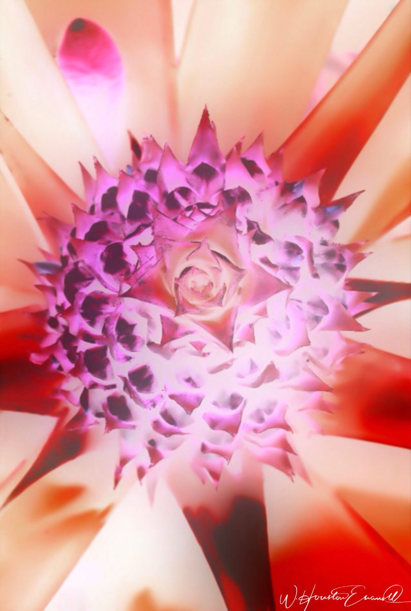
“Star Power” is the luminous celebration of a pineapple.
As I quizzed him about his interest in photography, I learned that he attributes his eye for art, color and design to his mother who’s side of the family has spawned other talented artists, in his generation. He has been posting on Instagram for quite some time – hundreds of images. I didn’t know. I didn’t “follow.” He is modest about his photos and does it for his own amusement, pure pleasure and personal enjoyment – that he likes to share. “I don’t do it to imagine it on someone’s wall.” Yet this observer believes that there is where it absolutely should be! Many walls…many places! #houstonevansphotography
He plays with the medium and all the tools and tricks of the trade. He enjoys the freedom of experimentation. The results are controlled, yet spontaneous. From high resolution to fuzzy pixels that require distance to assimilate. Up close for precise detail and soft smears for imagination to take hold, the variety of clarity or lack thereof are a part of the experience and expression.
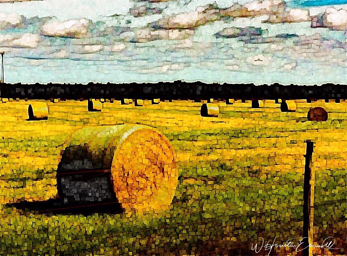
“Makin’ Hay” has an enhanced pointillist treatment – a Van Gogh-esque subject with a twist.
From my interior designer’s perspective, his bold images would be key focal points in the drama of architectural spaces – interiors from Miami to Honolulu and on around the world!!! I can see the towering orchids in hotel lobbies, bars, restaurants and swanky condos everywhere!!! I am eager to find a project, for which his work would be the key to the scheme, unveiling a spontaneous design resulting from the inspiration of the image.
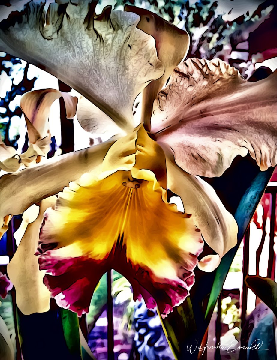
“Oblique Orchid” screams floral superiority as a commanding focal image. “Shooting the Bird” speaks to paradise revisited!!!
In the beginning, the photos stood on their own merits. Evans keeps his originals – some of which remain just that – in their original form, while others are tweaked or more radically manipulated to create stunning subjects and compositions.
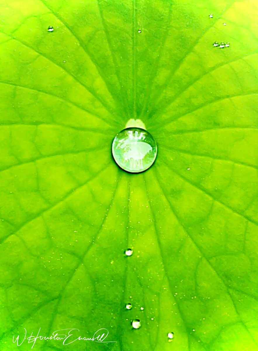
This brilliant, fresh simplicity of “Aqua Eye” observes the droplet’s reflection in the center of the cheery chartreuse petal. Coming upon a cool caddie “Daddy Long Legs.”
I can see his limitless fantasies contributing to the imaginative narrative of Meow Wolf, gracing hotel lobbies with larger-than-life orchid explosions and commanding condo walls with magical statements of tropical color, subject and form. Translucent installations of LED illumination could result in magnificent walls of design influence.
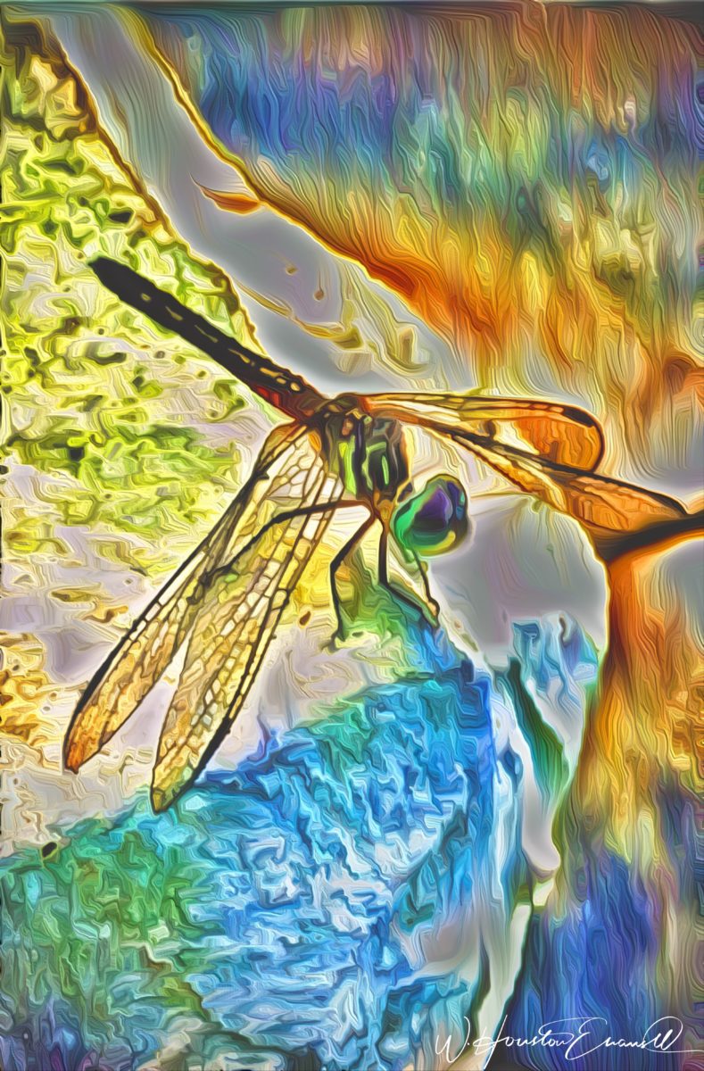
“No Flies on Me” is a fantasy of oozing colors and form melting and melding around the psychedelic dragon fly.
The digital age is advancing with such a pace that we are
all caught-up in photos of food, whacky selfies and sunsets on fire…but
having an artist’s eye, to truly see the potential and master the tools that
are now available – using them to create valid and valued masterpieces of art,
is extraordinary.
“Copy Cat” reflections mirror a chorus of color from sky to watery impressionistic likeness.This “Roadside Attraction” must have been a startling scene to distract dazzled drivers.
I truly believe that his work is exceptional – full of heart and soul – and spectacular fun!!!!!!!! I’m thrilled to learn of these images and now enjoy the continued progress of his discoveries and creations. Let’s see where this goes!!!!! He just might be coming out of hiding!!
Neighborhood covenants, zoning, physical practicality, budgetary constraints…all enter into whether it is realistic or desirable to save vegetation when clearing land for development. Carving around existing growth can be a tedious and costly addition to a project. But there are times when it is a design asset – an imperative even – to the over-all setting and effect of the scene.
Saving trees when designing a built environment is a challenge
that often pays off.
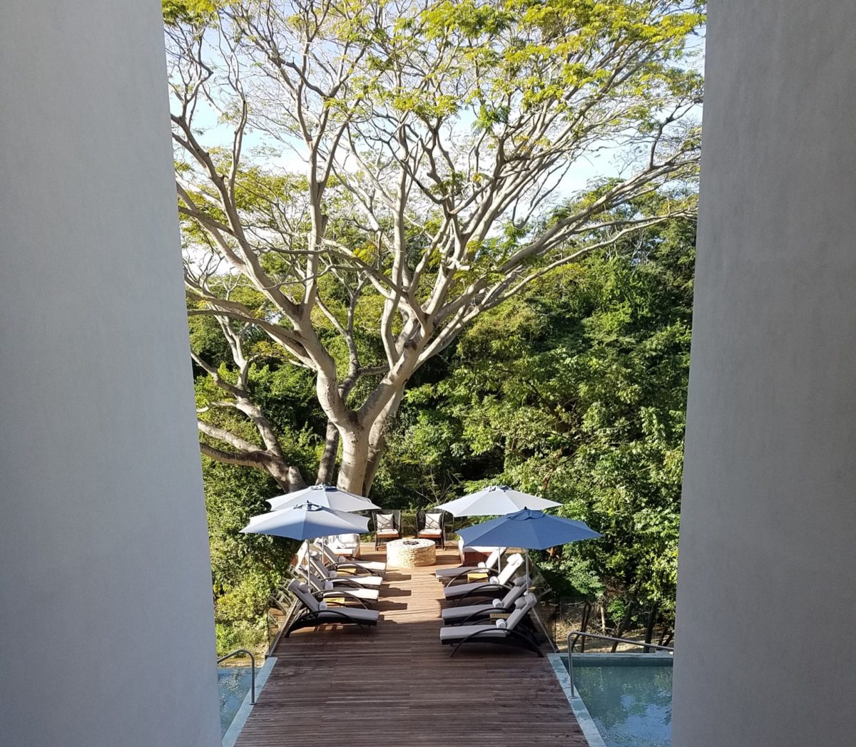
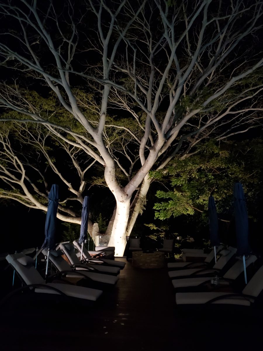
A spectacular backdrop to this seating area – the decades old tree is the focal point.At night – well lit – the same tree towers with dramatic illumination in the darkness as the rear “wall” of this seating area.
Raping acres of woods for barren subdivisions and adding back newly planted saplings the caliper of a quarter is unfortunate and takes years to satisfy. FHA requirements were the tell-tale token of bringing green back after a bulldozer’s brutal removal of all plant-life on a property. That lanky stick standing in the center of a dirt patch, that might get sod or seed…or rock, was a pitiful attempt to give back to the environment. However, in addition to broad-sweeping examples, individual decisions to saver rather than remove can prove valuable.
Years ago, when planning a patio expansion and exterior kitchen, friends brought the plans to me for a quick check before committing to the design from the design/build contractors that they had engaged. The new patio plan meandered along nearly the entire back facade of the house. With all the exciting kitchen layout and bar, seating areas and dining space, I instantly focused on the fact that their beautiful red-bud tree was gone – not in evidence on the pans! I exclaimed about it and was told that they were told it had to go. That was about 10 years ago – or more, yet it still stands today having modified the design to include a tree-well in the patio and opening in the proposed high-ceiling patio cover. The stunning multi-truck tree thrives, in the ground as it had for decades, and climbs skyward through the opening spreading widely toward the second story of the home. A wonderful, living, sculptural element, in the space. Good save!
Warmer climates invite the indoor/outdoor melding of living spaces. We all try to achieve them despite bitter cold transitions and near, if not complete shut-downs “off-season.” But in the tropics, outdoor living spaces become remarkable dimensions to expand living.
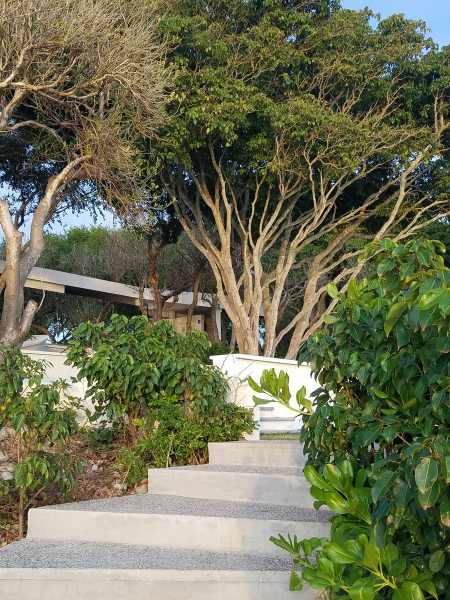
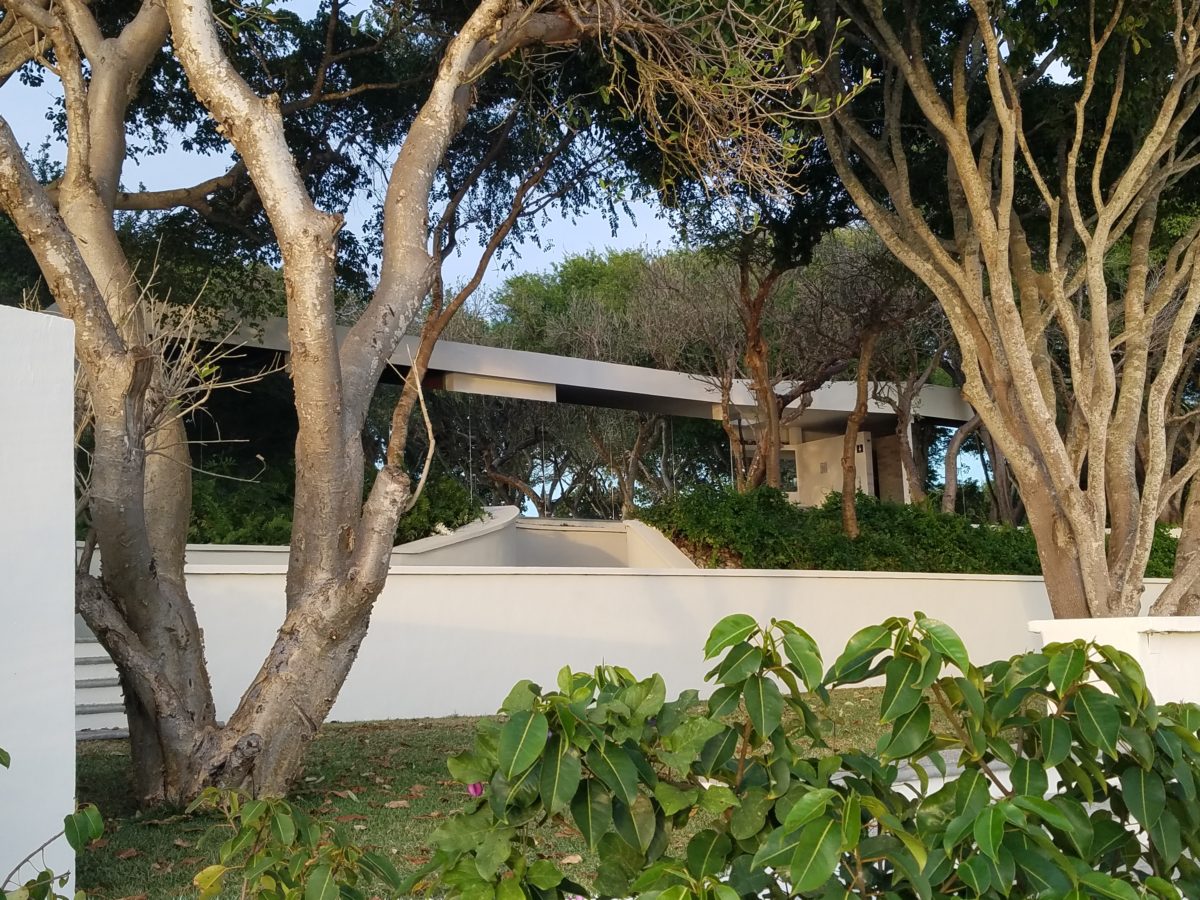
Sculptural trees are powerful elements viewed from inside and outside.
This past week, that situation came to mind as I enjoyed several examples of incorporating nature into the design scheme. Yes, landscape design is just that. Landscape architects do just that. They design exterior spaces with organic material. But what I was feeling recently was two complimentary things – one that designing in and around existing growth is so satisfying and in some cases, the living plant material becomes the architecture – not merely compliments it.
In addition to their sculptural beauty, they add balance, scale and a canopy over the exterior rooms.
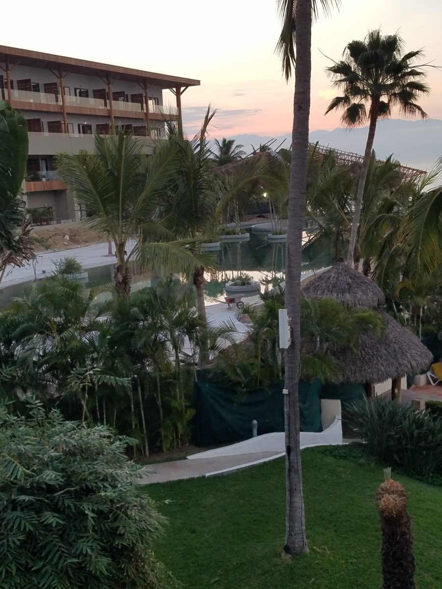
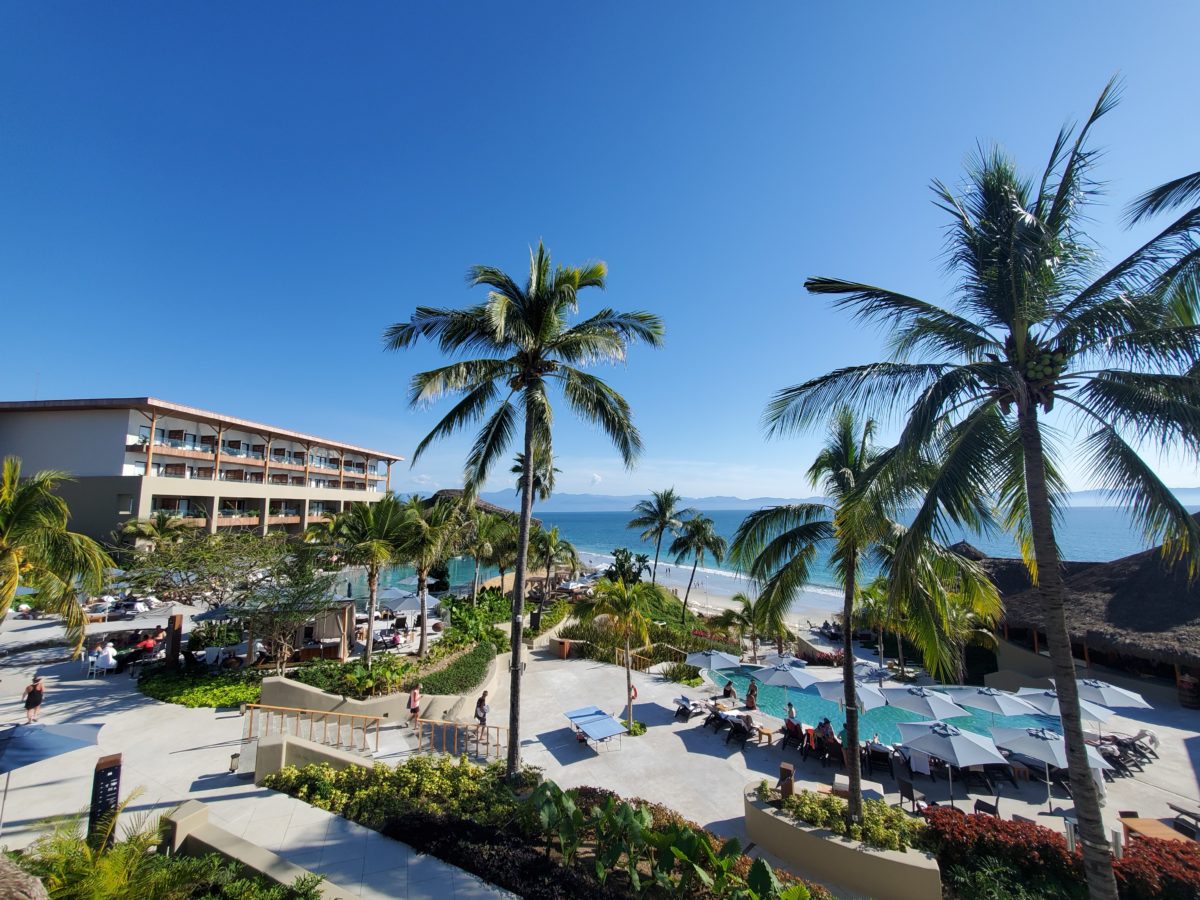
This past couple of weeks, we have see the results of 2 years of preparation and construction which transformed of a piece of partially vacant land into a seaside resort. Several key palms and a couple other key trees were saved and hundreds more were brought to the site to complete the design. The towering new trees showed signs of shock with their dried frond tips – but will surely survive.
What has been a foreground of some landscaping and virgin jungle ,with houses beyond, was bladed and terraced last year in preparation for a new project. Buildings and pools appeared, jungle growth was removed and a few key organic elements retained. The recently finished scene is dramatically different – incorporating specimen trees throughout the property into the new plan.
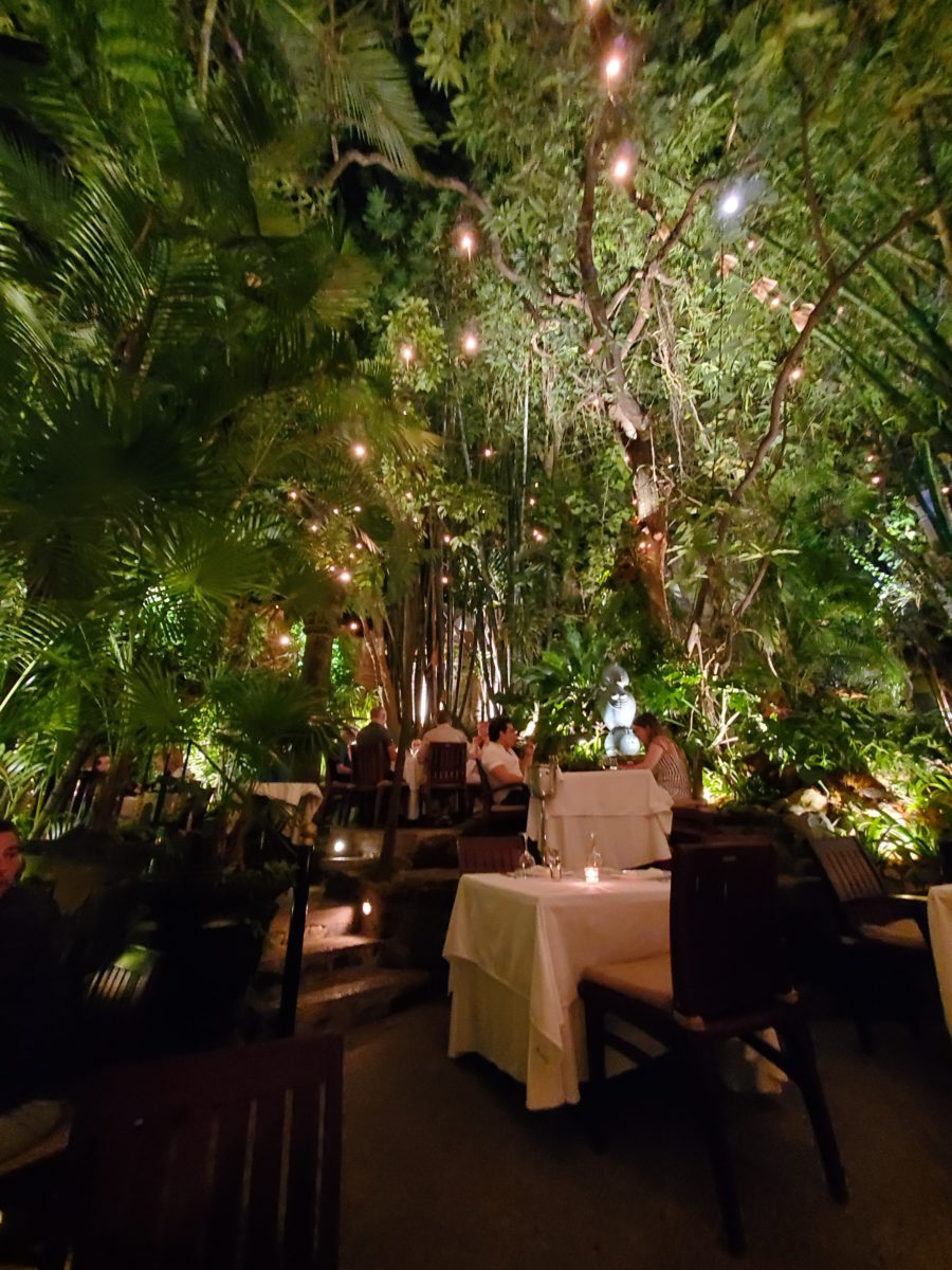
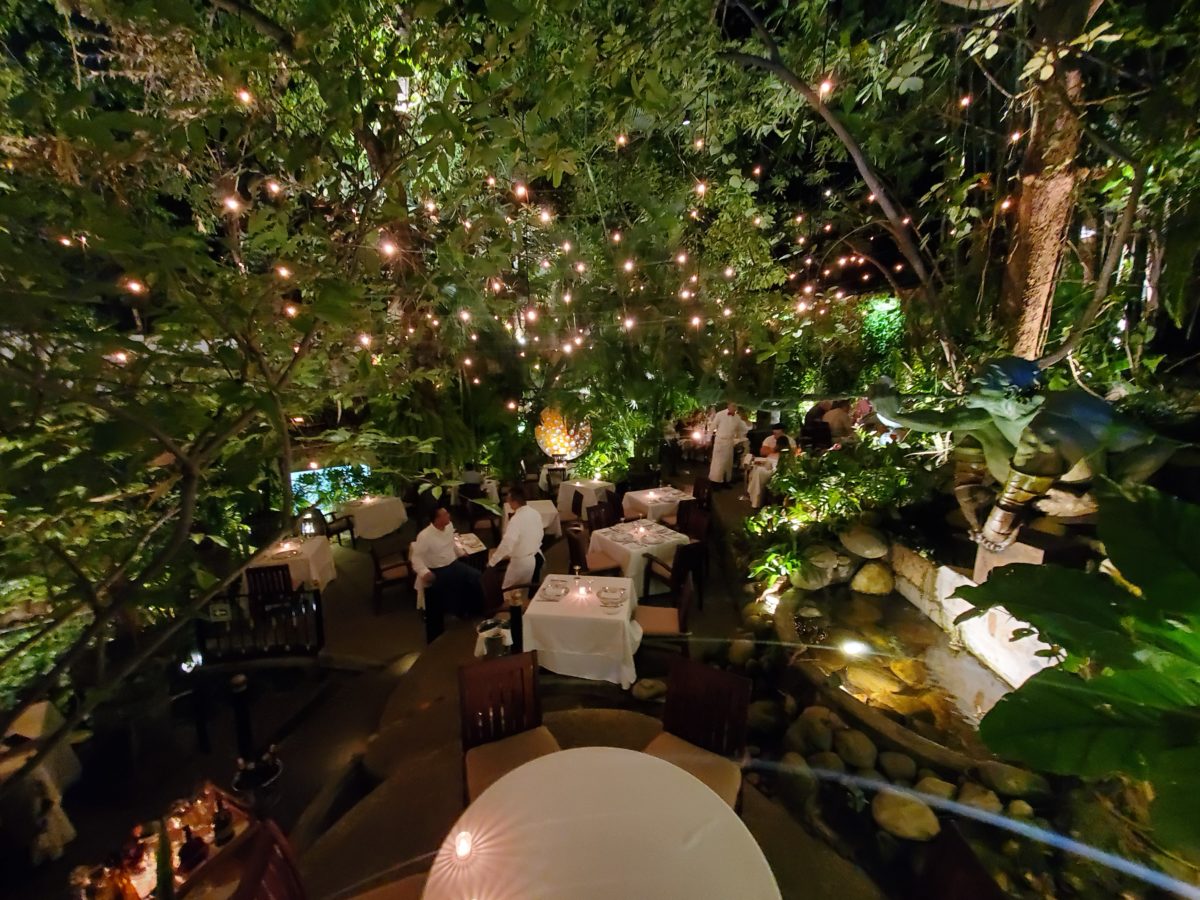
When landscaping becomes architecture you know you have crossed an exciting line. What I mean by that is to have the growth become walls – to have the vegetation read as though structural framework.
This terraced dining patio is framed by massive bamboo and other large trees and plantings. They are substantial enough to read like screens, if not walls, framing the space. From a canopy of growth, strings of LED lights are suspended as though from the ceiling – a ceiling of branches over this enchanting outside dining venue.
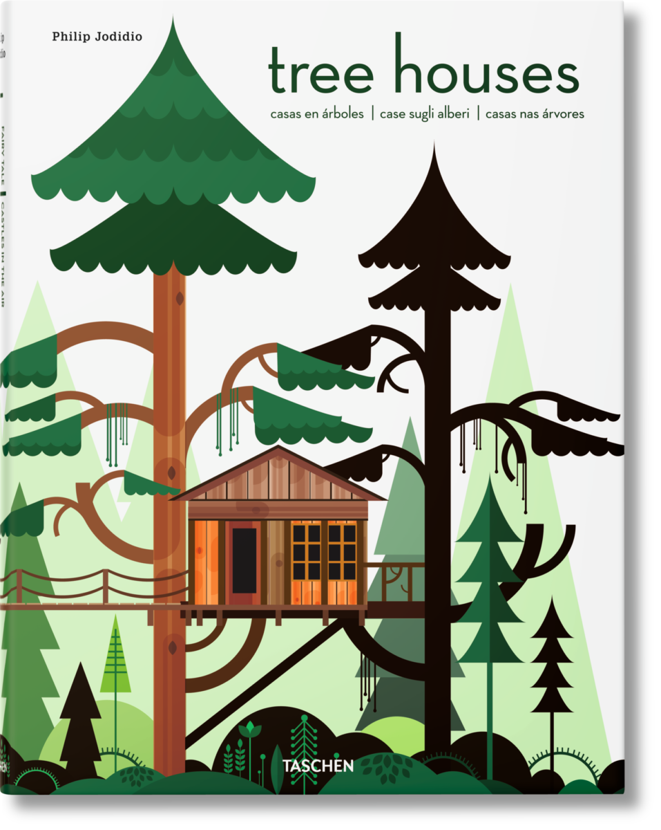
A tree house is another example. The tree is the structure – the framework to begin the additional elements that create a suspended room.
This entertaining and imagination-spurring book by Philip Jodidio is worth investigation. Here. find extraordinary examples of trees as the structure of other amazingly fanciful spaces!
By observing examples in your world, you will see, when designing around and in concert with the natural landscaping, the effects can be dramatic and of great value to the scene. On your next project, consider the possibilities of saving rather than removing – incorporating and celebrating nature’s design elements!
When designing for a vacation rental property, the first order of business is to select things that are durable and easy to maintain. This means finishes to furnishings. I know this from practical life experiences and also working with commercial/hospitality interiors. To do so, one needs time to place and receive the orders with enough contingency for mishap. It is also dependent upon the housekeeping arrangements planned for on-going maintenance.
In this recent project, the work began 12 months out – plenty of time you think…but it was all about the physical remodel. We began with the drawings for floor plan re-configuration and specifications for new lighting, cabinets and finishes throughout. The decision to furnish was not made until nearly 10 months later with a deadline to complete in less than 7 weeks. The delay was partially due to an indecision over how many of the 4 units (all on one floor) were to be short-term or long-term rentals. Then a new city ordinance imposed a moratorium, of sorts, on short-term rentals and while that was tossed about over several weeks…more indecision ensued.
It’s a riot to see overnight design projects transform interiors in 24 hours. That’s due to a free-reign for design decisions, a team(s) and vehicles to pick-up/deliver, all trades on deck, a single director calling the shots and an organized chaos that results in a magical finished project – yes, like magic. Open your eyes, be stricken with awe, cry a little and exclaim repeatedly that you “just can’t believe it!!!!”
Real life is generally not like that. Real life has in-put by owners, limited schedule openings by the various trades, little spontaneous decision-making and fleeting time riddled with unwanted surprises and delays. Real life, in this case, was a theme provided by the owner, a preconceived “look” developed in the mind’s eye and scratch paper of the designer during the selection of finishes and floor plan modifications and vacillation for several reasons, of what units to furnish and when. Over the course of a year, leading up to less than the last 30 days, the project was to be fully furnished and finished – ready to rent!
The good news is that with controlled frenzy, changing
availability of products, focused efforts and teamwork, we are pleased to present
the Lobster! Completed all but hanging the TVs by the requested July 1st
deadline, it is beautifully appointed and offers a colorful and a bit
whimsical, spacious, clean and did I mention enviable location- 2 blocks from Pacific Beach
in San Diego?
This entire project, except the move-in this last week, was done long-distance with the owner in Maine, her management company SHORE on-site in California and we the design team in New Mexico. This is not at all unusual, but Maine prompted the owner’s desire to name the unit Lobster. Not your spiny lobster from the local waters, but the New England version from the Atlantic with the classic recognizable form that accompanies the imagined crustacean – including the brilliant reds of the often appreciated steamed version!!
With fond memories of her childhood helping her elders maintain this property, the owner wanted to commemorate the building with an entry plaque visible from the street on the new redwood gate (soon to be completed). In addition, we suggested an individual name/theme for each of the 4 apartments which were all initially designated as fully-furnished short-term rentals – hence the bold identity for each! I designed the new name plaques and had them fabricated by Artistic Bronze in Florida. The backing was built by our talented Enrique Jimenez, in New Mexico, and all shipped to California. Bronze was selected for its timeless presentation, handsome durability and commanding respect. Parisienne was the font I selected which may now be used to identify the property as though a logo to tie-in with the on-site signage. Subliminal cues that are recognized even slightly are effective reminders and triggers for recognition. The idea was intended to offer a fun, but lasting, introduction and identification which was to be reflected in the interiors. The Lobster was the largest unit with 2 bedrooms. It was ultimately chosen to the be one fully-furnished unit and owner’s second home when visiting the area.
For budget and availability, we sacrificed certain durable
features that would have been better long-term investments, resulting in some
knock-down furniture that was never intended for much abuse. Fragile painted
table surfaces – for example – better in laminate, wood or stone…but time
will tell.
The look is clean and fun, colorful and beachy – with a slightly up-scaled twist. Cool aquas accent a few walls in the otherwise crisp white interior. Red punctuates effectively in lobster accent pillows, decorative accessories and the full-wall mosaic glass tile treatment in the kitchen. Yes, once again, we like to treat tile on the walls as not mere back-splashes, but wall-covering full height and width!
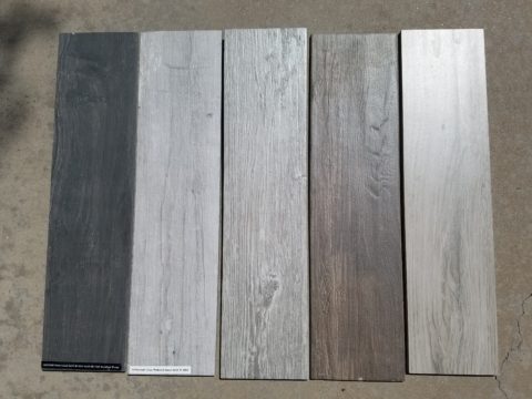
Weathered grey toned LVT (Luxury Vinyl Tile) in the way of interlocking planks were an easy to maintain and durable floor finish. The faux wood adds warmth and is softer underfoot than other hard surfaces. Perfectly matched with all trim pieces, this flooring is fabulous!!
Lighting is key and here we added recessed directional lights to spot the walls and related artwork. Switching was also an important detail to have options for the lighted areas and accents.
The owner found a novel lobster rug with a great textural,
tufted, yarn system that brings fun and great color and warmth to the bunk-bed
room! Busy, colorful bed dressings intentionally selected (over the hospitality
white that is still trending) contrast against the bright white bed frames
stacked for space optimization and a little kid fun!
A cool find in the way of the glass vessel lamp…where
usually the stem with electrical cord feeds down through the center of the base
and of the back, this one feeds from the socket stem with a cork top that
removes allowing the vessel to be filled with treasures – in this case southern
California beach shells and fragments! And for a little more animation, I found
a carved wooden shark to insert cruising above the shells to make the lamp even
more interesting!!!
A pair of vintage photographs of a lobster shack and fishing
boat contributed by a friend in Albuquerque – taken by him in Maine in 1962 –
were enhanced with bright red mats in their original polished silver metal
frames along with a large painting on canvas of a Maine lobster/fishing boat sent
by the owner in Maine provide interest to further perpetuate the lobster theme.
The master bedroom is a comfortable retreat with another
lobster pillow for punch! To give the room the best approach and make it feel
as large as it can be, placing the bed in front of the windows was the
solution. Beds facing the entrance to the room are always preferable to
arriving into the side of them – for visual space and a more inviting
orientation.
The original bathroom layout was all one space with tiny
appointments jammed together…so we removed the tall storage cabinets and sink
vanity allowing more room for the commode beside the tub/shower and added a
privacy door. Then the new cabinets and counter have their own space with
another privacy door resulting in a two-compartment bathroom area for maximum
use and enjoyment. Red mosaic glass tiles were repeated from the kitchen to further
coordinate the theme.
The bold color scheme was thoroughly distributed throughout
the unit which is an intentional design emphasis especially effective and novel
in a short-term vacation rental – where such a thorough scheme might be too
intense for one’s primary place of residence.
Effective design both functionally and visually should be a significant asset in the marketing of rental property. When used consistency in marketing material with logos and repeated features, this and other properties with attention to detail should attract the discriminating guests. Once there, repeated stays are the key to maintaining a strong guest population – of desired visitors.
Please watch for the entire slide show of before and afters of this dramatic transformation in the commercial projects section of our website, in coming weeks, entitled Emerald Green Beach Rentals – Lobster!
With all the New Year buzz about the new color forecasts…I started taking notice of the seeming non-color, white. It is often considered the absence of color when in fact it is a very complex color of many shades and values. Just try to select a white and you will know what I mean.
When you look at white paint samples, you will notice the nuances. There are pink whites and blue white, grey whites and yellow whites. Each white is off-set and contrasting to another. You see the differences by comparison and by context. You think you have just the right white until you place it against another sample and see that it is grey or cream and then second guess yourself again…and again…How do you know which white is right?
Dunn Edwards groups their whites and pastels in a separate section of their fan deck as do other paint companies. What is interesting here is that the background is a sheet of white copy paper. Notice how is reads against the colors in the samples…it seems to be a purple blue color. This shot was taken under a full-spectrum LED lamp. The colors should be true. The range of “white” is amazing.
To intentionally design with white is bold. To have the confidence, to decide that white IS the color and that white IS the scheme, is challenging. To effectively design with white, you not only have to select the right white(s), but you have to know just how much of anything else might be effective yet not detract.
Le Leche in Puerto Vallarta is a fabulous example of designing exclusively with white. Only with minimal punctuation with black lettering on the wall of containers and also by allowing shadows is the white interrupted. But the blacks’ minor interruptions gives depth and fine detail.
White design can be cold or warm. Depending upon the desired effect, mood or function of the space, the whites need to be carefully selected. This is true with lighting as well. Warm whites or cool whites…what gives you the desired result?
Popular white string lights add festivity and a warm glow to an evening scene.See how many lighting colors you can identify in this scene…Starting on the left, a cool pocket glows through the underbrush. The walkway has a warm pink-ish light. The very cool blues of the pool area give a dramatic read. A bold yellow accent peeks from the far left and also over on the right. The palm trees are wrapped in a warm white tube lights while the far right side illuminates the entry to the dining palapa with a cool white light source. The foam of the surf on the beach is captured with a cool white spotlight that maintains its naturally expected white color.
Knowing when to add color to a white scene to achieve an intentional POP is an art. The color itself, the amount and placement is all part of the success of a good design result. From the fine black detailing in the previous shot of La Leche to this still-life composition of a tropical cocktail that I propped the other day, the minimal punctuation of color is key.
White mosaic shards of tile in the background of this composition featuring a peeled coconut and the POP of a pretty pink party umbrella result in a white-on white scene. Yes, this shot says PARTY with a perky smile!
The bench which served as the backdrop for the coconut cocktail is a dramatic serpentine sculpture of site furniture that plays with the white-on-white of the tile and grout.
Contrasting against the organic wood decking, this white monolithic bench snakes around the periphery of this outdoor lounge area. The sunset is casting a soft pink wash over the all white glazed tile.
Beach settings using white materials compliment the white sand and greenery of the tropical plants. From wood frame platform cabanas to the sprinkling of umbrellas, white is a wonderful, fresh color for a crisp clean scene.
Whites on whites…creamy sand colors to crisp white terrycloth, the white-on-white scheme is soft, inviting and clean.Greenery compliments the white umbrellas and sunning beds on the lawn by the beach.Palm trunks and other fruit trees are often painted white to protect against insects and what insects insist on climbing the surface are easily spotted by birds who appreciate the help to capture a snack! In this case, they contribute to the white design theme.
The soft creamy off-white folds of fabric offer a soft, inviting scene.
Shadows in the creases and depths of the folds add the dimension to the luxurious feel of the cotton damask fabric.White stucco is dappled by shadows and greenery while given a warm, strong base by the brick pavers. White as an architectural finish is only successful if the context compliments it. This is true in all design.
Architectural color and texture of surfaces is a moving target. A recent discussion about a white building with black detailing would not have proved right for this particular use of white. The hard, commercial read would have been too severe for the intended effect. Yet that same project, with a warm white and an ochre accent, will be just the right combination to achieve the desired result. Watch for this project to be featured in a few months.
Architectural surfaces incorporating tones and textures of white provide interesting opportunities
Block and crumbled edge accent bands on the facade of an exterior wall.
White in design is an exciting selection. Knowing how, when and why to use it is a test of your creativity. Picking the right white is the challenge.
The limitless colors of white found in a pile of gravel…..
So the next time you think white, think a lot about it. Study the context and what you are trying to accomplish. Feel freed by the fact that white is a color to express and enjoy.
Not as the title suggests…tequila shots and all – but another kind of intoxication…an intoxication from unexpected beauty, sensory overload, inspiration as seen in the following photographs.
Those of you bundled up against the elements this time of year…freezing your booties off in the icy winter climes. Enjoy this escape into your unbridled imagination of design and lifestyle gone wild!
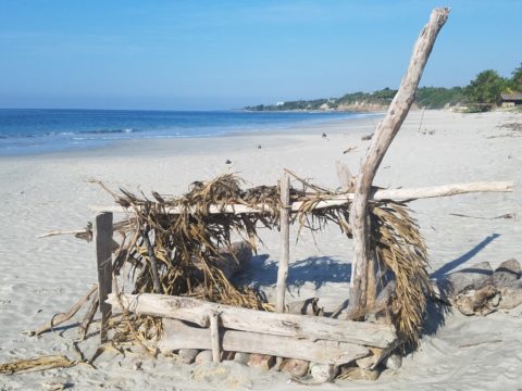
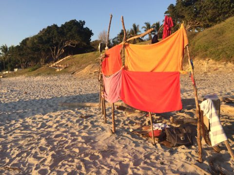
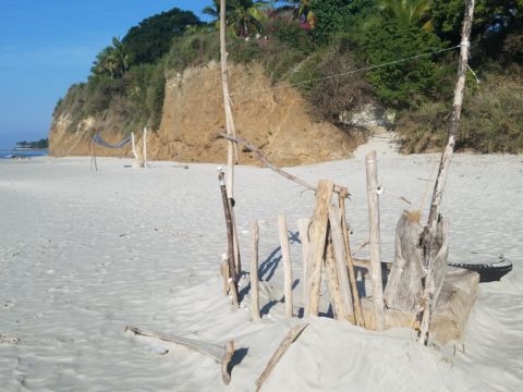
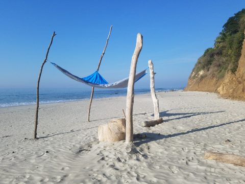
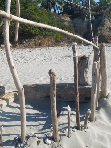
Thought a beachfront condo was out of reach? Think again. With all the DIY out there on the internet today, anything is possible. As evidenced by the inspiring framework of architecture that I have encountered just this week alone, consider the possibilities and have a little fun!!!
Very simple things trigger design concepts. Beyond the fascination I have had with these beach structures, this particular photo was bathed in late afternoon light. The glow of the orange towels was emitting a warmth that was so tropical, had it not been on a tropical beach, finding the same boldly colored and textured structure in a snow storm would have elicited a startling, contrasting feeling of the same tangible warmth.
This make-shift west-facing beachfront was so beautiful, in its simplicity, that it spurred ideas of bold fresh color, basic found-material furniture possibilities, fabric design and organic architectural solutions for patios both commercial and residential.
Imagine raw elements incorporated with concealed structural support to convey the feeling of spontaneous simplicity.
Then there’s that general calling that speaks to “the natural integrity of the materials.” You realize it is a grounding. It is a starting point of reference to all the embellishments, layers, machinations and manipulations that are possible.
Wood is wood until it is stained, painted, appliquéd…when does it lose its “natural integrity?” Even raw, man-made cinder block – CMU – concrete masonry units have their own natural character. Then stained in the aggregate or applied color, thickly coated…it alters it’s state – losing its material’s natural integrity.
What ignites design thrills? The fireworks of ideas that burst onto the scene illuminating so much that was previously obscured. It doesn’t have to be a remote and seemingly inaccessible tropical beach…it’s everywhere. Look around. See texture and color, shape and frame. Urban, suburban and rural settings in any climate all offer inspiration that can be isolated and appreciated. Design inspiration can be intoxicating.
Why is designing so exciting? Why is it often such a rush? You never know when an idea will appear or from where.
The world around you is a constant stimulation of ideas, inspirations and possibilities. You are thirsty for whatever is out there…whatever is waiting to be discovered, implemented… quench those longings. It is all about the freedom to allow ideas to be spawned from anything around you or in intertwined with your own imagination.
What fun to have come upon these simple structures on a glorious and sparsely populated beach. What fanciful design ideas and story-lines were prompted by the imaginary occupants, their creativity, resourcefulness and problem-solving simplicity. Lest you think they house the homeless adventurers, they are actually sun-shades for creative surfers and affluent sun-bathers seeking a primitive beach experience.
How might these primitive structural solutions play into a future project? Watch for design trends to incorporate more organic materials and nature’s inspirations!
When planning a commercial project, how do you separate your personal taste from an objective view of the program for the business? This situation has occurred twice in the last year with my practice. Well, there can be blurred lines. There can be design elements that work in both environments. There certainly are offices that mimic residential living rooms – contemporary or traditional – modern or historic, but it should directly relate to the type of business and the brand of that business. What does the space say with regard to conveying the intent of the business?
The selection of materials comes first. The bones of the building – what’s exposed, what’s concealed, flooring, wall treatments, etc…The first project was a medical related business – corporate office for a product line. The neighboring space was a physician’s office and treatment suite. The common space had existing concrete floors. The woman leading the design decisions for the medical corporate offices wanted to continue the concrete into her waiting area and throughout the offices with area rugs in each room. A small-scaled water feature, in the form of a grey box, is located adjacent to the seating and a distressed chest and metal sculpture are also part of the scene. Her selection of chairs were heavy, gold tapestry, over-stuffed and tufted. They were placed around a round table in the center of the room. All I could see was a setting for a Victorian séance. It in no way reflected the clean, crisp, fashionable brand that they had established to represent their rejuvenating medical product line. Rugs invited tripping hazards and the look was in no way speaking the language, of the intent of the business or its brand. It spoke directly of the woman’s home, from which she replicated her eclectic taste in the office.
Next door, nearing completion, the physician’s group was being strong-armed into going the same route with the concrete floors. We love concrete floors in so many applications, but here – in these two spaces, they were existing, did not take the stain well and looked dark and dirty in the final polished presentation – NOT the fresh look of a sleek medical group. Not the finish to convey confidence and cleanliness. Treatment rooms had vinyl flooring for necessary maintenance, corridors and physician’s office had carpeting, but the docs rejected the contrasting finished product in the entry and restrooms and went back to the light tile flooring that was originally specified regaining the professional appearance of the intended design.
Faux wood porcelain boards are a fantastic contribution to the design offerings for both residential and commercial finish materials. Shown here on the exterior of a building by the ocean, the artsy peeled bark variegation of the pattern is striking and makes a commanding design statement.
It is carried through into the interior and back outside on the rear dining patio.
The idea is that a wooden building by a seaside is traditional – this is a stunning twist on that which was once a customary building material revisited with an invincible, high-design version. The use of wood for such a place would have been historically accurate.
The same is true when faux porcelain planks are used on the floors in the produce section of a grocery store – replicating a produce market or barn where fresh produce is collected and sold. Some high-traffic food-service establishments, bars or breweries often want the look of wood floors – to convey a context or scene – but are not durable and therefore not advisable. A home – almost anywhere including the obvious – in the woods or by the shore, with wood flooring might not be practical, but by using the wood planking porcelain, the look is conveyed while the durability and maintenance is made effortless.
Recently an owner wanted the “look.” That sleek modern look of grey porcelain planking. His business was one that dealt with automotive repair and restoration. In evaluating his brand and the nature of the business, real wood floors would never be the material of preference. So to use even a durable, invincible, porcelain version seemed out of place.
Concrete would be more the material of a garage environment. To make a corporate statement, concrete can be dressed-up. Porcelain tiles simulating concrete is an appropriate faux finish option – either way, preferable to creating an interior of grey weathered wooden planks. Watch for the completion of these projects in the coming months.
Adopting the use of materials merely because you like them or they are in vogue is not always the best approach. Consider the context, the intent, the statement materials make – how they “read,” what they say – what they convey.
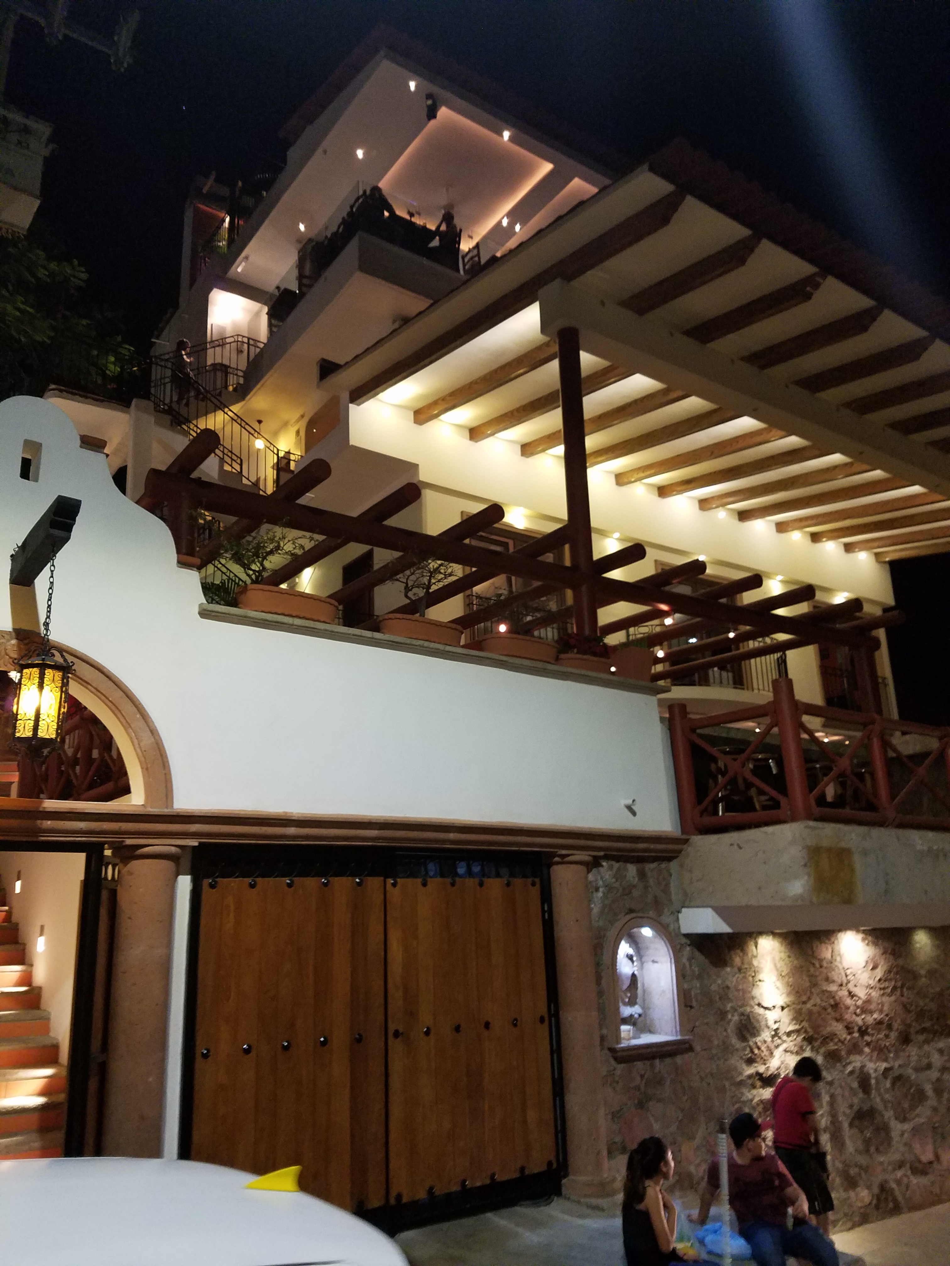
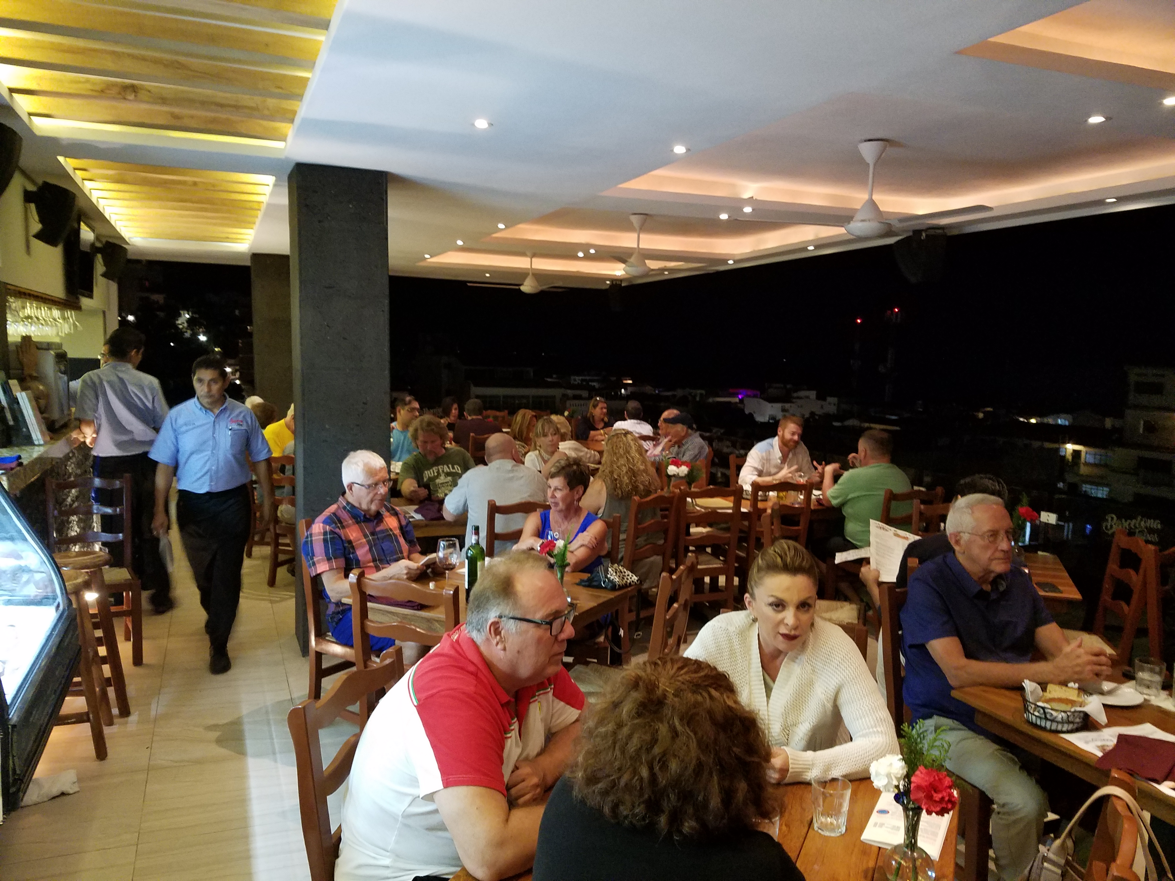
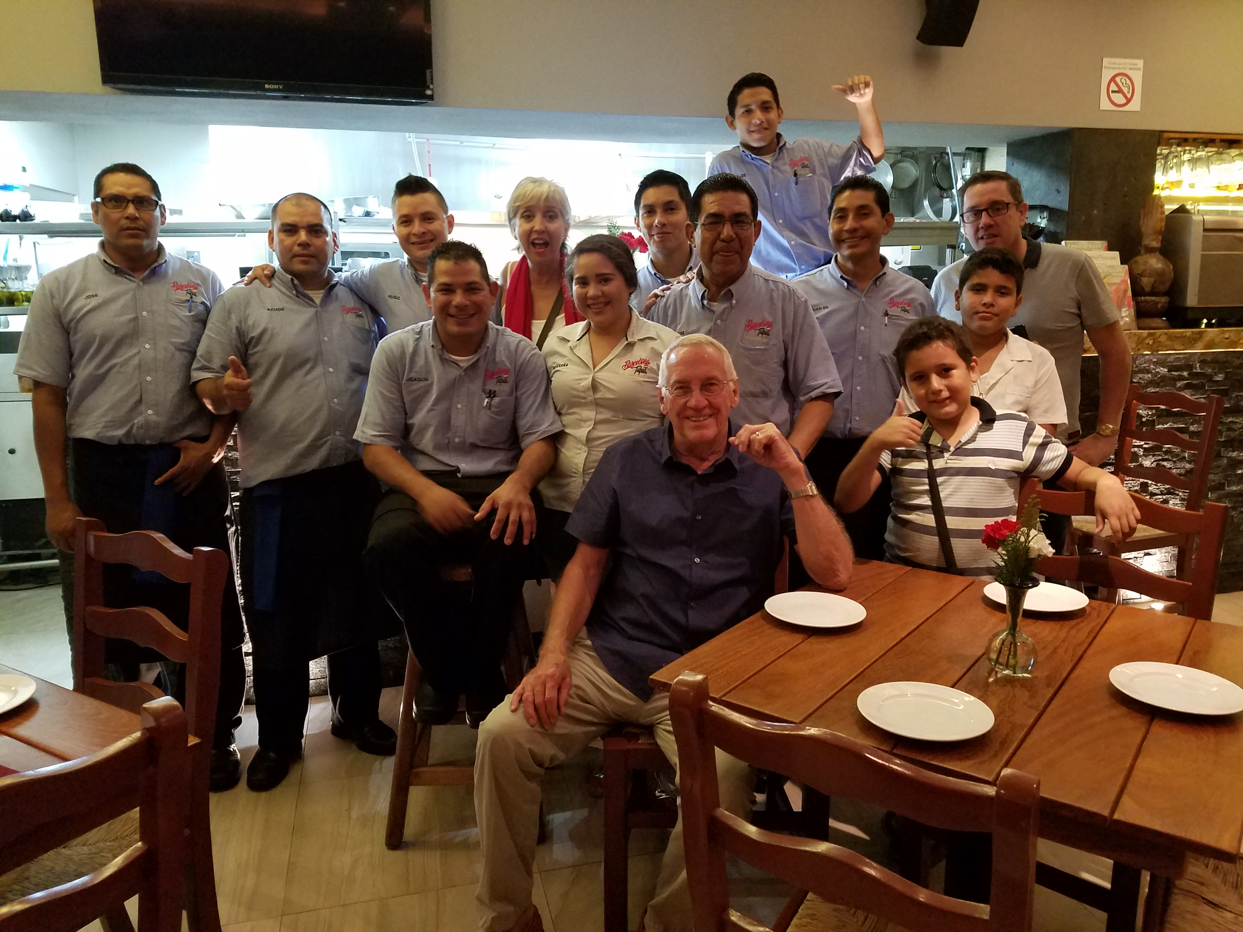
For years, Barcelona Tapas has been a creatively successful culinary and social scene on a quiet cobblestone backstreet in the tropical, seaside, destination of Puerto Vallarta. The vertical profile of the sun-bleached white building is distinctive with its open spaces – dining rooms on each ascending level.
It is a extremely popular, hip and happening, dining venue which has recently had a spectacular face-lift that brings the structure and open-aired/interior environment up to par with the culinary delights.
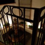
Upon arrival, the familiar, welcoming doorway opens to softly lit aggregate stairs that sweep up each tier of the towering edifice.
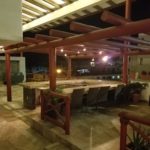
A massive Cantera stone fountain babbles gently amidst tropical plantings and an iron grill-work is indirectly illuminated for a dramatic effect. An expansive patio all with honed stone tile floors begins the layers of available spaces.
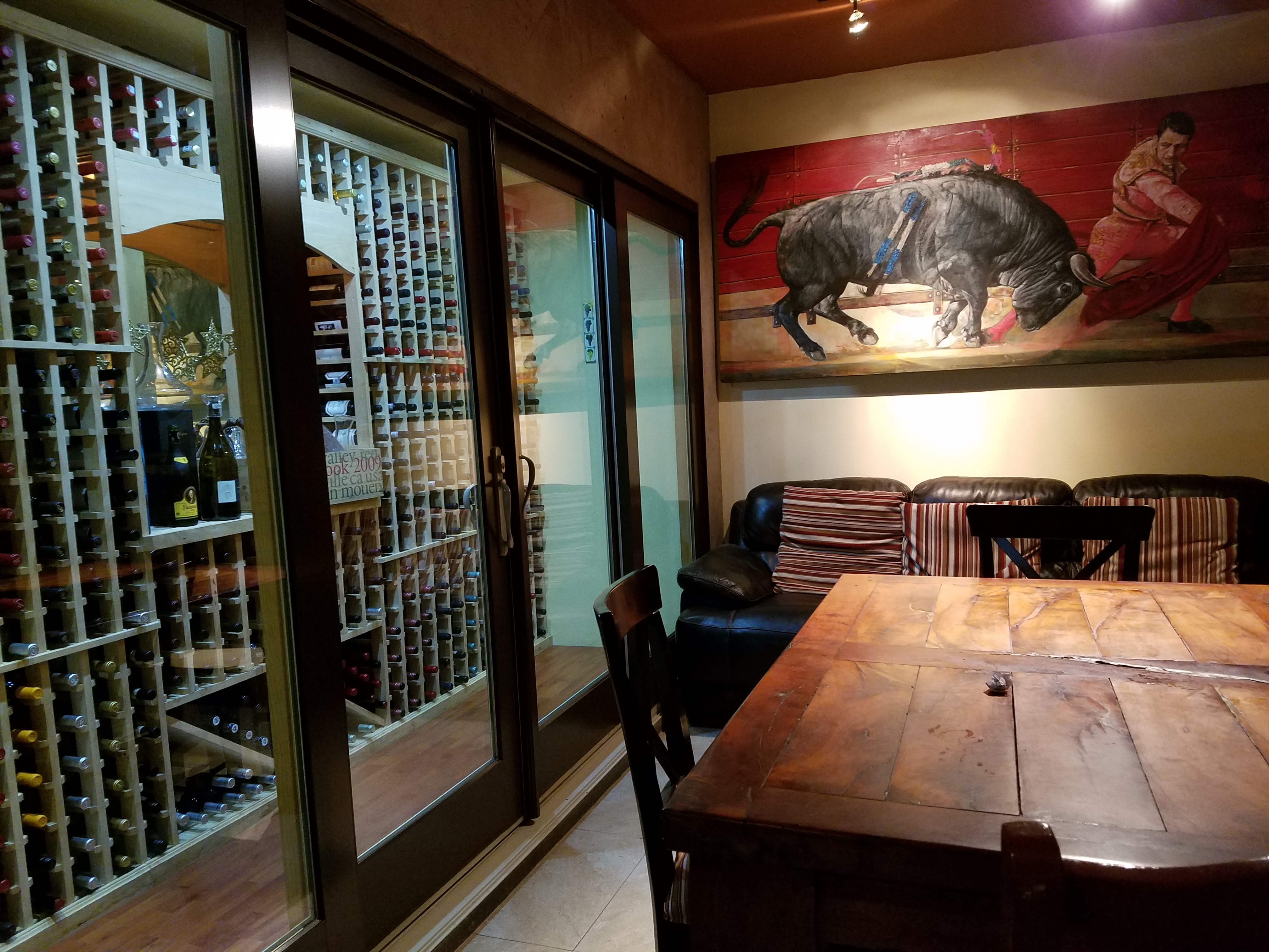
Next an intimate open-aired dining area with an adjacent chef’s table and luminous, full-wall wine cooler beckons with an inviting aura. The intense red drama of a bullfight is rendered in a large painting on the rear wall – a suiting backdrop to the Spanish theme.
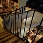
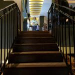
Continuing the ascension, the delightful glossy black ironwork railing follows along and up the open-to-the-sky aggregate staircase turning past the last landing. Ahead, the beautiful, warm glow of the new dimensional ceiling treatment accented with wood and indirect lighting draws the eye upward.
Upon arrival on this rooftop dining platform, what was always an exciting view of the city lights, both in the foreground and circling the bay miles around to the north, now expresses the new architectural features and finishes dazzling the eye.
Effective lighting, recessed ceiling details, a new clear glass railing, and modern ceiling fans dangling like detached white nosecone propellers present a whole new, fresh, modern look. The drama and effectiveness of the lighting paired with the wonderful surround sound, coming from eight Bose wall-mounted speakers and 2 sub-woofers recessed into the ceiling, result in an atmosphere and music that are seductive and sensational.
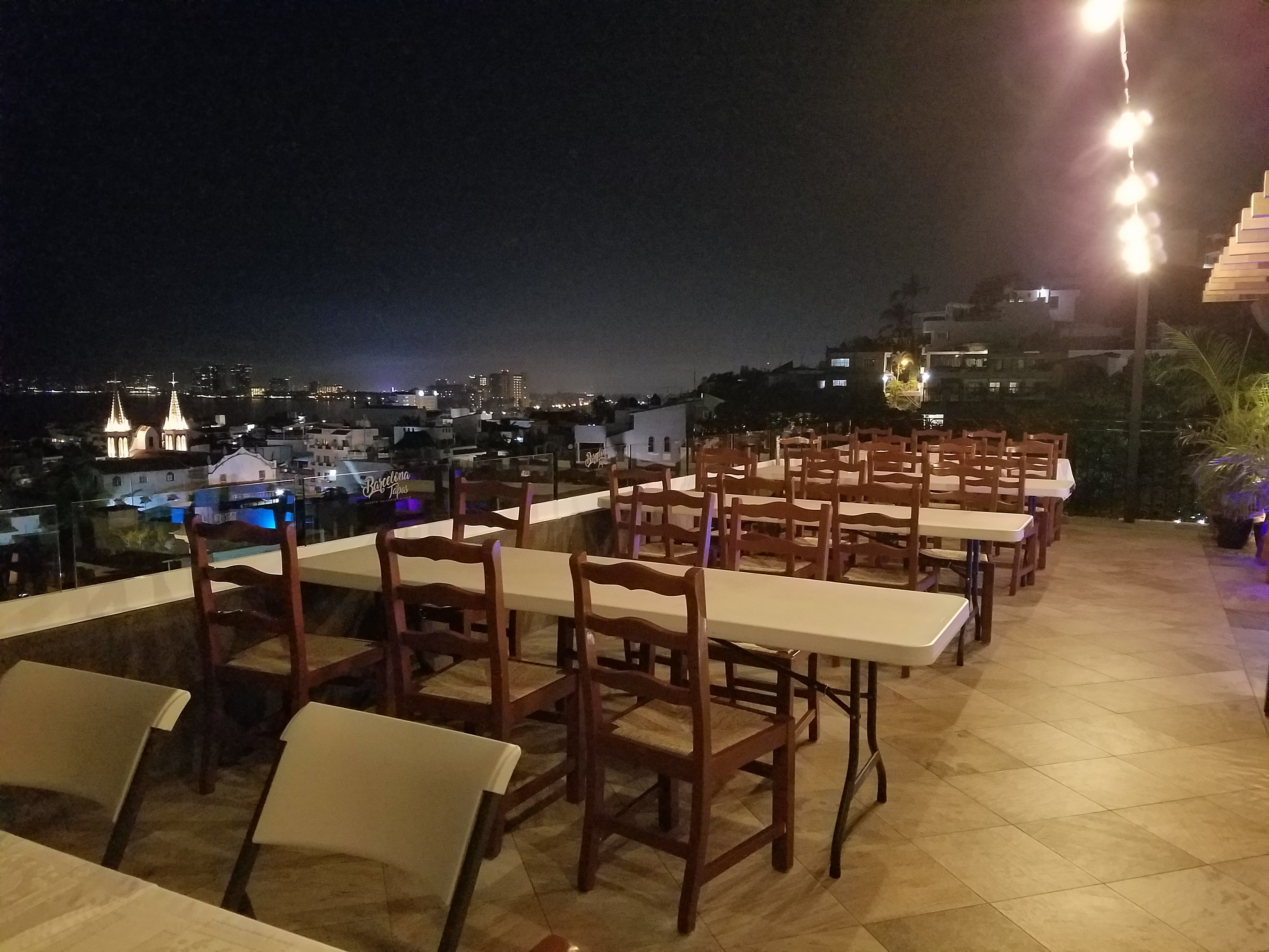
But wait – there’s more!!! Yes, an additional rooftop dining patio is revealed upon discovering the hidden staircase at the far end of the bar. New furniture and a billowing fabric-draped portico are soon to arrive!
This new space not only increases the seating capacity, but offers yet another panoramic view and trendy design-themed open venue – expanding the options even more!
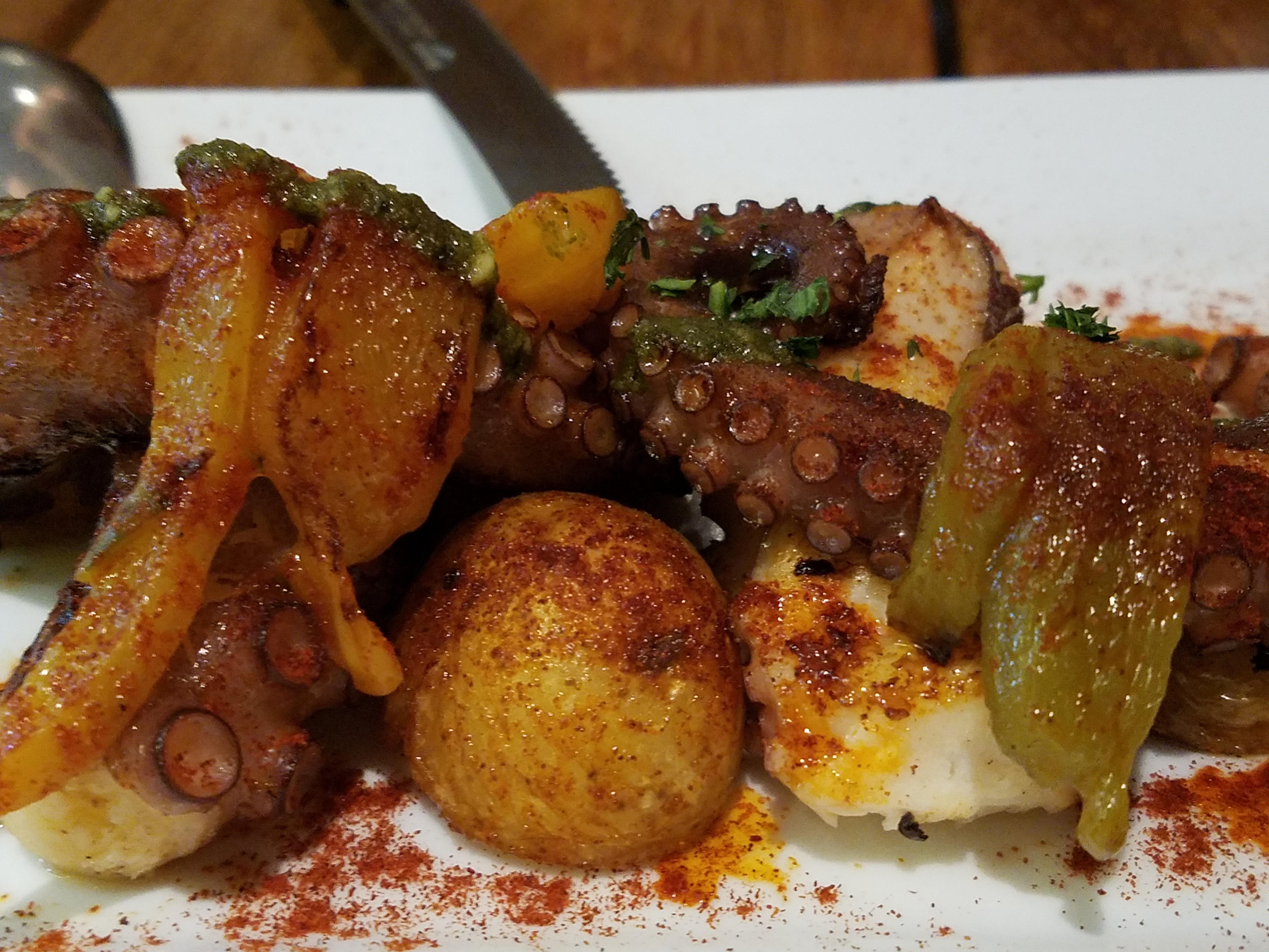
The project is Chef/Owner Bill Carballo’s passion.
He has been at it for years creating deliciously original and traditional Spanish tapas (here his exquisie presentations have been half eaten in the rush to enjoy)
from the immaculate exhibition kitchen at the start of the long bar, with a fine-tuned staff eager to assist and cater to your every need.
This enchanting transformation has attracted new discriminating, trend-setting clients and welcomed the return of loyal fans to experience this exciting new and stylish interpretation of Barcelona Tapas.
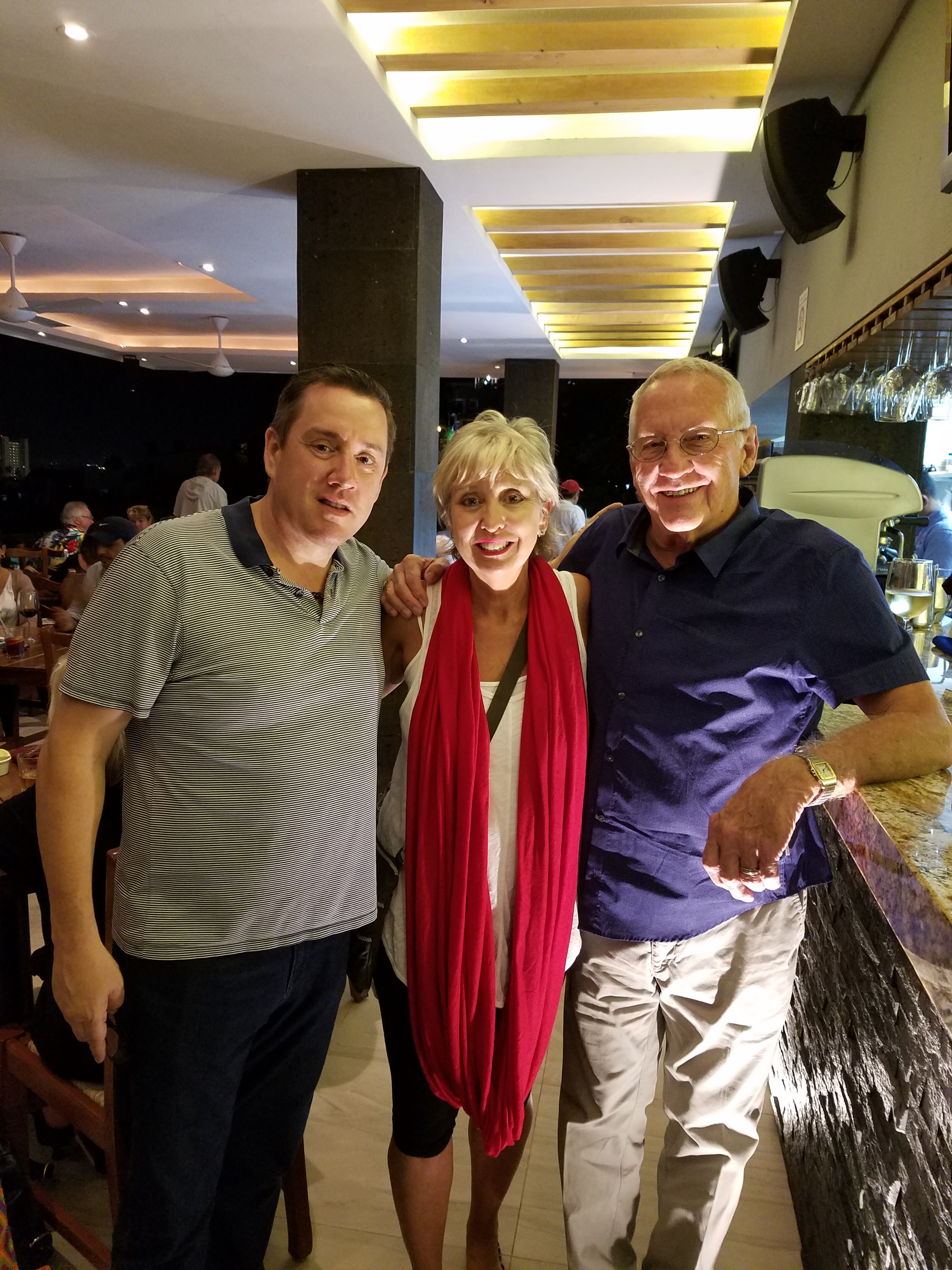
The doormen Luis and his affable sidekick are there to greet and assist!
Thank you gentlemen and Buenos Noches until next time!!!!
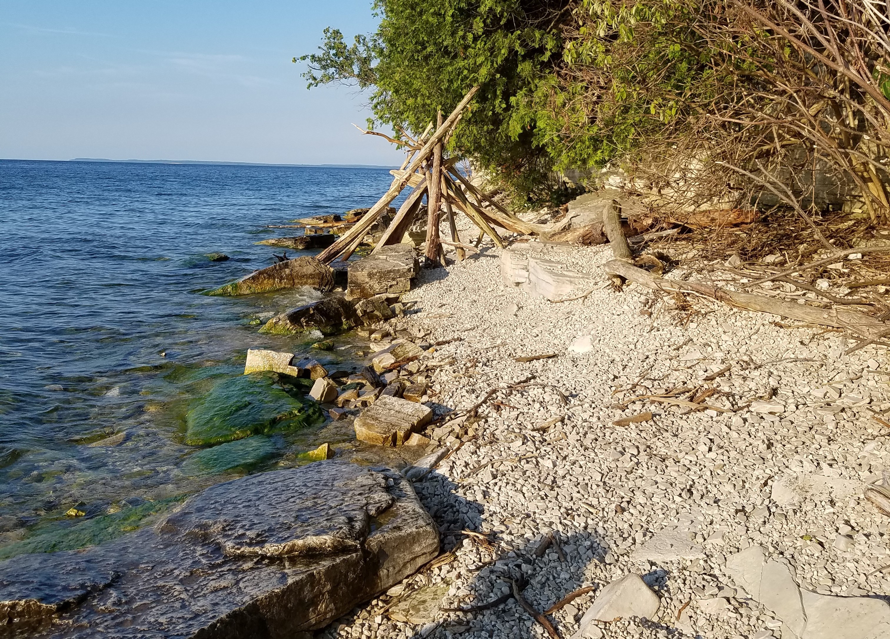
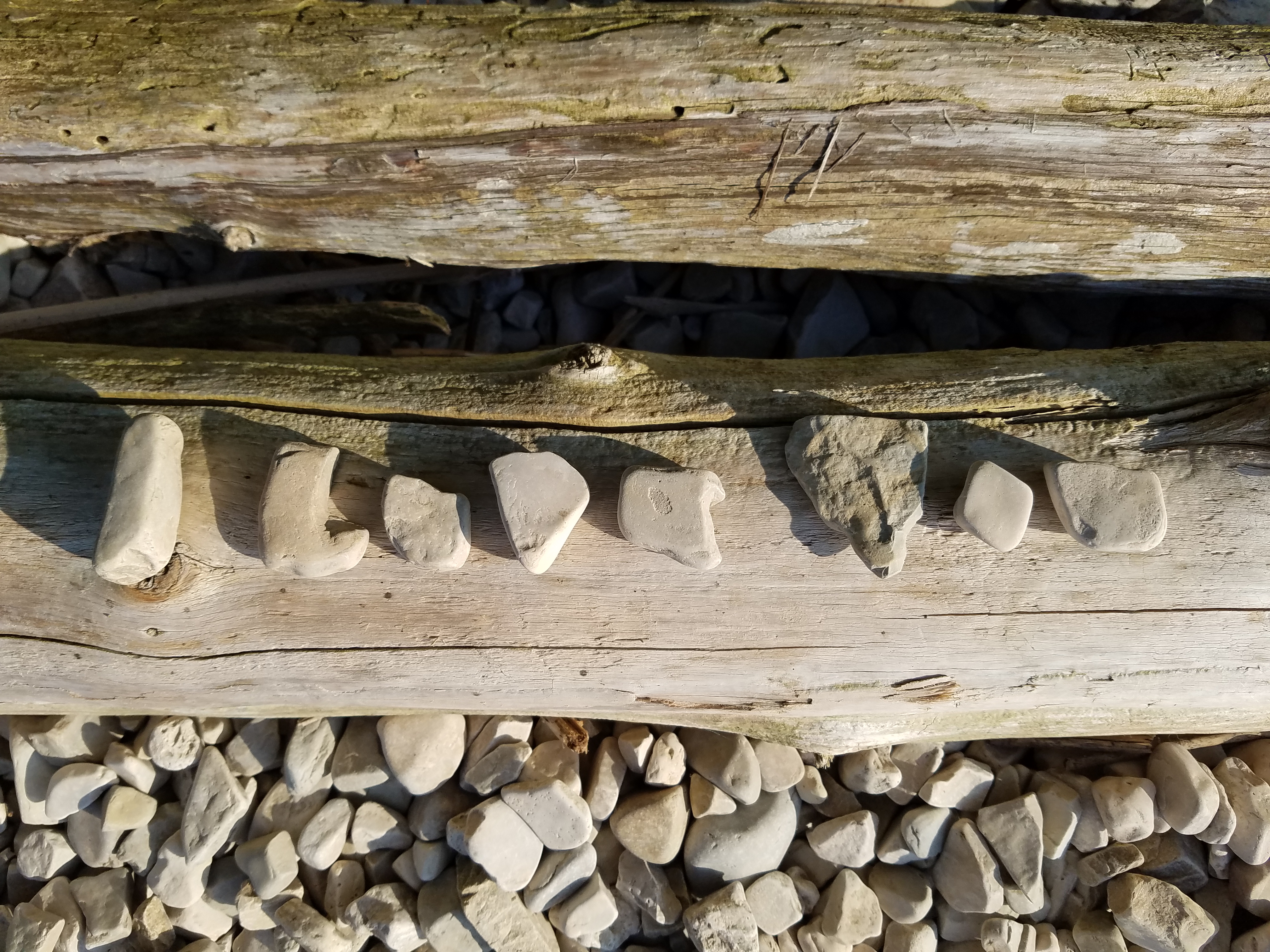
So when you least expect it…nature speaks. On a silent coastline on a great lake in the wilds of Wisconsin the stones on the beach offered a hidden alphabet of opportunity. Upon making this discovery, I searched for and collected just the right pieces and sent a love note to my sweetheart. Wishing he were there to share in the wonderful adventure that was hiking through the enchanted woods to this lakeside hideaway, I did the next best thing and found an expression of LOVE , took a photo and messaged off to him…technology and instant gratification – well, across the miles…
The lovely white stones were amazing…I don’t know the geology…could probably Google it, but suffice it to say they were white and soft, angular but smooth, bleached and clean – massed in a thick bed for miles along the shoreline. I wish I could have taken buckets of them to do something…fill a large snifter, layer in the sink for the water to spill over and remind me of this scene, touch and fondle – they were so special, so uniform in size – such a natural phenomenon of raw beauty.
Paired with the rough, elegant, weathered, driftwood that was scattered along the rubble and upon which I carefully placed the stones, the composition was truly a work of art – inspired by nature and assembled by my eager fascination with the media.
Take away…love is all around – OH! has that been said before? Well…love IS all around us and to find an actual, natural formation of alphabet letters that allowed the simplest expression of literal words, to be transported across the miles, was magic.
Art…design…nature…find it!!! Happy almost Valentine’s Day!!!!
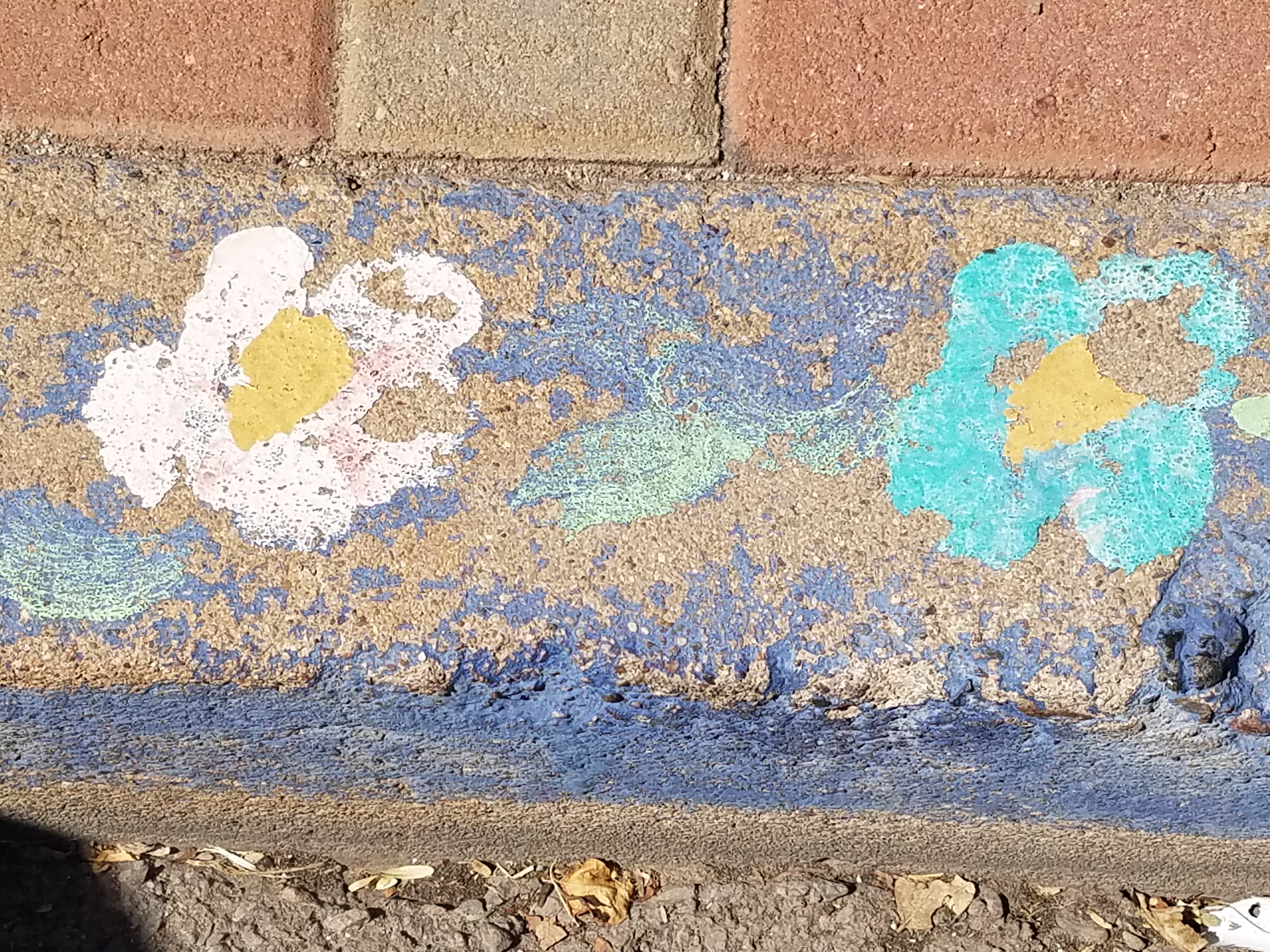
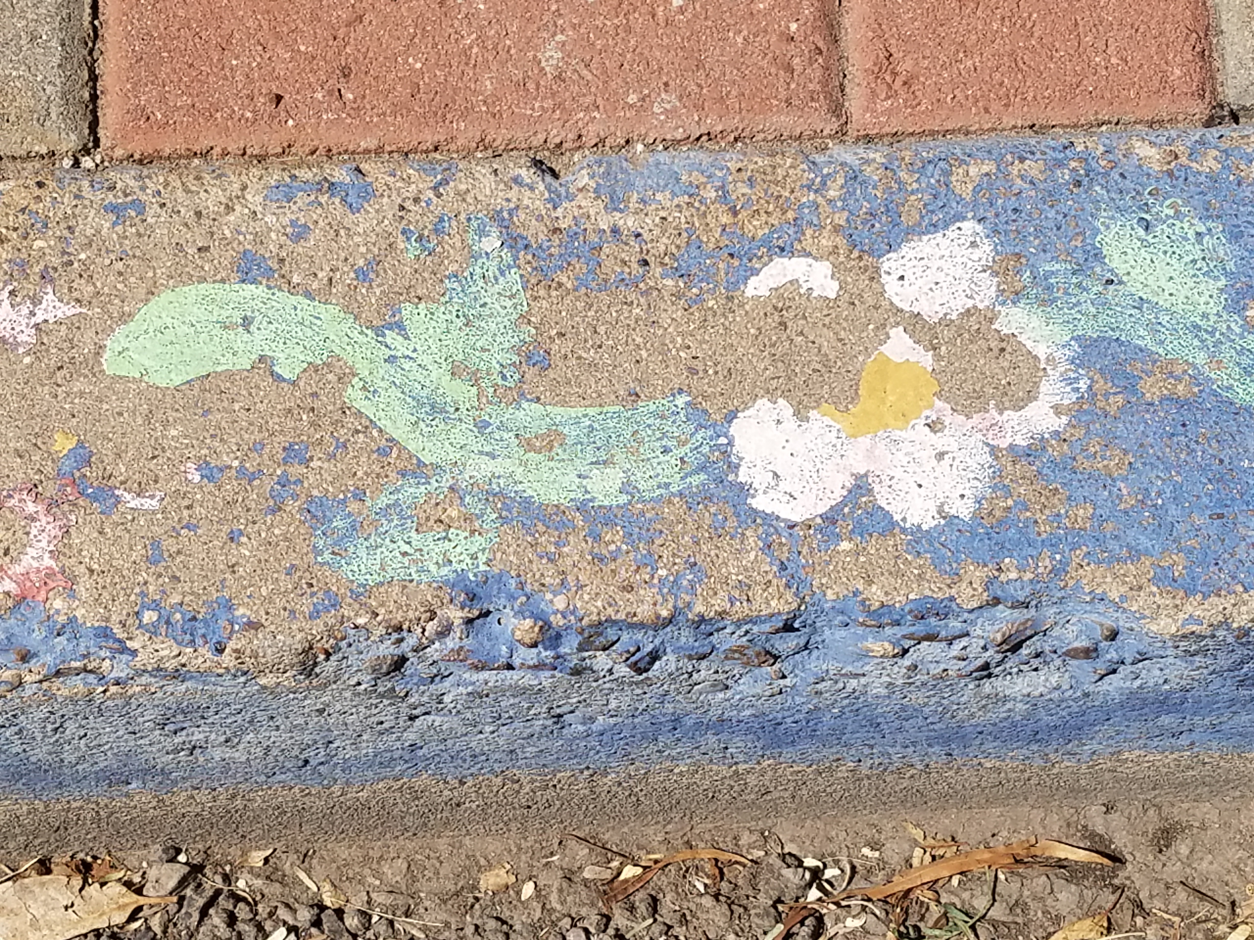
Silly little doodles in unlikely places. In some cases they might be considered undesirable graffiti, but I stepped over this beautiful little statement the other day and was compelled to take a photo as it made me smile.
Brush strokes now weathered and faded, chipped and primitive in their simplicity the colors were so pleasing and the floral motif quite nice.
It’s as though a child with a beginner’s eye took a single brush with bold steaks capturing the essence of a daisy. But then it looked like wind-swept clouds dancing in the suggestion of daisies floating across the sky above the sea.
Upon closer inspection, the aggregate stained blue is grounded by a collage of straw and leaf particles suggesting the beach’s detritus. This little composition has so much detail, so much suggestion, so much to offer if you take the time to look down…look closely…
We often see things in clouds…they move slowly morphing from the identifiable image into others or nothing. This miniature fantasy freezes the floating image on the texture of the concrete to create the composition of this most amazing piece.
Inspiration comes from many avenues. It is sparked by a suggestion, ignited in a flash by something in passing – a word, a phrase, an image, a cloud…
I now will start a folder of art in unlikely places…little details…a future tapestry of observations. Take a moment to see these little studies as you step through the world.
How can I say that I am too busy to write this week? As Saturday approaches, I realize that I have not stopped long enough to focus on any one thing, of the many that are bombarding me from all angles, about which I might formulate a theme for my story. I have to apologize, for once again, missing my Saturday deadline and hope that this was worth the wait!
Oh, to be so entertained by an onslaught of inspirational design elements as I have seen in the past few days only. And yet not only design – there was more. So I would like to start with an insert about Saturday as I (instead of writing my blog) took one last kayak cruise of the year.
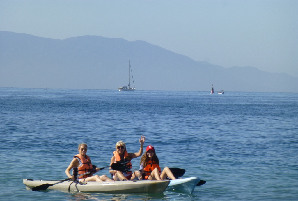
A few people had gathered at the edge of the sand, pointing and remarking that they thought they had seen a whale. I looked in that direction and noticed that a few boats had gathered – often a sign that whales are spotted. I quickly pushed off in my single kayak through the gentle surf out onto the beautiful Banderas Bay and experienced for the first time whales from that most intimate vantage point. Up close and personal, it was thrilling to say the least. The beach was crowded with onlookers oohing and ahhing as they blew mists of water into the air and rose up from and back down, under the bay’s glistening surface. I paddled out and maintained a safe distance, but close enough to hear and feel the graceful power. Hump-backed and for which they are aptly named, the dark, sleek black bodies of the mother and calf were magnificent as they broke the surface and greeted the encircling boats full of eager spectators wanting to catch the show. And a show it was as the mama rolled onto her side and raised her unbelievably long, towering fin to slap the water sending spray high into the air. She slapped again and everyone thought that once was a rush and two was a treat and three and then four and I lost count at 30 times she slapped the water as though to say – “You want a show? I’ll give you a show!” She must have known that it was too dangerous to breach at that point, for a grand finale, as the close proximity of boats could have had deadly results. And I was right on the water with them. Unforgettable. The pity is that I was without camera and have only the memory of this life affirming event . An event that was awesome and outrageous and yet brought a surreal, serene sense of calm, peace and palpable, tingling joy. Friends on the beach greeted me upon my return in awe of what they had witnessed and welcoming me warmly, with enthusiasm, over my good fortune to have been out there for such an amazing display.
This photo taken a week earlier – a bit choppier seas, with Tricia in the single and I with Victoria in the double, sets the scene of the Bay surrounded by the Sierra Madre range.
Now, having shared that incredible experience, I have decided to focus on one of the many design inspirations that I have encountered this week, but I hope you will visit our PATRICIAN DESIGN facebook page to see the collage of colorful art and texture that I have compiled to represent the many images that I have seen and offer to further stimulate your imagination.
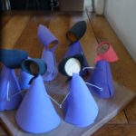
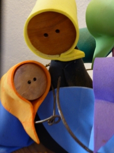
My focus at this seaside gallery of delights today, as we bring to a close a magical month, is a collection of precious little figures made from synthetic foam, wood and steel. These humble little animations represent three shared events, a group hug, the “wave” at a stadium event and a gathering for solemn prayer lead by a figure of distinction – the one in the red scarf.
The spirit of collective participation is conveyed. The spirit of humble expression is conveyed. They present a sense of simplicity of some of life’s joyful moments. These simple figures are happy and content. They are intriguing and relaxing to study from many angles.
Form and movement, color and texture the Spirits of Joy by Federico Leon de la Vega are a wonderful representation of life’s simplest and most basic moments of sharing joy. To see art in such a distillation, such a unpretentious media, execution of mechanics and form is true pleasure. It is not overwhelming or startling, it is not outrageous or provoking – it is moving and modest.
I hope that they bring a sense of joy to the start of your week and create an indelible memory to which you can return in your quiet thoughts to bring you peace and joy.