Designing with Balance and the Creation of the Can Wall!

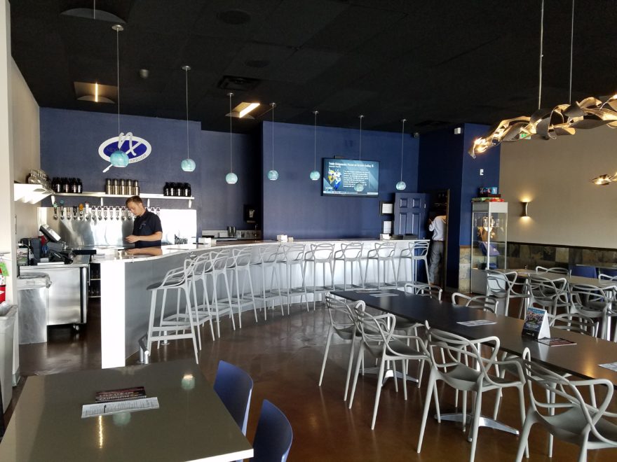
Given the opportunity to improve upon a recently completed taproom, we instantly realized that painting the entire interior would be the best quick-fix. But that instant gratification was not enough to give this needy/hungry interior some meat to get it off and running.

Atmosphere in interiors is so much a part of the brand, the identity, and the success of a business. Popularity is based upon a certain comfort level, the clientele who gravitate there and the product that they are effectively providing. Whether that is food or drink or both, the atmosphere, (including lively enjoyment by clientele), service and food/beverage – all contribute to a successful establishment.

This does not mean high-end, elegant, fancy or even simply hip – although the definition of hip can vary from spare unpretentious and un-self-conscious funky, to studied funky, to affected stylized, to trendy hip and happening,…but, it does NOT always have to represent expensive interior design.

Yet a strip center generally lacks pizzazz and to install a taproom into that generic scene takes some creativity. That does not mean money – it means just what I said, creativity.  And creative interior design is all about ingenuity and balance.

Balance in interior design is key. This interior was filled with hard, cold surfaces – concrete floors, silver-grey laminate table tops, brilliant silver table bases, grey chairs, polished white granite bar top, silver laminate bar face, silver metallic wall sconces, glistening silver under-scaled chandeliers, white walls with cobalt blue accent wall. Brrrrrrr….makes me chilly just recounting the scene. And this was summer! Imagine this setting with crisp cold wind blowing outside and snow blanketing the mountain – not the place you want to gather for a beer in the wintertime!!
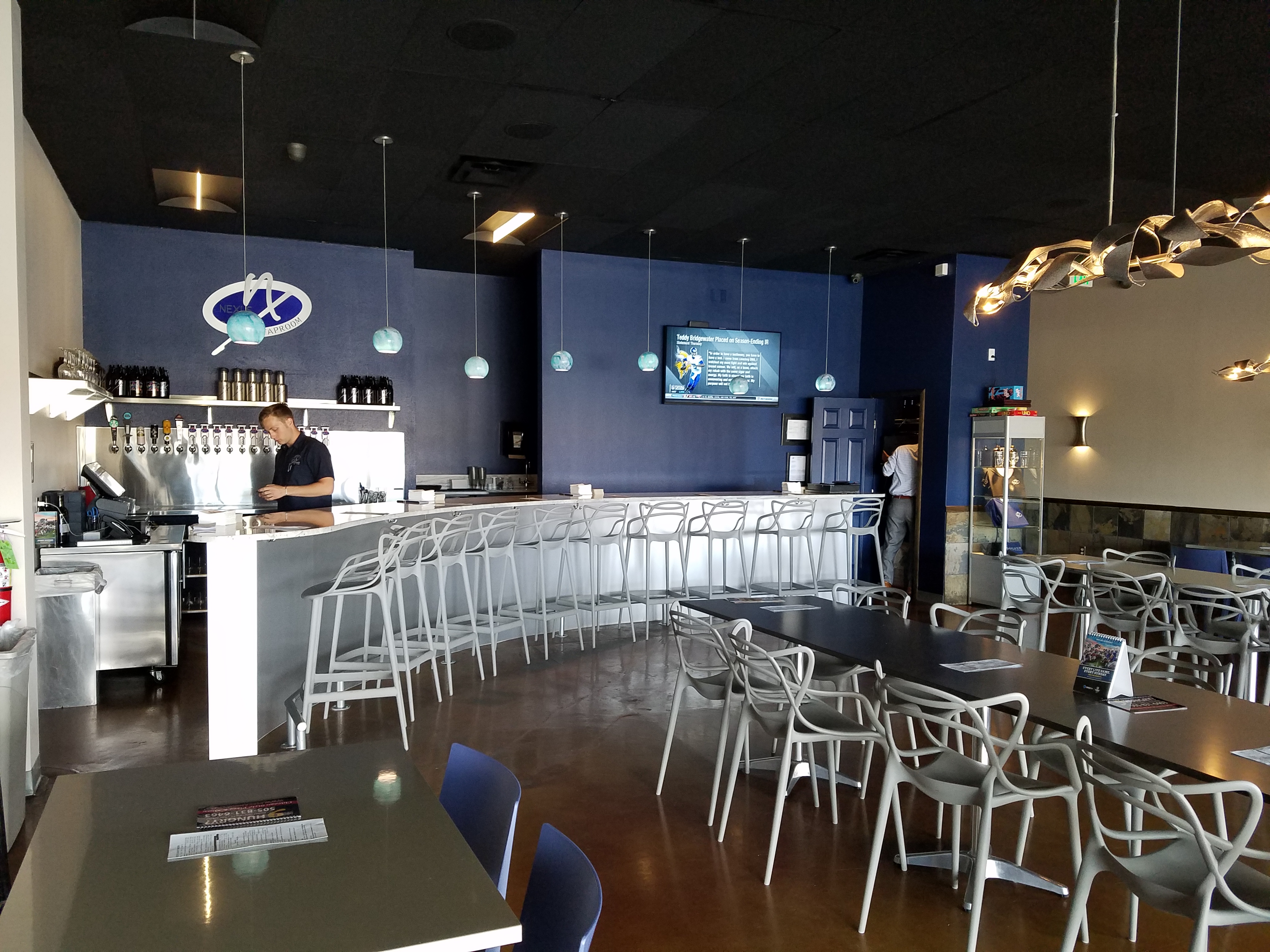
20160901_160828

To instantly soften and add warmth, we painted all walls a dark taupe. The soft, mousy grey/brown color pulled from the existing slate wainscoting to tie the two wall parts into a unified “read.” It gave the silver elements (especially the sconces) a contrast – which results in “interest.”
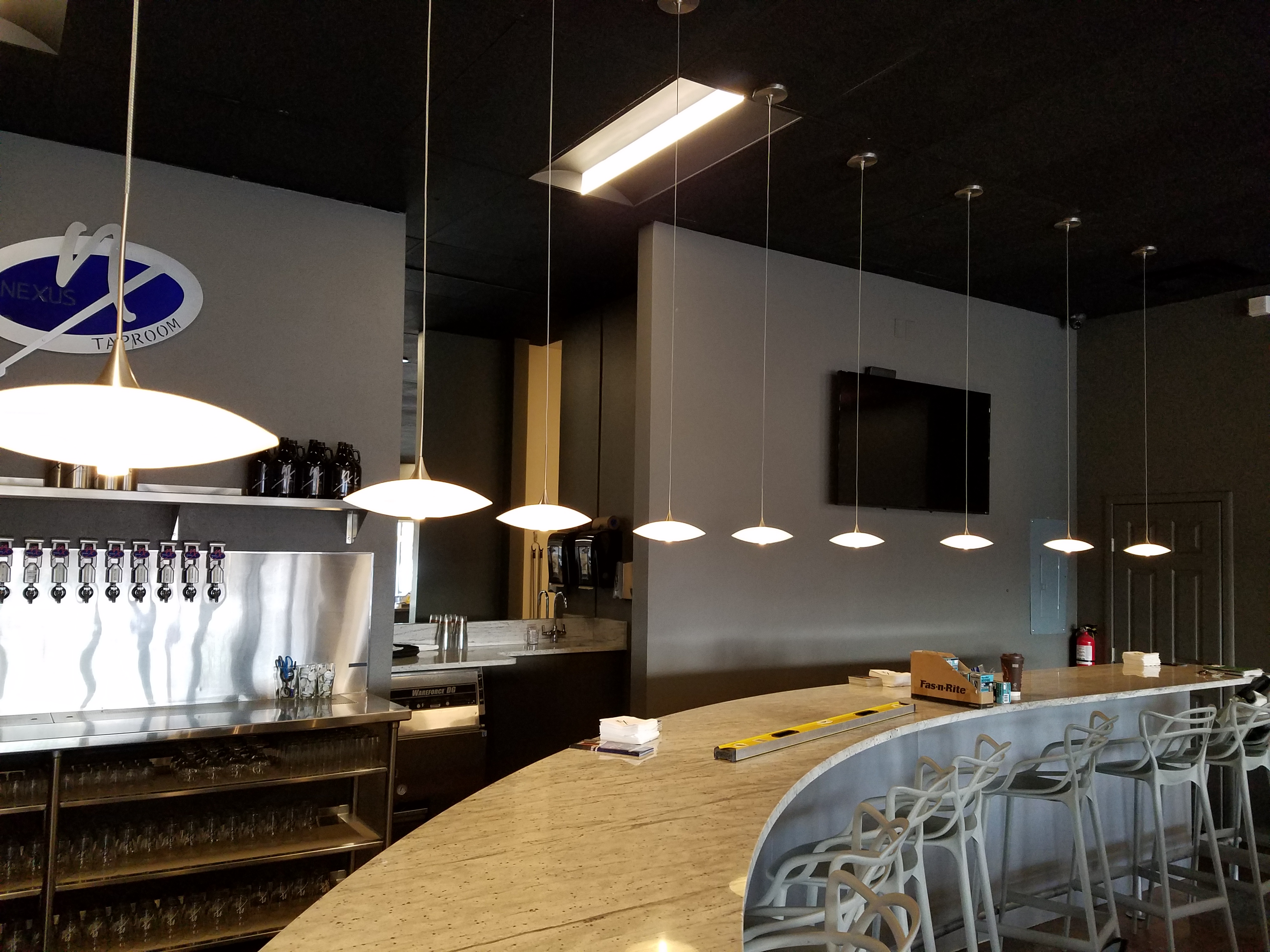
20161103_091444

The back bar was bland even with the new paint color and to add dimension and animation we mirrored the rear center section. This illusion added depth and interest to carry the ceiling through and add a mirrored storefront and exterior reflection which created an illusion of space and character where there had been nothing.

But unlike most back-bars, this area was conspicuously naked. A couple of stainless shelves housing stemmed wine glasses, and growlers felt spare. Plus the right side of the back bar was closer to the bar and the patrons were a mere few feet from a plain, painted sheet-rock wall. Yes, there was a large format TV screen above, but straight ahead – it was just blank wall.

In the wee hours of the morning, as I tossed and turned for a variety of reasons, I jumped from thought to thought, project to project, and personal concerns pelting all the while in a seemingly endless stream of insomnia. Yet, it was during the angst that the idea of the taproom being named “Silver”…silver…beer cans are silver/aluminum…beer cans crushed and nailed to a wall…texture, silver (theme of the taproom) interest – maybe?- all converged into one of those light-bulb moments of revelation.

And yet you might say – “silver…aluminum…more cold and hard. Why would this be an asset to this interior?” I felt that the texture and dimension of the cans would add more interest than the perceived cold and hard of them. The pockets of folded shadows and the relief off from the wall, paired with the over-all massive full-wall of pattern, would all contribute a positive design element to the scene.

As I pictured the wall of circularly flattened aluminum cans in my in my  mind’s eye (a tool that I employ daily while envisioning concepts and finished products well in advance of their fruition), I furthered the concept to encompass possible bar games. Yes, derived from this perfect grid of circular aluminum discs, I began creating games in my head. A bar is often animated by bar games and this was just another opportunity to interact using this unique wall-scape. Since that initial concept, I have created 3 different versions of the animated interaction in the form of games, on this fantastic Can Wall.

So with great patience, Enrique planned the layout with literally laser precision in a perfect grid. We counted the expected number of cans vertically and horizontally aligning with the brilliant red light beams. The previously crushed cans were laid out on a table – well a handful of the 3,200 that we had prepared for the wall. It was determined that punching the nails into the cans prior to installation would expedite the process of affixing them to the Can Wall. Labor intensive from start to finish, this wall was a great accomplishment for a devoted few.
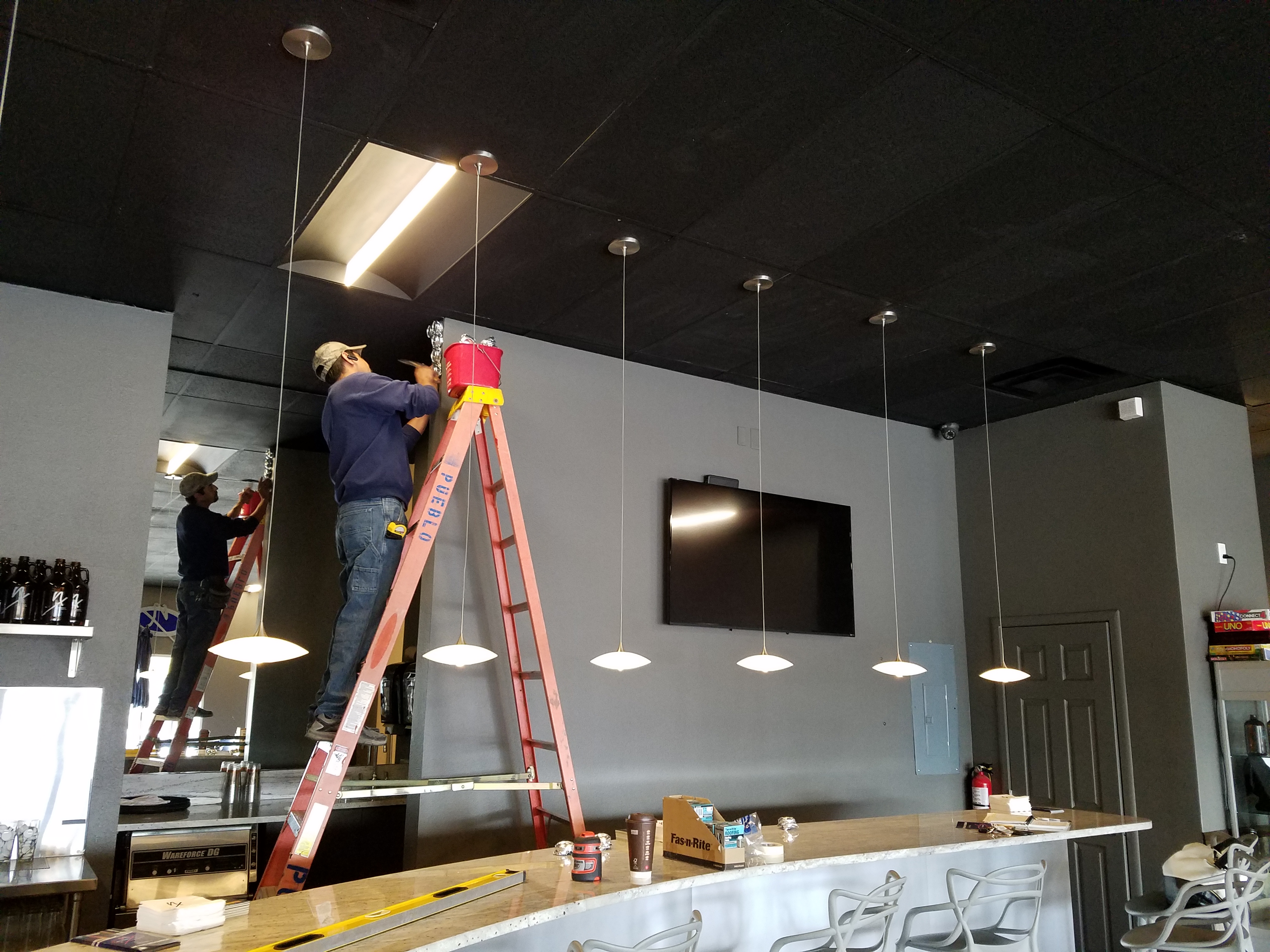
20161103_094518

As the cans were laid out on the table – initially upside down exposing the crinkly open side (devoid of tops), I instantly LOVED the complexity of the depth, texture and shadows. A tight, random application of them would have resulted in a fabulously complex matrix of design. But upon closer inspection, the “texture” was really raw, with sharp threatening edges that were not possibly reasonable within close contact with people brushing by. So, lacerating the staff was not an option – even for a really cool textural metallic wall treatment. Perhaps this application will surface in a more appropriate location away from human flesh in the not-too-distant-future!

Like hubcaps fastened to the broad side of a country barn at dusk, the reflective silver discs pop in the flanking darkness.
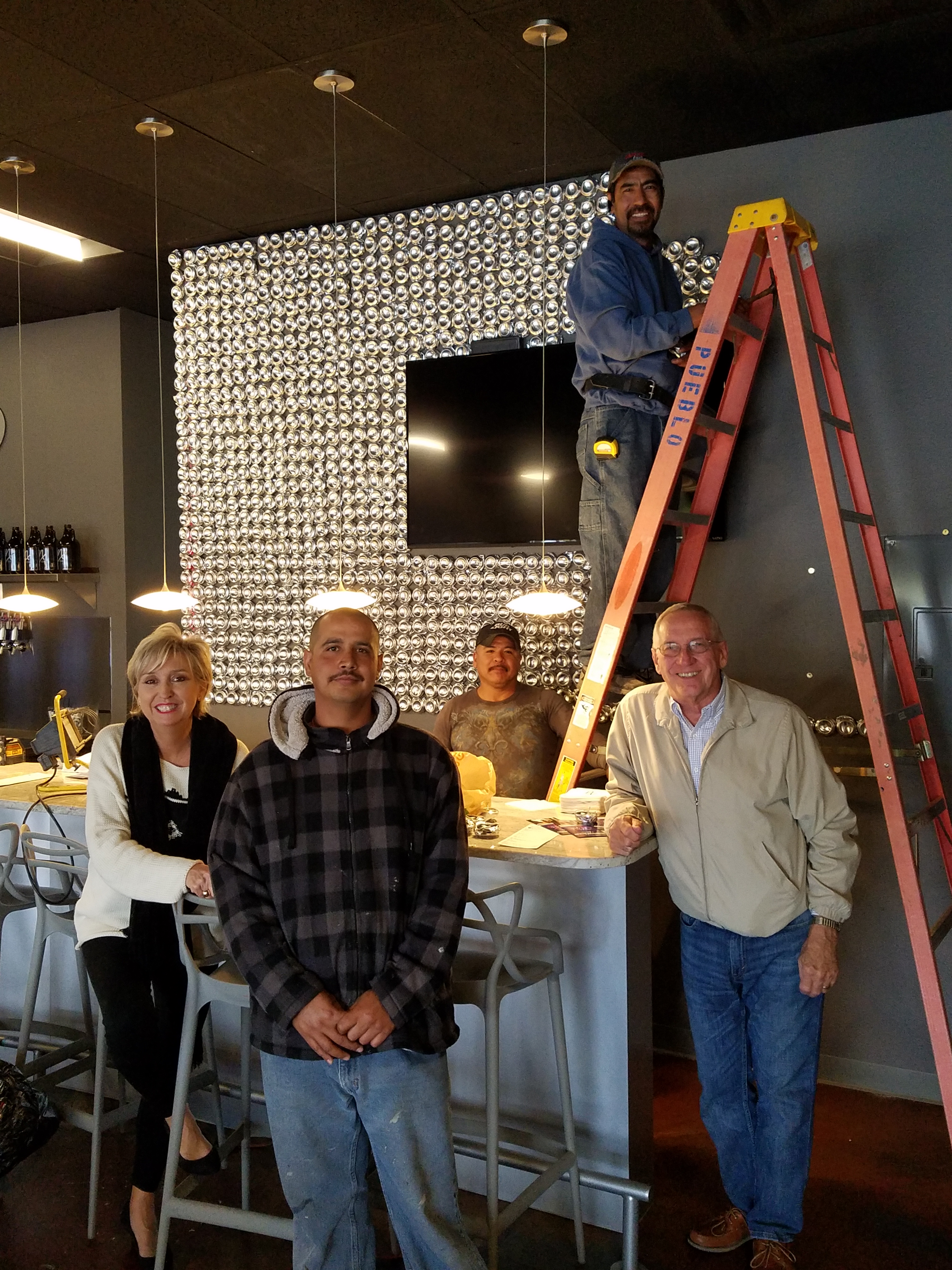
20161104_140152


The process is nearing completion and I will save for another blog sharing the fun and games emanating from the Can Wall,  and the entire finished project complete with new warm white pendant discs over the bar and soon-to-install enormous perforated drum light fixtures suspended from the ceiling, over-sized photo images of the brewery behind the scenes and tantalizing signature dishes in the unique category of the Nexus New Mexico Soul Food.


Meanwhile, the take-away here is…balance cold and rigid with warm and textural – along with all the other opposites that attract – when designing be balanced.



TRENDS – How Does One Decide?

TRENDS…we HAVE to have them…it makes us think, makes us shift…not to mention keeping viscosity in the economy. The shift is the element that moves the economy forward. Without that shift, we would be stagnantly content. And who wants to be stagnantly content – except the “Settlers” from the Direct TV ads?  DIRECTV_Commercial_2015_The_Settlers-520x245

Yet if you Google design trends they are all over the place. The intrigue is when they land on an actual theme that becomes THE TREND.

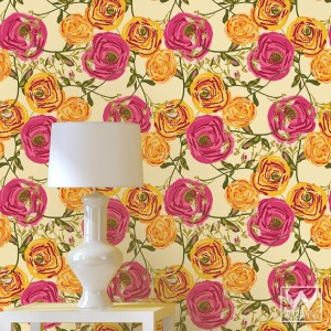
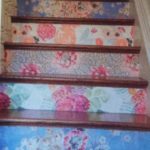
So as we advance into the new year and winter fades to spring – what lies ahead? I’m finding lots of nostalgia – features on milk glass and floral patterns and fancy geometric patterns, a recall to wallcoverings in floral prints and botanicals…Rose-wallpaper-Bari-J-WallAppeal-pattern-pink-yellow-zoom

The trick is how to invest in these elements and not have them become passé by next year. It’s all about balance – unless you have the desire and pocketbook to change out your interior annually! The desire to add something new to your personal spaces, or as my mother has always said “punch it up” is an art unto itself. How does one decide?

Information is so accessible. Access to ideas is endless. But HOW does one decide? How to make the decisions, the right combinations, what to keep and what to change…? The internet and TV…Anthropologie to Pottery Barn, Pinterest and beyond…You pin a gazillion things – but how do YOU decide?

But it gets kind of funny  – because for as many sites as you visit – there are oh so many professed “trends.” Therefore,  sifting through is the challenge and distilling what seems to take the lead. Pastels, patterns and florals is my finding…but is this just spring? Will this fade with the next season? Or is this a “look” that will last for a while? And do I embrace it all or pick and chose? How does one decide? Elle Decor 2016 design trends table

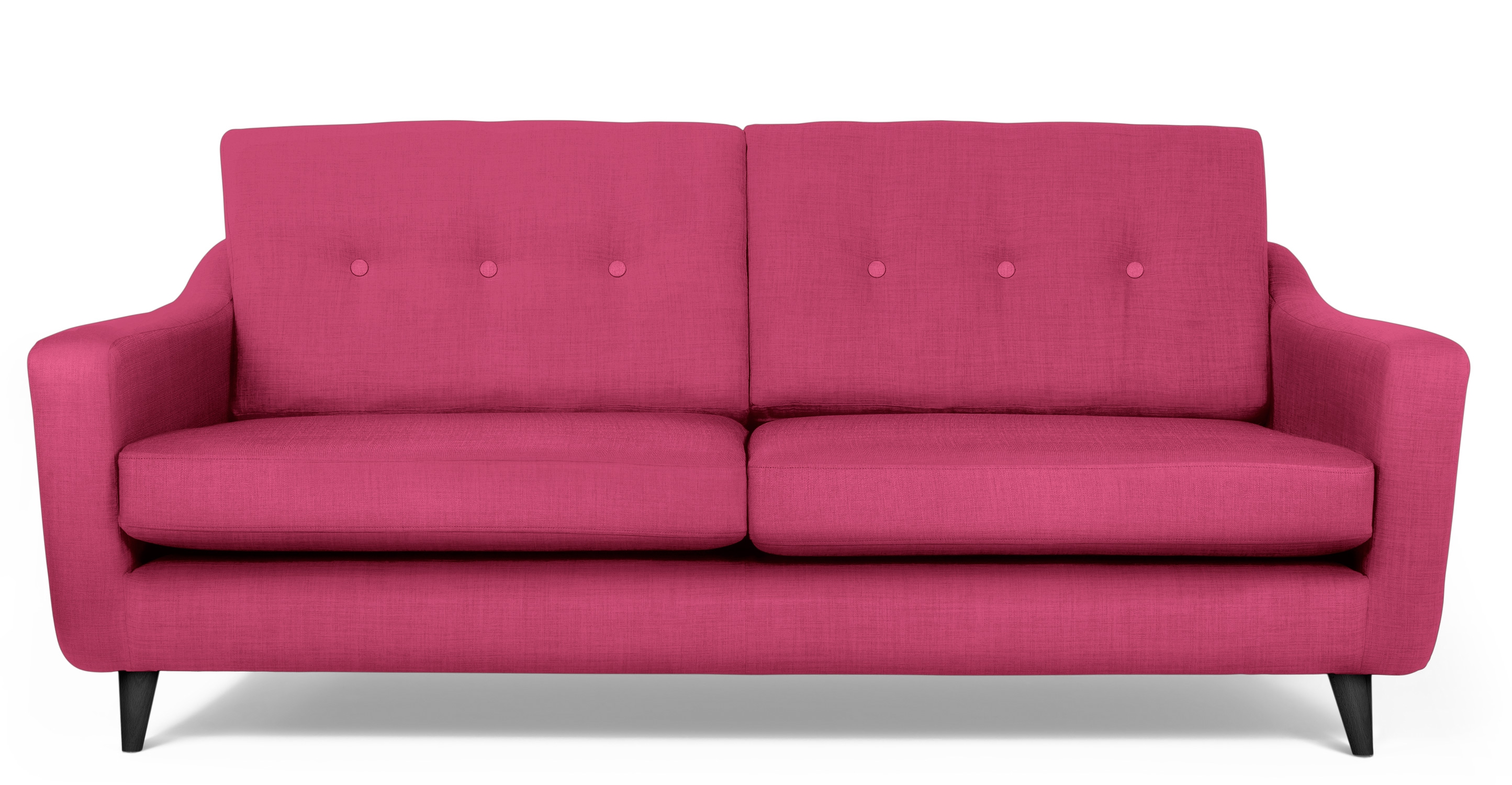
Pantone the color experts are even all over the place. Their designers were “inspired by the contrast of urban design and lush vegetation.” Whoa, really? That sure is a wide swath of possibilities!  And to say that these colors  are unisex is as though attempting to blurr the lines. A guy might wear a pastel pink, Rose Quartz, shirt – but would he upholster his sofa with it? Fashion and Home Decor often parallel their trends – and then they must veer off that same course for practical if not socially directed reasons.  Redford-3-Seater-Sofa-Peony-Pink

But the rationale is so amusing…for example,  Pantone writes: “Colors this season transport us to a happier, sunnier place where we feel free to express a wittier version of our real selves.” Yes, we all long to escape the doldrums of the short, dark, cold days of winter – hence the positive effect of transporting us to a happier, sunnier place is obvious – every year for that matter. That’s why tropical destinations are the prime vacations for winter getaways. Even most avid snow skiers manage to sneak in a run to the white sand beaches for some sun and fun alongside their plans to hit the slopes, get frost-bitten and nestle by the big fires.

I guess I’m looking for a more cerebral explanation for the color movements. And yet, maybe there aren’t any – so let’s not pretend then. What does it mean a “place where we feel free to express a wittier version of our real selves.” Wittier like a guy upholstering or painting his man cave with Rose Quartz or Peach Echo? That’s witty all right!!!!! That’s not the cerebral that I meant. But it is an interesting rationale. Color is giving us permission to express our REAL selves. I guess that’s one way.

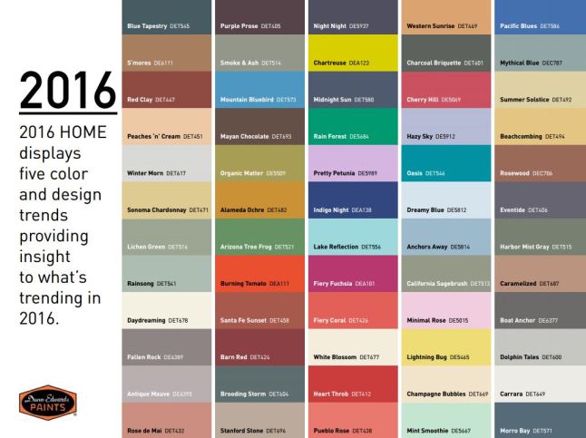
Yet, here are 5 different color series for the upcoming year…and as you can see – it’s all there – it’s all covered.  Pantone color-trends-2016


So as you climb out of the dark, cold recesses of winter and squint your eyes at the bright, colorful luminosity of spring in bloom, where will trends take you on your journey to “punch-up” your interiors?


Red – A GIFT of LOVE and the Little Bug Behind the Magic

A little bug selectively bred on a cactus in Mexico way back in the 1500s, for its use as a magnificently unique red dye, soon became recognized, by European traders who discovered it while bartering  in the Aztecan markets, as the most dazzling rich red on the planet. The result was the realization that this red bug juice was a rare trading commodity that rivaled even gold!  Yes, a squished bug that oozed a red color that was so extraordinary that it was nearly valued above all. This indigenous American discovery spread worldwide and altered the course of history for art (obviously), cultural  influences, certainly its trading value and even science.

Before I continue with this brief summary of this extraordinary discovery and my personal  comments on the subject, try this little experiment.  Think of all the things that you associate with red. Think of all the things that are special and standout because they are red. Do this yourself – make a list or maybe make it a game of it at a party – have everyone make their own list and then share the lists – see how many make the same observations and how many identify different items.  More on this later…

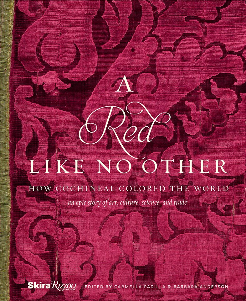
This story behind  today’s blog is derived from a book by Amy Butler Greenfield, A Perfect Red Empire, Espionage, and the Quest for the Color of Desire which influenced a collective of international experts, in a variety of fields of expertise, to produce an incomparable exhibit  at the Museum of International Folk Art in Santa Fe that astonished the world.  The book that compiles photographs of worldly treasures and narrative describing the making of and content of this extraordinary exhibit is A Red Like No Other – How Cochineal Colored the World. It was my Valentine’s gift and it truly is a treasure – a gift of love. A red likeno other - book

Cocheneal, this little bug and its unexpected authority and influence, is the center of this universal love affair. A love affair with a color so seductive and so powerful that it evokes passion and emotion with everything that bears its true hue. The forward of this book by co-editor Carmella Padilla states that “everyone has a visceral knowledge of red. Therein lies its power. ” Red is imperative. And if you didn’t realize the depth of this statement, you will be amused, challenged,  amazed and intrigued beyond belief to read about the history and processes behind this exhibit .

Carmine  – this regal bug juice, so purely red, the prized pigment – is something all artists revere. They know the importance of this hue as they strive to create their projects. The quest for the perfect colors and the balance of colors in painting and in other art forms is an ongoing progressive journey. I feel remiss to not have known about this earlier. How can you take art history for semesters on end and not be introduced to this? It’s been an exciting discovery for me to learn of this viscose bug extract, carmine, and this recent journey I have taken to read of its history has been truly thrilling.

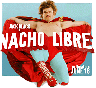
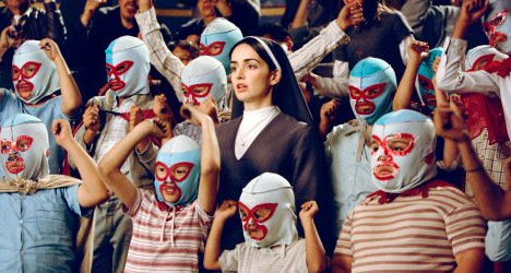
As I write this, by stark contrast to the wonderfully cerebral documentation and observations in this book, I find myself watching the endearingly inane movie Nacho Libre out of the corner of my eye.  And  what surprises me all of a sudden is that the color red is so effectively inserted into the scenes. nacholibre

The director, Jared Hess,  knowingly or not recognized the value of the color pop and punctuated many artful scenes that would have lacked depth and interest had he not had the eye to do so. My heightened awareness amuses me – especially in the context of this crazy, silly movie. The creatively artful incorporation and placement of red is so apparent in this nutty, fun film.  Ana de la Reguera lips Nacho  LibreHer lips, his costume, the children’s masks, a sunspot on a bus, the fighting ring ropes, structural elements in the arena are all so subliminal yet so vivid. Consistent and repeated use of the contrast with the bold red color in combination with turquoise is also a key element in this film.Nacho Libre masks
So back to the party where everyone is listing things they associate with red. If you can get a copy of this book and whip it out after everyone has read the lists, I promise everyone will find it captivating on so many levels and subjects – great lively conversation, fun, fascination and amazement will ensue!!


Discovering Design Dangling Three Dimensionally in Space at the Estudio Cafe

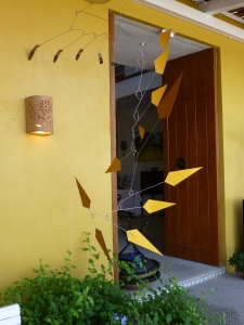
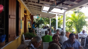
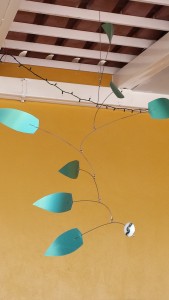
They hung from the exposed structure of the portico that ran the length of the house over-looking the marina and the tropical glistening scene that surrounded the estudio-cafe. Gently twirling blades of colorful aluminum balanced and counter-balanced on wire and suspended from nearly invisible filament. Petals of flowers, leaves, triangles, they dangled and spun in the gentle movement of air. What local artist created such magical sculptures that added such color and dimension to the various heights of space both inside and out ? I must find this fanciful person.P1040400
I discovered he was not a local, rather a visitor del norte. Yes, an American snow-bird escaping the chilly climes and bringing his art, as he vacationed in the southern resort of Puerto Vallarta, for others to share. There was a kismet, a chemistry between the two men, the host and the new-comer. Both teeming with artistic juices looking for challenging means of expression in a variety of media. The host was more than willing to share his space to exhibit these delicate yet powerful pieces. The new-comer when describing his work references “poetic spaces and meaningful places” and nothing could better describe where he found himself and his new venue, the estudio-cafe.20140118_125532
Having enjoyed for years the magic of the estudio-cafe with it’s perfect waterside setting and continuous collection of artists presenting exquisite musical talent and fine art of all manner, engaging conversation in an ever stimulating artistic dynamic, it was this day with the sun-bathed ochre stucco walls and shadows cast by the progression of the day with soft breezes wafting through the architecture, that I was moved once again by the composition of it all.
A three-dimensional collage of color and style, form and scale, art both created and spontaneous – an unselfconscious collection of rare confluence that cannot be created – but happens. This is an incredible experience. And it was with this overwhelming experience that first introduced us to our host and has since brought so many fascinating people into our lives.20140125_131409
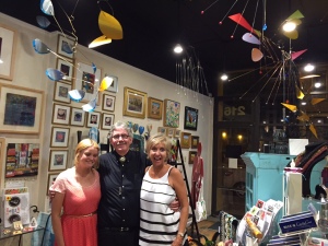
This was the beginning of the friendship, spawned by the love of art, related color and shapes, that brought Terry Welker’s work to New Mexico. After a couple of years admiring the enchantment and thrill of his mobiles at the estudio-cafe, I made the call that connected our common love of design and resulted in a premiere exhibit of spectacular, yet modest sized kinetic pieces a our boutique gallery in downtown Albuquerque.A0968D4A-813E-4E75-86B9-71807134DAA5 As he says of his work, “he animates space with sculpture.”
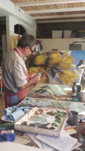
Come to PATRICIAN DESIGN to see these fantastic suspended sculptures and smile at the joy they bring. And also the “host.” This wonderful artist, Federico Leon de la Vega, who by warmly embracing family and friends has created a nurturing atmosphere of love and friendship, limitless talent and sensitivity and who has also generously exhibited his magnificent oil paintings at PATRICIAN DESIGN.20150117_121847 We invite you to experience these two outstanding artists brought together by a remarkable union of creative energy and goodwill.

Good Design Transcends Trends – Black Kitchens Then and NOW!

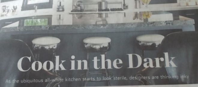
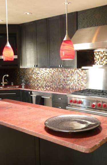
Black kitchens are sexy – as noted in the recent article “Cook in the Dark” by David A. Keeps, in the Wall Street Journal, last weekend September 13-14, 2014.20140919_162130 - Copy And in 2008 when we created a dramatic statement using black custom cabinets contrasted against raw-meat colored granite to many it was quite daring, even astonishing – but everyone LOVED it! image001 (1)Yes, it was a man’s kitchen – but as his female friends can attest, it is genderless in its stunningly composed design. This particular interior remodel featured this striking kitchen and we celebrated the black further by painting all the base trim, doors and molding in a semi-gloss black. Contrasting creamy travertine floors and walls are punctuated by the black trim and monolithic two-sided black marble fireplace and flanking cabinets.

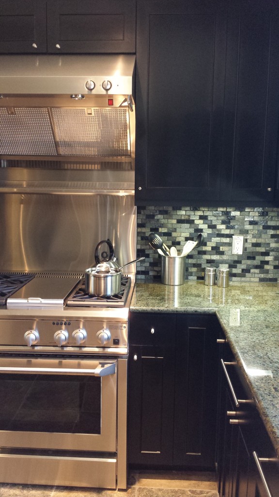
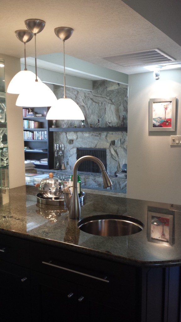
On the heels of that project, we found ourselves celebrating a stone fireplace installation from the 70s. Many thought it needed to go – but rather, we found the same slate stone in large format floor tiles and finished all of the floors throughout with this stunning natural material. All of a sudden the fireplace was at home in a new context. A completely new kitchen – enlarged with many added functions – was designed with black cabinets20140515_094950 and iridescent mossy green granite counter-tops flecked and riddled with gold and black fissures. The slate stone flooring was mimicked in the backsplash with the same silvery slate along with a black and grey stone madras-like mix.

I was there in that second interior today as the client prepared with great focus and determination for a significant reunion of friends coming from all over the country – some not having been together for 40 years! A new commission of a martini alongside a copy of Flying magazine (the client is a private pilot), by celebrated artist Susan E. Roden – delivered today, sparkles with highlights of silver leaf next to the brushed stainless accoutrements. The bright red pops against the neutrals and black anchors of the dark toned bar and obsidian kitchen.20140919_170106

So it’s been fun to read the Keeps’ article and hear of this new craze in dark kitchens – we always knew they were sexy. Clients love being ahead of the trends. But as is always the case – when the trend takes hold, the industry provides a new array of offerings for designers to incorporate. New materials, new finishes – the challenge is to think a bit off from the norm and create before the palette is presented on the industry’s silver platter. Remember though – that good design always transcends trends!

Tangerine Dreams – a Fresh Design Scheme for Inside and Out!

Inspiration is often a pleasant surprise. It happens with a spark that ignites a theme and the project evolves. In a very dramatic transformation of a simple yet dated living room, we skinned two walls with stacked white stone. The slivers of horizontal texture brought a clean-lined organic feel to the space. Existing sage green carpeting was a cool contrast against the clean bleached stone – we also painted the walls white to mimic the tones in the stone. The perfect punctuation in this sage and white scheme became the fresh pop of orange. Call it melon or coral our color is that somewhat rosy version to slightly soften the contrast. See more of this project at PATRICIAN DESIGN http://bit.ly/YQCyrE

Roll the footage along over the course of this last year and the finished product receives rave reviews. We are encouraged to take the scheme outdoors and continue this project now called Tangerine Dreams. Once outside the orange can be released to express brighter versions melding the coral tones with other shades more bold and brilliant.

Existing white patio furniture provided an open invitation to continue the thread of white that was introduced inside with the white stone wall. Making things look intentional and incorporating existing elements is a cost-effective approach. But the trick is not to let it appear as though the scheme was sacrificed for savings.

So with the lush green foliage of the desert’s semi-tropic offerings that were already mature in this landscaped yard – all we needed was to introduce floribunda of orange to carry through with the tangerine themed color scheme. We planned and prepared, planted and potted for the perfect patio party! Pillows, placements and pottery also brought orange tones sprinkled throughout the design.

A new water feature will replace a lemon tree lost in the last freeze. A brilliant orange trumpet bush will nestle against the towering ceramic urn of luminous green tones where cascading water will re-circulate from beneath the stone bed.

See more photos of this project in our facebook album at http://on.fb.me/13TVGUm and watch for future posts as the plantings mature and the work continues.P1060999

Lighting as ART – Louis Poulsen’s Collection of Fine Designs

The WOW factor of lighting is a key element in design – both interior and exterior.  Perking up dark corners, illuminating structures and landscaping, highlighting objects of importance, providing task light and spreading ambient light through the darkness, all have their place in the drama of design.

Lighting can often be seen but the source not identified. The effect is all that we want to achieve…like subtle shadows through trees at night or lighting a pathway while concealing the source beneath low plantings or rocky outcroppings, concealed recessed lighting or well-placed “up” lights also provide the drama without announcing the identity of the fixture – shhh – keeping it a secret. Yet, other instances scream for the light fixture to make a statement.

Ask a movie star. Lighting is known by all in the public eye to be a most important feature to enhance or destroy one’s appearance. Celebrities pay the big bucks to insure that they are properly lit for filmed interviews or still shots. So please when planning YOUR interiors, don’t put a primary light source over the top of your head casting downward…lest you look like a vampire. In vogue as they are, the bloodless dark-circled look is not what most people are trying to present when hoping to have an enhanced appearance during a cocktail conversation or on a hot date over the dinner table. Supplemental ambient light will dilute the singular direction of the light washing your faces with a softer, more even illume.

However, when intentionally used as a fixture of design, we want the coolest look with the best output for the function. Precise engineering paired with the decorative aspects of a well designed fixture result in an exciting art piece.  Yes, a piece of art!

Recently we were visited by our regional representatives from Louis Poulsen Lighting – to be reminded of their outstanding classic collection of timeless designer fixtures bringing the best of the best into commercial and residential interiors worldwide.  It got our juices going – salivating for the next opportunity when we will incorporate a magnificent lighting fixture into an interior project.

Two photos taken here in our shop feature the pierced perforations and organic cut-out designs of the “Aeros” by Ross Lovegrove and Louise Campbell’s “Collage” pendant. Two spectacular fixtures which compliment if not carry an interior design.

See more fun on facebook at http://on.fb.me/16cD99r

ImageImage

Late Snowstorm and the Context of Design

Image

Stay warm and be cool…

So it becomes very apparent – design is contextual.  Whether with architectural style and the context in which it occurs, or geographical context against which it is presented, I always stress that. And it is no more apparent than when traveling between different temperature zones. I do this often – visiting warmer climes in the colder months…but that too is a relative thing…

So MY norm is the enchanting 4-season temperate zone of Albuquerque, New Mexico.  It is from there that I base my perceptions…until I leave. Yes, we have four distinct seasons….we actually HAVE to have different wardrobes – unlike some areas that force a change in clothing just to create that difference, just to buy those cool seasonal togs and accessories…OR the truly freezing locales that demand warm layers for mere survival from the cold.

However, in Albuquerque, at a mile and more high, we experience those Rocky Mountain elements – high altitude temperature extremes and otherwise lovely moderate temperatures all summer long.  No humidity to speak of and no bugs – unless of course you board horses down in the valley by the Rio Grande!!

I digress…back to design…it is always contextual. Whether to boldly design against context, or embrace it for the natural order of things, the fact is that context is the “it” of design.

As I posted on our facebook from Albuquerque in the last couple of weeks, where we were experiencing true bursts of spring…”bring in the branches” – which are now in full bloom on their very own trees – bulbs are bursting from the warmed earth – daffodils, hyacinth and the phlox are lovely!! Bring in the branches to force the beauty of spring into your homes to expedite the glory that is the birth of a new season of growth and wonder!

Ok – I get carried away. However, the sobering experience of being enveloped in one of the largest snowstorms in the “whatever” amount of time – a long time – is awesome. A word often over-used…but apt for this tremendously magnificent late winter expression (its technically spring now) of the chilly, fluffy white precipitation of well over a foot that we have experienced in Innsbrook, Missouri today.

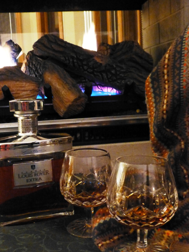
My design direction in this environment is to grab a warm snuggly throw, start the fire, pour a toddy, surround yourself with warm colors, soft textures, and for “hope,” have a brilliantly blooming bouquet to remind you that spring is only temporarily delayed, it is right around the corner and next week’s higher temperatures are sure to get you chomping at the bit to be outside, unveil the patio furniture, grill a few steaks, and start planting!!!

WARM and SPICY Chases Away the COLD – Color matters!

Whether winter where you are is freezing, cool, warm or even hot – the art of color and flavor will brighten you winter scene with table dressings full of color and spicy warm flavors.
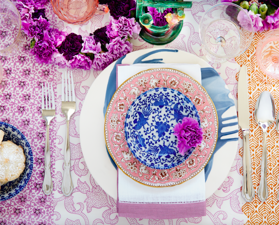
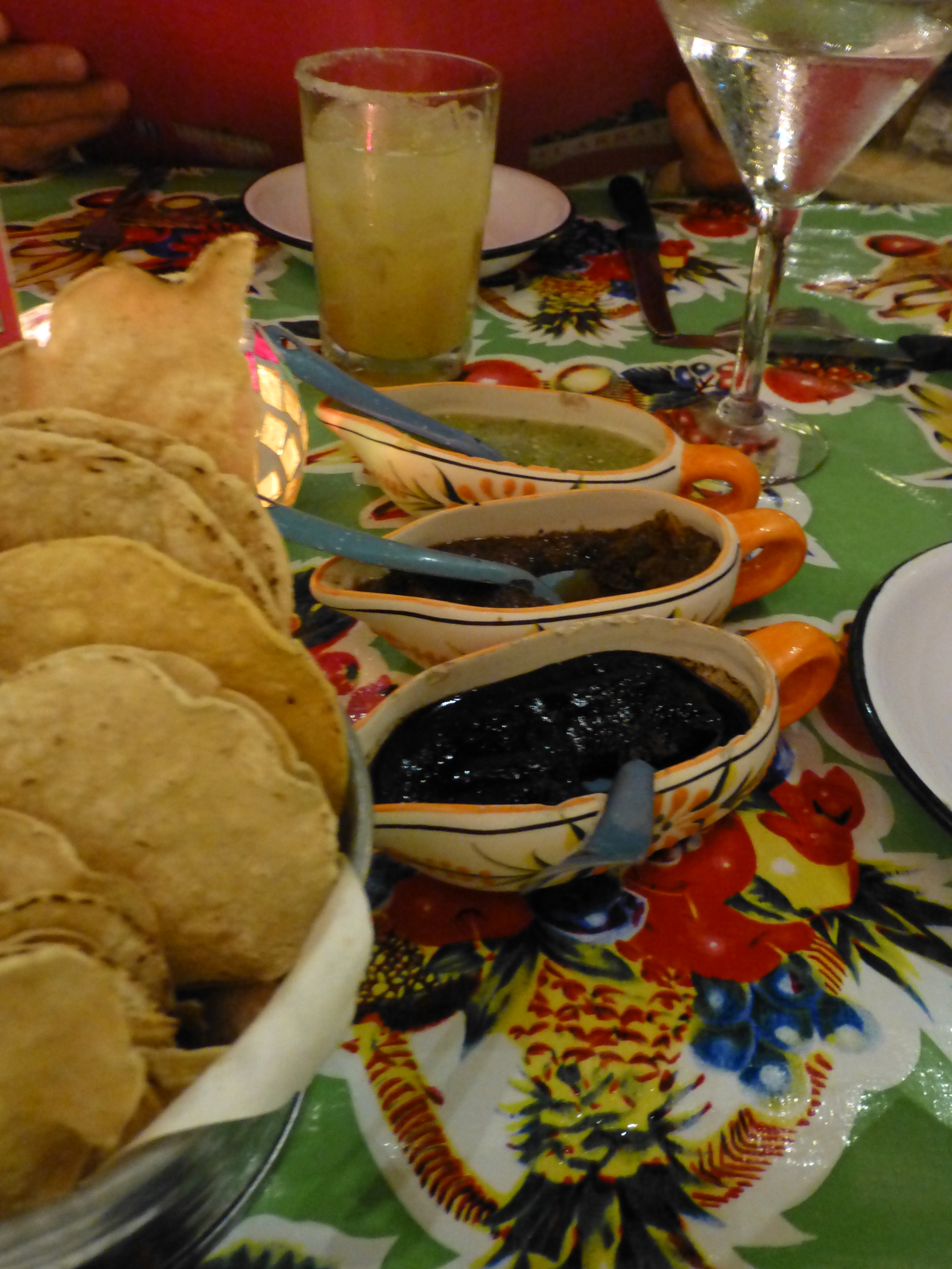
Specifically to escape the cold, color can be a key. While most of us react to red as a color of warm temperature, and blue as one of cool perceptions, color can also be rooted in very personal life experiences and certainly even cultural influences. To create an environment that incorporates color to change the perceived temperature, what might you think to do? In this case, bright, bold colors add vibrancy to what might be considered a more dormant time of year. We dined at this table last week. The colors and the spicy flavors instantly created a scene of warm, exotic indulgences.
Soft lighting, warm colors, inviting materials all contribute to comforting sensations when one is trying to escape from the violating effects of the cold. The colors can be somber, earthen and muted tones of red, rusts, burnt oranges, browns, smoky olive greens, yellows, gold and ochre…but add bright splashes and the scene comes alive!
On this trip, as we head south and gravitate to the tropical climes of Mexico, these bright, bold colors are warmed further with the soft lighting, and punctuated with spicy salsas that further infuse the experience with a warm feeling of utter contentment.

El Arrayan table setting

Warm and spicy colors and flavors at El Arrayan in Puerto Vallarta!

Try adding bold accents to you table dressing – the tropical accents are not limited to summer, here I found a Bobby Flay recipe that is easy and very warm and spicy.
http://www.foodnetwork.com/recipes/bobby-flay/skirt-steak-tacos-with-roasted-tomato-salsa-recipe/index.html?ic1=obinsite

Coming soon to PATRICIAN DESIGN – Watch for our new oilcloth table cloths to bring more exotic and fun fabric to your dining scene!

The Value and Variety of Good Lighting Effects in Interior Design

We paint with pigments but we can also paint with light. We can actually color a space or surface with a color of light or we can illuminate a color of a space or surface with the addition of light. Accenting items or areas in a space or exterior environment is an exciting element of interior or exterior design. We know that the fact that light exists in a space allows us to visually “read” that space. It makes me think though of the clever Kohler ad with the blind guy at a party coming back to his date from the restroom and exclaiming something like “Wait ‘til you see that bathroom!” Not the manner that most people experience a room – but like the last blog about lavender…there are many senses that comprise the effective or ineffective design of a room.
So lighting in this instance is of key importance. With short days of winter still ahead, the nights are longer and the need for artificial light is not just a design element, it is a functional requirement for utilizing or experiencing the space. Differently from ambient daylight however, artificial light offers many opportunities to manipulate, accent and create special effects.
Shadow and light the two opposing forces in the drama of lighting. The absence and the presence, the voids and depths versus the illuminations, accents and “pops” all contribute to the balance and effectiveness of the area’s influence. It gives us the opportunity to enhance, accent, draw attention to, and remove from the focus.
Inside, bring forward the things to emphasize and send back to the recesses of light or the lack thereof those that you choose not to place in importance. Accent a painting on a wall with a spotlight. Cast an ambient glow around the room from a translucent lampshade. Multiple light sources are often the best. They add variety, interest and balance to a scene.
Some light sources are decidedly decorative and they may or may not contribute greatly to the scene. Decorative fixtures can be chandeliers, table lamps, floor lamps, wall sconces, or surface mounted ceiling fixtures. They are selected not just for the illumination that they provide, but for their design influence in the scheme. How they play a part in the illumination of the space is another story – and variable.
People are best viewed from a light source at the face level rather than down from recessed or track lights in the ceiling, which is why table lamps are an asset when creating a setting in which people gather. Social settings differ from display settings. Lighting from above as an exclusive source can be limiting if not ineffective. The shadows cast are not attractive – rather, they can be ghoulish. It’s like the effects of a flashlight either from above or below on your face in a mirror – test this – you will never want to be on a date sitting beneath a light source glowing down from over your table. Scary.
To set the stage of an interior, determine where you want the viewer to go -where you want the destination of the “read” of the space to be. There are these accent spots – points of interest…and then the harmony of the entire area takes shape. Find the attractive features in various parts of the room…a plant in the corner might be lit from beneath to cast shadows on the wall – an inexpensive and dramatic effect. Buy an “up” light at Home Depot or Lowes – a local lighting store might have a greater price range and variety of lamping types and fixture styles. Also, a spot direct down onto a plant or sculpture on a pedestal or vase on a table – the drama of highlighting amidst the otherwise low-light is powerful.
Lighting creates mood, alters perception, and has subliminal as well as obvious effects. Use it to change the feel of a space. You want someone to linger, soften the light – you want them on edge and ready to leave – up the lighting to an unpleasant range. Restaurants and residential dining rooms are perfect examples of soft lighting providing a relaxed atmosphere – in those same rooms where the light levels are higher, notice the less relaxed sensation that is experienced. Likewise, if you want someone to feel welcome, soften the light rather than blasting it.
Light up you life with really good light!

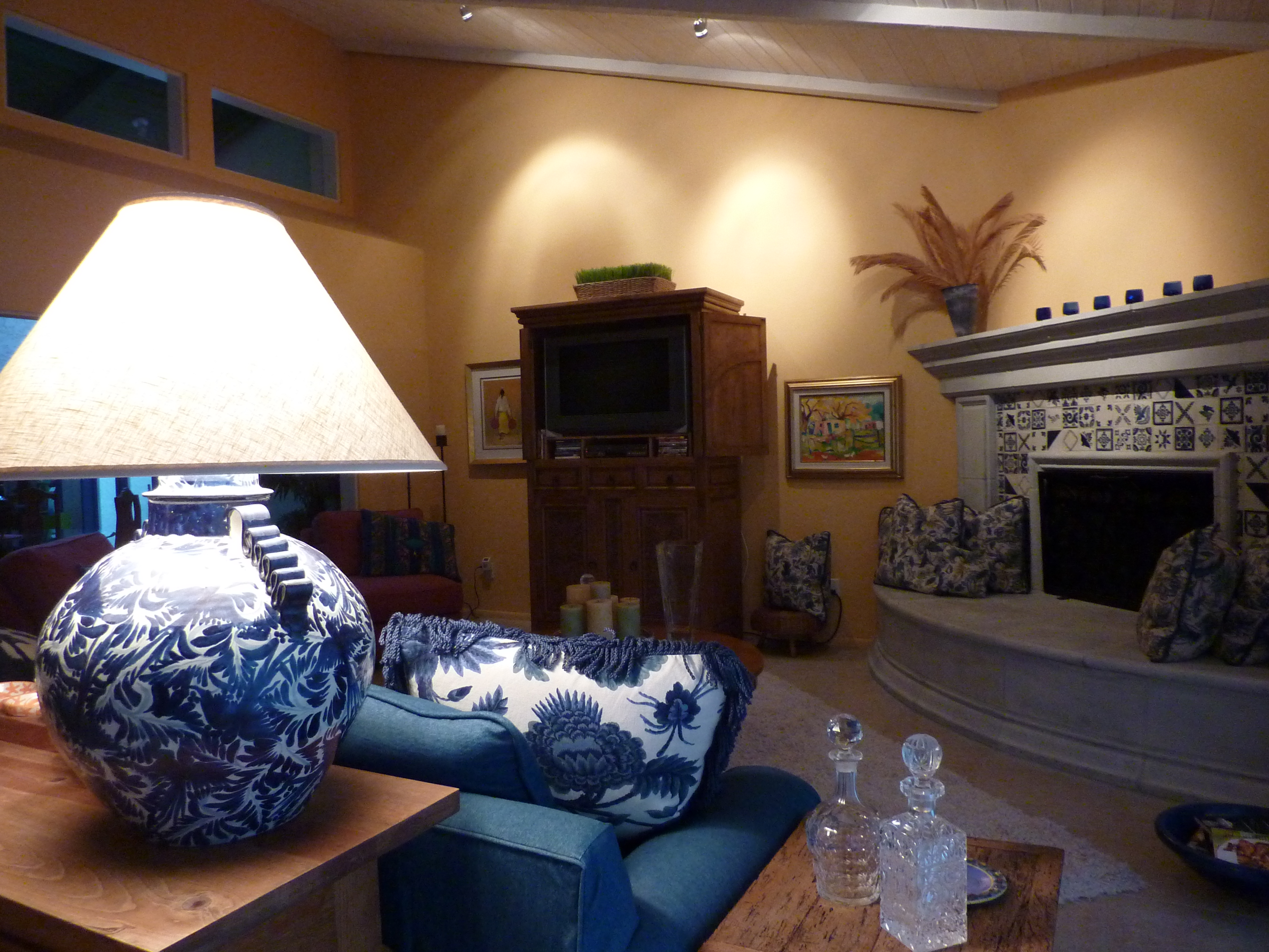
Casita soft and soothing www.casitadecolorestucson.com

Bright and Bold!

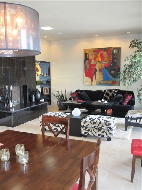
Sheer-shaded chandeliers and wall wash spots