COMFORT & JOY with ART

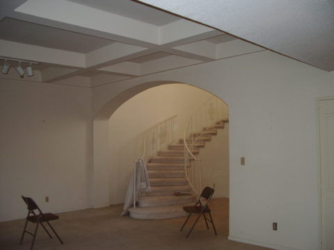
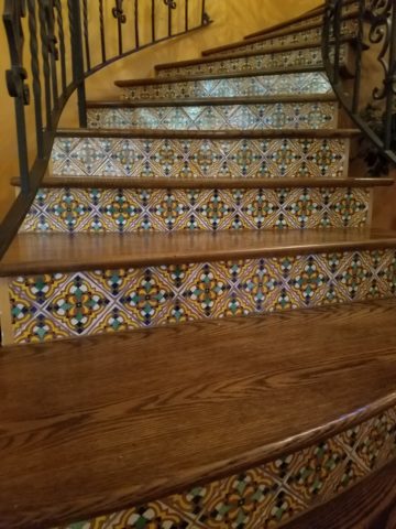
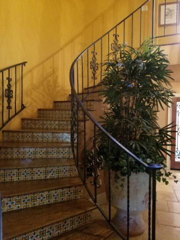
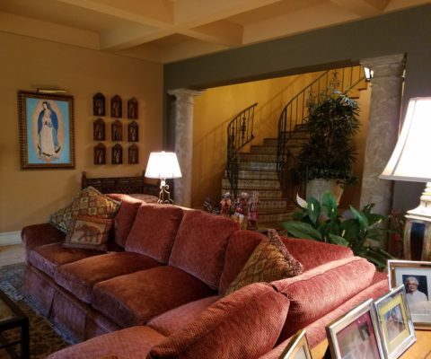
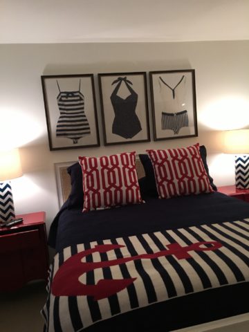
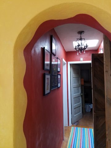
A few years ago I gave a talk. The title was  something like “I Need a Piece of Art to Go with My Red Sofa.”  It was a defensive argument giving liberty to those who sought artwork for decorative purposes rather than an esoteric rationale. As an interior designer surrounded by artistic influences and drawn to the limitless styles, pieces, concepts and movements of the art world, I see and appreciate both sides of this controversial coin.

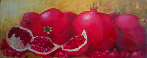
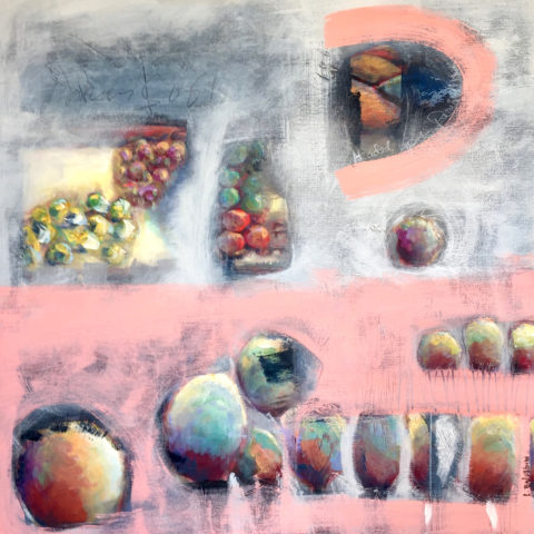
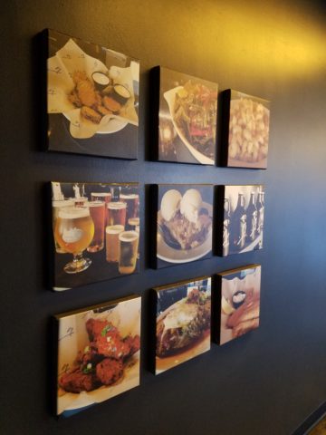
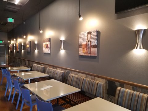
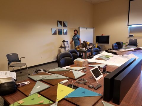
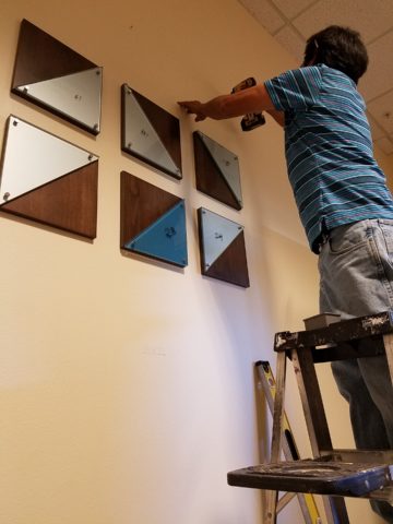
Federico Leon de la Vega’s Pomogranates

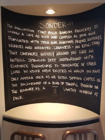
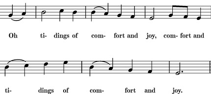
In my opinion art should bring joy. And that is not to discount art as a social commentary, honest statement of artistic philosophy, opinion, or personal expression. As an interior designer, my simple philosophy is that joy is a goal of interior habitats – function and joy simultaneously. For me, there is a synonym for beauty in there. Oh – and how apropos – it’s Christmas time and the carol God Rest Ye Merry Gentlemen specifically identifies bringing “tidings of comfort and joy.”

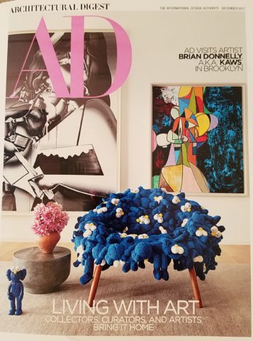
In this  month’s December 2017 issue of AD “Architectural Digest” Living with Art, architect Luis Laplace offers that he doesn’t really know about beauty in art. He sounds modest and self-effacing.  “I say I don’t know beauty. When I see that something works, then I see beauty.”  I say that is saying a lot about context. But inasmuch as I can see context being so perfect to showcase a piece that it validates it somehow, it seems lacking in the department of honest personal appreciation or criticism. Surely he must find beauty in art before it is placed.

I can see admitting that something having potential is a valid “wait and see” position to take when allowing a piece to be placed to its best advantage, prior to judging it too harshly – but that seems reserved for pieces about which one is trying to give them the benefit of the doubt! It sounds a bit like tap-dancing…making excuses. Excuses for not having an initial opinion or spontaneous reaction – much less appreciation – much less, joy.

Festive boat bringing JOY at the San Diego harbor parade last week.

Another comment that Laplace makes in this article “High Art” is that “We never use art as a decoration,” he declares. “We design for installation and rotation.” And I am sure in his world, that is exactly what he does. But let’s get down to earth and acknowledge that it’s a chicken and egg thing – the luxury to design expressly for the presentation of magnificent rotating works of art versus finding joy in a piece to decorate your world – with or without rotation. He makes decoration sound like a bad word. And perhaps he thinks it is – but why? Adornment, decoration, enhancement, emphasis – all superlatives, in my estimation.

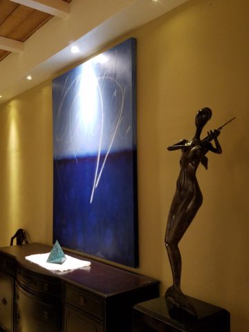
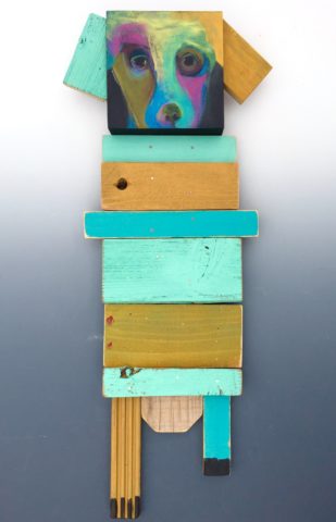
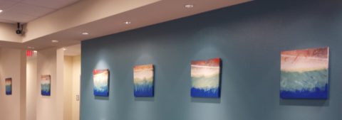
Federico Leon de la Vega’s Script on Blue

In a completely opposite place on the planet both figuratively and physically, Robert Downey Jr, in this same issue of AD, expresses an explanation for their selections and design direction. “We didn’t set out to do something conspicuously whacky.” He obviously gets great joy and a kick in the pants out of his approach which he cements, with the following comment: “We just enjoy a bit of whimsy and fun.”  And then a negative nod to separate him from the more cerebral art enthusiasts – “We definitely don’t like boring.”

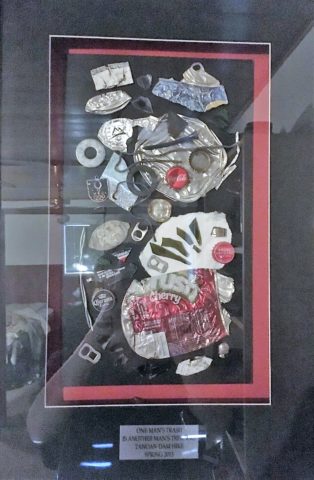
But that is a direct comment on the joy thing and one of my oft borrowed quotes “One man’s trash is another man’s treasure.” Here, a tangible example that I created for my grandson, Liam a few years ago. Debris he and I collected while on a walk one day, I assembled into a collage and had it framed for him with the plaque to remind him to look at things and regard things from all angles.

From what one person derives joy, another might find boring and uninteresting. And that oddly seems to return to the Luis Laplace comment about not seeing beauty until it is placed and then can be recognized. Hmmmm…Yet, I am saying that it might be of value to study things and  think about things differently than face value at a quick glance…spontaneity is valid and so is “love at first sight,” but often things are missed because their context s not serving them well. That space above your red sofa might be just the context and proper setting to showcase the “whatever it is” piece which might be far less interesting otherwise.

Which is why, in this time of international commerce delivering things from all over the planet with an almost instant gratification speed, we still have difficulty making decisions about what to chose to have in our world. Which fabric, which furniture, which art…the choices are at our fingertips and delivered to our doorsteps without leaving our living rooms, but fear of costly mistakes, second guessing trends and how to make good investments still remain the dilemma shared by most. Fear of trusting your own joy. Or, better yet, discovering and defining your personal joy.

Which brings me to the last quote I extracted from the December  2017 issue of AD by an artist, Brian Donnelly, speaking about his own residence and art collection, and that is  “I don’t buy art to put in specific places. I just collect what I love and hope to find a place for it.” Sounds like spontaneous joy to me!!

Closing with best wishes for a Merry Christmas and “tidings of comfort and joy.”


Value. What is an “Investment Piece” and Why?

In the design vernacular we keep hearing the term “investment piece.” What makes an investment piece? Is it that you spent more on it than most other purchases? You splurged? You made an unusual purchase that generally costs more than your norm. Sure, makes sense, I get this. Considered to be a focal piece, this seems to be the nod. However, I often feel entirely differently.


Investment. An investment in time, emotion, thoughts and beliefs…what type of unusual investment? An “investment piece” is usually a focal point or a piece placed in a position of prominence. It makes sense to identify an “investment piece” as something that is monetarily outside your usual comfort zone – but must it?

Consider that there is also the fact that a piece that hits a chord and is not easily replaced – if at all – is an investment. Seeing an objet d’art, on a folding table at a garage sale or amidst the throngs of a flea market, that catches your eye and is yours for a song – the bargain of the decade, or at least that day, is an emotional investment. It’s not about the money.

This “find” might actually have “cred” in a broad evaluation of appraisal. It might be a tiny Waterford crystal bud vase, like I found at a flea market for two dollars, about 35 years ago. I was just starting out, decorating my world, and it’s cut glistened and caught my eye from a cluttered table of garden tools, electric curlers and all manner of debris.  There was and still is a true value for this type of piece. It is replaceable – not one-of-a-kind, but a lovely piece. Similarly, at garage sale many years later, I spied a sparkle across many tables to discover a large Waterford ship’s decanter clustered with a few other unmarked pieces. Neighbors selling for a friend, they were cautiously asking twenty five dollars – the bargain of the day.

Once, in a consignment store, I came upon an ARS Italian ceramic box for five dollars that, although marked on the bottom, is not so published as to be easily priced. And I don’t care. Too me it is a one-of-a-kind find. It is old. I can’t replace it. I love the colors of the glazes and little pear top, it’s imperfections speak to it’s vintage and made-by-hand quality. It makes me smile.

When I hear people reference things by their monetary value, it strikes a sensitivity in me that is quite emotional. It annoys me. It frustrates me. Perhaps I am too sentimental, too attached to the enjoyment of “things,” but it’s what these things evoke, what they trigger in the form of memories or just spontaneous pleasure. What brings a smile, a tangible joy, is more to the point. It is a treasure.

Pieces with genuine sentimental value, because they have been inherited, reminding the current custodians of who preceded them and cared enough to preserve and pass down…and contrarily the ease with which some can unemotionally and easily part with something that has passed to them. It can be distilled to what one might find beautiful or not, and what speaks to the point – does this bring you joy or is it an onus?

It makes perfect sense that I am in this field. I see what clients have, ask them about what means what, and sometimes even argue in favor of keeping something that was destined for replacement or complete removal. I want to know what brings my clients joy. I want to make sure they don’t miss something they already have. It might just be the context that makes the difference.

Sometimes my clients have a piece – usually large – that they just don’t know how to use. They would like to, but just can’t find the right place. This is when we might consider other uses than the obvious. A bedroom dresser, might become a dining buffet. We change the context and save the piece. It gives new life and appreciation. It is a combination, in some cases, of function and joy. Thinking outside the box.

To have a careless non-attachment to things, that have not cost a relatively unusual amount, frustrates me.  Yes, it can be a good thing, freeing actually. Whereas I am burdened by my sentimentality. The fact that something is disposable merely because it was a “find” or a “bargain” should not make it less valuable – in my estimation. It’s not always about an expense.

It is a similar, yet reverse, process as selecting an item because of its cost or brand as thought that validates it. As though it is the primary reason to make the decision. I prefer to encourage people to find confidence in what they like – not merely a perceived or recognizable value. The result is the uniqueness that makes their world more personal, more individual, more uniquely theirs. It’s a treasure hunt. What is the value?

An “investment piece” should be almost, if not, irreplaceable – not by its cost – but by its unique ability to bring you joy. Have confidence to know it when you see it. It will be the right decision.


How Long Did It Take You to Do That?”

Recently chatting with a wonderfully multi-talented mixed-media artist of many colors, Laura Balombini and I commiserated on the Creative Process. A few weeks ago I blogged about the Creative Process as relates to client and designer interaction. Some people enjoy the detailed nature of the process and some prefer to be spared that enjoyment.

This recent conversation explored the hidden facets of the Creative Process. The light bulbs that go off in the wee hours of a sleepless night, the honing over time combinations and details, and the tapestry of life experiences that become the personal library of resources from which creativity is drawn.  Sitting in traffic can even result in an unexpected, seemingly unrelated epiphany!

Often called the inelegant “brain fart,” ideas bombard. They pop out often uninvited – when one is NOT even focusing and trying to come up with a solution. They come about without prompt or foresight. They happen.

Creative minds can rarely unplug. Downtime takes a concerted effort. Even those rare moments of attempted escape are invariably interrupted by unwanted, but often valuable, ideas. Not that the ideas are unwanted, but the spontaneous interruptions can be unavoidably annoying.

Yet, it is exciting. Having ideas and bringing them to fruition is greatly satisfying.  Balombini was bemoaning a similar quandary. Often asked “How long did it take you to paint that?” She said to me that the answer was obvious, but not what the observer wants to hear. Sometimes it takes minutes and other times it takes months. How can one charge the same square inch price or similar range of value for one piece that takes little time and something that takes much longer?  She lamented that she wished curious observers would direct their questions more toward a genuine interest in the “process.” Such as, “How did you come to select that color combination?” or “What inspired this assemblage?”


Inspiration is not a straight line. It is trial and error. It is a combination and accumulation of layers of ideas and fragments of many experiences. It is an illuminating and distilling of observations – all stored in the many compartments of the creative mind to be extracted and applied as the opportunities warrant.

Where she and I differ is that she, as an artist, creates constantly as a part of her process – as a necessity of her creativity and/or in hope of attracting a buyer (unless it is a commission – in which case, she hopes to satisfy the buyer) and I, as an interior designer, provide clients a service of creative ideas, solutions, suggestions and opinions toward an end. The ideas are selected, dismissed, modified and ultimately executed resulting in a finished design that is the product of the Creative Process. The creative services should provide effective solutions and be unique and thoughtfully custom-tailored for the client’s individual requirements and desires. The solutions are a result of many educated elements, collected life experiences and observations.

To appreciate what it takes to create is to take an interest in the complexities of the “process”. What might take minutes, to convey or even execute, results from a thought process and observations that are without boundary. The cumulative collection of experiences is what enable the designer or artist to find creative solutions, offer a variety of ideas and possibilities. This is the shared commonality of our discussion.

How often have you strolled through a museum or art gallery and thought, “I could do that!”

Have you ever attended a wine and paint event and tried to render the subject and watched as other of your fun-loving companions struggle to do the same, with as many different results as there are participants at the party? Copying is not easy, but it is very different from originating.

As I pondered this blog’s subject yesterday, in advance of putting it into print, another remarkably related and coincidental exchange took place. There I stood in the company of two co-workers of a business office for which I had designed the interior. They, having arrived after the project had been completed, were not privy to the details of the design elements and the process over months that took place. One asked the origin of the art series punctuating the east wall of the reception area. It was a collection of contiguous abstracted landscapes with rough dashes of brush strokes and stacked layers of color.  She asked if it was a result of a wine and paint party. I was aghast.

But upon further conversation it was clear that they recognized the same sized images, with a similar subject matter on each and the same color palette – not thinking beyond to the technically un-selfconscious (I like that word) process and ultimate application and execution. As we looked more closely and discussed the complexity of the texture and layering they came to understand that had they or I tried to copy it, we would not have had that remarkably un-selfconscious effect.  Ours would be more tense and rigid, in the attempt to be relaxed, loose and seemingly simple.  A new appreciation was realized. I had initiated an artistically creative commission from the very talented Federico Leon de la Vega as a solution for a long expanse with a splash of colorful, original, sophistication.

Artistic creativity is nebulous like a blond grabbing at the air…collecting her thoughts!!! Yet that nebulous creativity results in concrete solutions. Commission a painting, ask questions, buy one spontaneously when you like it, retain an interior designer and appreciate the Creative Process. Be creative and have a little fun. Try not to let it interfere with, or usurp, your attempts at some relaxing downtime.

The thickly applied paint on the canvas of the feature image, for this story, is by Ron Cheek. Incredible color balance, generous application of oil paint and loose strokes layered to present a powerful landscape. How long did it take him to do that? A lifetime up to that point.

Please visit our boutique gallery/design studio in downtown Albuquerque to see work by  these fine artists and others!

Custom Designed Art for Branding in Commercial Interiors

Designing artwork for commercial interiors offers an opportunity to connect to the brand. It means that we take into consideration the artwork as relates to the business and its identity. You might remember a blog from last year about the can wall. It was designed for a taproom. The theme was beer. The name was “Silver” and we considered that a natural off-shoot of that was the silver color of aluminum beer cans – as a wall treatment!

For that same project (in two locations) we further emphasized the brand with photos we took of their own products transferred to and stretched on canvas stretchers to be the “art” on the surrounding walls.


Fast forward to a conference room for an energy company home-based in Albuquerque – the iconic Sandia mountain being the earth’s monument – the familiar, perfect image to represent the company and the connection to the earth and its resources. For this  project, we were asked to build 27′ of custom , cabinetry and dress the wall above it.

The tall ceilings required a vertical element, but the length of the wall also begged for horizontal space-filling. As a cost-effective solution to such a large space, we decided to take a photo of the majestic mountain, separate it into 5 sections and have it enlarged and transferred onto aluminum panels for light weight and rigidity. The reviews were sensational as everyone loves and relates to the familiar scene – seen in such a colorfully explosive and expansive installation.

In response to the success of that solution, the client asked for a complimentary treatment for the opposing wall. Again, the wall was 27′ long and had the same ceiling height so we used multiple fragments in 3 groupings to center across the entire expanse. “Elemental Fragments” was born of the concept to have just that – fragments of elements in an orderly fashion – uniform yet random, to contrast against its formal geometry in response to the amorphous photographic landscape. Colors were derived from the blue, green and yellow in the scenic panorama interspersed in a field of silver.

Last week, on the day of the installation, colorful creative chaos – resulting from unwrapping the individually hand-crafted compositions and scattering them across the conference table – was part of the fun, of the scene.

The tedious work of aligning all just right, with perfect spacing and level mounting, added to the anticipation of realizing the finished product.

The luminous glass against the rich, stained wood punctuated with the  brushed stainless fasteners made a striking assembly.

Modern engineering and production, worldwide energy collaborations and shared technology coming together in a grounded environment of people and their place on the planet. A daunting system of assembling fragments of many elements that make things work to bring gas to the end users. The artwork makes the concept look easy. The result of the many facets, of the actual work and the artwork representing it, is not only effective, it is triumphal.

It’s creative fun to custom design pieces to relate to the brand, the business and the culture of a project. Bringing joy, pride and a sense of confidence in the focus of the work, to the employees and guests, is a successful finale.

Bring us your design challenge and we will design a solution specifically and especially for YOU!!!


SPANISH STYLE BRINGS INTERIOR SPICE

Fabulous clients – turned great friends – bought a good-sized townhome in Phoenix. It was plain vanilla inside with wall-to-wall broadloom and everything painted the same creamy neutral. They stood in the center of this bland slate and called me saying we think we want to clean this up and go with a mission-style simplicity.

They saw the ornate cream-painted wrought iron ascending the curved staircase and wanted it gone!

I flew over and saw for myself this dated interior with very good bones. Layout had great flow, nice lines, handsome coffered ceiling and other interesting features. I pondered the elements and the context of the exterior architecture. It was stucco with red clay tile roof, and iron railing details. Sure, we could slick it up, remove the embellishments…but should we?

The desert heat can be oppressive.  Some choose to embrace the glories of the sunshine and design bright airy interiors with plenty of refrigerated air to compensate for nature’s blistering temperatures.  This approach we were about to take was to be quite different, in that it offered a shady reprieve from the elements.

Therefore, despite the initial suggestion, for the style of the remodel, by my clients I offered another design direction . Why not spice it up with Spanish? Here we are in Phoenix, with architecture suggesting this genre. Knowing their bent for traditional interiors, from two past residences that we had designed together, and with a detailed discussion of the possibilities and evaluation of the elements, we agreed on the Spanish theme and began the transformation.

This is a perfect example of isolating the existing features and determining what to salvage and what to remove. Of the things to be salvaged, how can they be revitalized? So, with that in mind, the staircase was stripped of its carpeting and solid wood treads were added with custom-designed glazed ceramic tile, for the risers. A Moorish influence was the basis for the geometric motif.  The staircase’s semi-ornate railing  was  painted a dark, nearly black, charcoal. The result was startling.

Throughout the home, colors changed, stone columns and fireplace details were added, a wet bar was abandoned in favor of opening into the kitchen. Travertine stone floors were installed throughout the lower level with hardwood upstairs.

An open loft area was compartmentalized into a narrow gallery-bookcase with isolated and fully closed office beyond. Bold colors over-lap and contrast on layers of interior planes.


The result is a cozy retreat from the desert heat incorporating design elements suggestive of Spanish Colonial, transitioning to other modern elements complementing the overall design. To begin a remodel, look at the existing elements, the style of the architecture, the context of the structure and see if you can find a story.

This house now tells a story of intentional decisions, cohesive finishes, a directional theme and a finished product that represents the owners’ giving personal identity to their home.


Designing with the Brand in Mind

The grand opening of a project is always fun. Months of planning and construction resulting in a finished scene.

It’s not an easy path nor is it always as planned, but this project, conducted mostly long-distance, with only two field visits, is a great success.

Great clients make great projects. It’s a team effort and it helps that everyone is on the same page. The designer is a navigator, lighting the way to get to the end result. It can be a circuitous path. Like all projects, there are decisions and modifications, priorities and compromises.

Arizona Facial Plastics, having created a brand and provided a concept with which they wanted present their practice, sought an interior which instilled confidence, with the refreshing, pampering atmosphere of a spa, but with the aura of a conscientious, progressive medical environment.

In the fast-paced ever-expanding world of aesthetics, it is important to emphasize the quality and experience of service offered. In this clinic the services range from complex surgical procedures (performed off-site) to all of the cutting edge procedures and treatments desired by today’s discriminating clients. World-class products and state-of-the-art equipment and procedures are provided here, in the clinic, with quiet confidence and confidentiality.

To achieve their goals, we first focused on the brand and its style and colors. A crisp, serif-style A underscored with an elegant scroll, warm, soft charcoal compliments the bold cool gradated turquoise set against a fresh white ground.

Selecting finish materials began with the flooring and cabinetry. As is true with all interior projects, it is best to begin with the items that have the least options. There are fewer carpets and cabinet finishes than there are paint colors, for example.

We found the perfect carpet with a broadloom that provided a forgiving pattern, multiple textures and yarn colors. The complex product had an organic pattern of plush cut turquoise pile set in relief from a loop comprised of a grayed lavender and pale green citrine. Having made this selection, we then extracted individual colors of vinyl tile to compliment the carpeting in adjacent exam and procedure rooms. Gradated white porcelain tiles were used at the point of entry set against the contour of the carpeting in the waiting area creating a fluid, curvaceous transition and guiding, directional flow to the interior of the suite.

Once the flooring was selected, the cabinet and counter-top materials were next. A translucent yellow-green citrine engineered solid surface material was selected for the transaction counters at the reception desk and medical assistants’ work area. Dark charcoal plastic laminate was used for casework and select counters while exam room cabinets had a pencil-sketched floral patterned soft green laminate playing across the counter-tops.

An accent of sparkling glass and stone mosaic tile face the reception counter at the point of arrival.

Behind the receptionist, an elevated planter of succulent “sansevieria trifasciata”, regarded for it’s exceptional oxygen-producing properties, is a refreshing organic backdrop. Above, custom drapes filter light from the sloped ceiling atrium windows.


Non-representational expressions of color were selected for the wall art  throughout the space.

For the waiting room, we commissioned photographer, Katie Barry Councilor, of Smoketree Photography, to create a custom collection of abstracted body forms in grey scale. We then enhanced each image with their brand’s cool turquoise color, in the negative spaces, creating a series of artful stretched canvas images flanking their logo.

The take-away for clients is a serene, yet reverential  experience which instills confidence and promotes relaxation and rejuvenation. The subtle reiteration of the AZFP brand’s turquoise color throughout insures that the clients will be refreshed and reminded of their pleasing experience when they encounter that color even after leaving the clinic.

Hope you enjoy these before and after shots!!


Commercial Finishes – What They Say – What They Convey

When planning a commercial project, how do you separate your personal taste from an objective view of the program for the business? This situation has occurred twice in the last year with my practice. Well, there can be blurred lines. There can be design elements that work in both environments. There certainly are offices that mimic residential living rooms – contemporary or traditional – modern or historic, but it should directly relate to the type of business and the brand of that business. What does the space say with regard to conveying the intent of the business?

The selection of materials comes first. The bones of the building – what’s exposed, what’s concealed, flooring, wall treatments, etc…The first project was a medical related business – corporate office for a product line. The neighboring space was a physician’s office and treatment suite. The common space had existing concrete floors. The woman leading the design decisions for the medical corporate offices wanted to continue the concrete into her waiting area and throughout the offices with area rugs in each room. A small-scaled water feature, in the form of a grey box, is located adjacent to the seating and a distressed chest and metal sculpture are also part of the scene. Her selection of chairs were heavy, gold tapestry, over-stuffed and tufted. They were placed around a round table in the center of the room. All I could see was a setting for a Victorian séance. It in no way reflected the clean, crisp, fashionable brand that they had established to represent their rejuvenating medical product line. Rugs invited tripping hazards and the look was in no way speaking the language, of the intent of the business or its brand. It spoke directly of the woman’s home, from which she replicated her eclectic taste in the office.

Next door, nearing completion, the physician’s group was being strong-armed into going the same route with the concrete floors. We love concrete floors in so many applications, but here – in these two spaces, they were existing, did not take the stain well and looked dark and dirty in the final polished presentation – NOT the fresh look of a sleek medical group. Not the finish to convey confidence and cleanliness. Treatment rooms had vinyl flooring for necessary maintenance, corridors and physician’s office had carpeting, but the docs rejected the contrasting finished product in the entry and restrooms and went back to the light tile flooring that was originally specified regaining the professional appearance of the intended design.

Faux wood porcelain boards are a fantastic contribution to the design offerings for both residential and commercial finish materials. Shown here on the exterior of a building by the ocean, the artsy peeled bark variegation of the pattern is striking and makes a commanding design statement.


It is carried through into the interior and back outside on the rear dining patio.

The idea is that a wooden building by a seaside is traditional – this is a stunning twist on that which was once a customary building material revisited with an invincible, high-design version. The use of wood for such a place would have been historically accurate.

The same is true when faux porcelain planks are used on the floors in the produce section of a grocery store – replicating a produce market or barn where fresh produce is collected and sold. Some high-traffic food-service establishments, bars or breweries often want the look of wood floors – to convey a context or scene – but are not durable and therefore not advisable. A home – almost anywhere including the obvious – in the woods or by the shore, with wood flooring might not be practical, but by using the wood planking porcelain, the look is conveyed while the durability and maintenance is made effortless.

Recently an owner wanted the “look.” That sleek modern look of grey porcelain planking. His business was one that dealt with automotive repair and restoration. In evaluating his brand and the nature  of the business, real wood floors would never be the material of preference. So to use even a durable, invincible, porcelain version seemed out of place.

Concrete would be more the material of a garage environment. To make a corporate statement, concrete can be dressed-up. Porcelain tiles simulating concrete is an appropriate faux finish option – either way, preferable to creating an interior of grey weathered wooden planks. Watch for the completion of these projects in the coming months.

Adopting the use of materials merely because you like them or they are in vogue is not always the best approach. Consider the context, the intent, the statement materials make – how they “read,” what they say – what they convey.


Inspiration Discovered in Familiar Materials Used in New Ways

While at the stop light, I found myself behind this gorgeous fire truck and by the time I thought I should take it’s photo, it was pulling away and I was making a U-turn! So I quickly grabbed the phone, fumbled for the camera icon, and snapped this shot over the dash through the windshield as it powered up the street.

I have zoomed in on this spotlessly, shiny, magnificent machine for the effect of today’s story subject. This wonderful, patriotic, service – truck struck me not only because it was colorful and sparkling, but much of the high contrast and bling came from the diamond tread wrapping the handsome body.

Earlier in the week a client casually mentioned how cool it would be to use some of this material as an interior design element! Little did he know that his simple off-the-cuff comment inspired me to investigate and plan to do just that! I was minutes from presenting to this very client when this photo op occurred. Serendipitous perhaps?

What sparks the imagination? How do things evolve? What fun it is, as a part of the Creative Process, to explore the possibilities of unexpected materials used in new ways. In this case, the material is perfect to promote the theme of the brand – a successfully growing business related to cars and the repair and restoration thereof.

I won’t reveal the business just yet – it will be a dramatic unveiling soon-to-come. Suffice it to say, I am enjoying the process, with a great team, of expressing and furthering their well-established brand, in the development of the interior and exterior design.

Back to the diamond tread. You’ve seen this used on fire trucks, tool boxes, tailgates, flooring, trap doors…and much more. It comes in glossy aluminum as shown here with its brilliant, bright, bling – also in stainless steel (a bit more expensive), and a dark carbon version. It comes in large sheets – a couple of different sizes and thicknesses.

I have also discovered here, while on the search for materials for this project, a dark iridescent porcelain tile with a bas relief pattern simulating this amazing tread. This material like other faux finishes has it’s practical purposes – but like porcelain wood or porcelain stone – it is NOT the real deal. I have elected not to present this, for use on this project.

So stay tuned to the exciting insertion of this sheet metal in our new interior design. Just enough  – not too much – right where it will be effective – and make the best statement.

The takeaway is that the excitement of introducing different materials effectively – not gratuitously – but with a purpose – is part of the fun of design. The daily inspiration that comes from new projects and people, ideas and opportunities!!!

And in light of our holiday weekend – a perfect time to feature the shiny red truck that inspires and represents the outstanding individuals in the service and rescue fields – Happy Labor Day!

Regional Design Fun!

So many regions, so little time!!!! All the design directions available based upon where you are and what you love – just think!! Regional design provides a strong connection to the surrounding environs. From selecting artwork to color schemes, decorative accessories and even room scents, creating regionally specific interiors is a fun way to go. Often reserved for second homes, the novelty of focusing  on the design theme specific to the region does not always reflect real life.

Real life is usually comprised of a variety  of experiences, tastes, acquired objects, interests etc…designing around a specific regional theme is more deliberately focused and therefore not as eclectic as a person’s true life experiences and resulting accumulation of possessions and reflection of varied interests.

Seaside design would incorporate decorative accessories, fabrics and colors to represent the surroundings such as nautical themes and the elements of the natural scene incorporating seashells, seascapes, etc…

Therefore, the primary place of residence in such a locale would reflect that context but not necessarily be completely designed around it. The second home would have the novelty of centering the design exclusively on that seaside theme.

Here is a stunning example of the Americana By the Sea Bungalow! A spritz or burning of Votivo’s White Ocean Sands in this scene – oh heck – why? Just open the windows and breathe in the salty sea air!!!

While in the metropolitan Washington area, one can’t help but notice the architectural influence of colonial times and the interiors which reflect the same.

Steeped in the history of our relatively young country and the pre-colonial decorative arts that came across the water to the New World, the antiques, reproductions and embellishments are telling.

This whimsical casita in Santa Fe illustrates the colorful folk-art of both old and New Mexico, bold paint colors, graphic transitions, and the enchanting architecture of adobe charm. As a second home, the extravagance of collecting and displaying in a fanciful setting is a fun, on-going project!

A corner cabinet by acclaimed folk-art painter Barbara Peabody makes a bold statement housing additional collectibles from Old and New Mexico. A giclee print of a fabulous watercolor by Susan Weeks – the art of decoratively detailed cowboy boots.

Where do YOU live? What themes from your area do you incorporate in your interior design? Get out there are soak it in, gather ideas, start collections, buy local and have fun!!!!!!

Design Inspirations in the City Different

Do YOU know the way to Santa Fe, to play off of a song by another title? Up the hill and beneath a brilliant blue sky, the thunder clouds scatter with dramatic splendor. Past the cedar dotted landscape with punctuation of piñon the seasonal monsoonal green is blanketing the desert. A thrilling view passing swiftly, outside the window, like a series of paintings capturing  surreal scenes – always picturesque.

It’s July in The Land of Enchantment and a weekend getaway, in Santa Fe, promises stimulating design treats and artistic inspiration! Every visit is familiar – yet new. Around every corner, there is detail and color, decoration and un-selfconscious art.

Just when you think the Santa Fe market is saturated with myriad fabulous dining options, Paloma hits the ground running, on Guadalupe Street, to shake things up a bit!

The joy of experiencing the very new restaurant of an amazing friend was exhilarating! Marja Martin, la propietaria of this great new venue Paloma, brings limitless talent, outstanding vision and distinctive creativity to everything she touches.

The quite well-seeded Santa Fe dining scene is recipient of her newest endeavor. Already a well-established and well loved caterer, her artistic sensitivity and smart culinary concepts – that have been her signature – now result in a presentation of stunning unpretentious decor and exceptional  flavors. She’s giving patrons bold flavors and creative combinations inspired by true dining experiences, with our many-faceted Mexican neighbor’s to the south. The result is fun and transporting, in its authenticity.

Walking home, to the lovely casita of dear friends, the gates and doorways, patterns and particulars – uniquely New Mexican in their expression of design offer photographic treats. It’s magic. It’s exciting. It should be on everyone’s list to take the time to explore.

It’s as though history and current trends collide to create a patchwork of texture and color all to stimulate the senses. Exotic flavors and international everything all presented in the confines and context of this extraordinary place.

Interior design and exterior design bombarding from every pocket including this provocative little prose to ponder at Sonder. Get out there are feed your senses!