Atmos and Eating by Design

How do you select a restaurant? As a patron, what makes you dine out? How do you select your preferred dining experience? I’m talking about casual and easy or even more a more in-depth gastronomic event.

When it comes to casual, quick and easy, I still want the experience to have personality – a pleasing personality and great flavors. Personality is atmosphere. Great flavors is the kitchen. Service might be “step-up and place your order” or table-side wait-staff. In either case, I want it to be a pleasing experience. Why would anyone want it to be difficult or unpleasant? Perhaps that lies in the definitions of the beholder. What is difficult or unpleasant and the various degrees thereof is not be the same for everyone.

Throughout my childhood, I remember my mother and her peers reference “atmos.” It was important. It came up often. “Does the place have atmos?” Or “what great atmos.” Atmosphere – it is the feeling you get in an environment. It is the feeling a place emits. I don’t ever recall it being used in the negative – such as this place has horrible atmos…rather, like ambiance, it was reserved to compliment.


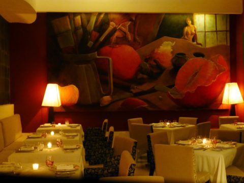
Cafe des Artistes – Puerto Vallarta – Note the full-wall mural by Federico  Leon de la Vega as a backdrop to the dining scene. Also, perhaps someone should have straightened the lamp shades!

We now hear “vibe.” The place has a good vibe – but not limited to only compliment, a place can have a decidedly bad vibe too! Is it just the saying “If you can’t say anything nice about something, don’t say anything at all?” Perhaps we are less polite than the previous generations. Yet, constructive criticism let’s you know what makes your patrons pleased. Truth be told…be honest with discretion.

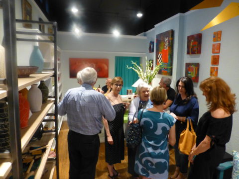
As a restaurant owner, it seems that erring on the side of greater numbers sharing the same opinion of easy and pleasing would capture the greater share of the demographic. Therefore, studies are out there to determine the value of ambiance and presentation. Starting with defining the description of your eatery…who are you and what and how do you serve? What is your “brand?” Whether funky or fine, dining should be worth the visit.

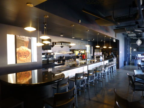
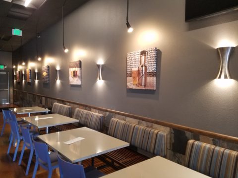
Nexus Brewery, in Albuquerque, has a unique brand and complimentary interior “vibe.”

I read a few excerpts from a fascinating new book, Gastrophysics, The New Science of Eating by Charles Spence. In it, he touches on the importance of atmosphere. He observes the value of interior design even as it relates to how much people eat and how much they spend as a result of atmospheric influences.

Another great read for understanding the art of a successful restaurant is Daniel Boardman’s Your First Restaurant – An Essential Guide. As an “essential aspect of your concept” Boardman identifies why the “thoughtfulness of the interior design” communicates to the patron a lot about the service and food that one might expect to receive.

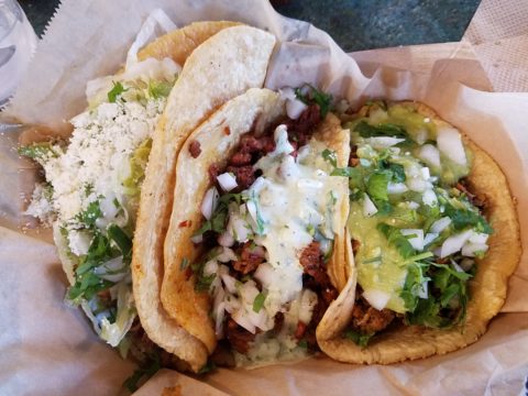
Tacos on paper – porque no?

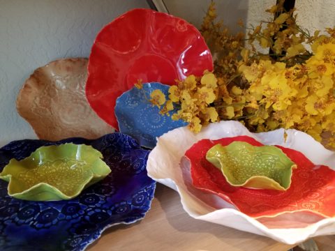
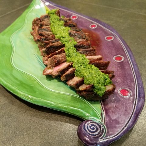
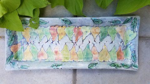
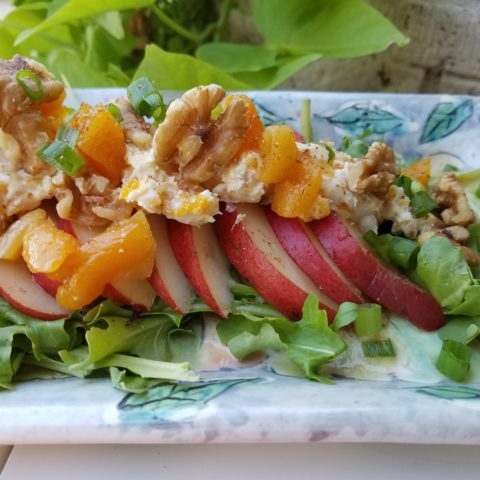
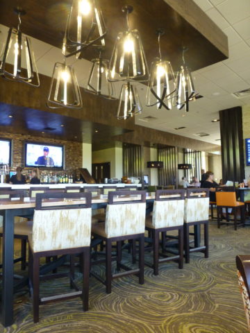
From lighting to the shape of the plate, ambiance and presentation are key features in a successful eating establishment.

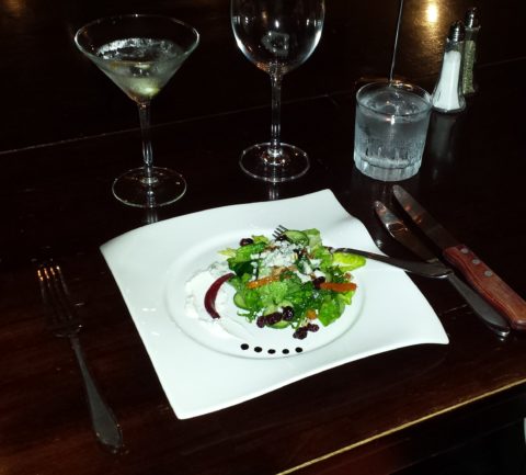
All the way from candles on a white linen table cloth to a handsome juicy burger in a basket lined with paper, in the context of the environment – design details matter.

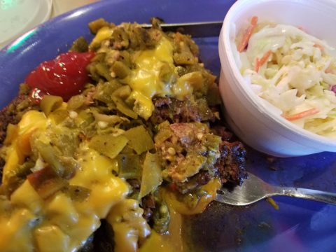
Luscious bun-less green chile cheese burger at Sparky’s in Hatch, New Mexico – served on paper and styrofoam – not fancy, but perfection!!


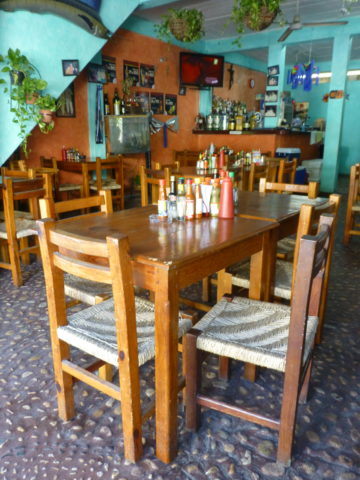
Stone under-foot and condiments as a center-piece!! Funky!!

Some reading this might say they don’t care. Fine. Perhaps on the surface, they think it doesn’t matter. They don’t realize the effectiveness of well thought-out details. They take these things for granted. Yet these details can make or break a dining experience – from casual to fine.

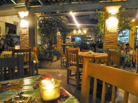
El Arrayan presents enclosed patio dining with a variety of light sources, well balanced colors and textures in Puerto Vallarta.

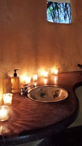
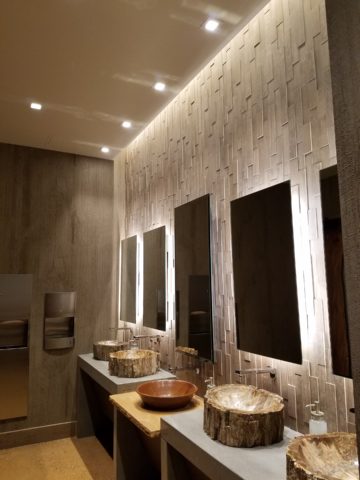
Next time you eat out, look around, smell the smells, hear the sounds, see the colors, notice the lighting sources and levels, feel the furniture and – have I not mentioned it? – check out the restrooms!!!!

Las Caletas…in the jungle…clean and simple.

Not only should they be very clean – but they should also continue the theme of the place.

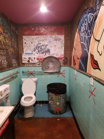
Graffiti by design, this restroom is actually immaculately clean and patrons do NOT contribute with their own markings. It is located in the street taco eatery of SALUD! in Barrio Logan, San Diego. Fast and friendly, delicious and fabulously  funky!

Pay attention and you might be surprised at what you discover about your sensitivities.

Chaco Hotel in Albuquerque is thoroughly theme-based throughout.

What you hear while dining contributes greatly to the pleasure or discomfort of your time spent in the environment. It either contributes positively or detracts annoyingly. Listen to the sounds next time you dine. At home or out, notice voices, chairs being moved, glassware, music, kitchen noises, traffic…see what detracts, what enhances or what might be considered neutral.

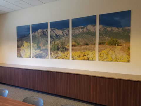
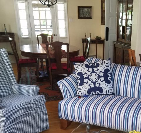
Interior designers are considering it all – the theme, atmosphere, colors, artwork, furniture, lighting, table dressings, serving pieces, fabrics, textures and even sound. Whether casual or more formal, these design details can make or break the success of the business.

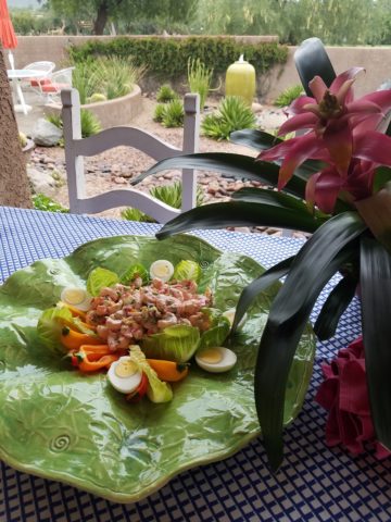
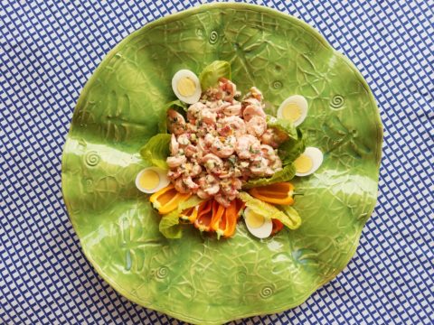
Oro Valley Country Club, Arizona.

Even if the food is exceptional, too bright lighting, ineffective colors, uncomfortable furniture or confused design elements can result in negating even the best chef’s efforts. It is a package. It is about the whole. It is a multi-sensory experience. Buen provecho!

TRENDS DIE – What’s New for 2018?

I was surfing for fodder about the new color trends to kick-off this first mindful missive for the New Year and the color trends were all over the place – no consistency at all. From Ben Moore selecting Caliente AF290,

“Caliente is the signature color of a modern architectural masterpiece; a lush carpet rolled out for a grand arrival; the assured backdrop for a book-lined library; a powerful first impression on a glossy front door. The eye can’t help but follow its bold strokes. Harness the vitality.” 

—Ellen O’Neill, Benjamin Moore & Co.

to Sherwin Williams in a totally opposite direction proclaiming Oceanside SW 6496 their color of the year.

“A collision of rich blue with jewel-toned green, a color that is both accessible and elusive… A complex, deep color that offers a sense of the familiar with a hint of the unknown, Oceanside, bridges together a harmonious balance of blues and greens that can be found in what’s old and new.”

What? Are we straddling now?  Do we have one foot in one color trend while the other stretches across the color wheel and causes us to nearly do the splits trying desperately to hang on?

The walls of my east gallery space were a spicy version of Caliente for nearly 20 years! Bold at the time and unheard-of for  gallery walls – it was not to be changed for nearly 2 decades!!!

Whew – that was a run. I even named the retail space “Caliente.” And the color-band between the crown and picture molding at the back was a version of Oceanside – a lighter value of the blue-green hue.

The Grand Re-Opening July 2016 presented a dramatic transformation to a pale aqua resulting in a diametrically opposed feeling – a cleansing from what was crowded and hot to spare and cool.

But I digress…

Annoyed by the seeming authority, but weak contrasting rationale that I encountered with the wide range of picks and opinions, I left the paint companies and clicked over to the Pantone site. There I encountered their authoritative, ethereal color forecast of the year – Ultra Violet!!!!!

Yikes – they were coming at me from every conceivable direction!!! How on earth is any eager apartment dwelling or home-owning individual supposed to know how to go forward in sprucing up their space without fear?

Then  I came upon a piece by Mehgan Nesmith Ugh, What’s With These Generational Color “Trends”? From observing the broad reaching trend surrounding millennial pink to snippets from other sources,  I scanned the paragraphs amused, but still not satisfied. Until I arrived at paragraph 6 and there it was – the true fact that keeps the world moving forward – for better or worse – TRENDS DIE.

Yes they do and for good reason. I’ve said it before, take care in making costly selections that will stay with you past their prime. Trends are there for a reason. Designers dabble in creativity every day of the year to come up with things to tantalize, inspire, evoke, and entertain – and most importantly, SELL. Some of these trends stick. Then they are no longer trends, they transition and become classics. But to transcend the fleeting status of trend, “it” must have something very solid about its being.

And when it comes to interior design, with all the style trends for furniture, fabrics, architectural elements, finishes and decorative accessories – colors race through history like no other design element has or will. Colors rule and when they are good, they are very very good, but when they are bad, they are horrid!!!!! Thank you Mr. Longfellow!!

Take the massively graceful modern art piece suspended from the ceiling of the East Wing of the National Art Gallery in Washington, D.C. – classic – both in form and color. Red and black. Strong and simple. Bold and brilliant. Imagine if it were this year’s Pantone pick Ultra Violet  Aghhhh!!!!!!!

Actually, methinks I protest too much. The shade of purple picked, by Pantone, is heavy on the blue rather than the red.  The blue cast gives it a calm. Not whacky like Barney screaming purple – but, rather a royal shade.  Nonetheless, it is better served as an accent – don’t buy  wallpaper in it. Go ahead and paint the walls and have your fun – but know that you can change it without peeling off hundreds, if not thousands of dollars of wall-covering or re-upholstering your sofa like Meghan was tempted to do!!

It’s a color that stands alone – plays better by itself than with friends – like the child’s report card where the box that says “plays well with others” is not checked.  In my estimation, it will read well with clean, crisp white.  However, like Ms. Nesmith aptly says in her piece “if you are  still curious about that Gen Z yellow, buy a vase!”

That’s how we play with  colors and create a bit  of collision, unexpected off-key harmony, intrigue and suspense. But it is not for the faint of heart and the chance of tiring of it is paramount. Trends die and colors are tricky.

So Happy New Year and Happy New Colors in your world to refresh and renew!! Thank you Meghan, for your lively contribution to today’s story.


Value. What is an “Investment Piece” and Why?

In the design vernacular we keep hearing the term “investment piece.” What makes an investment piece? Is it that you spent more on it than most other purchases? You splurged? You made an unusual purchase that generally costs more than your norm. Sure, makes sense, I get this. Considered to be a focal piece, this seems to be the nod. However, I often feel entirely differently.


Investment. An investment in time, emotion, thoughts and beliefs…what type of unusual investment? An “investment piece” is usually a focal point or a piece placed in a position of prominence. It makes sense to identify an “investment piece” as something that is monetarily outside your usual comfort zone – but must it?

Consider that there is also the fact that a piece that hits a chord and is not easily replaced – if at all – is an investment. Seeing an objet d’art, on a folding table at a garage sale or amidst the throngs of a flea market, that catches your eye and is yours for a song – the bargain of the decade, or at least that day, is an emotional investment. It’s not about the money.

This “find” might actually have “cred” in a broad evaluation of appraisal. It might be a tiny Waterford crystal bud vase, like I found at a flea market for two dollars, about 35 years ago. I was just starting out, decorating my world, and it’s cut glistened and caught my eye from a cluttered table of garden tools, electric curlers and all manner of debris.  There was and still is a true value for this type of piece. It is replaceable – not one-of-a-kind, but a lovely piece. Similarly, at garage sale many years later, I spied a sparkle across many tables to discover a large Waterford ship’s decanter clustered with a few other unmarked pieces. Neighbors selling for a friend, they were cautiously asking twenty five dollars – the bargain of the day.

Once, in a consignment store, I came upon an ARS Italian ceramic box for five dollars that, although marked on the bottom, is not so published as to be easily priced. And I don’t care. Too me it is a one-of-a-kind find. It is old. I can’t replace it. I love the colors of the glazes and little pear top, it’s imperfections speak to it’s vintage and made-by-hand quality. It makes me smile.

When I hear people reference things by their monetary value, it strikes a sensitivity in me that is quite emotional. It annoys me. It frustrates me. Perhaps I am too sentimental, too attached to the enjoyment of “things,” but it’s what these things evoke, what they trigger in the form of memories or just spontaneous pleasure. What brings a smile, a tangible joy, is more to the point. It is a treasure.

Pieces with genuine sentimental value, because they have been inherited, reminding the current custodians of who preceded them and cared enough to preserve and pass down…and contrarily the ease with which some can unemotionally and easily part with something that has passed to them. It can be distilled to what one might find beautiful or not, and what speaks to the point – does this bring you joy or is it an onus?

It makes perfect sense that I am in this field. I see what clients have, ask them about what means what, and sometimes even argue in favor of keeping something that was destined for replacement or complete removal. I want to know what brings my clients joy. I want to make sure they don’t miss something they already have. It might just be the context that makes the difference.

Sometimes my clients have a piece – usually large – that they just don’t know how to use. They would like to, but just can’t find the right place. This is when we might consider other uses than the obvious. A bedroom dresser, might become a dining buffet. We change the context and save the piece. It gives new life and appreciation. It is a combination, in some cases, of function and joy. Thinking outside the box.

To have a careless non-attachment to things, that have not cost a relatively unusual amount, frustrates me.  Yes, it can be a good thing, freeing actually. Whereas I am burdened by my sentimentality. The fact that something is disposable merely because it was a “find” or a “bargain” should not make it less valuable – in my estimation. It’s not always about an expense.

It is a similar, yet reverse, process as selecting an item because of its cost or brand as thought that validates it. As though it is the primary reason to make the decision. I prefer to encourage people to find confidence in what they like – not merely a perceived or recognizable value. The result is the uniqueness that makes their world more personal, more individual, more uniquely theirs. It’s a treasure hunt. What is the value?

An “investment piece” should be almost, if not, irreplaceable – not by its cost – but by its unique ability to bring you joy. Have confidence to know it when you see it. It will be the right decision.


COOK + PARTY: Set the Stage for Style with Art in Daily Life

Having art woven through the daily activities of your world is stimulating, satisfying and inspirational. It stimulates the imagination, satisfies with the knowledge that is was created by an individual artist and inspires to spur the creativity we each have to express – whether we know it or not. It encourages appreciation.

Functional art is a cornerstone of the work we offer at PATRICIAN DESIGN. As a novel promotion of the various artists who create and produce exciting food-safe serving pieces on display and for sale in our shop and affirmation, of the belief we have that art should set the stage for style in daily life, we began our series – Patti’s COOK + PARTY. We like to party and we love art – so we party with art at the  center of the  festivities!!!! Let’s get this party started!!!!!

Six months ago, we began our series and followed the seasons as we progressed. By Fourth of July we featured festive party parfaits in expected red, white and blue! Our martini glasses were placed upon colorful cocktail coasters hand dyed and pieced into pretty patchwork squares by fiber artist, Rebecca Speakes!

Micheladas were given a twist with plump yellow heirloom tomatoes! Alongside was a fresh guacamole featured in a rippled-edged undulating little piece of pottery by artist Anne Marie Werner Smith.

Her collection is wonderful and we continue to feature key pieces in our weekly recipe pairings.

The pairing of recipes, with handmade art pieces on which to present and serve is inspiring. Here is a New York Strip steak bathed in a crazy fresh, from the garden, combination of pesto/chimichurri (yes, we created some crazy combinations of the two) sauce presented on a fanciful leaf platter by artist Robin Chlad!

Seeing examples of fun recipe ideas displayed on functional art creations is an unbeatable combination. Just tell Guy Fieri that for his Next Big Project!!! Rooting out artist’s studios in every pocket of the country and discovering great work and pairing it with great food – fantastic!

The colorful drawings and painterly style of Mariana Gasteyer’s pottery is whimsical and festive! Here a couple of examples and a fabulous featured recipe of a paired pear salad – half roasted and half freshly sliced – the combination was divine and the presentation on the platter was perfection!

A summer road trip took us too Tucson where we featured a huge lotus platter by artist Penne Roberts. Here we featured a vintage Shrimp Louis Salad.


As fall progressed, we hiked Tent Rocks to photo this amazing platform piece by Jenn Dipaolo.

Upon the platform we placed a pair of sweet and savory mini pumpkin pots de creme.

This past week we featured a dazzling, luminous glass sunflower bowl Margaret Hidalgo Vanderheyden.

This spectacular fused glass assemblage frames our pecan crusted cheese ball perfectly.  Fall colors with holiday flair, this bowl makes a statement!!!

Supporting local artists, showcasing their pieces by pairing with food is the  bomb!

Start family traditions with signature art pieces, build collections and shop  small supporting local artists in your community!!!

If you would like to receive our weekly Patti’s COOK + PARTY recipes and pairings with our functional art finds, let us know what you think and sign-up with your email address!!

Custom Designed Art for Branding in Commercial Interiors

Designing artwork for commercial interiors offers an opportunity to connect to the brand. It means that we take into consideration the artwork as relates to the business and its identity. You might remember a blog from last year about the can wall. It was designed for a taproom. The theme was beer. The name was “Silver” and we considered that a natural off-shoot of that was the silver color of aluminum beer cans – as a wall treatment!

For that same project (in two locations) we further emphasized the brand with photos we took of their own products transferred to and stretched on canvas stretchers to be the “art” on the surrounding walls.


Fast forward to a conference room for an energy company home-based in Albuquerque – the iconic Sandia mountain being the earth’s monument – the familiar, perfect image to represent the company and the connection to the earth and its resources. For this  project, we were asked to build 27′ of custom , cabinetry and dress the wall above it.

The tall ceilings required a vertical element, but the length of the wall also begged for horizontal space-filling. As a cost-effective solution to such a large space, we decided to take a photo of the majestic mountain, separate it into 5 sections and have it enlarged and transferred onto aluminum panels for light weight and rigidity. The reviews were sensational as everyone loves and relates to the familiar scene – seen in such a colorfully explosive and expansive installation.

In response to the success of that solution, the client asked for a complimentary treatment for the opposing wall. Again, the wall was 27′ long and had the same ceiling height so we used multiple fragments in 3 groupings to center across the entire expanse. “Elemental Fragments” was born of the concept to have just that – fragments of elements in an orderly fashion – uniform yet random, to contrast against its formal geometry in response to the amorphous photographic landscape. Colors were derived from the blue, green and yellow in the scenic panorama interspersed in a field of silver.

Last week, on the day of the installation, colorful creative chaos – resulting from unwrapping the individually hand-crafted compositions and scattering them across the conference table – was part of the fun, of the scene.

The tedious work of aligning all just right, with perfect spacing and level mounting, added to the anticipation of realizing the finished product.

The luminous glass against the rich, stained wood punctuated with the  brushed stainless fasteners made a striking assembly.

Modern engineering and production, worldwide energy collaborations and shared technology coming together in a grounded environment of people and their place on the planet. A daunting system of assembling fragments of many elements that make things work to bring gas to the end users. The artwork makes the concept look easy. The result of the many facets, of the actual work and the artwork representing it, is not only effective, it is triumphal.

It’s creative fun to custom design pieces to relate to the brand, the business and the culture of a project. Bringing joy, pride and a sense of confidence in the focus of the work, to the employees and guests, is a successful finale.

Bring us your design challenge and we will design a solution specifically and especially for YOU!!!


SPANISH STYLE BRINGS INTERIOR SPICE

Fabulous clients – turned great friends – bought a good-sized townhome in Phoenix. It was plain vanilla inside with wall-to-wall broadloom and everything painted the same creamy neutral. They stood in the center of this bland slate and called me saying we think we want to clean this up and go with a mission-style simplicity.

They saw the ornate cream-painted wrought iron ascending the curved staircase and wanted it gone!

I flew over and saw for myself this dated interior with very good bones. Layout had great flow, nice lines, handsome coffered ceiling and other interesting features. I pondered the elements and the context of the exterior architecture. It was stucco with red clay tile roof, and iron railing details. Sure, we could slick it up, remove the embellishments…but should we?

The desert heat can be oppressive.  Some choose to embrace the glories of the sunshine and design bright airy interiors with plenty of refrigerated air to compensate for nature’s blistering temperatures.  This approach we were about to take was to be quite different, in that it offered a shady reprieve from the elements.

Therefore, despite the initial suggestion, for the style of the remodel, by my clients I offered another design direction . Why not spice it up with Spanish? Here we are in Phoenix, with architecture suggesting this genre. Knowing their bent for traditional interiors, from two past residences that we had designed together, and with a detailed discussion of the possibilities and evaluation of the elements, we agreed on the Spanish theme and began the transformation.

This is a perfect example of isolating the existing features and determining what to salvage and what to remove. Of the things to be salvaged, how can they be revitalized? So, with that in mind, the staircase was stripped of its carpeting and solid wood treads were added with custom-designed glazed ceramic tile, for the risers. A Moorish influence was the basis for the geometric motif.  The staircase’s semi-ornate railing  was  painted a dark, nearly black, charcoal. The result was startling.

Throughout the home, colors changed, stone columns and fireplace details were added, a wet bar was abandoned in favor of opening into the kitchen. Travertine stone floors were installed throughout the lower level with hardwood upstairs.

An open loft area was compartmentalized into a narrow gallery-bookcase with isolated and fully closed office beyond. Bold colors over-lap and contrast on layers of interior planes.


The result is a cozy retreat from the desert heat incorporating design elements suggestive of Spanish Colonial, transitioning to other modern elements complementing the overall design. To begin a remodel, look at the existing elements, the style of the architecture, the context of the structure and see if you can find a story.

This house now tells a story of intentional decisions, cohesive finishes, a directional theme and a finished product that represents the owners’ giving personal identity to their home.


A Most Illuminating Lighting Course Proves – It Exists!

As is often the case, after attending an engaging and informative continuing education class, I am compelled to share at least a fraction of the energy that I experienced today. When a class is good, it is energizing. This was a most illuminating lighting course!

We know that as interior designers that light plays a significant role in creating a scene. Whether task lighting, ambient lighting, spot lighting or washes of color – light plays an important role. What’s so exciting and compelling is the technology that is so rapidly changing the possibilities!

The profound change is a result of the perfected application of Light Emitting Diodes – LED lighting. Lynne Wilkinson takes the complexity of physics and speaks in plain language with a humorous and entertaining delivery distilling that which is incredibly complex into digestible information.

Here’s a link to Philips for more information:

https://www.usa.philips.com/c-m-li/led-light-bulbs

So today I want to impart a tiny bit of the exciting content of this day. If a child asked you – “what is light?” How might you answer that?  Um…well…it’s uh…Electromagnetic radiation. Duh! After clearing that hurdle, we settled into distinguishing the technology between incandescent and fluorescent and a number of other lighting sources.  We discussed temperature Kelvin, luminescence, illumination and the atomic composition of protons, neutrons and electrons that are involved. So how is this interesting to YOU?

Well…inasmuch as we in the field have kept step with much  of this terminology throughout our careers, and the sci-fi interpretations of the possibilities – the future is HERE! If you just look at I-Phones being only 10 years old, yes, 2007 – we’ve come a long way baby!! Nearly anything you can imagine already exists! And if it doesn’t yet, the brains in the incubators are racing to discover and invent the next iteration of these amazing possibilities!! Look at these cool dots and dashes dramatically streaking across a living room ceiling!


You probably know that LEDs are energy efficient. Have you noticed how dramatically their price has come down in the last, say, three years? They used to be $50 and now they are under $10..  They burn for 50,000 hours…but as they diminish, the quality of their light changes – they will burn long after the accuracy of their illumination has changed. Do you care?

So many health issues are still being discovered with regard to the effectiveness of lighting. Circadian rhythms – how your body is biologically on a timer. How it needs rest and waking hours. What interferes with the natural melatonin in your system that can affect your health. Dark is for sleep. Blue light versus red light can interfere with your good sleep? Here’s a hint – don’t leave computer screens or cell phones on in your bedroom – get rid  of the clocks and other light-emitting devices when you are trying to sleep. AVOID the cool colors – blue especially.

To take this to a higher level of interaction, artificial lighting can be “tuned.” We know it can be dimmed and change color – but tuning is the technology of changing the temperature and related color to compliment the activity in the space. Your living room can be tuned to track the time of day to compliment warm early morning, bright cool mid day, dimming down to the warmth of an evening glow. Do you care? Maybe not today – but to better organize and track a busy day, this can be soothing to compliment your morning coffee…energize you into a more productive mode as the day progresses and calm you as the day closes. It might be handy if you lived in Scandinavia where the days are shorter and the desire to create a sense of daylight’s progression is real.

In an operating room – do you want your surgeon to see well into your body parts? By tuning the room in zones, you can place certain colors of light over the surgery to better illuminate and contrast the focal point or dim the light to read monitors better (as in many endoscopic procedures where they go in with a camera and don’t even see the action except on the monitors which are better read with a darkened surrounding quality of light or lack thereof), or brighten other areas where medical implements, keyboards, etc need brighter light to do the job. The understanding and ability to control these various light levels, colors and luminescence is becoming very apparent. Might ultimately be invaluable.

Back to interior design applications and concerns – the idea is to create effective, appropriate light and not see the source. I have always said this especially in the realm of landscape lighting – yes outside. I never use the “runway lights,” rather I chose to conceal the light source and have it spill, wash, spot and filter without giving away the source of the light.  It is more subtle, effective, natural, soft, and pleasing. So in a kitchen, don’t let the under-counter lights be spotty, reflected on any adjacent dark or shiny surface, use smaller aperture ceiling fixtures (cans), hockey pucks in cabinets create shadows…with all the new LED tapes, fixtures and diffusers these faux pas are very avoidable.

Lightology has an exciting site full of great images, ideas and information

http://www.lightology.com/index.php?module=how_to&sub=new-recessed-lighting

As recently as 18 months ago we were remodeling a bar and wanted to use LED tape the full-length beneath the long countertop  – but the cost was significant. Today, that cost is a fraction of what it was. So I might be re-visiting that bar detail!!!

So many lights can be field modified cut and shaped. With the perfection of Organic LEDs, seemingly limitless possibilities exist. Imagine your laptop being so pliable that you can roll it into a tight tube and pack it effortlessly without fear of cracking or breaking. Light-weight and completely flexible. They exist.

Imagine an entire wall in your home that is a touch screen that can be installed as easily as wallpaper. Yes, pliable and paper thin, glued onto the wall and operate as a computer – all your news and information at your fingertips at a scale that commands the room. Smart surfaces – they exist.

Learn more from Planar

http://www.planar.com/products/led-video-walls/led-calculator/#!/welcome

Learn more from Corning:

https://www.corning.com/au/en/about-us/news-events/features/willow-samples.html

Back to now – smart homes can do so much from an app on your phone and lighting is a huge part of that control. You already know that you can turn you lights on and off from your phone on a beach in Tahiti. But did you know that your phone can be as small as a lipstick tube or small flashlight and have a retractable screen of flexible OLED – easy to hold, pack, carry and with a simple tug, click or push of a button reveal a thin full screen? It exists.

Learn more about OLED:

https://www.oled-info.com/introduction

Architecture and interior design benefit greatly from this technology, but are probably the last to be jumping on the bandwagon. This technology is introduced in so many other aspects of our world before it gets to mere offices and residences. Fabric panel walls that have lights IN the fabric and can be controlled for color and movement, resin furniture glowing from inside that can be used outside in all-weather, stair treads that sparkle with glass embedded into them and coffee tables that have pressure sensitivity that when you touch them they respond. So many of these creative applications are already very cost-effective and remarkably accessible.

Here is more about glowing furniture from Marceladick:

A German company, Cerion, making exciting glass pieces embedded with LEDs

http://glassprocessing.eu/dg-glass-furniture-glass-processing-3d-laser.htm

Glowing ceiling layers that once were inconvenient to replace lamps (bulbs) often were left dark rather than scale the heights to maintain. Now the long lasting light sources produce their glow for many years.

Fashion is also enhanced with the advent of these light sources in the actual fabrics. Models sporting luminous layers, glowing translucence, sparkling luminescence adding elements to clothing imagined. Think about draperies!

Here is a fashion-forward blog to share:

These exciting applications will be sure to get you thinking about the many possibilities. Love light? Use light!!

Fireplace Facelifts

The warmth of summer is still here…but it’s time to plan for fireplace season!! Officially fall begins on September 22 – just a few more days. It will be too late once the chill is in the air – so, be ready! If your fireplace needs a facelift – start thinking now!! The materials available, the accents and pizzazz, dimensional modifications and trim carpentry all contribute to the array of options to make your fireplace a fabulous focal point.

Whether a traditional-ish style, a southwestern kiva or a contemporary statement, there are certain steps that will transform instantly…or reasonably soon!!

Here are some examples of finished products AND works in progress…perhaps some ideas for your lifestyle!!! First we have a fairly contemporary home that was recently acquired and needed an update. The fireplace wall was flat and had no dimension or personality. Usually viewed as a focal point, a fireplace should command some respect.


This flat, non-dimensional, facade was weak at best. Under the guise of upscale, the granite surround provided little impact – if any. It was a non-commitment, to making a statement.  In order to give it some presence, we brought it forward – just a touch – only a couple of inches, to provide dimension and mass.


By encapsulating it in black porcelain tile, it added strength and emphasis. The blank wall above it – with the outlet – probably housed a TV. Naked – it was surrounded by white painted sheet-rock walls above the weak granite surround.

To have added the dimension and contrast of materials and to have COMMITTED to the entire wall – it now commands respect. It has structure. Not to mention, the black TV melds into the facade and is not naked in the room.

In a completely different scenario, this quiet corner kiva was simple, yet lacked detail. The original 40+ year-old broken red quarry hearth was a bit dingy in its newly refreshed interior.

The new color scheme is blue and white and therefore, with the New Mexico context, we added Mexican Talavera tile to the face of the hearth (could have been Portuguese or Greek – classic navy and white is worldwide in its history of classic style). In addition, for depth and detail, we placed a creamy, broken edged sandstone on the top of the hearth and also on the upper mantle ledge.

The result is fresh and classic – a simple, timeless update that will stand nicely for decades to come.

This next example is still in the process of transformation.  An attempt at a traditional statement of wood molding –  the golden oak, insipid tile and flanking brick were in dire contrast – not the good kind of contrast. The entire statement was weak, yet screaming in its ability, to call attention as the focal point that it was, to command the space – albeit, ineffectively.

To begin – as a band-aid for a temporary fix, we painted the wooden mantle and surround and even the inset tile. Knowing this was temporary, it was an inexpensive, non-structurally modified, place-holder.


This project is currently taking another step to modify the fireplace. As time and budget allowed, the hearth was squared – eliminating the angels and some of the over-generous depth. Flanking brick walls were painted a contrasting gray.

Soon to be completed….watch for this finished product.

The idea of this missive is that there are subtle changes that can take the “curse” off of a design dilemma. And there are certainly many transformative changes that will take things up a notch.

The next challenge in this department of fireplace facelifts will transform this dated design element. Currently in the design phase, this flat-faced and dated surround has great promise. The modifications will be remarkably easy and dramatically effective.

How does your fireplace speak about your interior design and living area’s focal point? Stay tuned!!!!


Commercial Finishes – What They Say – What They Convey

When planning a commercial project, how do you separate your personal taste from an objective view of the program for the business? This situation has occurred twice in the last year with my practice. Well, there can be blurred lines. There can be design elements that work in both environments. There certainly are offices that mimic residential living rooms – contemporary or traditional – modern or historic, but it should directly relate to the type of business and the brand of that business. What does the space say with regard to conveying the intent of the business?

The selection of materials comes first. The bones of the building – what’s exposed, what’s concealed, flooring, wall treatments, etc…The first project was a medical related business – corporate office for a product line. The neighboring space was a physician’s office and treatment suite. The common space had existing concrete floors. The woman leading the design decisions for the medical corporate offices wanted to continue the concrete into her waiting area and throughout the offices with area rugs in each room. A small-scaled water feature, in the form of a grey box, is located adjacent to the seating and a distressed chest and metal sculpture are also part of the scene. Her selection of chairs were heavy, gold tapestry, over-stuffed and tufted. They were placed around a round table in the center of the room. All I could see was a setting for a Victorian séance. It in no way reflected the clean, crisp, fashionable brand that they had established to represent their rejuvenating medical product line. Rugs invited tripping hazards and the look was in no way speaking the language, of the intent of the business or its brand. It spoke directly of the woman’s home, from which she replicated her eclectic taste in the office.

Next door, nearing completion, the physician’s group was being strong-armed into going the same route with the concrete floors. We love concrete floors in so many applications, but here – in these two spaces, they were existing, did not take the stain well and looked dark and dirty in the final polished presentation – NOT the fresh look of a sleek medical group. Not the finish to convey confidence and cleanliness. Treatment rooms had vinyl flooring for necessary maintenance, corridors and physician’s office had carpeting, but the docs rejected the contrasting finished product in the entry and restrooms and went back to the light tile flooring that was originally specified regaining the professional appearance of the intended design.

Faux wood porcelain boards are a fantastic contribution to the design offerings for both residential and commercial finish materials. Shown here on the exterior of a building by the ocean, the artsy peeled bark variegation of the pattern is striking and makes a commanding design statement.


It is carried through into the interior and back outside on the rear dining patio.

The idea is that a wooden building by a seaside is traditional – this is a stunning twist on that which was once a customary building material revisited with an invincible, high-design version. The use of wood for such a place would have been historically accurate.

The same is true when faux porcelain planks are used on the floors in the produce section of a grocery store – replicating a produce market or barn where fresh produce is collected and sold. Some high-traffic food-service establishments, bars or breweries often want the look of wood floors – to convey a context or scene – but are not durable and therefore not advisable. A home – almost anywhere including the obvious – in the woods or by the shore, with wood flooring might not be practical, but by using the wood planking porcelain, the look is conveyed while the durability and maintenance is made effortless.

Recently an owner wanted the “look.” That sleek modern look of grey porcelain planking. His business was one that dealt with automotive repair and restoration. In evaluating his brand and the nature  of the business, real wood floors would never be the material of preference. So to use even a durable, invincible, porcelain version seemed out of place.

Concrete would be more the material of a garage environment. To make a corporate statement, concrete can be dressed-up. Porcelain tiles simulating concrete is an appropriate faux finish option – either way, preferable to creating an interior of grey weathered wooden planks. Watch for the completion of these projects in the coming months.

Adopting the use of materials merely because you like them or they are in vogue is not always the best approach. Consider the context, the intent, the statement materials make – how they “read,” what they say – what they convey.


Color Schemes and the Complex Simplicity of It All

Color schemes are many. Color schemes evoke a mood or convey an atmosphere. They certainly can and often are responsible for imagined temperatures and/or seasonal sensations. What constitutes a pleasing color scheme? What constitutes pleasing? It all comes down to balance, layering and subsequent interest. It takes a enlightened eye and usually cannot be achieved by accident.

We are nearing completion of a living room that incorporates many design elements. Family heirloom antiques add a vintage touch along with the architectural style of the bungalow home.  Contrasting these pieces is a sleek-lined, modern, sofa that we found and reupholstered. And while not driven or influenced by current color trends, we selected a scheme derived from the existing Persian rugs. By extracting the blue and white from the patterns to refresh the interior – a classic, timeless color combination – we blended a wonderful scheme. Finding the common denominator(s) blue and white, we sought to anchor all with this consistent theme. Differing patterns provided additional layering and interest.

Then, just last week while dashing through the DCA terminal for SWA, my eye caught the attention of several magazine covers all featuring blue and white schemes!  Always in vogue, but not always featured as the cover story, this coincidental (or not) collection of blue and white photo images was a riot! I was forced to snap a few shots to send to my happy blue and white client.

If I described a new master bath remodel project as all white, I wonder what might come to mind. All whites are not created equal and the variation is startling when you see them in context, adjacent to one another. So here is the easiest example. A fan-deck from Sherwin Williams shows a collection of whites. They “read” very differently from one to the next. Yet taken one at a time – isolated from the rest – each would seem to be just plain white. Notice too how they differ from the white paper upon which they are printed – it is the spacing between the color chips – and even the white fabric upon which they were placed for the photo!

But there is really no such thing as “just plain white.” Once seen next to another, their unique qualities of hue come into play. A yellow white is creamy, while a cool white reads blue. It’s the context that makes the  color more legible. Without that they could be assumed and accepted to be merely “white.”

So, in this recent color scheme nearing completion, whites in context show their many colors. At first glance and if asked, one would say “the room is all white.”

Upon closer inspection (photos taken from a different angle seconds apart), that simplicity is replaced by a more complex, heightened level of awareness. This complexity is what adds interest and results in a better finished product than a true monochrome. What was a collection of white materials, in this master bath, is truly revealed as shades of white varying from ever so soft celadon to cream and grey to what might be read as actual “white” white.


Don’t trust your eye when it comes to color. Discover how paint on walls changes all through the day. Artificial light-sources alter the way a color appears.  Context with other colors alters the way one perceives color. Color is fun! Colors are fun! When designing interiors, enjoy the process of layering and the varying effects colors have on each other. Simplicity is usually not really simple. That term can be deceptive. Making it look that way is an art. Encourage the enjoyment of discovery.