Kicking Off Glitz and Blitzen Merchandising

Some retailers put Christmas merchandise out with Halloween and squeeze Thanksgiving autumnal themes in between. But for sure, by Black Friday its all about Christmas merchandising and SHOPPING! The season is in full swing! After salivating over the finely “curated” collections at Sundance, peeking through the dazzling embroidery at Johnny Was, had a taste of Margaritaville at Tommy Bahama’s and elbowed through the throngs at Anthropolgie…among the myriad stores I visited – well, raced through – this weekend, Crate and Barrel is the one where I focused my camera and paused to ponder as they are one of the most prominent trend setters in world of home decor.

Upon arrival, front and center in the very first display, I was particularly drawn to this embroidered pillow announcing South for the Winter!


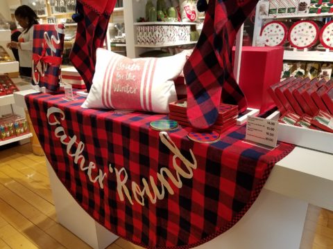
It caught my eye as it stated my very thoughts on the subject – although I prefer to stick around for a wintry Christmas and then head south as January sets in…it nevertheless spoke to me. But the combined selection of plaid fabric tree skirt and the cotton pillow had me puzzled. I picture the pillow being in that southerly destination expressing the sentiment but paired with the plaid, like a fish out of water. Plaid in a warm winter getaway didn’t seem to fit. Perhaps it is a pillow that you leave in your chilly, empty, abandoned house with your woolen plaid blankets and afghans as you snow-bird it south?  In which case the woolly plaid works, albeit nobody is there to get the drift – snow drift! Or a third scenario that I imagined is when you dream of going south, but are stuck in the northern climes and the pillow states your thoughts in a “wouldn’t it be nice” wishful thinking scenario??!! Three stories for this little pillow…which do you think is the best story?

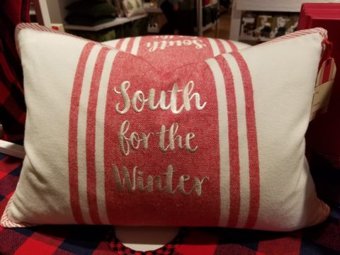
There on the Christmas display is an intriguing statement of home decor. There it sits, this smart little pillow, all dressed up with the coordinating holiday plaid and exclaiming a statement that might have many connotations…

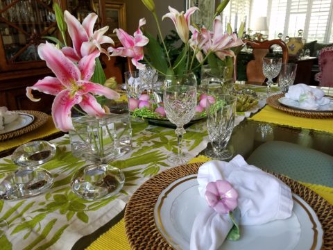
It’s nice to establish traditions for Christmas and other major holidays throughout the year. Yet like home decor in general, some people are more sentimental than others. While some treasure each year’s addition to a collection or contribution to the spirit of the season, others trade the look with each new trend.

This year an all gold tree…next year it might be jewel tones of amethyst purple, aquamarine teal and ruby accents…and of course the ever popular white on white on white!

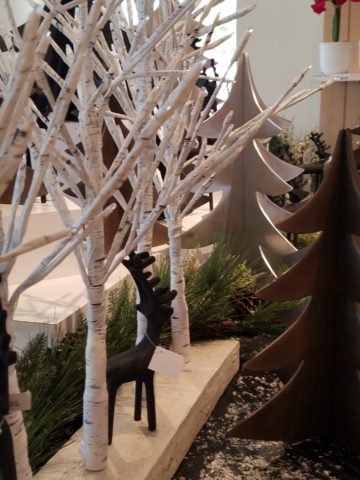
Like personal interior design, some switch it out often, with changing fashions, while others nestle in and call it home for the duration. The compromise here is that there might be a family room tree that displays all the traditional ornaments while a more focal tree in an entry or living room makes the trending design statement.

As interior designers we wouldn’t be very busy if everyone nestled in without change for decades, however, even in this staid scenario there is the need for sprucing up the tired, updating certain elements, replacing damaged or broken items…Therefore, reupholstering, replacing of worn flooring, introducing fresh paint colors, improving lighting, opening spaces, face-lifting kitchens and bathrooms…there are many things that we as designers can do to update while not changing the essence of the place called home. Just in time for the holidays and the refresh-during-winter design blitz!!

Back to Crate and Barrel’s merchandising…

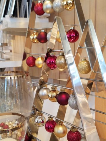
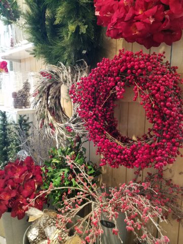
The bling that sparkles in the long dark nights of winter is a recurring and uplifting theme.

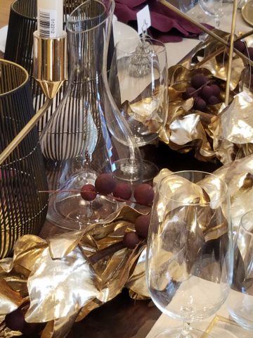
Red and green are inescapable for traditional Christmas color schemes.

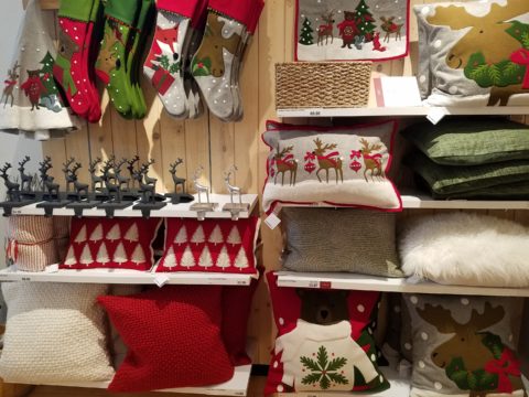
Holly leaves and berries, evergreen needles, brilliant red bows and ribbony garlands.

Having previously stated my love of the traditional blue and white color schemes in so many applications and blogs I have written, Hanukah’s blue and white colors are perfect to crisply punctuate the doldrums of defoliated trees and dormant, bare bones deciduous landscapes of winter.  The cool yet refreshing theme is a perfect winter color scheme.

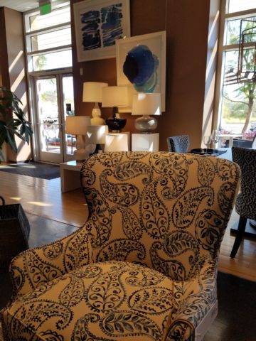
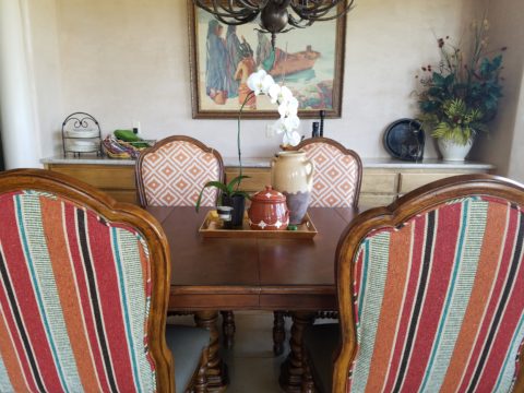
With their modern/retro style melding with a bit of industrial, Crate and Barrel’s stylized wing chairs with their updated lines sport a fresh take on a paisley motif cotton print.

Naughty or nice, reindeer, fir trees, twinkling lights, scented candles, silver and gold,  movies and music all stir the senses rejoicing in a healthy economy of vibrant shops, eager shoppers, anxious bargain-hunters, BOGOs and door busters, full of fresh new ideas, products, design trends, toys, gadgets and nearly anything you can imagine!

So get out there and strengthen the fiber of your community, support local artists and fabricators when you can,  shop where your neighbors work and where your local entrepreneurs invest their dollars and dreams. Try not to  overdose on all the glitz and blitzen of the merchandizing madness!!


Urban “Pieced Work” – an artistic narrative

We are excited to have the opportunity to bring a design installation(s) into a new project that will serve to support the brand with a twist. A nearly completed new smokehouse is coming to Albuquerque. This home-grown eatery blends family history and southern roots with southwestern barbecue flavors including indigenous  wood and iconic chile blends. But this is not about their cooking profile. It is about how we have arrived at a design theme that will define and further the identity in this new, specialized smokehouse department of this larger local brand.

To accomplish this task, we examined the concept the owner had  to remodel an existing facility that had been a popular gathering post serving this community for decades. The fringe barrio location was of a demographic primarily comprised of Mexican/Americans. Decades past it was home to a heavily black community. The fabric of these cultural combinations suggested a mosaic of color and vibrant heritages.

The spark of cultural references lead to discussion of the popular artistic expression of urban mural painting.


When we began the dialogue, the decision to have a mural painted by local neighborhood kids, with a mentor to design and supervise the work,  seemed to be the direction we were headed. After subject matter debate and development, I veered off on another tangent that might take a less subjective approach, be weather-proof and more durable for a patio location – mosaic.

This new more impervious and durable medium still offered the opportunity to engage the community, but with less focus on a specific subject and more about geometric color and texture. We discussed the details of installation so as to keep it simple for kids to participate using whole tiles – minimize cutting, if any, for starters.

Inspiration came from several other installations such as the Albuquerque Convention Center’s on-going mosaic mural project wrapping many sections of the buildings with intricate scenes of New Mexican lifestyle and cultural diversity. The colorful mosaic is an elegant and sophisticated contribution to our city’s cultural aesthetic.

Helen Atkins, manager of consignment art at PATRICIAN DESIGN’s downtown boutique gallery and the lead on their current restaurant mural project, has worked on several phases of the Convention Center’s mural project.

We have incorporated mosaic into several of our own design projects such as last week’s blog https://patriciandesign.com/trust-and-custom-designs/about a residential kitchen installation.

Here, in another installation, a fireplace surround of mosaic adds movement, color and textural interest to the room.

Ultimately, one of Helen Atkin’s personal photographs cemented the approach. It was decided that a geometry of different sizes and disparate glazes and designs of tiles pieced together in a colorful, textural  panel would be our design theme.

Helen Atkins, a recognized artist in many media, captured this in passing while visiting New Zealand. It’s crisp, yet irregular composition was intriguing and pleasing. It became the springboard for the concept for a geometric mosaic panel to anchor the theme of this new New Mexico eating establishment.

The idea became more exciting as we began gathering material from local tile distributors and our own personal inventories of favorite treasures saved for a special project. Here it was.  It seemed such a strong design element and therefore offered a new direction for the actual brand of this establishment. We embraced the idea and brought it into the interior and distributed murals throughout the space.

Still under construction, we will not divulge the identity or locations of this project just yet. But suffice it to say, the murals are an exciting part of this interior design scheme.

As we further discussed the plans to implement this project, school started and the ease of coordinating the assistance of neighborhood kids became more difficult. Helen lead the project as primary installer, coordinator and supervisor. She enlisted the assistance of a couple of people – one experienced and the other not at all.

We have named this series, Urban Pieced Work – an artistic narrative. Here we are interpreting generations old sewing patchwork using ceramic, glass and pottery pieces rather than the traditional fabric patches. The original folk art needlework has been in the American vernacular for ages.  In these installations, this up-cycled  use of discarded or discontinued tiles is similar to patchwork fabrics, re-purposed to make clothing, wall decor, window treatments and bed dressing when times were tough – often referred to as “pieced work.”

My paternal grandmother in New Mexico made this twin quilt for my bed when I was a child in Virginia.


My same grandmother made this and was given to me by my cousin, her only other granddaughter.

Mosaic is often, like fabric patchwork, a practical art form that puts scrap, shards and fragments to good use in an artistic fashion. Note though that more sophisticated mosaics have been designed more intentionally for centuries not merely as salvaged material. These masterpieces both in contemporary work and antiquities represent many periods in history and movements in artistic expression.


This mosaic version connects with the history of the restaurant’s roots and southern heritage. The panels’ mural nature speaks to the urban murals found throughout the community.

Located strategically throughout the interior, these murals have become a strong design element and anchor for this facet of the brand.


Another shot of the spectacular cultural story murals at the Albuquerque Convention Center.

We have woven a meaningful artistic statement throughout the interior and also on the exterior of the building. In addition, we will be inserting a graphic version into the signage and logo design.


Urban Pieced Work – an artistic narrative, of a New Mexican Smokehouse, will provide pleasing design visuals throughout this new interior, provoke conversation and interaction, weave an element of history and context with the southern roots of this exciting new eatery!

Join the conversation and watch for the first succulent flavors to come out of the smokers later this year.


Southwest Style – What is it?

Arriving for the first time in our American Southwest, one might feel like they have entered a different country, if not a different world!! To fly from anywhere else where there are rolling green hills, or green fields or dense green wooded landscapes, not to mention tropical environs and cruise over America’s Southwest, it looks like the moon – or some barren planet. Everyone remembers their first impression. Whether exotic or scary, lonely or seemingly uninhabitable, once you get on the ground and explore the beauty and variety of what’s here, you’re bitten – even smitten.

In all fairness, this is a completely defoliated winter shot!! Many now know how lush this magnificent Sandia Mountain can be at the top, in the summer. Yes, I said lush.

No other region has the distinct architecture and tri-cultural identity of what has become the elemental design style and flavor of this magical place. From “sea to shining sea” New England to Southern California you will find nuances of regional distinction – but not to the degree that the American southwest is set apart. Architectural influences from colonization have been the standard guiding style nationwide. Yet the ancient, practical elements, of civilization that long preceded the Europeans discovering the New World, is at the roots of this enchanting design style.

Tri-cultural architecture and interior design results from the remarkable history combining Native Americans carving out of stone walls, building with mud (adobe) bricks, devising simple, practical designs to capture heat and insulate in cold while minimizing solar gain in the warm weather months, with the conquering Spaniards and their colonial influences, and finally the pioneers from the east with their colonial English influences.  Now more often replicated, with frame construction and stucco facades, this unique melding is the core of Southwestern architectural design.

When one hears the term “earth tones” setting a design trend in the 70s, it suggests the brown, tan, orange palette that was terribly limiting. Certainly to label it earth tones, it became a curse of a color scheme. Sadly to link it to a representation of southwestern design was misplaced and unfortunate. And how sad to think that it was so broadly accepted – like lemmings following blindly – everyone adopted this as a truism. So often the case with trends.   The 70’s also spawned a diametrically opposite color scheme of blues and greens to refresh that which had been so mired in the “earth-tone” movement.

However, real earth tones are limitless. Earth tones are all colors…look down…look around. Even if you confine your interpretation to the dirt beneath your feet – the colors are vastly more than the brown, tan, rust, orange that became the rage. Soft pinks and grays, pale blue and whites…look at dirt. It might be more clay, might be more peat – from soft terracotta to dark espresso – dirt is earth and the colors and tones are limitless.

Tom Glover captured the beauty of the natural landscape through his artistic photographic medium that Georgia O’Keeffe and others have depicted through their artistic media.


Georgia O’Keeffe saw it and captured it in her own enduring style.

Nature offers color. Natural dyes have riddled that art world through time. Synthetic dyes took it a level further. But nature is at the core of all we have in this world.

http://www.quilthistory.com/dye.htm

Turquoise being a natural mineral in the American Southwest became a signature accent color punctuating the soft earthen tones of the adobe design palette.

Artist Victoria Martinez Rodgers paints a valley apple orchard and the turquoise wall is the perfect backdrop.

Color was always there for those who cared to notice. The great painters of this region presented it well. Their recordings of everything from the many colors of the rugged windswept landscapes to lush green mountain forests with shimmering golden aspen groves – and bosque cottonwoods screaming with yellow brilliance capture and convey so much more.

In autumn, bosque cottonwoods explode with color sending a streak of brilliant yellow all along the Rio Grande. Federico Leon de la Vega create this commissioned oil painting from a photo provided by his clients.

There are the natural and also synthetic dyes that were woven through the magnificent textiles of the Native Americans – blankets and articles of clothing were not limited to buckskin animal hides.

Ernest Blumenschein was the founder of the Taos Society of Artists capturing the color and textures of the realities that he encountered in this Land of Enchantment.

Sunsets everywhere play a part in the imagery of the landscape – here we see vast landscapes with brilliant fiery skies and those exciting corals and lavenders, soft pink and blue wisps provide inspiration for wall colors and backdrops to our richly embellished interior designs.

Yet spare, understated neutral interpretations also offer elegant representations of southwestern style.

So what do you visualize when you think of Southwestern Design? Please don’t say a turquoise wooden cutout of a howling coyote! Death by Southwestern Style – the overdose resulting from overdone clichés and trends that have spoiled the real art and beauty.

It doesn’t have to be all about cow skulls and pelts…but these cow hide butterfly chairs are pretty  cool!!!

Perhaps you see a Mexican influence which is also part of the melding of the regional style – like food, we have a fine line sometimes with certain traditional dishes that when adopted and adapted by American Southwest kitchens took on a unique identity all its own – differing between Texas, New Mexico, Arizona and California. We all enjoy bringing art and craft from our southern neighbors into our designs.

Borrowing, sharing, combining so many design elements such as adobe architecture, colonial wood trim detailing, fired brick technology, Mexican Talavera tile and pottery,

Native American textiles and so many other handcrafts

The owners of this interior have an intimate relationship with each of the artists that they have collected down to this magnificent mount of a buffalo. They knew him and his name and why he was put down.

from punched and tooled tin, paintings and pottery – southwestern interior design is rich with color, texture, artistic detailing and true soul. The connection to the earth is undeniable and nature always plays a key role.

So how might you introduce southwestern influences into YOUR design scheme? You could tile the wall(s) of a powder room in Talavera Tile. Maybe just a mirror surround?

You might paint an accent wall – or all walls in a room or some other bold color inspired by a regional image

Mango watercolor by Susan Weeks splashes coral against the golden yellow wall with a lime green lighted cabinet showcasing old, traditional, low-fire Talavera tableware. classic Talavera blue and white tile frame the bar opening and on through out the kitchen.

and collect art pieces such a punched tin crosses, wood and straw,

landscape or still life painting, hang a blanket or drape a bed with a beautiful woven textile…introducing different styles speaks to last week’s story about eclecticism. Don’t be afraid to mix things that you like. What brings you joy?


Living Room Transformation

As an adjunct to last week’s story about the progressive young couple and their dramatic kitchen remodel, I thought I should finish the subject and tell about the adjacent living room transformation and comfortable family room on the lower level.

When the kitchen grew to become the focal point upon entering and the bar counter expanded into the living area, it reduced that space to now become a comfortable sitting room for guests to gather or the family to relax while activities are  brewing in the kitchen.

Looking through to the dining room where a built-in storage bench was added along the window wall, offers additional seating. A new fabric-shade chandelier softens the light levels. All lighting in this remodel are on dimmers.

The former white brick wall had gently rubbed edges to suggest a distressed condition exposing the red brick beneath.  The fireplace had an unrelated golden oak mantle and surround with insipid tile inset also used to cover the hearth. The tile was a glazed faux marble with a Victorian design accent feature.

By simply painting the oak white to match the rest of the wood trim throughout the home and also painting the brick a soft taupe/grey tone, the look was instantly transformed. But they still had that awful tile…so here’s a design tip: to buy time either while you decide or until you save-up for the next phase, paint the tile away!!! To accommodate a new TV that is to go over the mantle, the wood surround was shortened. Notice the extra piece of wood trim that was removed to lower the mantle.

The hearth was removed and rebuilt (without the cut-off corners) with brick and painted to match the wall. Lucky for them the hardwood floor went beneath the hearth – so when they modified the size, they didn’t have to patch the floor! Tile was removed and replaced with 2×2 mosaic Carrara marble to coordinate with the herringbone mosaic of the same marble in the new kitchen backsplash/wall (see last week’s  blog).

A sofa found, for nearly free, was in good shape and reupholstered beautifully in this plush, durable navy solid.

The classic blue and white motif was punctuated with organic yellow.

The newly refinished original hardwood floors – taken from a golden oak finish to a rich espresso/walnut stain…

…with the blue and white wool hook rug creates a handsome contrast. The rug actually “reads” blue and white, but upon  closer inspection has warm khaki tones, soft turquoise detailing and is quite complex.

This revitalized cozy ambiance of this new sitting area/living room is perfect for this growing young family!

And for a more expansive gathering space, the lower level family room received a new sectional sofa in a durable charcoal fabric and a low-pile small diamond patterned wall to wall carpeting to conceal what had been cold tile  floors and make a comfortable room for all seasons!

Purrrrrrhaps someday they’ll have a cat to climb that crazy rope-wrapped pole!!!!!


For the LOVE of Fine China – USE IT – Inspired Table Settings

From the Diminishing Dining Room of last week’s observations, https://patriciandesign.com/category/dining-rooms/, I decided to further the conversation to encourage a new-found appreciation for having fun setting dinner tables!  I found fodder from Kentucky Fried Chicken served on formal silver platters to wipe-clean placements of dazzling designs to dress your tables.  A collection of tireless designers defend the use of fine china – own it, buy it, find it, inherit it, enjoy it, keep it and use it – don’t send it to the thrift shop!!!

Yes, the art of fine dining seems to be set aside in favor of ease and expediency, but this article from The Washington Post’s HOME section (thank you Feath – my clipping service) brings it all home to use and enjoy.  It is a celebration of art, design and playful creativity.

Not everyone loves to entertain, to create the “tablescape,” to even bother to put together an outfit to wear. Not everyone loves to get dressed in the morning – it is a chore, an obligation, a mere necessity. That’s unfortunate in my estimation. For those of us who do – love it – it is all about having fun with fashion or interior design is just that – FUN!

Last spring I began a series  of emails that I blasted to our mailing list called COOK + PARTY. It was (and will continue this next season) a collection of weekly recipes paired with table-top art pieces. In our gift boutique, we represent an incredible collection of artists who create fabulous tableware.  I paired a piece with a recipe each week to inspire and encourage everyone to use “functional” art in their daily lives and specifically for entertaining and even the family dining table.

https://patriciandesign.com/category/art-and-food/

Recent fodder revealed a great source for fabulous wipe-clean placemats from Caspari.  For decades a fine source for the best paper cocktail napkins, Caspari offers these bold patterns and colors, prints of fine china and fabulous fabrics – re-use and easy to clean – why not?

https://www.casparionline.com/catalogsearch/result/?q=placemat

A previous fall blog that I wrote illustrates the open-mindedness of looking around to find inspiration for seasonal table dressings.  The decision for your table-top inspiration can be spontaneous – just go outside and look around!


Among the refreshingly optimistic designers that were quoted in the Washington Post article:

https://www.washingtonpost.com/lifestyle/home/that-old-fussy-china-can-fit-your-casual-lifestyle-designers-talk-about-how/2018/02/21/46761538-0084-11e8-8acf-ad2991367d9d_story.html?utm_term=.3a6fde2e5124

Barry Dixon, from the verdant rolling hills of Warrenton, Virginia, specifically points out that this process of setting your table should be fun!  Don’t pull-out the same things each time – mix it up! Change it up by adding color and pattern differently with every new opportunity.

Seasonal flowers, yellow woven cotton place-mats, embroidered folk-art table runner, basket chargers beneath classic Limoges topped with ceramic napkin rings – it looks like spring!

Designer Timothy Corrigan tells us that many people find it too difficult to entertain with their best things because the onus of proper cleaning and put-away is too much! But Mr. Corrrigan points out the joy of using your best things every day – everyday is a celebration and what you enjoy should be used.

In another springtime setting…organic, rustic things with finery – black stones nestle fresh purple Campatula flowers antique Limoges and basket chargers –  makes an eclectic table settings – it’snot all or nothing…it’s the combinations and scene that is being set.

Hutton Wilkinson – way out in L.A. where casual chic is the practice of distilling what migrated from the more formal sister coast to the east – noted that he believes presentation is the key to success. It isn’t so much about what is served (don’t tell the chefs that), but rather on what it is served and how it is presented.  Imagine buckets of Kentucky Fried chicken served on elegant Georgian silver platters. That simple fast-food chicken becomes  magnificently irresistible. You can’t say you’re too busy to cook with that creative solution! Wilkinson believes that presentation helps food taste better in addition to looking beautiful! He advocates buying china because it’s beautiful – not merely serviceable. I agree…it’s not all about the mundane purpose of eating off of it – but rather the joy of eating off of it!!

Making your guests feel appreciated and treating them to a unique, pleasing experience is a gift to them.  A special treat to show that you care –  going that extra distance of detail and design.

Color combinations, textures,patterns – wonderfully pleasing tablescapes are a treat for the eye. (So special Marsha!)

So don’t say it’s too difficult…keep it simple with Real Simple – the source for easy, ingenious ideas and simple truths……the following link for proper place-settings will get you started.

https://www.realsimple.com/holidays-entertaining/entertaining/how-to-set-a-table

Patti says – “make it special every day.”

Diminishing Dining Rooms – How Do We Dine at Home?

Changes in social interactions, style of entertaining, cost of real estate and family dynamics all contribute to what we are seeing as the diminishing dining room. Yes, there are circles who still maintain and use formal dining rooms in their social repertoire.

Elegant entertaining, grand social gatherings and family traditions still support the validity of the formal dining room. However, the fact remains that the concept is changing.


It’s easy to digress from the focus on design and delve into the demise of the family dinner hour. that time when families truly gathered to share, enjoy, report, critique, discuss, plan…more and more fragmented we are losing what was a very galvanizing core of child development and character-building. But I digress…

Take the bachelor who would rather have his pool table than a dining table…moving it into the house first and making that statement clear.


Entertaining has become more casual, more spontaneous and geared to an open-plan of kitchen conversations, bars and movable group conversations. The act of gathering around a formal dining table after the customary cocktail hour is now more free-form.

Placed directly off the kitchen and connected to the family room – the open plan flows…

The cost of real estate certainly plays a part in the diminishing dining room. Space is limited and therefore consolidating the dining area to one rather than a separate breakfast space and formal dining room utilizes space to greater advantage. Having an unused dining room occupy so much square footage is wasteful.

Family dynamics dictate that with the busy schedules and conflicting schedules, the seeming luxury of a formal dinner-hour have changed. Whether in the breakfast dining space or formal (if there is one), the act of sitting together for a nightly ritual of dining is less being practiced.

Here, this dining area is in the den off the kitchen…a better use of the space by this family’s estimation.

As I was writing this, I stopped and thought of the dining room scene from Meet the Parents and I cracked up reliving the events and they unfolded one ridiculous thing after another…and then I Googled famous dining room scenes to find other examples – because I was amused and curious…I found several memorable examples like the Griswold’s Christmas, Eat, Drink, Man, Woman, Tortilla Soup – oh and Tom Jones with Albert Finney – a classic!!! So many other wonderful scenes – but one day will it all be history? Mere memories of days gone by?

So today the open plans expanding the interaction between kitchen and dining – family rooms melding from the kitchen bar…the concept and lifestyles that dictate the practicality and ultimately the design directions are becoming redefined. And we also see the expansion of outdoor living – additional dining opportunities are ever blossoming on patios…


The exhibition kitchen concept that has driven restaurants for years made it into homes for the same reason – communing with the action and participants, connecting with the preparation experience and even sharing the preparation experience – dinner guests as well as family members often share the food prep as a form of socializing and entertainment.

The limiting idea that encapsulated the kitchen away from the activities surrounding it was in many cases to be dismantled. The disruption of encircling and kitchen, unveiling it and even incorporating it with the dining experience has become more the norm.

Still playing with colors…this wonderful dining room begins to take shape as an adjunct to the kitchen.

The kitchen is the fulcrum of family life. The dining room is not separate from it anymore. The dining space is part of the preparation space or very close to it. A kitchen island with bar stools are often the most popular perch in a home – for family and guests alike.


So this provokes thought about new home design, remodeling and re-purposing space, re-thinking how to best claim family time and related activities and designing around those practical considerations and needs.

Atmos and Eating by Design

How do you select a restaurant? As a patron, what makes you dine out? How do you select your preferred dining experience? I’m talking about casual and easy or even more a more in-depth gastronomic event.

When it comes to casual, quick and easy, I still want the experience to have personality – a pleasing personality and great flavors. Personality is atmosphere. Great flavors is the kitchen. Service might be “step-up and place your order” or table-side wait-staff. In either case, I want it to be a pleasing experience. Why would anyone want it to be difficult or unpleasant? Perhaps that lies in the definitions of the beholder. What is difficult or unpleasant and the various degrees thereof is not be the same for everyone.

Throughout my childhood, I remember my mother and her peers reference “atmos.” It was important. It came up often. “Does the place have atmos?” Or “what great atmos.” Atmosphere – it is the feeling you get in an environment. It is the feeling a place emits. I don’t ever recall it being used in the negative – such as this place has horrible atmos…rather, like ambiance, it was reserved to compliment.


Cafe des Artistes – Puerto Vallarta – Note the full-wall mural by Federico  Leon de la Vega as a backdrop to the dining scene. Also, perhaps someone should have straightened the lamp shades!

We now hear “vibe.” The place has a good vibe – but not limited to only compliment, a place can have a decidedly bad vibe too! Is it just the saying “If you can’t say anything nice about something, don’t say anything at all?” Perhaps we are less polite than the previous generations. Yet, constructive criticism let’s you know what makes your patrons pleased. Truth be told…be honest with discretion.

As a restaurant owner, it seems that erring on the side of greater numbers sharing the same opinion of easy and pleasing would capture the greater share of the demographic. Therefore, studies are out there to determine the value of ambiance and presentation. Starting with defining the description of your eatery…who are you and what and how do you serve? What is your “brand?” Whether funky or fine, dining should be worth the visit.

Nexus Brewery, in Albuquerque, has a unique brand and complimentary interior “vibe.”

I read a few excerpts from a fascinating new book, Gastrophysics, The New Science of Eating by Charles Spence. In it, he touches on the importance of atmosphere. He observes the value of interior design even as it relates to how much people eat and how much they spend as a result of atmospheric influences.

Another great read for understanding the art of a successful restaurant is Daniel Boardman’s Your First Restaurant – An Essential Guide. As an “essential aspect of your concept” Boardman identifies why the “thoughtfulness of the interior design” communicates to the patron a lot about the service and food that one might expect to receive.

Tacos on paper – porque no?

From lighting to the shape of the plate, ambiance and presentation are key features in a successful eating establishment.

All the way from candles on a white linen table cloth to a handsome juicy burger in a basket lined with paper, in the context of the environment – design details matter.

Luscious bun-less green chile cheese burger at Sparky’s in Hatch, New Mexico – served on paper and styrofoam – not fancy, but perfection!!


Stone under-foot and condiments as a center-piece!! Funky!!

Some reading this might say they don’t care. Fine. Perhaps on the surface, they think it doesn’t matter. They don’t realize the effectiveness of well thought-out details. They take these things for granted. Yet these details can make or break a dining experience – from casual to fine.

El Arrayan presents enclosed patio dining with a variety of light sources, well balanced colors and textures in Puerto Vallarta.

Next time you eat out, look around, smell the smells, hear the sounds, see the colors, notice the lighting sources and levels, feel the furniture and – have I not mentioned it? – check out the restrooms!!!!

Las Caletas…in the jungle…clean and simple.

Not only should they be very clean – but they should also continue the theme of the place.

Graffiti by design, this restroom is actually immaculately clean and patrons do NOT contribute with their own markings. It is located in the street taco eatery of SALUD! in Barrio Logan, San Diego. Fast and friendly, delicious and fabulously  funky!

Pay attention and you might be surprised at what you discover about your sensitivities.

Chaco Hotel in Albuquerque is thoroughly theme-based throughout.

What you hear while dining contributes greatly to the pleasure or discomfort of your time spent in the environment. It either contributes positively or detracts annoyingly. Listen to the sounds next time you dine. At home or out, notice voices, chairs being moved, glassware, music, kitchen noises, traffic…see what detracts, what enhances or what might be considered neutral.

Interior designers are considering it all – the theme, atmosphere, colors, artwork, furniture, lighting, table dressings, serving pieces, fabrics, textures and even sound. Whether casual or more formal, these design details can make or break the success of the business.

Oro Valley Country Club, Arizona.

Even if the food is exceptional, too bright lighting, ineffective colors, uncomfortable furniture or confused design elements can result in negating even the best chef’s efforts. It is a package. It is about the whole. It is a multi-sensory experience. Buen provecho!

When is Too Much, Not Quite Enough?

Perhaps – when you are an avid collector, limitless treasure-hunter and lover of basic Americana (comprised of the appreciation of indelible graphic design and branding mixed with a healthy dose of green chile cheeseburgers, bodacious bbq and good fun) – it’s never enough! We’re in Hatch, New Mexico at Sparky’s once again!!!! The sensational roadside attraction – Sparky’s burger bastion MUST know when too much is not enough!

Nine and a half years ago Teako made a statement and the word has been spreading ever since!

The opening of this fun and funky establishment started out with a few outrageous signs and vintage mascots like the Colonel Saunders on a bench, Ronald McDonald as the un-official greeter

and a dedication to signature green chile cheeseburgers and mouthwatering bbq. Now both sides of the street (and scattered around town) are towering, larger-than-life icons of days gone by and travelers from all over the world stop to experience this unique site.

But inside, the treasures also abound! With each visit we discover new surprises and exciting additions. Because its Christmas, we were enticed by the “Say Queso” photo scene. We donned funky antlers and cozied up to the decked-out tree, with a backdrop of sparkle and ornament, beneath dangling snowflakes,

flanked by a towering toy soldier and Jolly Old Saint Nick himself!

The stockings were hung in clustered abundance over the entryway to the dining room. No such thing as too many or too much here!!!

The walls are plastered with iconic paraphernalia.

Patina etched tin painted and pitted, with pocks of rust and tarnish – weathered through many storms adding further character to the familiar and not-so familiar pieces, until finding safe haven here in this magical collection.

Camp art un-selfconsciously curated on every square inch of interior space.  A nostalgic presentation and preservation of graphic design and branding.

If you’re a “picker,” a graphic designer, a nostalgia buff, burger and bbq connoisseur or just a kid looking for a memorable bite on the side of the road,

Sparky’s unintentional museum, of the colorfully entertaining and eclectic, will not disappoint! It is a must-see landmark in this our Land of Enchantment.

Be enchanted at Sparky’s! Thanks for the memories!!!!! Keep ’em coming!!!


COOK + PARTY: Set the Stage for Style with Art in Daily Life

Having art woven through the daily activities of your world is stimulating, satisfying and inspirational. It stimulates the imagination, satisfies with the knowledge that is was created by an individual artist and inspires to spur the creativity we each have to express – whether we know it or not. It encourages appreciation.

Functional art is a cornerstone of the work we offer at PATRICIAN DESIGN. As a novel promotion of the various artists who create and produce exciting food-safe serving pieces on display and for sale in our shop and affirmation, of the belief we have that art should set the stage for style in daily life, we began our series – Patti’s COOK + PARTY. We like to party and we love art – so we party with art at the  center of the  festivities!!!! Let’s get this party started!!!!!

Six months ago, we began our series and followed the seasons as we progressed. By Fourth of July we featured festive party parfaits in expected red, white and blue! Our martini glasses were placed upon colorful cocktail coasters hand dyed and pieced into pretty patchwork squares by fiber artist, Rebecca Speakes!

Micheladas were given a twist with plump yellow heirloom tomatoes! Alongside was a fresh guacamole featured in a rippled-edged undulating little piece of pottery by artist Anne Marie Werner Smith.

Her collection is wonderful and we continue to feature key pieces in our weekly recipe pairings.

The pairing of recipes, with handmade art pieces on which to present and serve is inspiring. Here is a New York Strip steak bathed in a crazy fresh, from the garden, combination of pesto/chimichurri (yes, we created some crazy combinations of the two) sauce presented on a fanciful leaf platter by artist Robin Chlad!

Seeing examples of fun recipe ideas displayed on functional art creations is an unbeatable combination. Just tell Guy Fieri that for his Next Big Project!!! Rooting out artist’s studios in every pocket of the country and discovering great work and pairing it with great food – fantastic!

The colorful drawings and painterly style of Mariana Gasteyer’s pottery is whimsical and festive! Here a couple of examples and a fabulous featured recipe of a paired pear salad – half roasted and half freshly sliced – the combination was divine and the presentation on the platter was perfection!

A summer road trip took us too Tucson where we featured a huge lotus platter by artist Penne Roberts. Here we featured a vintage Shrimp Louis Salad.


As fall progressed, we hiked Tent Rocks to photo this amazing platform piece by Jenn Dipaolo.

Upon the platform we placed a pair of sweet and savory mini pumpkin pots de creme.

This past week we featured a dazzling, luminous glass sunflower bowl Margaret Hidalgo Vanderheyden.

This spectacular fused glass assemblage frames our pecan crusted cheese ball perfectly.  Fall colors with holiday flair, this bowl makes a statement!!!

Supporting local artists, showcasing their pieces by pairing with food is the  bomb!

Start family traditions with signature art pieces, build collections and shop  small supporting local artists in your community!!!

If you would like to receive our weekly Patti’s COOK + PARTY recipes and pairings with our functional art finds, let us know what you think and sign-up with your email address!!

Design Inspirations in the City Different

Do YOU know the way to Santa Fe, to play off of a song by another title? Up the hill and beneath a brilliant blue sky, the thunder clouds scatter with dramatic splendor. Past the cedar dotted landscape with punctuation of piñon the seasonal monsoonal green is blanketing the desert. A thrilling view passing swiftly, outside the window, like a series of paintings capturing  surreal scenes – always picturesque.

It’s July in The Land of Enchantment and a weekend getaway, in Santa Fe, promises stimulating design treats and artistic inspiration! Every visit is familiar – yet new. Around every corner, there is detail and color, decoration and un-selfconscious art.

Just when you think the Santa Fe market is saturated with myriad fabulous dining options, Paloma hits the ground running, on Guadalupe Street, to shake things up a bit!

The joy of experiencing the very new restaurant of an amazing friend was exhilarating! Marja Martin, la propietaria of this great new venue Paloma, brings limitless talent, outstanding vision and distinctive creativity to everything she touches.

The quite well-seeded Santa Fe dining scene is recipient of her newest endeavor. Already a well-established and well loved caterer, her artistic sensitivity and smart culinary concepts – that have been her signature – now result in a presentation of stunning unpretentious decor and exceptional  flavors. She’s giving patrons bold flavors and creative combinations inspired by true dining experiences, with our many-faceted Mexican neighbor’s to the south. The result is fun and transporting, in its authenticity.

Walking home, to the lovely casita of dear friends, the gates and doorways, patterns and particulars – uniquely New Mexican in their expression of design offer photographic treats. It’s magic. It’s exciting. It should be on everyone’s list to take the time to explore.

It’s as though history and current trends collide to create a patchwork of texture and color all to stimulate the senses. Exotic flavors and international everything all presented in the confines and context of this extraordinary place.

Interior design and exterior design bombarding from every pocket including this provocative little prose to ponder at Sonder. Get out there are feed your senses!