Finishing Touches FINISH the Job!

Finishing touches are always the beast to tame at the end of the hunt. Yes, you’ve hunted, you’ve searched, you’ve gathered, you’ve assembled and stood back and observed your work. What’s needed? What’s missing? When is it finished?

Just the word finish sets up a mental block for many. It’s like decisions period. Once you make a decision, you’ve lost your choices. Losing choices can be a dilemma in itself!   So, from Pinterest to HGTV and the internet at your fingertips the choices and options are endless, but what do YOU want to do, to call it “done? It’s all in the details…
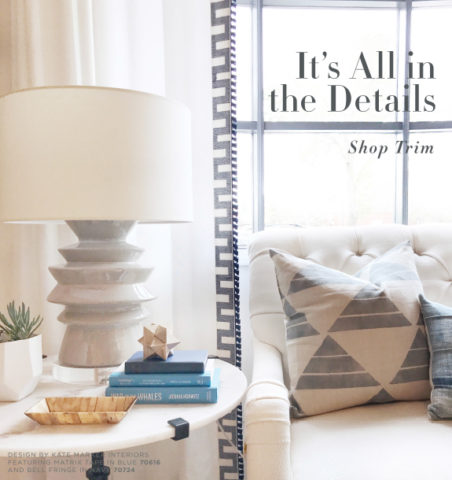
Schumacher  offers details right down to the trim on the draperies! This bold key design makes all the difference!

And inasmuch as you can’t seem to GET it done, you WANT it done – just can’t seem to get there from here. How do you decide what you need to add for those incomplete finishing touches – to be FINISHED?  Know though, that to have the feeling that it is finished is a good thing. Yet, that doesn’t mean you can’t change it – sooner or later!

We interior designers have jobs because our clients need to do things, change things, finish things. It seems that with all the options presented on TV and the internet, people are jumping in with inspired ideas, making decisions, buying things and doing things – then coming to a screeching halt! “HELP!” is the cry when everything seems to be too much – or not enough – or too uncertain and overwhelming – or not just right.

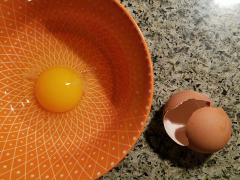
As if your own self-imposed frustrations and pressures are not enough, your partner rants…”Just finish it – will you? Be DONE with it!!!” Not everyone loves a DIY project. Most people don’t even like the disruption of a professional team coming in and tackling the job. Alas, “you have to break an egg to make an omelet,” some wise person once said.
Whether you’re changing paint colors for the third time in a month or tossing throw pillows around the room, to no satisfactory avail,  there’s something missing…something is not quite right…it’s not there yet.

Have you removed everything from the walls and lined them up waiting for inspiration as to how and where they should be placed and grouped – maybe re-framed?

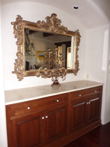
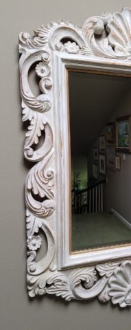
What about a mirror to add depth? Is it an installed mirror – the illusion of space without calling attention to the mirror itself or should I hang a framed mirror that makes the statement in its entirety? Do I lean it against the wall or is that a trendy affectation?
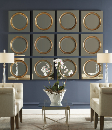
Uttermost is one of our favorite sources!

Studied nonchalance is an art form.  How to achieve that intentionally unpretentiously naturally relaxed look is a challenge.  Just writing about it here is an effort in describing that which is supposed to be effortless!!!!

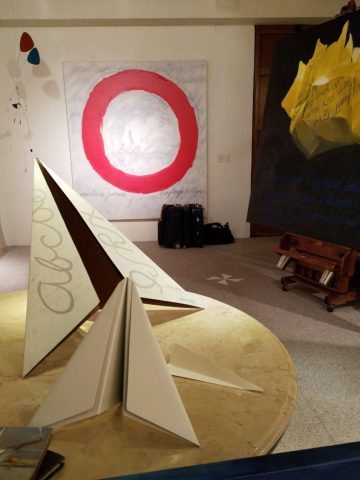
Perhaps it is a monotony of height. Do you need a tall piece among other lower elements in the room? Maybe a tree in the corner is the answer or a statue of some vertical art statement, to add interest and height. Perhaps you might consider hanging something, from the ceiling – a mobile or origami bird or even a light fixture, to draw the eye up from the otherwise low furniture pieces.
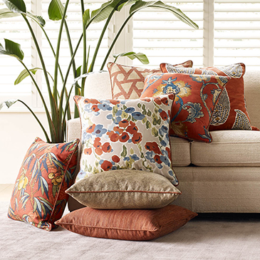
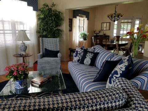
Robert Allen presents perfect fabrics for colorful pillow accents…and there’s that tall plant for height!

Speaking of light fixtures…how does your almost finished, but not quite there yet, room look at night? Are there dark pockets and corners that would benefit from some concealed up-lights – indirect lighting can be quite effective and enhance a spooky, dismal space.
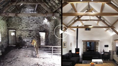
LOVE this before & after! Check out John Cullen Lighting for some great ideas and inspiration!! https://www.johncullenlighting.com/

Spooky is the season and, with the holidays approaching, the need to get things finished before guests arrive or you leave to visit… or just the hectic nature of the baking,  gift-buying and wrapping, shipping and other communications aspects of the season are upon you – pressure you to want to get things finished!
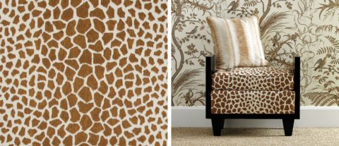
Brunschwig and Fils by Kravet offers an amazing collection of prints – mix and match!!!

Have you consulted with a friend? Do they rise to the invitation of critiquing your present state of affairs and offer design ideas that further serve to confuse you? Better yet, ask two friends and get two different options for finishing your space and then what? Pick one and the other’s feelings are hurt that you didn’t take their advice – even if they are not aware that your decisions moving forward were offered by another friend.
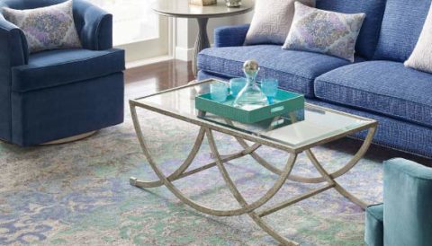
From the rug (thank you Company C for your “Colorful Living!” to the table accessories and all the things, pieces, fabrics, details in-between – finishing touches FINISH the job!!!

A designer is a problem solver, a tie-breaker, a marriage counselor, a creative who extracts your needs and – evaluating all options – offers the best solutions to get your job finished!

Paper Airplanes – Happy Joy

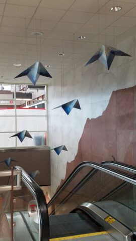
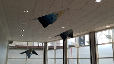
This week, upon arrival at the Denver airport, as I navigate this architecturally dramatic facility, I’m funneled with the masses making our way, from the gate area, to the trains, to the terminal. When suddenly, gracefully overhead as we ascend the escalator, large versions of paper airplanes hover above. Probably steel, but with the familiar fold and form of the simple paper origami originals, they were a whimsical attention divergence.


When I arrived at the top of the escalator, I realized that they were also above the escalator across the way so I walked over there (to the surprise of the masses with whom I had been funneling along). A couple in the crowd even called out “hey” or “ma’am” …I turned to see some were concerned that I had lost my way and expressed concern that I follow the pack. I waved to these helpful strangers indicating with my phone in hand that I was stopping to take a photo of these wonderful suspended planes.

This ignited a curiosity that led me to investigate a bit more. I have since learned that they are part of the Denver International Airport’s Arts & Venues Denver: Public Art Program 1994. There are 140 of these suspended would-be-paper (steel alloy) planes and they are the work of artist Patty Ortiz titled Experimental Aviation. A well-recognized artist and curator of contemporary art with decades of art management experience she “believes that art intrinsically is a social object and when placed as an action in relationship with the viewer ad participant that art carries a profound interconnectedness within real experience.” And there I was experiencing the simple loveliness and joy that these airplane sculptures conveyed, in context with the often monotonous air travel experience.

Kids who love paper airplanes never seem to grow up. I’ve written about this before, in the blog about Federico Leon de la Vega’s TEDx Talks a couple of years ago. Watch his Talk and see the final scene as the planes fly through the audience. https://www.youtube.com/watch?v=H9j_pLgCr1U

Paper airplanes are timeless tools of communication set flying from one person to another often with a secret note inside. Unfold and discover the message. Like passenger pigeons of days gone by…but unlike their obsolete and ultimately extinct message-delivering cousins, paper airplanes are timeless.

Never taking up the art, it has fascinated me forever. Origami seems to be originated from the Japanese word for folding – ori – and paper – kami = Orikami. Japanese art is so fine in all of its forms. And back to the paper airplanes, San Francisco hosted a competition Origami-Palooza complete with education and presentation of many facets of origami work including the Paper Airplane Challenge. Last month “The Paper Airplane Guy,” John Collins, the world record holder for paper airplane distance was there to assist in honing your paper airplane folding skills to insure greater success with your paper airplane flying! https://japancentersf.com/events/origami-palooza-great-paper-airplane-contest/

My happy observation of this past week and my advice with it – grab a piece of paper and try your hand at folding and flying a paper airplane!!!!!

Decorative Wallcovering – Fun with Tile

When you think about finishing a wall, you probably think about paint colors…you might think about a wallcovering – wallpaper, or even a mirror – I’ve previously noted how mirroring an entire wall can exponentially expand a room – a dimensional effect/illusion that suggests the room extends well beyond its actual size. But another wall treatment, with which I LOVE to play, is tile!

All over the world, the art of designing and creating decorative finishes with tile has been evolving for centuries. All cultures have utilized mud and clay, glazes and fire to bake beautiful patterns and colors onto geometric slabs. Shapes of rectangular, square, octagonal, dots or diamonds – the geometric shapes are many and the designs are limitless.

As is true with other wall treatments, I prefer not to stop on an outside corner. I believe that the color or material should suggest a built mass – part of the architecture. To stop on an outside corner suggests a veneer. It proves that the finish on the element is not a structural/integral part of a built mass. When you paint into an inside corner and stop, it allows the mass the read as though solid and not merely superficially treated. The same is true with tile. Don’t stop it until you get to an inside corner – if possible. There are situations that force a finished edge on the flat plain of a wall – but avoid outside corners at all cost!!

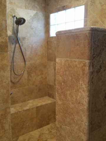
This entire shower is tiled floor to ceiling, around the pony wall, bench…no door…it reads like a built environment of stone tile.

Think of the surface as an architectural element. Tile from floor to ceiling, inside corner to inside corner – wrapping corners, if needed, along the way.

Take a backsplash…customarily used to do just that – catch splashes at the back wall of a wet area (sink) countertop…bathrooms and kitchens, behind sinks and between upper and lower cabinets – but why stop there?

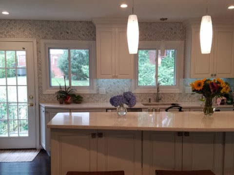
The entire back wall of this kitchen is mosaic marble tiles in a herringbone pattern.

Think of it as a true wallcovering – wallpaper. Commit to the entire surface. Here are more effective examples…

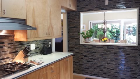
The backsplash and entire adjacent wall were covered in glass mosaic tiles. It “reads” like wallpaper.

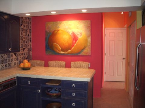
here again, the classic blue and white Talavera tile backsplash is continued along the entire wall from floor to ceiling.

We are currently working on a couple of kitchen projects that will soon be completed. They both use tile liberally. Each quite different from the other. Stay tuned for the finished products!

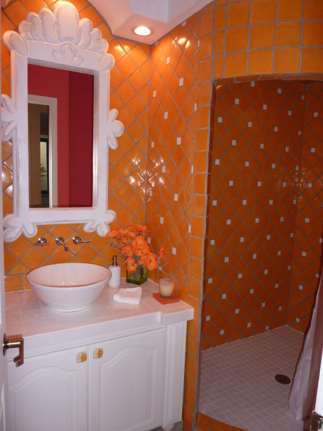
In bathrooms, the area around a mirror can be more than merely the backsplash. Embed the mirror into the tile surround or tile the entire wall and hang a mirror on top of the tile surface.

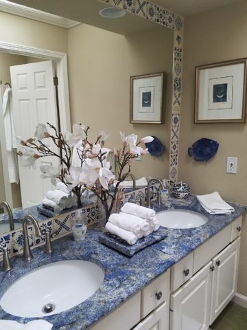
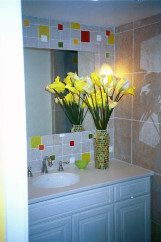
This mirror is flush with the surrounding tile, suggesting that it is embedded into a tile wall.


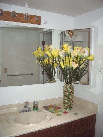
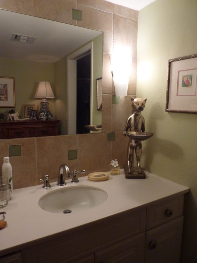
Planning this transformation, the mosaic vase was the inspiration. Then loose tiles were scattered on the countertop and the concept began. Note, the existing mirror was attached to wall with light fixture mounted above it and a medicine cabinet off to the side.


The transformation involved removing the medicine cabinet, taking the floor tile up the wall and wrapping it floor to ceiling. It was also cut into smaller squares to use behind the sink as a “full-wall backsplash.” Then punctuated with glass and glazed tiles to create an updated design. Relocating electrical to flanking the mirror for a pair of new sconces and a new countertop, faucet and sink with existing cabinets painted resulted in a cost-effective design.


Here a mirror is mounted on top of the fully tiled wall. Inside and outside of the shower enclosure the tile is a true wall treatment.

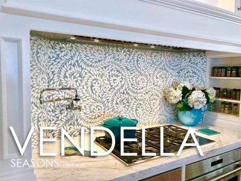
I recently received this advertisement in my email. It was such a spectacular collection that it caught my eye and I share here one of the patterns and context shots as the backdrop to a range.

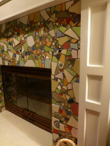
Mosaic assemblages can be fun! Here is a fireplace surround.

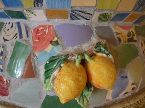
The addition of three-dimensional pieces adds interest.


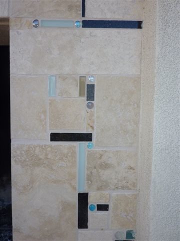
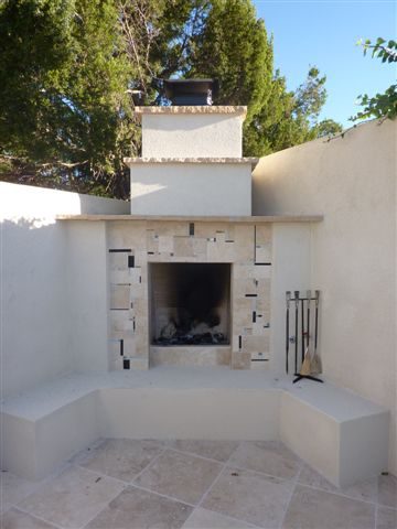
This exterior fireplace surround tolerates the elements – an all-season installation.

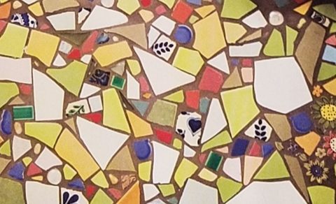
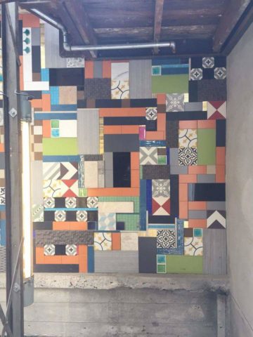
Here is a mosaic mural of a dynamic geometric abstraction  discovered in New Zealand. We are using this inspiration to establish a theme in a current restaurant project. An interpretation of this in the form of geometric tiles of various sizes, colors and patterns  will  be used to create a cohesive repeated design element through various areas of the restaurant – both inside and out. Watch for this completed project in coming months.

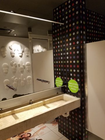
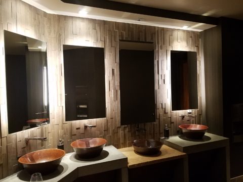
Commercial restrooms can benefit from full-wall tile treatments too. Not only does it look complete, but it is an ease of maintenance consideration.

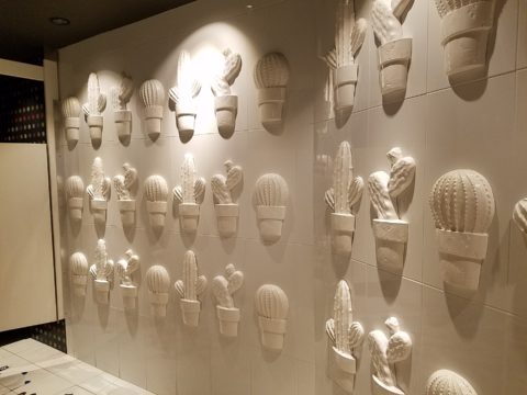
Three dimensional tiles add interest to this cactus motif!


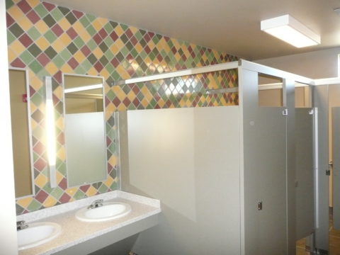
Fun with color and texture, tile are also easy too keep clean – terrific for public restrooms.

Murals are also terrific ways to use tile as art in your  interior/exterior designs!

This is embedded into the stucco for an integral installation.

When using outside though, remember to consider the range of temperature and moisture to which  it will be exposed. Porcelain is the most durable in areas where the temperatures get to and below freezing. Freezing and thawing can destroy tile. Many murals are made from clay that is not suitable in cold climates!

Inset into the tile wall treatment is this stunning glass mosaic abstract mural.

Tile – it’s a nearly limitless medium. So consider the possibilities for your next project! As a piece of art, an accent wall or an entire installation – full-wall treatments make a statement! Have fun with tile!


Mirror Mirror on the Wall – Do You Even Notice Me at All?

Designers use tricks, “trompe l oeil” – ever heard of it? Parlez-vous français? It’s a trick of the eye – and how handy is that to create an effect? Often murals are painted to give the illusion of depth or a scene that is not real, yet might fool you into thinking it is.  Similarly, mirrors can create the illusion of dimension and improve spaces – especially small spaces or rooms that feel particularly one-sided. Like the idea? Want to hear some fun designer tips?

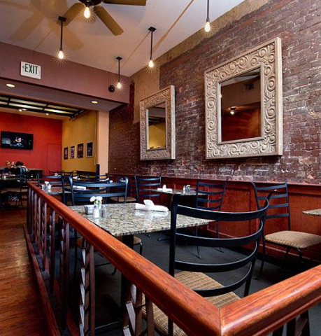
Large decorative mirrors expand the dining space in this restaurant. Faux finish  composite material give the impression of hand-carved wood – not!

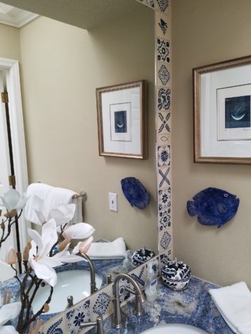
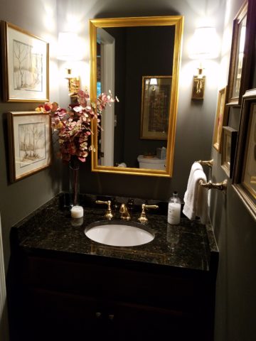
Mirrors in the Bath We know mirrors are commonly used for practical purposes such as bathroom vanities. They can be simple over-the-sink functional elements or framed versions for decorative pizzazz.

Below,  a built-in tiled surround is nearly a full-wall treatment but with a little relief.

an a more encapsulated/inset mirror shown here

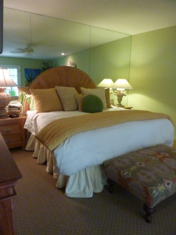
or full wall-to wall treatments that “go away” leaving only the illusion that the room continues beyond…you don’t really “see” the mirror, you see the illusion of space that it creates.

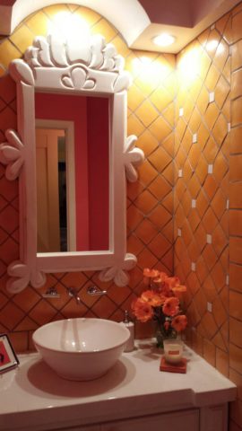
Bathrooms can be intimate spaces of decorative interest


or expanded to be grand spaces of extraordinary volume.

Dining Room Décor and Expansion Other rooms of the house can benefit from mirrors too. Often mirrors are placed in dining rooms over buffets to once again give the illusion of space to a room that is often small for the number of furniture pieces and people that gather there. It is an opportunity to add a decorative element as well as expand the space.

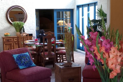
Mixing Geometrics A rectangular console table, sideboard, buffet or dresser enjoys the contrast of a round mirror

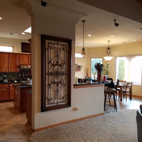
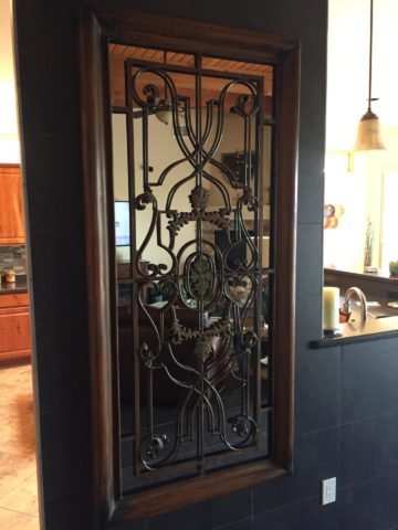
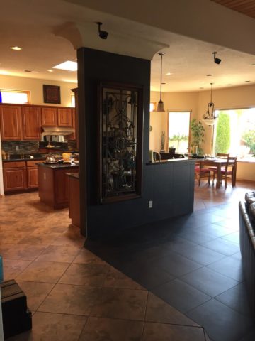
Mirrors as Artistic Accessories There are also fun additions to existing pieces like this framed grill-work which is given a new element of interest by adding a mirror behind the iron, set into the frame. Depth and interest instantly change the nature of this decorative wall piece.

Yes, the mirror becomes the decorative focal point. Large framed mirrors can become just that – a great focal point AND provide an illusion of depth. Notice too, the entire wall was tiled behind this focal piece adding further drama and interest.

The limitless options for frames and shapes makes mirrors a valuable accessory similar to a piece of artwork!

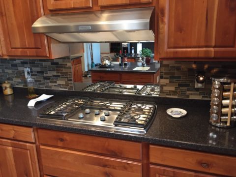
Kitchen Surprises Here’s a little trick…rather than looking into a tiled wall behind your cook-top, insert a mirror into the back-splash! It will give the illusion of an opening passing through to another room!!

Wish for a Window Add a “window” where you have none. A “fake window” adds dimension to an otherwise encapsulated interior space. This can be with an actual window to which you add mirrored glass to replace existing or merely a grouping of mirrors to suggest a window to the world.

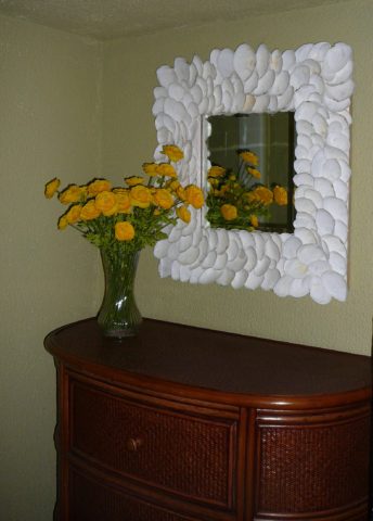
Embellish with Crafts Here we added white shells to have a little DIY fun!

Make it BIGGER – Make it Better Expand your living space, add value and create perceived square-footage!! Truly enlarging a room with a trick of design expertise is to know where to mirror an entire wall to achieve that illusion of a much larger space.

Consider what is being reflected. You won’t want it reflecting an open bathroom door necessarily…You can even enhance the area that will be reflected to maximize the effect.

Theatrical/Dramatic Lighting Effects and Mirrors

ART & Technology As is true with our fast-paced word today, the art of creating mirrors has gone from fine craft to commodity. Phenomenal prices are now available for what once was a luxury item.  Certainly, there are exquisite hand carved, fantastically finished and even gilded wood frames still being designed and handcrafted by artisans around the world,

but the offerings for production pieces of man-made faux wood and other interesting composites are now on the market. Beveling used to be an art. It was performed by hand (and still is – but it is a lost art and it’s not as necessary a trade with the advances in technology to achieve the detail).

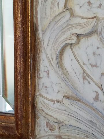
Difficult to see the hand-beveled work on this amazing hand-carved mirror.

The effects of a bevel either on the mirror within a frame or here as a frame itself, bevels add detail of angular reflection that add interest to a mirror’s single-plane depth providing the angular plane to reflect other surrounding facets of the scene.

Mirrors are one of the most versatile and effective design components. Look at them, look into them, use them, play with them – they will expand your world!!

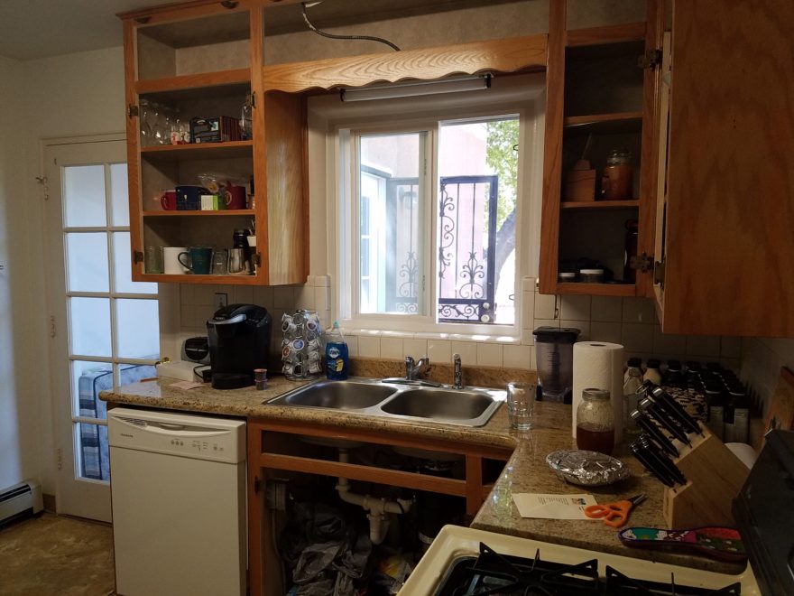
A Tale of Two Kitchens

Often with remodeling…it’s both the best of times as the anticipation for the exciting transitions is ignited, but since it takes “breaking an egg to make an omelet”, it is often the worst of times too as the demolition and displacement begins. Thank you Mr. Dickens, you set forth a mastery of profoundly conflicting opposites that I have used here which describe so many design project experiences so well.

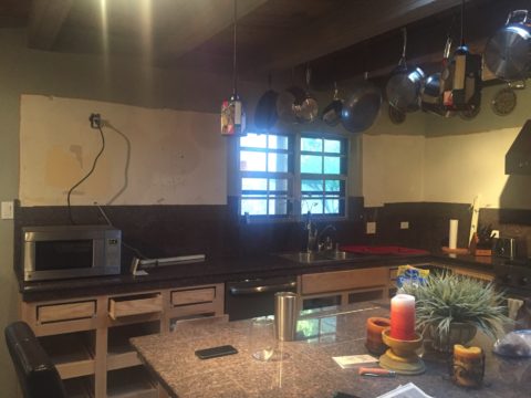
Currently, in our shop, we are designing almost parallel kitchens. They are at nearly identical beginning stages. The owners share little in common, if anything, except perhaps the age of their homes. The sizes are similar, yet one is a bit larger offering different options for design consideration.

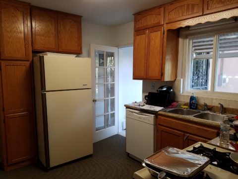
Both kitchens had been remodeled, from their originals, somewhere in the 70s and possibly 80s. One installed traditional drop-panel golden-oak with a curvy valance over the sink.

Brilliant blue paint to come will transform these re-purposed/salvaged cabinets with new personality!

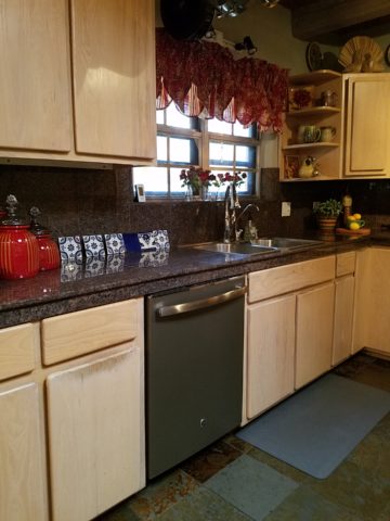
The other flat panel radius corners for a “modern” look – also in lighter bleached oak.

Each set of cabinets were in good condition opening the conversation to salvage versus replace. Certainly we encounter cabinets that have been destroyed by hard use and neglect, but when the boxes are reasonably well constructed – or enough so that some reinforcement will enhance their weight-bearing and usability qualities, we often take the route of refurbishing. (NOTE: As a DIY, this requires much research to insure that a new finish will be flawless, durable and easy to maintain.)

The beginning for each project propelled forward with distinctly different ideas. One to follow the original character of the home’s raised panels painted white doors and trim throughout, the other seeking an entire transformation to a multi-colored fiesta of fun!

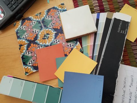
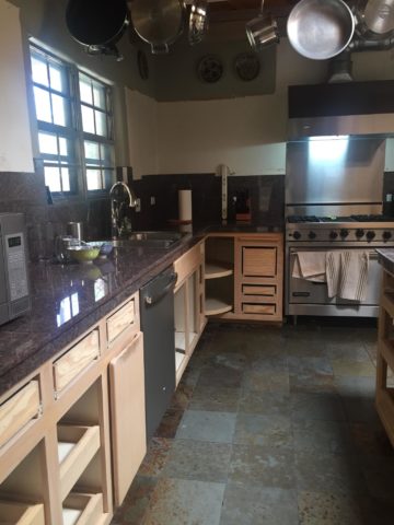
Mexican Talavera tile with Mexican terracotta Saltillo for the kitchen floor adjacent to white oak narrow plank original tongue and groove floor recently unveiled from beneath wall-to-wall carpeting.

Now that’s not to say that the more traditional soon-to-be white, raised panel kitchen will not be full of fun – as it will ultimately have a “party pass-through” connecting the kitchen through to the patio beyond and counter-top that transitions seamlessly from the sink area inside straight out to a party bar! A custom-sized double-hung window will open the scene in the warm weather months. We know that it’s going to be classic with a tremendous twist of fun!!!

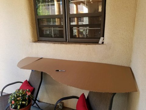
The patio level is a step down. The kitchen counter inside will flow through a new window that is lower – opening directly on the countertop surface – providing bar height outside.

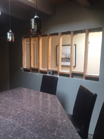
Both kitchens are being “opened” by removing portions of walls which have isolated them in years past. By removing the walls, additional daylight will be evident, a perceive expansion of the space will be realized and a connectivity to the other living areas for personal and entertaining enjoyment will become a reality.

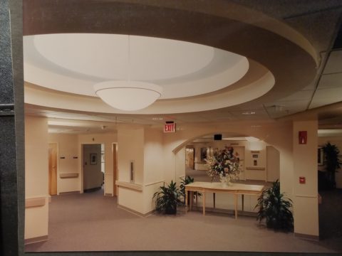
Breaking through to daylight from the hallway skylight – adds not only light, but incredible depth and dimension!!


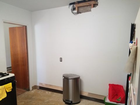
This is soon to open into the living room and large picture window beyond – a peak at the mountain will be an added reward.

A bit of structural modification to both are resulting in minor delays for permitting processes – other aspects of the work will continue, in the meanwhile, like the continued selection of finish materials, lighting fixtures and cabinet modifications.

In both cases we have discussed the design challenge of existing materials. I have found over the years that often, when confronted with existing conditions you might not have set-forth to include, they add character and an element of unselfconscious cool-ness. It occurs when certain conditions or materials are in place that you might not have chosen or planned into the design. Designs from scratch, that are too well coordinated or too perfectly planned, can lack that element of surprise or unexpected interest.

The first home had slate tile floors with a unusual mottling of colors leading with a cool aqua and including charcoal grays, smoky blues, ochre and rusty tones.

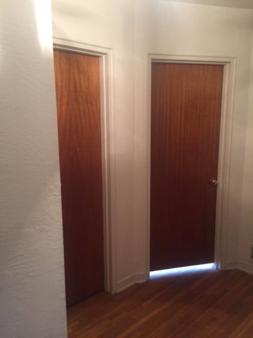
The other inherited period hollow mahogany doors all trimmed with white molding and original cabinetry. Do we paint them white – which would be the customary response or leave them and invite that element of “oh you kept these doors?”

In this second example it would be easy to “neutralize,” if not replace, the dated doors. However, the homeowner, having many fond experiences in Guatemala, appreciated the great condition of the tropical wood, grain and finish – so we will start without painting them and re-evaluate down the line as the new colors and finishes splash their celebration over the scene. As the transformation takes place, the decision regarding the doors can be re-evaluated.

This is a prime example of the design process. Often there are elements on a project that are a puzzlement. The great thing is that often the decision to remove, modify or leave unchanged can wait until the scene evolves. If you have the luxury to design as you go, you will have more opportunities to consider context, contrast, new options etc…that are often obscured by the overwhelming and often daunting task of visualizing the finished product.

Sharing the same vision is one of the hardest aspects of the design process. Full color architectural renderings, illustrations and even sketches go a long way in conveying the intent, but no two people see exactly the same thing through their mind’s eye.  During these preliminary stages of design concepts, nebulous ideas and imagined finished products, the opportunities for misconception are great.

I remember a hospital project many years ago where the head nurse was wincing at our suggestion of maple cabinets, headboards and other carpentry details. She kept quiet, but we (the design team) kept hearing rumors that she loved the color scheme, direction of the interior design and all of its architectural interest and design finishes, yet she could not embrace our suggestion of maple cabinets. One afternoon once we had gathered the materials for a touchy-feely presentation of color boards and tangible design elements, she had this incredibly surprised expression and exclaimed that she had never seen maple that color – it was natural – like a blond, wood, basketball floor. She further explained that she “pictured” the dark reddish Ethan Allen maple furniture of her childhood in her grandmother’s house. Needless to say, she had been having great difficulty accepting its inclusion into a design scheme of smoky lavenders, pastel clay tones, creamy whites, warm terra cottas and maple wood (in our mind’s eye – natural – and in hers, what she always thought was natural maple – dark reddish brown!!).

Communication is a powerful tool… often major decisions, opinions and actions can result in miscues due to miscommunications. To avoid such misunderstandings take care to provide thorough explanations along with tangible samples and other visual aids.

As we progress with these two kitchen remodels, we look forward to dramatic transformations, exciting phases of design work, some anxious anticipation, and ultimately four happy clients each enjoying their personal spaces, reflecting their lifestyle, home style and distinct personalities.  Watch for updates and before and after dazzlers!

“Wonder Time” & Creativity

I love the creative process. I love darting from idea to idea – the random electric jolt that results from spontaneous concepts that will create something wonderful, if not significant and the gratification of the final product!

That is interior design – creating something that enhances an interior – an interior (and exterior) space and all the elements within that serve people. Designing an interior which solves problems, increases enjoyment, and hopefully has staying power is the goal. Unless intentionally transient and intended to be impermanent, offering a design that has staying power transcends trends and creates without a framework of only the present.

If you are a client, potential client or an associate in this crazy, wonderful business don’t you ask yourself, “How does creativity happen?” An idea? A need?

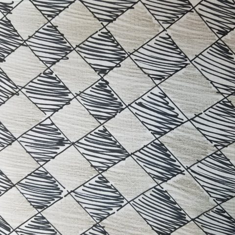
So the idea occurred on-site as I sketched a pattern that I thought would be the perfect statement and backdrop for all else in the house.


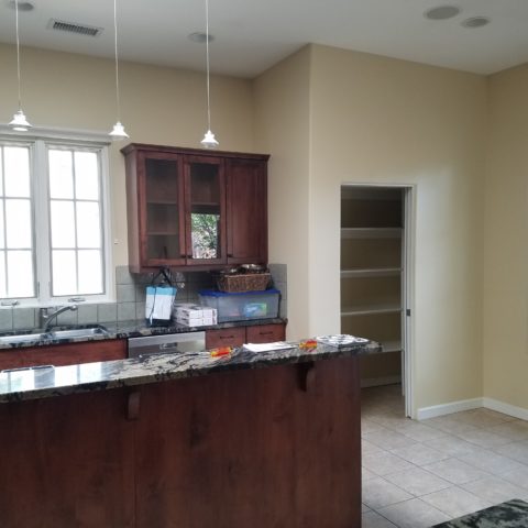
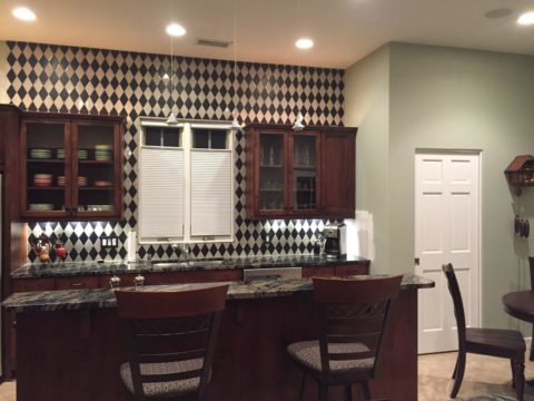
The kitchen had some expensive elements that were not practical to change. Existing cabinets, natural stone counter-tops and ceramic tile flooring all had to stay.


The original sketch realized in an nearly black, charcoal and cream tile pattern with an added opportunity for the client to turn an error into artistic expression.

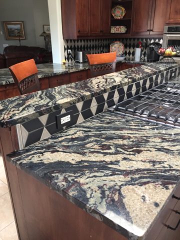
Well this client asked and made a creative discovery: “George (young-adult son) Juan (tile installer) and I had a lot of fun figuring out…the tile work behind the stove…That was supposed to be solid black..didn’t even get ordered…and George worked with the left over pieces and designed that (solution) himself!!!! I think it’s amazing and will always be so special bc of how it came to be!!”

“Basically, what happened was we ran out of the tan colored tile and only had some smaller-than-half pieces left from the cuts.” Resulting in George’s creative solution!!

Personal experience with years of working with a variety of people has shown the extraordinary difference in how each individual perceives and proceeds through the design process and related creativity. For some, the design process is an exciting adventure to be navigated with or without the aid of an exhibition leader (professional designer) to explore and travel the amazing paths of color, balance, detail, elements and combinations. For others it is not only not an exciting adventure, but one of frustration, anxiety and sheer obligation to complete a necessary task(s). Like a project with a deadline – finite and compulsory. Where’s the joy?

To design for others is the name of the game – the professional practice. In order to effectively design for others, one must have empathy. To extract a client’s wishes and create for the express purpose of making them look good, feel good, enjoy their environment, produce well and feel empowered all requires getting into their world. When you effectively do so with the genuine desire to make better, you empathize with their concerns, desires, sensitivities, and needs in order to design effective solutions.

How the brain perceives things and how sensitivities are realized, by different individuals, is remarkable. From our amazing, autistic grandson who finds wonder in very focused things from red cars to distinct shapes and colors, words and pictorial representations of them, to my dementia-challenged nonagenarian mother who clings to her very core appreciation for beauty and everything well designed; perceptions, sensitivities and levels of awareness continually astound.

Elsie de Wolfe a Renaissance woman of broad reaching creative ability said “I am going to make everything around me beautiful – that will be my life.” I wonder now if Mom knew of this amazing woman and heard this phrase that so reminds me of her, but sadly she would not be able to grasp or convey any possible recollection of that now.

I place an enormous emphasis on what I call, “Wonder Time.” Everyone needs time to “wonder.” We should all take more time to WONDER. It is in those moments that amazing things can happen. Realizations can be illuminated, ideas are formed and dreams materialize. It is a time for creativity. Do you take time to “wonder?”

For my once-toddler cousin, I remember the moment so clearly. We were on a mission to get something from the car. It offered an opportunity to have an mini adventure and explore the parking area of our beach house. We had descended many stairs to come out at ground level into the dark, shadowed carport of the massive exposed-concrete structure. It was spooky and mysterious in the twilight. As we made our way holding hands through the shadows, she all of sudden said “I wonder…” and was clearly deep in thought pondering something of our adventure that I wish  I could remember. But her phrase, “I wonder” is clear as a bell, to this day, more than 30 years later. I looked at her and asked “You what?” Wonder was such  an abstract word – a BIG word for such a little person – that it made me wonder what she knew about wondering!!!!! We dashed back upstairs and I announced to the gathered group – “She wonders!!” And began to explain our experiences in the depths  of the concrete carport. The blooming result, of that toddler full of wonderment, is today a highly observant and creative young adult.

Being inquisitive is part of that creative process – the “what if” of it all. I use that often in my design practice…”what if”…and “if, then.” It is not finite, it is a process that presents itself and a variety of tangents continuously.  Designer Todd Oldham observes that creative people are different and if you are not one, you will not understand the need to be creative. He knows that “as a creative person, you can actually survive off of your ideas.”

I agree. For some, creativity is a necessary aspect of being. It is a way of seeing. It is unavoidable and random. It is essential. It is life affirming and life giving. You either are one of the “creatives” or you are not. Yet creativity exists in each of us. It is not learned, but it can be honed.

The sensitivity that comes with this profoundly innate sense is sometimes an onerous burden. Being pleased by design details around you from nature to the built environment, from fashion to well-designed freeway overpasses, details matter and a great joy is the benefit. However, details can have the adverse affect, if not well executed. If they are not well placed or well designed details, they can grate and annoy, raise blood pressure and cause all manner of anxiety. It is an onus to be so sensitive to details. Poor lighting in a restaurant, imbalance of surface textures, ineffective or inappropriate colors  – it is all about that phrase “Beauty is in the eye of the beholder” and if the sensitive person is presented with jarring elements that they behold or consider to be in error, it can be most unavoidably disturbing.

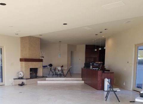
The placement of this fireplace an bar so grated on my sensitivities that it was amazingly uncomfortable being in this space. A challenge for correcting without structural modification for sure!

Like creative writers and their critics, who have often expressed their strength in the power of words…for designers and artists of many media, it is the power of color, lighting, pattern, and composition.

Good design is never out of style.

Quilting – An At-Home Workroom of Color!

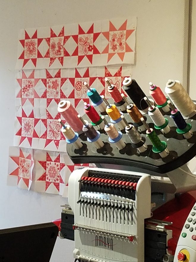
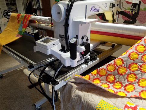
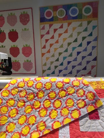
It’s not your grandmother’s quilting these days…computers have radically altered the landscape of this generations old art form.  Two days ago I found myself in an in-home art-studio/workroom that blew me away!

Initially a craft born out of necessity, as creative survivors accustomed to “making something out of nothing” re-purposed scraps of material to patchwork new articles of clothing, homegoods and ultimately art for the walls. This clever, resourceful, utilization was celebrated in Dolly Parton’s song turned movie, about her true-life “Coat of Many Colors.” https://en.wikipedia.org/wiki/Dolly_Parton%27s_Coat_of_Many_Colors

The intricate designs and refinement of pattern details was obviously all done by hand, but with the development of machines and now computers for this purpose, the possibilities are endless.

So as I turned the corner, to see a would-be remodel of combining two bedrooms and expanding to the north of the existing shell, I was astonished to see this remarkable, expansive workroom – all white – punctuated with colorful creativity. Colors, textures, patterns…this extraordinary, rather Renaissance, woman had carved out a generous space to explore this phenomenal art and craft.

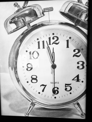
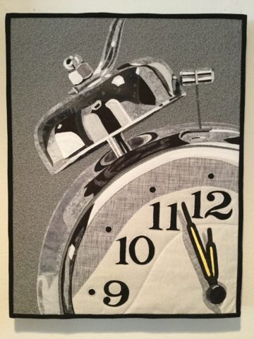
As an artist, Sue Watrous’ paintings and sketches are quite photo-real. On a few of her pieces, she has deconstructed the elements in the painting cutting them from fabric of many grey-tones defying the fact that they are textile assemblages.

This original pencil drawing – yes, photo-realistic, is amazing.

Then to create the same image as a patchwork quilt is remarkable!!

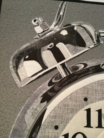
Yes, look closely, you can see the patches of fabric that are assembled in the many grey tones to create this amazing piece.

Her joie de vivre is derived from this magical space and the creations that she imagines and brings to fruition.

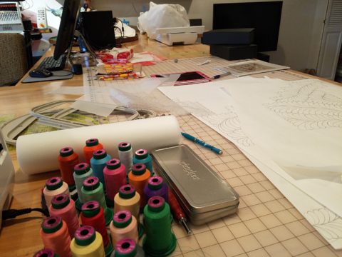
Upon entering her amazing domain, I felt as though I was entering an operating room – everything in perfect order, clean and spare – like a clean-room at Intel – I should gown-out or suit-up!!!

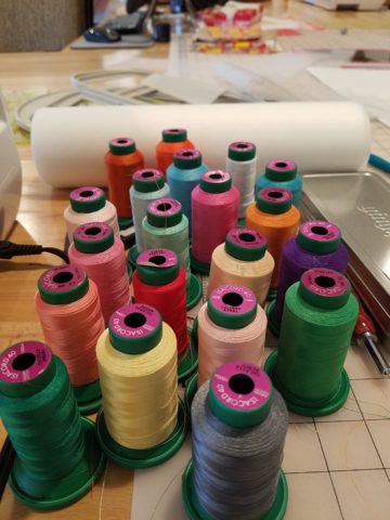
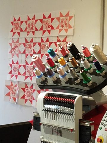
I might be exaggerating because it was white and clean, but warm and welcoming with the rainbow spectrum of thread spools and quilts both finished and in progress displayed on the walls and on the other many surfaces.

Self-taught, she nonchalantly references the many computerized machines strategically placed around the  room. There is an order to the layout and her approach is meticulous. Despite the fact that there is an active quilting community here – they are too busy quilting to teach – so Sue jumped into this after having seen a presentation at a show about five years ago. Years ago she quilted – but at this juncture, she knew at once that she wanted to enter this exciting and challenging realm, of computerized art assist!

Like the shoemaker who has no shoes, her quilts have yet to adorn the walls or bed dressings throughout the rest of her home. She doesn’t sell her work – but her family all has homes riddled with choice pieces.

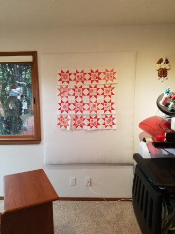
Her paintings are placed amidst her interior, but not her quilts. Today I focused on a large wall to be the future home of a near-to-be- completed quilt.

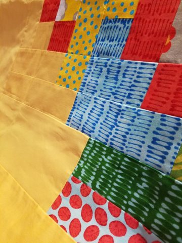
She tells me that the fabrics are like paints – she is painting with fabric.


And although she is not yet dying her own pieces, she told me of meeting a textile artist who spun her own thread from her own llamas, dyed it, designed and fabricated her own work.  Sue has created most if not all of her patterns and designs and I am confident that before this is over, she will be donning rubber gloves and dunking material in dye vats to find a new layer of creativity.


For the LOVE of Fine China – USE IT – Inspired Table Settings

From the Diminishing Dining Room of last week’s observations, https://patriciandesign.com/category/dining-rooms/, I decided to further the conversation to encourage a new-found appreciation for having fun setting dinner tables!  I found fodder from Kentucky Fried Chicken served on formal silver platters to wipe-clean placements of dazzling designs to dress your tables.  A collection of tireless designers defend the use of fine china – own it, buy it, find it, inherit it, enjoy it, keep it and use it – don’t send it to the thrift shop!!!

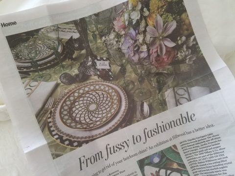
Yes, the art of fine dining seems to be set aside in favor of ease and expediency, but this article from The Washington Post’s HOME section (thank you Feath – my clipping service) brings it all home to use and enjoy.  It is a celebration of art, design and playful creativity.

Not everyone loves to entertain, to create the “tablescape,” to even bother to put together an outfit to wear. Not everyone loves to get dressed in the morning – it is a chore, an obligation, a mere necessity. That’s unfortunate in my estimation. For those of us who do – love it – it is all about having fun with fashion or interior design is just that – FUN!

Last spring I began a series  of emails that I blasted to our mailing list called COOK + PARTY. It was (and will continue this next season) a collection of weekly recipes paired with table-top art pieces. In our gift boutique, we represent an incredible collection of artists who create fabulous tableware.  I paired a piece with a recipe each week to inspire and encourage everyone to use “functional” art in their daily lives and specifically for entertaining and even the family dining table.

https://patriciandesign.com/category/art-and-food/

Recent fodder revealed a great source for fabulous wipe-clean placemats from Caspari.  For decades a fine source for the best paper cocktail napkins, Caspari offers these bold patterns and colors, prints of fine china and fabulous fabrics – re-use and easy to clean – why not?

https://www.casparionline.com/catalogsearch/result/?q=placemat

A previous fall blog that I wrote illustrates the open-mindedness of looking around to find inspiration for seasonal table dressings.  The decision for your table-top inspiration can be spontaneous – just go outside and look around!
 

Among the refreshingly optimistic designers that were quoted in the Washington Post article:

https://www.washingtonpost.com/lifestyle/home/that-old-fussy-china-can-fit-your-casual-lifestyle-designers-talk-about-how/2018/02/21/46761538-0084-11e8-8acf-ad2991367d9d_story.html?utm_term=.3a6fde2e5124

Barry Dixon, from the verdant rolling hills of Warrenton, Virginia, specifically points out that this process of setting your table should be fun!  Don’t pull-out the same things each time – mix it up! Change it up by adding color and pattern differently with every new opportunity.
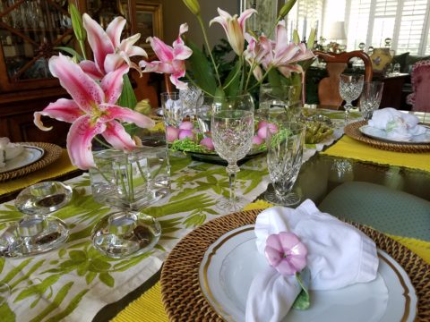
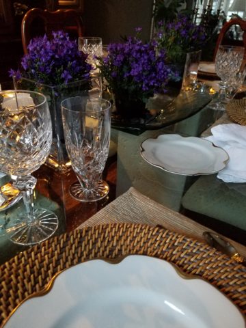
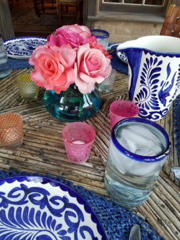
Seasonal flowers, yellow woven cotton place-mats, embroidered folk-art table runner, basket chargers beneath classic Limoges topped with ceramic napkin rings – it looks like spring!

Designer Timothy Corrigan tells us that many people find it too difficult to entertain with their best things because the onus of proper cleaning and put-away is too much! But Mr. Corrrigan points out the joy of using your best things every day – everyday is a celebration and what you enjoy should be used.

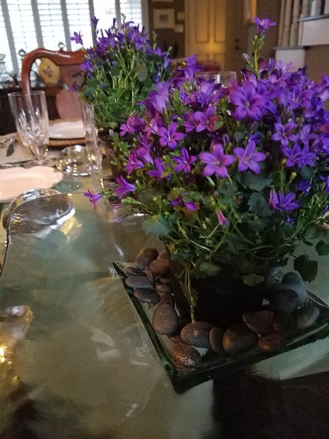
In another springtime setting…organic, rustic things with finery – black stones nestle fresh purple Campatula flowers antique Limoges and basket chargers –  makes an eclectic table settings – it’snot all or nothing…it’s the combinations and scene that is being set.

Hutton Wilkinson – way out in L.A. where casual chic is the practice of distilling what migrated from the more formal sister coast to the east – noted that he believes presentation is the key to success. It isn’t so much about what is served (don’t tell the chefs that), but rather on what it is served and how it is presented.  Imagine buckets of Kentucky Fried chicken served on elegant Georgian silver platters. That simple fast-food chicken becomes  magnificently irresistible. You can’t say you’re too busy to cook with that creative solution! Wilkinson believes that presentation helps food taste better in addition to looking beautiful! He advocates buying china because it’s beautiful – not merely serviceable. I agree…it’s not all about the mundane purpose of eating off of it – but rather the joy of eating off of it!!

Making your guests feel appreciated and treating them to a unique, pleasing experience is a gift to them.  A special treat to show that you care –  going that extra distance of detail and design.

Color combinations, textures,patterns – wonderfully pleasing tablescapes are a treat for the eye. (So special Marsha!)

So don’t say it’s too difficult…keep it simple with Real Simple – the source for easy, ingenious ideas and simple truths……the following link for proper place-settings will get you started.

https://www.realsimple.com/holidays-entertaining/entertaining/how-to-set-a-table

Patti says – “make it special every day.”

DIY…Do It Yourself Beachfront Getaways or DWI…Designing While Intoxicated!!

Not as the title suggests…tequila shots and all – but another kind of intoxication…an intoxication from unexpected beauty, sensory overload, inspiration as seen in the following photographs.

Those of you bundled up against the elements this time of year…freezing your booties off in the icy winter climes. Enjoy this escape into your unbridled imagination of design and lifestyle gone wild!

Thought a beachfront condo was out of reach? Think again. With all the DIY out there on the internet today, anything is possible. As evidenced by the inspiring framework of architecture that I have encountered just this week alone, consider the possibilities and have a little fun!!!

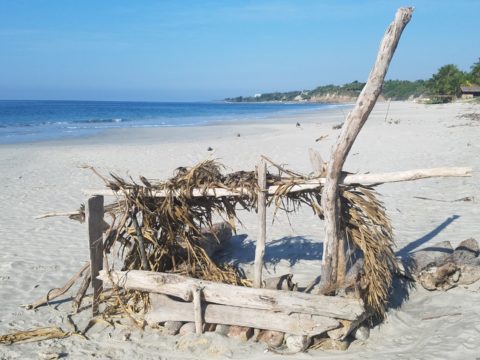
Very simple things trigger design concepts. Beyond the fascination I have had with these beach structures, this particular photo was bathed in late afternoon light. The glow of the orange towels was emitting a warmth that was so tropical, had it not been on a tropical beach, finding the same boldly colored and textured structure in a snow storm would have elicited a startling, contrasting feeling of the same tangible warmth.

This make-shift west-facing beachfront was so beautiful, in its simplicity, that it spurred ideas of bold fresh color, basic found-material furniture possibilities, fabric design and organic architectural solutions for patios both commercial and residential.

Imagine raw elements  incorporated  with concealed structural support to convey the feeling of spontaneous simplicity.

Then there’s that general calling that speaks to “the natural integrity of the materials.” You realize it is a grounding.  It is a starting point of reference to all the embellishments, layers, machinations and manipulations that are possible.

Wood is wood until it is stained, painted,  appliquéd…when does it lose its “natural integrity?”  Even raw, man-made cinder block – CMU – concrete masonry units have their own natural character. Then stained in the aggregate or applied color, thickly coated…it alters it’s state – losing its material’s natural integrity.

What ignites design thrills? The fireworks of ideas that burst onto the scene illuminating so much that was previously obscured. It doesn’t have to be a remote and seemingly inaccessible tropical beach…it’s everywhere. Look around. See texture and color, shape and frame. Urban, suburban and rural settings in any climate all offer inspiration that can be isolated and appreciated. Design inspiration can be intoxicating.

Why is designing so exciting? Why is it often such a rush? You never know when an idea will appear or from where.

The world around you is a constant stimulation of ideas, inspirations and possibilities. You are thirsty for  whatever is out there…whatever is waiting to be discovered, implemented… quench those longings.  It is all about the freedom to allow ideas to be spawned from anything around you or in intertwined with your own imagination.

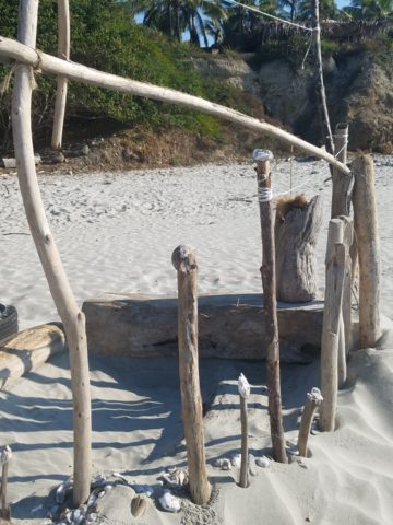
What fun to have come upon these simple structures on a glorious and sparsely populated beach. What fanciful design ideas and story-lines were prompted by the imaginary occupants, their creativity, resourcefulness and problem-solving simplicity.  Lest you think they house the homeless adventurers, they are actually sun-shades for creative surfers and affluent sun-bathers seeking a primitive beach experience.

How might these primitive structural solutions play into a future project? Watch for design trends to incorporate more organic materials and nature’s inspirations!

I’m ready to explore the possibilities. Are YOU?

Everyone Needs a Little Country Sometime

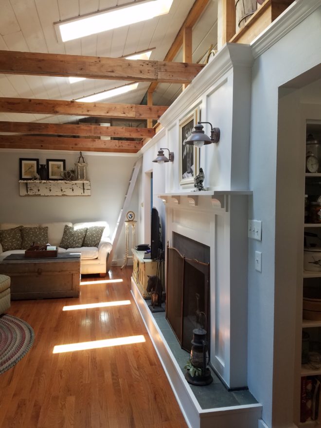
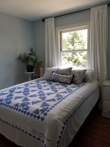
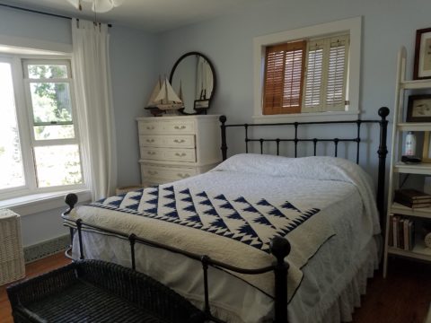
I would like to share a treat of a house in a magical setting along a quiet waterway in the lush rural lake community of Edgerton, Wisconsin. A most talented friend has created a riverside home from a modest rambler. What was a dated structure with limited interior appointments, low ceilings, tiny high windows, and ordinary fixtures is now a soft, sophisticated, space outfitted with treasures gathered in the countryside, filled with history, character and antique charm.

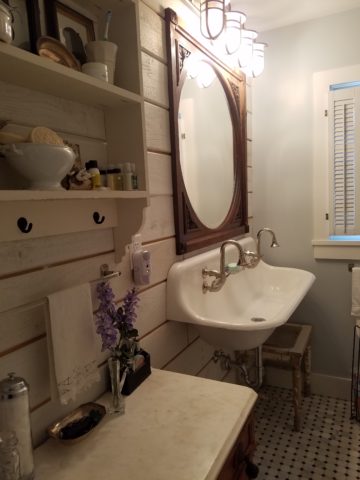
Hands on and knowing exactly what she wanted to achieve, she began collecting interesting fixtures and hardware, furniture pieces and finishes. She hired a remodeling contractor, but worked closely with him and his architect to detail every facet of this home. Unwilling to compromise certain features, she enlarged all window openings, reconfigured the entry, gutted the kitchen, redesigned the bathrooms, ripped out the ceiling exposing structure – increasing volume exponentially – and added a garage.

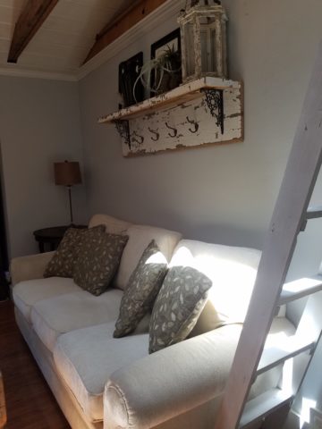
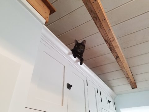
Exposed beams, new white-washed tongue and groove boards applied to raised ceiling, a found wooden column used for structural support, new crown molding, bead-board wainscoting, re-designed fireplace surround, and creatively concealed storage closets, have re-shaped the entire character of this interior so dramatically that all who entered, not having yet seen this incredible transformation, were awed.

Hearing their comments as they passed through the spaces was amusing in their commonality. Everyone was amazed at the amount of work done, creative elements incorporated, fun finds she had collected to transform this modest house into this cozy cottage. Her two cats have wonderful vantage points to watch the activities in the rooms below as guests gathered to celebrate the weekend’s family wedding festivities.
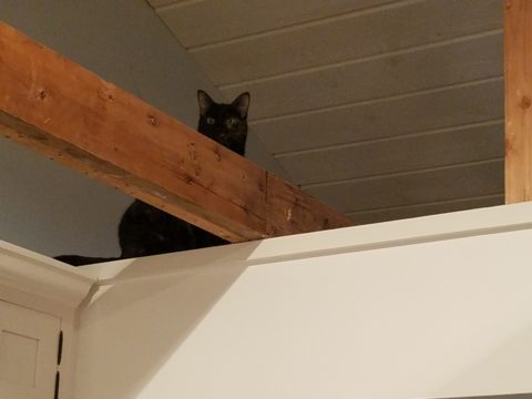
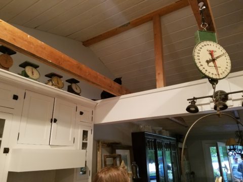
Daylight streams through windows and floribunda gardens around the house are now communing beautifully with the interior.

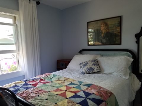
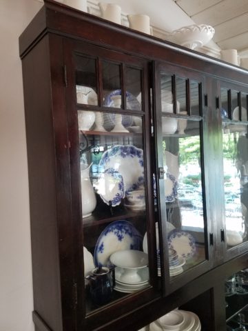
Ever-so-soft blues, with whites of every shade, create a soft backdrop to collections of fine china to vintage scales and myriad eclectic antiques.

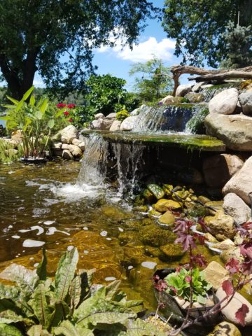
Outside a recently completed multi-tiered pond emits soft trickling background sound which wafts inside through the many open windows. Not to be reticent about being hands-on, this tenacious designer personally packed 23 loads of boulders and large stones into her truck, off-loaded and placed around the periphery of the pond. She planted tiny creeping vegetation among the stones, water plants, multiple trees and perennials to establish instant-gratification landscaping in her expansive backyard, which is a lush verdant botanical expression that grows abundantly right down to meet the river.

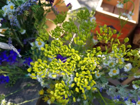
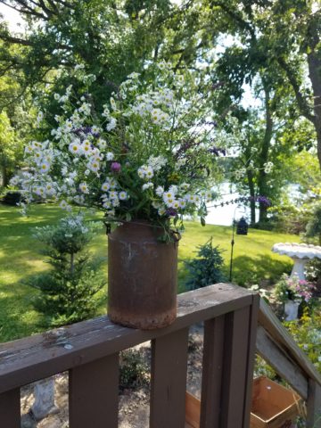
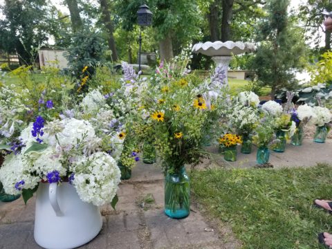
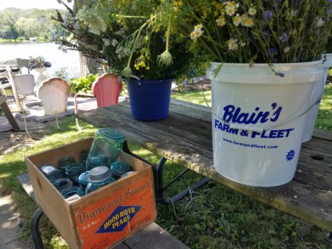
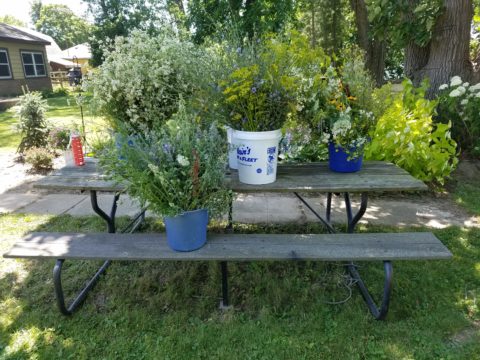
A great get-acquainted bonding of disparate family and friends occurred when we collected buckets of roadside flowers to make arrangements for the reception venue.

Wild bouquets punctuated with spectacular domestic flowers from the gardens surrounding the cottage provided fun activity and contributed to the charm of the scene.

Everyone needs a little country sometime.