WHITE by Design…

With all the New Year buzz about the new color forecasts…I started taking notice of the seeming non-color, white. It is often considered the absence of color when in fact it is a very complex color of many shades and values. Just try to select a white and you will know what I mean.

When you look at white paint samples, you will notice the nuances. There are pink whites and blue white, grey whites and yellow whites. Each white is off-set and contrasting to another. You see the differences by comparison and by context. You think you have just the right white until you place it against another sample and see that it is grey or cream and then second guess yourself again…and again…How do you know which white is right?

Dunn Edwards groups their whites and pastels in a separate section of their fan deck as do other paint companies. What is interesting here is that the background is a sheet of white copy paper. Notice how is reads against the colors in the samples…it seems to be a purple blue color. This shot was taken under a full-spectrum LED lamp. The colors should be true. The range of “white” is amazing.

To intentionally design with white is bold. To have the confidence, to decide that white IS the color and that white IS the scheme, is challenging. To effectively design with white, you not only have to select the right white(s), but you have to know just how much of anything else might be effective yet not detract.

Le Leche in Puerto Vallarta is a fabulous example of designing exclusively with white. Only with minimal punctuation with black lettering on the wall of containers and also by allowing shadows is the white interrupted. But the blacks’ minor interruptions gives depth and fine detail.

White design can be cold or warm. Depending upon the desired effect, mood or function of the space, the whites need to be carefully selected. This is true with lighting as well. Warm whites or cool whites…what gives you the desired result?

Popular white string lights add festivity and a warm glow to an evening scene.
See how many lighting colors you can identify in this scene…Starting on the left, a cool pocket glows through the underbrush. The walkway has a warm pink-ish light. The very cool blues of the pool area give a dramatic read. A bold yellow accent peeks from the far left and also over on the right. The palm trees are wrapped in a warm white tube lights while the far right side illuminates the entry to the dining palapa with a cool white light source. The foam of the surf on the beach is captured with a cool white spotlight that maintains its naturally expected white color.

Knowing when to add color to a white scene to achieve an intentional POP is an art. The color itself, the amount and placement is all part of the success of a good design result. From the fine black detailing in the previous shot of La Leche to this still-life composition of a tropical cocktail that I propped the other day, the minimal punctuation of color is key.

White mosaic shards of tile in the background of this composition featuring a peeled coconut and the POP of a pretty pink party umbrella result in a white-on white scene. Yes, this shot says PARTY with a perky smile!

The bench which served as the backdrop for the coconut cocktail is a dramatic serpentine sculpture of site furniture that plays with the white-on-white of the tile and grout.

Contrasting against the organic wood decking, this white monolithic bench snakes around the periphery of this outdoor lounge area. The sunset is casting a soft pink wash over the all white glazed tile.

Beach settings using white materials compliment the white sand and greenery of the tropical plants. From wood frame platform cabanas to the sprinkling of umbrellas, white is a wonderful, fresh color for a crisp clean scene.

Whites on whites…creamy sand colors to crisp white terrycloth, the white-on-white scheme is soft, inviting and clean.
Greenery compliments the white umbrellas and sunning beds on the lawn by the beach.
Palm trunks and other fruit trees are often painted white to protect against insects and what insects insist on climbing the surface are easily spotted by birds who appreciate the help to capture a snack! In this case, they contribute to the white design theme.

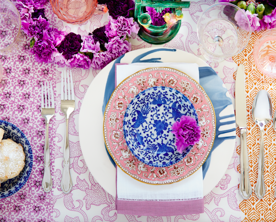
The soft creamy off-white folds of fabric offer a soft, inviting scene.

Shadows in the creases and depths of the folds add the dimension to the luxurious feel of the cotton damask fabric.
White stucco is dappled by shadows and greenery while given a warm, strong base by the brick pavers. White as an architectural finish is only successful if the context compliments it. This is true in all design.

Architectural color and texture of surfaces is a moving target. A recent discussion about a white building with black detailing would not have proved right for this particular use of white. The hard, commercial read would have been too severe for the intended effect. Yet that same project, with a warm white and an ochre accent, will be just the right combination to achieve the desired result. Watch for this project to be featured in a few months.

Architectural surfaces incorporating tones and textures of white provide interesting opportunities

Block and crumbled edge accent bands on the facade of an exterior wall.

White in design is an exciting selection. Knowing how, when and why to use it is a test of your creativity. Picking the right white is the challenge.

The limitless colors of white found in a pile of gravel…..

So the next time you think white, think a lot about it. Study the context and what you are trying to accomplish. Feel freed by the fact that white is a color to express and enjoy.

TRENDS – How Does One Decide?

TRENDS…we HAVE to have them…it makes us think, makes us shift…not to mention keeping viscosity in the economy. The shift is the element that moves the economy forward. Without that shift, we would be stagnantly content. And who wants to be stagnantly content – except the “Settlers” from the Direct TV ads?  DIRECTV_Commercial_2015_The_Settlers-520x245

Yet if you Google design trends they are all over the place. The intrigue is when they land on an actual theme that becomes THE TREND.

So as we advance into the new year and winter fades to spring – what lies ahead? I’m finding lots of nostalgia – features on milk glass and floral patterns and fancy geometric patterns, a recall to wallcoverings in floral prints and botanicals…Rose-wallpaper-Bari-J-WallAppeal-pattern-pink-yellow-zoom

The trick is how to invest in these elements and not have them become passé by next year. It’s all about balance – unless you have the desire and pocketbook to change out your interior annually! The desire to add something new to your personal spaces, or as my mother has always said “punch it up” is an art unto itself. How does one decide?

Information is so accessible. Access to ideas is endless. But HOW does one decide? How to make the decisions, the right combinations, what to keep and what to change…? The internet and TV…Anthropologie to Pottery Barn, Pinterest and beyond…You pin a gazillion things – but how do YOU decide?

But it gets kind of funny  – because for as many sites as you visit – there are oh so many professed “trends.” Therefore,  sifting through is the challenge and distilling what seems to take the lead. Pastels, patterns and florals is my finding…but is this just spring? Will this fade with the next season? Or is this a “look” that will last for a while? And do I embrace it all or pick and chose? How does one decide? Elle Decor 2016 design trends table

Pantone the color experts are even all over the place. Their designers were “inspired by the contrast of urban design and lush vegetation.” Whoa, really? That sure is a wide swath of possibilities!  And to say that these colors  are unisex is as though attempting to blurr the lines. A guy might wear a pastel pink, Rose Quartz, shirt – but would he upholster his sofa with it? Fashion and Home Decor often parallel their trends – and then they must veer off that same course for practical if not socially directed reasons.  Redford-3-Seater-Sofa-Peony-Pink

But the rationale is so amusing…for example,  Pantone writes: “Colors this season transport us to a happier, sunnier place where we feel free to express a wittier version of our real selves.” Yes, we all long to escape the doldrums of the short, dark, cold days of winter – hence the positive effect of transporting us to a happier, sunnier place is obvious – every year for that matter. That’s why tropical destinations are the prime vacations for winter getaways. Even most avid snow skiers manage to sneak in a run to the white sand beaches for some sun and fun alongside their plans to hit the slopes, get frost-bitten and nestle by the big fires.

I guess I’m looking for a more cerebral explanation for the color movements. And yet, maybe there aren’t any – so let’s not pretend then. What does it mean a “place where we feel free to express a wittier version of our real selves.” Wittier like a guy upholstering or painting his man cave with Rose Quartz or Peach Echo? That’s witty all right!!!!! That’s not the cerebral that I meant. But it is an interesting rationale. Color is giving us permission to express our REAL selves. I guess that’s one way.

Yet, here are 5 different color series for the upcoming year…and as you can see – it’s all there – it’s all covered.  Pantone color-trends-2016


So as you climb out of the dark, cold recesses of winter and squint your eyes at the bright, colorful luminosity of spring in bloom, where will trends take you on your journey to “punch-up” your interiors?