CONVERSATIONS ON DESIGN – SPECIFICALLY, PRO TIPS ABOUT COLOR

This past week alone I have consulted with a commercial client about reception seating and color, a home-owner, in a mountain setting, about durable floor finishes, bathroom remodels and color, a couple in a new home downsizing from one of 20 plus years about furniture arrangement and color, a couple from Las Vegas buying a second home by their daughter and grandkids about color, and a woman stopped in the shop yesterday visiting from Santa Fe and said that she didn’t know we were also a design firm -picked up a brochure and told me inasmuch as she had “a pretty good handle on design – she always struggled with color.”

See a common thread here? The comments were from that where she admitted to always struggling with color to another wanting her seemingly tract home to feel like a woodsy cabin with color, others wanted their spaces  lighter while others wanted to make a corporate statement that would support their brand and not go out of style in the coming few years. They all had steered toward neutrals – but not in a good way – because they were uncertain about committing to COLOR.

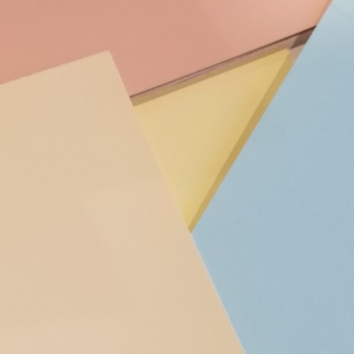
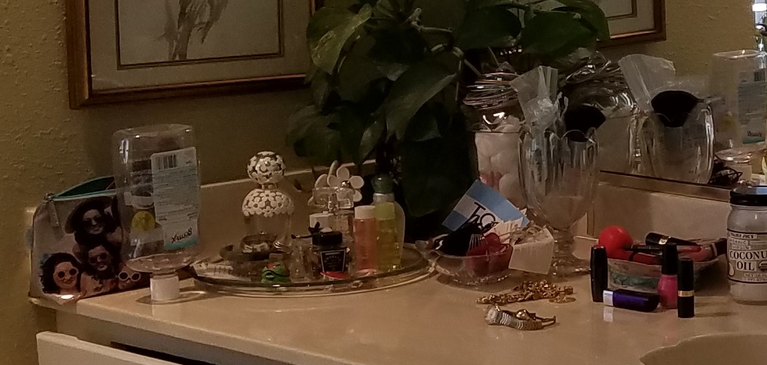
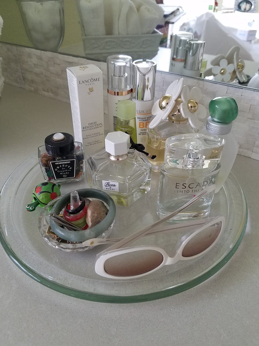
The whites and greys are their own beautifully valid color scheme. https://patriciandesign.com/project/modern-make-over/   I have written before about when white is a color or when it is the absence of color.  https://patriciandesign.com/white-by-design/

I also continually stress that all design decisions are based upon context. Many of you reading this, with whom I have consulted, will recognize much of these observations and tips. I stress select color to compliment your context!

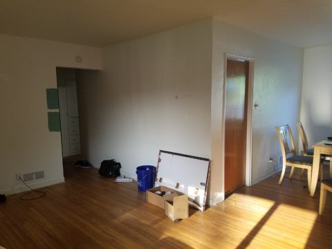
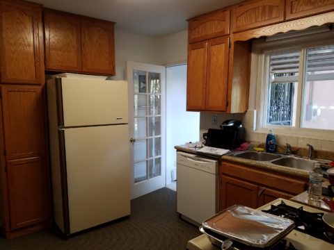
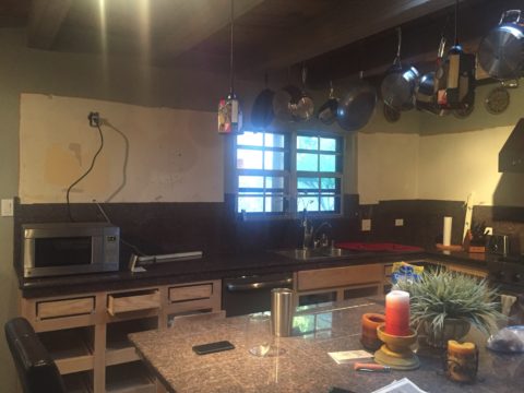
Interestingly, the mountain home has existing painted doors and trim. To change those elements would be costly. How can we woodsy-up this interior without those seemingly necessary key elements?

I asked her for her priorities and “comfort colors.” As a result, we will change the flooring for look and durability, building from that add color and various textures to enrich the space – stacked pebbles at the fireplace, a slab hearth, a wooden mantle and a light neutral will be the main backdrop splashed with strong elements of color (notice them on the mantle). The very vertical fireplace will be a bold golden yellow color to intentionally work with the honey tones of the pine architectural elements.

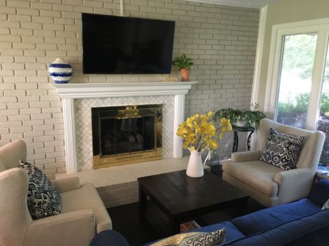
By contrast, a magnificent home (also in the mountains with great wooden details), had too much of a good thing for the owners’ other interior furnishings. In this case, the seeming sacrilege of painting the solid wood doors and trim was in order.

To paint all the solid wood doors and trim in this home was a leap of faith. But the goal was to add back stacked stone to carry a theme from the now naked fireplace to the kitchen bar and over to the entry door wall. Having it in three places will commit to an architectural theme for this finish selection. New colorful rug and fabrics for throw pillow will enliven the space and bring focus to individual accents throughout the interior.
The grey hand woven grey rug was not providing the needed backdrop for this new scheme so we gathered rug and fabric samples to “punch-up” the scene.
After the new rug arrived, we assembled the fabrics for another study of our options to detail the design.
Before, this little powder room was a bit bland. The quality, solid wood, raised panel, pine doors were too rustic for the owner’s preference – but painting was not an option – until we discussed it. What was a possible sacrilege became a beautiful solution to changing the design direction of this interior. Mirror and sconces remained while vanity, sink and colors were transformed!
The AFTER of the little powder room is still in the process, but it is clear that the transformation is startling with the newly painted doors and trim and the fresh POP of turquoise on the walls. Layers of color and emphasis changed. It is not about painting wood, it’s about creating balance. The massive, solid wood front door and antique and art pieces throughout will be emphasized as key features

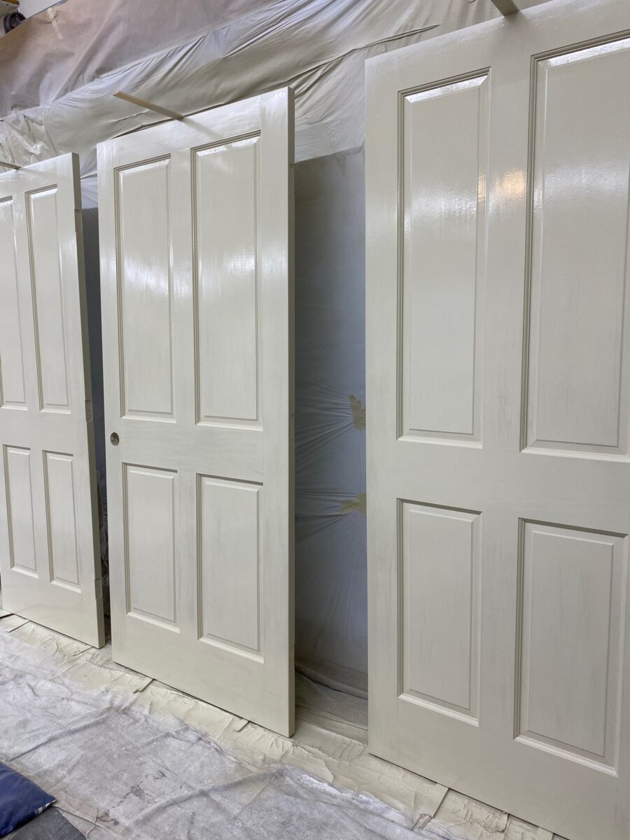
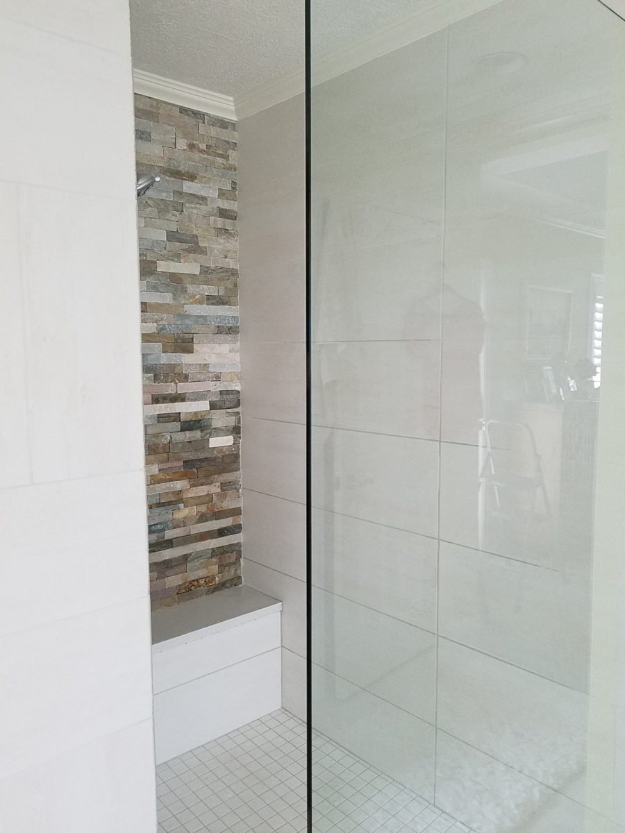
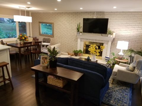
Another such interior was over-burdened with stained wood and to paint it all out white was a major commitment yet, the results will make for a lighter backdrop still revealing the bones and their texture, but freeing the owners to showcase their other pieces of fine woodwork, art and furnishings.

PRO TIPS

  • The trick with design decisions is to determine and understand the primary purpose and intended “read” of the space. What is most important and where do you want your focus?
  • Once you have evaluated the space, identified its primary purpose and selected what you want to emphasize; see what is either in the way of, or competing with that emphasis, and clear all else away. Add back the things that you consider most important either for function or joy (form).
  • If the architecture is most important, determine what about it and work from there to complete the space. If a piece of art is most important – place it to its best advantage and build around it so as not to compete, but compliment. If a view is most important – the same is true – clear away and frame with the most important and/or effective pieces.  Pick your priority, yet take everything into consideration.
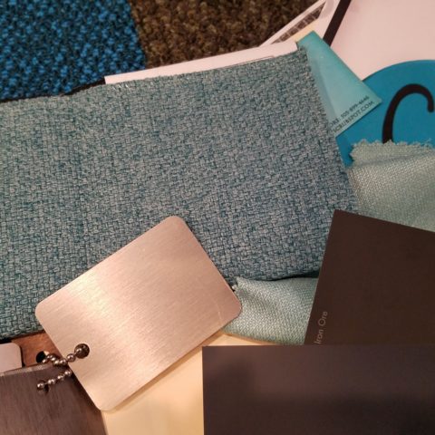
  • With regard to color…it can emphasize the architecture or be inserted for a bold statement(s) of art or fabric on furniture, rugs…When using color, the idea is still to have balance in the context of where you are placing it. It can be a backdrop or a foreground accent.
  • Consider existing conditions that will not be changed – such as flooring. Select colors that include the compliment to that material. Whether in direct opposition for contrast or to meld in   a way that creates a subtle transition – the consideration of existing materials is important.
  • The effect of considering existing materials can result in their appearing as though part of the plan rather than being inherited unintended.  This is generally a desirable result. Therefore, if you have a material that will not go away – make it intentionally part of the plan.

The corporate color issue was about updating their image and connecting with their clients in an intimate and comfortable manner- an environment that carried the trust of years of experience and embracing a new generation of financial management. They developed a marketing plan moving forward to identify a theme, feel of confidence and carry it through the entire experience. In a recent Facebook post you will see this project in the process and notice that the carpet was an existing condition and that it was used deliberately to make the new materials appear to all have been coordinated from the start. Long time clients and new are comfortable with the changes!   https://www.facebook.com/PatricianDesignABQ/

It’s OK to play it safe with neutrals – but in this case, it was time for a updated “brand” for this business. The unusual eggplant and chartreuse carpets inherited in the move to a different suite required some deliberate coordination, to have it all “read” as though designed afresh!

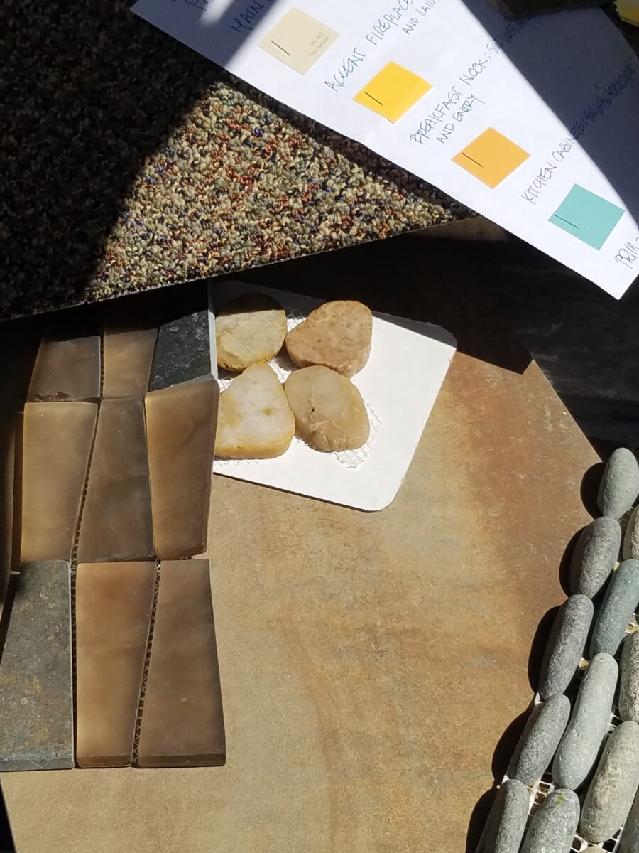
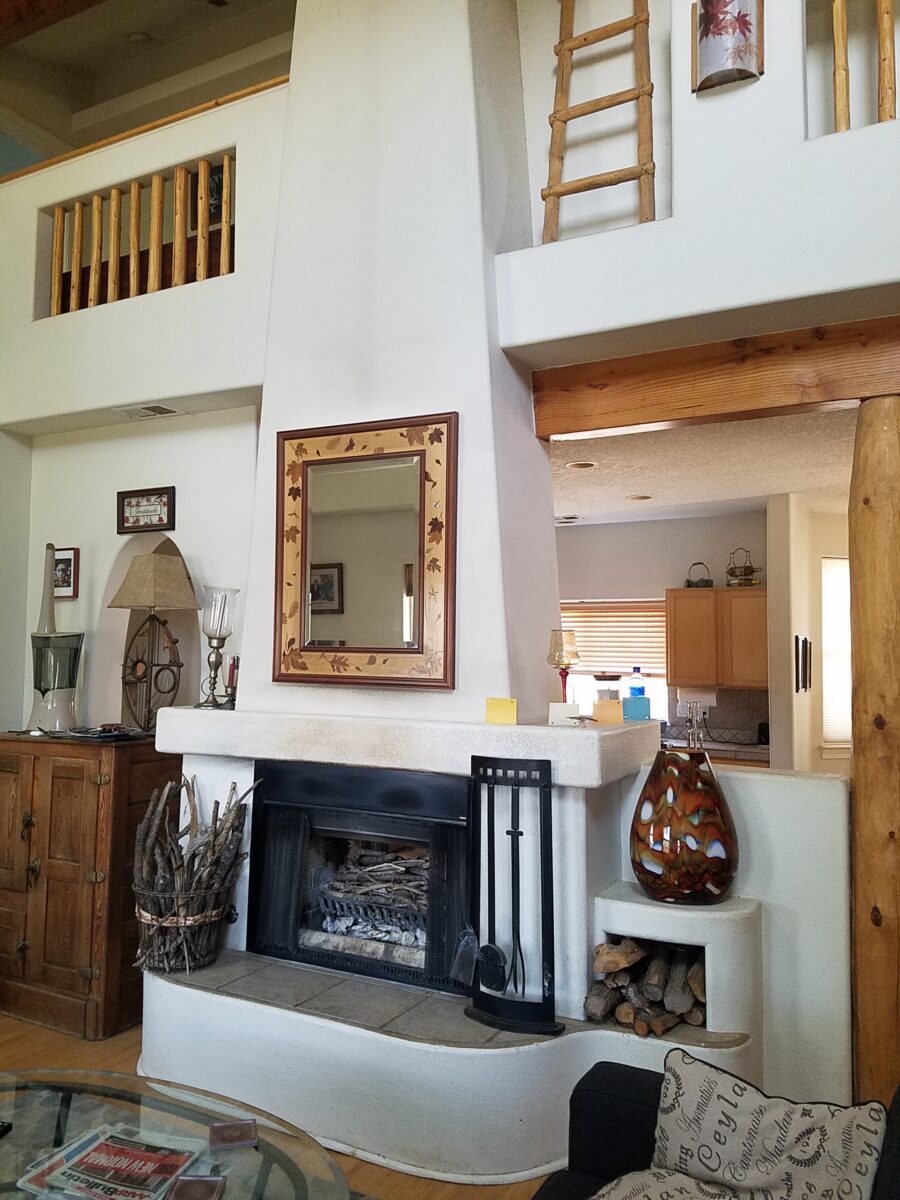
The want-to-be woodsy cabin project will have new, durable porcelain tile floors imitating variegated slate and from that palette of colors pull paint colors to add whimsy and visual impact along with other new additions of stacked pebbles at the fireplace and wood encasing the now sheet-rock mantle.

The stacked pebble stone, engineered stone, new wood mantle and splash of colors against the neutral will make a dynamic statement. Notice new color chips leaning on the mantle.

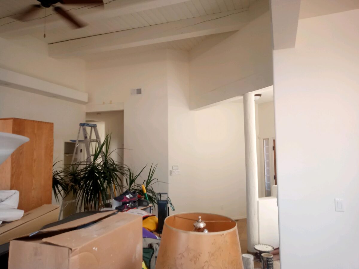
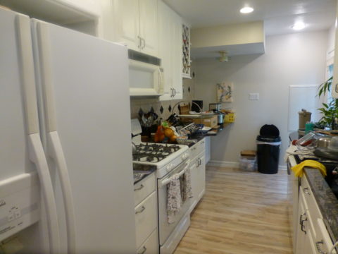
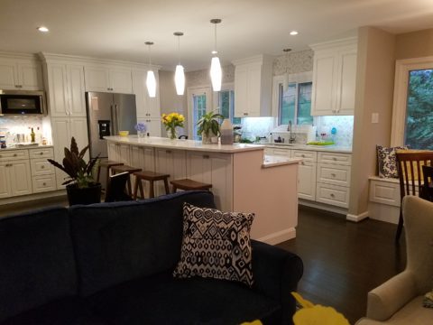
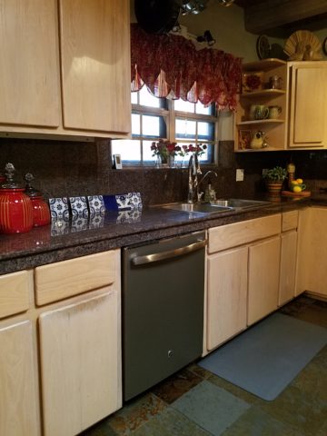
The couple downsizing and wanting more light and a less heavy southwestern feel panted their entire ceiling of beams and tongue and groove including support columns in white. The wood still “reads,” in all its hand-hewn texture and knots. The white is no less natural than the dark chocolate that had been their previous faux finish. Albeit the tongue and groove had a clear lacquer that we concealed behind the new cloak of white for a uniform backdrop.

The dark chocolate opaque stain of the pine members was no more valid than painting them an other color. We selected a white to open and refresh with a neutral backdrop to allow other elements to be more focal.
Painting currently underway!! Watch for before and afters of this refreshed interior.

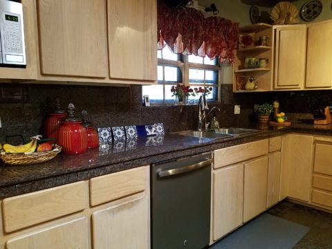
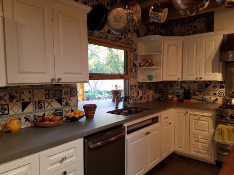
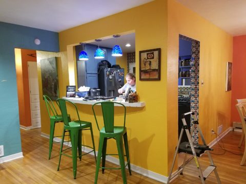
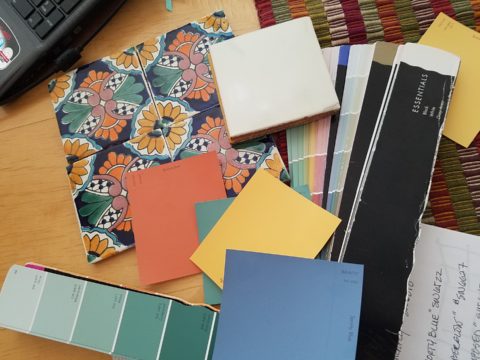
The couple with the second home had history in Hawaii and wanted a beachy, fresh theme for their new desert home. The flooring was a mottled light brown glazed tile and we selected a noticeably light, subtle sand colored wall paint to contrast and POP the existing off-white doors and trim throughout the home. Accents in recessed niches and doorways will become a soft turquoise while an interior laundry room gets a splash of citrusy yellow. The layers of color will be visible from different angles and vantage points. With the golden oak kitchen cabinets being painted out to match the existing off-white trim – the scheme will be fresh and beachy! Their artwork presents these colors and will being their personal touch to the arrangements. Watch for this project in coming weeks.

Do you have ideas about certain features in your interior that do not quite seem to come together? Do you feel the need to refresh? Are you looking for a new color scheme? Please do not be afraid of color and do not be confused about current trends. White and grey is a soothing combination. Trimmed with black, you get a defined contrast. Insert organic greens and the combination is sharp and now – and yet potentially timeless. HOWEVER – colors too have their place and selecting those and their combination that will speak to today and not be out-of-style tomorrow, as certain trending combinations might – select colors to compliment your context.

Here are a few other Patti Says blogs and PATRICIAN DESIGN projects about color selection:

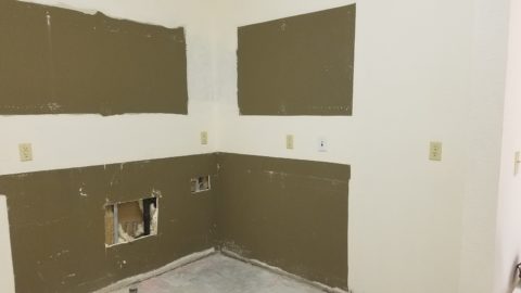
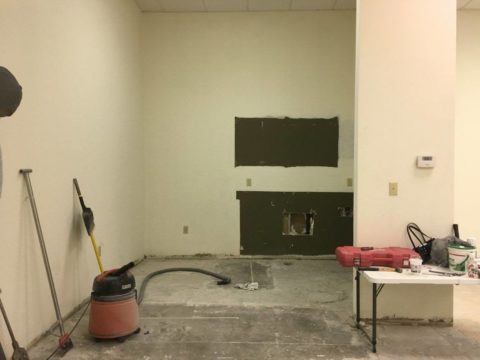
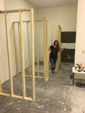
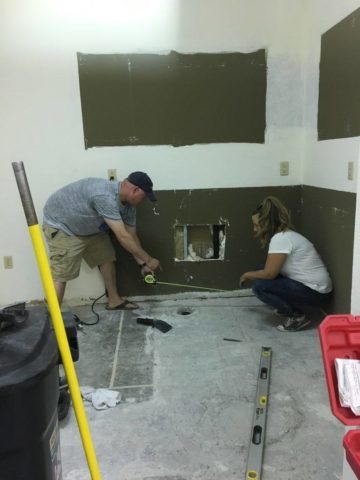
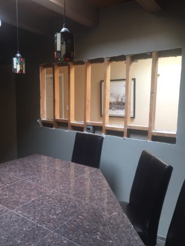
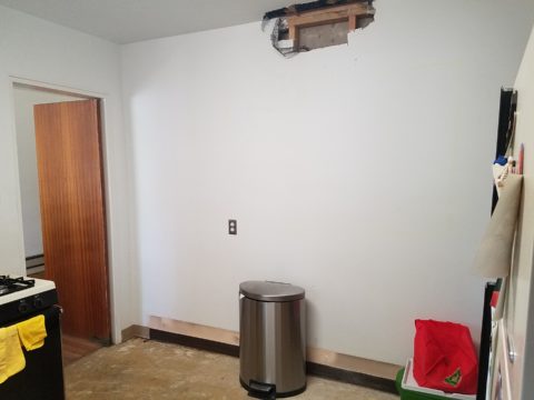
KEMP BEFORES  https://patriciandesign.com/rejuvenate-and-expand-your-interior-spaces-by-opening-walls/

Friends Don’t let friends pick paint colors  https://patriciandesign.com/5677-2/

Johnson’s PHX https://patriciandesign.com/spanish-style-brings-interior-spice/

Color forcasting  https://patriciandesign.com/color-schemes-and-the-complex-simplicity-of-it-all/

Bay area bungalow https://patriciandesign.com/project/bay-area-bungalow/

Celebrate the LOVE of COLOR!!!!!!!!!!

Discovering Extraordinary Ambiance on the Side of a Dusty Road.

After experiencing and pondering the value of incorporating nature’s elements into architectural planning in the previous blog, I find myself winding into the countryside from sea level to a mile high into jungles and ultimately pine forests, across vast expanses of rivers and towering bridges spanning grand abysses…and stopping at a modest panaderia (bakery) on the side of the road.

You can’t tell a book by its cover as this simple little rural structure – standing alone – looked curiously intriguing and quaint enough, with an unpaved parking area transitioning to well-tended pea-gravel. Traffic cruised by, on the way across the bridge.

Those that knew, turned in. We pulled off the road and were told that this couple had a wonderful bakery and were promised an exceptional treat! Fresh empanadas that would bring remarkably satisfying mid-morning joy.

Very tidy and thoughtfully eclectic, this little destination bakery is a precious find.

Oh, were we in for a surprise! At the entry, I stopped to shoot the whimsical cup of coffee mosaic set in a field of stone and concrete. I thought – what a fun design element to greet arrivals and set the stage. But I had no idea to what extent I was about to be elated. What unfolded so exceeded my expectations that I wanted to stay all day!!!

Happy stone and tile-work adorned the pathways. From the textures of stone and brick, tile and wood – it was an organic fantasy – an unexpected design experience.

Simple, yet spectacular – simply spectacular!!!!!

 Ceilings of colorful floral blooms – perhaps wisteria – suspended from their vines and other plantings intertwined with the structure.

Spotless and meticulous the eclectic elements were a harmonious creation.
Stone walls, wooden slats, vines and adobe all worked together to define the spaces.

 The wafting aroma of fresh baked goods – it was more than delightful.  From warm savory clouds with mushroom filling and another with chile-laced sausages – and an array of sweet strawberry, cream and pineapple empanadas to corn muffins, banana muffins and more! All nestled beneath colorfully woven cotton tablecloths.

Light and delicious – the best empanadas ever!! With a tiny sprinkles of granulated sugar, for a sweet crunch, before sinking into the fabulous fillings! Muffins challenged any others and savory treats were so satisfyingly delectable. Little buttons of banana slices on top denoted which were the banana muffins!!

Rich Mexican coffee with a touch of freshly ground cinnamon and luscious hot chocolate were served in custom-glazed “barro ware” complimenting the fresh-from-the-oven confections.

The exhibition baking kitchen overlooked the serving line. The buffet of pastries thoughtfully explained by our gracious and welcoming host, Jesus!

Carmen presents fresh strawberry tarts just from the oven!!!
A combination of old and new – tradition and technology meet in this cozy kitchen.

Fragmented spaces open, yet enclosed, offered intimate pockets in which to pause and enjoy.

Color-pops insert themselves effectively around the interior and exterior spaces.
Inviting seating areas semi-concealed offer private repose.
Tucked away – more areas to enjoy…

Clever use of clean blond wood shavings on the floor of the main covered patio created a wall-to-wall carpet of fresh aromatics complimenting the inviting aromas emitted from the ovens.  Rocking chairs and rigid sturdy versions, with a fun little rope swing, all surrounded  by tropical plantings made a cozy area to gather.

Soft underfoot and subtly fragrant – the wood chips make a great shag carpet!!!

As I meandered around exploring all the interesting spaces, textures, colors and plantings, I marveled at the sensitivity with which this had all been crafted and assembled. It was artful interior design with an exterior feel – open air and charming, with a decidedly handcrafted, Mexican sense of place.

Slices of handsome tree trunks make perfect stepping “stones” with graduated heights.

It was an eclectic collage of furniture, structure and organics – living and static – that was welcoming and artful, delightful and so pleasing, that it was a treat for all the senses.

The cool morning air of the mountains mingled, with the comforting fragrances, creating an atmosphere inviting gentle conversations of people gathered around good food and artfully relaxed surroundings.  

Peek in places and through doorways to find worlds of design waiting to be discovered!!!

Back to School: 10 Pro-tips for Setting Up a Dorm Room

It’s that time again…the end of summer and getting kids back to school…exciting, hectic, a bit stressful and today, very nostalgic. I (who saves everything) still have my little black and white Sony TV, embroidered fiber art that hung on my wall, floral twin bed sheets and bath towels! I remember the white chenille bedspreads that I got – giving one to my bestie/roommate so we’d match – even though she was a red accent person and I chose blues and greens!! We picked each other, our college and designed our neat and tidy package.

Earlier this weekend, as Victoria navigated this information highway that is the lead-up to getting her dorm room assignment, roommate and all the related details, she texted her yet-to-meet roomie and asked what her color scheme was going to be. Victoria, having established her pink (dusty rose) and grey scheme last fall upon entering her freshman year elsewhere, was hoping that she was not going to have to share her intimate space with a shocking orange scheme or similarly discordant color. All of a sudden, from the back seat came a exclamation – “NO Way!” To what, we asked  – “What?”  And she said “Guess what her color scheme is? Pink and Grey!!! YAY!!! What were the chances?”

Well, strolling through the stores with their piles of offerings displayed in tempting color-coordinated arrangements, pink and grey still carries over from last fall in a big way – so the chances, it seems, were not all that far-fetched!! LOL.

With the prominent pink and grey,  popular turquoise and grey and for the boys (if we are being color/gender-esque) black and grey – seems grey is the common denominator facilitating merchandising and keeping everyone in color-trend order.

Pro-tip #1 Make a list of what you’ll need prior to hitting the stores with their limitless temptations for dorm decor! It can be daunting if you go shopping – cold. It can be daunting anyway – but best to attempt to be prepared! As I looked around all the displays leading these trends…leading these kids…I wondered how many – if any – might veer off course and pick an orange and lime green  theme or brilliant cherry red…and what does it say about one if they buck the established trends?  Some might be oblivious to the trends – despite being bombarded in every store by the “must have” selections. Those independent thinkers who like what they like – if it matches or not.  The eclectic ones who are driven by memories, personal expression and acquisitions gathered and honed over the years that were not guided by trending decor influencers.

However, it is entirely possible to genuinely LOVE the trends and invest in the colors for more than the first semester of eager dorm room decor! We were living it! What was purchased last fall was saved and expanded upon, with new-found knowledge of the tips learned from the pros! There are boxes, bins, rugs, lamps, staplers, desk organizers, linens, bulletin boards, throw pillows, blankets and throws – all color coordinated making the job relatively easy and swift.  

The stores are prepared. Welcoming students – their signs are out and their shelves are stocked! Rows of pillows, mattress covers, foam pads, artsy accessories and accents galore…all to enhance the otherwise bare rooms that will soon come to life!

The morning of the move, they staggered the move-in time to insure an orderly point of arrival and processing to the rooms. We were assigned 9:30 and met curbside by a handsome posse of volunteer boys who were armed with rolling cartons cleverly created using carpet-wrapped moving dollies upon which were mounted large, sturdy cardboard cartons. These rolling bins were piled high with contents from the cars and wheeled into the dorm rooms with efficiency. Co-eds in red t-shirts identified them as the RA staff – the ones with the answers to all of your questions.

Being organized is key. Victoria had benefit of a previous semester where she watched the pros and got their tips! Pro-tip #2  Be organized!

To that end, utilize your limited space to the max! Capture all available real estate! Pro-tip #3  Bed risers. The beds are high – high enough to stack storage drawers/bins beneath them. They can be raised even higher with risers. Pro-tip #4 The plastic stacking drawers are cool because they make easy access to contents just like added dresser storage space.

Victoria had it all figured out. Pro-tip #5 To consolidate luggage, she packed a lot of her clothes in the bins – all in very specific order and folded making it easy to transfer once in the room.

Once in the room, she raised the bed even higher on 4 cone-shaped plastic riser units that she had purchased. She then placed her new mini frig (Pro-tip #6 Get a mini frig) and bins beneath the bed in an organized fashion. She emptied the bins one-by-one into the chest of drawers thereby freeing the bins for other supplies such as snacks, kitchen supplies and miscellaneous other necessities.

Having a mini frig in the room keeps personal perishables under control and handy instead of having to label things in the shared frig down the hall.

Pro-tip #7 Take extension cords and multi-plug surge protectors. This was handy for the reading lamp waaaaay up high above the now super high bed and also to run power to the mini frig. You can never have enough power sources and another bonus was that one of the set of four bed-riser units had power outlets and a short cord!

Pro-tip #8 Get a collapsible shoe rack/shelf (for ease of storage and transport). They have nifty wooden ones – but we took ours back as the closet had a tidy set of built-in shelves perfect for shoes.

Once the power was all connected and the bins organized clothes put away, it was time to make the bed and add the finishing touches.

It was beginning to look like a home-away-from-home! Pro-tip #9 With hanging implements that will not harm the wall like Command Strips, the walls will gradually come to life with strings of photos clipped with clothes pins, twinkly lights, bulletin boards and other imagery.

 Pro-tip #10 Take photos – the memories are priceless!!!!!!

Still crazy after all these years…..

Thanks Sam, for the memories!!!!!

Remodeling Process and Presenting the Same Accessories in the New Scheme

It’s true. If you think designer’s projects go more smoothly than the ones they do with and for you, you’re wrong. It’s true – they don’t! It’s about Murphy’s Law and I have been remodeling our master bath for months. Starting in November and as recently as this weekend personally installing (DIY) the stone surrounding our mirror, it is still not finished. But it’s close.

The full-wall mirror was re-used. During the removal and transportation to be cut-down, the edge cracked and had to be cut down…we lost an inch or so – no big deal EXCEPT that it then affected the dimensions of the new stone surround that had already been determined. Oh well…we now will have to cut the tile – had intended not to have to do that. One of the many little surprises and delays. We had to order more stone and will now engage the installer to cut the ones that would not fit the new and slightly non-parallel conditions .

It’s actually fun to tile…until you have to cut it. It is like frosting a cookie and then pressing it onto the wall. It goes quickly and gives instant gratification. But when things are not perfectly parallel, something has to give. That’s when we cut. (Or call someone to cut!!!)

The effect, of having almost all of the mirror surround finished, gets us that much closer. The effect is great and is beginning to feel like the intended design.

The shower before and after is providing the open expansive look that our little shower enclosure didn’t provide. Despite the facts that the footprint is nearly the same and the old enclosure was all clear glass – albeit framed in gold finished aluminum – this new single panel of 1/2″ clear glass and white-on-white floor and walls looks clean and open. Not a snail design – but, no door. Prepared to add a white shower curtain on a custom curved aluminum ceiling track once winter returns – but for now we’re enjoying the refreshing and comfortable atmosphere.

We elected to use stacked stone on the rear wall of the shower as our house sits at the base of the majestic Sandia Mountain and selecting stone seemed more grounded and contextual than other decorative options – of which there are a million from printed concrete, glass mosaic, embossed porcelains…the list goes on…

Decorative elements are beginning to “read” against the new finishes. The same Portuguese ceramic footed rectangular container holds a bouquet of white washcloths. Yes, I think that the rolled terry towels look like rosebuds and I have always enjoyed the softening effect they provide amidst all the other hard surfaces. Plus they are handy on the countertop for clean replacements.

Footed Italian porcelain has had wash cloths in it for years and stays on the new counter top in a slightly different location.

Behind the terry rosettes, notice the pair of Heisey open and lidded pair of stemmed glass vessels that I use for make-up brushes and cotton balls respectively.

The same crystal wide-mouth vase holds and dispenses the facial tissues. I love the effect of the white-on-white coiled folds of the tissues. They are soft and read interestingly through the cut crystal.

I’m a LEO and find myself discovering and enjoying subtle references to lions. Our front door knocker and this cache pot that I’ve had for over 20 years as examples.

Nothing in this new scene is new. These accessories are all the exact items that were scattered on the countertop previously! Funny how the exact same decorative accessories work so well in this new interior!

A silly little collection of found things in a family inherited vintage pressed glass bowl including a glass marble, square frosted glass coke-bottle-colored mosaic tile, various sea shells and fragments, a squashed bottle Coca Cola bottle cap from Mexico, a hemp cord DIY necklace with a shell pendant…

Another glass tray that was also on the previous countertop presents my fragrances, a few products, a bobble-head turtle, my Waterford ring stand stacked with costume glass rings, my tragic, yet miraculous jade bracelet (save for another story), a fossilized bone – in – stone I found as a child, my  white framed sunglasses which might seem selected for the new color scheme – when, in fact, they are a result of my love for white framed glasses and these that I bought even though I didn’t like the would-be “reader” small lenses – I kept. I don’t like the way they look on – so have relegated them to the master bath for emergency dashes to the outdoors, on the upstairs deck when my other sunglasses are downstairs!

Still to complete…the stone mirror surround, hang the glass shade for the new pendant light fixture, install the towel/robe plugs, install the polished chrome drawer bar handles to match the new square door and drawer pulls, clear all the remaining stone pieces, thin-set and grout bags and boxes from the tub deck, install the new window sills…

Re-evaluate your existing accessories (and/or furniture) before feeling the need to change everything when you remodel. Watch for the completed before and after shots of this remodel soon to come. Well, relatively soon!!

Patience and Reward for Design Processes

Patience. Good design requires patience. Do you have it? The design process can either take the route of “all planned before anything starts” (everything drawn and detailed, all finishes selected, all fixtures and furnishings, fabrics and accessories decided and specified, for perfect inclusion into the design) or the process of “design-as-you-go”. The “all planned” design process allows for exact pricing and budget planning. But if the process takes too long, some of the things specified might no longer be available – that has happened more than once! The other “design-as-you-go process” is more random.  There can be and often is a combination of these two approaches, but the second requires more patience and less precisely scheduled time.

The luxury  of  time, experimentation, trial and error, wait and see, what if, all are elements of the “design-as-you-go” process. It is decidedly the more fun and more participatory process. It starts and evolves before your very eyes, with the in-the-field options, to change, modify, massage, delete, add, think and re-think, all available while the action takes place, it is like creating an art piece one stroke at a time. Artistic expression rarely progresses in a straight line.

All of the above can be said of the pre-planning process too. You can illustrate, render, draft, erase, alter and change all the while – but you are doing it prior to commitment, prior to actually  seeing the actual design unfold in real time.

Changes and additions can arrest the process – whether in pre-construction planning or live-in-the-field. However, live-in-the-field is much more int-eruptive and possibly costly. Changes and additions can cause scheduling delays which can domino throughout the otherwise planned program. This can result in not only cost considerations, but disarray and a prolonged inability to use the space.

As I visited one of two parallel kitchen remodels nearing completion  that I have previously mentioned, the owner mused “It’s a painful process.” But as we stand there enjoying the transformation he continues “It is almost hard to remember all the phases we’ve been through to get here. Kind of like childbirth.” We laughed at the fact that the world would be filled with “only children” as no mother in their right mind would go through that pain again!! He and I both never having experienced it for ourselves – yet, “they say” that it’s true. All very much worth it in the end!!!  The ultimate reward!

This BEFORE shot of this kitchen shows dated, anemic face-framed radius flat panel cabinets, granite tile counter-tops and back-splash.


Not quite finished, cabinet pulls are being installed, final painting details are underway and the transformation is being unveiled. New cabinet doors add a classic raised panel detail painted white, with new concrete-like engineered Italian counter-tops, and striking Talavera tile back-splash punctuated with mini mosaic Spanish tile accents. A new window opens to the outside patio with the counter-top passing through and the window closing directly on the top.

Residential design – those private, personal spaces always involve knitted brows, vacillation, additional worry and more indecision than commercial designs. Not to say that commercial designs don’t involve interested parties, if not actual owners, the investment in the personal pocketbook and  personal emotion is not the same. Furthermore, there are greater personal thrills and disappointments in the residential projects.

Well, back to patience. It’s a virtue and I often struggle to practice it. I tend to be overly eager for instant gratification.  But patience is very important when creating something of value and timeless appeal.

Design takes patience during the various stages of design details. We are not talking about building a rocket ship – but imagine the design and engineering required for that!. Let’s just talk about something simple, like custom drapery rods. The client thinks – fast and easy. While on vacay they experience a lovely accommodation that features hand-forged drapery  rods. “Cool” they say. Filing that away among their thoughts of interesting interior details. A couple of weeks later, they are in front of an art booth and meet an iron-worker who offers all manner of custom iron work. So they recall the cool drapery rods and inquire as to whether he would do something like they described. “Sure,” he sings and whips out his portfolio of photos among which are very cool twisted iron drapery rods with swirly finials adorning the ends. They’re sold! They invite him over to see their windows and get started. At this point, their interior designer knows nothing of this idea or the contact and engagement.

Remember, they are thinking fast and easy. So they expose their idea and plan that is already underway asking their interior designer on advice for drapery fabric.  With this opening, the designer asks about the rods. Come to find, they aren’t sure how far past the windows they have been measured to go, they haven’t considered that the 5/8″ solid stock might want to sag after a while spanning 8 feet and they have no idea how they are going to hang the draperies…”Oh” we need rings?  So it seems that the conversation with the iron-worker has been rather cursory. Questions that needed to be asked and answered at the outset had not been thoroughly considered.

Fortunately, these details will now be addressed, issues solved and finished product all as it should be with proper extension past the actual window opening, matching rings to the iron rods, and a stout enough rod so as not to require a center support – an element to be avoided if at all possible. Whew – caught that one before it was too late!! (Watch for the installation of the hand-forged rods and custom draperies in the next few weeks).

Paint colors often wait until other decisions are made. I have mentioned previously that we usually pick things that have fewer options. There are more paint colors than anything else in our design world with fewer fabrics and even fewer rugs. In that order, we might pick the rug first, fabrics to build upon it and paint colors to bring it all together. Not necessarily – but that is a pretty good example.

Starting with an existing hardwood floors well preserved by decades of wall-to-wall carpeting, we discussed the desire to create a colorfully transforming interior and opening of the space to better connect the kitchen with the living area.


As we met to hang artwork, discuss iron drapery rods, custom chandelier and finishing touches, the clients remarked that this was so exciting to be nearing the end of this dramatically colorful transformation that so nearly has transported them back to Guatemala where so many fond memories have been established over the years.

Well, back to patience. It’s a virtue and I often struggle to practice it. I tend to be overly eager for instant gratification.  But patience is very important when creating something of value and timeless appeal.  Go forth and design your dreams with all the patience to make them come true!


Entrepreneurs! Getting Started with Design!

Starting out with your first brick and mortar business, the tasks are many. After homing in on your business specifics, selecting a name, designing a logo, deciding colors…you have your license and your business plan, you’ve found a place and then you need to present your business to the world!

A few weeks ago, we began a new project that is just what I have described…an exciting first-timer in the business world, having worked for others is now ready to do her own thing, be her own boss, make her own decisions and assume the risks necessary to take this leap into entrepreneurial adventure.

It’s exciting and scary, daunting at times and fun too. And it should be fun. Finding something that you enjoy, something you believe in and believe that you can do as well as, if not (hopefully) better than, anyone else in your market.

With inventory determined, name and logo designed the last task was to create the space to present her concept. We won’t divulge that today, the project is yet to be presented, but the framework is on what I want to comment.

We began compiling some finish options…paint, upholstery, privacy curtains, carpet and a little brushed aluminum bling!! We want to reinforce her brand with key colors and finishes.

Knowing the terms of the lease agreement – what is the landlord’s responsibility, what is grandfathered-in, what can be changed, any spending allowances amortized into the lease…these are all things that are necessary to determine how to go about designing the interior. It is necessary to establish costs within the over-all start-up budget. Having helpful, knowledgeable, creative people around you with whom to assemble your team is imperative.

We arrived at the site to find a very clean slate. Located in a retail strip center, it was a white box.

We instantly decided the flooring would be a combination of polished concrete and broadloom carpeting, some lights stay and some go, spots will be added, colors will reinforce her brand.

Toward the back, a break-room kitchen area needed demolition. This pocket would become fitting rooms.

There was existing ceramic tile on the floor that also needed to be removed. These were things that our client could attack herself – saving money and getting to know her space.

We learned that the restrooms were grandfathered in and did not require any additional improvements – other than cosmetic.

We learned that we could make changes and additions to the lights and only needed a permit for electrical portion of the work.

Many of these discoveries were of pleasant surprise to our client who had been miss-directed a bit and was in a state of frustration and near defeat. Gathering good information is imperative, in order to save time and money, make good decisions and know your options. Get out there and get busy!!!!!

Soon to bee completed, watch for this transformation in coming weeks.

Young Family Prioritizes Remodel

We all know that traditional housing floor plans are changing to maximize smaller footprints. The result is a more open layout. This preference, often seen in “loft” design where warehouse space is converted to living spaces – without many walls and with an eye on the interestingly industrial finishes of the existing space.  But this same concept applies to new home construction for starters or down-sizing to smaller homes and is definitely applicable in remodels of existing traditionally compartmentalized plans.

Lifestyles too have opened kitchens. Although often to maximize smaller spaces, they are also more open as cooking is more celebrated in the home and related activities are shared.  Kitchens have truly become the fulcrum of family life. So when this young  couple purchased their first home, the vintage 1960s split-level plan was not quite right.

The kitchen was a narrow galley-style tucked into a rear corner of the main floor. And although it had recently been remodeled, it was confining and not conducive to entertaining and growing a family.

The point of arrival was an open space with entry wall about 12-15 feet from the front door. To the right, the living room had a focal fireplace and the adjacent dining room made an “L” back to where the kitchen was tucked behind that previously mentioned entry wall.

So this progressive young couple thought way beyond merely  opening the wall creating a pass-through bar to better connect the kitchen to the living spaces. No, they said ” Let’s blast this baby out of here!” And with that they proceeded to visualize the point of arrival being the actual kitchen in full-view as guests arrived. Hello!!!!!

The former kitchen containment was revealed to present the new elongated welcoming bar counter-top, luminous glass pendants and supplemental recessed down lights, to meet and greet all who pass through their front door! Original hardwood floors were refinished in a dark walnut stain.

Their priorities were to create a larger, more functional kitchen with a clean, modern look and feel while making all open to better interact with their soon-to-arrive baby!

The clean white on white finishes in the kitchen are fresh and crisp. Lest you think they saved and added to existing cabinets, they did not – all cabinets are new!

And this might be considered gilding the lily, but we added a splash of artistic expression when we hand-painted the small squares in the new brushed stainless cabinet pulls to give them a bit of extra pizzazz!!!

By using the Carrara mosaic as a wall-covering, rather than merely a back-splash, the walls get a truly finished built-environment “read.”

The upper bar counter-top bows at bar-level to offer a more comfortable conversation scene.

The living room became a cozy sitting area off this wonderfully open kitchen and dining area.

Existing brick walls were softened with a grey-taupe to contrast with the white trim making it POP!

The fireplace now has a complimentary new Carrara mosaic in a diamond pattern to coordinate with the new herringbone mosaic of the kitchen wall.

And baby accoutrements adds colorful animation to the beautifully finished scene!

“HELLO!” they say. “Welcome to our beautiful new home!”


A Tale of Two Kitchens

Often with remodeling…it’s both the best of times as the anticipation for the exciting transitions is ignited, but since it takes “breaking an egg to make an omelet”, it is often the worst of times too as the demolition and displacement begins. Thank you Mr. Dickens, you set forth a mastery of profoundly conflicting opposites that I have used here which describe so many design project experiences so well.

Currently, in our shop, we are designing almost parallel kitchens. They are at nearly identical beginning stages. The owners share little in common, if anything, except perhaps the age of their homes. The sizes are similar, yet one is a bit larger offering different options for design consideration.

Both kitchens had been remodeled, from their originals, somewhere in the 70s and possibly 80s. One installed traditional drop-panel golden-oak with a curvy valance over the sink.

Brilliant blue paint to come will transform these re-purposed/salvaged cabinets with new personality!

The other flat panel radius corners for a “modern” look – also in lighter bleached oak.

Each set of cabinets were in good condition opening the conversation to salvage versus replace. Certainly we encounter cabinets that have been destroyed by hard use and neglect, but when the boxes are reasonably well constructed – or enough so that some reinforcement will enhance their weight-bearing and usability qualities, we often take the route of refurbishing. (NOTE: As a DIY, this requires much research to insure that a new finish will be flawless, durable and easy to maintain.)

The beginning for each project propelled forward with distinctly different ideas. One to follow the original character of the home’s raised panels painted white doors and trim throughout, the other seeking an entire transformation to a multi-colored fiesta of fun!

Mexican Talavera tile with Mexican terracotta Saltillo for the kitchen floor adjacent to white oak narrow plank original tongue and groove floor recently unveiled from beneath wall-to-wall carpeting.

Now that’s not to say that the more traditional soon-to-be white, raised panel kitchen will not be full of fun – as it will ultimately have a “party pass-through” connecting the kitchen through to the patio beyond and counter-top that transitions seamlessly from the sink area inside straight out to a party bar! A custom-sized double-hung window will open the scene in the warm weather months. We know that it’s going to be classic with a tremendous twist of fun!!!

The patio level is a step down. The kitchen counter inside will flow through a new window that is lower – opening directly on the countertop surface – providing bar height outside.

Both kitchens are being “opened” by removing portions of walls which have isolated them in years past. By removing the walls, additional daylight will be evident, a perceive expansion of the space will be realized and a connectivity to the other living areas for personal and entertaining enjoyment will become a reality.

Breaking through to daylight from the hallway skylight – adds not only light, but incredible depth and dimension!!


This is soon to open into the living room and large picture window beyond – a peak at the mountain will be an added reward.

A bit of structural modification to both are resulting in minor delays for permitting processes – other aspects of the work will continue, in the meanwhile, like the continued selection of finish materials, lighting fixtures and cabinet modifications.

In both cases we have discussed the design challenge of existing materials. I have found over the years that often, when confronted with existing conditions you might not have set-forth to include, they add character and an element of unselfconscious cool-ness. It occurs when certain conditions or materials are in place that you might not have chosen or planned into the design. Designs from scratch, that are too well coordinated or too perfectly planned, can lack that element of surprise or unexpected interest.

The first home had slate tile floors with a unusual mottling of colors leading with a cool aqua and including charcoal grays, smoky blues, ochre and rusty tones.

The other inherited period hollow mahogany doors all trimmed with white molding and original cabinetry. Do we paint them white – which would be the customary response or leave them and invite that element of “oh you kept these doors?”

In this second example it would be easy to “neutralize,” if not replace, the dated doors. However, the homeowner, having many fond experiences in Guatemala, appreciated the great condition of the tropical wood, grain and finish – so we will start without painting them and re-evaluate down the line as the new colors and finishes splash their celebration over the scene. As the transformation takes place, the decision regarding the doors can be re-evaluated.

This is a prime example of the design process. Often there are elements on a project that are a puzzlement. The great thing is that often the decision to remove, modify or leave unchanged can wait until the scene evolves. If you have the luxury to design as you go, you will have more opportunities to consider context, contrast, new options etc…that are often obscured by the overwhelming and often daunting task of visualizing the finished product.

Sharing the same vision is one of the hardest aspects of the design process. Full color architectural renderings, illustrations and even sketches go a long way in conveying the intent, but no two people see exactly the same thing through their mind’s eye.  During these preliminary stages of design concepts, nebulous ideas and imagined finished products, the opportunities for misconception are great.

I remember a hospital project many years ago where the head nurse was wincing at our suggestion of maple cabinets, headboards and other carpentry details. She kept quiet, but we (the design team) kept hearing rumors that she loved the color scheme, direction of the interior design and all of its architectural interest and design finishes, yet she could not embrace our suggestion of maple cabinets. One afternoon once we had gathered the materials for a touchy-feely presentation of color boards and tangible design elements, she had this incredibly surprised expression and exclaimed that she had never seen maple that color – it was natural – like a blond, wood, basketball floor. She further explained that she “pictured” the dark reddish Ethan Allen maple furniture of her childhood in her grandmother’s house. Needless to say, she had been having great difficulty accepting its inclusion into a design scheme of smoky lavenders, pastel clay tones, creamy whites, warm terra cottas and maple wood (in our mind’s eye – natural – and in hers, what she always thought was natural maple – dark reddish brown!!).

Communication is a powerful tool… often major decisions, opinions and actions can result in miscues due to miscommunications. To avoid such misunderstandings take care to provide thorough explanations along with tangible samples and other visual aids.

As we progress with these two kitchen remodels, we look forward to dramatic transformations, exciting phases of design work, some anxious anticipation, and ultimately four happy clients each enjoying their personal spaces, reflecting their lifestyle, home style and distinct personalities.  Watch for updates and before and after dazzlers!

Ten Tips on Mixing Metals – Making Sense of It All

How to mix and not mix metals….that is the question. Is it nobler to stick with one throughout or might I venture into a mix of metallic material? From switch plates to chandeliers, this question comes up all the time – and it’s fair. With all the options and the TRENDS saying one thing or another (probably to sell you something or to stand with a current trend fearful of venturing forth), it is a common dilemma. Here are a few tips to give you confidence in the  metal mixing mêlée.

  1. IF the door hinges are one thing – the handles should match. We often see pre-hung doors with brass hinges and a retro-fit of brush chrome or bronze – that is a no-no. 
  2. Is brass finish out – should I change all my hinges and door handles? In – out…no sooner does one hear that a finish is passé or they think they themselves are stuck with a less than new and trendy finish – be calm and carry on – to quote a couple of “trendy” phrases that drive me up a wall – it’s all good.
  3. If you have brass – embrace it! Fear not – it is all about the manner in which you present it – in what context you design with it. 
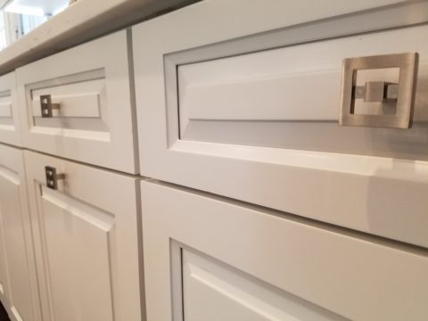
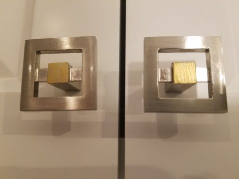
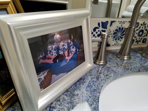
Following trends can be costly, unnecessary and unimaginative. Gold/brass finishes have been making a come-back in recent years. Sometimes it takes time for it to trickle into your purview. But the point is – good design is good design. So it’s not so much about if it is perceived to be good enough or right or wrong…it is if you can design around it and make it great. 
  4. Should you mix a bright brass chandelier with brushed stainless door hardware? Probably not, but it is not so much about the mixing – it is that to make something like that REALLY work, the overall design would have to be so intentionally mixed that it in itself (the intentional mixing) is an art-form. 
  5. If a kitchen has brushed chrome detailing (appliance trim, faucet, etc…), may I use brass cabinet pulls?  
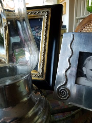
The answer is YES. In some contextual situations, the language of the materials speaks in vernaculars that separate certain groups from others as though allowed to be intentionally different – as they ARE different. 
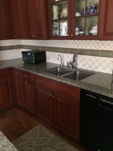
The great thing about knowing when to make statements in contrast – not conflict, is just that – knowing.
  6. The old world and contrasting contemporary look of Bronze, the stalwart wrought iron read of Black, the bling of Polished Chrome, the modern softening of the silver with Brushed Chrome or Stainless, the traditions and suggested opulence of Brass and Gold, the warm median balance of brushed nickel – guess what? They all have their place depending upon the context of design. 
  7. New finishes for appliances rule the kitchen. We thought we had it made when Sub Zero and others offered slots for panels for the fronts of appliances to enable matching of the flanking cabinets. But for those who wanted off-the-shelf units, beyond the merry-go-round colors from harvest gold to avocado green, burnt orange to basic white – the colors of the past were challenged by bold black and brushed stainless finishes – the new fab. 
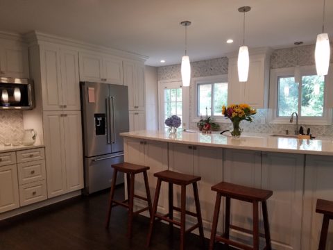
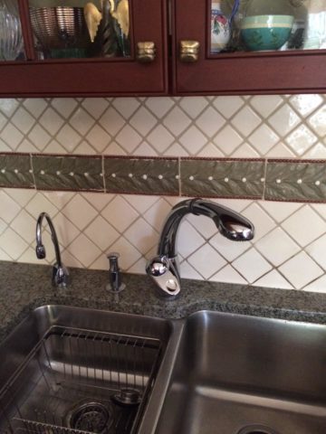
But now we are seeing matte black – and oh is that hot! Complimenting the concrete finishes and raw steel – contrasting with the brushed stainless – punctuating the trend of the clean commercial kitchen style of design. It is a bold yet soft new option for the edgy everyday kitchen.                                    http://www.foodandwine.com/cooking-techniques/look-these-beautiful-matte-black-major-appliances-refrigerator-ranges-ovens-and
  8. Ceiling fans present the same conundrum. Do they match the ceiling and go away? Do they hang suspended like a giant menacing propeller threatening to decapitate anyone who comes near? A black fan against a white ceiling might. A bronze fan in the middle of everything might appear a bit top-heavy. Ceiling height makes a difference. Surrounding decor makes a huge difference. Whether it is to be noticed or quietly disrupt the air for refreshing breezes without screaming their source – those are compelling questions. I cannot even address whether it should match the door handles – it makes me crazy. Unless it is an intentional focal point – like palm-frond paddles in a tropical bar – or industrial mechanisms intended to further that contextual theme, I think nearly all of them should visually go away.  Who wants the focal point of a room to be a fan centered and suspended from the ceiling to hover overhead and command the visual impact of a nose-diving airplane? Unless of course – that is the theme.  The fan designers would argue.

    Oh my – brass, chrome, bronze…where is the focal point? My eyes are darting everywhere!

  9. Fireplace grills…often found in polished brass – they can stay or be painted out – with a flat black that makes them fade into the void of the opening or simulate a cast-iron grate. They can be painted with a faux-rust finish – there are many possibilities – maybe even fire-engine red. The point is, once again, it is the context that makes it successful or appropriate – there is really no right or wrong answer here. 
  10. Tip # 10 is to take each offered finish as it comes, evaluate the context, find your focal point(s), what is the most cost-effective to change? All the door handles and hinges or the light fixture over the dining table? I say it in so many blogs…do not let trends rule your life. Have confidence in your own likes and comfort and go with it – good design never goes out of style. 
  11. BONUS TIP!! Do all my picture frames have to be the same finish? Do I have to re-frame my gold frames or change my maple to chrome or go black on all of them?  
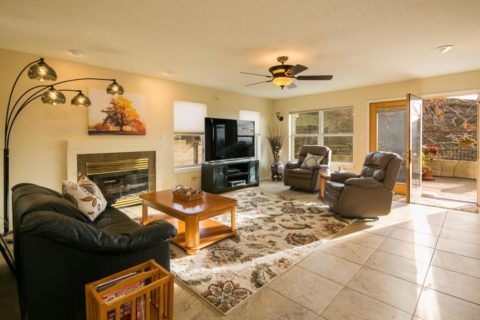
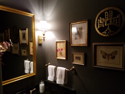
Have I ever mentioned context? Eclectic mixes can be quite fun and interesting.  
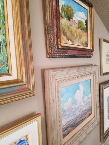
Groupings of identical moldings can be effective.    Random pieces scattered throughout can each be singularly nice. So don’t rush out and re-frame all your art. See how you intend to use it, group it, where and with what else. Be sensible and creative – be brave and do what you like! That makes sense!!!!!


Remodeling? How to Embrace Existing Conditions – Celebrate the Story

This happening scene provided fabulous fodder, to observe existing conditions being incorporated into a design, for great benefit on many levels. Applicable to all remodel projects – see what you think!

In this case, Night Club design. The styles are many, but the concept is of a  commonality comprised of a few basic functions – a fun place to socialize, meet people and enjoy the entertainment of the overall scene often including live performances. We probably all picture the image of a flashy, glitzy environment.

We were recently in a most unusual space that combined the glitz and bling you might expect with a “nightclub” atmosphere, but juxtaposed with rustic finishes that were unique to the original architecture. This brick expressed in some of the remaining structural elements – walls and column/arched spans of structure – was warm and rich providing an unexpected pleasing combination that so easily might have been eliminated – concealed behind slick new finishes.

To play-up the vintage aspects of the space, ornate traditional chandeliers were suspended amidst myriad dangling strands of sparkling, golden LED lights. These provided a glittering glow of ambient light in the upper reaches of the space effecting both the downstairs and upper level of the club. This mixed lighting treatment was obviously the eye-catching  emphasis of the interior.

Ample light was provided by the luminous chandeliers and thousands of dangling LED pin-dot lights along with the indirect lighting of the back-bar shelves. Therefore, the large steel domes that hung suspended over the bar needed not to contribute ambient light, but were limited to effectively cast direct downward light on the bar surface. Their golden interiors provided a warm glow while the exterior surface disappeared into the darkness.

The bar was quite simple and raw, yet read in enough of an interesting and complex fashion, to compliment the scene. The design was sufficient in its components and indirect lighting worked well with all the other design decisions.

The simple Tolix-styled stools were an understated easy fit with the other surprisingly raw materials of the bar.

To answer the need for friendly group conversations, there were comfortable places to gather with zoned seating areas of tufted leather sofas and leopard-patterned rugs,  wooden grouping tables, then hi-top tables with stools and finally barstools along the length of the bar. The various areas provided options for patrons to pick the most inviting or appropriate spot to enjoy the atmosphere with friends.

Having choices in any hospitality setting is invaluable. It allows the patrons to make their own decision how best to utilize and enjoy the space. It answers different needs and appeals to different people for different reasons, therefore inviting a variety of patrons to invest their time and money in the establishment. A broader reach of clientele.  A broader client base.

I’ve mentioned more than once that having restroom design follow the theme and quality, of the rest of the interior, is imperative. As it relates to night clubs, it is often the meeting-ground for dating, meeting new people, attracting new people and therefore,  the restroom should promote attractive feelings of approval and confidence in the guests.

Jazzing up the restrooms in keeping with the jazzy feeling of the club environment should be a natural continuation of the design scheme. That means mirrors – full length – not merely above the sinks,  good lighting without down-lights to cast unappealing shadows on the guests.

Here the placement of sinks outside the restrooms frees up space in the stall areas, while adding interest to the extended restroom area. The design theme presents free-standing bureaus for the sink cabinets. Often shared sinks are used in these anti-room set-ups, but in this case opposing sides of the vestibule provided an attractive vanity area for men and a separate one for women.

What was so inspiring and interesting as we scanned the interior were the various zones all within this complex mix of original, traditional architectural elements and adding traditional if not vintage lighting fixtures paired with modern high-tech lighting effects and large brilliant monitors featuring exotic, playful, getaway beach videos. It worked.

Have you ever encountered a structure that at first glance did not comply with the supposed new program? Awkward supports, raw materials, exposed mechanical…so ,many “unfortunate” things to get in the way of your design. Often the “imagined” design over-rides the reality of the moment. The challenge is to allow the moment – the reality of the existing conditions – to participate in the process rather than being briskly eliminated without thorough consideration.

And the additional bonus might often be cost-savings and budget stretching while not betraying that benefit at expense of the finished design. Brilliant to have incorporated the “whatever it is” – wasn’t that creative and hence, interesting!! OK – I’ll take that!

To have concealed or negated the architecture would have been almost criminal – certainly a loss of architectural integrity and textural interest.

The crime of missing opportunities like the seemingly conflicting traditional elements with the need to be glitzy and modern is to be too one-directional . It’s like having “design-blinders” on that direct and focus a theme without recognizing the value of thoughtful salvage of  content, contrast and context.

All of what we observed applies to both residential and commercial design. The takeaway is to consider existing conditions and, if applicable, embrace them. Give thoughtful consideration to the opportunities before glossing over them, concealing them or eliminating them altogether. Try to appreciate the gifts that might escape you if you insist on unnecessarily hammering and manipulating a space into submission – design submission. Rather, let it tell a story and contribute to the design process – which would more than likely result in a more unique and creative end project for that thoughtful integration of the existing elements.