DIY…Do It Yourself Beachfront Getaways or DWI…Designing While Intoxicated!!

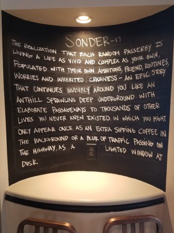
Not as the title suggests…tequila shots and all – but another kind of intoxication…an intoxication from unexpected beauty, sensory overload, inspiration as seen in the following photographs.

Those of you bundled up against the elements this time of year…freezing your booties off in the icy winter climes. Enjoy this escape into your unbridled imagination of design and lifestyle gone wild!

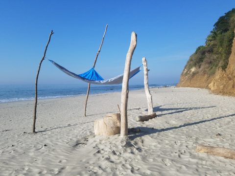
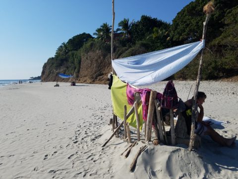
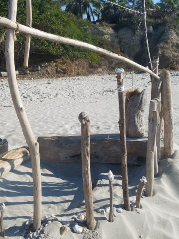
Thought a beachfront condo was out of reach? Think again. With all the DIY out there on the internet today, anything is possible. As evidenced by the inspiring framework of architecture that I have encountered just this week alone, consider the possibilities and have a little fun!!!

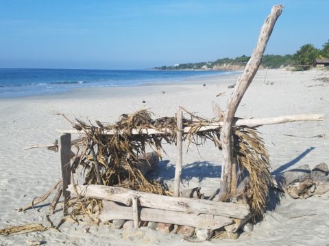
Very simple things trigger design concepts. Beyond the fascination I have had with these beach structures, this particular photo was bathed in late afternoon light. The glow of the orange towels was emitting a warmth that was so tropical, had it not been on a tropical beach, finding the same boldly colored and textured structure in a snow storm would have elicited a startling, contrasting feeling of the same tangible warmth.

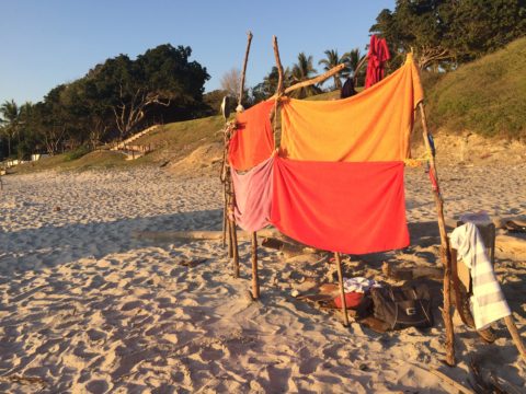
This make-shift west-facing beachfront was so beautiful, in its simplicity, that it spurred ideas of bold fresh color, basic found-material furniture possibilities, fabric design and organic architectural solutions for patios both commercial and residential.

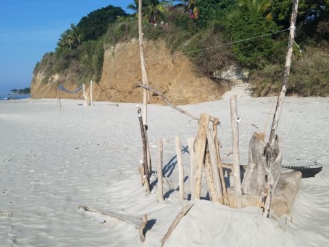
Imagine raw elements  incorporated  with concealed structural support to convey the feeling of spontaneous simplicity.

Then there’s that general calling that speaks to “the natural integrity of the materials.” You realize it is a grounding.  It is a starting point of reference to all the embellishments, layers, machinations and manipulations that are possible.

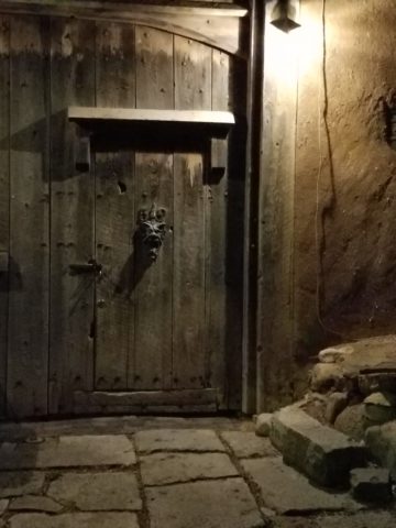
Wood is wood until it is stained, painted,  appliquéd…when does it lose its “natural integrity?”  Even raw, man-made cinder block – CMU – concrete masonry units have their own natural character. Then stained in the aggregate or applied color, thickly coated…it alters it’s state – losing its material’s natural integrity.

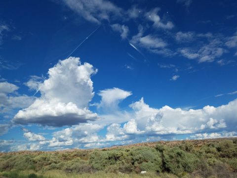
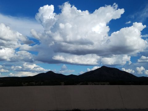
What ignites design thrills? The fireworks of ideas that burst onto the scene illuminating so much that was previously obscured. It doesn’t have to be a remote and seemingly inaccessible tropical beach…it’s everywhere. Look around. See texture and color, shape and frame. Urban, suburban and rural settings in any climate all offer inspiration that can be isolated and appreciated. Design inspiration can be intoxicating.

Why is designing so exciting? Why is it often such a rush? You never know when an idea will appear or from where.

The world around you is a constant stimulation of ideas, inspirations and possibilities. You are thirsty for  whatever is out there…whatever is waiting to be discovered, implemented… quench those longings.  It is all about the freedom to allow ideas to be spawned from anything around you or in intertwined with your own imagination.

What fun to have come upon these simple structures on a glorious and sparsely populated beach. What fanciful design ideas and story-lines were prompted by the imaginary occupants, their creativity, resourcefulness and problem-solving simplicity.  Lest you think they house the homeless adventurers, they are actually sun-shades for creative surfers and affluent sun-bathers seeking a primitive beach experience.

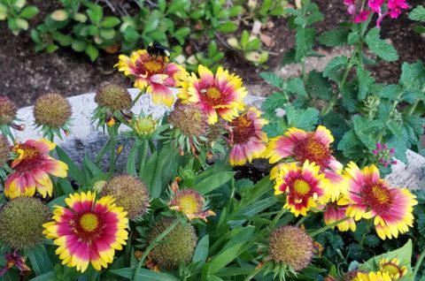
How might these primitive structural solutions play into a future project? Watch for design trends to incorporate more organic materials and nature’s inspirations!

I’m ready to explore the possibilities. Are YOU?

When is Too Much, Not Quite Enough?

Perhaps – when you are an avid collector, limitless treasure-hunter and lover of basic Americana (comprised of the appreciation of indelible graphic design and branding mixed with a healthy dose of green chile cheeseburgers, bodacious bbq and good fun) – it’s never enough! We’re in Hatch, New Mexico at Sparky’s once again!!!! The sensational roadside attraction – Sparky’s burger bastion MUST know when too much is not enough!

Nine and a half years ago Teako made a statement and the word has been spreading ever since!

The opening of this fun and funky establishment started out with a few outrageous signs and vintage mascots like the Colonel Saunders on a bench, Ronald McDonald as the un-official greeter

and a dedication to signature green chile cheeseburgers and mouthwatering bbq. Now both sides of the street (and scattered around town) are towering, larger-than-life icons of days gone by and travelers from all over the world stop to experience this unique site.

But inside, the treasures also abound! With each visit we discover new surprises and exciting additions. Because its Christmas, we were enticed by the “Say Queso” photo scene. We donned funky antlers and cozied up to the decked-out tree, with a backdrop of sparkle and ornament, beneath dangling snowflakes,

flanked by a towering toy soldier and Jolly Old Saint Nick himself!

The stockings were hung in clustered abundance over the entryway to the dining room. No such thing as too many or too much here!!!

The walls are plastered with iconic paraphernalia.

Patina etched tin painted and pitted, with pocks of rust and tarnish – weathered through many storms adding further character to the familiar and not-so familiar pieces, until finding safe haven here in this magical collection.

Camp art un-selfconsciously curated on every square inch of interior space.  A nostalgic presentation and preservation of graphic design and branding.

If you’re a “picker,” a graphic designer, a nostalgia buff, burger and bbq connoisseur or just a kid looking for a memorable bite on the side of the road,

Sparky’s unintentional museum, of the colorfully entertaining and eclectic, will not disappoint! It is a must-see landmark in this our Land of Enchantment.

Be enchanted at Sparky’s! Thanks for the memories!!!!! Keep ’em coming!!!


Getting Smashed with Good Design!

Here I was walking along, on this sun-washed Sunday morning, when I came upon what appeared to be giant frog’s eggs in the middle of a field – like ET had laid enormous translucent eggs on earth – I looked up, I looked around and there they sat – tumbled on the grass…the scene was surreal and beautiful in the early morning’s light.

Upon closer inspection, guys were hauling many more of them from a remote truck, onto the field.

I started taking photos and was approached by a man who asked if I had ever seen them before. No, I certainly had not. And inasmuch as this is NOT intended to be an endorsement or advertisement – the bold name, on the side of each, stated KNOCKERBALL!

I was so excited to come upon this other-worldly landscape that I began to fantasize about the many effects of good design. I shot inside the transparent globes, along the edges, down the rows and with great mountain backdrops.


The shape, color and structural detail was fascinating and fun! The taught cords inside created another layer of interest.

The kind man who was coordinating this event explained that they set-up soccer-like goals and wear these globes crashing and smashing, running and rolling across the field – unfortunately, I had to leave before the action began. It must be a blast!

I have since learned that “bubble ball” and “bubble soccer” are other names for this new fangled game and related equipment. They are not always rented for game days, but are also purchased as singletons and used to roll down hills and other antics. So fun! Check out this site: https://knockerball.com/what-is-knockerball/

Play with good design. Get smashed with good design. Discover good design. Get excited about good  design – wherever you find it!!

Design Inspirations in the City Different

Do YOU know the way to Santa Fe, to play off of a song by another title? Up the hill and beneath a brilliant blue sky, the thunder clouds scatter with dramatic splendor. Past the cedar dotted landscape with punctuation of piñon the seasonal monsoonal green is blanketing the desert. A thrilling view passing swiftly, outside the window, like a series of paintings capturing  surreal scenes – always picturesque.

It’s July in The Land of Enchantment and a weekend getaway, in Santa Fe, promises stimulating design treats and artistic inspiration! Every visit is familiar – yet new. Around every corner, there is detail and color, decoration and un-selfconscious art.

Just when you think the Santa Fe market is saturated with myriad fabulous dining options, Paloma hits the ground running, on Guadalupe Street, to shake things up a bit!

The joy of experiencing the very new restaurant of an amazing friend was exhilarating! Marja Martin, la propietaria of this great new venue Paloma, brings limitless talent, outstanding vision and distinctive creativity to everything she touches.

The quite well-seeded Santa Fe dining scene is recipient of her newest endeavor. Already a well-established and well loved caterer, her artistic sensitivity and smart culinary concepts – that have been her signature – now result in a presentation of stunning unpretentious decor and exceptional  flavors. She’s giving patrons bold flavors and creative combinations inspired by true dining experiences, with our many-faceted Mexican neighbor’s to the south. The result is fun and transporting, in its authenticity.

Walking home, to the lovely casita of dear friends, the gates and doorways, patterns and particulars – uniquely New Mexican in their expression of design offer photographic treats. It’s magic. It’s exciting. It should be on everyone’s list to take the time to explore.

It’s as though history and current trends collide to create a patchwork of texture and color all to stimulate the senses. Exotic flavors and international everything all presented in the confines and context of this extraordinary place.

Interior design and exterior design bombarding from every pocket including this provocative little prose to ponder at Sonder. Get out there are feed your senses!


Exterior Design – Celebrating Summer

As summer blazes on and we continue to enjoy the freedom offered by expanding our living spaces into the out-of-doors, I’m contemplating the variety of versions of outdoor living that are made possible by different climates. While friends in the tropics of coastal Mexico are complaining about the inescapable sweltering heat and humidity these summer months, the rest of the upper regions are rejoicing in the mere fact that the bitter cold is replaced by warm air and things are growing and green and flowering and alive!

Various water features come to life springing forth suggesting the refreshing sight and sound of a trickling brook,

bumble bees light on flowers that would be disintegrating clumps of dead growth in winter,

comfortable enjoyment of TVs on patios that become desolate, barren, outdoor rooms in winter.

The reverse is trending too however, where organic materials, (stone, woven reed rugs, plants, wood, bamboo) are used bringing nature inside the home.

This connecting nature indoors the home is a refreshing, rejuvenating  approach to design – in stark contrast to the crisp geometric inorganic feeling of other design trends. Taking it a step further is the seamless transition of the two.

Interior stone flooring flows out onto the patio…telescoping patio doors open allowing seamless transition between indoors and out.

“Transteriors” was coined by landscape designer Jamie Durie and his team who have enjoyed the broadening of his brand to link his exterior designs to the adjacent interior spaces with a celebration of sustainability and organic appeal. The brief mention in last month’s June 2017  edition of vmsd (Visual Merchandising + Store Design) was a validating article reinforcing my appreciation for the different climates and the design options and limitations we experience from zone to zone.

I’m returning this weekend to a project that I designed a few years ago in the Sonora Desert – it seems to have stood the test of time and is still referenced as a “Tangerine Dream” of indoor/outdoor living.

We didn’t have the luxury of telescoping doors opening glass walls to connect the inside with out, but we maximized the colors, materials, plants and design scheme to allow the transitional lifestyle flow. Stone and tropical plants inside speak to the same materials outside. Colors correlate and, in this case, the climate allows enjoyment outdoors all year around…with some minor limitations and yes, decided temperature changes.

But nothing like what occurs in the snowy climes where outdoor living – except some frigid winter sports – is all but closed for the season.

Advancements in technology and ideology have made transterior design much more viable –  allowing for amazing options for furniture, fabrics,

kitchens, fireplaces, flooring (take that same material from inside right out onto the patios – if its frost-proof), lighting and more from which designers can create exterior living spaces. These outdoor rooms so emulate the interiors that the transition is often difficult to see.  Not being able to discern the line between indoors and out is often the optimal effect – but not always…

Seasonal changes with interior/exterior design, like a change of clothes with the seasons, can also offer the expansion and exploration to entirely different spaces when the warm weather arrives that emphasize the design distinctions rather than trying to meld the two.

So venture out of your cozy bear’s lair the next time the crocuses begin to peek through the soil and the birds start to sing, whip out your rattan or faux wicker, teak lounges, hammocks, fabulous fabrics and potted palms and design your tropical summer retreat in your own backyard!


Everyone Needs a Little Country Sometime

I would like to share a treat of a house in a magical setting along a quiet waterway in the lush rural lake community of Edgerton, Wisconsin. A most talented friend has created a riverside home from a modest rambler. What was a dated structure with limited interior appointments, low ceilings, tiny high windows, and ordinary fixtures is now a soft, sophisticated, space outfitted with treasures gathered in the countryside, filled with history, character and antique charm.

Hands on and knowing exactly what she wanted to achieve, she began collecting interesting fixtures and hardware, furniture pieces and finishes. She hired a remodeling contractor, but worked closely with him and his architect to detail every facet of this home. Unwilling to compromise certain features, she enlarged all window openings, reconfigured the entry, gutted the kitchen, redesigned the bathrooms, ripped out the ceiling exposing structure – increasing volume exponentially – and added a garage.

Exposed beams, new white-washed tongue and groove boards applied to raised ceiling, a found wooden column used for structural support, new crown molding, bead-board wainscoting, re-designed fireplace surround, and creatively concealed storage closets, have re-shaped the entire character of this interior so dramatically that all who entered, not having yet seen this incredible transformation, were awed.

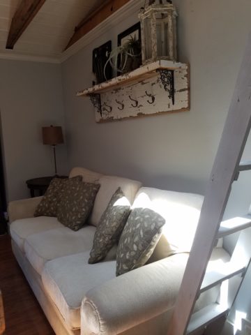
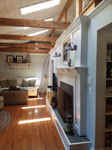
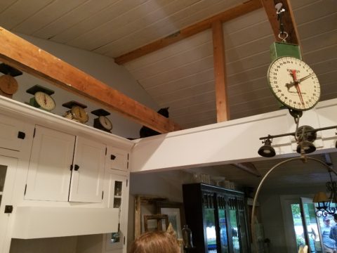
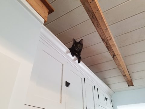
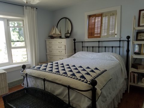
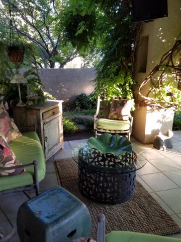
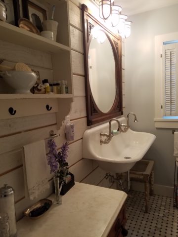
Hearing their comments as they passed through the spaces was amusing in their commonality. Everyone was amazed at the amount of work done, creative elements incorporated, fun finds she had collected to transform this modest house into this cozy cottage. Her two cats have wonderful vantage points to watch the activities in the rooms below as guests gathered to celebrate the weekend’s family wedding festivities.

Daylight streams through windows and floribunda gardens around the house are now communing beautifully with the interior.

Ever-so-soft blues, with whites of every shade, create a soft backdrop to collections of fine china to vintage scales and myriad eclectic antiques.

Outside a recently completed multi-tiered pond emits soft trickling background sound which wafts inside through the many open windows. Not to be reticent about being hands-on, this tenacious designer personally packed 23 loads of boulders and large stones into her truck, off-loaded and placed around the periphery of the pond. She planted tiny creeping vegetation among the stones, water plants, multiple trees and perennials to establish instant-gratification landscaping in her expansive backyard, which is a lush verdant botanical expression that grows abundantly right down to meet the river.

A great get-acquainted bonding of disparate family and friends occurred when we collected buckets of roadside flowers to make arrangements for the reception venue.

Wild bouquets punctuated with spectacular domestic flowers from the gardens surrounding the cottage provided fun activity and contributed to the charm of the scene.

Everyone needs a little country sometime.

What is a Picture Worth as You Plan Your Design?

We’ve all heard the expression “A picture speaks a thousand words.” And today, as I set forth to use it, I investigated its origin…seems the original quote might have been “A picture is worth ten thousand words” as stated by Fred R. Barnard in the 1920s. Either way, it conveys the same – seeing is believing and seeing is more literal in most people’s eyes. Words can describe and attempt to convey an intent or, in my world, a design concept. But to sketch it – well that’s the best way to show the intended idea. There were other unsubstantiated references to an old Japanese phrases, but suffice it to say – it is such a truism that it is referenced often.

Here is an illustration of a courtyard that we have proposed. Our custom designed hand crafted iron gate inserted into the existing low wall, water feature, flagstone and plantings are all new proposals. Can you picture it? If I had arm-waived with a verbal description would it have been as helpful? It’s a small space, so it would have been easier to convey than other more complicated design concepts, but for the sake of an example, this works. I’m thinking that your answer would be – “Yes, I get it! The illustration sets the stage and really helps me visualize the intended finished product!” It is exciting and more stimulating than a rigid CAD drawing and evokes more emotion in most, if not all, clients.

I realize as I write this that it directly reflects the observations in Federico Leon de la Vega’s comments about the value and actually critical importance of handwriting as he expressed in his TED TALKS last year.


Therefore, I prefer the artist’s rendering – to support and promote the talents thereof and also for the much better rendition of the concept! So as technology advances in the realm of illustration, I intend to continue to support the skills of the artists that so effectively express our designs.

Let’s get together and plan your next design project, find solutions and create the images that will springboard the work and ultimately represent your new reality!!!

Patio Primavera- Fabrics and Finishes for Outdoor Living

Finally spring is settling in with more consistent warm weather, garden shops are abundant with flowers, leaves are maturing and all is getting green!! The out-of-doors is beckoning us to expand our living spaces and set-up patios and outdoor kitchens, gardens and play areas for the coming months! YAY – Patio Primavera!!!

Every season introduces more and more fabulous products and paraphernalia for making moving outside more and more inviting and comfortable. Leafing through catalogs that jam our mailboxes, cruising the home decor sites, strolling through the big box home improvement stores and the local nurseries, the multitude of possibilities get our summer juices going – chomping at the bit to plan this and buy that, plant this and arrange that…it’s  rejuvenating and freeing from the interior spaces that we love to be cozy in all winter, but long to escape the confines of, as the warm weather progresses.

Advanced methods and materials for outside area rugs and fabrics, of polyester and better yet – acrylic fabrics that will tolerate the exposure to the elements, allow freedom to leave things set-up without running out into the rain, or worrying about too much sun which might require we bring things safely inside and then back out again.

Some of these fabrics defy being so durable and practical. Here are some amazing examples of bold colors, exciting patterns, plush textures and complex weaves that are all 100% acrylic – the most UV tolerant and mildew resistant of all!! But be prepared, they come with a handsome price tag. It is an investment to know that you are creating a scene that will last – that does not have to be replaced every year or two.

Incredible colors – brilliant and fade-proof.

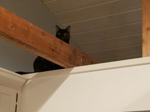
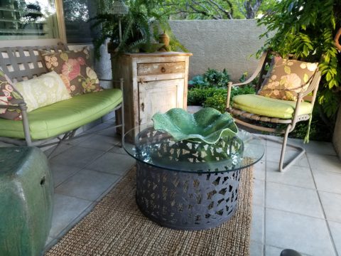
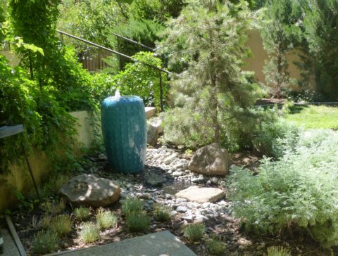
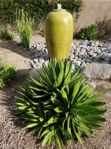
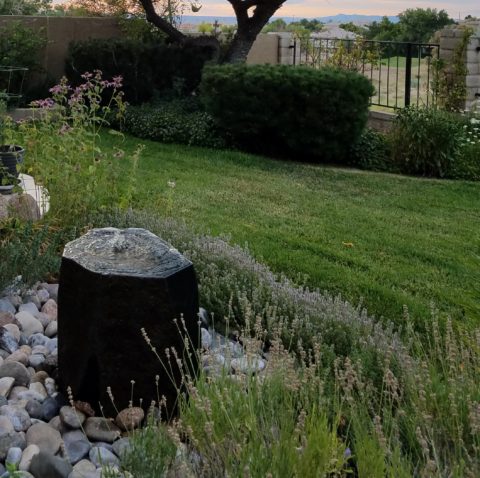
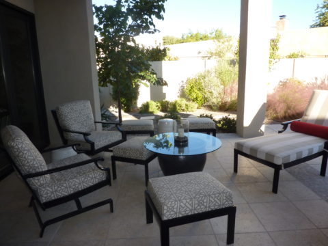
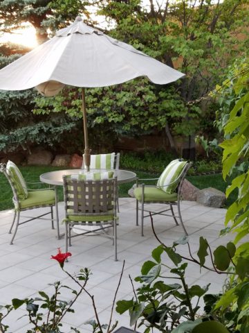
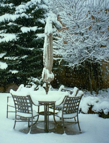
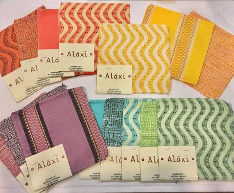
Lovely rich neutrals are stunning enough to be considered for indoor use too.

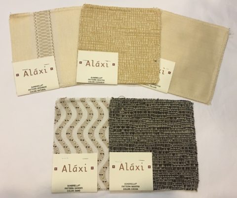
When shopping for outdoor materials – watch for that fiber content…it makes a difference. But know that there are thousands of incredible fabrics that you won’t find in the seasonal departments of local stores. We search the world to find these exceptional fabrics in order to present exclusive offerings to make outdoor spaces defy outdoor “exterior” design. IF only  for pillow accents (due to the precious prices), that can be THE show-stopper for your outdoor rooms. Find some that you LOVE and take the plunge.

Another investment for outdoor furnishings is powder-coating. Give new life to old pieces, salvage vintage pieces for new use! My grandmother’s white, bouncy metal chair was well used and rusty. Shown here, I powder-coated it 20 years ago this month and it has been sitting out in full high-desert sun and all the seasonal elements ever since – a testimonial to the durability of a good powder coat finish.

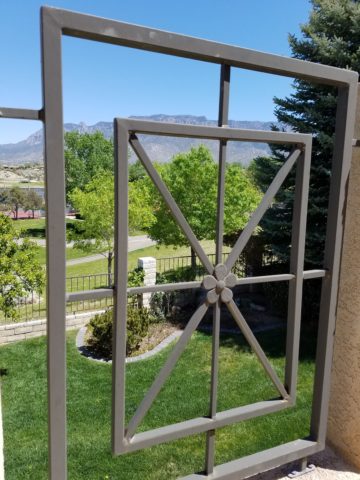
Discover garden elements that would surely rust if left out in the rain – these are perfect for powder-coating! Once treated, these fabulous “finds” will be durable exterior design features without a care – retaining their appearance and supporting your climbers for years in your garden!!!

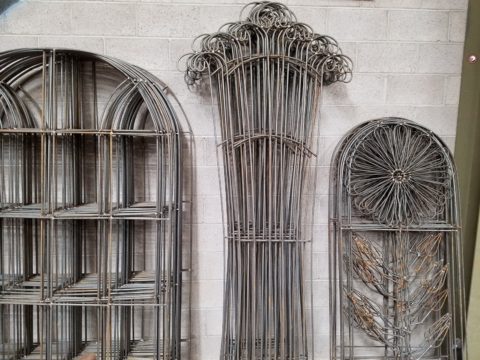
More durable than paint, this process for metal furniture (and more) usually starts with sandblasting the existing finish – rust and all – clean as a whistle – and provide a finish that will protect and preserve the appearance  for years of exposure to the elements – sun, wind, rain – no problem! Powder coatings are just that – a complex combination of materials that are combined and manipulated and ground into a soft powder. The application is done with electrostatic charge delivered via a spray gun. The powder-coated pieces are baked where the heat cures the coating. Powder-coatings come in so many colors! The resulting finish is extremely durable and will last for decades.

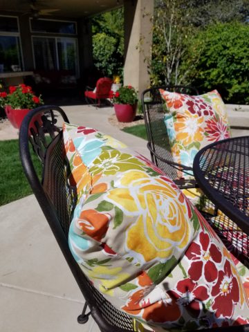
Other than furniture, it is also applicable for architectural detailing around your home and is certainly used in large-scale commercial applications. Powder-coating can be applied to other than metal pieces – but the technique differs slightly.

If you have pieces that you treasure or merely want to have around outside for a while without extra concern or maintenance, this is something worth investigating.

The take-away here is in recognizing the quality of life that is gained by utilizing and  celebrating your outdoor spaces. Whether a tiny balcony, intimate courtyard or an expansive patio area, decorate it! Explore the many design tricks, great materials, fabulous finishes and all the possibilities 
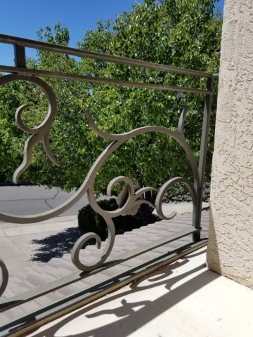
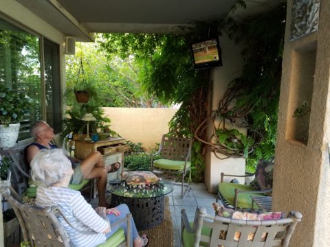
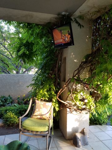
add a  TV,  fireplace,

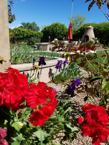
or chimenea, that will transform your exterior pockets into worry-free and priceless outdoor room additions for many months to come!!! You’ll want to LIVE out there!


Color of the Year 2017 Greenery!!

Ta Da! Pantone announces its color of the year for the coming 2017…drum roll please…and the color is Greenery!! Yay!!! Last year there were two  – yes, imagine that – they couldn’t decide so they slurried Rose Quartz and Serenity resulting in a pale, cool, wimpy blend of soft rose and lavenderesque shades into a blended wispy pastel dream. Non-committal, in my opinion…lacking confidence.  Last year the rationale was stated by Pantone’s Executive Director, Leatrice Eiseman as…

pantone-color-of-the-year-lee-eiseman-quote-2016

But this year they have it with this fresh organic hue in a yellow-ish shade primed for this year’s rationale from Ms. Eiseman which is:

pantone-color-of-the-year-lee-eiseman-quote-2017

I have always loved green. I grew up in a Virginia jungle of a suburban neighborhood inside the Beltway surrounding my hometown of Washington DC. where the first signs of spring were the tiny tips of dogwood leaves poking forth from the delicate branches of those beautiful under-growth trees. The dogwoods were the graceful, human-scale layer beneath the towering canopy of the immense, rigid, vertical tulip poplar and white oak trees that commanded the woods.

Soft mosses, lacey ferns and perky lily of the valley carpeted the hidden pockets of our backyard. New growth is that prediction of amazing renewal and promise of the start of summer. So it is a prime observation that as Eiseman states in her 2017 rationale “greenery…bursts forth…with a reassurance we yearn for…” although I do not feel this is peculiar to this year as winter always makes me yearn for greenery and the reassurance  that spring and summer will return.

My mother also loved green and that probably influenced my childhood perception of comfort and context of it in interior design. She had and still has an eye for color. In 1959 she selected an amazing sculpted wool pile carpet in a warm, dark, neutral, taupe tone and built upon it a color scheme of pinks and greens that was subtle and relaxing, organic and contrasting, blending beautifully in our wooded setting of verdant lushness in which we were cozily situated.

That was upstairs where we felt like we lived in a flowering tree house amidst the dense collection of green leafy between the trees and surrounded by all shades of pink and white azaleas. Downstairs, where we retreated in the winter months, her greens were mixed with gold tones creating a warm interpretation of the greenery around us.

When so many in that era, between the 60s and 70s, were styling interiors with heavy oranges, browns and golds,

orange-and-brown-f934b00ae8a8aabb9fa7d7d8e3ccec30

my mother gravitated toward Lily Pulitzer’s fresh, tropical palette of lime green and hot pinks, clean crisp turquoise and citrusy lemon yellow – both in her wardrobe and her interior accent colors.

most-popular-lilly-pulitzer-prints-no-names

Our beach house was turquoise and teal, navy and tan – the sea and the sand.

Following color trends is a slippery slope. I have blogged about it in the past. Adopting that which is often a combination of colors instantly records a place in time when everything from bath towels and shower curtains, bed dressings to draperies appears in the marketplace and inserts its predetermined obsolescent combinations into the lives of so many who would rather catch the wave – often behind the crest – to own and participate in what is conveyed by the market to be the “in” thing to do and to have.

It is best not to embrace and adopt the combinations that the market presents. It is better to select color and combinations that transcend the trends – skirt them so as not to fall into the trap of dated color schemes and tired combinations. Some avoid the trap by staying neutral. The safe, timeless colors of whites and grays mushrooms and taupes- but where is the risk and fun in that?

“Too bad for them” I often remark. It is such a missed opportunity…a limitation to select colors that you think you are supposed to like rather than those that truly bring you joy. I say “go for joy every time.” Color is such personality. It is a stage-setting element. It is a backdrop or foreground. It is a theme. It is an atmosphere.

With all that having been said, I for one am thrilled with this fresh selection for the new year. A bright beginning full of hope and new growth, fresh starts and positive forward movement – organic and life-affirming. So seek the colors that brings you joy and go forth with color in this new 2017 soon to arrive. My personal schemes will always have greenery!!!

Resourceful Creative Festive Fun

When it’s time sensitive and just can’t wait – what do you get? A BONUS BLOG!!!  Yes! A mid-week blog for the holidays! It began beneath a brilliant blue sky yesterday as the air, with a teeny bit of a  chill, was contrasted by the then warm sunshine glistening through a deciduous denuded Honey Locust making it’s lonely leftover pods look like birds silhouetted against the sky.

Scattered all over the ground were the same fallen wonderfully twisted mahogany-colored pods writhing amidst the dried leaves.

The color was so rich and warm it was irresistible. As I bent over to inspect one, I was captured by the unique quality of each pod and the amazing contours of their graceful, elongated shapes.

Almost as though they were varnished, they had a semi-gloss that was naturally beautiful. This is art in nature. This is inspiration. I can see this as a magnificent drapery fabric – a grand wall of these intertwined ribbons of organic seed pods.

20161120_140253

However, on a more current and immediate note – I saw a centerpiece or multiple centerpieces as it turned out. I gathered the pods in my fist as though a wonderfully wild bouquet. I then needed a bag (thank you Becky) as I kept dropping them, in an effort to force the ever growing collection.

Here is the quickie result of the awesome autumnal centerpiece. I had a faux wreath of berries and leaves, tossed in a few recently harvested local apples, (thank you Vigils), some leaves gathered from the driveway as the Bradford Pear – which, a little late this year due to our unseasonably warm Indian Summer this fall, has only started to drop its gloriously radiant leaves. And Voila!

I stood back and looked over my shoulder and saw the collapsed plastic bag still spilling pods out over the counter-top.

20161121_103710

I was about to call all my friends and ask “Do you want a piece of this fabulous, festive, fall, focus of attention? And I quickly realized I could expand the joy for those of you with grand tables  needing a longer statement down the center.

So flanking glass vases provided the extension I needed. Now this was quick – adding gravel, sand or moss in the vases would add interest and depth, maybe pheasant feathers, other dried flower pods and grasses – this was just a start based upon an irresistible inspiration scattered before me.

20161121_101825

So keep your eyes peeled for opportunities when you least expect them and make something out of nothing. Save unnecessary expense when you find your design accessories for free!!! Happy Thanksgiving!!!

pd-exteriors-logo