Da Vinci, The Genius

When you hear the name da Vinci, Leonardo da Vinci, its undeniably familiar. You might instantly call-up a synonym – genius. But what do you really, other than the Mona Lisa, recognize? And what do you even know about her and the painting itself? For the past several months now nearing the end of its run, the exhibition Da Vinci, The Genius, at the Albuquerque Natural History Museum, presented by Grande Exhibitions of Victoria, Australia in collaboration with the Museo Leonardo da Vinci , Rome and the French Scientific engineer Pascal Cotte is an amazing consolidation of information on this singularly remarkable man.

An artist or even designer are such understated titles for this man of extraordinary inventions, concepts, engineering, art and science, because he was the true Renaissance Man! He touched so many things to advance countless trades and disciplines many of which are the basis of machinery and equipment in use today. But as brilliant as the universal exploits of this amazing polymath are, this would be a tedious blog if I focused on the many pulley systems, gadgets, mirrors, SCUBA suits and even flying machines that he created in his lifetime.

Rather, I would like to use this fascinating field trip that I just experienced to examine how I as a designer have been influenced by da Vinci – specifically, the spectacular rendition of the Golden Mean – nature’s perfect ratio that occurs in nearly everything around us. This common mathematical ratio is used to create subliminal perfection and pleasing compositions that mimic the perfect ratio found in nature and specifically, for my purposes, in design.

If you remove this square from the rectangle, you’ll be left with another, smaller Golden Rectangle. This could continue infinitely.

I have written about this previously in greater depth. It is a subject that has no limits as the application of this ratio helps assure good compositions whether you realize it or not. For graphic designers it is a must. For interior designers and architects it the formula for so many aspects of their work. People in art and design have employed the use of this perfect ratio for thousands of years. If you apply it – it is foolproof.


But back to the exhibit…there he was – the iconic man rendered in gold on black. You’ve seen it. But to know him is to see the perfection in the proportions that da Vinci used to create this perfect figure.

Right there in a commanding focal point was da Vinci’s drawing of Vitruvian Man. The accompanying video explained the relationship of all the dimensions as they related to the perfection of the Golden Ratio. Time and time again it is evident in the sections of this perfect anatomy.

Da Vinci correlated that the perfection of the proportions should be applied to represent the perfect human anatomical body and that it was an analogy for the entire workings of the universe.

His magnificent study of knots became sought-after for luxury fabrics used in 15th century fashion – many of which costumes and finery he designed. Interpretations as lover’s knots – the bond between them was a popular notion of his time and afterward.


It is an exhibition worth seeing. Even if you have stood in front of the real Mona Lisa and have visited sites exhibiting his vast creations and noted observations, this exhibition is worth a visit!

Discovering Patterns

This week began with a juicy fabric presentation. I say juicy because it got my design juices working and I was inspired to take photos and imagine the opportunities to insert these wonderful colors, patterns and textures into upcoming projects.

Take the chicken and the egg scenario. Do YOU often find that exciting design elements invite thoughts of projects for which to use them?

A fun exercise is to take your camera and search for patterns to photo…patterns are everywhere from cast shadows to fabrics, signs and graphics to fallen leaves.

Seeing these exciting new fabrics – you had no intention of changing all your throw pillows, but these stimulating samples might make you consider changing your entire collection!

The opportunity to offer unique fabrics for clients who would otherwise never be exposed to the samples – not know of the possibilities – is exciting. Being able to make this introduction is a treat.

This first batch was of clean, sophisticated, woven, geometrics in blacks, whites and charcoal tones.

Whimsical patterns and textures, with splashes of color, offer more possibilities.

Now see these rich woven patterns and colors in this next series. An explosion of color and pattern  with a decidedly native direction – prime for New Mexico and design projects looking to evoke the elements of the southwest and other opportunities inspired by indigenous art.

With all this freshly implanted in my ever-swirling brain of design fragments waiting to be assembled, I traveled north this weekend for an enchanting New Mexico wedding that further fed the theme of indigenous art, pattern and design.

The lobby of Buffalo Thunder was riddled with magnificent pueblo pottery. The designs were wonderfully intricate and I saw them as stand-alone elements that could easily be fabric motifs. Here on pottery – but so fascinating to consider as possible inspirations for fabric patterns and designs.

Anasazi Buffalo Pot – Acoma Pueblo

Suggestive of a court jester, this expressive piece tells a figure story. The bold patterns make a powerfully beautiful statement. Who loves bold stripes? Do you wear them? Do you upholster with them?

Evening Star by Katherine Wall from the Jemez Pueblo

Cut-outs on lobby lounge chairs, with geometric upholstery, atop bold zig-zags of the area rug proves combining patterns creates a fine line between exciting juxtapositions and pairings – and risking possible disturbing disruption of order. Comedian Steven Wright uses dry wacky wit delivering hysterically funny observations to convey a sense of the obvious with a twist. I’m paraphrasing one I remember from years ago… “You know that feeling that you get when you lean way back in a chair…way back on the back legs…back so far that you are just about to fall…I feel like that all the time.” That’s like that feeling with challenging design. It goes just far enough to get your attention…designers get that feeling as they push the theoretical limits of design – all the time!

Ok- this is not perhaps THE most outrageous example of this theory – but a fun, eye-catching combination nonetheless!

Buffalo Thunder resort was the jumping off point to then venture beyond into the thrilling landscape of La Mesita Ranch.

Mixing different colors of brick make this random patterned walkway very pleasing and interesting.

The setting was natural, organic and inspired.

Simply lovely centerpieces

See a lovely, intense example blooming blue and white and much more in Nantucket on the cover of the new June 2018 issue of Architectural Digest.  http://www.theenglishroom.biz/2018/05/29/nantucket-beauty-by-markham-roberts/

So look for patterns all around. Discover exciting opportunities to mix patterns and textures.

Be brave – play with patterns!


Real Jeans are Wabi Sabi

An aside today to address a different design statement – of fashion, not interiors, I’m speaking out about FAKE JEANS. In the design field we watch trends and acknowledge the importance and validity of new design ideas, combinations, forms and functions. When torn jeans made the scene a couple of years ago, it was amusing and seemed to be a cheap, cheesy, frivolous attempt at something overly shabby chic. The discount stores were stuffed with them and the mainstream stores too.

Perhaps a cat clawed this pair to shreds? And the bottom – up above the ankle? Puzzling…

But it continued to make me roll my eyes with disbelief and when I saw well-heeled women sporting them and paying serious money for them. I was truly amazed.

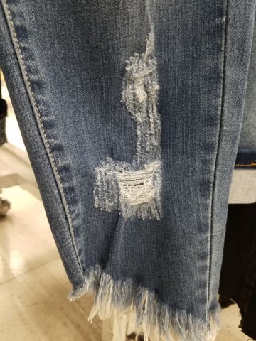
Fraying at the bottom suggests that they were comfortably too long and dragged to this result…but as a crop jean? HOW might one fray up the back of their upper ankle or calf? Hmmm…

Do you have a pair or two or three? All colors? All varying lengths and tapers? How long did you hold out before you caved and found the perfectly worn pair for you? Are they just broken through at the knee or are they riddled with torn, mangled shreds of fabric? Are they lacerated in mid-thigh? How might THAT have happened?

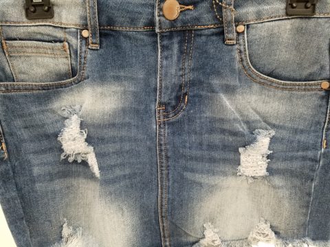
This is a skirt version of the story. But what IS the story? High thigh wear spots…

So does this make me sound like an oldster? Read more and see what you think. It’s NOT about the frayed tears, it’s about where they are, why they are, how they look and how many they are. I see jeans that look like they have been doused with acid! How might THAT happen? But boy when it did – whew, you saved them!! And wore them to tell the story!!!

I think this might have been a bear attack!!!!!

Others are worn in the oddest places of the structure having nothing to do with normal wear and tear – totally random splotches of abraded material – defying common sense.

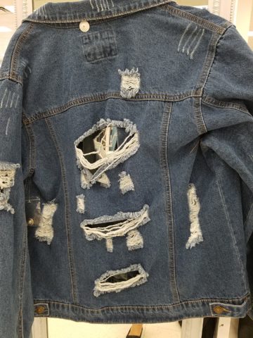
This jacket looks like somebody got into a bit of trouble!! Including scratch marks!!!

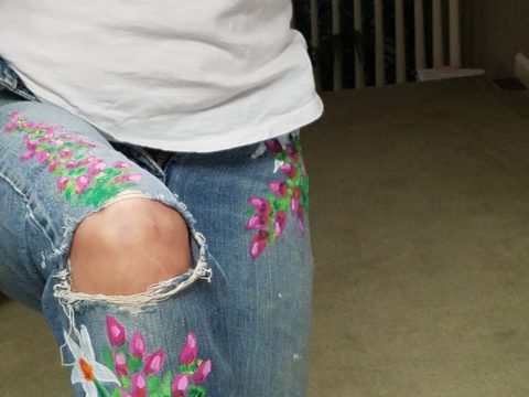
These jeans were my favorite. I loved the fit and the feel, the texture and color of the denim  and they got better with age. They were Levis and are now crowding 50 years old!!!

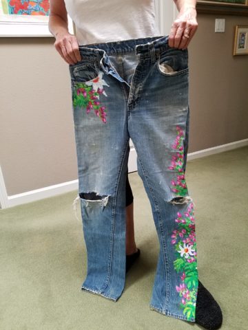
Yes, from the 70s, these jeans were the best. And I’ve saved them out of an inordinate sense of nostalgia. When you find jeans that have all these critical features you wear them to death. And that’s just what I did! These jeans were so perfect and had no stretch to fake the fit! The more I wore them and the more I washed them the softer they became and the more invaluable they became to my wardrobe and hence, my identity.  They were my fabulous freaking fashion fundamentals.

After a few years of near daily wear, these jeans began to gradually fade and wear away the darker threads in favor of the lighter cross threads of the twill. The seams and edges were breaking down. They began to show signs of possibly breaking through at the knee. They were experiencing the metamorphosis of Wabi-Sabi and I was anxious about their dematerializing. While a part of me loved these indications that they were truly my favorite as proven by these lovingly worn signs, I was facing a fear of loss.

I have previously written about the intensely thoughtful book by Leonard Koren,  Wabi Sabi for Artists, Designers, Poets & Philosophers and as I write this I went into my desk and extracted it once again to find a  passage that so speaks to this subject of  “The Material Qualities of Wabi Sabi…The suggestion of natural process. Things wabi-sabi are expressions of time frozen. They are made of materials that are visibly vulnerable to the effects of weathering and human treatment.. They record the sun, wind, rain, heat, and cold in a language of discoloration, rust, tarnish, stain, warping, shrinking, shriveling, and cracking. Their nicks, chips, bruises, scars, dents, peeling, and other forms of attrition are a testament to histories of use and misuse.  Though things wabi-sabi may be on the point of de-materialization (or materialization) – extremely faint, fragile, or desiccated – they still possess an undiminished poise and strength of character.”

“Irregular. Things wabi-sabi are indifferent to conventional good taste. since we already know what the correct” design solutions are, wabi-sabi thoughtfully offers the “wrong” solutions.” (A side note:  Koren mentions regularity in mass production and designers looking for ways to express poetic artistry and sabotage perfection to intentionally create irregularity). I don’t think the endless racks and stacks of identically torn, abraded, ripped, and even mangled jeans was what he had in mind!!!

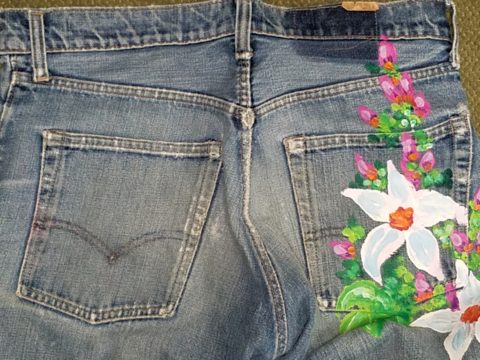
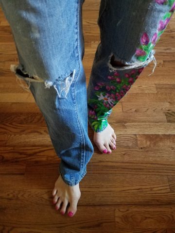
So these jeans of mine expressed unmatched strength of character impossible to replicate in my estimation and as time marched on and they gradually frayed and broke through I mourned the demise. The seams stopped the tears from severing the legs of these amazing jeans. I continued to wear them finding the badge of honest wear quite fashionably cool. But inasmuch as I loved the tears for what it represented in a life well lived and personified aging and the passage of time, I wanted to celebrate the priceless nature of these jeans and give them a revitalization without changing their character. With that I decided to add a little Flower Power, as I whipped out my brushes and paints and embellished them with hipppy  dippy flowers to celebrate their age and honest wear.

Honest. I guess that’s what my gripe is about.

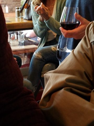
Night before last, I spied this common jean scene sitting at a wine bar. These actually look like they could have been naturally worn through in the knees, except you then see the mid- thigh rip – how would that have happened?

I doubt it is empathy that the celebrities sport the fake torn jeans off the rack. It is not empathy for those less fortunate who have torn jeans from wear and an inability to replace them due to cost. Impoverished people in torn jeans are  not trying to make a fashion statement and the people who are enjoying the forced-casual novelty of looking like they loved their jeans until they ripped or to make a social statement about “I am really on your level of every man/woman” are not fooling anyone – really? Neither one flies. Neither one is honest.

And to be perfectly honest about these jeans – they don’t button today. I had not tried them on in decades. My skinny, lanky, lovely niece did a few years ago.


And as I held them up today to photo, I decided just to try. I pulled them on exactly as I remember trying not to further rip them unnecessarily, got them all the way up wriggling into the well-worn butt and they weren’t going to button together -not this week.


But I  now have a new summer goal! Might I trim-up enough to button my old favs? That would be a feat!  Stay tuned!

If your jeans didn’t wear out from love and appreciation, I say, “give it up!” Like the Emperor’s New Clothes, look at them for what they are and exclaim They are NOT Real! Eeeuwwwww!!!!! It’s a  ridiculous, silly trend. It’s an affectation of numerous charades.

Good design. It’s in the eyes of the beholder. But I prefer to embrace the real effects of shabby chic and the ultimate wabi-sabi in fashion and interiors. Relaxed and un-constructed is one thing, but these ridiculous artificially torn jeans are beyond the pale!!! Ask me what I REALLY think!!!!!

Quilting – An At-Home Workroom of Color!

It’s not your grandmother’s quilting these days…computers have radically altered the landscape of this generations old art form.  
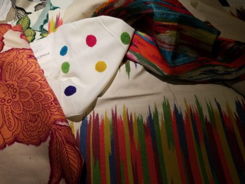
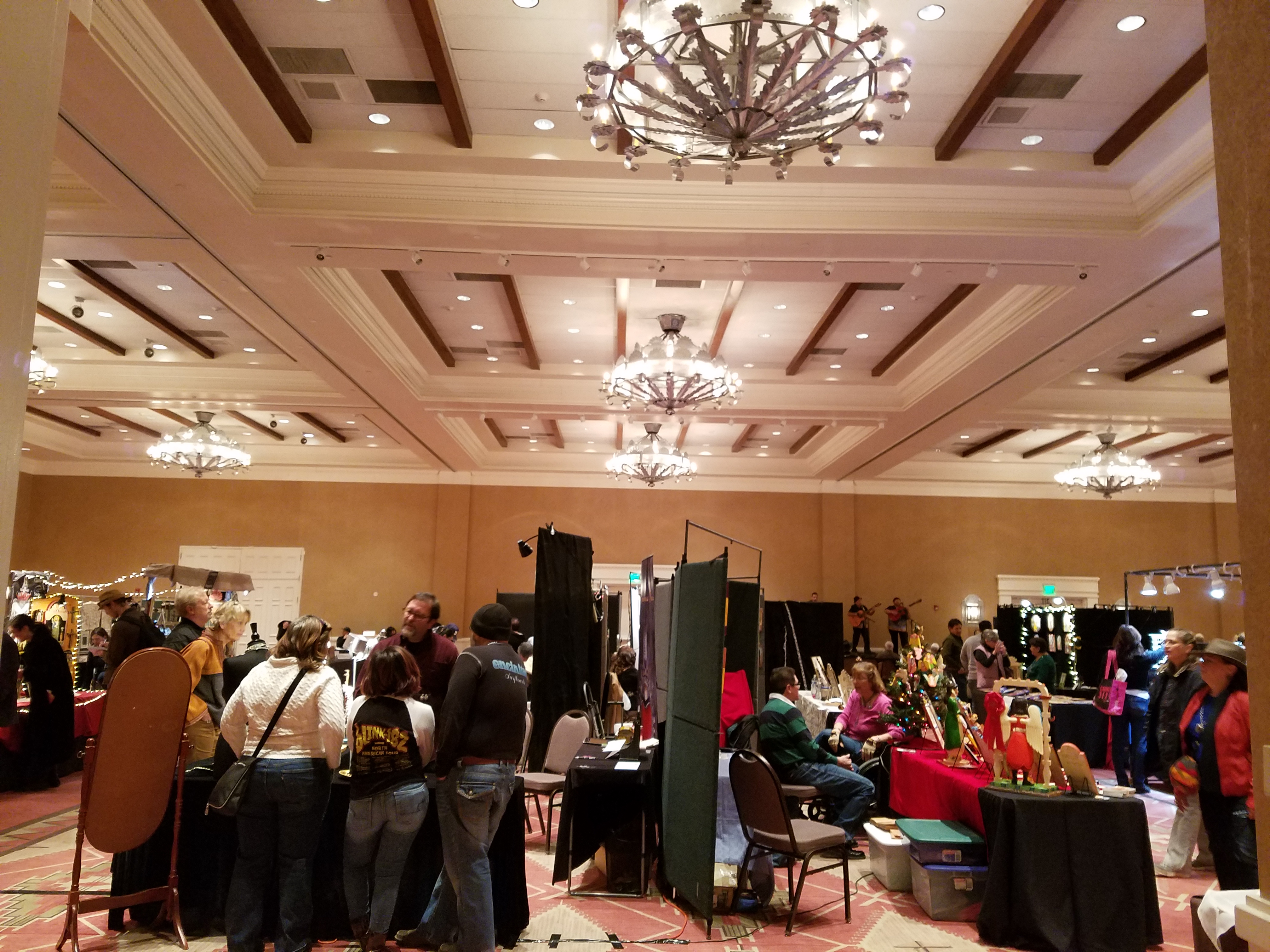
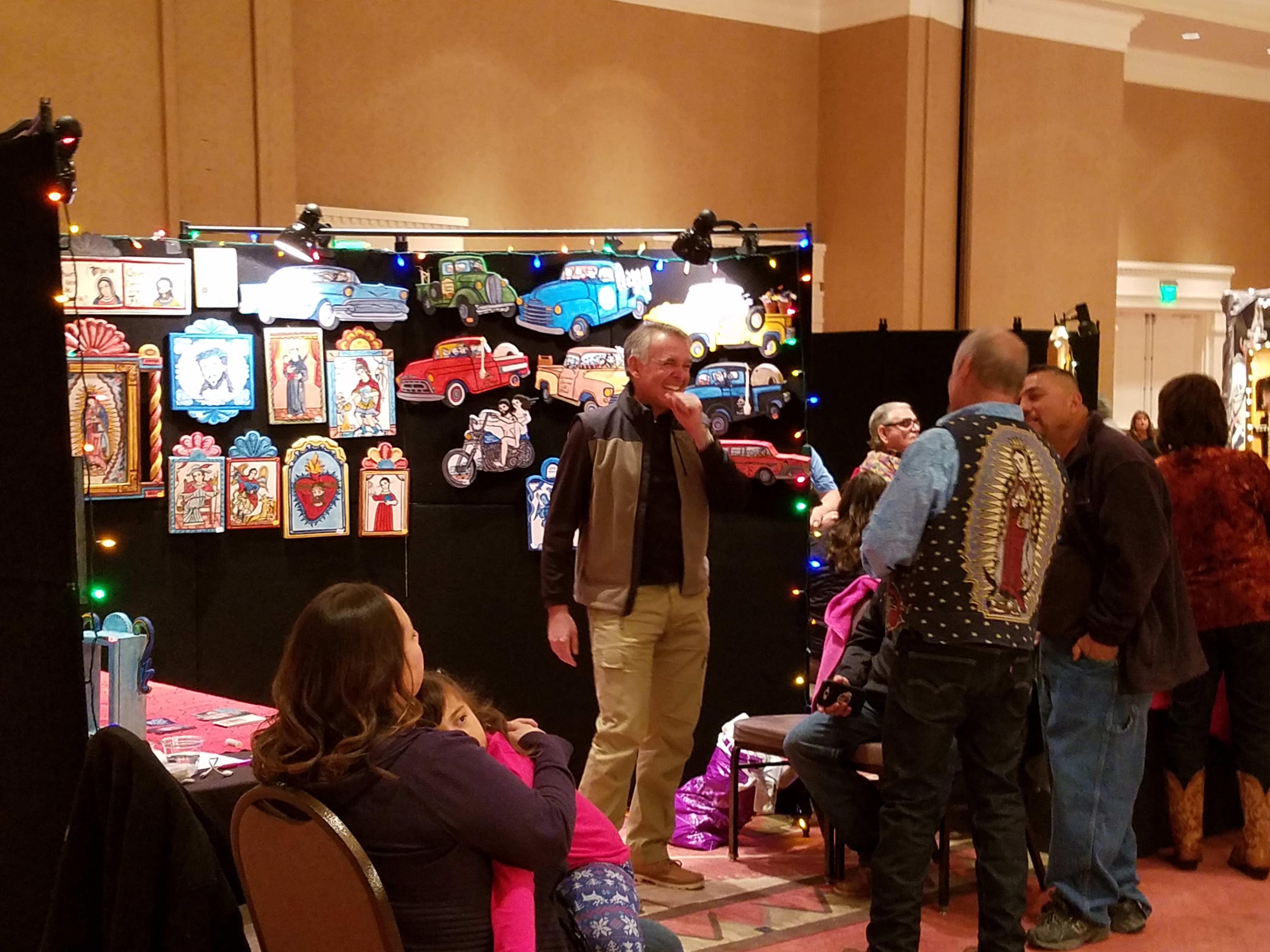
Two days ago I found myself in an in-home art-studio/workroom that blew me away!

Initially a craft born out of necessity, as creative survivors accustomed to “making something out of nothing” re-purposed scraps of material to patchwork new articles of clothing, homegoods and ultimately art for the walls. This clever, resourceful, utilization was celebrated in Dolly Parton’s song turned movie, about her true-life “Coat of Many Colors.” https://en.wikipedia.org/wiki/Dolly_Parton%27s_Coat_of_Many_Colors

The intricate designs and refinement of pattern details was obviously all done by hand, but with the development of machines and now computers for this purpose, the possibilities are endless.

So as I turned the corner, to see a would-be remodel of combining two bedrooms and expanding to the north of the existing shell, I was astonished to see this remarkable, expansive workroom – all white – punctuated with colorful creativity. Colors, textures, patterns…this extraordinary, rather Renaissance, woman had carved out a generous space to explore this phenomenal art and craft.

As an artist, Sue Watrous’ paintings and sketches are quite photo-real. On a few of her pieces, she has deconstructed the elements in the painting cutting them from fabric of many grey-tones defying the fact that they are textile assemblages.

This original pencil drawing – yes, photo-realistic, is amazing.

Then to create the same image as a patchwork quilt is remarkable!!

Yes, look closely, you can see the patches of fabric that are assembled in the many grey tones to create this amazing piece.

Her joie de vivre is derived from this magical space and the creations that she imagines and brings to fruition.

Upon entering her amazing domain, I felt as though I was entering an operating room – everything in perfect order, clean and spare – like a clean-room at Intel – I should gown-out or suit-up!!!

I might be exaggerating because it was white and clean, but warm and welcoming with the rainbow spectrum of thread spools and quilts both finished and in progress displayed on the walls and on the other many surfaces.

Self-taught, she nonchalantly references the many computerized machines strategically placed around the  room. There is an order to the layout and her approach is meticulous. Despite the fact that there is an active quilting community here – they are too busy quilting to teach – so Sue jumped into this after having seen a presentation at a show about five years ago. Years ago she quilted – but at this juncture, she knew at once that she wanted to enter this exciting and challenging realm, of computerized art assist!

Like the shoemaker who has no shoes, her quilts have yet to adorn the walls or bed dressings throughout the rest of her home. She doesn’t sell her work – but her family all has homes riddled with choice pieces.

Her paintings are placed amidst her interior, but not her quilts. Today I focused on a large wall to be the future home of a near-to-be- completed quilt.

She tells me that the fabrics are like paints – she is painting with fabric.


And although she is not yet dying her own pieces, she told me of meeting a textile artist who spun her own thread from her own llamas, dyed it, designed and fabricated her own work.  Sue has created most if not all of her patterns and designs and I am confident that before this is over, she will be donning rubber gloves and dunking material in dye vats to find a new layer of creativity.


What Do Fabulous Fabrics Have in Common?

Fabulous fabrics are NOT common – that’s what they have in common!!  After paint, fabrics are the most  malleable design element that can make dramatic transformations in an interior.  New pieces, reupholstering existing pieces, treasure-hunting to cover vintage pieces, salvaging family heirlooms, plastering or padding walls and ceilings, draping and accenting – doesn’t it sound exhilarating? Imagine the  possibilities!

Metal studs to trim things…wrap a lampshade, border draperies, trim a sofa, adorn a pillow…so many things…and the stormy cloud printed velvet in the background of this trim – is blustery and powerful.

One of the most fun-filled events in our design studio are the road-trip visits by our fabulous sales reps that bring the world to our conference table!!  In larger cities, the design resource centers, markets and their showrooms offer myriad marvelous samples of furniture, decorative accessories, art, lighting, fixtures, finishes and fabrics.  Exciting new design trends are presented each season.

But when you live, in isolation from the major centers, as we do here in the high desert – we are treated to personal presentations that are intimate, relaxing, inspiring and educational. Here is an exclusive collection that was presented just last week. Sit back and watch the fabrics unfurl and float – one after another – in layers of color, texture and incredibly inspirational style.

Weighty over-stitching or “top-stitching” adds detail-either high-contrast, color-on-color subtlety or the median slightly contrasting grey with white. Trending – touchable textures! Here presented for interior fashion, but you can bet that clothing fashion designers would love to play with these textiles for wearable art too!!!

Sure, throughout the year we travel  to source hubs, surf the net, call our reps, request samples, compile materials and gather what we need across the miles. It is challenging.  Like living on an island and bringing the amphibious containers of supplies over the sea and up onto the beach! But inasmuch as we don’t have a design center handy to do a lot of “one-stop-shopping,” we do curate our own very extensive source library of fabrics and architectural materials. With that at our fingertips, without leaving the studio, it’s a time-saver, a stimulating place to to engage clients and we are easily spoiled!

Fine weaves make terrific grounds for bold prints – here in three different color-ways – what a POP! Retro to new concepts – patterns add pizzazz!!

This recent textile presentation brought refined and rugged landscapes of intriguing textures and patterns that  stimulated our design juices.

Intentionally cut after the weaving process provides extra texture and pattern interest.


Often the “backside” of these fabrics are as interesting (if not more so) than the fronts – but be mindful of floating threads and other weaving details/methods that interfere with practical use.

Bold “geometrics” are not only vivid with high contrast threads, the texture is what cannot be accurately replicated or conveyed via digital images on a  screen. Despite the fact that I got up close and personal with these samples to photo, nothing beats touching and feeling the fibers and textures.

Complex weaves dazzle with design creativity. Bringing an artist’s concepts to fruition, with a mill to fabricate the dreams, is enchanting.

Traditions of weaving artisans are found in countries around the world. Sadly,  not many fine fabrics are woven here in the States, partially due to the cost of fabrication and also due to the generations of crafts people who are experienced in the art of weaving more cultivated in other cultures. Whether organic, engineered, by hand or efficient, fast-paced mechanization – art and technology continue to push the envelope of fantastic creation and production in the fabric industry.

Here’s a great tip – if for only a pillow cover – if only ONE side of a pillow cover, having unique fabrics is having art. Living with functional art. Appreciating the designs, textures, craftsmanship and unique qualities of fine fabrics and wall-coverings is most satisfying.

Paints hand applied to the surface of fine woven fabrics is gilding the lily.

Who doesn’t love these colorfully, whimsical dot halves hand-applied to the surface of this nubby neutral??!!

Silk-screening also is an art-form that enhances the quality and appreciation of fine fabrics and papers.

Some of this collection are vintage art-pieces resurrected with new colors on the screen prints.  The caliber of a fine, timeless, resource is about quality of both design and construction. A collection that continuously offers – classic and new, bold and subtle – answers to so many opportunities, is a resource that is to be celebrated!!

We investigate the most extraordinary fabrics, in the world, so that we can compile and create the perfect combinations for your exclusive lifestyle.

Stylists and Designers Prove Rugs Are Not Limited to Floors

Rugs on walls can be fabulous! I came across an article the other day that reminded me of my own history embracing this attention-grabbing design feature.

As I prepared for college and excitedly ran about gathering cool things to outfit my dorm room, I found this spectacular piece of felted embroidery. It was so spectacular and I so LOVED the colors that it became the focal point of my side of the room. Nothing says soften and warm-it-up than textiles on painted cinder block! Can I find a photo of that wonderful space from decades past? Not yet, but I pulled down the “rug” from its stashed hiding place way up on a closet shelf and have at least this to share.

It was a hippy dippy time for style and design. Even those of us a bit younger and not really hippies in the true sense of the free-love and wild abandoned lifestyle, we surely wanted to participate on the periphery with our fashion and interior design. Remember? Indian bedspreads for curtains and clothes, Mexican wedding shirts, beaded room dividers…all that and more. Pier One “shopped the world so we didn’t have to!!”

As far as my world of design and what textile wall-hangings had to do with interiors, it was more about quilts than rugs. The east coast was riddled with generations of seamstresses who perfected and perpetuated the art of patchwork. Once a necessity of frugal re-purposing, an art-form was born and evolved into magnificently detailed free-hand-stitched, award-winning, collectible masterpieces. I remember a textile exhibit at the DAR in Washington, D.C. that had incredible examples of fine fragile work carefully preserved and presented to honor this amazing artistic expression and its place in history. http://eyeonelegance.dar.org/

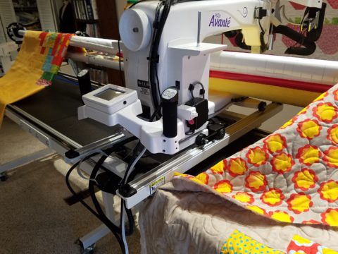
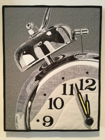
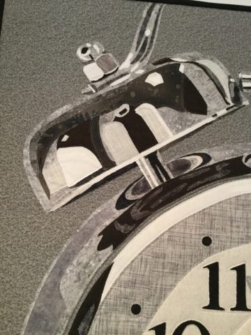
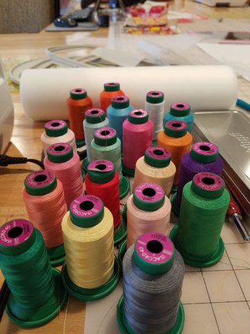
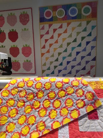
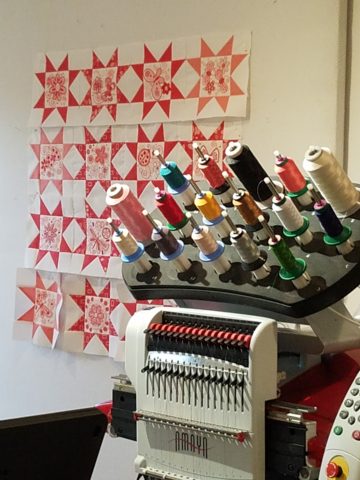
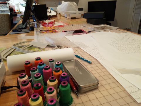
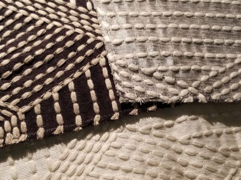
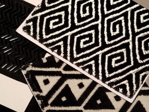
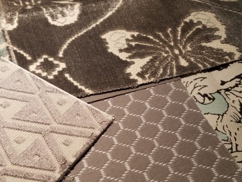
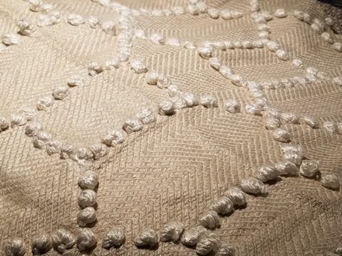
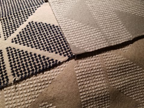
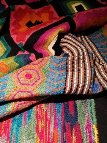
As is true in our world of fast-paced technology, ultimately more expeditious and modern machinery aided the artist in guiding the needles and now computer-generated digital methods of quilting and patchwork stitch at amazing rates of speed and detail.

Although weavers exist in all corners of the world, it was not a traditional art-form in our area. We would see exotic examples in homes of well-traveled adventurers. I came across this article from apartment therapy of some fun examples of rugs as wall-hangings and it sparked my memory of these thoughts on the subject.

http://www.apartmenttherapy.com/why-stylists-use-rugs-as-wall-hangings-and-you-should-too-212602

Fast forward in my history to my arrival in New Mexico – the sunny southwest where Native American weavers reign. I was instantly exposed to wonderful woven art pieces from exotic places like the soft earthen shades of the intricate Two Grey Hills and bright bold graphics of Chimayo. Everyone had examples of master weavers (and some not-so-master but fascinatingly beautiful and interestingly textural all the same), proudly mounted on authentic adobe and towering sheetrock walls of new construction. This sensational example is a powerfully beautiful focal point in the home of great collector clients.

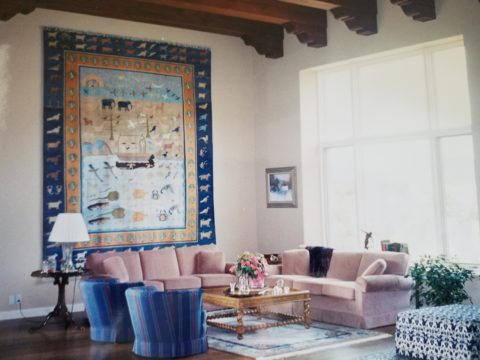
So the take-away from this week’s musings are if you have not tried a rug on your wall – get out there and find a cool piece and get it up there!!! You will be surprised at the effective texture and interest it adds to your eclectic interior!!!


Oh the Faces! Spanish Market

The sky was grey and the air had a decidedly seasonal still-cool yesterday which called for a cozy indoor activity – offered this weekend in the handsome Hotel Albuquerque, host of the Winter Spanish Market. Yes, the decades old traditional Spanish Market held in Santa Fe outside around the Plaza, on warm summer days in July, has begun a new tradition in Albuquerque in the opposite season indoors. http://www.visitalbuquerque.org/abq365/events/detail/28th-Annual-Winter-Spanish-Market/31793/

The collection of world class artists’ booths beneath the enormous hand-tooled tin chandeliers suspended from the spacious ballroom sparkled with festive illumination and colorful creations.

20161126_151417

A variety of Mariachi bands played to the crowds as the curious and collectors wove in and out of the rows of talented exhibitors.

Fine tin-work, dyed and cut straw assemblies, weavings and jewelry presented an incredible variety of work. Fine crafted furniture and spectacular wall pieces were displayed by master carvers. It was a collection of world-class art and fine craft.

20161126_151517

Crazy interpretations of his beloved traditional retablos are Charlie Carillos commically contemporary interpretations of vintage cars with saints at the wheel. Humor that is received with mixed reviews. But his talent is undisputed. Here he entertains at his booth with his colorful delivery.

20161126_151446

By startling contrast, the rich warm colors and traditional reverence that Catherine Robles-Shaw displays in her incredible carvings and painting techniques, wonderful detail and soulfully expressive faces. Her rich hues are Old World in their sensitivity to tone on tone and dark earthen colors outlined and enhanced with ribbons of gold.

Daughter, Roxanne Shaw-Galindo, a respected santero in her own right has continued to carve her own niche in this exclusive world of bultos, retablos and other manner of fine carving and painting.

The mystic powders carefully sought and gathered from ancient land forms and mineral-rich geology diluted with water and even the precious red of the rare cochineal all contribute to the luminous, translucent colors that read so differently from other media.

And further contrast is Frank  L. Garcia with his primary colors of electric blue, yellow and  red shining off of his wood surfaces. Uplifting and extracting smiles from all who pass his booth.

20161127_085738

Oh the faces!! Each santero has his or her own style.  Like fingerprints, the santeros each have cultivated a unique “look” to their work and expressions of their subjects.  The eyes say so much. Mournful, cheerful, pensive or stony stares, the characters are exclusively their own. Despite the similarities bound by tradition, each artist presents a specifically unique style which conveys incredible personality. These signature expressions, as individual as fingerprints, represent so distinctly each  inimitable artist. Despite the similarities bound by tradition, the methods and materials, each shine with startling individuality!

Here santero Ruben Gallegos poses with Mary Anne Green an avid collector and fond owner of several of Gallegos’ work.

Lee Valdez hunches over his soon-to-be cross carefully carving the rope detail around the edges. Light pencil lines define the decoration that he follows with remarkable precision – and look – he is sporting two pair of glasses stacked atop one another – which he says works just fine.

Behind him displayed on the wall are several other crosses in all manner of carving and decorative woodwork. One piece in particular is a yellow pine cross that is riddled with dark cinnamon colored worm holes – splattered actually – creating a spectacularly natural design. And further marks of nature that Lee captures are a knot hole and adjacent burled wood that he places dead center in the intersection of the cross. The four end pieces are carved from a piece of butternut wood providing the perfect natural contrast to the yellow pine yet complimenting the dark flecks of the worm holes. Quite a find, in this amazing piece of wood he spied in a hardware store, and remarkable sensitivity to isolate and assemble the various pieces to create the whole.

20161126_145127

A striking woman caught my eye. Her thick curly black hair and handsome silver cross strung on a multi-strand necklace of turquoise made a big statement amidst all of the art and drama. Meet Vanessa Baca.

20161126_140328

As we visited briefly I learned that she is a fellow blogger and I am sure it was fate that we met as her foodinbooks.com is a wealth of observations centered around great books and fabulous food within described. She writes with great depth of description and observation AND she breaks it down and teaches you how to prepare that about what you have just read!

Sean Wells painting as we watched, represents her art in her own striking appearance. Dark hair whipped and twisted with a stylish flair and topped with screaming orange flowers.

Wells’ images are equally colorful, happy and festive. If not her fine retablos, You might recognize her Fanciful Day of the Dead wine bottles and famous, collectible Lottery Scratchers! Find her on Etsy!

It was an inspiring day of extraordinary art in a genre that is so historically and regionally rooted with original methods and patient execution paired with the artistic imaginative people who practice and study this fine work. Thanks so much Mary Ann for a rare treat!

20161126_155650-copy

Today YOU can go see this final day of  the 28th Annual Spanish Market 2016! Get over there!


WONDER at the Renwick

At 4 years old my teeny cousin, Katherine whom I nicknamed Katie-belle, took my hand as we ventured forth with great discovery stepping down into the carport of our beach house. With commiserating whispers, like the two adventurers that we were that night, we exchanged queries about where we were headed and what we might find and she said ” I Wonder…”

“So what?” you might say. What’s such a big deal about that? Well the concept of wondering, being able to ponder with amazement at what might result, was astonishing to me coming from the mouth of such a young child.

When we returned upstairs to join the group, I was eager to share my amazement about her simple phrase, “I wonder.” I exclaimed  “She wonders!” Repeating it incredulously about 5 times!

Today she is a dedicated grown-up pursuing exciting adventures in education as she navigates the University system and teaches students with a creative approach that captivates and engages beyond their expectations.

What is wonder? What is wonderful? Yesterday I visited the Renwick Gallery in Washington, D.C. . The current exhibit is called WONDER. P1150084
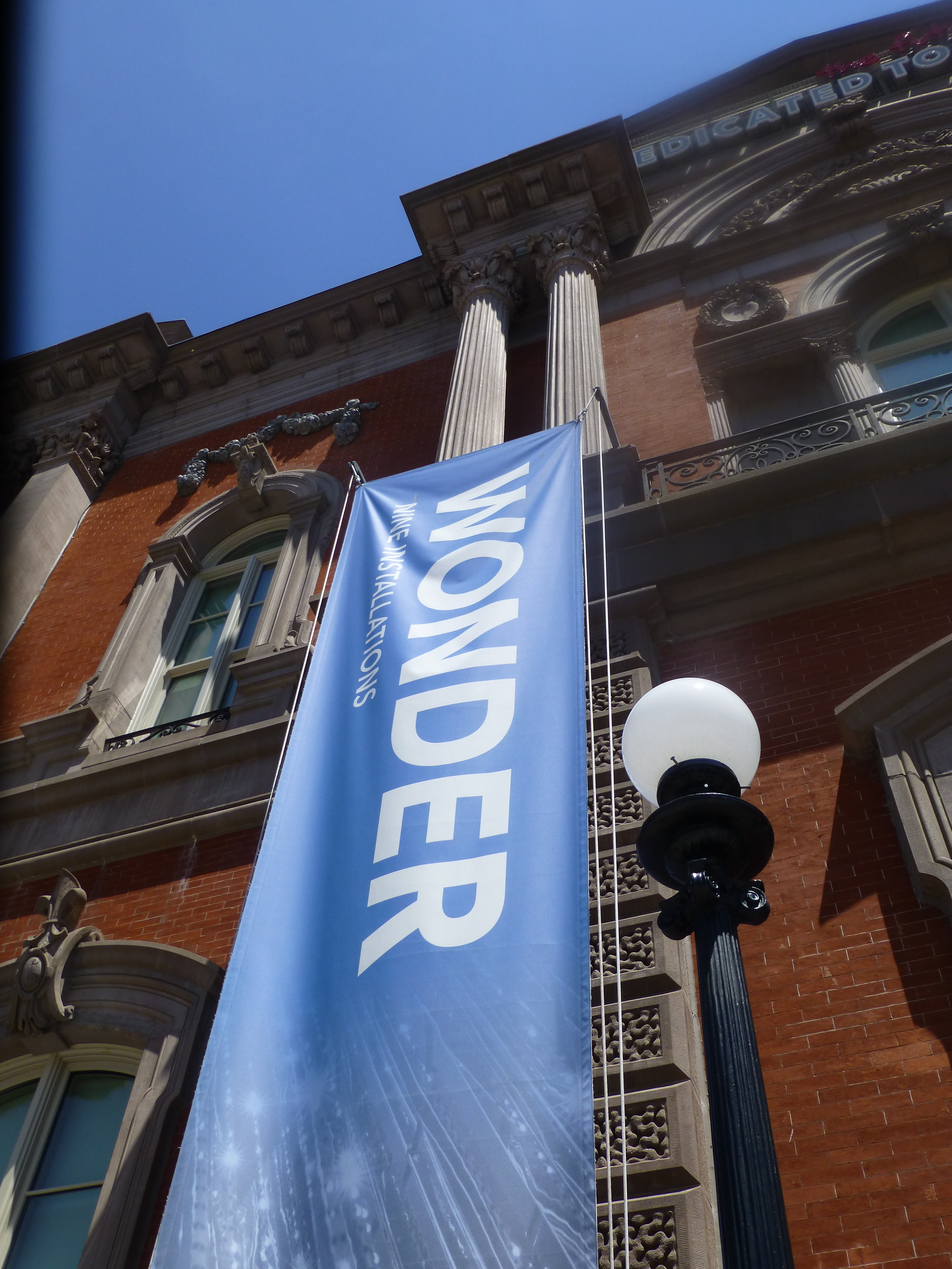
It truly is a wonderment for all ages. This architecturally magnificent building designed in 1859 by James Renwick, in the then chic Parisian Second Empire Style, is the elegant backdrop for a most progressive and creative collection of present day modern artists’ works. Diverse examples, of spectacular displays using simple materials,  brought to life in forms unexpected – of grand proportion and thrilling magnitude. Although my learned and previewer cousin had introduced me to the exhibit in advance, it captivated and engaged beyond my expectations.

This grand yet intimate edifice welcomes and encourages close observation of both itself and its contents. The spectacular main staircase, centered upon entry, presents a brilliant coral red carpet installed with a curvy,  serpentine migration up to the second level. Ooh – if copying is cool and emulating is the greatest form of compliment – I will be looking for an opportunity to specify a similarly whimsical installation. P1150052

Glittering overhead, spanning the entire length of the staircase, is a rectangular chandelier of mirror-like stainless steel punctuated with little LED lights blinking in random patterns. P1150066 
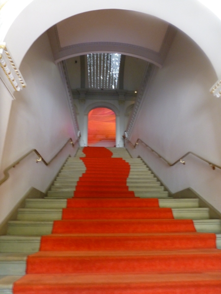
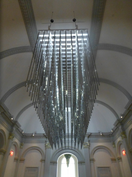
The glitz and bling make such a striking, formal, contemporary statement in this expansive volume that it startles with joyful contrast. The artist, Leo Villareal of whom I had heard in advance, was originally from Albuquerque – where we now call home. A remote desert origination transplanted into the fast pace of the urban centers of the east coast resulting in this shiny experimentation with light, form and wonderfully reflective surfaces. Villareal melds basic high-tech coding to use his own algorithm of the binary system 1s and 0s communicating to the lights when to turn off and turn on – yet sequences that are never exactly repeated .P1150064 
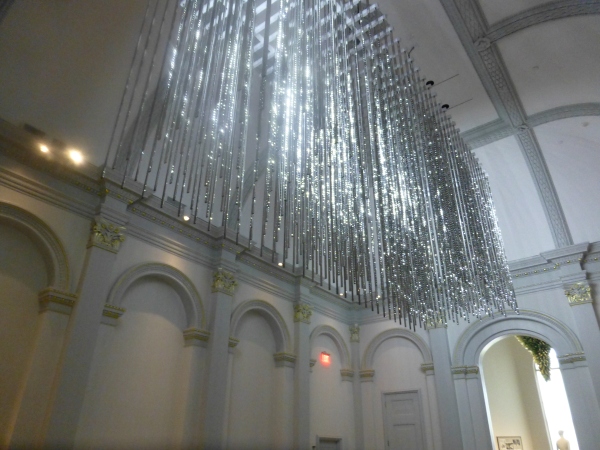
It’s not just your linear code of characters that is read on a screen –  here it is an artistic experience shared by all who look up in this gallery’s exciting exhibit.

Straight ahead, through the massive opening to the next exhibit hall, was the wispy fishnet-like rainbow of woven warm-colored fiber representing both  wonder and danger. Artist Janet Echelman’s inspiration is from a map of the energy released across the Pacific Ocean during the Tohoku earthquake and tsunami on March 11, 2011.  A natural disaster so devastating that it shifted the earth on its axis and cost us a fraction of a second in time. Surreal? Sci-fi? No, it really happened.  Beauty and grace depicting a horrific event. P1150063 
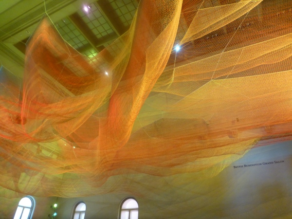
Large scaffolding at the end of the room suggests the manual installation that was required to suspend this wondrous drape catching light and glowing with golden aura. P1150068

The lower level still had wonders to explore starting with the magical woven willow saplings – creations of artist Patrick Dougherty. He has wound these great lengths of supple branches to form Hobbit – like holes of imaginary forest habitats. P1150056 
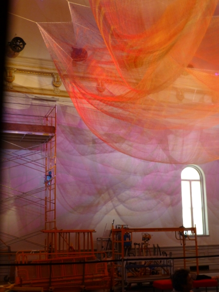
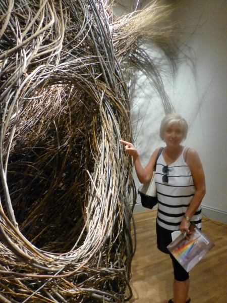
We were at once drawn into these cozy nurturing cubbies of what appeared to be nature – not forms created by man. Nature. Organic and raw, elegant and graceful winding toward the far reaches of the very high ceilings. Like a sculptor who says that the stone dictates what it wants to be and how he carves it – Dougherty knows that the long willow branches have a true will and bend their own way challenging him to work with them toward that goal of partnership with nature. The beauty is in the end result.  People of all ages wandered in and out, peeking through window-like openings pretending to be exploring an enchanted forest of wonder.

Next – stacked index cards- really? P1150061 
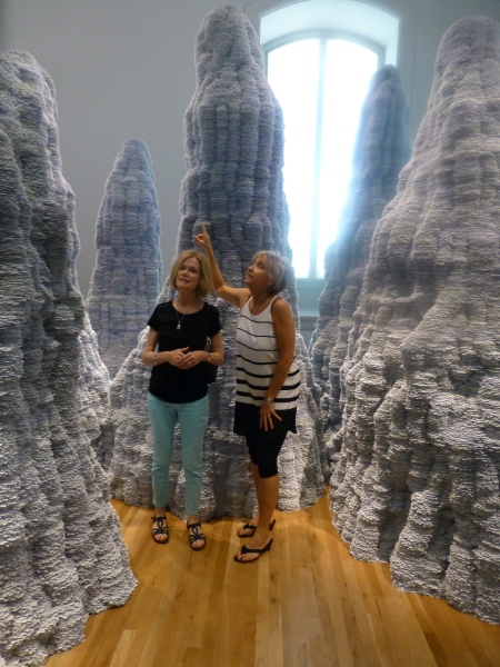
Have you ever experienced Tent Rocks?  8-24-12 Placitas lunch, Tent Rocks Heather, Tricia, Zeke 044Have you ever looked upward and around and through the magnificent forms created by nature eroding the earth’s strata revealing layers of color and creating spires of rocky towers? It is a magic land just south of Cochiti in a very unexpected pocket of nature’s magnificence in our Land of Enchantment. And the spires that artist Tara Donovan created with stacks of index cards – an overwhelming accumulation of millions of index cards suggest grey spires replicating nature’s wonders in the canyons among the spires of the Tent Rocks. P1150062 
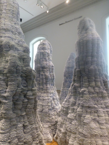
It’s as though a photographer captured this natural formation in black and white.  Donovan’s interpretations are tones of grey as a result of the stacked white index cards with slivers of shadow sucking away light in between each of them. Clustered and staggering in height, the “Untitled” towers are inviting to walk amidst and pass between, winding around them like a  tourist or explorer or perhaps inhabitant in ages past and present as they have stood for ages.

Snap out of it and see what is glowing like a fine fiber sail in the sunset in the next room. Stretching upward and crossing midway are thousands of incredibly fine threads woven from small hooks on the base. P1150059
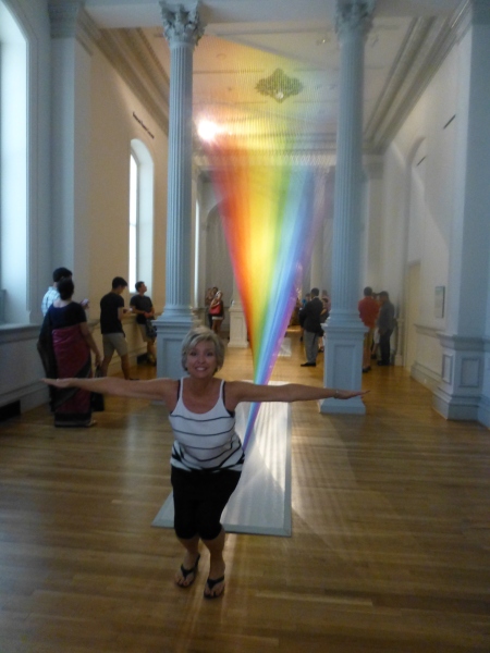
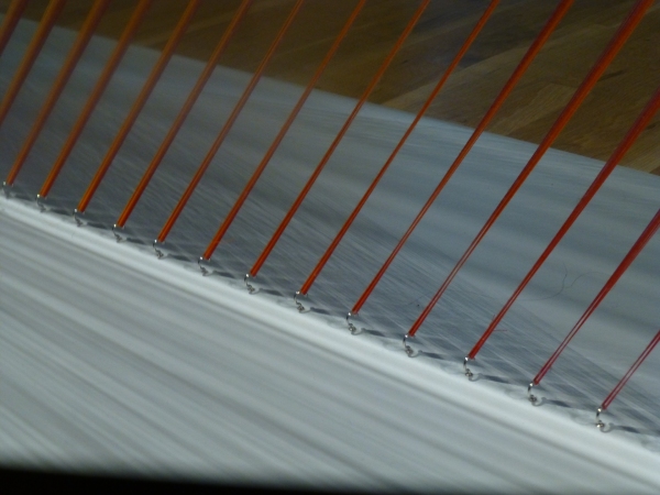
How could a human working only by hand – without computer generated machines digitally fabricating such perfection create this finished piece that we are studying with such wonder? How can this fine tedious seemingly impossible count of thousands of threads be executed with such grandeur and grace by one mere mortal? gabriel-dawe-plexusa1-wonder-renwick-gallery-washington-designboom-03 
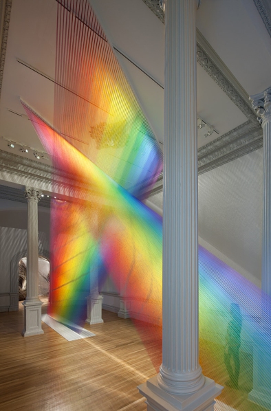
The artist Gabriel Dawe transcends our ability to comprehend the exactness of his beautiful accomplishment with extraordinary patience, precision and creative foresight to imagine the end result and bring it to fruition.  It is a wondrous, luminous sculpture of rainbow colored threads inspired by the skies of his native Mexico and current home in East Texas. The fine weavings also inspired by his Mexican heritage are interpreted, stretched and exaggerated here reflecting the light and spectrum of color from its base to ceiling. P1150060

We missed a couple of early installations of WONDER but were thrilled by today’s adventure. We had many opportunities to wonder…wonder how the artists conceive of their fantastic ideas and actually build their dreams to share with the world. We wondered what it takes to spark that creativity and passion that requires commitment and demands such unfailing determination. We wondered about those who collect these talents and curate these exhibits for the joy of so many. We wondered about the practical side of marketing these concepts to support the artists and this amazing  accommodation started so many years ago by a true visionary William W. Corcoran.

My next blog will trace the history of this wonderful architectural treasure, the Renwick, and share more of the day’s discoveries that you might visit and experience as you tour my birthplace – our Nation’s Capital.