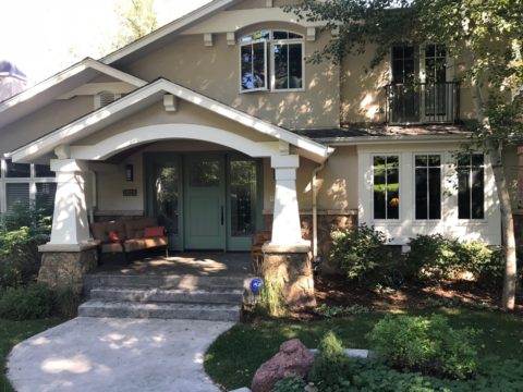
Once upon a time there was a quiet little house in the woods. Nestled among the juniper and pinons of the rolling hills of Estancia, the little house lacked design details to make it feel a part of its surroundings. The owners and their dogs had lived there for a decade and realized that a move was not pending and therefore it was time to bring the house into its own.
The neighbors…
Color was the primary element that they wanted to introduce – that along with a look better suited to the organic, woodsy setting and updates for fixtures and finishes. So, this plain, dated house in the woods began a magical transformation. Not wanting to embrace the sleek white and grey trends of the day, they expressly requested warmth and color.
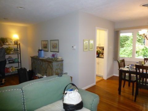
The interior was plain vanilla with warm honey-colored wood accents.
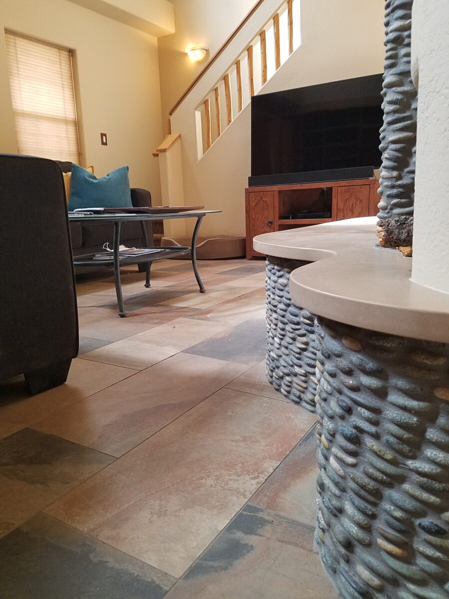
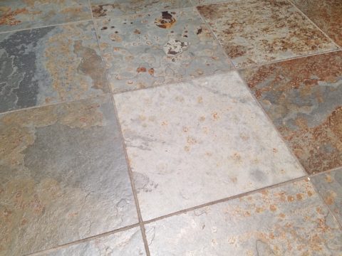
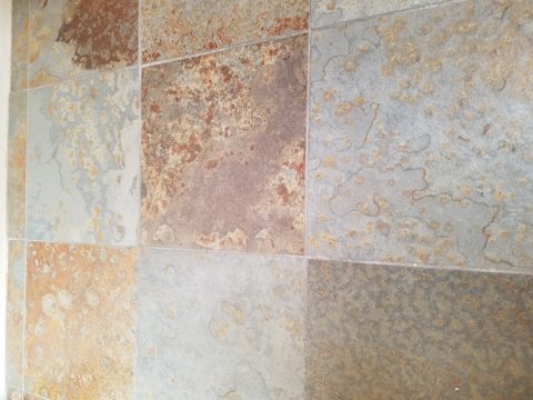
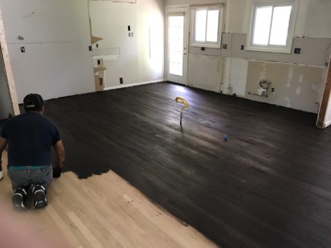
Beginning with the floor, we selected a porcelain tile that had a finish simulating a mottled slate. The outstandingly durable, slip-resistant material had earthen color variegations in the various pieces which were highly effective at concealing dusty dirt and debris from the out-of-doors and camouflaging the anticipated dog hair that was shed about. The resemblance of the tile to cut stone was remarkable. Due to its multi-color rendition of ochre, rust, charcoal, black and sand offered many tones from which to grow the design’s palette.
The flooring was a bland combination of slippery wood laminate and 12″ ceramic tiles.The new porcelain slate floor tile is multi-toned and rich with warmth. New wall colors and cabinets are peeking from behind…
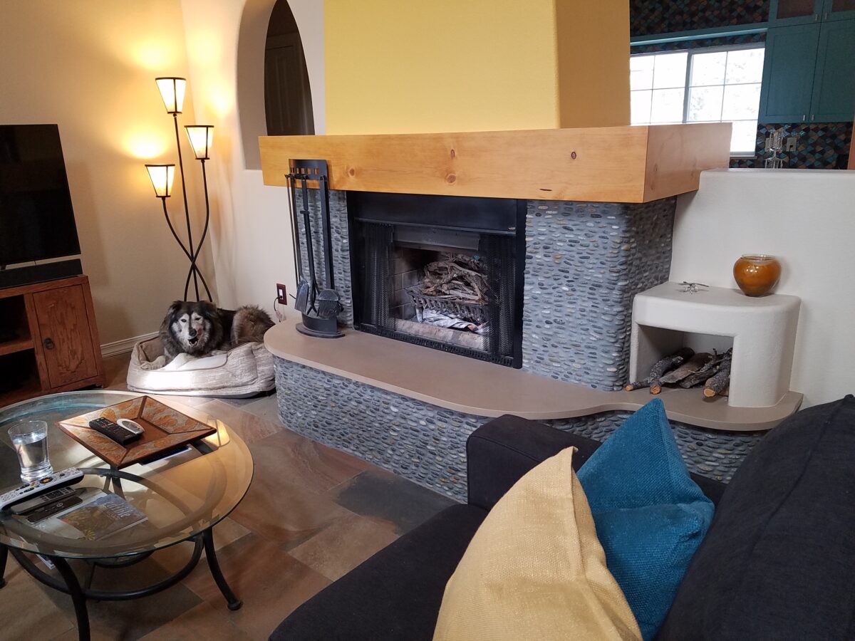
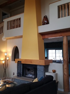
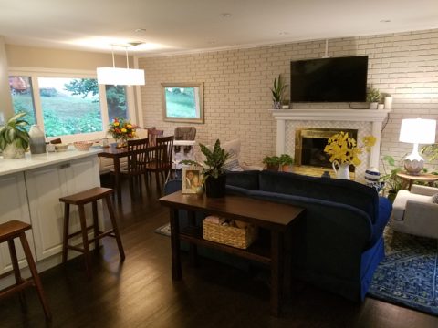
Rising from this new base for the interior scheme, we selected a dark, black/charcoal stacked stone. The smooth ovoid shapes added further organic texture with a subtle woven appearance to the surface of the fireplace.
Texture, color, form…the design is transformed…
The mantle and hearth were both the plain vanilla white of the walls and despite the fact that white can be crisp, clean and fresh – the owners were eager for bold commitment to color. In keeping with the pine columns and other cabinets and architectural detailing, we wrapped the existing form of the mantle in knotty pine finished with a honey stain to coordinate with the existing wood accents. The hearth became an undulating slab of Cambria quartz material in a craft-paper bag/sand color also derived from the swirling “slate” floor.
The graceful shape of the hearth was enhanced with the addition of the stacked stone and new slab surface.
Towering from the now strengthened façade of the fireplace, the tapered form of the chimney was begging for the color-pop that the owner’s desired. The honey color of the pine along with the warm tones in the flooring invited a golden ochre paint to command the space.
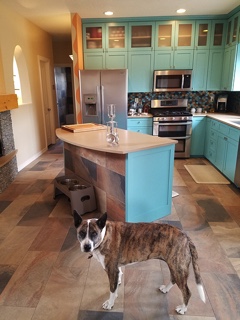
Specifically requesting the insertion of the owner’s favorite accent color – turquoise, we departed from the warm, earthen tones and punctuated the scheme in the new kitchen cabinets.
The original kitchen…tile floors and countertops, oak cabinets with off-white painted walls.
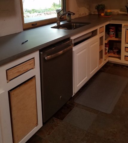
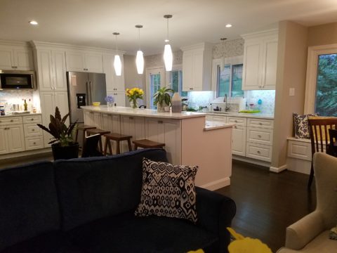
Salvaging the existing boxes and painting the faces, fabricating new doors, drawers, upper glass cabinets and end panels, the open kitchen is the fulcrum of the house. We see the trending minimalism of little or few cabinets in the kitchen, perhaps open shelving…however, this couple wanted even more concealed storage to keep their cooking and entertaining accessories out-of-sight, but close at hand.
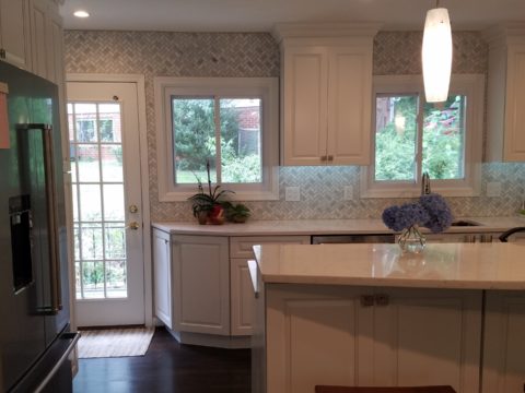
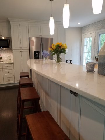
The kitchen transformation features new color, new faces, additional upper cabinets with etched glass panels, luminous glass tile backsplash, new quartz countertops with a new bowed shape for the island…all while keeping existing appliances, cabinet boxes and layout of the space.
Repeating the slab material of the fireplace’s hearth which passes through from the living room to the kitchen, the new Cambria quartz countertops continue the craft-paper bag/sand color. The slate floor wraps up the face of the island for a durable kick-surface and visual continuity.
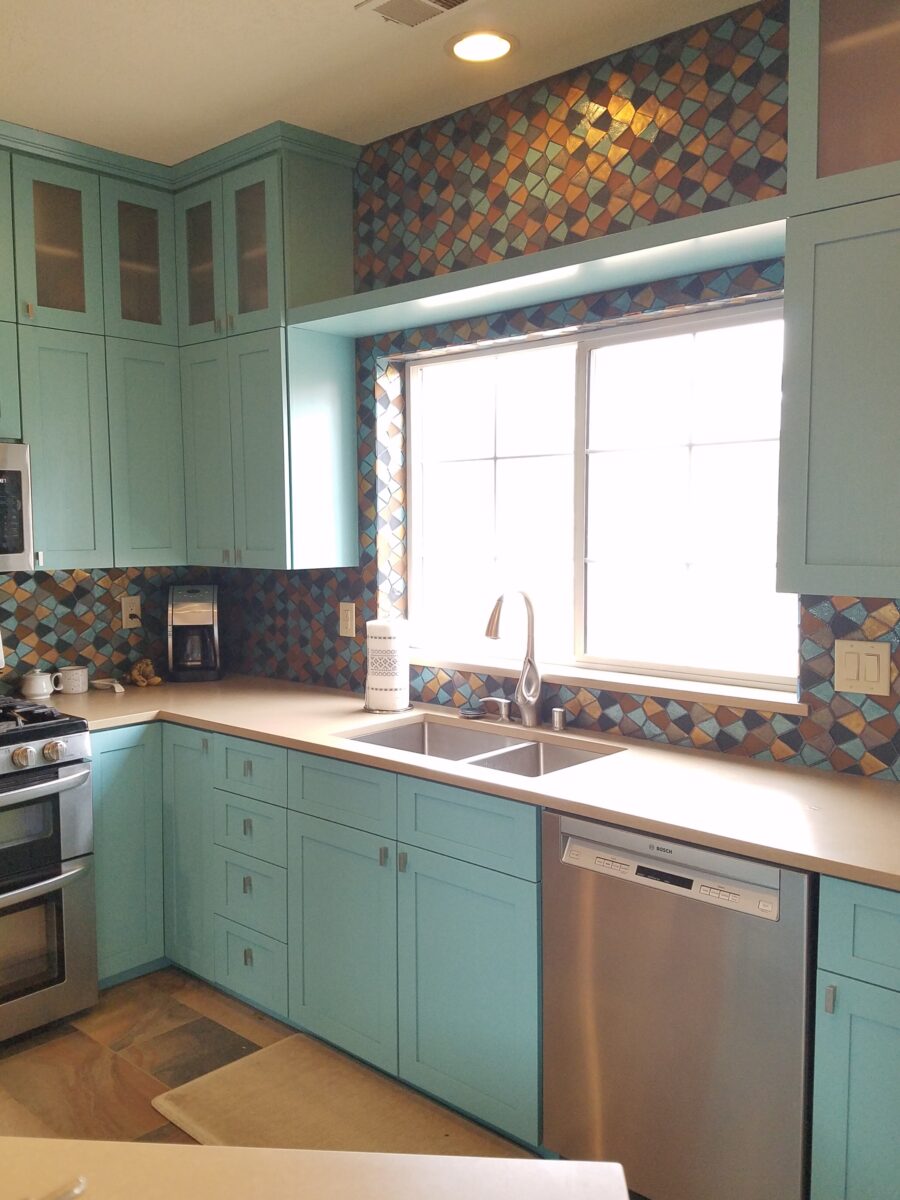
But wait! To further the focal features of the kitchen, we created a custom mix of colorful glass segments suggesting an interpretation of fallen aspen leaves golden and glossy in the damp of late fall/early winter precipitation. The combination of golden ochre and dark amber with the luminous turquoise of this stunning wall treatment dramatically contributes to the whimsically wonderful colorful scheme.
Saving the bathrooms for another story…there is more to be said about this woodsy transformation. Stay tuned and do not fear color! Embrace the context of your special places.
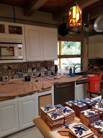
Time to remodel the kitchen!! This charming little bungalow had already experienced its share of remodeling – well, not so much structural – although, many interior design transformations had occurred over the decades. In the mix, the well-used and enjoyed kitchen was feeling a quite tired and dated.
You might remember I have used this now completed project, in the last few months, during its transformation process to identify certain features and design practices. Here is the as-promised unveiling of the before and after photos for further discussion about the design process, intent and results.
We loved the mottled color and organic character of the existing slate floors and opposing green-grey beams with spanning boards of a caramel stain. These were the two elements that went well together as though intentionally planned. Yet in between, the pale, peachy pickled oak cabinets with their radius detailing and red-rose/black matrix of the tiled granite counter-tops, didn’t seem to speak at all well with the ceiling treatment and slate floor’s greens, rusts and charcoal tones. It was a dark, confused space.
When observing and “listening to” the house, it was evident that the current kitchen, in addition to being poorly coordinated, had absolutely nothing to do with the original architectural intent. The new owners had brought a few very fine antique pieces into the home. The mid-century circa 1964 age of the house accepted them on its original hardwood floors also adorned with their fine antique rugs…but something was missing. There was no cohesive thread running through the house. Over the years finishes and decorative elements had been selected and installed without any consideration for original materials or an attempt to introduce compatible and harmonious materials for the good of the home’s overall theme.
In all fairness, had the entire interior been gutted and a
contemporary interior been uniformly installed into the framework/shell of the structure,
I might have considered it a success. However, this multiple decade decor was a
mix of disparate trends and preferences that had no commonality.
To begin the process of bringing this home into a cohesive
design last year, we had redesigned the living room. There we introduced a classic
blue and white color scheme derived from the Persian rug in the adjacent dining
room.
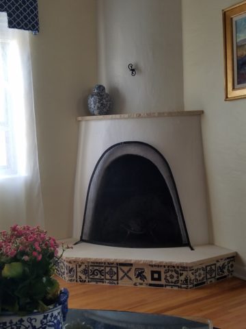
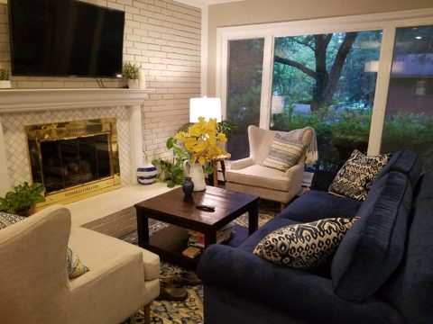
To the corner kiva fireplace, we added a sandstone hearth and
mantle with just enough blue and white Talavera tile trim at the base of the
hearth to subtly coordinate with the new scheme. The Talavera was an
appropriate material for this New Mexican bungalow.
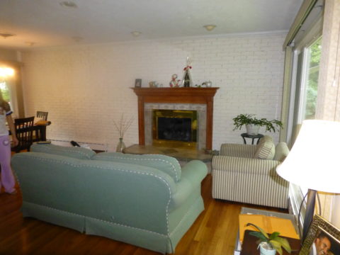
The original fireplace had a dark, broken brick quarry tile hearth and no cap on the mantle.The face-lift replaced the hearth material with broken-edged sandstone slab and matching mantle cap with Talavera detailing at the bottom.
With this living room having been so successfully re-designed, the obvious thought came into the discussion to continue the vernacular of the blue and white Talavera into the kitchen. As a bit of a purist when it comes to application and termination of materials, I was not content for a mere back-splash. No, if the tile were to be effective and commandeer the stage, it had to be used wall-to-wall as though an entire wall treatment.
Treating the Talavera tile as wall-covering, it continues from the kitchen, into the adjacent pocket-space housing a desk and laundry machines.
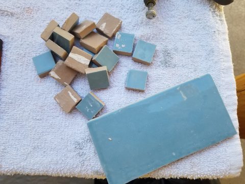
But wait! The addition of an earthy aqua handmade tile from
Spain offered an appealing and unexpected accent woven intermittently through
the Talavera. It created a coordinating thread from the colors found in the mottled
slate floors and ceiling beams.
Pre-grout shot shows the individually cut 1″ pieces inserted as mosaics into the random field of Talavera
The cabinets were in excellent condition, but the doors were
sadly dated and in no way spoke to the home’s other cabinets, doors and finish
carpentry.
The confused interior finishes we in need of a transformation!
With the white raised panel theme throughout the home’s original appointments, we elected to salvage the cabinet boxes and replace the doors and drawer fronts with a similar raised panel detail. The same red oak was used and, with a glossy white paint applied, the grain “read-through” with a very intentional yet subtle moiré-like pattern. The new raised panel white doors and drawers, with crowning top molding provided a crisp, timeless motif. The random patterned Talavera used as an entire wall-covering was very effective. The kitchen was quite gussied-up!!
The transformation was dramatically successful!
The existing slate floor was beautifully organic and I felt, from a design standpoint, was a must to salvage. Making it look like an intentional selection – part of the new scheme – was imperative. Therefore, selecting a counter-top that communed with the tones in the floor resulted in a selection of concrete-like engineered Italian quartz material – balancing the floor with the next horizontal plane and ultimately with the stained and green-grey boards of the existing ceiling treatment.
The new concrete-like Italian quartz counter-tops coordinate well with the other materials.
Another asset was the connection to the outdoors, however the existing window over the sink was high and small.
The window over the sink was high and small…
By bucking the warranty of the Pella people, we had a new double-hung window made to close down onto the new counter-top that passed through from inside to out. They would not fabricate the window to do what we intended, so we had the contractor remove the bottom of the new window frame, thus rendering the warranty null and void, in order to have a completely open, uninterrupted pass-through when raised.
Amusing and interesting…existing family pieces of blue and white ceramics are being discovered and used as decorative accessories in the new kitchen!
We also captured the opportunity to open the opposing wall into the hallway adding pass-through light and dimension to the space. This exponentially expanded the space and made the encapsulated kitchen feel much less confined.
Before, the kitchen felt small and dark…Opening the wall into the hallway brought in additional light and dimension.
To add drama to the newly created dimension, we discussed having a painting commissioned to pop an accent of yellow into the blue and white scheme on the far hallway wall. Lemons, a perfect citrus for the kitchen, was decided for the theme.
A miniature oil painting by Federico Leon de la Vega was used to Photoshop into the scene to inspire and convey the design intent.
The additional POP of yellow is a dramatically effective contribution to the overall composition. After consideration, the owners selected a local artist to paint the full-scale painting.
A local Albuquerque artist, Thomas Tomlinson rendered the lemons in acrylic with blue and white tile details.
In summary…keeping the original slate floor, existing cabinet boxes (replacing door and drawer-fronts only), with a bling of new chrome cabinet pulls, switching out the stained glass pendants, replacing the island’s surface with a handsome solid walnut top and a new coordinating concrete-like counter-tops on the periphery, with the decorative embellishment of the Talavera tile continued from the subtle introduction at the living room’s kiva fireplace, the transformation of the kitchen is stunning – not trendy – and was truly, uniquely designed for the architecture and forward, on-going contextual design conversation of the home.
Uniquely designed…
Look around and listen to the environment for and in which
you are designing. What makes the best sense for the design direction
considering the function and context of your project?
Trust. When asking any kind of advice, you generally ask those you trust. That’s not to say that you might not question the advice. There is never only one way to accomplish something, therefore, advice can be as different as the number of advisers you ask!
From a design standpoint, to offer and create custom elements, it’s often the case that the client will say, “Can you show me an example of that?” If something is new and different, created specifically in context and for this project, there IS no example. There might be similar things, or close approximations of the design – or not – but not the actual design. Trusting your designer to extract your wishes, taste, preferences and applicability to the space is key to creating something very special.
So, I can show examples of mixed pattern Talavera on a wall. I first did this in Tucson about 13 years ago to create a wallpaper-like full wall installation.
As I referenced this casita installation for my clients, while planning their kitchen remodel, I also came upon a restaurant in St. Louis this last spring that used a similar approach in an Italian theme…Talavera? Mexican? Italian? Oh well…another example I brought to the conversation.
For this new kitchen remodel project, we were working with existing conditions, the layout and the mottled green, rust, aqua, charcoal slate floor. All else was up for grabs. However, because I really feel strongly about context, I mentally gathered elements from other parts of the home and intentionally embraced the floor.
This fireplace was given a face lift last year to add the stone hearth and mantle with the decorative Talavera tile detailing.
I believe to abandon existing design themes reads like a designer show home – each room done by a different designer, without any cohesive design continuity. Pair the idea to make an effort to lace the rooms together, with the effort to adopt certain fixed materials and you have compelling diagram of creative remodeling guidelines.
When it is either not practical to replace an existing design element or when the existence of the that design element makes for an un-self conscious part of the composition, it can be priceless. The slate floor was of smaller 12″ format tiles than might be more popular today, but it’s unusual color and very organic feel was worth the challenge. Turning a questionable design element into an asset is success!
Once the flooring was determined to be key in the new design, extracting features (specifically colors) from it became the next task. We had already discussed bringing the blue and white Talavera in from the living room, but my client was not feeling the joy of pairing it with this wildly mottled slate floor.
To meld the design elements together, I selected a concrete-like engineered countertop (which came in two colors both of which were seen in the mottled slate – and provides fodder for a future story). This provided a solid anchor for the design between the mottled floor and the multi-patterned Talavera.
But what might be the one more thing to make this design be even more unique and more cohesive? I set forth to find the impossible, an aqua, handmade tile that would complement the Talavera in the light irregularity and “hecho a mano” feel.
The perfect handmade aqua tile from Spain (photo reads more blue) from DAL tile was the perfect accent.
The absolutely ideal accent appeared unexpectedly as I thought I would be searching farther and wider for this perfect piece. By cutting it into 1″ pieces we would have the artistic accent woven through the patchwork of Talavera, thereby inserting the aqua and adding interest and unexpected detail.
By not planning a symmetrical grid of the accent mosaics, but by creating random lines the unexpected quality of the installation continues.
At this stage, the grout could be grey or white – specifically off white (of which there are many). Opting for the white, to allow the tile to read in its patchwork pattern, without added confusion with a grid of grout competing for attention. We then made a last minute switch on the white grout to a creamier one after seeing the many colors of off-white Talavera up on the wall – leaning more creamy than merely off-white. Could I have shown an example of this design scheme? No, this was created specifically for this project, this client and the space that deserves such attention to detail.
We’re not finished yet. Watch for this transformation to be unveiled in coming weeks complete with before and afters!
Thirteen or so years ago we designed the interior of a home for a young family complete with a toddler. The desire was to bring color and modern accents while still selecting durable materials and hopefully timeless elements.
Fast forward these many years later and this same family now with two beautiful daughters is relocating to another city, another state and a new home. This home was well furnished and much, of what was shown, stayed with the house. The trick was, after having adopted so much from the previous owners, how would they make this house their home?
The point of arrival – the front door – was a tasteful charcoal grey, but by changing it to a bit lighter smoky green, it made a significant difference.
It’s tough to be up-rooted anytime in your school years…these girls missed the only home they had ever had, friends, activities, groups and familiar environs. This challenge was to help all four of them – parents and kids – get settled and assist in making this new house their true home.
As I flew to consult with them, I imagined the scene having seen photos to get somewhat oriented. I made the natural assumption that paint would make new statements to alter the previous owner’s selections and introduce the new family’s preferences. However, despite the change we made to the front door, it wasn’t all about paint once I arrived.
In the previous residence all those many years ago, we punctuated the interior with paint accents. Good design transcends trends and the years. Who would think that this interior was created thirteen years ago?
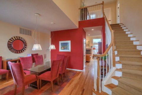
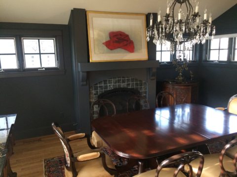
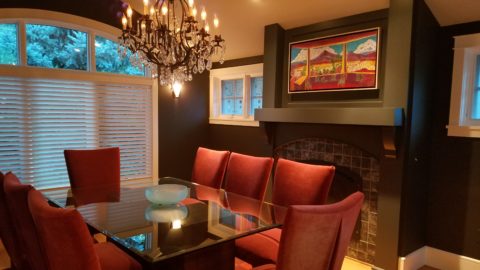
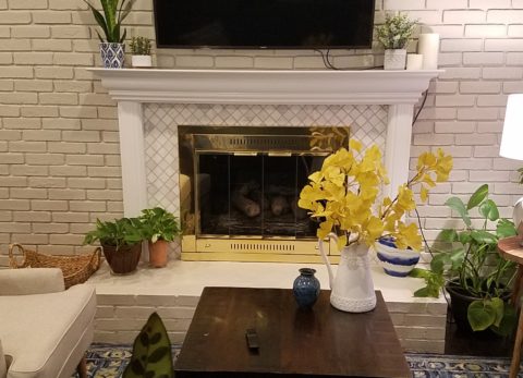
The dining room in the new home was painted entirely charcoal – trim and walls. Oppressive was an understatement and before I even got there they painted all the trim white to match the rest of the home. However, they left the fireplace charcoal – waiting for a discussion as to how to proceed.
Notice the dining room furniture having moved from one home into the next. We decided to paint all the wood trim surrounding the fireplace area white to match the rest. But it produced a startling brightness that will be absorbed once a new painting is selected for above the mantle.
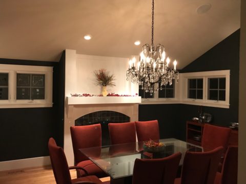
They inherited the chandalier with the home and although it is quite different from their previous dining room fixtures, they are making it their own by mixing their chairs, table, rug and sideboard.
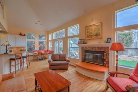
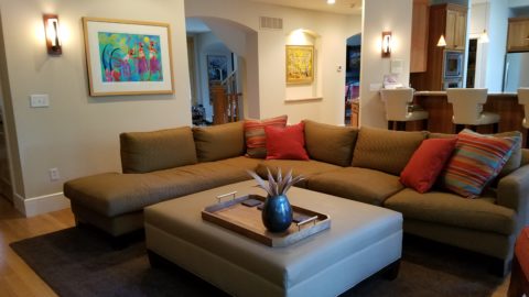
The framed lounge chair found a home in the new living room alongside the large sectional that they acquired from the previous owners of the house.
Here in the previous home, the painting over the fireplace has a prominent position, yet also has a place of prominence in the new home along with the chair and a half and the arm chair in the foreground.
Checking out a sample of a rug to add further color to the otherwise neutral scene.
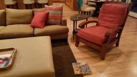
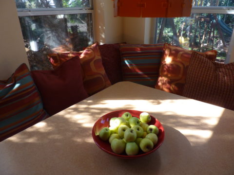
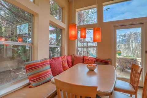
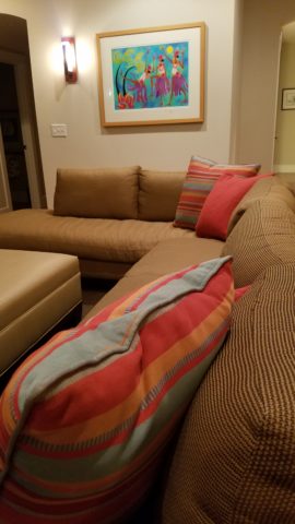
The simple placement of custom throw pillows initially designed for the banco in the kitchen are now colorful accents in the living room, on the newly acquired sectional left by the previous owners, are a remarkable save.
These pillows had seen their share of spilled milk and ground-in cereal over the years. But with periodic cleaning, they maintained their appearance perfectly.
Here the pillows are the perfect accent on the camel-colored sectional that came with the new house. The painting has been a family favorite for years.
The rest of the collection of throw pillows from that original breakfast nook are being re-purposed on the sectional in the lower level media room/office. They add the necessary splash of color in this neutral scene.
The fully upholstered chair-and-a-half also transferred from old to new. Previously in the family room, now in the music room/office. The master bedroom transferred completely. The girls’ rooms have a mix of their things and some new features. All in all it is beginning to take shape.
It pays to buy good materials that maintain well and take proper care of them. Not only will they offer years of enjoyment, in this case they bring the familiarity, to the new house, that is beginning to make it feel like “home.”
Sure, some might like the opportunity to start new without remnants of the previous life – but in this case, they cling to that which was comforting, familiar and theirs. Moving to a new home and being able to mix existing pieces so well with new ones to make this new house a home is a design success story!
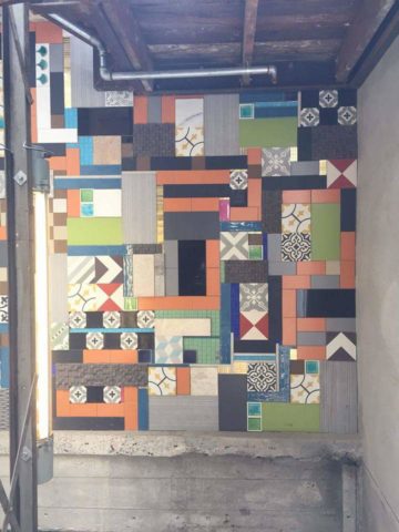
When you think about finishing a wall, you probably think about paint colors…you might think about a wallcovering – wallpaper, or even a mirror – I’ve previously noted how mirroring an entire wall can exponentially expand a room – a dimensional effect/illusion that suggests the room extends well beyond its actual size. But another wall treatment, with which I LOVE to play, is tile!
All over the world, the art of designing and creating decorative finishes with tile has been evolving for centuries. All cultures have utilized mud and clay, glazes and fire to bake beautiful patterns and colors onto geometric slabs. Shapes of rectangular, square, octagonal, dots or diamonds – the geometric shapes are many and the designs are limitless.
As is true with other wall treatments, I prefer not to stop on an outside corner. I believe that the color or material should suggest a built mass – part of the architecture. To stop on an outside corner suggests a veneer. It proves that the finish on the element is not a structural/integral part of a built mass. When you paint into an inside corner and stop, it allows the mass the read as though solid and not merely superficially treated. The same is true with tile. Don’t stop it until you get to an inside corner – if possible. There are situations that force a finished edge on the flat plain of a wall – but avoid outside corners at all cost!!
This entire shower is tiled floor to ceiling, around the pony wall, bench…no door…it reads like a built environment of stone tile.
Think of the surface as an architectural element. Tile from floor to ceiling, inside corner to inside corner – wrapping corners, if needed, along the way.
Take a backsplash…customarily used to do just that – catch splashes at the back wall of a wet area (sink) countertop…bathrooms and kitchens, behind sinks and between upper and lower cabinets – but why stop there?
The entire back wall of this kitchen is mosaic marble tiles in a herringbone pattern.
Think of it as a true wallcovering – wallpaper. Commit to the entire surface. Here are more effective examples…
The backsplash and entire adjacent wall were covered in glass mosaic tiles. It “reads” like wallpaper.
here again, the classic blue and white Talavera tile backsplash is continued along the entire wall from floor to ceiling.
We are currently working on a couple of kitchen projects that will soon be completed. They both use tile liberally. Each quite different from the other. Stay tuned for the finished products!
In bathrooms, the area around a mirror can be more than merely the backsplash. Embed the mirror into the tile surround or tile the entire wall and hang a mirror on top of the tile surface.
This mirror is flush with the surrounding tile, suggesting that it is embedded into a tile wall.
Planning this transformation, the mosaic vase was the inspiration. Then loose tiles were scattered on the countertop and the concept began. Note, the existing mirror was attached to wall with light fixture mounted above it and a medicine cabinet off to the side.
The transformation involved removing the medicine cabinet, taking the floor tile up the wall and wrapping it floor to ceiling. It was also cut into smaller squares to use behind the sink as a “full-wall backsplash.” Then punctuated with glass and glazed tiles to create an updated design. Relocating electrical to flanking the mirror for a pair of new sconces and a new countertop, faucet and sink with existing cabinets painted resulted in a cost-effective design.
Here a mirror is mounted on top of the fully tiled wall. Inside and outside of the shower enclosure the tile is a true wall treatment.
I recently received this advertisement in my email. It was such a spectacular collection that it caught my eye and I share here one of the patterns and context shots as the backdrop to a range.
Mosaic assemblages can be fun! Here is a fireplace surround.
The addition of three-dimensional pieces adds interest.
This exterior fireplace surround tolerates the elements – an all-season installation.
Here is a mosaic mural of a dynamic geometric abstraction discovered in New Zealand. We are using this inspiration to establish a theme in a current restaurant project. An interpretation of this in the form of geometric tiles of various sizes, colors and patterns will be used to create a cohesive repeated design element through various areas of the restaurant – both inside and out. Watch for this completed project in coming months.
Commercial restrooms can benefit from full-wall tile treatments too. Not only does it look complete, but it is an ease of maintenance consideration.
Three dimensional tiles add interest to this cactus motif!
Fun with color and texture, tile are also easy too keep clean – terrific for public restrooms.
Murals are also terrific ways to use tile as art in your interior/exterior designs!
This is embedded into the stucco for an integral installation.
When using outside though, remember to consider the range of temperature and moisture to which it will be exposed. Porcelain is the most durable in areas where the temperatures get to and below freezing. Freezing and thawing can destroy tile. Many murals are made from clay that is not suitable in cold climates!
Inset into the tile wall treatment is this stunning glass mosaic abstract mural.
Tile – it’s a nearly limitless medium. So consider the possibilities for your next project! As a piece of art, an accent wall or an entire installation – full-wall treatments make a statement! Have fun with tile!
As an adjunct to last week’s story about the progressive young couple and their dramatic kitchen remodel, I thought I should finish the subject and tell about the adjacent living room transformation and comfortable family room on the lower level.
When the kitchen grew to become the focal point upon entering and the bar counter expanded into the living area, it reduced that space to now become a comfortable sitting room for guests to gather or the family to relax while activities are brewing in the kitchen.
Looking through to the dining room where a built-in storage bench was added along the window wall, offers additional seating. A new fabric-shade chandelier softens the light levels. All lighting in this remodel are on dimmers.
The former white brick wall had gently rubbed edges to suggest a distressed condition exposing the red brick beneath. The fireplace had an unrelated golden oak mantle and surround with insipid tile inset also used to cover the hearth. The tile was a glazed faux marble with a Victorian design accent feature.
By simply painting the oak white to match the rest of the wood trim throughout the home and also painting the brick a soft taupe/grey tone, the look was instantly transformed. But they still had that awful tile…so here’s a design tip: to buy time either while you decide or until you save-up for the next phase, paint the tile away!!! To accommodate a new TV that is to go over the mantle, the wood surround was shortened. Notice the extra piece of wood trim that was removed to lower the mantle.
The hearth was removed and rebuilt (without the cut-off corners) with brick and painted to match the wall. Lucky for them the hardwood floor went beneath the hearth – so when they modified the size, they didn’t have to patch the floor! Tile was removed and replaced with 2×2 mosaic Carrara marble to coordinate with the herringbone mosaic of the same marble in the new kitchen backsplash/wall (see last week’s blog).
A sofa found, for nearly free, was in good shape and reupholstered beautifully in this plush, durable navy solid.
The classic blue and white motif was punctuated with organic yellow.
The newly refinished original hardwood floors – taken from a golden oak finish to a rich espresso/walnut stain…
…with the blue and white wool hook rug creates a handsome contrast. The rug actually “reads” blue and white, but upon closer inspection has warm khaki tones, soft turquoise detailing and is quite complex.
This revitalized cozy ambiance of this new sitting area/living room is perfect for this growing young family!
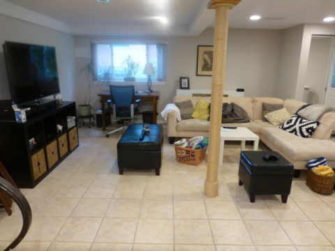
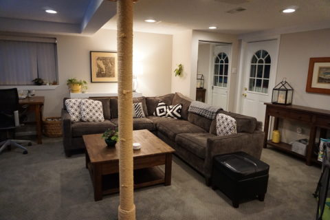
And for a more expansive gathering space, the lower level family room received a new sectional sofa in a durable charcoal fabric and a low-pile small diamond patterned wall to wall carpeting to conceal what had been cold tile floors and make a comfortable room for all seasons!
Purrrrrrhaps someday they’ll have a cat to climb that crazy rope-wrapped pole!!!!!
We all know that traditional housing floor plans are changing to maximize smaller footprints. The result is a more open layout. This preference, often seen in “loft” design where warehouse space is converted to living spaces – without many walls and with an eye on the interestingly industrial finishes of the existing space. But this same concept applies to new home construction for starters or down-sizing to smaller homes and is definitely applicable in remodels of existing traditionally compartmentalized plans.
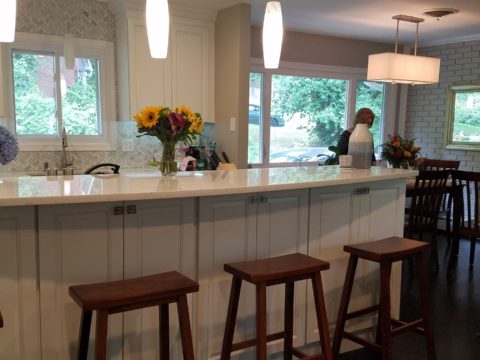
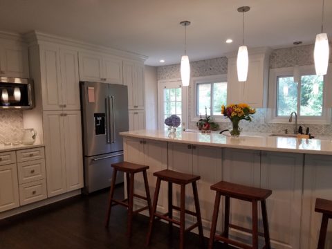
Lifestyles too have opened kitchens. Although often to maximize smaller spaces, they are also more open as cooking is more celebrated in the home and related activities are shared. Kitchens have truly become the fulcrum of family life. So when this young couple purchased their first home, the vintage 1960s split-level plan was not quite right.
The kitchen was a narrow galley-style tucked into a rear corner of the main floor. And although it had recently been remodeled, it was confining and not conducive to entertaining and growing a family.
The point of arrival was an open space with entry wall about 12-15 feet from the front door. To the right, the living room had a focal fireplace and the adjacent dining room made an “L” back to where the kitchen was tucked behind that previously mentioned entry wall.
So this progressive young couple thought way beyond merely opening the wall creating a pass-through bar to better connect the kitchen to the living spaces. No, they said ” Let’s blast this baby out of here!” And with that they proceeded to visualize the point of arrival being the actual kitchen in full-view as guests arrived. Hello!!!!!
The former kitchen containment was revealed to present the new elongated welcoming bar counter-top, luminous glass pendants and supplemental recessed down lights, to meet and greet all who pass through their front door! Original hardwood floors were refinished in a dark walnut stain.
Their priorities were to create a larger, more functional kitchen with a clean, modern look and feel while making all open to better interact with their soon-to-arrive baby!
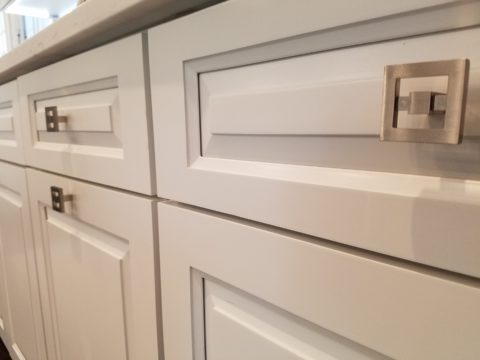
The clean white on white finishes in the kitchen are fresh and crisp. Lest you think they saved and added to existing cabinets, they did not – all cabinets are new!
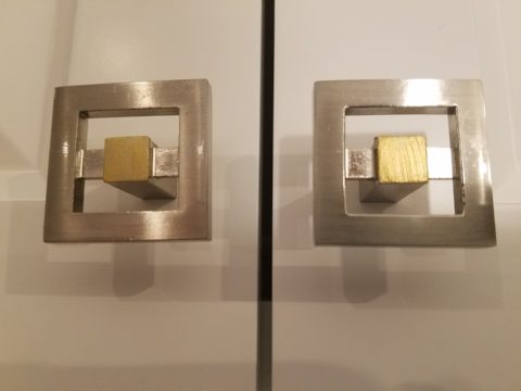
And this might be considered gilding the lily, but we added a splash of artistic expression when we hand-painted the small squares in the new brushed stainless cabinet pulls to give them a bit of extra pizzazz!!!
By using the Carrara mosaic as a wall-covering, rather than merely a back-splash, the walls get a truly finished built-environment “read.”
The upper bar counter-top bows at bar-level to offer a more comfortable conversation scene.
The living room became a cozy sitting area off this wonderfully open kitchen and dining area.
Existing brick walls were softened with a grey-taupe to contrast with the white trim making it POP!
The fireplace now has a complimentary new Carrara mosaic in a diamond pattern to coordinate with the new herringbone mosaic of the kitchen wall.
And baby accoutrements adds colorful animation to the beautifully finished scene!
“HELLO!” they say. “Welcome to our beautiful new home!”
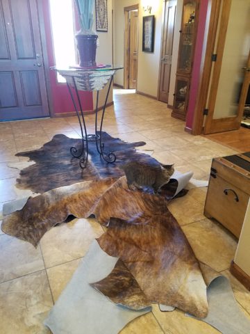
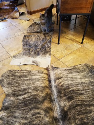
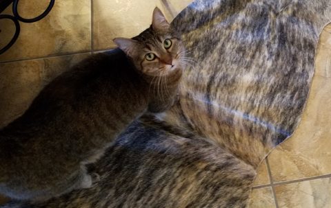
During the course of this day’s consultation this precious and perky bob-tailed cat, Kachina, inserted herself into the entire process. She greeted me upon arrival, walked all manner of adjacent furniture as we discussed the scope of work. She tip-toed across tables, sofa and chair backs, and ultimately the hides we were considering for upholstery.
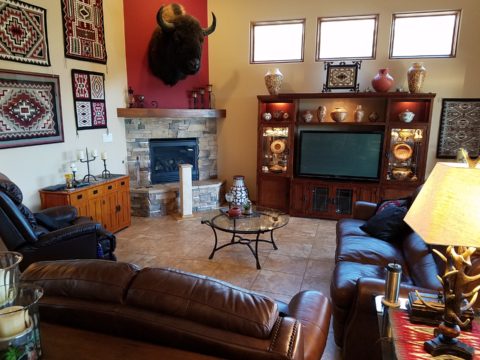
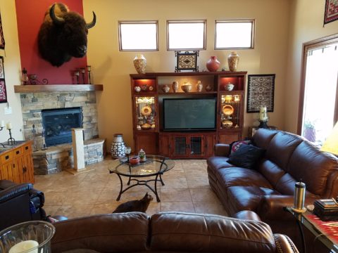
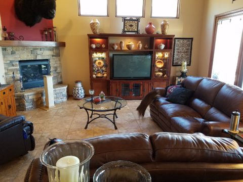
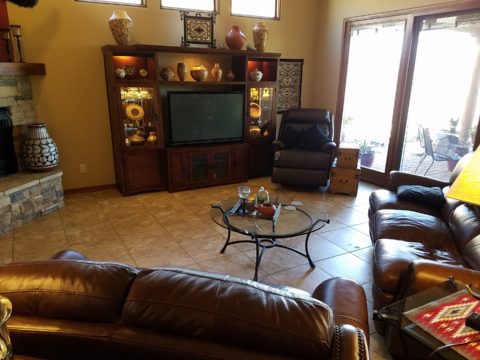
Initially we viewed the room and its present arrangement and realized that the l-shaped right angle position of the sofa, loveseat and recliner conflicted with the angles in the room. the sofa was perpendicular to the TV/display. The fireplace was at an angle in the corner. Neither one had the central focus – the attention was split from all angles. So the question was…Is it necessary to have the recliner as the primary TV viewing piece? Seemed like all the pieces were crammed together and the room was not being utilized to its full potential.
Kachina even has her eye on that bulky sofa as though to say – MOVE IT!
Kachina leaped onto the sofa to make her point- agreeing to the subject of our conversation!
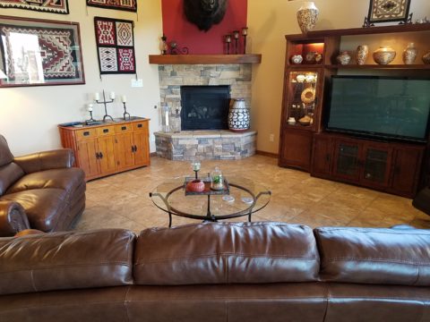
It was determined that the recliner need not be positioned to directly view the TV. Once we turned the sofa to be parallel to the fireplace, it also opened the angle to the entire room and framed both the TV/display unit and fireplace. The recliner tucked into the far corner -not facing the TV – created a cozy nook for reading and next to the patio doors allowed a view of the backyard.
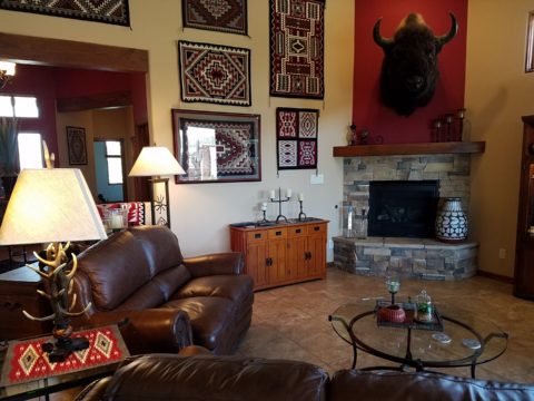
Needless to say, this fireplace crowned by this magnificent buffalo was an incredible focal point. Formerly from Wyoming, this couple knew this buffalo. They knew his name and knew that he became too aggressive and gored at least one female to death – who had to also be put down and who’s pelt was on the floor in another area of the home. The hunt and subsequent shoot has been preciously preserved and revered. These were not mere trophies.
This is the most extraordinary collection of very fine Native American Art I have ever seen in a private residence. From to carved stone, amazing weavings to paintings and pottery, the presentation is stunning.
To soften all the hard and cold materials of the floor tile, leather and iron detailing, we are now on the hunt for the perfect area rug. Probably a shag to carry the balance of the contrasting finishes. Design is all about contrast, balance and harmony. Unless the intent is to intentionally disrupt, in which case, the contrast takes center stage!!!!
These gorgeous brindle cow hides were so exotic and beautiful. The patterns and colors were wonderful and the couple who owned them had a great respect for the animals, and the celebration of their beautiful pelts.
Kachina was nearly camouflaged with her pretty pelt against theirs.
It’s fun when pets participate.
We will be making a pair of ottomans with these two hides. Great for pull-up at parties to gather around the cocktail table in the center of the room. Watch for the additional photos once the work is finished.
The warmth of summer is still here…but it’s time to plan for fireplace season!! Officially fall begins on September 22 – just a few more days. It will be too late once the chill is in the air – so, be ready! If your fireplace needs a facelift – start thinking now!! The materials available, the accents and pizzazz, dimensional modifications and trim carpentry all contribute to the array of options to make your fireplace a fabulous focal point.
Whether a traditional-ish style, a southwestern kiva or a contemporary statement, there are certain steps that will transform instantly…or reasonably soon!!
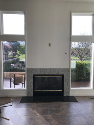
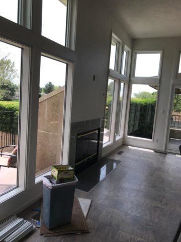
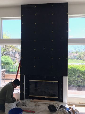
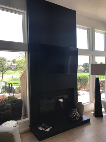
Here are some examples of finished products AND works in progress…perhaps some ideas for your lifestyle!!! First we have a fairly contemporary home that was recently acquired and needed an update. The fireplace wall was flat and had no dimension or personality. Usually viewed as a focal point, a fireplace should command some respect.
This flat, non-dimensional, facade was weak at best. Under the guise of upscale, the granite surround provided little impact – if any. It was a non-commitment, to making a statement. In order to give it some presence, we brought it forward – just a touch – only a couple of inches, to provide dimension and mass.
By encapsulating it in black porcelain tile, it added strength and emphasis. The blank wall above it – with the outlet – probably housed a TV. Naked – it was surrounded by white painted sheet-rock walls above the weak granite surround.
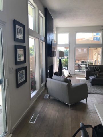
To have added the dimension and contrast of materials and to have COMMITTED to the entire wall – it now commands respect. It has structure. Not to mention, the black TV melds into the facade and is not naked in the room.
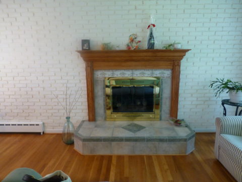
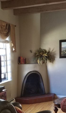
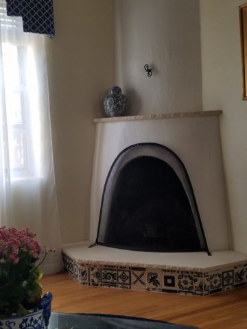
In a completely different scenario, this quiet corner kiva was simple, yet lacked detail. The original 40+ year-old broken red quarry hearth was a bit dingy in its newly refreshed interior.
The new color scheme is blue and white and therefore, with the New Mexico context, we added Mexican Talavera tile to the face of the hearth (could have been Portuguese or Greek – classic navy and white is worldwide in its history of classic style). In addition, for depth and detail, we placed a creamy, broken edged sandstone on the top of the hearth and also on the upper mantle ledge.
The result is fresh and classic – a simple, timeless update that will stand nicely for decades to come.
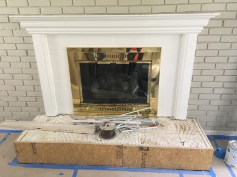
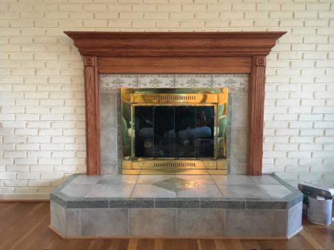
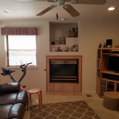
This next example is still in the process of transformation. An attempt at a traditional statement of wood molding – the golden oak, insipid tile and flanking brick were in dire contrast – not the good kind of contrast. The entire statement was weak, yet screaming in its ability, to call attention as the focal point that it was, to command the space – albeit, ineffectively.
To begin – as a band-aid for a temporary fix, we painted the wooden mantle and surround and even the inset tile. Knowing this was temporary, it was an inexpensive, non-structurally modified, place-holder.
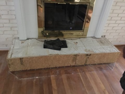
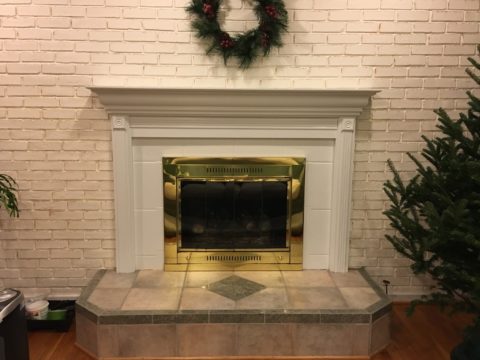
This project is currently taking another step to modify the fireplace. As time and budget allowed, the hearth was squared – eliminating the angels and some of the over-generous depth. Flanking brick walls were painted a contrasting gray.
Soon to be completed….watch for this finished product.
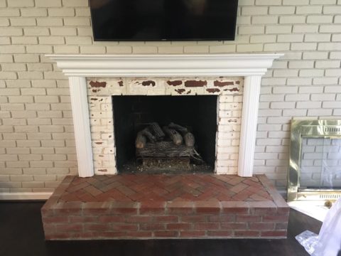
The idea of this missive is that there are subtle changes that can take the “curse” off of a design dilemma. And there are certainly many transformative changes that will take things up a notch.
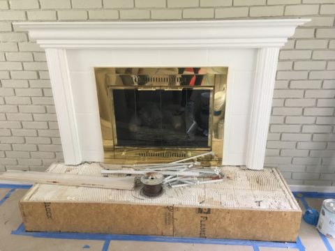
The next challenge in this department of fireplace facelifts will transform this dated design element. Currently in the design phase, this flat-faced and dated surround has great promise. The modifications will be remarkably easy and dramatically effective.
How does your fireplace speak about your interior design and living area’s focal point? Stay tuned!!!!
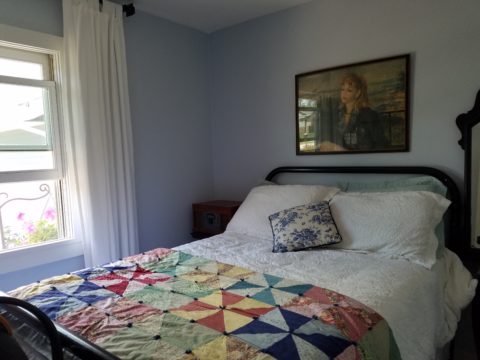
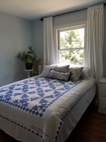
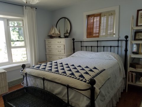
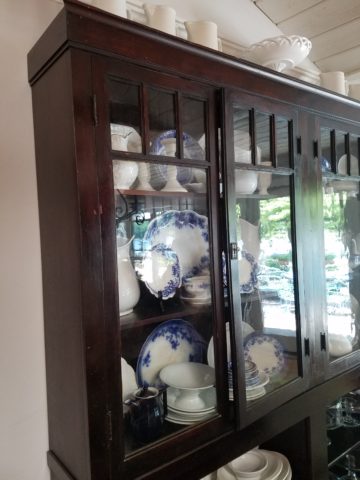
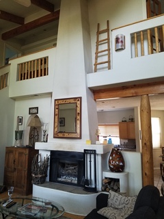
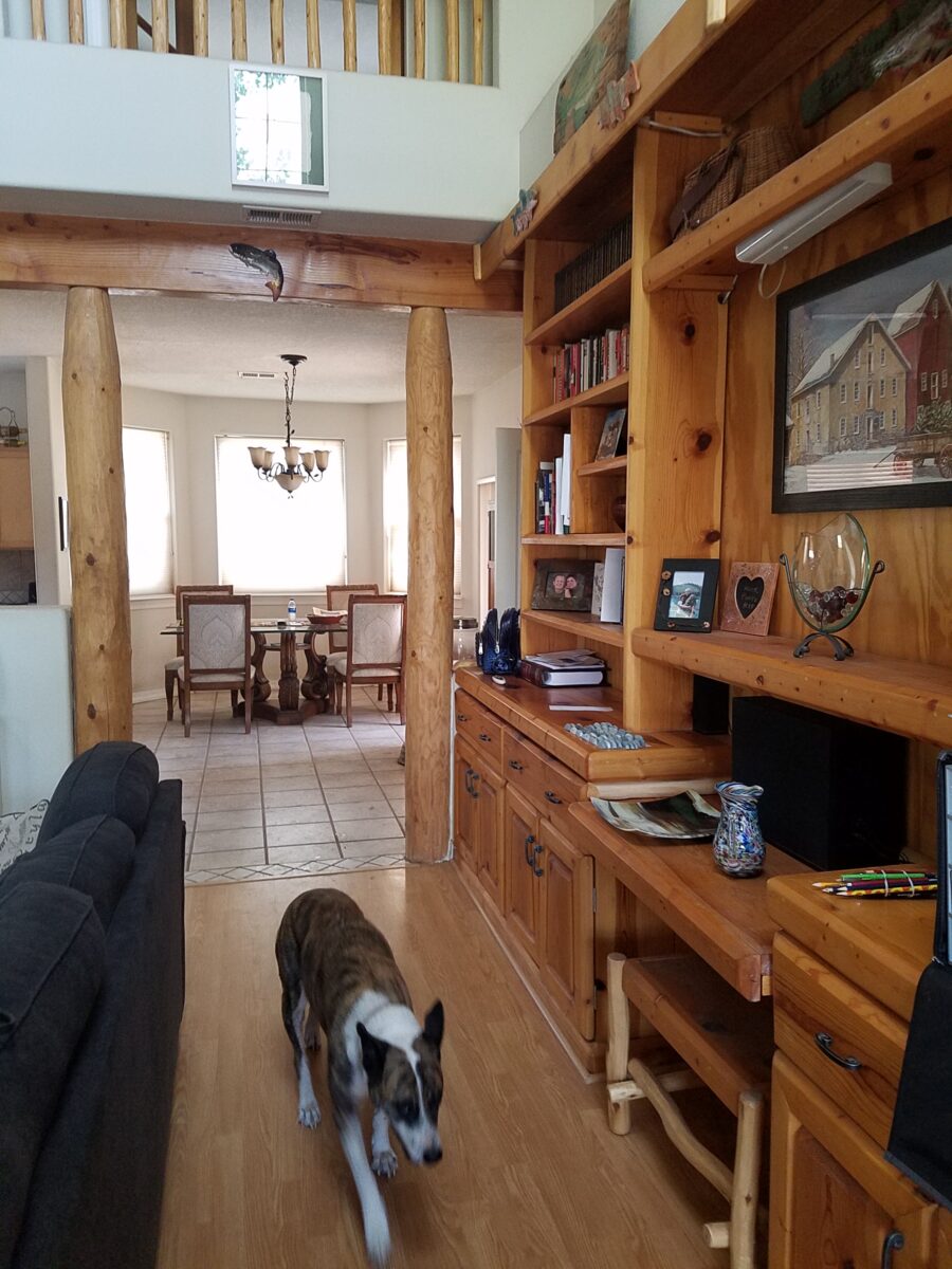
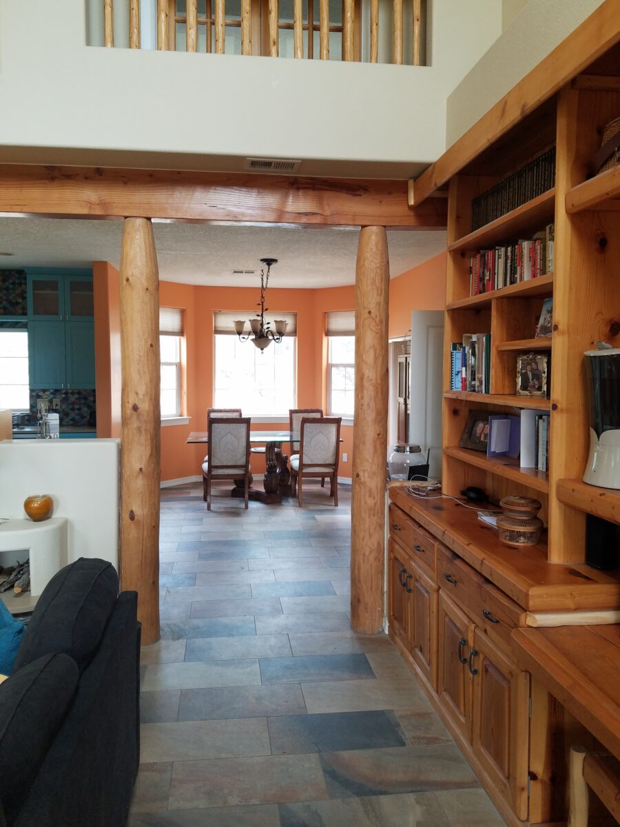
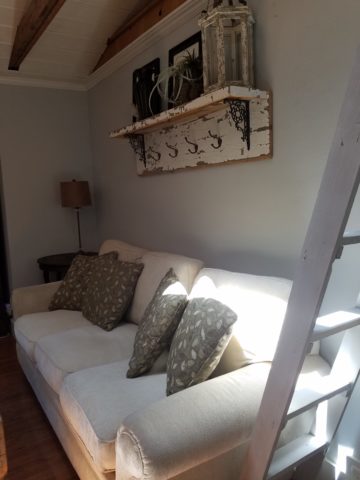
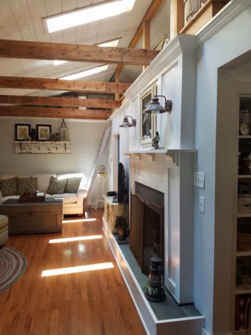
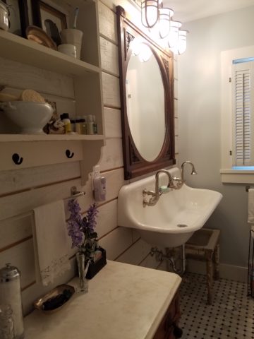
I would like to share a treat of a house in a magical setting along a quiet waterway in the lush rural lake community of Edgerton, Wisconsin. A most talented friend has created a riverside home from a modest rambler. What was a dated structure with limited interior appointments, low ceilings, tiny high windows, and ordinary fixtures is now a soft, sophisticated, space outfitted with treasures gathered in the countryside, filled with history, character and antique charm.
Hands on and knowing exactly what she wanted to achieve, she began collecting interesting fixtures and hardware, furniture pieces and finishes. She hired a remodeling contractor, but worked closely with him and his architect to detail every facet of this home. Unwilling to compromise certain features, she enlarged all window openings, reconfigured the entry, gutted the kitchen, redesigned the bathrooms, ripped out the ceiling exposing structure – increasing volume exponentially – and added a garage.
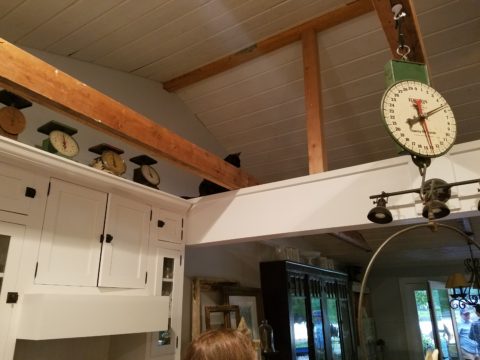
Exposed beams, new white-washed tongue and groove boards applied to raised ceiling, a found wooden column used for structural support, new crown molding, bead-board wainscoting, re-designed fireplace surround, and creatively concealed storage closets, have re-shaped the entire character of this interior so dramatically that all who entered, not having yet seen this incredible transformation, were awed.
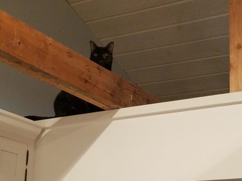
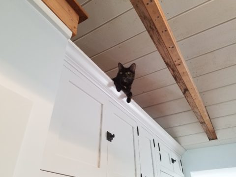
Hearing their comments as they passed through the spaces was amusing in their commonality. Everyone was amazed at the amount of work done, creative elements incorporated, fun finds she had collected to transform this modest house into this cozy cottage. Her two cats have wonderful vantage points to watch the activities in the rooms below as guests gathered to celebrate the weekend’s family wedding festivities.
Daylight streams through windows and floribunda gardens around the house are now communing beautifully with the interior.
Ever-so-soft blues, with whites of every shade, create a soft backdrop to collections of fine china to vintage scales and myriad eclectic antiques.
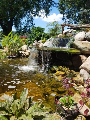
Outside a recently completed multi-tiered pond emits soft trickling background sound which wafts inside through the many open windows. Not to be reticent about being hands-on, this tenacious designer personally packed 23 loads of boulders and large stones into her truck, off-loaded and placed around the periphery of the pond. She planted tiny creeping vegetation among the stones, water plants, multiple trees and perennials to establish instant-gratification landscaping in her expansive backyard, which is a lush verdant botanical expression that grows abundantly right down to meet the river.
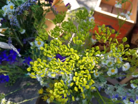
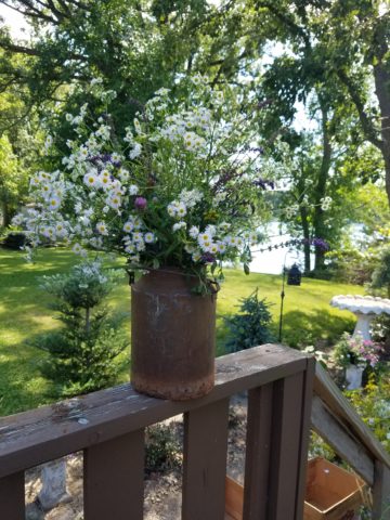
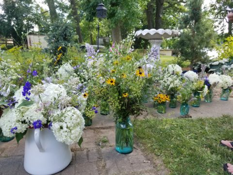
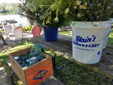
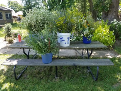
A great get-acquainted bonding of disparate family and friends occurred when we collected buckets of roadside flowers to make arrangements for the reception venue.
Wild bouquets punctuated with spectacular domestic flowers from the gardens surrounding the cottage provided fun activity and contributed to the charm of the scene.


 Hearing their comments as they passed through the spaces was amusing in their commonality. Everyone was amazed at the amount of work done, creative elements incorporated, fun finds she had collected to transform this modest house into this cozy cottage. Her two cats have wonderful vantage points to watch the activities in the rooms below as guests gathered to celebrate the weekend’s family wedding festivities.