A Designer’s Eye

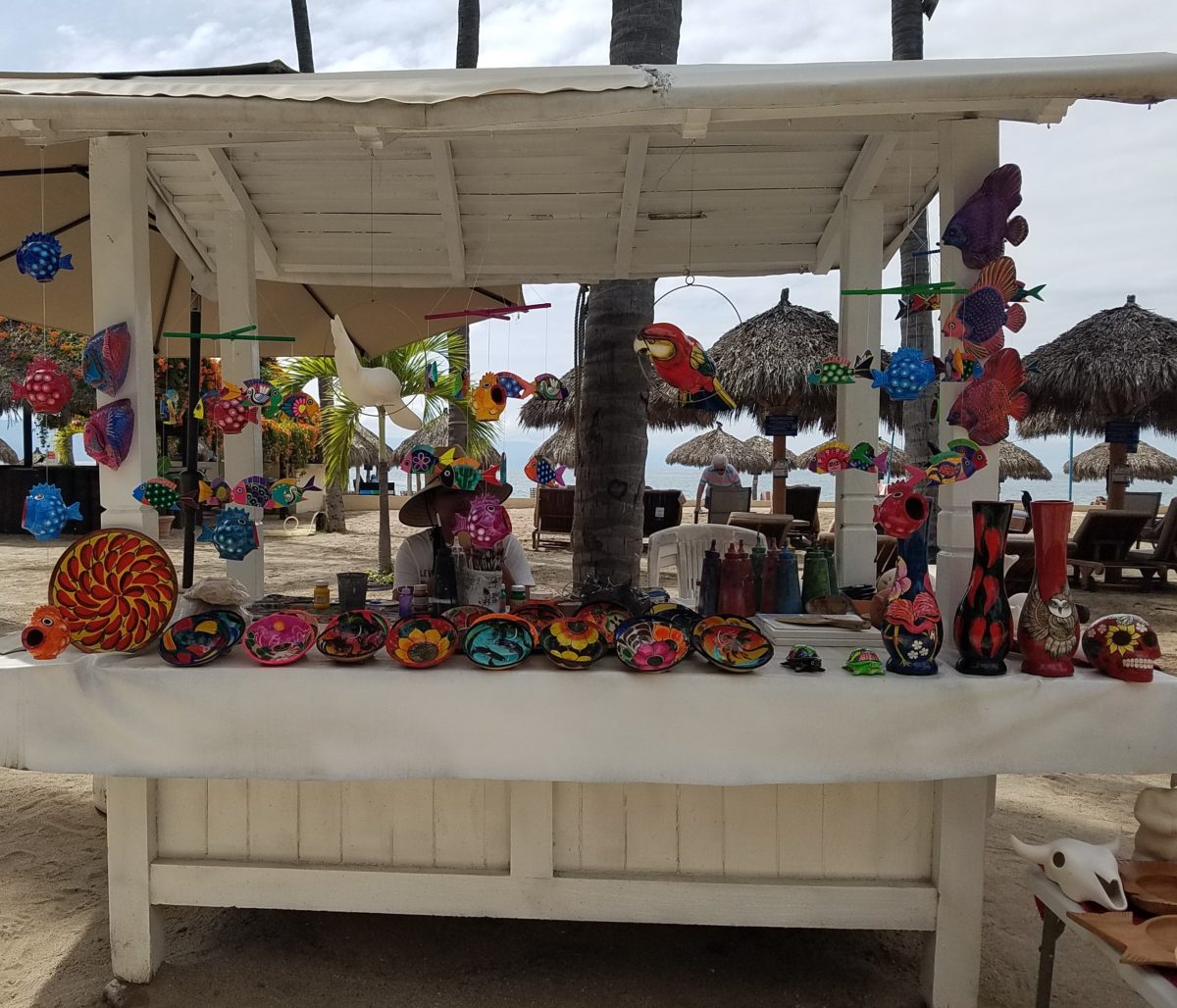
Hidden genius can be found amidst seemingly redundant arts and crafts.  Walking by you might not notice. Passing by many beach stands, they begin to look alike – very repetitive. The colorful wares and handcraft are striking and eye-catching and full of fiesta, yet if you pay attention you will notice the nuances. Discovering the true designer/artist.

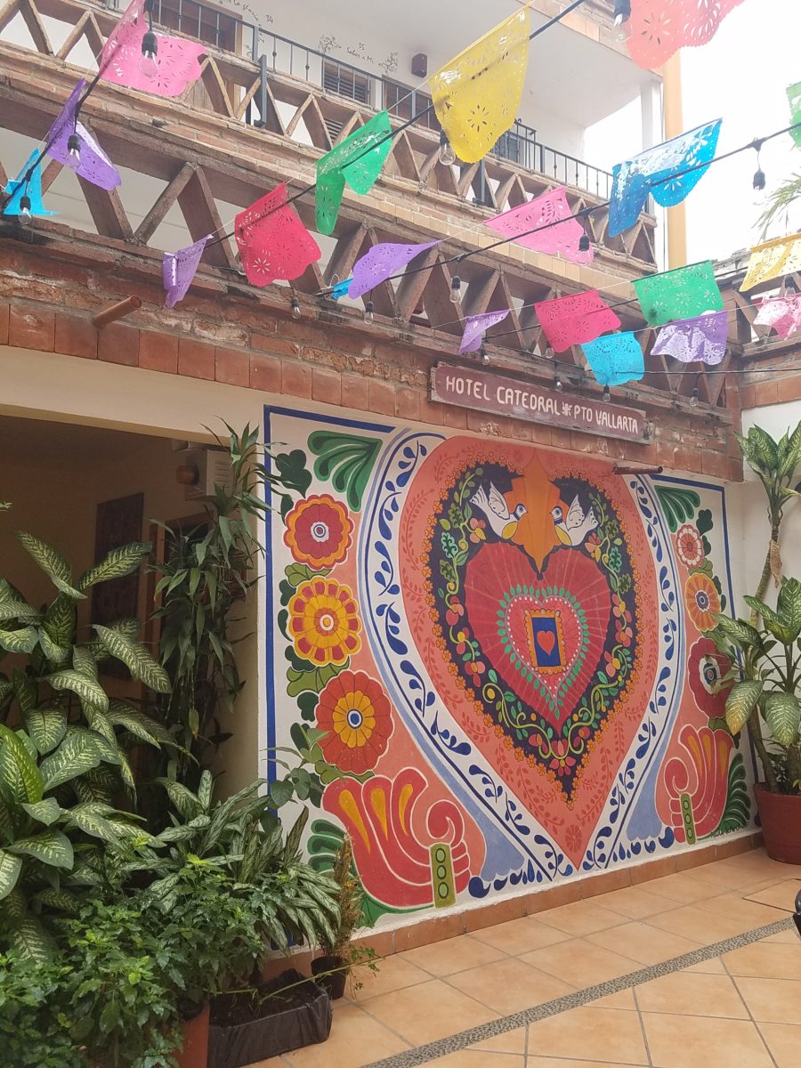
An escape to the tropics and especially to another country offer a reprieve from the cold and add an exotic element to getting out-of-town. Discovering the many indigenous art forms that come from all over Mexico is fun and exciting. Getting to know the makers and the distinctions in their work is another exciting level of appreciation.

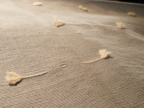
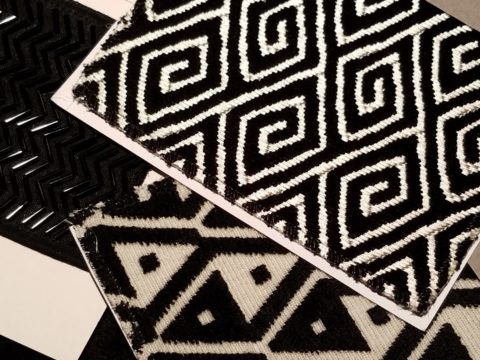
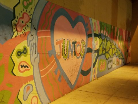
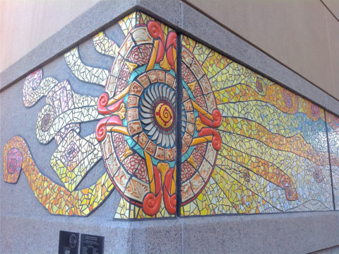
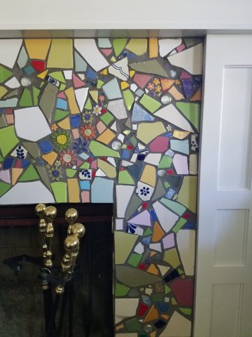
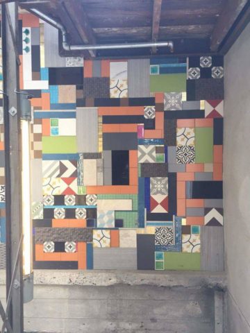
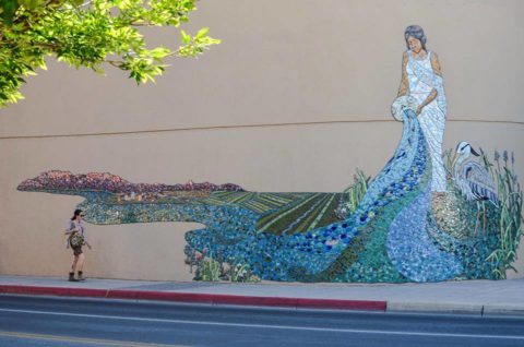
As is true with so many things, detail and design matter. I buy a smattering of things for my gallery/gift boutique. I like to support the local vendors and makers that produce these fantasy-filled folk-art pieces.  From fabrics to stuffed animals, painted pottery to murals and mosaics, the art is abundant and deserves to be examined.

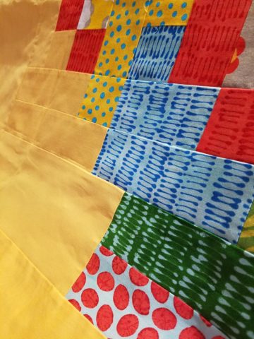
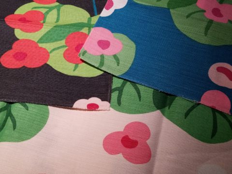
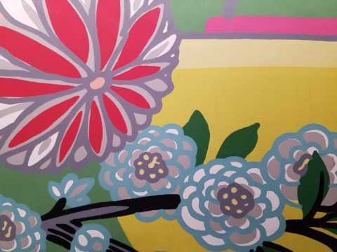
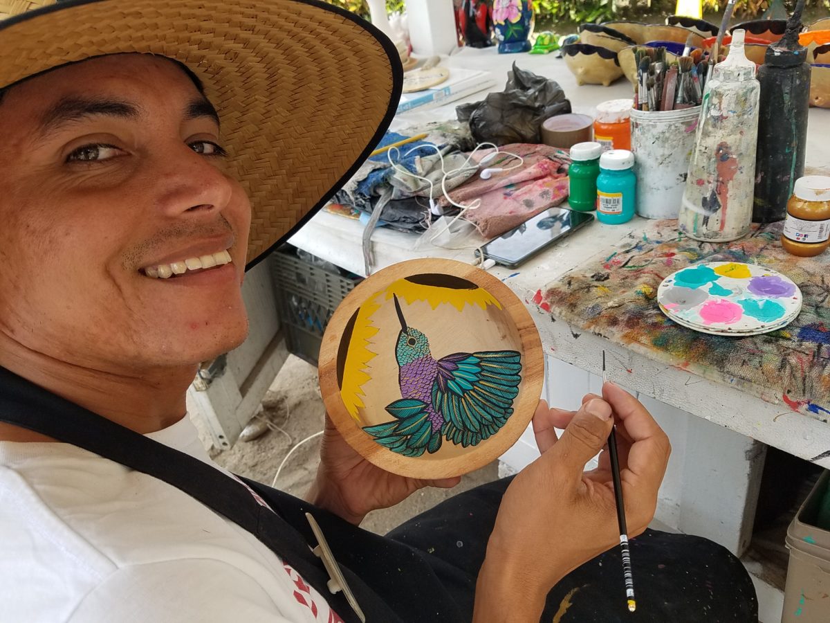
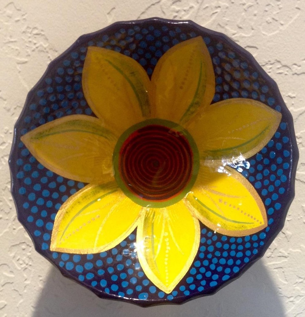
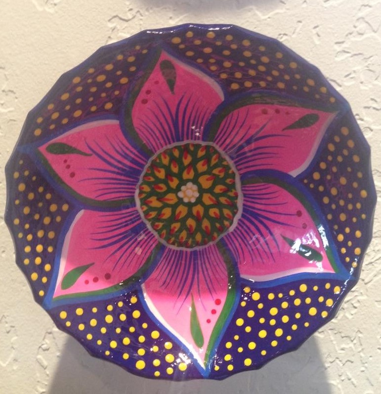
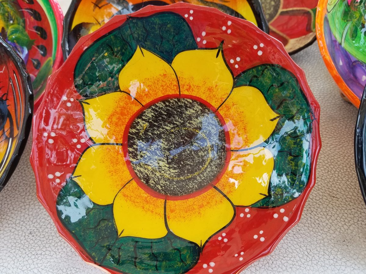
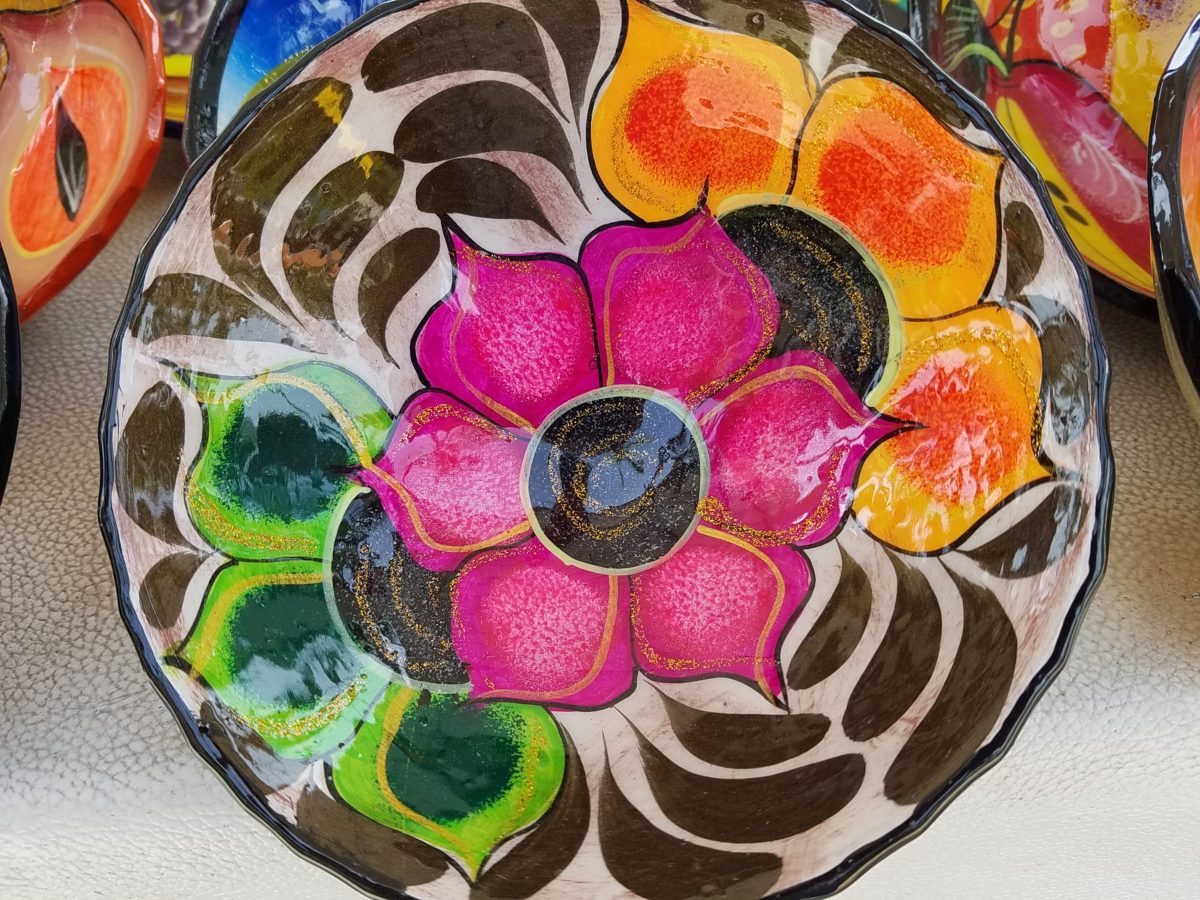
As an example, I am focusing on Victor Rivera. Victor is an artist and more so, an incredibly gifted designer.  His sense of pattern and imagery is exquisite. It reminds me of my mother’s love of Marimekko and Lily Pulitzer in the 60s and 70s. Her appreciation was a tremendous influence on me. The joy of color and pattern was a exhilarating celebration to wear and accessorize your home. Victor seems to possess a like-kind of innate sensibility and talent for devising and executing sensational color, pattern, motif and resulting design. He is currently creating, from a modest beach stand, what I believe is clearly different from others doing what might be thought to be similar work.

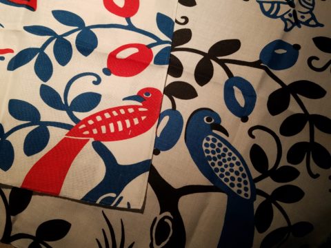
Like Maija Isola – a peer of my mother’s, having been born in the 20s her designs transcend the many decades in which she influenced color, pattern and bold imagery. Her work continues to live and influence the evolution of Scandinavian artistic direction and its impact on the world of design.  https://www.marimekko.com/com_en/world-of marimekko/design/designers/maija-isola

Similarily, architect Josef Frank contributed greatly to the design world through his architectural work and also his love of his limitless artistic expression through color and pattern. https://www.architecturaldigest.com/gallery/josef-frank-fabrics-london-exhibition

Watching Victor select his brushes, for the various applications and control on his designs, is fascinating and amazing.

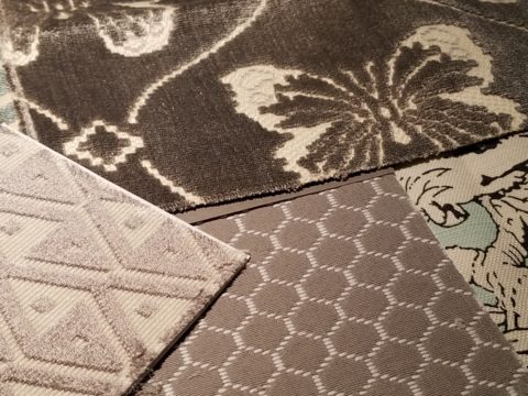
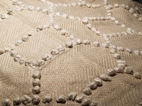
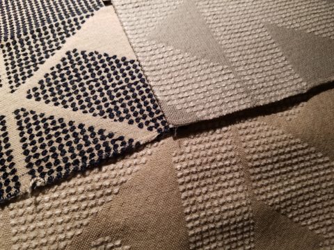
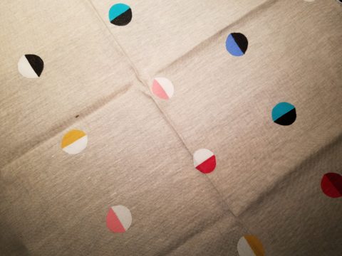
The sense of pattern and design is a different category of artistic talent, in my observation and estimation. A master, of pattern, form, design detail and art, is an artist. However, the focus on the repetition and integral connection of patterns – for this purpose in a one-dimensional application – is an intensely different pocket of an artistic brain.

And this brings me back to Victor. I want someone in a position to embrace and promote him, in the world  of fabric design and influence, to catapult him to the level to which he can and should aspire. Shout-out to Alegreea and the fabulous designers at Pineda Colavin!!!!!!!

His hummingbirds begin with a pencil drawing and basic “fill” colors at the start.
Working on both clay and wood prefabricated bowls by other artisans, his many layers of colors and details take shape.

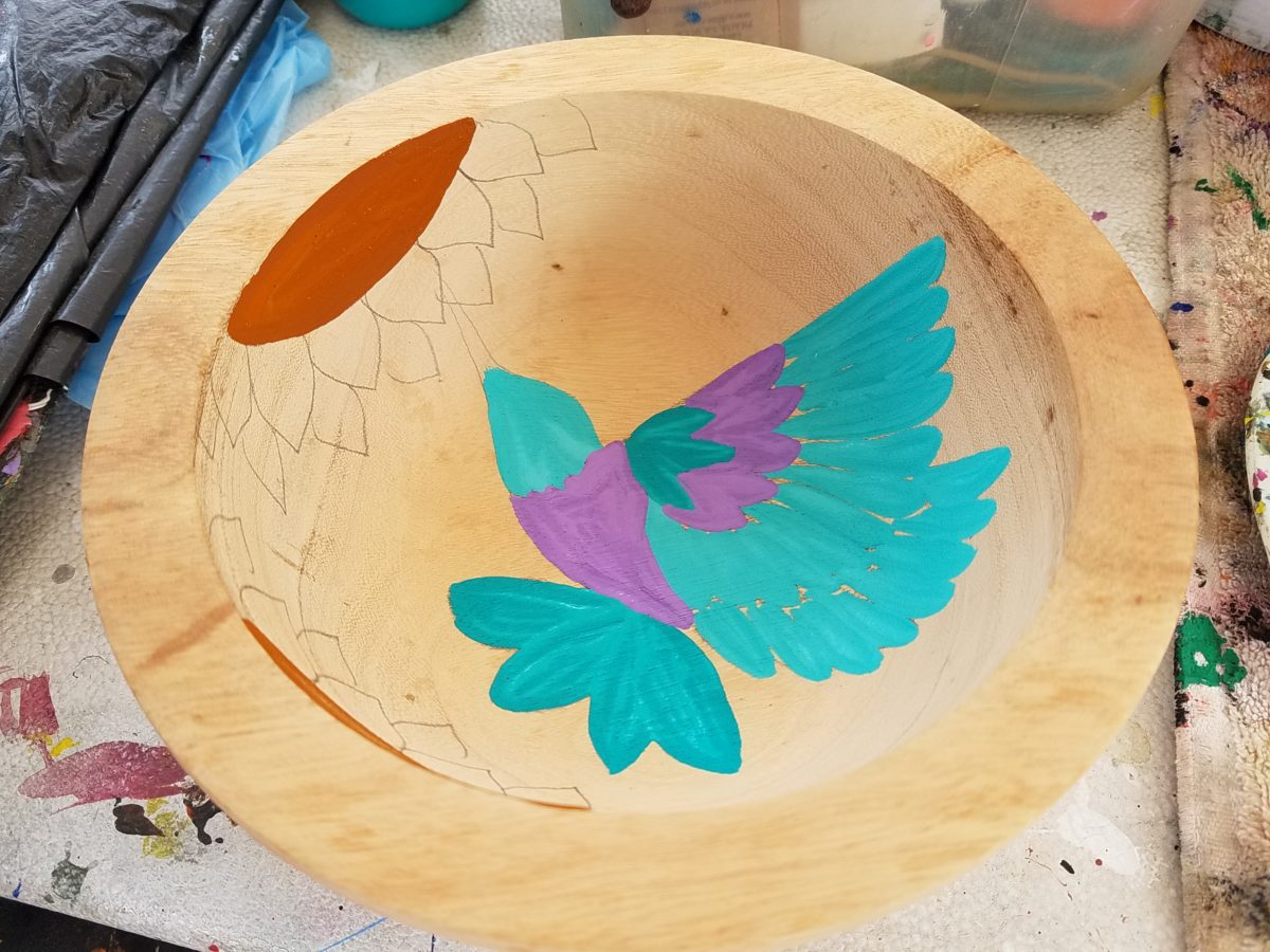
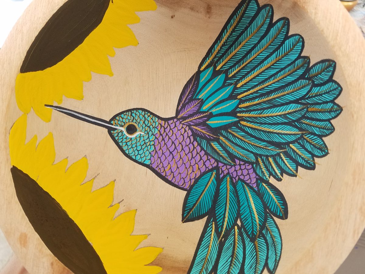
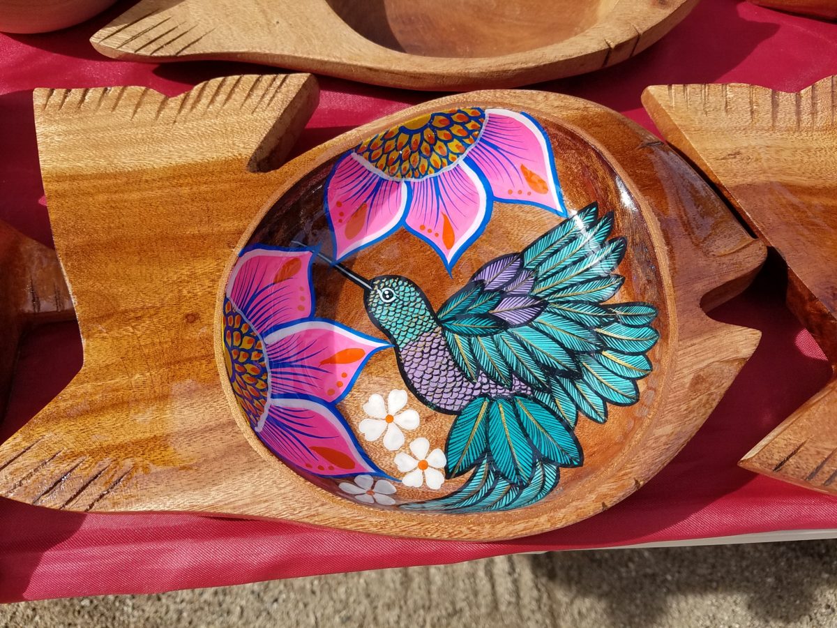
With myriad, mostly monotonous, Mexican street/beach artists, Victor is a beacon of light that stands out among the throngs. Once you stop to notice – the work he is creating is astonishingly  unique and beautiful. His designs are laced with meticulous detail, outstanding color combinations captivating and beautiful.

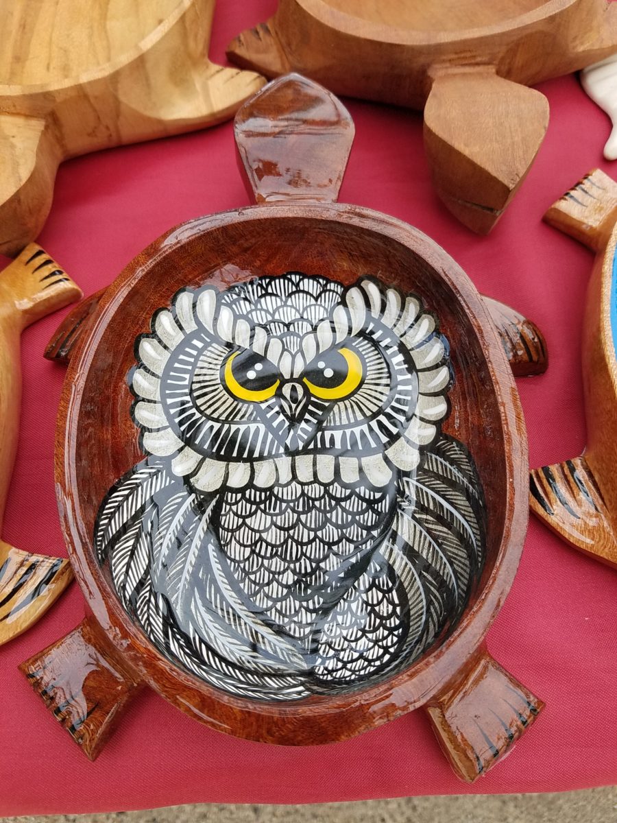
He will paint expeditiously simple works to satisfy the tourists and keep an inventory at the ready for spontaneous purchase – but when he has quiet time and is caught-up on his table of offerings, he creates amazing pieces that are truly remarkable. It is important to note though, that his more expeditious pieces still have a color combination with strokes of accents that still are above and well beyond the common.

He will paint commissions all day long – but left to  his own devices, his creativity is boundless. And, referencing back to the Scandinavian designers, his floral designs are outstanding!

Taking time to examine the world around you and the beauty of detail that awaits, is a joyful experience of great discovery and satisfaction! Not to mention great fun!!!

Fun with Victor, art and design!!!!!

Cool Rides Hot Design!

Racing through the Albuquerque Sunport several times this summer, I had seen in swift passing the blindingly brilliant bling of the Low Rider exhibit that had been set-up at the end of June. Last week I had an opportunity, while waiting in the arrival area, to peruse the many amazing rides that commanded the concourse.

This powerful art exhibit of the unique Latino culture of Low Riders represents great personal pride and emotional attachment on behalf of the owners and artists (often one and the same).

These finished products are almost like songs…from memorials to love interests, family and friendships – they express heartfelt emotions to present and share with the world.

Once stereotypically  thought to be limited to the bad boys taunting law enforcement with their wild paint jobs, gleaming chrome, bold moves, wild suspension, blaring music in a defiant statement of cultural expression, these amazing art pieces have since been recognized by distinguished museums worldwide for their exquisite attention to detail and the stories they tell.

In this exhibit, these moving statements of artistic expression are all home-grown. Yes, each made here in New Mexico it makes it all the more relevant.

Visitors to the Sunport have this wonderful opportunity – up close and personal – to examine the seemingly flawless machines adorned with sensational color, pattern and design. “Kids” of all ages will appreciate this show!

Each as though a canvas for the artist…motorcycles, kid’s versions and cars adorned with glitter, shine, polish and paint colors all contributing to the each unique statement. From airbrush to tedious handwork and limitless patient detailing results in exciting assemblages.

There are also decades of photos featuring the evolution of the culture here.  

By highlighting these fine, local examples the City hopes to elevate the art form on its merits and dismiss some of the stigmas attached with the stereotypes.  

And we all will have a little fun imagining the thrill of taking a ride in/on one of these beauties!!!

Enjoying Creativity – How Do You Exercise/Express Your Creative Juices?

Have you ever had a moment or period of time when you longed to create something just for fun? It might be to crochet a blanket or knit a scarf.  It might be to build a model plane or learn how to cast a bronze. What have you longed to create?

It seems that everyone needs a creative outlet even though they might not recognize it as creativity. When speaking to a guy  about his interest in working on cars, he didn’t consider his work “creative.” To work on a car for purposes of enhanced performance, restoration, maintenance or repair all takes a certain amount of creativity. The thought process of problem solving and taking action requires creative thinking.

Gardening, painting, sculpting, carving, pottery, collage…there are so many outlets for relaxing creativity. The idea is to not do it under pressure. Lest one defeat the purpose of the relaxing aspect – just for fun – pure joy.

Yesterday I spoke to an architect who said that her creative juices needed exercising. Despite the fact that her daily work required lots of creative thought, it was not pure pleasure. It was not all fun. She wanted/needed another outlet. So she set forth, to do some creative design time, purely for her leisure. She started creating desert floral collages, in a size that could be shared, as greeting cards. She brought them to show me, with a modest timidity, and was most surprised and thrilled when I received her work with great enthusiasm!

Rebecca has found the medium of paper to be quite satisfying, It is clean and precise, crisp and conveys her intent. She loves flowers, lives in the high desert and communes with cacti and appreciates all flowers – and with that her exciting, yet quiet, introspective, personally satisfying, creative expression has found an outlet.

With positive feedback from several people, she wants to launch a re-sale card line! Now the creative process goes another step. She needs to establish a brand – at least a name for her card line. Will she want a logo? What about her entire experience can she list in words and cull and distill to result in the perfect identity?

There are two parts to this situation and the first is to recognize the need for and find an outlet for the relaxing exercise of expressing creative juices and the second is receiving positive reinforcement for your efforts. Inasmuch as the second might seem  unnecessary, it is a great affirmation and valid “feel good” feeling to create for the fun of it and have your work appreciated!

It need not be commercial  – but “selling” your idea or creative project is even MORE flattering.  Although, it is usually not for compliment much less profit.

Creativity can be relaxing, if it is not in a demanding framework. It’s therapeutic. In pondering this subject, I wanted to know more. Seems that this is a complex topic that deserves more investigation. So,  I did a bit of reading…I found the Handbook of Creativity edited by Robert J. Sternberg from the Cambridge University Press 1999. In the first section – The Concept of Creativity: Prospects and Paradigms by Robert J. Sternberg and Todd I. Lubart it states “If one wanted to select the best novelist, artist, entrepreneur, or even chief executive officer, one would most likely want someone who is creative.”

It is true for those of us doing hiring – looking for that spirit that can see beyond…create…are desirable traits. Yet everyone has a certain creative element in their person. It is the degree to which they have it and in what capacity or direction which might be more applicable or desirable, for consideration  in a certain position over another.

The Concept of Creativity  further states that “Creativity is the ability to produce work that is both novel (i.e., original, unexpected) and appropriate (i.e., useful, adaptive concerning task constraints) (Lubart, 1994: Ochse, 1990; Sternberg, 1988a; Sternberg & Lubart, 1991, 1995, 1996).

The aforementioned seems obvious.

So is creativity a divine gift?  One that makes it difficult to study much less quantify or discern from another? That is not the purpose of his blog…but to not mention that query would be leaving something that one might ask – out.

As a professional designer, creativity is part of the daily job description. Yet you will find most designer’s exercise creative outlets that are different from their work. This spring I too launched a greeting card line. It was spawned from hours on the road between San Diego and Albuquerque, with the practice of harnessing myriad ditties that continually race thorough my thoughts. A sudden lightning bolt on one of those trips suggested that I doodle to accompany my ditties. Hence, DATE NITE CARDS were born in March of this year.   Little ditties and doodles to bring a smile, start a conversation, set a date, make new friends, rekindle the spark, celebrate friends, love, anniversaries, romance…

Designing with Your Story in Mind

Is your story important? Does anyone care about your story? And what does this have to do with interior design?

Whether you are marketing yourself or your business, your story has merit. It is about identity, branding and connecting. It is about letting people in a bit. It is about sharing history, experiences and process. It is about your unique reason for doing what you do.

For the past several months, I have been working with a client on a combination of interior design, graphic design, exterior design…it is all intertwined. A successful design laces together all these design elements. And that brings me to “the story.”

Even Facebook features a section to tell “your story.”  Yet, my client resisted presenting/using the story of this new business venture as a part of the design. He told me that was “so seventies.” That he had read that it was a dated concept that was no longer relevant. I begged to differ. For months I begged to differ! We agreed to disagree.

I believe that this is similar to many interpretations of design. What might be considered “dated” is often the manner in which it is used or done – not the thing itself. Whether a color,  a font, a style of furniture, a wall tile or wallpaper, an architectural detail or form…so many design elements are considered dated due to their context. Often, this is fair to observe. But, mix it up a bit and use things differently or with other different elements than the original trend presented and – Voila! You have a perfectly valid, even fabulous design – think outside the box!

The idea of a “story” is not unlike the “mission statement” which became a standard feature decades ago in every company’s presentation on printed media, lobby plaques, conference room walls, break rooms… Some say it is passe, but when something is good and has meaning – re-consider. Like “the story”, “the mission statement” identifies goals and intent…when paired with the story, it provides an overview of the who, what, why that inquiring patrons want to know.

So back to the story…about “the story.”  When a business or any concept is respected or liked, revered or praised, it is natural for people to wonder “How did they get started?” “How did they come up with this idea?” “What is their history in this business?” These are common questions that clever ideas or designs invite. So why not satisfy that interest, create a buzz…Let’s give them something to talk about!!!

In this world of disconnection, making connections seem all the more important. What used to be a natural exchange – of communication, ideas, sharing – is now something that has to be inserted with greater intention.

So this new business, for which I have been designing, is a barbeque establishment. There are a million. They have certain things in common. Without my enumerating them here – can you envision some common denominators that you might connect with barbeque joints? As is true with any venture, I asked: “What makes this one different? Better barbeque? Maybe. Cool interior? Hopefully. Are those the only unique traits? Is that the memorable take-away?  It certainly isn’t a bad one – the idea is to have great food – and a fun environment, but what else might contribute to the experience of this barbecue being unforgettable? What might you have, to tell your friends, to spread the word?”

My opinion was a  combination of an intriguing brand and “the story.” But before I go further, they coined a word to express their beer brewing prowess – exbeerience!  This will enter into the story as we go along.

Now maybe my opinion about their story was so worthy of consideration because there was so much to this story. That certainly helps. It happens to be a great story with layers of interesting twists and turns – riddled with history and significance. Plus, it had a local interest angle that has the potential to create a buzz far beyond their actual location.  

To begin to tell the story, I encouraged the development of a unique logo for this specific branch of the brand. Taking the lead to design it,  and incorporating it into interior/exterior design was part of my vision for a complete design package and presentation. Extracting from the story to create the logo seemed natural. The private persona was becoming public.

As we developed the logo, featuring a wood-carved graphic of an original log cabin/smokehouse, the story was recorded and edited down to a summarized version.

It was available for printed material, social media, and as art to be presented on walls. Yes, it was intended to become a decorative element too.

The Story became a focal piece in the interior along with authentic, original photos of the log smokehouse and an interpretation of patchwork quilts entitled Urban Piecework made from leftover ceramic and porcelain tiles, glass and clay assembled in wall-mounted panels throughout the interior and exterior spaces. 

Photos of the original smokehouse in North Carolina will soon be presented to further reiterate the story on the interior walls.
Urban Piecework commands the interior with bold mosaics reminiscent of patchwork quilts – an intriguing backdrop installed both inside and out.

Connecting with patrons, followers, clients, friends, family and acquaintances is valuable. As a business, it wraps who and those elements that are important to you in a familiar cocoon of context. It can instill a level of comfort and confidence in addition to sparking additional interest that might have taken longer to establish, without the introduction of your story.

The final multi-dimensional and multi-textural wall-piece featuring the story and mission is a striking 4’x6′ multi-textural panel. It offers patrons an opportunity to get a few questions answered as they enjoy their “exbeerience” at BLUE.

It was a privilege to promote, extract and produce this story and contribute such an important and valuable element to this business’s marketing and solidifying it’s new, exciting chapter of their brand.

Consider your story. Own it. Share it. Celebrate the uniqueness of your story. Design with your story in mind.

Urban “Pieced Work” – an artistic narrative

We are excited to have the opportunity to bring a design installation(s) into a new project that will serve to support the brand with a twist. A nearly completed new smokehouse is coming to Albuquerque. This home-grown eatery blends family history and southern roots with southwestern barbecue flavors including indigenous  wood and iconic chile blends. But this is not about their cooking profile. It is about how we have arrived at a design theme that will define and further the identity in this new, specialized smokehouse department of this larger local brand.

To accomplish this task, we examined the concept the owner had  to remodel an existing facility that had been a popular gathering post serving this community for decades. The fringe barrio location was of a demographic primarily comprised of Mexican/Americans. Decades past it was home to a heavily black community. The fabric of these cultural combinations suggested a mosaic of color and vibrant heritages.

The spark of cultural references lead to discussion of the popular artistic expression of urban mural painting.


When we began the dialogue, the decision to have a mural painted by local neighborhood kids, with a mentor to design and supervise the work,  seemed to be the direction we were headed. After subject matter debate and development, I veered off on another tangent that might take a less subjective approach, be weather-proof and more durable for a patio location – mosaic.

This new more impervious and durable medium still offered the opportunity to engage the community, but with less focus on a specific subject and more about geometric color and texture. We discussed the details of installation so as to keep it simple for kids to participate using whole tiles – minimize cutting, if any, for starters.

Inspiration came from several other installations such as the Albuquerque Convention Center’s on-going mosaic mural project wrapping many sections of the buildings with intricate scenes of New Mexican lifestyle and cultural diversity. The colorful mosaic is an elegant and sophisticated contribution to our city’s cultural aesthetic.

Helen Atkins, manager of consignment art at PATRICIAN DESIGN’s downtown boutique gallery and the lead on their current restaurant mural project, has worked on several phases of the Convention Center’s mural project.

We have incorporated mosaic into several of our own design projects such as last week’s blog https://patriciandesign.com/trust-and-custom-designs/about a residential kitchen installation.

Here, in another installation, a fireplace surround of mosaic adds movement, color and textural interest to the room.

Ultimately, one of Helen Atkin’s personal photographs cemented the approach. It was decided that a geometry of different sizes and disparate glazes and designs of tiles pieced together in a colorful, textural  panel would be our design theme.

Helen Atkins, a recognized artist in many media, captured this in passing while visiting New Zealand. It’s crisp, yet irregular composition was intriguing and pleasing. It became the springboard for the concept for a geometric mosaic panel to anchor the theme of this new New Mexico eating establishment.

The idea became more exciting as we began gathering material from local tile distributors and our own personal inventories of favorite treasures saved for a special project. Here it was.  It seemed such a strong design element and therefore offered a new direction for the actual brand of this establishment. We embraced the idea and brought it into the interior and distributed murals throughout the space.

Still under construction, we will not divulge the identity or locations of this project just yet. But suffice it to say, the murals are an exciting part of this interior design scheme.

As we further discussed the plans to implement this project, school started and the ease of coordinating the assistance of neighborhood kids became more difficult. Helen lead the project as primary installer, coordinator and supervisor. She enlisted the assistance of a couple of people – one experienced and the other not at all.

We have named this series, Urban Pieced Work – an artistic narrative. Here we are interpreting generations old sewing patchwork using ceramic, glass and pottery pieces rather than the traditional fabric patches. The original folk art needlework has been in the American vernacular for ages.  In these installations, this up-cycled  use of discarded or discontinued tiles is similar to patchwork fabrics, re-purposed to make clothing, wall decor, window treatments and bed dressing when times were tough – often referred to as “pieced work.”

My paternal grandmother in New Mexico made this twin quilt for my bed when I was a child in Virginia.


My same grandmother made this and was given to me by my cousin, her only other granddaughter.

Mosaic is often, like fabric patchwork, a practical art form that puts scrap, shards and fragments to good use in an artistic fashion. Note though that more sophisticated mosaics have been designed more intentionally for centuries not merely as salvaged material. These masterpieces both in contemporary work and antiquities represent many periods in history and movements in artistic expression.


This mosaic version connects with the history of the restaurant’s roots and southern heritage. The panels’ mural nature speaks to the urban murals found throughout the community.

Located strategically throughout the interior, these murals have become a strong design element and anchor for this facet of the brand.


Another shot of the spectacular cultural story murals at the Albuquerque Convention Center.

We have woven a meaningful artistic statement throughout the interior and also on the exterior of the building. In addition, we will be inserting a graphic version into the signage and logo design.


Urban Pieced Work – an artistic narrative, of a New Mexican Smokehouse, will provide pleasing design visuals throughout this new interior, provoke conversation and interaction, weave an element of history and context with the southern roots of this exciting new eatery!

Join the conversation and watch for the first succulent flavors to come out of the smokers later this year.


FLOWER POWER – A Marketing Imperative

While in Park City this weekend, I pondered what might the subject of this week’s story be. Dazzled by the smart presentation of this hidden little jewel of a town, I was continuously remarking about the fresh abundance of flowers, well maintained facades, manicured lawns and medians and the obviously collective appreciation for what draws patrons to want, if not need, to invest in property, art, clothing, home decor and food! Yes, need – it can become an imperative!

Here a restaurant has dressed their facade with brilliant red flowering boxes beneath the sidewalk window.

Oh – oops…do you think it might have been the Ferrari that was drawing attention?

Imagine your patrons being drawn into your establishment as an imperative – a must see, or must buy here, or must try this place, or must check out their wares, or must taste their food or drink their craft beer!

The patio of this brew pub is surrounded by fresh flowers in rustic wooden boxes.

Preparing to open for the day, this pub also has light strings to animate the patio at night.

You see this charming presentation potential in small resort communities and those who have cultivated their assets to the max, reap the benefits of their vision, smart development and on-going maintenance.

 Another brew pub sees value in an eye-catching floral frontage. Courtesy – Heather Harrell

The architecture is decidedly mountain themed, vintage 19th century colorful and textural, but interestingly punctuated by modern elements and fresh ideas. The practical pitched roofs, quaint scale, textural wood trim and detailing, all contribute to this charming scene.

Courtesy – Heather Harrell

To dismiss the value of flowers in marketing is to ignore the Flower Power!

Some places take a little more work to grow seasonal sprays of abundant color in pots, buckets,  bowls, barrels and boxes, but the effect of drawing people is undeniable.

 Courtesy – Heather Harrell

From Key West to Anchorage, the results are proven. Beauty, color, nature sells.

It’s a combination of color being a visual POP amidst concrete and brick, but it is also the positive life-affirming statement that it projects.

We know color in advertising is a draw and we know that anything that adds animation is a draw – flowers colorfully animate the street-scape and draw customers to them.

Here the passers-by are drawn to the menus posted in the window by the red geraniums that brilliantly are placed in planters in front of them.


Courtesy – Heather Harrell

They infuse the built environment with nature.


Like hummingbirds swiftly hone in on the finest blooms or like bees collecting pollen, we are drawn toward that which speaks visually from the surrounding foliage.


Courtesy – Heather Harrell

Texture is another element in this mix. We know that good design is about balance. Flowers balance the otherwise hard surfaces in their periphery. The finishes on a streetscape or sidewalk scene are generally, if not exclusively, hard. Flowers soften the surrounding surfaces and also balance the smooth and hard with random shape, texture, flexibility and even movement.

Whether a casual bar or fine dining restaurant, retail shop or any business wanting to attract and invite the public to them, flowers are an asset.

I feel about flowers similarly to how I feel about twinkling lights on a patio or in public trees. The advantage in the lights is that they can survive the frigid elements and make their statement in all seasons. Lesson here – once the plants are spent for the season, keep the lights on!!! Both elements are valuable draws and enhance the atmosphere of any establishment or environment. (Go back and notice how many photos have visible stringed lights in them!)

And if possible, plant those past-season pots with hearty pansies, ornamental kale or evergreen shrubs to keep the life calling from the sidewalks.

An art gallery has boxwood in steel vessels at the entrance.

A potted evergreen will add life to the paved surfaces when the flower season has passed.

And  for the sake of broadening the reach on this subject, to include not only the flowers and the mention of stringed lights, is the inclusion of creative signs, banners, flags, umbrellas and other elements that contribute to the festive nature that attracts peoples interest and draws them into your business.

Courtesy – Heather Harrell


Rooftop bar with flowers, flags and umbrellas – King Edward too!        Courtesy – Heather Harrell

Celebrate the the power of flowers!


Quilting – An At-Home Workroom of Color!

It’s not your grandmother’s quilting these days…computers have radically altered the landscape of this generations old art form.  
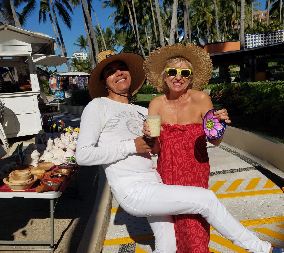
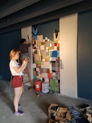
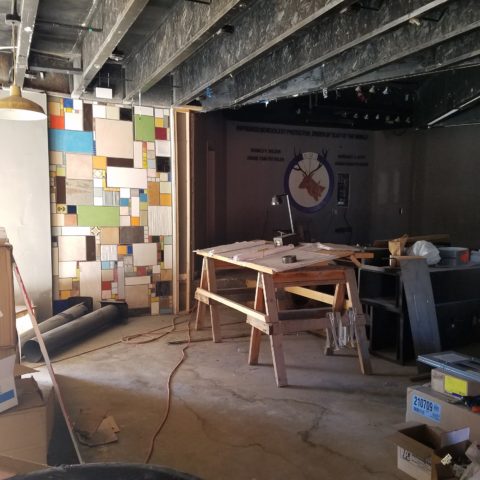
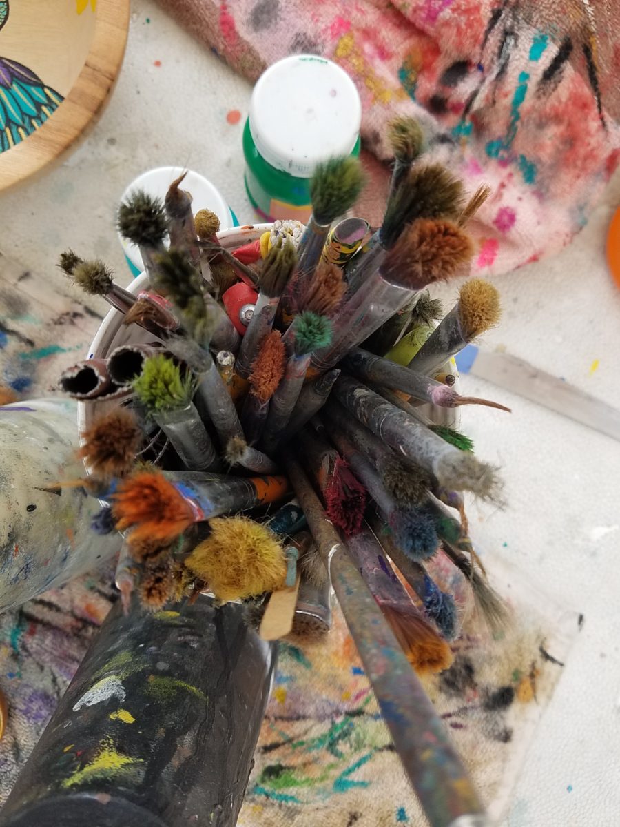
Two days ago I found myself in an in-home art-studio/workroom that blew me away!

Initially a craft born out of necessity, as creative survivors accustomed to “making something out of nothing” re-purposed scraps of material to patchwork new articles of clothing, homegoods and ultimately art for the walls. This clever, resourceful, utilization was celebrated in Dolly Parton’s song turned movie, about her true-life “Coat of Many Colors.” https://en.wikipedia.org/wiki/Dolly_Parton%27s_Coat_of_Many_Colors

The intricate designs and refinement of pattern details was obviously all done by hand, but with the development of machines and now computers for this purpose, the possibilities are endless.

So as I turned the corner, to see a would-be remodel of combining two bedrooms and expanding to the north of the existing shell, I was astonished to see this remarkable, expansive workroom – all white – punctuated with colorful creativity. Colors, textures, patterns…this extraordinary, rather Renaissance, woman had carved out a generous space to explore this phenomenal art and craft.

As an artist, Sue Watrous’ paintings and sketches are quite photo-real. On a few of her pieces, she has deconstructed the elements in the painting cutting them from fabric of many grey-tones defying the fact that they are textile assemblages.

This original pencil drawing – yes, photo-realistic, is amazing.

Then to create the same image as a patchwork quilt is remarkable!!

Yes, look closely, you can see the patches of fabric that are assembled in the many grey tones to create this amazing piece.

Her joie de vivre is derived from this magical space and the creations that she imagines and brings to fruition.

Upon entering her amazing domain, I felt as though I was entering an operating room – everything in perfect order, clean and spare – like a clean-room at Intel – I should gown-out or suit-up!!!

I might be exaggerating because it was white and clean, but warm and welcoming with the rainbow spectrum of thread spools and quilts both finished and in progress displayed on the walls and on the other many surfaces.

Self-taught, she nonchalantly references the many computerized machines strategically placed around the  room. There is an order to the layout and her approach is meticulous. Despite the fact that there is an active quilting community here – they are too busy quilting to teach – so Sue jumped into this after having seen a presentation at a show about five years ago. Years ago she quilted – but at this juncture, she knew at once that she wanted to enter this exciting and challenging realm, of computerized art assist!

Like the shoemaker who has no shoes, her quilts have yet to adorn the walls or bed dressings throughout the rest of her home. She doesn’t sell her work – but her family all has homes riddled with choice pieces.

Her paintings are placed amidst her interior, but not her quilts. Today I focused on a large wall to be the future home of a near-to-be- completed quilt.

She tells me that the fabrics are like paints – she is painting with fabric.


And although she is not yet dying her own pieces, she told me of meeting a textile artist who spun her own thread from her own llamas, dyed it, designed and fabricated her own work.  Sue has created most if not all of her patterns and designs and I am confident that before this is over, she will be donning rubber gloves and dunking material in dye vats to find a new layer of creativity.


What Do Fabulous Fabrics Have in Common?

Fabulous fabrics are NOT common – that’s what they have in common!!  After paint, fabrics are the most  malleable design element that can make dramatic transformations in an interior.  New pieces, reupholstering existing pieces, treasure-hunting to cover vintage pieces, salvaging family heirlooms, plastering or padding walls and ceilings, draping and accenting – doesn’t it sound exhilarating? Imagine the  possibilities!

Metal studs to trim things…wrap a lampshade, border draperies, trim a sofa, adorn a pillow…so many things…and the stormy cloud printed velvet in the background of this trim – is blustery and powerful.

One of the most fun-filled events in our design studio are the road-trip visits by our fabulous sales reps that bring the world to our conference table!!  In larger cities, the design resource centers, markets and their showrooms offer myriad marvelous samples of furniture, decorative accessories, art, lighting, fixtures, finishes and fabrics.  Exciting new design trends are presented each season.

But when you live, in isolation from the major centers, as we do here in the high desert – we are treated to personal presentations that are intimate, relaxing, inspiring and educational. Here is an exclusive collection that was presented just last week. Sit back and watch the fabrics unfurl and float – one after another – in layers of color, texture and incredibly inspirational style.

Weighty over-stitching or “top-stitching” adds detail-either high-contrast, color-on-color subtlety or the median slightly contrasting grey with white. Trending – touchable textures! Here presented for interior fashion, but you can bet that clothing fashion designers would love to play with these textiles for wearable art too!!!

Sure, throughout the year we travel  to source hubs, surf the net, call our reps, request samples, compile materials and gather what we need across the miles. It is challenging.  Like living on an island and bringing the amphibious containers of supplies over the sea and up onto the beach! But inasmuch as we don’t have a design center handy to do a lot of “one-stop-shopping,” we do curate our own very extensive source library of fabrics and architectural materials. With that at our fingertips, without leaving the studio, it’s a time-saver, a stimulating place to to engage clients and we are easily spoiled!

Fine weaves make terrific grounds for bold prints – here in three different color-ways – what a POP! Retro to new concepts – patterns add pizzazz!!

This recent textile presentation brought refined and rugged landscapes of intriguing textures and patterns that  stimulated our design juices.

Intentionally cut after the weaving process provides extra texture and pattern interest.


Often the “backside” of these fabrics are as interesting (if not more so) than the fronts – but be mindful of floating threads and other weaving details/methods that interfere with practical use.

Bold “geometrics” are not only vivid with high contrast threads, the texture is what cannot be accurately replicated or conveyed via digital images on a  screen. Despite the fact that I got up close and personal with these samples to photo, nothing beats touching and feeling the fibers and textures.

Complex weaves dazzle with design creativity. Bringing an artist’s concepts to fruition, with a mill to fabricate the dreams, is enchanting.

Traditions of weaving artisans are found in countries around the world. Sadly,  not many fine fabrics are woven here in the States, partially due to the cost of fabrication and also due to the generations of crafts people who are experienced in the art of weaving more cultivated in other cultures. Whether organic, engineered, by hand or efficient, fast-paced mechanization – art and technology continue to push the envelope of fantastic creation and production in the fabric industry.

Here’s a great tip – if for only a pillow cover – if only ONE side of a pillow cover, having unique fabrics is having art. Living with functional art. Appreciating the designs, textures, craftsmanship and unique qualities of fine fabrics and wall-coverings is most satisfying.

Paints hand applied to the surface of fine woven fabrics is gilding the lily.

Who doesn’t love these colorfully, whimsical dot halves hand-applied to the surface of this nubby neutral??!!

Silk-screening also is an art-form that enhances the quality and appreciation of fine fabrics and papers.

Some of this collection are vintage art-pieces resurrected with new colors on the screen prints.  The caliber of a fine, timeless, resource is about quality of both design and construction. A collection that continuously offers – classic and new, bold and subtle – answers to so many opportunities, is a resource that is to be celebrated!!

We investigate the most extraordinary fabrics, in the world, so that we can compile and create the perfect combinations for your exclusive lifestyle.

Custom Designed Art for Branding in Commercial Interiors

Designing artwork for commercial interiors offers an opportunity to connect to the brand. It means that we take into consideration the artwork as relates to the business and its identity. You might remember a blog from last year about the can wall. It was designed for a taproom. The theme was beer. The name was “Silver” and we considered that a natural off-shoot of that was the silver color of aluminum beer cans – as a wall treatment!

For that same project (in two locations) we further emphasized the brand with photos we took of their own products transferred to and stretched on canvas stretchers to be the “art” on the surrounding walls.


Fast forward to a conference room for an energy company home-based in Albuquerque – the iconic Sandia mountain being the earth’s monument – the familiar, perfect image to represent the company and the connection to the earth and its resources. For this  project, we were asked to build 27′ of custom , cabinetry and dress the wall above it.

The tall ceilings required a vertical element, but the length of the wall also begged for horizontal space-filling. As a cost-effective solution to such a large space, we decided to take a photo of the majestic mountain, separate it into 5 sections and have it enlarged and transferred onto aluminum panels for light weight and rigidity. The reviews were sensational as everyone loves and relates to the familiar scene – seen in such a colorfully explosive and expansive installation.

In response to the success of that solution, the client asked for a complimentary treatment for the opposing wall. Again, the wall was 27′ long and had the same ceiling height so we used multiple fragments in 3 groupings to center across the entire expanse. “Elemental Fragments” was born of the concept to have just that – fragments of elements in an orderly fashion – uniform yet random, to contrast against its formal geometry in response to the amorphous photographic landscape. Colors were derived from the blue, green and yellow in the scenic panorama interspersed in a field of silver.

Last week, on the day of the installation, colorful creative chaos – resulting from unwrapping the individually hand-crafted compositions and scattering them across the conference table – was part of the fun, of the scene.

The tedious work of aligning all just right, with perfect spacing and level mounting, added to the anticipation of realizing the finished product.

The luminous glass against the rich, stained wood punctuated with the  brushed stainless fasteners made a striking assembly.

Modern engineering and production, worldwide energy collaborations and shared technology coming together in a grounded environment of people and their place on the planet. A daunting system of assembling fragments of many elements that make things work to bring gas to the end users. The artwork makes the concept look easy. The result of the many facets, of the actual work and the artwork representing it, is not only effective, it is triumphal.

It’s creative fun to custom design pieces to relate to the brand, the business and the culture of a project. Bringing joy, pride and a sense of confidence in the focus of the work, to the employees and guests, is a successful finale.

Bring us your design challenge and we will design a solution specifically and especially for YOU!!!


Designing with the Brand in Mind

The grand opening of a project is always fun. Months of planning and construction resulting in a finished scene.

It’s not an easy path nor is it always as planned, but this project, conducted mostly long-distance, with only two field visits, is a great success.

Great clients make great projects. It’s a team effort and it helps that everyone is on the same page. The designer is a navigator, lighting the way to get to the end result. It can be a circuitous path. Like all projects, there are decisions and modifications, priorities and compromises.

Arizona Facial Plastics, having created a brand and provided a concept with which they wanted present their practice, sought an interior which instilled confidence, with the refreshing, pampering atmosphere of a spa, but with the aura of a conscientious, progressive medical environment.

In the fast-paced ever-expanding world of aesthetics, it is important to emphasize the quality and experience of service offered. In this clinic the services range from complex surgical procedures (performed off-site) to all of the cutting edge procedures and treatments desired by today’s discriminating clients. World-class products and state-of-the-art equipment and procedures are provided here, in the clinic, with quiet confidence and confidentiality.

To achieve their goals, we first focused on the brand and its style and colors. A crisp, serif-style A underscored with an elegant scroll, warm, soft charcoal compliments the bold cool gradated turquoise set against a fresh white ground.

Selecting finish materials began with the flooring and cabinetry. As is true with all interior projects, it is best to begin with the items that have the least options. There are fewer carpets and cabinet finishes than there are paint colors, for example.

We found the perfect carpet with a broadloom that provided a forgiving pattern, multiple textures and yarn colors. The complex product had an organic pattern of plush cut turquoise pile set in relief from a loop comprised of a grayed lavender and pale green citrine. Having made this selection, we then extracted individual colors of vinyl tile to compliment the carpeting in adjacent exam and procedure rooms. Gradated white porcelain tiles were used at the point of entry set against the contour of the carpeting in the waiting area creating a fluid, curvaceous transition and guiding, directional flow to the interior of the suite.

Once the flooring was selected, the cabinet and counter-top materials were next. A translucent yellow-green citrine engineered solid surface material was selected for the transaction counters at the reception desk and medical assistants’ work area. Dark charcoal plastic laminate was used for casework and select counters while exam room cabinets had a pencil-sketched floral patterned soft green laminate playing across the counter-tops.

An accent of sparkling glass and stone mosaic tile face the reception counter at the point of arrival.

Behind the receptionist, an elevated planter of succulent “sansevieria trifasciata”, regarded for it’s exceptional oxygen-producing properties, is a refreshing organic backdrop. Above, custom drapes filter light from the sloped ceiling atrium windows.


Non-representational expressions of color were selected for the wall art  throughout the space.

For the waiting room, we commissioned photographer, Katie Barry Councilor, of Smoketree Photography, to create a custom collection of abstracted body forms in grey scale. We then enhanced each image with their brand’s cool turquoise color, in the negative spaces, creating a series of artful stretched canvas images flanking their logo.

The take-away for clients is a serene, yet reverential  experience which instills confidence and promotes relaxation and rejuvenation. The subtle reiteration of the AZFP brand’s turquoise color throughout insures that the clients will be refreshed and reminded of their pleasing experience when they encounter that color even after leaving the clinic.

Hope you enjoy these before and after shots!!