A few years ago, awesome crept into our vernacular and took over. It stole our ability to select options for descriptive excess or exception. Everything from accolades for a job well done, positive reinforcement for anything, to a spectacular sunset, a great new outfit or a startling meteor shower – everything from a tad past the norm…to something truly fantastic – became awesome. Our language offers so many superlatives, yet we have gotten so lazy.
At the expense of sounding like an advertisement or otherwise paid spokesperson, I write today of a late-night confection experience that is truly like no other. An experience so artful that I could not take enough photos. Artistic delights at a bustling urban eatery where flowers and gold leaf adorn each piece of fanciful frosted awesomeness. Ha -there it is! Had to add more to the mere “awesome,” though!
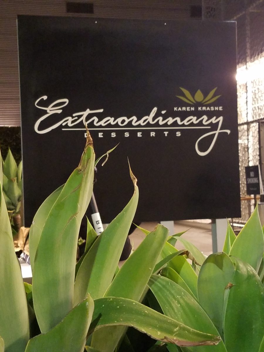
Extra ordinary – extraordinary – beyond the norm – beyond ordinary, yes, that is an understatement for what I am about to reveal. Yet, that is the moniker of this extraordinary establishment – Extraordinary Desserts!
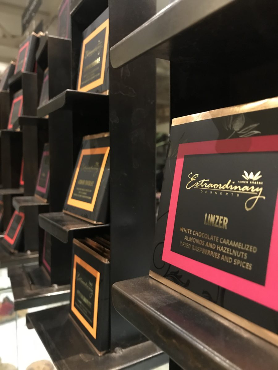
Several years ago we were treated to a late night surprise. Not knowing our intended destination, we were taken winding through the streets and came upon this little structure the read like an Asian garden. Twinkling lights peeking through wooden slats softened by lush tropical vegetation – the scene was magic. Once we realized the focus of this cozy pocket, we were enchanted. Patrons stood in line to pass along the “extraordinary” dessert cases displaying all manner of outrageously beautiful desserts. Once they decided and paid for their selection, they gathered in intimate twosomes or small groups to savor the delectable delights they had chosen.
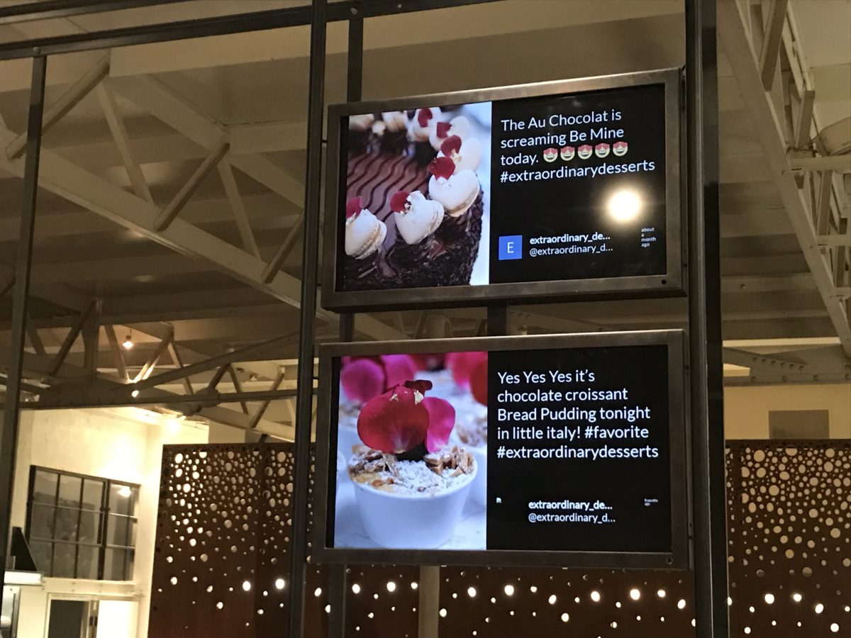
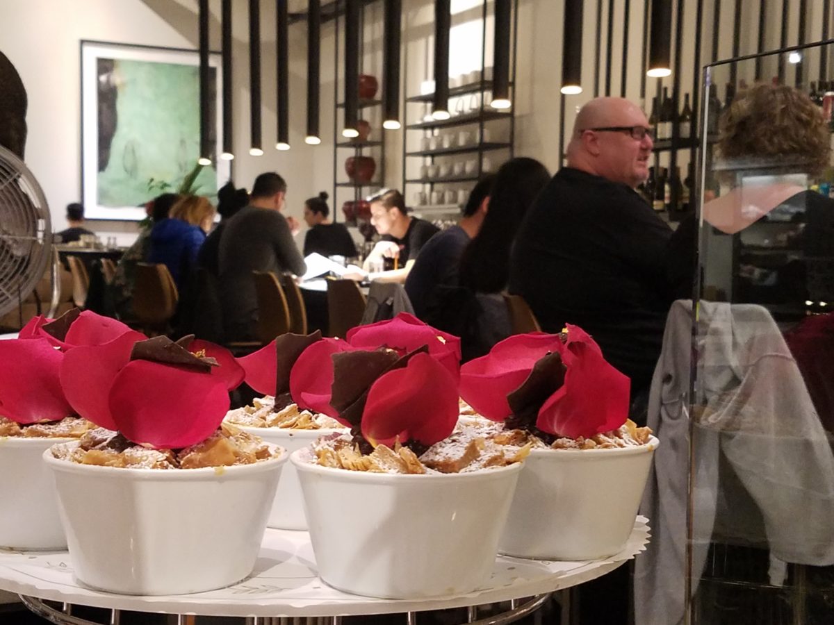
Last night, we decided to rediscover this uniquely sweet spot and Googled our way into downtown San Diego. What we found, by happy accident, was a second location – an urban edifice presented on a crowded sidewalk packed with people waiting eagerly to be seated and begin their indulgences.
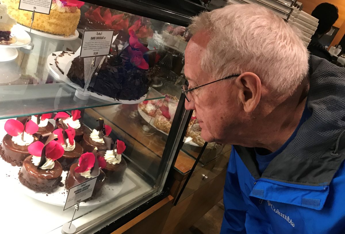
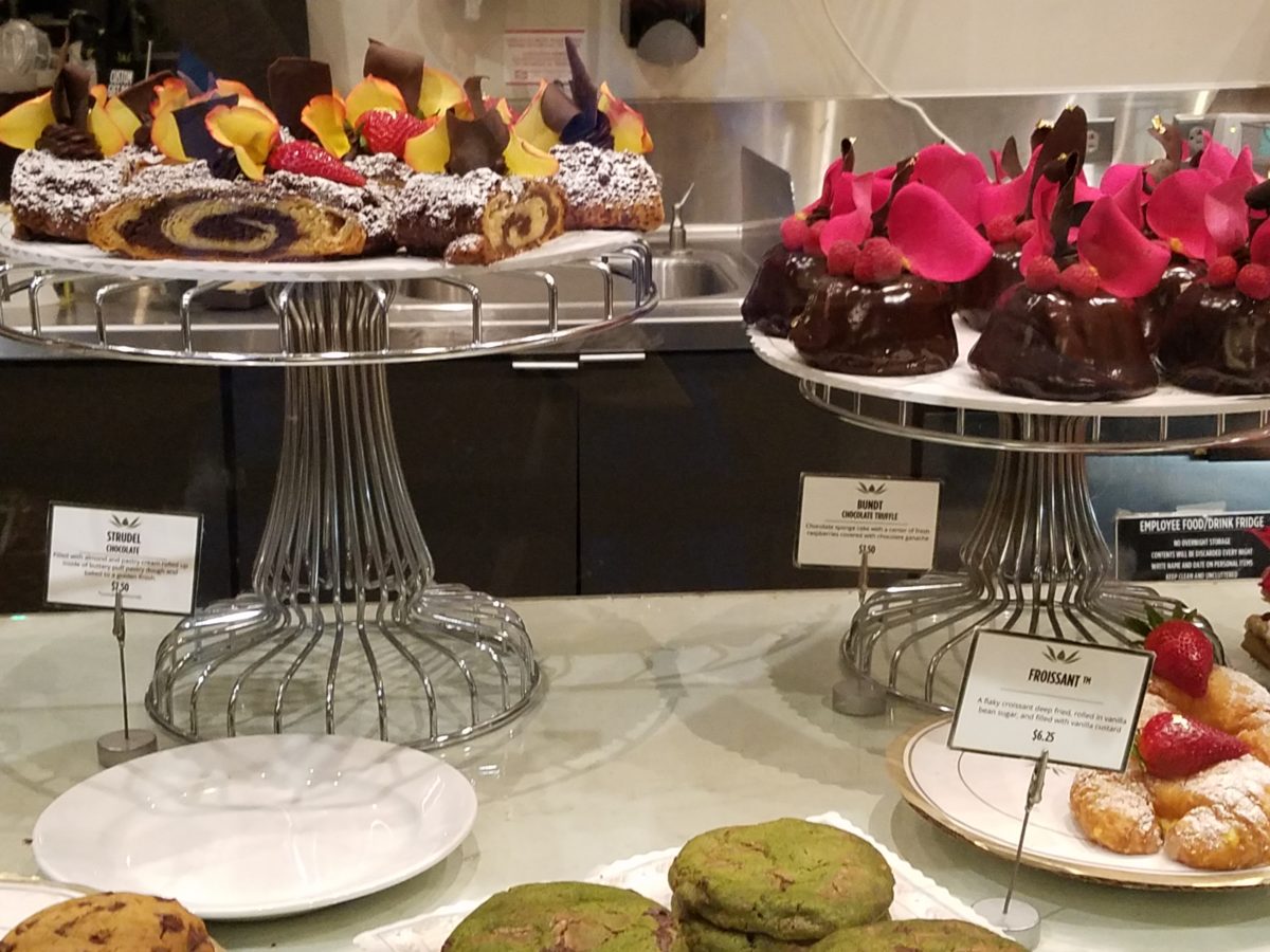
After leaving our name with the greeters at the podium, we squeezed through the throngs to get a peek at the cases full of magical wonders. Ok – you think I exaggerate…so now begins the photos…
When extraordinary is an UNDERSTATEMENT, you know you are in the presence of something quite special. Maybe that’s why people invent words like splendiferous or supercalifragilisticexpialidocious!
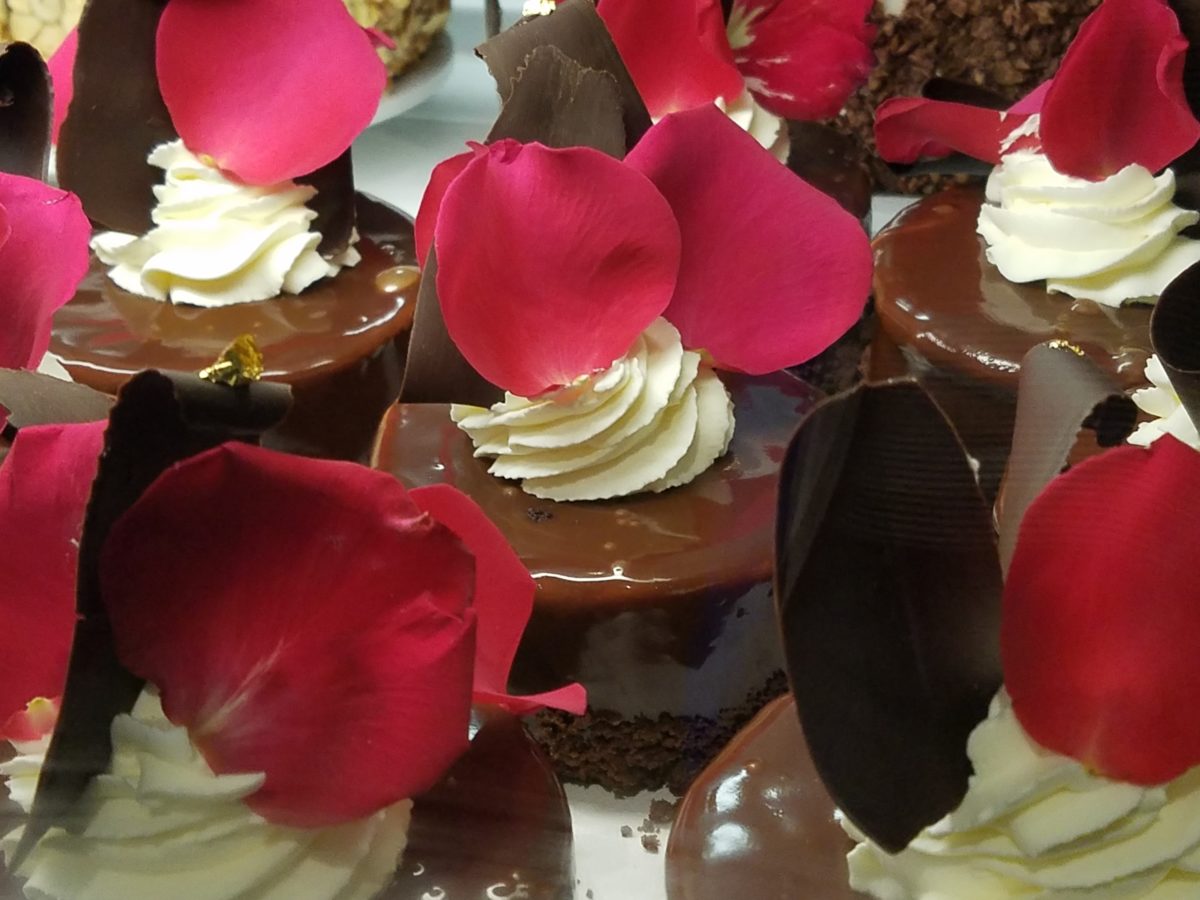
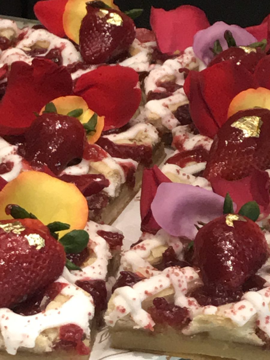
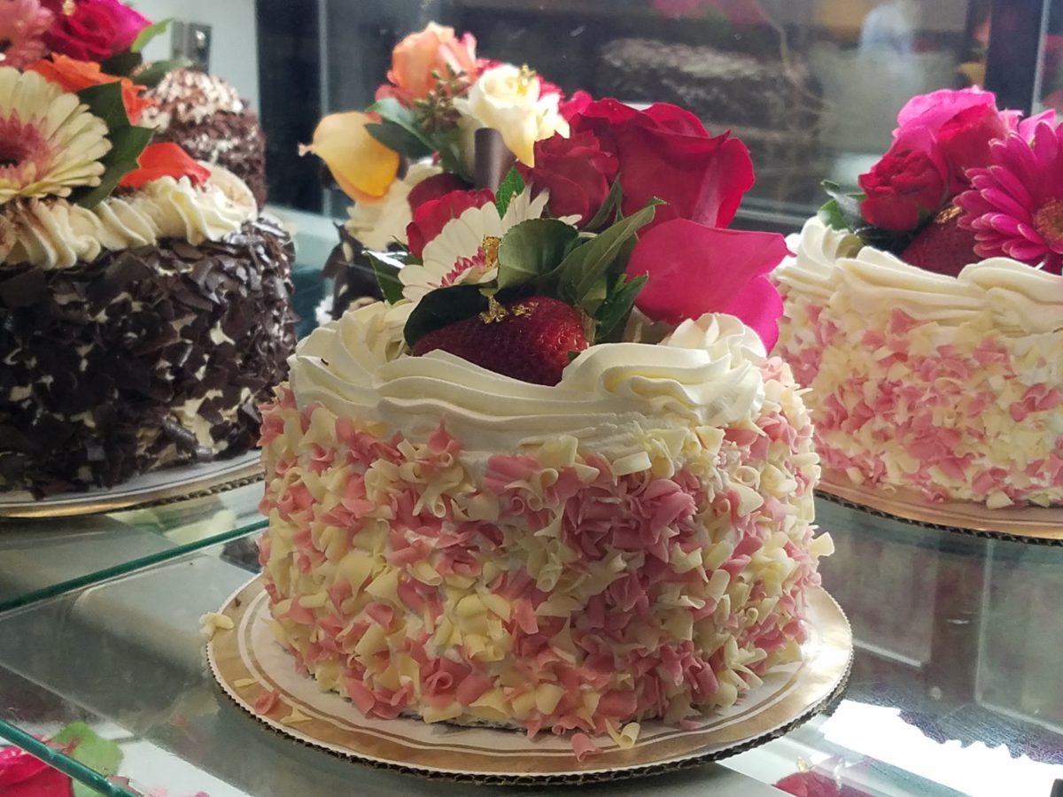
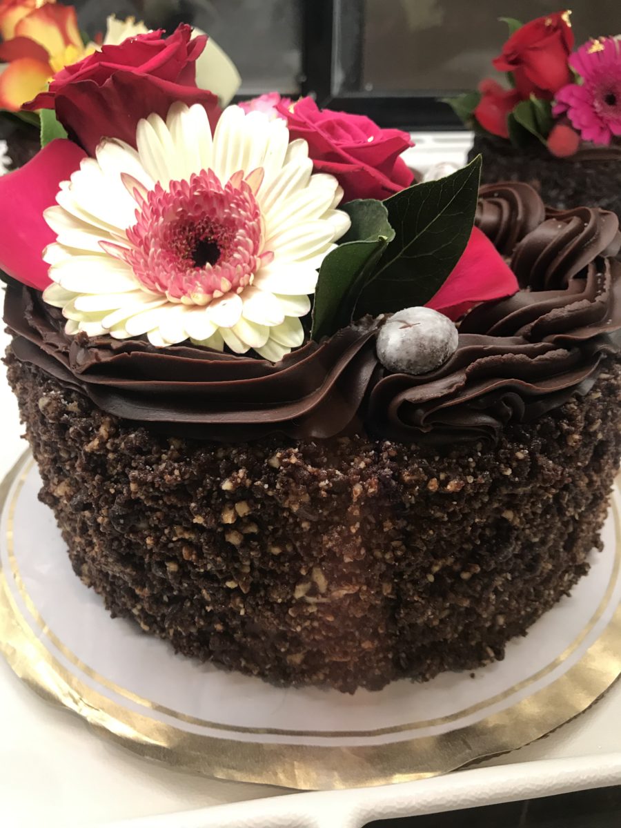
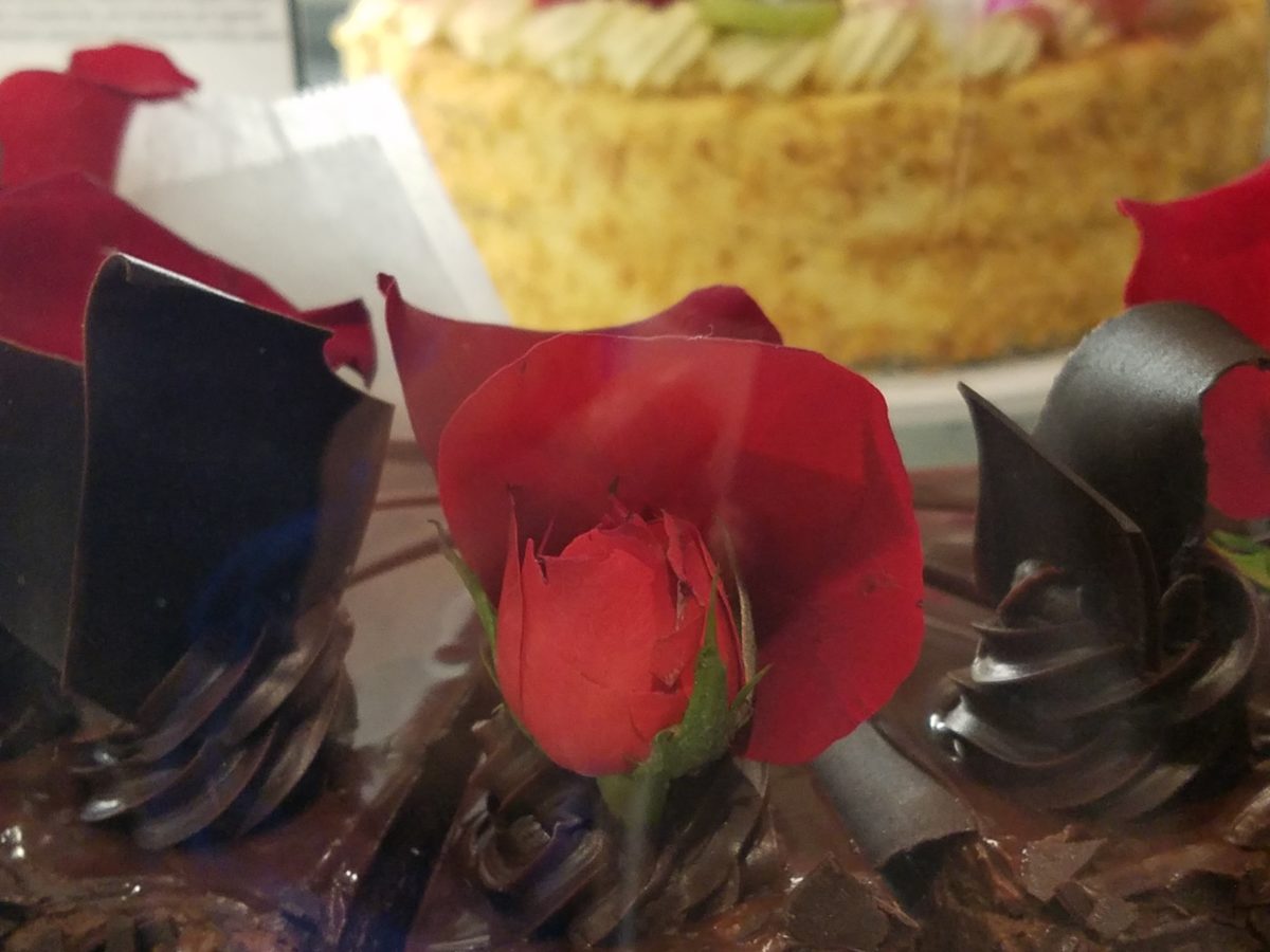
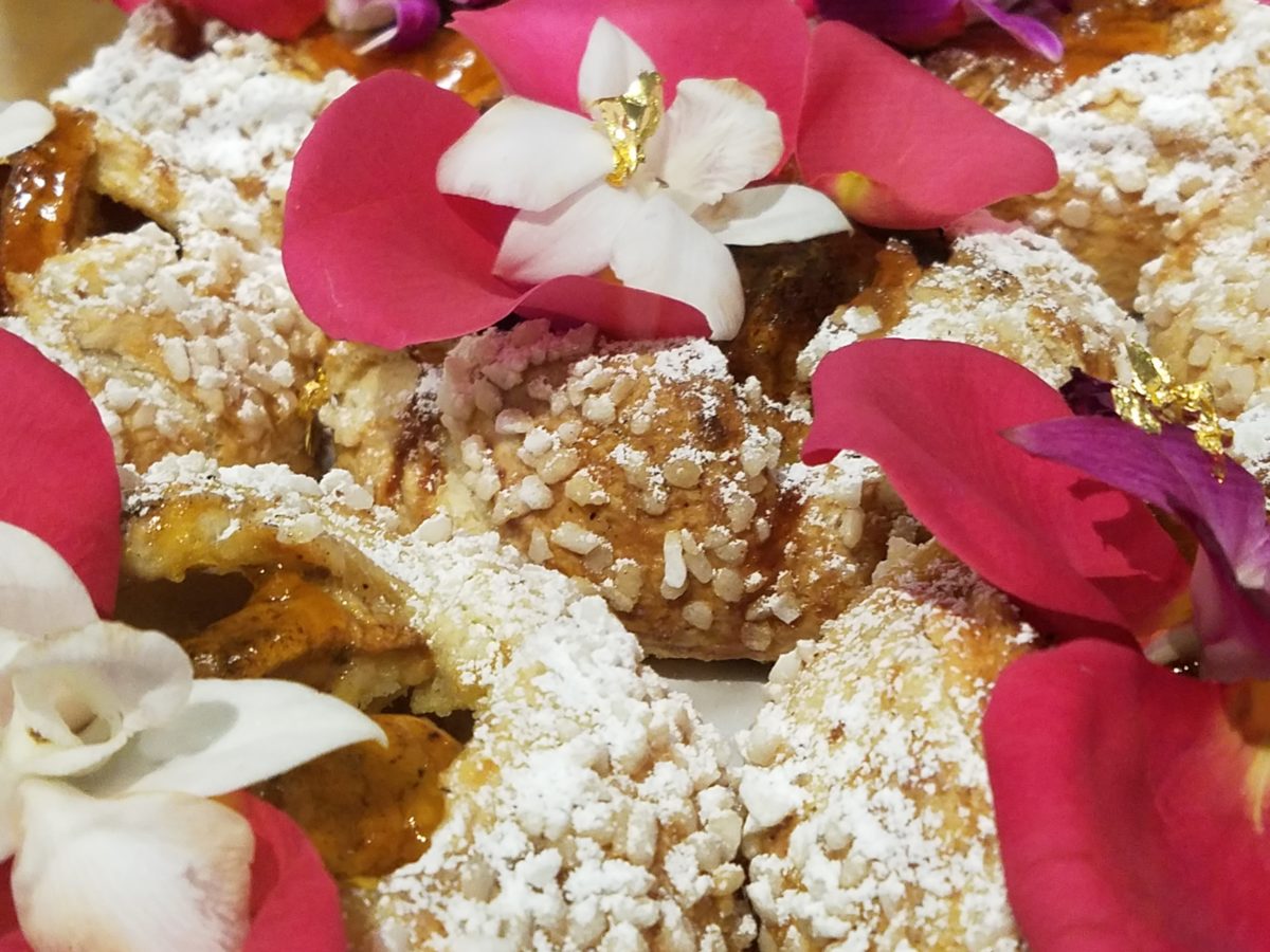
The rich velvety and textured frostings and layers of fabulous flavors awaited us as we scanned the displays.
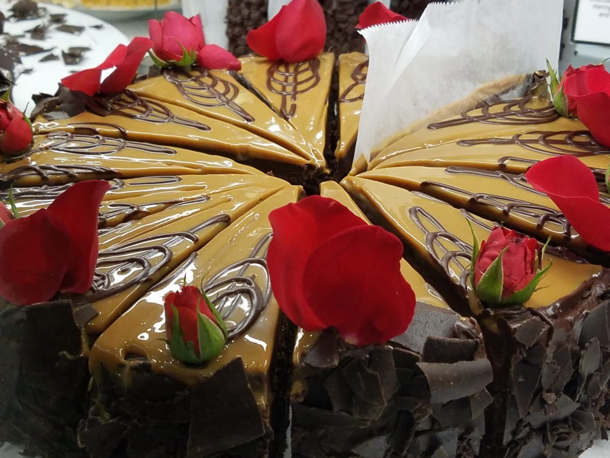
Floribunda- yes, gilding the lilies (orchids as it were) – nothing was too over-the-top! The rich velvety and textured frostings and layers of fabulous flavors awaited us as we scanned the displays.
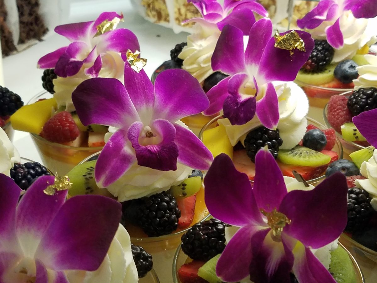
Seeing so many astonishingly spectacular desserts in one place all for the spontaneous taking is almost too much to bear. You mean I can HAVE that right now??? I can have a piece of many of them – RIGHT NOW?????
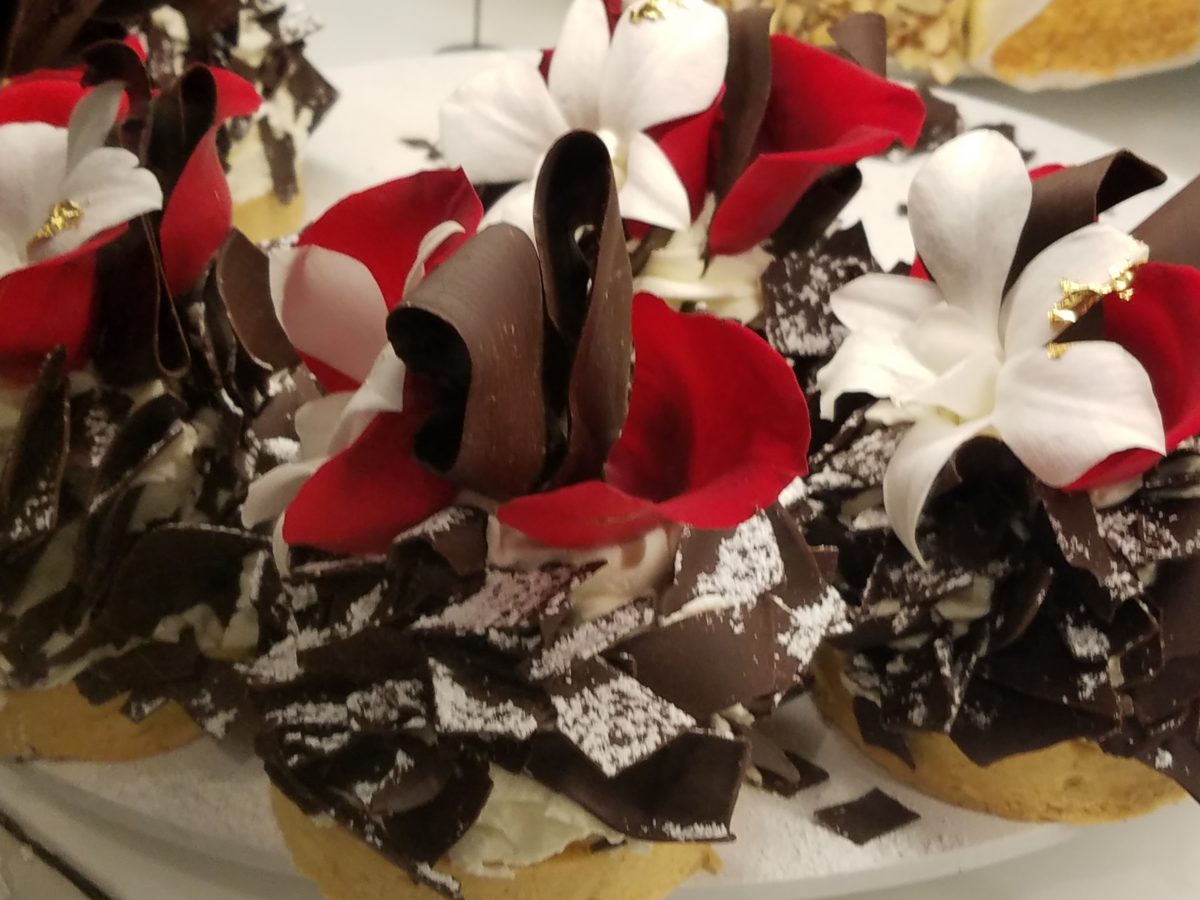
Emulating fine Cerelene Limoges, the would-be doilies of parchment paper rimmed with gold detailing and lettered with Extraordinary the details were dazzling! No stone left un-turned, they thought of everything to make this a tantalizing treat and patrician presentation!
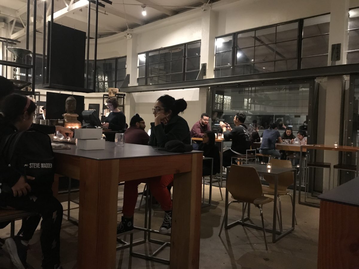
The interior offers seating at the bar and tables organized throughout. Two tops or ganged together for a crowd, everyone was so focused on their prizes – beauty set before them – animated chatter wafted through the sugar-spun air! Some chose to sample several knowing that they would take a goodly portion home. Others savored a single serving of a beautifully flavorful masterpiece.
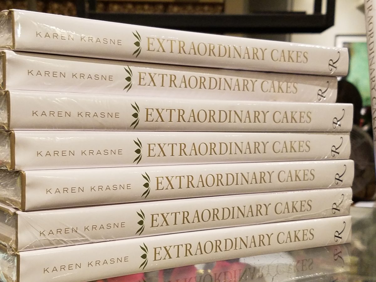
And yes, there’s a book about the cakes – Karen Krasne – appears to be the brain behind this bounty. I look forward to meeting her. She has an amazing machine with a well-oiled staff. Everyone was efficient and friendly and shared in the enthusiasm that was being expressed all around.
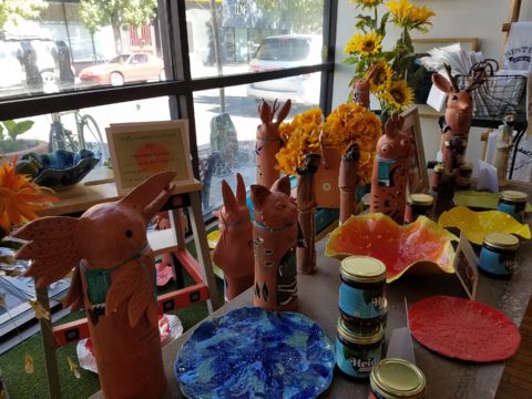
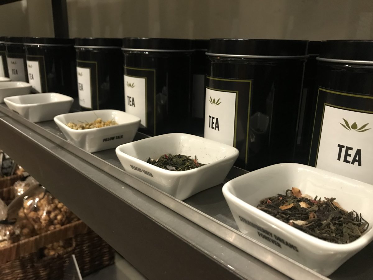
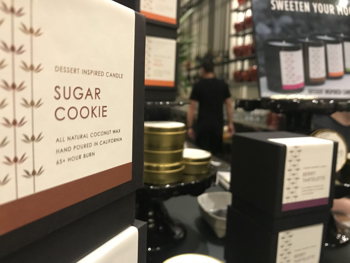
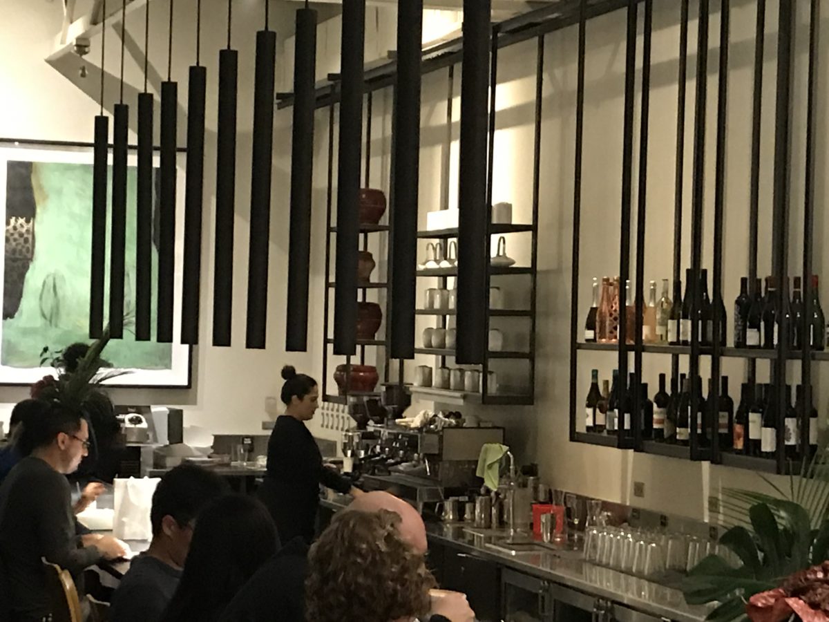
The shelves are filled with teas and other sweet temptations, interesting vessels and serving pieces.
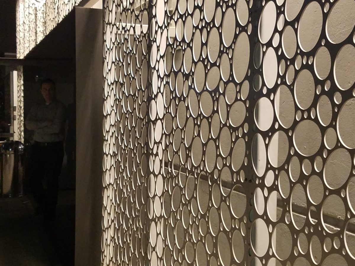
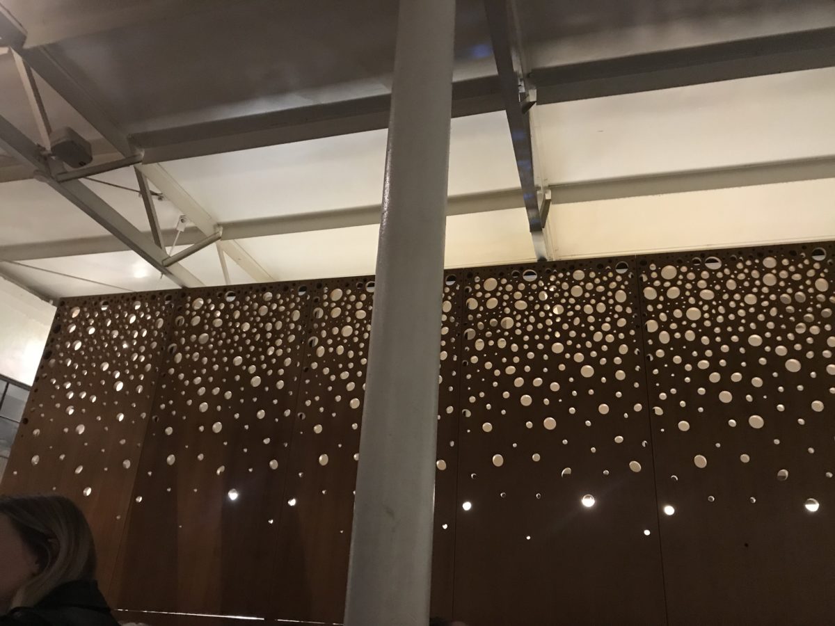
The lighting is dim and the structure envelopes the interior with white-washed frosting of voluminous space punctuated with dark cylindrical pendant lights and pierced bubble-like panels back-lit for added interest, subtle luminosity and dimension.
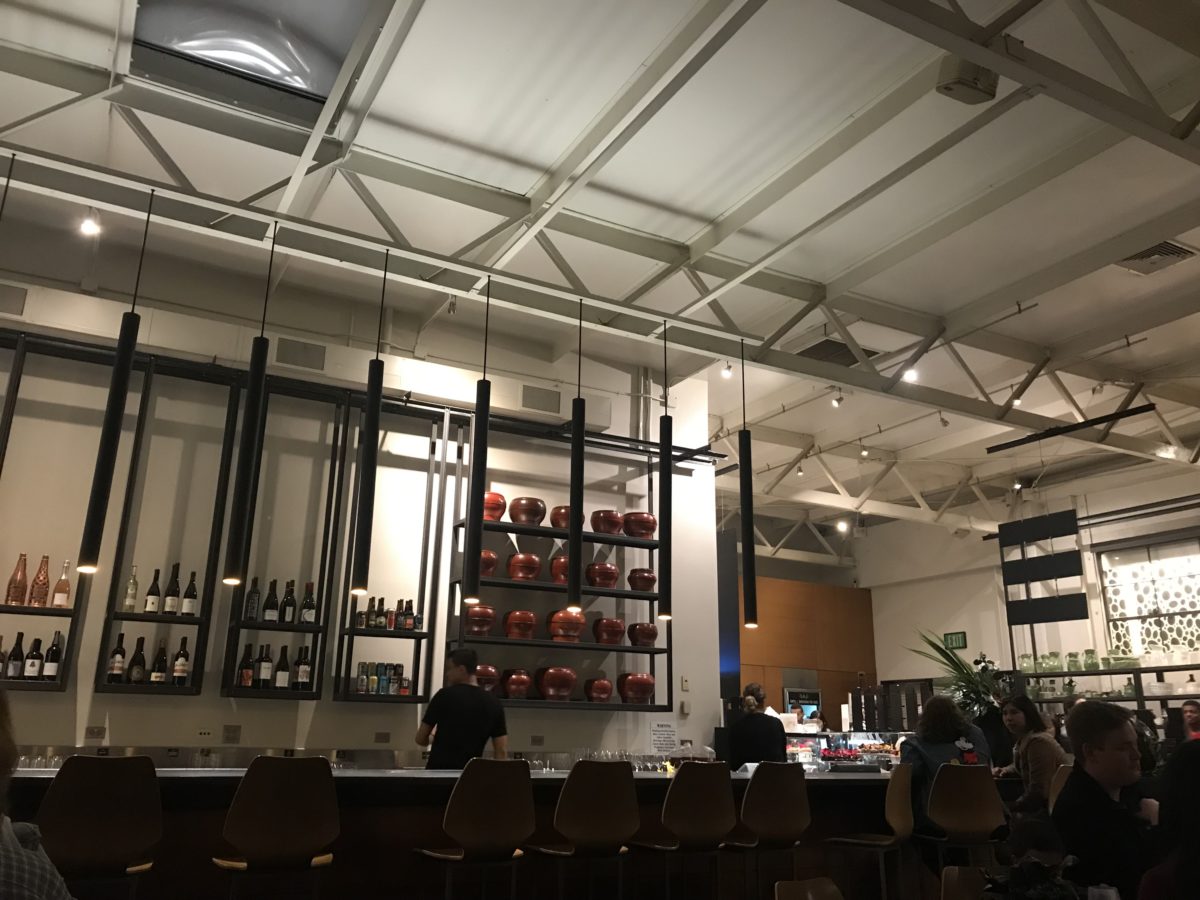
Raw, polished concrete floors, steel tables and molded wood chairs give a nice balance of warm and cool, rigid and suave – while clean and almost hygge in feel.
Perhaps, in the world of custom confections and TV foodie competitions, these desserts might be within some semblance of a norm – but only from the finest of creatives, in circles of which we usually do not run.
But having cavorted last night through the cheerful melee of confection connoisseurs – albeit one doesn’t have to be clubbed over the head or knighted by the cooks of the kingdom to appreciate what we experienced – we are sufficiently spoiled both visually and flavor-wise to be tough to ever satisfy again. Good design. Great design. Extraordinary design is often still an understatement!