Tips to Start and Maintain Joyful Traditions

Wherever you  may be…it’s the time of year when traditions are so much a part of everyone’s holiday experiences. And with that opening sentence – no doubt some of yours come to mind.

Traditions, of course, are not limited to holidays – but for purposes of this season, it is the primary focus of this missive. Interestingly, over the past few weeks, I have had a few people ask me about home decor and specifically starting or perpetuating holiday traditions. I found it so compelling because traditions are created from repeat practices and experiences.

Fond memories of family friends and their annual tradition of making warm and frothy Tom and Jerrys! I found these vintage china mugs just like the ones from my memories. Have have recently seen them re-created – new – just like these! Perhaps its time to start our own tradition of Tom and Jerrys for the holidays!

You can begin to practice things that become traditions – that’s the key. Of the recent conversations, one person approached me about a week before Thanksgiving.  He was single, hosting a few friends and didn’t know where to begin. Could I help? The other inquiry was from a couple of years ago as a young woman who was not from New Mexico found herself here, newly married and in a new home.  How was she to create the feeling of Christmas? The answers to both of these queries are at the end …

As is true with all consultation whether it is interior design, medical, self-help, physical fitness, IT…it all begins with questions. The consultant must ask questions to establish information that will guide them to make their recommendations. Here are 4 Tips for Approaching Traditions that will begin the conversation.

Perpetuating a Tradition:  Memories are personal references that are the basis for traditions. The repeat performance of these various acts establish traditions. Continuing to practice the traditions insures that they repeat as each like-kind of event unfolds. It takes effort to continue to re-create traditions, but to lose the pattern can become irretrievable. It can be an onus or a joy to perpetuate traditions. I would prefer to embrace the latter! Ideally, any tradition that you chose to perpetuate should be a joy.

This vintage set was given to me by a dear friend. It held precious memories from her grandmother having served hot cocoa from it every Christmas. My friend’s experiences dated back to the 1920s. The set preceded her memory…as her grandmother, born in the last quarter of the 1800s owned it for years prior. We enjoy hot cocoa from it nearly every Christmas morning!

Creating New Traditions: Establishing the approach that perpetuating a tradition should be a joy or the act of something that brings joy, the same is true with creating a tradition. Seems obvious that you wouldn’t want to create a traditional around something that does not bring you joy. But you might be surprised. I have recently learned that sometimes people think that they begin something that is a common practice to create a version for themselves, when in fact it is a perceived obligation rather than a joy. Don’t force it- don’t feel obliged to begin a practice just because others do it. Experience, invent or witness something that brings you joy and replicate it. You might recall it from your past, find it in a scene from a movie or experience at someone else’s home, derive it from participating in an activity or, of course, discovering internet ideas that abound. If something interests you to the extent that you want to practice it – then do it! If you enjoy it enough, you will perpetuate it and it will become a tradition.

This little Santa Doll was handmade by a friend of mine when her kids – now grown with kids of their own – were kids. Not originally intended to be a “Crazy Santa,” his accidental facial expression resulted in his name – held now for over three decades. He comes out every Christmas as an amusing family tradition.

Modifying Traditions: We all need to determine how much we want to take on,  how much we want to invest (in time or money) and how we achieve the same or similar results to create the joy. If traditions become too complicated or difficult, it might be time to re-think them. Rather than discard them, modify them. The time to discard a tradition is when it no longer brings you joy. But before that might happen and if the event/activity or degree of difficulty challenge your want to perpetuate the tradition, consider modifying it to suit your changing needs, circumstances and enjoyment.

This might happen if you move away from the context in which the tradition originally occurred, change in participants – if any, change in interests, physical or financial limitations…if the tradition still brings joy – find a way to achieve that with the necessary modification. Circumstances alter cases…like where you might have lived or are living at the time. Your fondest memories might be of chilly temperatures, warm fireplaces and the scent of pine trees…then you relocate to the tropics! This provides an opportunity to retain some of the original traditions and introduce some new. Not to mention, you might move to a different country where an entirely new set of traditions will present themselves – or just the different words for familiar favorites. Even without changing languages, in England they hang stockings at the foot of each bed rather than the mantle. Father Christmas is their Santa Claus. The list of similarities and slight differences goes on…

As I walked in the park last weekend, I spotted this fun, dangling snowman! So I stopped to inquire and capture a few shots. This family celebrates their son’s birthday every year with a piñata. Born on Christmas Day, they select another day close-by to have the piñata portion of the party. A family tradition.

No snowy scene for snowball fights or skiing? Toss a ball or frisbee,  take a hike or bike,  instead.

No enormous turkey? Roast a breast or a more manageable duck or chicken.

Become a vegetarian? Using the same type of familiar meal service and table dressings, modify the menu.

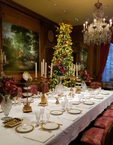
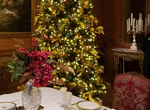
Not convenient to cut and haul a tree from the wild? Buy one instead. Real tree a hassle? Become the proud owner of a magnificent fake tree- with a bit of pine-scented room spray!  In my case, I occasionally give myself a “bye” break from putting up our tree (Although I love my tradition of collecting silver ornaments, of which I have dozens). So the “modification” is to have a magnificent, tall poinsettia on the entry table and several others scattered throughout the house to punctuate the interior with splashes of red.

No formal dining room? Gather on cushions around a coffee table – even if it means a piece of plywood from Home Depot on cinderblocks with a paper tablecloth! Candles and a centerpiece will set the scene.

Sharing Traditions

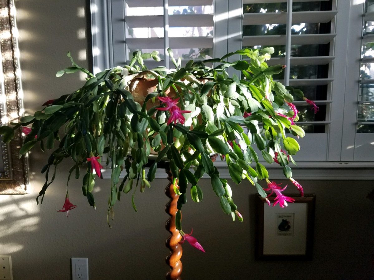
Gifting things that represent your traditions is a wonderful way to share. Obviously, baking and sharing traditional delicacies is prime. Making or finding  ornaments to gift is nice.  I offer cuttings of our family’s Christmas cactus. My grandmother always kept one or more plants from the original plant that was in her family home in Youngstown, New York.  She was born in 1892 and her grandmother remembered the plant and told my grandmother that it preceded her in that same house. We don’t know how far back it goes, but at least mid 1800s. I have kept cuttings and grown mature plants from the very plants that my grandmother had her entire life of over 100 years and kept all the while we were growing up in the same house for 20+ years and now my 40 years since!  Gifting a traditional food or a CD you compile of favorite recordings, sharing plant cuttings, passing along a treasured possession – all are ways to share traditions.

But what if you are starting out? Memories from childhood might be the basis for beginning your own adult traditions – whatever the springboard, it should be fun to establish your own holiday traditions.

Colton’s Reindeer – A child’s artwork can be passed for generations.

Whether it is handmade decoration, food centered, activity engaging, music oriented, game playing, object collecting…each person has their focus. Even if one is alone for a holiday, there are sentimental triggers that remind of past events.

Food Centered: Main dishes, baking desserts, crafting cocktails…

Party cocktails – always a fun  tradition…note here the festive cocktail coasters. Handmade by artist Rebecca Speakes, they make a wonderful gift to start a collection.

Activity Engaging: Playing games, sports – live or on TV, taking a walk, driving around to see holiday displays, theater productions…

Music Oriented:  Gathering around a piano (guitar, accordion…whatever) to sing, neighborhood caroling, participate in a choir, Karaoke games, attending a concert, background music evoking memories for the occasion…

Decoration: Dressing your interior and exterior for the event(s)…

Hanukkah traditions, decorations – the brilliant blues and metallic accents…Color plays a big part in traditions and their interpretation and practices.

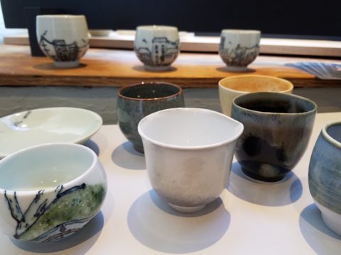
Collecting: Adding to collections…handmade series, vintage pieces, new releases…

Remember the guy before Thanksgiving?  He had no formal dining room. He was having 7 friends gather. He wanted to do some semblance of what he regarded as a traditional Thanksgiving dinner. I asked him how he preferred to gather – standing with cocktails and appetizers grazing throughout the evening or a “sit-down” approach? He really wanted the feeling of sitting down to feast. In light of not having a formal dining area – and as it turned out, no coffee table either,  I advised that he gather on cushions around a coffee table. Since he didn’t have one, I suggested that he go to Home Depot and get a 48″ square cut piece of plywood  to position on top of a double stack of cinder blocks. I went in search of finding a table cloth and 8 large cushions (pillows) , votive candles and a centerpiece comprised of a bright yellow mum plant in a basket, with a few mini pumpkins and fall leaves. The scene was set. He used his own plates and utensils, white paper napkins and a package of orange cocktail napkins. He planned the meal and asked for each person to contribute an item that was special for them. After all the dishes were identified, he prepared the main dish, a casserole of boneless turkey breasts surrounded by his traditional favorite, Pepperidge Farm stuffing – baked and beautiful – and two other things that were not being contributed by his friends – canned cranberry jelly (ha ha) and a pumpkin pie that he purchased from a local bakery. Voila!

The gal entering her first Christmas as an adult was not from New Mexico nor was her young husband . They had a new home here and the local traditions were not in her realm of traditions. She wanted a large tree but did not own one single Christmas ornament. She bought a live-cut tree and we bought strings of mini white lights,  a couple dozen red feathered cardinal  bird ornaments, candy canes and white ribbon. She tied white bows on the tree and scattered the red birds all over it. I cannot believe that I can’t find the photo of the finished product – but it was a memorable solution for a first Christmas presentation.

This year I captured a quick shot of this tree in a friend’s house that reminded me of that young woman’s first Christmas tree. In vogue this year are the bare, stick-like trees that offer twinkly accents and an airy presentation of ornaments of choice and here featured are the very similar red cardinals!

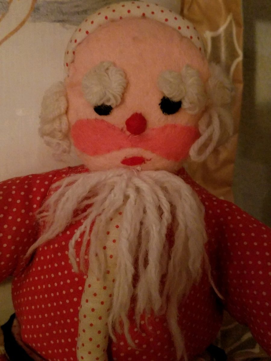
Happy Traditions Near and Far!!!!

Taking Time to Observe Intimate Details – Observations from Nature

Had I planned this blog, I assure the readers that it would have been more thoughtfully compiled. However, as it is a pure reaction to recent exciting experiences, I am without much fodder that, although was before me, I neglected to document. Such as card racks full of Georgia O’Keefe greeting cards featuring prints of her magnificent work and exact pairings of the amazing landscapes we witnessed with her paintings and her magnified flowers too. Dashing in and out of her distinctive museum just off the Santa Fe Plaza bearing her name and thoughtful work (a MUST see when visiting Santa Fe), to stepping up the steps at the Ghost Ranch Abiquiu property, I didn’t document as I was too busy looking at and absorbing – so much.  Yet without prior planning, I seem to have assembled enough that surprises me and therefore has become the body of this blog, about taking time to look

The striations of color are as though painted – nature and its creator – amazing art and artist.

On this recent road trip and surrounding days in our immediate environs, I experienced inspiring images and pairings, beauty and detail, color and form…that evolved into this blog featuring the landscape and expressive paintings of Georgia O’Keefe. Captivated by the remarkable light and surreal landscape as have been so many artists, O’Keefe settled into the colorful backdrop of Abiquiu where the formations of color, sand, rock, and sky were interwoven with sparse, but all the more beautiful vegetation and flowing water carving its way through the enchanting scenery.  

Georgia O’Keeffe. My Front Yard, Summer, 1941. Oil on canvas, 20 1/16 x 30 1/8 inches. Georgia O’Keeffe Museum. Gift of The Georgia O’Keeffe Foundation. © Georgia O’Keeffe Museum. [2006.5.173] Although we did not photo this exact scene, the landscape was just as magical all around us.

Those of you who enjoy taking photos, capturing moments, items and scenes will appreciate the exhilaration and awestruck sense of this humble presentation.

An iconic land form Abiqui, New Mexico

Art and nature. Design and nature. Nature inspires artists and designers with color and proportion. The natural world is a limitless collection of examples of perfection, majesty, detail and form. Living in New Mexico presents amazing opportunities for studying so many offerings from the natural world – verdant valleys and lush bosques to towering mountains, contoured mesas, golden plains, glistening rivers and rainbows of geology rising up from the earth. The sculptural land formations are  what seem other-worldly.  And yet there they are – majestic sculptures against the sky. 

O’Keefe was keenly aware of the extraordinary world she encountered and she captured it through her eyes and expressed through her strokes with fluid sensitivity and sense of color.

Georgia O’Keefe loved and appreciated around the world for her sensitivity and ability, to capture and convey her enchanting surroundings.

Very real and hauntingly beautiful landscape of Ghost Ranch – Abiquiu, New Mexico translated into the sharp, crisp, colors and forms of O’Keefe’s paintings.

Years ago a very dear friend gave me an exceptional gift, of a book. The farther along I progress in this world and enjoy the vast opportunities to appreciate the beauty of nature, limitless boundaries of design, art and all that is produced by talented, creative, observers, treasures such as this have increasingly greater meaning. One Hundred Flowers a 1987 masterpiece collaboration of photographer, publisher, editor and scholars presents an outstanding collection representing this significant subject matter – flowers – that she took time to observe.

Up close and personal…in intimate detail she saw and rendered sensational studies of flowers. Expanded to enormous scale well beyond their reality, these explosions of color and contrast, fluid form and detail are amazing to encounter. Even in the pages of this stunning book her work is startling. In person it is awe-inspiring.

Upon returning from the Abiquiu visit, I retrieved  my beautiful book. I took great joy in the dust cover – suitable for framing. A brilliant white squash blossom captivates, before even opening the cover. As I leafed through these large format pages in this lovely, exquisitely bound tome, I realized that, within a week prior to this O’Keefe familiarization trip, I have taken photos of flowers for a similar reason as she  – stopping to look and observe their singular beauty amidst all else in the surrounds. 

Unknowingly, a couple of days earlier I captured this spectaculalr squash blossom that had survived our first frost.

Just a few days prior to the Abiqui visit, while walking among the petroglyphs at the base of the dramatic black volcanic rock rubble of our west mesa, we came upon a singular, stellar squash blossom. Having survived recent frosts, this one was luminous and brilliant among so many other spent blossoms dried and shriveled away for the season. It was irresistible.

Little did I know, at the time we encountered this beauty of a squash blossom, that I would soon revisit O’Keefe’s studies of this wild and magnificent bloom.

Here more studies from the One Hundred Flowers book featuring this dazzling white squash blossom.

In the design world, we often quote architect and furniture designer Ludwig Mies Van Der Rohe (1886-1969), one of the founders of modern architecture and an advocate for the simplicity of style with his popular phrase “less is more.”  I felt that O’Keefe’s interpretations distilled the forms of her subjects to the essential elements that best conveyed them in a manner of simplicity. Her flowers are bold and clear sweeps and contours, of the design of each. Distilling to these essential elements is the practice of “less is more.”

Her bell-flower trumpets of petunias and hollyhocks in purples, pinks and even arresting blacks reminded me of a photo that I took less than two weeks prior to enjoying my book for this study.

However, she was not sparing with color nor scale. Fabulously daring color combinations and contrasts are signatures of her interpretations along with her magnificent sense of magnification – presenting bold gifts to we, her viewers.  

The opening of the book quotes O’Keefe about her profound appreciation for a flower.

“A flower is relatively small. Everyone has many associations with a flower – the idea of flowers. You put out your hand to touch the flower – lean forward to smell it – maybe touch it with your lips almost without thinking – or give it to someone to please them. Still – in a way – nobody sees a flower – really – it is so small – we haven’t time – and to see takes time like to have a friend takes time. If I could paint the flower exactly as I see it no one would see what I see because I would paint it small like the flower is small. So I said to my self – I’ll paint what I see – what the flower is to me but I’ll paint it big and they will be surprised into taking time to look at it – “   Georgia O’Keefe “About Myself,”  1939

Be surprised. Be inspired. Be aware of your surroundings, for all the beauty of nature and its influence.  Embrace color and contrast, punctuations and accents. Take time. How might your next design project reflect observations from nature?

The Wealth of Art That is Our Elegant Library of Congress

If the Basilica in my last blog didn’t get your juices flowing about incredible public art spaces, the Library of Congress was our next stop. Yes, it houses nearly everything having to do with writing, recording, documenting…but the building itself is amazing! It in itself is a wealth of artistic detailing. The interior has more gold leaf – not gold paint – but hammered metal gold leaf – than any other building in our Nation’s Capital. Inside and out, the craftsmanship of the stone carvings and architectural embellishments is magnificent. This inestimable landmark is so much more than the sober name suggests.

We parked in the garage of Union Station and walked the few blocks past the Supreme Court and the Capitol Building to our destination of the Library of Congress. The brilliant blue skies behind the bright white edifices belied what some regarded as the oppressive heat. I however am a heat freak – it’s summer – bring it on!

Columbus Fountain at Union Station also known as the Columbus Memorial is a public artwork by American sculptor  Lorado Taft, located serves as a tribute to the explorer Christopher Columbus.
The Supreme Court – cool, brilliant white against a striking blue sky – at 100 °
Crouching to get a shot of our Nation’s Capitol Building.

Symbolism is executed with every inch of the design details both inside and out of the imposing Library of Congress. Ascending the exterior stairs sets the stage for arriving at a monument of immeasurable wealth of human dissertation and history. Here I can only touch on the tip of the iceberg…

Picnic tables out front at our Library of Congress…relax, grab and bite and read a bit before going back to work!!!

From an inauspicious beginning of modest expectations to greater expanses with devastating fiery catastrophes in between, the Library of Congress has an amazing story. Thomas Jefferson played a significant role in re-building the foundation of what we now have today.

While waiting for the tour to begin in the magnificent Thomas Jefferson building, we were directed to two remarkably entertaining exhibits on the lower level – a Gershwin gathering and a Hope homage.

The George and Ira Gershwin Room is a tribute to the two brothers and their contribution to American music. This nostalgic and very familiar subject matter makes you hum and tap your toes. The exhibit presents George’s piano and custom-designed writing desk, Ira’s table and typewriter, self portraits and myriad documents that trace their lives and amazing careers.

The Hope for America Exhibit focuses on the varied careers of Bob Hope along with other recognizable entertainers. The exhibit offers the satirical humor – crossing party lines – both socially and politically for which Hope was so appreciated, admired and beloved. Hope received the U.S. Congressional Medal of Honor and the Presidential Medal of Freedom for his commitment, in his nearly 50 year service, entertaining the men and women of the armed forces abroad.

As the actual tour began, we were introduced with a short film as an overview of what was to come. We were then guided up a staircase and gathered in what was a most astonishingly beautiful, expansive space full of piercing, daylight, sunbeams glancing off incredibly detailed architectural stone carving and sculpture. Vast murals, vaults and arches in the 360 degrees of beauty from floor to voluminous ceiling was staggering.

” Founded in 1800, the Library of Congress is the nation’s oldest federal cultural institution. The Library seeks to spark the imagination and creativity and to further human understanding and wisdom by providing access to knowledge through its magnificent collections, programs and exhibitions.” Thomas Jefferson stepped-in to save the Library of Congress after a few inauspicious starts.  Not enough time devoted here to a history lesson – learn more at https://www.loc.gov/  –   but this grand space into which we entered is the Thomas Jefferson Building.

The focus of this blog is to share a bit of the art and decorative embellishments of this stunning architectural environment – beginning with the Commemorative Arch by Olin L. Warner (1844-1896) featuring a young man to the left and a bearded elder man on the right signifying that the process of learning never ceases…

Grand staircases on opposing sides of the space are adorned with carvings of “putti” – Italian for little boys – as they are pictured representing various occupations from gardeners to astronomers – the depiction of each vocation is fascinating with what it means to have that respective knowledge to pursue one’s career path.

Beneath the string of putti are representations of the 4 corners of the globe depicting figures of each, Asia paired with Europe and American paired with Africa.

Minerva, the Roman Goddess of Learning and Wisdom is aptly featured in a series of statues and images.

Most fascinating to me, up in an adjacent domed ceiling area was the “Evolution of the Written Word,” a series of lunettes by John White Alexander (1856-11915). Having previously written about the importance of handwriting for a million reasons that go beyond, but are directly connected to, this depicted evolution, I found this to be simple, yet profound. It is a beautifully rendered and fascinatingly distilled artistic expression of a very significant timeline. Beginning with The Cairn – we see them stacked stones on beaches for fun and on paths in the wilderness as markers, but here Alexander renders primitive man communicating by stacking stones to possibly mark the dead, a passage or a place of significance. 

As the history progresses, Oral Tradition becomes the means of communication – but only/obviously in personal contact. Words are created. Then Egyptian Hieroglyphics enter the scene with images representing words depicted on surfaces.

Picture Writing on animal skin – and ultimately more refined to vellum – becomes a more mobile means of communication.

Theologians recording ancient stories of biblical history brought monks to the art of the written word in compilations of the Bible as the first manuscripts/books became recorded.

And then an exponential leap in communication came with the invention of John Gutenberg ca. 1400-1468 of the Printing Press! Asia had its versions of printing machines even before Gutenberg, but inspired by seeing grapes at harvests being “pressed,” he put that concept into the process of placing individual letters in place and pressing them onto paper. Western Europe then had a movable metal type process that increased productivity of printed material – printing the first ……in Western Europe. The tour guide sadly explained to us that Gutenberg died a pauper as his investors, not patient with economic fluctuations, excused him from his rightful place in the business and left him to live out his life only to receive proper recognition posthumously.

It is the first complete book extant in the West and is also the earliest to be printed from movable type. This rare version is printed on vellum.

Unfortunately, at this point in the tour, we had to excuse ourselves with a quick wave and thanks to our guide as we were departing later that afternoon. Before leaving the building though, we dashed upstairs to discover the main Reading Room – entering from a way upper tier, we had a bird’s-eye view of this grand space. The scale was daunting and the spectacular architectural detail was breath-taking. The WOW-factor was palpable!

The Reading Room.

Eight giant marble columns each support 10-foot-high allegorical female figures in plaster representing characteristic features of civilized life and thought: Religion, Commerce, History, Art, Philosophy, Poetry, Law and Science.

Layer upon layer of intricate, symbolic details.

The 16 bronze statues upon the balustrades of the galleries are a tribute to men whose lives symbolized the thought and activity represented by the plaster statues.

Shhhhhhhhh……it’s the Reading Room

And with that – we only had enough experience and education about this incredible resource and monument of artistic beauty to whet our appetite for more and surely lure us there again for more information about all that comprises this amazing public gift and resource.  

Ta Da!!! Seriously – standing there in awe…taken with my phone!

There are so many wonderful things to see and do – get out there and see it!!!

Designing a Cool Theme for a Vacay Rental Property

When designing for a vacation rental property, the first order of business is to select things that are durable and easy to maintain. This means finishes to furnishings. I know this from practical life experiences and also working with commercial/hospitality interiors. To do so, one needs time to place and receive the orders with enough contingency for mishap. It is also dependent upon the housekeeping arrangements planned for on-going maintenance.

In this recent project, the work began 12 months out – plenty of time you think…but it was all about the physical remodel. We began with the drawings for floor plan re-configuration and specifications for new lighting, cabinets and finishes throughout. The decision to furnish was not made until nearly 10 months later with a deadline to complete in less than 7 weeks. The delay was partially due to an indecision over how many of the 4 units (all on one floor) were to be short-term or long-term rentals. Then a new city ordinance imposed a moratorium, of sorts, on short-term rentals and while that was tossed about over several weeks…more indecision ensued.

It’s a riot to see overnight design projects transform interiors in 24 hours. That’s due to a free-reign for design decisions, a team(s) and vehicles to pick-up/deliver, all trades on deck, a single director calling the shots and an organized chaos that results in a magical finished project – yes, like magic. Open your eyes, be stricken with awe, cry a little and exclaim repeatedly that you “just can’t believe it!!!!”

Real life is generally not like that. Real life has in-put by owners, limited schedule openings by the various trades, little spontaneous decision-making and fleeting time riddled with unwanted surprises and delays. Real life, in this case, was a theme provided by the owner, a preconceived “look” developed in the mind’s eye and scratch paper of the designer during the selection of finishes and floor plan modifications and vacillation for several reasons, of what units to furnish and when. Over the course of a year, leading up to less than the last 30 days, the project was to be fully furnished and finished – ready to rent!

The good news is that with controlled frenzy, changing availability of products, focused efforts and teamwork, we are pleased to present the Lobster! Completed all but hanging the TVs by the requested July 1st deadline, it is beautifully appointed and offers a colorful and a bit whimsical, spacious, clean and did I mention  enviable location- 2 blocks from Pacific Beach in San Diego?

This entire project, except the move-in this last week, was done long-distance with the owner in Maine, her management company SHORE on-site in California and we the design team in New Mexico. This is not at all unusual, but Maine prompted the owner’s desire to name the unit Lobster. Not your spiny lobster from the local waters, but the New England version from the Atlantic with the classic recognizable form that accompanies the imagined crustacean – including the brilliant reds of the often appreciated steamed version!!

With fond memories of her childhood helping her elders maintain this property, the owner wanted to commemorate the building with an entry plaque visible from the street on the new redwood gate (soon to be completed). In addition, we suggested an individual name/theme for each of the 4 apartments which were all initially designated as fully-furnished short-term rentals – hence the bold identity for each!   I designed the new name plaques and had them fabricated by Artistic Bronze in Florida. The backing was built by our talented Enrique Jimenez, in New Mexico, and all shipped to California. Bronze was selected for its timeless presentation, handsome durability and commanding respect. Parisienne was the font I selected which may now be used to identify the property as though a logo to tie-in with the on-site signage. Subliminal cues that are recognized even slightly are effective reminders and triggers for recognition. The idea was intended to offer a fun, but lasting, introduction and identification which was to be reflected in the interiors. The Lobster was the largest unit with 2 bedrooms. It was ultimately chosen to the be one fully-furnished unit and owner’s second home when visiting the area.

For budget and availability, we sacrificed certain durable features that would have been better long-term investments, resulting in some knock-down furniture that was never intended for much abuse. Fragile painted table surfaces – for example – better in laminate, wood or stone…but time will tell.

The look is clean and fun, colorful and beachy – with a slightly up-scaled twist. Cool aquas accent a few walls in the otherwise crisp white interior. Red punctuates effectively in lobster accent pillows, decorative accessories and the full-wall mosaic glass tile treatment in the kitchen. Yes, once again, we like to treat tile on the walls as not mere back-splashes, but wall-covering full height and width!

Weathered grey toned LVT (Luxury Vinyl Tile) in the way of interlocking planks were an easy to maintain and durable floor finish. The faux wood adds warmth and is softer underfoot than other hard surfaces. Perfectly matched with all trim pieces, this flooring is fabulous!!

Lighting is key and here we added recessed directional lights to spot the walls and related artwork. Switching was also an important detail to have options for the lighted areas and accents.

The owner found a novel lobster rug with a great textural, tufted, yarn system that brings fun and great color and warmth to the bunk-bed room! Busy, colorful bed dressings intentionally selected (over the hospitality white that is still trending) contrast against the bright white bed frames stacked for space optimization and a little kid fun!

A cool find in the way of the glass vessel lamp…where usually the stem with electrical cord feeds down through the center of the base and of the back, this one feeds from the socket stem with a cork top that removes allowing the vessel to be filled with treasures – in this case southern California beach shells and fragments! And for a little more animation, I found a carved wooden shark to insert cruising above the shells to make the lamp even more interesting!!!

A pair of vintage photographs of a lobster shack and fishing boat contributed by a friend in Albuquerque – taken by him in Maine in 1962 – were enhanced with bright red mats in their original polished silver metal frames along with a large painting on canvas of a Maine lobster/fishing boat sent by the owner in Maine provide interest to further perpetuate the lobster theme.

The master bedroom is a comfortable retreat with another lobster pillow for punch! To give the room the best approach and make it feel as large as it can be, placing the bed in front of the windows was the solution. Beds facing the entrance to the room are always preferable to arriving into the side of them – for visual space and a more inviting orientation.

The original bathroom layout was all one space with tiny appointments jammed together…so we removed the tall storage cabinets and sink vanity allowing more room for the commode beside the tub/shower and added a privacy door. Then the new cabinets and counter have their own space with another privacy door resulting in a two-compartment bathroom area for maximum use and enjoyment. Red mosaic glass tiles were repeated from the kitchen to further coordinate the theme. 

The bold color scheme was thoroughly distributed throughout the unit which is an intentional design emphasis especially effective and novel in a short-term vacation rental – where such a thorough scheme might be too intense for one’s primary place of residence.

Effective design both functionally and visually should be a significant asset in the marketing of rental property. When used consistency in marketing material with logos and repeated features, this and other properties with attention to detail should attract the discriminating guests. Once there, repeated stays are the key to maintaining a strong guest population – of desired visitors.

Please watch for the entire slide show of before and afters of this dramatic transformation in the commercial projects section of our website, in coming weeks, entitled Emerald Green Beach Rentals – Lobster!

DETAILS Found at Hillwood Estate This Christmas

The world is full of detail. From the wonders of nature and the perfection of a flower, to the man-made creations that come from inspiration of all sorts. The combined influences that result, in interesting and good design, are limitless and we now have layers of platforms upon which ideas are presented. The access to creativity is staggering.

Take Etsy and Pinterest. There the ideas abound. Everyone has access to creative ideas unlike ever before in our world. In the past, a keen eye observed and discerned. The clever managed to find inspiration in the most obscure places, analyze observations and interpret them for their own purposes. Creativity was spawned from observation paired with original thought. Yet, that observation was generally first-hand. Therefore, those that got about more, saw more and had greater exposure to more (and there you have it) were creatively stimulated more!

We (perhaps I should say I since it is from my own vantage point and experiences, from whence I speak/write), often are so busy observing that we don’t take the time to dissect and catalog the information we discover. I am so very guilty of that as I am so captivated by design and creativity that I forget to  remember!!! Ha – yes – forget to remember or record!!!!

I constantly find myself regretting to have taken a photo of something (some who know how many photos I take might want to take exception with this point), but it’s true. I regret not taking a photo or studying something which, retrospectively, I recognize as something quite special. In the rush to experience the entire scene, I fail to notice or retain the details. Have you ever felt that you were so caught-up in a new experience that afterward you feel you should have paid closer attention? I forget to remember to store the observations or I forget to take a photo – regretting it afterward.

The breakfast room aat Hillwood Mansion where Marjorie Post rarely entertained, but was always set to do so. Pink poinsettias are the seasonal choice.

This can be from a class lecture to a theatrical production. I wish I had focused more closely rather than getting distracted by my own imagination which  often runs rampant with the encounter. However, the stimulation can be so great that the imagination kicks in and causes diversions, in the attention, resulting in a deficit of detail gathering. Hence a clear case of un-diagnosed ADD!!!

With all of this having been the prelude to my thoughts for the day, I have elected to pick out a few details from a recent tour of the Hillwood Estate and Gardens nestled on magnificent wooded grounds in the heart of northeast Washington, DC. And how wonderful to have had the opportunity this week to stroll through the mansion, now museum, of the late Marjorie Merriweather Post during the Christmas season.

As previously mentioned, I would have, could have, should have taken more photos, but was so enchanted at every turn by the beauty and gracious luxury that unfolded, I was too busy darting from one magnificent scene to the next to capture more than I share here. I apologize.

Her favorite color was pink and this tree greeting visitors upon arrival is a precious jewel among many beautiful Christmas trees and decorations displayed in the mansion.


From the reflection on the polished floors of the little white lights to the shimmering crystal punctuated with pink blossoms bedecking the tree was undeniably elegant.

The railings ascending the staircase at the reception desk were draped with garland and strung with simple gold painted discs which were repeated in the coordinating tree which also featured a collection of blue reproduction Faberge eggs.


Marjorie Post was a discerning collector of all manner of artistic beauty including exceptional Russian decorative art. The actual exhibit of Faberge currently available for view on the property is nearing its end. Many dazzlingly detailed pieces from her own collection and others on loan for the exhibit are being shown.

If you are in Washington this month, please treat yourself. This exhibit of Faberge pieces is outstanding.

The gold leaves on this magnificent tree in the dining room would be fun to replicate. Could have easily been dipped in gold leaf. Like lime leaves – or from your garden perhaps photinia or laurel even rhododendron – maybe go faux with silk from the craft store – spray ’em gold!!! Paint magic!

And if you have ever installed a dangle of mistletoe…check this out! This elegant bundle suspended, from the towering heights of the entry hall, puts all other sprigs to shame!!! In the opulent foyer, this grand ball of gilded ribbon-clad mistletoe invites those to tempt the fates of love and superstition, with but a kiss!

Whether it is a theme of gold or a snowy season of white, find details and enjoy the creative opportunities that present themselves to you in passing or from the depths of your imagination and create your own holiday magic!!!

Creating fantasy, festivity or seasonal celebration, gather the details every day from observing all the particulars around you.  It is amazing from where you can collect ideas and be inspired to create your own festive fantasy!!!!!! Then be sure to take some photos!!!!!!!


Urban “Pieced Work” – an artistic narrative

We are excited to have the opportunity to bring a design installation(s) into a new project that will serve to support the brand with a twist. A nearly completed new smokehouse is coming to Albuquerque. This home-grown eatery blends family history and southern roots with southwestern barbecue flavors including indigenous  wood and iconic chile blends. But this is not about their cooking profile. It is about how we have arrived at a design theme that will define and further the identity in this new, specialized smokehouse department of this larger local brand.

To accomplish this task, we examined the concept the owner had  to remodel an existing facility that had been a popular gathering post serving this community for decades. The fringe barrio location was of a demographic primarily comprised of Mexican/Americans. Decades past it was home to a heavily black community. The fabric of these cultural combinations suggested a mosaic of color and vibrant heritages.

The spark of cultural references lead to discussion of the popular artistic expression of urban mural painting.


When we began the dialogue, the decision to have a mural painted by local neighborhood kids, with a mentor to design and supervise the work,  seemed to be the direction we were headed. After subject matter debate and development, I veered off on another tangent that might take a less subjective approach, be weather-proof and more durable for a patio location – mosaic.

This new more impervious and durable medium still offered the opportunity to engage the community, but with less focus on a specific subject and more about geometric color and texture. We discussed the details of installation so as to keep it simple for kids to participate using whole tiles – minimize cutting, if any, for starters.

Inspiration came from several other installations such as the Albuquerque Convention Center’s on-going mosaic mural project wrapping many sections of the buildings with intricate scenes of New Mexican lifestyle and cultural diversity. The colorful mosaic is an elegant and sophisticated contribution to our city’s cultural aesthetic.

Helen Atkins, manager of consignment art at PATRICIAN DESIGN’s downtown boutique gallery and the lead on their current restaurant mural project, has worked on several phases of the Convention Center’s mural project.

We have incorporated mosaic into several of our own design projects such as last week’s blog https://patriciandesign.com/trust-and-custom-designs/about a residential kitchen installation.

Here, in another installation, a fireplace surround of mosaic adds movement, color and textural interest to the room.

Ultimately, one of Helen Atkin’s personal photographs cemented the approach. It was decided that a geometry of different sizes and disparate glazes and designs of tiles pieced together in a colorful, textural  panel would be our design theme.

Helen Atkins, a recognized artist in many media, captured this in passing while visiting New Zealand. It’s crisp, yet irregular composition was intriguing and pleasing. It became the springboard for the concept for a geometric mosaic panel to anchor the theme of this new New Mexico eating establishment.

The idea became more exciting as we began gathering material from local tile distributors and our own personal inventories of favorite treasures saved for a special project. Here it was.  It seemed such a strong design element and therefore offered a new direction for the actual brand of this establishment. We embraced the idea and brought it into the interior and distributed murals throughout the space.

Still under construction, we will not divulge the identity or locations of this project just yet. But suffice it to say, the murals are an exciting part of this interior design scheme.

As we further discussed the plans to implement this project, school started and the ease of coordinating the assistance of neighborhood kids became more difficult. Helen lead the project as primary installer, coordinator and supervisor. She enlisted the assistance of a couple of people – one experienced and the other not at all.

We have named this series, Urban Pieced Work – an artistic narrative. Here we are interpreting generations old sewing patchwork using ceramic, glass and pottery pieces rather than the traditional fabric patches. The original folk art needlework has been in the American vernacular for ages.  In these installations, this up-cycled  use of discarded or discontinued tiles is similar to patchwork fabrics, re-purposed to make clothing, wall decor, window treatments and bed dressing when times were tough – often referred to as “pieced work.”

My paternal grandmother in New Mexico made this twin quilt for my bed when I was a child in Virginia.


My same grandmother made this and was given to me by my cousin, her only other granddaughter.

Mosaic is often, like fabric patchwork, a practical art form that puts scrap, shards and fragments to good use in an artistic fashion. Note though that more sophisticated mosaics have been designed more intentionally for centuries not merely as salvaged material. These masterpieces both in contemporary work and antiquities represent many periods in history and movements in artistic expression.


This mosaic version connects with the history of the restaurant’s roots and southern heritage. The panels’ mural nature speaks to the urban murals found throughout the community.

Located strategically throughout the interior, these murals have become a strong design element and anchor for this facet of the brand.


Another shot of the spectacular cultural story murals at the Albuquerque Convention Center.

We have woven a meaningful artistic statement throughout the interior and also on the exterior of the building. In addition, we will be inserting a graphic version into the signage and logo design.


Urban Pieced Work – an artistic narrative, of a New Mexican Smokehouse, will provide pleasing design visuals throughout this new interior, provoke conversation and interaction, weave an element of history and context with the southern roots of this exciting new eatery!

Join the conversation and watch for the first succulent flavors to come out of the smokers later this year.


Eclecticism in Design – What Does it Mean? What Does it Say?

Looking back (to both sides of the turn of the 20th century), eclectic interiors were only cultivated by the very rich. Those who had the discretionary income to take vacations abroad, had diplomatic ties or nomadic adventuresome types who took precious time off to explore different locations and  cultures other than from whence they came. Others of means might have merely hired decorators to create interiors that suggested such adventure and access, without leaving their drawing rooms. Expensive eclecticism catapulted status.

Leaf through decades of Architectural Digest – THE authority on design for examples and inspiration of fabulously eclectic interiors among all the varied styles they have documented for us!

A surge in eclecticism occurred with the many military personnel and their families who were stationed overseas and were able to transport containers of belongings along the way.

Recognize a meter tray? A meter size diameter of solid brass tooled with hand detailing and pressed/formed/hammered designs. From table tops to wall hangings, they are statement pieces!

They brought back fine and fun arts and crafts from around the globe. These homes were distinctively punctuated with art that was recognizable in those circles – you could tell where people had been stationed by the decorative elements in their homes.

A souvenir from 1970s South Vietnam! Ceramic elephants were the rage!!! From stand-alone accents to end tables and bases for larger cocktail tables supporting glass slabs, these animated novelties of artistic expressions continue to bring joy decades later!

As the original owners handed down these nostalgic treasures, the history of the discoveries was diluted if not lost but the appreciation for many of the collectibles remained and was passed down to younger generations starting their homes. Inherited interiors spawns eclecticism.

Antique collection Rose Medallion passed down in a family.

Many homes have been assembled with the elements gifted by others resulting in a nostalgic, familiar collage of decorative accessories.

Vintage pink glass salad plates, family antique chairs, and a china cabinet of new and old collectibles used and mixed with love and affection.

Pier One capitalized on this decades ago. Their slogan was something like “we shop the world so you don’t have to.” In lieu of experiencing great world travels, the buyers sought exotic, interesting, affordable, mass-produced items and eclecticism expanded exponentially. They actually set seasonal decor trends with their ability to influence the market with their sweeping design reach to international artisans and fabricators, massive buying power, focused design team and extensive marketing campaigns.

Some, in order to create that sense of eclecticism, haunt thrift stores and antique markets. “Thrifting” is today’s trend for gathering eclectic “finds.” From antiques to current cast-offs, the sport can be quite satisfying, cost-effective and can result in some amazing acquisitions!

“Thrifted” antique table and eclectic crystal decanters contrast sweeping contour of limestone hearth.

Eclecticism means varied interests and experiences, an appreciation for what is good and fun rather than merely coordinating. It suggests independence, personal taste and style, with a freedom from convention and changing trends. A successful eclectic interior still requires balance and proper placement and distribution of the varied objects. Have what you like. Be surrounded by things that make you feel good, productive and bring you joy.

Bring Elegant Functional Pottery into Your Daily Life

Powerfully, pretty, porcelain, pottery graces the urban storefront window this month, of the east gallery of PATRICIAN DESIGN, with elegant, functional inspiration.

The opening of this the second  installation of the Resilience exhibit features a collection of porcelain pieces that is intended to be an entirely functional  ensemble of art.

It’s been refreshing to have these well established artists paired with exciting emerging artists presenting their expressive talents, in the form of something that you can use and enjoy, to enhance the aesthetic connections in your daily life.

Resilience, conceived by Helen Atkins, an exciting emerging artist herself, is the manager of consignment art at PATRICIAN DESIGN.

Her concept was to “explore the experience of local female artists at various junctures if their careers.”

As a recipient of the Makeshift Grant Project, “Resilience” is funded by the downtown Albuquerque Arts & Cultural District and the Albuquerque Community Foundation. The name of this project suggests that the strength and flexibility of clay as it is formed is an analogy to similar characteristics in the course of a woman’s life. Strength and flexibility – resiliency and tenacious fortitude are the features the two share  and which are celebrated with this show.

In addition to this relevant topic of women, the functionality of this collection is what is even more expansive. No gender specific appeal to this wonderful work, the idea that pulling in from the disposable practices of everyday life, strikes a universal chord.

To pull in and focus on what  you have and use in your daily life is the beginning. Evaluating between pure function and added beauty being introduced as an enhancing element is the trick. Then discovering individual pieces that bring enjoyment  while contributing to the function as well as the aesthetic of the scene,  from an interior design standpoint, is wonderful.

Your “scene” should be exclusively personal to you and your life experiences.  It is personal and wonderful to incorporate handmade artwork in all aspects of a design project. To appreciate the detail and have the opportunity of taking that artwork all the way to daily tableware is pure joy. These and other potters that we feature at PATRICIAN DESIGN offer just that – the opportunity to incorporate art into the simple functions of eating and drinking.

Artist  Kathryne Cyman is a master of the 400 year-old Japanese process of Arita pottery.  Please read more about Kathryne’s journey at http://art.unm.edu/kathryne-cyman/   Showing alongside her capable student Jordyn Bernicke, the two present simple, elegant, affordable pottery pieces for you to bring into your  daily life.

Imagine the soft, delicate yet durable cup in your hand from which to sip and relax. Even to toss o.j. on the run – the basic action of drinking from a handmade vessel, in a color and finish that makes you smile, is an enhancement to the day.

Sensory perceptions ignited by the feel and the look of a beautiful piece of pottery is restorative.

We are privileged to have this exhibit and to meet these fine artists. We are privileged as a community to have this program at UNM.  It appears that the natural beauty of New Mexico, life lived close to the earth and celebrated by Native Americans for generations is a parallel practice to the Arita process by the artisans in Japan.

This exhibit proves that to admire the techniques that produce beauty is to acknowledge the importance and value of including these elements in our daily lives.

Real Jeans are Wabi Sabi

An aside today to address a different design statement – of fashion, not interiors, I’m speaking out about FAKE JEANS. In the design field we watch trends and acknowledge the importance and validity of new design ideas, combinations, forms and functions. When torn jeans made the scene a couple of years ago, it was amusing and seemed to be a cheap, cheesy, frivolous attempt at something overly shabby chic. The discount stores were stuffed with them and the mainstream stores too.

Perhaps a cat clawed this pair to shreds? And the bottom – up above the ankle? Puzzling…

But it continued to make me roll my eyes with disbelief and when I saw well-heeled women sporting them and paying serious money for them. I was truly amazed.

Fraying at the bottom suggests that they were comfortably too long and dragged to this result…but as a crop jean? HOW might one fray up the back of their upper ankle or calf? Hmmm…

Do you have a pair or two or three? All colors? All varying lengths and tapers? How long did you hold out before you caved and found the perfectly worn pair for you? Are they just broken through at the knee or are they riddled with torn, mangled shreds of fabric? Are they lacerated in mid-thigh? How might THAT have happened?

This is a skirt version of the story. But what IS the story? High thigh wear spots…

So does this make me sound like an oldster? Read more and see what you think. It’s NOT about the frayed tears, it’s about where they are, why they are, how they look and how many they are. I see jeans that look like they have been doused with acid! How might THAT happen? But boy when it did – whew, you saved them!! And wore them to tell the story!!!

I think this might have been a bear attack!!!!!

Others are worn in the oddest places of the structure having nothing to do with normal wear and tear – totally random splotches of abraded material – defying common sense.

This jacket looks like somebody got into a bit of trouble!! Including scratch marks!!!

These jeans were my favorite. I loved the fit and the feel, the texture and color of the denim  and they got better with age. They were Levis and are now crowding 50 years old!!!

Yes, from the 70s, these jeans were the best. And I’ve saved them out of an inordinate sense of nostalgia. When you find jeans that have all these critical features you wear them to death. And that’s just what I did! These jeans were so perfect and had no stretch to fake the fit! The more I wore them and the more I washed them the softer they became and the more invaluable they became to my wardrobe and hence, my identity.  They were my fabulous freaking fashion fundamentals.

After a few years of near daily wear, these jeans began to gradually fade and wear away the darker threads in favor of the lighter cross threads of the twill. The seams and edges were breaking down. They began to show signs of possibly breaking through at the knee. They were experiencing the metamorphosis of Wabi-Sabi and I was anxious about their dematerializing. While a part of me loved these indications that they were truly my favorite as proven by these lovingly worn signs, I was facing a fear of loss.

I have previously written about the intensely thoughtful book by Leonard Koren,  Wabi Sabi for Artists, Designers, Poets & Philosophers and as I write this I went into my desk and extracted it once again to find a  passage that so speaks to this subject of  “The Material Qualities of Wabi Sabi…The suggestion of natural process. Things wabi-sabi are expressions of time frozen. They are made of materials that are visibly vulnerable to the effects of weathering and human treatment.. They record the sun, wind, rain, heat, and cold in a language of discoloration, rust, tarnish, stain, warping, shrinking, shriveling, and cracking. Their nicks, chips, bruises, scars, dents, peeling, and other forms of attrition are a testament to histories of use and misuse.  Though things wabi-sabi may be on the point of de-materialization (or materialization) – extremely faint, fragile, or desiccated – they still possess an undiminished poise and strength of character.”

“Irregular. Things wabi-sabi are indifferent to conventional good taste. since we already know what the correct” design solutions are, wabi-sabi thoughtfully offers the “wrong” solutions.” (A side note:  Koren mentions regularity in mass production and designers looking for ways to express poetic artistry and sabotage perfection to intentionally create irregularity). I don’t think the endless racks and stacks of identically torn, abraded, ripped, and even mangled jeans was what he had in mind!!!

So these jeans of mine expressed unmatched strength of character impossible to replicate in my estimation and as time marched on and they gradually frayed and broke through I mourned the demise. The seams stopped the tears from severing the legs of these amazing jeans. I continued to wear them finding the badge of honest wear quite fashionably cool. But inasmuch as I loved the tears for what it represented in a life well lived and personified aging and the passage of time, I wanted to celebrate the priceless nature of these jeans and give them a revitalization without changing their character. With that I decided to add a little Flower Power, as I whipped out my brushes and paints and embellished them with hipppy  dippy flowers to celebrate their age and honest wear.

Honest. I guess that’s what my gripe is about.

Night before last, I spied this common jean scene sitting at a wine bar. These actually look like they could have been naturally worn through in the knees, except you then see the mid- thigh rip – how would that have happened?

I doubt it is empathy that the celebrities sport the fake torn jeans off the rack. It is not empathy for those less fortunate who have torn jeans from wear and an inability to replace them due to cost. Impoverished people in torn jeans are  not trying to make a fashion statement and the people who are enjoying the forced-casual novelty of looking like they loved their jeans until they ripped or to make a social statement about “I am really on your level of every man/woman” are not fooling anyone – really? Neither one flies. Neither one is honest.

And to be perfectly honest about these jeans – they don’t button today. I had not tried them on in decades. My skinny, lanky, lovely niece did a few years ago.


And as I held them up today to photo, I decided just to try. I pulled them on exactly as I remember trying not to further rip them unnecessarily, got them all the way up wriggling into the well-worn butt and they weren’t going to button together -not this week.


But I  now have a new summer goal! Might I trim-up enough to button my old favs? That would be a feat!  Stay tuned!

If your jeans didn’t wear out from love and appreciation, I say, “give it up!” Like the Emperor’s New Clothes, look at them for what they are and exclaim They are NOT Real! Eeeuwwwww!!!!! It’s a  ridiculous, silly trend. It’s an affectation of numerous charades.

Good design. It’s in the eyes of the beholder. But I prefer to embrace the real effects of shabby chic and the ultimate wabi-sabi in fashion and interiors. Relaxed and un-constructed is one thing, but these ridiculous artificially torn jeans are beyond the pale!!! Ask me what I REALLY think!!!!!

The Art & Architecture of Gingerbread Houses

Art and architecture meet all the time. Sculptural forms, building models, buildings themselves, sketches…but at this time of year, the fanciful world of gingerbread houses takes the spotlight and, in this recent scene we encountered, offered a beautiful fund-raiser while at it!!!

20161220_080440

As we pulled away in the pre-dawn hours of the  morning…we felt the chill in the air and the glow over the mountain sending us on our way.

We traversed across the terminal and before cutting over left to the escalator, we spied—at the same time—a wondrously tall Christmas tree adorned with airplanes and ribbon…and surrounded by an amazing collection of ginger bread houses on display in some sort of fund-raiser fashion.

20161220_080515

Upon closer inspection, the fantasy became tangible. The individual structures took on a form of expressive life in their individual attention-getting style. Each one was quite unique incorporating rivers and ponds, vehicles and foliage of all manner.

It is a Christmas tradition to create a gingerbread house full of fantasy and fear, hope and salvation. From the simple joy of baking traditions for Christmas, to the many versions of fairy tales that save children from the wicked ones in the woods creating and story-telling surrounding these magical edifices makes gingerbread houses a staple of the winter holidays – all the while offering architectural design and  construction projects for all ages. Below, see the Hanukkah version of this adorable house.

I just read a great piece by Tori Avey in which she summarized the history of gingerbread. http://toriavey.com/?s=gingerbread

She references architectural design with the fact that: Elaborately decorated gingerbread became synonymous with all things fancy and elegant in England. The gold leaf that was often used to decorate gingerbread cookies led to the popular expression ‘to take the gilt off of gingerbread.’ The carved, white architectural details found on many colonial American seaside homes is sometimes referred to as ‘gingerbread work’.

Having been raised on the east coast, describing houses with ornate “gingerbread” detailing was part of our vocabulary. I now see it in Rocky Mountain Victorians and California seaside cottages. It always conveys a quaint, welcoming feeling.

Avey further states: Gingerbread houses originated in Germany during the 16th century. The elaborate cookie-walled houses, decorated with foil in addition to gold leaf, became associated with Christmas tradition. Their popularity rose when the Brothers Grimm wrote the story of Hansel and Gretel, in which the main characters stumble upon a house made entirely of treats deep in the forest. It is unclear whether or not gingerbread houses were a result of the popular fairy tale, or vice versa.

Recently the record for world’s largest gingerbread house was broken. The previous record was set by the Mall of America in 2006. The new winning gingerbread house, spanning nearly 40,000 cubic feet, was erected at Traditions Golf Club in Bryan, Texas.

Everything is bigger in Texas!!!

The house required a building permit and was built much like a traditional house. 4,000 gingerbread bricks were used during its construction. To put that in perspective, a recipe for a house this size would include 1,800 pounds of butter and 1,080 ounces of ground ginger. Sounds more like a gingerbread resort!

So as we walked around this wonderful display at the ABQ Sunport and marveled at the colorful creativity, I knew this was the story for today.

The cartoon in the paper that morning also found  humor in the subject.

20161220_083319

And to further galvanize that thought, we arrived in San Diego to find Keira proudly presenting their half-eaten, already picked apart gingerbread project in the center of the kitchen table. T’was the joy of gingerbread houses—post construction, eating them!!!

20161220_112922