Paper Airplanes – Happy Joy

This week, upon arrival at the Denver airport, as I navigate this architecturally dramatic facility, I’m funneled with the masses making our way, from the gate area, to the trains, to the terminal. When suddenly, gracefully overhead as we ascend the escalator, large versions of paper airplanes hover above. Probably steel, but with the familiar fold and form of the simple paper origami originals, they were a whimsical attention divergence.


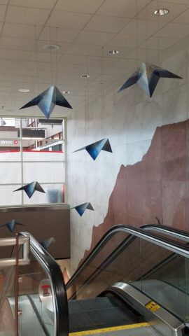
When I arrived at the top of the escalator, I realized that they were also above the escalator across the way so I walked over there (to the surprise of the masses with whom I had been funneling along). A couple in the crowd even called out “hey” or “ma’am” …I turned to see some were concerned that I had lost my way and expressed concern that I follow the pack. I waved to these helpful strangers indicating with my phone in hand that I was stopping to take a photo of these wonderful suspended planes.

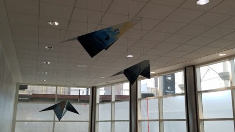
This ignited a curiosity that led me to investigate a bit more. I have since learned that they are part of the Denver International Airport’s Arts & Venues Denver: Public Art Program 1994. There are 140 of these suspended would-be-paper (steel alloy) planes and they are the work of artist Patty Ortiz titled Experimental Aviation. A well-recognized artist and curator of contemporary art with decades of art management experience she “believes that art intrinsically is a social object and when placed as an action in relationship with the viewer ad participant that art carries a profound interconnectedness within real experience.” And there I was experiencing the simple loveliness and joy that these airplane sculptures conveyed, in context with the often monotonous air travel experience.

Kids who love paper airplanes never seem to grow up. I’ve written about this before, in the blog about Federico Leon de la Vega’s TEDx Talks a couple of years ago. Watch his Talk and see the final scene as the planes fly through the audience. https://www.youtube.com/watch?v=H9j_pLgCr1U

Paper airplanes are timeless tools of communication set flying from one person to another often with a secret note inside. Unfold and discover the message. Like passenger pigeons of days gone by…but unlike their obsolete and ultimately extinct message-delivering cousins, paper airplanes are timeless.

Never taking up the art, it has fascinated me forever. Origami seems to be originated from the Japanese word for folding – ori – and paper – kami = Orikami. Japanese art is so fine in all of its forms. And back to the paper airplanes, San Francisco hosted a competition Origami-Palooza complete with education and presentation of many facets of origami work including the Paper Airplane Challenge. Last month “The Paper Airplane Guy,” John Collins, the world record holder for paper airplane distance was there to assist in honing your paper airplane folding skills to insure greater success with your paper airplane flying! https://japancentersf.com/events/origami-palooza-great-paper-airplane-contest/

My happy observation of this past week and my advice with it – grab a piece of paper and try your hand at folding and flying a paper airplane!!!!!

Bring Elegant Functional Pottery into Your Daily Life

Powerfully, pretty, porcelain, pottery graces the urban storefront window this month, of the east gallery of PATRICIAN DESIGN, with elegant, functional inspiration.

The opening of this the second  installation of the Resilience exhibit features a collection of porcelain pieces that is intended to be an entirely functional  ensemble of art.

It’s been refreshing to have these well established artists paired with exciting emerging artists presenting their expressive talents, in the form of something that you can use and enjoy, to enhance the aesthetic connections in your daily life.

Resilience, conceived by Helen Atkins, an exciting emerging artist herself, is the manager of consignment art at PATRICIAN DESIGN.

Her concept was to “explore the experience of local female artists at various junctures if their careers.”

As a recipient of the Makeshift Grant Project, “Resilience” is funded by the downtown Albuquerque Arts & Cultural District and the Albuquerque Community Foundation. The name of this project suggests that the strength and flexibility of clay as it is formed is an analogy to similar characteristics in the course of a woman’s life. Strength and flexibility – resiliency and tenacious fortitude are the features the two share  and which are celebrated with this show.

In addition to this relevant topic of women, the functionality of this collection is what is even more expansive. No gender specific appeal to this wonderful work, the idea that pulling in from the disposable practices of everyday life, strikes a universal chord.

To pull in and focus on what  you have and use in your daily life is the beginning. Evaluating between pure function and added beauty being introduced as an enhancing element is the trick. Then discovering individual pieces that bring enjoyment  while contributing to the function as well as the aesthetic of the scene,  from an interior design standpoint, is wonderful.

Your “scene” should be exclusively personal to you and your life experiences.  It is personal and wonderful to incorporate handmade artwork in all aspects of a design project. To appreciate the detail and have the opportunity of taking that artwork all the way to daily tableware is pure joy. These and other potters that we feature at PATRICIAN DESIGN offer just that – the opportunity to incorporate art into the simple functions of eating and drinking.

Artist  Kathryne Cyman is a master of the 400 year-old Japanese process of Arita pottery.  Please read more about Kathryne’s journey at http://art.unm.edu/kathryne-cyman/   Showing alongside her capable student Jordyn Bernicke, the two present simple, elegant, affordable pottery pieces for you to bring into your  daily life.

Imagine the soft, delicate yet durable cup in your hand from which to sip and relax. Even to toss o.j. on the run – the basic action of drinking from a handmade vessel, in a color and finish that makes you smile, is an enhancement to the day.

Sensory perceptions ignited by the feel and the look of a beautiful piece of pottery is restorative.

We are privileged to have this exhibit and to meet these fine artists. We are privileged as a community to have this program at UNM.  It appears that the natural beauty of New Mexico, life lived close to the earth and celebrated by Native Americans for generations is a parallel practice to the Arita process by the artisans in Japan.

This exhibit proves that to admire the techniques that produce beauty is to acknowledge the importance and value of including these elements in our daily lives.

10 Tips for Spring Refreshers

Like bears coming out of hibernation, people start to stretch and yawn and look around and ask me “What can I do to refresh my interior for spring?” It’s similar to the fall preparation for hunkering down for the winter…”What can I do to cozy-up my house?” as the leaves drop and a chill wafts through the air.

Spring is the season for re-birth and starting fresh. Fresh – what does that suggest? This year we are very fortunate that Pantone set forth the color direction for the entire year – greenery. I have great enthusiasm for incorporating this bright verdant living color throughout the seasons – yes, a color for all seasons – but we are not limited to green in its various forms. I give you permission to add color that makes you feel good. Pick your favorite color…any color!

Now let’s get to that question about “What can I do to refresh my interior for spring?.” Here are 10 tips to change your world and bring joy as spring approaches.

  1. Color POP: Speaking of your favorite color…”paint magic” as its often referred is the practically instantaneous positive reinforcement that you need to make a quick, effective change in your interior! Pick an accent wall – preferably one that is framed by inside corners (rather than stopping a color on an outside corner) and take the leap of painting it an entirely different color than your norm.  Bear in mind other color cues in the room so as not to create a discord of color or completion between your design elements – but don’t be afraid either. The idea is a pleasing POP! and an extra pointer, if your room is already painted a decisive color, white can be the accent. Yes, white can be an intentional color accent and not the lack of color that it can often seem to be.
  2. Live Plants and Flowers: Spring suggests flowers and greenery – to watch them grow toward the warm weather, bulbs inside can be fun, bouquets of your favorite flowers, sprigs of greenery in a small vase can even be enough. A bud vase on your bathroom sink counter, a statement piece at your entry or coffee table, a flowering plant with young buds to last a few weeks, a fern to add feathery freshness. – any and all of these can add life to your interior spaces.  If you have flowering trees or bushes outside, this is the time to cut a few branches and bring them inside, place in a vase with water and the warmth of your interior will “force” the buds to bloom – Voila!
  3. Reupholster to Refresh: Do you have a tired piece of furniture that might deserve a new fabric? A favorite comfy chair, a hand-me-down of sentimental value, a good frame (bones) that can be salvaged to new with a change of printed fabric, leather, or woven textile. This furniture facelift is just the trick to give new life to older pieces.
  4. Change It Up: When you move things around and rearrange your furniture, artwork and accessories you will be surprised how you can refresh without adding anything new. Take a look at your furniture arrange. Can the same pieces be rearranged in the same room and create a new look?? Might you move one piece out to another room or bring in a different piece from some other room?
  5. Pillows to Toss: Throw pillows…throw them out! Well, I exaggerate a bit, but cycle them into a bag in the closet for another time or place or “recovery” and find some fun new pillows to brighten and refresh your interior. What an effective change a few colorful pillows can make in a room!
  6. Add Art: DIY or find something to cheer you! Dressing your walls with new work can lift your  spirits!
  7. Fresh Fragrances: Like Votive’s Pink Mimosa or Skeem’s Current Mangosteen scented candles, or Vance Kittera incense will add a dimension of sensory appreciation to refresh the stale, stagnant air of winter.
  8. Wipe and Dry: New dishtowels are a great and simple boost to change seasons! Find some fresh and uplifting colors to brighten your kitchen and make wiping up more fun! They make a great gift too!
  9. Stash Your Throw: What’s that afghan on your sofa or that blanket on your bed? Switch out the dark colors of winter with fresh new accents to add color and cuddle in too!
  10. Get Tidy: Marie Kondo has written books about it- she knows the “life-changing magic” that getting organized and tidy can do for you! Spring cleaning is a great therapy and introspective look at the things you own, how much you have and what is clutter beyond your ability to enjoy it all.


The Art of Anime and a trip to the Marukai Japanese Market

Design through the eyes of a 13 year old. A 13 year old girl having had her birthday just last weekend and who is immersed in the world of anime. Anime is a style of Japanese illustration and animation. An exciting world of fantasy and action, good versus evil all wrapped in color and remarkable edgy design.  Simply stated in her words “anime is a style of Japanese cartoons of many genre.” Her current favorite is Magi and the Labyrinth of Magic. Anime Magi-The-Labyrinth-of-Magic 
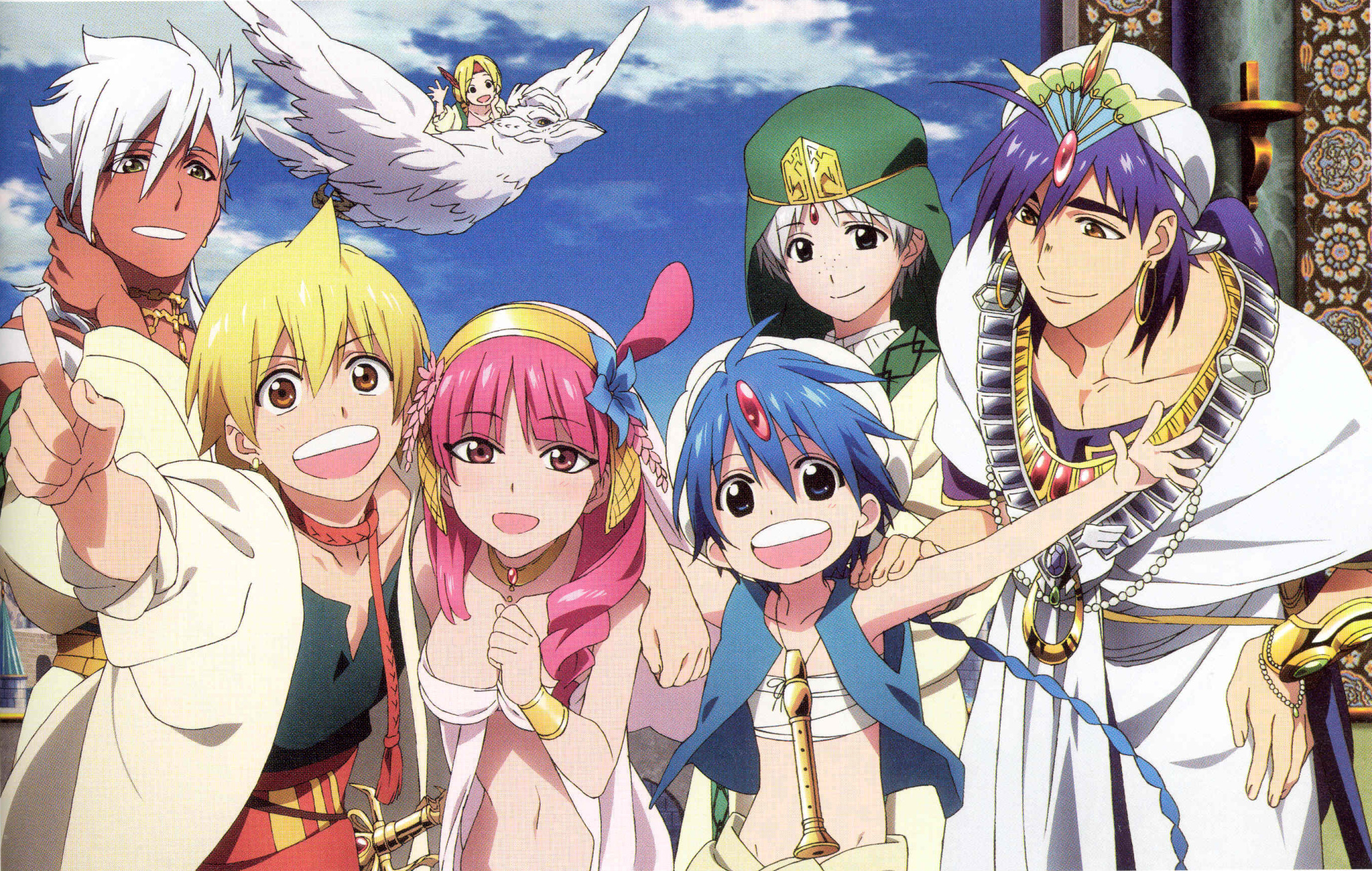
The characters have large saucer-like eyes belying their Japanese origin. Their story-lines appeal on many levels for all ages.

Katarina loves to watch the cartoons, draw the characters and learn about the world from which they originate. So one of her birthday to-dos was a visit to the Marukai Market in San Diego. Instantly, upon entering “Tokyo Central” colors and forms scream from floor to ceiling producing a sensory over-load that made me take a breath. Katarina beamed at my reaction. She said  with her subtle delivery “See?  I told you.” 2016-04-16 San Diego Hoech P1130765

It is a startling graphic design extravaganza of cellophane wrapped brands, foil metallic labels, signs and glitz and packaging that suggests advanced art classes on the subject.   2016-04-16 San Diego Hoech P1130764 
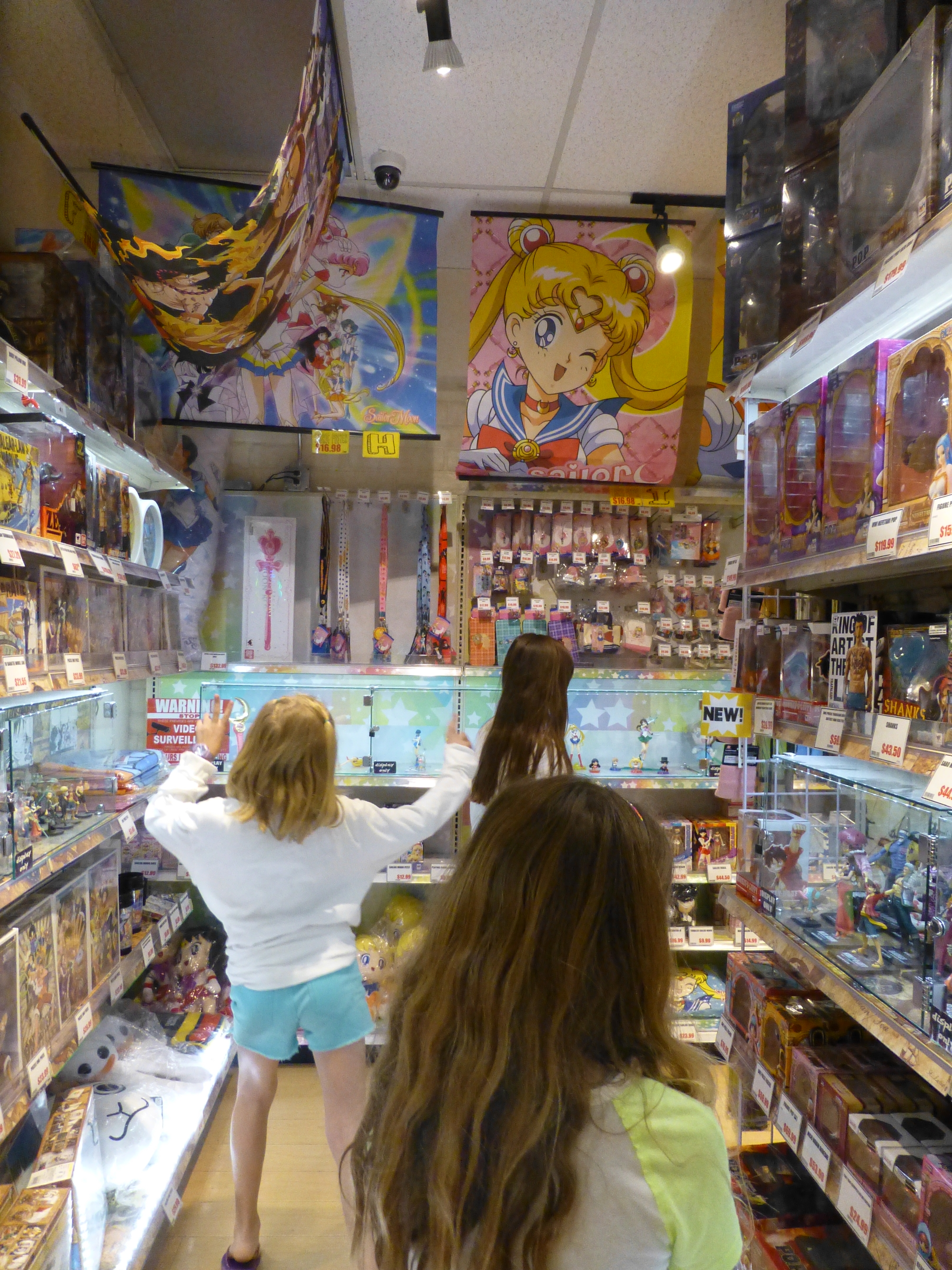
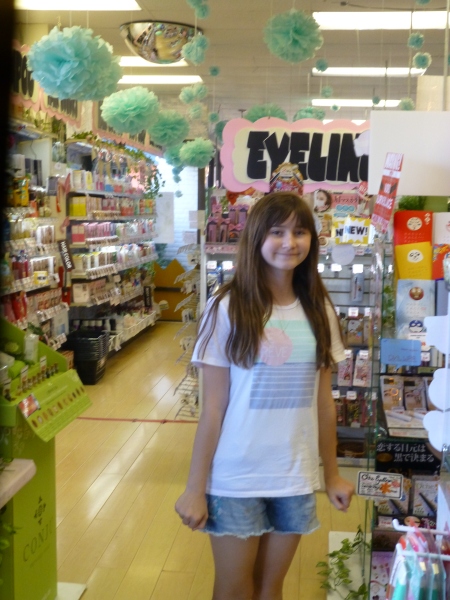
From over-sized dangling flowers to disco balls sparkling from the rafters, the place is alive with static animation. Well, monitors too airing the vary anime of this initial topic!

The merchandise is displayed in such multiples that they are a design of their own. The patterns and redundancy, characters and faces peeking from every inch of space. Row upon row of stuffed animals each with adorable expressions begging to be taken home.2016-04-16 San Diego Hoech P1130767

But it’s the design on EVERYTHING that is so amazing. To see such an emphasis on design. The importance and effect on every package. When comparing to like-kind of variety stores in the U.S., this is product design gone wild. The edifice itself is  but a box. Simple, clean and attractive from the outside,  inside is nothing but raw retail finishes. But it doesn’t matter because the back-drop is invisible. It is impossible for the eye to go beyond the products. It is impossible to see anything of the space other than its intense collections of contents.

2016-04-16 San Diego Hoech P1130773
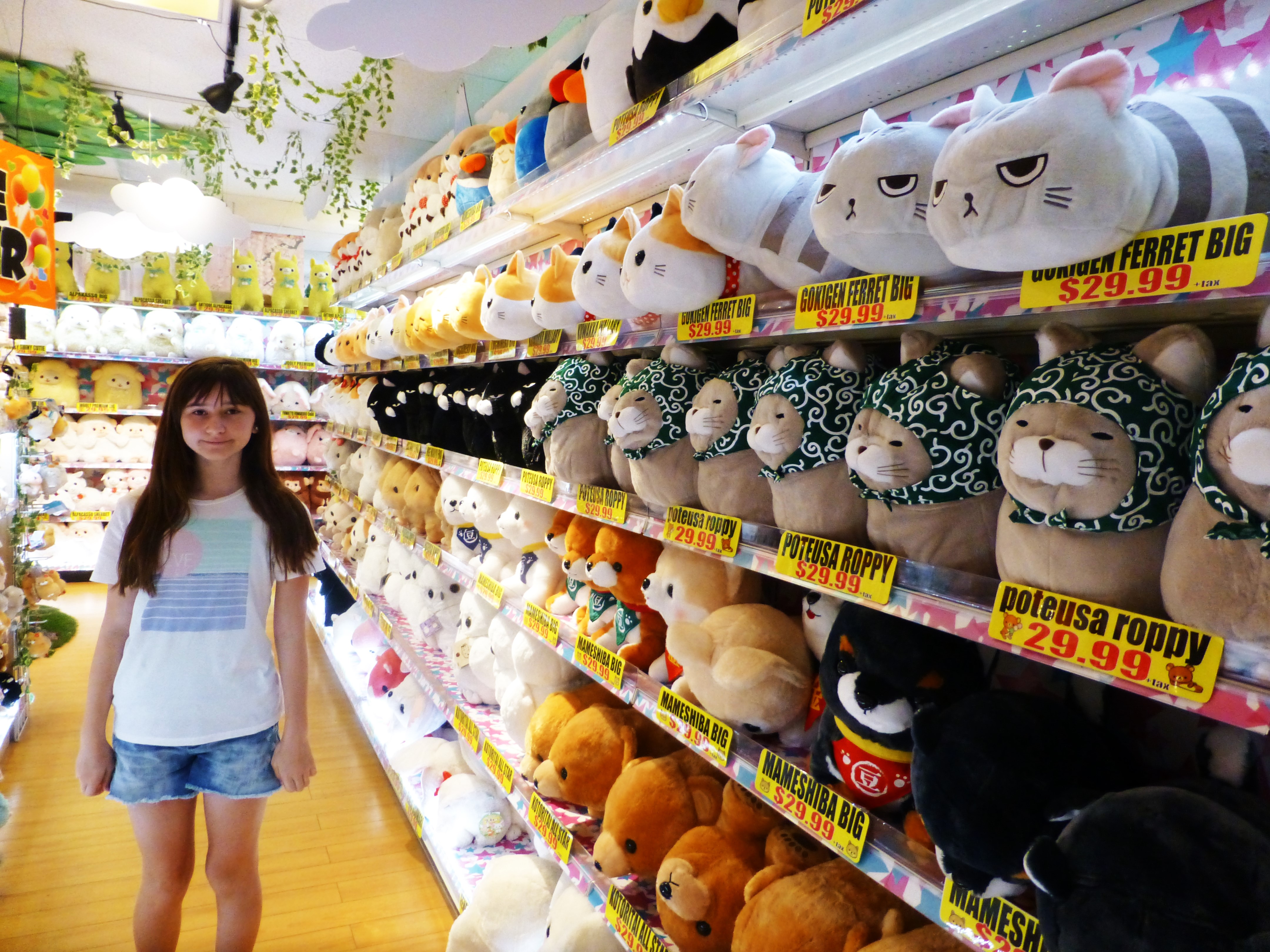
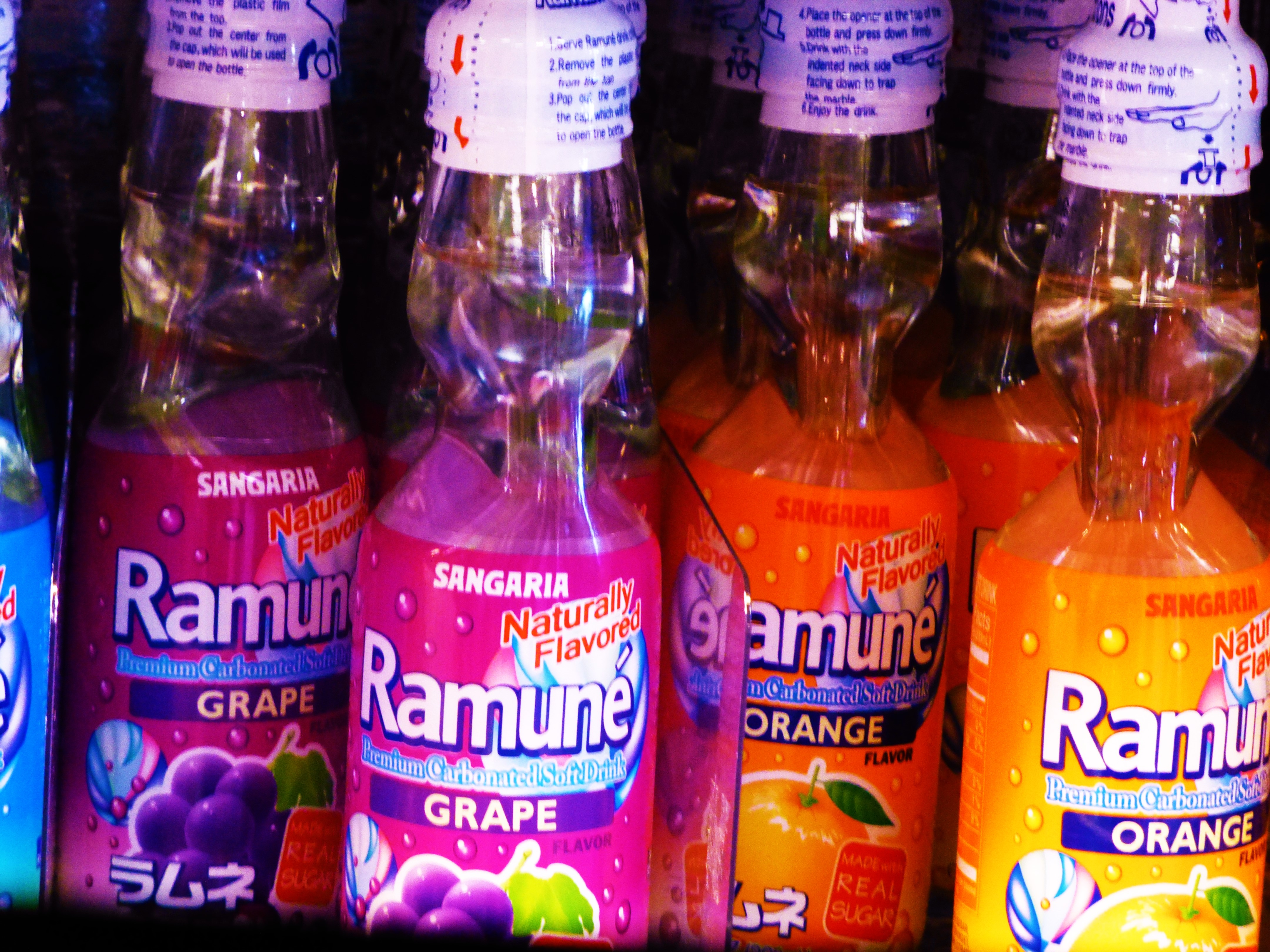
From beverage bottles to bears, pink kitties to hair and make-up lotions and potions, games and costumes – yes you too can dress-up like a bowl of Ramen Noodles or an egg yolk named Gudetama.

Although this amazing chain of markets is concentrated in California and Hawaii, it is worth investigating the Asian Markets in your area especially with an emphasis on Japanese products to see these colorfully artful expressions of graphic design, inspiration and imagination. 2016-04-16 San Diego Hoech P1130775 
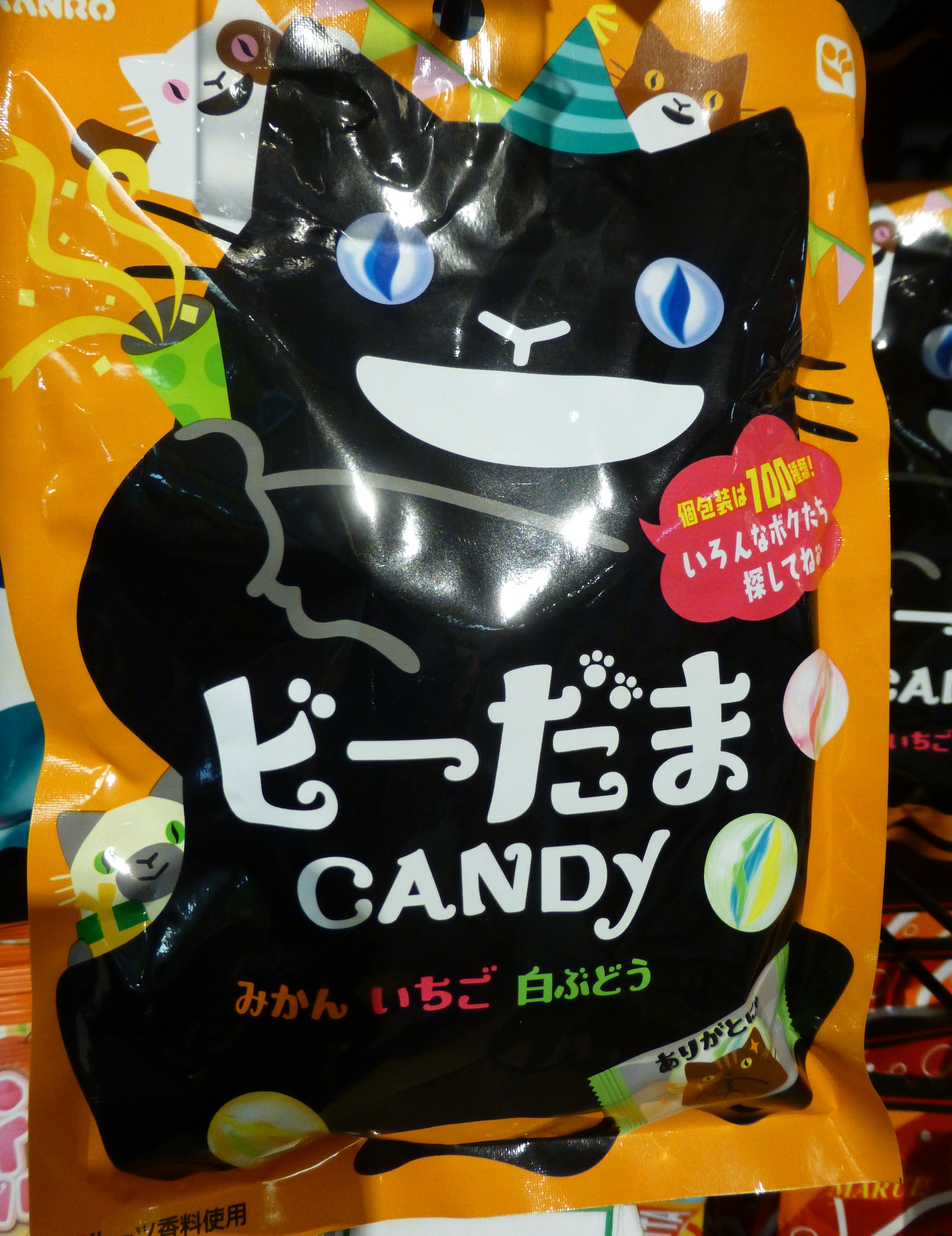
Thank you Katrink for this amazing experience we shared for your birthday!!!