The Wealth of Art That is Our Elegant Library of Congress

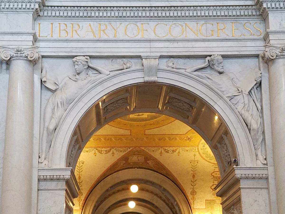
If the Basilica in my last blog didn’t get your juices flowing about incredible public art spaces, the Library of Congress was our next stop. Yes, it houses nearly everything having to do with writing, recording, documenting…but the building itself is amazing! It in itself is a wealth of artistic detailing. The interior has more gold leaf – not gold paint – but hammered metal gold leaf – than any other building in our Nation’s Capital. Inside and out, the craftsmanship of the stone carvings and architectural embellishments is magnificent. This inestimable landmark is so much more than the sober name suggests.

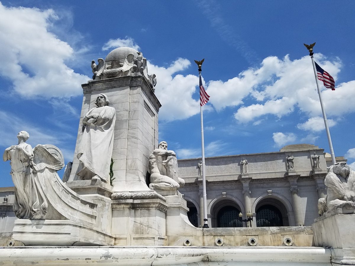
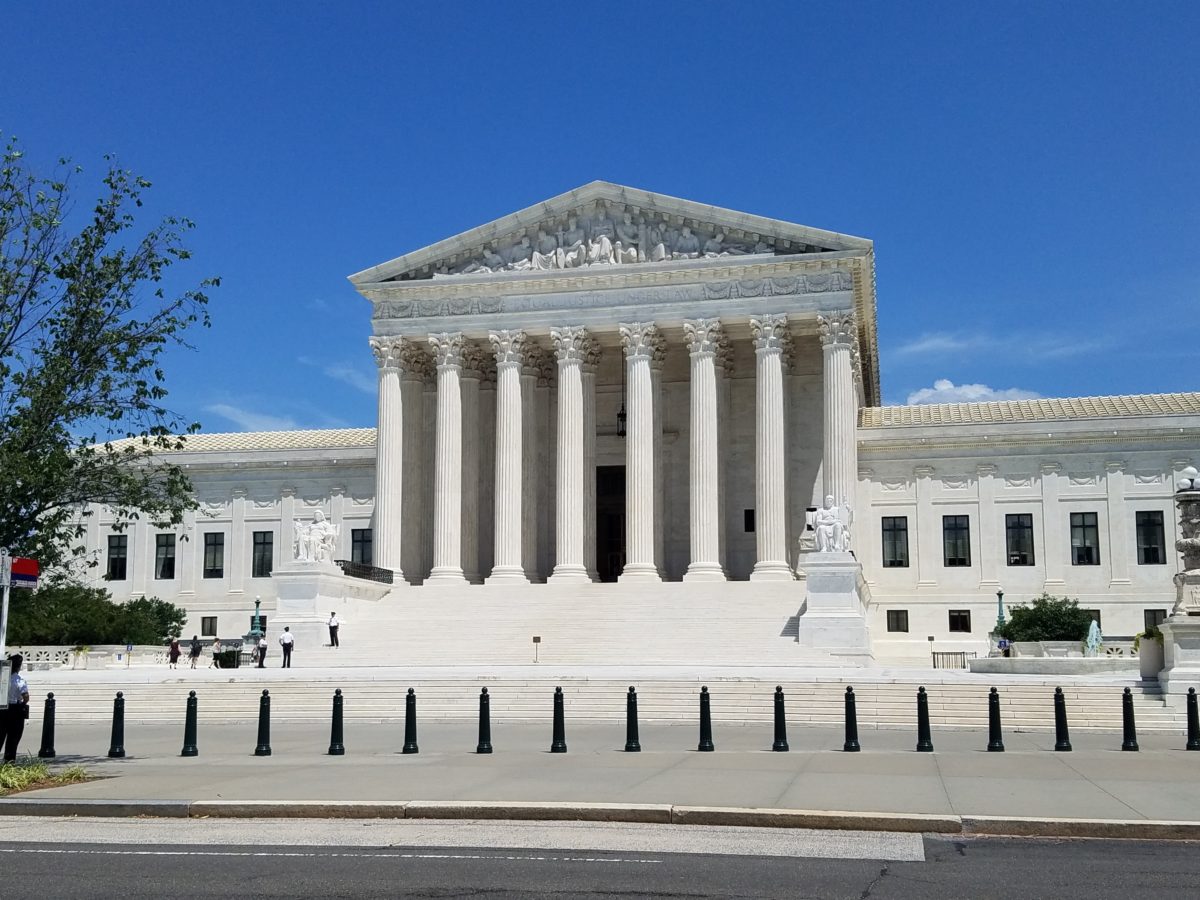
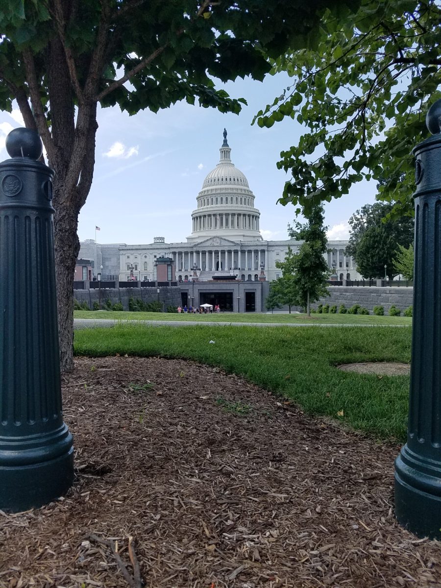
We parked in the garage of Union Station and walked the few blocks past the Supreme Court and the Capitol Building to our destination of the Library of Congress. The brilliant blue skies behind the bright white edifices belied what some regarded as the oppressive heat. I however am a heat freak – it’s summer – bring it on!

Columbus Fountain at Union Station also known as the Columbus Memorial is a public artwork by American sculptor  Lorado Taft, located serves as a tribute to the explorer Christopher Columbus.
The Supreme Court – cool, brilliant white against a striking blue sky – at 100 °
Crouching to get a shot of our Nation’s Capitol Building.

Symbolism is executed with every inch of the design details both inside and out of the imposing Library of Congress. Ascending the exterior stairs sets the stage for arriving at a monument of immeasurable wealth of human dissertation and history. Here I can only touch on the tip of the iceberg…

Picnic tables out front at our Library of Congress…relax, grab and bite and read a bit before going back to work!!!

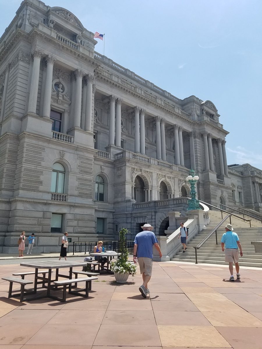
From an inauspicious beginning of modest expectations to greater expanses with devastating fiery catastrophes in between, the Library of Congress has an amazing story. Thomas Jefferson played a significant role in re-building the foundation of what we now have today.

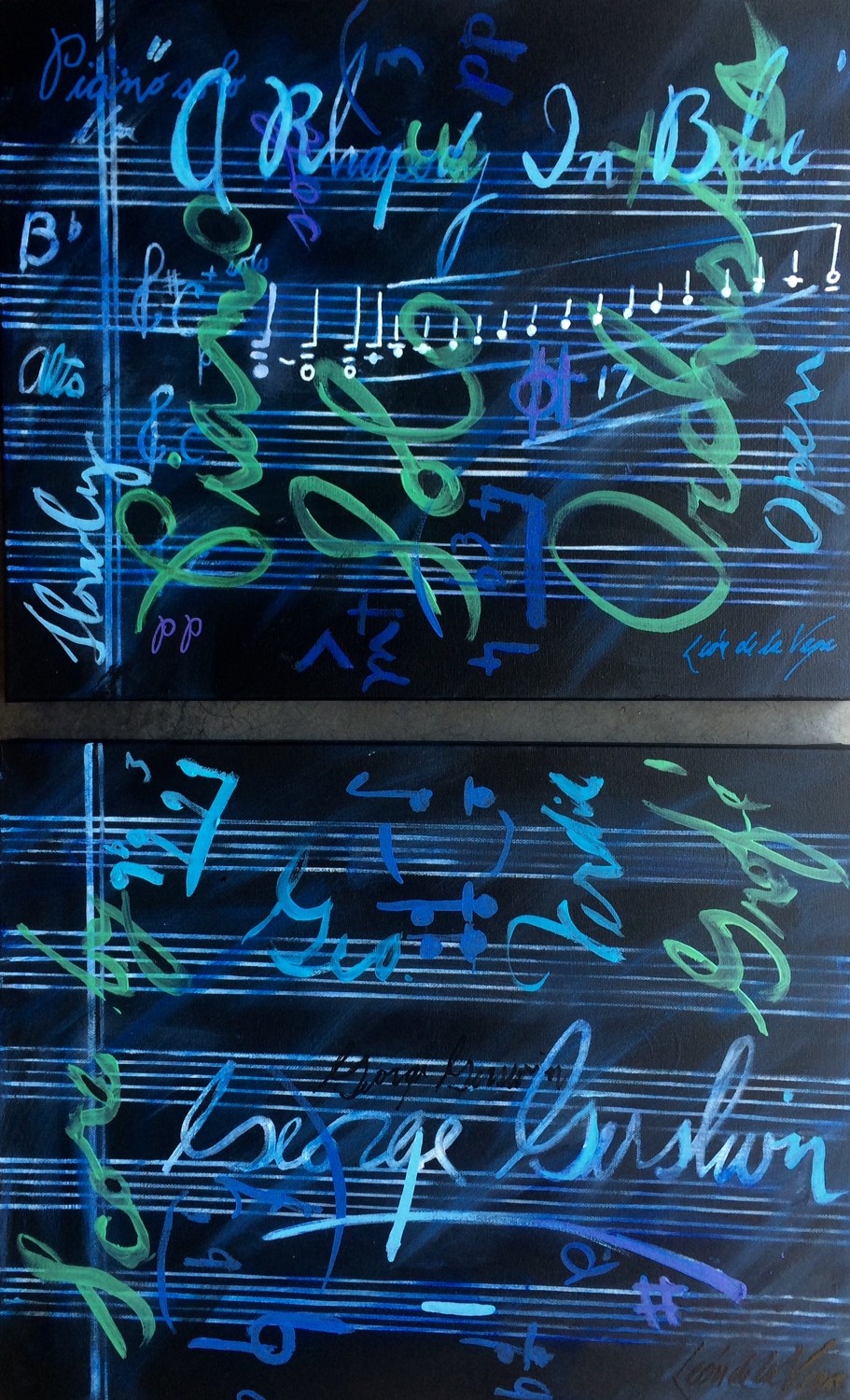
While waiting for the tour to begin in the magnificent Thomas Jefferson building, we were directed to two remarkably entertaining exhibits on the lower level – a Gershwin gathering and a Hope homage.

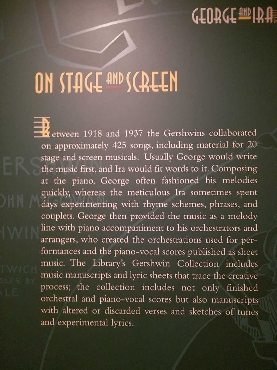
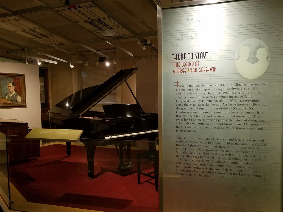
The George and Ira Gershwin Room is a tribute to the two brothers and their contribution to American music. This nostalgic and very familiar subject matter makes you hum and tap your toes. The exhibit presents George’s piano and custom-designed writing desk, Ira’s table and typewriter, self portraits and myriad documents that trace their lives and amazing careers.

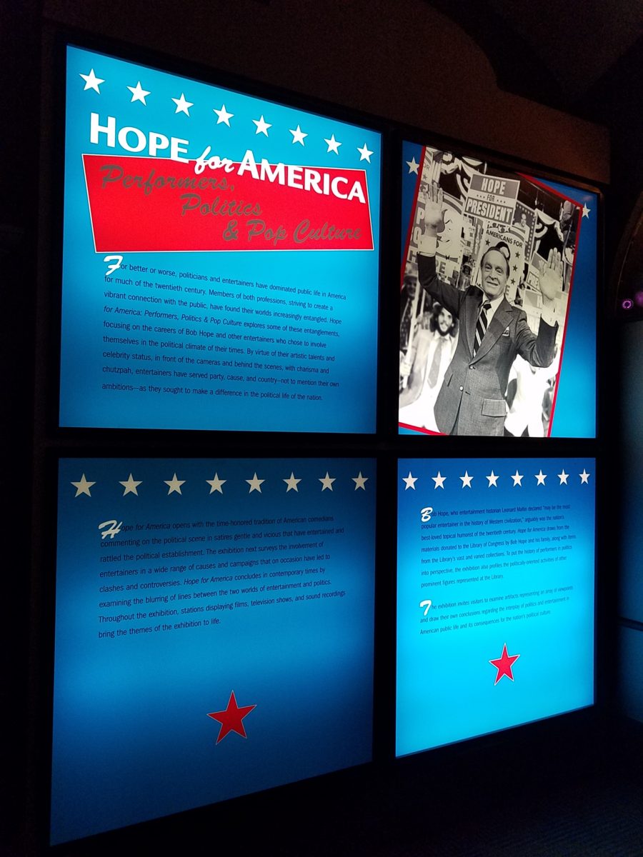
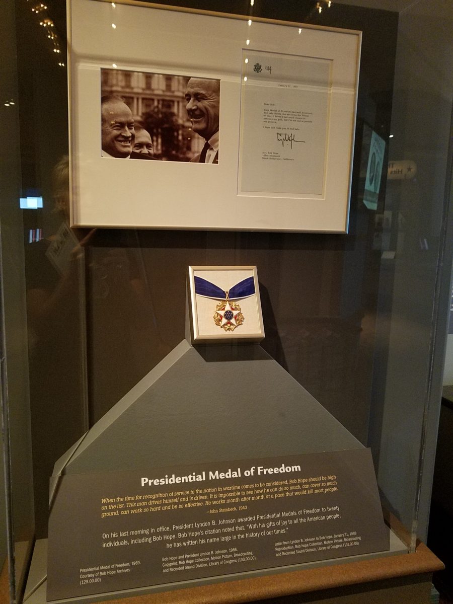
The Hope for America Exhibit focuses on the varied careers of Bob Hope along with other recognizable entertainers. The exhibit offers the satirical humor – crossing party lines – both socially and politically for which Hope was so appreciated, admired and beloved. Hope received the U.S. Congressional Medal of Honor and the Presidential Medal of Freedom for his commitment, in his nearly 50 year service, entertaining the men and women of the armed forces abroad.

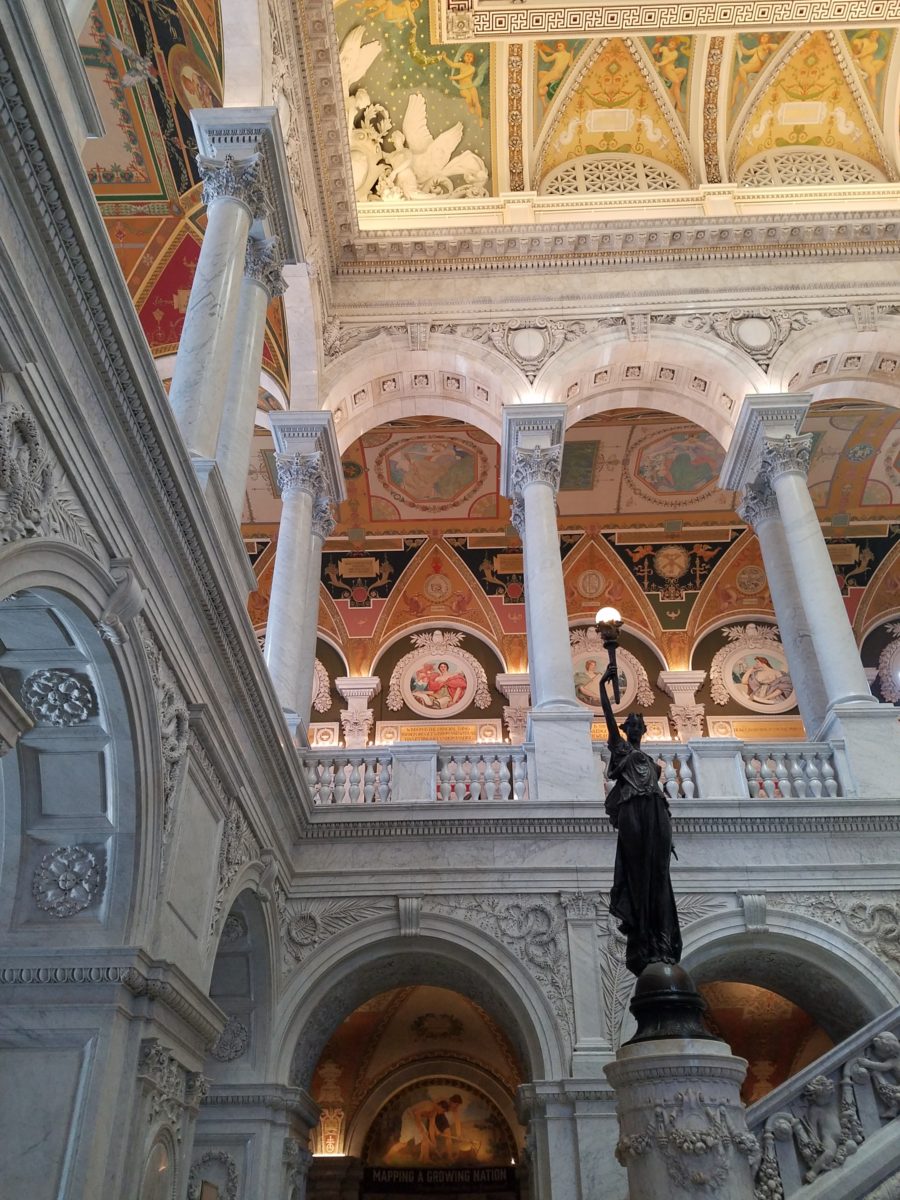
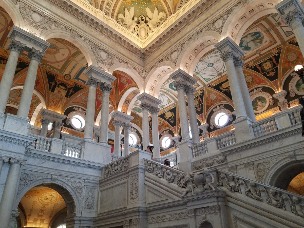
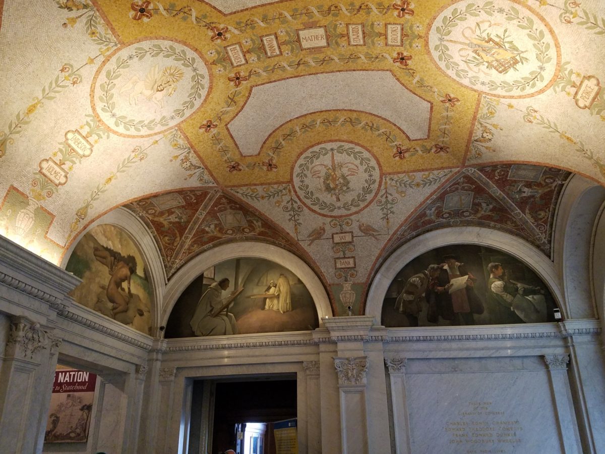
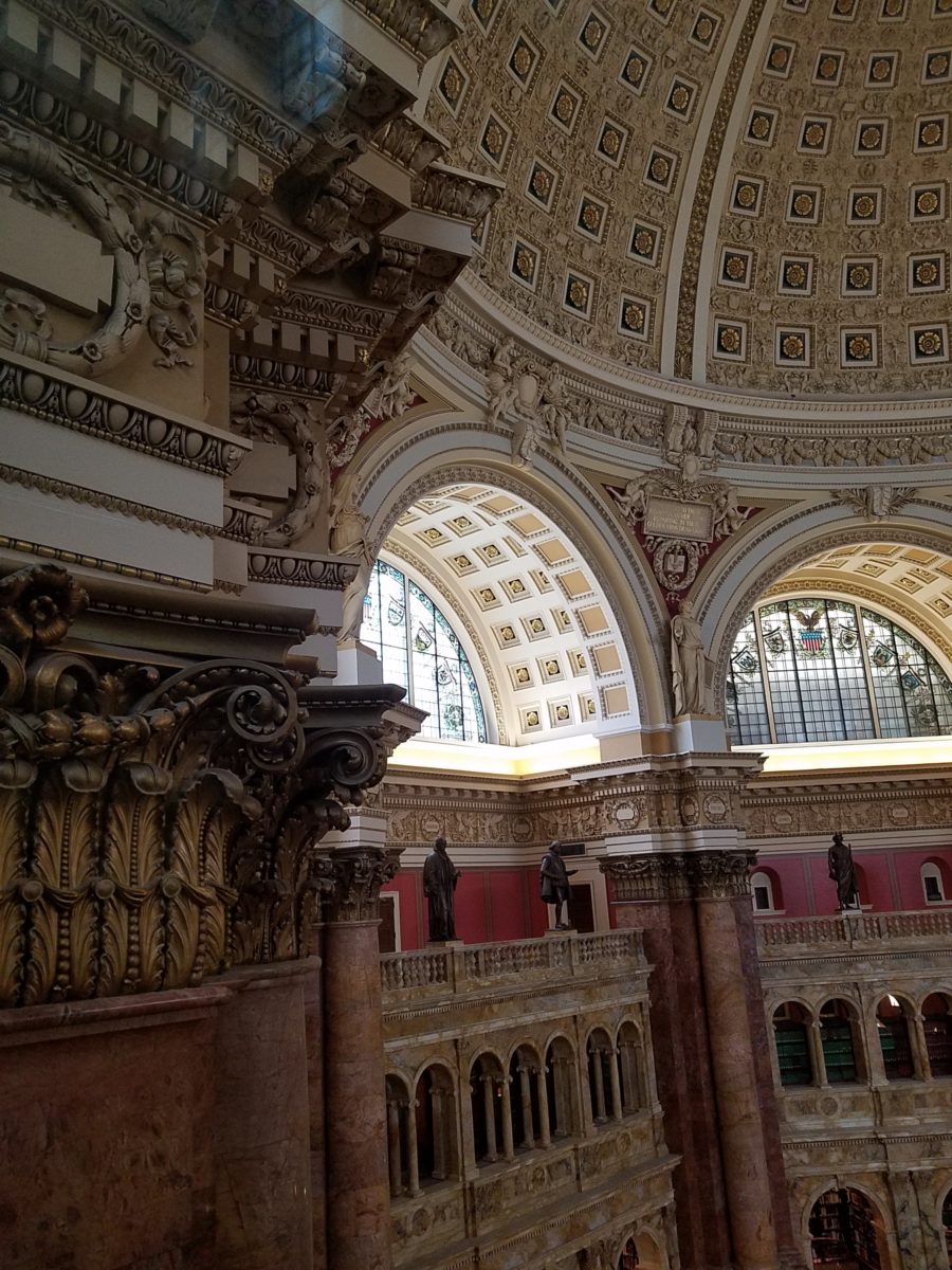
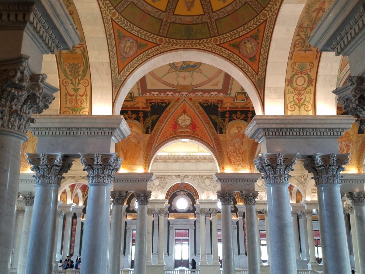
As the actual tour began, we were introduced with a short film as an overview of what was to come. We were then guided up a staircase and gathered in what was a most astonishingly beautiful, expansive space full of piercing, daylight, sunbeams glancing off incredibly detailed architectural stone carving and sculpture. Vast murals, vaults and arches in the 360 degrees of beauty from floor to voluminous ceiling was staggering.

” Founded in 1800, the Library of Congress is the nation’s oldest federal cultural institution. The Library seeks to spark the imagination and creativity and to further human understanding and wisdom by providing access to knowledge through its magnificent collections, programs and exhibitions.” Thomas Jefferson stepped-in to save the Library of Congress after a few inauspicious starts.  Not enough time devoted here to a history lesson – learn more at https://www.loc.gov/  –   but this grand space into which we entered is the Thomas Jefferson Building.

The focus of this blog is to share a bit of the art and decorative embellishments of this stunning architectural environment – beginning with the Commemorative Arch by Olin L. Warner (1844-1896) featuring a young man to the left and a bearded elder man on the right signifying that the process of learning never ceases…

Grand staircases on opposing sides of the space are adorned with carvings of “putti” – Italian for little boys – as they are pictured representing various occupations from gardeners to astronomers – the depiction of each vocation is fascinating with what it means to have that respective knowledge to pursue one’s career path.

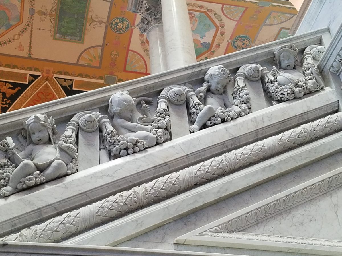
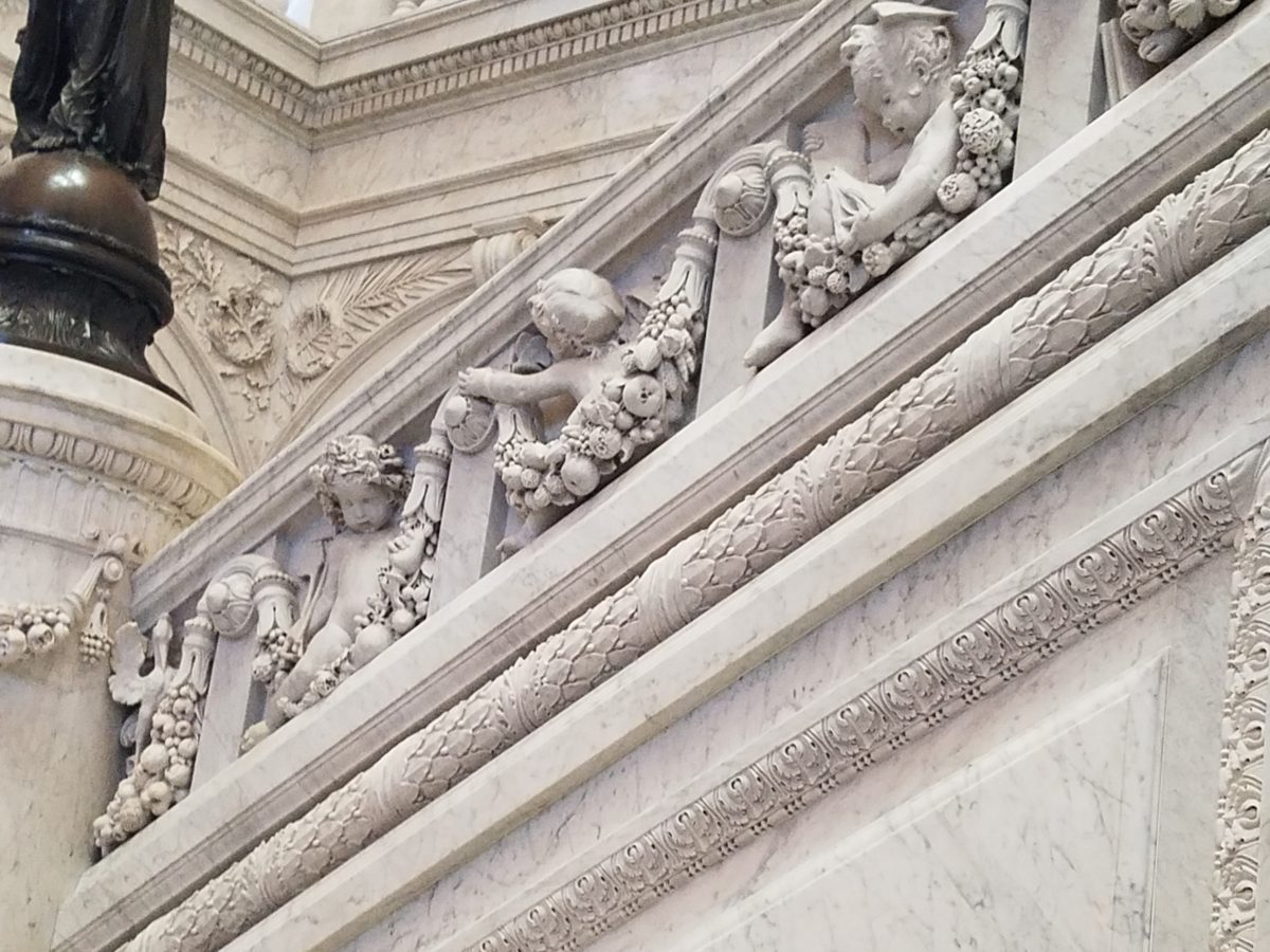
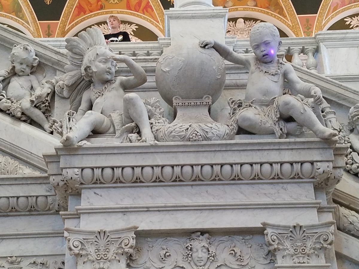
Beneath the string of putti are representations of the 4 corners of the globe depicting figures of each, Asia paired with Europe and American paired with Africa.

Minerva, the Roman Goddess of Learning and Wisdom is aptly featured in a series of statues and images.

Most fascinating to me, up in an adjacent domed ceiling area was the “Evolution of the Written Word,” a series of lunettes by John White Alexander (1856-11915). Having previously written about the importance of handwriting for a million reasons that go beyond, but are directly connected to, this depicted evolution, I found this to be simple, yet profound. It is a beautifully rendered and fascinatingly distilled artistic expression of a very significant timeline. Beginning with The Cairn – we see them stacked stones on beaches for fun and on paths in the wilderness as markers, but here Alexander renders primitive man communicating by stacking stones to possibly mark the dead, a passage or a place of significance. 

As the history progresses, Oral Tradition becomes the means of communication – but only/obviously in personal contact. Words are created. Then Egyptian Hieroglyphics enter the scene with images representing words depicted on surfaces.

Picture Writing on animal skin – and ultimately more refined to vellum – becomes a more mobile means of communication.

Theologians recording ancient stories of biblical history brought monks to the art of the written word in compilations of the Bible as the first manuscripts/books became recorded.

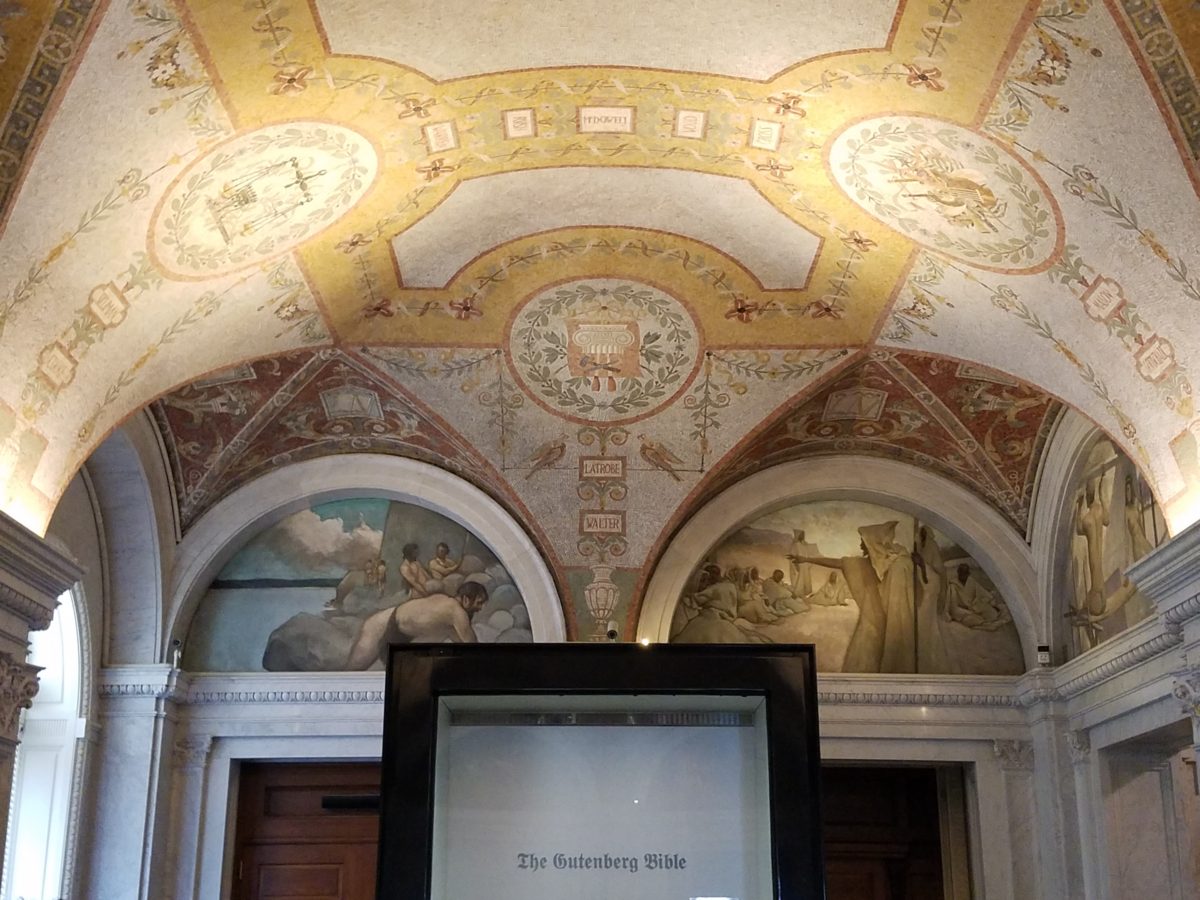
And then an exponential leap in communication came with the invention of John Gutenberg ca. 1400-1468 of the Printing Press! Asia had its versions of printing machines even before Gutenberg, but inspired by seeing grapes at harvests being “pressed,” he put that concept into the process of placing individual letters in place and pressing them onto paper. Western Europe then had a movable metal type process that increased productivity of printed material – printing the first ……in Western Europe. The tour guide sadly explained to us that Gutenberg died a pauper as his investors, not patient with economic fluctuations, excused him from his rightful place in the business and left him to live out his life only to receive proper recognition posthumously.

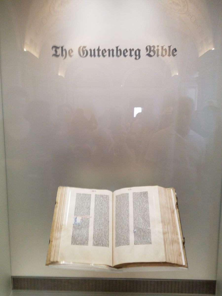
It is the first complete book extant in the West and is also the earliest to be printed from movable type. This rare version is printed on vellum.

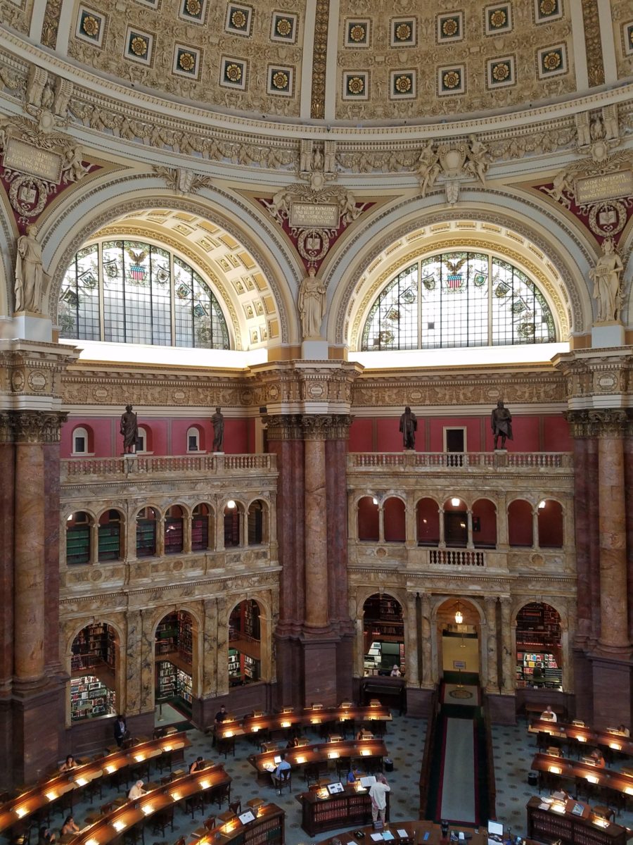
Unfortunately, at this point in the tour, we had to excuse ourselves with a quick wave and thanks to our guide as we were departing later that afternoon. Before leaving the building though, we dashed upstairs to discover the main Reading Room – entering from a way upper tier, we had a bird’s-eye view of this grand space. The scale was daunting and the spectacular architectural detail was breath-taking. The WOW-factor was palpable!

The Reading Room.

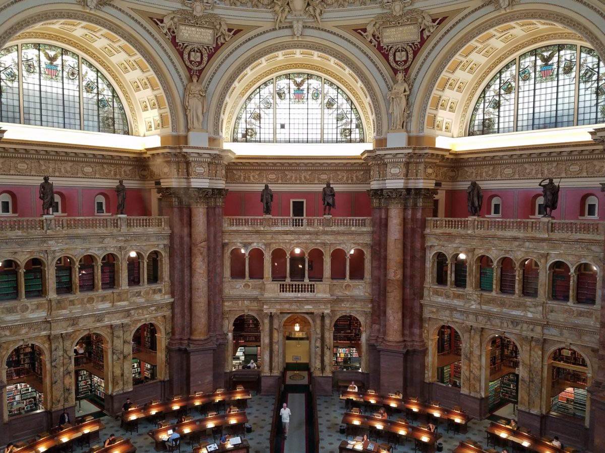
Eight giant marble columns each support 10-foot-high allegorical female figures in plaster representing characteristic features of civilized life and thought: Religion, Commerce, History, Art, Philosophy, Poetry, Law and Science.

Layer upon layer of intricate, symbolic details.

The 16 bronze statues upon the balustrades of the galleries are a tribute to men whose lives symbolized the thought and activity represented by the plaster statues.

Shhhhhhhhh……it’s the Reading Room

And with that – we only had enough experience and education about this incredible resource and monument of artistic beauty to whet our appetite for more and surely lure us there again for more information about all that comprises this amazing public gift and resource.  

Ta Da!!! Seriously – standing there in awe…taken with my phone!

There are so many wonderful things to see and do – get out there and see it!!!

Have You Listened to Your Heart on a Quest to Create ART?

When do you know when to listen to a sign? What opportunity changes your life? From romance to career changes and all manner of life’s opportunities – what catches your attention? What switches on inside and makes you take notice? Having someone cross your path and not realize he/she is your soul-mate. We’ve seen many movies with this elusive thread woven through the plot. One of my favorite songs, about such would-be near-misses, is “If He’s Ever Near”  in which Karla Bonoff pines…

They say just once in life
You find someone that’s right
But the world looks so confused
I can’t tell false from true

And love’s so hard to find
In this state of mind
Oh I hope I’ll know him
I hope I’ll know him
If he’s ever near

…her yearning hits a cord.  What is a sign? How do you know? What action do you take? It’s not always particularly obvious.

Recognizing opportunities is what separates many successful people from the rest of the world. Taking chances, when those signs make their appearance, is the other factor. Risk-taking is a scary leap into the unknown, but so often results in great reward when it is a true calling and approached with dedication to seek and meet the challenges.

Seems from many with whom I’ve spoken, a true calling is pretty clear. It taps into a passion and ignites a level of excitement and enthusiasm that is hence to fore unmatched. It becomes an irreversible path forward. Like an involuntary propulsion. Thrilling for some – terrifying for others. Which type are YOU? Perhaps you find yourself in the middle – healthy respect for the trepidation, but curiosity for what’s in store!!!

Twice this week I have met with artists who are each taking an enormous leap into a new life direction. One who might not be ready for me to blog about her adventure has leaped from a 30+ year life in Mexico… to a year-long reunion in Arizona with family tapping into the vibrant art scene in Sedona…then a soul-searching move to New Mexico where she invested her savings to start a new independent life…and after exploring her options and searching introspectively for her personal needs, happiness and goals has decided, after yet another year, to sell her new home and return to Sedona to pursue what she firmly believes is her calling. She took leaps, explored options, followed leads and returned to what she initially thought was the right place for her, but which had contingencies that masked her true indicators. She did not want to have imagined constraints rule her decision. Now she realizes that it is her choice, her viewpoint, and ultimately her quest for joy. Her focus and grace have inspired me on many levels and I hope to share her story once she’s ready!

Yesterday I was visited by a Renaissance artist whose enthusiasm and self-effacing manner bring sunshine to every event!  Kim Jackson has a new-found passion!  Having mastered her profession in the arena of photography (http://www.kimjacksonphotography.com)  she had an encounter that looks like will change her life path with new-found joy.

Sprinkled at my reception desk, I was presented with an array of amazing little jewels. Kim spread a collection of painted rocks and miniature paintings in a scattering like pebbles and fallen leaves. Only these jewels were painted with such detail and expression that I was arrested – awestruck.

Her own words about this turning point in her life is enchanting.

Last summer I was gifted a painted rock by a 4 year old girl about to lose both of her dogs – the rock read “Love”.

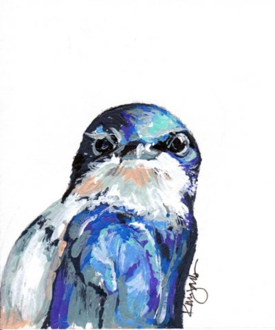
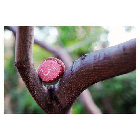
I was touched and photographed it to share with my instagram followers, which lead me down the #paintedrock hashtag. The first artist’s post I clicked on – she does amazing mandala dot art – shared what kind of paint she used and gave other general tips. By that afternoon I had a rainbow of colors and was painting my first rocks.

Kim was there to capture the family on the eve of having to put their two dogs down. The little girl presented her with a simple yet profound object and message that resonated so strongly with Kim that it sparked an idea that lead down a path…

 My rock art (art rocks) style has evolved in the last 10 months, and at the beginning of May 2018 I painted my first 2D “little dessert” and bird paintings – supposed to be gifts for Mother’s Day. With encouragement from a fellow artist I have approached galleries and received warm reviews on both the stones and little paintings. 

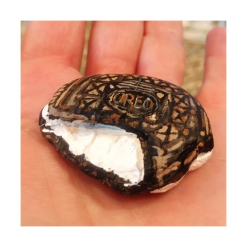
Although Kim’s photography still plays a significant and pleasurable career role in her life, this quest to explore other of her creative energies and talents is proving to be an exciting and potentially lucrative path.

Thanks to the support of my husband Billy, I feel extremely lucky to be given a chance with a second artistic medium – something I never dreamed I would be able to do. I’ve lived my entire life thinking that I could not paint well. While feeling blessed to make a career out of my photography, this is an exciting new direction, I am excited to see where it leads.

I see Kim as a precious stone, of many facets. Although she will still pursue her love of photography and capture people’s lives and many story chapters, Kim will make room for this blossoming career move into the exploration of creating art directly from her heart to her hand.

This sentiment has been so profoundly stated by Federico Leon de la Vega as he references a similar heartfelt expression regarding the (very personal and possibly evolutionary level) value of handwriting. https://www.youtube.com/watch?v=H9j_pLgCr1U

Federico prepares a prp for his TEDX Talk. “From my head to my mind, from my mind to my hand, from my hand to the paper, I place in your hand, so you may fold it and keep it near your heart.”

Some things cross your path unwanted and certainly change your life. For the undesirable things, I recently read this phrase  by Glennon Doyle “Your wound probably is not your fault, but your healing is your responsibility.” Well, you might very well have caused your wound – but either way, taking charge of the healing is your responsibility. Which makes me realize that which we have all been told so many times –  that your destiny is in YOUR hands.

As this relates to art – do not be afraid to explore your creative tendencies. Do not feel you are not worthy or good enough. Experiment. There are so many examples of late bloomers in life. A prime example are the magnificent Portraits of Courage by George W Bush. He dabbled and played with a wide variety of subjects before he hit on portraiture. His abstractly artistic interpretations of people too shape and he discovered that these seemingly primitive paintings had intriguing representation, expression, character, beauty and appeal. The path led him to a powerful platform for veterans, fund-raising opportunities, heightened awareness and acknowledgement of sacrifice.

https://www.bushcenter.org/exhibits-and-events/exhibits/2017/portraits-of-courage-exhibit.html

As stated on the website, this exercise has become significant:

A VIBRANT COLLECTION OF OIL PAINTINGS AND STORIES BY PRESIDENT GEORGE W. BUSH HONORING THE SACRIFICE AND COURAGE OF AMERICA’S MILITARY VETERANS — AND HIGHLIGHTING THE WORK OF THE BUSH INSTITUTE’S MILITARY SERVICE INITIATIVE.

A great article on the accidental painter is here in The Artists’ Network

“These portrait paintings aren’t great but they are gutsy, because it is gutsy to show your artwork period, but it is really gutsy when you know the work isn’t perfect and you do it anyway, because it matters to you.

We could all learn a little bit from this–to embrace our abilities as they are right now, and then to simply let the work go…”

It’s not about a perception of being great or even good enough – most artists never really believe that they are. It is about following your passion – in this case, artistic expression. You might be surprised at what happens next! Believe in the power of ART!!


COMFORT & JOY with ART

A few years ago I gave a talk. The title was  something like “I Need a Piece of Art to Go with My Red Sofa.”  It was a defensive argument giving liberty to those who sought artwork for decorative purposes rather than an esoteric rationale. As an interior designer surrounded by artistic influences and drawn to the limitless styles, pieces, concepts and movements of the art world, I see and appreciate both sides of this controversial coin.

Federico Leon de la Vega’s Pomogranates

In my opinion art should bring joy. And that is not to discount art as a social commentary, honest statement of artistic philosophy, opinion, or personal expression. As an interior designer, my simple philosophy is that joy is a goal of interior habitats – function and joy simultaneously. For me, there is a synonym for beauty in there. Oh – and how apropos – it’s Christmas time and the carol God Rest Ye Merry Gentlemen specifically identifies bringing “tidings of comfort and joy.”

In this  month’s December 2017 issue of AD “Architectural Digest” Living with Art, architect Luis Laplace offers that he doesn’t really know about beauty in art. He sounds modest and self-effacing.  “I say I don’t know beauty. When I see that something works, then I see beauty.”  I say that is saying a lot about context. But inasmuch as I can see context being so perfect to showcase a piece that it validates it somehow, it seems lacking in the department of honest personal appreciation or criticism. Surely he must find beauty in art before it is placed.

I can see admitting that something having potential is a valid “wait and see” position to take when allowing a piece to be placed to its best advantage, prior to judging it too harshly – but that seems reserved for pieces about which one is trying to give them the benefit of the doubt! It sounds a bit like tap-dancing…making excuses. Excuses for not having an initial opinion or spontaneous reaction – much less appreciation – much less, joy.

Festive boat bringing JOY at the San Diego harbor parade last week.

Another comment that Laplace makes in this article “High Art” is that “We never use art as a decoration,” he declares. “We design for installation and rotation.” And I am sure in his world, that is exactly what he does. But let’s get down to earth and acknowledge that it’s a chicken and egg thing – the luxury to design expressly for the presentation of magnificent rotating works of art versus finding joy in a piece to decorate your world – with or without rotation. He makes decoration sound like a bad word. And perhaps he thinks it is – but why? Adornment, decoration, enhancement, emphasis – all superlatives, in my estimation.

Federico Leon de la Vega’s Script on Blue

In a completely opposite place on the planet both figuratively and physically, Robert Downey Jr, in this same issue of AD, expresses an explanation for their selections and design direction. “We didn’t set out to do something conspicuously whacky.” He obviously gets great joy and a kick in the pants out of his approach which he cements, with the following comment: “We just enjoy a bit of whimsy and fun.”  And then a negative nod to separate him from the more cerebral art enthusiasts – “We definitely don’t like boring.”

But that is a direct comment on the joy thing and one of my oft borrowed quotes “One man’s trash is another man’s treasure.” Here, a tangible example that I created for my grandson, Liam a few years ago. Debris he and I collected while on a walk one day, I assembled into a collage and had it framed for him with the plaque to remind him to look at things and regard things from all angles.

From what one person derives joy, another might find boring and uninteresting. And that oddly seems to return to the Luis Laplace comment about not seeing beauty until it is placed and then can be recognized. Hmmmm…Yet, I am saying that it might be of value to study things and  think about things differently than face value at a quick glance…spontaneity is valid and so is “love at first sight,” but often things are missed because their context s not serving them well. That space above your red sofa might be just the context and proper setting to showcase the “whatever it is” piece which might be far less interesting otherwise.

Which is why, in this time of international commerce delivering things from all over the planet with an almost instant gratification speed, we still have difficulty making decisions about what to chose to have in our world. Which fabric, which furniture, which art…the choices are at our fingertips and delivered to our doorsteps without leaving our living rooms, but fear of costly mistakes, second guessing trends and how to make good investments still remain the dilemma shared by most. Fear of trusting your own joy. Or, better yet, discovering and defining your personal joy.

Which brings me to the last quote I extracted from the December  2017 issue of AD by an artist, Brian Donnelly, speaking about his own residence and art collection, and that is  “I don’t buy art to put in specific places. I just collect what I love and hope to find a place for it.” Sounds like spontaneous joy to me!!

Closing with best wishes for a Merry Christmas and “tidings of comfort and joy.”


What is a Picture Worth as You Plan Your Design?

We’ve all heard the expression “A picture speaks a thousand words.” And today, as I set forth to use it, I investigated its origin…seems the original quote might have been “A picture is worth ten thousand words” as stated by Fred R. Barnard in the 1920s. Either way, it conveys the same – seeing is believing and seeing is more literal in most people’s eyes. Words can describe and attempt to convey an intent or, in my world, a design concept. But to sketch it – well that’s the best way to show the intended idea. There were other unsubstantiated references to an old Japanese phrases, but suffice it to say – it is such a truism that it is referenced often.

Here is an illustration of a courtyard that we have proposed. Our custom designed hand crafted iron gate inserted into the existing low wall, water feature, flagstone and plantings are all new proposals. Can you picture it? If I had arm-waived with a verbal description would it have been as helpful? It’s a small space, so it would have been easier to convey than other more complicated design concepts, but for the sake of an example, this works. I’m thinking that your answer would be – “Yes, I get it! The illustration sets the stage and really helps me visualize the intended finished product!” It is exciting and more stimulating than a rigid CAD drawing and evokes more emotion in most, if not all, clients.

I realize as I write this that it directly reflects the observations in Federico Leon de la Vega’s comments about the value and actually critical importance of handwriting as he expressed in his TED TALKS last year.


Therefore, I prefer the artist’s rendering – to support and promote the talents thereof and also for the much better rendition of the concept! So as technology advances in the realm of illustration, I intend to continue to support the skills of the artists that so effectively express our designs.

Let’s get together and plan your next design project, find solutions and create the images that will springboard the work and ultimately represent your new reality!!!

Would A Love Letter Be The Same Without Handwriting?

After having seen Federico Leon de la Vega’s presentation at TEDX Talks in September and after having seen some of the work in progress over the past couple of years, it was a treat last week to be in his studio to see the collection exhibited up close and in person!

Presented on fabulously enormous canvases and a few smaller studies, these bold graphic statements compile a contemporary collection that is quite astounding. The premise is quite provocative.

The idea that handwriting is a basic human means of communication having evolved into the very personal flowing script of cursive that each individual can call their own – in their own style – it’s almost as personal as a fingerprint. It is an extraordinary human function that should be protected, revered and certainly not lost to the fast-paced technology of the digital age!

Making one’s mark on a surface…a piece of paper…to convey a thought, idea, instruction, story, a doodle on a paper towel – a love letter.

20170117_120810

With Valentine’s Day approaching, it brings to mind the idea of love letters. We read them throughout literature and listen to them in songs. We hear of them being saved over time by recipients in treasured boxes tied with ribbon to be read over and over or merely saved for others to find long after…

These magnificent oil paintings convey the art of handwriting. They celebrate the simplest marks of hand to canvas with brush and paint looping in circles and jutting in spikes – the primary strokes of handwriting. These primary strokes are the foundation of mastering the control needed to make the continuous flow of letters that become each person’s personal interpretation of the alphabet in cursive style and an exclusive means of communication.

Style – handwriting conveys personal style. Look at yours. Is it always the same or do you mix it up? Do you stay consistent or do you express different styles of your own handwriting for different purposes?  Look at your friend’s handwriting – would you recognize it anywhere?

federico-signature

It is thrilling to walk among these great canvases with their color and  bold strokes. It is arresting to realize that they are so simple yet so complex in what they are saying. We must recognize the value of handwriting. We must not let it be dropped from our schools’ curriculum. We must continue to see the importance of the pure, mind to hand, raw emotion.

Powerful spikes require starting and stopping – control.

Loose loops also require control to maintain uniformity.

20170113_194255

After control is learned, expression can take over resulting in that personal style that becomes each individual’s identifying handwriting.

20170113_194522

Federico reminds us in his talk, about how we might have attempted to write a love letter for the first time and how many times it was crumpled because it wasn’t quite right. The failed attempts of recording our feelings as we strive to say the right thing, to express our deepest emotions. Yet once accomplished, those words hand-written mean so much more than the same words conveyed by type or digital communications.

“From my heart to my mind, from my mind to my hand, from my hand to the paper I place in your hand,  so you may fold it and keep it near to your heart. No delete!”

The digital world is all around us. We cannot escape it, nor should we. However, the human evolution and the brain’s development that mastered the art of handwriting is a place that could be diminished and lost if we do not continue the art and practice of personal expression through this extraordinary medium.

All we need is love – sent via a personalized handwritten letter from the heart. Here’s to a Happy Valentine’s Day !!!

An Artist in the House Inspired by Rhapsody in Blue

An artist in the house is a rare treat. Yes, you who are artists and those of you who have an artist in the family are spoiled by  this continuum of creativity bursting about you. As a designer I am of an artistic nature. I think in artistic expressions, react to artistic stimuli, and make decisions based upon aesthetic sensitivities that I inherently have.

But these weeks being visited once again by our dear friend and respected artist Federico Leon de la Vega and having him painting on the patio and in what we fondly refer to as the estudio-garage, we are surrounded by the unique scent of solvents and products peculiar to his trade of oil painting and the genius of his ability to express his observations on canvas.

Canvases scattered about with partially  completed masterpieces, ideas started and left to dry or waiting for further inspiration while others begin and take shape in varying degrees of completion. A mountain standing on end about 4′ long by 3′ tall, a lemon rind un-peeling in an abstract interpretation of the bright yellow fruit. A still life of citrus lemons and blue pottery creating a classic combination of color.

But in addition to this wondrous collection of colorful and dramatic paintings surrounding us is Federico’s ongoing project of  Mind Your Calligraphy which continues to grow and expand on this very compelling subject. As any of you who have watched the YouTube video by the same name know by now, this fascinating, universally important subject about cursive touches so many imperatives in our lives. ejercicio-preparatorio-2-federico-leon-de-la-vega

Based upon his passionate observations on the subject and translating those observations into paintings illustrating the concepts and precepts that frame this topic, Leon de la Vega is compiling an exciting body of work and references to bring this more to the fore. His recent invitation to speak at the TED-X Talks in Albuquerque this fall are a further step in bringing this essential topic to the attention of those who can make a difference.

Here are two new paintings depicting inspiration from handwritten music scores. Federico met with a client who has a great love of music by his magnificent glossy black grand  piano commanding attention in the corner of his sunroom.  The two began discussing how handwritten music scores, like cursive, allow the individual the quick personal freedom of jotting ideas on paper that can later be transferred to printed, digital means. And in fact those simple personal writings of notes on paper become quite valuable as they are uniquely and spontaneously penned by the hand of the artist. What could be more personal? The two men focused on Gershwin as they further discussed their mutual enjoyment of music, the unique appreciation and connection of expression through handwritten musical creations. Resulting from this conversation, the composer became the focus of these two abstractions of Rhapsody in Blue.  Gershwin diptych