Focus on an Artist, Patricia Forbes and the Art of Custom Design.

Collecting art, investing in art, loving art, designing with art…one aspect or all of the above, art in interior design has many facets. I have written previously about and presented a workshop about “I want a piece of art to go with my red sofa,” a kind of raspberry in the face of curators, collectors, critics and appraisers who would never take or condone that approach. But the desire and need exists and as a interior designer it is wonderful to work with artists who can and want to respond to cues, take on commissions and create for specific parameters.

Contrary to opinions from the high-brows, this is not to say that these artists lack artistic integrity or meaningful self-expression. Their value is as any other – determined by what the market will bear. The basis for this writing is that we work with many artists who love their work. And creating it (even under direction) brings them and their patrons joy.

Featured here is the up-lifting, colorful and texturally abstract work of Patricia Forbes. We have enjoyed commissioning her for specific interiors over the years and are never disappointed in the quality and creativity of her pieces.
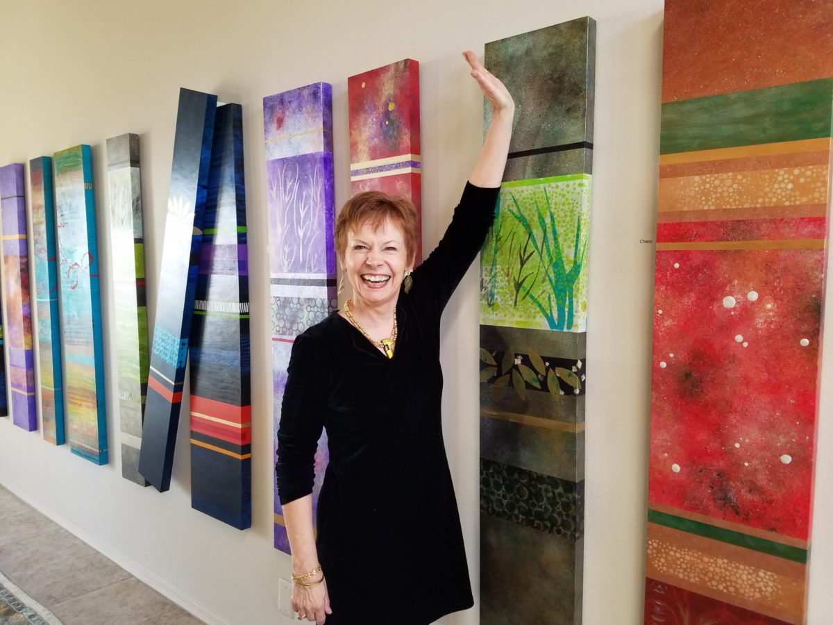
For scale, diminutive Forbes poses by her Vertical Stick series.

With so many mass-produced art offerings at the trendy home decor stores, it is refreshing to encounter new clients who are at the start of their nesting years, establishing their own domains, selecting things that bring them comfort and identity and who’s appreciation lies in acquiring original art.

Designing an interior is about comfort and personal identity. It is about surrounding oneself with things that work – both functionally and aesthetically. Individual’s requirements, in either of those departments, can vary greatly – but suffice it to say, each person or couple or family unit creates a home environment based upon their likes and needs (and budget).

Enter the interior designer. When calling on the assistance of someone outside the intimacy of the home, the client is hoping for and expecting a successful custom-tailoring of their requests based upon the experience of the professional.

When designing an interior, it is exciting to use existing pieces already owned by the client. It is gratifying to arrange and place those items in ways not yet imagined – thereby justifying the investment in design consultation. After an intense session of rearranging furniture, artwork and decorative accessories the “ta-da” moment is one of near instant gratification and satisfaction.

When an interior needs a little something to pull it together, fill a gap, create an accent or establish a focal point, it is great fun to engage the creativity of an artist to custom design a piece to fit the need. Approaching an artist for the express purpose of acquiring a piece of their work to enhance a space is  an exciting venture. It is a personal connection between artist and patron that creates a communion, a bond.
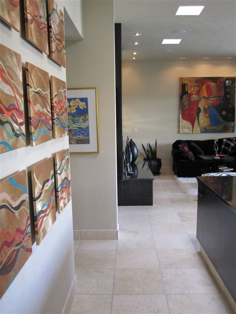
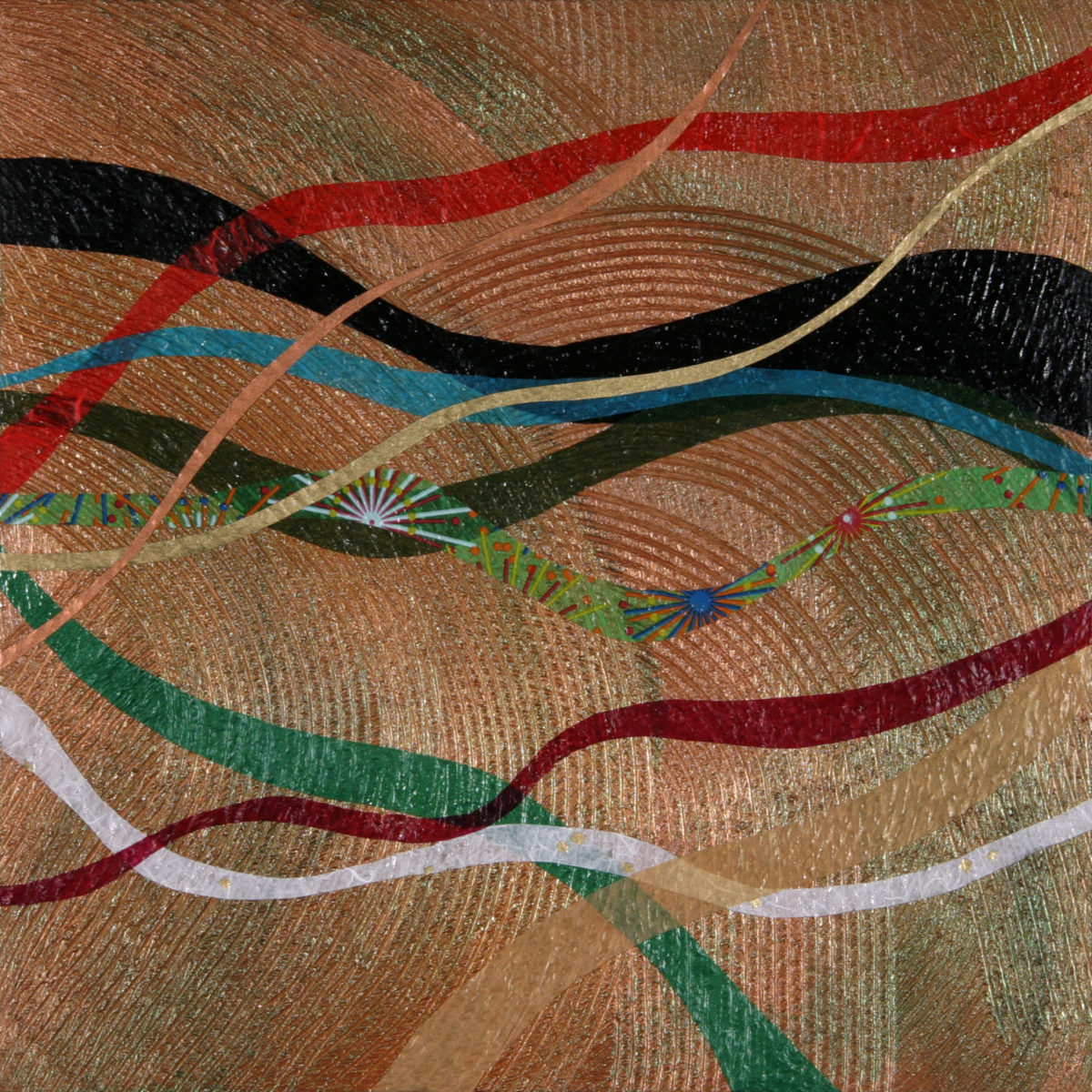
Here I took inspiration from a single panel that Forbes had constructed and requested a series of 9 panels grouped in a grid to make a larger statement on the wall. The interest created from a grid of images adds movement and dimension to this series already complex with sculpted texture and applied layers.

Color, texture, size, style, subject (or not) all are aspects of art that are to be considered for the personal  interests of both artist and patron. If the patron has selected an artist to approach about a commission it is as a result of experiencing their work and appreciating it. The artist, in response, is to accept the parameters of the request and enjoy the challenge and process of creating the intended/desired finished product.
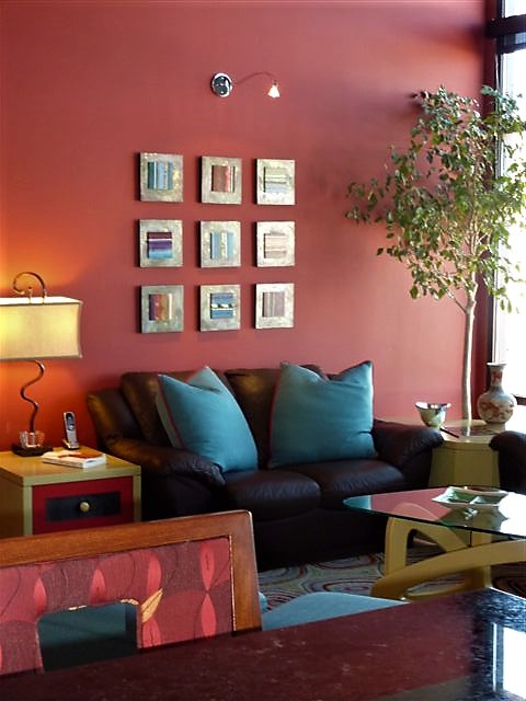
The intensity of this rich red wall was decided early in the design process. As we built layers of existing elements and introduced new pieces, the desire for a custom installation became apparent. This Urban Elements series was a collaborative effort between Forbes and me to provide a bit of an edgy, industrial vibe to this eclectic urban loft. Note too that the end table and coffee table were locally crafted for the project by Kirt Kirkpatrick

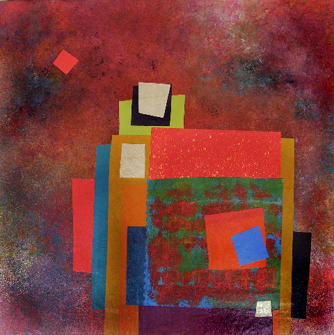
Forbes’ creativity is rooted in pattern, color and texture. Primarily non-objective, her pieces are compositions of movement and dimension. Working with a layering technique, she builds her action with a collage of papers and fibers, paint and stain. Action is key when describing Forbes’ artwork.
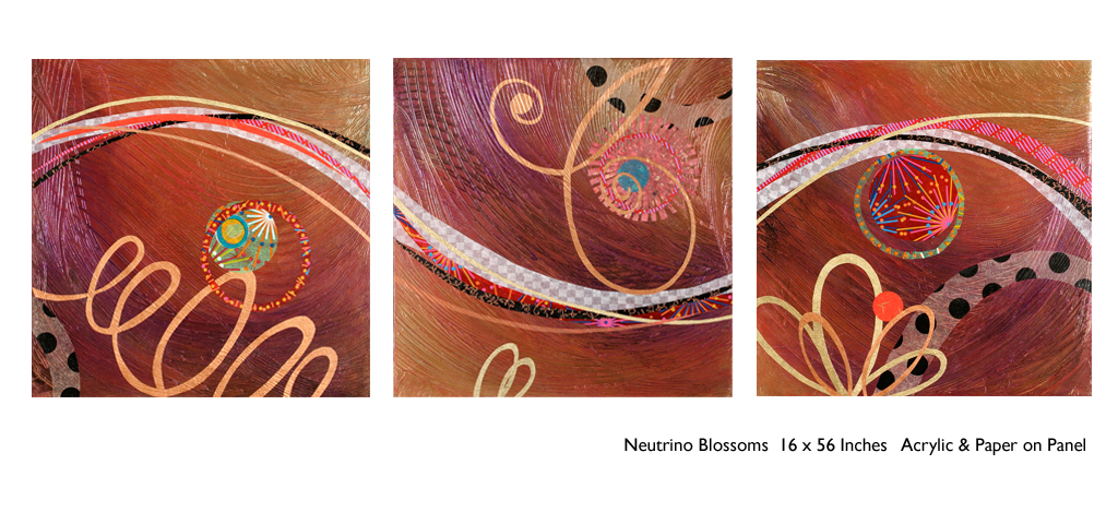
She creates for herself, but when called upon to collaborate on a project, her eager curiosity for what might result is enthusiastic and ever-promising. About her style and self-expression she states “When I have created a joyfulness and vibrancy in the work, I know I ahve created an experience I wish to share.”
When asked…

1. How/when/why did you start your abstract technique of layering colors and textures?

Forbes has always been drawn to color as a means of her personal expression, once she “experimented with acrylic materials that would hold a texture and  started playing with those using combs and rubber spatulas and sticks to mark in the materials” she was hooked.  “Metallic and interference paints call to me — so I began to combine the over the textured backgrounds, and  then discovered that with acrylic one could imbed paper.  It was really experimentation and discovery of what these amazing materials could do…”

2. What is the most satisfying aspect of your art  for you personally?

The element of surprise is what gets Forbes excited! “When something comes together almost unexpectedly and I wonder how I did that — it’s always a search for the right combination of elements, colors, textures, feelings.”  When they all come together she experiences great satisfaction.  “It’s like turning over pieces to see what fits. Sometimes I have to turn over a lot of pieces to get the right combination — sometimes wondering whether to continue.  Seems like it is always worth continuing the work to a happy conclusion.”

3. Why do you enjoy commissions to create specific pieces for interiors/patrons?

Forbes expresses genuine gratitude for her patrons. “I feel honored and appreciated when someone likes and appreciates my work and invites me to do something special for their home or office space.”  
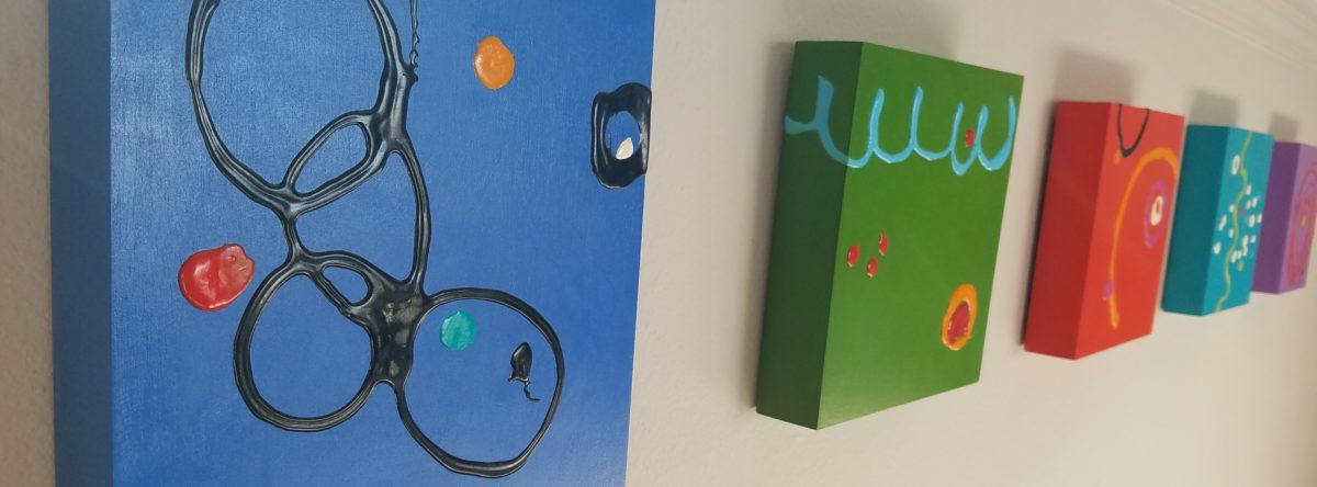
4. What pleases/satisfies you about this custom commission process?

The process of working together with  her patrons is positive creative challenge. “I enjoy the collaborative aspect and going through the process with a client or designer and receiving their feedback as the work progresses.”

The satisfaction for a designer in partnering with an artist is designing and realizing a vision to complete a space. Bringing visions to reality.  I often say that my team provides tremendous support in making my dreams come true. From artists and craftspeople to seamstresses and all manner of contractors, it is truly a team effort to achieve great results!

Da Vinci, The Genius

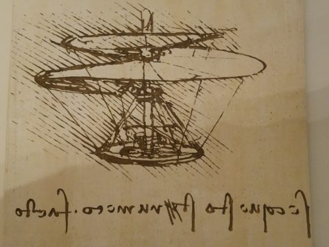
When you hear the name da Vinci, Leonardo da Vinci, its undeniably familiar. You might instantly call-up a synonym – genius. But what do you really, other than the Mona Lisa, recognize? And what do you even know about her and the painting itself? For the past several months now nearing the end of its run, the exhibition Da Vinci, The Genius, at the Albuquerque Natural History Museum, presented by Grande Exhibitions of Victoria, Australia in collaboration with the Museo Leonardo da Vinci , Rome and the French Scientific engineer Pascal Cotte is an amazing consolidation of information on this singularly remarkable man.

An artist or even designer are such understated titles for this man of extraordinary inventions, concepts, engineering, art and science, because he was the true Renaissance Man! He touched so many things to advance countless trades and disciplines many of which are the basis of machinery and equipment in use today. But as brilliant as the universal exploits of this amazing polymath are, this would be a tedious blog if I focused on the many pulley systems, gadgets, mirrors, SCUBA suits and even flying machines that he created in his lifetime.

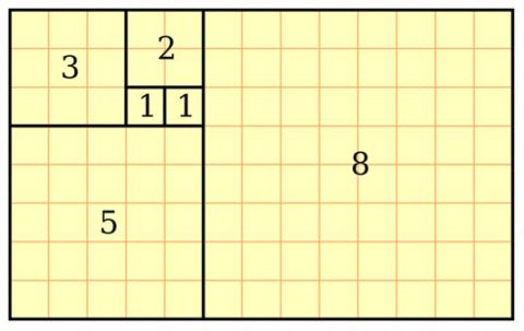
Rather, I would like to use this fascinating field trip that I just experienced to examine how I as a designer have been influenced by da Vinci – specifically, the spectacular rendition of the Golden Mean – nature’s perfect ratio that occurs in nearly everything around us. This common mathematical ratio is used to create subliminal perfection and pleasing compositions that mimic the perfect ratio found in nature and specifically, for my purposes, in design.

If you remove this square from the rectangle, you’ll be left with another, smaller Golden Rectangle. This could continue infinitely.

I have written about this previously in greater depth. It is a subject that has no limits as the application of this ratio helps assure good compositions whether you realize it or not. For graphic designers it is a must. For interior designers and architects it the formula for so many aspects of their work. People in art and design have employed the use of this perfect ratio for thousands of years. If you apply it – it is foolproof.


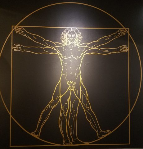
But back to the exhibit…there he was – the iconic man rendered in gold on black. You’ve seen it. But to know him is to see the perfection in the proportions that da Vinci used to create this perfect figure.

Right there in a commanding focal point was da Vinci’s drawing of Vitruvian Man. The accompanying video explained the relationship of all the dimensions as they related to the perfection of the Golden Ratio. Time and time again it is evident in the sections of this perfect anatomy.

Da Vinci correlated that the perfection of the proportions should be applied to represent the perfect human anatomical body and that it was an analogy for the entire workings of the universe.

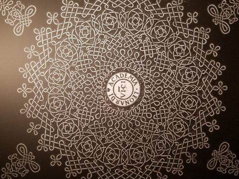
His magnificent study of knots became sought-after for luxury fabrics used in 15th century fashion – many of which costumes and finery he designed. Interpretations as lover’s knots – the bond between them was a popular notion of his time and afterward.


It is an exhibition worth seeing. Even if you have stood in front of the real Mona Lisa and have visited sites exhibiting his vast creations and noted observations, this exhibition is worth a visit!

HOME – An Artist’s Perspective

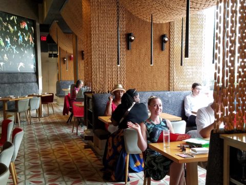
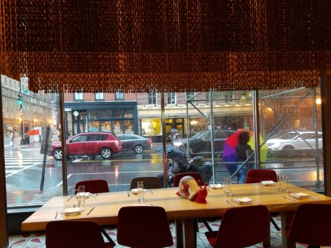
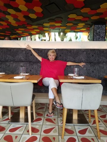
It was quite by accident that we ran into SAAM! Truly, our destination and plan for the afternoon was to catch a bite at the hip and artsy Jaleo tapas restaurant and head to the Bible Museum to see some cool film of all of the buildings in downtown DC that feature biblical quotes on their facades – or something to that effect. But as we sat there in this trippy Spanish-themed interior, right next to the window, we

watched the staff bring in umbrellas from the sidewalk seating areas as the wind picked-up and the sky darkened. Our plans soon began to change. We dawdled at the table well past our tantalizing tapas feast and watched the rain come down in sheets.

As the time past, it became apparent that the Bible Museum was too daunting a task to embark on after the storm subsided. So we dashed between the drops to the nearby Smithsonian American Art Museum – SAAM!

Having never been there before and not having planned this outing, we entered without a clue as to what we might find – except perhaps the portraits of the Presidents – cool enough. Yet inasmuch as the exhibits were wonderful and many faceted, I want to focus on one inspired installation that pertains directly to architecture and design.

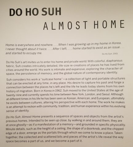
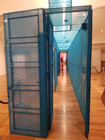
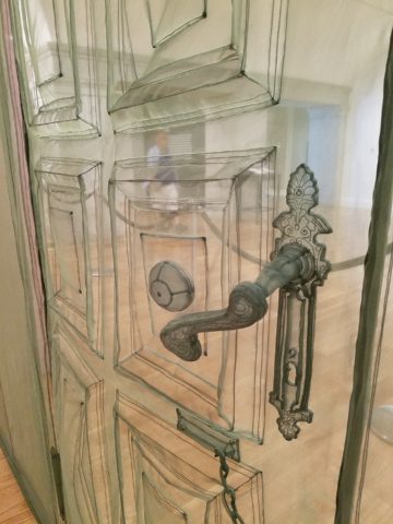
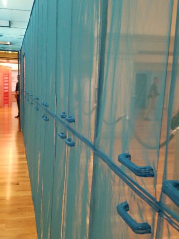
Considered to be perhaps the most compelling architectural artists around today, Do Ho Suh takes nostalgia for “home” to a whole new dimension. He figured out that he didn’t need to wait for enchanted ruby red slippers – no, he re-creates memories of “home” and makes them transportable all over the planet. And by whole new dimension, I mean we walked through fine translucent fabrics – taught and stitched – over concealed stainless steel frames creating hallways of houses where he had formerly lived around the world.

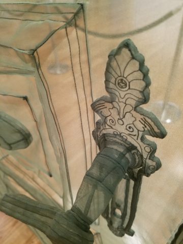
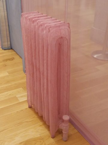
With great attention to detail, he stitched door hardware, radiators, and wood trim details. It was remarkable.

This interactive immersion was thought provoking. I think it is impossible to pass through this presentation without experiencing a few fleeting personal memories of the your own past homes. As Dorothy taught us,”There’s no place like home.”

It was as though the sheer polyester fabric was misty or ethereal as though not really there – a very effective medium to suggest a thought or memory. How fascinating to render a structure with such a diaphanous, fragile sense – tangible yet not.  “Almost Home.” There, but not quite.

The time it must have taken to create this tedious textile architectural art-piece, of delicately painstaking work, surely proves his love for these past dwellings.

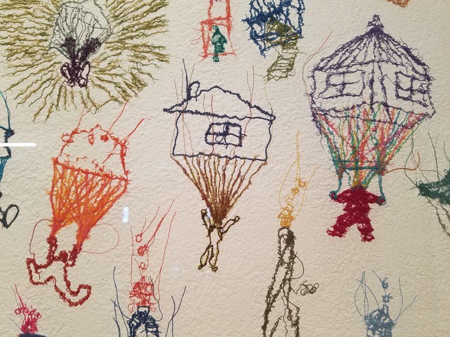
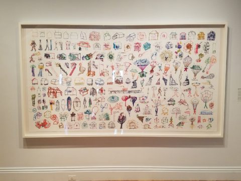
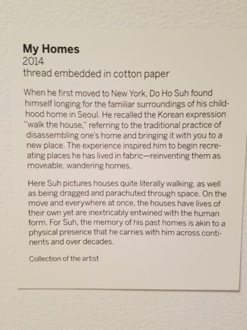
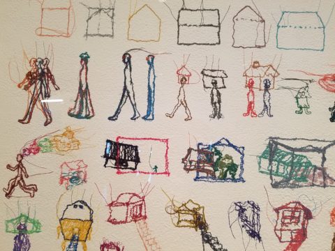
This presentation will be the most comprehensive of Do Ho Suh’s work ever shown on the East Coast. And wait – there’s more! After having navigated the Twilight Zone of Do Ho Suh’s recollections, I was even more strongly drawn to this large-scale piece of stitched textile work mounted on the wall! It was a colorful and beautifully complex collection of images of people and homes in various states of movement and fantasy.


Colorful threads intentionally strewn from the stitched images of human figures, some sporting houses on their heads, another running with memories flying behind his head…taking the home (s) through life’s stages – memories…home is where the heart is…taking their memories with them…

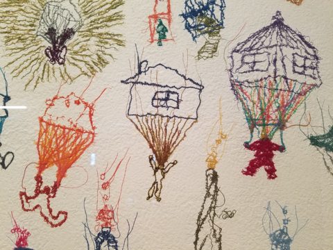
People parachuting with houses floating through the air…pitched roofs and domes – all manner of interpretations of “home.”

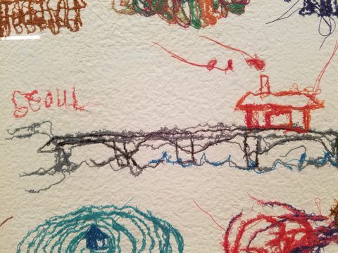
There is a stitched reference to Seoul and a house on a jetty suspended above a wild, choppy sea.

Live – dwell – reside – inhabit…Be quick – it’s only there until the 5th of August.

When is Too Much, Not Quite Enough?

Perhaps – when you are an avid collector, limitless treasure-hunter and lover of basic Americana (comprised of the appreciation of indelible graphic design and branding mixed with a healthy dose of green chile cheeseburgers, bodacious bbq and good fun) – it’s never enough! We’re in Hatch, New Mexico at Sparky’s once again!!!! The sensational roadside attraction – Sparky’s burger bastion MUST know when too much is not enough!

Nine and a half years ago Teako made a statement and the word has been spreading ever since!

The opening of this fun and funky establishment started out with a few outrageous signs and vintage mascots like the Colonel Saunders on a bench, Ronald McDonald as the un-official greeter

and a dedication to signature green chile cheeseburgers and mouthwatering bbq. Now both sides of the street (and scattered around town) are towering, larger-than-life icons of days gone by and travelers from all over the world stop to experience this unique site.

But inside, the treasures also abound! With each visit we discover new surprises and exciting additions. Because its Christmas, we were enticed by the “Say Queso” photo scene. We donned funky antlers and cozied up to the decked-out tree, with a backdrop of sparkle and ornament, beneath dangling snowflakes,

flanked by a towering toy soldier and Jolly Old Saint Nick himself!

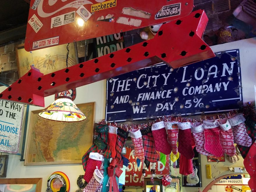
The stockings were hung in clustered abundance over the entryway to the dining room. No such thing as too many or too much here!!!

The walls are plastered with iconic paraphernalia.

Patina etched tin painted and pitted, with pocks of rust and tarnish – weathered through many storms adding further character to the familiar and not-so familiar pieces, until finding safe haven here in this magical collection.

Camp art un-selfconsciously curated on every square inch of interior space.  A nostalgic presentation and preservation of graphic design and branding.

If you’re a “picker,” a graphic designer, a nostalgia buff, burger and bbq connoisseur or just a kid looking for a memorable bite on the side of the road,

Sparky’s unintentional museum, of the colorfully entertaining and eclectic, will not disappoint! It is a must-see landmark in this our Land of Enchantment.

Be enchanted at Sparky’s! Thanks for the memories!!!!! Keep ’em coming!!!


Loved Loving Vincent!!!!

Last night was a crystal clear starry starry night as we strolled down the quiet urban sidewalk, between the building facades, on our way to what we soon came to realize was an event we would never forget. Once settled in our seats and after way too many previews, the magic began and we were instantly mesmerized by the millions of brushstrokes of over 100 artists recreating the world immediately before and for a year after the death of Vincent Van Gogh.

There, in a cozy theater downtown, we experienced a wondrous film, Loving Vincent. We embarked on a extraordinary journey and were lost in this fanciful world of brilliant color and bold movement as the movie unfolded with an animation unlike we had ever experienced. It was a though we were watching Van Gogh paint this film. The rough deliberate strokes were actually moving as the scenes unfolded – the scenes were alive with the movement of the animation.

http://lovingvincent.com/

This remarkable delivery vehicle to convey a portion of Van Gogh’s world brought colors dancing – even screaming – across the screen in familiar swirls, and deliberate marks that were so identifiably his. What the artists were able to accomplish was astonishing. The focal surface of the theater was busy with the seemingly live brushstrokes of Vincent Van Gogh. Borrowing from his actual paintings, the viewer is transported into the world of his interpretation from street scenes where he experienced the corner with the yellow house to capturing individual’s who appeared throughout the film such as The Zouave in his red hat distinctive of his French military service, to the bearded postman, Joseph Roulin, who was so key in the intimate, mysterious and different story line, the expansive scenery of Provence and the intimate details of daily life.

As a true Van Gogh fan, it  was love at first sight – do you remember where you were when first introduced to his magic? Having grown-up in Washington, D.C. I was fortunate to have had family visits and school field trips to the magnificent National Gallery of Art where, upon each visit starting at a very young age, I would scour the gift shop for postcards of my favorite images – taking home with me memories of the beautiful influences that have continued to shape my appreciation for color and composition, balance and light, contrast and context, subject matter and the power of observation. I must credit my  mother and grandmother for instilling in me this awareness of things of beauty and their importance in our lives.

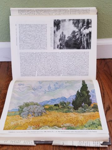
Fast-forward a bit…way back when…dare I admit…when first studying art history in college, the bible was HW Janson’s HISTORY OF ART. A daunting tome filled with the overview of all that is art as we knew it at the time. Van Gogh and his impressionist colleagues were sprinkled throughout latter portion of the book.

There his genius was once again presented to me stirring a wild appreciation for his rebellious disregard for conventional painting styles. He possessed and fed his own passionate, if not desperate, need to apply paint to surfaces, capturing life and telling stories from his unique and insightfully perceptive vantage point.  The Impressionists have always stirred a passion for the boldly colorful, adventuresome, romantic and sensitively sensual expressions of life for me.

Years later my husband and I were fortunate to attend the National Gallery’s exhibit Masterpieces from the Van Gogh Museum Amsterdam.

It was the fall of 1998 and we were thrilled to be walking toward the oh so familiar edifice with great eagerness for what awaited.

The line wrapped the building, but moved along with efficient, orderly procession as the anticipation grew with each forward step.

Inside we purchased the audio tour tapes and, with headsets on, immersed ourselves for the next few hours in the dazzling world of this remarkable artist.

His unique undaunted expression of the scenes, people and details around him, through his own unschooled techniques, was awe-inspiring.

Tormented and tested he discovered his passion and for a very few years carving out an indelible place that will live, breathe and be enjoyed forever.

The people in their joys and sorrows, fashion of the time, landscapes of bountiful beauty, interiors of keenly observed detail all expressed through his sensitive eye and brought to generations of viewers – a priceless gift to the world.

The take-away…embrace bold expression, fear not color in your world, appreciate the details, and go see this film, Loving Vincent, before it leaves a theater near YOU!!!!

Getting Smashed with Good Design!

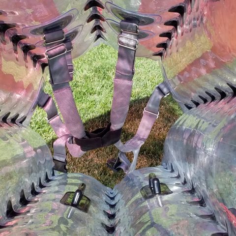
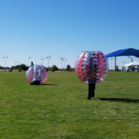
Here I was walking along, on this sun-washed Sunday morning, when I came upon what appeared to be giant frog’s eggs in the middle of a field – like ET had laid enormous translucent eggs on earth – I looked up, I looked around and there they sat – tumbled on the grass…the scene was surreal and beautiful in the early morning’s light.

Upon closer inspection, guys were hauling many more of them from a remote truck, onto the field.

I started taking photos and was approached by a man who asked if I had ever seen them before. No, I certainly had not. And inasmuch as this is NOT intended to be an endorsement or advertisement – the bold name, on the side of each, stated KNOCKERBALL!

I was so excited to come upon this other-worldly landscape that I began to fantasize about the many effects of good design. I shot inside the transparent globes, along the edges, down the rows and with great mountain backdrops.


The shape, color and structural detail was fascinating and fun! The taught cords inside created another layer of interest.

The kind man who was coordinating this event explained that they set-up soccer-like goals and wear these globes crashing and smashing, running and rolling across the field – unfortunately, I had to leave before the action began. It must be a blast!

I have since learned that “bubble ball” and “bubble soccer” are other names for this new fangled game and related equipment. They are not always rented for game days, but are also purchased as singletons and used to roll down hills and other antics. So fun! Check out this site: https://knockerball.com/what-is-knockerball/

Play with good design. Get smashed with good design. Discover good design. Get excited about good  design – wherever you find it!!

A Most Illuminating Lighting Course Proves – It Exists!

As is often the case, after attending an engaging and informative continuing education class, I am compelled to share at least a fraction of the energy that I experienced today. When a class is good, it is energizing. This was a most illuminating lighting course!

We know that as interior designers that light plays a significant role in creating a scene. Whether task lighting, ambient lighting, spot lighting or washes of color – light plays an important role. What’s so exciting and compelling is the technology that is so rapidly changing the possibilities!
The profound change is a result of the perfected application of Light Emitting Diodes – LED lighting. Lynne Wilkinson takes the complexity of physics and speaks in plain language with a humorous and entertaining delivery distilling that which is incredibly complex into digestible information.

Here’s a link to Philips for more information:

https://www.usa.philips.com/c-m-li/led-light-bulbs

So today I want to impart a tiny bit of the exciting content of this day. If a child asked you – “what is light?” How might you answer that?  Um…well…it’s uh…Electromagnetic radiation. Duh! After clearing that hurdle, we settled into distinguishing the technology between incandescent and fluorescent and a number of other lighting sources.  We discussed temperature Kelvin, luminescence, illumination and the atomic composition of protons, neutrons and electrons that are involved. So how is this interesting to YOU?
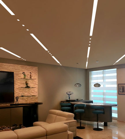
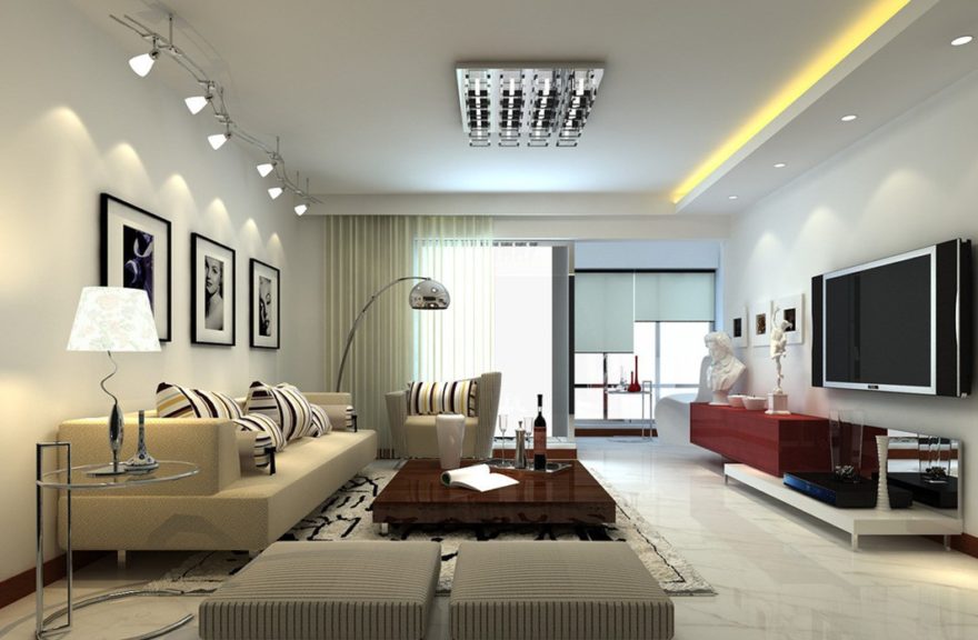
Well…inasmuch as we in the field have kept step with much  of this terminology throughout our careers, and the sci-fi interpretations of the possibilities – the future is HERE! If you just look at I-Phones being only 10 years old, yes, 2007 – we’ve come a long way baby!! Nearly anything you can imagine already exists! And if it doesn’t yet, the brains in the incubators are racing to discover and invent the next iteration of these amazing possibilities!! Look at these cool dots and dashes dramatically streaking across a living room ceiling!


You probably know that LEDs are energy efficient. Have you noticed how dramatically their price has come down in the last, say, three years? They used to be $50 and now they are under $10..  They burn for 50,000 hours…but as they diminish, the quality of their light changes – they will burn long after the accuracy of their illumination has changed. Do you care?

So many health issues are still being discovered with regard to the effectiveness of lighting. Circadian rhythms – how your body is biologically on a timer. How it needs rest and waking hours. What interferes with the natural melatonin in your system that can affect your health. Dark is for sleep. Blue light versus red light can interfere with your good sleep? Here’s a hint – don’t leave computer screens or cell phones on in your bedroom – get rid  of the clocks and other light-emitting devices when you are trying to sleep. AVOID the cool colors – blue especially.

To take this to a higher level of interaction, artificial lighting can be “tuned.” We know it can be dimmed and change color – but tuning is the technology of changing the temperature and related color to compliment the activity in the space. Your living room can be tuned to track the time of day to compliment warm early morning, bright cool mid day, dimming down to the warmth of an evening glow. Do you care? Maybe not today – but to better organize and track a busy day, this can be soothing to compliment your morning coffee…energize you into a more productive mode as the day progresses and calm you as the day closes. It might be handy if you lived in Scandinavia where the days are shorter and the desire to create a sense of daylight’s progression is real.

In an operating room – do you want your surgeon to see well into your body parts? By tuning the room in zones, you can place certain colors of light over the surgery to better illuminate and contrast the focal point or dim the light to read monitors better (as in many endoscopic procedures where they go in with a camera and don’t even see the action except on the monitors which are better read with a darkened surrounding quality of light or lack thereof), or brighten other areas where medical implements, keyboards, etc need brighter light to do the job. The understanding and ability to control these various light levels, colors and luminescence is becoming very apparent. Might ultimately be invaluable.

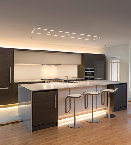
Back to interior design applications and concerns – the idea is to create effective, appropriate light and not see the source. I have always said this especially in the realm of landscape lighting – yes outside. I never use the “runway lights,” rather I chose to conceal the light source and have it spill, wash, spot and filter without giving away the source of the light.  It is more subtle, effective, natural, soft, and pleasing. So in a kitchen, don’t let the under-counter lights be spotty, reflected on any adjacent dark or shiny surface, use smaller aperture ceiling fixtures (cans), hockey pucks in cabinets create shadows…with all the new LED tapes, fixtures and diffusers these faux pas are very avoidable.

Lightology has an exciting site full of great images, ideas and information

http://www.lightology.com/index.php?module=how_to&sub=new-recessed-lighting

As recently as 18 months ago we were remodeling a bar and wanted to use LED tape the full-length beneath the long countertop  – but the cost was significant. Today, that cost is a fraction of what it was. So I might be re-visiting that bar detail!!!

So many lights can be field modified cut and shaped. With the perfection of Organic LEDs, seemingly limitless possibilities exist. Imagine your laptop being so pliable that you can roll it into a tight tube and pack it effortlessly without fear of cracking or breaking. Light-weight and completely flexible. They exist.

Imagine an entire wall in your home that is a touch screen that can be installed as easily as wallpaper. Yes, pliable and paper thin, glued onto the wall and operate as a computer – all your news and information at your fingertips at a scale that commands the room. Smart surfaces – they exist.

Learn more from Planar

http://www.planar.com/products/led-video-walls/led-calculator/#!/welcome

Learn more from Corning:

https://www.corning.com/au/en/about-us/news-events/features/willow-samples.html

Back to now – smart homes can do so much from an app on your phone and lighting is a huge part of that control. You already know that you can turn you lights on and off from your phone on a beach in Tahiti. But did you know that your phone can be as small as a lipstick tube or small flashlight and have a retractable screen of flexible OLED – easy to hold, pack, carry and with a simple tug, click or push of a button reveal a thin full screen? It exists.

Learn more about OLED:

https://www.oled-info.com/introduction

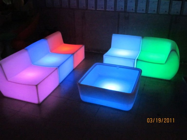
Architecture and interior design benefit greatly from this technology, but are probably the last to be jumping on the bandwagon. This technology is introduced in so many other aspects of our world before it gets to mere offices and residences. Fabric panel walls that have lights IN the fabric and can be controlled for color and movement, resin furniture glowing from inside that can be used outside in all-weather, stair treads that sparkle with glass embedded into them and coffee tables that have pressure sensitivity that when you touch them they respond. So many of these creative applications are already very cost-effective and remarkably accessible.

Here is more about glowing furniture from Marceladick:

A German company, Cerion, making exciting glass pieces embedded with LEDs

http://glassprocessing.eu/dg-glass-furniture-glass-processing-3d-laser.htm

Glowing ceiling layers that once were inconvenient to replace lamps (bulbs) often were left dark rather than scale the heights to maintain. Now the long lasting light sources produce their glow for many years.

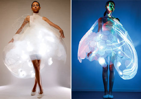
Fashion is also enhanced with the advent of these light sources in the actual fabrics. Models sporting luminous layers, glowing translucence, sparkling luminescence adding elements to clothing imagined. Think about draperies!

Here is a fashion-forward blog to share:

These exciting applications will be sure to get you thinking about the many possibilities. Love light? Use light!!

Let There Be Light for the New Year!!

Short days and longs nights…Do you find that your interior is dull, lifeless and even feels a bit cavernous after dark? As the sun  sets and the lamps come on, the effects can be horrible, adequate or sensational.

Poor lighting can have remarkable subliminal effects on mood, energy, and attitude. The subtle signs of poor lighting such as dark corners, shadows on faces, difficulty reading and dull colors are all important factors that contribute to an uncomfortable interior in these short days of long, dark nights.

Lighting has multiple reasons for being—three primary ones—to see, yes, ambient light. But to do tasks (reading, sewing, playing games), and accent lighting to illuminate artwork and other interior features. Mood lighting such as candlelight (once the primary light source – now an effect in most cases) is a lesser but effective  lighting tool.  Good lighting makes amazing differences.

Beware of down-lights. Lights that shine down from the ceiling. Although a very effective and common lighting tool, they must be balanced with good ambient light.  I have often used this example of sitting in a restaurant across from your date and their face is painted with ghoulish dark shadows under their eyes, beneath their nose, and accentuating all the folds of their features. It is the opposite of a kid putting a flashlight under their chin shining upward creating similarly haunting effects. Creepy. Certainly not flattering.

2008-10-13_001

The same unpleasant effects happen in the home. It’s such a common malady of ineffective lighting that most people assume it is a necessary evil of short days. It’s sad—no, really it’s SAD—Seasonal Affective Disorder! To treat the serious effects of this syndrome there are many studies and inventive solutions, but for most of us, the less arresting effects of poor lighting can be greatly improved and our lives enhanced.

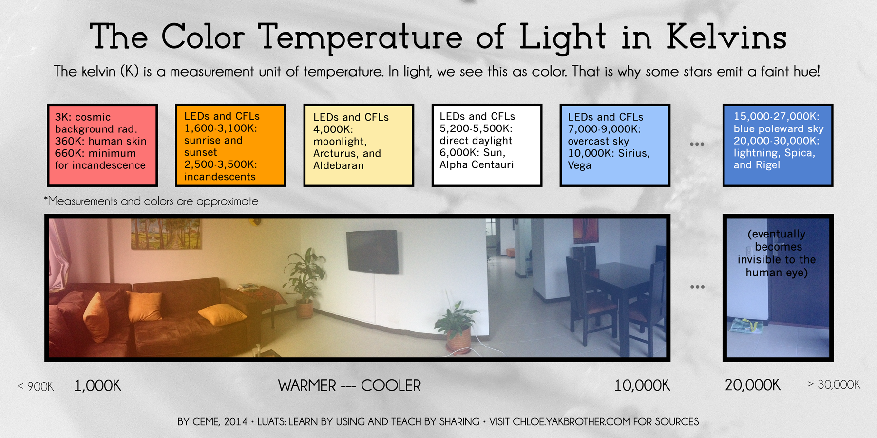
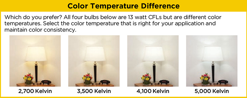
To begin this process of evaluating your lighting an improving it right away, start with the lamps—the light bulbs! We have so many choices these days including the familiar incandescent, compact fluorescent, and the newer LED with excellent color choices and low energy usage.  We could talk about the “temperature” of light sources measured in Kelvin, but we won’t—only that it runs a spectrum of warm to cool.

e6bca6db6f0faf4f9ecb0775cb4bc4eb

Walk around your home and look specifically at the color that glows from the various light sources. Does it look yellow? Does it look white? Does it look blue-ish? Recognizing these distinctions from warm to cool is the start.

light_bulb_color_temperature

Where are the shadows? Are the corners dark and recessive? And, when you combine these two, do you find, for example, dark areas and yellow glowing sources? Sometimes that soft, warm yellow is preferred while other scenes are made more intentionally crisp with cooler light.

Experiment with different lamps in your fixtures – light bulbs in your table lamps and recessed cans, hallway sconces and bathroom fixtures. It’s a fun experiment and very illuminating – yes, the pun was intended.

Are your lamp shades opaque or translucent? Do the shades themselves cast a color? Do they block the light or allow it through? Do they throw the light up and down or up, down and out? This is another detail of which to take note.

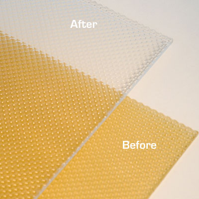
If you have dated recessed fluorescent tube units – common in kitchens for example – they are often housed in a box either recessed or surface-mounted on the ceiling. Take a look at the plastic lenses – are they discolored and yellow? This aging process can dramatically affect the quality of light that is emitted. So if you are not ready to replace these fixtures with more effective modern lighting statements, try replacing the lenses.

001-flat_sheets_before_after

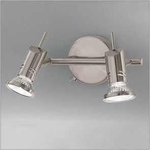
A similar installation is that of skylights which have fluorescent lamps up inside the wells with that same plastic lens over the opening to the skylight. The original idea was to have the natural light pass through during the day and artificial light take over after hours. The lens  was to intentionally conceal the unattractive fluorescent tubes, but it sacrificed the depth of the framed well. A quick update is to remove the lenses and fluorescents and expose the well of the skylight adding dimension to the room and eliminating the unattractive lens that conceals the dimensional cavity. Recessed can fixtures around the skylight in the surrounding ceiling are the most common solution to this transition from old to new, a cable can be strung, pendants can be hung, but if budget constraints prohibit that investment at this time, you might investigate the power source up inside the skylight well and replace the fluorescent fixture with an inexpensive, adjustable, surface-mounted spotlight – perhaps with two heads to provide light from that same source while opening the skylight well without the unnecessary lens.

franklite-scintilla-2-light-nickel-finish-spotlight-spot8882-a94

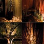
The dark pockets around your rooms can be improved with up-lights in corners and up under plants. Inexpensive fixtures are available at any lighting store or big box home improvement stores. Place one of these up-lights (remember to select the color “temperature” that pleases you the most) and see what that additional pop in the corner does to open your space. When up-lights are used beneath plants to shoot upward and cast shadows onto the walls and ceilings can create drama and exotic interest at night. This is true both indoors and out.

Torchiere floor lamps are those that face upward. Like a torch, they send the light toward the ceiling – another effective splash of light in an otherwise dark space in the room.

Colors are radically affected by the color of light that shines upon them. Therefore, an interior color scheme can be horribly tweaked to not resemble at all the actual colors chosen and combined to create the scene, when artificially illuminated after dark. Contrarily, colors can be rendered with great brilliance and accuracy when illuminated with the right combination of lighting. (although daylight contributes in these two examples).

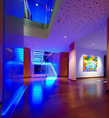
By the same token we can have great fun and “paint” with light creating a color scheme entirely with colored lamps washing the walls, and interior elements just for the art and exercise of doing so, but I digress.

images

In summary, look around your rooms after dark and look for opportunities to make changes that will dramatically affect the comfort level – the results will be startling!!! If planning new construction or remodel – have plenty of light in key places throughout the space. Think dimmers so you can control the amount of light. Let there be light in this Happy New Year!


Red – A GIFT of LOVE and the Little Bug Behind the Magic

A little bug selectively bred on a cactus in Mexico way back in the 1500s, for its use as a magnificently unique red dye, soon became recognized, by European traders who discovered it while bartering  in the Aztecan markets, as the most dazzling rich red on the planet. The result was the realization that this red bug juice was a rare trading commodity that rivaled even gold!  Yes, a squished bug that oozed a red color that was so extraordinary that it was nearly valued above all. This indigenous American discovery spread worldwide and altered the course of history for art (obviously), cultural  influences, certainly its trading value and even science.

Before I continue with this brief summary of this extraordinary discovery and my personal  comments on the subject, try this little experiment.  Think of all the things that you associate with red. Think of all the things that are special and standout because they are red. Do this yourself – make a list or maybe make it a game of it at a party – have everyone make their own list and then share the lists – see how many make the same observations and how many identify different items.  More on this later…

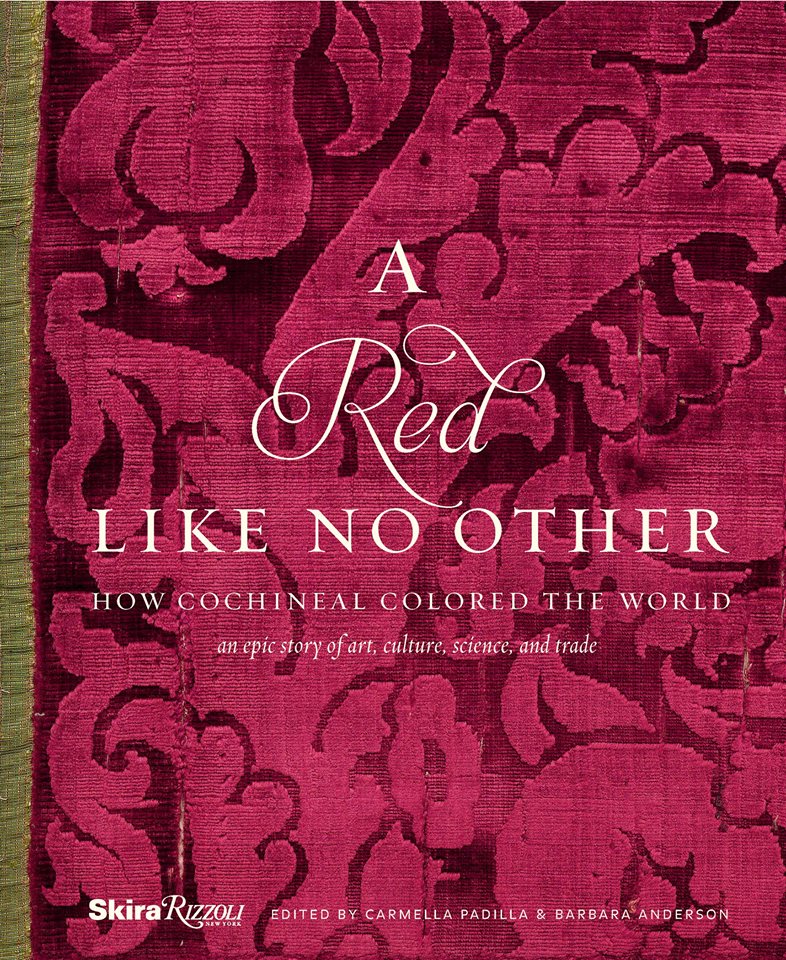
This story behind  today’s blog is derived from a book by Amy Butler Greenfield, A Perfect Red Empire, Espionage, and the Quest for the Color of Desire which influenced a collective of international experts, in a variety of fields of expertise, to produce an incomparable exhibit  at the Museum of International Folk Art in Santa Fe that astonished the world.  The book that compiles photographs of worldly treasures and narrative describing the making of and content of this extraordinary exhibit is A Red Like No Other – How Cochineal Colored the World. It was my Valentine’s gift and it truly is a treasure – a gift of love. A red likeno other - book

Cocheneal, this little bug and its unexpected authority and influence, is the center of this universal love affair. A love affair with a color so seductive and so powerful that it evokes passion and emotion with everything that bears its true hue. The forward of this book by co-editor Carmella Padilla states that “everyone has a visceral knowledge of red. Therein lies its power. ” Red is imperative. And if you didn’t realize the depth of this statement, you will be amused, challenged,  amazed and intrigued beyond belief to read about the history and processes behind this exhibit .

Carmine  – this regal bug juice, so purely red, the prized pigment – is something all artists revere. They know the importance of this hue as they strive to create their projects. The quest for the perfect colors and the balance of colors in painting and in other art forms is an ongoing progressive journey. I feel remiss to not have known about this earlier. How can you take art history for semesters on end and not be introduced to this? It’s been an exciting discovery for me to learn of this viscose bug extract, carmine, and this recent journey I have taken to read of its history has been truly thrilling.

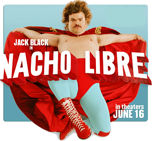
As I write this, by stark contrast to the wonderfully cerebral documentation and observations in this book, I find myself watching the endearingly inane movie Nacho Libre out of the corner of my eye.  And  what surprises me all of a sudden is that the color red is so effectively inserted into the scenes. nacholibre

The director, Jared Hess,  knowingly or not recognized the value of the color pop and punctuated many artful scenes that would have lacked depth and interest had he not had the eye to do so. My heightened awareness amuses me – especially in the context of this crazy, silly movie. The creatively artful incorporation and placement of red is so apparent in this nutty, fun film.  Ana de la Reguera lips Nacho  LibreHer lips, his costume, the children’s masks, a sunspot on a bus, the fighting ring ropes, structural elements in the arena are all so subliminal yet so vivid. Consistent and repeated use of the contrast with the bold red color in combination with turquoise is also a key element in this film.Nacho Libre masks

So back to the party where everyone is listing things they associate with red. If you can get a copy of this book and whip it out after everyone has read the lists, I promise everyone will find it captivating on so many levels and subjects – great lively conversation, fun, fascination and amazement will ensue!!


Taking Pause to Value the Art of the Written Word

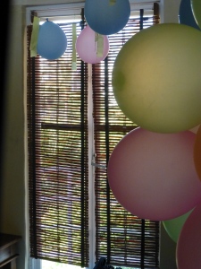
I awakened in the painter’s house with slivers of sunlight glistening through the bamboo shades, exotic chirping happily piercing the silence and cinnamon scenting the air from the open grill preparing the best French toast on the planet. P1110818

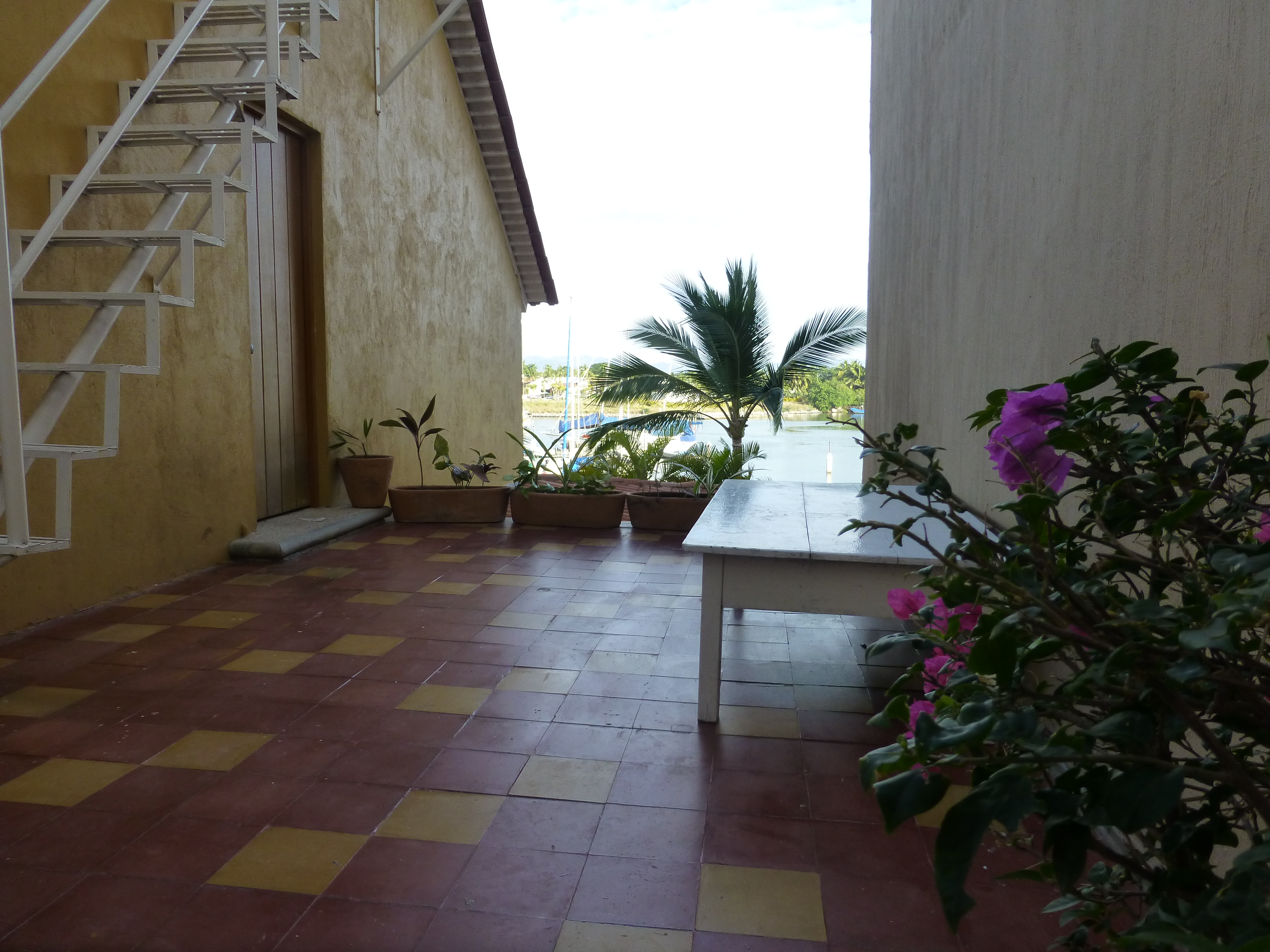
This place exudes thoughtful reflection and invites savoring the simple things of beauty and  meaning. P1110821

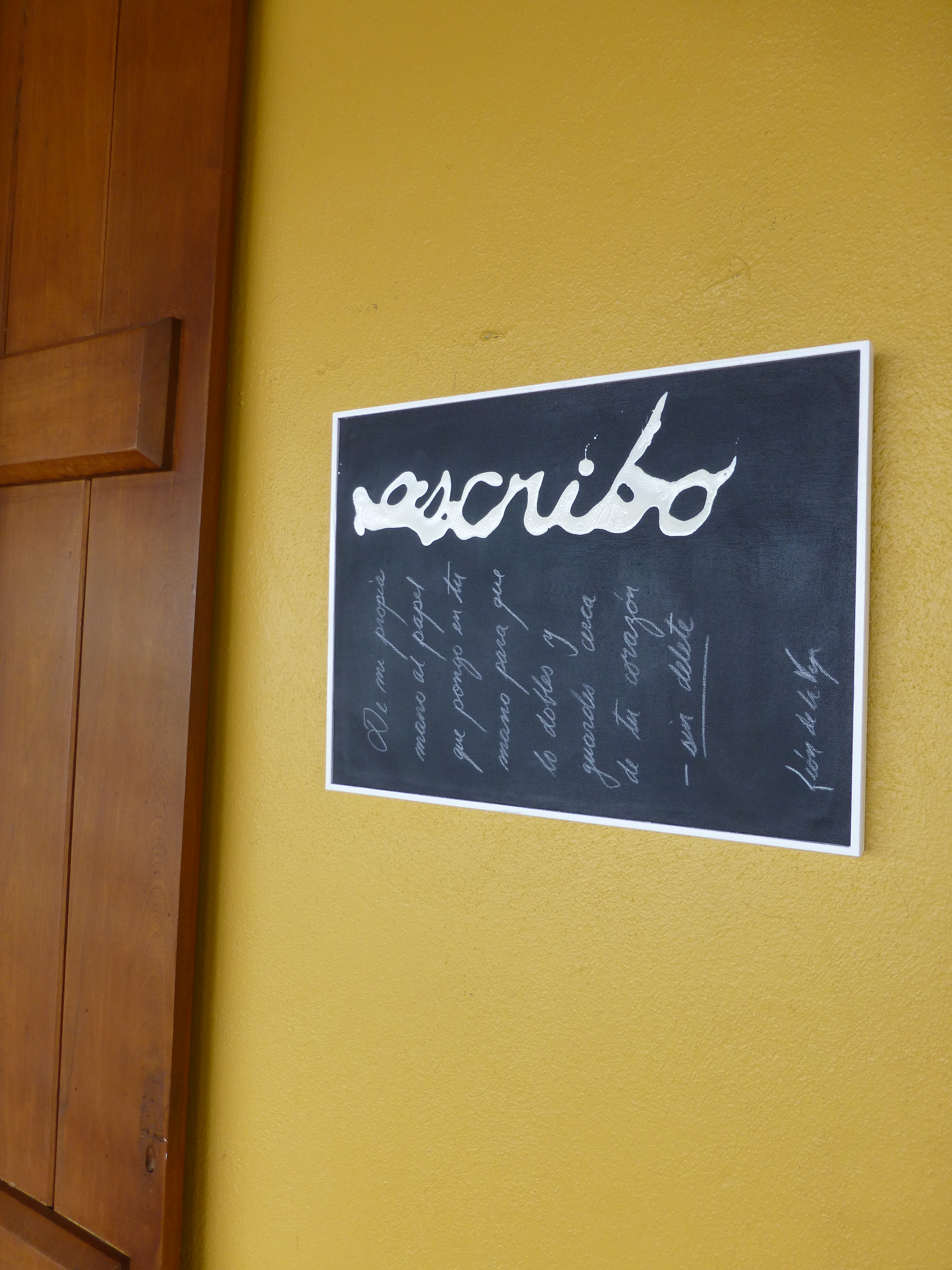
From intense and intimate conversations centering around the passions of life to convivial arguments and relaxed exchanges, those gathered at the estudio-café tables examine the events of the world from their own individual vantage points. P1110829Today the primary focus was a topic with which everyone seemed to view from the same perspective. All were in avid agreement as they discussed the recent exhibit in Mexico City from where the artist, Leon de la Vega, has recentlyjust returned. This significant event was an important auction where part of the proceeds were to benefit the Mexican Institute of Neonatology toward research on children’s learning and therapy and no less to benefit the artist expressing his concerns for the current state of affairs with the lost art of writing by hand. Federico's invitation P1110815
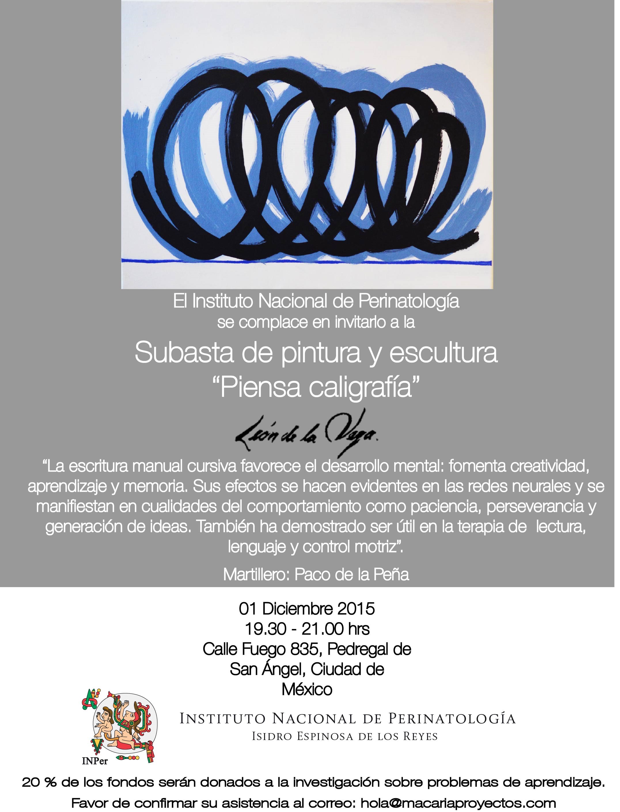
With the advancement of smart technology comes the dumbing of the people tethered to it.  Everyone…all of us…are victims and if we are to save the core of our humanity we must preserve our handmade, organic, communications. We have computer aided drafting and graphic programs, texting and video all of which negate the tactile, made-by-hand written or drawn creations of the human touch. To have a computer consistently come between the hand of man and his end results is a gap that will never be regained once lost.  Recovering this lost art, in so many forms, is critical to mankind. This all sounds pretty heady. But once you enter these spirited conversations you realize that the demise of past civilizations is not unlike this self-destructive path to which  we now bear witness. The beautifully insightful, well-crafted video in Spanish introduces Leon de la Vega’s collection and explains these observations which are universally recognized by those who are interested in taking pause to realize what is happening around us. You won’t need a translator.

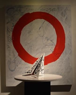
In response to these observations, as the video explains, Leon de la Vega has embarked on an exploration of  communications by hand, incorporating them into sculpture, stylized images and abstracted interpretations. writing series P1110818

He is inserting into and embellishing on his artistic expressions in the form of calligraphy—which in its finest examples— has proven to be both art and literal communication through the ages. P1110838

But if one examines the very personal and expressive beauty of fine penmanship,  we realize that our schools are not even teaching basic cursive  to our children. Our schools are forced to chose between computer classes, music, art and even the basic direction to form the written word.  The  collection was very well received in Mexico City last month and a second exciting and thought-provoking exhibition/auction of work will take place in early February, also in Mexico City.