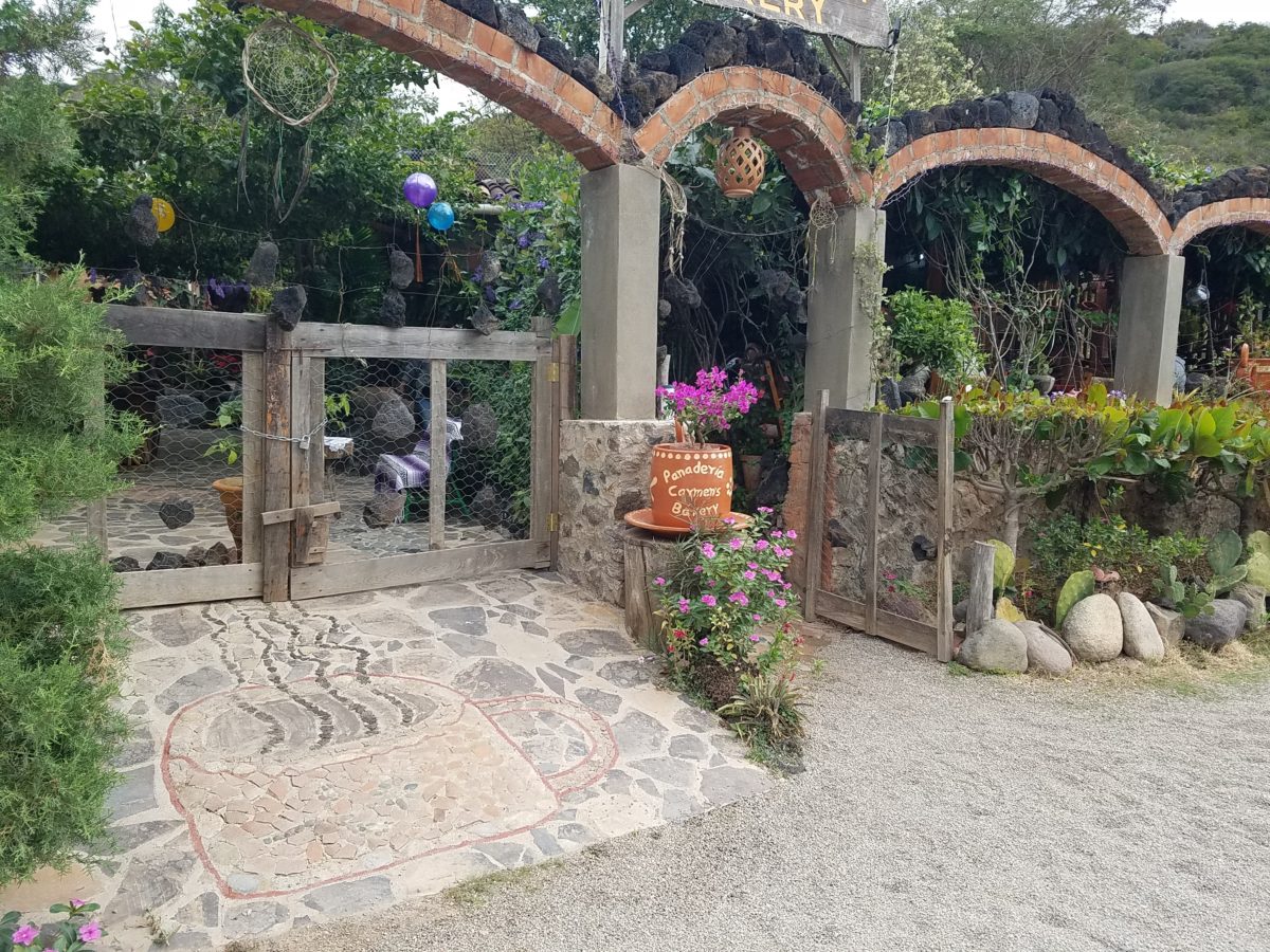
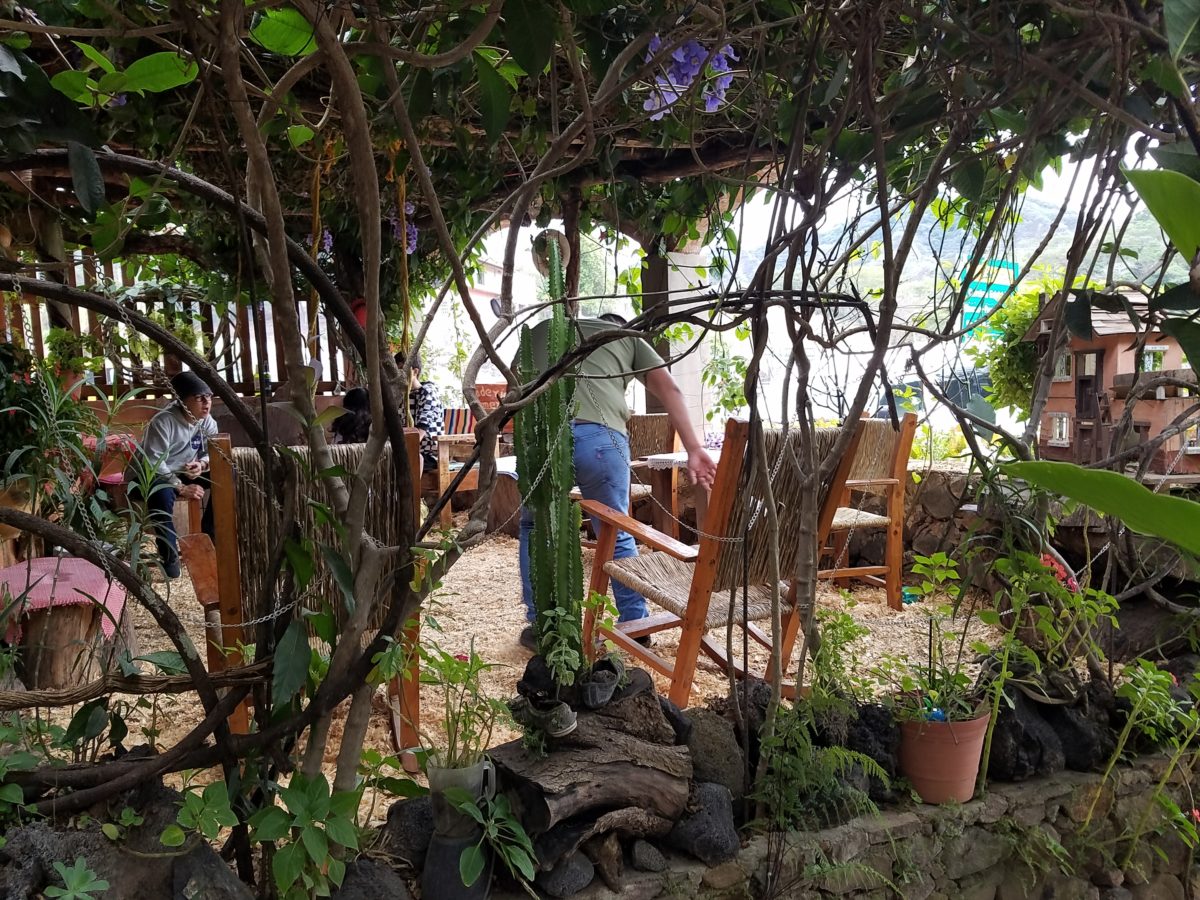
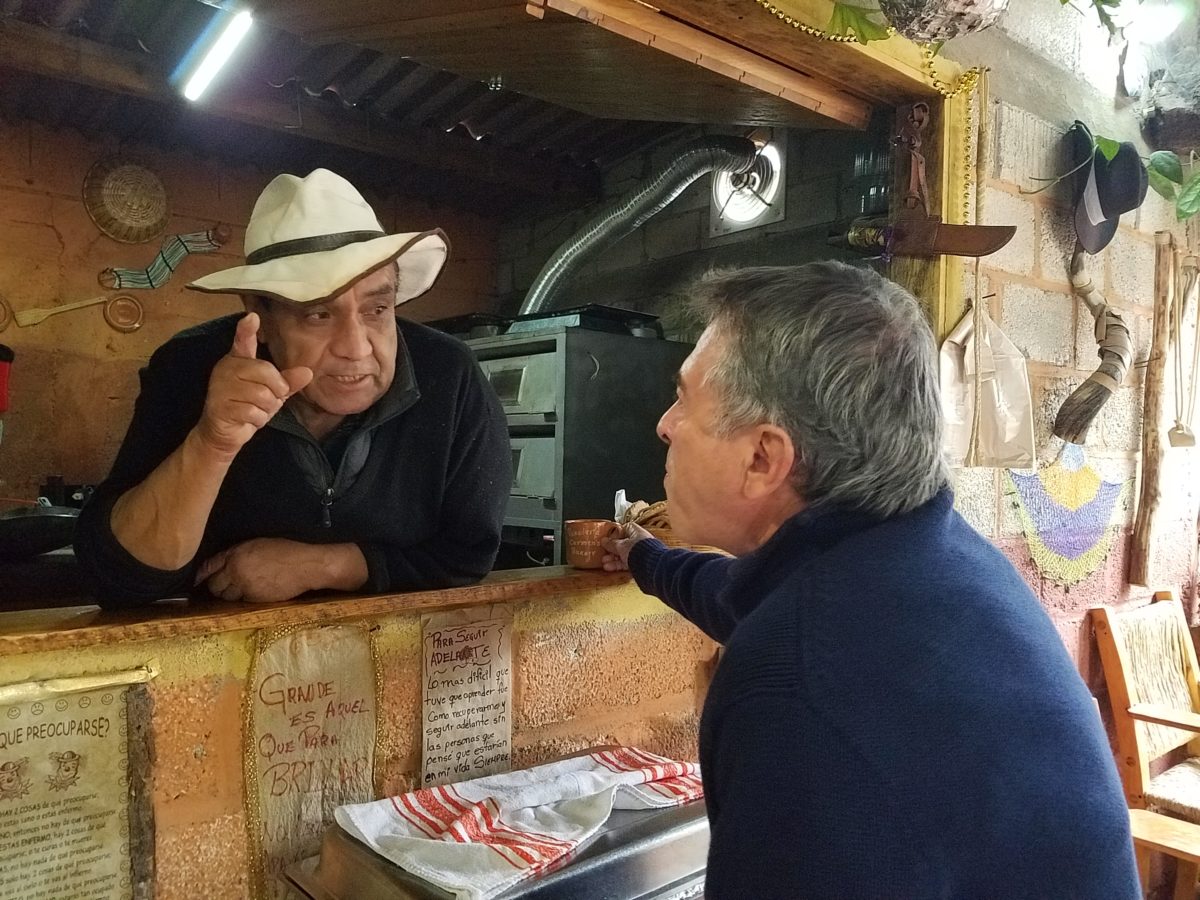
After experiencing and pondering the value of incorporating nature’s elements into architectural planning in the previous blog, I find myself winding into the countryside from sea level to a mile high into jungles and ultimately pine forests, across vast expanses of rivers and towering bridges spanning grand abysses…and stopping at a modest panaderia (bakery) on the side of the road.
You can’t tell a book by its cover as this simple little rural structure – standing alone – looked curiously intriguing and quaint enough, with an unpaved parking area transitioning to well-tended pea-gravel. Traffic cruised by, on the way across the bridge.
Those that knew, turned in. We pulled off the road and were told that this couple had a wonderful bakery and were promised an exceptional treat! Fresh empanadas that would bring remarkably satisfying mid-morning joy.
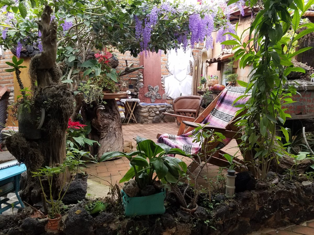
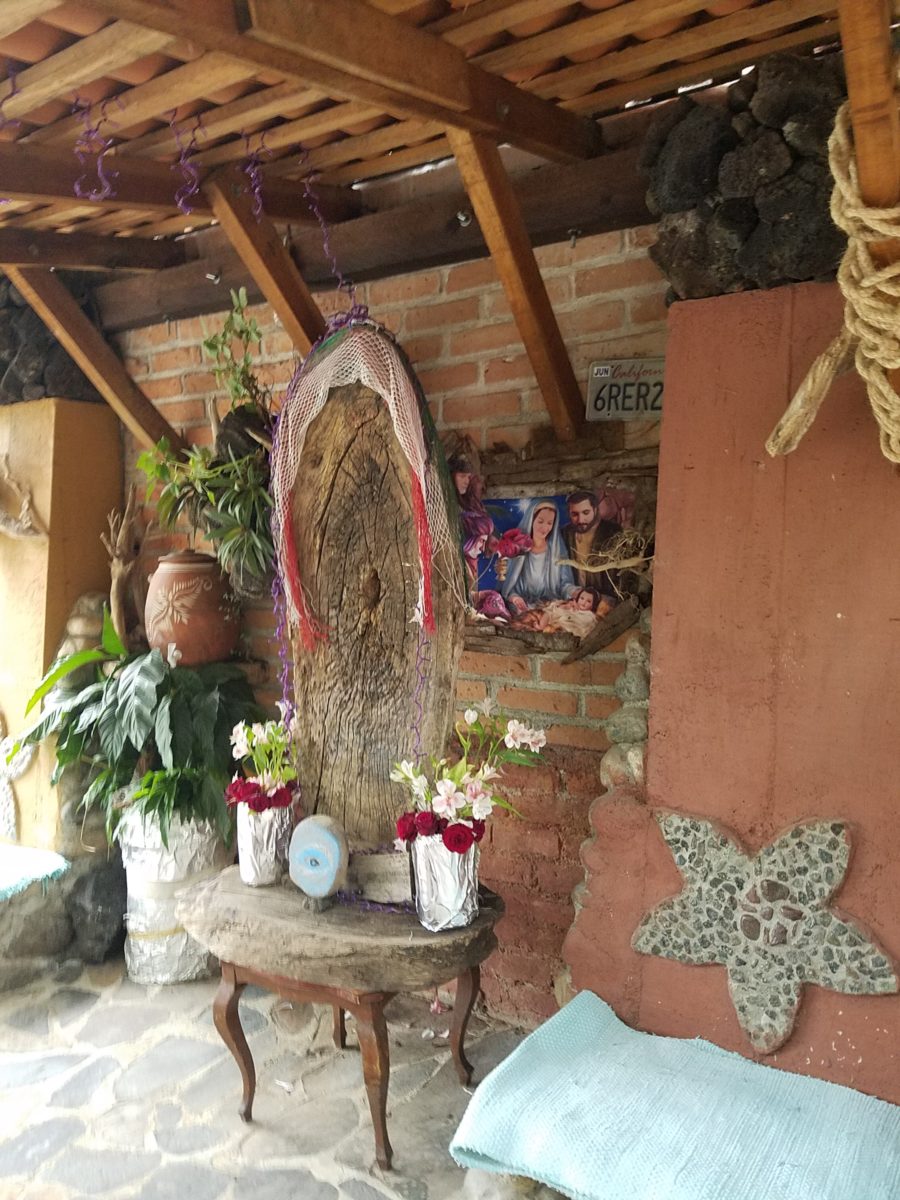
Very tidy and thoughtfully eclectic, this little destination bakery is a precious find.
Oh, were we in for a surprise! At the entry, I stopped to shoot the whimsical cup of coffee mosaic set in a field of stone and concrete. I thought – what a fun design element to greet arrivals and set the stage. But I had no idea to what extent I was about to be elated. What unfolded so exceeded my expectations that I wanted to stay all day!!!
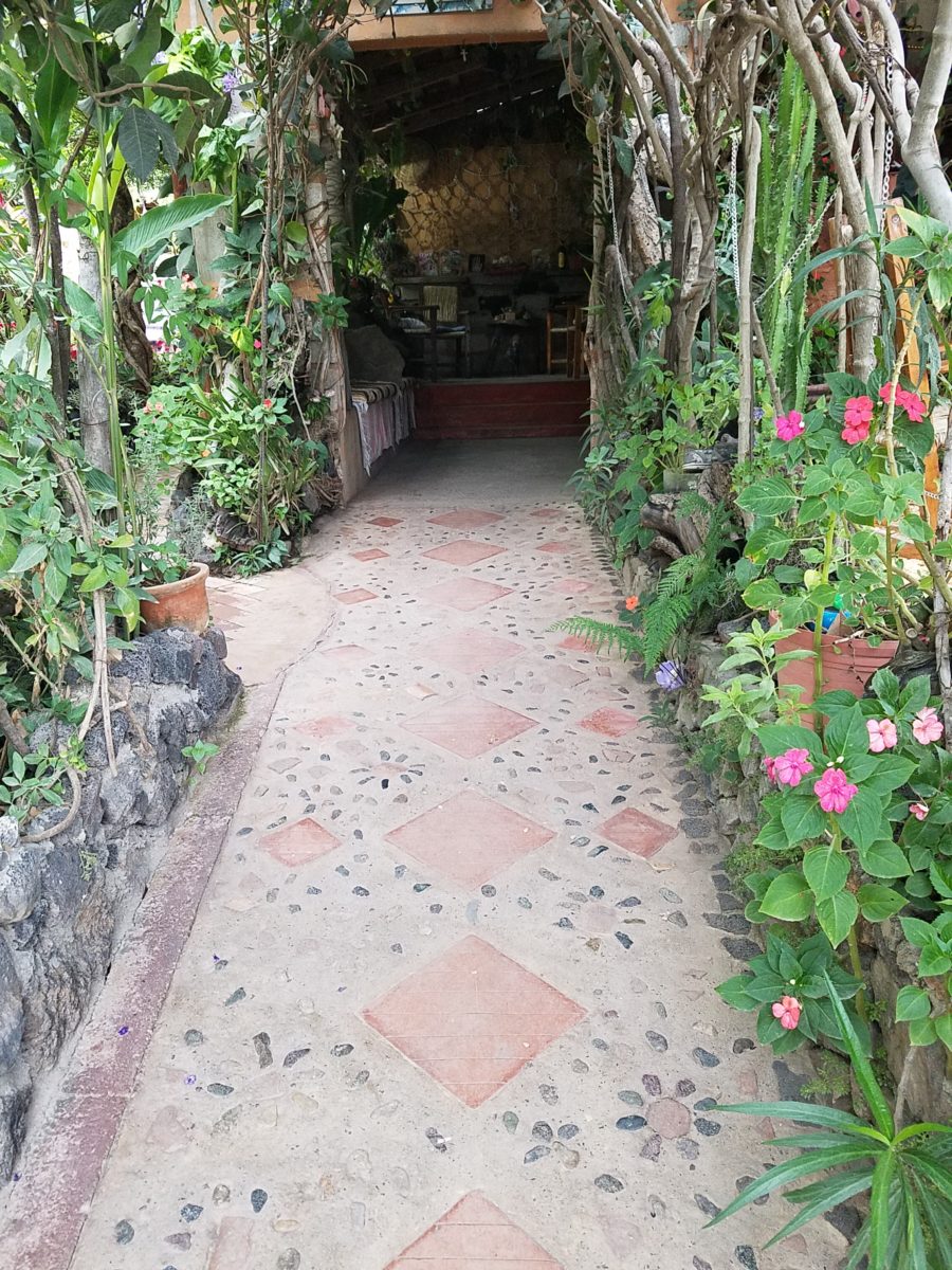
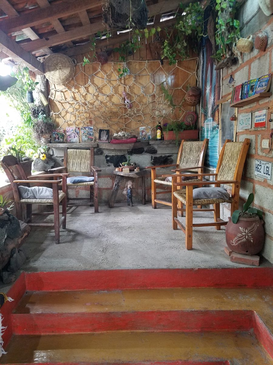
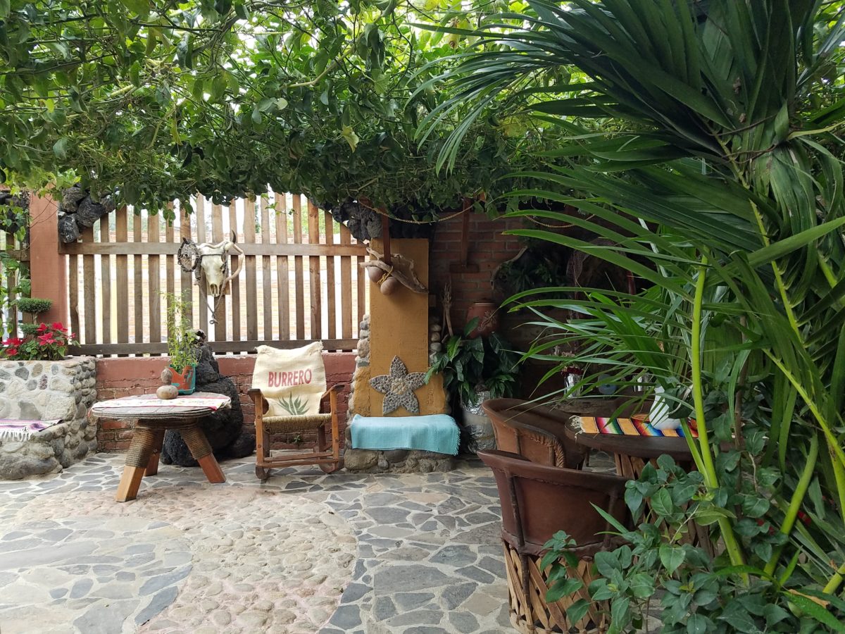
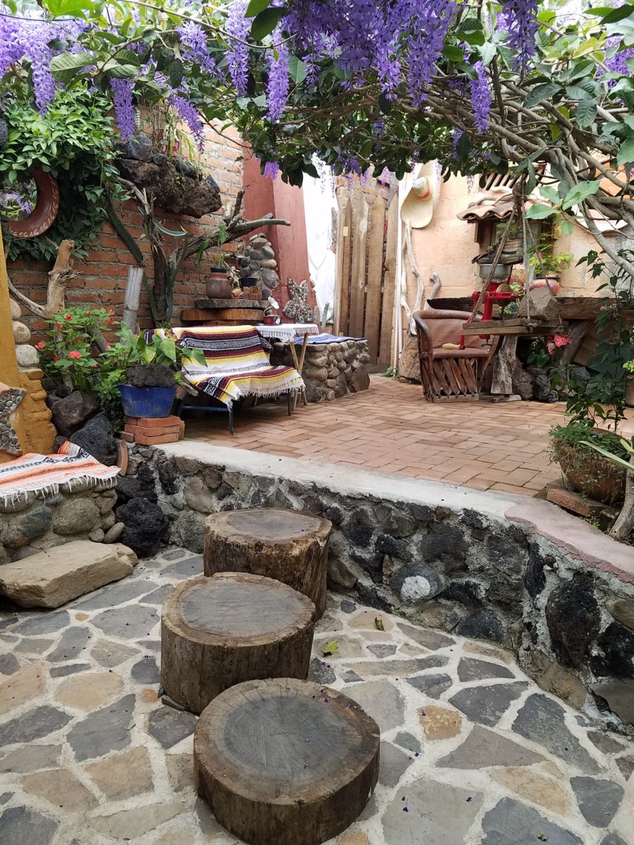
Happy stone and tile-work adorned the pathways. From the textures of stone and brick, tile and wood – it was an organic fantasy – an unexpected design experience.
Simple, yet spectacular – simply spectacular!!!!!
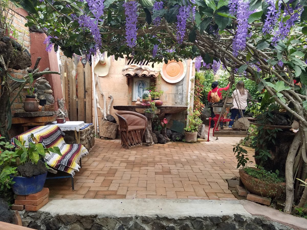
Ceilings of colorful floral blooms – perhaps wisteria – suspended from their vines and other plantings intertwined with the structure.
Spotless and meticulous the eclectic elements were a harmonious creation.Stone walls, wooden slats, vines and adobe all worked together to define the spaces.
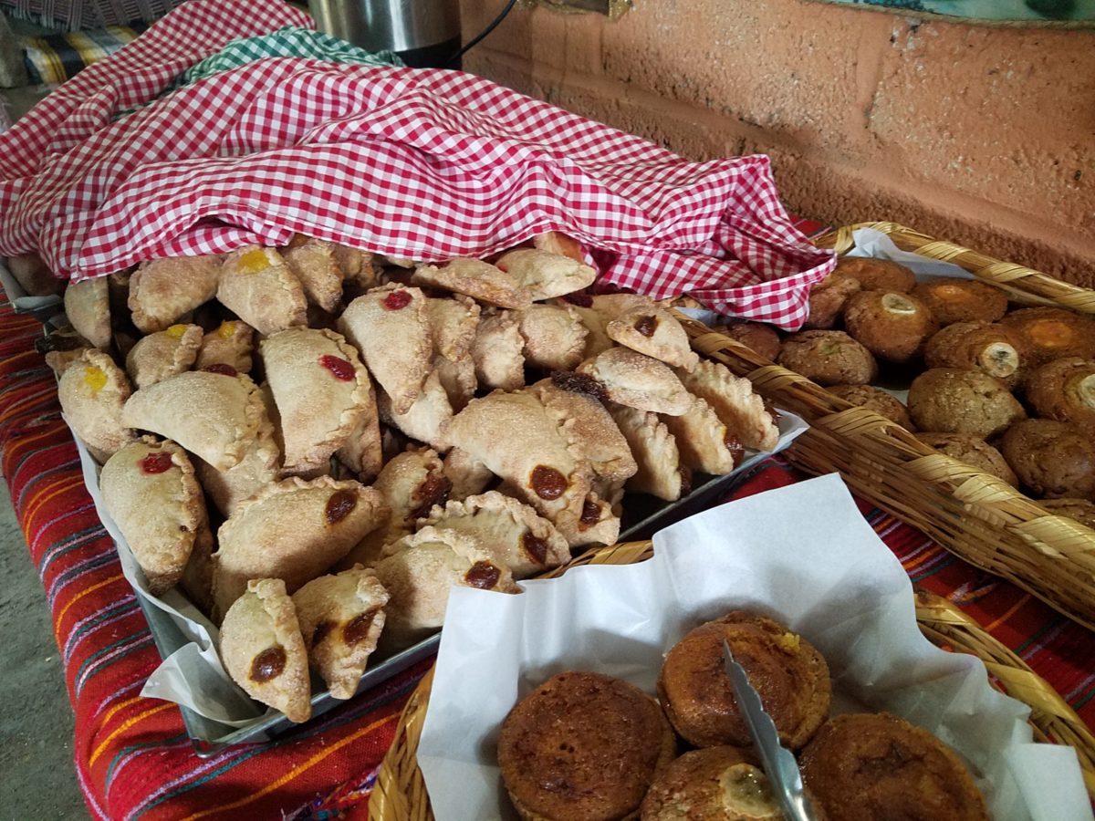
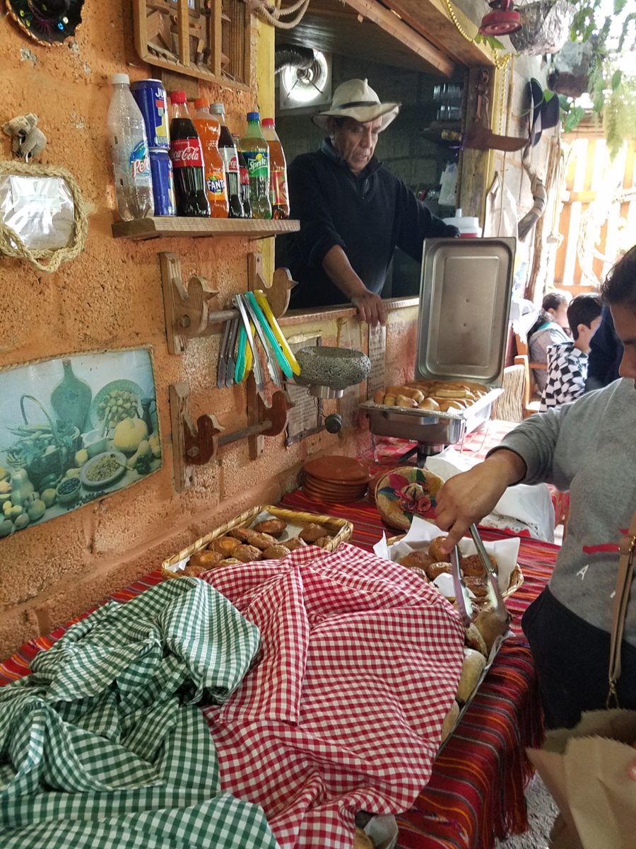
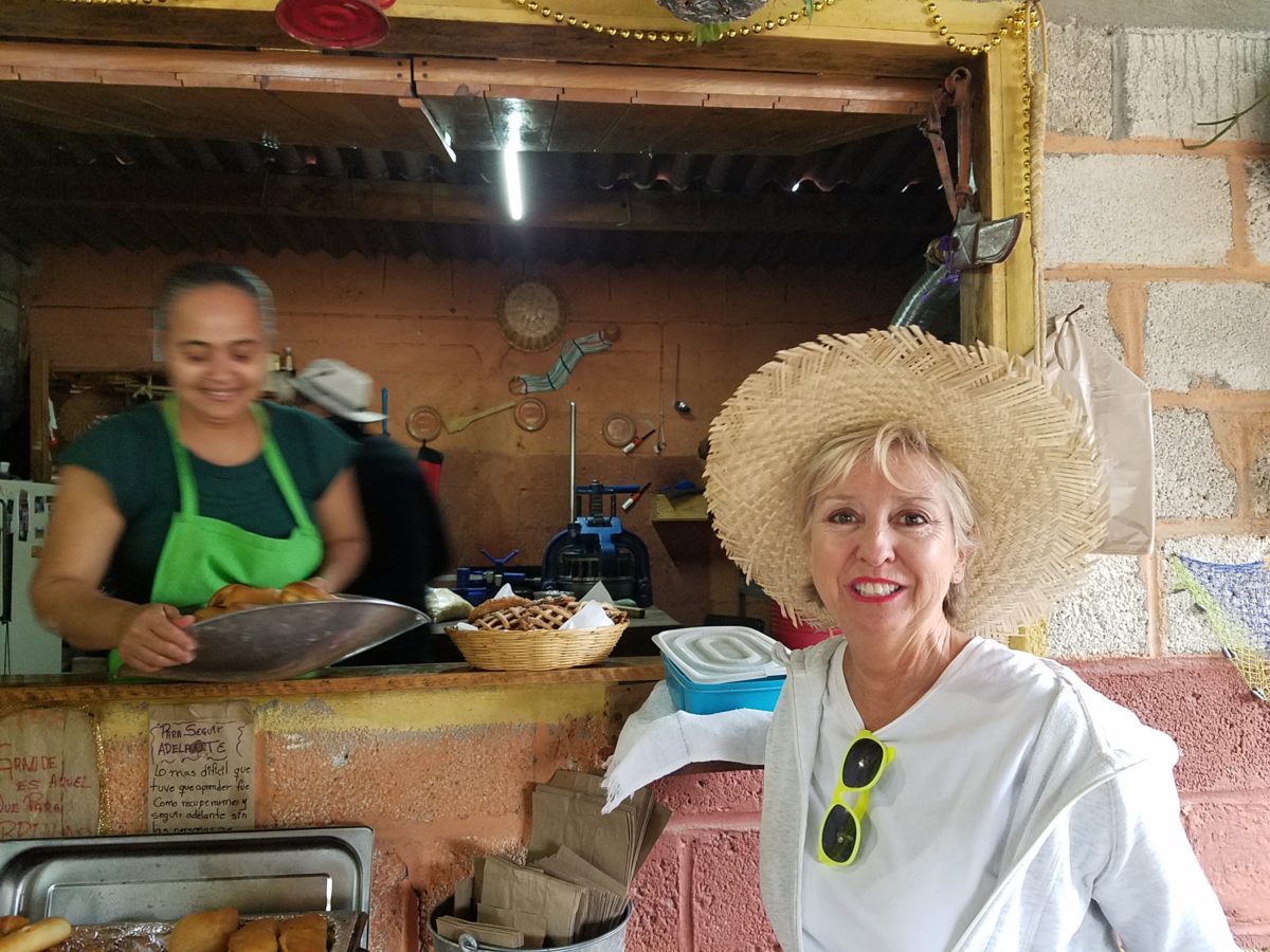
The wafting aroma of fresh baked goods – it was more than delightful. From warm savory clouds with mushroom filling and another with chile-laced sausages – and an array of sweet strawberry, cream and pineapple empanadas to corn muffins, banana muffins and more! All nestled beneath colorfully woven cotton tablecloths.
Light and delicious – the best empanadas ever!! With a tiny sprinkles of granulated sugar, for a sweet crunch, before sinking into the fabulous fillings! Muffins challenged any others and savory treats were so satisfyingly delectable. Little buttons of banana slices on top denoted which were the banana muffins!!
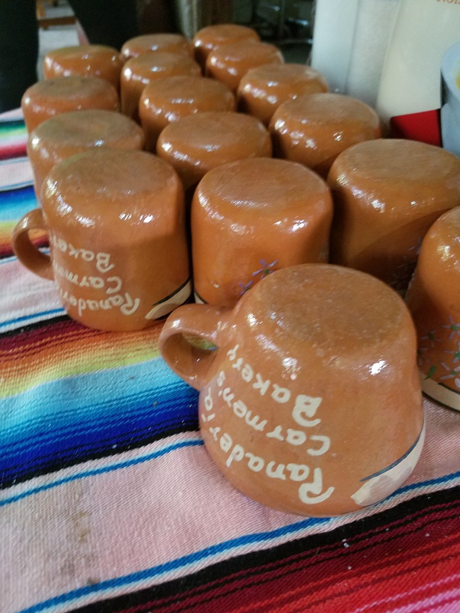
Rich Mexican coffee with a touch of freshly ground cinnamon and luscious hot chocolate were served in custom-glazed “barro ware” complimenting the fresh-from-the-oven confections.
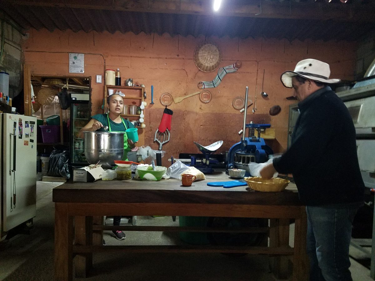
The exhibition baking kitchen overlooked the serving line. The buffet of pastries thoughtfully explained by our gracious and welcoming host, Jesus!
Carmen presents fresh strawberry tarts just from the oven!!! A combination of old and new – tradition and technology meet in this cozy kitchen.
Fragmented spaces open, yet enclosed, offered intimate pockets in which to pause and enjoy.
Color-pops insert themselves effectively around the interior and exterior spaces.Inviting seating areas semi-concealed offer private repose. Tucked away – more areas to enjoy…
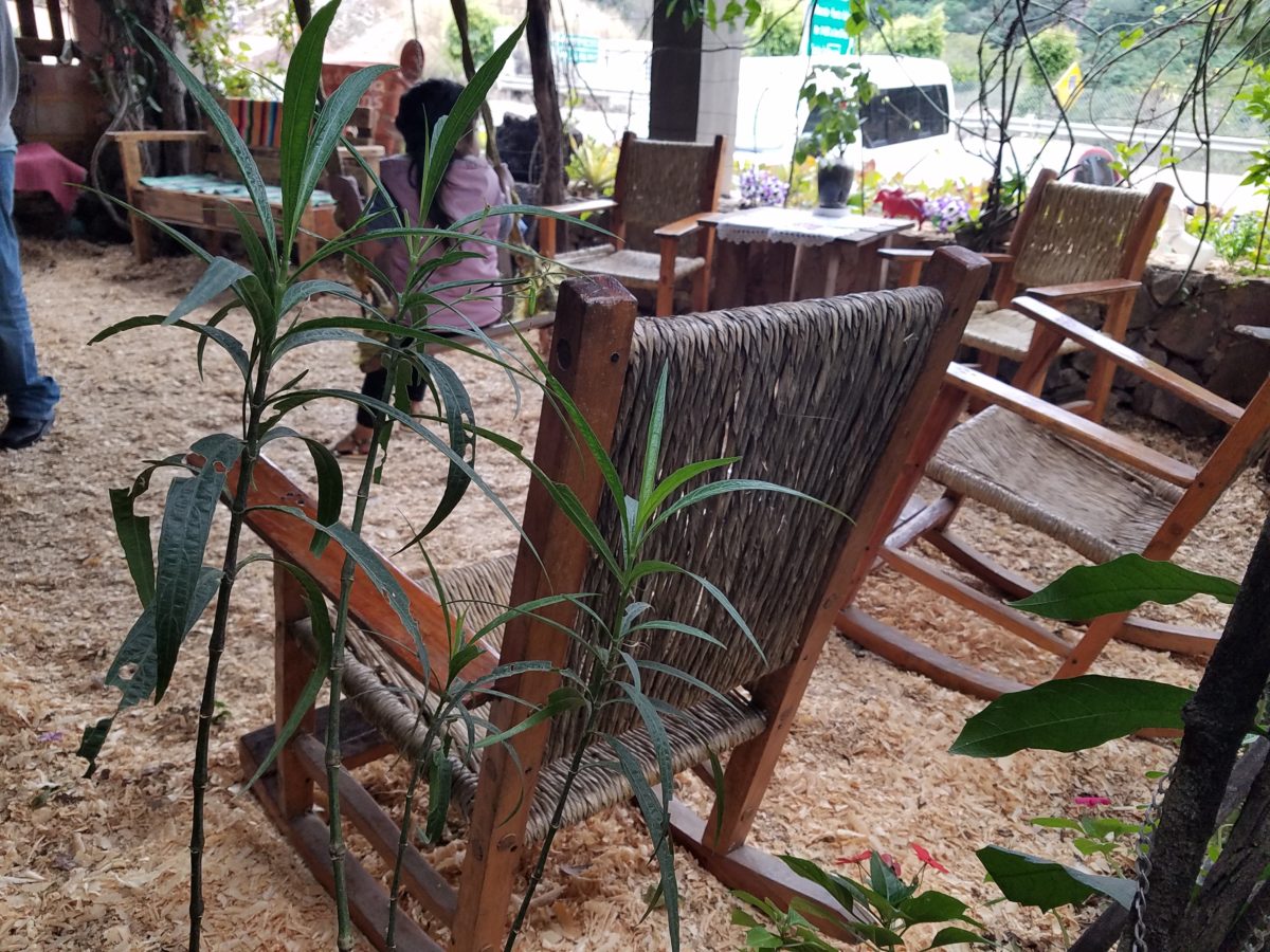
Clever use of clean blond wood shavings on the floor of the main covered patio created a wall-to-wall carpet of fresh aromatics complimenting the inviting aromas emitted from the ovens. Rocking chairs and rigid sturdy versions, with a fun little rope swing, all surrounded by tropical plantings made a cozy area to gather.
Soft underfoot and subtly fragrant – the wood chips make a great shag carpet!!!
As I meandered around exploring all the interesting spaces, textures, colors and plantings, I marveled at the sensitivity with which this had all been crafted and assembled. It was artful interior design with an exterior feel – open air and charming, with a decidedly handcrafted, Mexican sense of place.
Slices of handsome tree trunks make perfect stepping “stones” with graduated heights.
It was an eclectic collage of furniture, structure and organics – living and static – that was welcoming and artful, delightful and so pleasing, that it was a treat for all the senses.
The cool morning air of the mountains mingled, with the comforting fragrances, creating an atmosphere inviting gentle conversations of people gathered around good food and artfully relaxed surroundings.
Peek in places and through doorways to find worlds of design
waiting to be discovered!!!
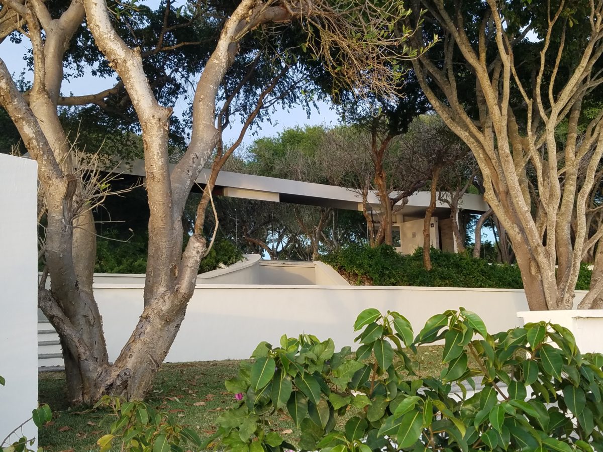
Neighborhood covenants, zoning, physical practicality, budgetary constraints…all enter into whether it is realistic or desirable to save vegetation when clearing land for development. Carving around existing growth can be a tedious and costly addition to a project. But there are times when it is a design asset – an imperative even – to the over-all setting and effect of the scene.
Saving trees when designing a built environment is a challenge
that often pays off.
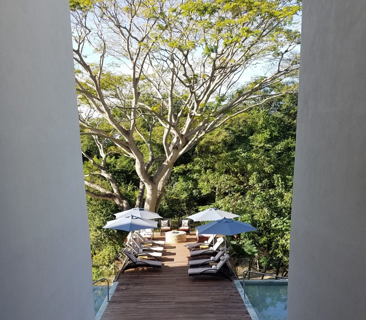
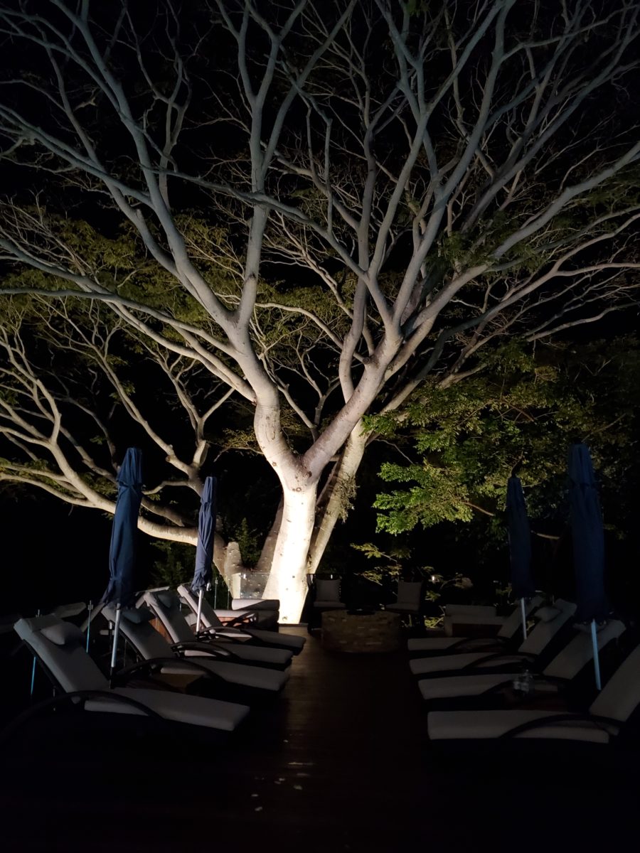
A spectacular backdrop to this seating area – the decades old tree is the focal point.At night – well lit – the same tree towers with dramatic illumination in the darkness as the rear “wall” of this seating area.
Raping acres of woods for barren subdivisions and adding back newly planted saplings the caliper of a quarter is unfortunate and takes years to satisfy. FHA requirements were the tell-tale token of bringing green back after a bulldozer’s brutal removal of all plant-life on a property. That lanky stick standing in the center of a dirt patch, that might get sod or seed…or rock, was a pitiful attempt to give back to the environment. However, in addition to broad-sweeping examples, individual decisions to saver rather than remove can prove valuable.
Years ago, when planning a patio expansion and exterior kitchen, friends brought the plans to me for a quick check before committing to the design from the design/build contractors that they had engaged. The new patio plan meandered along nearly the entire back facade of the house. With all the exciting kitchen layout and bar, seating areas and dining space, I instantly focused on the fact that their beautiful red-bud tree was gone – not in evidence on the pans! I exclaimed about it and was told that they were told it had to go. That was about 10 years ago – or more, yet it still stands today having modified the design to include a tree-well in the patio and opening in the proposed high-ceiling patio cover. The stunning multi-truck tree thrives, in the ground as it had for decades, and climbs skyward through the opening spreading widely toward the second story of the home. A wonderful, living, sculptural element, in the space. Good save!
Warmer climates invite the indoor/outdoor melding of living spaces. We all try to achieve them despite bitter cold transitions and near, if not complete shut-downs “off-season.” But in the tropics, outdoor living spaces become remarkable dimensions to expand living.
Sculptural trees are powerful elements viewed from inside and outside.
This past week, that situation came to mind as I enjoyed several examples of incorporating nature into the design scheme. Yes, landscape design is just that. Landscape architects do just that. They design exterior spaces with organic material. But what I was feeling recently was two complimentary things – one that designing in and around existing growth is so satisfying and in some cases, the living plant material becomes the architecture – not merely compliments it.
In addition to their sculptural beauty, they add balance, scale and a canopy over the exterior rooms.
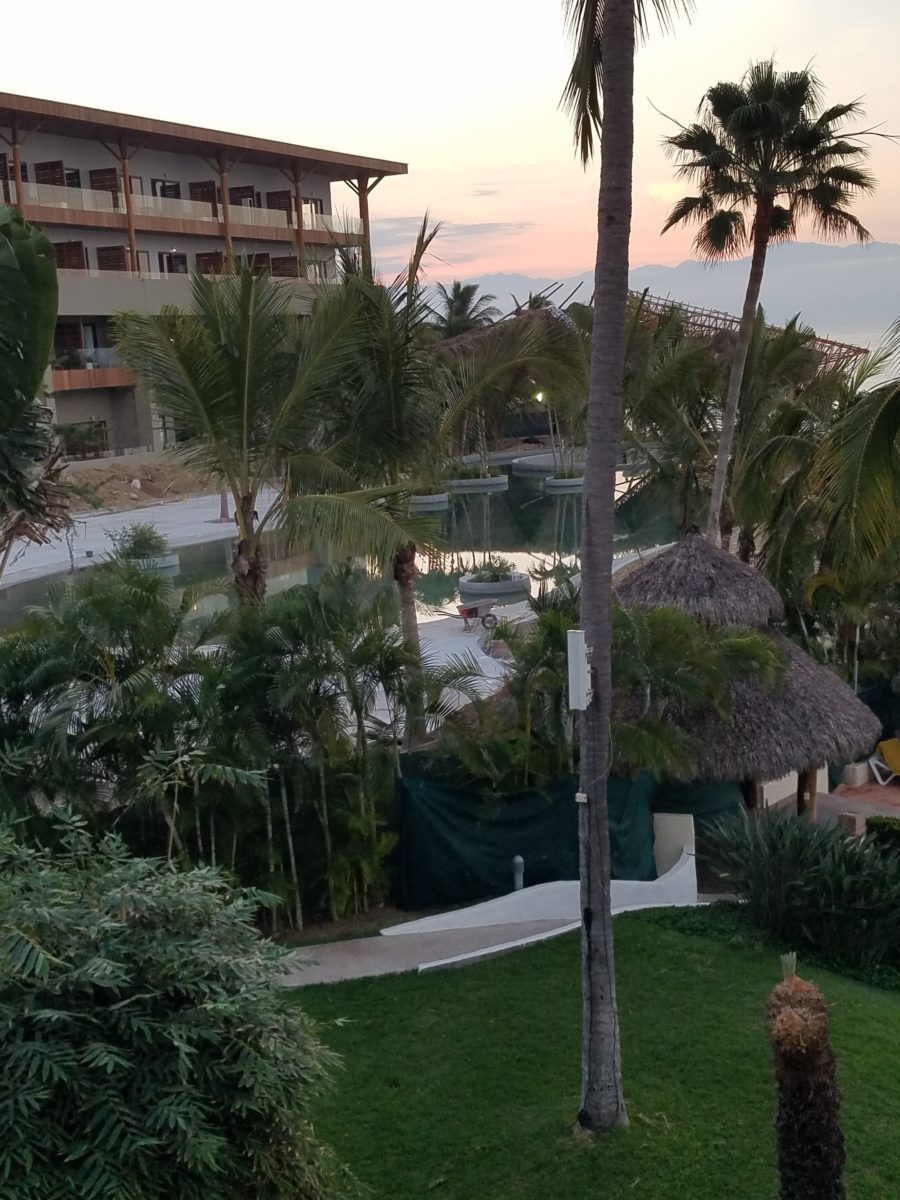
This past couple of weeks, we have see the results of 2 years of preparation and construction which transformed of a piece of partially vacant land into a seaside resort. Several key palms and a couple other key trees were saved and hundreds more were brought to the site to complete the design. The towering new trees showed signs of shock with their dried frond tips – but will surely survive.
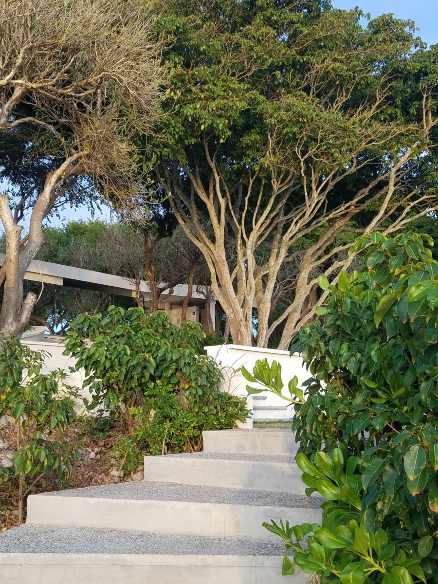
What has been a foreground of some landscaping and virgin jungle ,with houses beyond, was bladed and terraced last year in preparation for a new project. Buildings and pools appeared, jungle growth was removed and a few key organic elements retained. The recently finished scene is dramatically different – incorporating specimen trees throughout the property into the new plan.
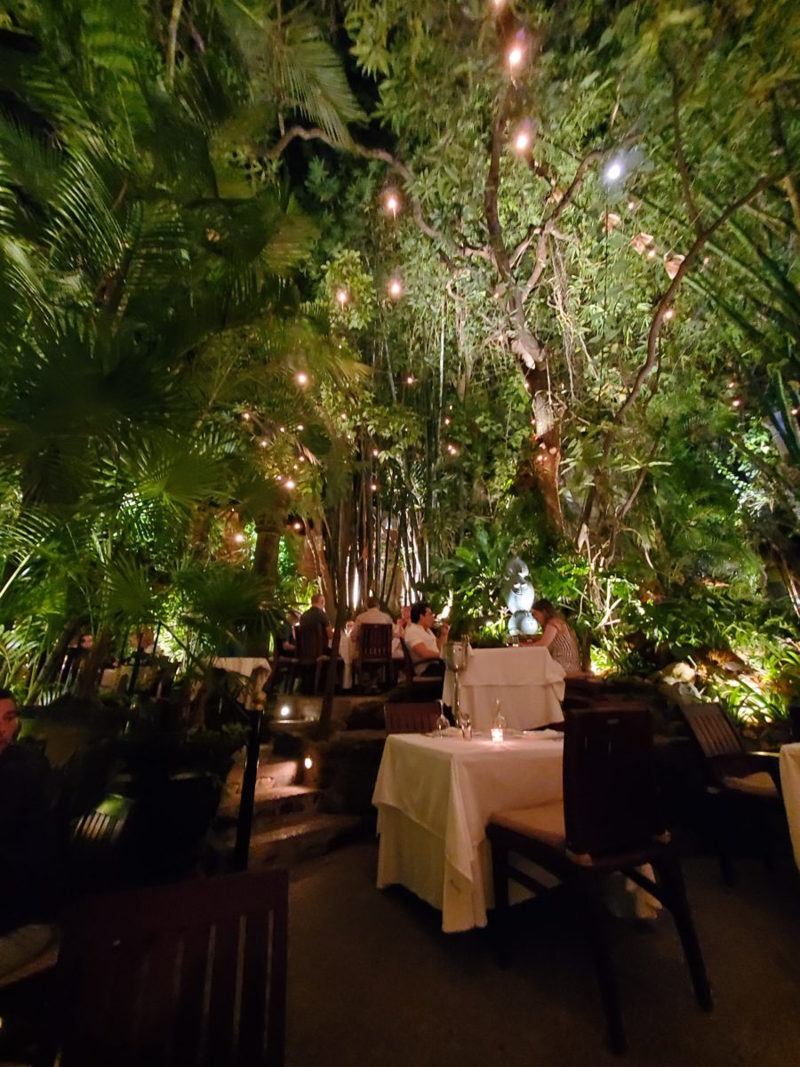
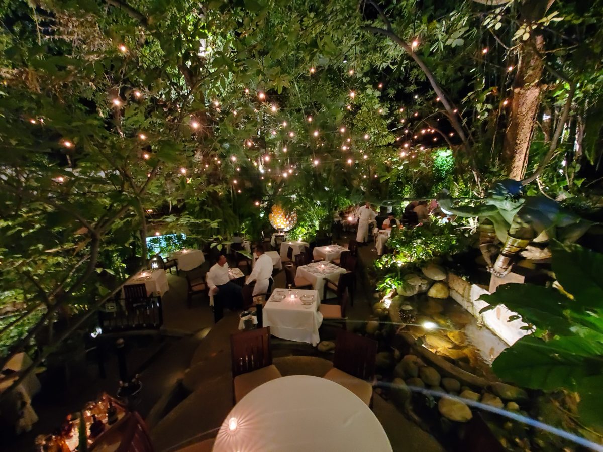
When landscaping becomes architecture you know you have crossed an exciting line. What I mean by that is to have the growth become walls – to have the vegetation read as though structural framework.
This terraced dining patio is framed by massive bamboo and other large trees and plantings. They are substantial enough to read like screens, if not walls, framing the space. From a canopy of growth, strings of LED lights are suspended as though from the ceiling – a ceiling of branches over this enchanting outside dining venue.
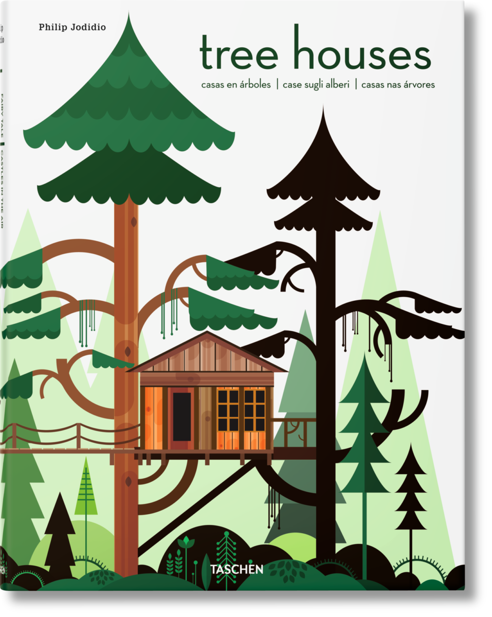
A tree house is another example. The tree is the structure – the framework to begin the additional elements that create a suspended room.
This entertaining and imagination-spurring book by Philip Jodidio is worth investigation. Here. find extraordinary examples of trees as the structure of other amazingly fanciful spaces!
By observing examples in your world, you will see, when designing around and in concert with the natural landscaping, the effects can be dramatic and of great value to the scene. On your next project, consider the possibilities of saving rather than removing – incorporating and celebrating nature’s design elements!
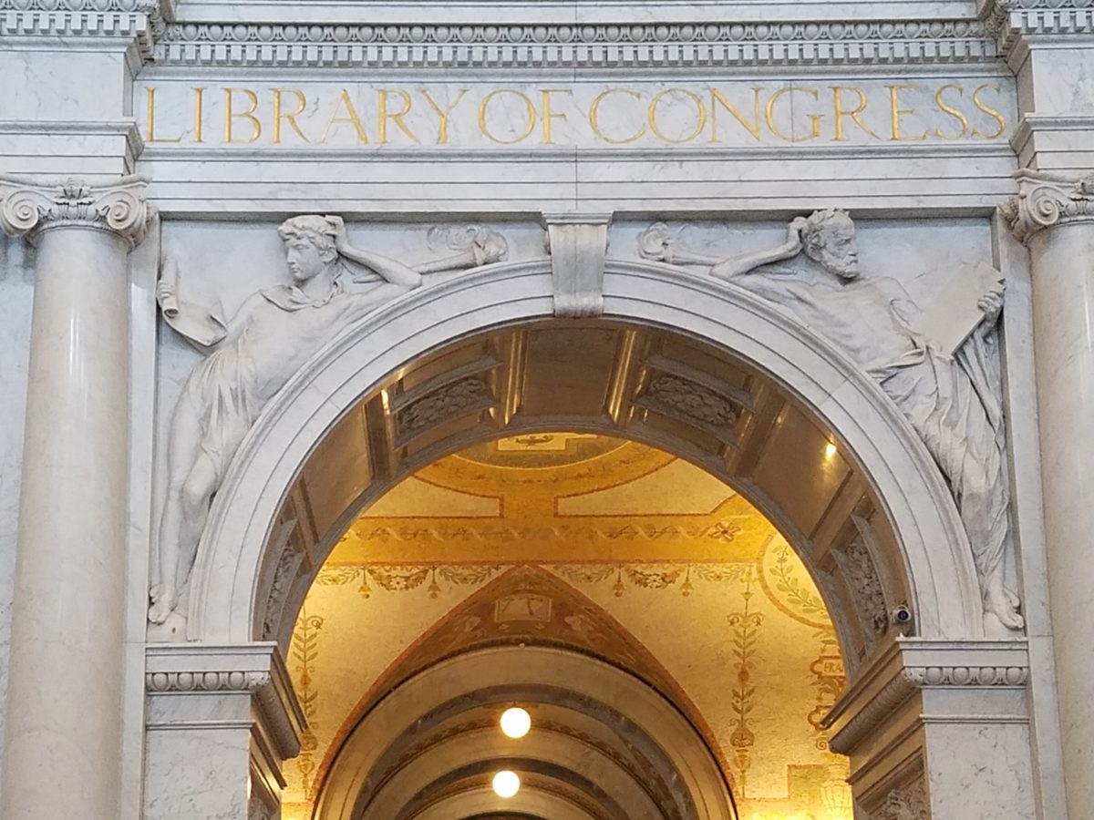
If the Basilica in my last blog didn’t get your juices
flowing about incredible public art spaces, the Library of Congress was our
next stop. Yes, it houses nearly everything having to do with writing,
recording, documenting…but the building itself is amazing! It in itself is a
wealth of artistic detailing. The interior has more gold leaf – not gold paint
– but hammered metal gold leaf – than any other building in our Nation’s
Capital. Inside and out, the craftsmanship of the stone carvings and
architectural embellishments is magnificent. This inestimable landmark is so
much more than the sober name suggests.
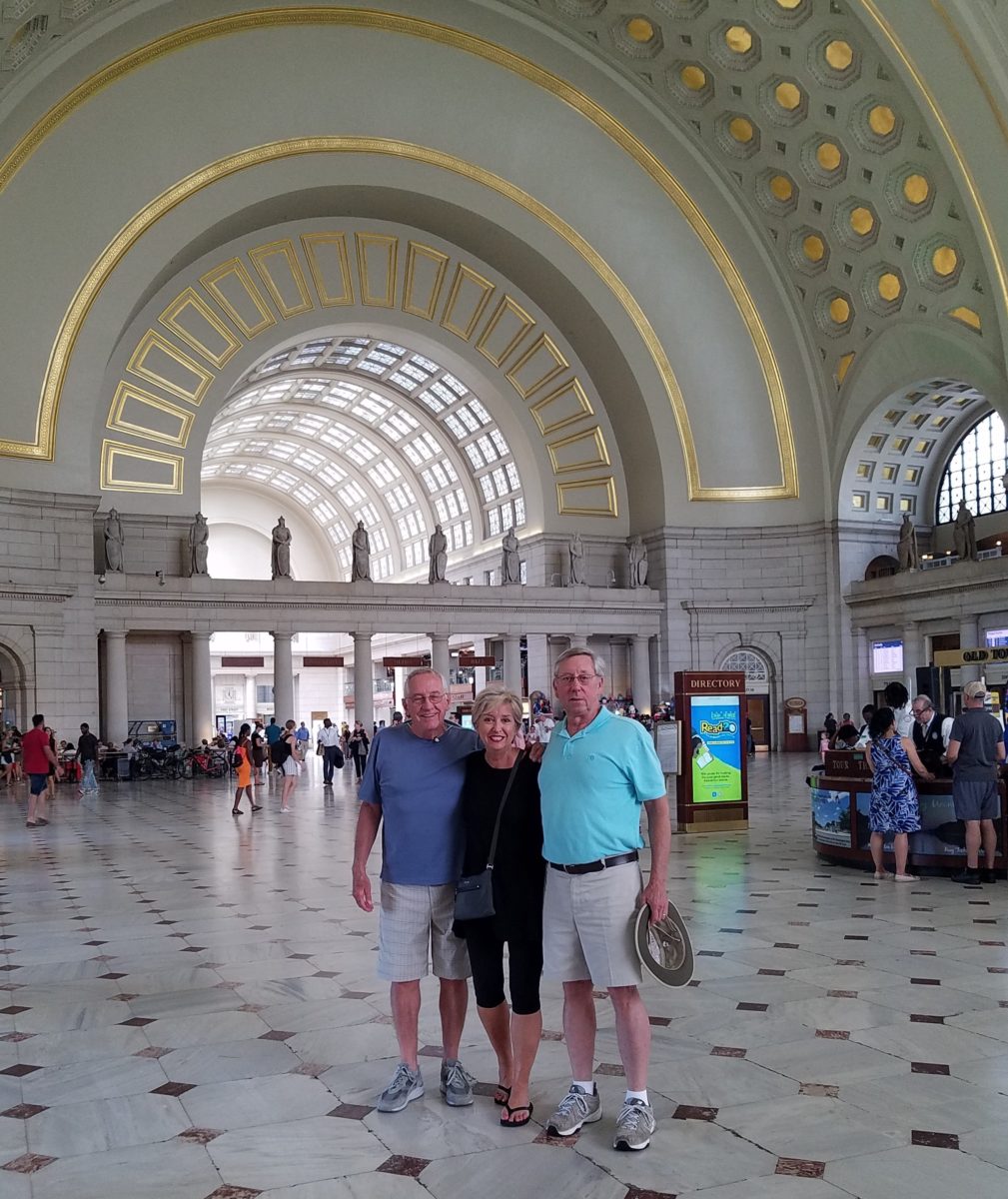
We parked in the garage of Union Station and walked the few
blocks past the Supreme Court and the Capitol Building to our destination of
the Library of Congress. The brilliant blue skies behind the bright white
edifices belied what some regarded as the oppressive heat. I however am a heat
freak – it’s summer – bring it on!
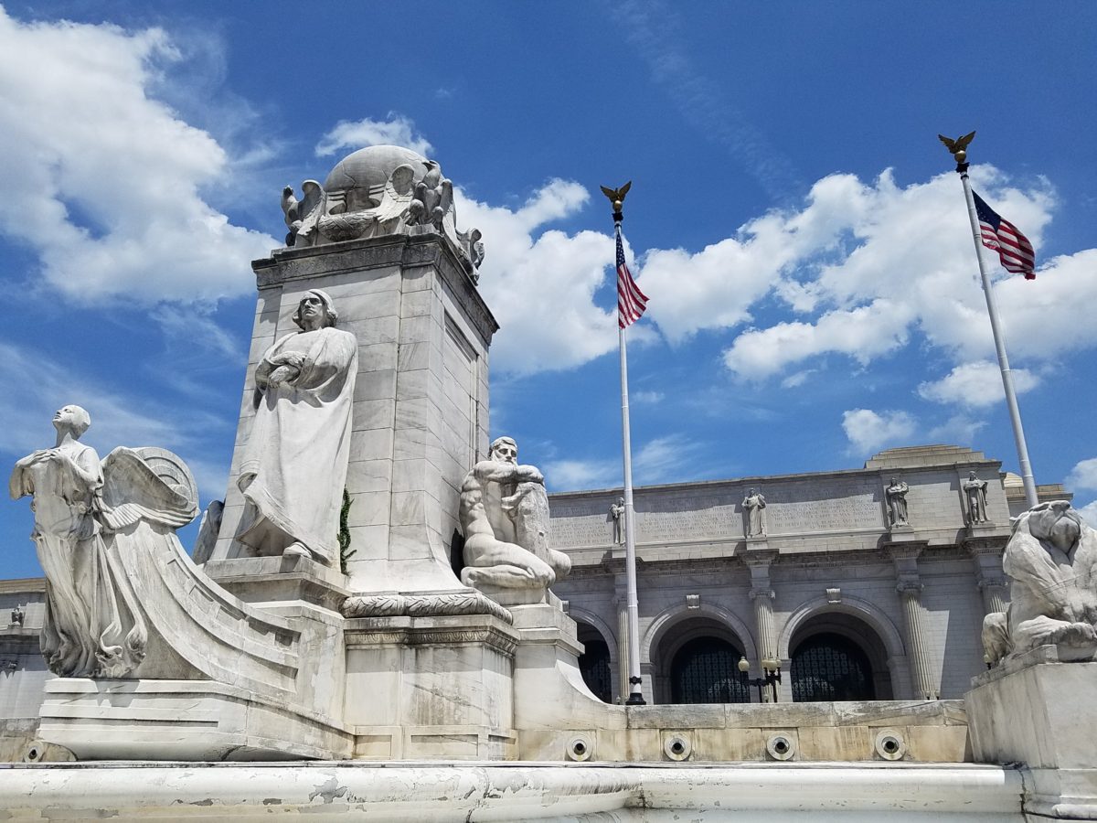
Columbus Fountain at Union Station also known as the Columbus Memorial is a public artwork by American sculptor Lorado Taft, located serves as a tribute to the explorer Christopher Columbus.The Supreme Court – cool, brilliant white against a striking blue sky – at 100 ° Crouching to get a shot of our Nation’s Capitol Building.
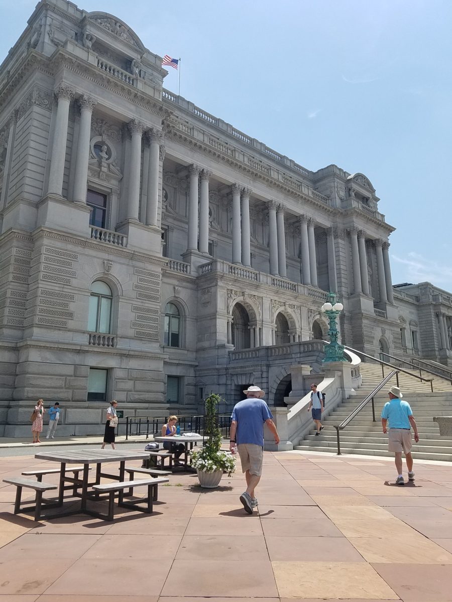
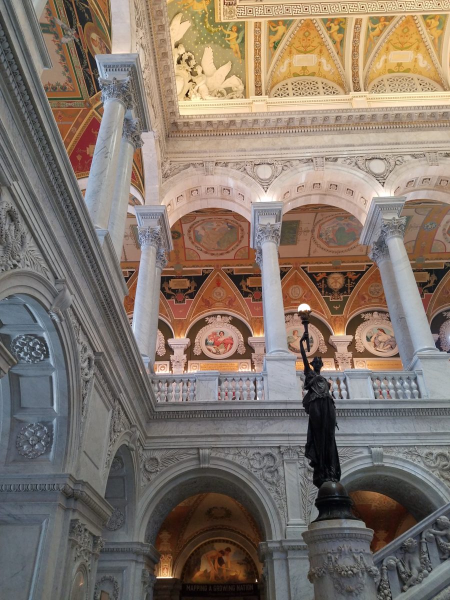
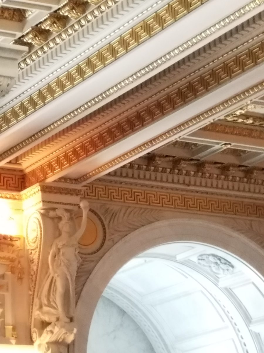
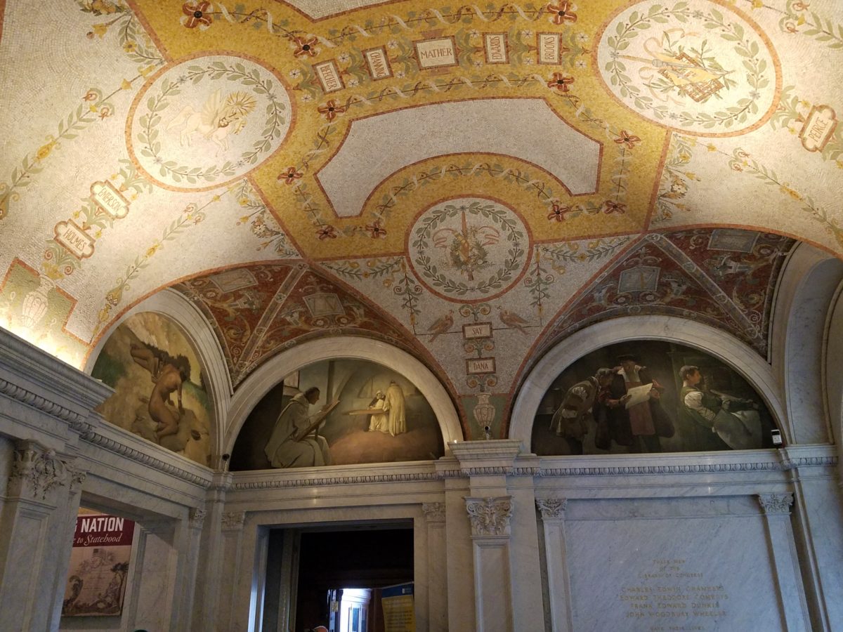
Symbolism is executed with every inch of the design details
both inside and out of the imposing Library of Congress. Ascending the exterior
stairs sets the stage for arriving at a monument of immeasurable wealth of
human dissertation and history. Here I can only touch on the tip of the
iceberg…
Picnic tables out front at our Library of Congress…relax, grab and bite and read a bit before going back to work!!!
From an inauspicious beginning of modest expectations to
greater expanses with devastating fiery catastrophes in between, the Library of
Congress has an amazing story. Thomas Jefferson played a significant role in
re-building the foundation of what we now have today.
While waiting for the tour to begin in the magnificent
Thomas Jefferson building, we were directed to two remarkably entertaining exhibits
on the lower level – a Gershwin gathering and a Hope homage.
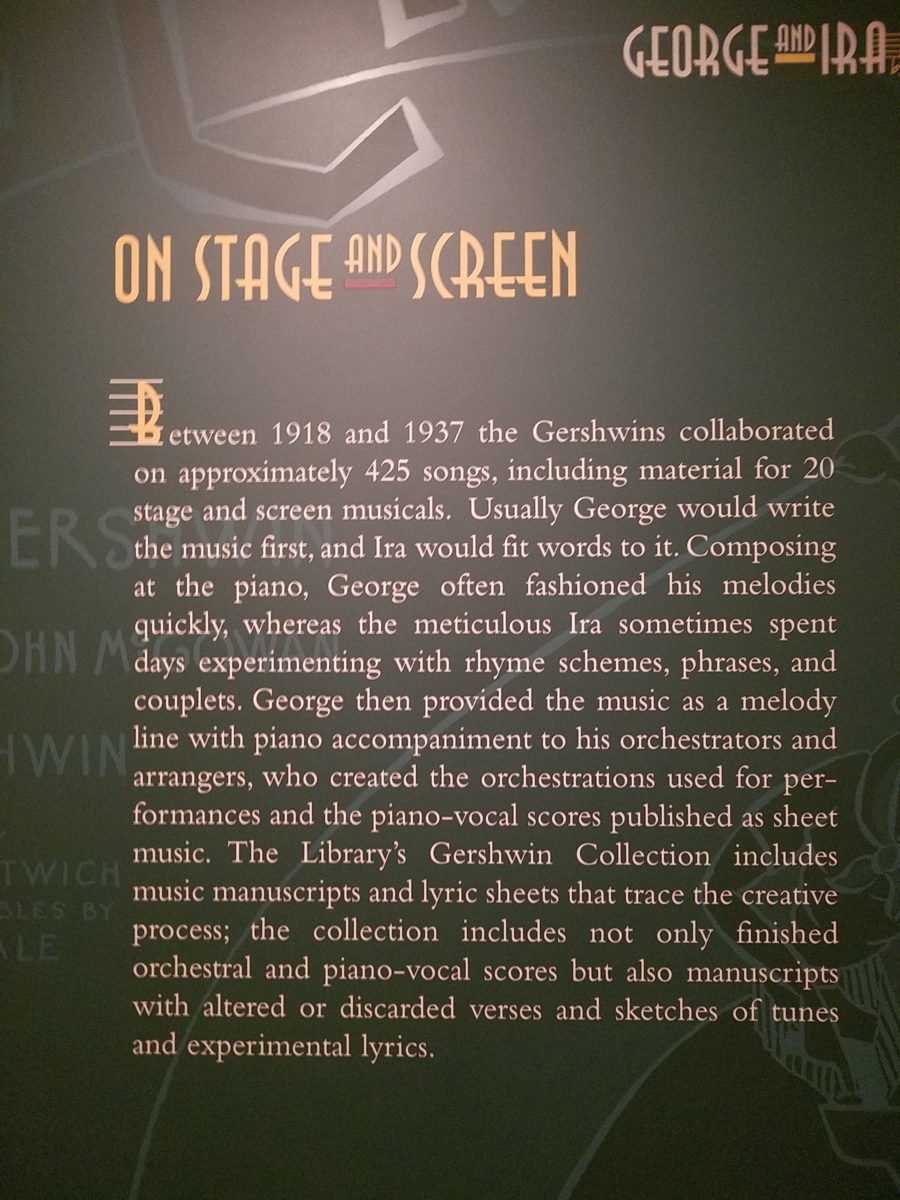
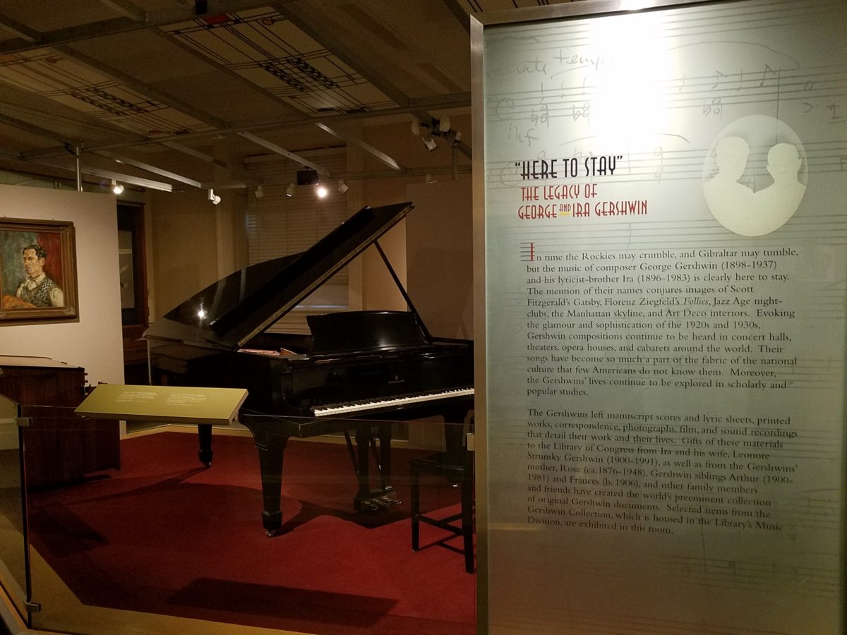
The George and Ira Gershwin Room is a tribute to the two
brothers and their contribution to American music. This nostalgic and very
familiar subject matter makes you hum and tap your toes. The exhibit presents
George’s piano and custom-designed writing desk, Ira’s table and typewriter,
self portraits and myriad documents that trace their lives and amazing careers.
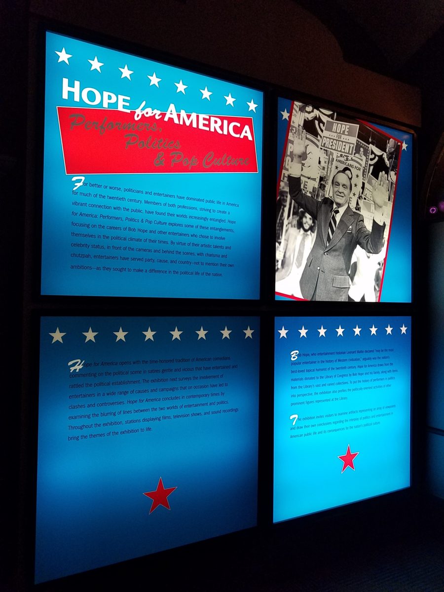
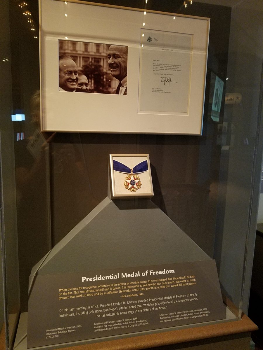
The Hope for America Exhibit focuses on the varied careers
of Bob Hope along with other recognizable entertainers. The exhibit offers the
satirical humor – crossing party lines – both socially and politically for
which Hope was so appreciated, admired and beloved. Hope received the U.S.
Congressional Medal of Honor and the Presidential Medal of Freedom for his
commitment, in his nearly 50 year service, entertaining the men and women of
the armed forces abroad.
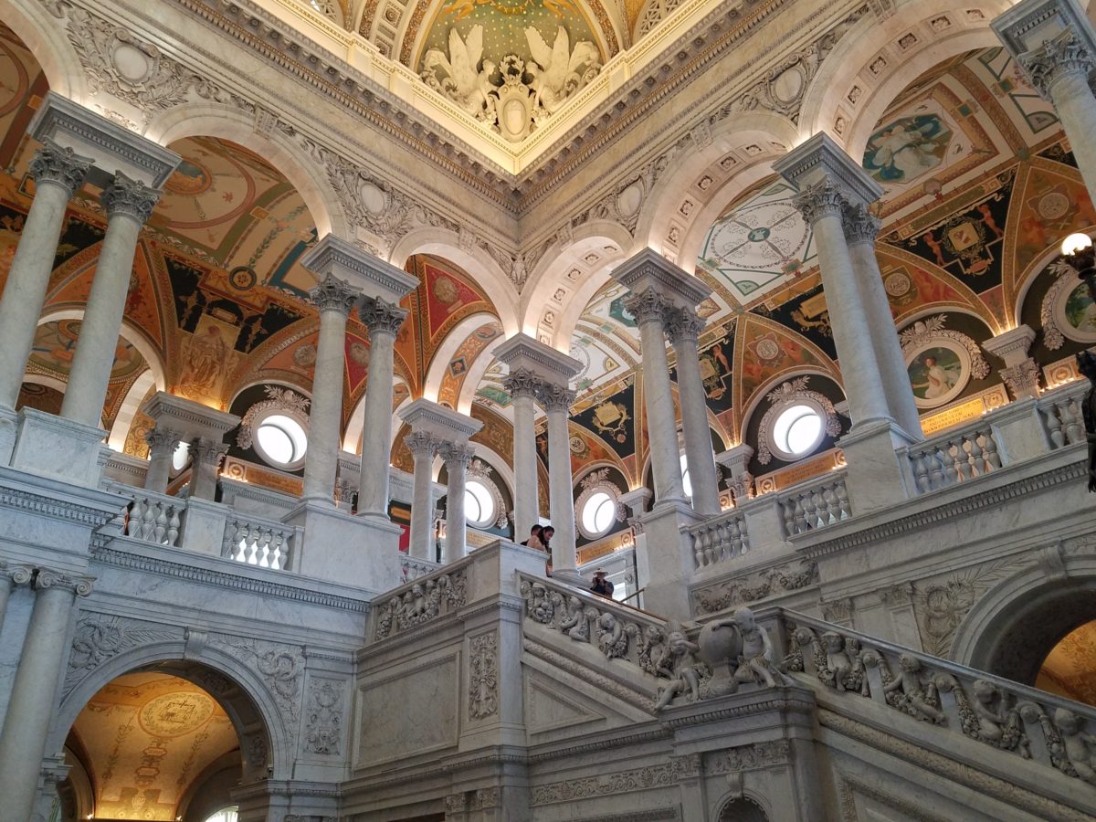
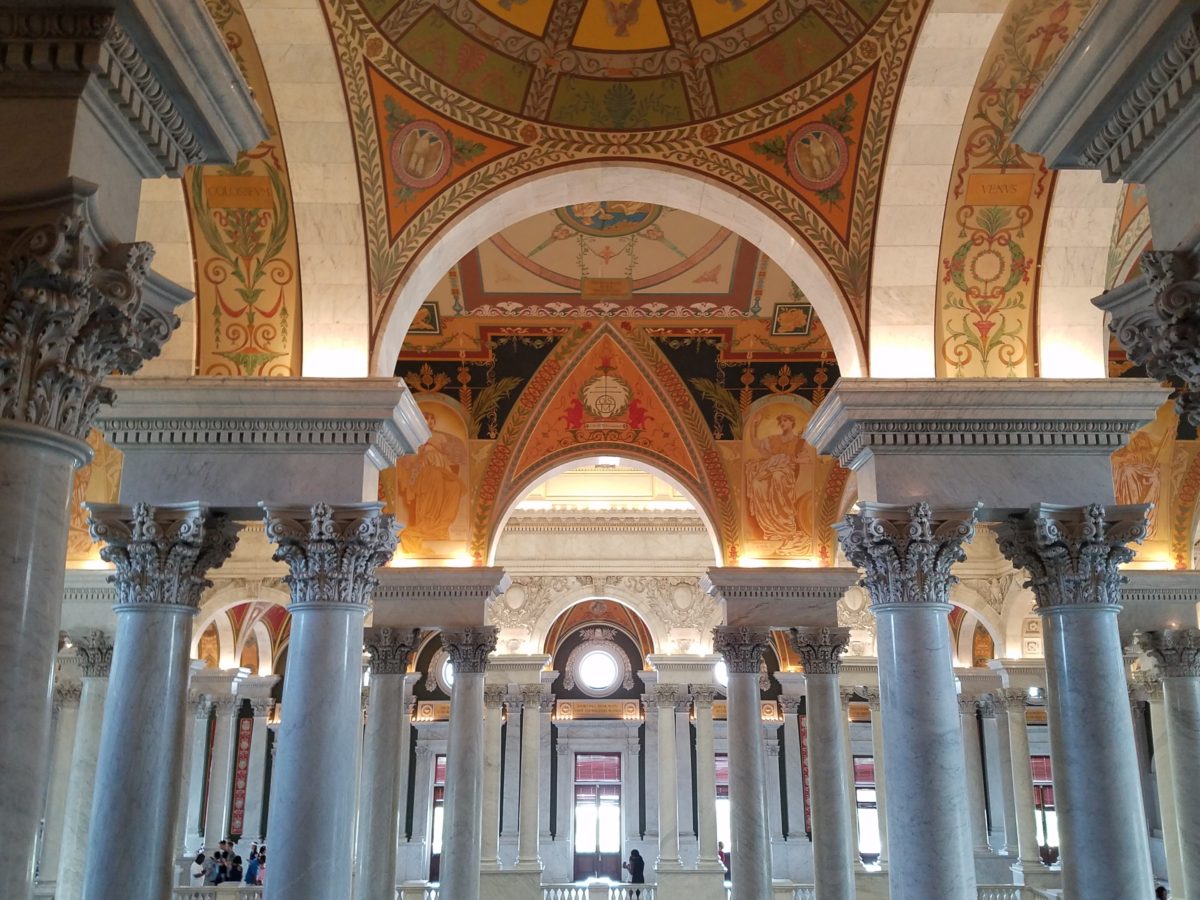
As the actual tour began, we were introduced with a short
film as an overview of what was to come. We were then guided up a staircase and
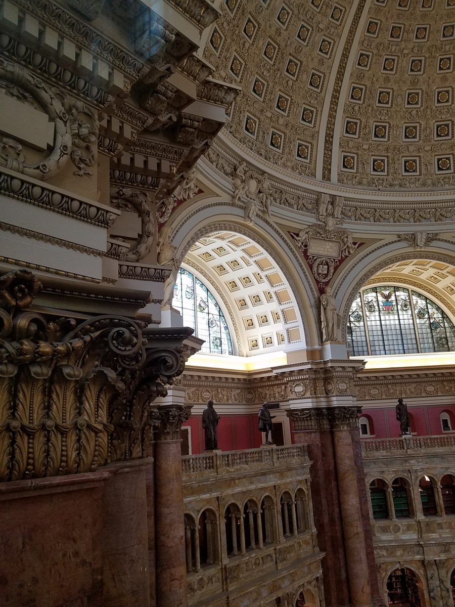
gathered in what was a most astonishingly beautiful, expansive space full of
piercing, daylight, sunbeams glancing off incredibly detailed architectural
stone carving and sculpture. Vast murals, vaults and arches in the 360 degrees
of beauty from floor to voluminous ceiling was staggering.
” Founded in 1800, the Library of Congress is the
nation’s oldest federal cultural institution. The Library seeks to spark the
imagination and creativity and to further human understanding and wisdom by
providing access to knowledge through its magnificent collections, programs and
exhibitions.” Thomas Jefferson stepped-in to save the Library of Congress
after a few inauspicious starts. Not
enough time devoted here to a history lesson – learn more at https://www.loc.gov/ – but this grand space into which we entered is
the Thomas Jefferson Building.
The focus of this blog is to share a bit of the art and
decorative embellishments of this stunning architectural environment –
beginning with the Commemorative Arch by Olin L. Warner (1844-1896) featuring a
young man to the left and a bearded elder man on the right signifying that the
process of learning never ceases…
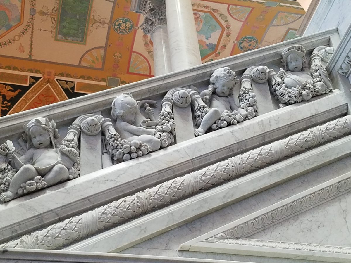
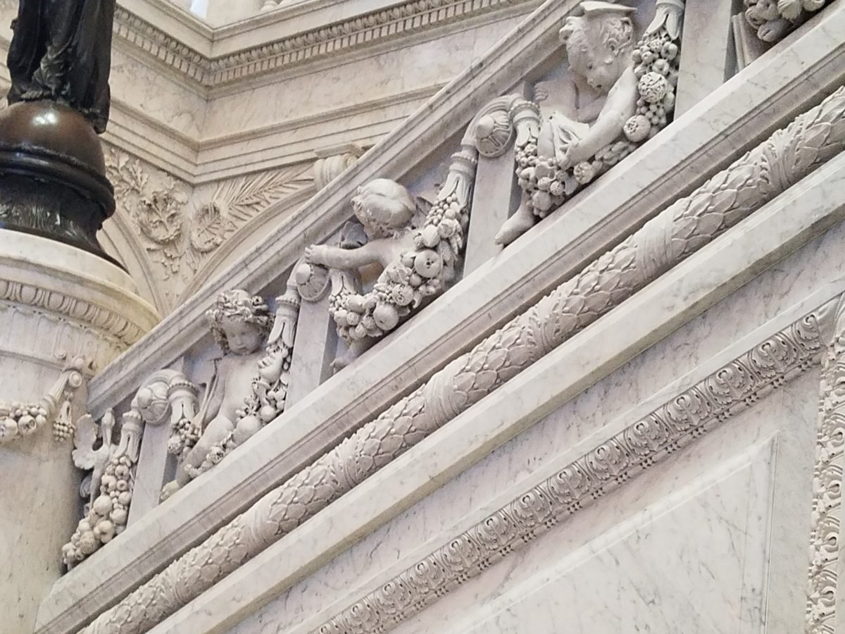
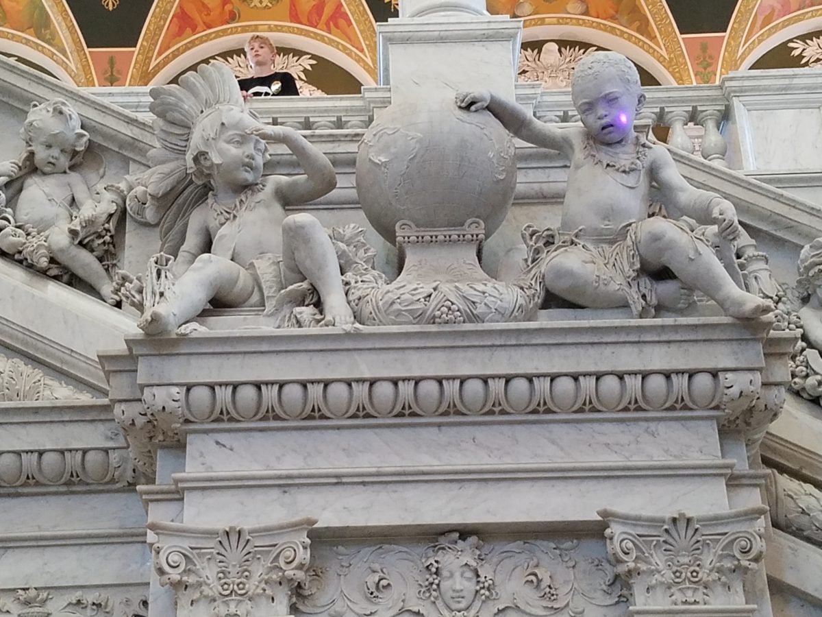
Grand staircases on opposing sides of the space are adorned
with carvings of “putti” – Italian for little boys – as they are
pictured representing various occupations from gardeners to astronomers – the depiction
of each vocation is fascinating with what it means to have that respective
knowledge to pursue one’s career path.
Beneath the string of putti are representations of the 4
corners of the globe depicting figures of each, Asia paired with Europe and
American paired with Africa.
Minerva, the Roman Goddess of Learning and Wisdom is aptly
featured in a series of statues and images.
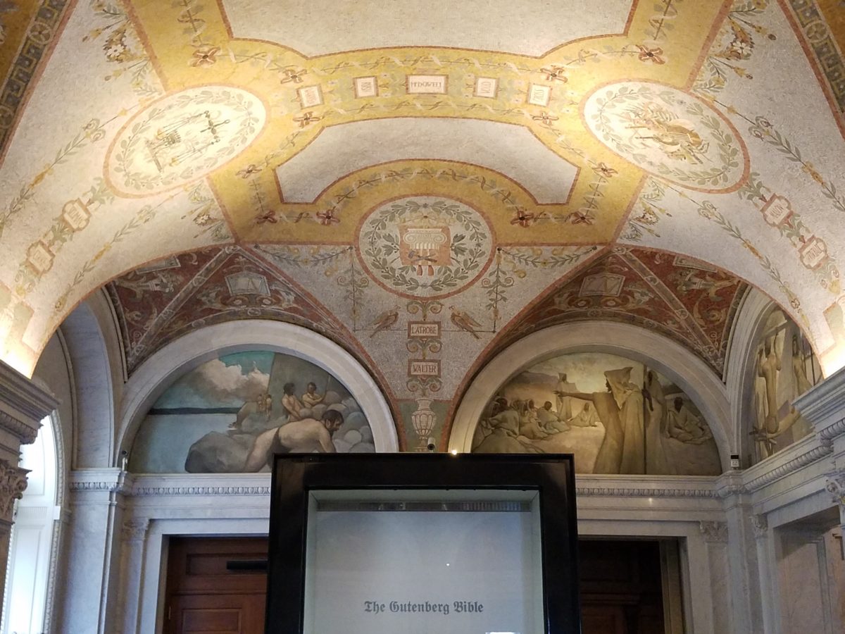
Most fascinating to me, up in an adjacent domed ceiling area
was the “Evolution of the Written Word,” a series of lunettes by John
White Alexander (1856-11915). Having previously written about the importance of
handwriting for a million reasons that go beyond, but are directly connected
to, this depicted evolution, I found this to be simple, yet profound. It is a beautifully
rendered and fascinatingly distilled artistic expression of a very significant
timeline. Beginning with The Cairn – we see them stacked stones on beaches for
fun and on paths in the wilderness as markers, but here Alexander renders
primitive man communicating by stacking stones to possibly mark the dead, a
passage or a place of significance.
As the history progresses, Oral Tradition becomes the means
of communication – but only/obviously in personal contact. Words are created.
Then Egyptian Hieroglyphics enter the scene with images representing words
depicted on surfaces.
Picture Writing on animal skin – and ultimately more refined
to vellum – becomes a more mobile means of communication.
Theologians recording ancient stories of biblical history
brought monks to the art of the written word in compilations of the Bible as
the first manuscripts/books became recorded.
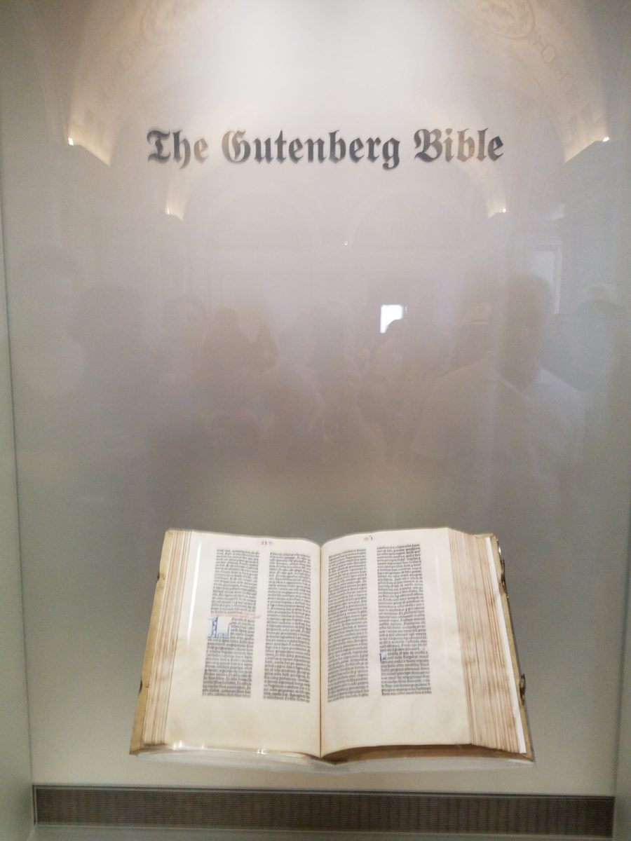
And then an exponential leap in communication came with the invention of John Gutenberg ca. 1400-1468 of the Printing Press! Asia had its versions of printing machines even before Gutenberg, but inspired by seeing grapes at harvests being “pressed,” he put that concept into the process of placing individual letters in place and pressing them onto paper. Western Europe then had a movable metal type process that increased productivity of printed material – printing the first ……in Western Europe. The tour guide sadly explained to us that Gutenberg died a pauper as his investors, not patient with economic fluctuations, excused him from his rightful place in the business and left him to live out his life only to receive proper recognition posthumously.
It is the first complete book
extant in the West and is also the earliest to be printed from movable type. This
rare version is printed on vellum.
Unfortunately, at this point in the tour, we had to excuse
ourselves with a quick wave and thanks to our guide as we were departing later
that afternoon. Before leaving the building though, we dashed upstairs to
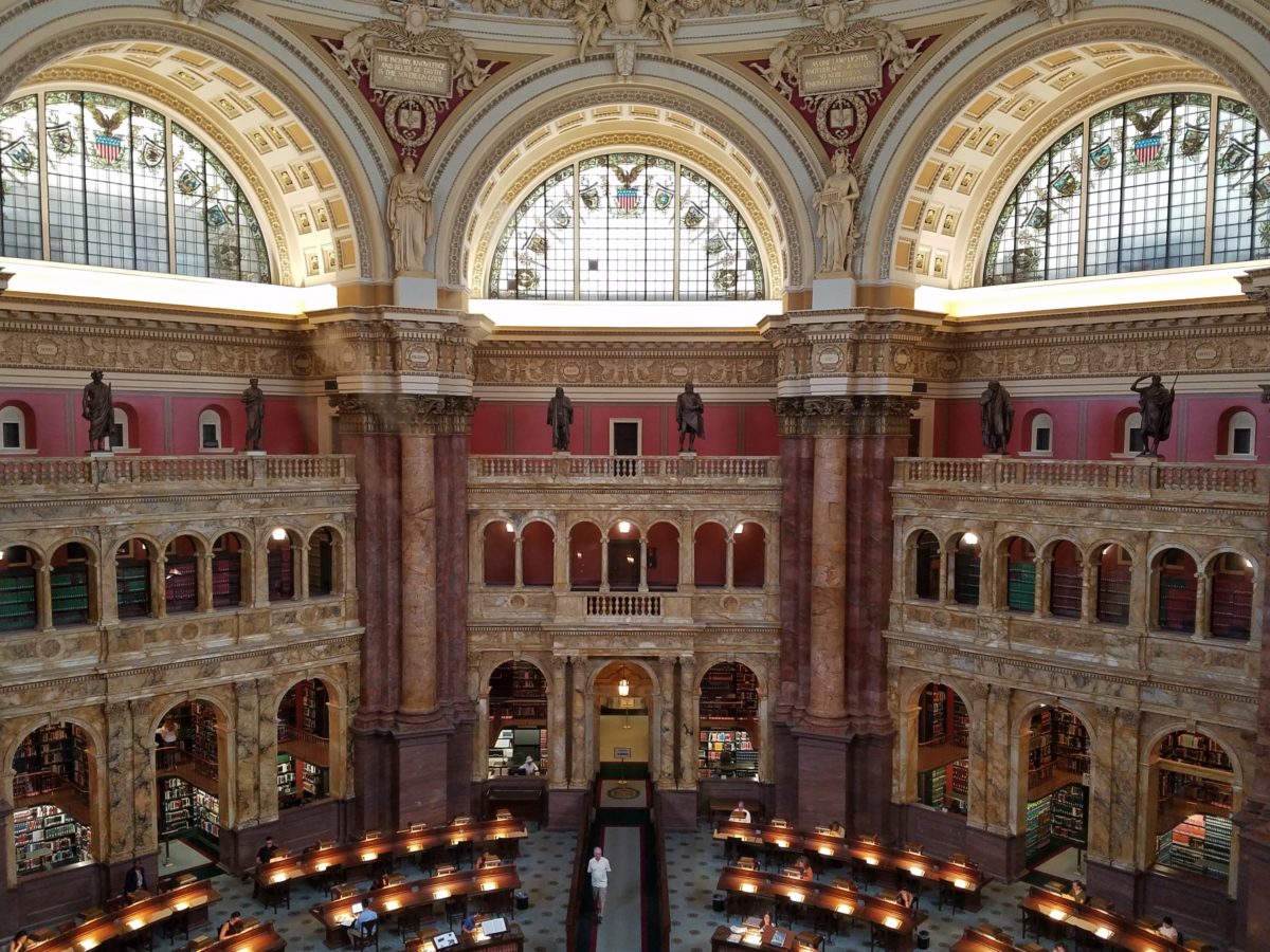
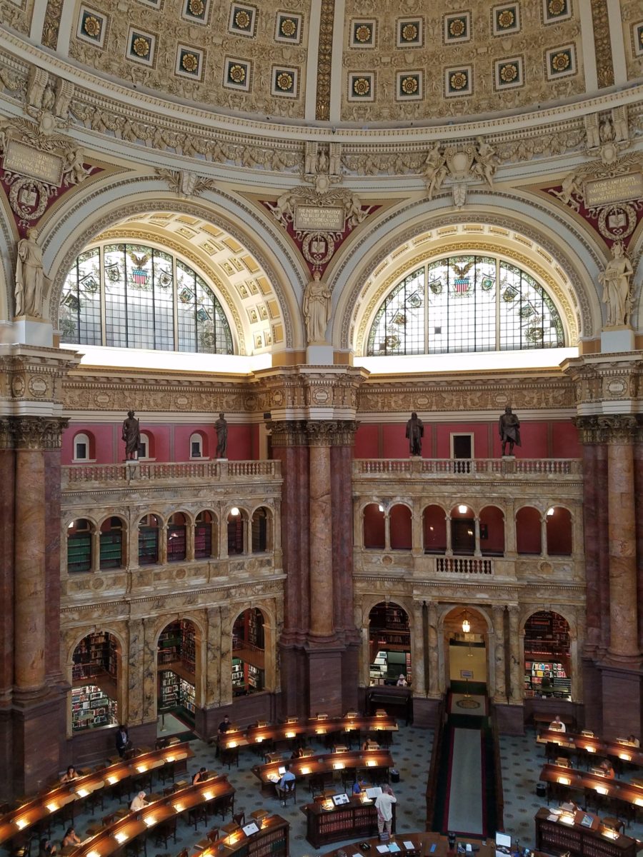
discover the main Reading Room – entering from a way upper tier, we had a
bird’s-eye view of this grand space. The scale was daunting and the spectacular
architectural detail was breath-taking. The WOW-factor was palpable!
The Reading Room.
Eight giant marble columns each support 10-foot-high
allegorical female figures in plaster representing characteristic features of
civilized life and thought: Religion, Commerce, History, Art, Philosophy,
Poetry, Law and Science.
Layer upon layer of intricate, symbolic details.
The 16 bronze statues upon the balustrades of the
galleries are a tribute to men whose lives symbolized the thought and activity
represented by the plaster statues.
Shhhhhhhhh……it’s the Reading Room
And with that – we only had enough experience and education about this incredible resource and monument of artistic beauty to whet our appetite for more and surely lure us there again for more information about all that comprises this amazing public gift and resource.
Ta Da!!! Seriously – standing there in awe…taken with my phone!
There are so many wonderful things to see and do – get out there and see it!!!
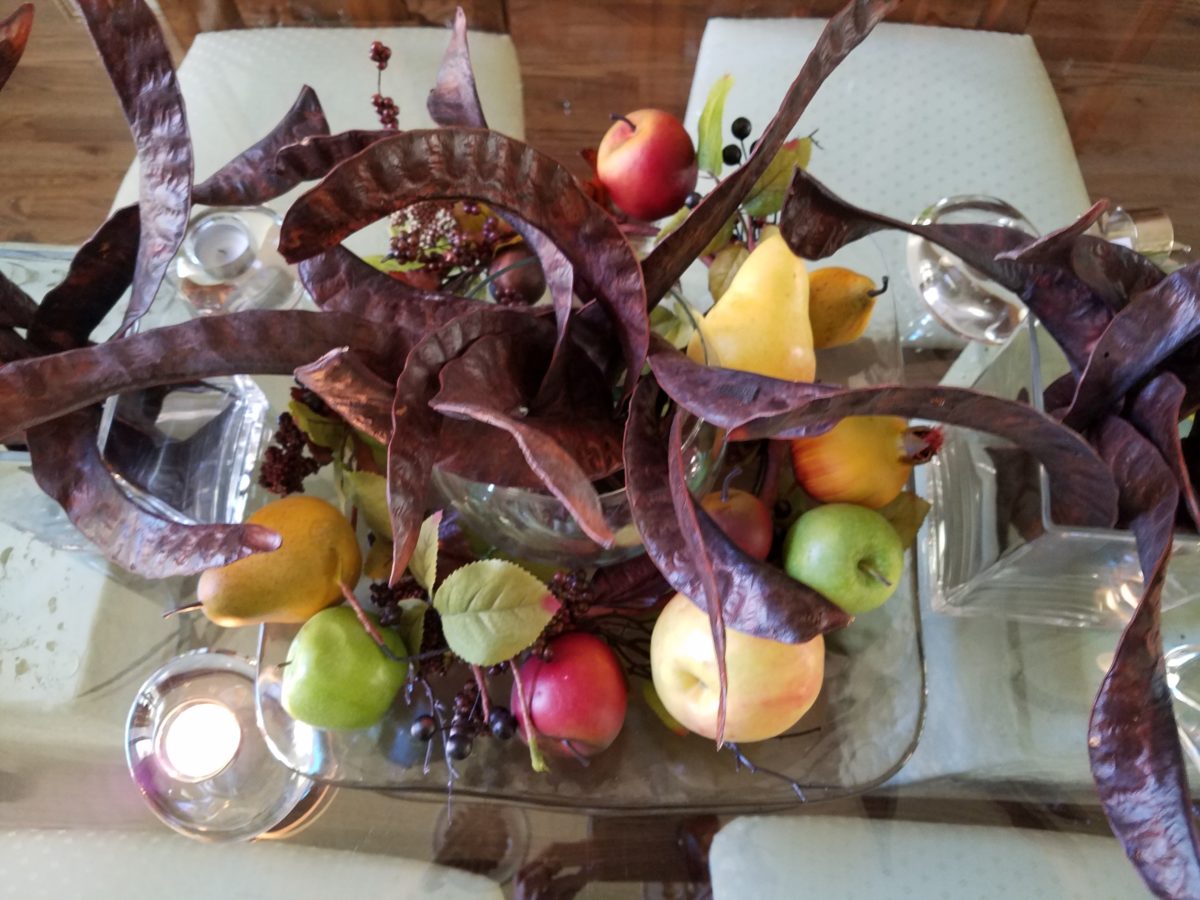
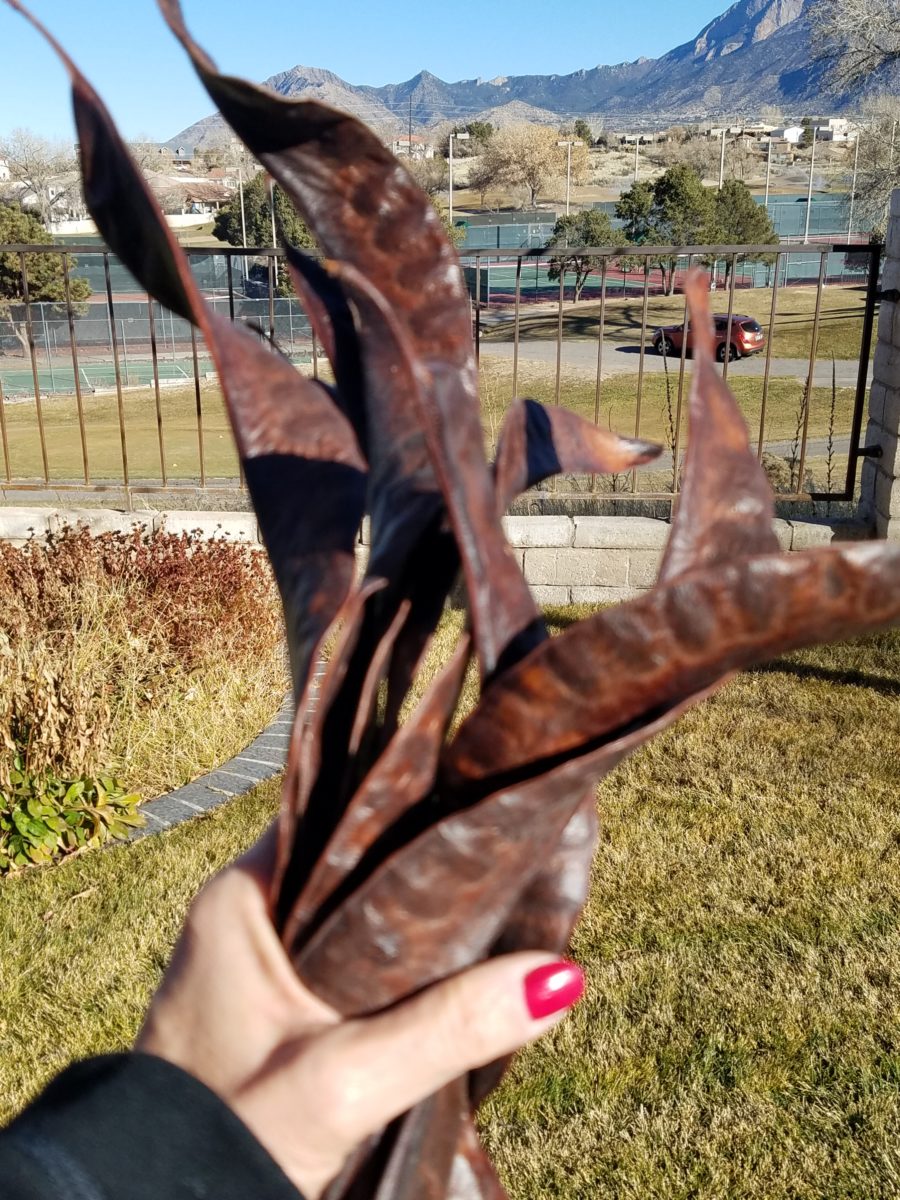
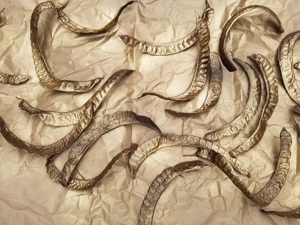
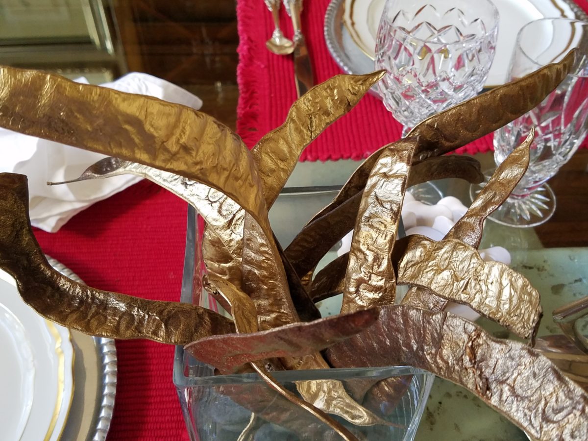
The return of the pods with a twist! Those gorgeously twisted mahogany colored Locust pods that fall every autumn and beg to be re-purposed, if not for their procreating seeds, as table dressings!!! Yes, I have embraced their raw, organic beauty for quite some time. Look back to my introduction to these handsome hulls and the first fabulous table-scape that resulted. https://patriciandesign.com/resourceful-creative-festive-fun/
The original autumnal centerpiece using the Locust pods a couple of years ago…
There have been many bouquets since. Then yesterday, as I walked my 10,000 step trek around a nearby park, I pondered the theme for this Christmas blog and another pod piece came to mind. One lone Locust tree there in the park had produced a blanket of pods that have been weathering these last couple of months – fortunately, not weathered too badly. I gathered 2 dozen of them and marched home with a purpose! Fists full and looking a bit curious, I passed several strollers wondering about my two unusual bouquets.
My idea was to tweak them from their natural autumnal brown
to a gilded glory!
Spray painting on brown craft paper – both sides – instant transformation!
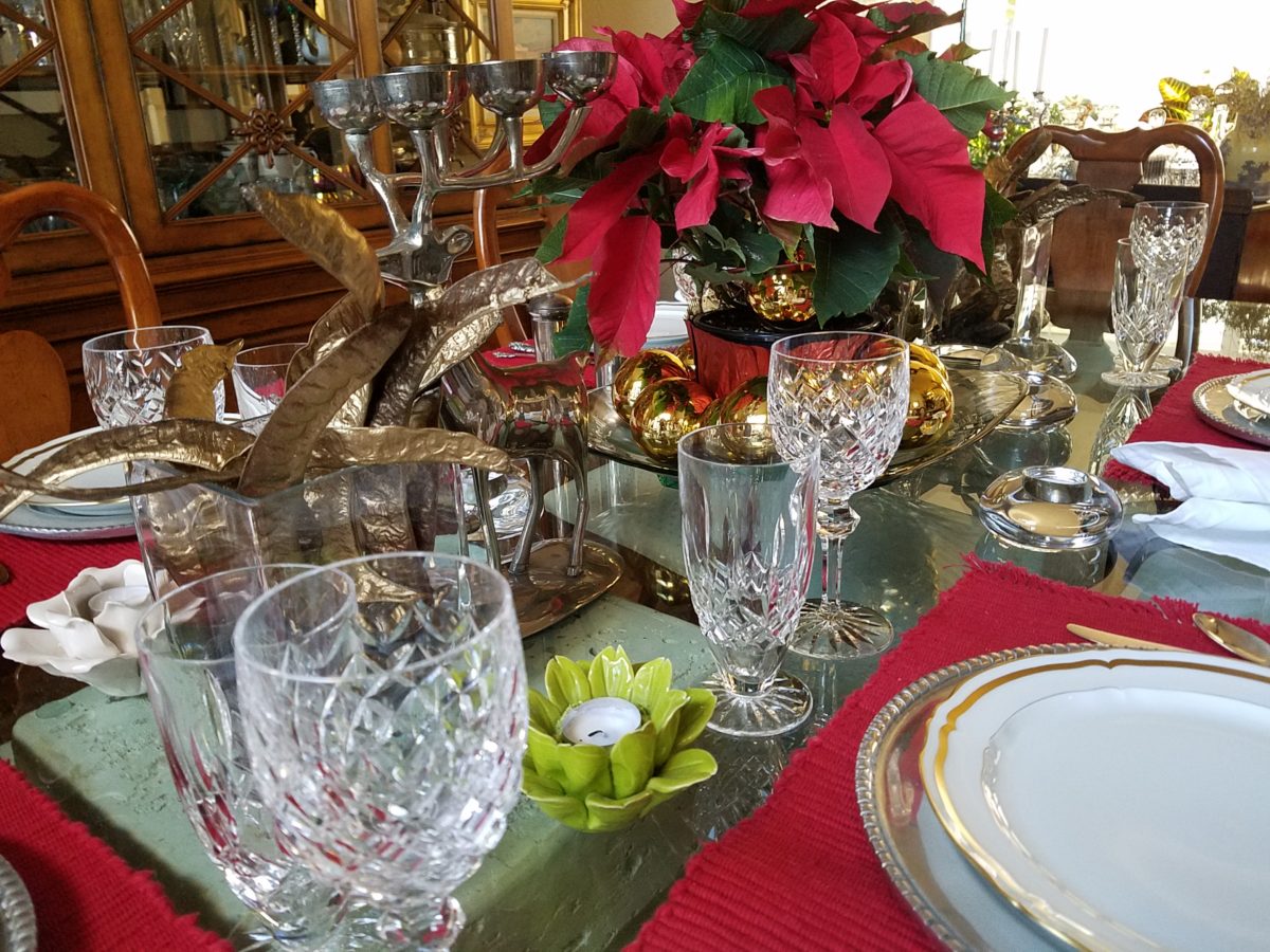
Yes, gilding the lily of lovely rich, natural pods to become wildly twisted golden spires flanking the traditional poinsettia of our Christmas table.
Building the scene as I go…
Last minute gold glass balls ringing the red poinsettia centerpiece,
Spruce sprigs from the yard.
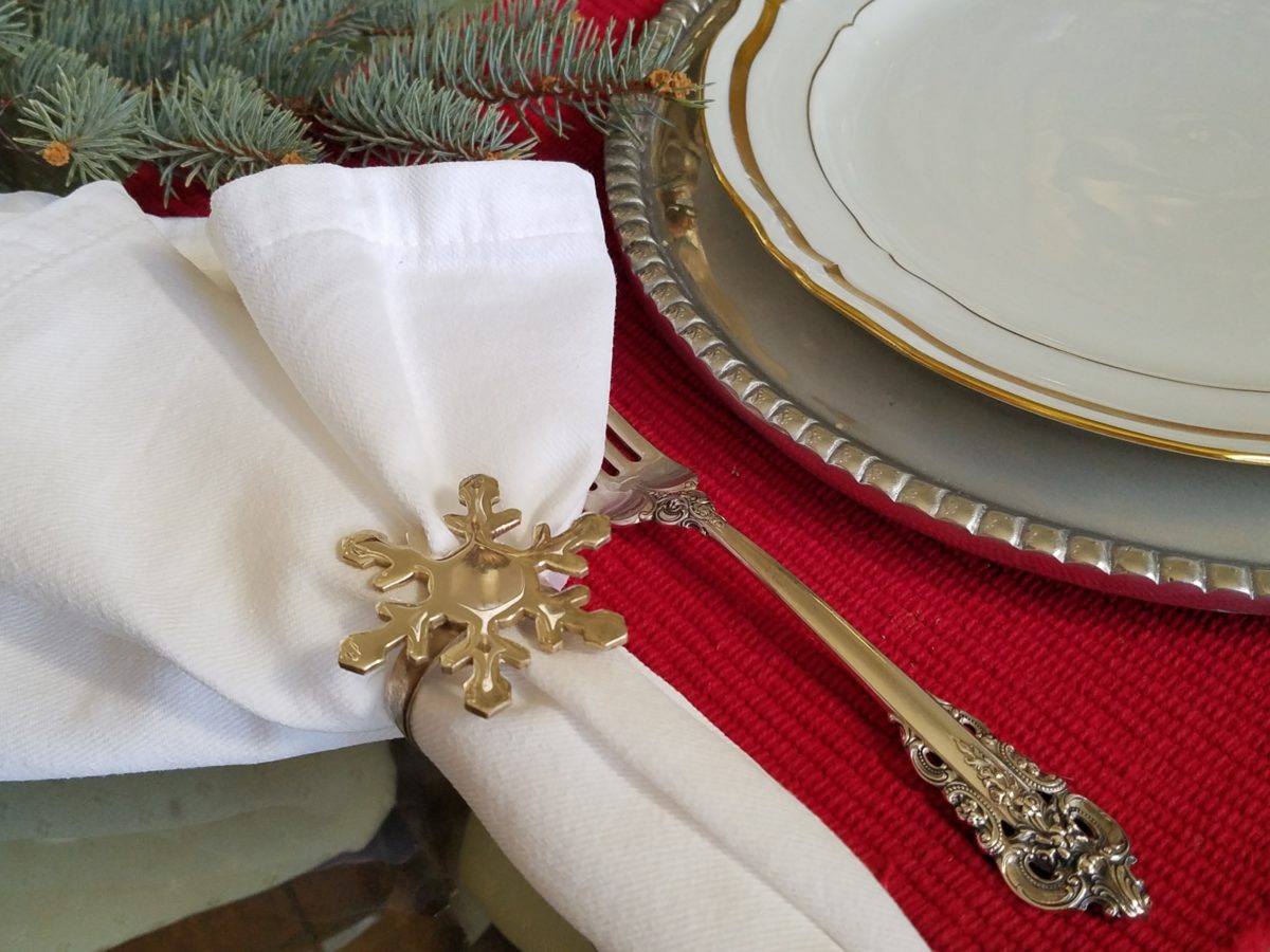
a pair of silver reindeer, silver snowflake napkin rings, blue spruce cuttings from the backyard, scattered votive holders, crystal and china for the touch of formality and we’re ready for our silver and gold, red and green, festive feast!
Mexican pewter chargers, with fine gold trimmed Limoge china, Grand Baroque sterling and aluminum snowflake napkin rings – mixes metals to the max!
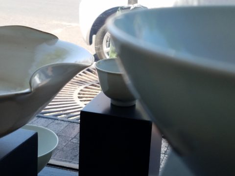
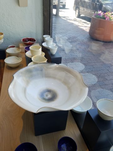
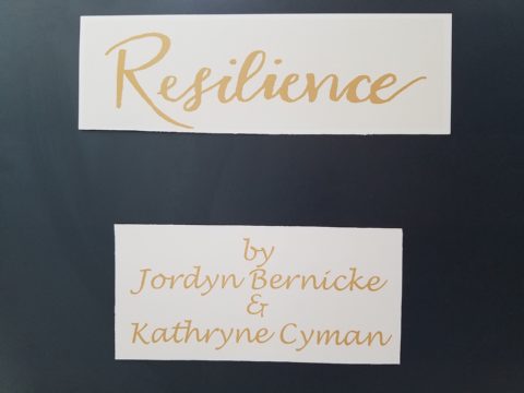
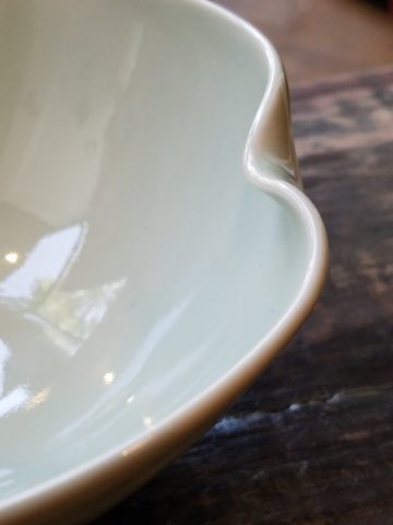
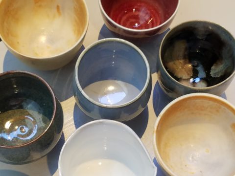
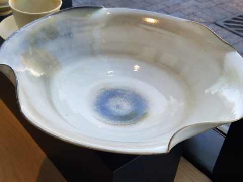
Powerfully, pretty, porcelain, pottery graces the urban storefront window this month, of the east gallery of PATRICIAN DESIGN, with elegant, functional inspiration.
The opening of this the second installation of the Resilience exhibit features a collection of porcelain pieces that is intended to be an entirely functional ensemble of art.
It’s been refreshing to have these well established artists paired with exciting emerging artists presenting their expressive talents, in the form of something that you can use and enjoy, to enhance the aesthetic connections in your daily life.
Resilience, conceived by Helen Atkins, an exciting emerging artist herself, is the manager of consignment art at PATRICIAN DESIGN.
Her concept was to “explore the experience of local female artists at various junctures if their careers.”
As a recipient of the Makeshift Grant Project, “Resilience” is funded by the downtown Albuquerque Arts & Cultural District and the Albuquerque Community Foundation. The name of this project suggests that the strength and flexibility of clay as it is formed is an analogy to similar characteristics in the course of a woman’s life. Strength and flexibility – resiliency and tenacious fortitude are the features the two share and which are celebrated with this show.
In addition to this relevant topic of women, the functionality of this collection is what is even more expansive. No gender specific appeal to this wonderful work, the idea that pulling in from the disposable practices of everyday life, strikes a universal chord.
To pull in and focus on what you have and use in your daily life is the beginning. Evaluating between pure function and added beauty being introduced as an enhancing element is the trick. Then discovering individual pieces that bring enjoyment while contributing to the function as well as the aesthetic of the scene, from an interior design standpoint, is wonderful.
Your “scene” should be exclusively personal to you and your life experiences. It is personal and wonderful to incorporate handmade artwork in all aspects of a design project. To appreciate the detail and have the opportunity of taking that artwork all the way to daily tableware is pure joy. These and other potters that we feature at PATRICIAN DESIGN offer just that – the opportunity to incorporate art into the simple functions of eating and drinking.
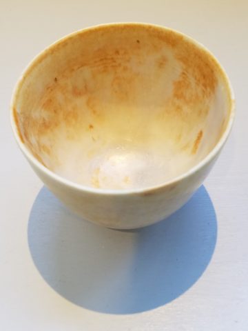
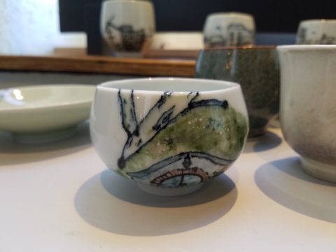
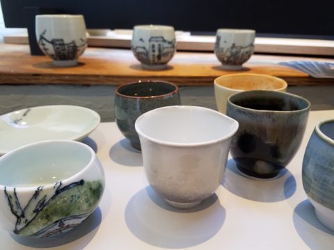
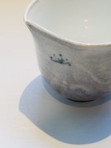
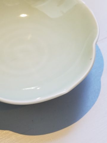
Artist Kathryne Cyman is a master of the 400 year-old Japanese process of Arita pottery. Please read more about Kathryne’s journey at http://art.unm.edu/kathryne-cyman/ Showing alongside her capable student Jordyn Bernicke, the two present simple, elegant, affordable pottery pieces for you to bring into your daily life.
Imagine the soft, delicate yet durable cup in your hand from which to sip and relax. Even to toss o.j. on the run – the basic action of drinking from a handmade vessel, in a color and finish that makes you smile, is an enhancement to the day.
Sensory perceptions ignited by the feel and the look of a beautiful piece of pottery is restorative.
We are privileged to have this exhibit and to meet these fine artists. We are privileged as a community to have this program at UNM. It appears that the natural beauty of New Mexico, life lived close to the earth and celebrated by Native Americans for generations is a parallel practice to the Arita process by the artisans in Japan.
This exhibit proves that to admire the techniques that produce beauty is to acknowledge the importance and value of including these elements in our daily lives.
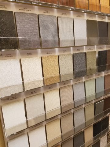
Stone. How do you select your stone? How did we become so fortunate to have so many choices? So many that we “take it for granted” or with a bit of stone humor, “for granite!!”
I’ve previously noted that trends come about as a result of changes in technology, availability, or the mere on-going need to keep creating and to keep the economy moving forward with the insatiable need for the newest – whatever.
In the early last century, plastic laminate – commonly known as Formica by both brand and composition – was invented and, over the ensuing decades, grew in color, pattern and application. It was THE counter-top material for cost and availability for generations and is still widely used today expanding its reach with quite remarkable textures, colors and faux finishes.
Stone – natural and timeless has been the luxury material – an alternative for only the rich and famous or those fortunate enough to live next door to a quarry. Stone has been the heart and the natural art of the world’s structure – the fantastic geology of our earth since the beginning and has formed with astonishing beauty and variety with the evolution of the planet. Quarried for centuries, ancient civilizations installed magnificent structures in close proximity to the source – natural resources with monetary resources at hand resulted in everything from edifices to interior finishes and furniture.
Voila – then technology and supply chain logistics made the cost and availability more accessible bringing stone into modern kitchens everywhere. Stone transported from Brazil, China, Italy and nearly every pocket of the planet offers a world of choices for YOUR counter-tops (and more). But with so many choices, how do you chose?
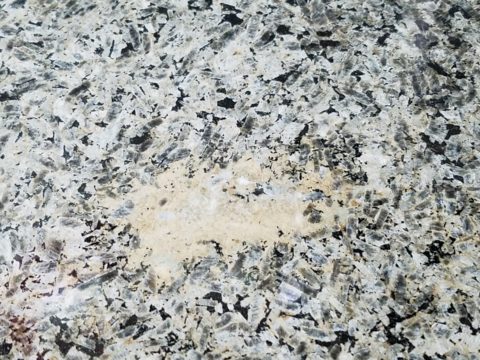
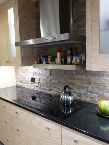
This will be a focal point of your kitchen. It is either the neutral against other lively patterns and textures or it is a matrix of color or perhaps a bold prominent swirling, sweeping statement of fantasy and magical movement. It is valuable to remind yourself that you are studying geology. Nature formed this. It is nature’s art.
Even in a tight matrix stone, irregular surprises of deposits can occur. The choice is to capture those statements adding character in your countertop or dodge them in favor of a more uniform, expected appearance. You either appreciate the wild nature of the seeming imperfections and regard them as fortunate finds or your prefer the expected uniformity of the overall look of the stone you have selected. To accomplish this one way or another is to select your slab.
When ordering from a big box store, you often do not have that opportunity – they draw from an assortment of stocking sources and you won’t have the chance to pick your slab – just your variety. This can result in happy or not so happy surprises. Stone is a natural material.
Stone can be finished in a variety of textures from very highly polished to honed and even rough leather-like textures. These features are further details and enhancements that will make a significant difference in the overall style and impression of your design decisions. It’s a big investment – study your options and combinations of adjacent materials.
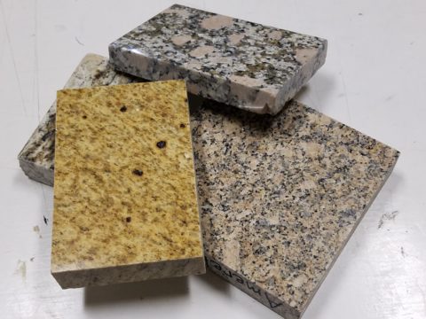
Samples of stone are just that – samples – cuttings from a slab – but no two slabs are alike. The sample you hold in your hand and place against cabinet and tile options might have a streak running trough it or be primarily one color that you picked because you loved – but the actual slab might not be that same composition.
The closet thing you can get is to have consecutive slabs cut allowing amazing pattern matching and anticipated designs. But it will slowly morph away from the specific design as the slabs are sliced illustrating the natural evolution of the stone’s formation.
When you have the opportunity, pick your slab. You can then see the actual details of the stone and more specifically you can layout your countertop template directly on the stone to know exactly what will occur where and how the finished countertop will look. In any case, a natural stone surface is a unique work of art!
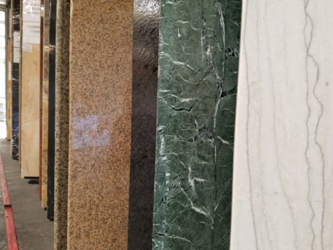
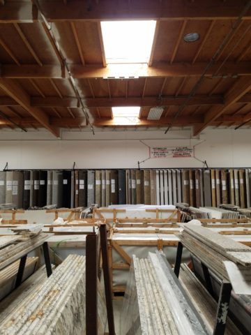
Here, a unique warehouse of pre-cut slabs all 2, 3 or 4 x9 feet. The cost is reduced due to bulk fabrication. Field cutting handles most installs while other fabrications shop can be engaged to create custom installations.
Every piece of rock extracted from the earth has its own character. From color, pattern, and mineral specks, enhanced by the process of cutting and polishing. Like a stone washed by rain, the colors are more rich and brilliant…that same stone dried has a softer dull appearance. This distinction between shiny or mat, polished or honed is another choice depending upon the context and look of the intended design. Knowing what a natural thing can become either used in its raw state or enhanced to modify its appearance is the key to more choices.
BONUS offer!!! You can have your island in a different stone for contrast or complimentary reasons!!!
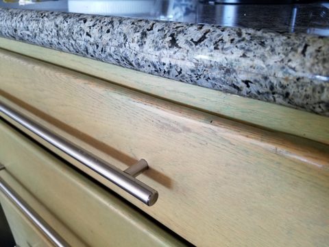
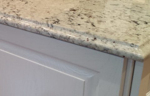
Once you’ve selected your stone, you then pick the edge detail. A few options are – square for a clean modern look,
radius for a more durable edge and softer statement. Notice the seam that results from laminating two thin slabs for a larger bullnose subtle and if done well, not noticeable without close inspection.
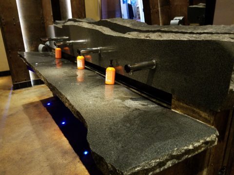
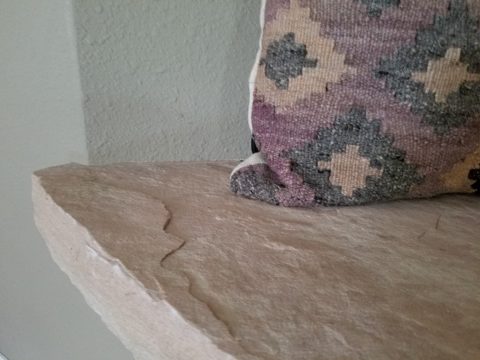
Broken edge for the rough natural look – granite (the tough choice) and also shown here, sandstone (not the best choice for a working counter-top, but rustic and great for wall caps, benches, mantles and hearths.
An ogee edge for a more formal detail.
Natural stone is durable and easy to maintain. Have no fear! It tolerates heat and is terrific for transferring hot baking pans or dishes from the stove or oven. You can chip the edge with a strong blow – but otherwise will not be easily damaged. The stain issues are nearly non-existent. While some stones are more prone to staining, others are more imperious and with improved sealants, most are warranted for anti-stain. Furthermore, stains – IF they occur, can be usually be removed/restored/refinished on-site. The only other concern might be susceptibility to acid etching which varies with differing stones. As is true with staining, these areas can often be repaired on-site in your home.
If you want to be certain of your stone’s properties prior to purchasing, use a sample and apply the dealer’s suggested sealer. Put test patches on it with things like tomato paste, citrus juice, oil and wait a few hours…wipe the sample clean and you’ll know how it responded. Each stone’s resistance to staining, scratching or etching varies with the source, composition, color and finish.
Now natural stone has a lot of competition from man-made materials, solid surfaces, engineered stone, concrete…they vary according to their fabrication, composition and finish, but most do not possess the same durability and impervious properties of natural stone. Investigate each on its own merits. There are often times when design decisions favor the aesthetic of a man-made material. As always, make your decision weighing the pros and cons.
An aside today to address a different design statement – of fashion, not interiors, I’m speaking out about FAKE JEANS. In the design field we watch trends and acknowledge the importance and validity of new design ideas, combinations, forms and functions. When torn jeans made the scene a couple of years ago, it was amusing and seemed to be a cheap, cheesy, frivolous attempt at something overly shabby chic. The discount stores were stuffed with them and the mainstream stores too.
Perhaps a cat clawed this pair to shreds? And the bottom – up above the ankle? Puzzling…
But it continued to make me roll my eyes with disbelief and when I saw well-heeled women sporting them and paying serious money for them. I was truly amazed.
Fraying at the bottom suggests that they were comfortably too long and dragged to this result…but as a crop jean? HOW might one fray up the back of their upper ankle or calf? Hmmm…
Do you have a pair or two or three? All colors? All varying lengths and tapers? How long did you hold out before you caved and found the perfectly worn pair for you? Are they just broken through at the knee or are they riddled with torn, mangled shreds of fabric? Are they lacerated in mid-thigh? How might THAT have happened?
This is a skirt version of the story. But what IS the story? High thigh wear spots…
So does this make me sound like an oldster? Read more and see what you think. It’s NOT about the frayed tears, it’s about where they are, why they are, how they look and how many they are. I see jeans that look like they have been doused with acid! How might THAT happen? But boy when it did – whew, you saved them!! And wore them to tell the story!!!
I think this might have been a bear attack!!!!!
Others are worn in the oddest places of the structure having nothing to do with normal wear and tear – totally random splotches of abraded material – defying common sense.
This jacket looks like somebody got into a bit of trouble!! Including scratch marks!!!
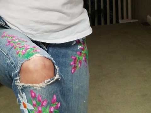
These jeans were my favorite. I loved the fit and the feel, the texture and color of the denim and they got better with age. They were Levis and are now crowding 50 years old!!!
Yes, from the 70s, these jeans were the best. And I’ve saved them out of an inordinate sense of nostalgia. When you find jeans that have all these critical features you wear them to death. And that’s just what I did! These jeans were so perfect and had no stretch to fake the fit! The more I wore them and the more I washed them the softer they became and the more invaluable they became to my wardrobe and hence, my identity. They were my fabulous freaking fashion fundamentals.
After a few years of near daily wear, these jeans began to gradually fade and wear away the darker threads in favor of the lighter cross threads of the twill. The seams and edges were breaking down. They began to show signs of possibly breaking through at the knee. They were experiencing the metamorphosis of Wabi-Sabi and I was anxious about their dematerializing. While a part of me loved these indications that they were truly my favorite as proven by these lovingly worn signs, I was facing a fear of loss.
I have previously written about the intensely thoughtful book by Leonard Koren, Wabi Sabi for Artists, Designers, Poets & Philosophers and as I write this I went into my desk and extracted it once again to find a passage that so speaks to this subject of “The Material Qualities of Wabi Sabi…The suggestion of natural process. Things wabi-sabi are expressions of time frozen. They are made of materials that are visibly vulnerable to the effects of weathering and human treatment.. They record the sun, wind, rain, heat, and cold in a language of discoloration, rust, tarnish, stain, warping, shrinking, shriveling, and cracking. Their nicks, chips, bruises, scars, dents, peeling, and other forms of attrition are a testament to histories of use and misuse. Though things wabi-sabi may be on the point of de-materialization (or materialization) – extremely faint, fragile, or desiccated – they still possess an undiminished poise and strength of character.”
“Irregular. Things wabi-sabi are indifferent to conventional good taste. since we already know what the correct” design solutions are, wabi-sabi thoughtfully offers the “wrong” solutions.” (A side note: Koren mentions regularity in mass production and designers looking for ways to express poetic artistry and sabotage perfection to intentionally create irregularity). I don’t think the endless racks and stacks of identically torn, abraded, ripped, and even mangled jeans was what he had in mind!!!
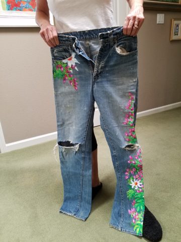
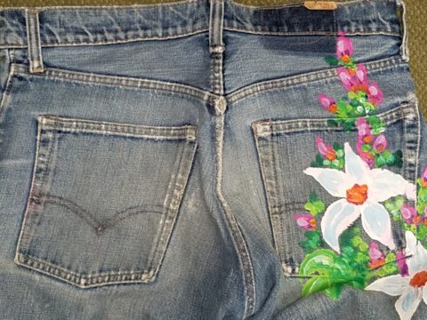
So these jeans of mine expressed unmatched strength of character impossible to replicate in my estimation and as time marched on and they gradually frayed and broke through I mourned the demise. The seams stopped the tears from severing the legs of these amazing jeans. I continued to wear them finding the badge of honest wear quite fashionably cool. But inasmuch as I loved the tears for what it represented in a life well lived and personified aging and the passage of time, I wanted to celebrate the priceless nature of these jeans and give them a revitalization without changing their character. With that I decided to add a little Flower Power, as I whipped out my brushes and paints and embellished them with hipppy dippy flowers to celebrate their age and honest wear.
Honest. I guess that’s what my gripe is about.
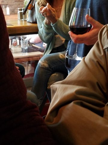
Night before last, I spied this common jean scene sitting at a wine bar. These actually look like they could have been naturally worn through in the knees, except you then see the mid- thigh rip – how would that have happened?
I doubt it is empathy that the celebrities sport the fake torn jeans off the rack. It is not empathy for those less fortunate who have torn jeans from wear and an inability to replace them due to cost. Impoverished people in torn jeans are not trying to make a fashion statement and the people who are enjoying the forced-casual novelty of looking like they loved their jeans until they ripped or to make a social statement about “I am really on your level of every man/woman” are not fooling anyone – really? Neither one flies. Neither one is honest.
And to be perfectly honest about these jeans – they don’t button today. I had not tried them on in decades. My skinny, lanky, lovely niece did a few years ago.
And as I held them up today to photo, I decided just to try. I pulled them on exactly as I remember trying not to further rip them unnecessarily, got them all the way up wriggling into the well-worn butt and they weren’t going to button together -not this week.
But I now have a new summer goal! Might I trim-up enough to button my old favs? That would be a feat! Stay tuned!
If your jeans didn’t wear out from love and appreciation, I say, “give it up!” Like the Emperor’s New Clothes, look at them for what they are and exclaim They are NOT Real! Eeeuwwwww!!!!! It’s a ridiculous, silly trend. It’s an affectation of numerous charades.
Good design. It’s in the eyes of the beholder. But I prefer to embrace the real effects of shabby chic and the ultimate wabi-sabi in fashion and interiors. Relaxed and un-constructed is one thing, but these ridiculous artificially torn jeans are beyond the pale!!! Ask me what I REALLY think!!!!!
From the Diminishing Dining Room of last week’s observations, https://patriciandesign.com/category/dining-rooms/, I decided to further the conversation to encourage a new-found appreciation for having fun setting dinner tables! I found fodder from Kentucky Fried Chicken served on formal silver platters to wipe-clean placements of dazzling designs to dress your tables. A collection of tireless designers defend the use of fine china – own it, buy it, find it, inherit it, enjoy it, keep it and use it – don’t send it to the thrift shop!!!
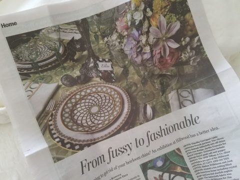
Yes, the art of fine dining seems to be set aside in favor of ease and expediency, but this article from The Washington Post’s HOME section (thank you Feath – my clipping service) brings it all home to use and enjoy. It is a celebration of art, design and playful creativity.
Not everyone loves to entertain, to create the “tablescape,” to even bother to put together an outfit to wear. Not everyone loves to get dressed in the morning – it is a chore, an obligation, a mere necessity. That’s unfortunate in my estimation. For those of us who do – love it – it is all about having fun with fashion or interior design is just that – FUN!
Last spring I began a series of emails that I blasted to our mailing list called COOK + PARTY. It was (and will continue this next season) a collection of weekly recipes paired with table-top art pieces. In our gift boutique, we represent an incredible collection of artists who create fabulous tableware. I paired a piece with a recipe each week to inspire and encourage everyone to use “functional” art in their daily lives and specifically for entertaining and even the family dining table.
Recent fodder revealed a great source for fabulous wipe-clean placemats from Caspari. For decades a fine source for the best paper cocktail napkins, Caspari offers these bold patterns and colors, prints of fine china and fabulous fabrics – re-use and easy to clean – why not?
A previous fall blog that I wrote illustrates the open-mindedness of looking around to find inspiration for seasonal table dressings. The decision for your table-top inspiration can be spontaneous – just go outside and look around!
Among the refreshingly optimistic designers that were quoted in the Washington Post article:
Barry Dixon, from the verdant rolling hills of Warrenton, Virginia, specifically points out that this process of setting your table should be fun! Don’t pull-out the same things each time – mix it up! Change it up by adding color and pattern differently with every new opportunity.
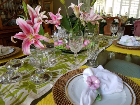
Seasonal flowers, yellow woven cotton place-mats, embroidered folk-art table runner, basket chargers beneath classic Limoges topped with ceramic napkin rings – it looks like spring!
Designer Timothy Corrigan tells us that many people find it too difficult to entertain with their best things because the onus of proper cleaning and put-away is too much! But Mr. Corrrigan points out the joy of using your best things every day – everyday is a celebration and what you enjoy should be used.
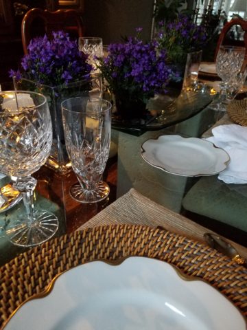
In another springtime setting…organic, rustic things with finery – black stones nestle fresh purple Campatula flowers antique Limoges and basket chargers – makes an eclectic table settings – it’snot all or nothing…it’s the combinations and scene that is being set.
Hutton Wilkinson – way out in L.A. where casual chic is the practice of distilling what migrated from the more formal sister coast to the east – noted that he believes presentation is the key to success. It isn’t so much about what is served (don’t tell the chefs that), but rather on what it is served and how it is presented. Imagine buckets of Kentucky Fried chicken served on elegant Georgian silver platters. That simple fast-food chicken becomes magnificently irresistible. You can’t say you’re too busy to cook with that creative solution! Wilkinson believes that presentation helps food taste better in addition to looking beautiful! He advocates buying china because it’s beautiful – not merely serviceable. I agree…it’s not all about the mundane purpose of eating off of it – but rather the joy of eating off of it!!
Making your guests feel appreciated and treating them to a unique, pleasing experience is a gift to them. A special treat to show that you care – going that extra distance of detail and design.
Color combinations, textures,patterns – wonderfully pleasing tablescapes are a treat for the eye. (So special Marsha!)
So don’t say it’s too difficult…keep it simple with Real Simple – the source for easy, ingenious ideas and simple truths……the following link for proper place-settings will get you started.
Not as the title suggests…tequila shots and all – but another kind of intoxication…an intoxication from unexpected beauty, sensory overload, inspiration as seen in the following photographs.
Those of you bundled up against the elements this time of year…freezing your booties off in the icy winter climes. Enjoy this escape into your unbridled imagination of design and lifestyle gone wild!
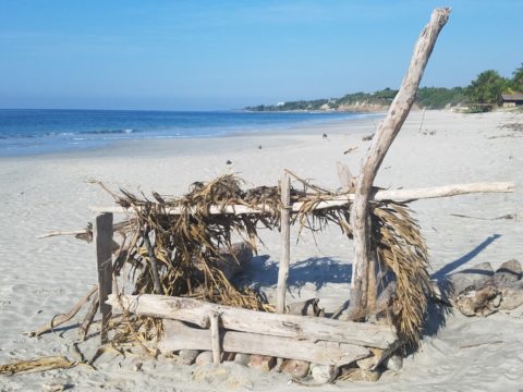
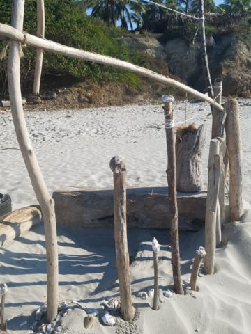
Thought a beachfront condo was out of reach? Think again. With all the DIY out there on the internet today, anything is possible. As evidenced by the inspiring framework of architecture that I have encountered just this week alone, consider the possibilities and have a little fun!!!
Very simple things trigger design concepts. Beyond the fascination I have had with these beach structures, this particular photo was bathed in late afternoon light. The glow of the orange towels was emitting a warmth that was so tropical, had it not been on a tropical beach, finding the same boldly colored and textured structure in a snow storm would have elicited a startling, contrasting feeling of the same tangible warmth.
This make-shift west-facing beachfront was so beautiful, in its simplicity, that it spurred ideas of bold fresh color, basic found-material furniture possibilities, fabric design and organic architectural solutions for patios both commercial and residential.
Imagine raw elements incorporated with concealed structural support to convey the feeling of spontaneous simplicity.
Then there’s that general calling that speaks to “the natural integrity of the materials.” You realize it is a grounding. It is a starting point of reference to all the embellishments, layers, machinations and manipulations that are possible.
Wood is wood until it is stained, painted, appliquéd…when does it lose its “natural integrity?” Even raw, man-made cinder block – CMU – concrete masonry units have their own natural character. Then stained in the aggregate or applied color, thickly coated…it alters it’s state – losing its material’s natural integrity.
What ignites design thrills? The fireworks of ideas that burst onto the scene illuminating so much that was previously obscured. It doesn’t have to be a remote and seemingly inaccessible tropical beach…it’s everywhere. Look around. See texture and color, shape and frame. Urban, suburban and rural settings in any climate all offer inspiration that can be isolated and appreciated. Design inspiration can be intoxicating.
Why is designing so exciting? Why is it often such a rush? You never know when an idea will appear or from where.
The world around you is a constant stimulation of ideas, inspirations and possibilities. You are thirsty for whatever is out there…whatever is waiting to be discovered, implemented… quench those longings. It is all about the freedom to allow ideas to be spawned from anything around you or in intertwined with your own imagination.
What fun to have come upon these simple structures on a glorious and sparsely populated beach. What fanciful design ideas and story-lines were prompted by the imaginary occupants, their creativity, resourcefulness and problem-solving simplicity. Lest you think they house the homeless adventurers, they are actually sun-shades for creative surfers and affluent sun-bathers seeking a primitive beach experience.
How might these primitive structural solutions play into a future project? Watch for design trends to incorporate more organic materials and nature’s inspirations!
Everyone loves befores and afters. Last week we featured a project that received a dramatic transformation. The trick is, you have to think thoroughly about taking “befores” before you tear into it!!! Hindsight is so often 20/20 when delving into a remodel.
I dashed over to Phoenix last month to celebrate the Grand Opening of an exciting new clinic that we have recently completed. While there I visited great friends and re-visited a wonderful residential project that has stood the test of time.
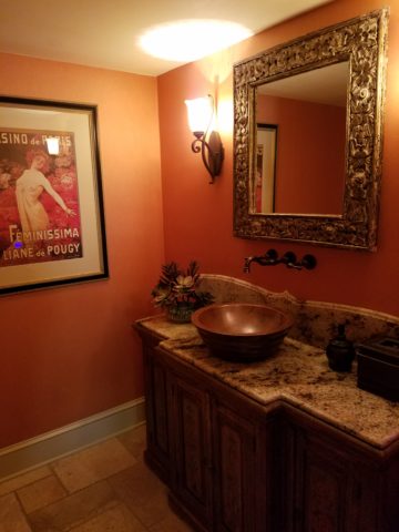
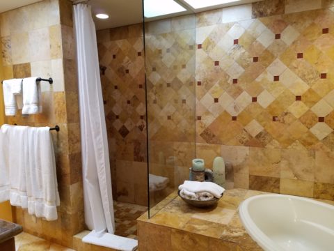
Here we have two restrooms in that same project. Rich colors of warm coral, brick and golden tones with natural materials from stone floors to counter-tops and wall treatments. It is a Spanish theme – albeit eclectic with art and decorative accessories, of this well-traveled couple.
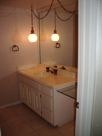
What was plain 80s’ vanilla receives a new-found richness and warmth, depth and interest. Do not be afraid of dark colors in small rooms – I’ve said that many times in the past. I’ll bet that you have seen spaces exactly like these “before” shots. Clean slates, but so uninteresting it is remarkable to think owners are content to live without personality in their anemic interior spaces. We added powerful personality and panache throughout this residence.
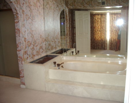
The master bath had dated surfaces and uninteresting configuration. We transformed the area by connecting, with a glass panel, the tub and shower areas. However, we elected to use a shower curtain instead of glass door. I often suggest this alternative. It is softening, less expensive, easy, minimal maintenance – less wiping!!! Watch for another new master bath with a shower curtain and glass combo.
Full wall treatments of stone or ceramic are wonderful, substantive ways to suggest architecture over mere decorative appliqué. The material suggests structural forms. It never should stop on an outside corner, lest it defeat the purpose. It is to be a mass.
So take those “befores” and enjoy the “afters.” Don’t be afraid of dark colors in small rooms, and use stone and ceramics generously without fear.
P.S. Last week and this today are of a fabulously enjoyable and successful remodel transformation done 12 years ago!!! Yes, revisiting a couple of weeks ago, I took these afters of exactly the interior that we designed that long ago. It has been a virtually timeless project. The owners have enjoyed the spaces so well that they have maintained them without any modification. So we thought that you as readers would get a kick out of the long-term success of these design decisions.


 https://www.casparionline.com/catalogsearch/result/?q=placemat