Details of Home

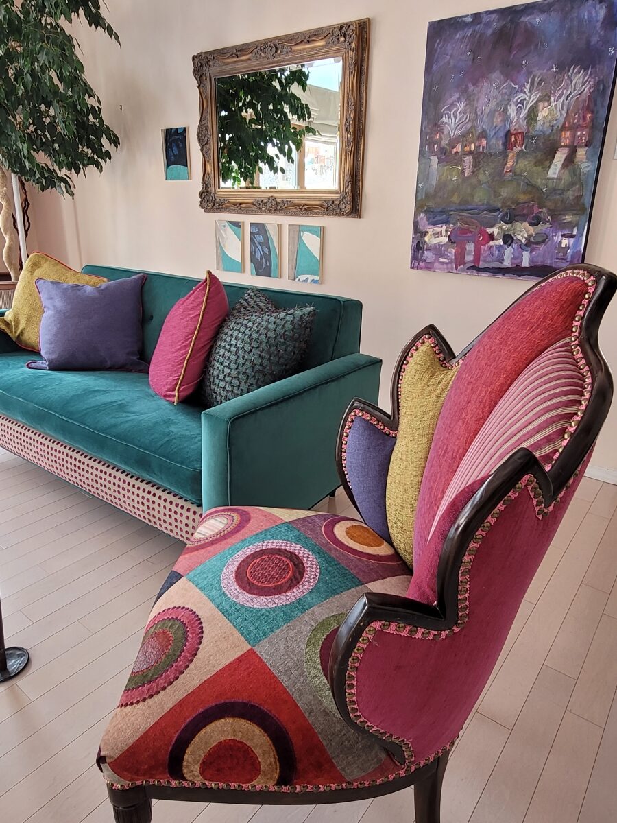
Whether a minimalist or an eclectic collector/gatherer, one’s details of home are important and personal. Like personality types, what is important to one person is not so much for another. However, it tells a story. The details of a home make it just that. Home. 

This interior has a lot of personality and very much reflects the artist who lives here. Antique family side chairs take a near full century leap with this new, colorfully eclectic upholstery.

Residences, the dwellings in which we live, can take many forms – from short-term to decades of ensconced living. To “reside” regardless of the length of time – suggests a certain level of comfort to include some detail(s) to make it “home.” 

Each home is an individually personal space filled with details that make it so.

What might YOU consider imperative elements of what you call “home?”  Consider comfort, color, ambiance, familiarity, convenience, nostalgia and perhaps just pure joy.  

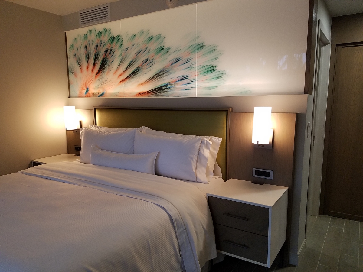
A hotel room for the busy “road warrior” traveling for business, might reveal a photo of a loved one placed thoughtfully on the nightstand. Something as simple as this can make a temporary residence feel more like “home.” 

Upon plopping the overnight bag on the hotel bed, one of the first things to unpack might be the framed photo of a loved one to place on the nightstand.

Dorm rooms will reflect personalities, pleasures, interests, colors and imagery for young people leaving home for the first time. They create their own sense of place and “home” while embarking on their new chapters of life.

While looking around your place of residence – this place you call “home,” consider what is important to you. It might be the actual architecture, quality of natural light, a collection, a piece of art, furniture, photographs, decorative accessories…

A little over a year ago during the throws of our introspective isolation, my cousin, a thoughtful artist of photography, commented from Connecticut about The Essence of Home. In it she shares intimate observations and encourages personal study of your significant space – memory or current abode. She also suggests an interesting little project in which she invites us to “take half an hour and create a photo essay of a place that has significance” to us.  “Challenge yourself to capture a feeling. Wait for the right time of day and seek out the mystery of the place. (This is a great activity for kids, too. You’ll be amazed by what they choose to photograph – what “home” means to them.) See what thing you’re drawn to capturing; become aware of the everyday beauty in the space around you.”  https://www.catebarryphotography.com/

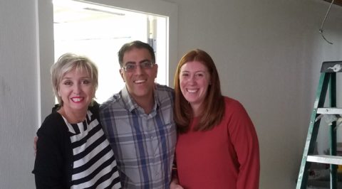
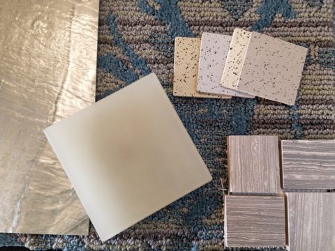
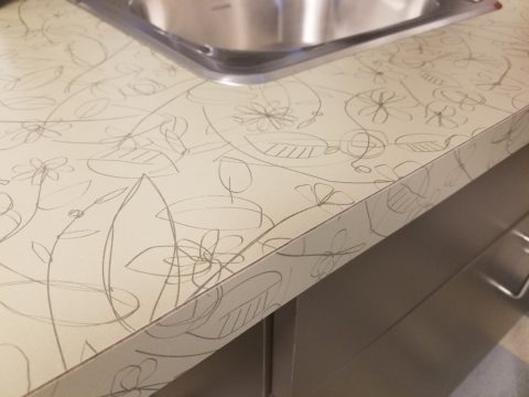
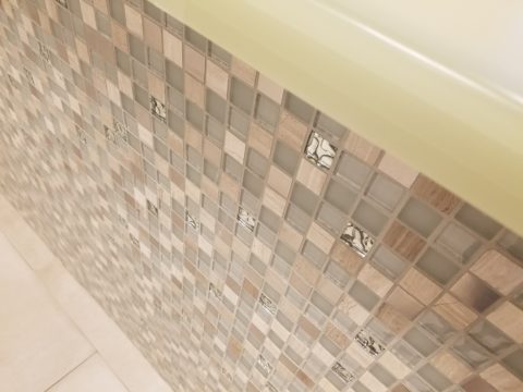
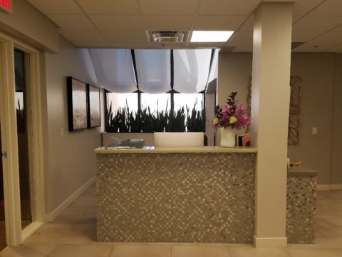
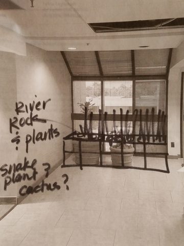
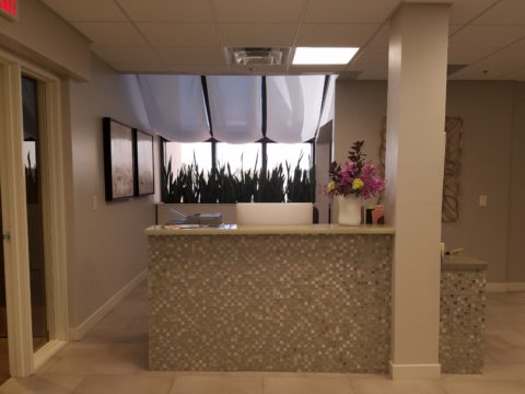
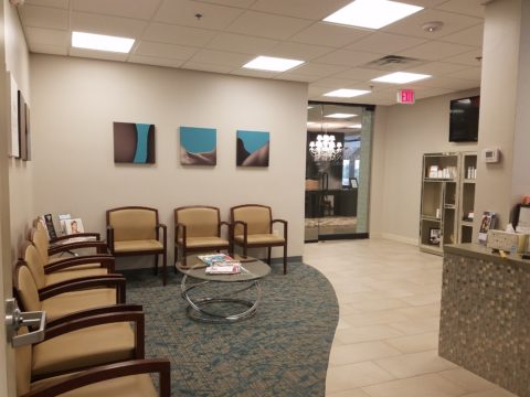
As an interior designer, I am engaged in creating and illuminating details that are meaningful. Whether a view or an object, color or finish, access or privacy – inside or out of the interior these elements collectively contribute to create the overall design. I encourage my clients to identify things they do and things they own – things they have gathered and how they live. What of them is of greater importance and why. This process begins a dialog of preference, value, and interests. Establishing priorities to springboard a project is key to a firm platform for the design. 

You know the old question…If your house were on fire, what would you want to get out? It might be a person or a pet certainly – but if it were a material possession(s), it is a question worth pondering. The same is true if you moved or remodeled, what elements would you want to retain or replicate and what would you eliminate or change?

Vintage family pieces reupholstered, new pieces repurposed, bookcases filled with personal treasures, and the precious pet in the center of the action. Home.

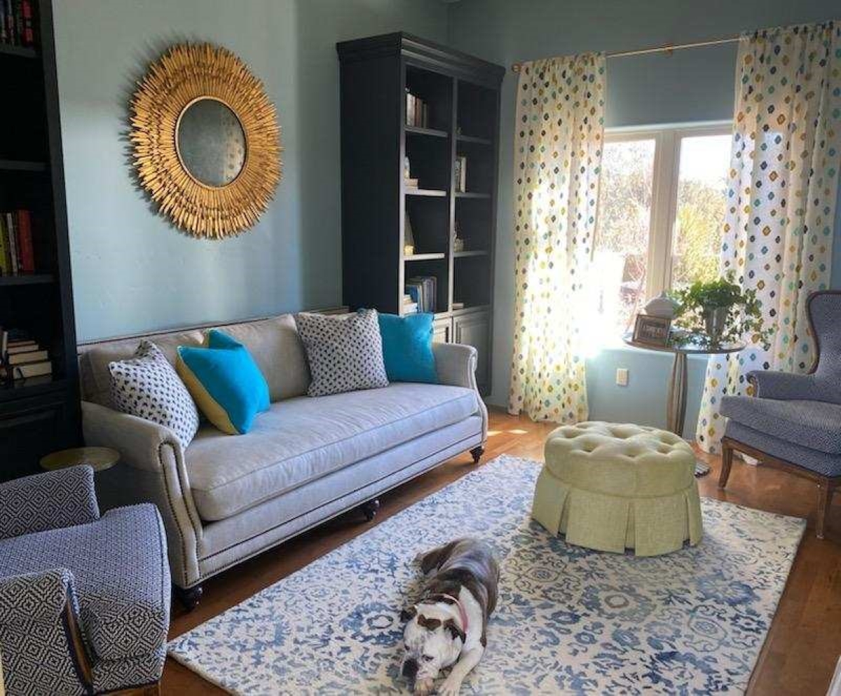
 The details of your home are personal, identifying, comforting aspects of your interior design. Discovering these important details is significant in effectively planning your interiors.

Hidden Talent Exposed

Hidden talent – that remarkable artwork that appears (seemingly) out of nowhere, on a par with great masters of the medium. I considered this element of surprise – looking back several decades to a local painter, Wilson Hurley, who had more than one very different, distinguished career and diverse life experiences before he delved deeply into his passion for painting in his 40s. Once exposed, his paintings revealed his extraordinary talents and he become a nationally recognized treasure for his sweeping landscapes and a variety of other subjects.  

On that note, I have just gotten off the phone with a very good friend, in Florida, Houston Evans. I have recently learned that he is a passionate weekend photographer! An amazing photo appeared in a Facebook post and I was astonished by the enchanting image, color and composition. I was instantly captivated – and curious. Upon closer inspection, his stylish swashbuckling  signature made me realize that this hobby was subtly becoming more than that – yes, he had his mark digitally mastered and is probably THE perfect brand for his diverse and stunning work.

“Star Power” is the luminous celebration of a pineapple.

As I quizzed him about his interest in photography, I learned that he attributes his eye for art, color and design to his mother who’s side of the family has spawned other talented artists, in his generation. He has been posting on Instagram for quite some time – hundreds of images. I didn’t know. I didn’t “follow.” He is modest about his photos and does it for his own amusement, pure pleasure and personal enjoyment – that he likes to share. “I don’t do it to imagine it on someone’s wall.” Yet this observer believes that there is where it absolutely should be! Many walls…many places! #houstonevansphotography

He plays with the medium and all the tools and tricks of the trade. He enjoys the freedom of experimentation. The results are controlled, yet spontaneous. From high resolution to fuzzy pixels that require distance to assimilate. Up close for precise detail and soft smears for imagination to take hold, the variety of clarity or lack thereof are a part of the experience and expression.  

“Makin’ Hay” has an enhanced pointillist treatment – a Van Gogh-esque subject with a twist.

From my interior designer’s perspective, his bold images would be key focal points in the drama of architectural spaces – interiors from Miami to Honolulu and on around the world!!! I can see the towering orchids in hotel lobbies, bars, restaurants and swanky condos everywhere!!! I am eager to find a project, for which his work would be the key to the scheme, unveiling a spontaneous design resulting from the inspiration of the image.

“Oblique Orchid” screams floral superiority as a commanding focal image.
“Shooting the Bird” speaks to paradise revisited!!!

In the beginning, the photos stood on their own merits. Evans keeps his originals – some of which remain just that – in their original form, while others are tweaked or more radically manipulated to create stunning subjects and compositions.

This brilliant, fresh simplicity of “Aqua Eye” observes the droplet’s reflection in the center of the cheery chartreuse petal.
Coming upon a cool caddie “Daddy Long Legs.”

I can see his limitless fantasies contributing to the imaginative narrative of Meow Wolf, gracing hotel lobbies with larger-than-life orchid explosions and commanding condo walls with magical statements of tropical color, subject and form. Translucent installations of LED illumination could result in magnificent walls of design influence.

“No Flies on Me” is a fantasy of oozing colors and form melting and melding around the psychedelic dragon fly.

The digital age is advancing with such a pace that we are all caught-up in photos of food, whacky selfies and sunsets on fire…but having an artist’s eye, to truly see the potential and master the tools that are now available – using them to create valid and valued masterpieces of art, is extraordinary.

“Copy Cat” reflections mirror a chorus of color from sky to watery impressionistic likeness.
This “Roadside Attraction” must have been a startling scene to distract dazzled drivers.

I truly believe that his work is exceptional – full of heart and soul – and spectacular fun!!!!!!!! I’m thrilled to learn of these images and now enjoy the continued progress of his discoveries and creations. Let’s see where this goes!!!!! He just might be coming out of hiding!!

Yes, his selfie – “Prickled!”

Taking Time to Observe Intimate Details – Observations from Nature

Had I planned this blog, I assure the readers that it would have been more thoughtfully compiled. However, as it is a pure reaction to recent exciting experiences, I am without much fodder that, although was before me, I neglected to document. Such as card racks full of Georgia O’Keefe greeting cards featuring prints of her magnificent work and exact pairings of the amazing landscapes we witnessed with her paintings and her magnified flowers too. Dashing in and out of her distinctive museum just off the Santa Fe Plaza bearing her name and thoughtful work (a MUST see when visiting Santa Fe), to stepping up the steps at the Ghost Ranch Abiquiu property, I didn’t document as I was too busy looking at and absorbing – so much.  Yet without prior planning, I seem to have assembled enough that surprises me and therefore has become the body of this blog, about taking time to look

The striations of color are as though painted – nature and its creator – amazing art and artist.

On this recent road trip and surrounding days in our immediate environs, I experienced inspiring images and pairings, beauty and detail, color and form…that evolved into this blog featuring the landscape and expressive paintings of Georgia O’Keefe. Captivated by the remarkable light and surreal landscape as have been so many artists, O’Keefe settled into the colorful backdrop of Abiquiu where the formations of color, sand, rock, and sky were interwoven with sparse, but all the more beautiful vegetation and flowing water carving its way through the enchanting scenery.  

Georgia O’Keeffe. My Front Yard, Summer, 1941. Oil on canvas, 20 1/16 x 30 1/8 inches. Georgia O’Keeffe Museum. Gift of The Georgia O’Keeffe Foundation. © Georgia O’Keeffe Museum. [2006.5.173] Although we did not photo this exact scene, the landscape was just as magical all around us.

Those of you who enjoy taking photos, capturing moments, items and scenes will appreciate the exhilaration and awestruck sense of this humble presentation.

An iconic land form Abiqui, New Mexico

Art and nature. Design and nature. Nature inspires artists and designers with color and proportion. The natural world is a limitless collection of examples of perfection, majesty, detail and form. Living in New Mexico presents amazing opportunities for studying so many offerings from the natural world – verdant valleys and lush bosques to towering mountains, contoured mesas, golden plains, glistening rivers and rainbows of geology rising up from the earth. The sculptural land formations are  what seem other-worldly.  And yet there they are – majestic sculptures against the sky. 

O’Keefe was keenly aware of the extraordinary world she encountered and she captured it through her eyes and expressed through her strokes with fluid sensitivity and sense of color.

Georgia O’Keefe loved and appreciated around the world for her sensitivity and ability, to capture and convey her enchanting surroundings.

Very real and hauntingly beautiful landscape of Ghost Ranch – Abiquiu, New Mexico translated into the sharp, crisp, colors and forms of O’Keefe’s paintings.

Years ago a very dear friend gave me an exceptional gift, of a book. The farther along I progress in this world and enjoy the vast opportunities to appreciate the beauty of nature, limitless boundaries of design, art and all that is produced by talented, creative, observers, treasures such as this have increasingly greater meaning. One Hundred Flowers a 1987 masterpiece collaboration of photographer, publisher, editor and scholars presents an outstanding collection representing this significant subject matter – flowers – that she took time to observe.

Up close and personal…in intimate detail she saw and rendered sensational studies of flowers. Expanded to enormous scale well beyond their reality, these explosions of color and contrast, fluid form and detail are amazing to encounter. Even in the pages of this stunning book her work is startling. In person it is awe-inspiring.

Upon returning from the Abiquiu visit, I retrieved  my beautiful book. I took great joy in the dust cover – suitable for framing. A brilliant white squash blossom captivates, before even opening the cover. As I leafed through these large format pages in this lovely, exquisitely bound tome, I realized that, within a week prior to this O’Keefe familiarization trip, I have taken photos of flowers for a similar reason as she  – stopping to look and observe their singular beauty amidst all else in the surrounds. 

Unknowingly, a couple of days earlier I captured this spectaculalr squash blossom that had survived our first frost.

Just a few days prior to the Abiqui visit, while walking among the petroglyphs at the base of the dramatic black volcanic rock rubble of our west mesa, we came upon a singular, stellar squash blossom. Having survived recent frosts, this one was luminous and brilliant among so many other spent blossoms dried and shriveled away for the season. It was irresistible.

Little did I know, at the time we encountered this beauty of a squash blossom, that I would soon revisit O’Keefe’s studies of this wild and magnificent bloom.

Here more studies from the One Hundred Flowers book featuring this dazzling white squash blossom.

In the design world, we often quote architect and furniture designer Ludwig Mies Van Der Rohe (1886-1969), one of the founders of modern architecture and an advocate for the simplicity of style with his popular phrase “less is more.”  I felt that O’Keefe’s interpretations distilled the forms of her subjects to the essential elements that best conveyed them in a manner of simplicity. Her flowers are bold and clear sweeps and contours, of the design of each. Distilling to these essential elements is the practice of “less is more.”

Her bell-flower trumpets of petunias and hollyhocks in purples, pinks and even arresting blacks reminded me of a photo that I took less than two weeks prior to enjoying my book for this study.

However, she was not sparing with color nor scale. Fabulously daring color combinations and contrasts are signatures of her interpretations along with her magnificent sense of magnification – presenting bold gifts to we, her viewers.  

The opening of the book quotes O’Keefe about her profound appreciation for a flower.

“A flower is relatively small. Everyone has many associations with a flower – the idea of flowers. You put out your hand to touch the flower – lean forward to smell it – maybe touch it with your lips almost without thinking – or give it to someone to please them. Still – in a way – nobody sees a flower – really – it is so small – we haven’t time – and to see takes time like to have a friend takes time. If I could paint the flower exactly as I see it no one would see what I see because I would paint it small like the flower is small. So I said to my self – I’ll paint what I see – what the flower is to me but I’ll paint it big and they will be surprised into taking time to look at it – “   Georgia O’Keefe “About Myself,”  1939

Be surprised. Be inspired. Be aware of your surroundings, for all the beauty of nature and its influence.  Embrace color and contrast, punctuations and accents. Take time. How might your next design project reflect observations from nature?

Designing with Your Story in Mind

Is your story important? Does anyone care about your story? And what does this have to do with interior design?

Whether you are marketing yourself or your business, your story has merit. It is about identity, branding and connecting. It is about letting people in a bit. It is about sharing history, experiences and process. It is about your unique reason for doing what you do.

For the past several months, I have been working with a client on a combination of interior design, graphic design, exterior design…it is all intertwined. A successful design laces together all these design elements. And that brings me to “the story.”

Even Facebook features a section to tell “your story.”  Yet, my client resisted presenting/using the story of this new business venture as a part of the design. He told me that was “so seventies.” That he had read that it was a dated concept that was no longer relevant. I begged to differ. For months I begged to differ! We agreed to disagree.

I believe that this is similar to many interpretations of design. What might be considered “dated” is often the manner in which it is used or done – not the thing itself. Whether a color,  a font, a style of furniture, a wall tile or wallpaper, an architectural detail or form…so many design elements are considered dated due to their context. Often, this is fair to observe. But, mix it up a bit and use things differently or with other different elements than the original trend presented and – Voila! You have a perfectly valid, even fabulous design – think outside the box!

The idea of a “story” is not unlike the “mission statement” which became a standard feature decades ago in every company’s presentation on printed media, lobby plaques, conference room walls, break rooms… Some say it is passe, but when something is good and has meaning – re-consider. Like “the story”, “the mission statement” identifies goals and intent…when paired with the story, it provides an overview of the who, what, why that inquiring patrons want to know.

So back to the story…about “the story.”  When a business or any concept is respected or liked, revered or praised, it is natural for people to wonder “How did they get started?” “How did they come up with this idea?” “What is their history in this business?” These are common questions that clever ideas or designs invite. So why not satisfy that interest, create a buzz…Let’s give them something to talk about!!!

In this world of disconnection, making connections seem all the more important. What used to be a natural exchange – of communication, ideas, sharing – is now something that has to be inserted with greater intention.

So this new business, for which I have been designing, is a barbeque establishment. There are a million. They have certain things in common. Without my enumerating them here – can you envision some common denominators that you might connect with barbeque joints? As is true with any venture, I asked: “What makes this one different? Better barbeque? Maybe. Cool interior? Hopefully. Are those the only unique traits? Is that the memorable take-away?  It certainly isn’t a bad one – the idea is to have great food – and a fun environment, but what else might contribute to the experience of this barbecue being unforgettable? What might you have, to tell your friends, to spread the word?”

My opinion was a  combination of an intriguing brand and “the story.” But before I go further, they coined a word to express their beer brewing prowess – exbeerience!  This will enter into the story as we go along.

Now maybe my opinion about their story was so worthy of consideration because there was so much to this story. That certainly helps. It happens to be a great story with layers of interesting twists and turns – riddled with history and significance. Plus, it had a local interest angle that has the potential to create a buzz far beyond their actual location.  

To begin to tell the story, I encouraged the development of a unique logo for this specific branch of the brand. Taking the lead to design it,  and incorporating it into interior/exterior design was part of my vision for a complete design package and presentation. Extracting from the story to create the logo seemed natural. The private persona was becoming public.

As we developed the logo, featuring a wood-carved graphic of an original log cabin/smokehouse, the story was recorded and edited down to a summarized version.

It was available for printed material, social media, and as art to be presented on walls. Yes, it was intended to become a decorative element too.

The Story became a focal piece in the interior along with authentic, original photos of the log smokehouse and an interpretation of patchwork quilts entitled Urban Piecework made from leftover ceramic and porcelain tiles, glass and clay assembled in wall-mounted panels throughout the interior and exterior spaces. 

Photos of the original smokehouse in North Carolina will soon be presented to further reiterate the story on the interior walls.
Urban Piecework commands the interior with bold mosaics reminiscent of patchwork quilts – an intriguing backdrop installed both inside and out.

Connecting with patrons, followers, clients, friends, family and acquaintances is valuable. As a business, it wraps who and those elements that are important to you in a familiar cocoon of context. It can instill a level of comfort and confidence in addition to sparking additional interest that might have taken longer to establish, without the introduction of your story.

The final multi-dimensional and multi-textural wall-piece featuring the story and mission is a striking 4’x6′ multi-textural panel. It offers patrons an opportunity to get a few questions answered as they enjoy their “exbeerience” at BLUE.

It was a privilege to promote, extract and produce this story and contribute such an important and valuable element to this business’s marketing and solidifying it’s new, exciting chapter of their brand.

Consider your story. Own it. Share it. Celebrate the uniqueness of your story. Design with your story in mind.

Custom Designed Art for Branding in Commercial Interiors

Designing artwork for commercial interiors offers an opportunity to connect to the brand. It means that we take into consideration the artwork as relates to the business and its identity. You might remember a blog from last year about the can wall. It was designed for a taproom. The theme was beer. The name was “Silver” and we considered that a natural off-shoot of that was the silver color of aluminum beer cans – as a wall treatment!

For that same project (in two locations) we further emphasized the brand with photos we took of their own products transferred to and stretched on canvas stretchers to be the “art” on the surrounding walls.


Fast forward to a conference room for an energy company home-based in Albuquerque – the iconic Sandia mountain being the earth’s monument – the familiar, perfect image to represent the company and the connection to the earth and its resources. For this  project, we were asked to build 27′ of custom , cabinetry and dress the wall above it.

The tall ceilings required a vertical element, but the length of the wall also begged for horizontal space-filling. As a cost-effective solution to such a large space, we decided to take a photo of the majestic mountain, separate it into 5 sections and have it enlarged and transferred onto aluminum panels for light weight and rigidity. The reviews were sensational as everyone loves and relates to the familiar scene – seen in such a colorfully explosive and expansive installation.

In response to the success of that solution, the client asked for a complimentary treatment for the opposing wall. Again, the wall was 27′ long and had the same ceiling height so we used multiple fragments in 3 groupings to center across the entire expanse. “Elemental Fragments” was born of the concept to have just that – fragments of elements in an orderly fashion – uniform yet random, to contrast against its formal geometry in response to the amorphous photographic landscape. Colors were derived from the blue, green and yellow in the scenic panorama interspersed in a field of silver.

Last week, on the day of the installation, colorful creative chaos – resulting from unwrapping the individually hand-crafted compositions and scattering them across the conference table – was part of the fun, of the scene.

The tedious work of aligning all just right, with perfect spacing and level mounting, added to the anticipation of realizing the finished product.

The luminous glass against the rich, stained wood punctuated with the  brushed stainless fasteners made a striking assembly.

Modern engineering and production, worldwide energy collaborations and shared technology coming together in a grounded environment of people and their place on the planet. A daunting system of assembling fragments of many elements that make things work to bring gas to the end users. The artwork makes the concept look easy. The result of the many facets, of the actual work and the artwork representing it, is not only effective, it is triumphal.

It’s creative fun to custom design pieces to relate to the brand, the business and the culture of a project. Bringing joy, pride and a sense of confidence in the focus of the work, to the employees and guests, is a successful finale.

Bring us your design challenge and we will design a solution specifically and especially for YOU!!!


Getting Smashed with Good Design!

Here I was walking along, on this sun-washed Sunday morning, when I came upon what appeared to be giant frog’s eggs in the middle of a field – like ET had laid enormous translucent eggs on earth – I looked up, I looked around and there they sat – tumbled on the grass…the scene was surreal and beautiful in the early morning’s light.

Upon closer inspection, guys were hauling many more of them from a remote truck, onto the field.

I started taking photos and was approached by a man who asked if I had ever seen them before. No, I certainly had not. And inasmuch as this is NOT intended to be an endorsement or advertisement – the bold name, on the side of each, stated KNOCKERBALL!

I was so excited to come upon this other-worldly landscape that I began to fantasize about the many effects of good design. I shot inside the transparent globes, along the edges, down the rows and with great mountain backdrops.


The shape, color and structural detail was fascinating and fun! The taught cords inside created another layer of interest.

The kind man who was coordinating this event explained that they set-up soccer-like goals and wear these globes crashing and smashing, running and rolling across the field – unfortunately, I had to leave before the action began. It must be a blast!

I have since learned that “bubble ball” and “bubble soccer” are other names for this new fangled game and related equipment. They are not always rented for game days, but are also purchased as singletons and used to roll down hills and other antics. So fun! Check out this site: https://knockerball.com/what-is-knockerball/

Play with good design. Get smashed with good design. Discover good design. Get excited about good  design – wherever you find it!!

Designing with the Brand in Mind

The grand opening of a project is always fun. Months of planning and construction resulting in a finished scene.

It’s not an easy path nor is it always as planned, but this project, conducted mostly long-distance, with only two field visits, is a great success.

Great clients make great projects. It’s a team effort and it helps that everyone is on the same page. The designer is a navigator, lighting the way to get to the end result. It can be a circuitous path. Like all projects, there are decisions and modifications, priorities and compromises.

Arizona Facial Plastics, having created a brand and provided a concept with which they wanted present their practice, sought an interior which instilled confidence, with the refreshing, pampering atmosphere of a spa, but with the aura of a conscientious, progressive medical environment.

In the fast-paced ever-expanding world of aesthetics, it is important to emphasize the quality and experience of service offered. In this clinic the services range from complex surgical procedures (performed off-site) to all of the cutting edge procedures and treatments desired by today’s discriminating clients. World-class products and state-of-the-art equipment and procedures are provided here, in the clinic, with quiet confidence and confidentiality.

To achieve their goals, we first focused on the brand and its style and colors. A crisp, serif-style A underscored with an elegant scroll, warm, soft charcoal compliments the bold cool gradated turquoise set against a fresh white ground.

Selecting finish materials began with the flooring and cabinetry. As is true with all interior projects, it is best to begin with the items that have the least options. There are fewer carpets and cabinet finishes than there are paint colors, for example.

We found the perfect carpet with a broadloom that provided a forgiving pattern, multiple textures and yarn colors. The complex product had an organic pattern of plush cut turquoise pile set in relief from a loop comprised of a grayed lavender and pale green citrine. Having made this selection, we then extracted individual colors of vinyl tile to compliment the carpeting in adjacent exam and procedure rooms. Gradated white porcelain tiles were used at the point of entry set against the contour of the carpeting in the waiting area creating a fluid, curvaceous transition and guiding, directional flow to the interior of the suite.

Once the flooring was selected, the cabinet and counter-top materials were next. A translucent yellow-green citrine engineered solid surface material was selected for the transaction counters at the reception desk and medical assistants’ work area. Dark charcoal plastic laminate was used for casework and select counters while exam room cabinets had a pencil-sketched floral patterned soft green laminate playing across the counter-tops.

An accent of sparkling glass and stone mosaic tile face the reception counter at the point of arrival.

Behind the receptionist, an elevated planter of succulent “sansevieria trifasciata”, regarded for it’s exceptional oxygen-producing properties, is a refreshing organic backdrop. Above, custom drapes filter light from the sloped ceiling atrium windows.


Non-representational expressions of color were selected for the wall art  throughout the space.

For the waiting room, we commissioned photographer, Katie Barry Councilor, of Smoketree Photography, to create a custom collection of abstracted body forms in grey scale. We then enhanced each image with their brand’s cool turquoise color, in the negative spaces, creating a series of artful stretched canvas images flanking their logo.

The take-away for clients is a serene, yet reverential  experience which instills confidence and promotes relaxation and rejuvenation. The subtle reiteration of the AZFP brand’s turquoise color throughout insures that the clients will be refreshed and reminded of their pleasing experience when they encounter that color even after leaving the clinic.

Hope you enjoy these before and after shots!!