How the COVID CRISIS Might Bring Change to the Housing Market…

A friend sent me one of her trade articles from the residential real estate perspective regarding how this COVID crisis might bring change to the housing market.  In the article, it touched on the size of homes, working from home, privacy in the home and smart technology that will play a larger role. Plus a nod to adding a stock tank pool to your backyard to beat the summer heat!

It’s true that this period of weeks having a close-up look at our homes – their design, function, aesthetics – has resulted in some new ideas and opinions about how and where we live. Have you felt the need for more privacy or more space?

How might Covid 19 brings changes to the housing market?

A few years ago the pendulum swung in commercial design favoring the open office/collaboration layout.  What was a new concept of open office spaces in the middle of the last century, resulted in the design and development of systems furniture flourishing.  Then the even more “open” concepts of collaborative spaces with foosball tables to entertain the staff providing breaks without leaving the building entered the scene. 
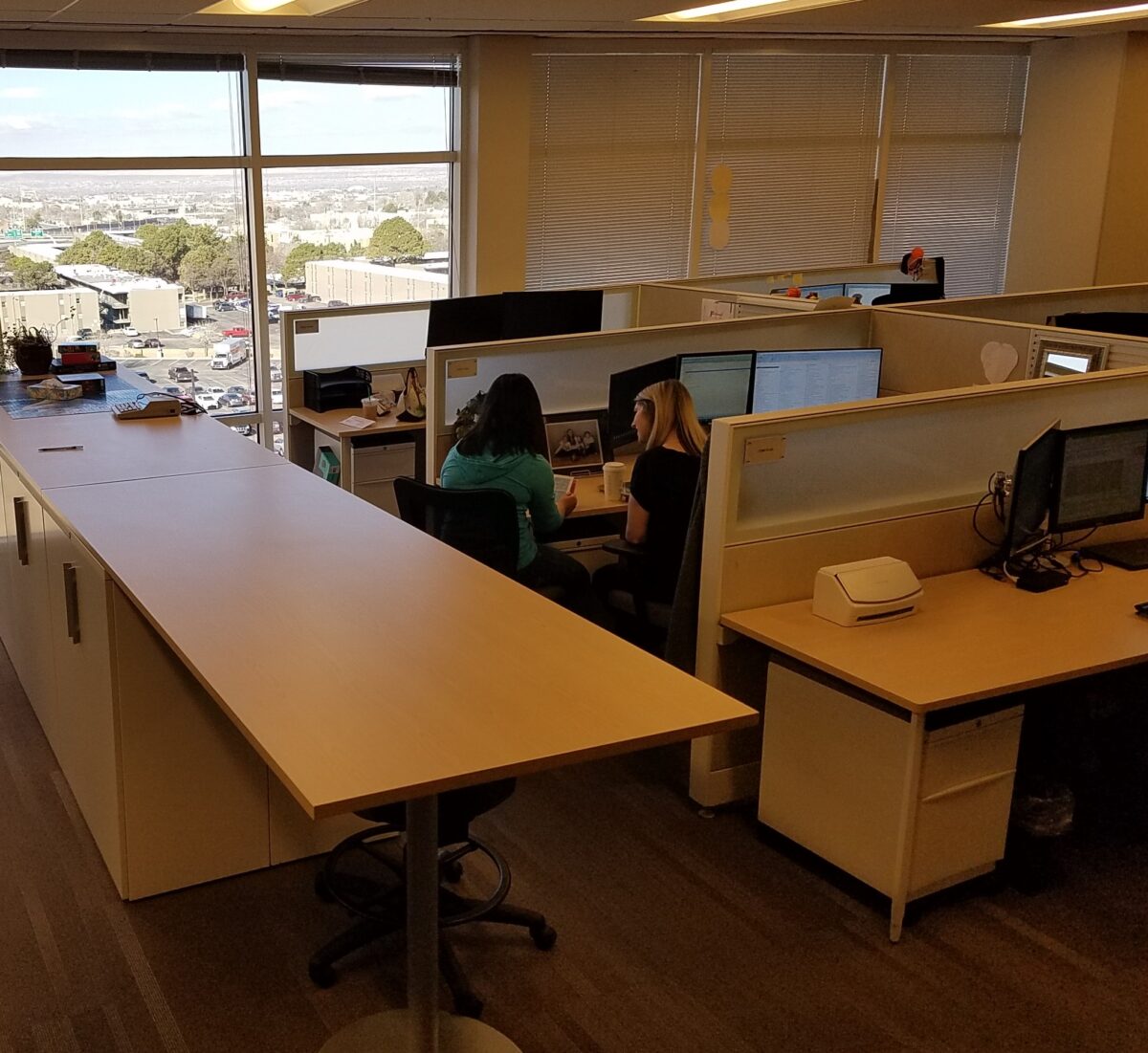
Open office encourages interaction – not as much as fully, open collaborative spaces.It maximizes space, but still omits total privacy for more concentrated work .

This has continued today as some were slower to jump on the trend and are still experiencing the “new-found” re-design of fewer private offices and more collaborative spaces.  However,  the pendulum is swinging back a bit with feedback from some employees reporting that they need more quiet space to do their work and focus away from distractions.  Having a private space can be grounding and comforting and allows an individual to worry about less and focus on more.

In a rotating office, there  less comfort and familiarity. This can contribute to distracted performance. Yet, all of this data is variable depending upon the nature of the work, temperament of the individuals, style of individual work practices, existing conditions in the workplace, culture of the business and even geographic considerations.

But as this relates to homes, many of these factors have similar effects. The real estate article notes that rather than down-sizing homes,  with more open floor plans which has been a recent market trend , they will see a rise in the desire for buyers to want larger homes, in which to partition activities. This might very well be true. Especially if working from home is instituted. The need for privacy away from the possibly over- collaborative office environment, to finding oneself commandeering a pocket of the house for their work needs, requires a design focus.

Where larger, open kitchens had become the fulcrum of family life,  the real estate article suggests that this might not be so popular moving forward.  I’m not sure I agree.  Where the article states that “the noisy epicenter”  might require re-thinking,  I believe that it will remain the vibrant epicenter adjacent to the primary living area, but that other areas of the home will be designed to provide needed escape and privacy.
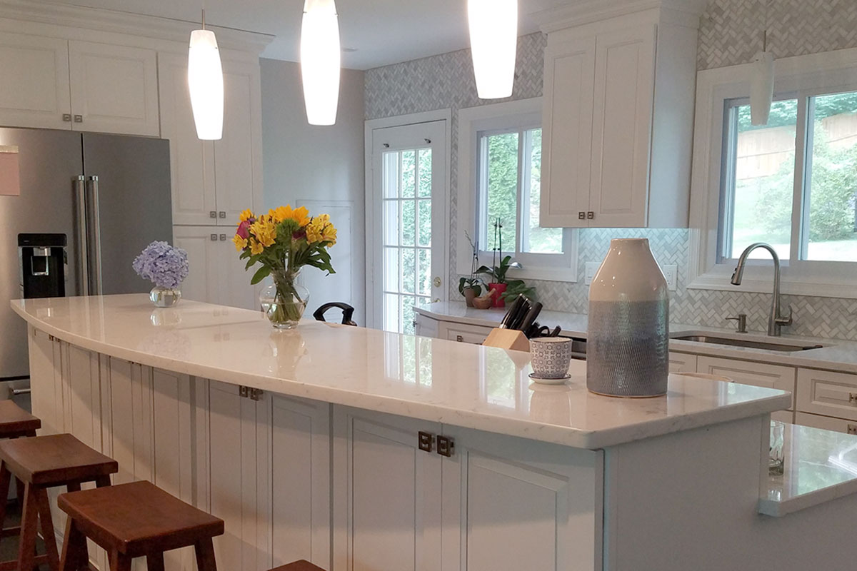
Too much collaboration and collective living/working can result in a desperation for private spaces. There seems to be a cry for balance. Where we want gathering spaces for the family to be together for meals, games, movies or projects, the confinement with family, although precious and priceless on the one hand, has also proven that there is great value/need in private spaces. 
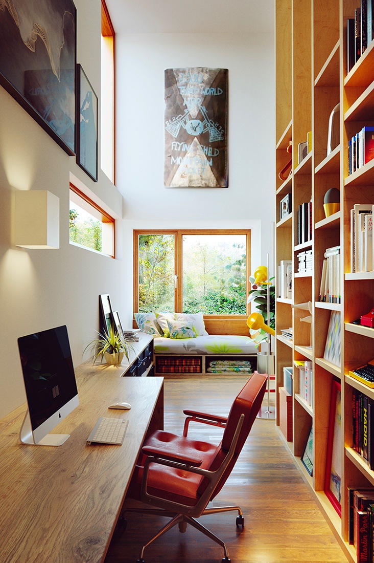
Home-designing.com is a great resource for visual ideas. Here a cozy reading nook with office/study space and going vertical, to best use the space, are tall shelves. They can also make room-dividers when partitioning off private spaces! Lots of natural light connects inside spaces with the outdoors.

Partitioning spaces within an interior is something we reference as “zoning.” We design “zones” to offer certain tasks or activities to take place separately from others. Sometimes this is partially divided by low walls or screens and other times the need for complete partitioning – as in separate rooms – is in order.
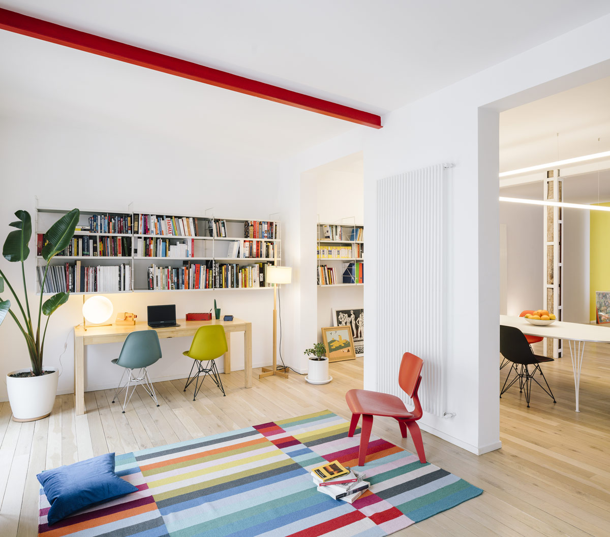
Another creative space from home-designing.com featuring a double workspace, partial wall partition to “zone” spaces. Color “pops” are fun too!!!

The ever popular Jack and Jill bathroom might connect a bedroom with a separate study – a bedroom suite rather than merely a pair of bedrooms.  Study spaces will play a more important role as more on-line options for schooling are made available.  Learning and working from home have been eye-opening experiences. Privacy is paramount when trying to focus on your work.  Study spaces can be single rooms dedicated to this purpose or pockets in the home – converting closets and beneath stair areas for small desk spaces and study nooks.  Slivers of garage space might be opened to the indoors. Unused attic spaces might be captured for loft-like openings up and away.
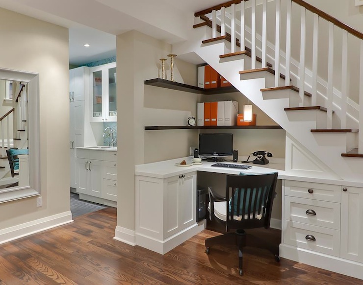
Decorpad.com is another great resource for creative space-planning and design ideas. Here Leslie Goodwin shoots this valuable space which is captured to carve-out a home-office.

Space-saving and consolidating furniture pieces like bunk beds – going vertical to better utilize the “real estate” in bedrooms, etc.  Valuable square-footage will be captured and used creatively – much like clever design efficiency on a boat or motor home. Space is precious – let’s use it wisely.

Back to the kitchen being the fulcrum – multi-tasking can also be a result of this confined at-home mix of activities and responsibilities. At certain ages, parental assistance is necessary to navigate the studies and coordination with the on-line programs. The kitchen has been and becoming more and more a classroom/study hall. While older kids might just want to be in the center of things while they don their headphones effectively separating them from much of the surrounding activities, still keeping them in the mix, others are actively sharing their lessons with their at-home parent/teachers smack dab in the center of the activities.

Larger homes –  rather than downsizing to smaller can allow for multi-generational  living. College kids studying on-line rather than going away might return or stay at home.  Grandchildren requiring day care might be with grandparents part of the time.

Conversations centered around energy conservation with the desire to have a more open connected feeling with the outdoors can seem contradictory; but technology has advanced window, skylight, door, and many different translucent and transparent panels, to bring the outdoors in!
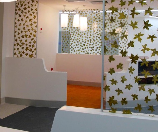
Lucere resin panels can be used a limitless commercial and residential settings!!

Residential design might be enlarging, partitioning, adding light and connections to outdoor living. Therefore,  sharing the joy while providing space, privacy, healthy circadian rhythm and connections to expanding to and enjoying the outdoors.

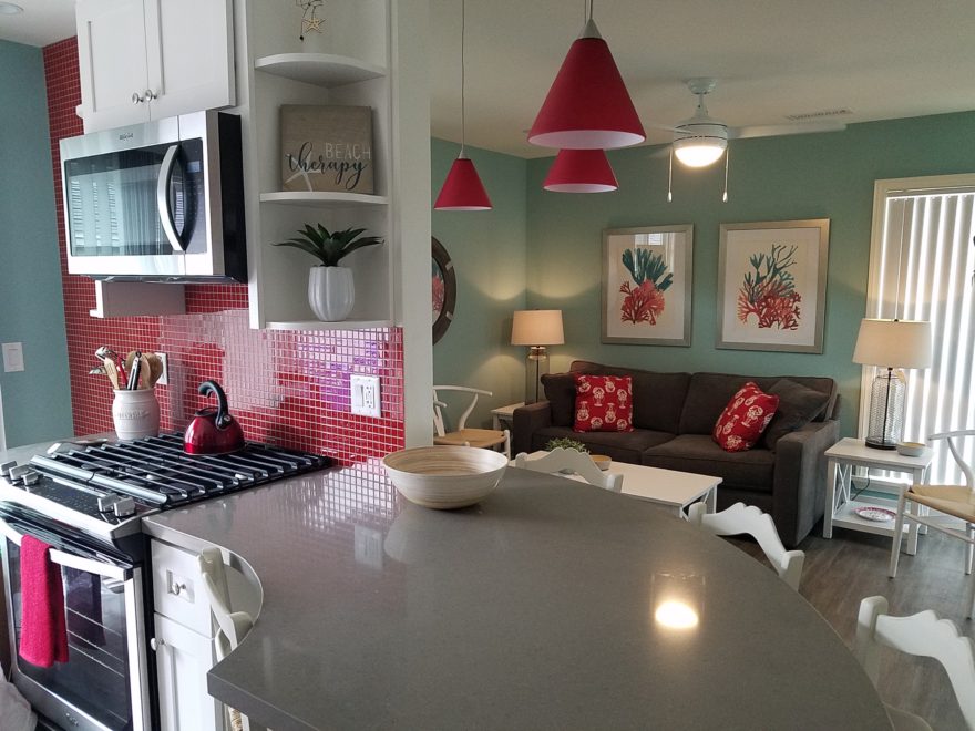
Designing a Cool Theme for a Vacay Rental Property

When designing for a vacation rental property, the first order of business is to select things that are durable and easy to maintain. This means finishes to furnishings. I know this from practical life experiences and also working with commercial/hospitality interiors. To do so, one needs time to place and receive the orders with enough contingency for mishap. It is also dependent upon the housekeeping arrangements planned for on-going maintenance.

In this recent project, the work began 12 months out – plenty of time you think…but it was all about the physical remodel. We began with the drawings for floor plan re-configuration and specifications for new lighting, cabinets and finishes throughout. The decision to furnish was not made until nearly 10 months later with a deadline to complete in less than 7 weeks. The delay was partially due to an indecision over how many of the 4 units (all on one floor) were to be short-term or long-term rentals. Then a new city ordinance imposed a moratorium, of sorts, on short-term rentals and while that was tossed about over several weeks…more indecision ensued.

It’s a riot to see overnight design projects transform interiors in 24 hours. That’s due to a free-reign for design decisions, a team(s) and vehicles to pick-up/deliver, all trades on deck, a single director calling the shots and an organized chaos that results in a magical finished project – yes, like magic. Open your eyes, be stricken with awe, cry a little and exclaim repeatedly that you “just can’t believe it!!!!”

Real life is generally not like that. Real life has in-put by owners, limited schedule openings by the various trades, little spontaneous decision-making and fleeting time riddled with unwanted surprises and delays. Real life, in this case, was a theme provided by the owner, a preconceived “look” developed in the mind’s eye and scratch paper of the designer during the selection of finishes and floor plan modifications and vacillation for several reasons, of what units to furnish and when. Over the course of a year, leading up to less than the last 30 days, the project was to be fully furnished and finished – ready to rent!

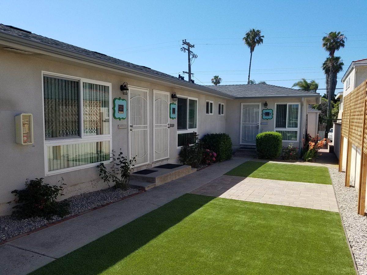
The good news is that with controlled frenzy, changing availability of products, focused efforts and teamwork, we are pleased to present the Lobster! Completed all but hanging the TVs by the requested July 1st deadline, it is beautifully appointed and offers a colorful and a bit whimsical, spacious, clean and did I mention  enviable location- 2 blocks from Pacific Beach in San Diego?

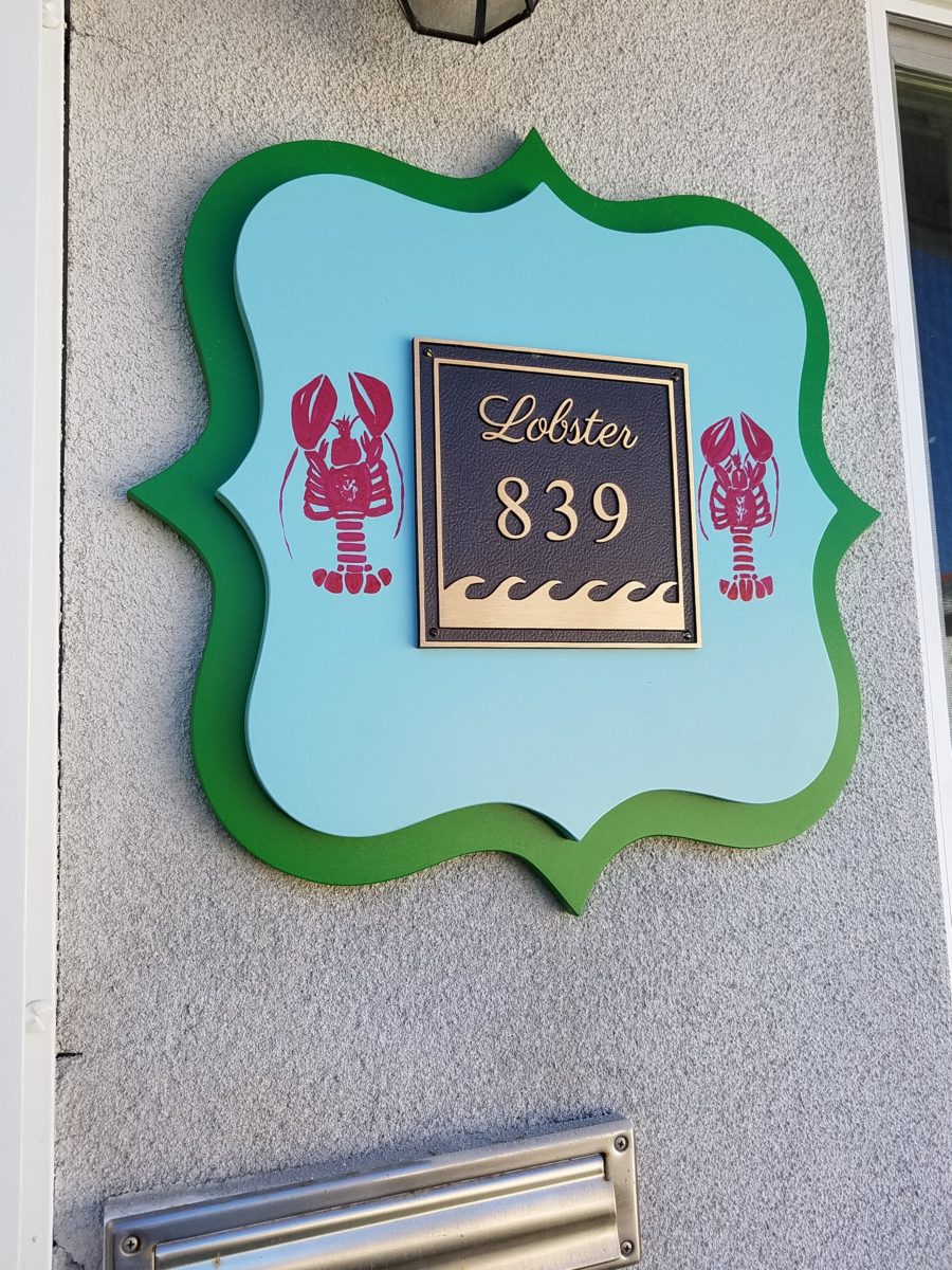
This entire project, except the move-in this last week, was done long-distance with the owner in Maine, her management company SHORE on-site in California and we the design team in New Mexico. This is not at all unusual, but Maine prompted the owner’s desire to name the unit Lobster. Not your spiny lobster from the local waters, but the New England version from the Atlantic with the classic recognizable form that accompanies the imagined crustacean – including the brilliant reds of the often appreciated steamed version!!

With fond memories of her childhood helping her elders maintain this property, the owner wanted to commemorate the building with an entry plaque visible from the street on the new redwood gate (soon to be completed). In addition, we suggested an individual name/theme for each of the 4 apartments which were all initially designated as fully-furnished short-term rentals – hence the bold identity for each!   I designed the new name plaques and had them fabricated by Artistic Bronze in Florida. The backing was built by our talented Enrique Jimenez, in New Mexico, and all shipped to California. Bronze was selected for its timeless presentation, handsome durability and commanding respect. Parisienne was the font I selected which may now be used to identify the property as though a logo to tie-in with the on-site signage. Subliminal cues that are recognized even slightly are effective reminders and triggers for recognition. The idea was intended to offer a fun, but lasting, introduction and identification which was to be reflected in the interiors. The Lobster was the largest unit with 2 bedrooms. It was ultimately chosen to the be one fully-furnished unit and owner’s second home when visiting the area.

For budget and availability, we sacrificed certain durable features that would have been better long-term investments, resulting in some knock-down furniture that was never intended for much abuse. Fragile painted table surfaces – for example – better in laminate, wood or stone…but time will tell.

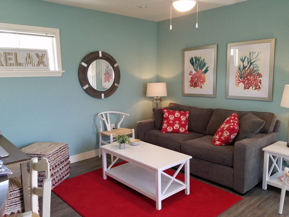
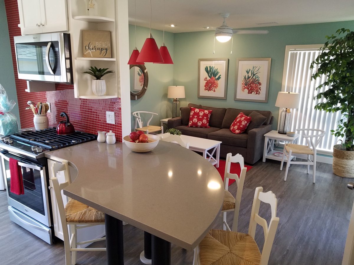
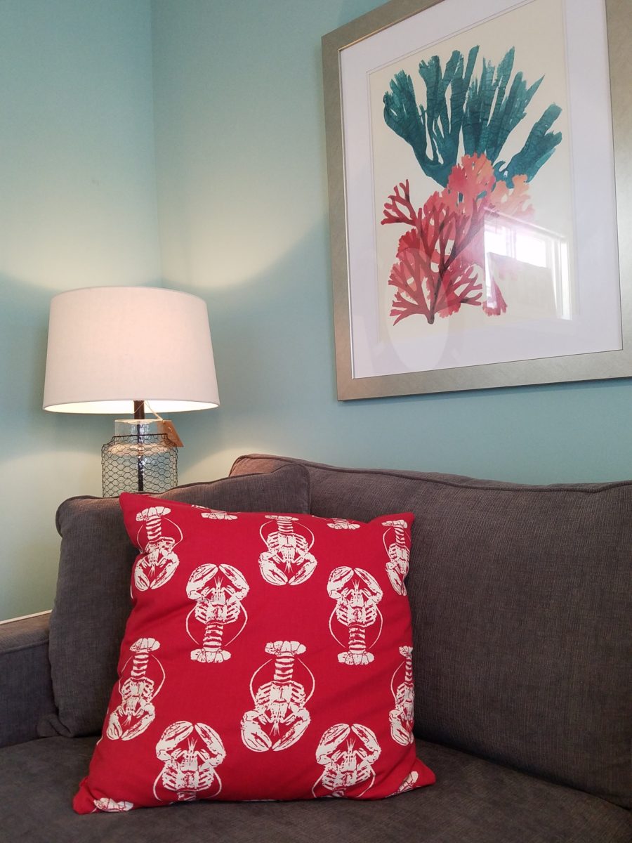
The look is clean and fun, colorful and beachy – with a slightly up-scaled twist. Cool aquas accent a few walls in the otherwise crisp white interior. Red punctuates effectively in lobster accent pillows, decorative accessories and the full-wall mosaic glass tile treatment in the kitchen. Yes, once again, we like to treat tile on the walls as not mere back-splashes, but wall-covering full height and width!

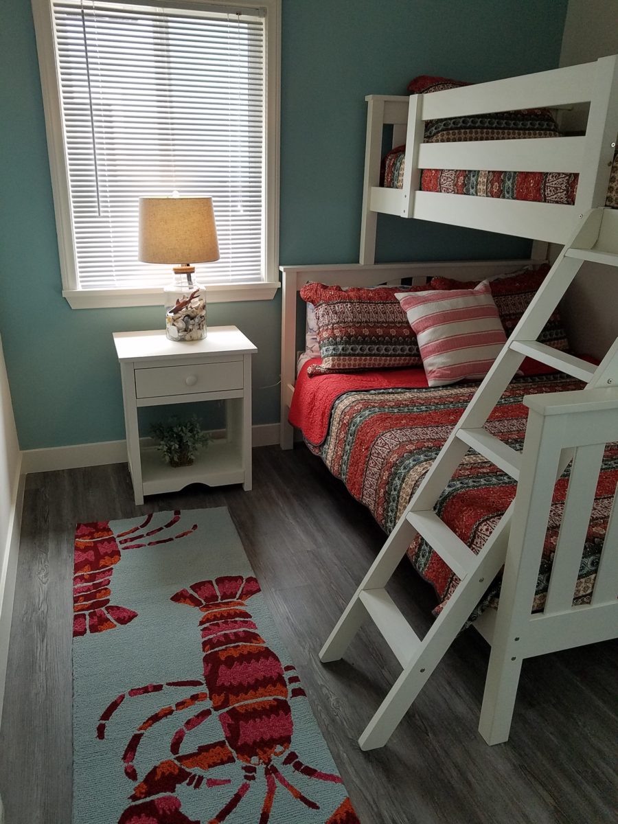
Weathered grey toned LVT (Luxury Vinyl Tile) in the way of interlocking planks were an easy to maintain and durable floor finish. The faux wood adds warmth and is softer underfoot than other hard surfaces. Perfectly matched with all trim pieces, this flooring is fabulous!!

Lighting is key and here we added recessed directional lights to spot the walls and related artwork. Switching was also an important detail to have options for the lighted areas and accents.

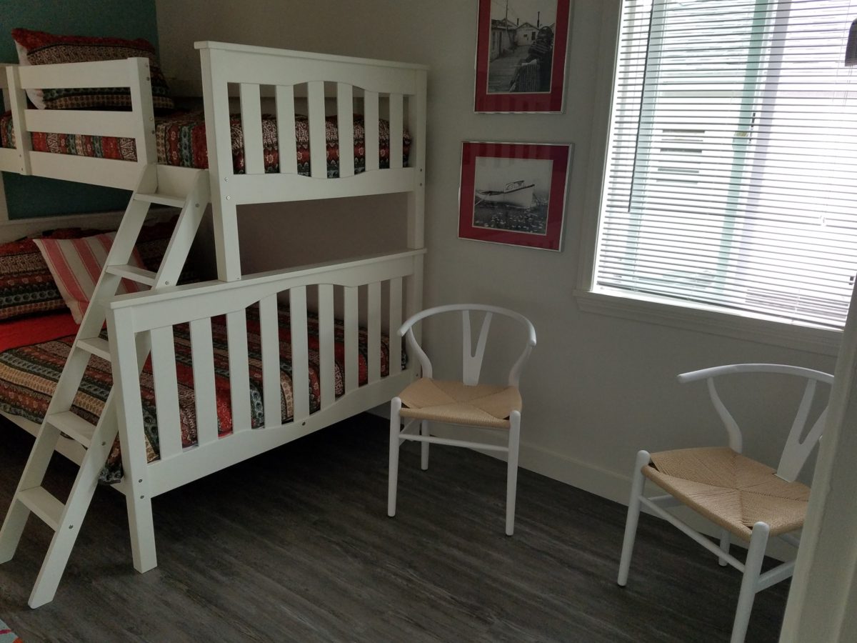
The owner found a novel lobster rug with a great textural, tufted, yarn system that brings fun and great color and warmth to the bunk-bed room! Busy, colorful bed dressings intentionally selected (over the hospitality white that is still trending) contrast against the bright white bed frames stacked for space optimization and a little kid fun!

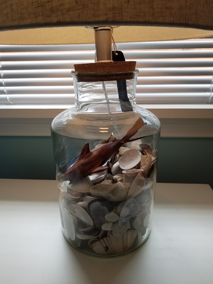
A cool find in the way of the glass vessel lamp…where usually the stem with electrical cord feeds down through the center of the base and of the back, this one feeds from the socket stem with a cork top that removes allowing the vessel to be filled with treasures – in this case southern California beach shells and fragments! And for a little more animation, I found a carved wooden shark to insert cruising above the shells to make the lamp even more interesting!!!

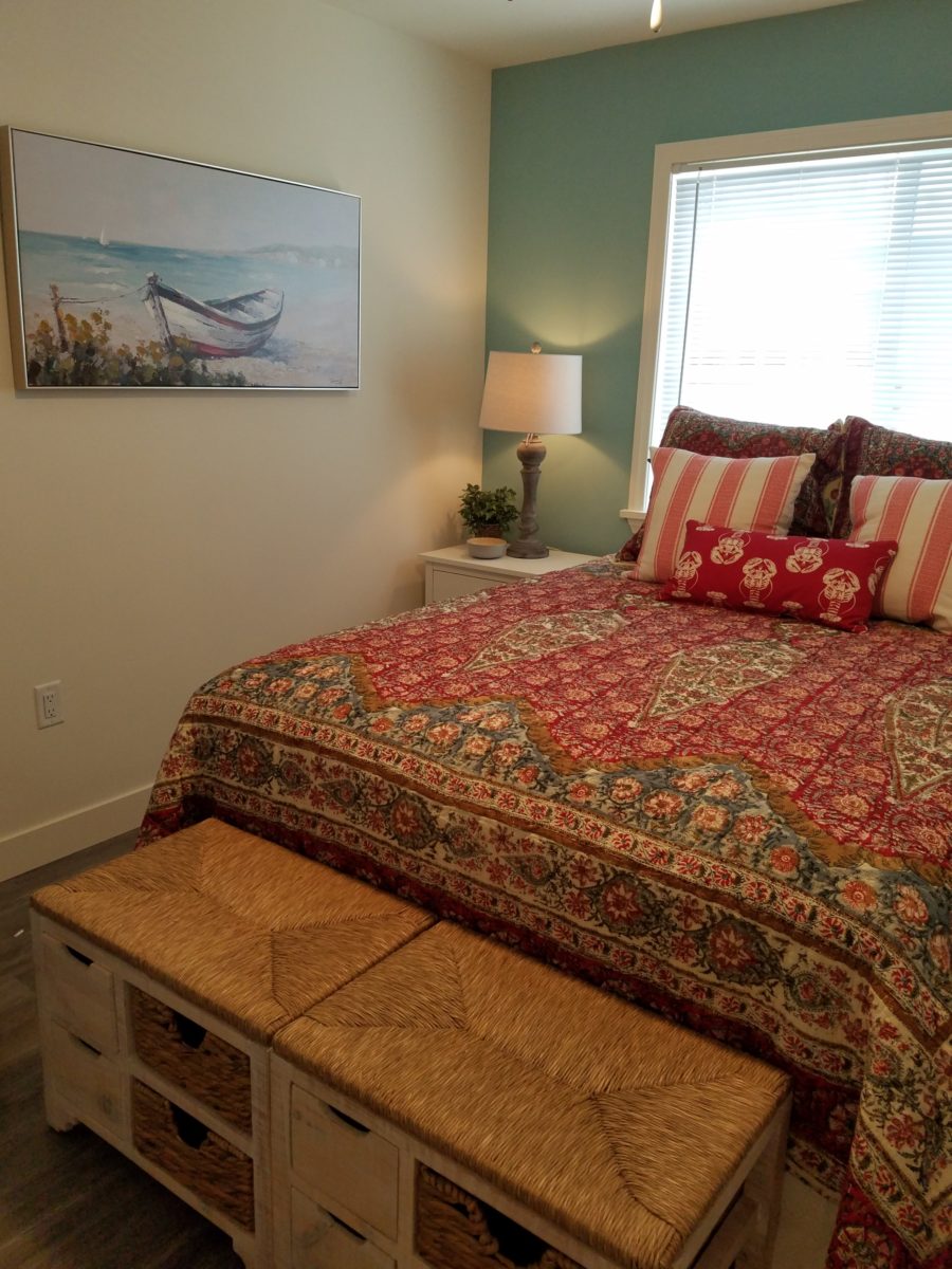
A pair of vintage photographs of a lobster shack and fishing boat contributed by a friend in Albuquerque – taken by him in Maine in 1962 – were enhanced with bright red mats in their original polished silver metal frames along with a large painting on canvas of a Maine lobster/fishing boat sent by the owner in Maine provide interest to further perpetuate the lobster theme.

The master bedroom is a comfortable retreat with another lobster pillow for punch! To give the room the best approach and make it feel as large as it can be, placing the bed in front of the windows was the solution. Beds facing the entrance to the room are always preferable to arriving into the side of them – for visual space and a more inviting orientation.

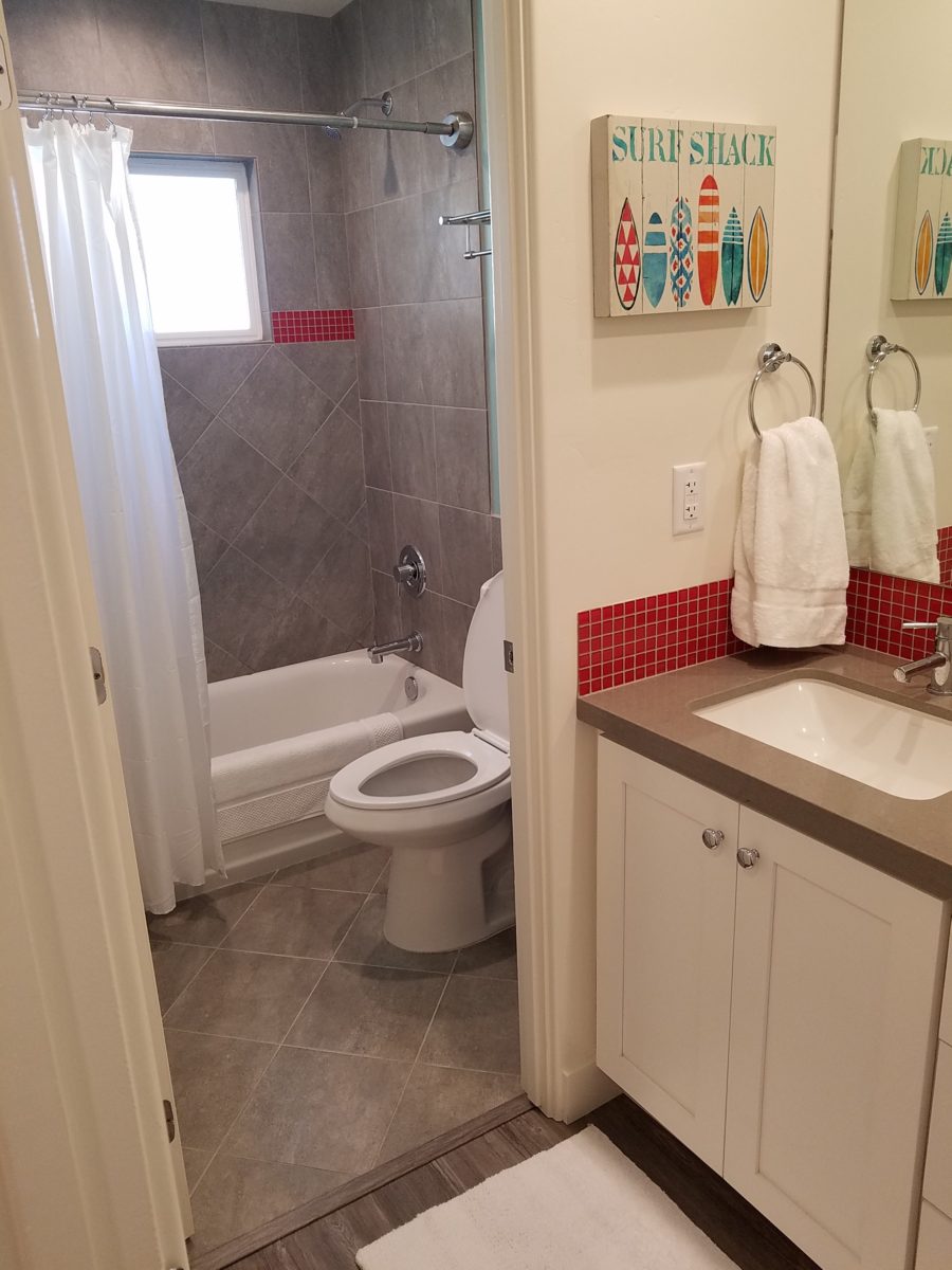
The original bathroom layout was all one space with tiny appointments jammed together…so we removed the tall storage cabinets and sink vanity allowing more room for the commode beside the tub/shower and added a privacy door. Then the new cabinets and counter have their own space with another privacy door resulting in a two-compartment bathroom area for maximum use and enjoyment. Red mosaic glass tiles were repeated from the kitchen to further coordinate the theme. 

The bold color scheme was thoroughly distributed throughout the unit which is an intentional design emphasis especially effective and novel in a short-term vacation rental – where such a thorough scheme might be too intense for one’s primary place of residence.

Effective design both functionally and visually should be a significant asset in the marketing of rental property. When used consistency in marketing material with logos and repeated features, this and other properties with attention to detail should attract the discriminating guests. Once there, repeated stays are the key to maintaining a strong guest population – of desired visitors.

Please watch for the entire slide show of before and afters of this dramatic transformation in the commercial projects section of our website, in coming weeks, entitled Emerald Green Beach Rentals – Lobster!

10 Tips for Remodeling: To Improve and Enhance

I’m currently working on an urban loft apartment.  The criteria with which I was presented, upon our first meeting, consisted of three items: One – to enclose an open bedroom to provide privacy, Two  – to provide alternate access to the shared master bathroom. (There is also a powder room, but the shower and tub were only accessible through the master bedroom), Three – because it is a relatively small footprint with voluminous tall ceilings, he was hoping to create a small second tier for additional square-footage.  I understood these items to be his intended “improvements.”

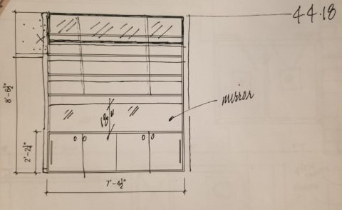
While on-site, at the first meeting, it was (and is always) impossible to limit the observations to only those isolated areas of concern without seeing all else that is occurring around the space.  Therefore, I consider the extra comments that I offered for minor changes to be “enhancements.” These are things that have not had or do not have  priority in the eyes of the client and might have even gone unnoticed forever. Items such as adding a wing wall at the front entry to screen view from the door through the kitchen, concealing a new tall closet of matching cabinetry directly behind the wall to add storage to the kitchen,  add a clerestory window and bookcase with cabinets to the new wall between the master bedroom and living area for borrowed light and additional storage!

Occasionally these offerings are met with a shrug, hmmm or a “maybe” and not really considered to be of great value, but more often than not they are greeted with exclamations like ‘Oh, I never would have thought of that.”  “What a cool idea!”  “I would love to have that.”  And it is with this enthusiasm that my client responded.

So when considering remodeling or identifying the primary improvements needed, begin with the priorities then layer design details of additional enhancements and you will create a master plan that can be executed over time in phases in a preferred or practical order of priority.

1. Begin with your list to improve the function and enjoyment of your environment.

2.Prioritize the list and guesstimate costs to establish a starting conversation    regarding budget.

3. In addition to cost – consider pairing like-kinds of things together such as adding or removing a wall which involves framing, sheetrock, texture, paint – it might be cost-effective to do all items related to these trades even if they are not the same priority.

4. The distinction between improving and enhancing is a fine line because improving does enhance, however I consider improving more practical and enhancing with embellishments that are less critical, but make further improvements and enhance the quality of the space. Such as crown molding, improved base trim, unobtrusively installed mirrors, windows, updated hardware, etc… https://bit.ly/2HCYrU

5. Storage is always welcome. Look for opportunities to add cabinets, vertical spaces to maximize your footprint, second-tier countertops, raise cabinet heights even furniture to provide additional storage. https://bit.ly/2GZglUa 

6. Passing daylight through to interior spaces is more common in offices than in residences, yet for the same reasons of “borrowing” light in commercial spaces, skylights, vertical slivers of glass, transoms and clerestories are valuable assets when it comes to bringing daylight into pockets of darkness. https://bit.ly/2HCddKU

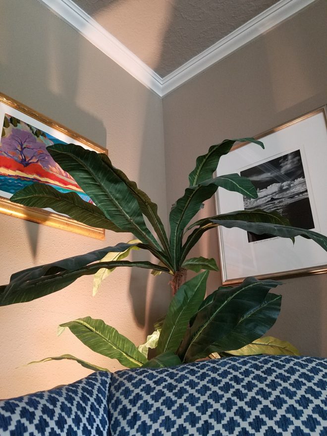
7.Evaluate your existing lighting. Adding dimmable ambient light to rooms to supplement existing down-lights such as pendants in kitchens, translucent lamps shades on table and floor lamps, even well-concealed under-cabinet lights will add control and mood enhancements. Spot light wall art and sculptural pieces, illuminate corners with up-lights (up through trees, behind chairs), and consider changing to LED lamping (bulbs) for longer-life, cost -effectiveness and a full range of colors!

This up-light filters through the plant from behind the chair casting interesting shadows and illuminating an otherwise dark corner.

8. When considering new flooring know your needs as there are so many options for soft under-foot, freeze-proof to carry outside, ease of maintenance, durability, non-slip, and of course the many aesthetic preferences.

This interlocking vinyl floor has remarkable graining look, color and texture and provides soft “give” underfoot. These new luxury vinyls defy our early perceptions of faux finishes.

9. Stacking laundry machines have provided terrific opportunities for added space in laundry rooms, more cabinets, counter space, laundry sinks, craft areas and more! https://bit.ly/2HpkKih

10.Opening walls enlarges spaces – even a peek-through, but also create the interest of depth and layering of dimension, color and light.  https://bit.ly/2GZrMLj

Drama, Discretion and the Element of Surprise – Concealing & Revealing

Have you ever had someone ask you to cover your eyes and then there is an anticipatory pause as you stand there anxiously or they guide you – no peeking – in your temporary darkness, to a point where they say “you can look now!” and you do so with great anticipation? The elements of surprise and discovery are put into play to create drama. Hopefully, the unveiling is met with the positive reaction that the presenter had in mind.

Recently I was called to the home of a wife and mother with a dog. Only she was in evidence and present for this meeting.

Her initial contacting our office and brief correspondence prior to meeting was done via email regarding her introduction and retaining me to assist her with her newly acquired home. Her first concern, conveyed even before we met in person, was one of achieving a “cozy” interior.

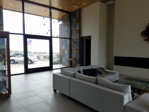
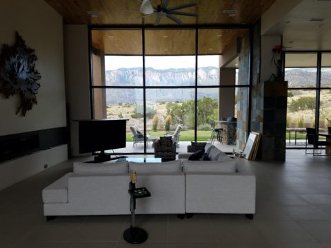
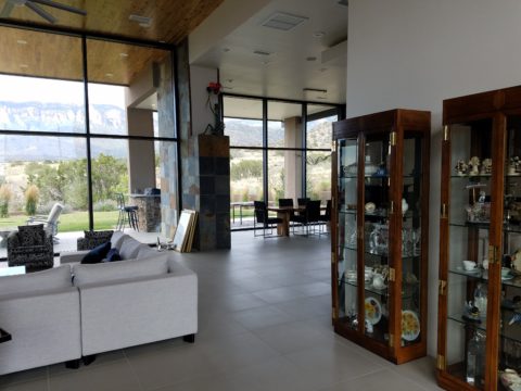
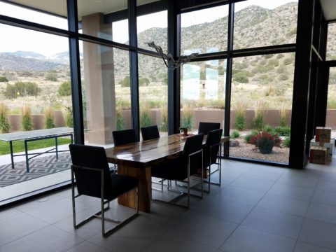
The home’s contents were partially dismantled as the original owners were in the process of boxing up and moving out. In all fairness, despite the unfurnished state, it was devoid of mystery or interest. It did offer a commanding view of the mountains seen very closely through an expansive north facing wall of glass. But as magnificent as the unrestrained scene was, the drama might better have been revealed by invitation rather than seen in its entirety, from outside the un-obscured glass front door and large flanking sidelights straight through the house and without interruption. This presented an exciting opportunity.

By invitation, I mean selecting who sees into your home and how far. Who sees the intimacy of the interior and the would-be personal vantage-point of the dramatic scene. The opportunity was to control this drama and give it even greater impact by concealing and revealing.  The opportunity to create a design which offered privacy,  bit of mystery and discretion – with the ultimate revelation of the startling glass wall and jaw-dropping view.

This sketch by architect Matthew Frederick illustrates the effective use of “denial and reward” to enrich the approach to the ultimate unveiling of the destination.


This home I’m describing offered little or none of these characteristics to entice the guest/viewer and, with that, certainly defied the word cozy.

The objective, as originally stated by my client, was to achieve a cozy interior. Presented with all hard surfaces of stone, tile, steel and glass, the problem seemed obvious, offering possible solutions was my task.

When I suggested a partial-height point-of-arrival wall be constructed inside the entry to stop the view and allowing one to assess and receive the guest and/or conduct a transaction, I was instantly met with “Oh, but it’s that view that my husband loves! He wouldn’t go for that.” And I’m thinking…but seeing all from outside the front of the house straight through and out the other side?

First roadblock. He who has strong opinion and, in his absence, is inserted into the conversation, without benefit of thoughtful exchange, strongly suggested that further evaluation of this option seemed moot. This through-space seen in its entirety, without interruption from outside the front door to the back of the house, was totally transparent and the representative (she) of the team was referencing his seemingly over-riding preference, in contrast to her stated concerns…cozy. Not to mention private.

To create a successful design, it is important to consider contrasting elements. All hard surfaces begged for softening counter-balance.  Transparency suggested the need for partial obscurity – at least at the point-of-arrival.

Wouldn’t it be interesting to obscure some of that magnificent view from anyone who approached the door and rather invite those so chosen to discover the mystery and drama once they’re brought into the space?  This addresses both privacy and drama with greater sensitivity while beginning to address cozy, by concealing the living space from public view.

Un-obscured glass on the back of the house is the private drama.  Seeing the view from inside and connecting the outside to inside, for personal enjoyment is unique. By allowing only family and guests be given that vantage point, from the interior and private backyard exterior to the inside, is the privacy bonus. Drama and privacy achieved.

As with most things in life, you get more punch from the element of surprise. To have guests arrive, be received and then invited to proceed, to experience the drama, is far more effective than seeing it all without the heightened expectation or even unexpected surprise.