Color Scheme Tips

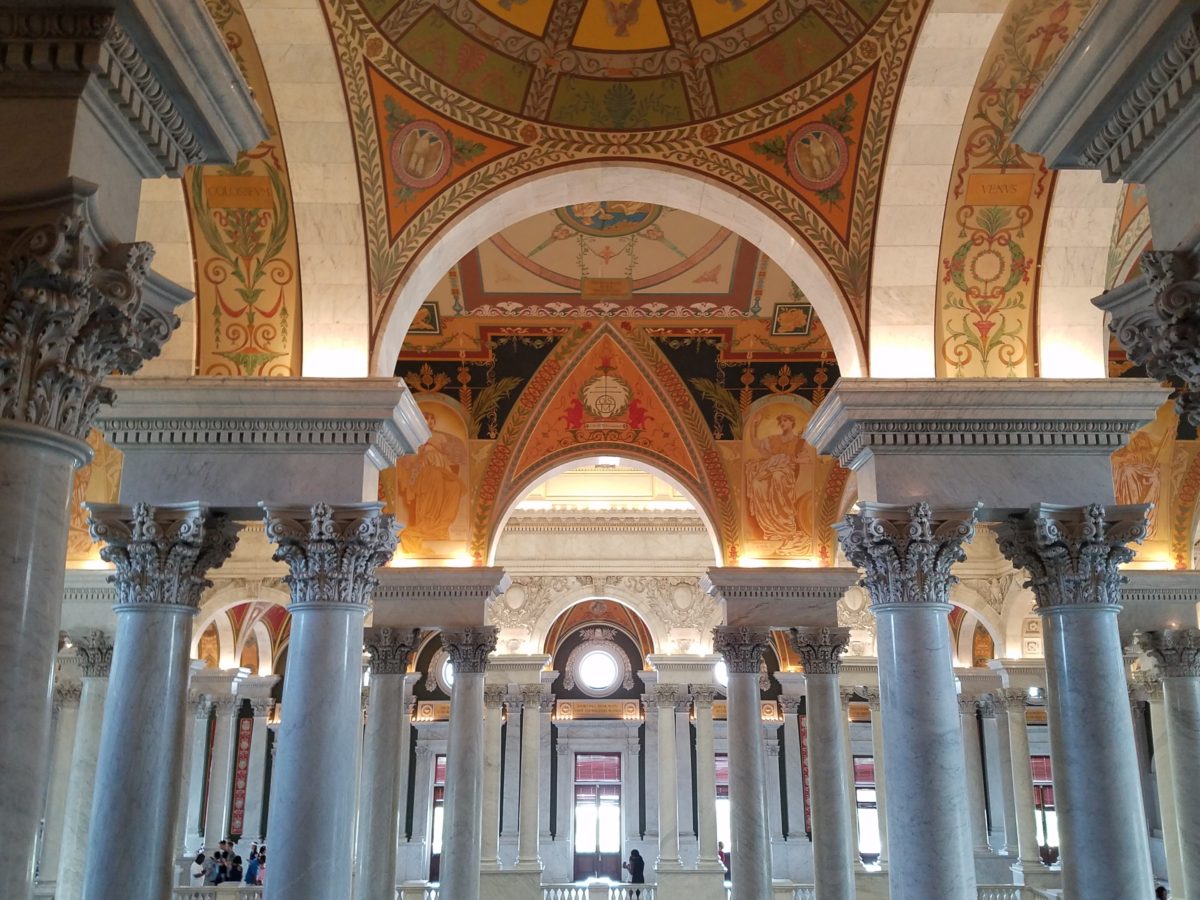
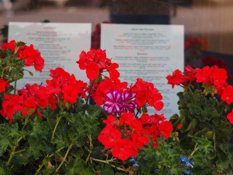
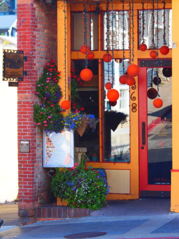
Color schemes are limitless. The permutations are endless. Color is exciting and fun. It is personal. Colors evoke feelings, memories, emotions and are key to a comfortable interior.

How often have you been asked or pondered on your own…”What is your favorite color?” Some people hesitate to answer, while others blurt-out readily with their fav.  But what color you choose to wear versus what you enjoy in your interior surroundings and how much might be quite different.

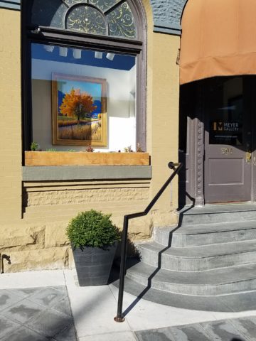
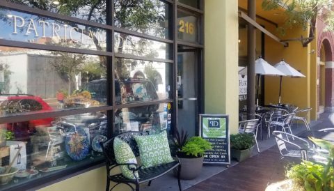
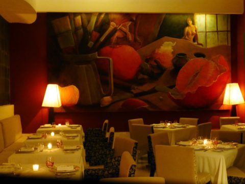
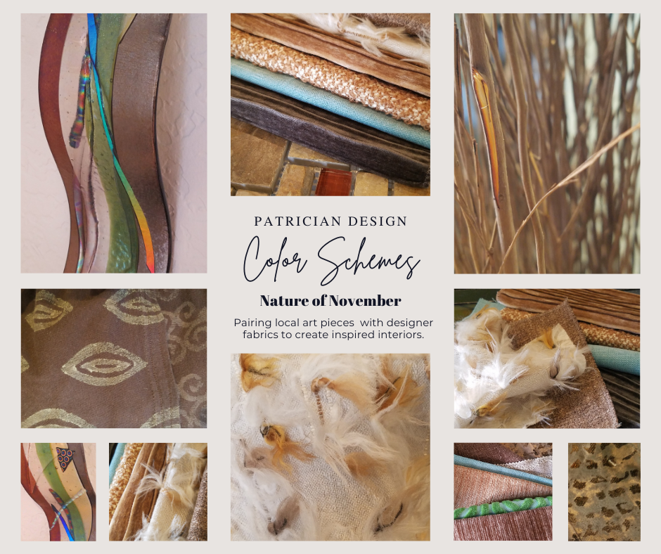
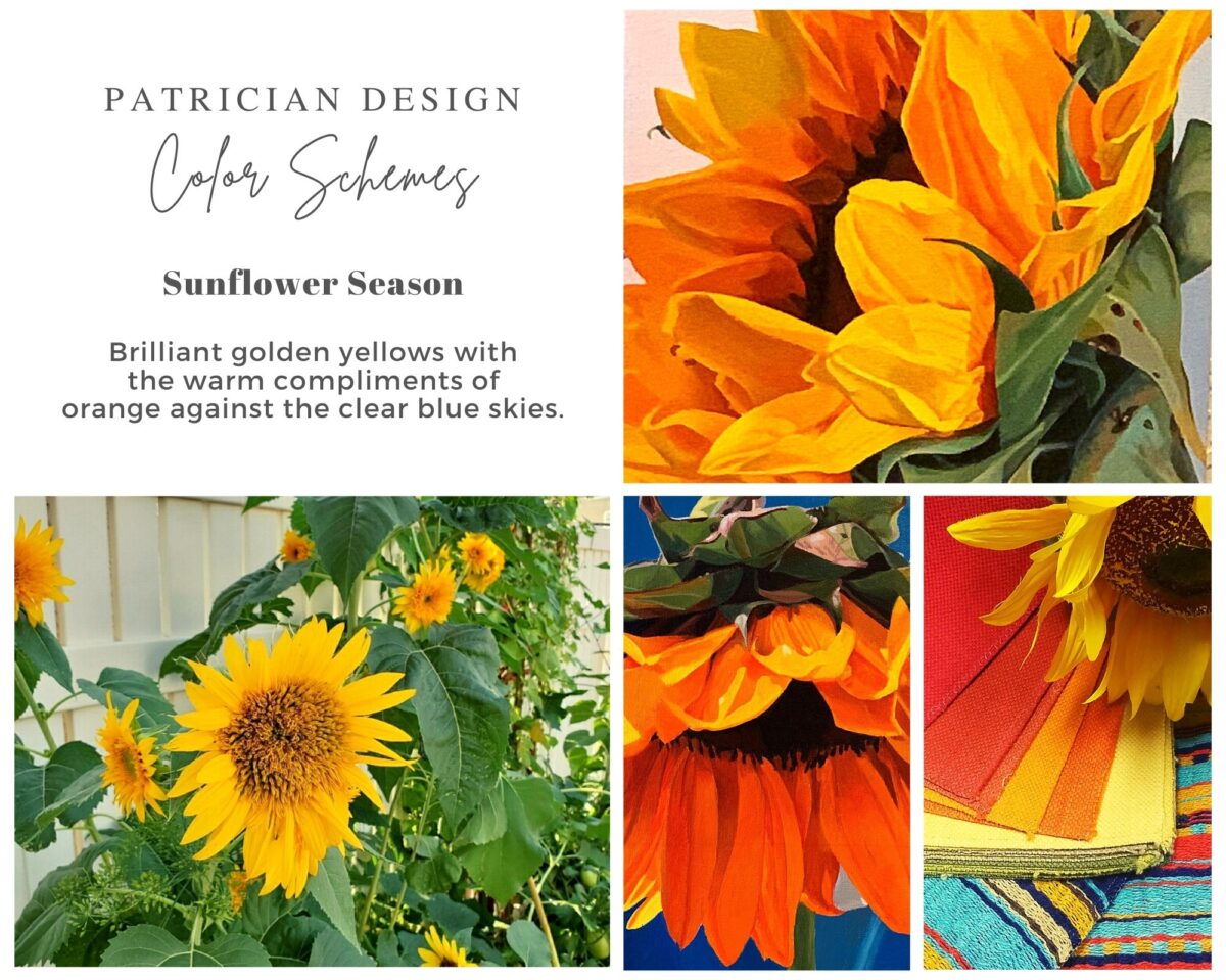
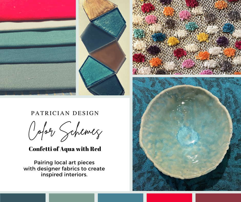
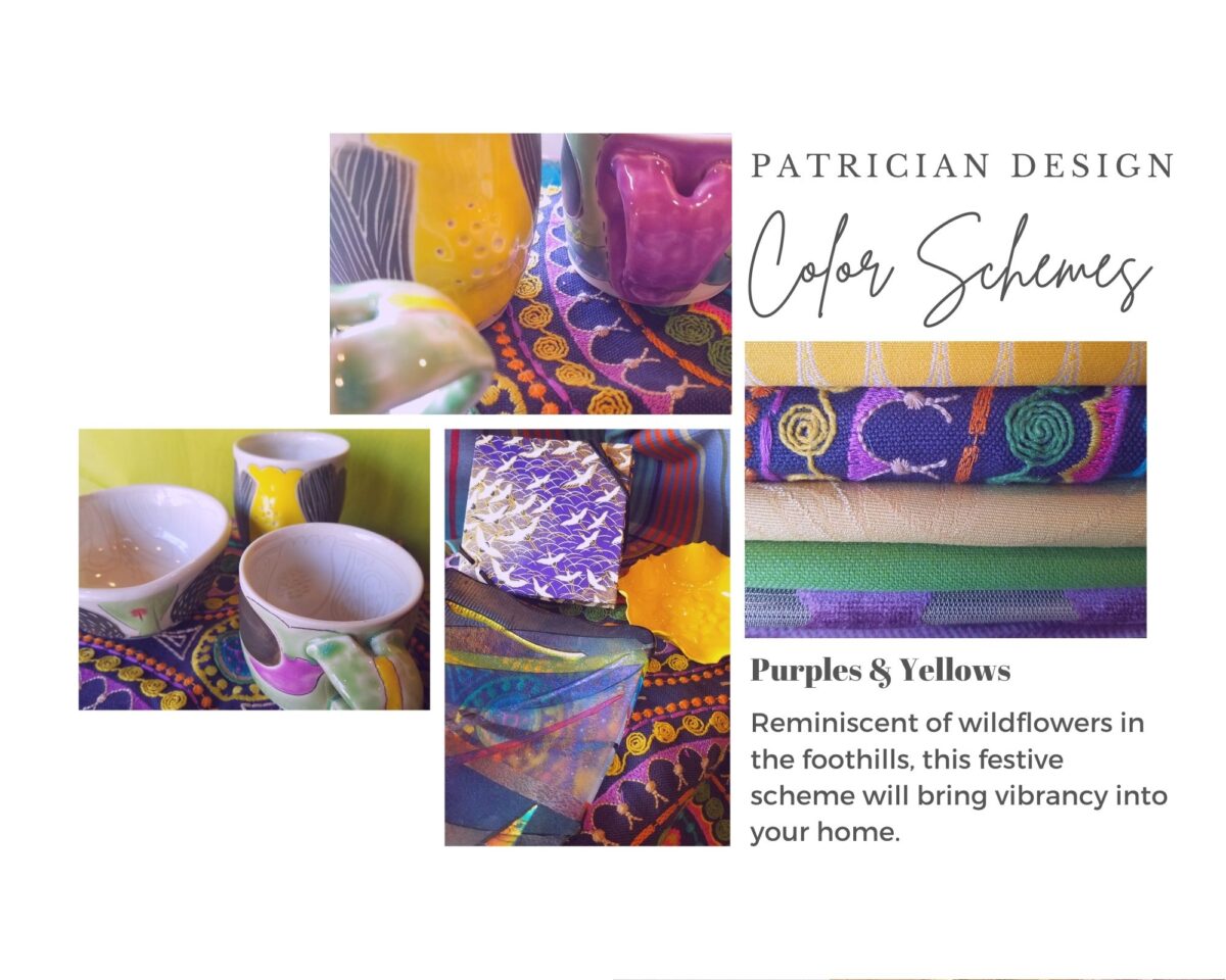
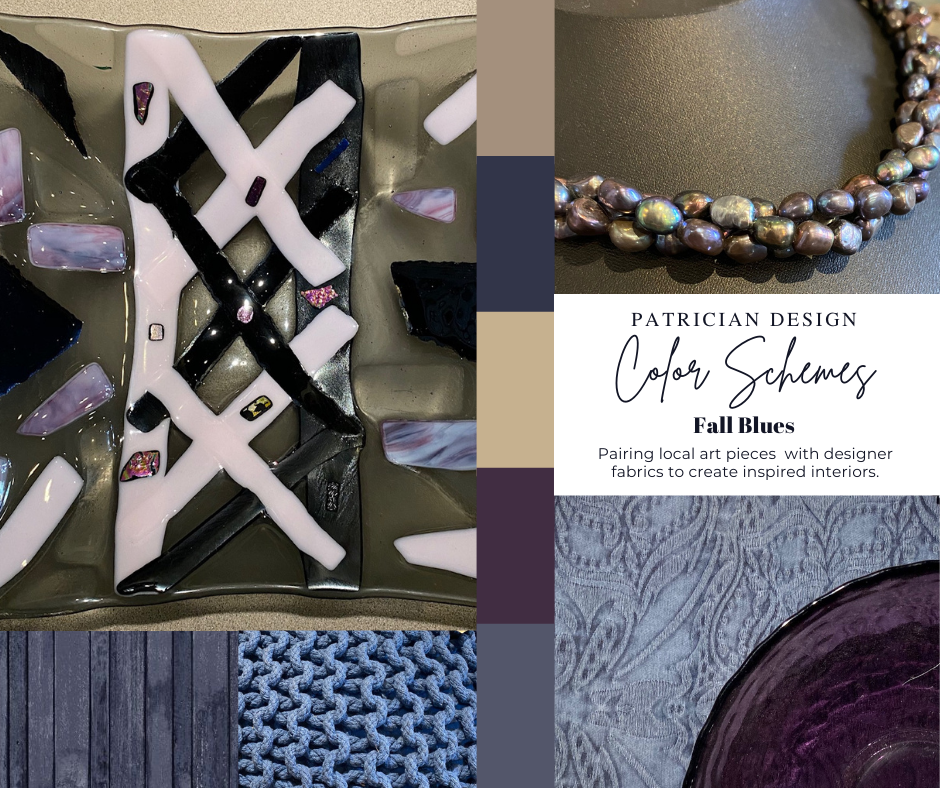
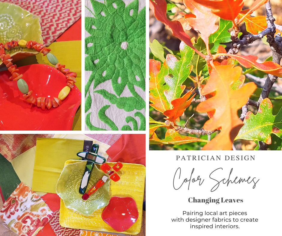
Several weeks ago, I launched a weekly post on our PATRICIAN DESIGN Facebook page called “Color Schemes.”  The idea is to inspire design ideas by pairing artwork with designer fabrics. When planning an interior there is always a focal point complimented and surrounded by supporting elements.  Whether a key painting will command the space or an expansive window with a view will direct the focus to a scene of outside colors and textures – that key element will greatly influence a successful interior color scheme.

Annette Donald creates colorful cubes in her creative take on our beloved chile ristras. A serrano chile oil painting, on canvas, by Federico Leon de la Vega is quite representational. Paired here with Romo and Ralph Lauren fabrics, Sherwin Williams paints…fresh and festive!

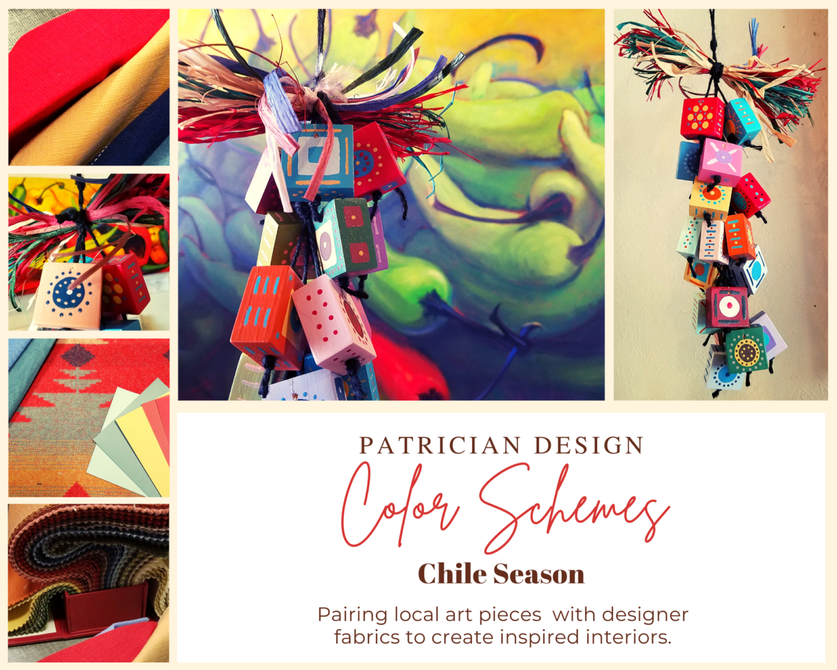
Here is the example of a November Scheme and you can scroll back each Monday for the past few months to enjoy a variety of the Color Schemes! https://www.facebook.com/PatricianDesignABQ/photos/a.243005986618/10157154423221619/

We embrace the The Nature of November with its unique colors and textures. As the air becomes chilly and the leaves fade…warm, soft colors bring us indoors. Featured here an elegant fused glass ribbon wall piece by Lisa Checnoff.

There are four primary considerations that I discuss with my clients when determining which colors to choose, emphasize, avoid, use as accents and where. To establish these selections, we evaluate personal preferences, contextual implications, seasonal influences and even trends. 

PERSONAL:  In planning an interior, I always want to know what colors make our clients happy, comfortable, stimulated, vexed or relaxed. These personal insights reveal important information for selecting types of materials too.

By examining what might be one’s favorite color, the discussion will navigate the distinctions, if any, regarding preferences for clothes versus interior furnishings. Interestingly, they are not always the same – although, by mere comfort and familiarity, they often are.  Simply asking about a favorite color is not enough.

Brilliant golden yellows and blues – splash color! Featured here are fabulous photo-realistic acrylic paintings by Sheri Mays paired with amazing fabrics of the same exciting palette.

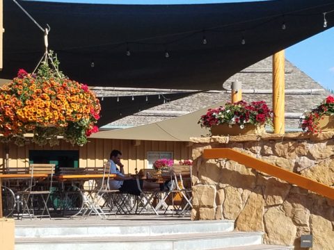
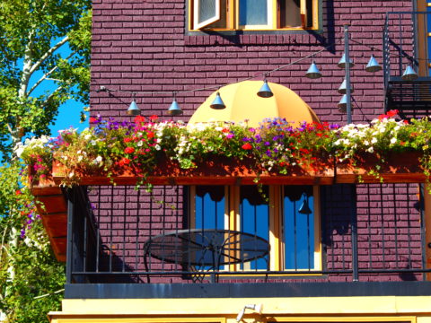
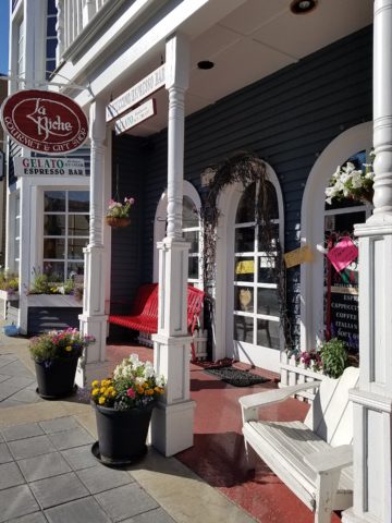
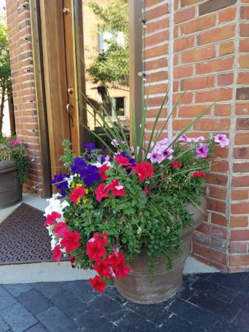
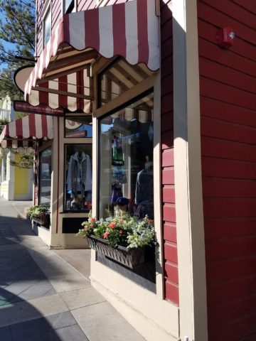
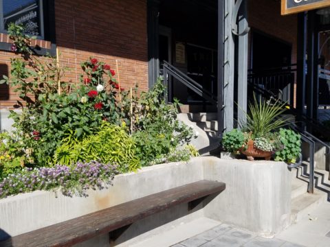
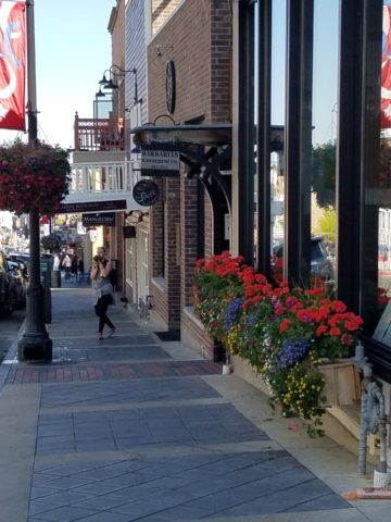
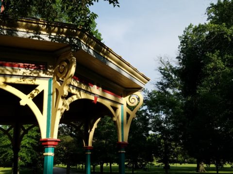
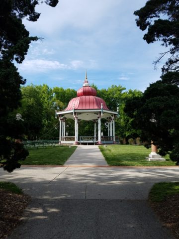
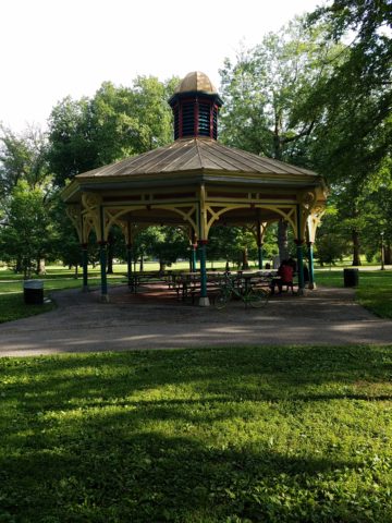
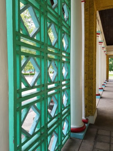
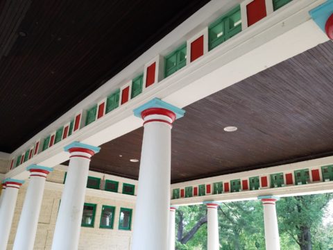
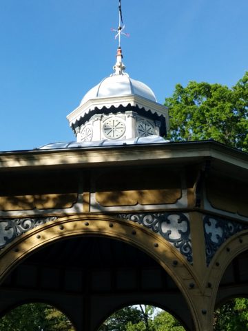
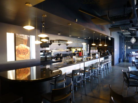
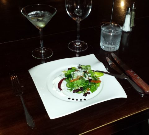
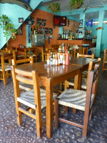
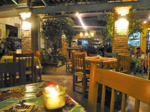
CONTEXT:  The context of the interior might dictate or at least steer the direction of the design. The luxury of having multiple personal environments offers the opportunity to have different color pleasures exercised in different places. The ski condo might be woodsy and textural with browns, greys, stone and wood punctuated with a pop of color versus the seaside retreat with its crisp whites and cool blues and greens punctuated with pastels or bold contrasts. Therefore, the location of an interior might direct the desired color palette.

Inspired by this spa-aqua pottery bowl by Penny Roberts and the custom glass tile mosaic we recently combined to face a newly remodeled kitchen wall – the cool seaside/spa feel balanced with ambers and warm dots of color – pink, fuchsia, orange and golden yellow. Durable brushed cotton solids come in myriad colors and are perfect for pillows or upholstery.

SEASONAL:  This one is tricky because it plays on the perceived climate outside – even if the interior is maintained at a constant temperature. It takes a concerted effort to plan a color scheme – including textures and finishes in anticipation of changing seasons and relative temperatures. I previously mentioned that a window with a view might be the focal point of a room…imagine the effect the changing seasons might have on the selection of interior colors and textures versus a consistent tropical scene, for example?  

Perhaps you love purple – ever pair it with golden yellow? Here, functional, fantasy pottery designed and crafted with the most precise attention to detail by Jen DePaolo inspires our boldly brilliant scheme.

TRENDS:  Inasmuch as I avoid being steered by trends, it is impossible and not advisable – in design – to avoid them. Clients are influenced by them and bring that would-be preference to the table.  It is essential to continue to have “colors-of-the-year” and other market-driven colors change to stimulate the economy with buying and selling, replacement and updating.  It’s our socio/economic norm.  It also serves as an encouragement to re-fresh. But to limit that influence, in favor of long-term personal pleasures, is best.  The pressure of this marketing color influence contributes to our being a disposable culture. Not time here for a lecture on such things – but rather to instill an appreciation for and confidence in personal selections an decisions – in this case,  color.

Patinaed pearls and stunning glasswork by Margaret Hidalgo Vanderheyden inspire the soft, greyed lavenders and blues of this cool scheme.

An interesting and on-going test for evaluating a successful interior is when designing in one season – it has to work in all others. For example, when I meet with clients in the heat of July with lush foliage and color, warm temperatures and long days, that same interior has to succeed when it is frigid outside, barren, and with darker, shorter days. What might the challenges be in creating a successful scheme and what might be the solutions to make it work?

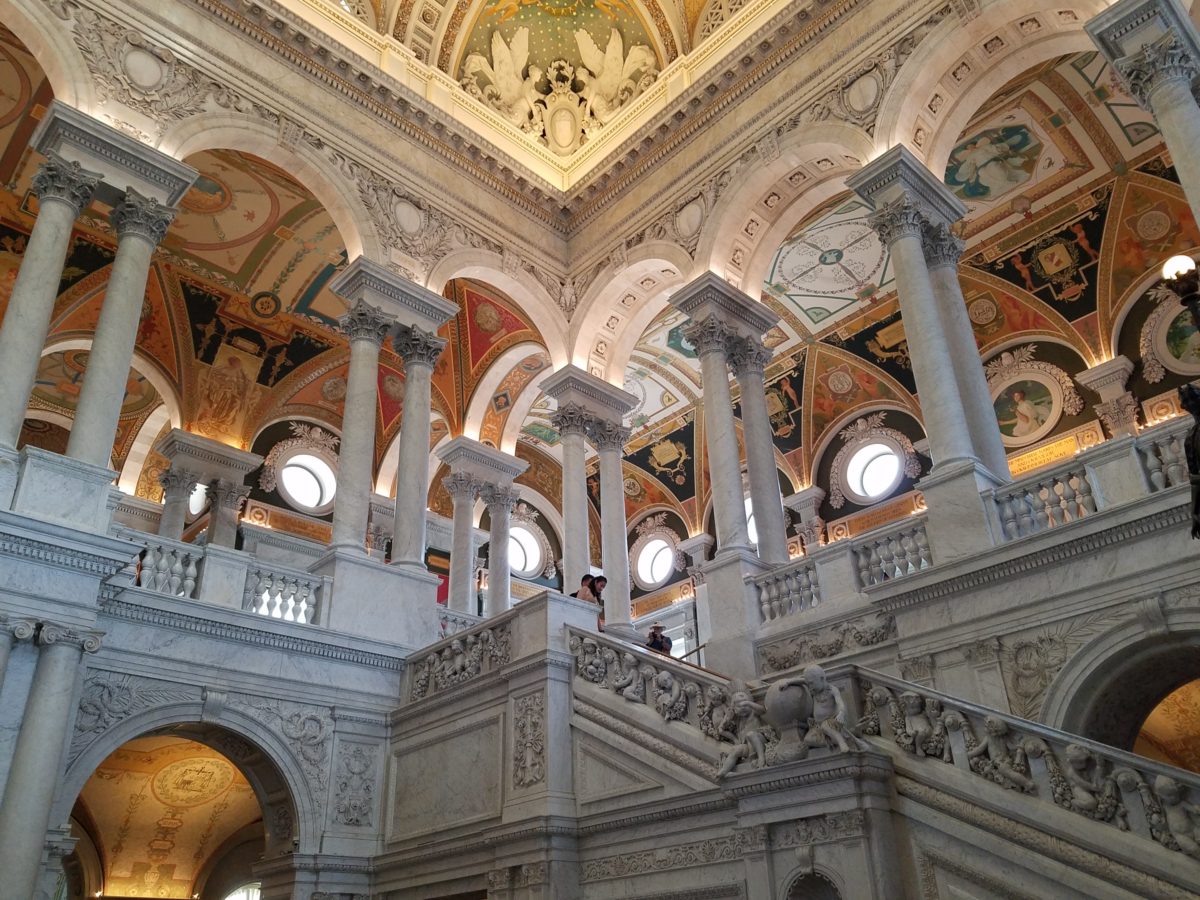
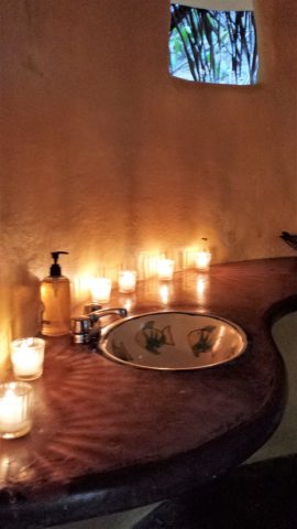
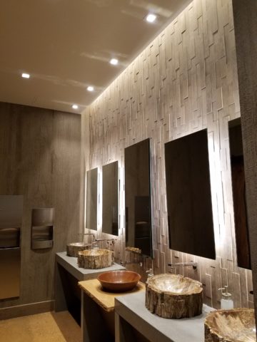
Having noted all of this and knowing the different reactions people have to color, isn’t it interesting when an interior is so successful that it appeals to many, if not the majority, of those who experience it?  This is more applicable to commercial or public spaces – from doctors’ offices to hotels.  However, the challenge and success is in knowing the many things to be considered and implementing a balance of them throughout all aspects of the interior.

Anne Marie Werner-Smith’s brilliantly glazed pottery here with Margaret Hidalgo-Vanderheyden’s lovely fused glass crosses along with coral and dyed stone necklace and woven table runner from Chiapas reflect the changing colors of fall leaves…

Appreciating color is a gift to designers. It truly is an imperative to appreciate all colors and have the sensitivity to discern the nuances between various values and the effects of selections and combinations from the infinite choices.

I hope this has given you ideas and inspiration to move forward with YOUR color schemes! Sign-up for our weekly email of Color Schemes with classic blue and white and stunning neutral greys coming!! And follow the posts on Facebook every Monday.

Fantasy Centerpieces in a Magical Setting

Inspiration for centerpieces – here – a neutral color scheme – white on white on white…Often limited to weddings, take a tip from a social phenomenon – Diner en Blanc for dramatic centerpieces! Any of which could be ablaze with seasonal color – depending upon your desired theme. And with the advancements in LED lighting, the colors are limitless and instantly changeable.

The Diner en Blanc is an international event that began in Paris, 1988. An amazing concept that began with an invitation among friends to an elegant al fresco affair. This unique gathering was prestigious and decadent.

Someone gave a nod to the city of origin!

Everyone wore white so that they could find each other amidst other crowds who were gathered at the venue. ( Which becomes rather humorous amidst 2,000 people ALL wearing white!!) https://www.google.com/search?q=origin+diner+en+blanc&oq=origin+diner+en+blanc&aqs=chrome..69i57j0.5779j0j4&sourceid=chrome&ie=UTF-8

The remarkable event spread around the world and Albuquerque has celebrated this creative event for several years. This is my second experience with this white fantasy. Every year the venue is kept secret only to be revealed at the last moment when attendees are assembled and usually transported on buses to the destination. This surprise location was right across from the designated gathering places downtown. And instead of boarding a bus each group, expecting just that, cued up as though to go aboard – only to be led single file across the street to the expansive Civic Plaza!

One big patio party!

This year with the Hyatt Regency team screaming with creativity from the table dressings…to the phenomenal food…to the fabulous frivolity – it was magic!

Would you believe luscious, chunky lobster salad served in a half tail, sliced beef filet and many artfully decadent extras…

Asked to wear white, bring your own tables, chairs, table dressings, centerpieces – all in white – the evening unfolds with exciting flurries of fabric, flowers, statuary, lights – all intended to make a spectacular statement for each group’s table.

Imagine all of this theatrical staging with 2,000 performers (we) in one enormous space – outside in the perfection of a last ditch of summer evening. It is a remarkable event.

Pretty parasols…
mysterious masks…

As I strolled through the tables capturing photos of the various “tablescapes”, I realized that the creativity was applicable to so many possibilities of table dressings – with color added!

LED lighting set the scene aglow with myriad magical colors! It changes the perceived temperature of a scene.

So enjoy seeing these creations and imagine them in seasonal splendor – fall now…winter coming…spring bursting forth and summer ablaze with color – for your upcoming parties throughout the year!

The scene changed and darkness fell..

With magnificent mariachis to flowing flamenco dancers the entertainment was dazzling and morphed into an enthusiastic DJ who rocked the stage for dancing into the night… It was an exterior nightclub – an excellent setting for a many faceted affair! https://www.facebook.com/DinerEnBlanc.Albuquerque/

An elegant table for Dion’s Pizza and water bottles!!!

Cheers to elegant parties! Who needs an excuse???

The Wealth of Art That is Our Elegant Library of Congress

If the Basilica in my last blog didn’t get your juices flowing about incredible public art spaces, the Library of Congress was our next stop. Yes, it houses nearly everything having to do with writing, recording, documenting…but the building itself is amazing! It in itself is a wealth of artistic detailing. The interior has more gold leaf – not gold paint – but hammered metal gold leaf – than any other building in our Nation’s Capital. Inside and out, the craftsmanship of the stone carvings and architectural embellishments is magnificent. This inestimable landmark is so much more than the sober name suggests.

We parked in the garage of Union Station and walked the few blocks past the Supreme Court and the Capitol Building to our destination of the Library of Congress. The brilliant blue skies behind the bright white edifices belied what some regarded as the oppressive heat. I however am a heat freak – it’s summer – bring it on!

Columbus Fountain at Union Station also known as the Columbus Memorial is a public artwork by American sculptor  Lorado Taft, located serves as a tribute to the explorer Christopher Columbus.
The Supreme Court – cool, brilliant white against a striking blue sky – at 100 °
Crouching to get a shot of our Nation’s Capitol Building.

Symbolism is executed with every inch of the design details both inside and out of the imposing Library of Congress. Ascending the exterior stairs sets the stage for arriving at a monument of immeasurable wealth of human dissertation and history. Here I can only touch on the tip of the iceberg…

Picnic tables out front at our Library of Congress…relax, grab and bite and read a bit before going back to work!!!

From an inauspicious beginning of modest expectations to greater expanses with devastating fiery catastrophes in between, the Library of Congress has an amazing story. Thomas Jefferson played a significant role in re-building the foundation of what we now have today.

While waiting for the tour to begin in the magnificent Thomas Jefferson building, we were directed to two remarkably entertaining exhibits on the lower level – a Gershwin gathering and a Hope homage.

The George and Ira Gershwin Room is a tribute to the two brothers and their contribution to American music. This nostalgic and very familiar subject matter makes you hum and tap your toes. The exhibit presents George’s piano and custom-designed writing desk, Ira’s table and typewriter, self portraits and myriad documents that trace their lives and amazing careers.

The Hope for America Exhibit focuses on the varied careers of Bob Hope along with other recognizable entertainers. The exhibit offers the satirical humor – crossing party lines – both socially and politically for which Hope was so appreciated, admired and beloved. Hope received the U.S. Congressional Medal of Honor and the Presidential Medal of Freedom for his commitment, in his nearly 50 year service, entertaining the men and women of the armed forces abroad.

As the actual tour began, we were introduced with a short film as an overview of what was to come. We were then guided up a staircase and gathered in what was a most astonishingly beautiful, expansive space full of piercing, daylight, sunbeams glancing off incredibly detailed architectural stone carving and sculpture. Vast murals, vaults and arches in the 360 degrees of beauty from floor to voluminous ceiling was staggering.

” Founded in 1800, the Library of Congress is the nation’s oldest federal cultural institution. The Library seeks to spark the imagination and creativity and to further human understanding and wisdom by providing access to knowledge through its magnificent collections, programs and exhibitions.” Thomas Jefferson stepped-in to save the Library of Congress after a few inauspicious starts.  Not enough time devoted here to a history lesson – learn more at https://www.loc.gov/  –   but this grand space into which we entered is the Thomas Jefferson Building.

The focus of this blog is to share a bit of the art and decorative embellishments of this stunning architectural environment – beginning with the Commemorative Arch by Olin L. Warner (1844-1896) featuring a young man to the left and a bearded elder man on the right signifying that the process of learning never ceases…

Grand staircases on opposing sides of the space are adorned with carvings of “putti” – Italian for little boys – as they are pictured representing various occupations from gardeners to astronomers – the depiction of each vocation is fascinating with what it means to have that respective knowledge to pursue one’s career path.

Beneath the string of putti are representations of the 4 corners of the globe depicting figures of each, Asia paired with Europe and American paired with Africa.

Minerva, the Roman Goddess of Learning and Wisdom is aptly featured in a series of statues and images.

Most fascinating to me, up in an adjacent domed ceiling area was the “Evolution of the Written Word,” a series of lunettes by John White Alexander (1856-11915). Having previously written about the importance of handwriting for a million reasons that go beyond, but are directly connected to, this depicted evolution, I found this to be simple, yet profound. It is a beautifully rendered and fascinatingly distilled artistic expression of a very significant timeline. Beginning with The Cairn – we see them stacked stones on beaches for fun and on paths in the wilderness as markers, but here Alexander renders primitive man communicating by stacking stones to possibly mark the dead, a passage or a place of significance. 

As the history progresses, Oral Tradition becomes the means of communication – but only/obviously in personal contact. Words are created. Then Egyptian Hieroglyphics enter the scene with images representing words depicted on surfaces.

Picture Writing on animal skin – and ultimately more refined to vellum – becomes a more mobile means of communication.

Theologians recording ancient stories of biblical history brought monks to the art of the written word in compilations of the Bible as the first manuscripts/books became recorded.

And then an exponential leap in communication came with the invention of John Gutenberg ca. 1400-1468 of the Printing Press! Asia had its versions of printing machines even before Gutenberg, but inspired by seeing grapes at harvests being “pressed,” he put that concept into the process of placing individual letters in place and pressing them onto paper. Western Europe then had a movable metal type process that increased productivity of printed material – printing the first ……in Western Europe. The tour guide sadly explained to us that Gutenberg died a pauper as his investors, not patient with economic fluctuations, excused him from his rightful place in the business and left him to live out his life only to receive proper recognition posthumously.

It is the first complete book extant in the West and is also the earliest to be printed from movable type. This rare version is printed on vellum.

Unfortunately, at this point in the tour, we had to excuse ourselves with a quick wave and thanks to our guide as we were departing later that afternoon. Before leaving the building though, we dashed upstairs to discover the main Reading Room – entering from a way upper tier, we had a bird’s-eye view of this grand space. The scale was daunting and the spectacular architectural detail was breath-taking. The WOW-factor was palpable!

The Reading Room.

Eight giant marble columns each support 10-foot-high allegorical female figures in plaster representing characteristic features of civilized life and thought: Religion, Commerce, History, Art, Philosophy, Poetry, Law and Science.

Layer upon layer of intricate, symbolic details.

The 16 bronze statues upon the balustrades of the galleries are a tribute to men whose lives symbolized the thought and activity represented by the plaster statues.

Shhhhhhhhh……it’s the Reading Room

And with that – we only had enough experience and education about this incredible resource and monument of artistic beauty to whet our appetite for more and surely lure us there again for more information about all that comprises this amazing public gift and resource.  

Ta Da!!! Seriously – standing there in awe…taken with my phone!

There are so many wonderful things to see and do – get out there and see it!!!

Designing is like Cooking…

Designing is like cooking – I guess cooking is a form of design. Yes, it certainly is. Whether it is graphic design, fashion design, architecture, musical composition, poetry, landscape or interior design – artists of all media – the art of creating, designing, composing, it is all about the right ingredients in the right amount to balance the scene. Proportion.

Even though I will be focusing on interior design, the”scene” could be the sheet music, the canvas, the poet’s screen or paper…the “scene” is the window that frames/encompasses the finished product. To compare these artistic endeavors, to the art of cooking, is so obvious to me.

Everyone must cook something. Whether it is merely heating up beanie weenies, with a sliced dill pickle tossed in, chased with a gin on the rocks, it is a composition that must result in a tasty scene – for someone. Having said that, we must also note that “beauty is in the eye of the beholder.”  The more successful compositions appeal to a greater number of aficionados.  

To cook, one must combine the right ingredients, in the right proportions, to combine to result in the best finished product. When I design, as with cooking, it is often “create as you go”…it is important to add an element and taste…re-think…evaluate…

Assembling ingredients and considering the balance of them in the finished product. 

At a glance, the significant distinctions between cooking and interior design is that in cooking, the finished product might be gorgeous, but taste terrible. Interior design is all visual – on the surface…or so you might think…until you evaluate function. A beautiful cake needs to taste as good as it looks. An interior must function as well as it looks.  Both are dependent on the subliminal factors that result in a truly successful finish product.

Successful is also in the eye of the beholder…25+ years ago my mother and I went shopping for a leather sofa. She, at 5′ 3″, was a bit on the “vertically challenged” side of the ergonomic spectrum. Therefore, actually sitting in the contenders was important so that her feet comfortably rested on the floor and her back against the back – no propping up with throw pillows to make the fit. So we searched and sat and searched and sat until one day, like Goldilocks, we found one that was “just right.”  

A few weeks later, having waited anxiously for this perfect sofa to arrive, Mom excitedly called me and said “they’re delivering my sofa today!” I told her I would be by after work to see it. But before I could finish my day and see this long-awaited focal piece, she called again exclaiming “It’s the wrong sofa!” To which I replied “hang on – I’ll be right there.”

Sure enough, I watched her as she sat on her beautiful new leather sofa and looked like Lily Tomlin doing Edith Ann! Her legs shot straight out and even with a scoot forward, her feet dangled in mid-air. We knew something was wrong. It looked like the right sofa, but we didn’t have the intended dimensions of what we ordered. So all we could do was go back to the showroom and hope the sofa that we thought we had ordered was still on the floor and go from there…

With great relief, we found the showroom model…Mom crossed the room and took a seat. A very comfortable seat. Everything fit just right. So what was with the sofa that was delivered earlier today? As it turned out, it was the right sofa, only hers was brand new. The one on the floor had been sat upon for months and by a thousand fannies…the answer was simple prompted by a simple question. Would they exchange the brand new cushion filling for the broken down stuffing that was in the floor model? And with that – voila! Her new sofa was modified to be the perfect fit – old, broken-down cushions and all!!!!! She still sits comfortably on that sofa today.  Function. The outside looked great – the ingredients were a bit off. Ingredients make the difference.

I used this example with a client recently when she had a chair reupholstered. Per her request, the stuffing was not changed – but the upholsterer thought that the collapsed appearance was not good and would reflect a lack of attention on his part. So he plumped and made more firm the stuffing inside his new, tighter envelopes.  She was not pleased and thought all was lost. I assured her that it was an easy fix and asked that it be redone. He is in the process of modifying the fill to accomplish the comfort she remembers. The chair looks great – but the ingredients/details are not creating the function that would make it a truly successful design.

As a designer, we often (especially in bidding environments) are faced with “or equal” substitutions to our design selections. The specifications have to be within a certain tolerance, but the results can radically change the complexion, success, look and effectiveness of the design. Imagine how this could affect a recipe?  Well,sometimes great new recipes come from unintentional substitutions….take these cookies I baked last weekend.


Barbara Bush’s popular Cowboy Cookies – unplanned, I had a wild hair to bake cookies. I can count on one hand how often that has happened in the last 20 years!! So having had these fabulous cookies recently (thanks Feath), I rummaged through the pantry for the ingredients. Well, I had wholewheat flour, not all purpose, I had a few butterscotch morsels and a few more white chocolate chips. I had no chocolate chips nor coconut. I had steel cut oats not rolled oats. Too lazy to run to the store, I thought that the worst that could happen was that my cookies would be terrible and I would have wasted the ingredients and a couple hours of time…However, I am pleased to report that they are wonderful and resulted in a new oatmeal cookie worth sharing. Substitutions can work, but the harmony of ingredients is the key.

Another issue that can challenge a good design is when there are too many chefs in the kitchen. The ingredients can become imbalanced and substitutions can be made that alter if not spoil the intended results. In some projects, the”lead” shifts. The contractor, subs, and owner can all insert changes that alter the design. This usually occurs without regard for the design as a whole. Each person has their field of vision, their focus of expertise or special interest.  Sweet, salty, acidic…each has its place – balance. A disregard for any of the ingredients, poor substitutions or imbalanced quantities – will alter the results.

Yin and Yang – the balance of our known universe – is all at the root of the balance of good design. Balance and the relationships of scale (which are also forms of balance). Rough/Smooth, Shiny/Dull, Dark/Light, Soft/Hard are all ingredients of good design. The balance of these are the equation of successful solutions. And this doesn’t even include the magic of color its balance and compliments.

Many people are good cooks. They have an innate sense of what works. Many people have an innate sense of good design. They often take it for granted. They might not be able to articulate it – but they can create it, they know it when they see it and they employ the rules of balance whether they realize it or not. In both of these cases, theses innately talented people often need reinforcement or encouragement – validation  – affirmation.

From dinner guests to friends coming over to see the new furniture arrangement, talented cooks and decorators can get the job done – as with all professional chefs and designers – with the support and contribution of the talents around them.

Paper Airplanes – Happy Joy

This week, upon arrival at the Denver airport, as I navigate this architecturally dramatic facility, I’m funneled with the masses making our way, from the gate area, to the trains, to the terminal. When suddenly, gracefully overhead as we ascend the escalator, large versions of paper airplanes hover above. Probably steel, but with the familiar fold and form of the simple paper origami originals, they were a whimsical attention divergence.


When I arrived at the top of the escalator, I realized that they were also above the escalator across the way so I walked over there (to the surprise of the masses with whom I had been funneling along). A couple in the crowd even called out “hey” or “ma’am” …I turned to see some were concerned that I had lost my way and expressed concern that I follow the pack. I waved to these helpful strangers indicating with my phone in hand that I was stopping to take a photo of these wonderful suspended planes.

This ignited a curiosity that led me to investigate a bit more. I have since learned that they are part of the Denver International Airport’s Arts & Venues Denver: Public Art Program 1994. There are 140 of these suspended would-be-paper (steel alloy) planes and they are the work of artist Patty Ortiz titled Experimental Aviation. A well-recognized artist and curator of contemporary art with decades of art management experience she “believes that art intrinsically is a social object and when placed as an action in relationship with the viewer ad participant that art carries a profound interconnectedness within real experience.” And there I was experiencing the simple loveliness and joy that these airplane sculptures conveyed, in context with the often monotonous air travel experience.

Kids who love paper airplanes never seem to grow up. I’ve written about this before, in the blog about Federico Leon de la Vega’s TEDx Talks a couple of years ago. Watch his Talk and see the final scene as the planes fly through the audience. https://www.youtube.com/watch?v=H9j_pLgCr1U

Paper airplanes are timeless tools of communication set flying from one person to another often with a secret note inside. Unfold and discover the message. Like passenger pigeons of days gone by…but unlike their obsolete and ultimately extinct message-delivering cousins, paper airplanes are timeless.

Never taking up the art, it has fascinated me forever. Origami seems to be originated from the Japanese word for folding – ori – and paper – kami = Orikami. Japanese art is so fine in all of its forms. And back to the paper airplanes, San Francisco hosted a competition Origami-Palooza complete with education and presentation of many facets of origami work including the Paper Airplane Challenge. Last month “The Paper Airplane Guy,” John Collins, the world record holder for paper airplane distance was there to assist in honing your paper airplane folding skills to insure greater success with your paper airplane flying! https://japancentersf.com/events/origami-palooza-great-paper-airplane-contest/

My happy observation of this past week and my advice with it – grab a piece of paper and try your hand at folding and flying a paper airplane!!!!!

FLOWER POWER – A Marketing Imperative

While in Park City this weekend, I pondered what might the subject of this week’s story be. Dazzled by the smart presentation of this hidden little jewel of a town, I was continuously remarking about the fresh abundance of flowers, well maintained facades, manicured lawns and medians and the obviously collective appreciation for what draws patrons to want, if not need, to invest in property, art, clothing, home decor and food! Yes, need – it can become an imperative!

Here a restaurant has dressed their facade with brilliant red flowering boxes beneath the sidewalk window.

Oh – oops…do you think it might have been the Ferrari that was drawing attention?

Imagine your patrons being drawn into your establishment as an imperative – a must see, or must buy here, or must try this place, or must check out their wares, or must taste their food or drink their craft beer!

The patio of this brew pub is surrounded by fresh flowers in rustic wooden boxes.

Preparing to open for the day, this pub also has light strings to animate the patio at night.

You see this charming presentation potential in small resort communities and those who have cultivated their assets to the max, reap the benefits of their vision, smart development and on-going maintenance.

 Another brew pub sees value in an eye-catching floral frontage. Courtesy – Heather Harrell

The architecture is decidedly mountain themed, vintage 19th century colorful and textural, but interestingly punctuated by modern elements and fresh ideas. The practical pitched roofs, quaint scale, textural wood trim and detailing, all contribute to this charming scene.

Courtesy – Heather Harrell

To dismiss the value of flowers in marketing is to ignore the Flower Power!

Some places take a little more work to grow seasonal sprays of abundant color in pots, buckets,  bowls, barrels and boxes, but the effect of drawing people is undeniable.

 Courtesy – Heather Harrell

From Key West to Anchorage, the results are proven. Beauty, color, nature sells.

It’s a combination of color being a visual POP amidst concrete and brick, but it is also the positive life-affirming statement that it projects.

We know color in advertising is a draw and we know that anything that adds animation is a draw – flowers colorfully animate the street-scape and draw customers to them.

Here the passers-by are drawn to the menus posted in the window by the red geraniums that brilliantly are placed in planters in front of them.


Courtesy – Heather Harrell

They infuse the built environment with nature.


Like hummingbirds swiftly hone in on the finest blooms or like bees collecting pollen, we are drawn toward that which speaks visually from the surrounding foliage.


Courtesy – Heather Harrell

Texture is another element in this mix. We know that good design is about balance. Flowers balance the otherwise hard surfaces in their periphery. The finishes on a streetscape or sidewalk scene are generally, if not exclusively, hard. Flowers soften the surrounding surfaces and also balance the smooth and hard with random shape, texture, flexibility and even movement.

Whether a casual bar or fine dining restaurant, retail shop or any business wanting to attract and invite the public to them, flowers are an asset.

I feel about flowers similarly to how I feel about twinkling lights on a patio or in public trees. The advantage in the lights is that they can survive the frigid elements and make their statement in all seasons. Lesson here – once the plants are spent for the season, keep the lights on!!! Both elements are valuable draws and enhance the atmosphere of any establishment or environment. (Go back and notice how many photos have visible stringed lights in them!)

And if possible, plant those past-season pots with hearty pansies, ornamental kale or evergreen shrubs to keep the life calling from the sidewalks.

An art gallery has boxwood in steel vessels at the entrance.

A potted evergreen will add life to the paved surfaces when the flower season has passed.

And  for the sake of broadening the reach on this subject, to include not only the flowers and the mention of stringed lights, is the inclusion of creative signs, banners, flags, umbrellas and other elements that contribute to the festive nature that attracts peoples interest and draws them into your business.

Courtesy – Heather Harrell


Rooftop bar with flowers, flags and umbrellas – King Edward too!        Courtesy – Heather Harrell

Celebrate the the power of flowers!


Inspiration Aroused in a Fantasy Pleasure Ground

Like gardens? Like ornate, ornamental, architectural fantasy structures? Do magical forms and colorful design elements arouse your creative juices?

Memorial Day and the holiday weekend offers festivities with family and friends, time to honor in memory those who have performed with honor to preserve and protect our freedom, reflective moments away from the rigors of the work-week, and in our case this weekend an extraordinary encounter with one of the country’s most magnificent “pleasure grounds!” Yes, an introduction to Tower Grove Park (thank you Ali-bali) and the awesome written description of its inception and extraordinary design in the 1860s was our sensational, design stimulating, multi-sensory, experience.

Perhaps these photos will provide ideas for your fence or railing detail or even a backyard gazebo!


If you would like to enjoy the language of the beautifully written original intent of this property in a manner and style that is not often experienced, please follow this link and be enchanted with great vision, joyful optimism and intimate appreciation.

https://www.towergrovepark.org/mcadams1

Art and nature intertwine in these magnificent verdant grounds of Tower Grove Park with its wonderful gardens, charming Victorian pavilions and significant statuesque monuments. Conceived and donated by the visionary, Henry Shaw, in 1866. The writings of David MacAdam (found in the above referenced link) reference taking “ramblings” in the park – originally designed for driving in and through but with emphasized encouragement to go afoot to observe closely, in one’s casual time, these wondrous fields and arbors, around ponds and through gardens.

He writes “A visitor who takes a summer ramble in the park starting from the east entrance and noting the objects of interest we have mentioned, must certainly admit it is a most interesting and agreeable place. Every few steps will open a different view, ornamental structure or some work of art.”

Peeking from pockets of this enchanted scene are fanciful pavilions each with a singular identity.

We hear that winter scenes in the park present a wonderland of snow frosted evergreen trees, quiet pavilions, sculptural dark trunks, statuesque bronze figures and serene blankets of white dotted with the dormant shrubbery that comes alive once again each spring.

MacAdam further notes, “The artist of the graceful and cultivated style pursues, then, a middle course between the picturesque and the formality of the purely artificial, aiming always to preserve the harmony of natural forms and scenes.”

While the landscaping is magnificent, the architectural detail is captivating – conjuring up fairy tale scenes of dancing and romance. MacAdam writes further, in thoughtful detail, about the concept of encouraging the public to experience this grand property with all of its engaging ornament and ultimate beneficial consequence.  “To do this thoroughly they can hardly avoid walking a part of the distance, and the attractions of the place should induce them to do this contentedly, recollecting that one of the objects for which it exists is to invite persons of sedentary habits to healthful exercise. ”

I was so excited about the fretwork and fancy  details – the sunlight dappled across the frames of these sturdy yet delicate structures.

Inspiration around every corner with design elements that are timelessly graceful. Grill-work and column lines present powerful progressions.

It was as though these structures were attempting to emulate giant confections of fondant and frosting, carving and detail just shy of excess.

Realizing these structures are over a century and a half old, preserved by the enjoyment and appreciation of their patrons – which are all the people of St. Louis.

“The worrying command, “keep off the grass,” writes MacAdam “when the feet are aching to tread the carpet of youth’s memories, does not harass the visitor by springing out on his eye as he turns each curve. Music too is thrown in free in summertime, and thus all elements of pleasure and beauty are woven together in lightness and brightness for the general good. It is on the fact of this freedom in the use of a public park, the hopefulness it indicates in human nature, an the equal consideration it shows for all classes, is based in faith of those who believe in its refining and elevating influence. Such a place does not sermonize dogmatically, nor does nature. She exhibits a truth instead of voicing a doctrine. It unfolds fair spectacles, without restraint or an air of patronage, for all who care to see, and it thus tends to refute the selfish theories of either extremes of society, to reconcile  divergent elements, to encourage the gentler ideas and tastes, and to promote innocent recreations and purer manners. The poor are forced to see that wealth beyond their control, and without their asking, has created a resort free for the enjoyment of all, and the rich, by the equality in its use, are reminded of the artificial origin of class and the everlasting kinship of man.”

It was a glorious afternoon of optimism, inspiration and enjoyment. Happy Memorial Day weekend to all and may you find art and inspiration around every corner!

Atmos and Eating by Design

How do you select a restaurant? As a patron, what makes you dine out? How do you select your preferred dining experience? I’m talking about casual and easy or even more a more in-depth gastronomic event.

When it comes to casual, quick and easy, I still want the experience to have personality – a pleasing personality and great flavors. Personality is atmosphere. Great flavors is the kitchen. Service might be “step-up and place your order” or table-side wait-staff. In either case, I want it to be a pleasing experience. Why would anyone want it to be difficult or unpleasant? Perhaps that lies in the definitions of the beholder. What is difficult or unpleasant and the various degrees thereof is not be the same for everyone.

Throughout my childhood, I remember my mother and her peers reference “atmos.” It was important. It came up often. “Does the place have atmos?” Or “what great atmos.” Atmosphere – it is the feeling you get in an environment. It is the feeling a place emits. I don’t ever recall it being used in the negative – such as this place has horrible atmos…rather, like ambiance, it was reserved to compliment.


Cafe des Artistes – Puerto Vallarta – Note the full-wall mural by Federico  Leon de la Vega as a backdrop to the dining scene. Also, perhaps someone should have straightened the lamp shades!

We now hear “vibe.” The place has a good vibe – but not limited to only compliment, a place can have a decidedly bad vibe too! Is it just the saying “If you can’t say anything nice about something, don’t say anything at all?” Perhaps we are less polite than the previous generations. Yet, constructive criticism let’s you know what makes your patrons pleased. Truth be told…be honest with discretion.

As a restaurant owner, it seems that erring on the side of greater numbers sharing the same opinion of easy and pleasing would capture the greater share of the demographic. Therefore, studies are out there to determine the value of ambiance and presentation. Starting with defining the description of your eatery…who are you and what and how do you serve? What is your “brand?” Whether funky or fine, dining should be worth the visit.

Nexus Brewery, in Albuquerque, has a unique brand and complimentary interior “vibe.”

I read a few excerpts from a fascinating new book, Gastrophysics, The New Science of Eating by Charles Spence. In it, he touches on the importance of atmosphere. He observes the value of interior design even as it relates to how much people eat and how much they spend as a result of atmospheric influences.

Another great read for understanding the art of a successful restaurant is Daniel Boardman’s Your First Restaurant – An Essential Guide. As an “essential aspect of your concept” Boardman identifies why the “thoughtfulness of the interior design” communicates to the patron a lot about the service and food that one might expect to receive.

Tacos on paper – porque no?

From lighting to the shape of the plate, ambiance and presentation are key features in a successful eating establishment.

All the way from candles on a white linen table cloth to a handsome juicy burger in a basket lined with paper, in the context of the environment – design details matter.

Luscious bun-less green chile cheese burger at Sparky’s in Hatch, New Mexico – served on paper and styrofoam – not fancy, but perfection!!


Stone under-foot and condiments as a center-piece!! Funky!!

Some reading this might say they don’t care. Fine. Perhaps on the surface, they think it doesn’t matter. They don’t realize the effectiveness of well thought-out details. They take these things for granted. Yet these details can make or break a dining experience – from casual to fine.

El Arrayan presents enclosed patio dining with a variety of light sources, well balanced colors and textures in Puerto Vallarta.

Next time you eat out, look around, smell the smells, hear the sounds, see the colors, notice the lighting sources and levels, feel the furniture and – have I not mentioned it? – check out the restrooms!!!!

Las Caletas…in the jungle…clean and simple.

Not only should they be very clean – but they should also continue the theme of the place.

Graffiti by design, this restroom is actually immaculately clean and patrons do NOT contribute with their own markings. It is located in the street taco eatery of SALUD! in Barrio Logan, San Diego. Fast and friendly, delicious and fabulously  funky!

Pay attention and you might be surprised at what you discover about your sensitivities.

Chaco Hotel in Albuquerque is thoroughly theme-based throughout.

What you hear while dining contributes greatly to the pleasure or discomfort of your time spent in the environment. It either contributes positively or detracts annoyingly. Listen to the sounds next time you dine. At home or out, notice voices, chairs being moved, glassware, music, kitchen noises, traffic…see what detracts, what enhances or what might be considered neutral.

Interior designers are considering it all – the theme, atmosphere, colors, artwork, furniture, lighting, table dressings, serving pieces, fabrics, textures and even sound. Whether casual or more formal, these design details can make or break the success of the business.

Oro Valley Country Club, Arizona.

Even if the food is exceptional, too bright lighting, ineffective colors, uncomfortable furniture or confused design elements can result in negating even the best chef’s efforts. It is a package. It is about the whole. It is a multi-sensory experience. Buen provecho!

When is Too Much, Not Quite Enough?

Perhaps – when you are an avid collector, limitless treasure-hunter and lover of basic Americana (comprised of the appreciation of indelible graphic design and branding mixed with a healthy dose of green chile cheeseburgers, bodacious bbq and good fun) – it’s never enough! We’re in Hatch, New Mexico at Sparky’s once again!!!! The sensational roadside attraction – Sparky’s burger bastion MUST know when too much is not enough!

Nine and a half years ago Teako made a statement and the word has been spreading ever since!

The opening of this fun and funky establishment started out with a few outrageous signs and vintage mascots like the Colonel Saunders on a bench, Ronald McDonald as the un-official greeter

and a dedication to signature green chile cheeseburgers and mouthwatering bbq. Now both sides of the street (and scattered around town) are towering, larger-than-life icons of days gone by and travelers from all over the world stop to experience this unique site.

But inside, the treasures also abound! With each visit we discover new surprises and exciting additions. Because its Christmas, we were enticed by the “Say Queso” photo scene. We donned funky antlers and cozied up to the decked-out tree, with a backdrop of sparkle and ornament, beneath dangling snowflakes,

flanked by a towering toy soldier and Jolly Old Saint Nick himself!

The stockings were hung in clustered abundance over the entryway to the dining room. No such thing as too many or too much here!!!

The walls are plastered with iconic paraphernalia.

Patina etched tin painted and pitted, with pocks of rust and tarnish – weathered through many storms adding further character to the familiar and not-so familiar pieces, until finding safe haven here in this magical collection.

Camp art un-selfconsciously curated on every square inch of interior space.  A nostalgic presentation and preservation of graphic design and branding.

If you’re a “picker,” a graphic designer, a nostalgia buff, burger and bbq connoisseur or just a kid looking for a memorable bite on the side of the road,

Sparky’s unintentional museum, of the colorfully entertaining and eclectic, will not disappoint! It is a must-see landmark in this our Land of Enchantment.

Be enchanted at Sparky’s! Thanks for the memories!!!!! Keep ’em coming!!!


Getting Smashed with Good Design!

Here I was walking along, on this sun-washed Sunday morning, when I came upon what appeared to be giant frog’s eggs in the middle of a field – like ET had laid enormous translucent eggs on earth – I looked up, I looked around and there they sat – tumbled on the grass…the scene was surreal and beautiful in the early morning’s light.

Upon closer inspection, guys were hauling many more of them from a remote truck, onto the field.

I started taking photos and was approached by a man who asked if I had ever seen them before. No, I certainly had not. And inasmuch as this is NOT intended to be an endorsement or advertisement – the bold name, on the side of each, stated KNOCKERBALL!

I was so excited to come upon this other-worldly landscape that I began to fantasize about the many effects of good design. I shot inside the transparent globes, along the edges, down the rows and with great mountain backdrops.


The shape, color and structural detail was fascinating and fun! The taught cords inside created another layer of interest.

The kind man who was coordinating this event explained that they set-up soccer-like goals and wear these globes crashing and smashing, running and rolling across the field – unfortunately, I had to leave before the action began. It must be a blast!

I have since learned that “bubble ball” and “bubble soccer” are other names for this new fangled game and related equipment. They are not always rented for game days, but are also purchased as singletons and used to roll down hills and other antics. So fun! Check out this site: https://knockerball.com/what-is-knockerball/

Play with good design. Get smashed with good design. Discover good design. Get excited about good  design – wherever you find it!!