Everyone loves “Before & Afters.” The transformation of an object or a space is the magic of interior design. One of the most valuable elements in our design wheelhouse is fabric. Fabrics have the ability to transform. Like paint – color – altering to enhance a piece or the entire environment, fabrics offer not only color, but texture, pattern, design and style.
I love a good find. Call it antiquing, thrifting, scouting, treasure hunting…the hunt is the intrigue. Exploring random sources to find the perfect piece. Once found – knowing what, if anything, is needed to transform it.
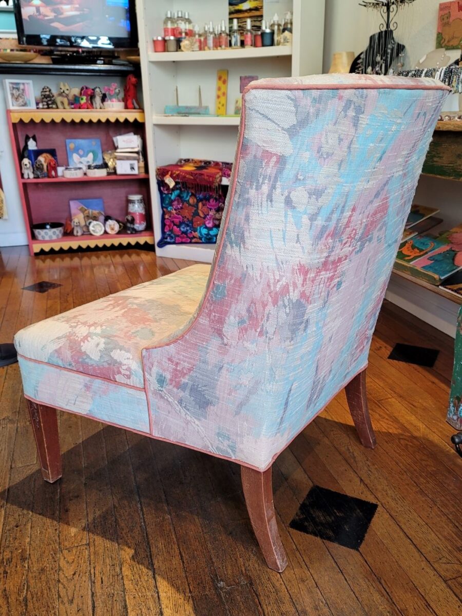
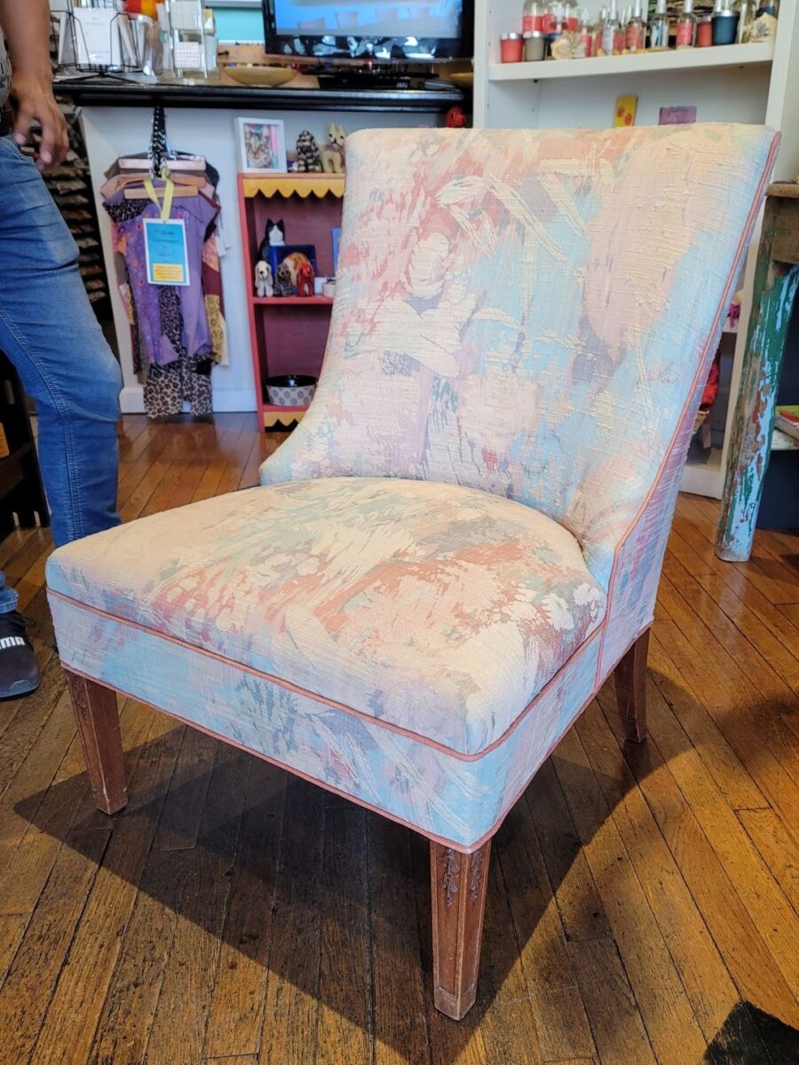
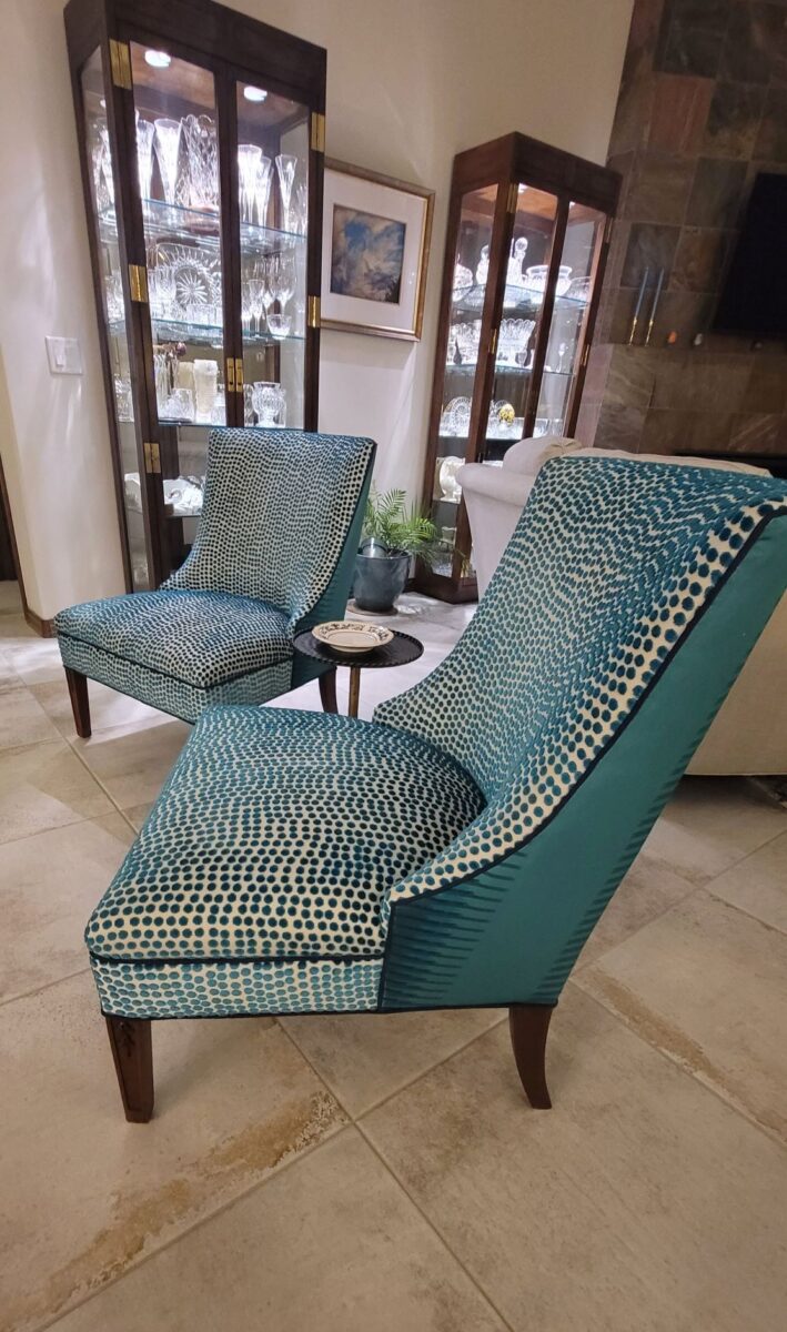
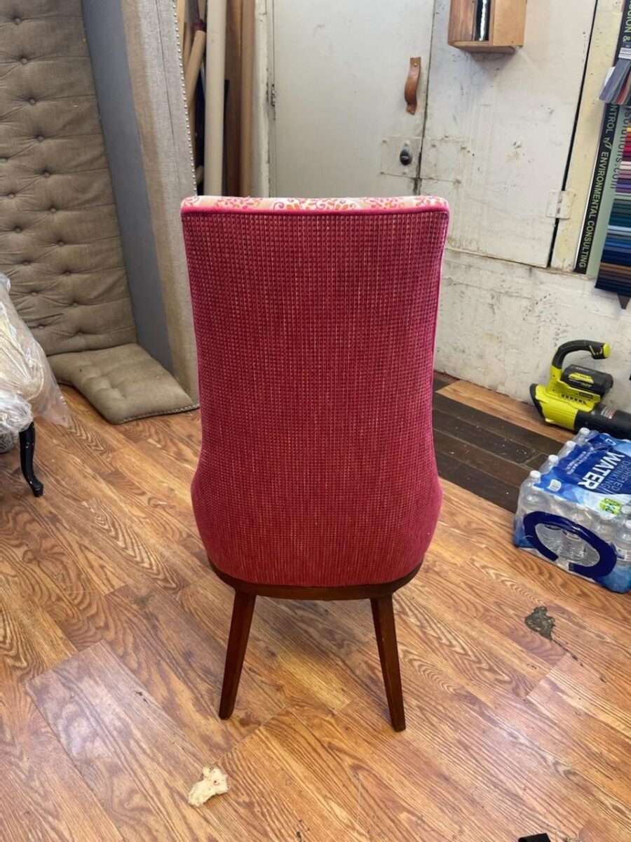
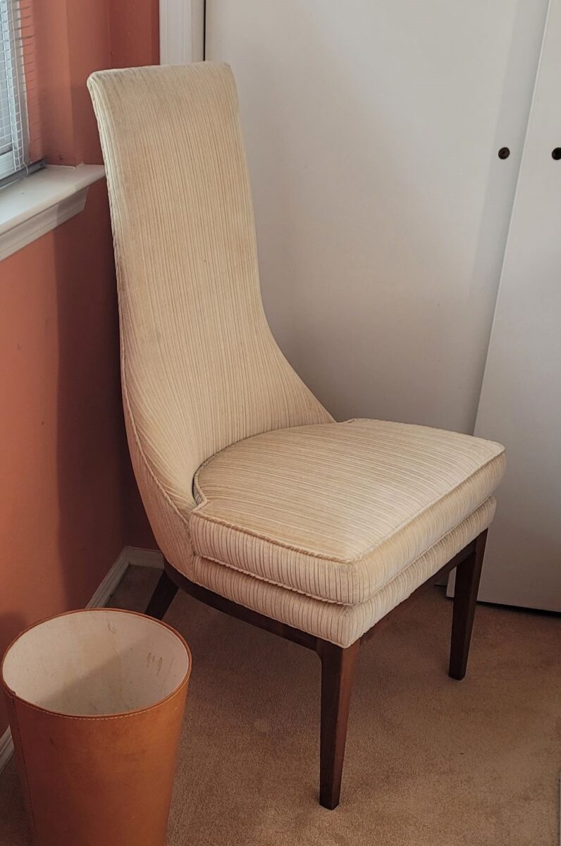
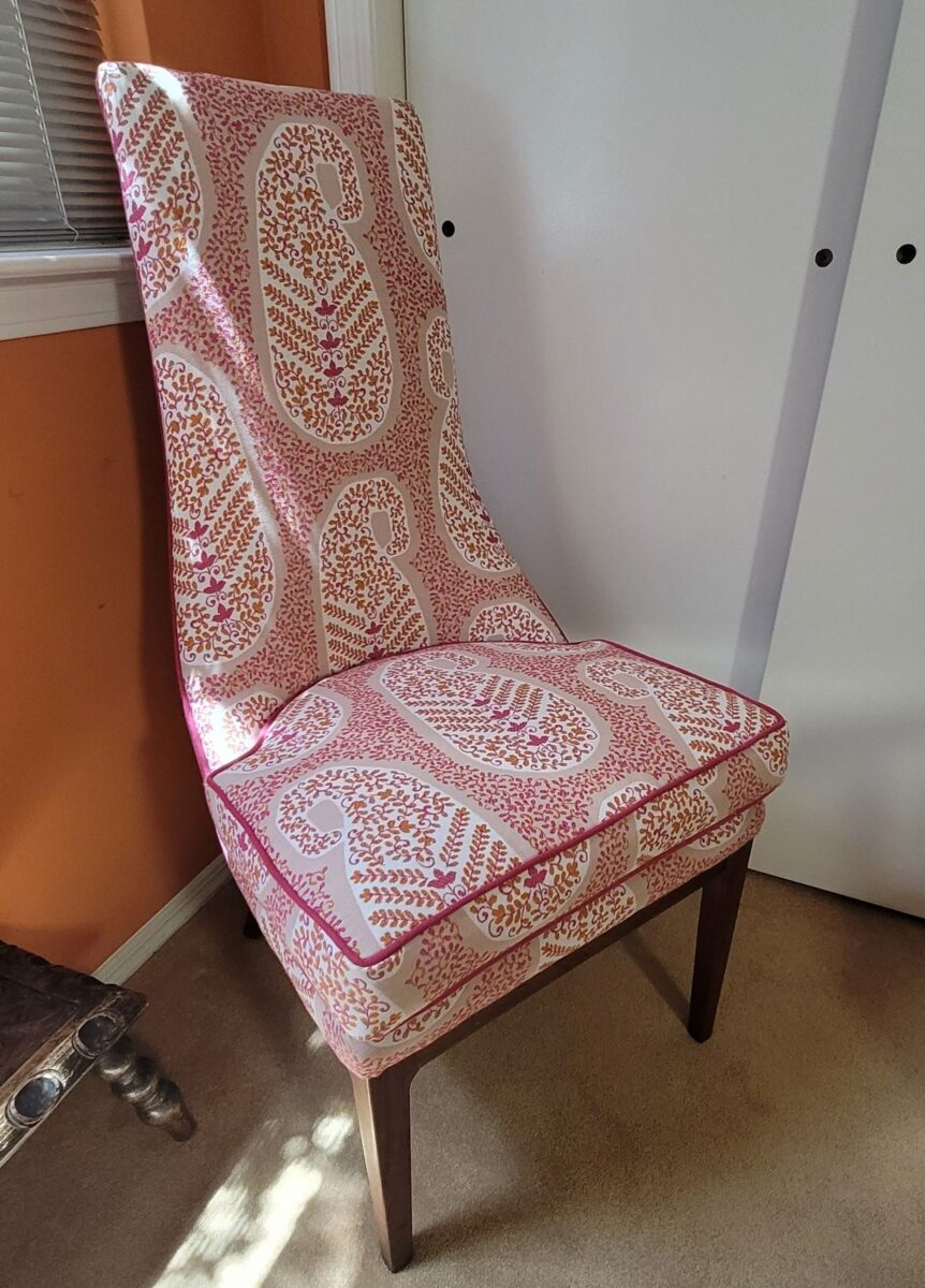
The lines of these handsome armless chairs caught our attention out in the elements, on the front porch as we passed by.We inquired of the owners if they were for sale and they said yes! it was apparent that they were nicely done in their original iteration, but the dated floral fabric was tired and ready for replacement.Having fun mixing fabrics is another layer of design detail. Here, the backs of the chairs have an intricate overstitching over the printed graphics.Piping the chair with a solid welt cord to complement the other two fabrics defines and details the chairs.
Reupholstery is a life-saving treatment. To salvage a tired piece with good bones and great lines is a service to good design. Pairing old pieces with new fabrics is rejuvenating. Inserting fabulous fabrics into a design scheme is a fine art that gives aged pieces a new life and contributes to the uniqueness of the composition of a space.
As we placed the chairs for an intimate conversational grouping, the scene started to take shape. Seeing the chairs in the context of the new interior illustrates how effectively they contribute to the composition of the room’s design.
Of the design elements, paint is the one with the seemingly limitless choices. Fabrics are next. The worldwide variety of textiles, creatives, fibers and the combinations thereof are vast. Searching for just the right fabric for a specific piece is part of that treasure hunt.
You have heard the term “run of the mill.” Even for many, having never thought of this as a fabric metaphor – this phrase is used commonly to describe the common. It means ordinary – a common, mass-produced product’s run of a manufacturing mill. Using common fabrics is a cop-out when it comes to creating unique designs – especially when there are so many incredible fabrics from which to choose.
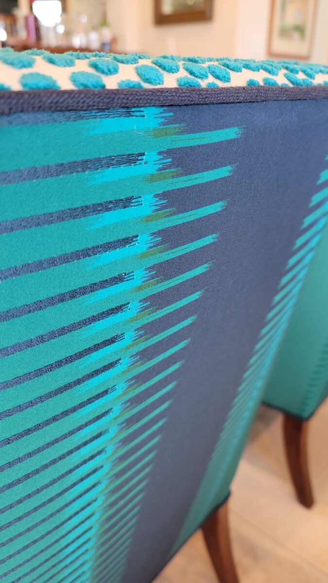
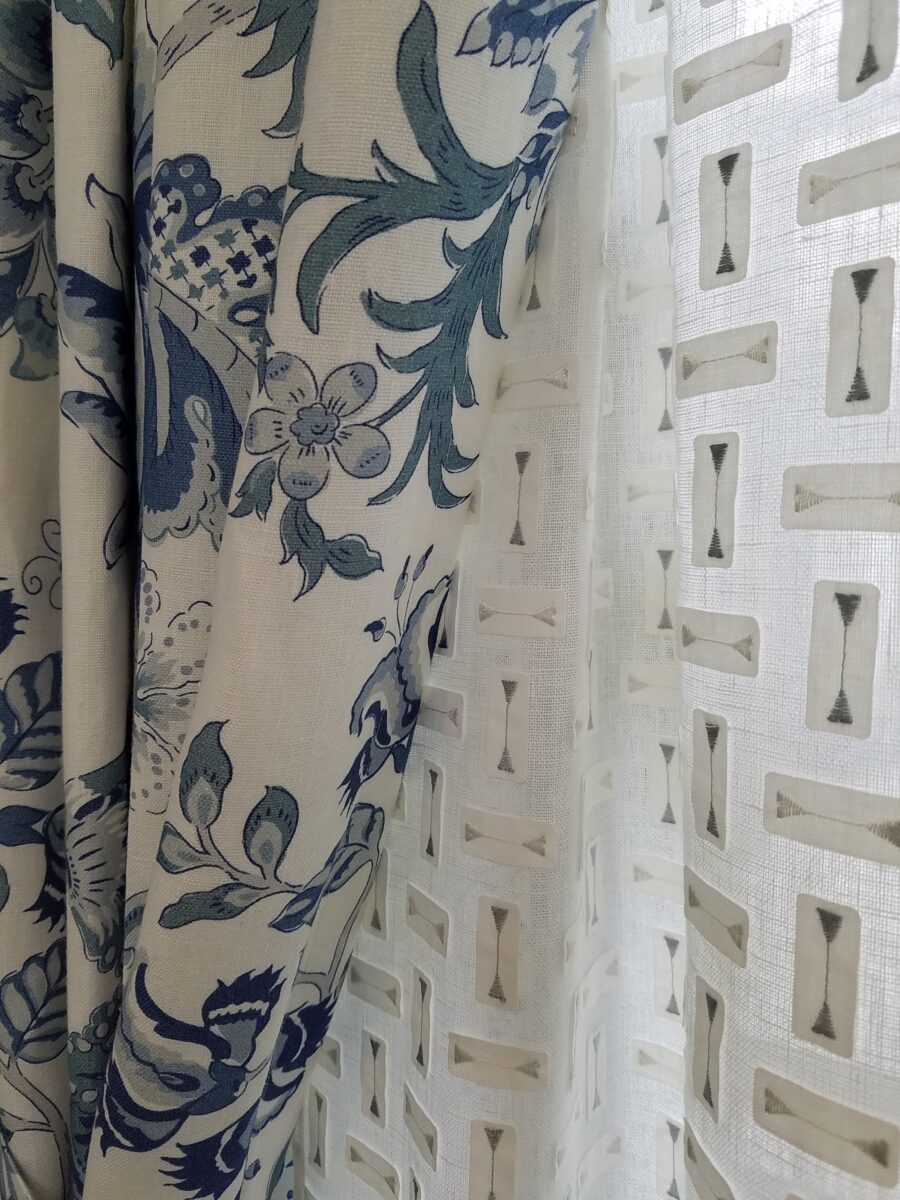
Focusing on a close-up of this recent upholstery fabric, we see the intricacies of the colors and textures of the weave.Here too, upon closer inspection, the overstitching on the printed graphic is an exquisite detail.
Personality comes into play when selecting a fabric. Along with function (how durable/cleanable it needs to be), the taste and preferences of the user, and the context in which it might occur – personality of the pieces plays a major role. For example, reading the personality of a chair – its lines and scale.
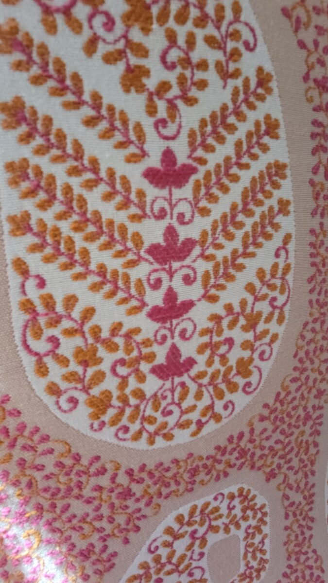
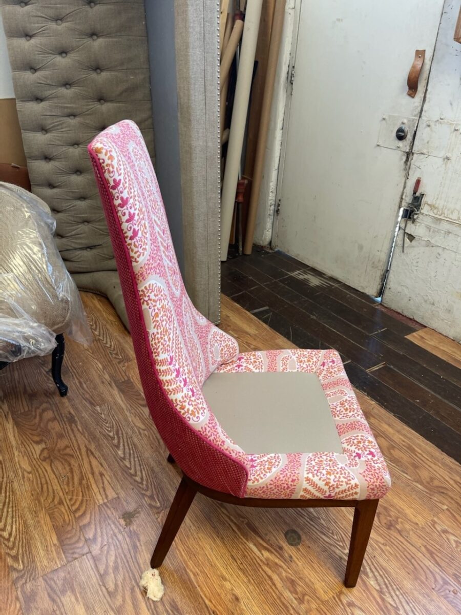
In the workroom, the chair begins to express its new identity.Extracting the raspberry color from the paisley pattern we’re using on the front of the chair, once again offers layers of design detail.This elegant little pair of chairs exhibited grace and style.Once reupholstered, it took on even more personality!
The personalities of fabrics are as endless as the textiles themselves. Fabrics evoke moods, seasons and even attitude. For commercial use, as well as heavy-use residential – workhorse fabrics have evolved. Not long ago, durable fabrics looked durable, less attractive and limited. And without turning this into a continuing education course about fiber content, it is obvious once you investigate the options, durability for wear, ultraviolet tolerance, mildew resistance, and antimicrobial properties – are all woven or applied to fabrics allowing amazing installations in commercial interiors that you would not hesitate to have on your living room sofa!
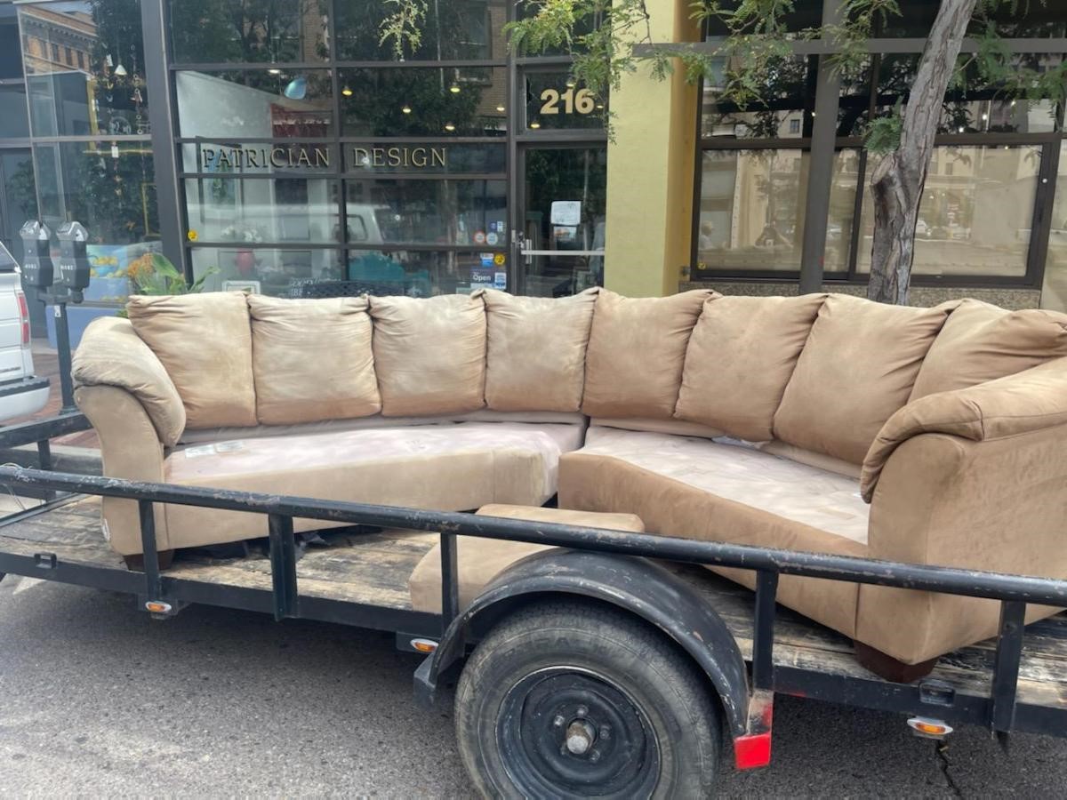
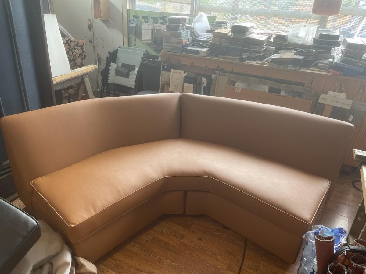
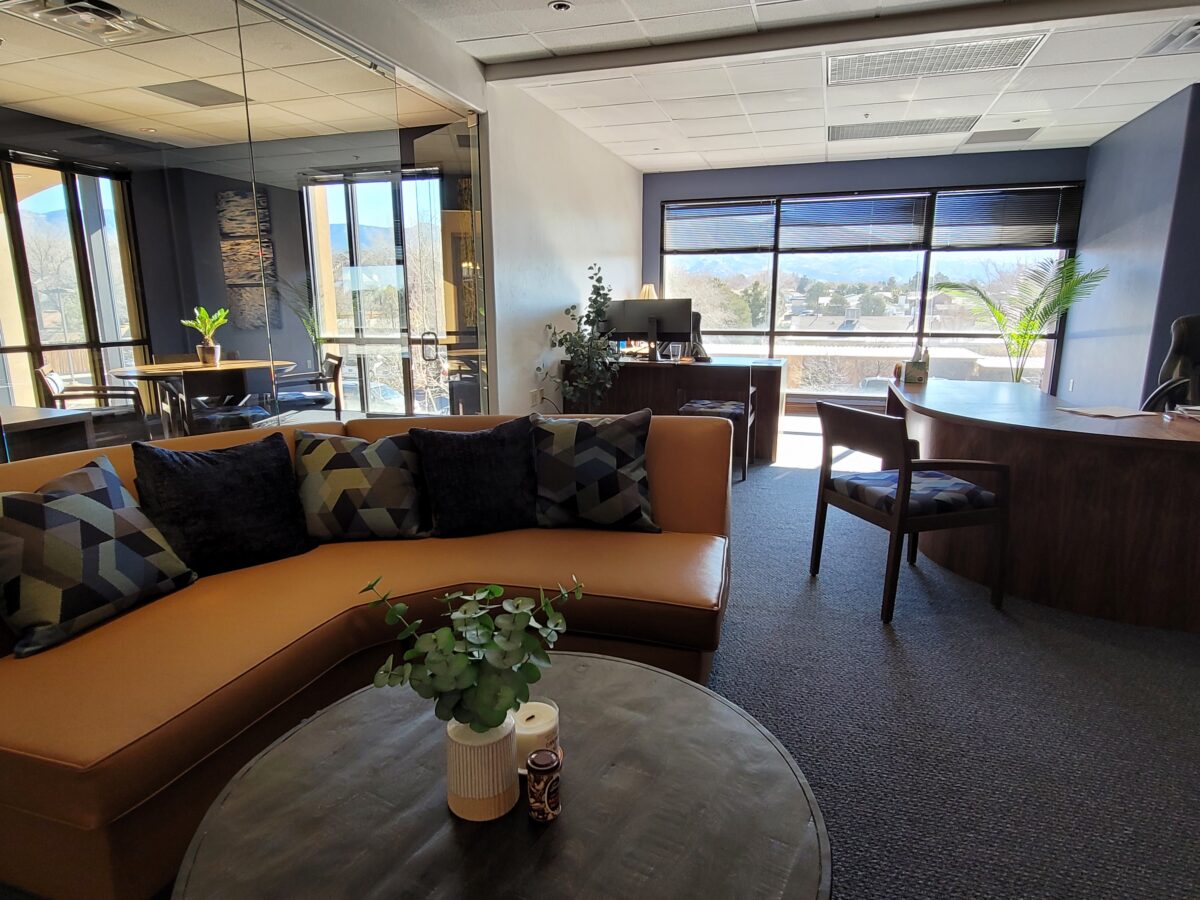
Most people wouldn’t look twice at this tired sectional, however, we knew we wanted a portion of a curved sectional (not an “L”, but a soft curve).Once we determined the bones were good, we realized it was going to work perfectly in its new interior. We selected a commercial-grade faux leather for the new skin.Voila! The finished sectional is further detailed with custom throw pillows to bring together the caramel and blue tones of this color scheme. Warmly greeting guests upon arrival.
Residential interiors can now enjoy what commercial interiors have realized for years. By incorporating the durability and cleanability which allows for the wear and tear – without showing those signs of real life – residential and commercial interiors incorporate fabulous fabrics that defy their strength – beauty and style conquer!
Sustainability of the fiber sources is an increasing topic of conversation. That and the fiber contents regarding the health/safety of the materials and treatments, if any, used (Okeo Tex certification, for example).
With all this information regarding the myriad options, enhanced durability and the unique opportunities that textiles provide to dress your great pieces – treasure the history, family hand-me-downs (if not heirlooms) and give them new life!!!! Its ART!!!
Whether a minimalist or an eclectic collector/gatherer, one’s details of home are important and personal. Like personality types, what is important to one person is not so much for another. However, it tells a story. The details of a home make it just that. Home.
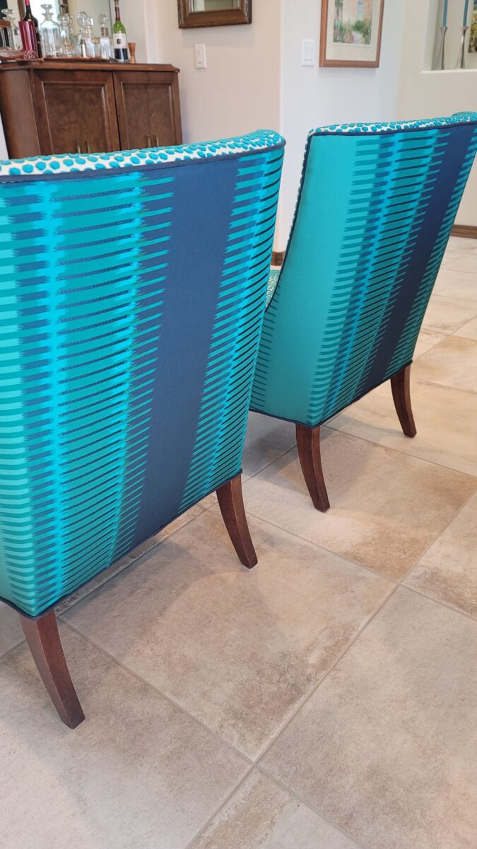
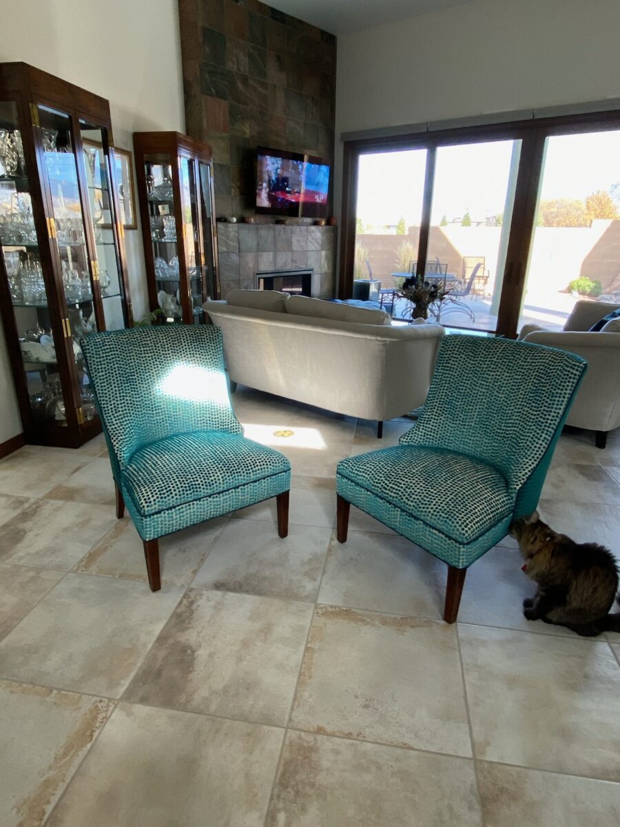
This interior has a lot of personality and very much reflects the artist who lives here. Antique family side chairs take a near full century leap with this new, colorfully eclectic upholstery.
Residences, the dwellings in which we live, can take many forms – from short-term to decades of ensconced living. To “reside” regardless of the length of time – suggests a certain level of comfort to include some detail(s) to make it “home.”
Each home is an individually personal space filled with details that make it so.
What might YOU consider imperative elements of what you call “home?” Consider comfort, color, ambiance, familiarity, convenience, nostalgia and perhaps just pure joy.
A hotel room for the busy “road warrior” traveling for business, might reveal a photo of a loved one placed thoughtfully on the nightstand. Something as simple as this can make a temporary residence feel more like “home.”
Upon plopping the overnight bag on the hotel bed, one of the first things to unpack might be the framed photo of a loved one to place on the nightstand.
Dorm rooms will reflect personalities, pleasures, interests, colors and imagery for young people leaving home for the first time. They create their own sense of place and “home” while embarking on their new chapters of life.
While looking around your place of residence – this place you call “home,” consider what is important to you. It might be the actual architecture, quality of natural light, a collection, a piece of art, furniture, photographs, decorative accessories…
A little over a year ago during the throws of our introspective isolation, my cousin, a thoughtful artist of photography, commented from Connecticut about The Essence of Home. In it she shares intimate observations and encourages personal study of your significant space – memory or current abode. She also suggests an interesting little project in which she invites us to “take half an hour and create a photo essay of a place that has significance” to us. “Challenge yourself to capture a feeling. Wait for the right time of day and seek out the mystery of the place. (This is a great activity for kids, too. You’ll be amazed by what they choose to photograph – what “home” means to them.) See what thing you’re drawn to capturing; become aware of the everyday beauty in the space around you.” https://www.catebarryphotography.com/
As an interior designer, I am engaged in creating and illuminating details that are meaningful. Whether a view or an object, color or finish, access or privacy – inside or out of the interior these elements collectively contribute to create the overall design. I encourage my clients to identify things they do and things they own – things they have gathered and how they live. What of them is of greater importance and why. This process begins a dialog of preference, value, and interests. Establishing priorities to springboard a project is key to a firm platform for the design.
You know the old question…If your house were on fire, what would you want to get out? It might be a person or a pet certainly – but if it were a material possession(s), it is a question worth pondering. The same is true if you moved or remodeled, what elements would you want to retain or replicate and what would you eliminate or change?
Vintage family pieces reupholstered, new pieces repurposed, bookcases filled with personal treasures, and the precious pet in the center of the action. Home.
The details of your home are personal, identifying, comforting aspects of your interior design. Discovering these important details is significant in effectively planning your interiors.
Color schemes are limitless. The permutations are endless. Color is exciting and fun. It is personal. Colors evoke feelings, memories, emotions and are key to a comfortable interior.
How often have you been asked or pondered on your own…”What is your favorite color?” Some people hesitate to answer, while others blurt-out readily with their fav. But what color you choose to wear versus what you enjoy in your interior surroundings and how much might be quite different.
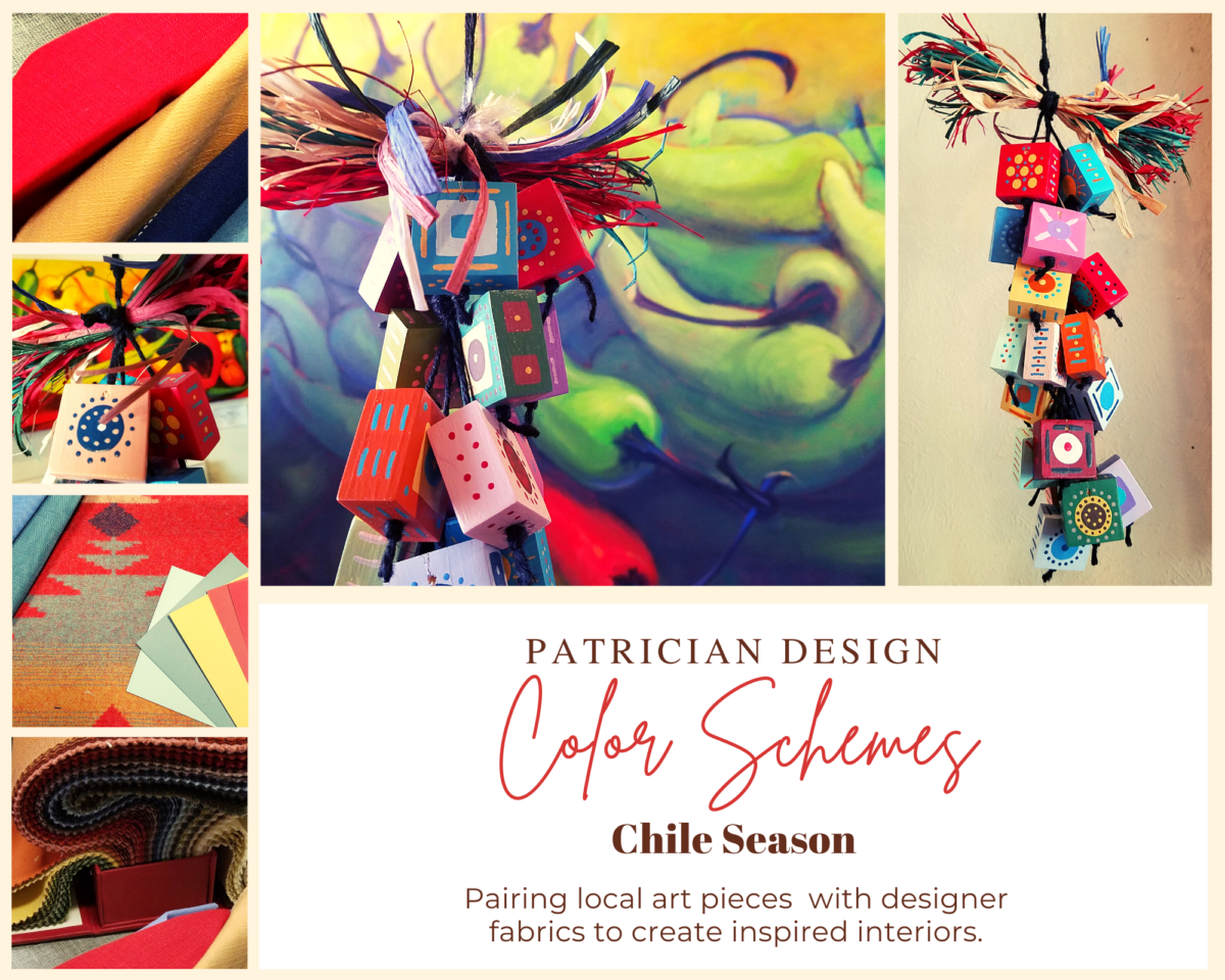
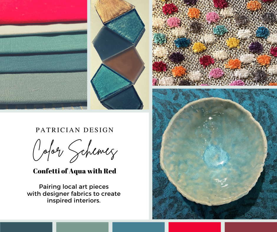
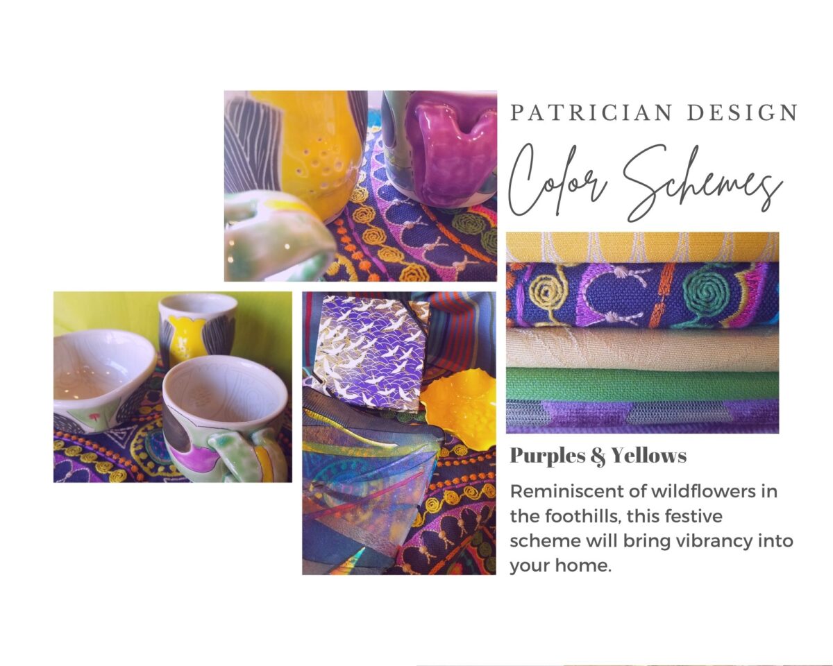
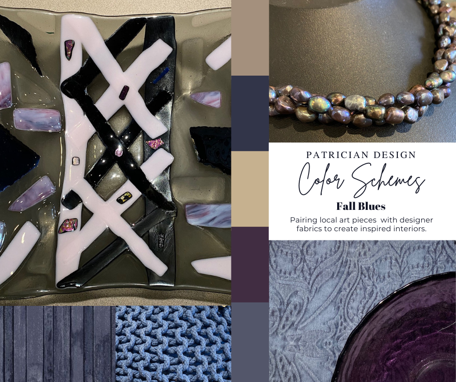
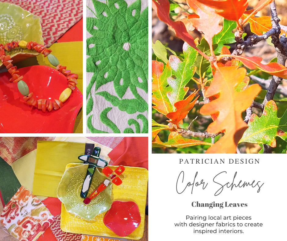
Several weeks ago, I launched a weekly post on our PATRICIAN DESIGN Facebook page called “Color Schemes.” The idea is to inspire design ideas by pairing artwork with designer fabrics. When planning an interior there is always a focal point complimented and surrounded by supporting elements. Whether a key painting will command the space or an expansive window with a view will direct the focus to a scene of outside colors and textures – that key element will greatly influence a successful interior color scheme.
Annette Donald creates colorful cubes in her creative take on our beloved chile ristras. A serrano chile oil painting, on canvas, by Federico Leon de la Vega is quite representational. Paired here with Romo and Ralph Lauren fabrics, Sherwin Williams paints…fresh and festive!
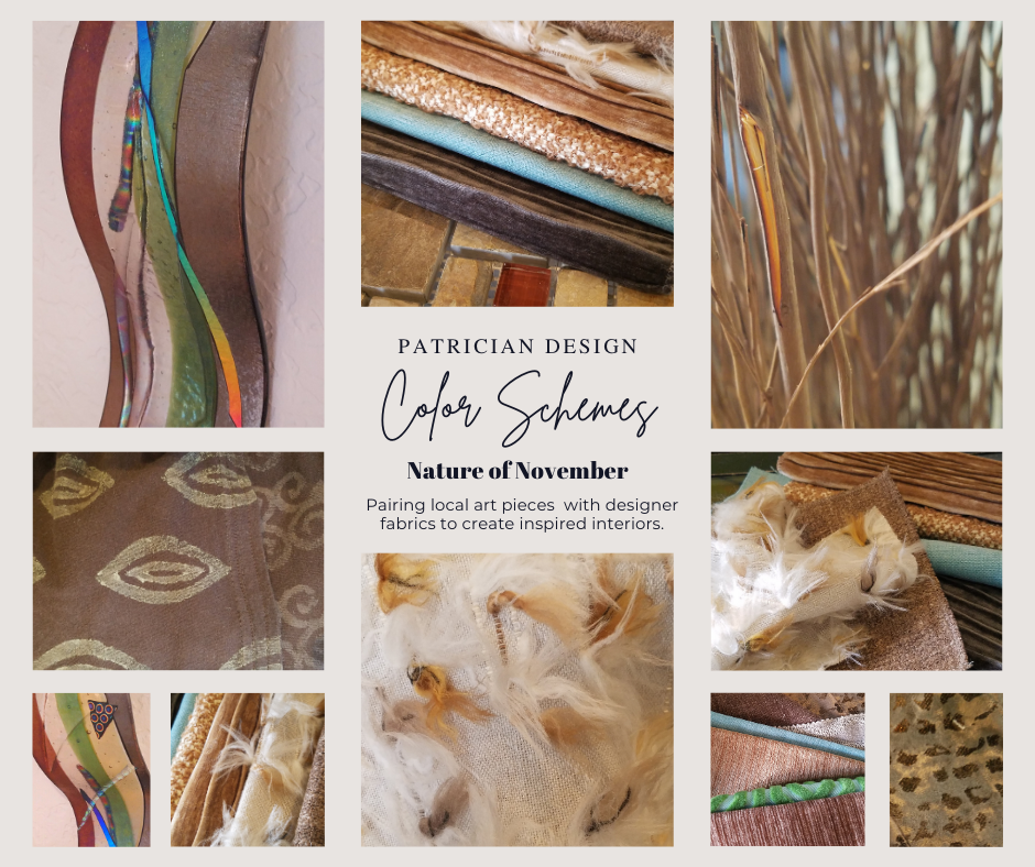
Here is the example of a November Scheme and you can scroll back each Monday for the past few months to enjoy a variety of the Color Schemes! https://www.facebook.com/PatricianDesignABQ/photos/a.243005986618/10157154423221619/
We embrace the The Nature of November with its unique colors and textures. As the air becomes chilly and the leaves fade…warm, soft colors bring us indoors. Featured here an elegant fused glass ribbon wall piece by Lisa Checnoff.
There are four primary considerations that I discuss with my clients when determining which colors to choose, emphasize, avoid, use as accents and where. To establish these selections, we evaluate personal preferences, contextual implications, seasonal influences and even trends.
PERSONAL: In planning an interior, I always want to know what colors make our clients happy, comfortable, stimulated, vexed or relaxed. These personal insights reveal important information for selecting types of materials too.
By examining what might be one’s favorite color, the discussion will navigate the distinctions, if any, regarding preferences for clothes versus interior furnishings. Interestingly, they are not always the same – although, by mere comfort and familiarity, they often are. Simply asking about a favorite color is not enough.
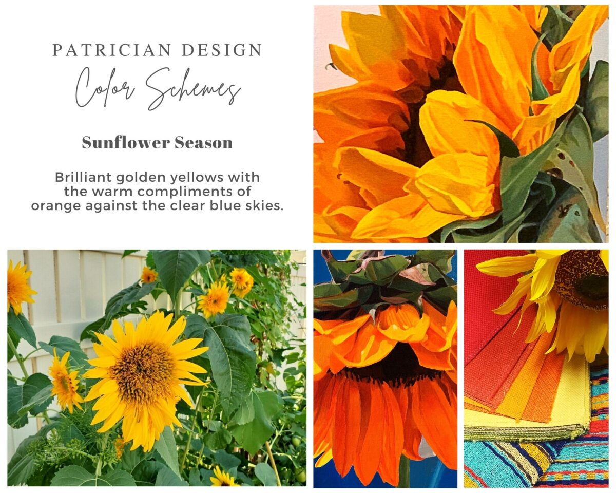
Brilliant golden yellows and blues – splash color! Featured here are fabulous photo-realistic acrylic paintings by Sheri Mays paired with amazing fabrics of the same exciting palette.
CONTEXT: The context of the interior might dictate or at least steer the direction of the design. The luxury of having multiple personal environments offers the opportunity to have different color pleasures exercised in different places. The ski condo might be woodsy and textural with browns, greys, stone and wood punctuated with a pop of color versus the seaside retreat with its crisp whites and cool blues and greens punctuated with pastels or bold contrasts. Therefore, the location of an interior might direct the desired color palette.
Inspired by this spa-aqua pottery bowl by Penny Roberts and the custom glass tile mosaic we recently combined to face a newly remodeled kitchen wall – the cool seaside/spa feel balanced with ambers and warm dots of color – pink, fuchsia, orange and golden yellow. Durable brushed cotton solids come in myriad colors and are perfect for pillows or upholstery.
SEASONAL: This one is tricky because it plays on the perceived climate outside – even if the interior is maintained at a constant temperature. It takes a concerted effort to plan a color scheme – including textures and finishes in anticipation of changing seasons and relative temperatures. I previously mentioned that a window with a view might be the focal point of a room…imagine the effect the changing seasons might have on the selection of interior colors and textures versus a consistent tropical scene, for example?
Perhaps you love purple – ever pair it with golden yellow? Here, functional, fantasy pottery designed and crafted with the most precise attention to detail by Jen DePaolo inspires our boldly brilliant scheme.
TRENDS: Inasmuch as I avoid being steered by trends, it is impossible and not advisable – in design – to avoid them. Clients are influenced by them and bring that would-be preference to the table. It is essential to continue to have “colors-of-the-year” and other market-driven colors change to stimulate the economy with buying and selling, replacement and updating. It’s our socio/economic norm. It also serves as an encouragement to re-fresh. But to limit that influence, in favor of long-term personal pleasures, is best. The pressure of this marketing color influence contributes to our being a disposable culture. Not time here for a lecture on such things – but rather to instill an appreciation for and confidence in personal selections an decisions – in this case, color.
Patinaed pearls and stunning glasswork by Margaret Hidalgo Vanderheyden inspire the soft, greyed lavenders and blues of this cool scheme.
An interesting and on-going test for evaluating a successful interior is when designing in one season – it has to work in all others. For example, when I meet with clients in the heat of July with lush foliage and color, warm temperatures and long days, that same interior has to succeed when it is frigid outside, barren, and with darker, shorter days. What might the challenges be in creating a successful scheme and what might be the solutions to make it work?
Having noted all of this and knowing the different reactions people have to color, isn’t it interesting when an interior is so successful that it appeals to many, if not the majority, of those who experience it? This is more applicable to commercial or public spaces – from doctors’ offices to hotels. However, the challenge and success is in knowing the many things to be considered and implementing a balance of them throughout all aspects of the interior.
Anne Marie Werner-Smith’s brilliantly glazed pottery here with Margaret Hidalgo-Vanderheyden’s lovely fused glass crosses along with coral and dyed stone necklace and woven table runner from Chiapas reflect the changing colors of fall leaves…
Appreciating color is a gift to designers. It truly is an imperative to appreciate all colors and have the sensitivity to discern the nuances between various values and the effects of selections and combinations from the infinite choices.
I hope this has given you ideas and inspiration to move forward with YOUR color schemes! Sign-up for our weekly email of Color Schemes with classic blue and white and stunning neutral greys coming!! And follow the posts on Facebook every Monday.
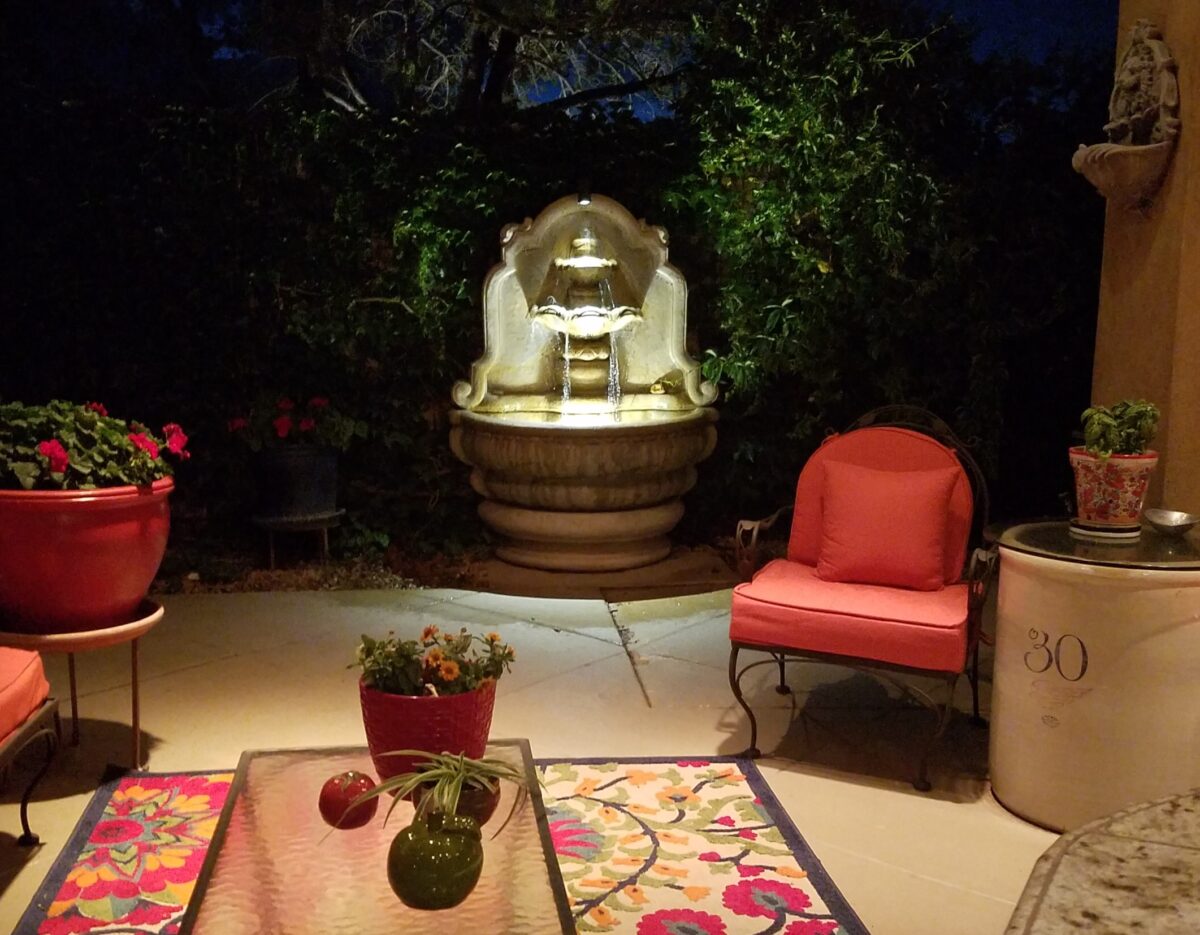
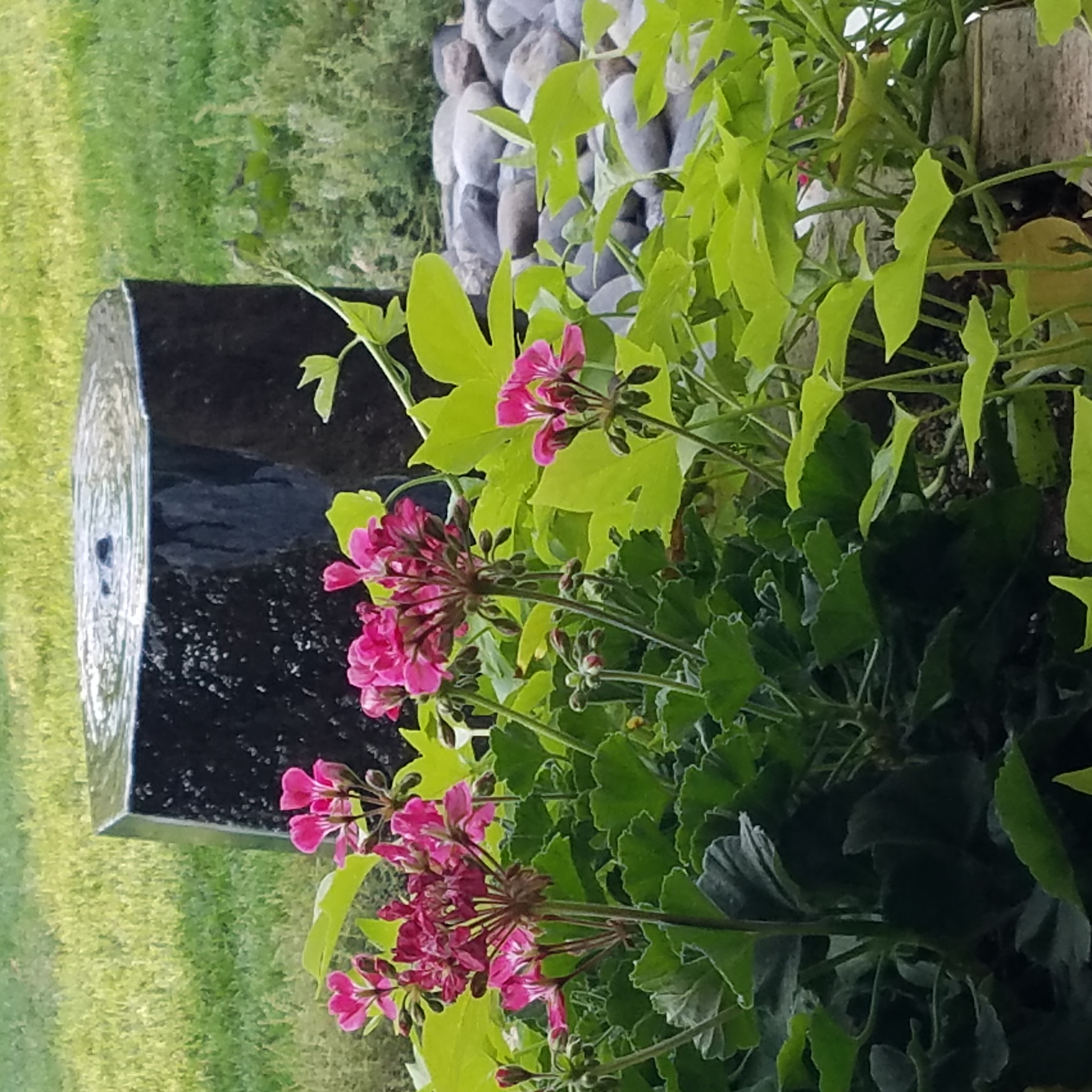
The serene sound of a fountain can provide mesmerizing relaxation. Like white noise, but better. Close your eyes, in close proximity to a little fountain, and be lulled into a wonderful respite zone. Even indoors, this is an effective relaxation element…outside the birds and breeze contribute to the joy.
Pets reap benefits too! Kona gets a refreshing sip from the fountain!!!At night, that same fountain offers gentle water sounds and an interesting sculptural effect.
Social distancing and isolation – these two popular terms that have defined so much of our daily living in the last several months and imparted a negative connotation. They paint a picture of living more at home – alone and even “out-of-touch” – literally. All of my childhood I heard the phrase “ne touche pas!” My uncle’s favorite, for sure! And now I hear it in my mind all the time. Don’t touch the shopping cart, door handle, people’s hands, “ne touche pas!” and if you do – wash and sanitize to a fare-thee-well!
Yet, on a positive note, this stay safe – be safe – living at home has spawned creativity to maximize that environment and relieve stress. It means, more than ever, expanding your outdoor options from placing a pair of chairs and tiny table on a previously unused, diminutive urban balcony or adding a palatial pool in your backyard…there are many options in-between depending on your circumstances and means.
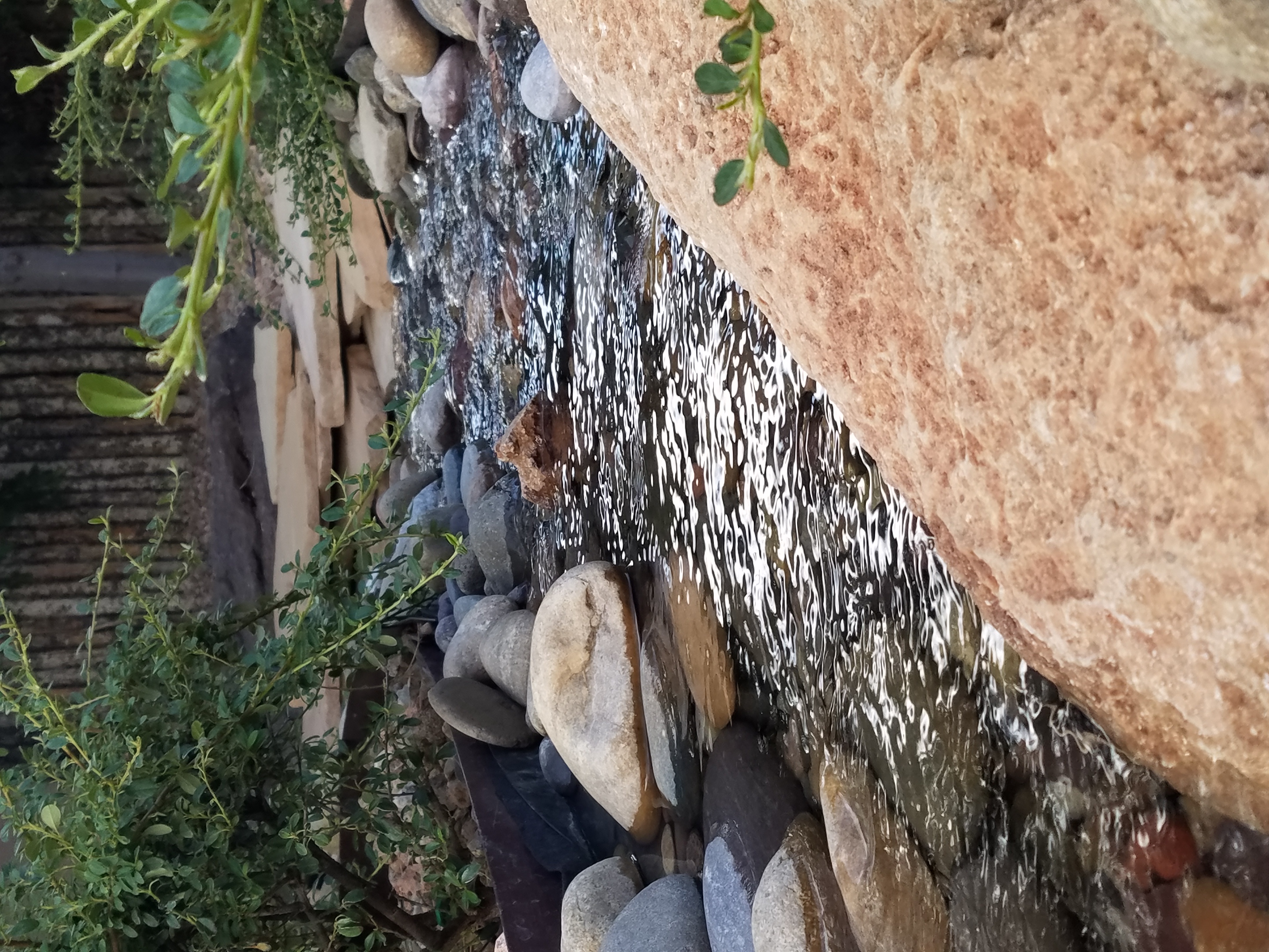
Our cousin in Tucson has created a lagoon effect with the dark bottom and mosaic trim. an oasis in the desert.
Water features are an amazingly therapeutic design element. Water suggests cleansing. It is refreshing and renewing. Water has promise. It can also suggest escape.
The Calgon add campaign of decades ago resonates today for those of us who remember…”Calgon, take me away…Lose yourself in luxury” The escape and indulgence of a relaxing soak in a tub. The gentle buoyancy relieves tension and encourages rest. It often suggests leisure. It is a luxurious, pampering exercise.
https://www.youtube.com/watch?v=8yjGPgs0_S0 Here is a video from the 70s to take you back to “Take me away…” Come back Calgon!!! We miss your commercials now more than ever!!!
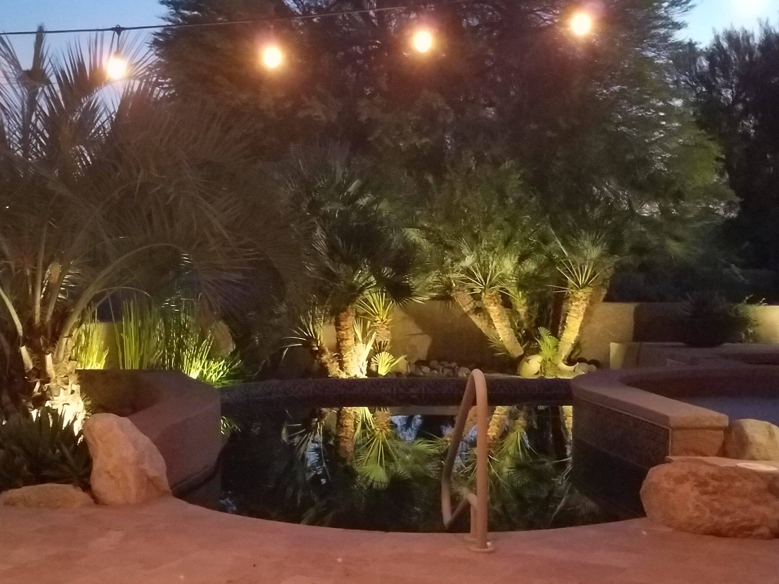
Taking that refreshing water scene outdoors is one of the most popular design projects trending today. From DIY to major construction people are discovering ways to escape without leaving home. Water features provide virtual escapes and actual refreshment for many people seeking that added dimension, diversion and sought-after pleasure in their lives.
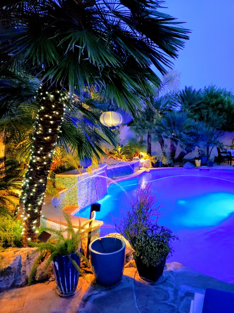
A friend in Phoenix has tricked out her pool with fabulous landscaping, spectacular iridescent glass tiles and LED lighting – the luminous colors an be changed with her mood!!!!
Swimming pools, a gorgeous grotto, lap lane, all afford the luxury of submersion and even exercise.
The sound of a small water feature to a creek-like landscape addition in your yard – the projects are many. This DIY guy created what he fondly calls “Covid Creek” – a project that took several weeks of focused creativity and back-breaking work all prompted by being stuck at home. The results are a magical mountain stream flowing beneath the trees in their modest-sized backyard. A creek-like water feature or pond can offer a respite to sit beside, dangle your toes and imagine scene far from the confines of our limited environs. You would be amazed at what beautiful illusions can be accomplished!!!
A babbling backyard book built as a therapeutic DIY project during the COVID confinement.
Such multi-sensory water features offering the touch and feel of water, gentle sound and visual beauty are powerful design elements to exercise the senses. Our senses suffer with redundant stimulation. The reclusive limitations of recent months have us stagnating with sameness. It’s the variety if stimuli we are so accustomed to experiencing that keeps things interesting and alive. Moving water is one of these exceptional sensory stimulations.
Organic garden sculptures – chiseled granite boulders with re-circulating water – meld with the landscaping.
Whether a tiny fountain or in-ground pool…even a galvanized livestock tub – investigate your options. Regard your environment and study your spaces to select the best design elements for your setting.
This past week alone I have consulted with a commercial client about reception seating and color, a home-owner, in a mountain setting, about durable floor finishes, bathroom remodels and color, a couple in a new home downsizing from one of 20 plus years about furniture arrangement and color, a couple from Las Vegas buying a second home by their daughter and grandkids about color, and a woman stopped in the shop yesterday visiting from Santa Fe and said that she didn’t know we were also a design firm -picked up a brochure and told me inasmuch as she had “a pretty good handle on design – she always struggled with color.”
See a common thread here? The comments were from that where she admitted to always struggling with color to another wanting her seemingly tract home to feel like a woodsy cabin with color, others wanted their spaces lighter while others wanted to make a corporate statement that would support their brand and not go out of style in the coming few years. They all had steered toward neutrals – but not in a good way – because they were uncertain about committing to COLOR.
I also continually stress that all design decisions are based upon context. Many of you reading this, with whom I have consulted, will recognize much of these observations and tips. I stress select color to compliment your context!
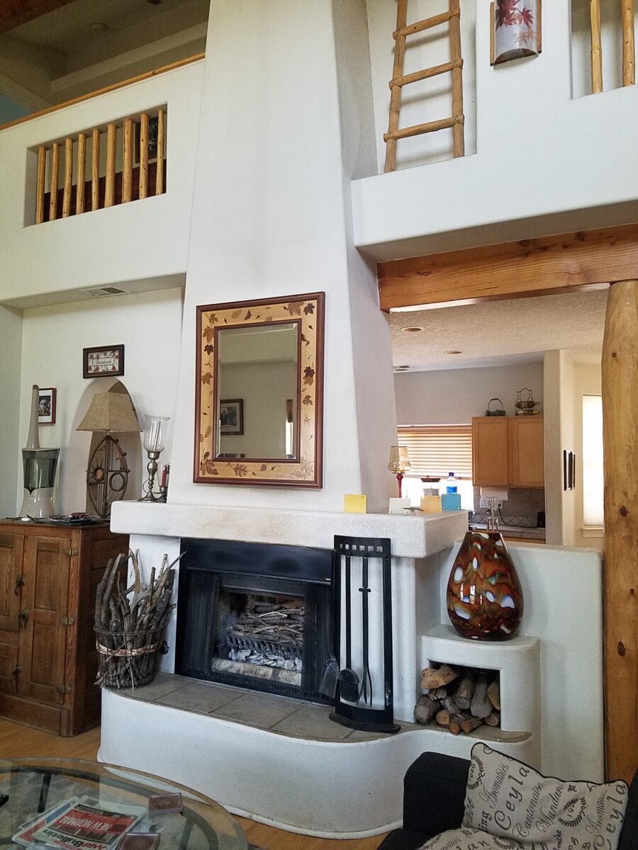
Interestingly, the mountain home has existing painted doors and trim. To change those elements would be costly. How can we woodsy-up this interior without those seemingly necessary key elements?
I asked her for her priorities and “comfort colors.” As a result, we will change the flooring for look and durability, building from that add color and various textures to enrich the space – stacked pebbles at the fireplace, a slab hearth, a wooden mantle and a light neutral will be the main backdrop splashed with strong elements of color (notice them on the mantle). The very vertical fireplace will be a bold golden yellow color to intentionally work with the honey tones of the pine architectural elements.
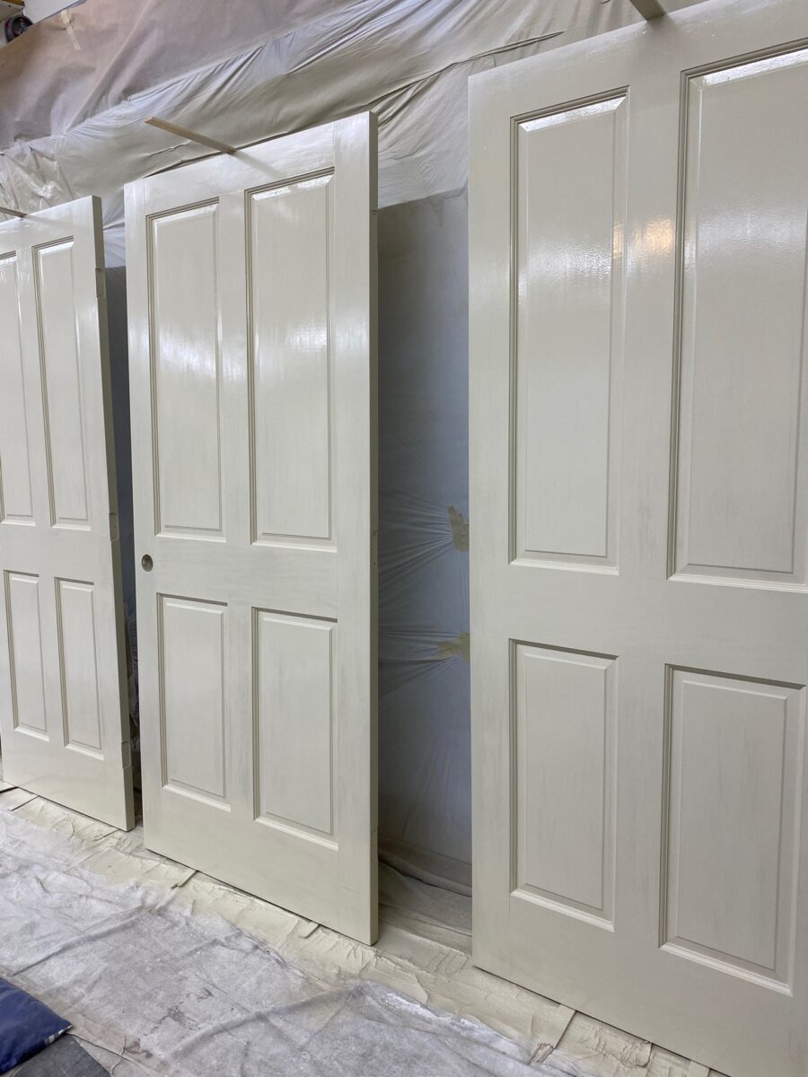
By contrast, a magnificent home (also in the mountains with great wooden details), had too much of a good thing for the owners’ other interior furnishings. In this case, the seeming sacrilege of painting the solid wood doors and trim was in order.
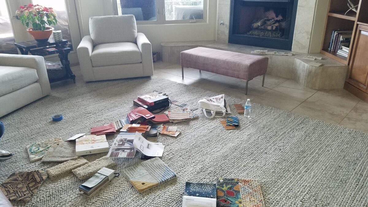
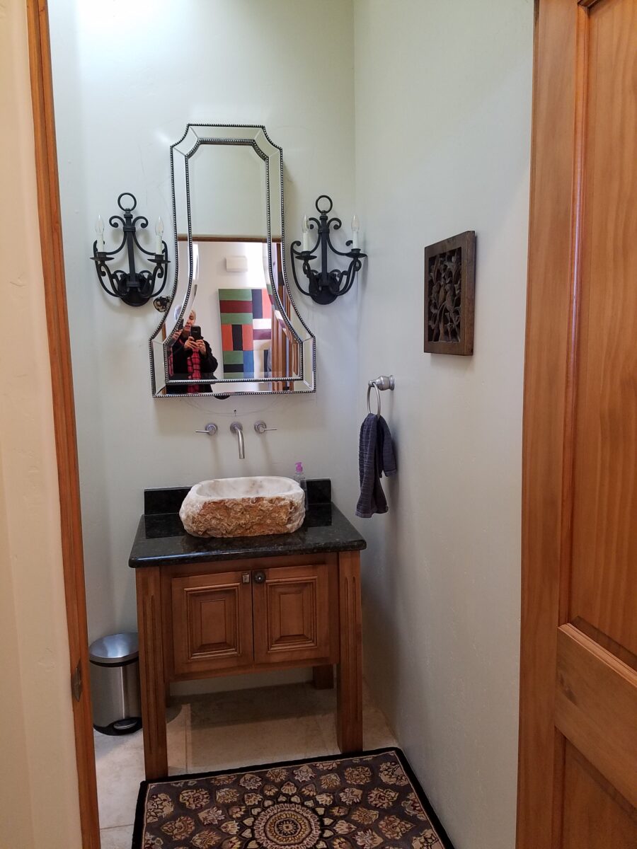
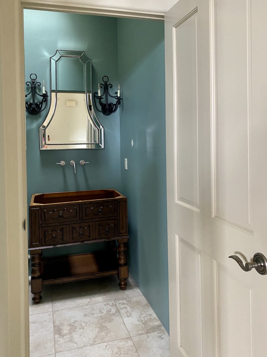
To paint all the solid wood doors and trim in this home was a leap of faith. But the goal was to add back stacked stone to carry a theme from the now naked fireplace to the kitchen bar and over to the entry door wall. Having it in three places will commit to an architectural theme for this finish selection. New colorful rug and fabrics for throw pillow will enliven the space and bring focus to individual accents throughout the interior.The grey hand woven grey rug was not providing the needed backdrop for this new scheme so we gathered rug and fabric samples to “punch-up” the scene.After the new rug arrived, we assembled the fabrics for another study of our options to detail the design.Before, this little powder room was a bit bland. The quality, solid wood, raised panel, pine doors were too rustic for the owner’s preference – but painting was not an option – until we discussed it. What was a possible sacrilege became a beautiful solution to changing the design direction of this interior. Mirror and sconces remained while vanity, sink and colors were transformed!The AFTER of the little powder room is still in the process, but it is clear that the transformation is startling with the newly painted doors and trim and the fresh POP of turquoise on the walls. Layers of color and emphasis changed. It is not about painting wood, it’s about creating balance. The massive, solid wood front door and antique and art pieces throughout will be emphasized as key features
Another such interior was over-burdened with stained wood and to paint it all out white was a major commitment yet, the results will make for a lighter backdrop still revealing the bones and their texture, but freeing the owners to showcase their other pieces of fine woodwork, art and furnishings.
PRO TIPS
The trick with design decisions is to determine and understand the primary purpose and intended “read” of the space. What is most important and where do you want your focus?
Once you have evaluated the space, identified its primary purpose and selected what you want to emphasize; see what is either in the way of, or competing with that emphasis, and clear all else away. Add back the things that you consider most important either for function or joy (form).
If the architecture is most important, determine what about it and work from there to complete the space. If a piece of art is most important – place it to its best advantage and build around it so as not to compete, but compliment. If a view is most important – the same is true – clear away and frame with the most important and/or effective pieces. Pick your priority, yet take everything into consideration.
With regard to color…it can emphasize the architecture or be inserted for a bold statement(s) of art or fabric on furniture, rugs…When using color, the idea is still to have balance in the context of where you are placing it. It can be a backdrop or a foreground accent.
Consider existing conditions that will not be changed – such as flooring. Select colors that include the compliment to that material. Whether in direct opposition for contrast or to meld in a way that creates a subtle transition – the consideration of existing materials is important.
The effect of considering existing materials can result in their appearing as though part of the plan rather than being inherited unintended. This is generally a desirable result. Therefore, if you have a material that will not go away – make it intentionally part of the plan.
The corporate color issue was about updating their image and connecting with their clients in an intimate and comfortable manner- an environment that carried the trust of years of experience and embracing a new generation of financial management. They developed a marketing plan moving forward to identify a theme, feel of confidence and carry it through the entire experience. In a recent Facebook post you will see this project in the process and notice that the carpet was an existing condition and that it was used deliberately to make the new materials appear to all have been coordinated from the start. Long time clients and new are comfortable with the changes! https://www.facebook.com/PatricianDesignABQ/
It’s OK to play it safe with neutrals – but in this case, it was time for a updated “brand” for this business. The unusual eggplant and chartreuse carpets inherited in the move to a different suite required some deliberate coordination, to have it all “read” as though designed afresh!
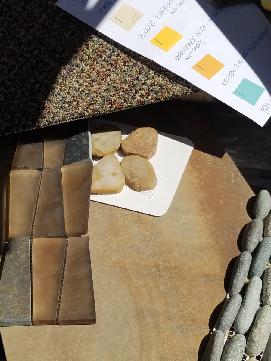
The want-to-be woodsy cabin project will have new, durable porcelain tile floors imitating variegated slate and from that palette of colors pull paint colors to add whimsy and visual impact along with other new additions of stacked pebbles at the fireplace and wood encasing the now sheet-rock mantle.
The stacked pebble stone, engineered stone, new wood mantle and splash of colors against the neutral will make a dynamic statement. Notice new color chips leaning on the mantle.
The couple downsizing and wanting more light and a less heavy southwestern feel panted their entire ceiling of beams and tongue and groove including support columns in white. The wood still “reads,” in all its hand-hewn texture and knots. The white is no less natural than the dark chocolate that had been their previous faux finish. Albeit the tongue and groove had a clear lacquer that we concealed behind the new cloak of white for a uniform backdrop.
The dark chocolate opaque stain of the pine members was no more valid than painting them an other color. We selected a white to open and refresh with a neutral backdrop to allow other elements to be more focal.Painting currently underway!! Watch for before and afters of this refreshed interior.
The couple with the second home had history in Hawaii and wanted a beachy, fresh theme for their new desert home. The flooring was a mottled light brown glazed tile and we selected a noticeably light, subtle sand colored wall paint to contrast and POP the existing off-white doors and trim throughout the home. Accents in recessed niches and doorways will become a soft turquoise while an interior laundry room gets a splash of citrusy yellow. The layers of color will be visible from different angles and vantage points. With the golden oak kitchen cabinets being painted out to match the existing off-white trim – the scheme will be fresh and beachy! Their artwork presents these colors and will being their personal touch to the arrangements. Watch for this project in coming weeks.
Do you have ideas about certain features in your interior that do not quite seem to come together? Do you feel the need to refresh? Are you looking for a new color scheme? Please do not be afraid of color and do not be confused about current trends. White and grey is a soothing combination. Trimmed with black, you get a defined contrast. Insert organic greens and the combination is sharp and now – and yet potentially timeless. HOWEVER – colors too have their place and selecting those and their combination that will speak to today and not be out-of-style tomorrow, as certain trending combinations might – select colors to compliment your context.
Here are a few other Patti Says blogs and PATRICIAN DESIGN projects about color selection:
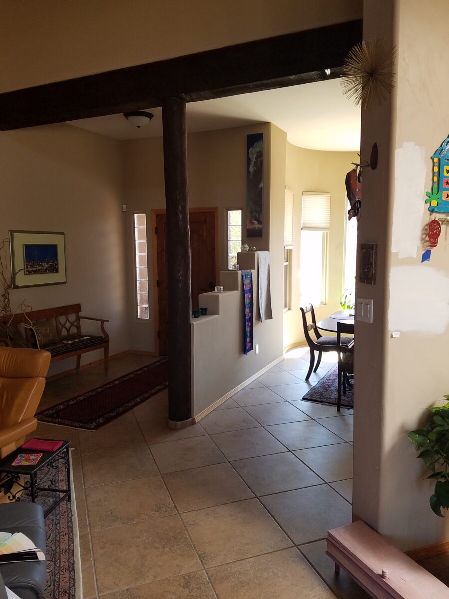
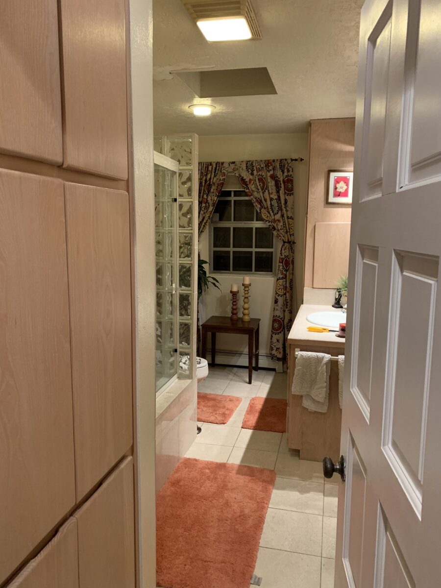
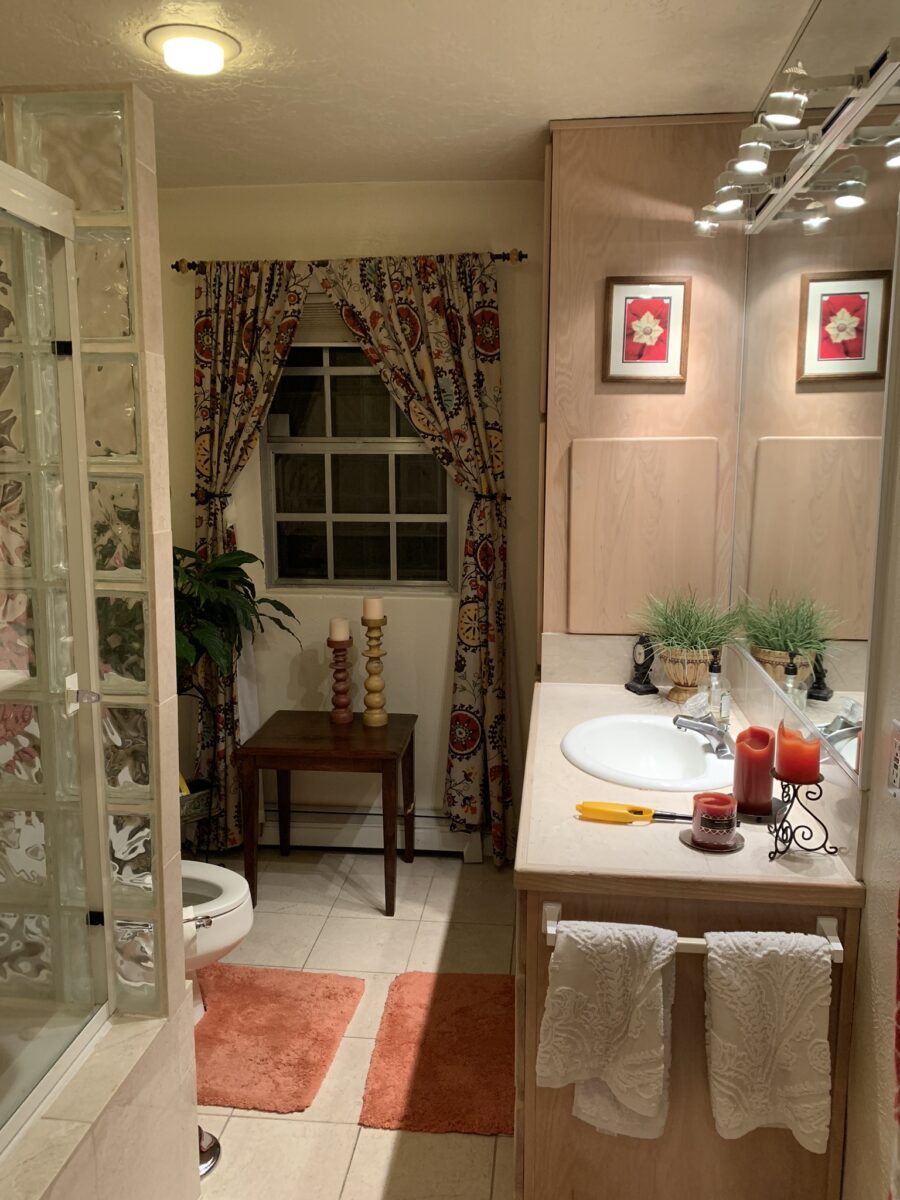
Last August 11, 2019, I left you hanging with a radical bathroom remodel that was in the throws of being transformed. The title of the blog was Everyone Loves Before and Afters. https://patriciandesign.com/everyone-loves-before-and-afters/ Here today, I am excited to present the finished product and a little more to the story…
Everyone DOES Love “before and afters.” The original blog identifies the material process of the project, but as important as the material applications are the emotional aspects of design and precede the material selections.
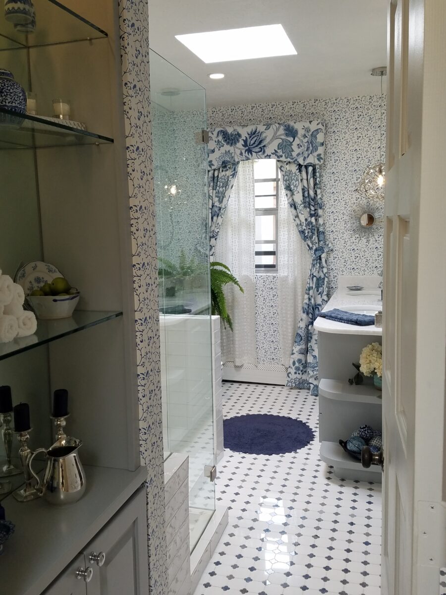
The home is a bungalow style home from the 1950s. Charming architectural elements and traditional details set the stage, sensitivity, and the emotions behind any design decisions we were to consider. See the first phase of this home’s updating design in the primary living space at this link: https://patriciandesign.com/project/classic-blue-white/ The kitchen was also re-finished. Maintaining the same design layout and appliances, the new finishes resulted in a startling transformation. https://patriciandesign.com/project/kitchen-transformation/
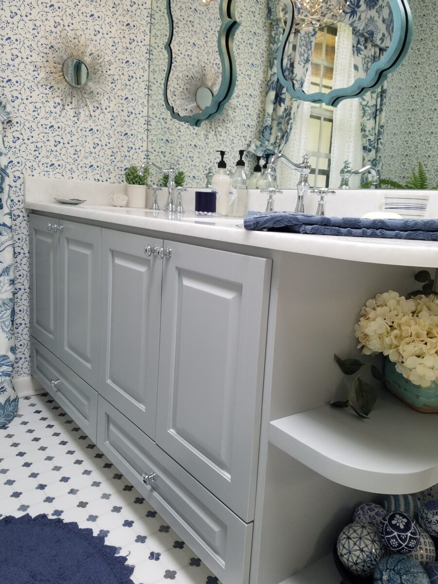
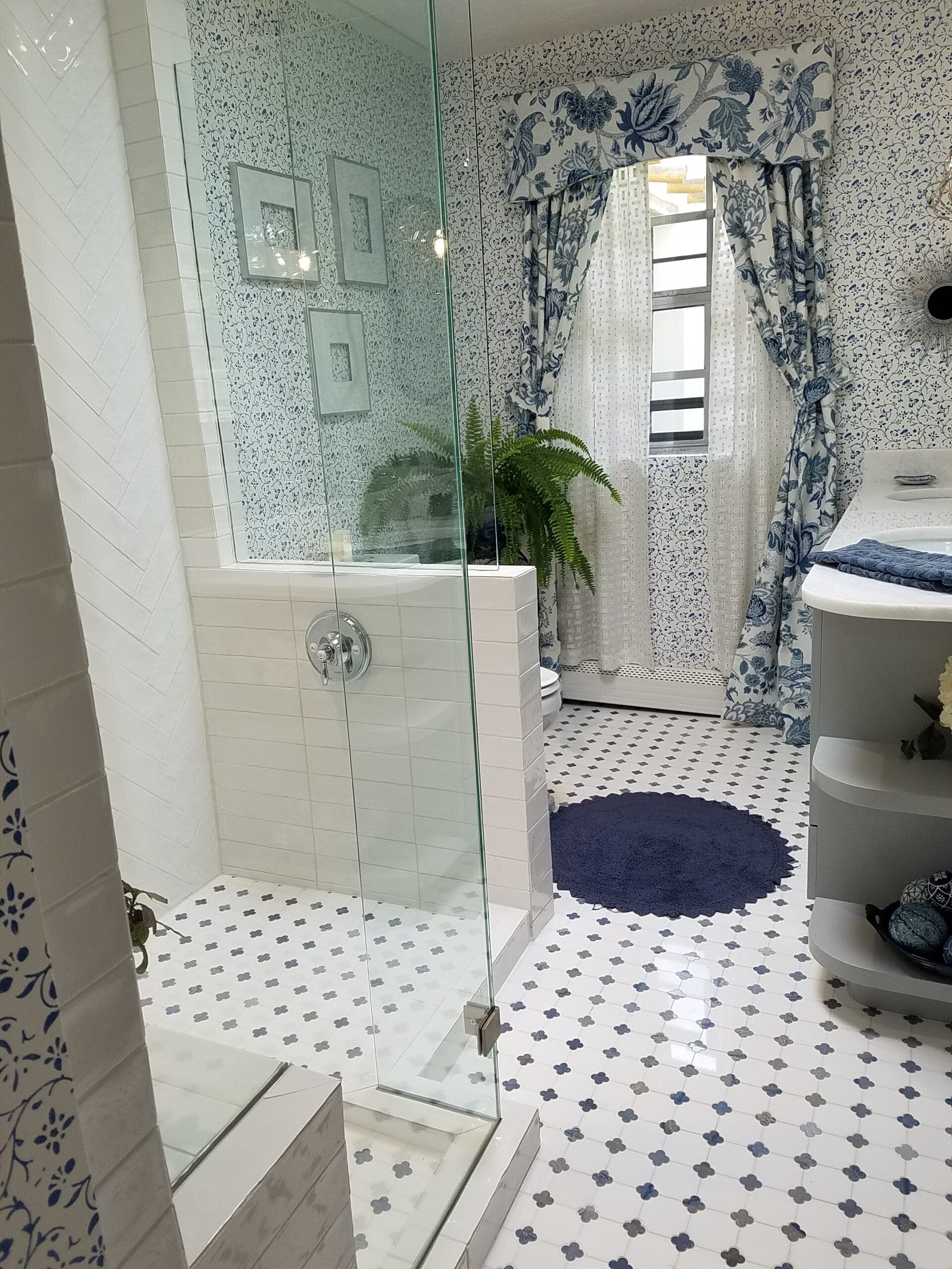
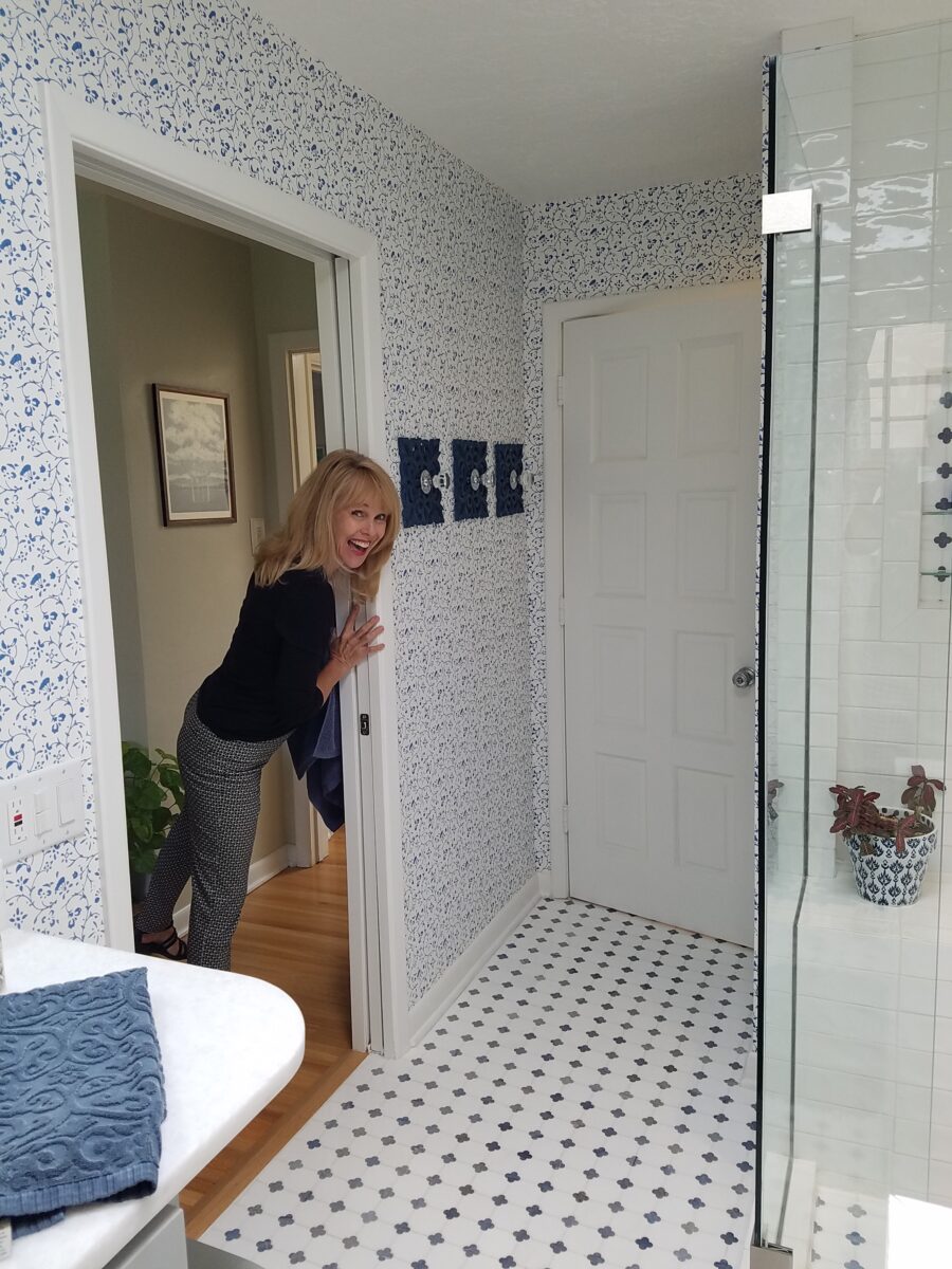
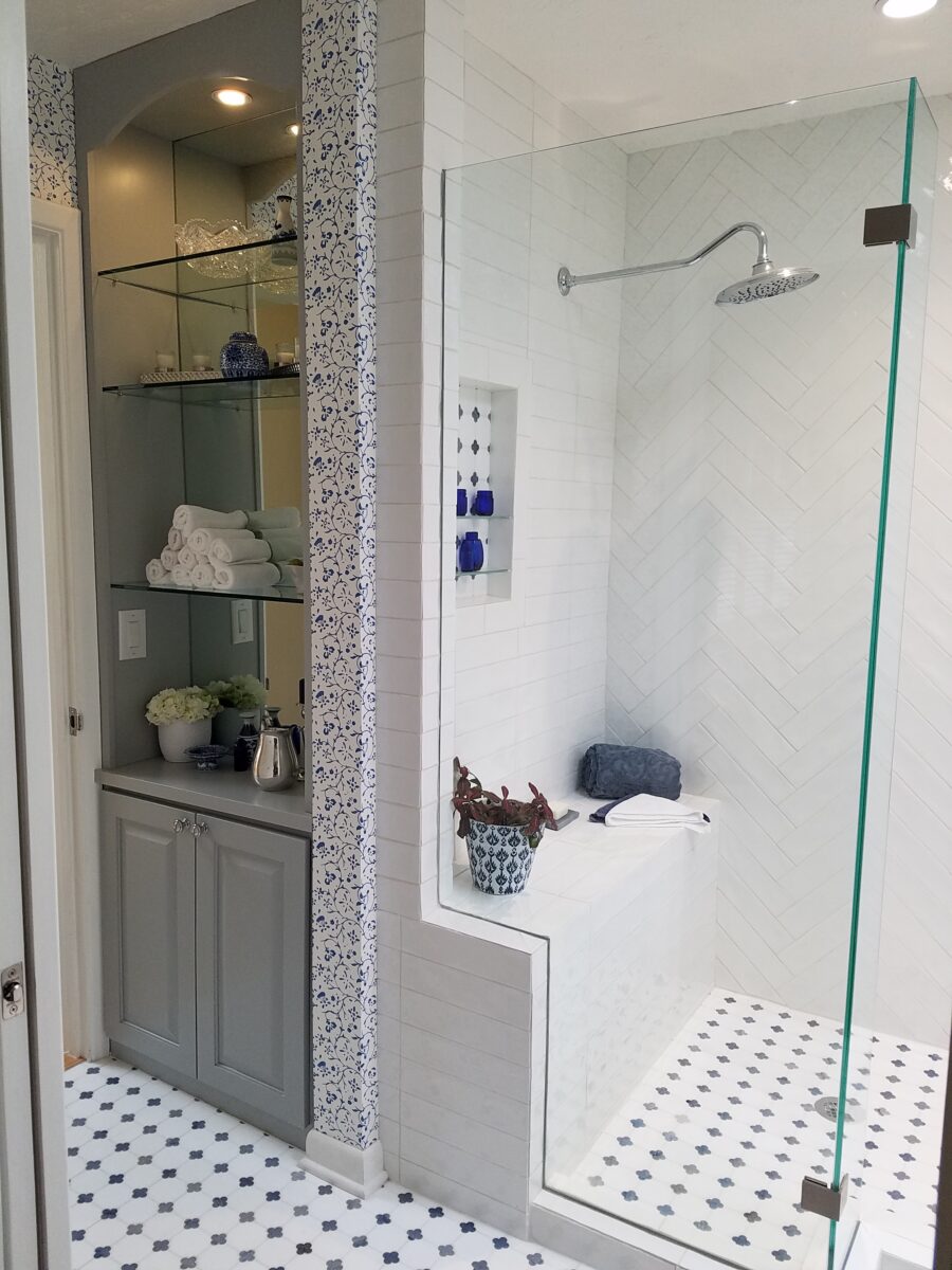
The challenge in this project was to retain the character and traditional charm that the couple so enjoyed about their home, while introducing new, modern design features and trends melding with traditional design elements. New custom cabinets for the vanity and linen storage/display unit along with the re-design of the shower – eliminating the tub and making a “doorless” access and a pocket door connecting to the adjacent guest room were the three key construction components.
Dated finishes done in the 80s, by previous owners, were common and bland. The tub and shower were enclosed with by-passing glass doors in aluminum tracks and frames. This bathroom was the dated and fussy room that we presented last August. The tired and dull finishes needed replacing and refreshing. It was to be a complete make-over to compliment other recent improvements in the home.
Once the general concept for the remodel is determined, the “what if” stage begins. The stage where ideas are tossed about and decisions lead to other decisions. The options are massaged giving way to different combinations and considerations.
After all the options are discussed the plan is adopted – a combination of everyone’s input. Hopefully not design by committee, but in this case the couple, in whose house we were working, and the me, the designer. After the design is determined, the input of the general contractor and/or the sub-contractors can come into play. They are generally given the opportunity to evaluate existing conditions and voice opinions and procedures or details that their expertise can bring to the project. Everything is considered until a cohesive plan is developed.
New cabinets were locally fabricated to not only insure excellent craftsmanship, but to customize the fit (left to right) and provide specific drawer configurations for the desired new height of the cabinets with an additional sink.The tub was removed, and the new shower enclosure was clear glass and given a wider footprint to allow for a jog which eliminated the need for a door. The shower valve was relocated from beneath the shower head to the opposite “pony” wall, making it easier to operate the temperature and flow without getting wet first!
Other than the shower reconfiguration, new cabinets, and pocket doorway into the guest room all else was superficial cosmetic design features. This is where the layers of embellishment come into play.
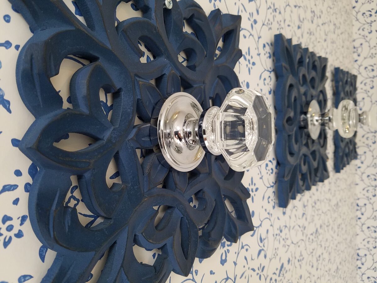
During the process, there were certainly hesitations about the combination of patterns and finishes being proposed…however, you know you’re on the right track when the happy homeowner has fun accessorizing and creates the perfect towel/robe hooks! DIY – finding these blue, wooden, open-work plaques, our creative homeowner bought polished chrome and glass doorknobs and attached them securely to the plaques – Voila!
In keeping with the traditional design direction previously adopted in updating the interior, the flooring was selected for its natural stone mosaic authenticity. With a warm grey selected for the custom cabinets and white herringbone patterned subway tile on the rear wall of the shower enclosure made for a fresh modern look.
A mix of patterns – a balancing act – the art of design. Do not be afraid.
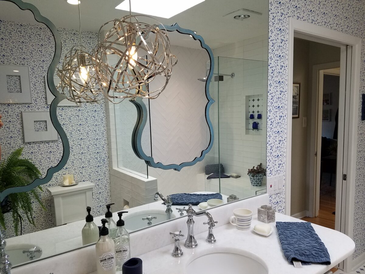
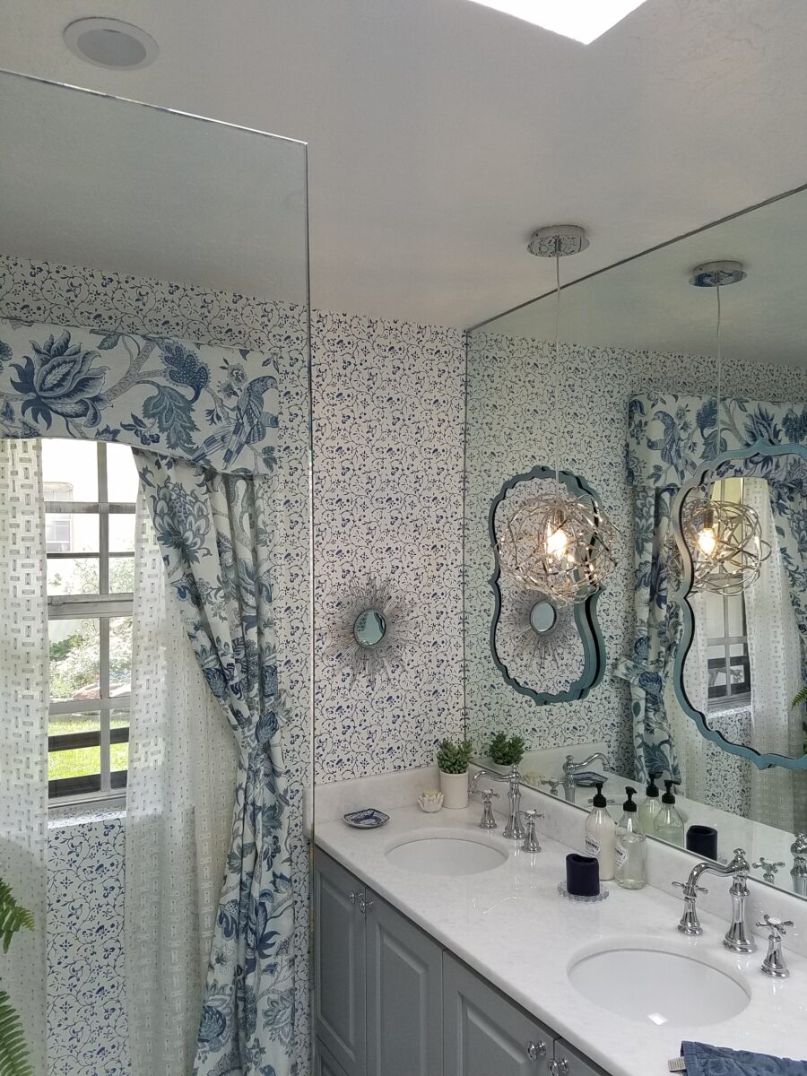
But wait! These traditional elements and modern trends were further embellished with a second layer of curvy turquoise mirrors installed over the full-wall mirror – suspended between is a polished chrome sphere of open bands providing ambient light and additional task light for the vanity area.
Layer upon layer until the composition is complete!
Classic blue and white screen-print on paper with an overall pattern of vines and leaves fills in the voids creating a not-too-busy backdrop – adding further dimensions to the design.
Natural stone slab of a white crystal-like granite – looks like a stone quartz crystal.
Drapery fabric in a traditional floral on linen with whimsical, modern “martini glass” sheers soften the window and diffuse the incoming light.
The resulting completed interior is a radical transformation from the dull beige and peach of the previous scheme. Fresh and crisp – with just enough busy to be playful – the new owners claim that they smile every time they enter or even walk by.
Remember the first photo? The BEFORE & AFTER transformation is extraordinary.
Where are you finding comfort, peace and a reprieve from the crazy of it all? I’ve been checking in with people from around the country asking where they are finding peace and tranquility during these unusual times. Sharing their peaceful places has been fun and thoughtful.
Isabel sends greetings from “The Beach” – Standley Lake in Westminster, Colorado.
Discovering comfort in familiar and new places is the name of the game during this time of uncertainty and isolation. Some are more isolated than others. Some are surrounded by real or virtual workmates, others family, some have the companionship of a pet while others find themselves living alone and feeling a different kind of isolating solitude.
Several sunsets submitted…seems that is a restful time for most. Jan finds peace, at the end of the day, from her backyard. Nice.
Snuggling up with music or a good book, watching movies, playing games and exercise are all a part of our daily lives, but in this current situation they are magnified with importance. Technology has certainly broadened our reach. The information we can access is nearly limitless and connecting platforms to video chats have facilitated the way we communicate over the miles. Activities and focus on our senses heightens our physical and sensory benefit and enjoyment .
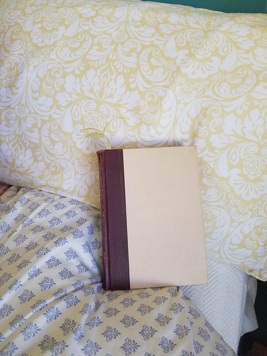
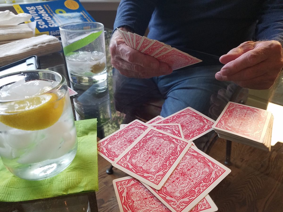
Whether a tablet, paperback or hardcover – nothing says escape like a good book.Solitaire or a battle of gin…with a little gin.
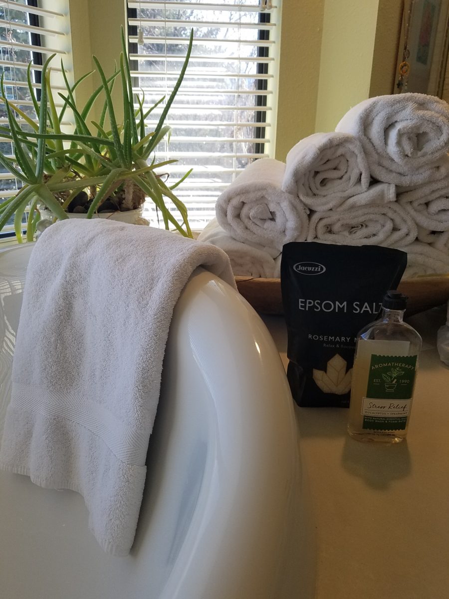
Interiors are our haven. Finding peaceful places within your realm is a new adventure of discovery that is occurring as a result of a resourcefulness to stay comfortable and balanced. It’s a great time to pamper yourself. Who doesn’t like to take a bath? I don’t. But these days, that tub and inviting bubbles and fresh scents are intriguing. If you don’t have any bath salts or bubbles…find some fresh rosemary sprigs or pine needles…lemon juice or grated rind…perhaps a little ginger powder or grated fresh…put it a cloth pouch so as not to clog your plumbing.
Light a scented candle, make your own fragrances, play a little music and escape for a bit.
I usually feel too rushed – and that’s ironic because taking a restful soaker is supposed to be a perfect stress-reliever. How awful is it not to have time to decompress? Well…we all have a lot of time on our hands – albeit time being utilized differently.
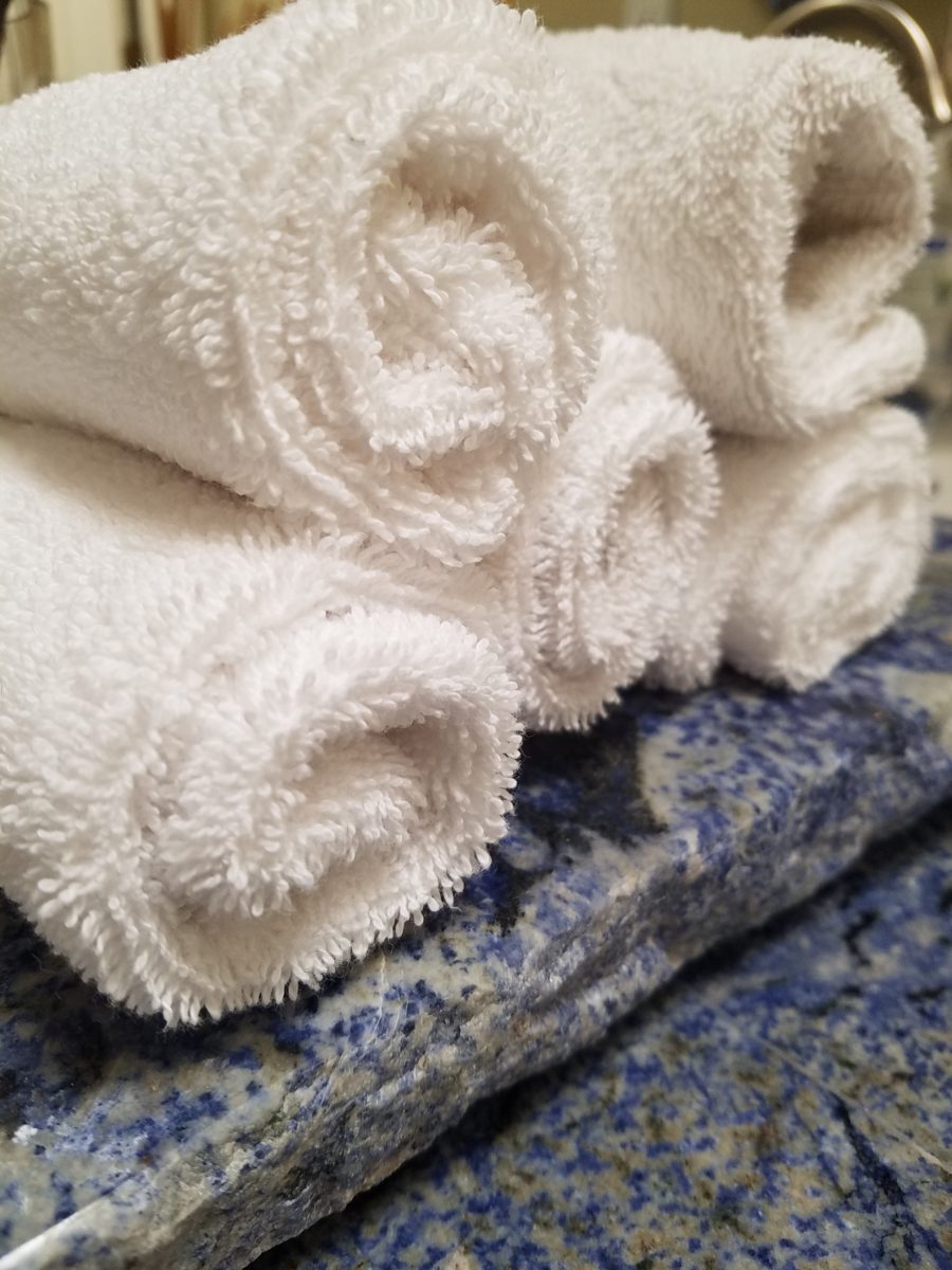
Roll-up a few towels to set the stage – make it like a vacation spa – if only for an hour until the world catches up again!!!
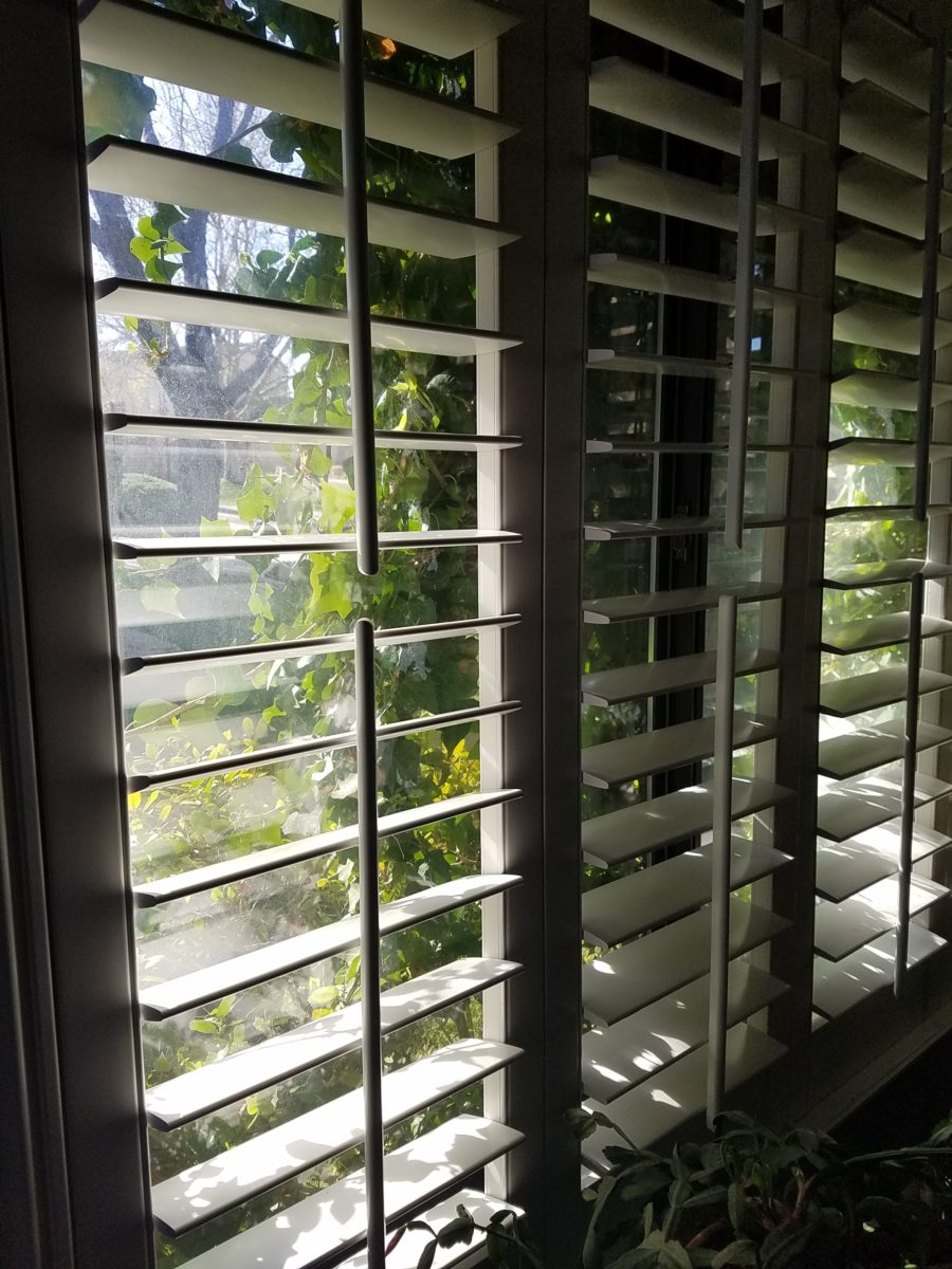
Curling up with a good book. We know that getting up and getting dressed in the morning provides a normalcy and participation that keeps us from feeling less reclusive. Preparing for the day! And inasmuch as it is a rarity for most of us to stop in the middle of the day and read a book – it is a luxury we should allow ourselves. It is an escape, a reprieve. Discovering new places and positions to enjoy a good read is another way to find peace. Places where daylight filters in is restorative.
Tracking daylight through your interior…you might notice the orientation, time of day and penetration of light with more time spent at home.
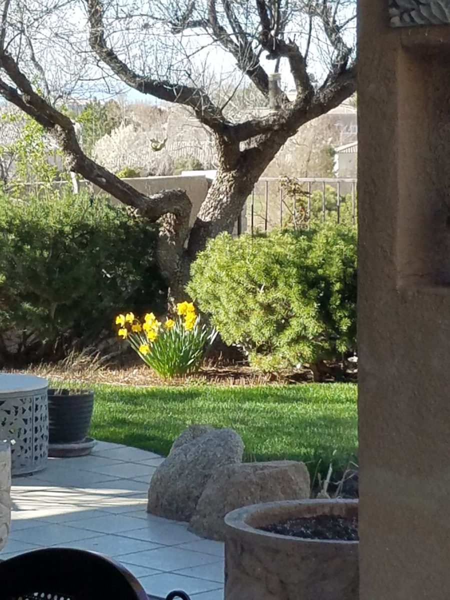
Outside, weather plays a big part in how we can expand our isolation beyond or interior walls. From quiet garden spaces to hiking and exploring nature’s playground – the ability to enjoy exterior spaces is prime. Having warm weather on the way broadens that area of our safe shelters.
Hi Zoe in Northern Virginia!!!!! Families are having lots of outdoor time. “What a GREAT backyard you have!!!!!!!” “The better to stay isolated and still have lots of adventures,” says she!!!!!Wowee from Maui – thanks Linda for this shot from your window- some people have it rough!!!! Isolation in paradise!!A quiet corner of a garden can be a new discovery now that we have the time to pause and focus on the details around us.
Biking and walking trails are being explored, in these new times, and revealing great resources within our reach. One of the positive outcomes of this “down time” is a desire to get out and move – the restlessness is prompting a newfound need and satisfaction gained from exercise.
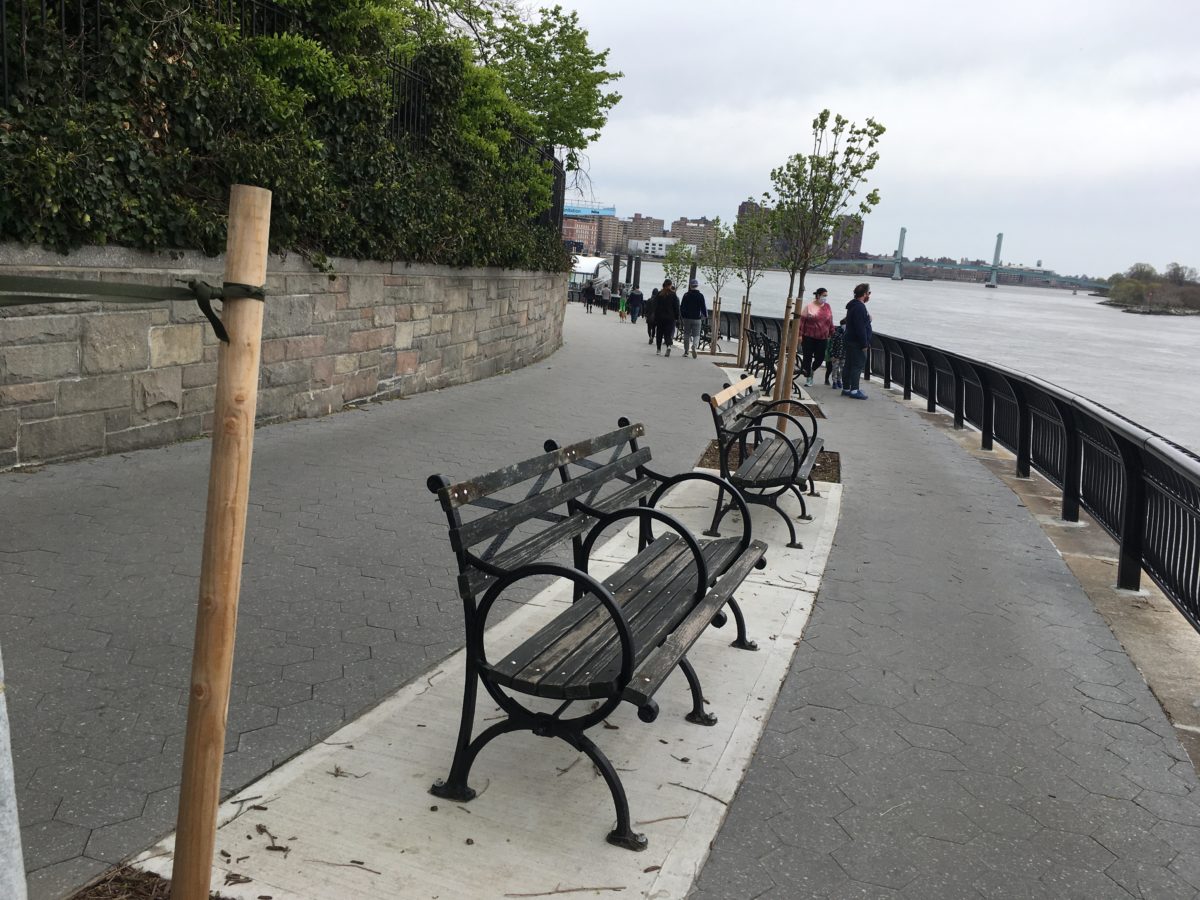
New growth brings new promise as spring peeks through….taking walks is great for both body and mind in the high desert of Albuquerque.Hello Heather over there in Arlington, Virginia – running over the Rt 66 trail!! Not much traffic!!!!! Shelley sends this scene from their lovely Lake Keowee neighborhood in the secluded woods of northwestern South Carolina. My friend Jeannie, who usually works at the now very enormously lonely Metropolitan Museum of Art in NYC, writes that her Peaceful Place is “on one of these benches in this jewel of an oasis called Carl Shultz Park here on the Upper East Side overlooking the East River. Nice breezes to enjoy and usually lots of pleasure boats. Been doing a lot of reading here and a fine place to get a whiff of fresh air.”
Hobbies and projects have flourished. Weather permitting, outside gardens need tending and indoor projects/hobbies have truly been re-vitalized with renewed appreciation and interest.
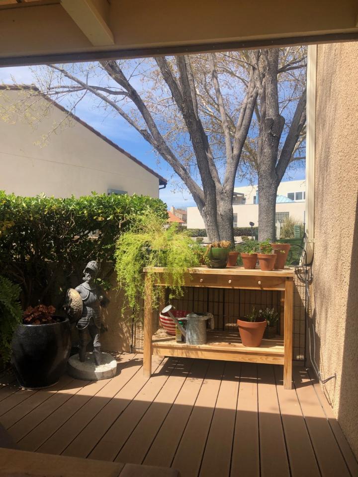
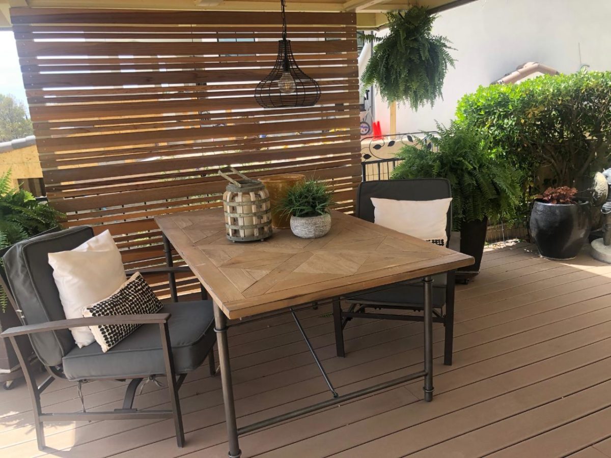
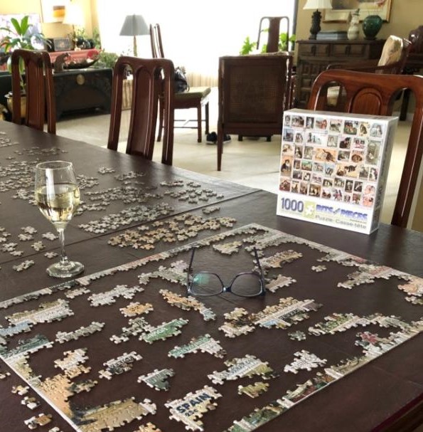
A recently added potting table on Cathy’s deck provides a perfect area to focus on preparing patio pots and new growth!!Adjacent to her potting area, Cathy has a perfect place for repose. Reading or playing cards, enjoying a morning coffee, evening cocktail or a quiet meal – this area provides a perfect retreat. More fun and games as Bonnie attacks her 5th jigsaw puzzle since the quarantine started just a few weeks ago…with a little refreshment and plenty of early evening sunshine! Love that the days are getting longer!!!!
Plump your pillows and prop up your feet – inside or out – a healthy combination of rest and meditation, healthy eating, brain work and physical exercise is the recipe for success during our surreal pause. Find your peaceful place – find your joy.
These are amazing times that are truly testing our creativity and ingenuity. We are challenged to alter our work-modes to operate remotely, utilize time very differently to balance work and family, find new ways to communicate and share and even radically re-direct manufacturing for purposes far different from their original intent…these are all very stimulating, creative challenges.
Isabel works from “home” in Denver managing the daily business of PATRICIAN DESIGN.
Where do the masses flock now that they are confined? Craft stores, home-improvement warehouses and on-line instant gratification pick-me-ups.
Don – in his Home Depot orange shorts was a joke that we enjoyed for several years coining the phrase “Everywhere we go – we got o Home Depot!” From China to Albuquerque we took photos of Home Depot, often in his orange shorts! Couldn’t keep us away!
While most people are home-bound and businesses are fallow – wondering how they will survive this down-time and loss of income and the means to play catch-up with their debts – there are those who have been able to re-invent their talents to manufacture items very different from their norm that are in high demand at this time. Re-purposing has taken on a whole new meaning. Where we were re-purposing an old door into a headboard or bicycle parts into wall art, we are now transforming entire production facilities that made widgets of all manner into plants of workers learning how to manufacture masks and ventilators… gowns and gloves.
The creativity is so broad-reaching it will change the way each of us behaves moving forward. It will change policy and priorities in government. It will alter thinking and spawn new ideas and procedures everywhere. It will have global impact and consequences unlike anything we have known. It will prove uniting and divisive, for differing reasons.
Less public displays of affection between casual connections with more formal respect for personal space are certain outcomes. Perhaps a combination of suspicion and respect at the start…but how long will it take to wear-off? When will the guard be dropped and behavior relax? What will be the definition of our new normal? Circumstances – certainly do – alter cases…
Interior design is tactile. It is comprised of textures and
colors difficult to replicate over the computer screen. Before off of this we
recognized that viewing fabric collections over the on-line portals was a way
to get possible candidates for consideration – but more often than not, there
were greater numbers of rejects once the actual samples arrived.
There is much we can do remotely. We can send drawings, send photos of fabrics (providing we have felt them and know them, in order to honestly recommend them), do video walk-throughs to view a space and make recommendations remotely. We can place orders and arranging shipping and receiving, coordinate sub-contractors and make things happen.
Many tradespeople such as upholsterers, seamstresses cabinet-makers can continue to work in the privacy of their own workrooms providing the have the material. Many fabric sources are still shipping orders. We have two sofas and two benches currently being upholstered – the fabric having been ordered, shipped and delivered all last week. With several other fabrics on their way, our seamstress will be very busy creating custom throw pillow, bed dressings and draperies. We can keep many of our talented, local people busy.
Artists in their studios are eager to express their thoughts and feelings and even bring YOUR interests to life in paintings, pottery, jewelry, sculpture…self-quarantined by their own habits – now is the time to commission a custom piece – pottery centerpiece, focal painting, personal jewelry piece, pet and people portraits by sending photographs!
The dynamics and demographics of our communities will be radically changed as a result of this crisis. Remember how upset many were over Walmart coming into towns displacing, if not eradicating small local businesses? Well, watch what’s happening with large national businesses today and their smaller, local counterparts. We will lose so many and replaced by whom? What? How? How will this change the look and feel of Mainstreet?
The interior design profession is so intimate and personal. It is about hands-on…to be there to move furniture, adjust groupings, share the experience of balancing textures, temperatures of color, size and scale… it’s hard to do from your laptop on a remote beach.
So while the ads on TV promote the home decor sites for instant furnishings and decorative accessories – remember that they don’t always look as you expected once they arrive. Many offer returns, but often with freight and re-stocking charges.
During this unusually
unprecedented time when anxiety instigates spontaneous purchases,
designers can still consult to advise and direct, offer ideas, consult about
choices and decisions. They can help make decisions and assist in finding the
right pieces and making the best purchases.
So call them. Show them your finds. Discuss your choices and ideas. Get their opinions and make better decisions due to their experienced advice. It might and should save you money and headaches in the long-run.
Hidden talent – that remarkable artwork that appears (seemingly) out of nowhere, on a par with great masters of the medium. I considered this element of surprise – looking back several decades to a local painter, Wilson Hurley, who had more than one very different, distinguished career and diverse life experiences before he delved deeply into his passion for painting in his 40s. Once exposed, his paintings revealed his extraordinary talents and he become a nationally recognized treasure for his sweeping landscapes and a variety of other subjects.
On that note, I have just gotten off the phone with a very good friend, in Florida, Houston Evans. I have recently learned that he is a passionate weekend photographer! An amazing photo appeared in a Facebook post and I was astonished by the enchanting image, color and composition. I was instantly captivated – and curious. Upon closer inspection, his stylish swashbuckling signature made me realize that this hobby was subtly becoming more than that – yes, he had his mark digitally mastered and is probably THE perfect brand for his diverse and stunning work.
“Star Power” is the luminous celebration of a pineapple.
As I quizzed him about his interest in photography, I learned that he attributes his eye for art, color and design to his mother who’s side of the family has spawned other talented artists, in his generation. He has been posting on Instagram for quite some time – hundreds of images. I didn’t know. I didn’t “follow.” He is modest about his photos and does it for his own amusement, pure pleasure and personal enjoyment – that he likes to share. “I don’t do it to imagine it on someone’s wall.” Yet this observer believes that there is where it absolutely should be! Many walls…many places! #houstonevansphotography
He plays with the medium and all the tools and tricks of the trade. He enjoys the freedom of experimentation. The results are controlled, yet spontaneous. From high resolution to fuzzy pixels that require distance to assimilate. Up close for precise detail and soft smears for imagination to take hold, the variety of clarity or lack thereof are a part of the experience and expression.
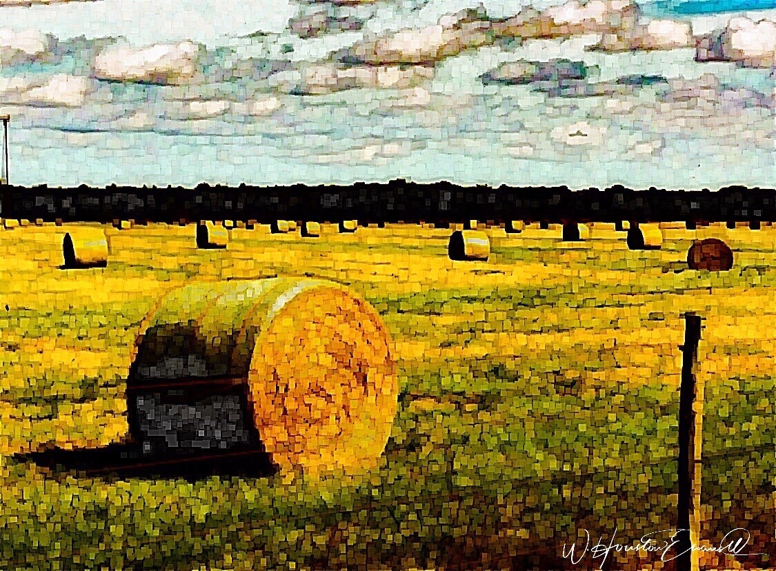
“Makin’ Hay” has an enhanced pointillist treatment – a Van Gogh-esque subject with a twist.
From my interior designer’s perspective, his bold images would be key focal points in the drama of architectural spaces – interiors from Miami to Honolulu and on around the world!!! I can see the towering orchids in hotel lobbies, bars, restaurants and swanky condos everywhere!!! I am eager to find a project, for which his work would be the key to the scheme, unveiling a spontaneous design resulting from the inspiration of the image.
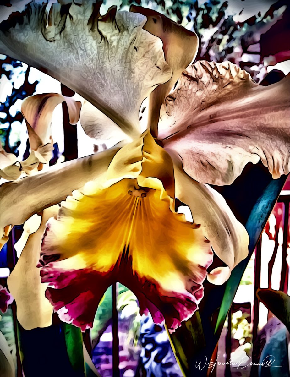
“Oblique Orchid” screams floral superiority as a commanding focal image. “Shooting the Bird” speaks to paradise revisited!!!
In the beginning, the photos stood on their own merits. Evans keeps his originals – some of which remain just that – in their original form, while others are tweaked or more radically manipulated to create stunning subjects and compositions.
This brilliant, fresh simplicity of “Aqua Eye” observes the droplet’s reflection in the center of the cheery chartreuse petal. Coming upon a cool caddie “Daddy Long Legs.”
I can see his limitless fantasies contributing to the imaginative narrative of Meow Wolf, gracing hotel lobbies with larger-than-life orchid explosions and commanding condo walls with magical statements of tropical color, subject and form. Translucent installations of LED illumination could result in magnificent walls of design influence.
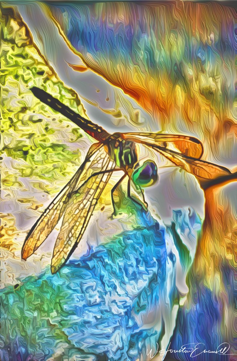
“No Flies on Me” is a fantasy of oozing colors and form melting and melding around the psychedelic dragon fly.
The digital age is advancing with such a pace that we are
all caught-up in photos of food, whacky selfies and sunsets on fire…but
having an artist’s eye, to truly see the potential and master the tools that
are now available – using them to create valid and valued masterpieces of art,
is extraordinary.
“Copy Cat” reflections mirror a chorus of color from sky to watery impressionistic likeness.This “Roadside Attraction” must have been a startling scene to distract dazzled drivers.
I truly believe that his work is exceptional – full of heart and soul – and spectacular fun!!!!!!!! I’m thrilled to learn of these images and now enjoy the continued progress of his discoveries and creations. Let’s see where this goes!!!!! He just might be coming out of hiding!!
Some fabrics are just so fabulous that they can carry a design scheme. You could wrap a rock with them and feel that they are accomplishing the design statement to set the theme, mood and encourage interest, if not confidence in comfort! Stimulating the senses is a major part of design.
Often, a throw pillow can make an effective accent. We joke often when we find exclusive fabrics in the hundreds of dollars a yard and say “Perhaps a throw pillow?” Knowing that the projects affording such luxury for miles of drapery panels are few and far between!
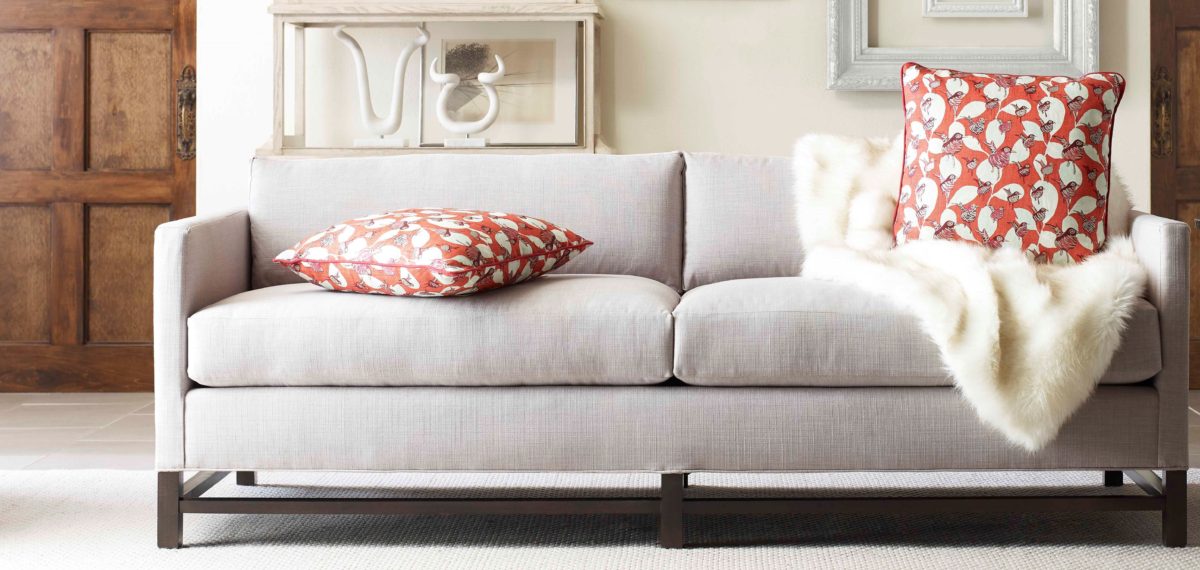
Duralee offers statement furniture pieces of unpretentious luxury and comfort with a collection of fine fabrics that will satisfy any budget. Birds take flight from this delightful Duralee pattern.
Sight Sound Smell Taste and Touch – you know. Colors and textures catch one’s attention. They set the mood.
Upon entering a space you take-in the colors and textures and if fabric is in play.With further tactile examination fabric contributes greatly to these two sensory perceptions – sight and touch.
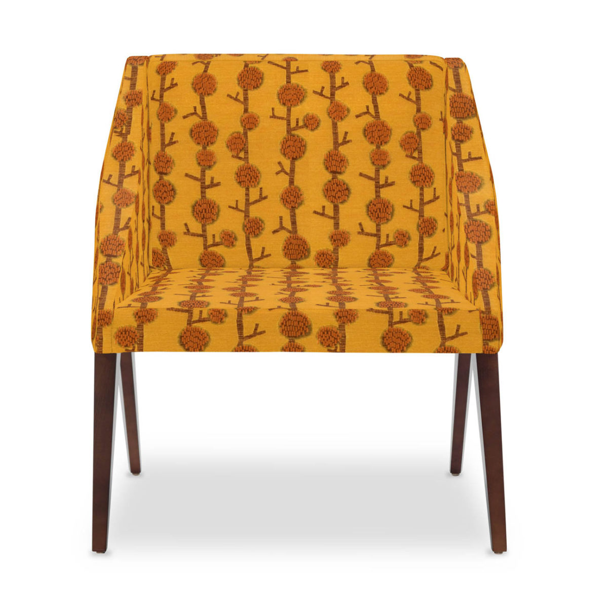
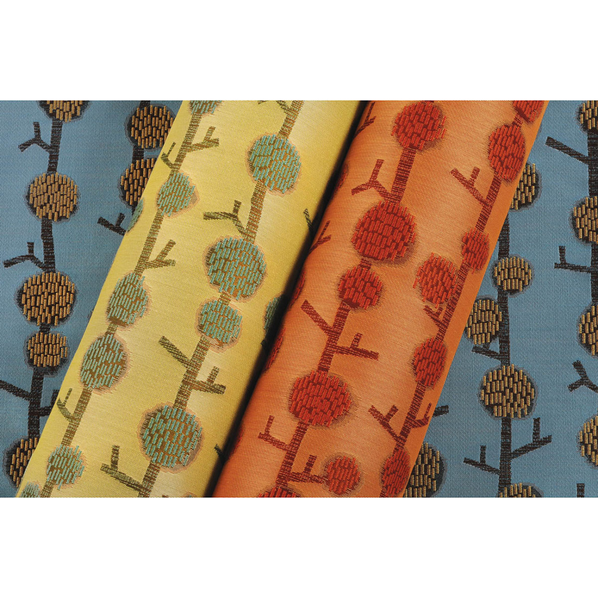
This playful Donghia organic has fuzzy tactile balls sprouting from the linear twigs. From the “ground” to all the intertwining and overlaying weaves, the complexity of textiles is exciting. Come see these exceptional designer fabrics in our studio.Many fabrics have multiple colorways. If you see an intriguing fabric that’s not “your color”, its worth asking about the entire collection.
Juxtaposition can also be an effective technique. When placing a modern pattern on a vintage piece, you breathe new life into the forgotten history – refreshing and capturing the best of both worlds!
You might not have a lot of confidence in someone who wants to wrap a rock to make a design statement. However, my point is, when you love something you want it regardless of the delivery system! Find fabrics that you love and insert them into your rooms – home or office. It’s like your favorite flavor. Sweet or savory – slather it on a piece of cardboard and you’ll be significantly satisfied. You need not struggle with how to do it – just make it happen. So to get a little taste of an exciting textile, make a table runner, simple dining chair seats, select a backing and make a throw or an accent pillow. Bring the joy of exciting textiles into your interiors.
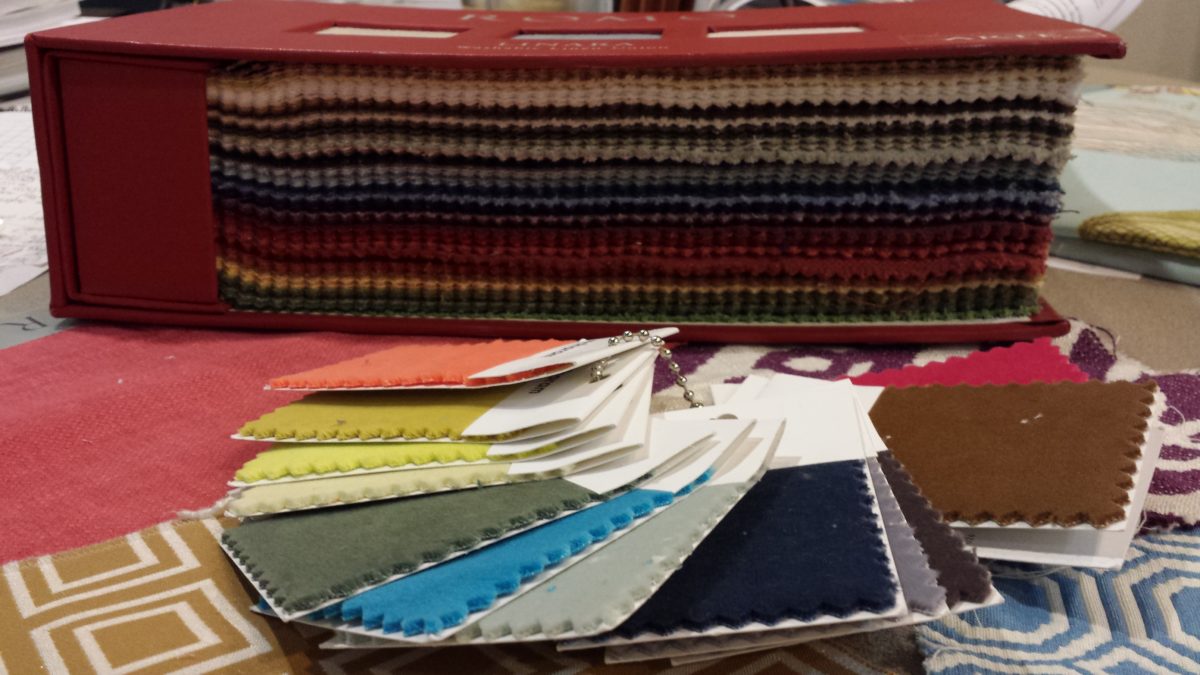
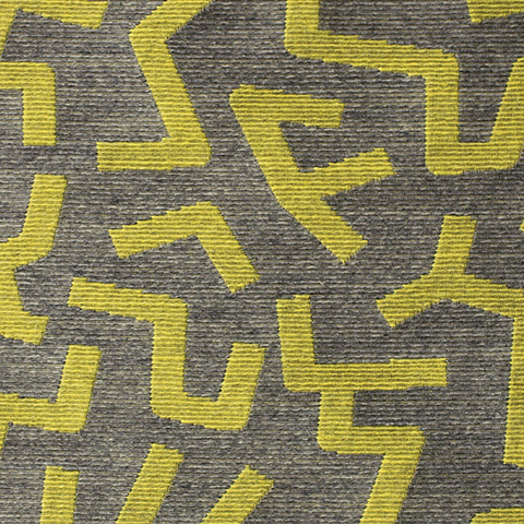
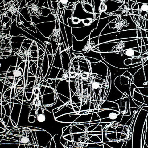
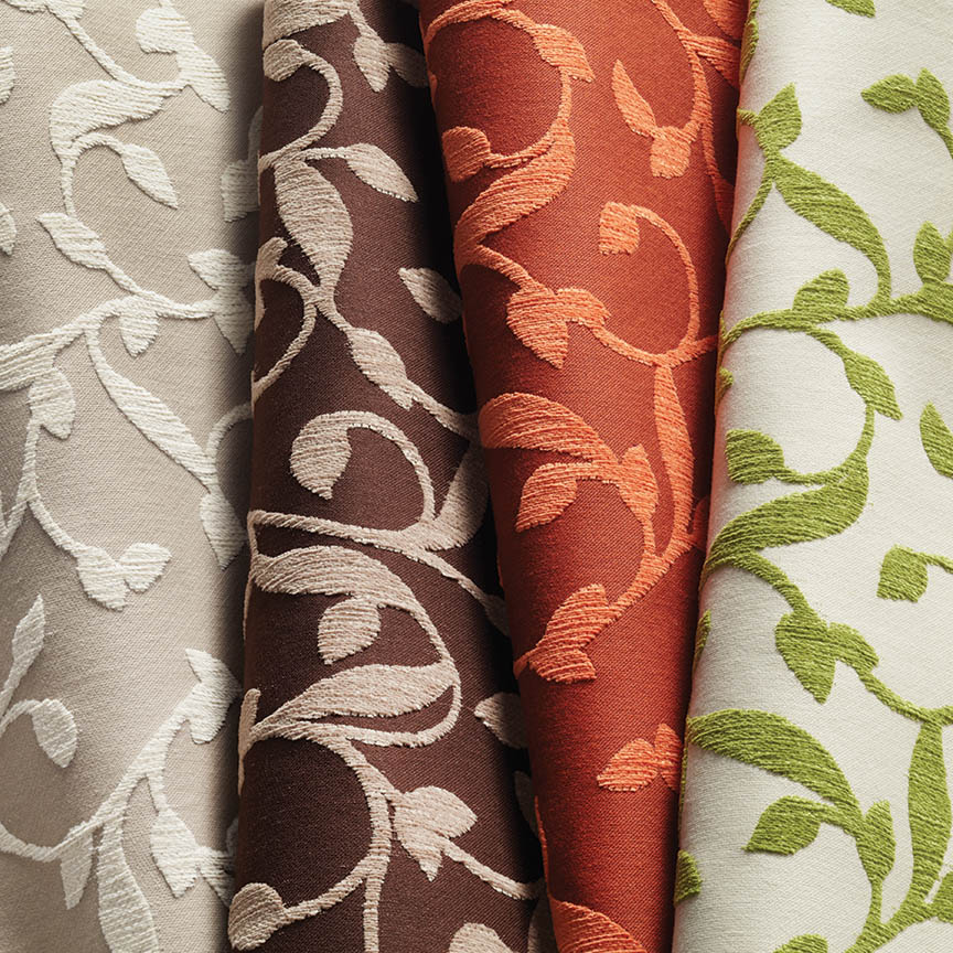
Here are a series of fun fabrics from our source library – tools of the trade. We LOVE fabrics and must touch the texture, feel the weight and evaluate the colors. Seeing images on-line do NOT do justice to the many incredibly creative textiles are available to enhance interiors.
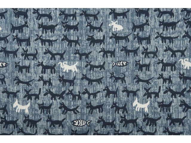
Cute critters march across this sophisticated yet whimsically novel woven.
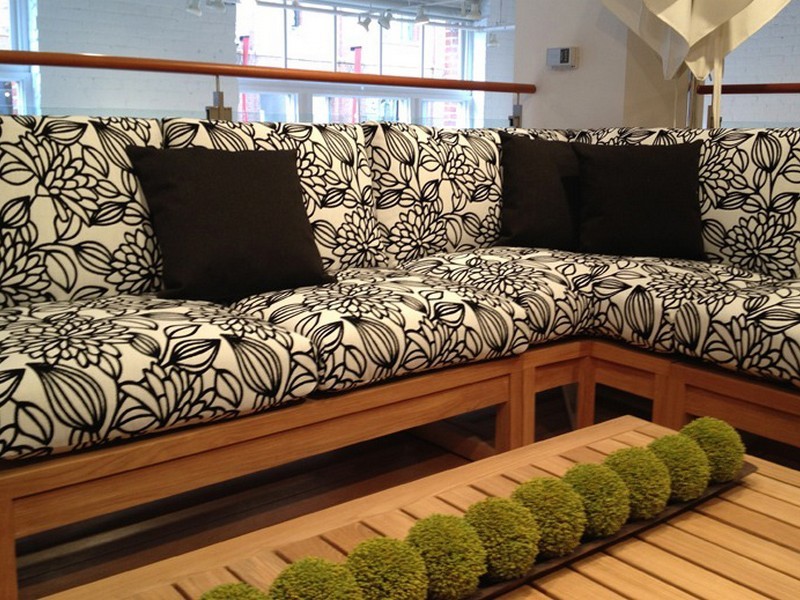
Other considerations not necessarily in evidence are the wear-ability/durability of a fabric and the resistance to ultraviolet rays, mildew and other elements. Wool is inherently flame retardant, for example. And exteriors have come alive as these amazing performance textiles will often fool you in disbelief that they have the properties to withstand the radiating ultra-violet rays of the sun and damp conditions which invite mold and mildew. These incredible fabrics are truly indoor-outdoor in appearance and extraordinary performance!
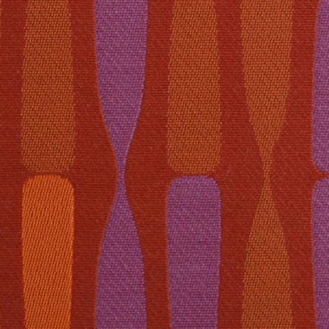
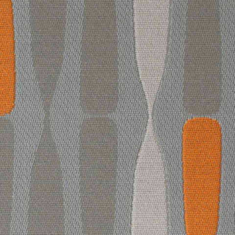
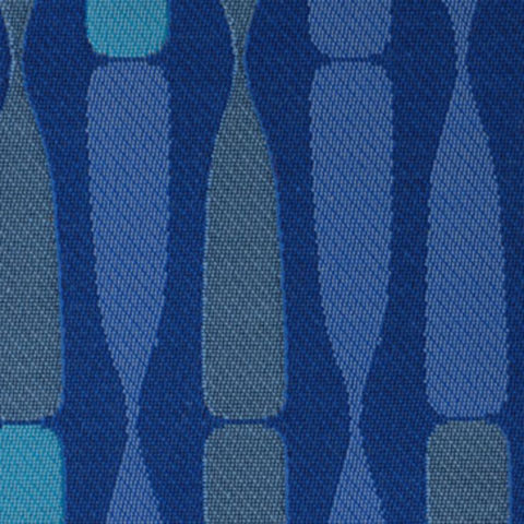
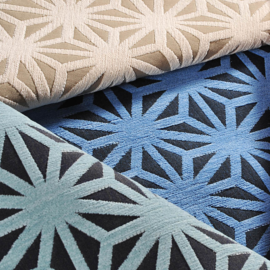
High-performance luxury weaves such as jacquards, piques, tapestries, matelassé, ottomans, damasks and sheers defy their extraordinary performance properties.
Roy Hamilton a recognized designer in many media, brings fresh patterns to Chella. Roy Hamilton, designer of exclusive ceramics, sculptural and textural interior elements and fabrics for over sixty years.
Call for an appointment to explore our source library for the most unique fabrics in the world!
Floor-to-ceiling shelves of samples await your exploration for commercial and residential application!! You can order most textiles by the yard!