Everyone Loves Before and Afters

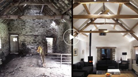
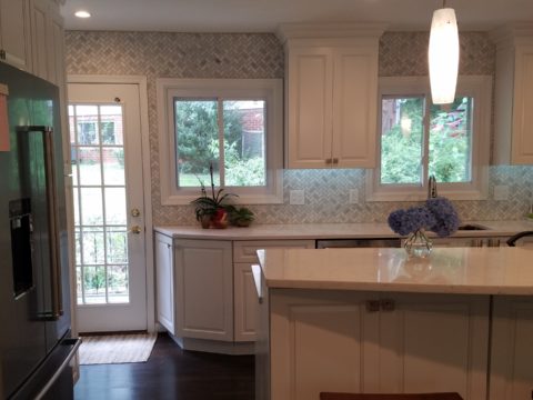
Everyone loves before and after shots – they are so telling, dramatic and fun to compare. How about during? This week, we are nearing completion of a project that has been in the works for the past few months. Not quite finished, here is a little story about the stages of the design process…

Are YOU planning a remodel…a room an entire house?

Once a project is identified, the options are studied. Usually each party involve has their preconceived notions…images and ideas come to mind. The mind is that arena from which it is tough to articulate images and especially between people. The design process requires that ideas need to be expressed, defined and argued – pros and cons.

This room was dated and fussy. The finishes were tired and needed refreshing. The project was described as a complete makeover to compliment other recent updates in the home.

The scope of work was to remove the tub, replace the cabinets, add a second sink and create an opening into the guest room. At that point, the “what ifs” began.

Healthy arguing ensues – meaning sharing ideas back and forth, explaining the approach and concepts. More like presenting than arguing. It’s actually a fun, creative process – full of choices, ideas and seemingly limitless opportunities. It’s the “What if…” stage. Sketches are used, arm-waving and samples, photos and words all contribute to the compilation of the ultimate design.  Each person contributes to the process until a common plan is adopted.

Whether formal plans are needed depends upon the code requirements, if applicable (“cosmetic only” changes requiring no modifications to structure, electrical or HVAC – for example – might not need formal drawings). Therefore, the development of documents is dependent upon the requirements of the municipality and/or methods of the contractors. Regardless, sketches begin the process.

If code requirements necessitate permitting, the process must proceed through that stage prior to commencing the work. So after weeks of ideas being tossed about, a plan was conceived, client approved drawings were made and the process moved forward.

The scheme was set with the first materials selected – glossy glazed imperfect wall tiles for an interesting and textural herringbone pattern with a stone mosaic for the floor.

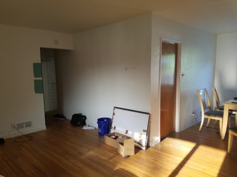
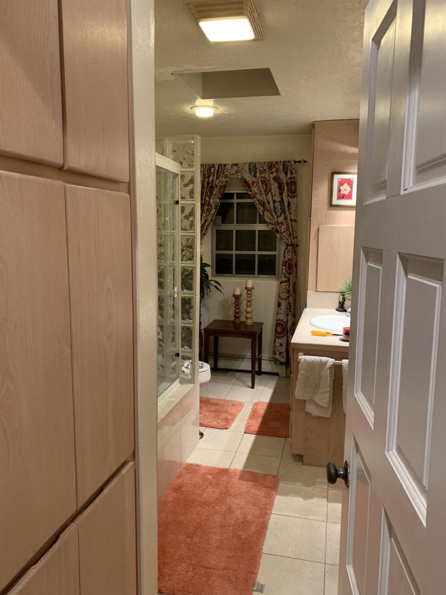
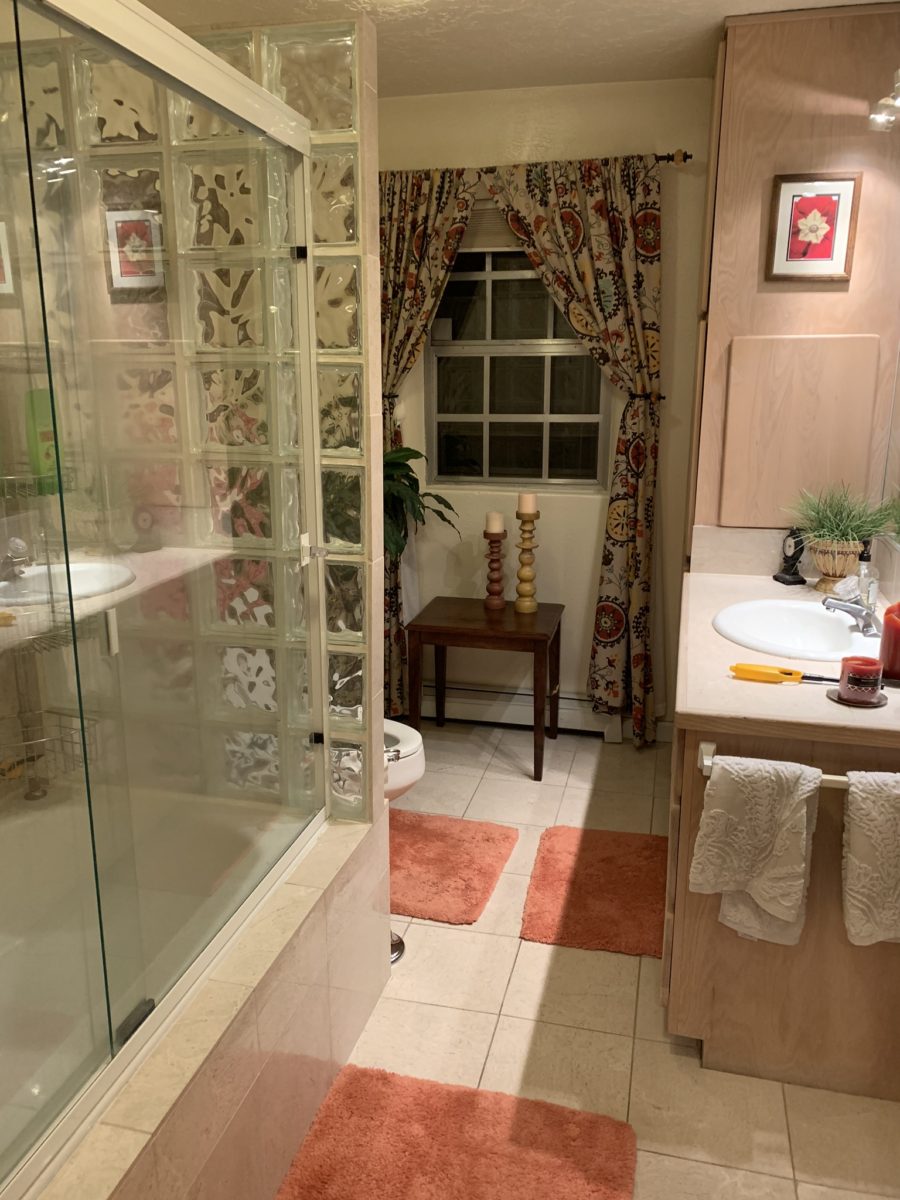
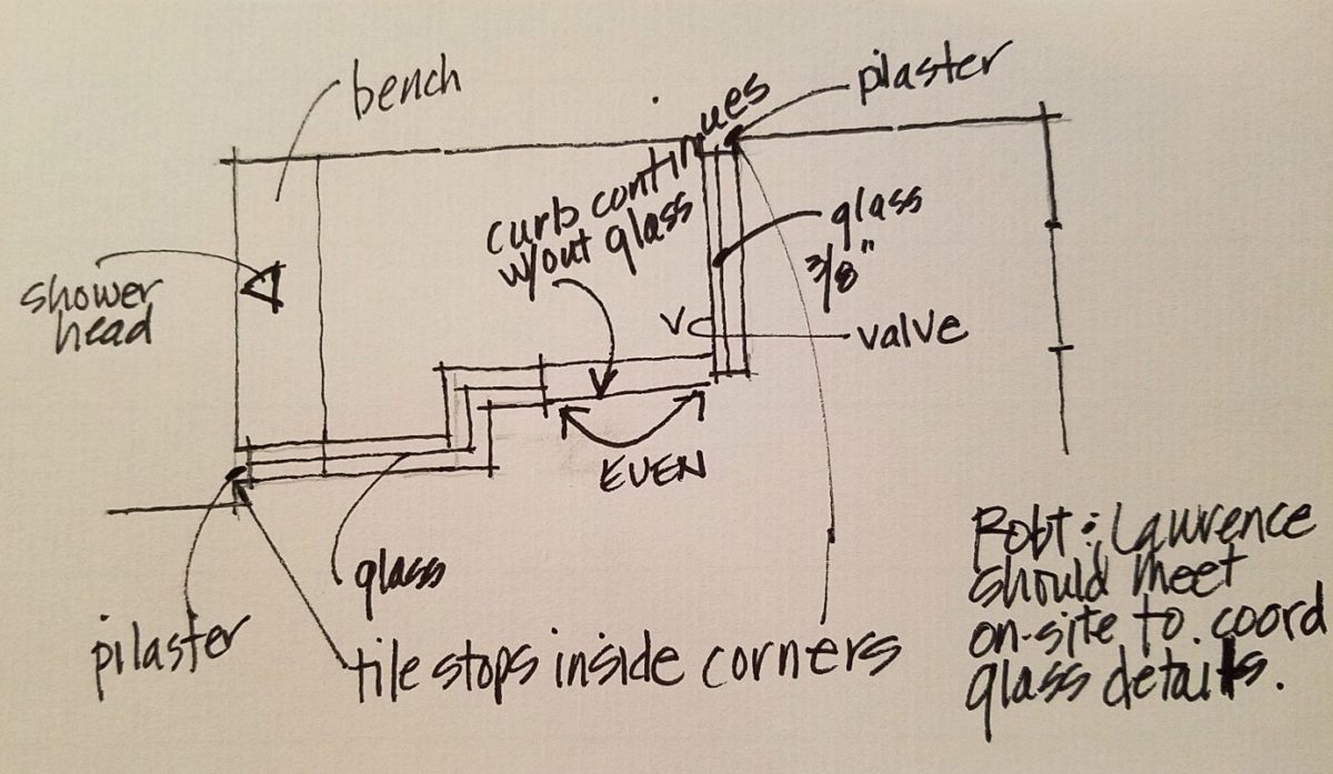
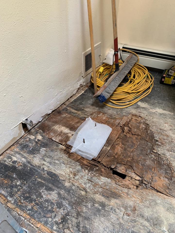
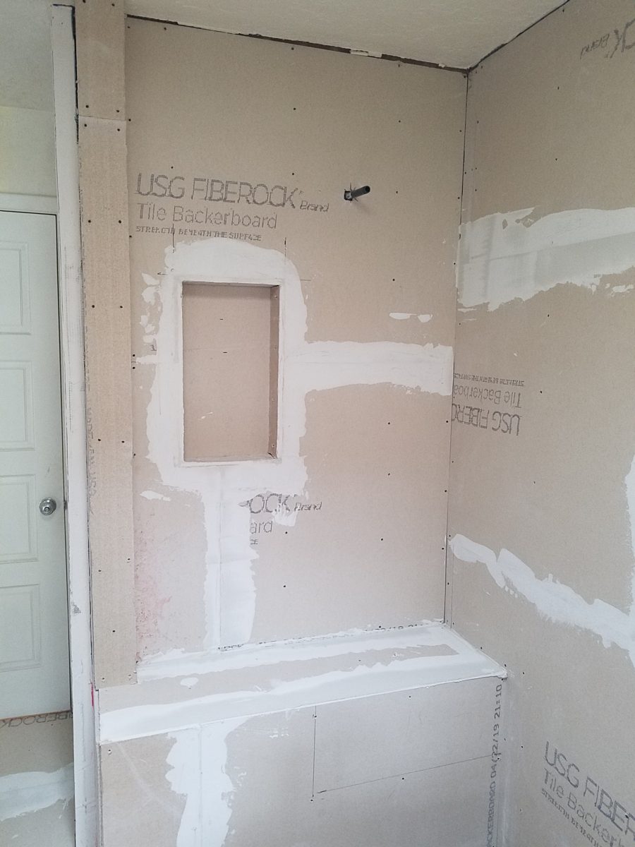
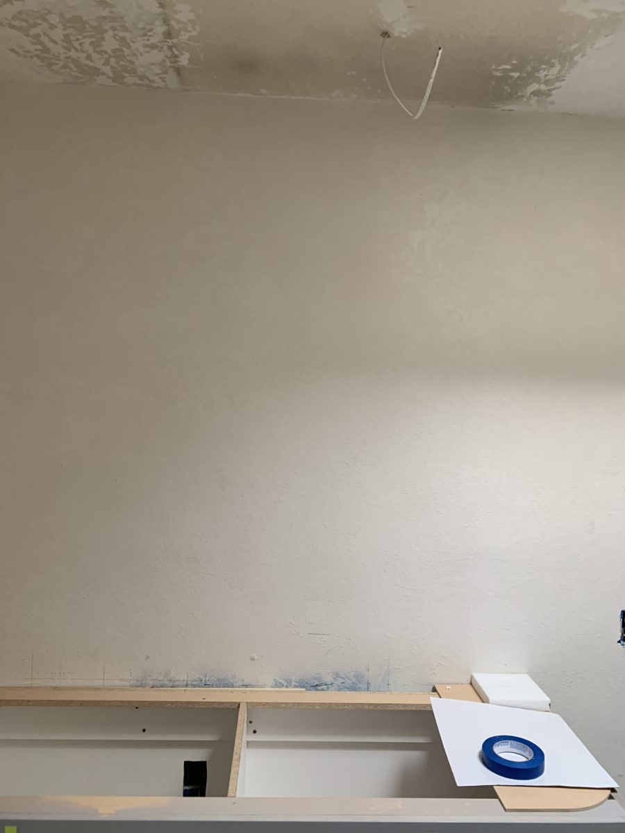
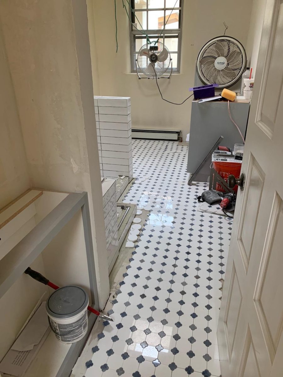
The demolition – always a shock – but “you have to break and egg to make an omelet!”  Unbeknownst to anyone, the floor was rotted beneath the toilet and required repair. Mirror, glass block, tile and much sheet-rock was removed.

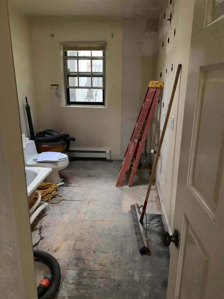
Old cabinets were removed and after all the dust had settled, the bare bones exposed and a clean slate presented, the new work began.

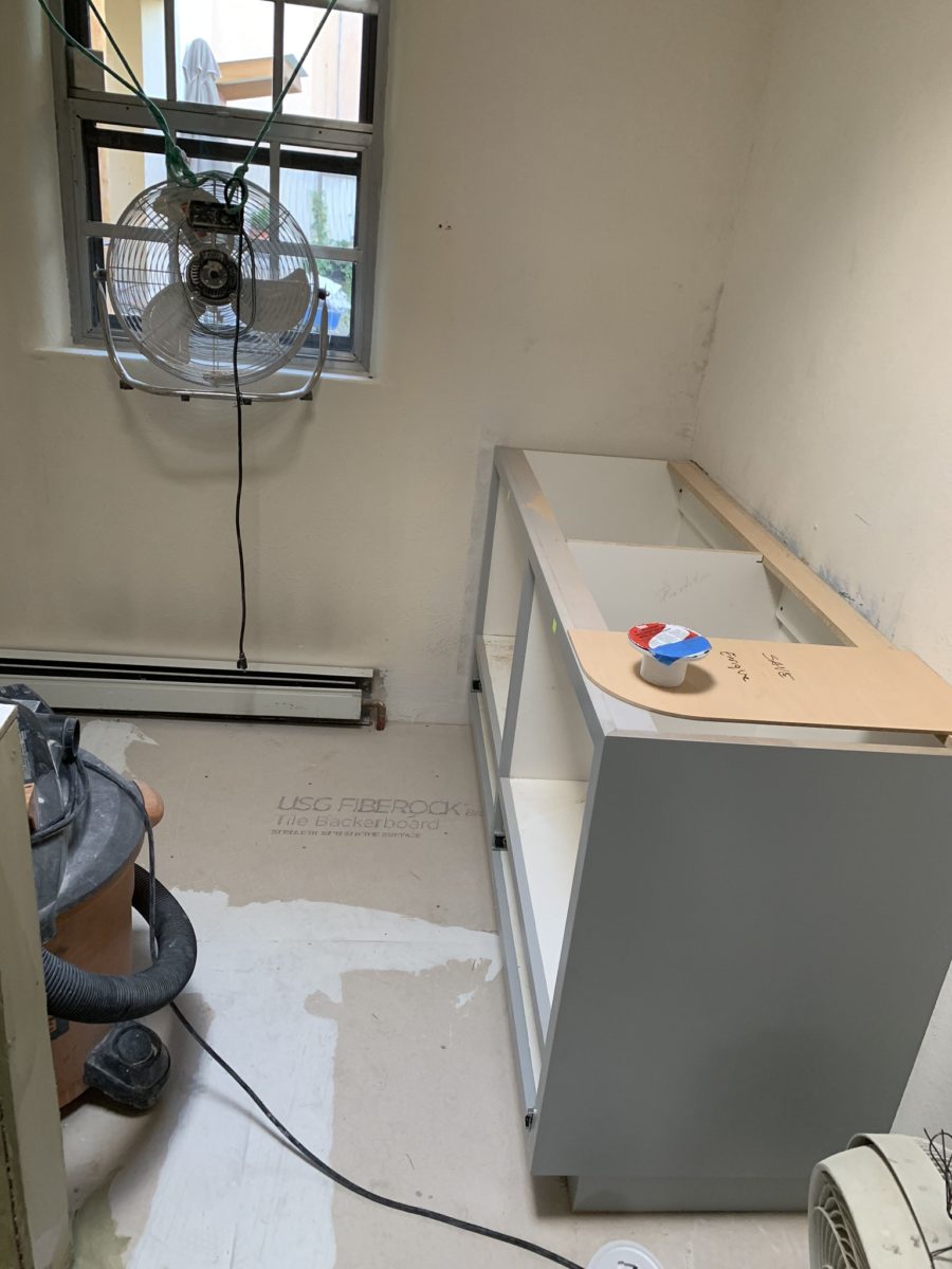
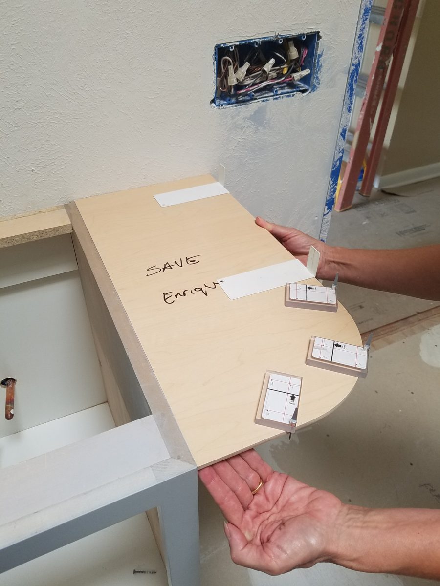
The new cabinets were to accommodate a second sink and slightly longer counter-top. To make sure access between the shower and counter-top was not too restricted, I designed a radius to ease the squeeze. Enrique made a template of the radius that would be represent his end shelving and counter-top. When Rocky Mountain Stone arrived to shoot their lasers to measure for their templates, the radius template Enrique had made was very helpful.

The end of this cabinet will have radius shelves with counter-top following the radius. Until then, Enrique made a template of the shape so that the counter-top could be measured in advance of end piece being completed and installed.
The laser process to template the counter-top begins…with the help of the mock-up of the radius!

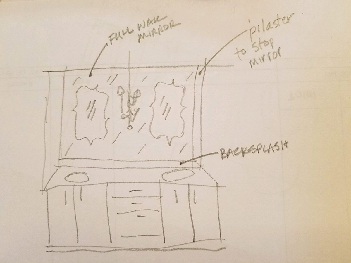
Decisions regarding lighting had not been finalized, with the completion of the plans. Having eliminated the desire to have recessed fixtures, whether to use a center sconce, two flanking sconces or a single pendant in the center between the sinks was still up in the air. Love the pun! Debating a full height panel of mirror versus two wall hung framed pieces, was also undecided.

But here’s an “oops” when we discovered the power for the light fixture off-center for a center-hung pendant.

Taking the risk to be disappointed, but with little investment to do so,  our client elected to buy the two curvy framed mirrors that almost promised to be too small. Upon arrival one of the two mirrors were broken. Bummer.

The inevitable, unexpected happens on every project…we had decided not too use these so rather than have the one of the pair replaced, we requested a refund. However, upon further study, we modified the design to accommodate both mirrors – we are re-ordering the second mirror.

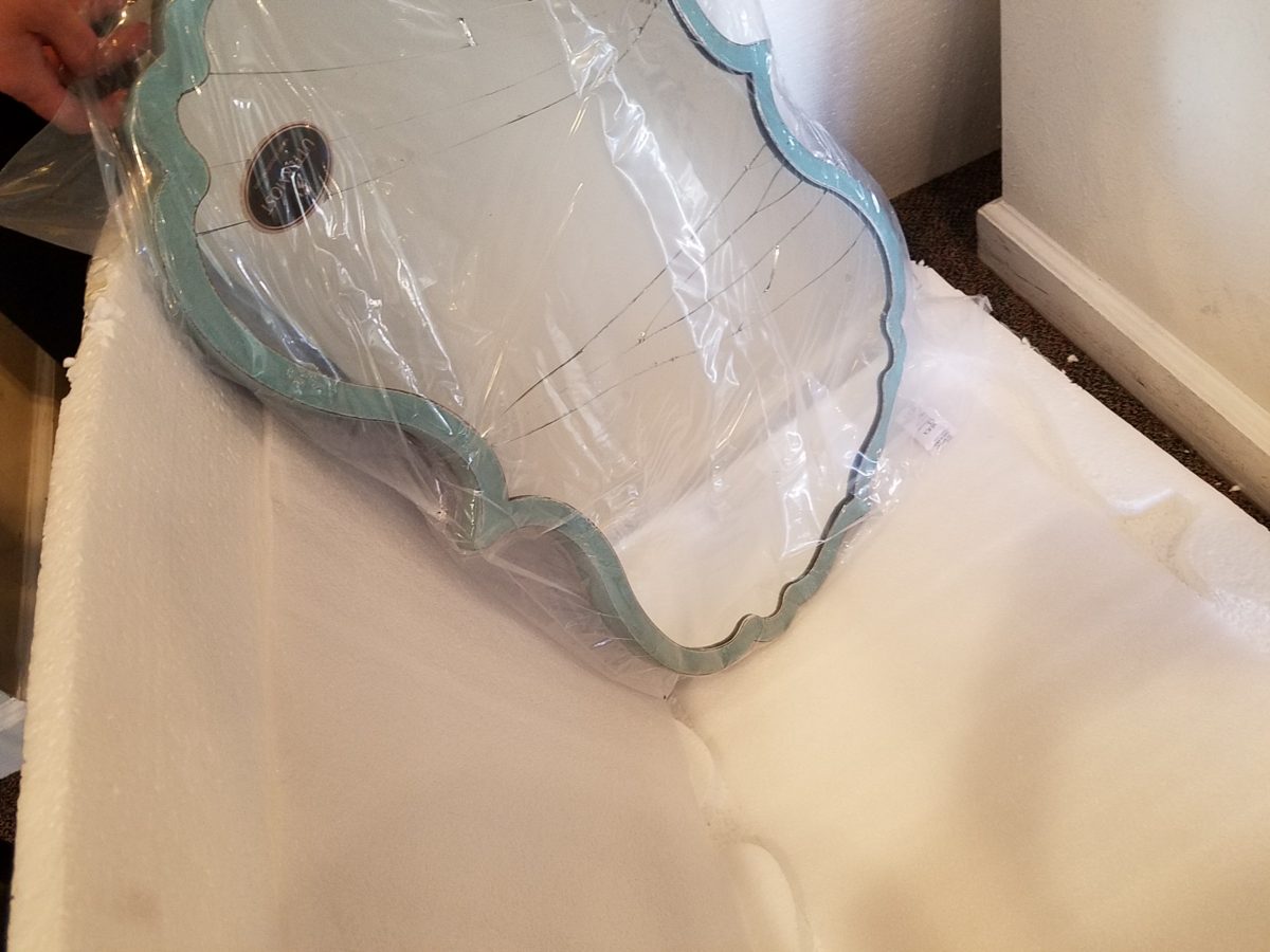
But in an effort to determine if we wanted to have the broken mirror replaced or refunded. We held it up on the wall, as we feared, it was confirmed that they could not carry the space. We asked that the company not replace the broken mirror, but refund the cost.

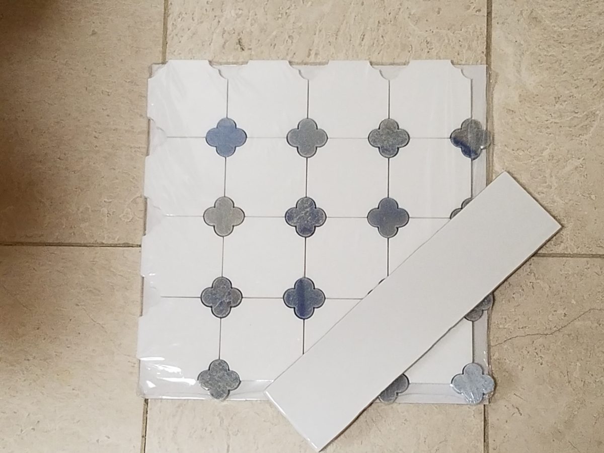
 We really loved the whimsical quality of the curvy framed mirrors and their distressed turquoise finish was a great addition to the otherwise blue and white scheme. So, a week later, after pondering the dilemma of the mirrors…I offered what seemed to be a radical suggestion (but not really), and that was to install a full-panel wall mirror – backsplash to ceiling – and then mount (over it) the two mirrors. To do so, our very able and talented glass master, Robert,  would have to cut (prior to installing) holes in the mirror panel located behind where the framed mirrors were  prepared for hanging. The result would be the pair of mirrors hanging on top of the full panel creating a floating, multi dimensional effect. Watch for “afters” in a couple weeks, of this completed installation.

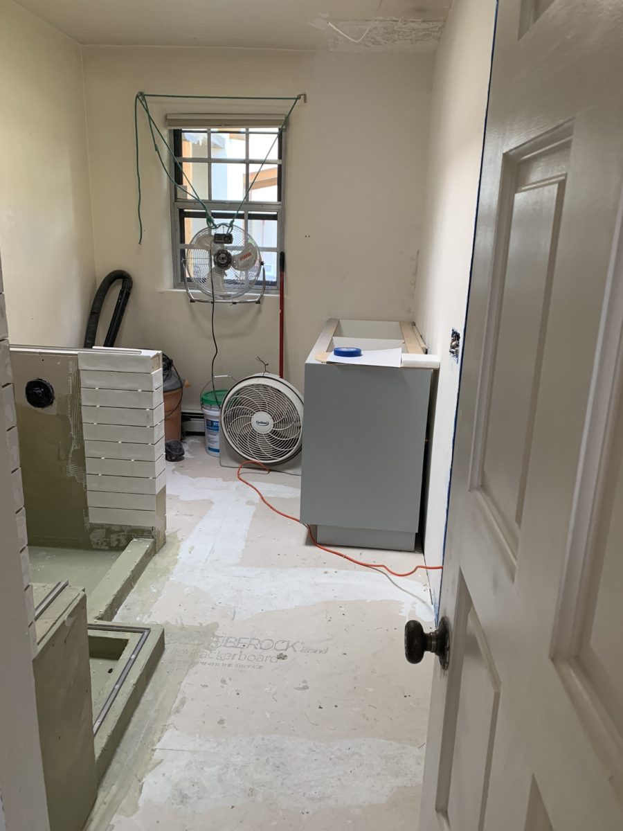
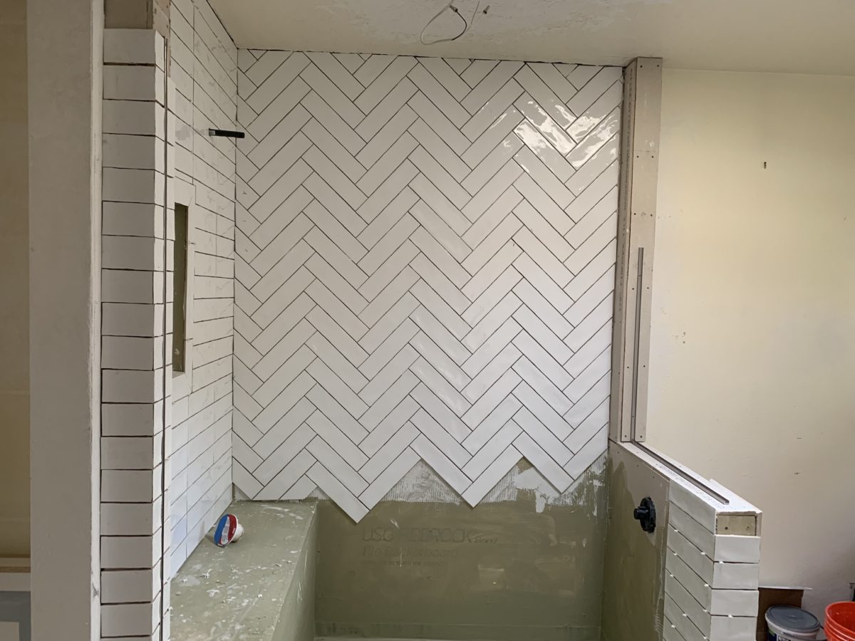
As the project  proceeds, the flooring is nearly completed and all but the finishing touches remain.

Pilasters were added at each end to stop the tile on an inside corner, rather than having it quit flush on the wall. The shower will not have a door, but nearly encapsulated with frame-less clear glass to give an illusion of a more spacious room.

Best to stop here and reserve the finale for the finished “after” shots as promised.

Patti’s Pick for a Floral Fabric for Spring…Artistic Accents in Many Colors

Blossoms are bursting forth and spring is near…Flowers have a decidedly feminine bent, but due to their organic nature and natural occurrence as the season begins to unfold, I truly  believe that they are a gender-less element of rebirth, warmth, optimism and wonder.

In our backyard, these minis are ahead of their more attenuated cousins!

Interior designers welcome floral fabrics as contributing to the pattern mixes, accents and animated offerings amidst other geometric, stripe and solid pieces.

Floral fabrics – here on a textural ground, bring artistic accents to an interior!

Yet, men don’t gravitate to floral fabrics unless perhaps they sport a tropical shirt in the summer – the uniform of the relaxed, vacay, free and festive escape! You might not find a floral throw pillow on their sofa when batching it. But why not?  Spring is spring, flowers are flowers – who doesn’t like them? Embrace your natural instincts! Be brave! Go beyond the aloha shirt and fling a floral throw pillow on your sofa!

Ok…perhaps without the fringe? This denim-blue color on a linen texture is not too flowery – but makes a bright, fresh statement!

Ok – forget the possible gender gap on this subject…

But I did tip-toe outside on the patio tile this morning chilling my toes, to hop across the still dormant grass, in order to take these shots of the first bulbs forced through the crunchy soil to greet the season.

Our daffodils are one of the very first signs of Spring here in the high desert…not indigenous, for sure, but a happy addition to the garden!

In previous spring seasons, I have written about cutting branches before they bloom in order to “force” the blooms for early bouquets indoors…and inasmuch as several of the flowering trees have begun to burst, including Bradford  Pears, our is close, but not quite there.

Bradford pears are early bloomers…go outside and find some flowering tree or bush in your yard and cut a few branches. Leave them tall, long and lanky – if you have the space. Bring them inside and stick them in a bucket of water, or the vase you ultimately intend too use, and watch them bloom practically before your very eyes! It is a fantastic way to celebrate spring in your home or office!

The forecast for the Washington DC cherry blossom peak is early April.

A bit early still, but you can monitor the progress at https://cherryblossomwatch.com/

My personal pick for a fabulous floral pattern this season is Pindler’s Cherry Blossom. Floral patterns for Spring – and all year round! I like this one for its linen texture and loose watercolor style. It is  relaxed and yet can be crisp – a very versatile print and fabric. It comes in 5 different color-ways and therefore offers many opportunities to incorporate in your interior schemes.

Pindler’s Cherry Blossom on linen – magenta
Sky, a second of the five color in the Cherry Blossom series from Pindler and Pindler

Artistic accents always a great design detail. We have samples of these fabulous finds at PATRICIAN DESIGN. Come visit our extensive design library for terrific trends, resources, ideas and inspiration!

Time to Remodel – Finding a Theme

Time to remodel the kitchen!! This charming little bungalow had already experienced its share of remodeling – well, not so much structural – although, many interior design transformations had occurred over the decades. In the mix, the well-used and enjoyed kitchen was feeling a quite tired and dated.

You might remember I have used this now completed project, in the last few months, during its transformation process to identify certain features and design practices. Here is the as-promised unveiling of the before and after photos for further discussion about the design process, intent and results.

We loved the mottled color and organic character of the existing slate floors and opposing green-grey beams with spanning boards of a caramel stain. These were the two elements that went well together as though intentionally planned. Yet in between, the pale, peachy pickled oak cabinets with their radius detailing and red-rose/black matrix of the tiled granite counter-tops, didn’t seem to speak at all well with the ceiling treatment and slate floor’s greens, rusts and charcoal tones. It was a dark, confused space.  

When observing and “listening to” the house, it was evident that the current kitchen, in addition to being poorly coordinated, had absolutely nothing to do with the original architectural intent. The new owners had brought a few very fine antique pieces into the home. The mid-century circa 1964 age of the house accepted them on its original hardwood floors also adorned with their fine antique rugs…but something was missing. There was no cohesive thread running through the house. Over the years finishes and decorative elements had been selected and installed without any consideration for original materials or an attempt to introduce compatible and harmonious materials for the good of the home’s overall theme.

In all fairness, had the entire interior been gutted and a contemporary interior been uniformly installed into the framework/shell of the structure, I might have considered it a success. However, this multiple decade decor was a mix of disparate trends and preferences that had no commonality.

To begin the process of bringing this home into a cohesive design last year, we had redesigned the living room. There we introduced a classic blue and white color scheme derived from the Persian rug in the adjacent dining room.

To the corner kiva fireplace, we added a sandstone hearth and mantle with just enough blue and white Talavera tile trim at the base of the hearth to subtly coordinate with the new scheme. The Talavera was an appropriate material for this New Mexican bungalow.

The original fireplace had a dark, broken brick quarry tile hearth and no cap on the mantle.
The face-lift replaced the hearth material with broken-edged sandstone slab and matching mantle cap with Talavera detailing at the bottom.

With this living room having been so successfully re-designed, the obvious thought came into the discussion to continue the vernacular of the blue and white Talavera into the kitchen. As a bit of a purist when it comes to application and termination of materials, I was not content for a mere back-splash.  No, if the tile were to be effective and commandeer the stage, it had to be used wall-to-wall as though an entire wall treatment.

Treating the Talavera tile as wall-covering, it continues from the kitchen, into the adjacent pocket-space housing a desk and laundry machines.

But wait! The addition of an earthy aqua handmade tile from Spain offered an appealing and unexpected accent woven intermittently through the Talavera. It created a coordinating thread from the colors found in the mottled slate floors and ceiling beams.  

Pre-grout shot shows the individually cut 1″ pieces inserted as mosaics into the random field of Talavera

The cabinets were in excellent condition, but the doors were sadly dated and in no way spoke to the home’s other cabinets, doors and finish carpentry.

The confused interior finishes we in need of a transformation!

With the white raised panel theme throughout the home’s original appointments, we elected to salvage the cabinet boxes and replace the doors and drawer fronts with a similar raised panel detail. The same red oak was used and, with a glossy white paint applied, the grain “read-through” with a very intentional yet subtle moiré-like pattern. The new raised panel white doors and drawers, with crowning top molding provided a crisp, timeless motif. The random patterned Talavera used as an entire wall-covering was very effective. The kitchen was quite gussied-up!!

The transformation was dramatically successful!

The existing slate floor was beautifully organic and I felt, from a design standpoint, was a must to salvage. Making it look like an intentional selection – part of the new scheme – was imperative. Therefore, selecting a counter-top that communed with the tones in the floor resulted in a selection of concrete-like engineered Italian quartz material – balancing the floor with the next horizontal plane and ultimately with the stained and green-grey boards of the existing ceiling treatment.

The new concrete-like Italian quartz counter-tops coordinate well with the other materials.

Another asset was the connection to the outdoors, however the existing window over the sink was high and small.

The window over the sink was high and small…

By bucking the warranty of the Pella people, we had a new double-hung window made to close down onto the new counter-top that passed through from inside to out. They would not fabricate the window to do what we intended, so we had the contractor remove the bottom of the new window frame, thus rendering the warranty null and void, in order to have a completely open, uninterrupted pass-through when raised.

Amusing and interesting…existing family pieces of blue and white ceramics are being discovered and used as decorative accessories in the new kitchen!

We also captured the opportunity to open the opposing wall into the hallway adding pass-through light and dimension to the space. This exponentially expanded the space and made the encapsulated kitchen feel much less confined.

Before, the kitchen felt small and dark…
Opening the wall into the hallway brought in additional light and dimension.

To add drama to the newly created dimension, we discussed having a painting commissioned to pop an accent of yellow into the blue and white scheme on the far hallway wall. Lemons, a perfect citrus for the kitchen, was decided for the theme.  

A miniature oil painting by Federico Leon de la Vega was used to Photoshop into the scene to inspire and convey the design intent.

The additional POP of yellow is a dramatically effective contribution to the overall composition. After consideration, the owners selected a local artist to paint the full-scale painting.

A local Albuquerque artist, Thomas Tomlinson rendered the lemons in acrylic with blue and white tile details.

In summary…keeping the original slate floor, existing cabinet boxes (replacing door and drawer-fronts only), with a bling of new chrome cabinet pulls, switching out the stained glass pendants, replacing the island’s surface with a handsome solid walnut top and a new coordinating concrete-like counter-tops on the periphery, with the decorative embellishment of the Talavera tile continued from the subtle introduction at the living room’s kiva fireplace, the transformation of the kitchen is stunning – not trendy – and was truly, uniquely designed for the architecture and forward, on-going contextual design conversation of the home.

Uniquely designed…

Look around and listen to the environment for and in which you are designing. What makes the best sense for the design direction considering the function and context of your project?

WHITE by Design…

With all the New Year buzz about the new color forecasts…I started taking notice of the seeming non-color, white. It is often considered the absence of color when in fact it is a very complex color of many shades and values. Just try to select a white and you will know what I mean.

When you look at white paint samples, you will notice the nuances. There are pink whites and blue white, grey whites and yellow whites. Each white is off-set and contrasting to another. You see the differences by comparison and by context. You think you have just the right white until you place it against another sample and see that it is grey or cream and then second guess yourself again…and again…How do you know which white is right?

Dunn Edwards groups their whites and pastels in a separate section of their fan deck as do other paint companies. What is interesting here is that the background is a sheet of white copy paper. Notice how is reads against the colors in the samples…it seems to be a purple blue color. This shot was taken under a full-spectrum LED lamp. The colors should be true. The range of “white” is amazing.

To intentionally design with white is bold. To have the confidence, to decide that white IS the color and that white IS the scheme, is challenging. To effectively design with white, you not only have to select the right white(s), but you have to know just how much of anything else might be effective yet not detract.

Le Leche in Puerto Vallarta is a fabulous example of designing exclusively with white. Only with minimal punctuation with black lettering on the wall of containers and also by allowing shadows is the white interrupted. But the blacks’ minor interruptions gives depth and fine detail.

White design can be cold or warm. Depending upon the desired effect, mood or function of the space, the whites need to be carefully selected. This is true with lighting as well. Warm whites or cool whites…what gives you the desired result?

Popular white string lights add festivity and a warm glow to an evening scene.
See how many lighting colors you can identify in this scene…Starting on the left, a cool pocket glows through the underbrush. The walkway has a warm pink-ish light. The very cool blues of the pool area give a dramatic read. A bold yellow accent peeks from the far left and also over on the right. The palm trees are wrapped in a warm white tube lights while the far right side illuminates the entry to the dining palapa with a cool white light source. The foam of the surf on the beach is captured with a cool white spotlight that maintains its naturally expected white color.

Knowing when to add color to a white scene to achieve an intentional POP is an art. The color itself, the amount and placement is all part of the success of a good design result. From the fine black detailing in the previous shot of La Leche to this still-life composition of a tropical cocktail that I propped the other day, the minimal punctuation of color is key.

White mosaic shards of tile in the background of this composition featuring a peeled coconut and the POP of a pretty pink party umbrella result in a white-on white scene. Yes, this shot says PARTY with a perky smile!

The bench which served as the backdrop for the coconut cocktail is a dramatic serpentine sculpture of site furniture that plays with the white-on-white of the tile and grout.

Contrasting against the organic wood decking, this white monolithic bench snakes around the periphery of this outdoor lounge area. The sunset is casting a soft pink wash over the all white glazed tile.

Beach settings using white materials compliment the white sand and greenery of the tropical plants. From wood frame platform cabanas to the sprinkling of umbrellas, white is a wonderful, fresh color for a crisp clean scene.

Whites on whites…creamy sand colors to crisp white terrycloth, the white-on-white scheme is soft, inviting and clean.
Greenery compliments the white umbrellas and sunning beds on the lawn by the beach.
Palm trunks and other fruit trees are often painted white to protect against insects and what insects insist on climbing the surface are easily spotted by birds who appreciate the help to capture a snack! In this case, they contribute to the white design theme.

The soft creamy off-white folds of fabric offer a soft, inviting scene.

Shadows in the creases and depths of the folds add the dimension to the luxurious feel of the cotton damask fabric.
White stucco is dappled by shadows and greenery while given a warm, strong base by the brick pavers. White as an architectural finish is only successful if the context compliments it. This is true in all design.

Architectural color and texture of surfaces is a moving target. A recent discussion about a white building with black detailing would not have proved right for this particular use of white. The hard, commercial read would have been too severe for the intended effect. Yet that same project, with a warm white and an ochre accent, will be just the right combination to achieve the desired result. Watch for this project to be featured in a few months.

Architectural surfaces incorporating tones and textures of white provide interesting opportunities

Block and crumbled edge accent bands on the facade of an exterior wall.

White in design is an exciting selection. Knowing how, when and why to use it is a test of your creativity. Picking the right white is the challenge.

The limitless colors of white found in a pile of gravel…..

So the next time you think white, think a lot about it. Study the context and what you are trying to accomplish. Feel freed by the fact that white is a color to express and enjoy.

Refresh and Renew Designing Purposefully for the New Year

Designing with a purpose is always the way to begin a project. But it is particularly valuable as a tool to start the New Year off fresh! What I mean by purpose is that your interiors should reflect the purpose that they serve for you and your family. By establishing a purpose for your spaces, you will achieve happiness.

Sounds simple, but happiness is proved by what brings you joy, peace and a smile to your face. To achieve this, you will need to evaluate your lifestyle, routines and the rooms in which you perform certain functions.

Upon entering your home, do you feel satisfied? Does arriving home make you feel happy? Is it your safe and comfy retreat from the outside world? Do you like the smell? Yes it matters. Like a realtor telling a home seller to boil some cinnamon sticks on the stove to create the scent of spices in the chilly months or fragrant floral bouquets in the spring and summer…all of the senses come into play when you are staging an interior. And to enhance the design of your own home – you are staging for yourself! If your home smells musty or stale, consider the sources and do a little fabric refreshing, open windows, check for grease in the kitchen…purge the unpleasant odors.

So how do you start your day? Is your room light or dark and how adjustable is it to modify as needed? Is the floor upon which you first set your feet in the morning warm or cool, rough or soft?  How do these elements make you feel? How do you want to feel? Consider all of your senses. Consider the purpose of the space and what you want it to do for you. As you evaluate these small details, ask yourself “Do I want to make changes in any of these existing conditions? It’s usually fairly easy to do and if you just take one piece at a time, you will find that the improvements are very effective.

Is your bedroom restful? Are your feel happy when they hit the floor? Examine the sensory details to get started designing with a purpose.

If you  enjoy cooking, see how your kitchen functions and how it looks to you as a workplace. Do you have things handy? Is what you use most often easily accessible? Evaluate and rearrange if needed. Re-organize your kitchen.

Some cooks like everything concealed, while some like having certain of their equipment out and ready. Make it suit your purpose.

When you entertain, how do you like to do it? Is your style casual or more formal? Where do people gather and how many at a given time? You can “zone” your entertaining so that some are gathered in established seating areas while others might pull up a stool and watch you cook. Consider the flow of your gatherings.  Consider the purpose. I find that I am up and down a lot and therefore I opt for a little upholstered ottoman that I can scoot under the glass top coffee table when not in use. Benches, ottomans, even floor pillows can be great supplemental seating for overflow and these pieces are lower and visually less crowded than pulling chairs in from adjacent rooms.

With regard to seating, do you have pets, kids? Are you hard on your upholstery? This might determine what fabrics you select, if you are considering new pieces or re-upholstery of existing pieces, in your home.

I write often about color. There are so many paint choices that is impossible not to find the right color combinations for your spaces. Consider the purpose. Remember that different rooms can have different color schemes, if that serves your purpose. If you want a space to be restful, select soothing colors and if your want to express a more vibrant spirited feeling, choose colors that are more bright, bold and intense. Consider the purpose of the space and its color scheme regarding how you want it to make you feel.

It all boils down to observing your rooms and their details, letting go of things that no longer serve a purpose. If they do not function well or make you smile – let go. Rearrange your things. This is a neat trick to re-purposing your possessions and giving rooms a new look. Move things from one room to another or just within the same room. You will feel refreshed merely by making these simple changes.

As is true with all good New Year’s resolutions…don’t put off tomorrow, what you can do today! So get started and see how you can make your home the place where you gain strength and rejuvenation, achieve happiness and surround yourself with the things that bring you joy.

Kicking Off Glitz and Blitzen Merchandising

Some retailers put Christmas merchandise out with Halloween and squeeze Thanksgiving autumnal themes in between. But for sure, by Black Friday its all about Christmas merchandising and SHOPPING! The season is in full swing! After salivating over the finely “curated” collections at Sundance, peeking through the dazzling embroidery at Johnny Was, had a taste of Margaritaville at Tommy Bahama’s and elbowed through the throngs at Anthropolgie…among the myriad stores I visited – well, raced through – this weekend, Crate and Barrel is the one where I focused my camera and paused to ponder as they are one of the most prominent trend setters in world of home decor.

Upon arrival, front and center in the very first display, I was particularly drawn to this embroidered pillow announcing South for the Winter!


It caught my eye as it stated my very thoughts on the subject – although I prefer to stick around for a wintry Christmas and then head south as January sets in…it nevertheless spoke to me. But the combined selection of plaid fabric tree skirt and the cotton pillow had me puzzled. I picture the pillow being in that southerly destination expressing the sentiment but paired with the plaid, like a fish out of water. Plaid in a warm winter getaway didn’t seem to fit. Perhaps it is a pillow that you leave in your chilly, empty, abandoned house with your woolen plaid blankets and afghans as you snow-bird it south?  In which case the woolly plaid works, albeit nobody is there to get the drift – snow drift! Or a third scenario that I imagined is when you dream of going south, but are stuck in the northern climes and the pillow states your thoughts in a “wouldn’t it be nice” wishful thinking scenario??!! Three stories for this little pillow…which do you think is the best story?

There on the Christmas display is an intriguing statement of home decor. There it sits, this smart little pillow, all dressed up with the coordinating holiday plaid and exclaiming a statement that might have many connotations…

It’s nice to establish traditions for Christmas and other major holidays throughout the year. Yet like home decor in general, some people are more sentimental than others. While some treasure each year’s addition to a collection or contribution to the spirit of the season, others trade the look with each new trend.

This year an all gold tree…next year it might be jewel tones of amethyst purple, aquamarine teal and ruby accents…and of course the ever popular white on white on white!

Like personal interior design, some switch it out often, with changing fashions, while others nestle in and call it home for the duration. The compromise here is that there might be a family room tree that displays all the traditional ornaments while a more focal tree in an entry or living room makes the trending design statement.

As interior designers we wouldn’t be very busy if everyone nestled in without change for decades, however, even in this staid scenario there is the need for sprucing up the tired, updating certain elements, replacing damaged or broken items…Therefore, reupholstering, replacing of worn flooring, introducing fresh paint colors, improving lighting, opening spaces, face-lifting kitchens and bathrooms…there are many things that we as designers can do to update while not changing the essence of the place called home. Just in time for the holidays and the refresh-during-winter design blitz!!

Back to Crate and Barrel’s merchandising…

The bling that sparkles in the long dark nights of winter is a recurring and uplifting theme.

Red and green are inescapable for traditional Christmas color schemes.

Holly leaves and berries, evergreen needles, brilliant red bows and ribbony garlands.

Having previously stated my love of the traditional blue and white color schemes in so many applications and blogs I have written, Hanukah’s blue and white colors are perfect to crisply punctuate the doldrums of defoliated trees and dormant, bare bones deciduous landscapes of winter.  The cool yet refreshing theme is a perfect winter color scheme.

With their modern/retro style melding with a bit of industrial, Crate and Barrel’s stylized wing chairs with their updated lines sport a fresh take on a paisley motif cotton print.

Naughty or nice, reindeer, fir trees, twinkling lights, scented candles, silver and gold,  movies and music all stir the senses rejoicing in a healthy economy of vibrant shops, eager shoppers, anxious bargain-hunters, BOGOs and door busters, full of fresh new ideas, products, design trends, toys, gadgets and nearly anything you can imagine!

So get out there and strengthen the fiber of your community, support local artists and fabricators when you can,  shop where your neighbors work and where your local entrepreneurs invest their dollars and dreams. Try not to  overdose on all the glitz and blitzen of the merchandizing madness!!


Patience and Reward for Design Processes

Patience. Good design requires patience. Do you have it? The design process can either take the route of “all planned before anything starts” (everything drawn and detailed, all finishes selected, all fixtures and furnishings, fabrics and accessories decided and specified, for perfect inclusion into the design) or the process of “design-as-you-go”. The “all planned” design process allows for exact pricing and budget planning. But if the process takes too long, some of the things specified might no longer be available – that has happened more than once! The other “design-as-you-go process” is more random.  There can be and often is a combination of these two approaches, but the second requires more patience and less precisely scheduled time.

The luxury  of  time, experimentation, trial and error, wait and see, what if, all are elements of the “design-as-you-go” process. It is decidedly the more fun and more participatory process. It starts and evolves before your very eyes, with the in-the-field options, to change, modify, massage, delete, add, think and re-think, all available while the action takes place, it is like creating an art piece one stroke at a time. Artistic expression rarely progresses in a straight line.

All of the above can be said of the pre-planning process too. You can illustrate, render, draft, erase, alter and change all the while – but you are doing it prior to commitment, prior to actually  seeing the actual design unfold in real time.

Changes and additions can arrest the process – whether in pre-construction planning or live-in-the-field. However, live-in-the-field is much more int-eruptive and possibly costly. Changes and additions can cause scheduling delays which can domino throughout the otherwise planned program. This can result in not only cost considerations, but disarray and a prolonged inability to use the space.

As I visited one of two parallel kitchen remodels nearing completion  that I have previously mentioned, the owner mused “It’s a painful process.” But as we stand there enjoying the transformation he continues “It is almost hard to remember all the phases we’ve been through to get here. Kind of like childbirth.” We laughed at the fact that the world would be filled with “only children” as no mother in their right mind would go through that pain again!! He and I both never having experienced it for ourselves – yet, “they say” that it’s true. All very much worth it in the end!!!  The ultimate reward!

This BEFORE shot of this kitchen shows dated, anemic face-framed radius flat panel cabinets, granite tile counter-tops and back-splash.


Not quite finished, cabinet pulls are being installed, final painting details are underway and the transformation is being unveiled. New cabinet doors add a classic raised panel detail painted white, with new concrete-like engineered Italian counter-tops, and striking Talavera tile back-splash punctuated with mini mosaic Spanish tile accents. A new window opens to the outside patio with the counter-top passing through and the window closing directly on the top.

Residential design – those private, personal spaces always involve knitted brows, vacillation, additional worry and more indecision than commercial designs. Not to say that commercial designs don’t involve interested parties, if not actual owners, the investment in the personal pocketbook and  personal emotion is not the same. Furthermore, there are greater personal thrills and disappointments in the residential projects.

Well, back to patience. It’s a virtue and I often struggle to practice it. I tend to be overly eager for instant gratification.  But patience is very important when creating something of value and timeless appeal.

Design takes patience during the various stages of design details. We are not talking about building a rocket ship – but imagine the design and engineering required for that!. Let’s just talk about something simple, like custom drapery rods. The client thinks – fast and easy. While on vacay they experience a lovely accommodation that features hand-forged drapery  rods. “Cool” they say. Filing that away among their thoughts of interesting interior details. A couple of weeks later, they are in front of an art booth and meet an iron-worker who offers all manner of custom iron work. So they recall the cool drapery rods and inquire as to whether he would do something like they described. “Sure,” he sings and whips out his portfolio of photos among which are very cool twisted iron drapery rods with swirly finials adorning the ends. They’re sold! They invite him over to see their windows and get started. At this point, their interior designer knows nothing of this idea or the contact and engagement.

Remember, they are thinking fast and easy. So they expose their idea and plan that is already underway asking their interior designer on advice for drapery fabric.  With this opening, the designer asks about the rods. Come to find, they aren’t sure how far past the windows they have been measured to go, they haven’t considered that the 5/8″ solid stock might want to sag after a while spanning 8 feet and they have no idea how they are going to hang the draperies…”Oh” we need rings?  So it seems that the conversation with the iron-worker has been rather cursory. Questions that needed to be asked and answered at the outset had not been thoroughly considered.

Fortunately, these details will now be addressed, issues solved and finished product all as it should be with proper extension past the actual window opening, matching rings to the iron rods, and a stout enough rod so as not to require a center support – an element to be avoided if at all possible. Whew – caught that one before it was too late!! (Watch for the installation of the hand-forged rods and custom draperies in the next few weeks).

Paint colors often wait until other decisions are made. I have mentioned previously that we usually pick things that have fewer options. There are more paint colors than anything else in our design world with fewer fabrics and even fewer rugs. In that order, we might pick the rug first, fabrics to build upon it and paint colors to bring it all together. Not necessarily – but that is a pretty good example.

Starting with an existing hardwood floors well preserved by decades of wall-to-wall carpeting, we discussed the desire to create a colorfully transforming interior and opening of the space to better connect the kitchen with the living area.


As we met to hang artwork, discuss iron drapery rods, custom chandelier and finishing touches, the clients remarked that this was so exciting to be nearing the end of this dramatically colorful transformation that so nearly has transported them back to Guatemala where so many fond memories have been established over the years.

Well, back to patience. It’s a virtue and I often struggle to practice it. I tend to be overly eager for instant gratification.  But patience is very important when creating something of value and timeless appeal.  Go forth and design your dreams with all the patience to make them come true!


Adopt a Pet…Adopt a Piece of Home Decor

Are you drawn to pet adoption events? Do you wander over when you find the dog adoption people parked, out in the open, along the side of the road, in the corner of a parking lot or even at the pet stores themselves? I don’t. I avoid them like the plague. I know that given just one sweet look or mournful expression or happy eager wag, I would have a problem.

I rescued my Rockford about 30 years ago. He had been kept chained to a tree in a backyard with a choke collar that he had very much outgrown.

I absolutely cannot allow myself to be tempted knowing that my resistance would be weak and my resolve would be challenged. I don’t need a dog at this time in my busy, crazy  life. However, I would certainly go that route, if I were in the market.

Little Mini was passed from house to house until the fit was just right!

We all know that adopting a pet – dog or cat…or other…is such a wonderful gift – to them and to the lucky new owner! And I feel the same way about furniture and home decor. Yes, I see a direct correlation between “thrifting” and pet adoption. Funny?

Whether it is a early start on the garage sale circuit (not my bag, but very worthwhile) or estate sales (also not my thing as I get too emotional, about the family not wanting the treasures) or scouting consignment shops and thrift stores (less emotional because the context of the pieces are not so personal) it’s all about treasure hunting. It’s a growing trend for sure!

But like pet adoption, I see salvaging a previously owned piece, over buying new, just like giving a fresh start to a neglected, even forgotten, treasure. And, as you know, they say “One man’s trash is another man’s treasure.” and I so believe that statement! That same phrase could be said about your newly adopted pooch!  Your new “treasure.” As well as that fabulous hand carved chair – your new treasure!

Bring it home, get it cleaned up, play with it around the house and get it some new clothes – oh – am I talking about the new four legged family member or that awesome new chair??!! Interesting similarities are shared by the adopted pet and the adopted furniture find!

All dressed up and ready for a party!!!!

From Victorian through mid-century modern, reupholstering gives a fresh new outfit to that fabulous piece that has been left sporting a shabby suit.

Threadbare but still fabulous – what a great save!

See beyond the existing condition  – “You can’t tell a book by its cover.”  And you will see beyond the surface focusing on the lines, bones and details.

This Winged Victory of a sofa was ripe for re-purposing!


New suit and shoes and this was a great save!!!!!

Discovering great pieces is soulful. Eclecticism is interesting. Balance is better achieved when you have a mix of interesting things.  Buying all new is not as creative and can result in a monotonous look that is immediately dated. You’ll know what year THAT room ensemble was created!!!!! Furthermore, re-purposing, recycling, up-cycling trends provides an opportunity to employ the talents of the local upholsterers and refinishers – support local talent!

To a void that pitfall – be brave and seek your pieces. Assemble them with care and embrace unique things. If you love them – make them part of your world. Find potential and then enhance it. Context enhances. Mix new with old and give new life to old pieces. It will be a satisfying and rewarding experience.

What you see in a thrift shop is one thing – seeing beyond it to a new context that celebrates it and features it with other things you love is the personal magic that makes YOUR interior uniquely yours.

This tired but handsome piece came to us in need of a face lift!


Multiple fabrics add pizzazz! Find just the right fabrics and you have a custom masterpiece! And the lumbar pillow for this one is still on it’s way, for a third pattern providing even more interest!!!!!

Give new life to old pieces and it will be a rewarding experience. Then go out an adopt a dog!


Finishing Touches FINISH the Job!

Finishing touches are always the beast to tame at the end of the hunt. Yes, you’ve hunted, you’ve searched, you’ve gathered, you’ve assembled and stood back and observed your work. What’s needed? What’s missing? When is it finished?

Just the word finish sets up a mental block for many. It’s like decisions period. Once you make a decision, you’ve lost your choices. Losing choices can be a dilemma in itself!   So, from Pinterest to HGTV and the internet at your fingertips the choices and options are endless, but what do YOU want to do, to call it “done? It’s all in the details…

Schumacher  offers details right down to the trim on the draperies! This bold key design makes all the difference!

And inasmuch as you can’t seem to GET it done, you WANT it done – just can’t seem to get there from here. How do you decide what you need to add for those incomplete finishing touches – to be FINISHED?  Know though, that to have the feeling that it is finished is a good thing. Yet, that doesn’t mean you can’t change it – sooner or later!

We interior designers have jobs because our clients need to do things, change things, finish things. It seems that with all the options presented on TV and the internet, people are jumping in with inspired ideas, making decisions, buying things and doing things – then coming to a screeching halt! “HELP!” is the cry when everything seems to be too much – or not enough – or too uncertain and overwhelming – or not just right.

As if your own self-imposed frustrations and pressures are not enough, your partner rants…”Just finish it – will you? Be DONE with it!!!” Not everyone loves a DIY project. Most people don’t even like the disruption of a professional team coming in and tackling the job. Alas, “you have to break an egg to make an omelet,” some wise person once said.

Whether you’re changing paint colors for the third time in a month or tossing throw pillows around the room, to no satisfactory avail,  there’s something missing…something is not quite right…it’s not there yet.

Have you removed everything from the walls and lined them up waiting for inspiration as to how and where they should be placed and grouped – maybe re-framed?

What about a mirror to add depth? Is it an installed mirror – the illusion of space without calling attention to the mirror itself or should I hang a framed mirror that makes the statement in its entirety? Do I lean it against the wall or is that a trendy affectation?

Uttermost is one of our favorite sources!

Studied nonchalance is an art form.  How to achieve that intentionally unpretentiously naturally relaxed look is a challenge.  Just writing about it here is an effort in describing that which is supposed to be effortless!!!!

Perhaps it is a monotony of height. Do you need a tall piece among other lower elements in the room? Maybe a tree in the corner is the answer or a statue of some vertical art statement, to add interest and height. Perhaps you might consider hanging something, from the ceiling – a mobile or origami bird or even a light fixture, to draw the eye up from the otherwise low furniture pieces.

Robert Allen presents perfect fabrics for colorful pillow accents…and there’s that tall plant for height!

Speaking of light fixtures…how does your almost finished, but not quite there yet, room look at night? Are there dark pockets and corners that would benefit from some concealed up-lights – indirect lighting can be quite effective and enhance a spooky, dismal space.

LOVE this before & after! Check out John Cullen Lighting for some great ideas and inspiration!! https://www.johncullenlighting.com/

Spooky is the season and, with the holidays approaching, the need to get things finished before guests arrive or you leave to visit… or just the hectic nature of the baking,  gift-buying and wrapping, shipping and other communications aspects of the season are upon you – pressure you to want to get things finished!

Brunschwig and Fils by Kravet offers an amazing collection of prints – mix and match!!!

Have you consulted with a friend? Do they rise to the invitation of critiquing your present state of affairs and offer design ideas that further serve to confuse you? Better yet, ask two friends and get two different options for finishing your space and then what? Pick one and the other’s feelings are hurt that you didn’t take their advice – even if they are not aware that your decisions moving forward were offered by another friend.

From the rug (thank you Company C for your “Colorful Living!” to the table accessories and all the things, pieces, fabrics, details in-between – finishing touches FINISH the job!!!

A designer is a problem solver, a tie-breaker, a marriage counselor, a creative who extracts your needs and – evaluating all options – offers the best solutions to get your job finished!

Young Family Prioritizes Remodel

We all know that traditional housing floor plans are changing to maximize smaller footprints. The result is a more open layout. This preference, often seen in “loft” design where warehouse space is converted to living spaces – without many walls and with an eye on the interestingly industrial finishes of the existing space.  But this same concept applies to new home construction for starters or down-sizing to smaller homes and is definitely applicable in remodels of existing traditionally compartmentalized plans.

Lifestyles too have opened kitchens. Although often to maximize smaller spaces, they are also more open as cooking is more celebrated in the home and related activities are shared.  Kitchens have truly become the fulcrum of family life. So when this young  couple purchased their first home, the vintage 1960s split-level plan was not quite right.

The kitchen was a narrow galley-style tucked into a rear corner of the main floor. And although it had recently been remodeled, it was confining and not conducive to entertaining and growing a family.

The point of arrival was an open space with entry wall about 12-15 feet from the front door. To the right, the living room had a focal fireplace and the adjacent dining room made an “L” back to where the kitchen was tucked behind that previously mentioned entry wall.

So this progressive young couple thought way beyond merely  opening the wall creating a pass-through bar to better connect the kitchen to the living spaces. No, they said ” Let’s blast this baby out of here!” And with that they proceeded to visualize the point of arrival being the actual kitchen in full-view as guests arrived. Hello!!!!!

The former kitchen containment was revealed to present the new elongated welcoming bar counter-top, luminous glass pendants and supplemental recessed down lights, to meet and greet all who pass through their front door! Original hardwood floors were refinished in a dark walnut stain.

Their priorities were to create a larger, more functional kitchen with a clean, modern look and feel while making all open to better interact with their soon-to-arrive baby!

The clean white on white finishes in the kitchen are fresh and crisp. Lest you think they saved and added to existing cabinets, they did not – all cabinets are new!

And this might be considered gilding the lily, but we added a splash of artistic expression when we hand-painted the small squares in the new brushed stainless cabinet pulls to give them a bit of extra pizzazz!!!

By using the Carrara mosaic as a wall-covering, rather than merely a back-splash, the walls get a truly finished built-environment “read.”

The upper bar counter-top bows at bar-level to offer a more comfortable conversation scene.

The living room became a cozy sitting area off this wonderfully open kitchen and dining area.

Existing brick walls were softened with a grey-taupe to contrast with the white trim making it POP!

The fireplace now has a complimentary new Carrara mosaic in a diamond pattern to coordinate with the new herringbone mosaic of the kitchen wall.

And baby accoutrements adds colorful animation to the beautifully finished scene!

“HELLO!” they say. “Welcome to our beautiful new home!”