Whimsically Wonderful and Woodsy Transformation and the Design Process

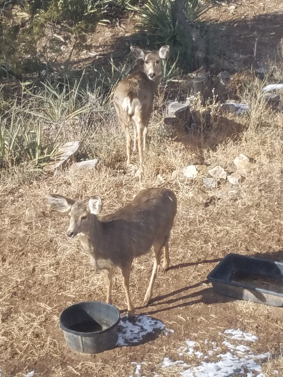
Once upon a time there was a quiet little house in the woods. Nestled among the juniper and pinons of the rolling hills of Estancia, the little house lacked design details to make it feel a part of its surroundings. The owners and their dogs had lived there for a decade and realized that a move was not pending and therefore it was time to bring the house into its own.

The neighbors…

Color was the primary element that they wanted to introduce – that along with a look better suited to the organic, woodsy setting and updates for fixtures and finishes. So, this plain, dated house in the woods began a magical transformation. Not wanting to embrace the sleek white and grey trends of the day, they expressly requested warmth and color.

The interior was plain vanilla with warm honey-colored wood accents.

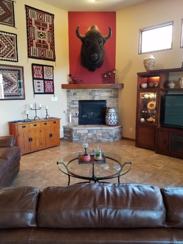
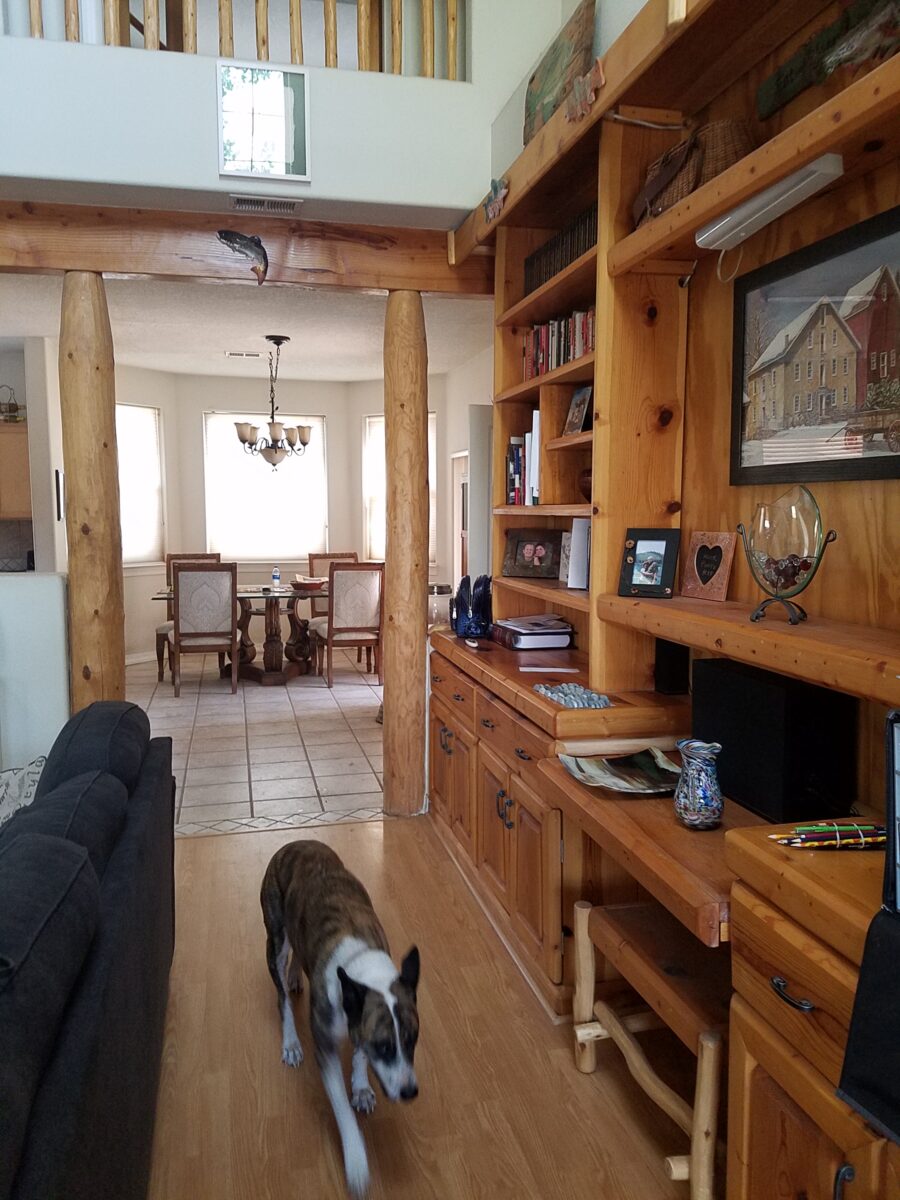
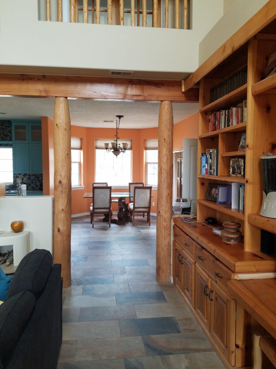
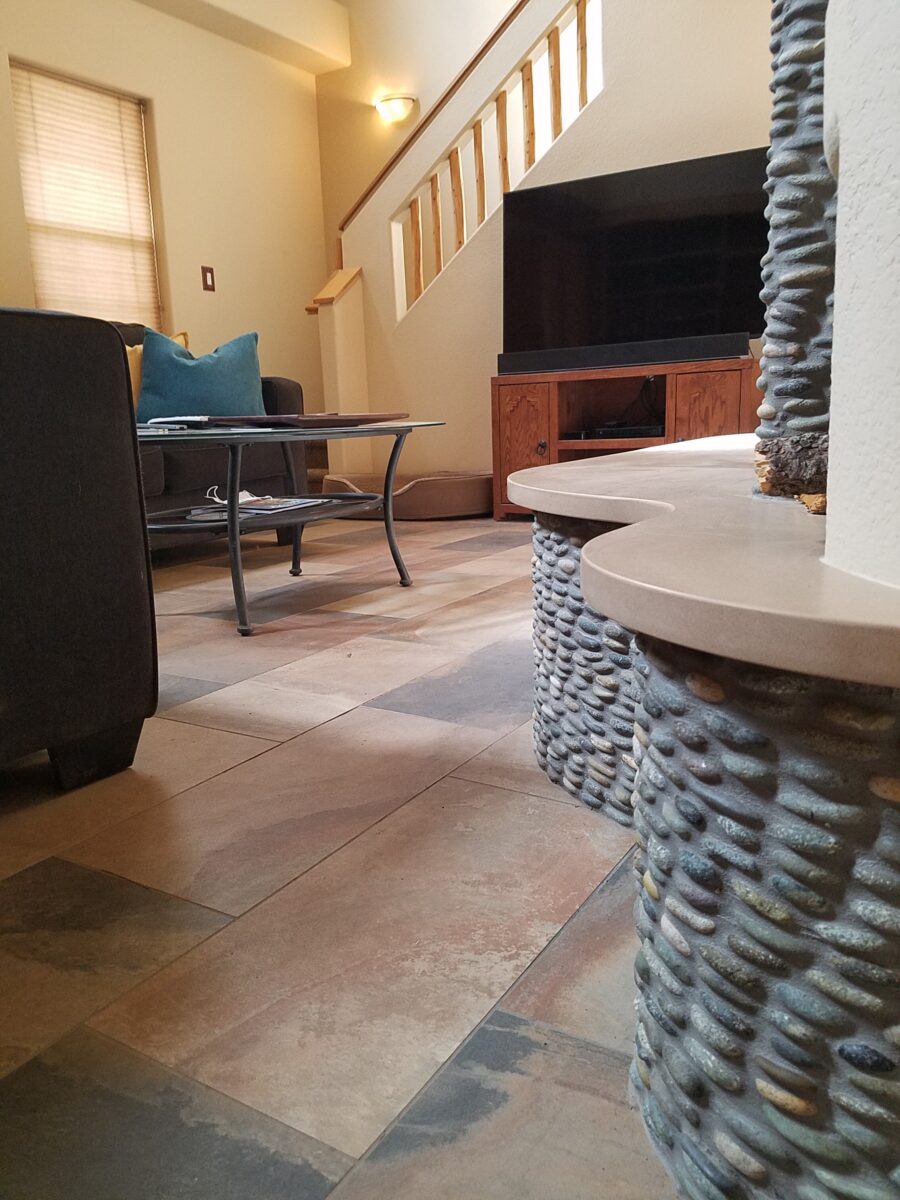
Beginning with the floor, we selected a porcelain tile that had a finish simulating a mottled slate. The outstandingly durable, slip-resistant material had earthen color variegations in the various pieces which were highly effective at concealing dusty dirt and debris from the out-of-doors and camouflaging the anticipated dog hair that was shed about. The resemblance of the tile to cut stone was remarkable. Due to its multi-color rendition of ochre, rust, charcoal, black and sand offered many tones from which to grow the design’s palette.

The flooring was a bland combination of slippery wood laminate and 12″ ceramic tiles.
The new porcelain slate floor tile is multi-toned and rich with warmth. New wall colors and cabinets are peeking from behind…

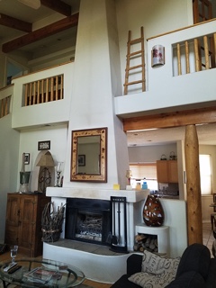
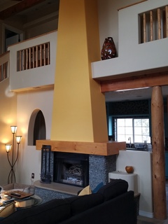
Rising from this new base for the interior scheme, we selected a dark, black/charcoal stacked stone. The smooth ovoid shapes added further organic texture with a subtle woven appearance to the surface of the fireplace.

Texture, color, form…the design is transformed…

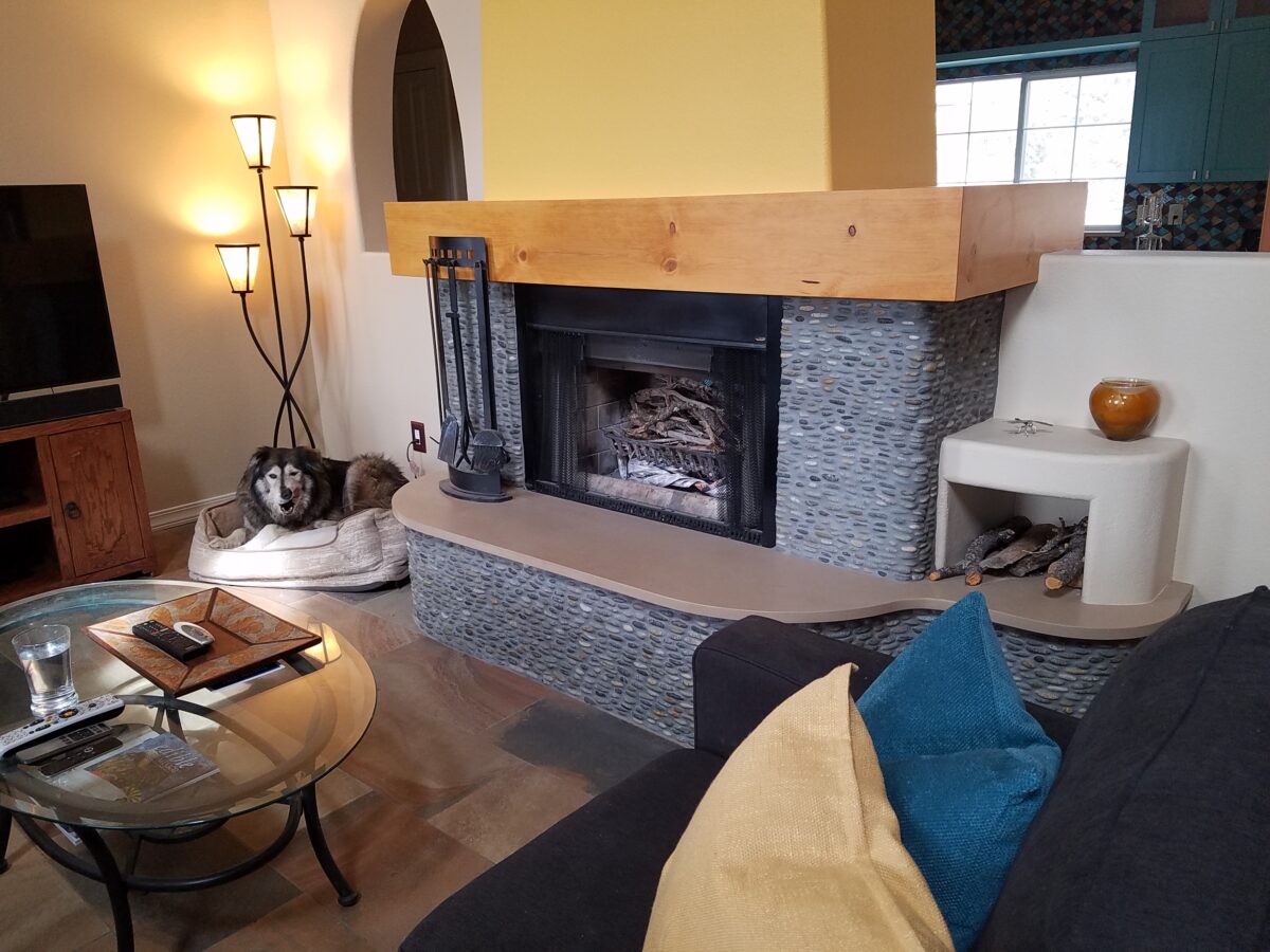
The mantle and hearth were both the plain vanilla white of the walls and despite the fact that white can be crisp, clean and fresh – the owners were eager for bold commitment to color. In keeping with the pine columns and other cabinets and architectural detailing, we wrapped the existing form of the mantle in knotty pine finished with a honey stain to coordinate with the existing wood accents. The hearth became an undulating slab of Cambria quartz material in a craft-paper bag/sand color also derived from the swirling “slate” floor.

The graceful shape of the hearth was enhanced with the addition of the stacked stone and new slab surface.

Towering from the now strengthened façade of the fireplace, the tapered form of the chimney was begging for the color-pop that the owner’s desired. The honey color of the pine along with the warm tones in the flooring invited a golden ochre paint to command the space.

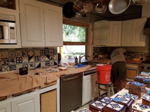
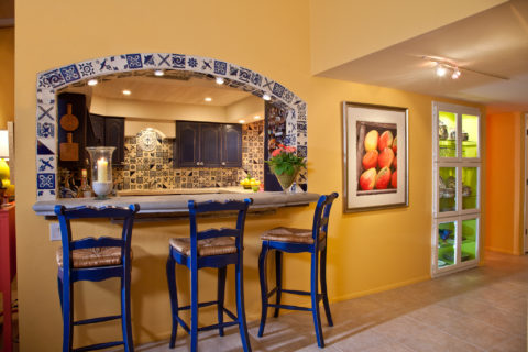
Specifically requesting the insertion of the owner’s favorite accent color – turquoise, we departed from the warm, earthen tones and punctuated the scheme in the new kitchen cabinets.

The original kitchen…tile floors and countertops, oak cabinets with off-white painted walls.

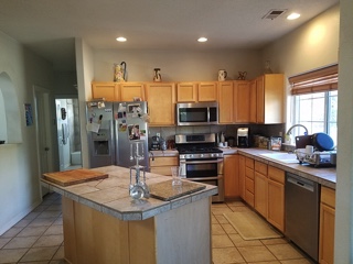
Salvaging the existing boxes and painting the faces, fabricating new doors, drawers, upper glass cabinets and end panels, the open kitchen is the fulcrum of the house. We see the trending minimalism of little or few cabinets in the kitchen, perhaps open shelving…however, this couple wanted even more concealed storage to keep their cooking and entertaining accessories out-of-sight, but close at hand.

The kitchen transformation features new color, new faces, additional upper cabinets with etched glass panels, luminous glass tile backsplash, new quartz countertops with a new bowed shape for the island…all while keeping existing appliances, cabinet boxes and layout of the space.

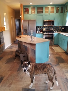
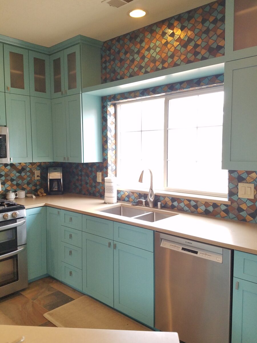
Repeating the slab material of the fireplace’s hearth which passes through from the living room to the kitchen, the new Cambria quartz countertops continue the craft-paper bag/sand color. The slate floor wraps up the face of the island for a durable kick-surface and visual continuity.

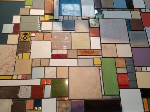
But wait! To further the focal features of the kitchen, we created a custom mix of colorful glass segments suggesting an interpretation of fallen aspen leaves golden and glossy in the damp of late fall/early winter precipitation. The combination of golden ochre and dark amber with the luminous turquoise of this stunning wall treatment dramatically contributes to the whimsically wonderful colorful scheme.

Saving the bathrooms for another story…there is more to be said about this woodsy transformation. Stay tuned and do not fear color! Embrace the context of your special places.

Color Scheme Tips

Color schemes are limitless. The permutations are endless. Color is exciting and fun. It is personal. Colors evoke feelings, memories, emotions and are key to a comfortable interior.

How often have you been asked or pondered on your own…”What is your favorite color?” Some people hesitate to answer, while others blurt-out readily with their fav.  But what color you choose to wear versus what you enjoy in your interior surroundings and how much might be quite different.

Several weeks ago, I launched a weekly post on our PATRICIAN DESIGN Facebook page called “Color Schemes.”  The idea is to inspire design ideas by pairing artwork with designer fabrics. When planning an interior there is always a focal point complimented and surrounded by supporting elements.  Whether a key painting will command the space or an expansive window with a view will direct the focus to a scene of outside colors and textures – that key element will greatly influence a successful interior color scheme.

Annette Donald creates colorful cubes in her creative take on our beloved chile ristras. A serrano chile oil painting, on canvas, by Federico Leon de la Vega is quite representational. Paired here with Romo and Ralph Lauren fabrics, Sherwin Williams paints…fresh and festive!

Here is the example of a November Scheme and you can scroll back each Monday for the past few months to enjoy a variety of the Color Schemes! https://www.facebook.com/PatricianDesignABQ/photos/a.243005986618/10157154423221619/

We embrace the The Nature of November with its unique colors and textures. As the air becomes chilly and the leaves fade…warm, soft colors bring us indoors. Featured here an elegant fused glass ribbon wall piece by Lisa Checnoff.

There are four primary considerations that I discuss with my clients when determining which colors to choose, emphasize, avoid, use as accents and where. To establish these selections, we evaluate personal preferences, contextual implications, seasonal influences and even trends. 

PERSONAL:  In planning an interior, I always want to know what colors make our clients happy, comfortable, stimulated, vexed or relaxed. These personal insights reveal important information for selecting types of materials too.

By examining what might be one’s favorite color, the discussion will navigate the distinctions, if any, regarding preferences for clothes versus interior furnishings. Interestingly, they are not always the same – although, by mere comfort and familiarity, they often are.  Simply asking about a favorite color is not enough.

Brilliant golden yellows and blues – splash color! Featured here are fabulous photo-realistic acrylic paintings by Sheri Mays paired with amazing fabrics of the same exciting palette.

CONTEXT:  The context of the interior might dictate or at least steer the direction of the design. The luxury of having multiple personal environments offers the opportunity to have different color pleasures exercised in different places. The ski condo might be woodsy and textural with browns, greys, stone and wood punctuated with a pop of color versus the seaside retreat with its crisp whites and cool blues and greens punctuated with pastels or bold contrasts. Therefore, the location of an interior might direct the desired color palette.

Inspired by this spa-aqua pottery bowl by Penny Roberts and the custom glass tile mosaic we recently combined to face a newly remodeled kitchen wall – the cool seaside/spa feel balanced with ambers and warm dots of color – pink, fuchsia, orange and golden yellow. Durable brushed cotton solids come in myriad colors and are perfect for pillows or upholstery.

SEASONAL:  This one is tricky because it plays on the perceived climate outside – even if the interior is maintained at a constant temperature. It takes a concerted effort to plan a color scheme – including textures and finishes in anticipation of changing seasons and relative temperatures. I previously mentioned that a window with a view might be the focal point of a room…imagine the effect the changing seasons might have on the selection of interior colors and textures versus a consistent tropical scene, for example?  

Perhaps you love purple – ever pair it with golden yellow? Here, functional, fantasy pottery designed and crafted with the most precise attention to detail by Jen DePaolo inspires our boldly brilliant scheme.

TRENDS:  Inasmuch as I avoid being steered by trends, it is impossible and not advisable – in design – to avoid them. Clients are influenced by them and bring that would-be preference to the table.  It is essential to continue to have “colors-of-the-year” and other market-driven colors change to stimulate the economy with buying and selling, replacement and updating.  It’s our socio/economic norm.  It also serves as an encouragement to re-fresh. But to limit that influence, in favor of long-term personal pleasures, is best.  The pressure of this marketing color influence contributes to our being a disposable culture. Not time here for a lecture on such things – but rather to instill an appreciation for and confidence in personal selections an decisions – in this case,  color.

Patinaed pearls and stunning glasswork by Margaret Hidalgo Vanderheyden inspire the soft, greyed lavenders and blues of this cool scheme.

An interesting and on-going test for evaluating a successful interior is when designing in one season – it has to work in all others. For example, when I meet with clients in the heat of July with lush foliage and color, warm temperatures and long days, that same interior has to succeed when it is frigid outside, barren, and with darker, shorter days. What might the challenges be in creating a successful scheme and what might be the solutions to make it work?

Having noted all of this and knowing the different reactions people have to color, isn’t it interesting when an interior is so successful that it appeals to many, if not the majority, of those who experience it?  This is more applicable to commercial or public spaces – from doctors’ offices to hotels.  However, the challenge and success is in knowing the many things to be considered and implementing a balance of them throughout all aspects of the interior.

Anne Marie Werner-Smith’s brilliantly glazed pottery here with Margaret Hidalgo-Vanderheyden’s lovely fused glass crosses along with coral and dyed stone necklace and woven table runner from Chiapas reflect the changing colors of fall leaves…

Appreciating color is a gift to designers. It truly is an imperative to appreciate all colors and have the sensitivity to discern the nuances between various values and the effects of selections and combinations from the infinite choices.

I hope this has given you ideas and inspiration to move forward with YOUR color schemes! Sign-up for our weekly email of Color Schemes with classic blue and white and stunning neutral greys coming!! And follow the posts on Facebook every Monday.

Hidden Talent Exposed

Hidden talent – that remarkable artwork that appears (seemingly) out of nowhere, on a par with great masters of the medium. I considered this element of surprise – looking back several decades to a local painter, Wilson Hurley, who had more than one very different, distinguished career and diverse life experiences before he delved deeply into his passion for painting in his 40s. Once exposed, his paintings revealed his extraordinary talents and he become a nationally recognized treasure for his sweeping landscapes and a variety of other subjects.  

On that note, I have just gotten off the phone with a very good friend, in Florida, Houston Evans. I have recently learned that he is a passionate weekend photographer! An amazing photo appeared in a Facebook post and I was astonished by the enchanting image, color and composition. I was instantly captivated – and curious. Upon closer inspection, his stylish swashbuckling  signature made me realize that this hobby was subtly becoming more than that – yes, he had his mark digitally mastered and is probably THE perfect brand for his diverse and stunning work.

“Star Power” is the luminous celebration of a pineapple.

As I quizzed him about his interest in photography, I learned that he attributes his eye for art, color and design to his mother who’s side of the family has spawned other talented artists, in his generation. He has been posting on Instagram for quite some time – hundreds of images. I didn’t know. I didn’t “follow.” He is modest about his photos and does it for his own amusement, pure pleasure and personal enjoyment – that he likes to share. “I don’t do it to imagine it on someone’s wall.” Yet this observer believes that there is where it absolutely should be! Many walls…many places! #houstonevansphotography

He plays with the medium and all the tools and tricks of the trade. He enjoys the freedom of experimentation. The results are controlled, yet spontaneous. From high resolution to fuzzy pixels that require distance to assimilate. Up close for precise detail and soft smears for imagination to take hold, the variety of clarity or lack thereof are a part of the experience and expression.  

“Makin’ Hay” has an enhanced pointillist treatment – a Van Gogh-esque subject with a twist.

From my interior designer’s perspective, his bold images would be key focal points in the drama of architectural spaces – interiors from Miami to Honolulu and on around the world!!! I can see the towering orchids in hotel lobbies, bars, restaurants and swanky condos everywhere!!! I am eager to find a project, for which his work would be the key to the scheme, unveiling a spontaneous design resulting from the inspiration of the image.

“Oblique Orchid” screams floral superiority as a commanding focal image.
“Shooting the Bird” speaks to paradise revisited!!!

In the beginning, the photos stood on their own merits. Evans keeps his originals – some of which remain just that – in their original form, while others are tweaked or more radically manipulated to create stunning subjects and compositions.

This brilliant, fresh simplicity of “Aqua Eye” observes the droplet’s reflection in the center of the cheery chartreuse petal.
Coming upon a cool caddie “Daddy Long Legs.”

I can see his limitless fantasies contributing to the imaginative narrative of Meow Wolf, gracing hotel lobbies with larger-than-life orchid explosions and commanding condo walls with magical statements of tropical color, subject and form. Translucent installations of LED illumination could result in magnificent walls of design influence.

“No Flies on Me” is a fantasy of oozing colors and form melting and melding around the psychedelic dragon fly.

The digital age is advancing with such a pace that we are all caught-up in photos of food, whacky selfies and sunsets on fire…but having an artist’s eye, to truly see the potential and master the tools that are now available – using them to create valid and valued masterpieces of art, is extraordinary.

“Copy Cat” reflections mirror a chorus of color from sky to watery impressionistic likeness.
This “Roadside Attraction” must have been a startling scene to distract dazzled drivers.

I truly believe that his work is exceptional – full of heart and soul – and spectacular fun!!!!!!!! I’m thrilled to learn of these images and now enjoy the continued progress of his discoveries and creations. Let’s see where this goes!!!!! He just might be coming out of hiding!!

Yes, his selfie – “Prickled!”

Discovering Extraordinary Ambiance on the Side of a Dusty Road.

After experiencing and pondering the value of incorporating nature’s elements into architectural planning in the previous blog, I find myself winding into the countryside from sea level to a mile high into jungles and ultimately pine forests, across vast expanses of rivers and towering bridges spanning grand abysses…and stopping at a modest panaderia (bakery) on the side of the road.

You can’t tell a book by its cover as this simple little rural structure – standing alone – looked curiously intriguing and quaint enough, with an unpaved parking area transitioning to well-tended pea-gravel. Traffic cruised by, on the way across the bridge.

Those that knew, turned in. We pulled off the road and were told that this couple had a wonderful bakery and were promised an exceptional treat! Fresh empanadas that would bring remarkably satisfying mid-morning joy.

Very tidy and thoughtfully eclectic, this little destination bakery is a precious find.

Oh, were we in for a surprise! At the entry, I stopped to shoot the whimsical cup of coffee mosaic set in a field of stone and concrete. I thought – what a fun design element to greet arrivals and set the stage. But I had no idea to what extent I was about to be elated. What unfolded so exceeded my expectations that I wanted to stay all day!!!

Happy stone and tile-work adorned the pathways. From the textures of stone and brick, tile and wood – it was an organic fantasy – an unexpected design experience.

Simple, yet spectacular – simply spectacular!!!!!

 Ceilings of colorful floral blooms – perhaps wisteria – suspended from their vines and other plantings intertwined with the structure.

Spotless and meticulous the eclectic elements were a harmonious creation.
Stone walls, wooden slats, vines and adobe all worked together to define the spaces.

 The wafting aroma of fresh baked goods – it was more than delightful.  From warm savory clouds with mushroom filling and another with chile-laced sausages – and an array of sweet strawberry, cream and pineapple empanadas to corn muffins, banana muffins and more! All nestled beneath colorfully woven cotton tablecloths.

Light and delicious – the best empanadas ever!! With a tiny sprinkles of granulated sugar, for a sweet crunch, before sinking into the fabulous fillings! Muffins challenged any others and savory treats were so satisfyingly delectable. Little buttons of banana slices on top denoted which were the banana muffins!!

Rich Mexican coffee with a touch of freshly ground cinnamon and luscious hot chocolate were served in custom-glazed “barro ware” complimenting the fresh-from-the-oven confections.

The exhibition baking kitchen overlooked the serving line. The buffet of pastries thoughtfully explained by our gracious and welcoming host, Jesus!

Carmen presents fresh strawberry tarts just from the oven!!!
A combination of old and new – tradition and technology meet in this cozy kitchen.

Fragmented spaces open, yet enclosed, offered intimate pockets in which to pause and enjoy.

Color-pops insert themselves effectively around the interior and exterior spaces.
Inviting seating areas semi-concealed offer private repose.
Tucked away – more areas to enjoy…

Clever use of clean blond wood shavings on the floor of the main covered patio created a wall-to-wall carpet of fresh aromatics complimenting the inviting aromas emitted from the ovens.  Rocking chairs and rigid sturdy versions, with a fun little rope swing, all surrounded  by tropical plantings made a cozy area to gather.

Soft underfoot and subtly fragrant – the wood chips make a great shag carpet!!!

As I meandered around exploring all the interesting spaces, textures, colors and plantings, I marveled at the sensitivity with which this had all been crafted and assembled. It was artful interior design with an exterior feel – open air and charming, with a decidedly handcrafted, Mexican sense of place.

Slices of handsome tree trunks make perfect stepping “stones” with graduated heights.

It was an eclectic collage of furniture, structure and organics – living and static – that was welcoming and artful, delightful and so pleasing, that it was a treat for all the senses.

The cool morning air of the mountains mingled, with the comforting fragrances, creating an atmosphere inviting gentle conversations of people gathered around good food and artfully relaxed surroundings.  

Peek in places and through doorways to find worlds of design waiting to be discovered!!!

BEFORE AND AFTER for Busy Young Couple Making First House a HOME

Busy lives in a new town, he in his residency and she working in a busy OR, they bought a house – their first house – and asked for help making it theirs.

They have traveled the world and collected art along the way, a disparate inventory of things that caught their eye, spoke of their experiences and reminded them of people, places and things to savor once home.

Home, that was the task. Create HOME in this new, old house. Built mid-century, it was simple, clean with some patchy remodeling from previous owners reflecting rather common decisions, with limited funds. We needed to discuss priorities and budget, evaluate what should stay and what needed to be changed.

They both had a love of Guatemala. Their travels there left them with dreams of color and pattern, handmade functional art and an exotic sense of place. Having these elements ingrained in their longing, they expressed a desire to have that sense, but with a bit of a modern twist.

Assembling the colors and materials…

We salvaged the existing natural granite slab countertop and unfortunate surface-mounted sink. The granite was a practical save and the sink came along for the ride. In order to integrate the granite as though intentional,  I selected a multi-colored Talavera tile that specifically had a dollop of mustard glaze in the design picking up that Dijon field color in the speckled granite. As is my usual preferred mode of installation, we took it wall-to-wall as a complete wall-covering.

We also saved the cabinet boxes and doors, but needed to give them a lift from their median caramel stain on oak. Deconstructing the colors in the design of the Talavera,  we knew we wanted blue cabinets – so the paint shades were fanned and the color pinned-down. To give the cabinets that wabi-sabi look of loving wear, we sanded the edges after the painting was finished. We also added cabinets over the stove for additional storage space and utilization of that blank wall.

We removed all the doors and drawer fronts, filled the holes from the old pulls/knobs and painted them off-site. We painted the boxes in the field. Granite was salvaged along with the sink.
New paint, Saltillo flooring, Talavera tile and cabinet pulls along with new appliances gave an updated look to the scene.

In real life, when  practicality rules, certain things have to give way for the good of the whole. The whole being the pocketbook and other elements that take precedence at the time. So we live with the radiant heaters, keep the chandelier for now, until they have one fabricated to their specifications, use a machined rug instead of a handcrafted piece and know that over the years they will massage this starting place and truly make it their home.

Continuing to dissect the colors from the new wall tile, our colorful young couple wanted more color…we chose individual values of bold paint colors –  smoky turquoise, slightly burnt orange and brilliant golden yellow to intersect the planes throughout the space.

Typical mahogany doors common to that era of home interiors, the decision to match the white trim would have been easy, but we labored over the existing natural, tropical wood and decided to keep it in the mix.

Although the nearly immaculate, original hardwood oak floors were revealed after removing the wall-to-wall carpeting, the kitchen floor throughout the rear vestibule and laundry room was an inexpensive and uninspired sheet vinyl.  Saltillo clay tiles were the answer to furthering the Guatemalan feel. More commonly associated with Mexico, these clay tiles are historically the plebian choice. Taking many forms, some artful enough to be the cornerstone of patrician interiors in fine mosaic installations and other patterns and designs, clay tiles – glazed and unglazed always add an artful, soulful human element. Speaking to that, we inserted 2″x2″ glazed Talavera accent tiles into the floor’s  new Saltillo field in the vestibule creating an almost area-rug-like definition.

The dated floor-plan enclosed the kitchen separating it from the rest of the living area. The very first comment made by our clients was questioning if we could open that wall – connecting with the living room and large picture window beyond.

The mottled cobalt blue light fixtures add another punctuation of color over the bar along with the parrot green barstools that our home-owners spontaneously nailed in an irresistible lust for even more color!!

Rather than trying to continue the existing “Dijon” granite, white Talavera tiles were used on the new pass-through bar counters – both high and low on the new cabinets.

The first phase of this colorful project has set the stage for an enjoyable work-in-progress for years to come as they now have a basis for design, more collectibles to come, and all they enjoy from places near and far. The upcoming annual trip to Guatemala, in April, will reinforce the joy and appreciation for this special place “home base” in their lives.

The dogs look in eagerly, but are limited to their expansive backyard, their vestibule and full run of the master suite.

Although they selected a durable denim twill fabric to reupholster their sofa and loveseat that they were gifted from a friendly neighbor, the primary living area is – for the most part – “off-limits,” but that seems to work for everyone in the family!!!

Time to Remodel – Finding a Theme

Time to remodel the kitchen!! This charming little bungalow had already experienced its share of remodeling – well, not so much structural – although, many interior design transformations had occurred over the decades. In the mix, the well-used and enjoyed kitchen was feeling a quite tired and dated.

You might remember I have used this now completed project, in the last few months, during its transformation process to identify certain features and design practices. Here is the as-promised unveiling of the before and after photos for further discussion about the design process, intent and results.

We loved the mottled color and organic character of the existing slate floors and opposing green-grey beams with spanning boards of a caramel stain. These were the two elements that went well together as though intentionally planned. Yet in between, the pale, peachy pickled oak cabinets with their radius detailing and red-rose/black matrix of the tiled granite counter-tops, didn’t seem to speak at all well with the ceiling treatment and slate floor’s greens, rusts and charcoal tones. It was a dark, confused space.  

When observing and “listening to” the house, it was evident that the current kitchen, in addition to being poorly coordinated, had absolutely nothing to do with the original architectural intent. The new owners had brought a few very fine antique pieces into the home. The mid-century circa 1964 age of the house accepted them on its original hardwood floors also adorned with their fine antique rugs…but something was missing. There was no cohesive thread running through the house. Over the years finishes and decorative elements had been selected and installed without any consideration for original materials or an attempt to introduce compatible and harmonious materials for the good of the home’s overall theme.

In all fairness, had the entire interior been gutted and a contemporary interior been uniformly installed into the framework/shell of the structure, I might have considered it a success. However, this multiple decade decor was a mix of disparate trends and preferences that had no commonality.

To begin the process of bringing this home into a cohesive design last year, we had redesigned the living room. There we introduced a classic blue and white color scheme derived from the Persian rug in the adjacent dining room.

To the corner kiva fireplace, we added a sandstone hearth and mantle with just enough blue and white Talavera tile trim at the base of the hearth to subtly coordinate with the new scheme. The Talavera was an appropriate material for this New Mexican bungalow.

The original fireplace had a dark, broken brick quarry tile hearth and no cap on the mantle.
The face-lift replaced the hearth material with broken-edged sandstone slab and matching mantle cap with Talavera detailing at the bottom.

With this living room having been so successfully re-designed, the obvious thought came into the discussion to continue the vernacular of the blue and white Talavera into the kitchen. As a bit of a purist when it comes to application and termination of materials, I was not content for a mere back-splash.  No, if the tile were to be effective and commandeer the stage, it had to be used wall-to-wall as though an entire wall treatment.

Treating the Talavera tile as wall-covering, it continues from the kitchen, into the adjacent pocket-space housing a desk and laundry machines.

But wait! The addition of an earthy aqua handmade tile from Spain offered an appealing and unexpected accent woven intermittently through the Talavera. It created a coordinating thread from the colors found in the mottled slate floors and ceiling beams.  

Pre-grout shot shows the individually cut 1″ pieces inserted as mosaics into the random field of Talavera

The cabinets were in excellent condition, but the doors were sadly dated and in no way spoke to the home’s other cabinets, doors and finish carpentry.

The confused interior finishes we in need of a transformation!

With the white raised panel theme throughout the home’s original appointments, we elected to salvage the cabinet boxes and replace the doors and drawer fronts with a similar raised panel detail. The same red oak was used and, with a glossy white paint applied, the grain “read-through” with a very intentional yet subtle moiré-like pattern. The new raised panel white doors and drawers, with crowning top molding provided a crisp, timeless motif. The random patterned Talavera used as an entire wall-covering was very effective. The kitchen was quite gussied-up!!

The transformation was dramatically successful!

The existing slate floor was beautifully organic and I felt, from a design standpoint, was a must to salvage. Making it look like an intentional selection – part of the new scheme – was imperative. Therefore, selecting a counter-top that communed with the tones in the floor resulted in a selection of concrete-like engineered Italian quartz material – balancing the floor with the next horizontal plane and ultimately with the stained and green-grey boards of the existing ceiling treatment.

The new concrete-like Italian quartz counter-tops coordinate well with the other materials.

Another asset was the connection to the outdoors, however the existing window over the sink was high and small.

The window over the sink was high and small…

By bucking the warranty of the Pella people, we had a new double-hung window made to close down onto the new counter-top that passed through from inside to out. They would not fabricate the window to do what we intended, so we had the contractor remove the bottom of the new window frame, thus rendering the warranty null and void, in order to have a completely open, uninterrupted pass-through when raised.

Amusing and interesting…existing family pieces of blue and white ceramics are being discovered and used as decorative accessories in the new kitchen!

We also captured the opportunity to open the opposing wall into the hallway adding pass-through light and dimension to the space. This exponentially expanded the space and made the encapsulated kitchen feel much less confined.

Before, the kitchen felt small and dark…
Opening the wall into the hallway brought in additional light and dimension.

To add drama to the newly created dimension, we discussed having a painting commissioned to pop an accent of yellow into the blue and white scheme on the far hallway wall. Lemons, a perfect citrus for the kitchen, was decided for the theme.  

A miniature oil painting by Federico Leon de la Vega was used to Photoshop into the scene to inspire and convey the design intent.

The additional POP of yellow is a dramatically effective contribution to the overall composition. After consideration, the owners selected a local artist to paint the full-scale painting.

A local Albuquerque artist, Thomas Tomlinson rendered the lemons in acrylic with blue and white tile details.

In summary…keeping the original slate floor, existing cabinet boxes (replacing door and drawer-fronts only), with a bling of new chrome cabinet pulls, switching out the stained glass pendants, replacing the island’s surface with a handsome solid walnut top and a new coordinating concrete-like counter-tops on the periphery, with the decorative embellishment of the Talavera tile continued from the subtle introduction at the living room’s kiva fireplace, the transformation of the kitchen is stunning – not trendy – and was truly, uniquely designed for the architecture and forward, on-going contextual design conversation of the home.

Uniquely designed…

Look around and listen to the environment for and in which you are designing. What makes the best sense for the design direction considering the function and context of your project?

WHITE by Design…

With all the New Year buzz about the new color forecasts…I started taking notice of the seeming non-color, white. It is often considered the absence of color when in fact it is a very complex color of many shades and values. Just try to select a white and you will know what I mean.

When you look at white paint samples, you will notice the nuances. There are pink whites and blue white, grey whites and yellow whites. Each white is off-set and contrasting to another. You see the differences by comparison and by context. You think you have just the right white until you place it against another sample and see that it is grey or cream and then second guess yourself again…and again…How do you know which white is right?

Dunn Edwards groups their whites and pastels in a separate section of their fan deck as do other paint companies. What is interesting here is that the background is a sheet of white copy paper. Notice how is reads against the colors in the samples…it seems to be a purple blue color. This shot was taken under a full-spectrum LED lamp. The colors should be true. The range of “white” is amazing.

To intentionally design with white is bold. To have the confidence, to decide that white IS the color and that white IS the scheme, is challenging. To effectively design with white, you not only have to select the right white(s), but you have to know just how much of anything else might be effective yet not detract.

Le Leche in Puerto Vallarta is a fabulous example of designing exclusively with white. Only with minimal punctuation with black lettering on the wall of containers and also by allowing shadows is the white interrupted. But the blacks’ minor interruptions gives depth and fine detail.

White design can be cold or warm. Depending upon the desired effect, mood or function of the space, the whites need to be carefully selected. This is true with lighting as well. Warm whites or cool whites…what gives you the desired result?

Popular white string lights add festivity and a warm glow to an evening scene.
See how many lighting colors you can identify in this scene…Starting on the left, a cool pocket glows through the underbrush. The walkway has a warm pink-ish light. The very cool blues of the pool area give a dramatic read. A bold yellow accent peeks from the far left and also over on the right. The palm trees are wrapped in a warm white tube lights while the far right side illuminates the entry to the dining palapa with a cool white light source. The foam of the surf on the beach is captured with a cool white spotlight that maintains its naturally expected white color.

Knowing when to add color to a white scene to achieve an intentional POP is an art. The color itself, the amount and placement is all part of the success of a good design result. From the fine black detailing in the previous shot of La Leche to this still-life composition of a tropical cocktail that I propped the other day, the minimal punctuation of color is key.

White mosaic shards of tile in the background of this composition featuring a peeled coconut and the POP of a pretty pink party umbrella result in a white-on white scene. Yes, this shot says PARTY with a perky smile!

The bench which served as the backdrop for the coconut cocktail is a dramatic serpentine sculpture of site furniture that plays with the white-on-white of the tile and grout.

Contrasting against the organic wood decking, this white monolithic bench snakes around the periphery of this outdoor lounge area. The sunset is casting a soft pink wash over the all white glazed tile.

Beach settings using white materials compliment the white sand and greenery of the tropical plants. From wood frame platform cabanas to the sprinkling of umbrellas, white is a wonderful, fresh color for a crisp clean scene.

Whites on whites…creamy sand colors to crisp white terrycloth, the white-on-white scheme is soft, inviting and clean.
Greenery compliments the white umbrellas and sunning beds on the lawn by the beach.
Palm trunks and other fruit trees are often painted white to protect against insects and what insects insist on climbing the surface are easily spotted by birds who appreciate the help to capture a snack! In this case, they contribute to the white design theme.

The soft creamy off-white folds of fabric offer a soft, inviting scene.

Shadows in the creases and depths of the folds add the dimension to the luxurious feel of the cotton damask fabric.
White stucco is dappled by shadows and greenery while given a warm, strong base by the brick pavers. White as an architectural finish is only successful if the context compliments it. This is true in all design.

Architectural color and texture of surfaces is a moving target. A recent discussion about a white building with black detailing would not have proved right for this particular use of white. The hard, commercial read would have been too severe for the intended effect. Yet that same project, with a warm white and an ochre accent, will be just the right combination to achieve the desired result. Watch for this project to be featured in a few months.

Architectural surfaces incorporating tones and textures of white provide interesting opportunities

Block and crumbled edge accent bands on the facade of an exterior wall.

White in design is an exciting selection. Knowing how, when and why to use it is a test of your creativity. Picking the right white is the challenge.

The limitless colors of white found in a pile of gravel…..

So the next time you think white, think a lot about it. Study the context and what you are trying to accomplish. Feel freed by the fact that white is a color to express and enjoy.

Urban “Pieced Work” – an artistic narrative

We are excited to have the opportunity to bring a design installation(s) into a new project that will serve to support the brand with a twist. A nearly completed new smokehouse is coming to Albuquerque. This home-grown eatery blends family history and southern roots with southwestern barbecue flavors including indigenous  wood and iconic chile blends. But this is not about their cooking profile. It is about how we have arrived at a design theme that will define and further the identity in this new, specialized smokehouse department of this larger local brand.

To accomplish this task, we examined the concept the owner had  to remodel an existing facility that had been a popular gathering post serving this community for decades. The fringe barrio location was of a demographic primarily comprised of Mexican/Americans. Decades past it was home to a heavily black community. The fabric of these cultural combinations suggested a mosaic of color and vibrant heritages.

The spark of cultural references lead to discussion of the popular artistic expression of urban mural painting.


When we began the dialogue, the decision to have a mural painted by local neighborhood kids, with a mentor to design and supervise the work,  seemed to be the direction we were headed. After subject matter debate and development, I veered off on another tangent that might take a less subjective approach, be weather-proof and more durable for a patio location – mosaic.

This new more impervious and durable medium still offered the opportunity to engage the community, but with less focus on a specific subject and more about geometric color and texture. We discussed the details of installation so as to keep it simple for kids to participate using whole tiles – minimize cutting, if any, for starters.

Inspiration came from several other installations such as the Albuquerque Convention Center’s on-going mosaic mural project wrapping many sections of the buildings with intricate scenes of New Mexican lifestyle and cultural diversity. The colorful mosaic is an elegant and sophisticated contribution to our city’s cultural aesthetic.

Helen Atkins, manager of consignment art at PATRICIAN DESIGN’s downtown boutique gallery and the lead on their current restaurant mural project, has worked on several phases of the Convention Center’s mural project.

We have incorporated mosaic into several of our own design projects such as last week’s blog https://patriciandesign.com/trust-and-custom-designs/about a residential kitchen installation.

Here, in another installation, a fireplace surround of mosaic adds movement, color and textural interest to the room.

Ultimately, one of Helen Atkin’s personal photographs cemented the approach. It was decided that a geometry of different sizes and disparate glazes and designs of tiles pieced together in a colorful, textural  panel would be our design theme.

Helen Atkins, a recognized artist in many media, captured this in passing while visiting New Zealand. It’s crisp, yet irregular composition was intriguing and pleasing. It became the springboard for the concept for a geometric mosaic panel to anchor the theme of this new New Mexico eating establishment.

The idea became more exciting as we began gathering material from local tile distributors and our own personal inventories of favorite treasures saved for a special project. Here it was.  It seemed such a strong design element and therefore offered a new direction for the actual brand of this establishment. We embraced the idea and brought it into the interior and distributed murals throughout the space.

Still under construction, we will not divulge the identity or locations of this project just yet. But suffice it to say, the murals are an exciting part of this interior design scheme.

As we further discussed the plans to implement this project, school started and the ease of coordinating the assistance of neighborhood kids became more difficult. Helen lead the project as primary installer, coordinator and supervisor. She enlisted the assistance of a couple of people – one experienced and the other not at all.

We have named this series, Urban Pieced Work – an artistic narrative. Here we are interpreting generations old sewing patchwork using ceramic, glass and pottery pieces rather than the traditional fabric patches. The original folk art needlework has been in the American vernacular for ages.  In these installations, this up-cycled  use of discarded or discontinued tiles is similar to patchwork fabrics, re-purposed to make clothing, wall decor, window treatments and bed dressing when times were tough – often referred to as “pieced work.”

My paternal grandmother in New Mexico made this twin quilt for my bed when I was a child in Virginia.


My same grandmother made this and was given to me by my cousin, her only other granddaughter.

Mosaic is often, like fabric patchwork, a practical art form that puts scrap, shards and fragments to good use in an artistic fashion. Note though that more sophisticated mosaics have been designed more intentionally for centuries not merely as salvaged material. These masterpieces both in contemporary work and antiquities represent many periods in history and movements in artistic expression.


This mosaic version connects with the history of the restaurant’s roots and southern heritage. The panels’ mural nature speaks to the urban murals found throughout the community.

Located strategically throughout the interior, these murals have become a strong design element and anchor for this facet of the brand.


Another shot of the spectacular cultural story murals at the Albuquerque Convention Center.

We have woven a meaningful artistic statement throughout the interior and also on the exterior of the building. In addition, we will be inserting a graphic version into the signage and logo design.


Urban Pieced Work – an artistic narrative, of a New Mexican Smokehouse, will provide pleasing design visuals throughout this new interior, provoke conversation and interaction, weave an element of history and context with the southern roots of this exciting new eatery!

Join the conversation and watch for the first succulent flavors to come out of the smokers later this year.


FLOWER POWER – A Marketing Imperative

While in Park City this weekend, I pondered what might the subject of this week’s story be. Dazzled by the smart presentation of this hidden little jewel of a town, I was continuously remarking about the fresh abundance of flowers, well maintained facades, manicured lawns and medians and the obviously collective appreciation for what draws patrons to want, if not need, to invest in property, art, clothing, home decor and food! Yes, need – it can become an imperative!

Here a restaurant has dressed their facade with brilliant red flowering boxes beneath the sidewalk window.

Oh – oops…do you think it might have been the Ferrari that was drawing attention?

Imagine your patrons being drawn into your establishment as an imperative – a must see, or must buy here, or must try this place, or must check out their wares, or must taste their food or drink their craft beer!

The patio of this brew pub is surrounded by fresh flowers in rustic wooden boxes.

Preparing to open for the day, this pub also has light strings to animate the patio at night.

You see this charming presentation potential in small resort communities and those who have cultivated their assets to the max, reap the benefits of their vision, smart development and on-going maintenance.

 Another brew pub sees value in an eye-catching floral frontage. Courtesy – Heather Harrell

The architecture is decidedly mountain themed, vintage 19th century colorful and textural, but interestingly punctuated by modern elements and fresh ideas. The practical pitched roofs, quaint scale, textural wood trim and detailing, all contribute to this charming scene.

Courtesy – Heather Harrell

To dismiss the value of flowers in marketing is to ignore the Flower Power!

Some places take a little more work to grow seasonal sprays of abundant color in pots, buckets,  bowls, barrels and boxes, but the effect of drawing people is undeniable.

 Courtesy – Heather Harrell

From Key West to Anchorage, the results are proven. Beauty, color, nature sells.

It’s a combination of color being a visual POP amidst concrete and brick, but it is also the positive life-affirming statement that it projects.

We know color in advertising is a draw and we know that anything that adds animation is a draw – flowers colorfully animate the street-scape and draw customers to them.

Here the passers-by are drawn to the menus posted in the window by the red geraniums that brilliantly are placed in planters in front of them.


Courtesy – Heather Harrell

They infuse the built environment with nature.


Like hummingbirds swiftly hone in on the finest blooms or like bees collecting pollen, we are drawn toward that which speaks visually from the surrounding foliage.


Courtesy – Heather Harrell

Texture is another element in this mix. We know that good design is about balance. Flowers balance the otherwise hard surfaces in their periphery. The finishes on a streetscape or sidewalk scene are generally, if not exclusively, hard. Flowers soften the surrounding surfaces and also balance the smooth and hard with random shape, texture, flexibility and even movement.

Whether a casual bar or fine dining restaurant, retail shop or any business wanting to attract and invite the public to them, flowers are an asset.

I feel about flowers similarly to how I feel about twinkling lights on a patio or in public trees. The advantage in the lights is that they can survive the frigid elements and make their statement in all seasons. Lesson here – once the plants are spent for the season, keep the lights on!!! Both elements are valuable draws and enhance the atmosphere of any establishment or environment. (Go back and notice how many photos have visible stringed lights in them!)

And if possible, plant those past-season pots with hearty pansies, ornamental kale or evergreen shrubs to keep the life calling from the sidewalks.

An art gallery has boxwood in steel vessels at the entrance.

A potted evergreen will add life to the paved surfaces when the flower season has passed.

And  for the sake of broadening the reach on this subject, to include not only the flowers and the mention of stringed lights, is the inclusion of creative signs, banners, flags, umbrellas and other elements that contribute to the festive nature that attracts peoples interest and draws them into your business.

Courtesy – Heather Harrell


Rooftop bar with flowers, flags and umbrellas – King Edward too!        Courtesy – Heather Harrell

Celebrate the the power of flowers!


Southwest Style – What is it?

Arriving for the first time in our American Southwest, one might feel like they have entered a different country, if not a different world!! To fly from anywhere else where there are rolling green hills, or green fields or dense green wooded landscapes, not to mention tropical environs and cruise over America’s Southwest, it looks like the moon – or some barren planet. Everyone remembers their first impression. Whether exotic or scary, lonely or seemingly uninhabitable, once you get on the ground and explore the beauty and variety of what’s here, you’re bitten – even smitten.

In all fairness, this is a completely defoliated winter shot!! Many now know how lush this magnificent Sandia Mountain can be at the top, in the summer. Yes, I said lush.

No other region has the distinct architecture and tri-cultural identity of what has become the elemental design style and flavor of this magical place. From “sea to shining sea” New England to Southern California you will find nuances of regional distinction – but not to the degree that the American southwest is set apart. Architectural influences from colonization have been the standard guiding style nationwide. Yet the ancient, practical elements, of civilization that long preceded the Europeans discovering the New World, is at the roots of this enchanting design style.

Tri-cultural architecture and interior design results from the remarkable history combining Native Americans carving out of stone walls, building with mud (adobe) bricks, devising simple, practical designs to capture heat and insulate in cold while minimizing solar gain in the warm weather months, with the conquering Spaniards and their colonial influences, and finally the pioneers from the east with their colonial English influences.  Now more often replicated, with frame construction and stucco facades, this unique melding is the core of Southwestern architectural design.

When one hears the term “earth tones” setting a design trend in the 70s, it suggests the brown, tan, orange palette that was terribly limiting. Certainly to label it earth tones, it became a curse of a color scheme. Sadly to link it to a representation of southwestern design was misplaced and unfortunate. And how sad to think that it was so broadly accepted – like lemmings following blindly – everyone adopted this as a truism. So often the case with trends.   The 70’s also spawned a diametrically opposite color scheme of blues and greens to refresh that which had been so mired in the “earth-tone” movement.

However, real earth tones are limitless. Earth tones are all colors…look down…look around. Even if you confine your interpretation to the dirt beneath your feet – the colors are vastly more than the brown, tan, rust, orange that became the rage. Soft pinks and grays, pale blue and whites…look at dirt. It might be more clay, might be more peat – from soft terracotta to dark espresso – dirt is earth and the colors and tones are limitless.

Tom Glover captured the beauty of the natural landscape through his artistic photographic medium that Georgia O’Keeffe and others have depicted through their artistic media.


Georgia O’Keeffe saw it and captured it in her own enduring style.

Nature offers color. Natural dyes have riddled that art world through time. Synthetic dyes took it a level further. But nature is at the core of all we have in this world.

http://www.quilthistory.com/dye.htm

Turquoise being a natural mineral in the American Southwest became a signature accent color punctuating the soft earthen tones of the adobe design palette.

Artist Victoria Martinez Rodgers paints a valley apple orchard and the turquoise wall is the perfect backdrop.

Color was always there for those who cared to notice. The great painters of this region presented it well. Their recordings of everything from the many colors of the rugged windswept landscapes to lush green mountain forests with shimmering golden aspen groves – and bosque cottonwoods screaming with yellow brilliance capture and convey so much more.

In autumn, bosque cottonwoods explode with color sending a streak of brilliant yellow all along the Rio Grande. Federico Leon de la Vega create this commissioned oil painting from a photo provided by his clients.

There are the natural and also synthetic dyes that were woven through the magnificent textiles of the Native Americans – blankets and articles of clothing were not limited to buckskin animal hides.

Ernest Blumenschein was the founder of the Taos Society of Artists capturing the color and textures of the realities that he encountered in this Land of Enchantment.

Sunsets everywhere play a part in the imagery of the landscape – here we see vast landscapes with brilliant fiery skies and those exciting corals and lavenders, soft pink and blue wisps provide inspiration for wall colors and backdrops to our richly embellished interior designs.

Yet spare, understated neutral interpretations also offer elegant representations of southwestern style.

So what do you visualize when you think of Southwestern Design? Please don’t say a turquoise wooden cutout of a howling coyote! Death by Southwestern Style – the overdose resulting from overdone clichés and trends that have spoiled the real art and beauty.

It doesn’t have to be all about cow skulls and pelts…but these cow hide butterfly chairs are pretty  cool!!!

Perhaps you see a Mexican influence which is also part of the melding of the regional style – like food, we have a fine line sometimes with certain traditional dishes that when adopted and adapted by American Southwest kitchens took on a unique identity all its own – differing between Texas, New Mexico, Arizona and California. We all enjoy bringing art and craft from our southern neighbors into our designs.

Borrowing, sharing, combining so many design elements such as adobe architecture, colonial wood trim detailing, fired brick technology, Mexican Talavera tile and pottery,

Native American textiles and so many other handcrafts

The owners of this interior have an intimate relationship with each of the artists that they have collected down to this magnificent mount of a buffalo. They knew him and his name and why he was put down.

from punched and tooled tin, paintings and pottery – southwestern interior design is rich with color, texture, artistic detailing and true soul. The connection to the earth is undeniable and nature always plays a key role.

So how might you introduce southwestern influences into YOUR design scheme? You could tile the wall(s) of a powder room in Talavera Tile. Maybe just a mirror surround?

You might paint an accent wall – or all walls in a room or some other bold color inspired by a regional image

Mango watercolor by Susan Weeks splashes coral against the golden yellow wall with a lime green lighted cabinet showcasing old, traditional, low-fire Talavera tableware. classic Talavera blue and white tile frame the bar opening and on through out the kitchen.

and collect art pieces such a punched tin crosses, wood and straw,

landscape or still life painting, hang a blanket or drape a bed with a beautiful woven textile…introducing different styles speaks to last week’s story about eclecticism. Don’t be afraid to mix things that you like. What brings you joy?