Eclecticism in Design – What Does it Mean? What Does it Say?

Looking back (to both sides of the turn of the 20th century), eclectic interiors were only cultivated by the very rich. Those who had the discretionary income to take vacations abroad, had diplomatic ties or nomadic adventuresome types who took precious time off to explore different locations and  cultures other than from whence they came. Others of means might have merely hired decorators to create interiors that suggested such adventure and access, without leaving their drawing rooms. Expensive eclecticism catapulted status.
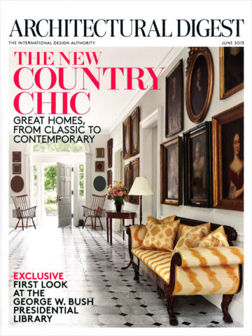
Leaf through decades of Architectural Digest – THE authority on design for examples and inspiration of fabulously eclectic interiors among all the varied styles they have documented for us!

A surge in eclecticism occurred with the many military personnel and their families who were stationed overseas and were able to transport containers of belongings along the way.
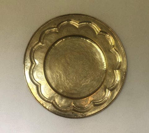
Recognize a meter tray? A meter size diameter of solid brass tooled with hand detailing and pressed/formed/hammered designs. From table tops to wall hangings, they are statement pieces!

They brought back fine and fun arts and crafts from around the globe. These homes were distinctively punctuated with art that was recognizable in those circles – you could tell where people had been stationed by the decorative elements in their homes.

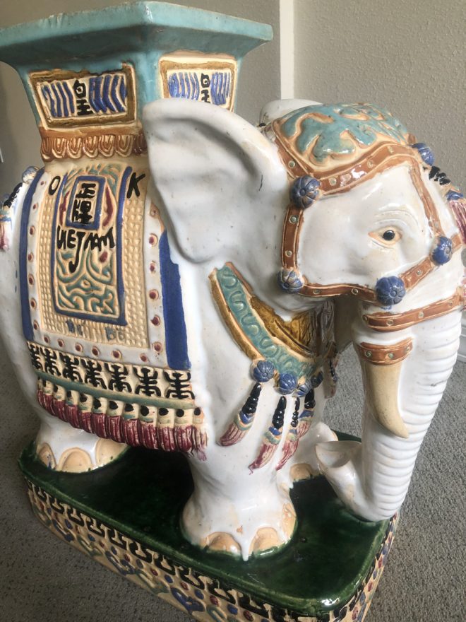
A souvenir from 1970s South Vietnam! Ceramic elephants were the rage!!! From stand-alone accents to end tables and bases for larger cocktail tables supporting glass slabs, these animated novelties of artistic expressions continue to bring joy decades later!

As the original owners handed down these nostalgic treasures, the history of the discoveries was diluted if not lost but the appreciation for many of the collectibles remained and was passed down to younger generations starting their homes. Inherited interiors spawns eclecticism.
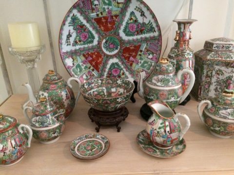
Antique collection Rose Medallion passed down in a family.

Many homes have been assembled with the elements gifted by others resulting in a nostalgic, familiar collage of decorative accessories.
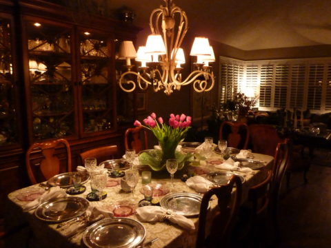
Vintage pink glass salad plates, family antique chairs, and a china cabinet of new and old collectibles used and mixed with love and affection.

Pier One capitalized on this decades ago. Their slogan was something like “we shop the world so you don’t have to.” In lieu of experiencing great world travels, the buyers sought exotic, interesting, affordable, mass-produced items and eclecticism expanded exponentially. They actually set seasonal decor trends with their ability to influence the market with their sweeping design reach to international artisans and fabricators, massive buying power, focused design team and extensive marketing campaigns.

Some, in order to create that sense of eclecticism, haunt thrift stores and antique markets. “Thrifting” is today’s trend for gathering eclectic “finds.” From antiques to current cast-offs, the sport can be quite satisfying, cost-effective and can result in some amazing acquisitions!
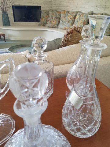
“Thrifted” antique table and eclectic crystal decanters contrast sweeping contour of limestone hearth.

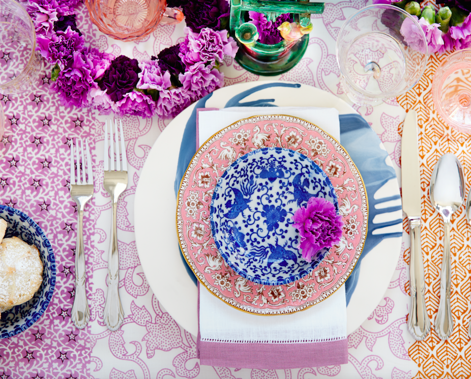
Eclecticism means varied interests and experiences, an appreciation for what is good and fun rather than merely coordinating. It suggests independence, personal taste and style, with a freedom from convention and changing trends. A successful eclectic interior still requires balance and proper placement and distribution of the varied objects. Have what you like. Be surrounded by things that make you feel good, productive and bring you joy.

Quilting – An At-Home Workroom of Color!

It’s not your grandmother’s quilting these days…computers have radically altered the landscape of this generations old art form.  Two days ago I found myself in an in-home art-studio/workroom that blew me away!
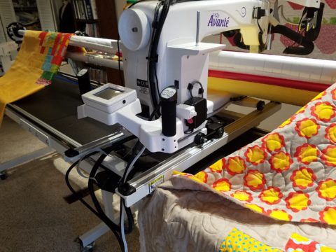
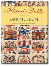
Initially a craft born out of necessity, as creative survivors accustomed to “making something out of nothing” re-purposed scraps of material to patchwork new articles of clothing, homegoods and ultimately art for the walls. This clever, resourceful, utilization was celebrated in Dolly Parton’s song turned movie, about her true-life “Coat of Many Colors.” https://en.wikipedia.org/wiki/Dolly_Parton%27s_Coat_of_Many_Colors

The intricate designs and refinement of pattern details was obviously all done by hand, but with the development of machines and now computers for this purpose, the possibilities are endless.

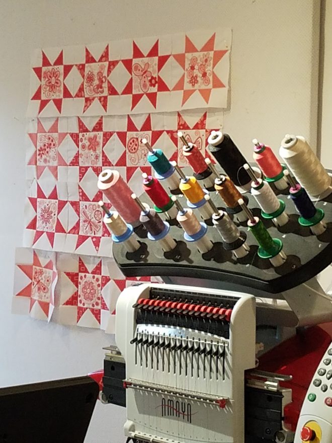
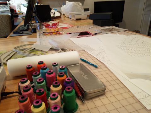
So as I turned the corner, to see a would-be remodel of combining two bedrooms and expanding to the north of the existing shell, I was astonished to see this remarkable, expansive workroom – all white – punctuated with colorful creativity. Colors, textures, patterns…this extraordinary, rather Renaissance, woman had carved out a generous space to explore this phenomenal art and craft.

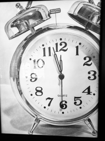
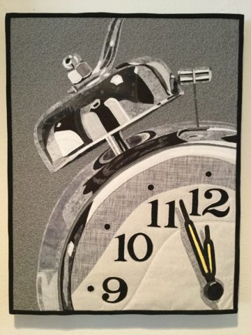
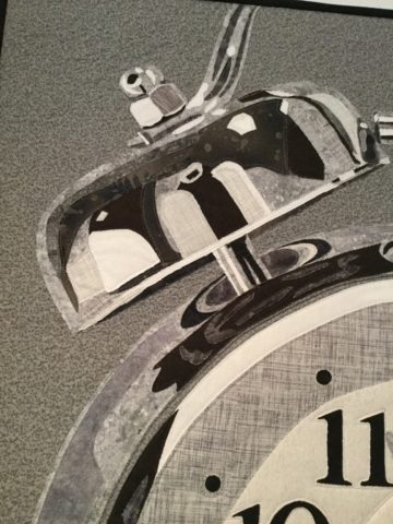
As an artist, Sue Watrous’ paintings and sketches are quite photo-real. On a few of her pieces, she has deconstructed the elements in the painting cutting them from fabric of many grey-tones defying the fact that they are textile assemblages.

This original pencil drawing – yes, photo-realistic, is amazing.

Then to create the same image as a patchwork quilt is remarkable!!

Yes, look closely, you can see the patches of fabric that are assembled in the many grey tones to create this amazing piece.

Her joie de vivre is derived from this magical space and the creations that she imagines and brings to fruition.

Upon entering her amazing domain, I felt as though I was entering an operating room – everything in perfect order, clean and spare – like a clean-room at Intel – I should gown-out or suit-up!!!

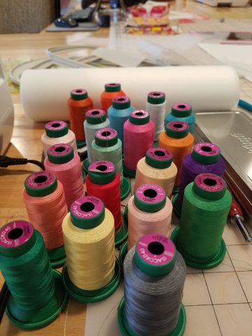
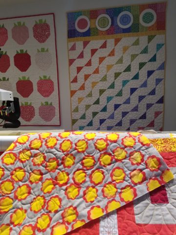
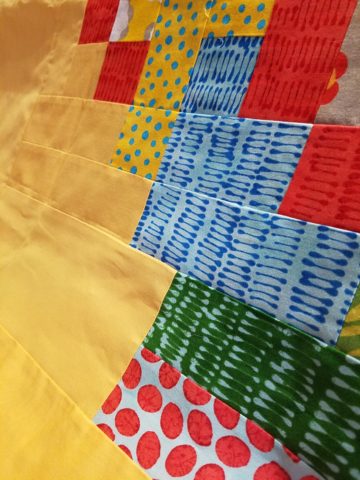
I might be exaggerating because it was white and clean, but warm and welcoming with the rainbow spectrum of thread spools and quilts both finished and in progress displayed on the walls and on the other many surfaces.

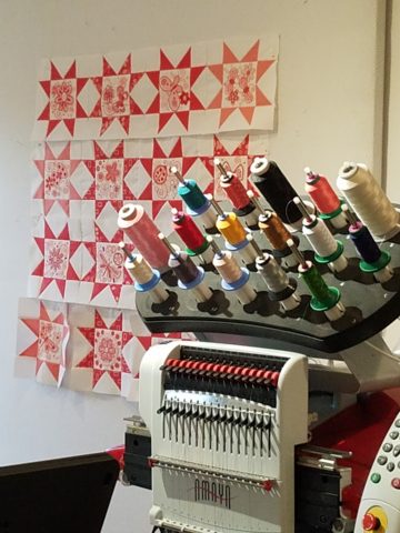
Self-taught, she nonchalantly references the many computerized machines strategically placed around the  room. There is an order to the layout and her approach is meticulous. Despite the fact that there is an active quilting community here – they are too busy quilting to teach – so Sue jumped into this after having seen a presentation at a show about five years ago. Years ago she quilted – but at this juncture, she knew at once that she wanted to enter this exciting and challenging realm, of computerized art assist!

Like the shoemaker who has no shoes, her quilts have yet to adorn the walls or bed dressings throughout the rest of her home. She doesn’t sell her work – but her family all has homes riddled with choice pieces.

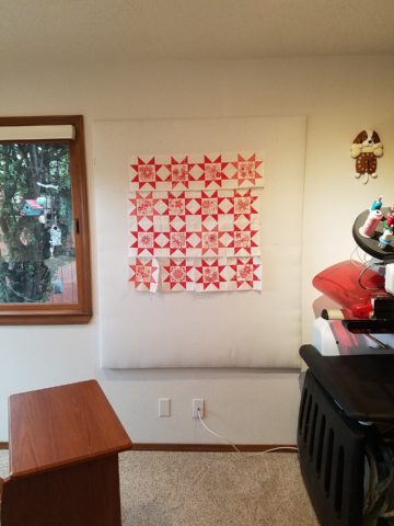
Her paintings are placed amidst her interior, but not her quilts. Today I focused on a large wall to be the future home of a near-to-be- completed quilt.

She tells me that the fabrics are like paints – she is painting with fabric.


And although she is not yet dying her own pieces, she told me of meeting a textile artist who spun her own thread from her own llamas, dyed it, designed and fabricated her own work.  Sue has created most if not all of her patterns and designs and I am confident that before this is over, she will be donning rubber gloves and dunking material in dye vats to find a new layer of creativity.


What Do Fabulous Fabrics Have in Common?

Fabulous fabrics are NOT common – that’s what they have in common!!  After paint, fabrics are the most  malleable design element that can make dramatic transformations in an interior.  New pieces, reupholstering existing pieces, treasure-hunting to cover vintage pieces, salvaging family heirlooms, plastering or padding walls and ceilings, draping and accenting – doesn’t it sound exhilarating? Imagine the  possibilities!

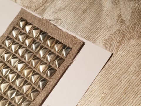
Metal studs to trim things…wrap a lampshade, border draperies, trim a sofa, adorn a pillow…so many things…and the stormy cloud printed velvet in the background of this trim – is blustery and powerful.

One of the most fun-filled events in our design studio are the road-trip visits by our fabulous sales reps that bring the world to our conference table!!  In larger cities, the design resource centers, markets and their showrooms offer myriad marvelous samples of furniture, decorative accessories, art, lighting, fixtures, finishes and fabrics.  Exciting new design trends are presented each season.

But when you live, in isolation from the major centers, as we do here in the high desert – we are treated to personal presentations that are intimate, relaxing, inspiring and educational. Here is an exclusive collection that was presented just last week. Sit back and watch the fabrics unfurl and float – one after another – in layers of color, texture and incredibly inspirational style.

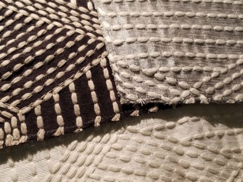
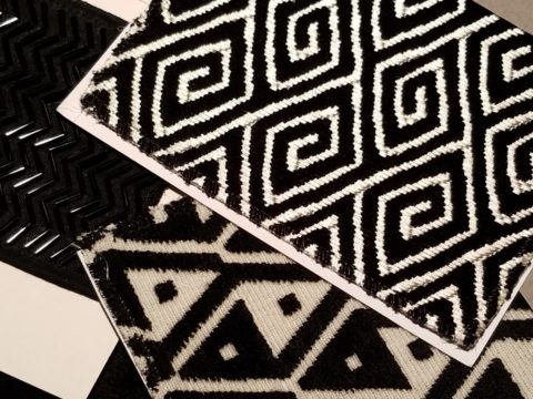
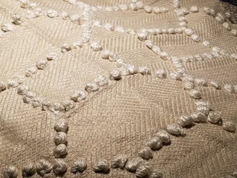
Weighty over-stitching or “top-stitching” adds detail-either high-contrast, color-on-color subtlety or the median slightly contrasting grey with white. Trending – touchable textures! Here presented for interior fashion, but you can bet that clothing fashion designers would love to play with these textiles for wearable art too!!!

Sure, throughout the year we travel  to source hubs, surf the net, call our reps, request samples, compile materials and gather what we need across the miles. It is challenging.  Like living on an island and bringing the amphibious containers of supplies over the sea and up onto the beach! But inasmuch as we don’t have a design center handy to do a lot of “one-stop-shopping,” we do curate our own very extensive source library of fabrics and architectural materials. With that at our fingertips, without leaving the studio, it’s a time-saver, a stimulating place to to engage clients and we are easily spoiled!

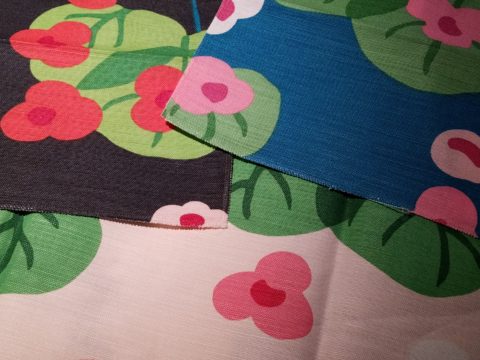
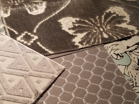
Fine weaves make terrific grounds for bold prints – here in three different color-ways – what a POP! Retro to new concepts – patterns add pizzazz!!

This recent textile presentation brought refined and rugged landscapes of intriguing textures and patterns that  stimulated our design juices.

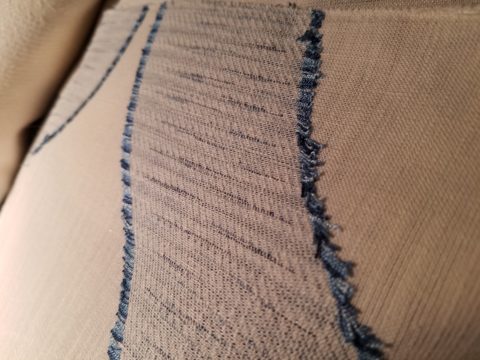
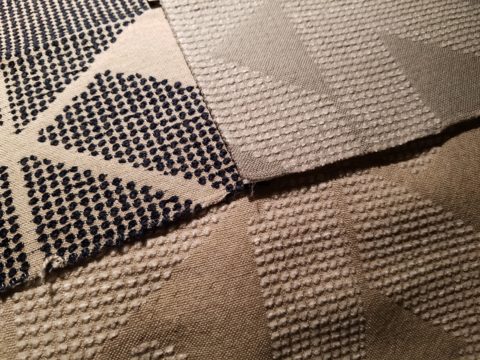
Intentionally cut after the weaving process provides extra texture and pattern interest.


Often the “backside” of these fabrics are as interesting (if not more so) than the fronts – but be mindful of floating threads and other weaving details/methods that interfere with practical use.

Bold “geometrics” are not only vivid with high contrast threads, the texture is what cannot be accurately replicated or conveyed via digital images on a  screen. Despite the fact that I got up close and personal with these samples to photo, nothing beats touching and feeling the fibers and textures.

Complex weaves dazzle with design creativity. Bringing an artist’s concepts to fruition, with a mill to fabricate the dreams, is enchanting.

Traditions of weaving artisans are found in countries around the world. Sadly,  not many fine fabrics are woven here in the States, partially due to the cost of fabrication and also due to the generations of crafts people who are experienced in the art of weaving more cultivated in other cultures. Whether organic, engineered, by hand or efficient, fast-paced mechanization – art and technology continue to push the envelope of fantastic creation and production in the fabric industry.

Here’s a great tip – if for only a pillow cover – if only ONE side of a pillow cover, having unique fabrics is having art. Living with functional art. Appreciating the designs, textures, craftsmanship and unique qualities of fine fabrics and wall-coverings is most satisfying.

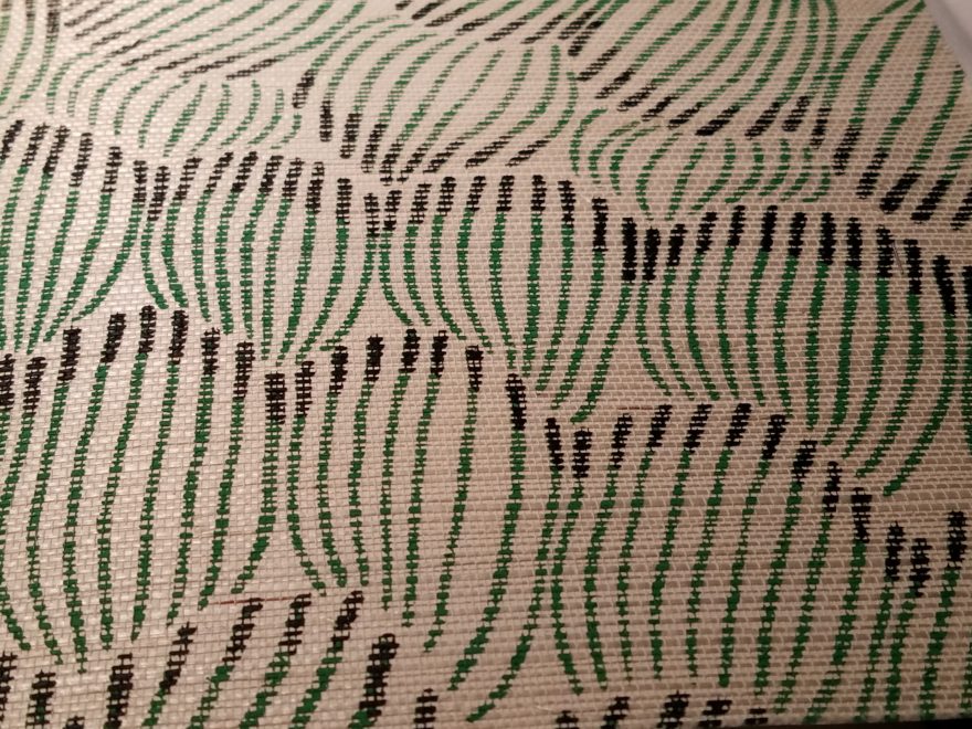
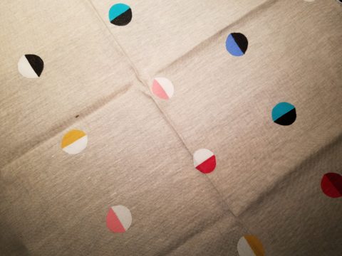
Paints hand applied to the surface of fine woven fabrics is gilding the lily.

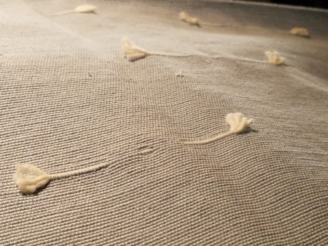
Who doesn’t love these colorfully, whimsical dot halves hand-applied to the surface of this nubby neutral??!!

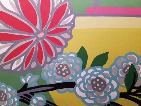
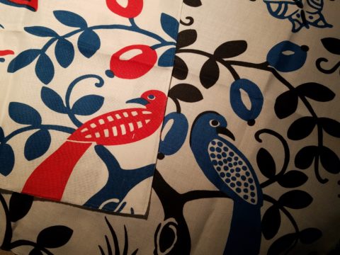
Silk-screening also is an art-form that enhances the quality and appreciation of fine fabrics and papers.

Some of this collection are vintage art-pieces resurrected with new colors on the screen prints.  The caliber of a fine, timeless, resource is about quality of both design and construction. A collection that continuously offers – classic and new, bold and subtle – answers to so many opportunities, is a resource that is to be celebrated!!

We investigate the most extraordinary fabrics, in the world, so that we can compile and create the perfect combinations for your exclusive lifestyle.

Surprise Seasonal Discoveries in the National Gallery of ART

So, in direct contrast to discovering art in unexpected places such as a simple series of brush strokes painted on a course concrete curb, (last week’s pattisays blog) this week, as fall leaves fill the air and pumpkins pop up on every surface, my observations are about discovering art occur in an actual art gallery, specifically the National Gallery of Art in Washington D.C.. Imagine that! The city has been abuzz for months in anticipation of the recent unveiling of the updated East Building.

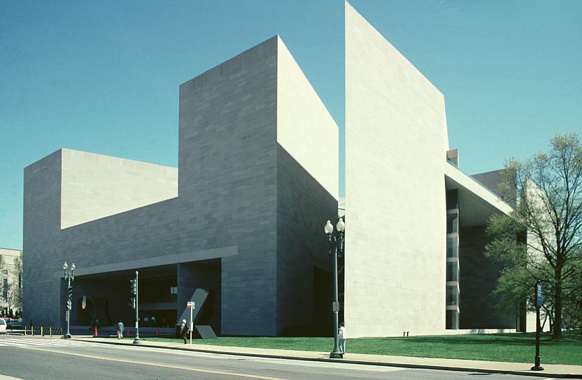
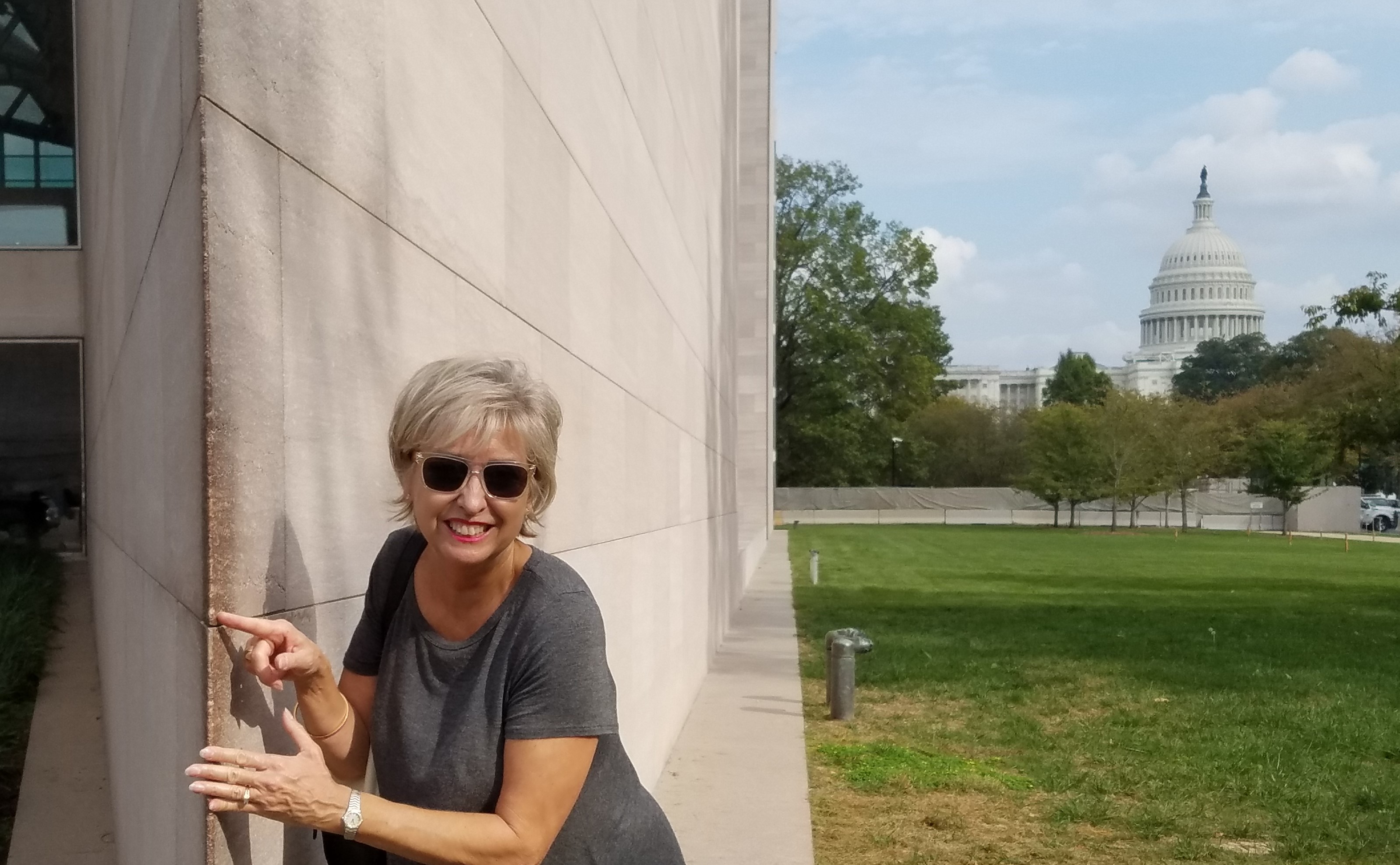
It was in 1978, the year I left my home town of Washington that I.M. Pei’s exciting new modern edifice was presented to an anxious art-loving public. So very different from the West Building and all others in the historic vicinity, some people were astonished but most were thrilled. This sleek angular sculpture of a building was a statement in and around which to display the growing modern and contemporary collection. An art-piece of its own accord. Yes, the building was at once regarded as its own work of art.  We eagerly raced to touch the famous wedge of geometry that came to such an acute angle that it begged to be touched.

i-m-pei-east-building

Nearly 40 years later that same fine edge is silently showing its age missing little chunks of compound and lovingly discolored with all the hands from around the world that have touched and smiled at the towering stone form in contrast to the rotund, ornamented and domed Capital in the background. Both majestically iconic, but stylistically so very different.

20161020_145510_002-copy

20161020_145320

But wait – this elegant aging beauty has had a three year rejuvenation treatment! New stairways and elevators connect galleries making the flow of exhibits more enjoyable. The tunnel connecting East to West sparkles with light and all the subtle changes result in a seamless passage through and enhanced experience for visitors.

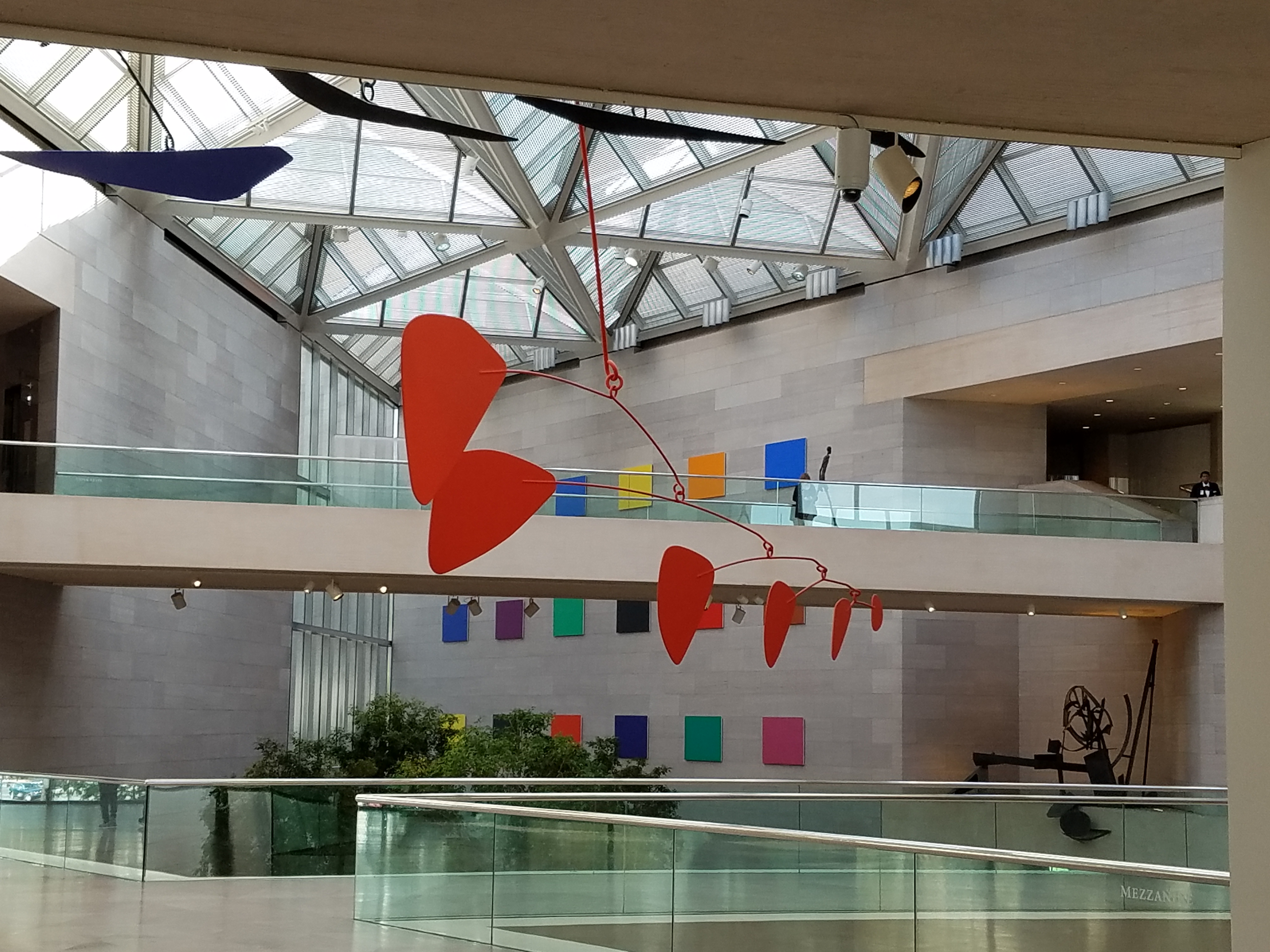
The glassy, crisp, stark, expansive lobby where the enormous Calder mobile is suspended defying its enormity and weight as it gracefully, almost motionlessly, moves silently with the subtle, indiscernible stirring of air is the fulcrum of the building. Exhibit halls tucked away but newly connected are exciting to frequent visitors who know the building so well.

20161020_120055

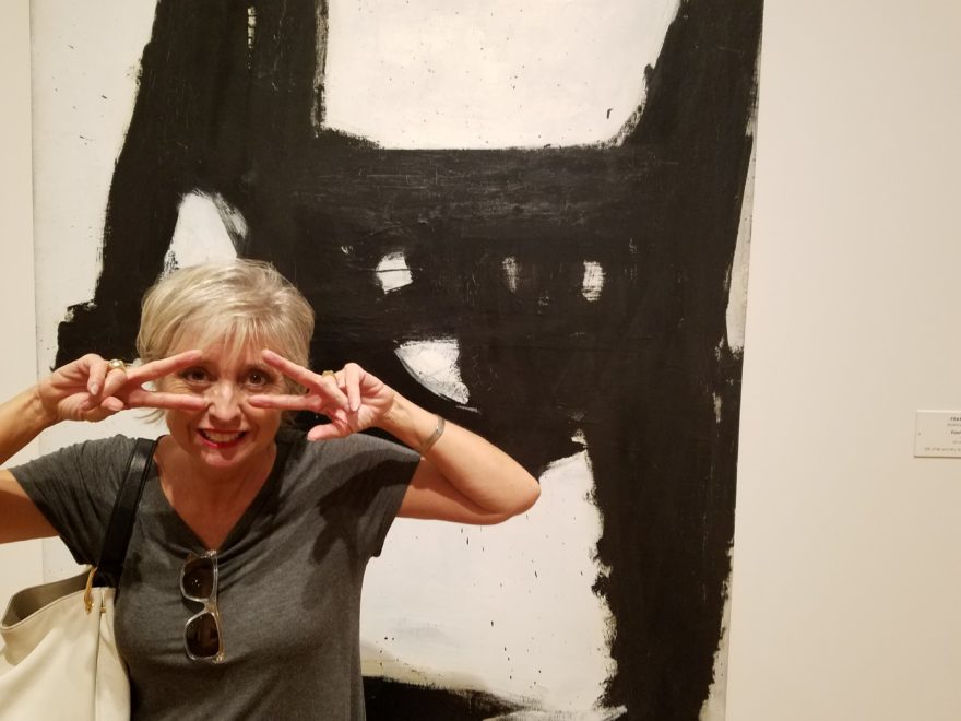
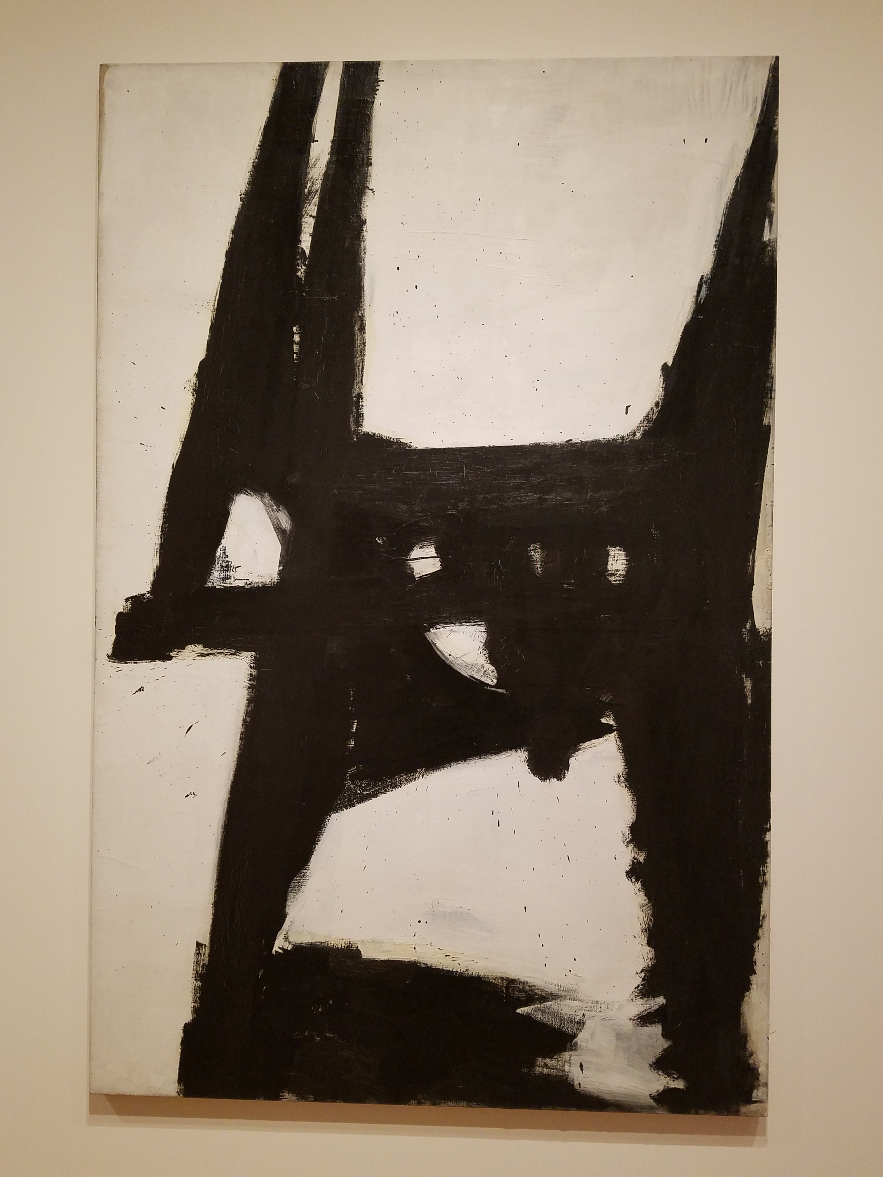
I naturally had to have a little fun and in keeping with the season made a couple of entertaining discoveries. Here Four Square and oil on Canvas by Franz Kline in 1956 is noted by The Art Story/Modern Art Insight “a fine example of  his gestural approach to painting. The viewer is led to ponder the canvas, seeing as either a close-up of a linguistic symbol, or perhaps, a set of open windows.”

20161020_141429

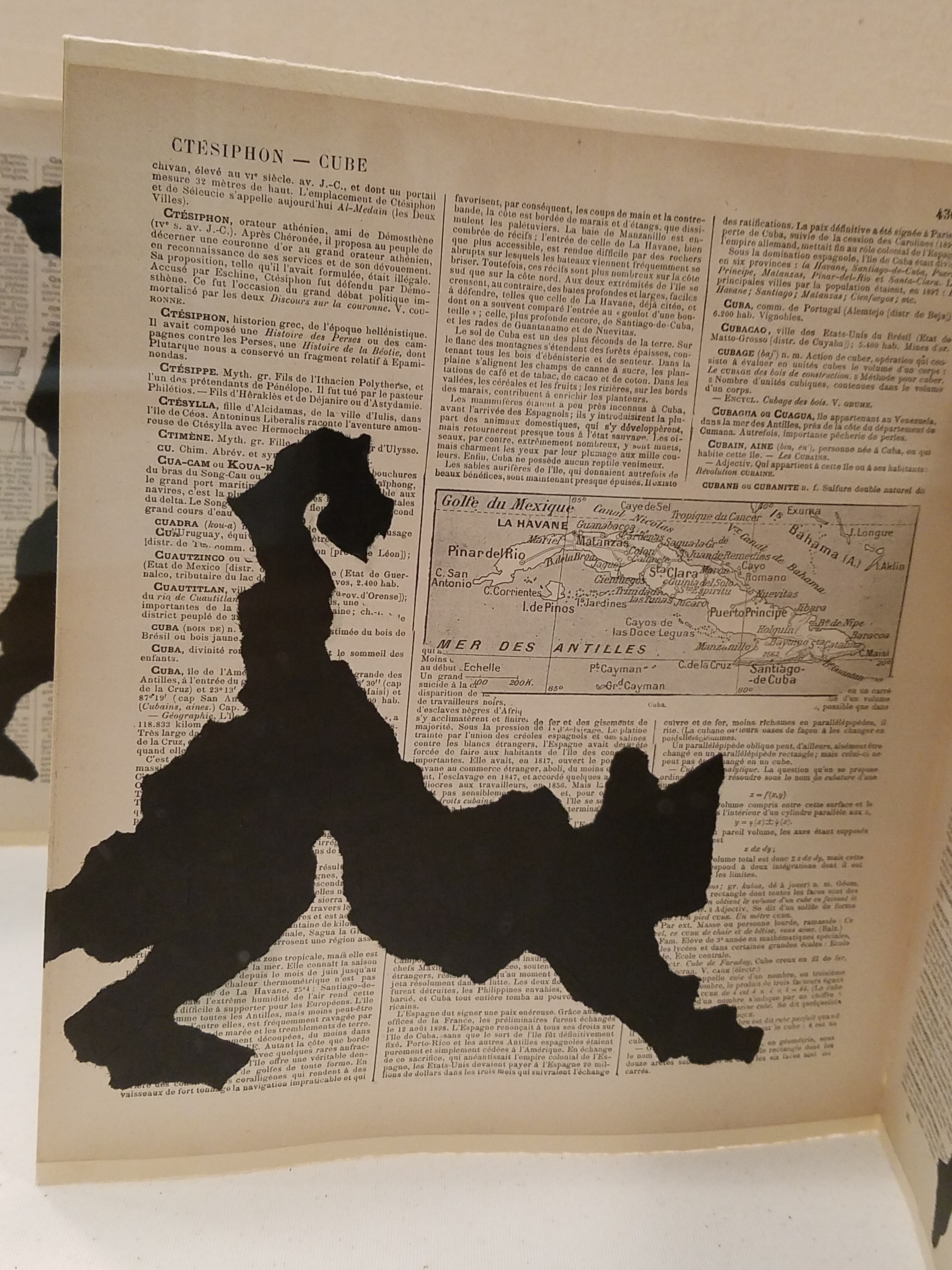
Really? Linguistic symbol or a set of windows? Well, maybe it’s the season…but I instantly saw a cat – a crazy black cat, an abstraction of James Dean’s “Pete” perhaps, which made me want a mask and to be that crazy cat and prance about for Halloween!

20161020_141522_001

In another piece, Portage, by William Kentridge of South Africa born in my birth year of 1955, a folded accordion-like book with torn  black figures of paper affixed to encyclopedia pages resulted in my seeing another black cat! I do think it was of human figures bearing weight, carrying, moving through various poses. Call me Halloweeny – but this one was decidedly a black cat. Don’t YOU think?

20161020_143546

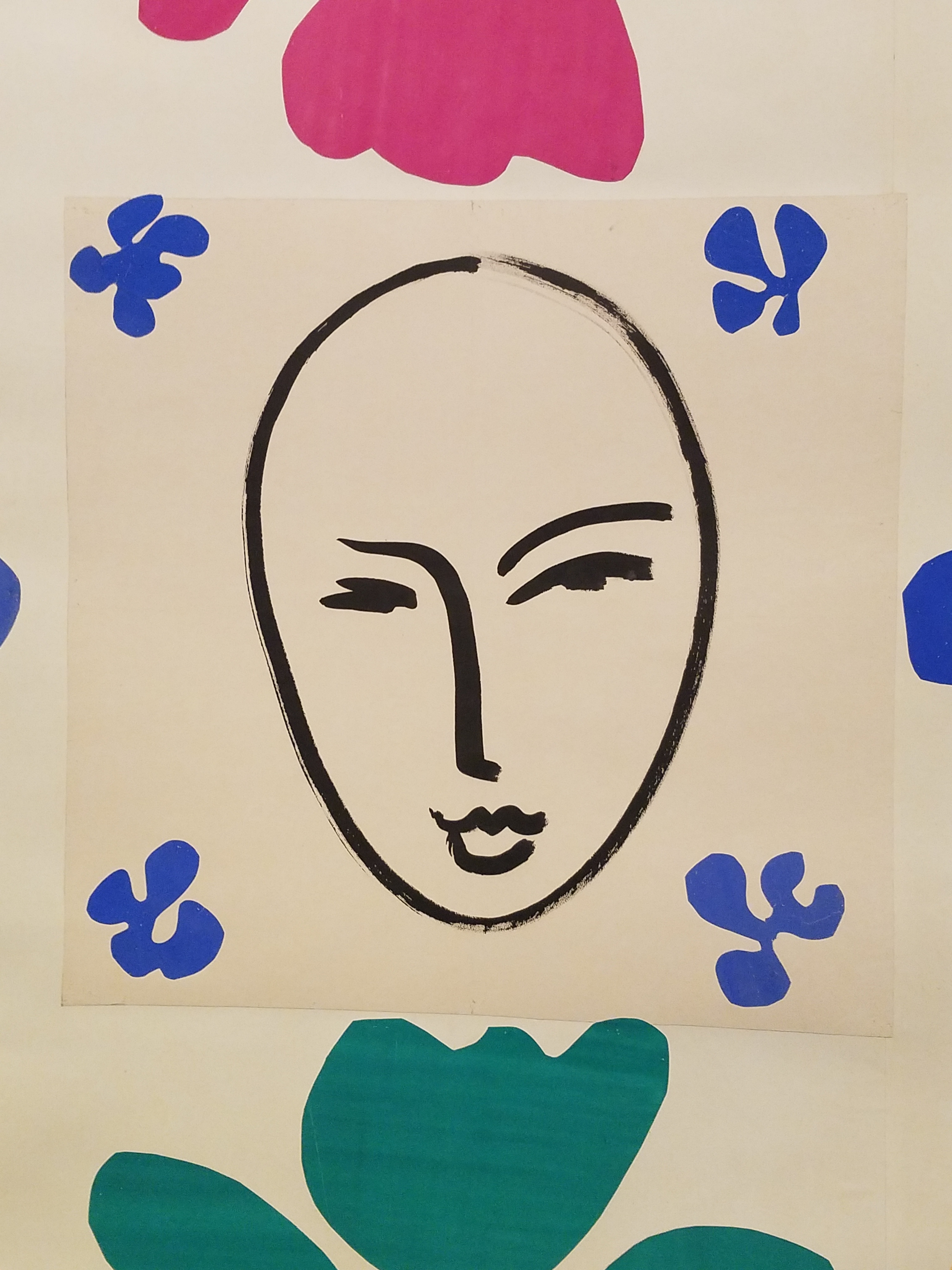
It was fabulous, exciting, fun and emotional to see the colorful Matisse cut-outs once again in such close proximity with Matisse’s placement marks and rough cut pieces – crude yet refined – rough yet lovely. Seeing these incredible compositions up close again is breath-taking.

Oh, and might this be another seasonal mask?

20161020_143742

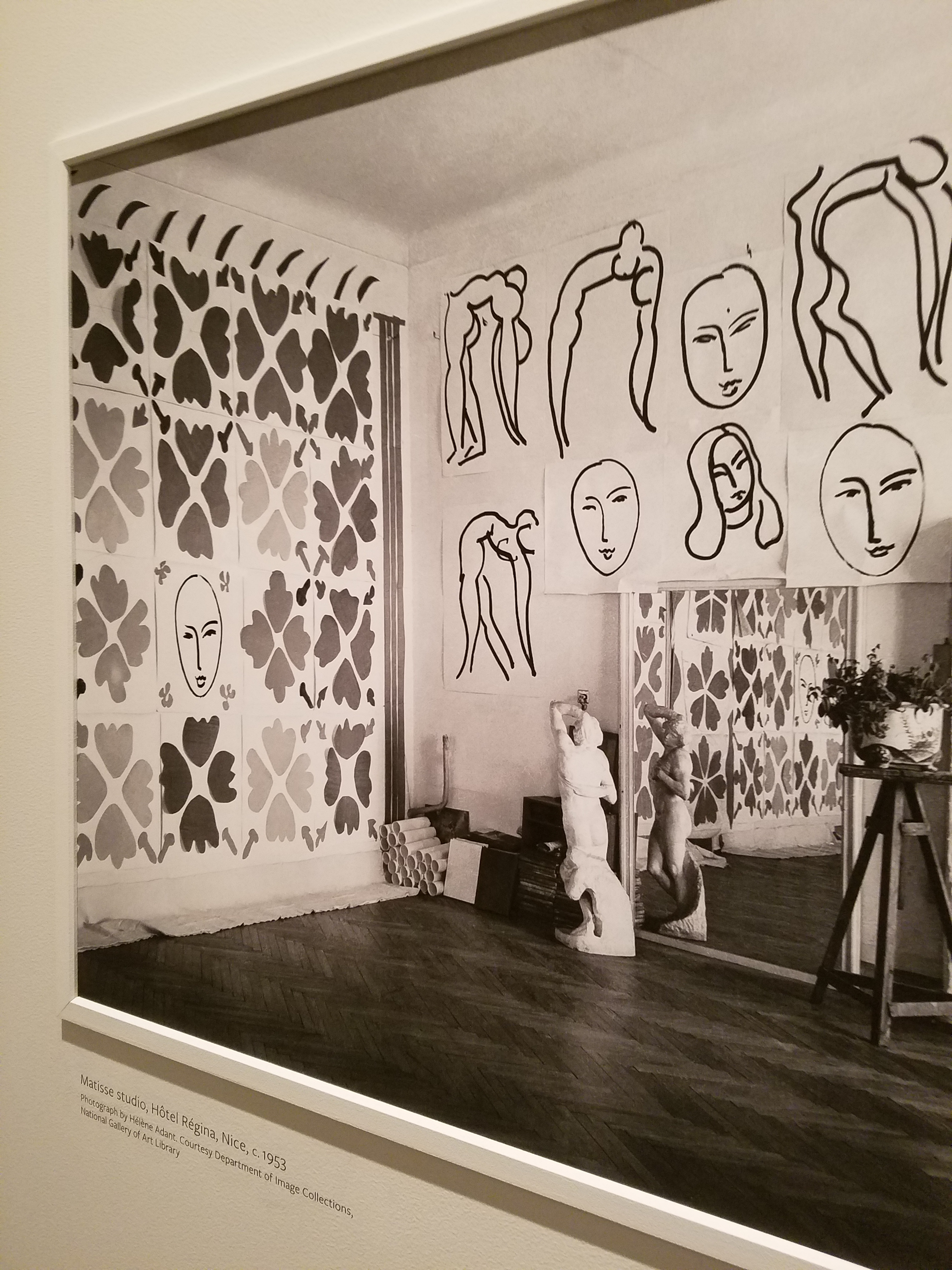
From awestruck to silly…to a quiet reverence at coming to the black and white photo of this enormous piece in Hotel Regina in Nice in 1953!!  Seeing it in the setting of its day and captured in a photo all those many years ago was one of many moments of reverence.

20161020_143238

Once again, pay attention to the little things, be surprised, let yourself be amused and enjoy discovering art wherever you might find it – unexpected and very much expected places!


TRENDS – How Does One Decide?

TRENDS…we HAVE to have them…it makes us think, makes us shift…not to mention keeping viscosity in the economy. The shift is the element that moves the economy forward. Without that shift, we would be stagnantly content. And who wants to be stagnantly content – except the “Settlers” from the Direct TV ads?  DIRECTV_Commercial_2015_The_Settlers-520x245

Yet if you Google design trends they are all over the place. The intrigue is when they land on an actual theme that becomes THE TREND.

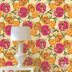
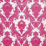
So as we advance into the new year and winter fades to spring – what lies ahead? I’m finding lots of nostalgia – features on milk glass and floral patterns and fancy geometric patterns, a recall to wallcoverings in floral prints and botanicals…Rose-wallpaper-Bari-J-WallAppeal-pattern-pink-yellow-zoom

The trick is how to invest in these elements and not have them become passé by next year. It’s all about balance – unless you have the desire and pocketbook to change out your interior annually! The desire to add something new to your personal spaces, or as my mother has always said “punch it up” is an art unto itself. How does one decide?
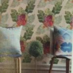
Information is so accessible. Access to ideas is endless. But HOW does one decide? How to make the decisions, the right combinations, what to keep and what to change…? The internet and TV…Anthropologie to Pottery Barn, Pinterest and beyond…You pin a gazillion things – but how do YOU decide?

But it gets kind of funny  – because for as many sites as you visit – there are oh so many professed “trends.” Therefore,  sifting through is the challenge and distilling what seems to take the lead. Pastels, patterns and florals is my finding…but is this just spring? Will this fade with the next season? Or is this a “look” that will last for a while? And do I embrace it all or pick and chose? How does one decide? Elle Decor 2016 design trends table

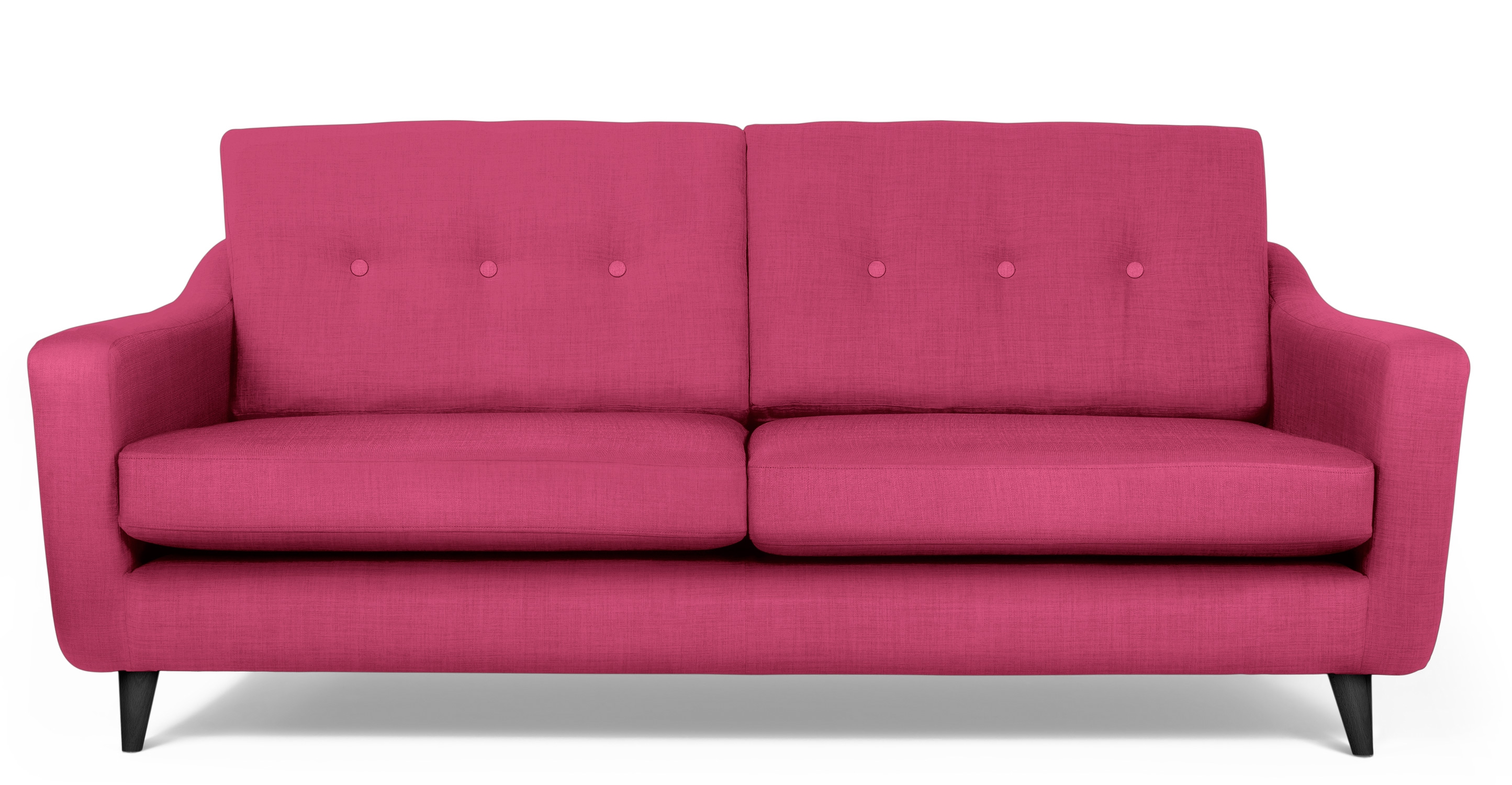
Pantone the color experts are even all over the place. Their designers were “inspired by the contrast of urban design and lush vegetation.” Whoa, really? That sure is a wide swath of possibilities!  And to say that these colors  are unisex is as though attempting to blurr the lines. A guy might wear a pastel pink, Rose Quartz, shirt – but would he upholster his sofa with it? Fashion and Home Decor often parallel their trends – and then they must veer off that same course for practical if not socially directed reasons.  Redford-3-Seater-Sofa-Peony-Pink
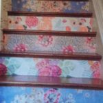
But the rationale is so amusing…for example,  Pantone writes: “Colors this season transport us to a happier, sunnier place where we feel free to express a wittier version of our real selves.” Yes, we all long to escape the doldrums of the short, dark, cold days of winter – hence the positive effect of transporting us to a happier, sunnier place is obvious – every year for that matter. That’s why tropical destinations are the prime vacations for winter getaways. Even most avid snow skiers manage to sneak in a run to the white sand beaches for some sun and fun alongside their plans to hit the slopes, get frost-bitten and nestle by the big fires.

I guess I’m looking for a more cerebral explanation for the color movements. And yet, maybe there aren’t any – so let’s not pretend then. What does it mean a “place where we feel free to express a wittier version of our real selves.” Wittier like a guy upholstering or painting his man cave with Rose Quartz or Peach Echo? That’s witty all right!!!!! That’s not the cerebral that I meant. But it is an interesting rationale. Color is giving us permission to express our REAL selves. I guess that’s one way.

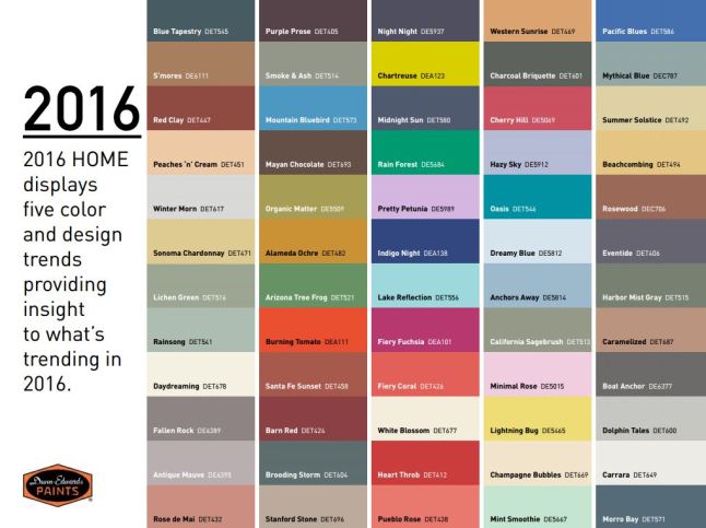
Yet, here are 5 different color series for the upcoming year…and as you can see – it’s all there – it’s all covered.  Pantone color-trends-2016


So as you climb out of the dark, cold recesses of winter and squint your eyes at the bright, colorful luminosity of spring in bloom, where will trends take you on your journey to “punch-up” your interiors?


Stage Sets, Christmas and Cozy Fires

Old movies provide an extraordinary view into periods of history, social norms, and the interior design of the times. Watching old movies exposes lifestyles and context like a text book. Whether capturing modest environments or posh extravagances, they depict with accuracy – if not exaggeration – exciting opportunities to transport the viewer into another world.

From my perspective, I drink in all of this creativity as I scan the sets, peek around the actors and study the minutia of the many varied interiors. I marvel at the sensitivity and attention to detail and decorative arts required to create effective set designs.

When movies are in color they illustrate such interesting decisions for artistic contrast and combinations; but in black and white, the imagination must fill in the blanks. The emphasis on the chiaroscuro adds a very  different focus. Scenes in color are often exaggerated realism stretching the art. While black and white scenes are rich with tonal values, shading and bathed with the art and drama of lighting.

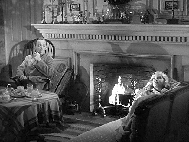
Perfect for this season the 1942 classic film Holiday Inn, with Bing Crosby and Marjorie Reynolds shown here by the fireside, allows the viewer to feel the cozy setting,  the warmth and take in the details of the room all without benefit of color. It’s fun to wonder what is the color of the walls, fabrics, accessories and other accents could be. The possibilities are endless – but probably not really  – if one is to design with accuracy for the time period.  movie Holiday Inn Bing Crosby Marjorie Reynolds   Try it with this still shot from the movie…imagine the colors…it’s fun!
Tis the season to light fireplaces and enjoy the flickering light, golden white colors sparked with jewel-toned color bursts, the visual and physical warmth that come in many forms. Step into the scene and feel the temperature, textures…see the colors and combinations.

I recently said – as sexist as it might sound – that I would never have a gas-log fireplace as long as there was a physically capable, self-respecting man around to fetch the wood and haul it home and stack it up, go outside in the frigid air to lug in the logs and of course clean it out from all the wonderful timber turned ashes.  Spoiled? Yes. I love a REAL fire in a fireplace – you bet…the crackle and smoky aroma of distinctly different species, real fire dancing and real wood “combusting” – natural elements that create a concert of sensory experiences and evoke so many memories. Is it working? Can you imagine it?

Fantasy mirroring reality, with the creativity of set design replicating accurate portrayals of life, provides another tool for historical markers and study outside of a museum setting. Perhaps you will find yourself scanning the sets and peering around the actors to see what you can discover surrounding and beyond the action.

And as this movie has so emblazoned in our holiday  traditions…I’m dreaming of a white Christmas. Thank you Bing.

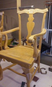
Redheads are Brighter – Even in a Chair

There once was a chair

quite bland, blond and fair.

A victim of the 80s

when pickling and white-wash went crazy.

But along came a designer

who sat down beside her

and painted her troubles away.

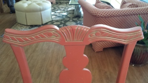
20151105_100857_resized20151111_105300_resized

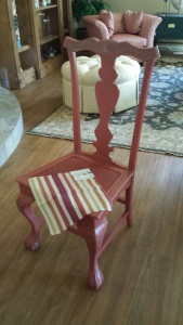
Now she is sassy

coral red and quite classy.

And with her new flair

has inspired others bland and fair,

to make the change

that’s all the rage

to be bold over lighter

redheads are brighter!

20151109_091739

(My bright and creative friend, Lynn Platow has more sassy savvy exuding from her very brilliant core than anyone I know. Check out her site http://www.redheadsarebrighter.com/)