For the LOVE of Fine China – USE IT – Inspired Table Settings

From the Diminishing Dining Room of last week’s observations, https://patriciandesign.com/category/dining-rooms/, I decided to further the conversation to encourage a new-found appreciation for having fun setting dinner tables!  I found fodder from Kentucky Fried Chicken served on formal silver platters to wipe-clean placements of dazzling designs to dress your tables.  A collection of tireless designers defend the use of fine china – own it, buy it, find it, inherit it, enjoy it, keep it and use it – don’t send it to the thrift shop!!!

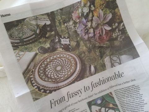
Yes, the art of fine dining seems to be set aside in favor of ease and expediency, but this article from The Washington Post’s HOME section (thank you Feath – my clipping service) brings it all home to use and enjoy.  It is a celebration of art, design and playful creativity.
Not everyone loves to entertain, to create the “tablescape,” to even bother to put together an outfit to wear. Not everyone loves to get dressed in the morning – it is a chore, an obligation, a mere necessity. That’s unfortunate in my estimation. For those of us who do – love it – it is all about having fun with fashion or interior design is just that – FUN!

Last spring I began a series  of emails that I blasted to our mailing list called COOK + PARTY. It was (and will continue this next season) a collection of weekly recipes paired with table-top art pieces. In our gift boutique, we represent an incredible collection of artists who create fabulous tableware.  I paired a piece with a recipe each week to inspire and encourage everyone to use “functional” art in their daily lives and specifically for entertaining and even the family dining table.
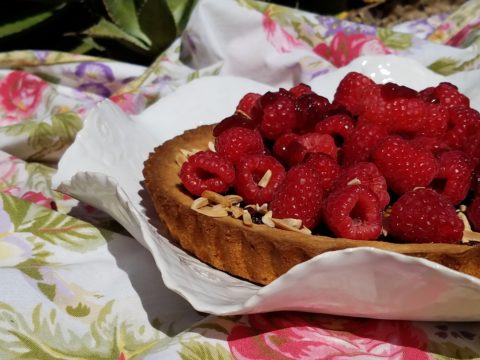
https://patriciandesign.com/category/art-and-food/

Recent fodder revealed a great source for fabulous wipe-clean placemats from Caspari.  For decades a fine source for the best paper cocktail napkins, Caspari offers these bold patterns and colors, prints of fine china and fabulous fabrics – re-use and easy to clean – why not?
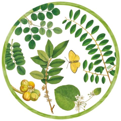
https://www.casparionline.com/catalogsearch/result/?q=placemat

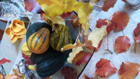
A previous fall blog that I wrote illustrates the open-mindedness of looking around to find inspiration for seasonal table dressings.  The decision for your table-top inspiration can be spontaneous – just go outside and look around!

 

Among the refreshingly optimistic designers that were quoted in the Washington Post article:

https://www.washingtonpost.com/lifestyle/home/that-old-fussy-china-can-fit-your-casual-lifestyle-designers-talk-about-how/2018/02/21/46761538-0084-11e8-8acf-ad2991367d9d_story.html?utm_term=.3a6fde2e5124

Barry Dixon, from the verdant rolling hills of Warrenton, Virginia, specifically points out that this process of setting your table should be fun!  Don’t pull-out the same things each time – mix it up! Change it up by adding color and pattern differently with every new opportunity.
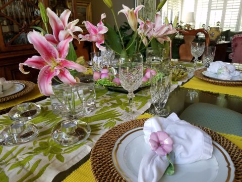
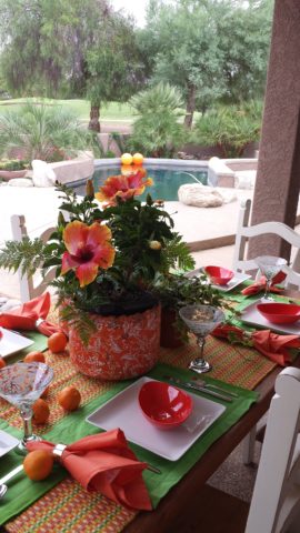
Seasonal flowers, yellow woven cotton place-mats, embroidered folk-art table runner, basket chargers beneath classic Limoges topped with ceramic napkin rings – it looks like spring!

Designer Timothy Corrigan tells us that many people find it too difficult to entertain with their best things because the onus of proper cleaning and put-away is too much! But Mr. Corrrigan points out the joy of using your best things every day – everyday is a celebration and what you enjoy should be used.
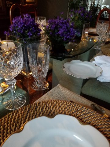
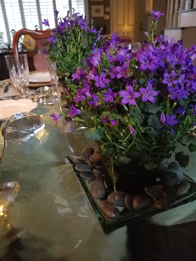
In another springtime setting…organic, rustic things with finery – black stones nestle fresh purple Campatula flowers antique Limoges and basket chargers –  makes an eclectic table settings – it’snot all or nothing…it’s the combinations and scene that is being set.

Hutton Wilkinson – way out in L.A. where casual chic is the practice of distilling what migrated from the more formal sister coast to the east – noted that he believes presentation is the key to success. It isn’t so much about what is served (don’t tell the chefs that), but rather on what it is served and how it is presented.  Imagine buckets of Kentucky Fried chicken served on elegant Georgian silver platters. That simple fast-food chicken becomes  magnificently irresistible. You can’t say you’re too busy to cook with that creative solution! Wilkinson believes that presentation helps food taste better in addition to looking beautiful! He advocates buying china because it’s beautiful – not merely serviceable. I agree…it’s not all about the mundane purpose of eating off of it – but rather the joy of eating off of it!!

Making your guests feel appreciated and treating them to a unique, pleasing experience is a gift to them.  A special treat to show that you care –  going that extra distance of detail and design.
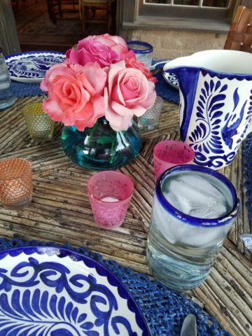
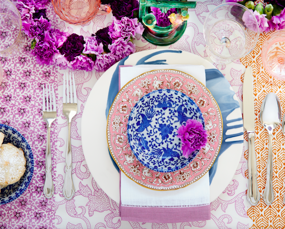
Color combinations, textures,patterns – wonderfully pleasing tablescapes are a treat for the eye. (So special Marsha!)

So don’t say it’s too difficult…keep it simple with Real Simple – the source for easy, ingenious ideas and simple truths……the following link for proper place-settings will get you started.

https://www.realsimple.com/holidays-entertaining/entertaining/how-to-set-a-table

Patti says – “make it special every day.”

The Importance of Color in Design – How to Begin

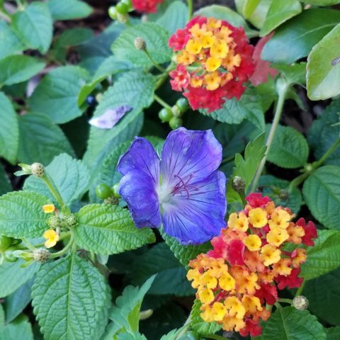
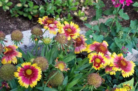
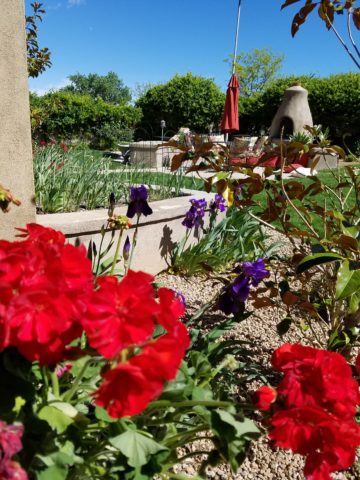
This last week I was inspired by a rainbow that appeared over our great Sandia Mountain and within 3 minutes I nearly tripped over a bed of flowers presenting the same rainbow of colors. With this pairing of color coincidence, I felt compelled to write this week’s blog about color.

Color can be difficult. It is so critical to effective design decisions whether graphic design, fashion design, interior design or architecture.  It might be used for a logo to brand a business , a room scheme or the exterior of a monumental building…how do you begin to select a color or a color scheme?

Well first you have to consider your client. What are their needs and desires? Once narrowed, the search for the perfect colors to convey their project’s personality begins.

Computers aid designers in finding fine nuances between colors. Exploring the range of values in a hue – the range of light to dark of a specific color and the adjacent colors that meld from one to the next has become easier.

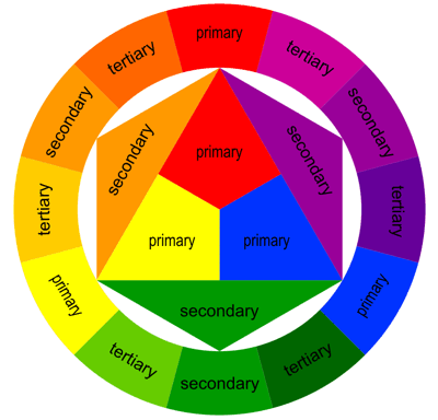
It all comes down to the color wheel. It’s a circle illustrating the colors of the spectrum. The relationship of these colors are the building blocks of all the colors. Sir Isaac  Newton – the same of the apple and gravity fame – devised this understanding of the rainbow of colors back in the 1600s using a prism to identify the components.

As children we are taught about the rainbow of colors comprising ROY G BIV – the easy to remember name that represents the colors RED ORANGE YELLLOW GREEN BLUE INDIGO VIOLET

Decisions regarding the selection of colors and the resulting schemes are identified by the following relationships:

Complimentary –  two opposite colors on the color wheel

Monochromatic – three different values of the same color

Analogous –  three adjacent colors on the color wheel

Split Complements –  one color and the two adjacent tertiary colors of its complement

Triadic – three evenly spaced colors on the color wheel

Tetradic – two complimentary pairs of colors

As I pursued this topic today, I encountered an interesting site by a guy Jason Cohen. If you are curious to know more on the subject,  check out  https://blog.asmartbear.com/color-wheels.html

This last week, over the course of 2 days, I encountered several examples of these colors all around me. From the rainbow to the flowers and myriad balloons. It didn’t hurt that it was during the International Balloon Fiesta http://www.balloonfiesta.com/ which is one of the most colorful events in the world.


Unless we have a limitless budget affording custom design materials, it is best to begin with the materials that offer the fewest colors. I have mentioned this in the past, there are more paint colors than there are carpet colors, fabric colors, or solid surface materials. Therefore, selecting your color scheme based upon the selection of a material with fewer color options is the best start…you build from there…paint being the easiest component to finish the scheme.

Color affects mood, perceived temperature, individual’s reaction to seasonal cues, and all manner of context. Pastels in springtime and warm tones in the fall – color makes powerful suggestions and should be used as a tool with that power in mind. The power of suggestion. What are you suggesting? What are you trying to convey?

With your best intentions, colors will change with light sources, time of day, adjacent colors and people’s own perceptions. It is not a perfect science when you consider all those variables. Take caution to select colors based upon the conditions that will occur in the final location/presentation. Without fear, pick your color schemes and beware, but don’t be afraid!

Exterior Design – Celebrating Summer

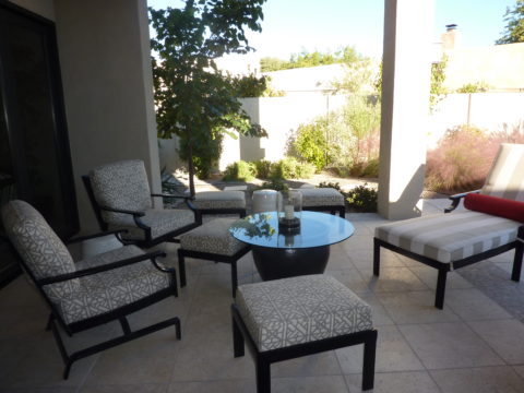
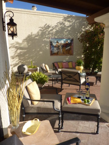
As summer blazes on and we continue to enjoy the freedom offered by expanding our living spaces into the out-of-doors, I’m contemplating the variety of versions of outdoor living that are made possible by different climates. While friends in the tropics of coastal Mexico are complaining about the inescapable sweltering heat and humidity these summer months, the rest of the upper regions are rejoicing in the mere fact that the bitter cold is replaced by warm air and things are growing and green and flowering and alive!

Various water features come to life springing forth suggesting the refreshing sight and sound of a trickling brook,

bumble bees light on flowers that would be disintegrating clumps of dead growth in winter,

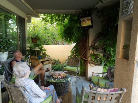
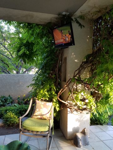
comfortable enjoyment of TVs on patios that become desolate, barren, outdoor rooms in winter.

The reverse is trending too however, where organic materials, (stone, woven reed rugs, plants, wood, bamboo) are used bringing nature inside the home.

This connecting nature indoors the home is a refreshing, rejuvenating  approach to design – in stark contrast to the crisp geometric inorganic feeling of other design trends. Taking it a step further is the seamless transition of the two.

Interior stone flooring flows out onto the patio…telescoping patio doors open allowing seamless transition between indoors and out.

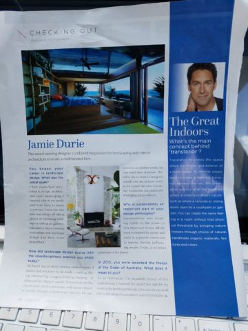
“Transteriors” was coined by landscape designer Jamie Durie and his team who have enjoyed the broadening of his brand to link his exterior designs to the adjacent interior spaces with a celebration of sustainability and organic appeal. The brief mention in last month’s June 2017  edition of vmsd (Visual Merchandising + Store Design) was a validating article reinforcing my appreciation for the different climates and the design options and limitations we experience from zone to zone.

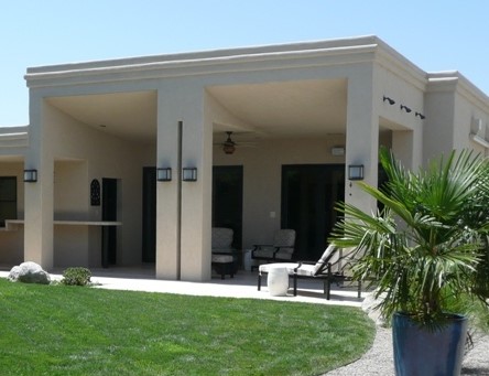
I’m returning this weekend to a project that I designed a few years ago in the Sonora Desert – it seems to have stood the test of time and is still referenced as a “Tangerine Dream” of indoor/outdoor living.

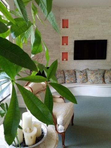
We didn’t have the luxury of telescoping doors opening glass walls to connect the inside with out, but we maximized the colors, materials, plants and design scheme to allow the transitional lifestyle flow. Stone and tropical plants inside speak to the same materials outside. Colors correlate and, in this case, the climate allows enjoyment outdoors all year around…with some minor limitations and yes, decided temperature changes.

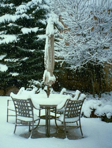
But nothing like what occurs in the snowy climes where outdoor living – except some frigid winter sports – is all but closed for the season.

Advancements in technology and ideology have made transterior design much more viable –  allowing for amazing options for furniture, fabrics,

kitchens, fireplaces, flooring (take that same material from inside right out onto the patios – if its frost-proof), lighting and more from which designers can create exterior living spaces. These outdoor rooms so emulate the interiors that the transition is often difficult to see.  Not being able to discern the line between indoors and out is often the optimal effect – but not always…

Seasonal changes with interior/exterior design, like a change of clothes with the seasons, can also offer the expansion and exploration to entirely different spaces when the warm weather arrives that emphasize the design distinctions rather than trying to meld the two.

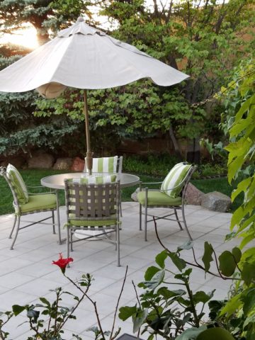
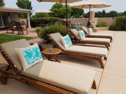
So venture out of your cozy bear’s lair the next time the crocuses begin to peek through the soil and the birds start to sing, whip out your rattan or faux wicker, teak lounges, hammocks, fabulous fabrics and potted palms and design your tropical summer retreat in your own backyard!


Patio Primavera- Fabrics and Finishes for Outdoor Living

Finally spring is settling in with more consistent warm weather, garden shops are abundant with flowers, leaves are maturing and all is getting green!! The out-of-doors is beckoning us to expand our living spaces and set-up patios and outdoor kitchens, gardens and play areas for the coming months! YAY – Patio Primavera!!!

Every season introduces more and more fabulous products and paraphernalia for making moving outside more and more inviting and comfortable. Leafing through catalogs that jam our mailboxes, cruising the home decor sites, strolling through the big box home improvement stores and the local nurseries, the multitude of possibilities get our summer juices going – chomping at the bit to plan this and buy that, plant this and arrange that…it’s  rejuvenating and freeing from the interior spaces that we love to be cozy in all winter, but long to escape the confines of, as the warm weather progresses.

Advanced methods and materials for outside area rugs and fabrics, of polyester and better yet – acrylic fabrics that will tolerate the exposure to the elements, allow freedom to leave things set-up without running out into the rain, or worrying about too much sun which might require we bring things safely inside and then back out again.

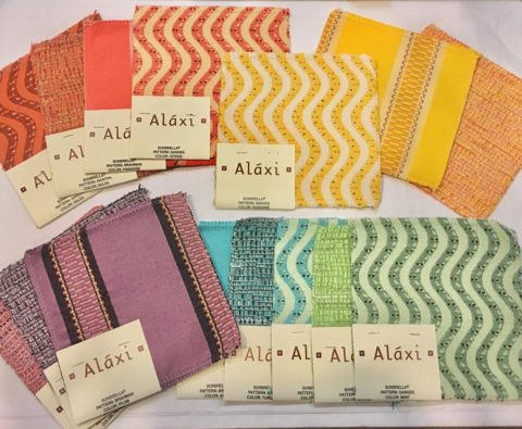
Some of these fabrics defy being so durable and practical. Here are some amazing examples of bold colors, exciting patterns, plush textures and complex weaves that are all 100% acrylic – the most UV tolerant and mildew resistant of all!! But be prepared, they come with a handsome price tag. It is an investment to know that you are creating a scene that will last – that does not have to be replaced every year or two.

Incredible colors – brilliant and fade-proof.

Lovely rich neutrals are stunning enough to be considered for indoor use too.
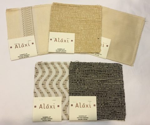
When shopping for outdoor materials – watch for that fiber content…it makes a difference. But know that there are thousands of incredible fabrics that you won’t find in the seasonal departments of local stores. We search the world to find these exceptional fabrics in order to present exclusive offerings to make outdoor spaces defy outdoor “exterior” design. IF only  for pillow accents (due to the precious prices), that can be THE show-stopper for your outdoor rooms. Find some that you LOVE and take the plunge.
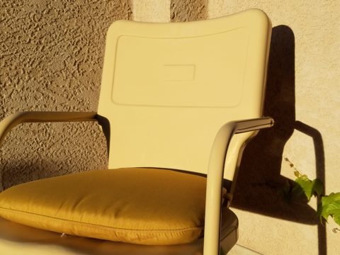
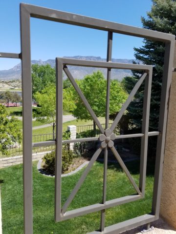
Another investment for outdoor furnishings is powder-coating. Give new life to old pieces, salvage vintage pieces for new use! My grandmother’s white, bouncy metal chair was well used and rusty. Shown here, I powder-coated it 20 years ago this month and it has been sitting out in full high-desert sun and all the seasonal elements ever since – a testimonial to the durability of a good powder coat finish.

Discover garden elements that would surely rust if left out in the rain – these are perfect for powder-coating! Once treated, these fabulous “finds” will be durable exterior design features without a care – retaining their appearance and supporting your climbers for years in your garden!!!
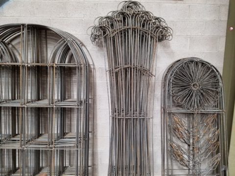
More durable than paint, this process for metal furniture (and more) usually starts with sandblasting the existing finish – rust and all – clean as a whistle – and provide a finish that will protect and preserve the appearance  for years of exposure to the elements – sun, wind, rain – no problem! Powder coatings are just that – a complex combination of materials that are combined and manipulated and ground into a soft powder. The application is done with electrostatic charge delivered via a spray gun. The powder-coated pieces are baked where the heat cures the coating. Powder-coatings come in so many colors! The resulting finish is extremely durable and will last for decades.
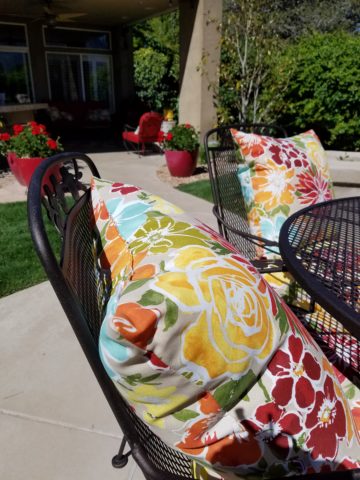
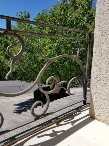
Other than furniture, it is also applicable for architectural detailing around your home and is certainly used in large-scale commercial applications. Powder-coating can be applied to other than metal pieces – but the technique differs slightly.
If you have pieces that you treasure or merely want to have around outside for a while without extra concern or maintenance, this is something worth investigating.

The take-away here is in recognizing the quality of life that is gained by utilizing and  celebrating your outdoor spaces. Whether a tiny balcony, intimate courtyard or an expansive patio area, decorate it! Explore the many design tricks, great materials, fabulous finishes and all the possibilities add a  TV,  fireplace,

or chimenea, that will transform your exterior pockets into worry-free and priceless outdoor room additions for many months to come!!! You’ll want to LIVE out there!


Color of the Year 2017 Greenery!!

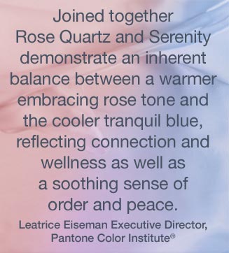
Ta Da! Pantone announces its color of the year for the coming 2017…drum roll please…and the color is Greenery!! Yay!!! Last year there were two  – yes, imagine that – they couldn’t decide so they slurried Rose Quartz and Serenity resulting in a pale, cool, wimpy blend of soft rose and lavenderesque shades into a blended wispy pastel dream. Non-committal, in my opinion…lacking confidence.  Last year the rationale was stated by Pantone’s Executive Director, Leatrice Eiseman as…

pantone-color-of-the-year-lee-eiseman-quote-2016

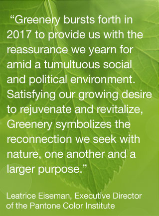
But this year they have it with this fresh organic hue in a yellow-ish shade primed for this year’s rationale from Ms. Eiseman which is:

pantone-color-of-the-year-lee-eiseman-quote-2017

I have always loved green. I grew up in a Virginia jungle of a suburban neighborhood inside the Beltway surrounding my hometown of Washington DC. where the first signs of spring were the tiny tips of dogwood leaves poking forth from the delicate branches of those beautiful under-growth trees. The dogwoods were the graceful, human-scale layer beneath the towering canopy of the immense, rigid, vertical tulip poplar and white oak trees that commanded the woods.

Soft mosses, lacey ferns and perky lily of the valley carpeted the hidden pockets of our backyard. New growth is that prediction of amazing renewal and promise of the start of summer. So it is a prime observation that as Eiseman states in her 2017 rationale “greenery…bursts forth…with a reassurance we yearn for…” although I do not feel this is peculiar to this year as winter always makes me yearn for greenery and the reassurance  that spring and summer will return.

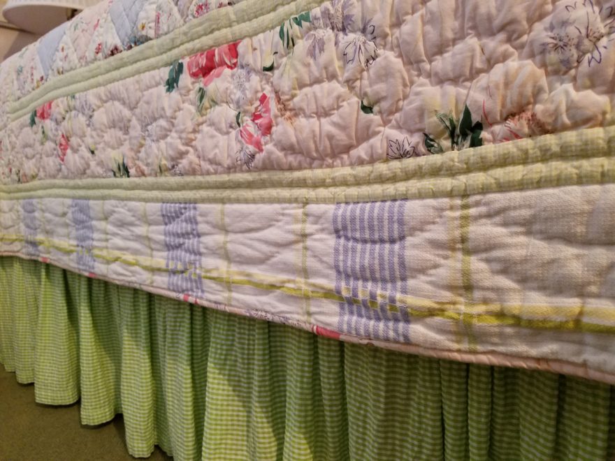
My mother also loved green and that probably influenced my childhood perception of comfort and context of it in interior design. She had and still has an eye for color. In 1959 she selected an amazing sculpted wool pile carpet in a warm, dark, neutral, taupe tone and built upon it a color scheme of pinks and greens that was subtle and relaxing, organic and contrasting, blending beautifully in our wooded setting of verdant lushness in which we were cozily situated.

That was upstairs where we felt like we lived in a flowering tree house amidst the dense collection of green leafy between the trees and surrounded by all shades of pink and white azaleas. Downstairs, where we retreated in the winter months, her greens were mixed with gold tones creating a warm interpretation of the greenery around us.

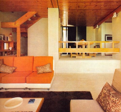
When so many in that era, between the 60s and 70s, were styling interiors with heavy oranges, browns and golds,

orange-and-brown-f934b00ae8a8aabb9fa7d7d8e3ccec30

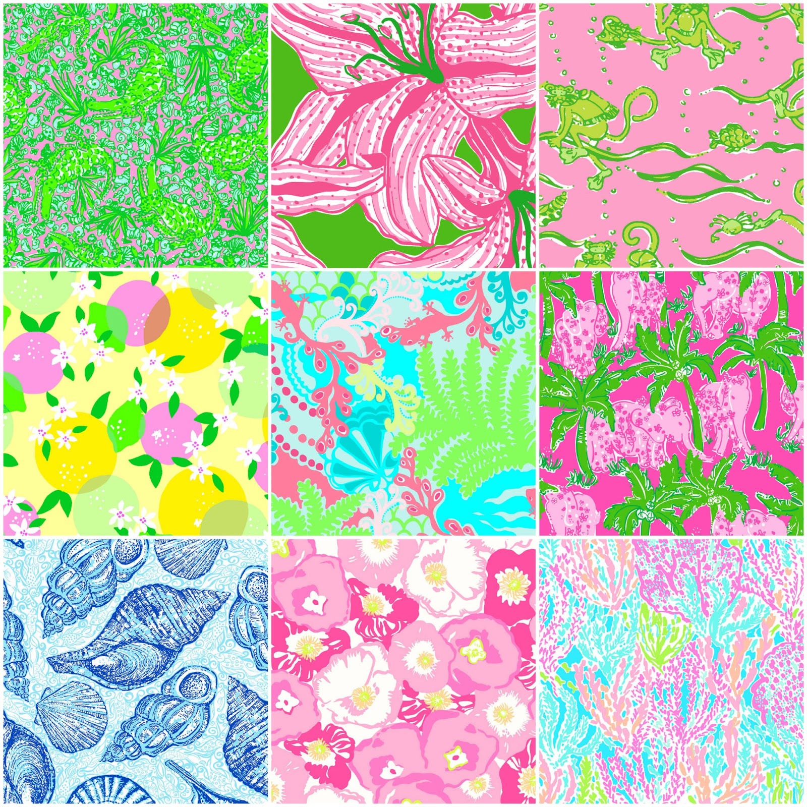
my mother gravitated toward Lily Pulitzer’s fresh, tropical palette of lime green and hot pinks, clean crisp turquoise and citrusy lemon yellow – both in her wardrobe and her interior accent colors.

most-popular-lilly-pulitzer-prints-no-names

Our beach house was turquoise and teal, navy and tan – the sea and the sand.

Following color trends is a slippery slope. I have blogged about it in the past. Adopting that which is often a combination of colors instantly records a place in time when everything from bath towels and shower curtains, bed dressings to draperies appears in the marketplace and inserts its predetermined obsolescent combinations into the lives of so many who would rather catch the wave – often behind the crest – to own and participate in what is conveyed by the market to be the “in” thing to do and to have.

It is best not to embrace and adopt the combinations that the market presents. It is better to select color and combinations that transcend the trends – skirt them so as not to fall into the trap of dated color schemes and tired combinations. Some avoid the trap by staying neutral. The safe, timeless colors of whites and grays mushrooms and taupes- but where is the risk and fun in that?

“Too bad for them” I often remark. It is such a missed opportunity…a limitation to select colors that you think you are supposed to like rather than those that truly bring you joy. I say “go for joy every time.” Color is such personality. It is a stage-setting element. It is a backdrop or foreground. It is a theme. It is an atmosphere.

With all that having been said, I for one am thrilled with this fresh selection for the new year. A bright beginning full of hope and new growth, fresh starts and positive forward movement – organic and life-affirming. So seek the colors that brings you joy and go forth with color in this new 2017 soon to arrive. My personal schemes will always have greenery!!!

Resourceful Creative Festive Fun

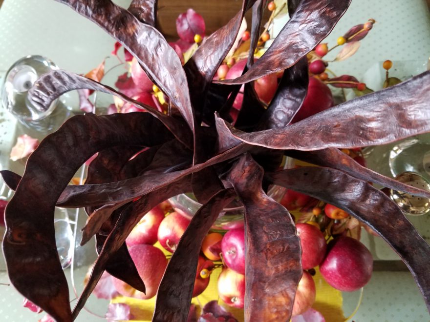
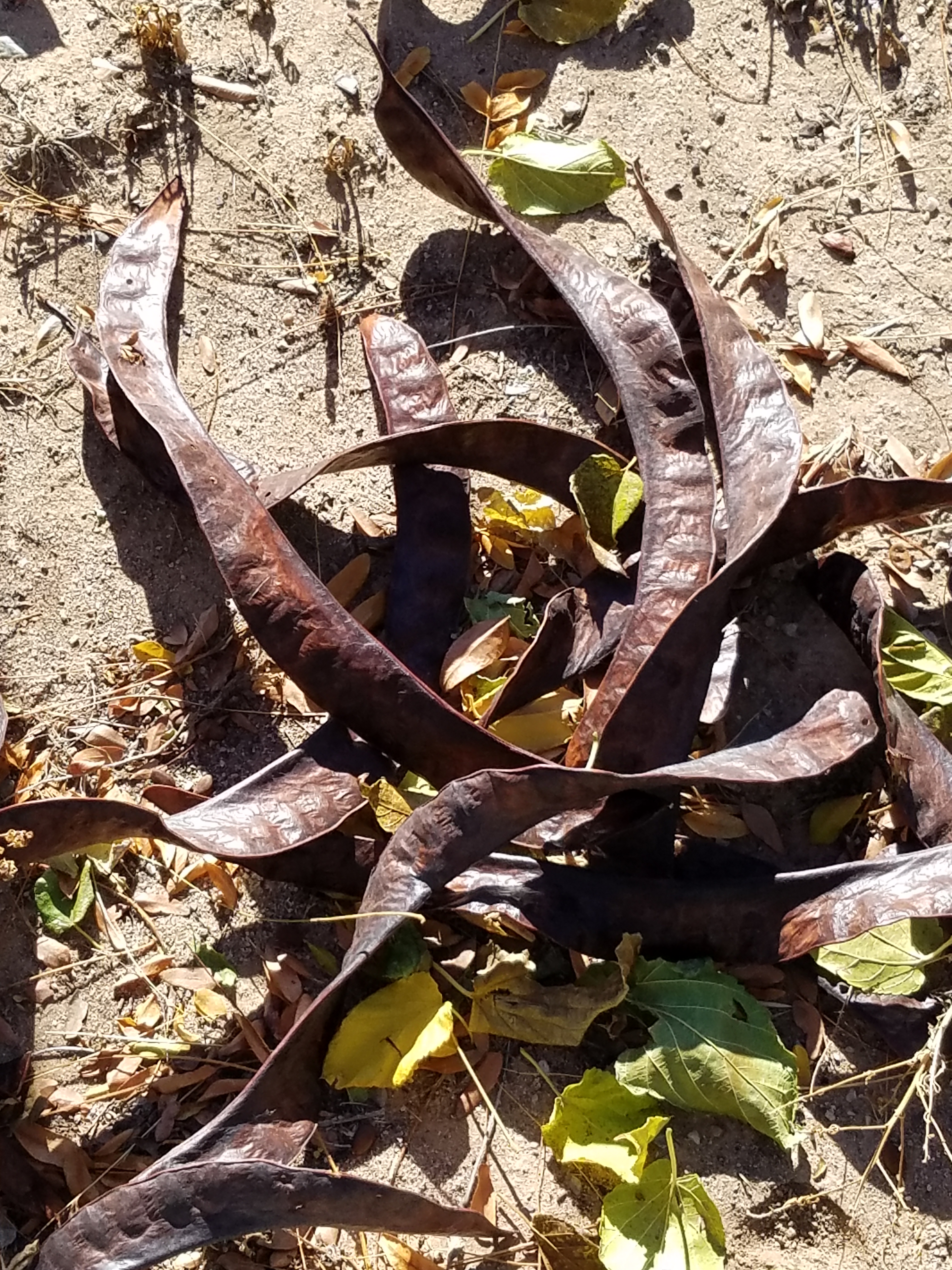
When it’s time sensitive and just can’t wait – what do you get? A BONUS BLOG!!!  Yes! A mid-week blog for the holidays! It began beneath a brilliant blue sky yesterday as the air, with a teeny bit of a  chill, was contrasted by the then warm sunshine glistening through a deciduous denuded Honey Locust making it’s lonely leftover pods look like birds silhouetted against the sky.

Scattered all over the ground were the same fallen wonderfully twisted mahogany-colored pods writhing amidst the dried leaves.

The color was so rich and warm it was irresistible. As I bent over to inspect one, I was captured by the unique quality of each pod and the amazing contours of their graceful, elongated shapes.

Almost as though they were varnished, they had a semi-gloss that was naturally beautiful. This is art in nature. This is inspiration. I can see this as a magnificent drapery fabric – a grand wall of these intertwined ribbons of organic seed pods.

20161120_140253

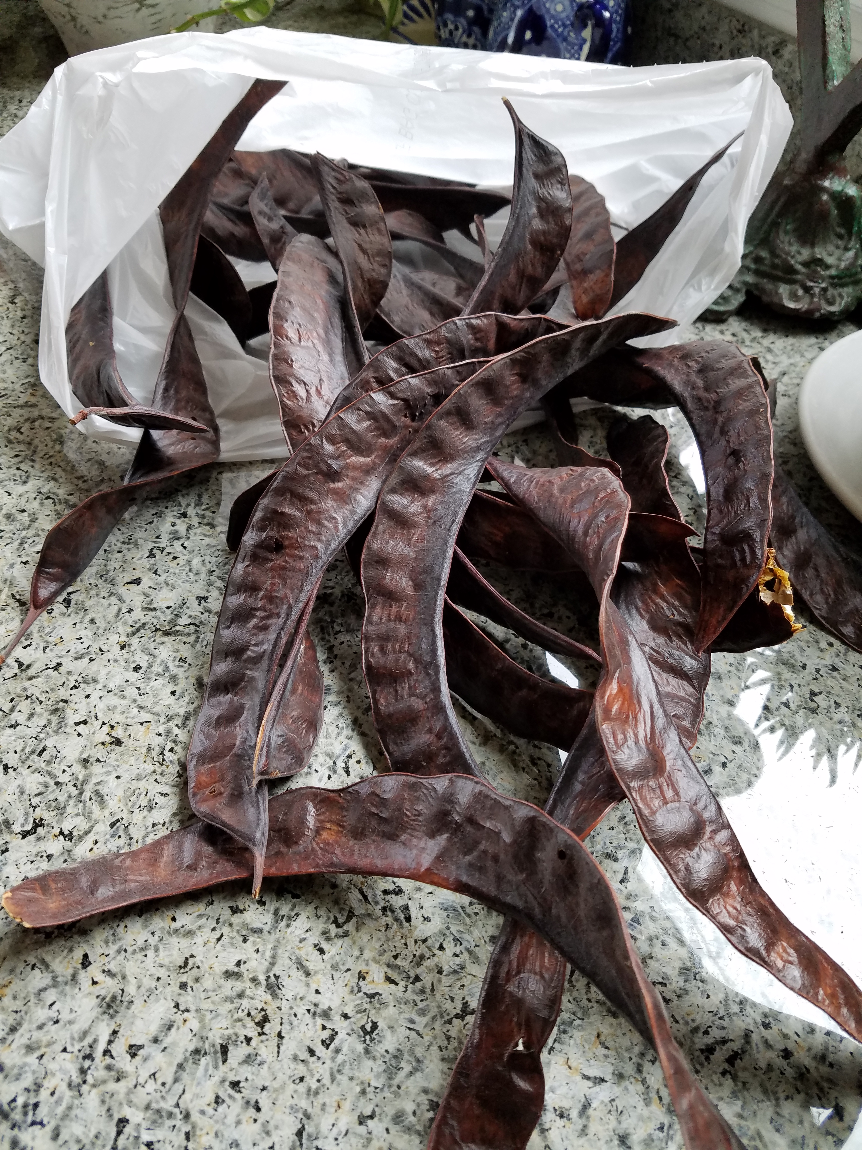
However, on a more current and immediate note – I saw a centerpiece or multiple centerpieces as it turned out. I gathered the pods in my fist as though a wonderfully wild bouquet. I then needed a bag (thank you Becky) as I kept dropping them, in an effort to force the ever growing collection.

Here is the quickie result of the awesome autumnal centerpiece. I had a faux wreath of berries and leaves, tossed in a few recently harvested local apples, (thank you Vigils), some leaves gathered from the driveway as the Bradford Pear – which, a little late this year due to our unseasonably warm Indian Summer this fall, has only started to drop its gloriously radiant leaves. And Voila!

I stood back and looked over my shoulder and saw the collapsed plastic bag still spilling pods out over the counter-top.

20161121_103710

I was about to call all my friends and ask “Do you want a piece of this fabulous, festive, fall, focus of attention? And I quickly realized I could expand the joy for those of you with grand tables  needing a longer statement down the center.

So flanking glass vases provided the extension I needed. Now this was quick – adding gravel, sand or moss in the vases would add interest and depth, maybe pheasant feathers, other dried flower pods and grasses – this was just a start based upon an irresistible inspiration scattered before me.

20161121_101825

So keep your eyes peeled for opportunities when you least expect them and make something out of nothing. Save unnecessary expense when you find your design accessories for free!!! Happy Thanksgiving!!!

pd-exteriors-logo

Designing with Balance and the Creation of the Can Wall!

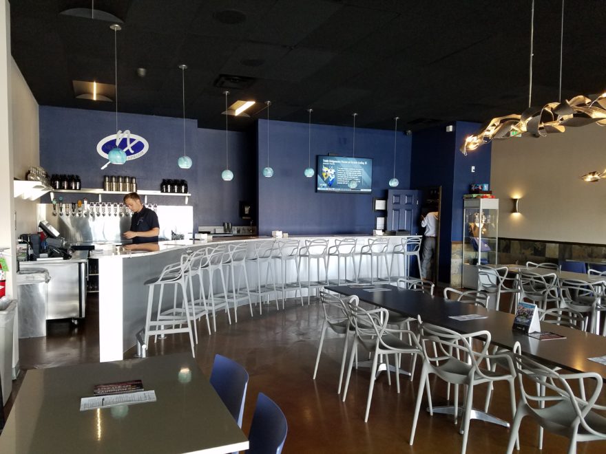
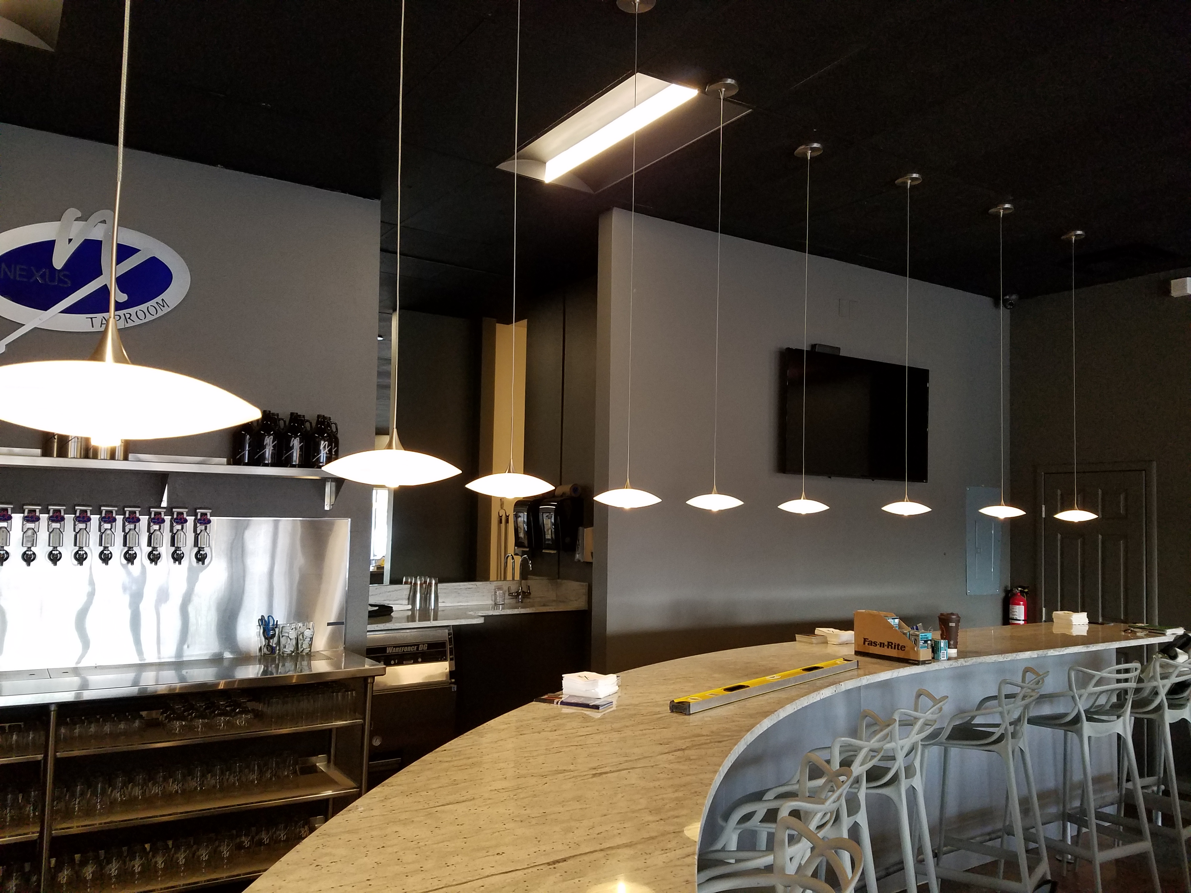
Given the opportunity to improve upon a recently completed taproom, we instantly realized that painting the entire interior would be the best quick-fix. But that instant gratification was not enough to give this needy/hungry interior some meat to get it off and running.

Atmosphere in interiors is so much a part of the brand, the identity, and the success of a business. Popularity is based upon a certain comfort level, the clientele who gravitate there and the product that they are effectively providing. Whether that is food or drink or both, the atmosphere, (including lively enjoyment by clientele), service and food/beverage – all contribute to a successful establishment.

This does not mean high-end, elegant, fancy or even simply hip – although the definition of hip can vary from spare unpretentious and un-self-conscious funky, to studied funky, to affected stylized, to trendy hip and happening,…but, it does NOT always have to represent expensive interior design.

Yet a strip center generally lacks pizzazz and to install a taproom into that generic scene takes some creativity. That does not mean money – it means just what I said, creativity.  And creative interior design is all about ingenuity and balance.

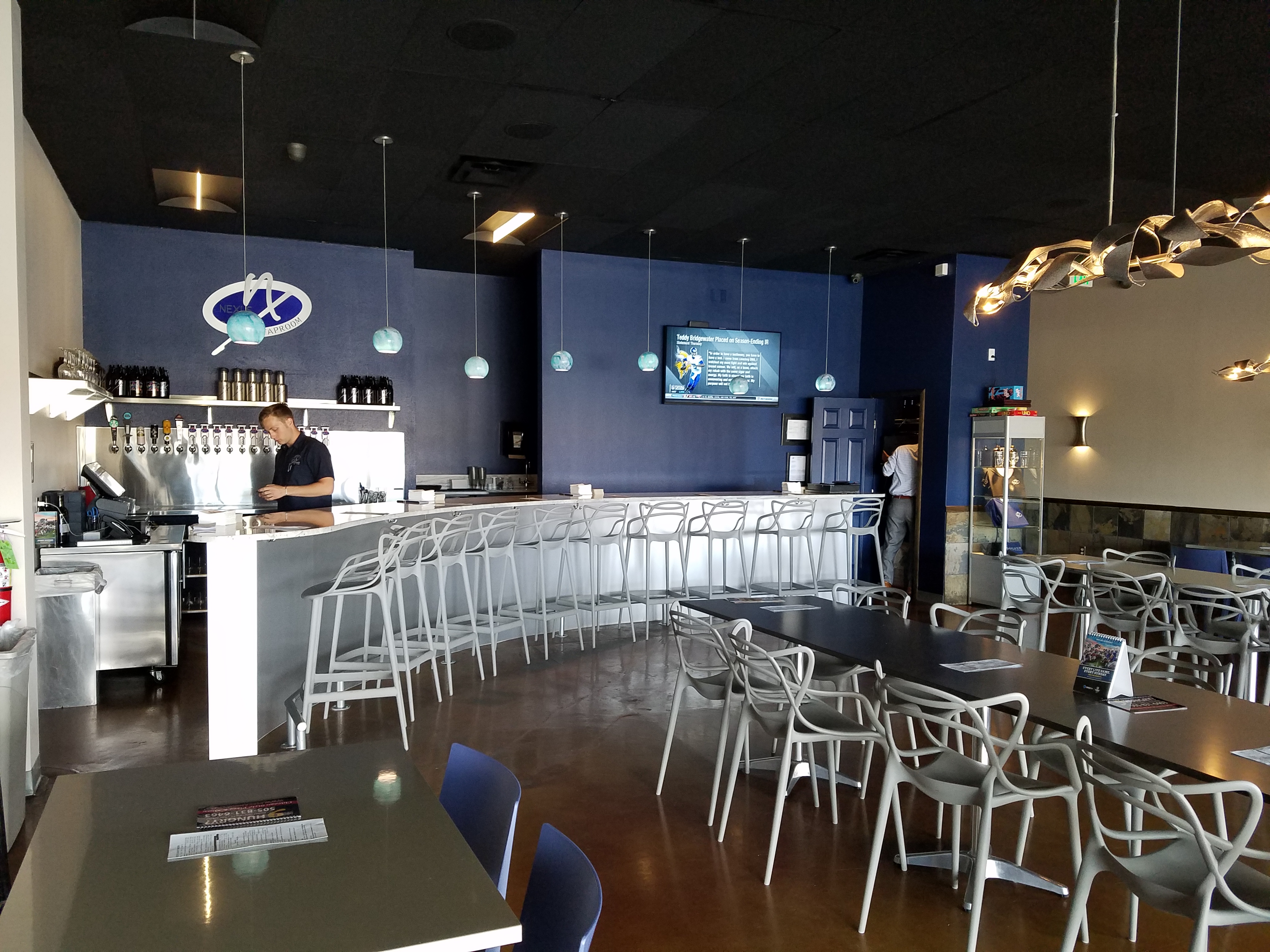
Balance in interior design is key. This interior was filled with hard, cold surfaces – concrete floors, silver-grey laminate table tops, brilliant silver table bases, grey chairs, polished white granite bar top, silver laminate bar face, silver metallic wall sconces, glistening silver under-scaled chandeliers, white walls with cobalt blue accent wall. Brrrrrrr….makes me chilly just recounting the scene. And this was summer! Imagine this setting with crisp cold wind blowing outside and snow blanketing the mountain – not the place you want to gather for a beer in the wintertime!!

20160901_160828

To instantly soften and add warmth, we painted all walls a dark taupe. The soft, mousy grey/brown color pulled from the existing slate wainscoting to tie the two wall parts into a unified “read.” It gave the silver elements (especially the sconces) a contrast – which results in “interest.”

20161103_091444

The back bar was bland even with the new paint color and to add dimension and animation we mirrored the rear center section. This illusion added depth and interest to carry the ceiling through and add a mirrored storefront and exterior reflection which created an illusion of space and character where there had been nothing.

But unlike most back-bars, this area was conspicuously naked. A couple of stainless shelves housing stemmed wine glasses, and growlers felt spare. Plus the right side of the back bar was closer to the bar and the patrons were a mere few feet from a plain, painted sheet-rock wall. Yes, there was a large format TV screen above, but straight ahead – it was just blank wall.

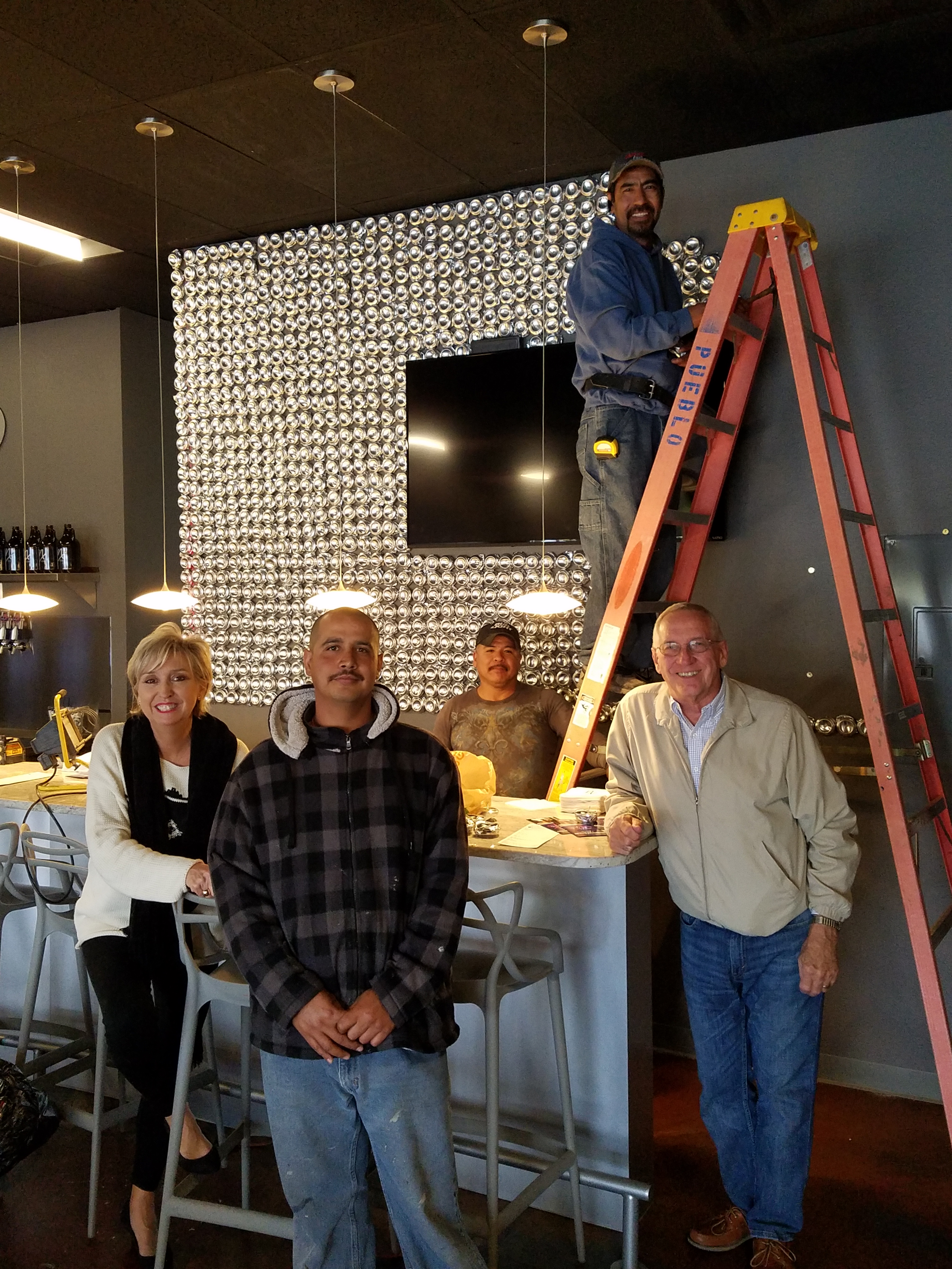
In the wee hours of the morning, as I tossed and turned for a variety of reasons, I jumped from thought to thought, project to project, and personal concerns pelting all the while in a seemingly endless stream of insomnia. Yet, it was during the angst that the idea of the taproom being named “Silver”…silver…beer cans are silver/aluminum…beer cans crushed and nailed to a wall…texture, silver (theme of the taproom) interest – maybe?- all converged into one of those light-bulb moments of revelation.

And yet you might say – “silver…aluminum…more cold and hard. Why would this be an asset to this interior?” I felt that the texture and dimension of the cans would add more interest than the perceived cold and hard of them. The pockets of folded shadows and the relief off from the wall, paired with the over-all massive full-wall of pattern, would all contribute a positive design element to the scene.

As I pictured the wall of circularly flattened aluminum cans in my in my  mind’s eye (a tool that I employ daily while envisioning concepts and finished products well in advance of their fruition), I furthered the concept to encompass possible bar games. Yes, derived from this perfect grid of circular aluminum discs, I began creating games in my head. A bar is often animated by bar games and this was just another opportunity to interact using this unique wall-scape. Since that initial concept, I have created 3 different versions of the animated interaction in the form of games, on this fantastic Can Wall.

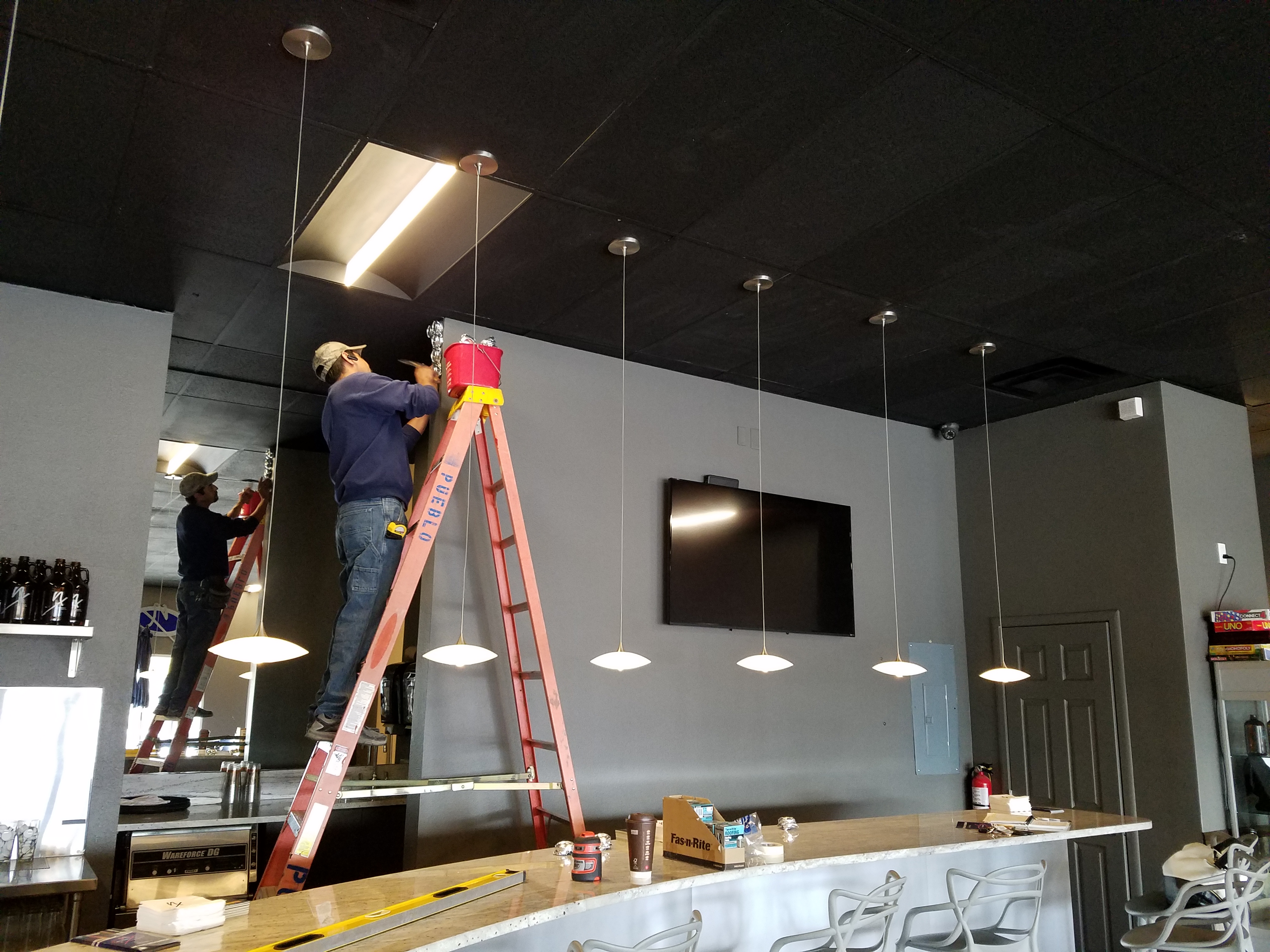
So with great patience, Enrique planned the layout with literally laser precision in a perfect grid. We counted the expected number of cans vertically and horizontally aligning with the brilliant red light beams. The previously crushed cans were laid out on a table – well a handful of the 3,200 that we had prepared for the wall. It was determined that punching the nails into the cans prior to installation would expedite the process of affixing them to the Can Wall. Labor intensive from start to finish, this wall was a great accomplishment for a devoted few.

20161103_094518

As the cans were laid out on the table – initially upside down exposing the crinkly open side (devoid of tops), I instantly LOVED the complexity of the depth, texture and shadows. A tight, random application of them would have resulted in a fabulously complex matrix of design. But upon closer inspection, the “texture” was really raw, with sharp threatening edges that were not possibly reasonable within close contact with people brushing by. So, lacerating the staff was not an option – even for a really cool textural metallic wall treatment. Perhaps this application will surface in a more appropriate location away from human flesh in the not-too-distant-future!

Like hubcaps fastened to the broad side of a country barn at dusk, the reflective silver discs pop in the flanking darkness.

20161104_140152


The process is nearing completion and I will save for another blog sharing the fun and games emanating from the Can Wall,  and the entire finished project complete with new warm white pendant discs over the bar and soon-to-install enormous perforated drum light fixtures suspended from the ceiling, over-sized photo images of the brewery behind the scenes and tantalizing signature dishes in the unique category of the Nexus New Mexico Soul Food.


Meanwhile, the take-away here is…balance cold and rigid with warm and textural – along with all the other opposites that attract – when designing be balanced.


A Joyful Fireplace for All Seasons

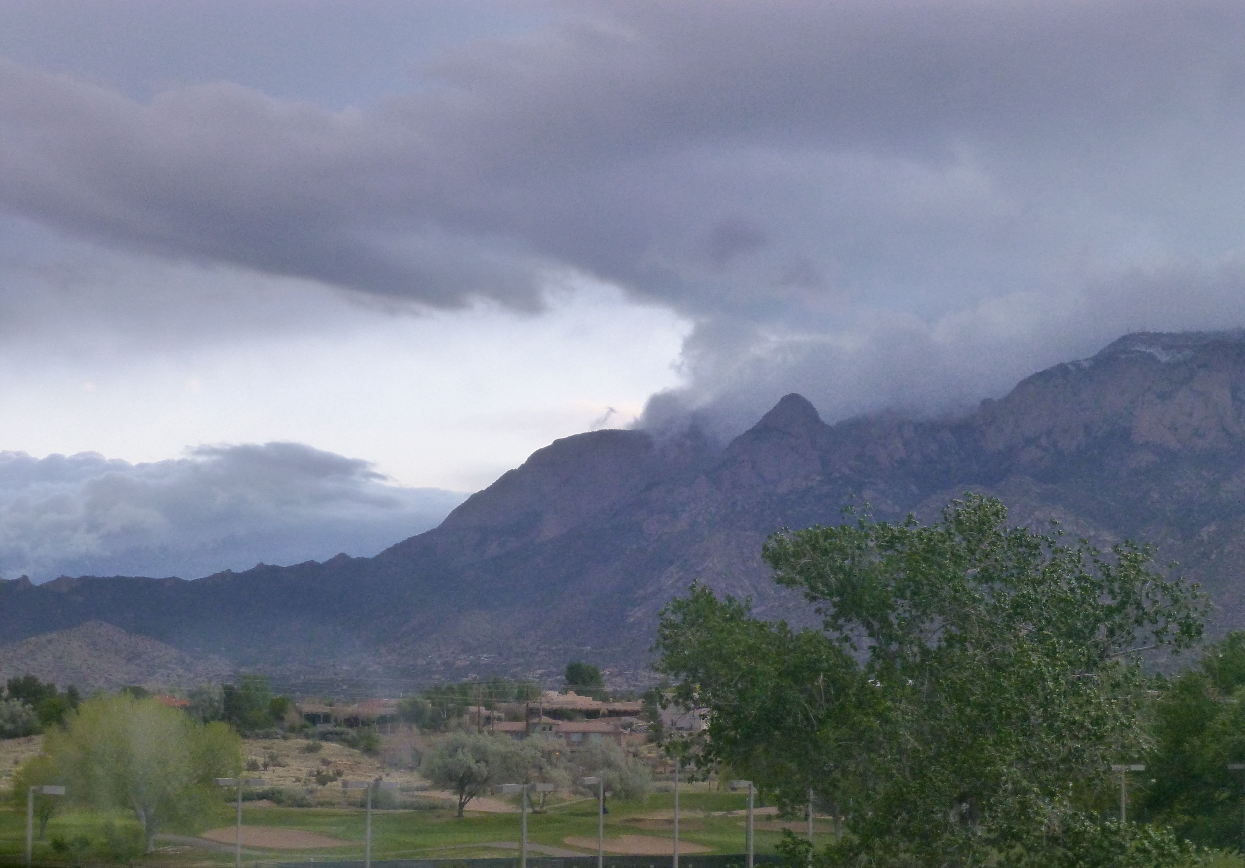
Where were YOU last Sunday morning? As the day dawned, the clouds over the mountain yawned – breaking open to expose various shades of sky beyond their shroud blanketing the morning. Soft grey waves curled over the crest and wrapped around the peaks on violent wind gusts thrashing the new green growth below.P1140149

Imagine…birds are chirping over the roar of Mariah in protest or defiance of this late blast of Mother Nature interrupting what had been spring’s warm welcome. Hooray hooray it’s the firsts of May and the forecast is a high of 50 degrees after overnight lows of a chilly 37 degree rain. This now after having seen record-breaking 70s in February and 80 degrees several days since.

Ah…the fluctuations of spring. With this awakening comes the want, on this Sunday morning, to climb back under the covers and hunker down.  P1140158 However, while the wind wildly whips our towering 30 foot plus blue spruce tree and all the other new green growth from tentacles of wisteria vines to our precious peach tree and fragile red buds, we ascend to the kitchen and talk about building a fire.
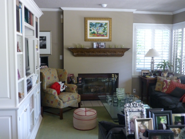
Yes, building a fire. With only one fireplace, I have not succumbed to the instant gratification of igniting fake logs or worse a digital image of a burning fire. Albeit I am not the one venturing out into the elements to retrieve the wood from the stack of fragrant local pinon on the side of the house. Nor am I the one shoveling the ashes to make way for a well-ventilated new pile perfectly placed to assure a good burn.

But I did painstakingly sit cross-legged in front of the fireplace for hours that turned into days breaking tiles in sturdy zip-lock freezer bags with a hammer and fit myriad shards into place creating this wild art-piece that is the focal point of our family room.

We didn’t have a mantle nor did we have a surround. We had found a tin mantle to affix to the wall at one point and later three resin plaques to mount beneath it on the painted sheetrock face creating an attempt at dressing that end of the room. But it never was quite right, never brought joy and every changing season resulted in compounded frustration for this unsatisfactory situation. The shoemaker who has not shoes was I, the designer with a sadly neglected fireplace with no design. P1080268

After more than 15 years, the day came when I enlisted Enrique Jimenez to finally make yet another of my dreams come true. With barely a breath of space on the window side of the fireplace protrusion available for a mantle return, he took the measurements and delivered a few days later a nearly fully assembled mantel and trim.20130731_181349

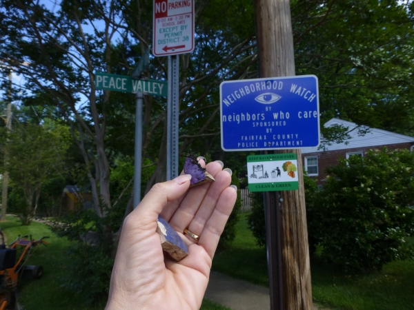
Once painted glossy white by dear John, the space surrounding the firebox opening begged for a finish material. I considered the usual suspects –  granite slab, harlequin glazed ceramic and glass mosaic when the whacky thought hit me – go nuts with fragments of color using treasured pieces I had collected over the years. From a shard I picked up off the street on Peace Valley Lane P1070814 the weekend of Matthew’s graduation from Stuart to little flowers and birds leftover from samples we commissioned for a donor wall at the Albuquerque Community Foundation by artist Meg Butler to chucks of Mexican Talavera and brilliant colors from other pieces and places the palette and random pattern began to take shape.
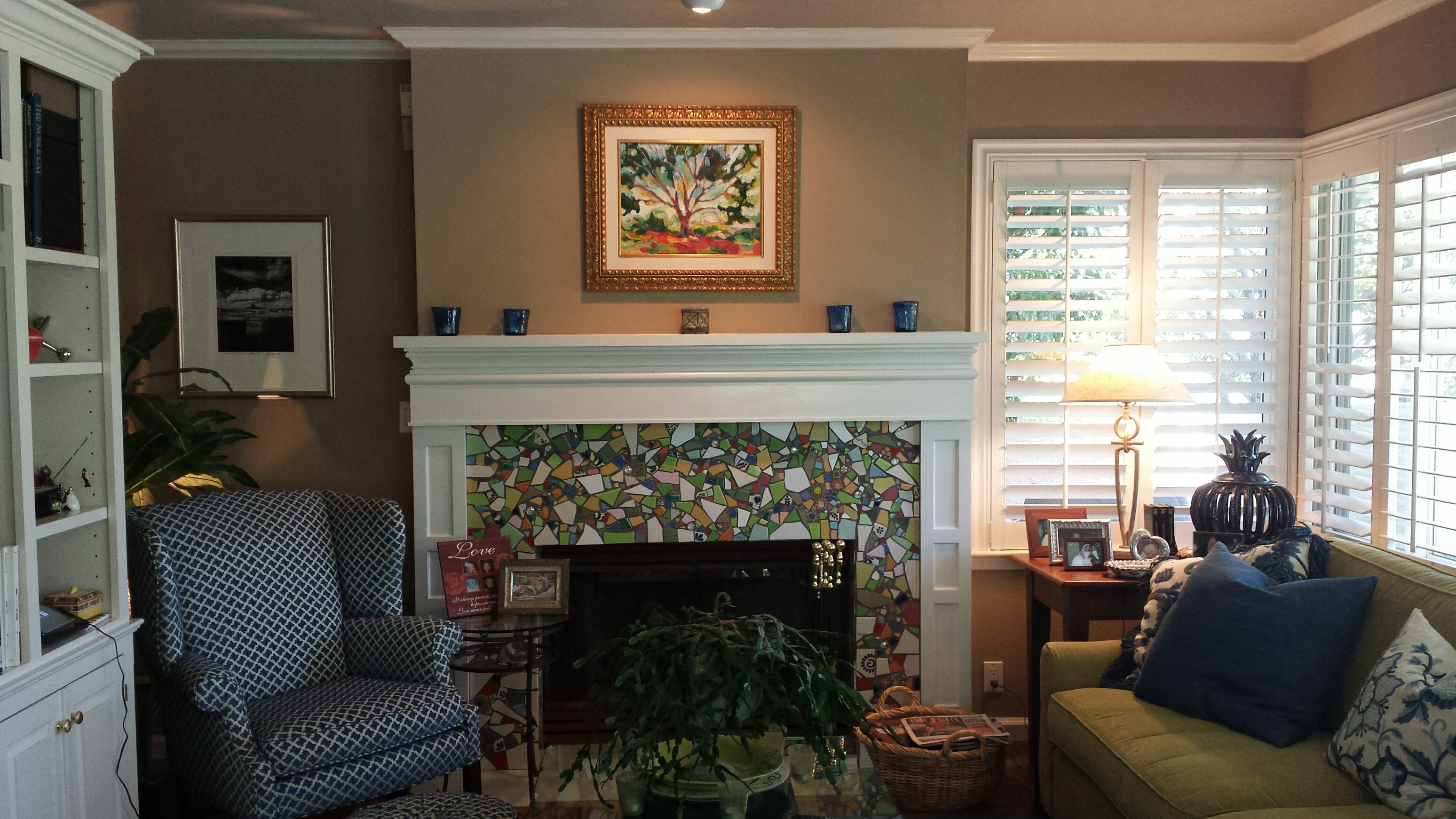

So the hours and days sitting cross-legged on the floor paid off as this multi-seasonal mosaic of color makes me happy and brings as much great joy in May as it does in December. It is a fireplace for all seasons and a happy finished product and satisfying solution to years’ old dilemma. 20160507_092036_resized

So here’s to the first day of May (last week) that came in with a chilly blast belying spring’s arrival giving us the opportunity to have a cozy Sunday by the  flames of a real fire flashing from the happy mosaic of our a bit frantic, but friendly, family room fireplace.


TRENDS – How Does One Decide?

TRENDS…we HAVE to have them…it makes us think, makes us shift…not to mention keeping viscosity in the economy. The shift is the element that moves the economy forward. Without that shift, we would be stagnantly content. And who wants to be stagnantly content – except the “Settlers” from the Direct TV ads?  DIRECTV_Commercial_2015_The_Settlers-520x245

Yet if you Google design trends they are all over the place. The intrigue is when they land on an actual theme that becomes THE TREND.

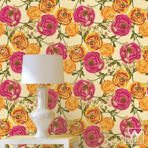
So as we advance into the new year and winter fades to spring – what lies ahead? I’m finding lots of nostalgia – features on milk glass and floral patterns and fancy geometric patterns, a recall to wallcoverings in floral prints and botanicals…Rose-wallpaper-Bari-J-WallAppeal-pattern-pink-yellow-zoom

The trick is how to invest in these elements and not have them become passé by next year. It’s all about balance – unless you have the desire and pocketbook to change out your interior annually! The desire to add something new to your personal spaces, or as my mother has always said “punch it up” is an art unto itself. How does one decide?

Information is so accessible. Access to ideas is endless. But HOW does one decide? How to make the decisions, the right combinations, what to keep and what to change…? The internet and TV…Anthropologie to Pottery Barn, Pinterest and beyond…You pin a gazillion things – but how do YOU decide?

But it gets kind of funny  – because for as many sites as you visit – there are oh so many professed “trends.” Therefore,  sifting through is the challenge and distilling what seems to take the lead. Pastels, patterns and florals is my finding…but is this just spring? Will this fade with the next season? Or is this a “look” that will last for a while? And do I embrace it all or pick and chose? How does one decide? Elle Decor 2016 design trends table

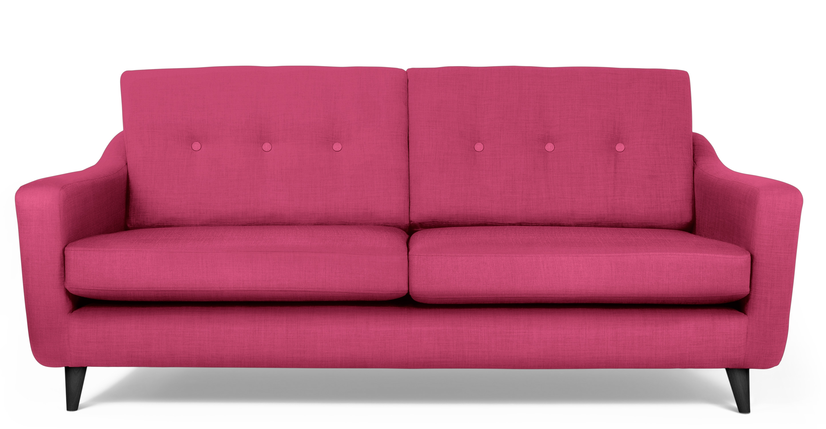
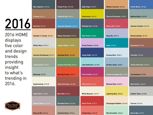
Pantone the color experts are even all over the place. Their designers were “inspired by the contrast of urban design and lush vegetation.” Whoa, really? That sure is a wide swath of possibilities!  And to say that these colors  are unisex is as though attempting to blurr the lines. A guy might wear a pastel pink, Rose Quartz, shirt – but would he upholster his sofa with it? Fashion and Home Decor often parallel their trends – and then they must veer off that same course for practical if not socially directed reasons.  Redford-3-Seater-Sofa-Peony-Pink

But the rationale is so amusing…for example,  Pantone writes: “Colors this season transport us to a happier, sunnier place where we feel free to express a wittier version of our real selves.” Yes, we all long to escape the doldrums of the short, dark, cold days of winter – hence the positive effect of transporting us to a happier, sunnier place is obvious – every year for that matter. That’s why tropical destinations are the prime vacations for winter getaways. Even most avid snow skiers manage to sneak in a run to the white sand beaches for some sun and fun alongside their plans to hit the slopes, get frost-bitten and nestle by the big fires.

I guess I’m looking for a more cerebral explanation for the color movements. And yet, maybe there aren’t any – so let’s not pretend then. What does it mean a “place where we feel free to express a wittier version of our real selves.” Wittier like a guy upholstering or painting his man cave with Rose Quartz or Peach Echo? That’s witty all right!!!!! That’s not the cerebral that I meant. But it is an interesting rationale. Color is giving us permission to express our REAL selves. I guess that’s one way.

Yet, here are 5 different color series for the upcoming year…and as you can see – it’s all there – it’s all covered.  Pantone color-trends-2016


So as you climb out of the dark, cold recesses of winter and squint your eyes at the bright, colorful luminosity of spring in bloom, where will trends take you on your journey to “punch-up” your interiors?


The Colors of an Exceptional Cooking Class Cocina

To experience this glorious morning, on the open patio of a tiny commercial kitchen, in an otherwise residential neighborhood paralleling the river Cuale, in the very foodie coastal city of  Puerto Vallarta, is a treat beyond measure—but I will try to share. I will attempt to take you to this special place full of unselfconscious art and function.

The cobblestone streets are dusty and send fine particulates of powder into the atmosphere causing a fairy-dust-like twinkle in the bright morning light. We bump along in a taxi turning and curving along the circuitous route that surely would lead most to believe what they say—that “this place is so hard to find, it has to be good!!!”

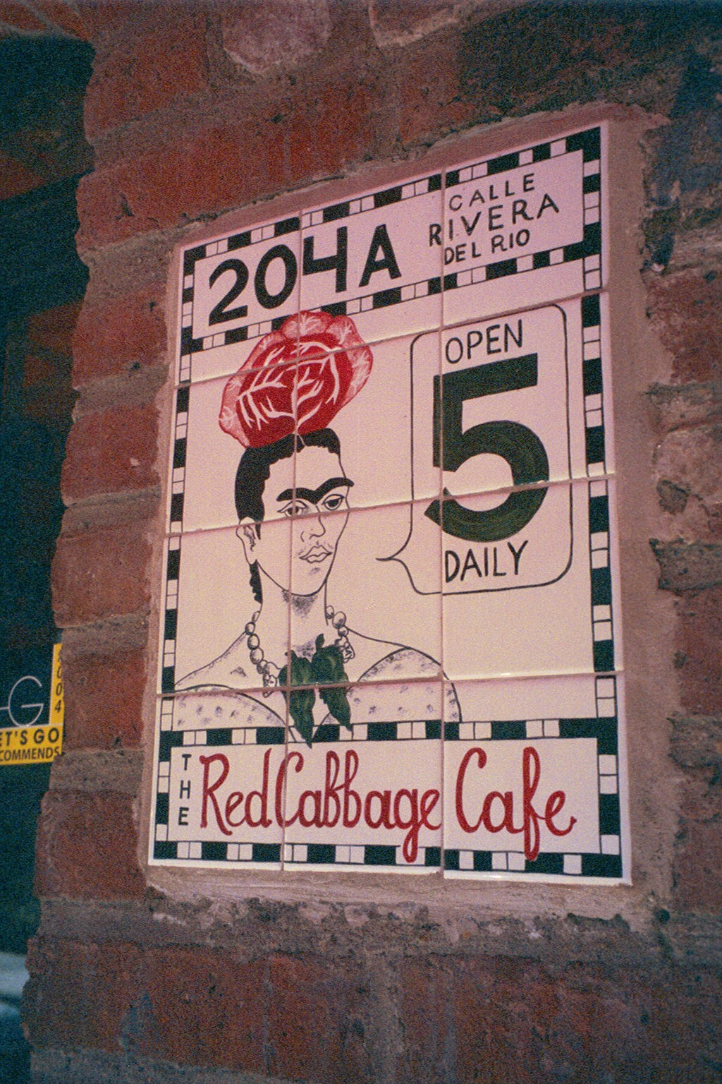
The front is shut and  obviously closed for  business. The taxi driver brings this to our attention, “is closed” he says simply— assuming that he will be continuing along the bumpy calle along the rio back to the bustling scene of the awakening city and return us to our point of earlier departure. PA15821103517

“No,” we tell him “we’re taking a cooking class” “leciones en la cocina” we attempt to convey and with that he beams a broad smile and says “really?” and stops the cab along the wrong side against the opposing traffic on the little street in front of the café.

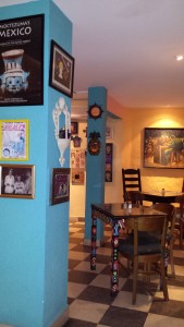
We notice Lola peeking through the door at us as she unlatches the locks motioning us through and welcoming us as we enter the quiet little checkerboard floored dining room. 20140125_204143At night this place buzzes with animated conversations and is alive with color and funky memorabilia, art and posters, collages of collectibles all on brilliantly painted walls creating an eclectic artistic interior of fun and festivity. But on this morning, the room is dormant save the three other guests waiting to participate in the morning’s class.
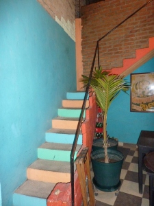
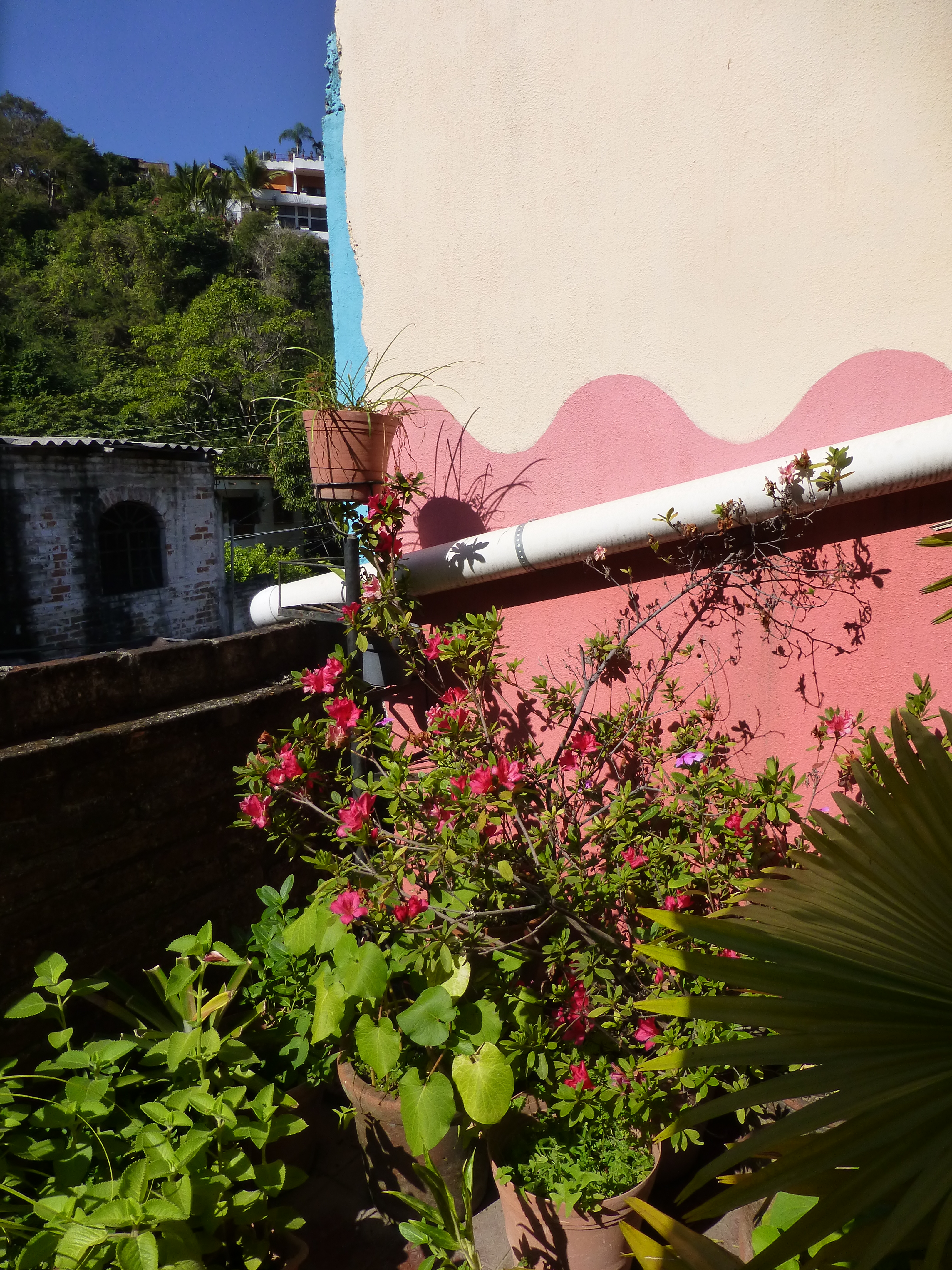
After brief introductions we are escorted through a doorway to a narrow concrete staircase. PVR 2011 after girls 1 050 Red Cabbage stairsDaylight streams from above and we ascend past more brilliantly painted walls to a second floor open to the sky onto a patio rimmed with potted herbs and flowering plants. P1120475 To the right we realize that the rest of the space is undercover, yet always exposed to the elements from that one open east-facing orientation.
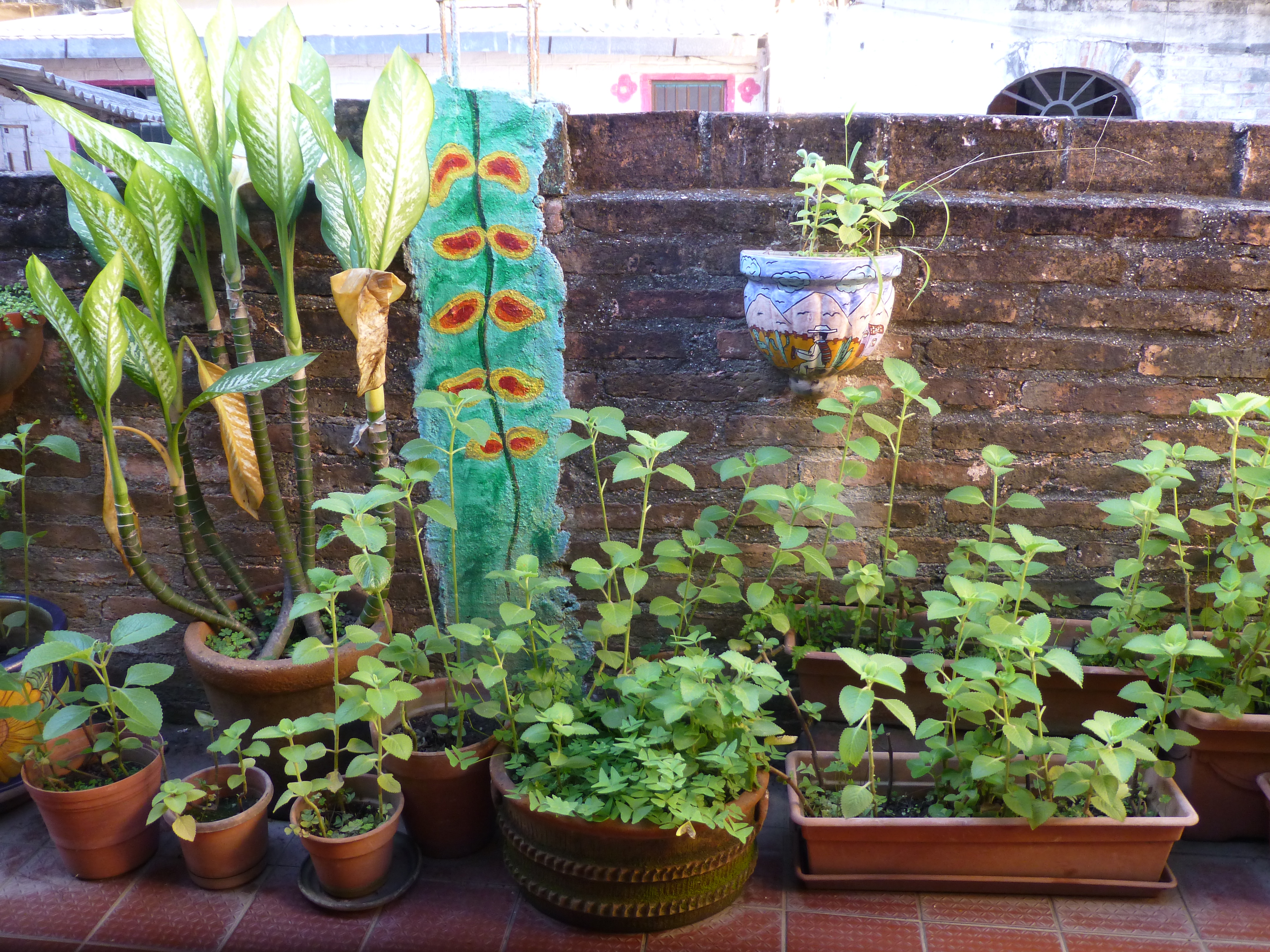
Inasmuch as I love cooking and eating and all things related to culinary pleasures, this is not the focus of this story, but rather, it is to describe this artfully inspired space and all the raw style and primitive grace we encounter in this wonderfully entertaining class of good and indigenous fresh foods and their fabulous flavors.

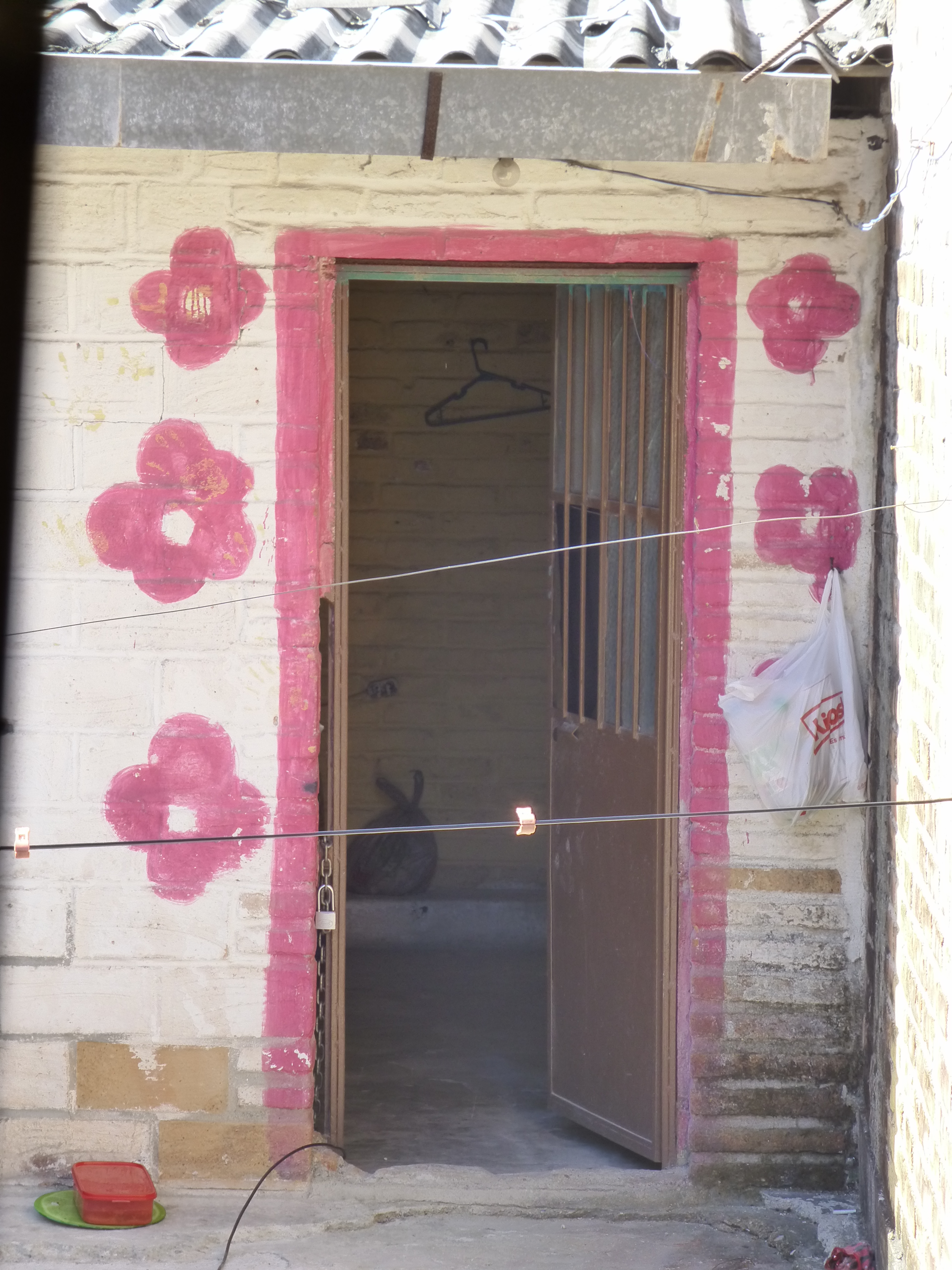
The space is charming and intimate and spotless. The colors are screaming from every direction including  a whimsical pink door surround seen over the wall of the patio. P1120522 The surrounding area is quite run-down and depressed, yet this jewel of a creative kitchen space shines boldly amidst the  impoverished surrounds. P1120524

The sky is perfect blue and sharply contrasts against the wavy pink paints dividing between pale and happy bubble gum of the stucco wall. A functioning drain-pipe of clean white PVC bisects the wall beneath which is a profusely blooming rose-colored azalea in a clay pot. P1120523

Panning into the covered portion of the space, the radiant coral color wall wraps to the back and transitions with gracefully wavy detail to a paint remarkably resembling the sky blue—of the actual sky—that we encountered out front which slams into a dazzling yellow-gold wall half painted and half tiled with the same luminous yellow color. And I have only described the backdrop!


Against these boldly painted and tiled walls are layers of other things that add even more dimension and interest to the kitchen. Blue and white tableware, glazed clay vessels, and a mysteriously faded poster of Frida Kahlo. More of the sky-like blue is hanging in the form of various sized and shaped enamel cooking pots on the coral wall.


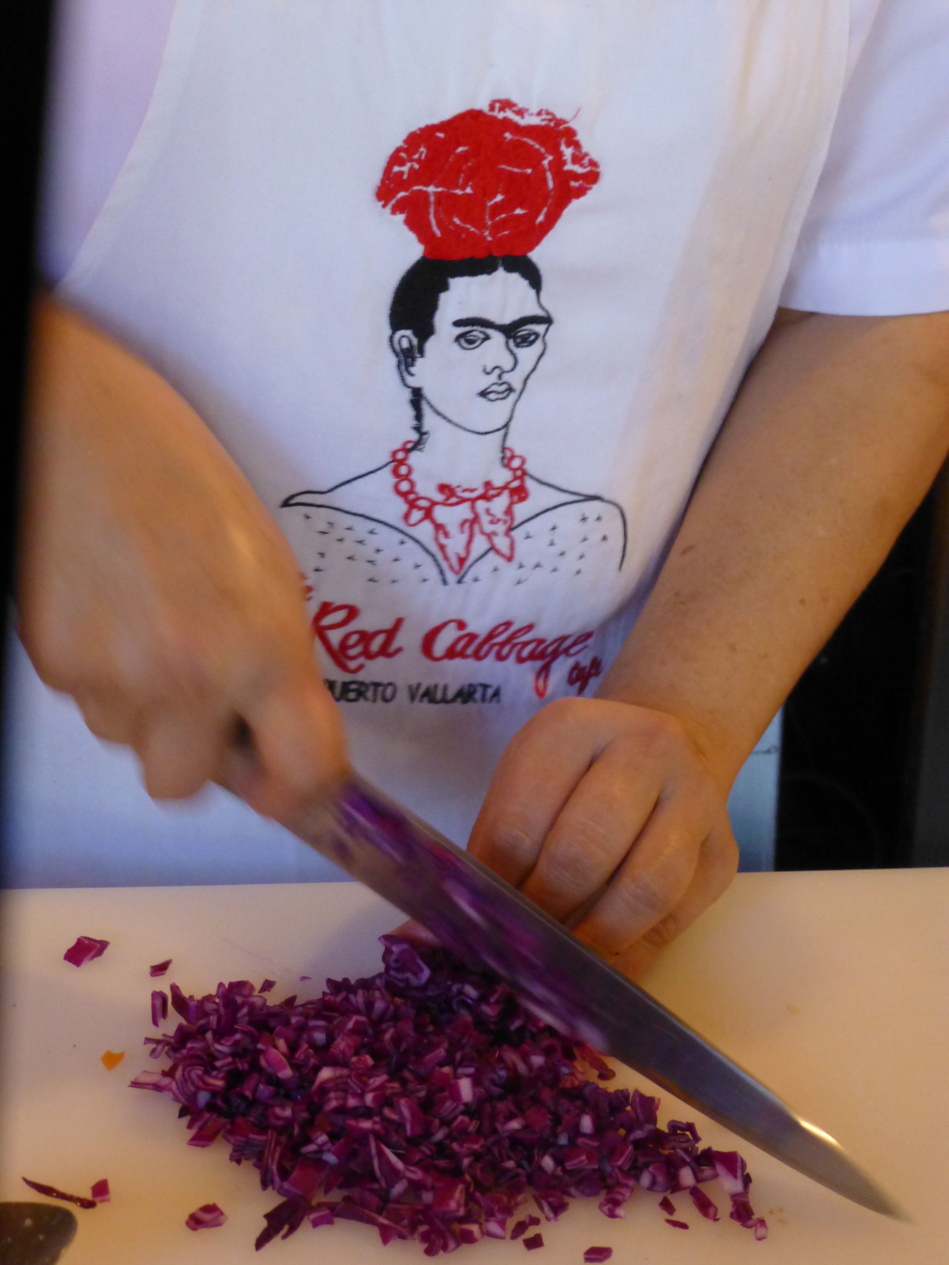
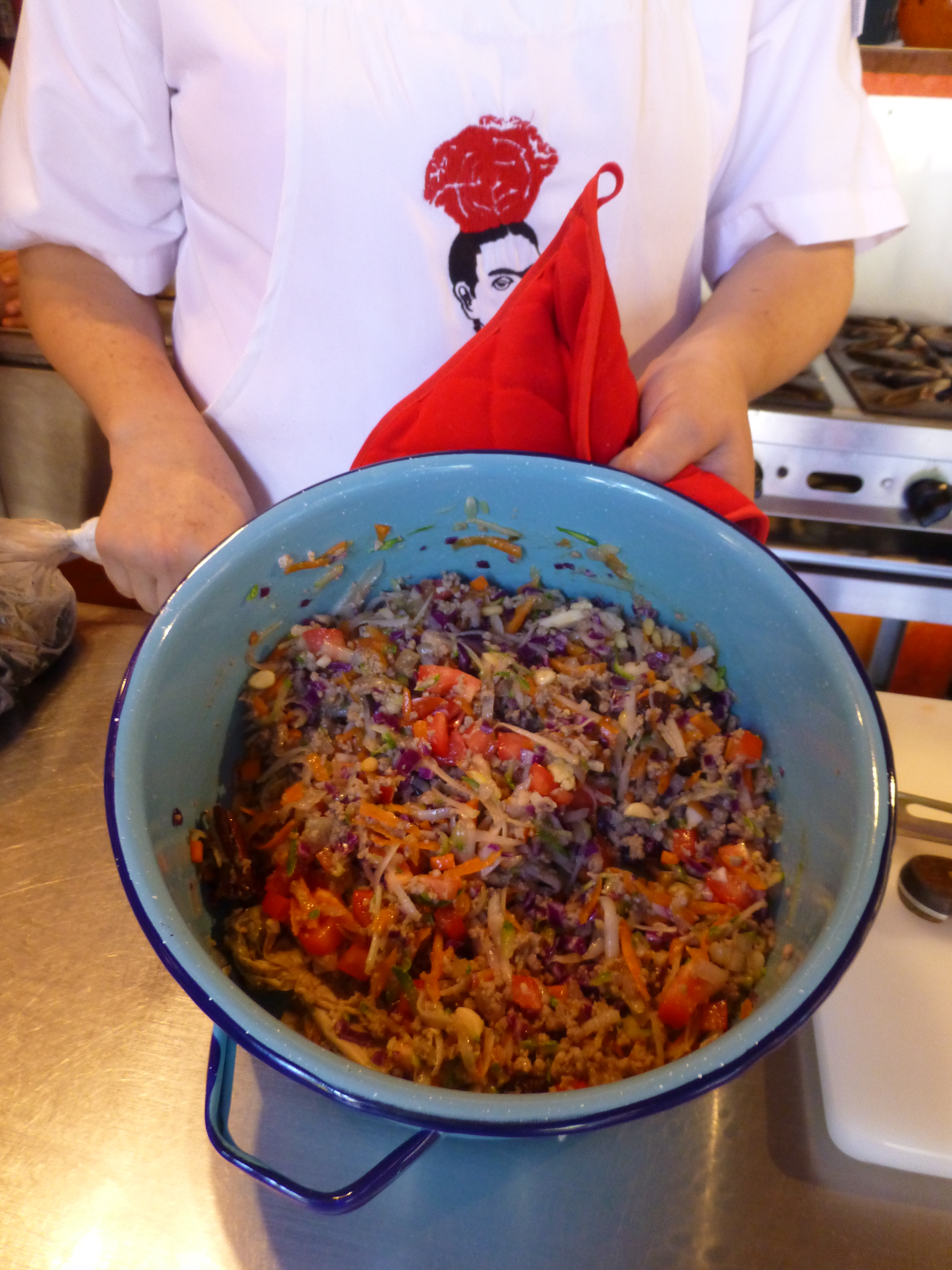
The crisp white aprons of the two chefs pop against the background of multi-colors branded with the embroidered red and black logo of Frida with a red cabbage balanced atop her head. P1120487

It seems from the murmurs coming from the eager students that this enchanting environment represents the promise of a flavorful feast of color and texture. The food matches the interior. The stuffing for the dark rich green roasted poblano peppers is a colorful collection of shredded carrots, red cabbage, zucchini, tomatoes, raisins and pine nuts creating a seemingly woven fabric of colors and texture. P1120491


The finished product, Chiles en Nogada, represents the Mexican flag of red green and white. Plated here on red glass for an artful presentation. P1120518

Myriad handmade condiment dishes and traditional serving pieces contribute to the collection of color we are experiencing in this spectacular sensory bombardment. And I mean that in a really good way. The intensity of the colors and layering, the structure and accessories right down to the food and its presentation results in an artistic expression that goes way beyond the sterile experience often connected with the laboratory of a commercial cooking experience.


So we say—why be status quo when you can be individually fabulous, cooking and creating in an unconventional environment that reflects the animation and joy of the flavors that comprise the artful meals?! Thank you Lola for imagining and realizing the Red Cabbage and bringing so many artful, entertaining years and delicious meals to the community of fortunate residents and happy visitors—happy that they were able to find the place!P1120530