For the LOVE of Fine China – USE IT – Inspired Table Settings

From the Diminishing Dining Room of last week’s observations, https://patriciandesign.com/category/dining-rooms/, I decided to further the conversation to encourage a new-found appreciation for having fun setting dinner tables!  I found fodder from Kentucky Fried Chicken served on formal silver platters to wipe-clean placements of dazzling designs to dress your tables.  A collection of tireless designers defend the use of fine china – own it, buy it, find it, inherit it, enjoy it, keep it and use it – don’t send it to the thrift shop!!!

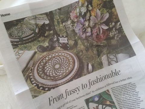
Yes, the art of fine dining seems to be set aside in favor of ease and expediency, but this article from The Washington Post’s HOME section (thank you Feath – my clipping service) brings it all home to use and enjoy.  It is a celebration of art, design and playful creativity.

Not everyone loves to entertain, to create the “tablescape,” to even bother to put together an outfit to wear. Not everyone loves to get dressed in the morning – it is a chore, an obligation, a mere necessity. That’s unfortunate in my estimation. For those of us who do – love it – it is all about having fun with fashion or interior design is just that – FUN!

Last spring I began a series  of emails that I blasted to our mailing list called COOK + PARTY. It was (and will continue this next season) a collection of weekly recipes paired with table-top art pieces. In our gift boutique, we represent an incredible collection of artists who create fabulous tableware.  I paired a piece with a recipe each week to inspire and encourage everyone to use “functional” art in their daily lives and specifically for entertaining and even the family dining table.

https://patriciandesign.com/category/art-and-food/

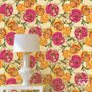
Recent fodder revealed a great source for fabulous wipe-clean placemats from Caspari.  For decades a fine source for the best paper cocktail napkins, Caspari offers these bold patterns and colors, prints of fine china and fabulous fabrics – re-use and easy to clean – why not?

https://www.casparionline.com/catalogsearch/result/?q=placemat

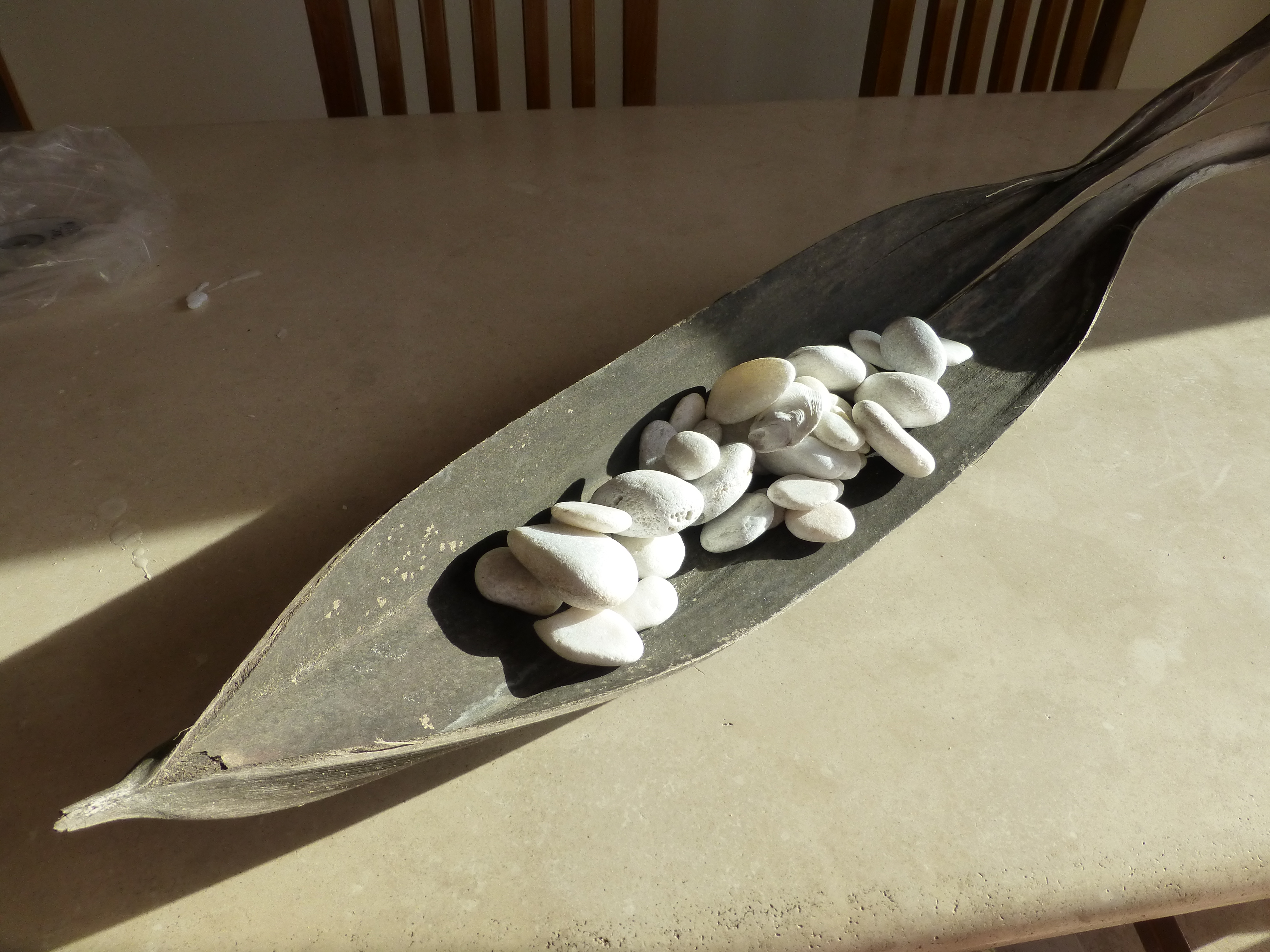
A previous fall blog that I wrote illustrates the open-mindedness of looking around to find inspiration for seasonal table dressings.  The decision for your table-top inspiration can be spontaneous – just go outside and look around!


Among the refreshingly optimistic designers that were quoted in the Washington Post article:

https://www.washingtonpost.com/lifestyle/home/that-old-fussy-china-can-fit-your-casual-lifestyle-designers-talk-about-how/2018/02/21/46761538-0084-11e8-8acf-ad2991367d9d_story.html?utm_term=.3a6fde2e5124

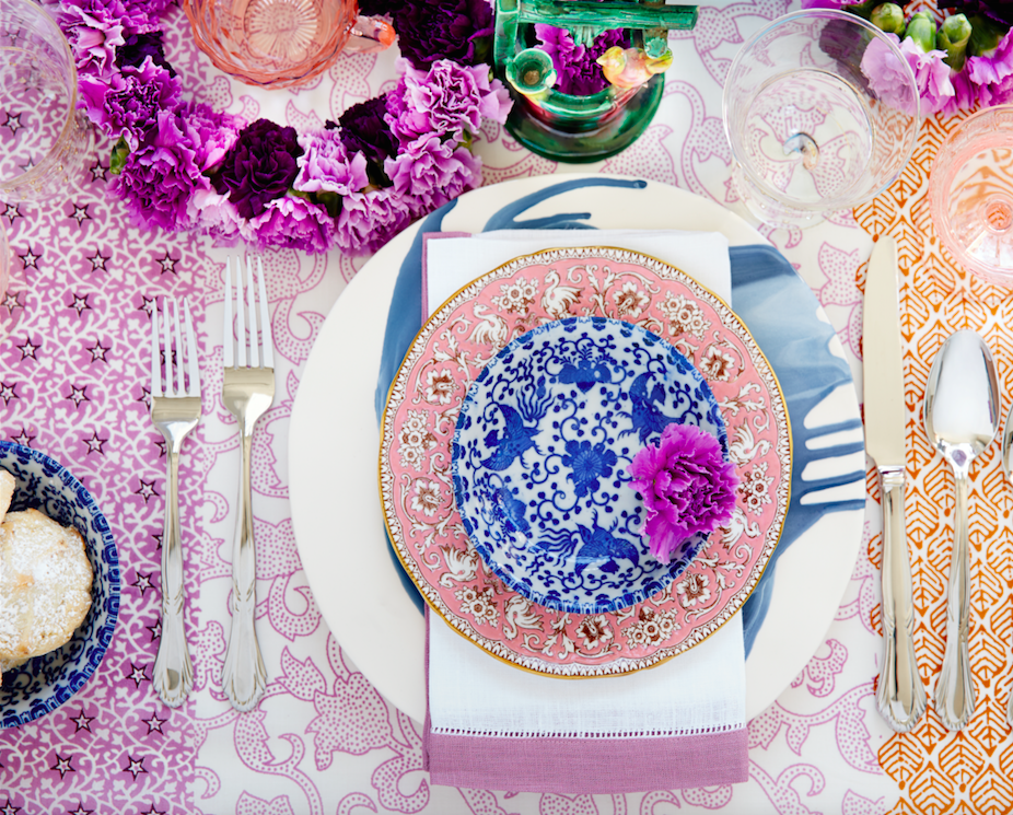
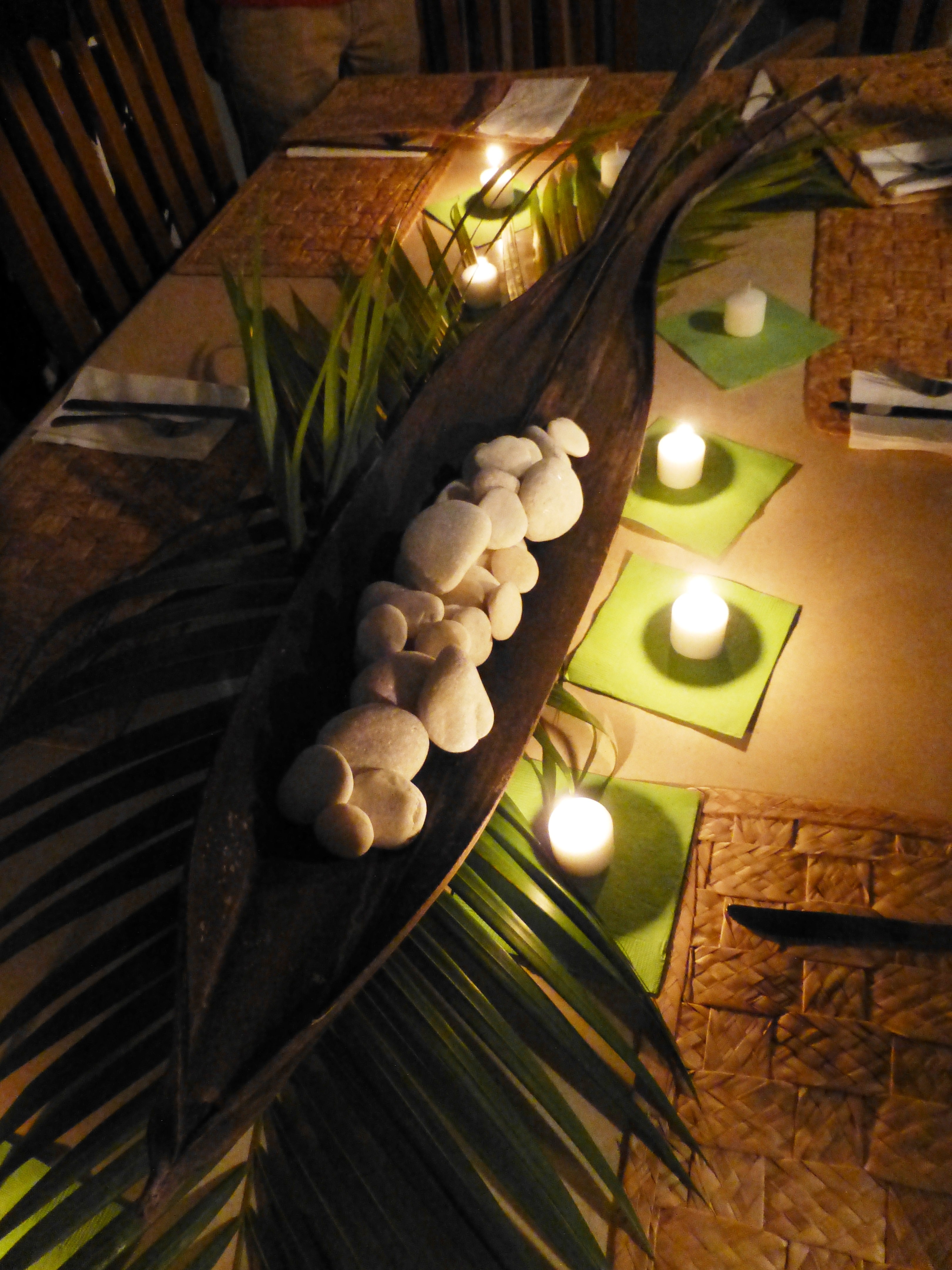
Barry Dixon, from the verdant rolling hills of Warrenton, Virginia, specifically points out that this process of setting your table should be fun!  Don’t pull-out the same things each time – mix it up! Change it up by adding color and pattern differently with every new opportunity.

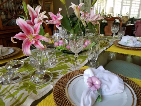
Seasonal flowers, yellow woven cotton place-mats, embroidered folk-art table runner, basket chargers beneath classic Limoges topped with ceramic napkin rings – it looks like spring!

Designer Timothy Corrigan tells us that many people find it too difficult to entertain with their best things because the onus of proper cleaning and put-away is too much! But Mr. Corrrigan points out the joy of using your best things every day – everyday is a celebration and what you enjoy should be used.

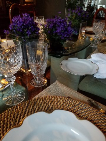
In another springtime setting…organic, rustic things with finery – black stones nestle fresh purple Campatula flowers antique Limoges and basket chargers –  makes an eclectic table settings – it’snot all or nothing…it’s the combinations and scene that is being set.

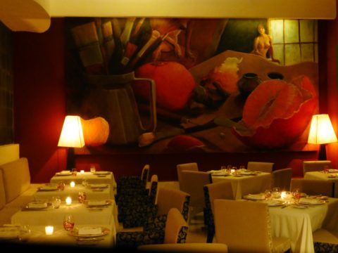
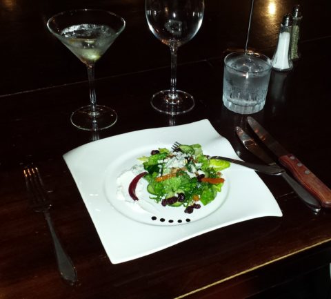
Hutton Wilkinson – way out in L.A. where casual chic is the practice of distilling what migrated from the more formal sister coast to the east – noted that he believes presentation is the key to success. It isn’t so much about what is served (don’t tell the chefs that), but rather on what it is served and how it is presented.  Imagine buckets of Kentucky Fried chicken served on elegant Georgian silver platters. That simple fast-food chicken becomes  magnificently irresistible. You can’t say you’re too busy to cook with that creative solution! Wilkinson believes that presentation helps food taste better in addition to looking beautiful! He advocates buying china because it’s beautiful – not merely serviceable. I agree…it’s not all about the mundane purpose of eating off of it – but rather the joy of eating off of it!!

Making your guests feel appreciated and treating them to a unique, pleasing experience is a gift to them.  A special treat to show that you care –  going that extra distance of detail and design.

Color combinations, textures,patterns – wonderfully pleasing tablescapes are a treat for the eye. (So special Marsha!)

So don’t say it’s too difficult…keep it simple with Real Simple – the source for easy, ingenious ideas and simple truths……the following link for proper place-settings will get you started.

https://www.realsimple.com/holidays-entertaining/entertaining/how-to-set-a-table

Patti says – “make it special every day.”

Atmos and Eating by Design

How do you select a restaurant? As a patron, what makes you dine out? How do you select your preferred dining experience? I’m talking about casual and easy or even more a more in-depth gastronomic event.

When it comes to casual, quick and easy, I still want the experience to have personality – a pleasing personality and great flavors. Personality is atmosphere. Great flavors is the kitchen. Service might be “step-up and place your order” or table-side wait-staff. In either case, I want it to be a pleasing experience. Why would anyone want it to be difficult or unpleasant? Perhaps that lies in the definitions of the beholder. What is difficult or unpleasant and the various degrees thereof is not be the same for everyone.

Throughout my childhood, I remember my mother and her peers reference “atmos.” It was important. It came up often. “Does the place have atmos?” Or “what great atmos.” Atmosphere – it is the feeling you get in an environment. It is the feeling a place emits. I don’t ever recall it being used in the negative – such as this place has horrible atmos…rather, like ambiance, it was reserved to compliment.


Cafe des Artistes – Puerto Vallarta – Note the full-wall mural by Federico  Leon de la Vega as a backdrop to the dining scene. Also, perhaps someone should have straightened the lamp shades!

We now hear “vibe.” The place has a good vibe – but not limited to only compliment, a place can have a decidedly bad vibe too! Is it just the saying “If you can’t say anything nice about something, don’t say anything at all?” Perhaps we are less polite than the previous generations. Yet, constructive criticism let’s you know what makes your patrons pleased. Truth be told…be honest with discretion.

As a restaurant owner, it seems that erring on the side of greater numbers sharing the same opinion of easy and pleasing would capture the greater share of the demographic. Therefore, studies are out there to determine the value of ambiance and presentation. Starting with defining the description of your eatery…who are you and what and how do you serve? What is your “brand?” Whether funky or fine, dining should be worth the visit.

Nexus Brewery, in Albuquerque, has a unique brand and complimentary interior “vibe.”

I read a few excerpts from a fascinating new book, Gastrophysics, The New Science of Eating by Charles Spence. In it, he touches on the importance of atmosphere. He observes the value of interior design even as it relates to how much people eat and how much they spend as a result of atmospheric influences.

Another great read for understanding the art of a successful restaurant is Daniel Boardman’s Your First Restaurant – An Essential Guide. As an “essential aspect of your concept” Boardman identifies why the “thoughtfulness of the interior design” communicates to the patron a lot about the service and food that one might expect to receive.

Tacos on paper – porque no?

From lighting to the shape of the plate, ambiance and presentation are key features in a successful eating establishment.

All the way from candles on a white linen table cloth to a handsome juicy burger in a basket lined with paper, in the context of the environment – design details matter.

Luscious bun-less green chile cheese burger at Sparky’s in Hatch, New Mexico – served on paper and styrofoam – not fancy, but perfection!!


Stone under-foot and condiments as a center-piece!! Funky!!

Some reading this might say they don’t care. Fine. Perhaps on the surface, they think it doesn’t matter. They don’t realize the effectiveness of well thought-out details. They take these things for granted. Yet these details can make or break a dining experience – from casual to fine.

El Arrayan presents enclosed patio dining with a variety of light sources, well balanced colors and textures in Puerto Vallarta.

Next time you eat out, look around, smell the smells, hear the sounds, see the colors, notice the lighting sources and levels, feel the furniture and – have I not mentioned it? – check out the restrooms!!!!

Las Caletas…in the jungle…clean and simple.

Not only should they be very clean – but they should also continue the theme of the place.

Graffiti by design, this restroom is actually immaculately clean and patrons do NOT contribute with their own markings. It is located in the street taco eatery of SALUD! in Barrio Logan, San Diego. Fast and friendly, delicious and fabulously  funky!

Pay attention and you might be surprised at what you discover about your sensitivities.

Chaco Hotel in Albuquerque is thoroughly theme-based throughout.

What you hear while dining contributes greatly to the pleasure or discomfort of your time spent in the environment. It either contributes positively or detracts annoyingly. Listen to the sounds next time you dine. At home or out, notice voices, chairs being moved, glassware, music, kitchen noises, traffic…see what detracts, what enhances or what might be considered neutral.

Interior designers are considering it all – the theme, atmosphere, colors, artwork, furniture, lighting, table dressings, serving pieces, fabrics, textures and even sound. Whether casual or more formal, these design details can make or break the success of the business.

Oro Valley Country Club, Arizona.

Even if the food is exceptional, too bright lighting, ineffective colors, uncomfortable furniture or confused design elements can result in negating even the best chef’s efforts. It is a package. It is about the whole. It is a multi-sensory experience. Buen provecho!

DIY – Inspiration is All Around!

DIY is so in vogue. Where it used to be chic to hire someone to do everything in your world, now practicality rules! The savings and fun of doing things yourself is huge. There are so many inspirations on-line. Ideas overflow-ith and the possibilities are endless.

Where do you get YOUR inspiration? It’s all around us. I had been contemplating a shower/wedding gift. I always prefer to find something unique rather than picking from a registry at Nordstrom’s or William Sonoma…but this one was a challenge.

Recently, my inspiration came from taking a morning walk through the desert.

The decorative graphic on the invitation was a floral arrangement of soft pastels and antlers. Yes, antlers. This bride-to-be is a hunter. A long, lanky, beautiful, feminine, crack shot! I’ve known her since she was a toddler. I had been picturing that graphic in my mind in an effort to divine some special gift that related to that theme…something uniquely memorable and lasting.

As I walked through the rough desert grasses and around piles of dead tumbleweeds I regarded them with a new-found appreciation. They had such an interesting structural framework that I realized that they clearly resembled antlers.

They became the springboard for a floral arrangement that would replicate the theme of the invitation and, with that, I began selecting them and carefully carrying their rotund prickly selves back to the car.

Next step – what else will make this a successful rendition of the theme I was trying to emulate? Off to the craft stores! I selected delicate, creamy-white wooden roses, soft pink mini silk roses and some fill from both Michael’s and Hobby Lobby. The PERFECT ceramic vessel presented itself in an soft, oval shape glazed in a powder blue, but with edges and character that offered attractive, desirable, intentional imperfection.

As I have mentioned in past stories, a successful designer has a good team. Building a team to realize your dreams is the key to that success and I called on my very special and exquisitely talented floral designer to assemble my gatherings into the image of my intent. Melba has made my dreams come true for years. She gets into my head and interprets my words and elements to create a finished product that has hit the nail on the head over and over again.

I pulled out the many materials that I had purchased. She evaluated each, talked to me about my concept, and studied the combinations that were laid out on the table.

This piece exceeded my expectations. The fine branches of the tumbleweeds were the delicate punctuation amidst the flowers.

When she actually ordered real, bleached deer antlers that became the statuary of the piece, I was thrilled! Not only was the finished arrangement perfection, I didn’t think it was realistic to expect to get real antlers and incorporate them into this design in such short notice. She had less than 2 weeks! It was spectacular.

DIY inspiration is all around – even in dead, dried tumbleweeds. Creativity begins with a concept and progresses with the fun of making it uniquely yours. Team DIY!


Resourceful Creative Festive Fun

When it’s time sensitive and just can’t wait – what do you get? A BONUS BLOG!!!  Yes! A mid-week blog for the holidays! It began beneath a brilliant blue sky yesterday as the air, with a teeny bit of a  chill, was contrasted by the then warm sunshine glistening through a deciduous denuded Honey Locust making it’s lonely leftover pods look like birds silhouetted against the sky.

Scattered all over the ground were the same fallen wonderfully twisted mahogany-colored pods writhing amidst the dried leaves.

The color was so rich and warm it was irresistible. As I bent over to inspect one, I was captured by the unique quality of each pod and the amazing contours of their graceful, elongated shapes.

Almost as though they were varnished, they had a semi-gloss that was naturally beautiful. This is art in nature. This is inspiration. I can see this as a magnificent drapery fabric – a grand wall of these intertwined ribbons of organic seed pods.

20161120_140253

However, on a more current and immediate note – I saw a centerpiece or multiple centerpieces as it turned out. I gathered the pods in my fist as though a wonderfully wild bouquet. I then needed a bag (thank you Becky) as I kept dropping them, in an effort to force the ever growing collection.

Here is the quickie result of the awesome autumnal centerpiece. I had a faux wreath of berries and leaves, tossed in a few recently harvested local apples, (thank you Vigils), some leaves gathered from the driveway as the Bradford Pear – which, a little late this year due to our unseasonably warm Indian Summer this fall, has only started to drop its gloriously radiant leaves. And Voila!

I stood back and looked over my shoulder and saw the collapsed plastic bag still spilling pods out over the counter-top.

20161121_103710

I was about to call all my friends and ask “Do you want a piece of this fabulous, festive, fall, focus of attention? And I quickly realized I could expand the joy for those of you with grand tables  needing a longer statement down the center.

So flanking glass vases provided the extension I needed. Now this was quick – adding gravel, sand or moss in the vases would add interest and depth, maybe pheasant feathers, other dried flower pods and grasses – this was just a start based upon an irresistible inspiration scattered before me.

20161121_101825

So keep your eyes peeled for opportunities when you least expect them and make something out of nothing. Save unnecessary expense when you find your design accessories for free!!! Happy Thanksgiving!!!

pd-exteriors-logo

TRENDS – How Does One Decide?

TRENDS…we HAVE to have them…it makes us think, makes us shift…not to mention keeping viscosity in the economy. The shift is the element that moves the economy forward. Without that shift, we would be stagnantly content. And who wants to be stagnantly content – except the “Settlers” from the Direct TV ads?  DIRECTV_Commercial_2015_The_Settlers-520x245

Yet if you Google design trends they are all over the place. The intrigue is when they land on an actual theme that becomes THE TREND.

So as we advance into the new year and winter fades to spring – what lies ahead? I’m finding lots of nostalgia – features on milk glass and floral patterns and fancy geometric patterns, a recall to wallcoverings in floral prints and botanicals…Rose-wallpaper-Bari-J-WallAppeal-pattern-pink-yellow-zoom

The trick is how to invest in these elements and not have them become passé by next year. It’s all about balance – unless you have the desire and pocketbook to change out your interior annually! The desire to add something new to your personal spaces, or as my mother has always said “punch it up” is an art unto itself. How does one decide?

Information is so accessible. Access to ideas is endless. But HOW does one decide? How to make the decisions, the right combinations, what to keep and what to change…? The internet and TV…Anthropologie to Pottery Barn, Pinterest and beyond…You pin a gazillion things – but how do YOU decide?

But it gets kind of funny  – because for as many sites as you visit – there are oh so many professed “trends.” Therefore,  sifting through is the challenge and distilling what seems to take the lead. Pastels, patterns and florals is my finding…but is this just spring? Will this fade with the next season? Or is this a “look” that will last for a while? And do I embrace it all or pick and chose? How does one decide? Elle Decor 2016 design trends table

Pantone the color experts are even all over the place. Their designers were “inspired by the contrast of urban design and lush vegetation.” Whoa, really? That sure is a wide swath of possibilities!  And to say that these colors  are unisex is as though attempting to blurr the lines. A guy might wear a pastel pink, Rose Quartz, shirt – but would he upholster his sofa with it? Fashion and Home Decor often parallel their trends – and then they must veer off that same course for practical if not socially directed reasons.  Redford-3-Seater-Sofa-Peony-Pink

But the rationale is so amusing…for example,  Pantone writes: “Colors this season transport us to a happier, sunnier place where we feel free to express a wittier version of our real selves.” Yes, we all long to escape the doldrums of the short, dark, cold days of winter – hence the positive effect of transporting us to a happier, sunnier place is obvious – every year for that matter. That’s why tropical destinations are the prime vacations for winter getaways. Even most avid snow skiers manage to sneak in a run to the white sand beaches for some sun and fun alongside their plans to hit the slopes, get frost-bitten and nestle by the big fires.

I guess I’m looking for a more cerebral explanation for the color movements. And yet, maybe there aren’t any – so let’s not pretend then. What does it mean a “place where we feel free to express a wittier version of our real selves.” Wittier like a guy upholstering or painting his man cave with Rose Quartz or Peach Echo? That’s witty all right!!!!! That’s not the cerebral that I meant. But it is an interesting rationale. Color is giving us permission to express our REAL selves. I guess that’s one way.

Yet, here are 5 different color series for the upcoming year…and as you can see – it’s all there – it’s all covered.  Pantone color-trends-2016


So as you climb out of the dark, cold recesses of winter and squint your eyes at the bright, colorful luminosity of spring in bloom, where will trends take you on your journey to “punch-up” your interiors?


The Colors of an Exceptional Cooking Class Cocina

To experience this glorious morning, on the open patio of a tiny commercial kitchen, in an otherwise residential neighborhood paralleling the river Cuale, in the very foodie coastal city of  Puerto Vallarta, is a treat beyond measure—but I will try to share. I will attempt to take you to this special place full of unselfconscious art and function.

The cobblestone streets are dusty and send fine particulates of powder into the atmosphere causing a fairy-dust-like twinkle in the bright morning light. We bump along in a taxi turning and curving along the circuitous route that surely would lead most to believe what they say—that “this place is so hard to find, it has to be good!!!”

The front is shut and  obviously closed for  business. The taxi driver brings this to our attention, “is closed” he says simply— assuming that he will be continuing along the bumpy calle along the rio back to the bustling scene of the awakening city and return us to our point of earlier departure. PA15821103517

“No,” we tell him “we’re taking a cooking class” “leciones en la cocina” we attempt to convey and with that he beams a broad smile and says “really?” and stops the cab along the wrong side against the opposing traffic on the little street in front of the café.

We notice Lola peeking through the door at us as she unlatches the locks motioning us through and welcoming us as we enter the quiet little checkerboard floored dining room. 20140125_204143
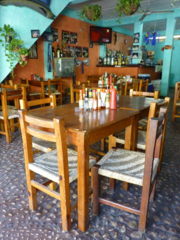
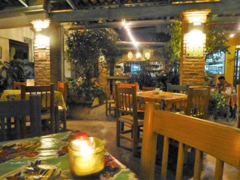
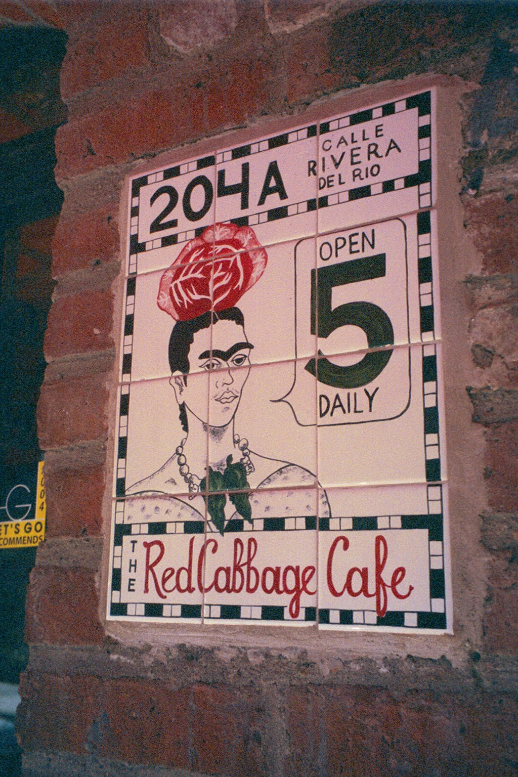
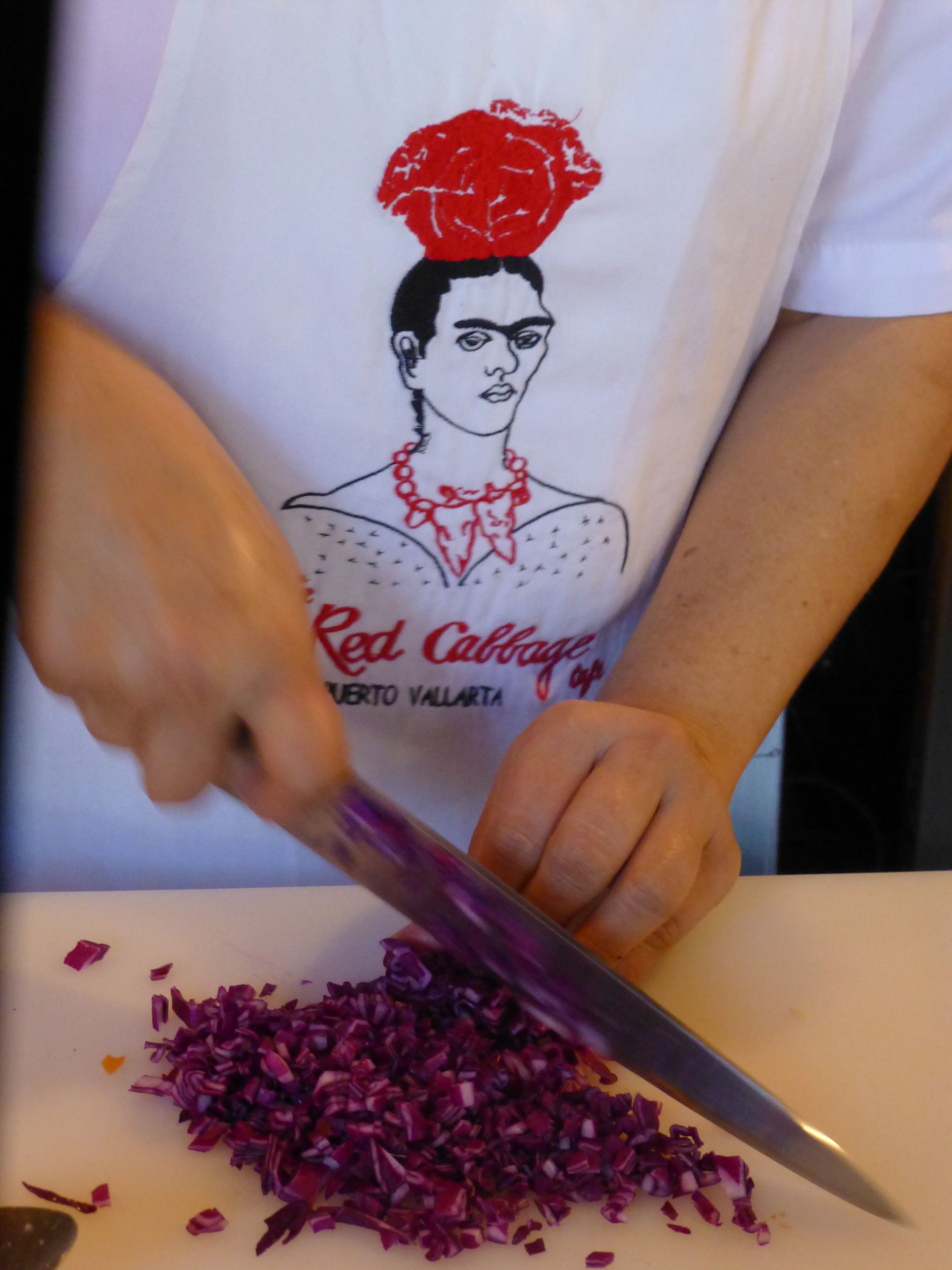
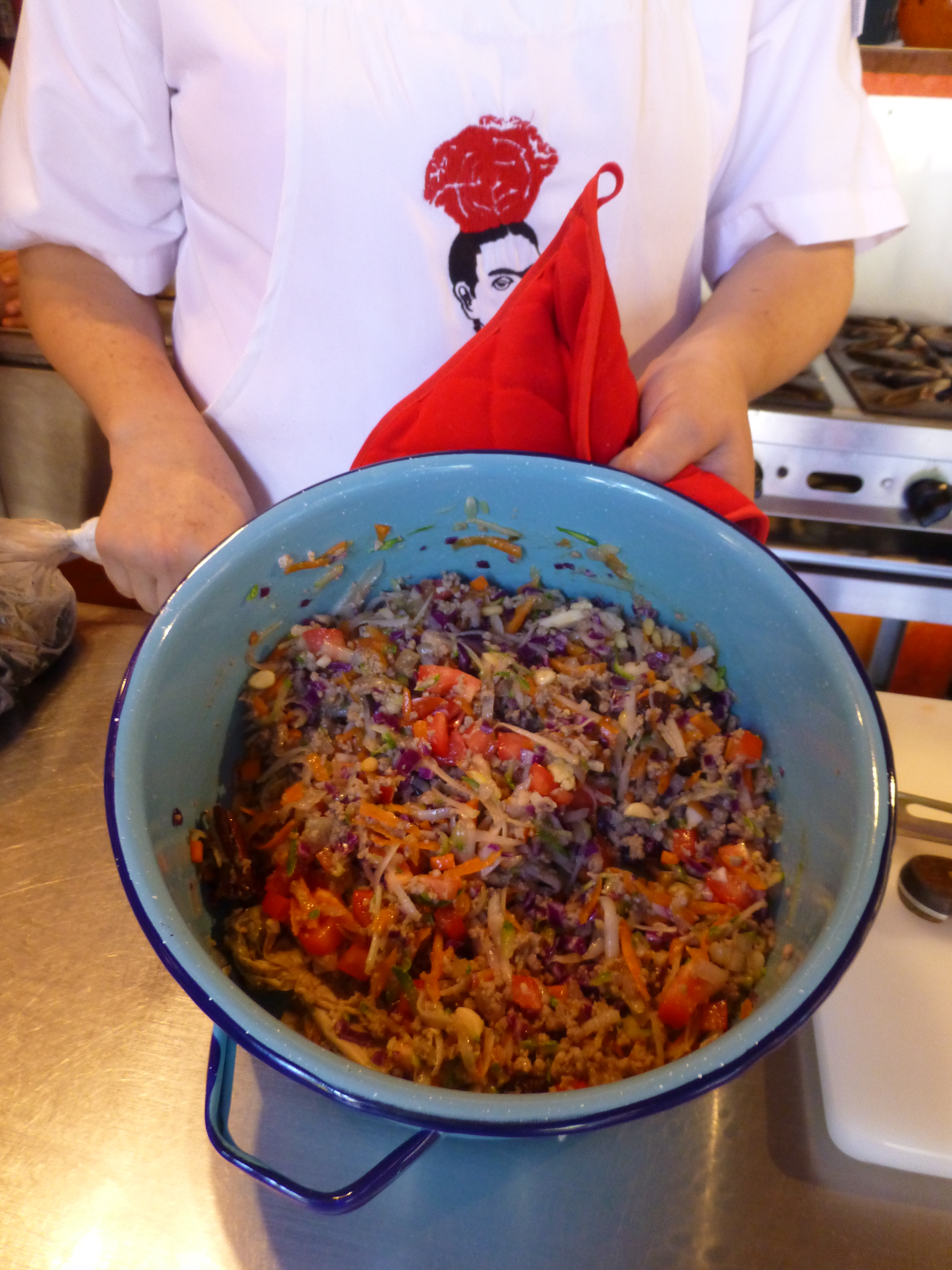
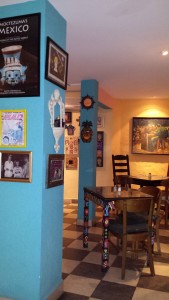
At night this place buzzes with animated conversations and is alive with color and funky memorabilia, art and posters, collages of collectibles all on brilliantly painted walls creating an eclectic artistic interior of fun and festivity. But on this morning, the room is dormant save the three other guests waiting to participate in the morning’s class.

After brief introductions we are escorted through a doorway to a narrow concrete staircase. PVR 2011 after girls 1 050 Red Cabbage stairs
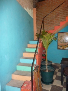
Daylight streams from above and we ascend past more brilliantly painted walls to a second floor open to the sky onto a patio rimmed with potted herbs and flowering plants. P1120475 
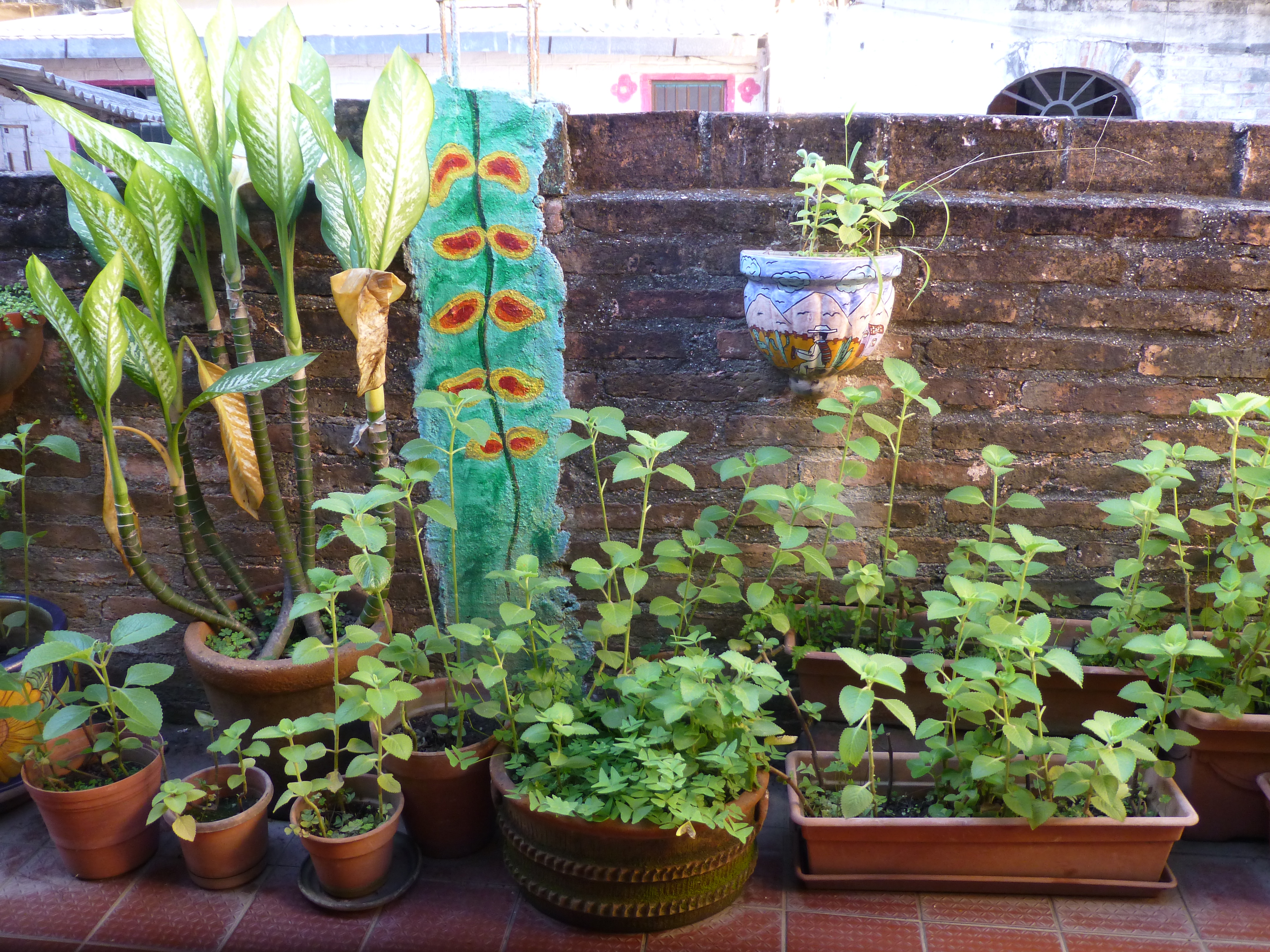
To the right we realize that the rest of the space is undercover, yet always exposed to the elements from that one open east-facing orientation.

Inasmuch as I love cooking and eating and all things related to culinary pleasures, this is not the focus of this story, but rather, it is to describe this artfully inspired space and all the raw style and primitive grace we encounter in this wonderfully entertaining class of good and indigenous fresh foods and their fabulous flavors.

The space is charming and intimate and spotless. The colors are screaming from every direction including  a whimsical pink door surround seen over the wall of the patio. P1120522 
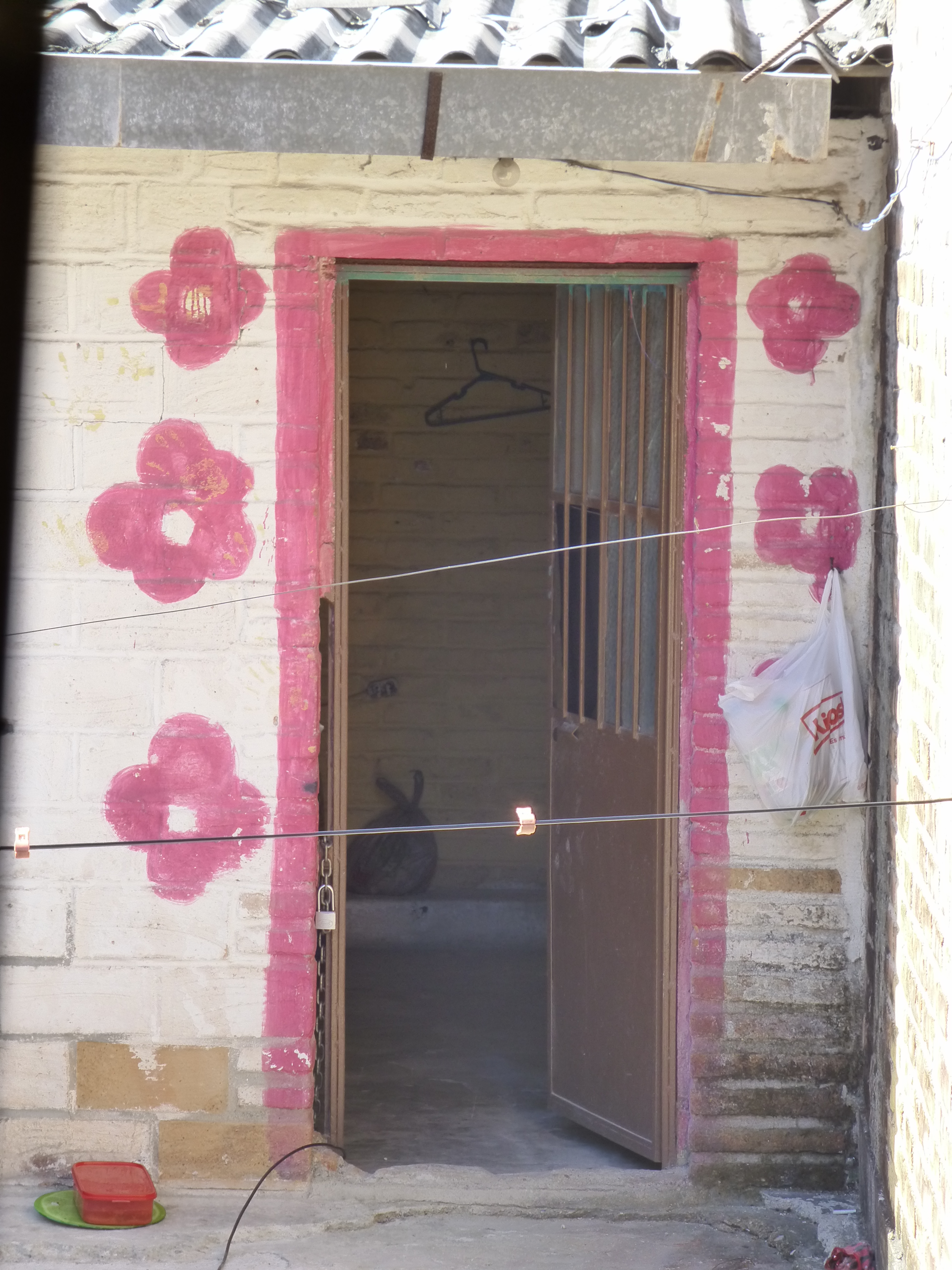
The surrounding area is quite run-down and depressed, yet this jewel of a creative kitchen space shines boldly amidst the  impoverished surrounds. P1120524

The sky is perfect blue and sharply contrasts against the wavy pink paints dividing between pale and happy bubble gum of the stucco wall. A functioning drain-pipe of clean white PVC bisects the wall beneath which is a profusely blooming rose-colored azalea in a clay pot. P1120523

Panning into the covered portion of the space, the radiant coral color wall wraps to the back and transitions with gracefully wavy detail to a paint remarkably resembling the sky blue—of the actual sky—that we encountered out front which slams into a dazzling yellow-gold wall half painted and half tiled with the same luminous yellow color. And I have only described the backdrop!


Against these boldly painted and tiled walls are layers of other things that add even more dimension and interest to the kitchen. Blue and white tableware, glazed clay vessels, and a mysteriously faded poster of Frida Kahlo. More of the sky-like blue is hanging in the form of various sized and shaped enamel cooking pots on the coral wall.


The crisp white aprons of the two chefs pop against the background of multi-colors branded with the embroidered red and black logo of Frida with a red cabbage balanced atop her head. P1120487

It seems from the murmurs coming from the eager students that this enchanting environment represents the promise of a flavorful feast of color and texture. The food matches the interior. The stuffing for the dark rich green roasted poblano peppers is a colorful collection of shredded carrots, red cabbage, zucchini, tomatoes, raisins and pine nuts creating a seemingly woven fabric of colors and texture. P1120491


The finished product, Chiles en Nogada, represents the Mexican flag of red green and white. Plated here on red glass for an artful presentation. P1120518

Myriad handmade condiment dishes and traditional serving pieces contribute to the collection of color we are experiencing in this spectacular sensory bombardment. And I mean that in a really good way. The intensity of the colors and layering, the structure and accessories right down to the food and its presentation results in an artistic expression that goes way beyond the sterile experience often connected with the laboratory of a commercial cooking experience.


So we say—why be status quo when you can be individually fabulous, cooking and creating in an unconventional environment that reflects the animation and joy of the flavors that comprise the artful meals?! Thank you Lola for imagining and realizing the Red Cabbage and bringing so many artful, entertaining years and delicious meals to the community of fortunate residents and happy visitors—happy that they were able to find the place!P1120530


Table Dressings From Nature – Inspirational Fun!


It could have been a sculptural piece of drift wood or a gnarly tree branch from the woods or a twisted piece of metal from a salvage yard…but the idea is to see things in a different way and once again—as I have done this before— to make something from nothing. And in this case, with no effort or manipulation—just the natural beauty of the found object.

The tide was out making the beach so wide it was like a great runway of wet sand. Scattered on the surface were the leavings of the waves – pieces of shell and polished stones. There amidst the beautiful debris was what looked like the suggestion of an abandoned boat hull—a dried, darkened palm sheath. I instantly knew, this would be another beginning of the tropical table-scape that I am so fond of creating when we are at the beach. P1110860

“Creating something from nothing,” my father would often say. He was a great believer in that idea that one man’s trash was another man’s treasure. We loved to beach comb together whenever we found ourselves at the tide’s edge. Sometimes it was tropical and the coral was bleached white and pocked with texture. Fine mesh pieces of purple sea fan and perfect little green “hat” shells would be nestled among the dense collections of heavier piles of white coral.

Then other scenes would find us on northern beaches of the Maryland coast where there was no coral but the ocean would wash multi-colored surf-polished stones onto the shore blanketing the sand particularly at the very edge where the water would curl between the beach and the ocean’s depths. Tiny purple and pink clam shells would peek, being abruptly exposed and quickly bury themselves back into the wet sand moistened with  each incoming wave.

On this day, the warm breeze is tropical and the beach is expansive offering rare treasures scattered broadly but sparingly on the pristine surface of sand. It is here that I encountered my centerpiece.

Don of course is saying—”what are you going to do with that? It’s too big. Leave it here.” And I assure him that it is in fact a treasure and that it will be magnificent in the center of our dinner table where we are entertaining 11 for festivities this coming weekend. He, as always, acquiesces knowing that it is futile to stand in the way of my wildly enthusiastic creativity. P1110861 P1110871

Over the next couple of days, he and I both collect white stones and shells on our daily beach walks. At my instruction, we only collect white unless it is a particularly interesting shell. The idea is to have the stark contrast with the dark hull of the palm sheath.P1120142

Our dining table is a handsome slab of travertine marble. Laminated to a double thickness and finely finished with a smooth full bull-nose edge, it is the perfect organic surface to build this also very organic centerpiece.

It needs something…the neutral tones are lovely. Yet, the dark espresso brown of the palm sheath with the white of the stones, against the creamy surface of the travertine invites something more. I realize that it can only be enhanced with another layer of organic material – here in the form of the fresh verdant green palm fronds – the perfect punctuation! P1120102

Oh would that I had collected more flat oyster shell halves…they work so well for votive candle bases…but alas, parrot green cocktail napkins will have to do for this last minute detail.

Our woven palm place mats, in their natural dried flaxen color, compliment the rest of the organics on our table. And as night falls, the sun drops beneath the sea’s horizon and twinkle of scattered candles finish our scene. Salud!


National Poinsettia Day and Cuttings to Carry into the Future

Thank you Joel Roberts Poinsett for bringing this brilliant red and green explosion of color and such a perfect plant to represent the colors of the Christmas season to our northern climes! Upon learning that today was National Poinsettia Day, I set forth to learn a bit about why…P1110598

You too can Google it, but in a nutshell, back in the early 1800s, this observant amateur botanist was our first Ambassador to the new Republic of Mexico! Not to mention, his day job was that of a doctor and a soldier! Busy well-rounded guy it seems!

Poinsett sent cuttings of this spectacular and exotic flowering plant from where he was visiting in the Taxco region of Mexico, to his home in Charleston, South Carolina. Once he returned to Charleston, he spread the joy and sent other clippings of his magnificent discovery to friends including a Mr. Buist in Philadelphia who gave a piece to Mr. James McNab who took it to the Botanical Garden of Edinburgh, Scotland founded in 1670. (From “Paxton’s Magazine of Botany” 1837)

The initial botanical name Euphorbia pulcherrima was actually assigned by a German botanist, Wilenow, in 1833, but within 4 years it was renamed Poinsettia Pucherrima by William Hickling Prescott a historian and gardener who had been asked, by someone in authority, to rename it. He did so by selecting to honor Joel Poinsett for his numerous achievements in both government and horticulture.

This dramatic flowering plant comes in many colors – the familiar and original red to creamy off-whites, chartreuse, pinks and various variegated versions such as this fabulous marbled specimen called strawberries and cream.strawberries n cream poinsettia

Poinsett retired from his career in public service as Secretary of War in 1841. He became one of the founders of the National Institute for the Promotion of Science and the Useful – which later became the Smithsonian Institute. I was born in D.C. and raised inside the Beltway and never knew that the Smithsonian which was a memorably mandatory field trip nearly every year of my childhood, was originally named the wordy National Institute for the Promotion of Science and the Useful – but it certainly describes it all in one fell swoop!!

There are many legends and folk stories centering around this “flor de Nochebuena” in Mexico but the thread of this story that has personal interest to me is that the same poinsettia cutting taken to Edinburgh by James McNab is still producing and flowering annually in the Royal Botanical Garden in Scotland to this day.

As I read this history, I was excited about this remarkable tracing of the original cuttings.  In our family we have what my grandmother , Dee Dee, always referred to as “the family cactus.” This rounded, smooth leafed variation (some have pointy, spiked leaves)with its hot pink blooms is our cactus.P1110601

Dee Dee, Anna Ives Wagner, was born in 1892 in Youngstown, New York.  She arrived at our house to live with us in the late 1950s. She brought with her a very special plant. It was a cutting off of the original plant that was in her ancestral home – the Root Home, Twin Pines – 830 River Road – then Main Street, Youngstown.

Dee Dee remembered that plant from her childhood and had heard from her mother and aunts that it was there in theirs as well – which without complicated math puts it in the house since the mid 1800s. Unfortunately we don’t know when it started…but the house dates back to our great, great, great grandfather, Dr. Benjamin Root c.1840. The house stayed in our family, passing finally to my  grandmother’s aunt Helen Root who lived there with an original cutting of the plant until the 1950s when she moved to Elmira with her niece and her husband, Edith and Ray Hulbert.

We grew-up with the family cactus bursting forth with wild fuscia blooms every fall into winter. It was always an exciting and exotic flowering extravaganza in the colder dark months of the season. It brought a sense of life, growth, and color that was a spectacular contrast to the otherwise drab, dull, dormancy of winter.P1110609

I guard my plants, given to me as a cutting by Dee Dee when I first moved to New Mexico, with great responsibility and appreciation.

Last year my Mother’s large family cactus withered before our very eyes…she was so protective of it that she perhaps neglected to give it new soil and nutrients instead favoring watering a bit too much which  resulted in its demise. As she witnessed and worried about the failing plant, we carefully cultivated clippings and as weak and depleted as they were – nurtured them in water losing a couple but saving a few so that they now are flourishing in a clay pot in a window with the soft daylight of  northern exposure displaying a resiliency, hope, and celebration of life that continues to greet each day. Perhaps  metaphors for procreation, family traditions, aging in place…

My mother is 93 and her mother, Dee Dee, lived to be three weeks shy of her 101st birthday.

Joel Poinsett died on December 12, 1851 at the age of 72 – one hundred and sixty four years ago today! Happy Poinsettia Day!! Merry Christmas Joel Poinsett!


Holiday Tablescapes KISS Theory!

For the fast switch , KISS is the name of the game – keep it simple and sensational! The Thanksgiving weekend creates a great opportunity to get a jump on Christmas. Yesterday neighbors were out precariously placing lights along their rooflines, lining walkways and blanketing shrubs. We noticed this as we were out walking, observing, not quite ready to dive in to the next holiday ourselves.

But I did think that this was a great opportunity to illustrate a continuation of my favorite seasonal design practices and that is going outside to nature to get inspiration and actual elements for my creations. And the most remarkable aspect of this exercise is that it is all in our own yard. Look around and you will be amazed at what is out there!

For Thanksgiving I had been inspired by the blazing colors of the Bradford Pear that was – is still – screaming with color at the front of our house. 20151126_093537
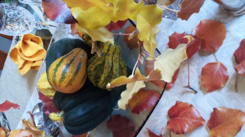
The rich maroons transitioning to corals and rosy tones into brilliant golds and even bright yellows  were irresistible. It’s similar to a maple tree with its magnificent range of fall colors but with precious little round heart-shaped leaves. 20151126_093558

20151126_095436 - Copy
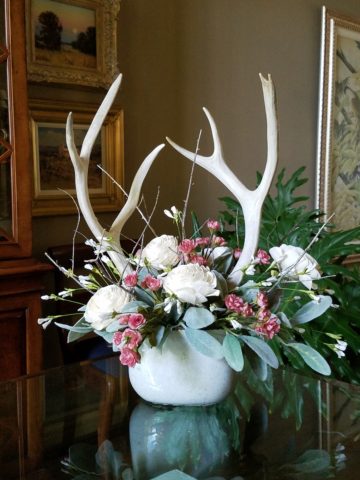
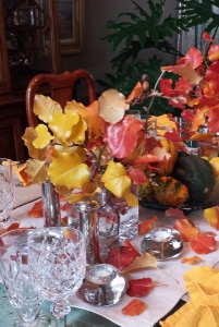
I created a tablescape using short-cut branches in a pair of squatty square glass vessels flanking a large square hand-blown glass platter. In the center on the platter, I gathered acorn squash which we will be enjoying baked with brown sugar and butter later this week, and added some ornamental gourds for their interesting shapes and colors. 20151126_093945 
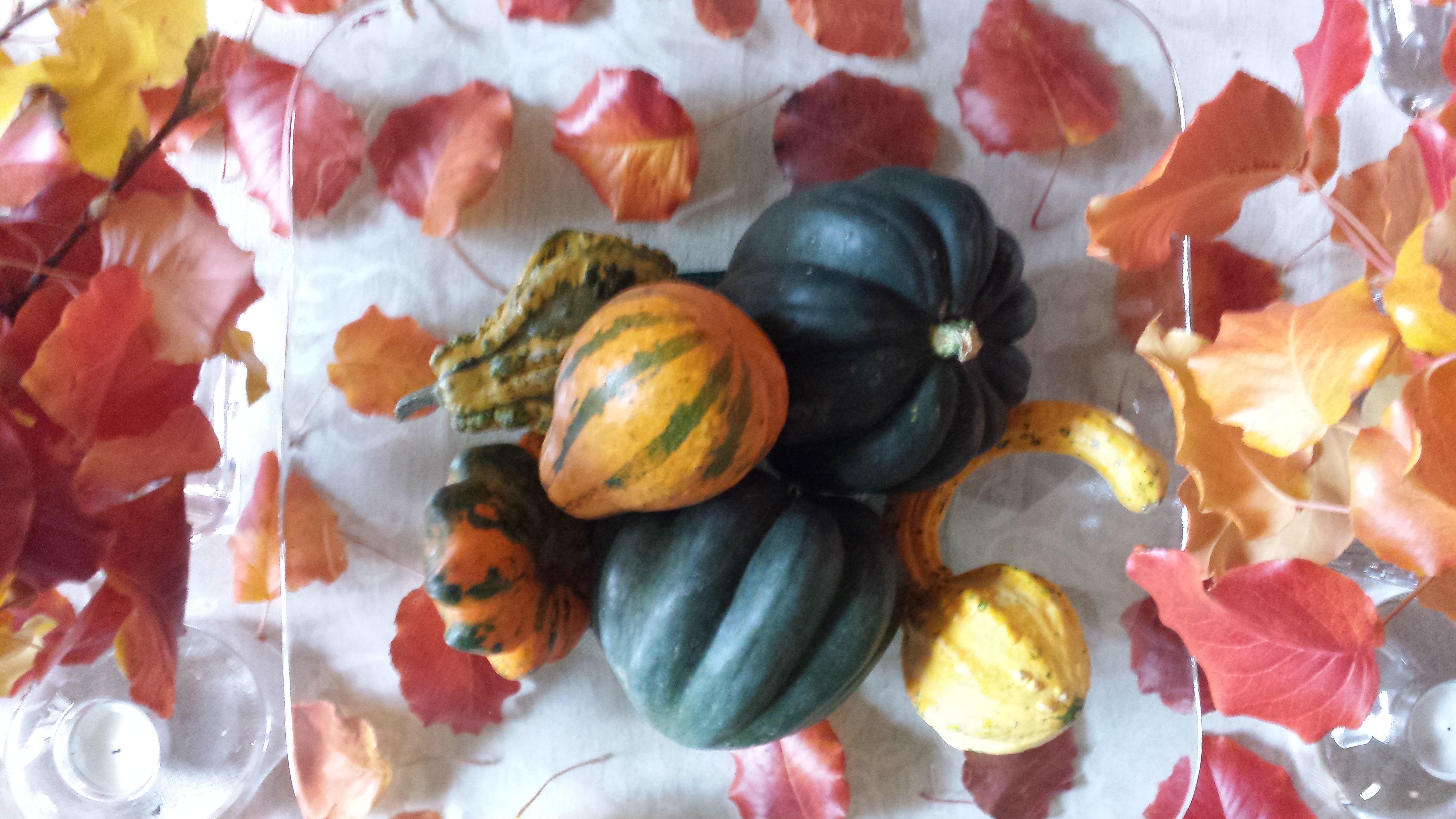
After scattering some of the leaves around the arrangement on the neutral linen table runner, the result was boldly colorful, organic and spicy scene bursting with autumnal warmth.P1110503
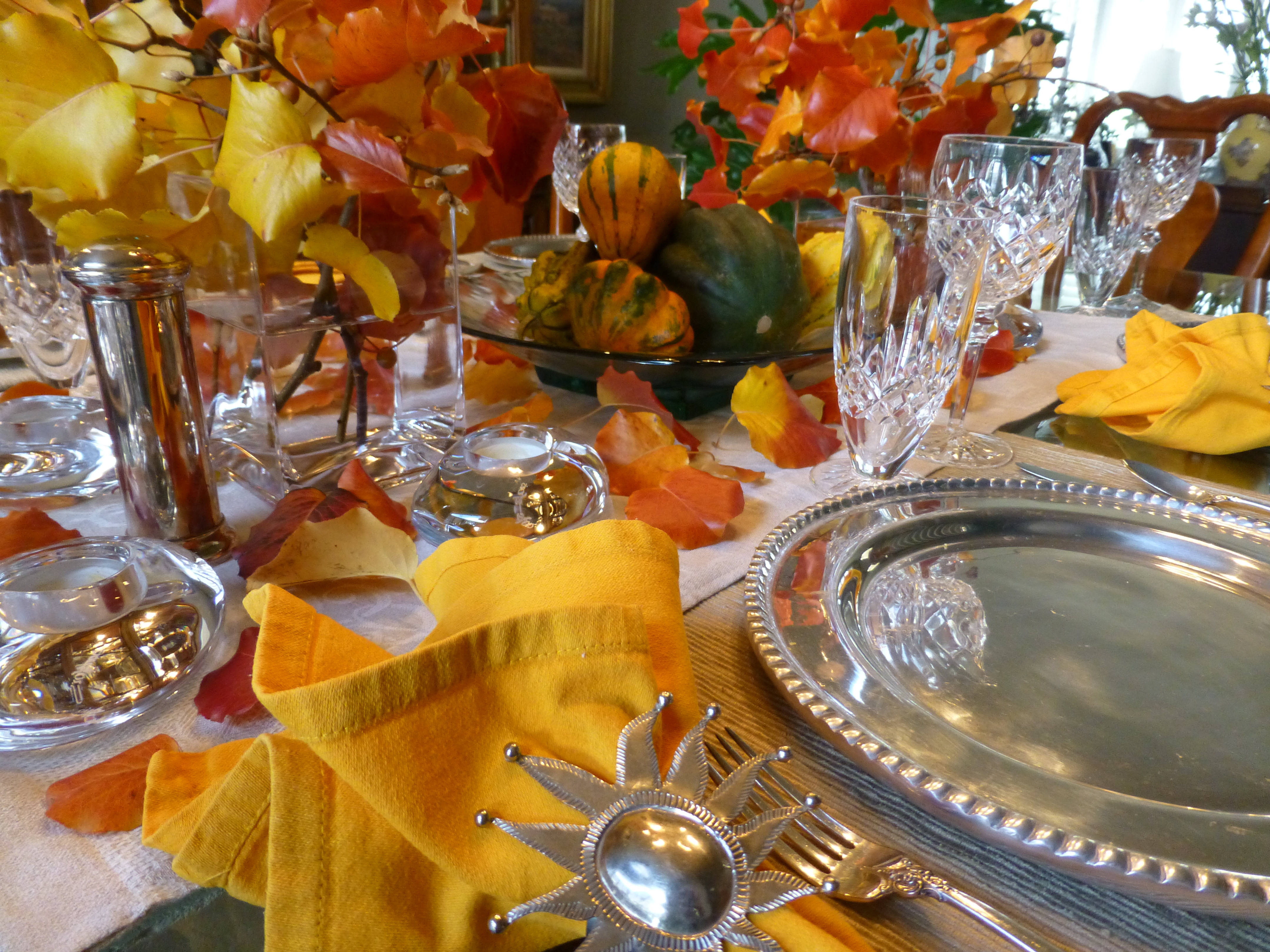
So as I pondered this setting this morning, two days later…the leaves on the table were getting crunchy, the branches were dropping leaves and the water in the containers was a bit cloudy…time to clean it up! Since it seems that everyone is already transitioning to Christmas themes, I thought why not do the same?! The alternative of merely cleaning it up and leaving it barren was a bit anticlimactic after enjoying the spectacular beauty of this recent  holiday table. So here again nature was calling to venture forth and scour the yard for the next seasonal statement.

Now remember, this is just a quick transition…I can take it leagues and layers further as the weeks progress by adding holiday runners, ornaments, some bling and other accoutrements. But for today, the switch is quick. I ventured out into the yard and cut some bushy mugo pine and smoky blue spruce branches,  P1110558 
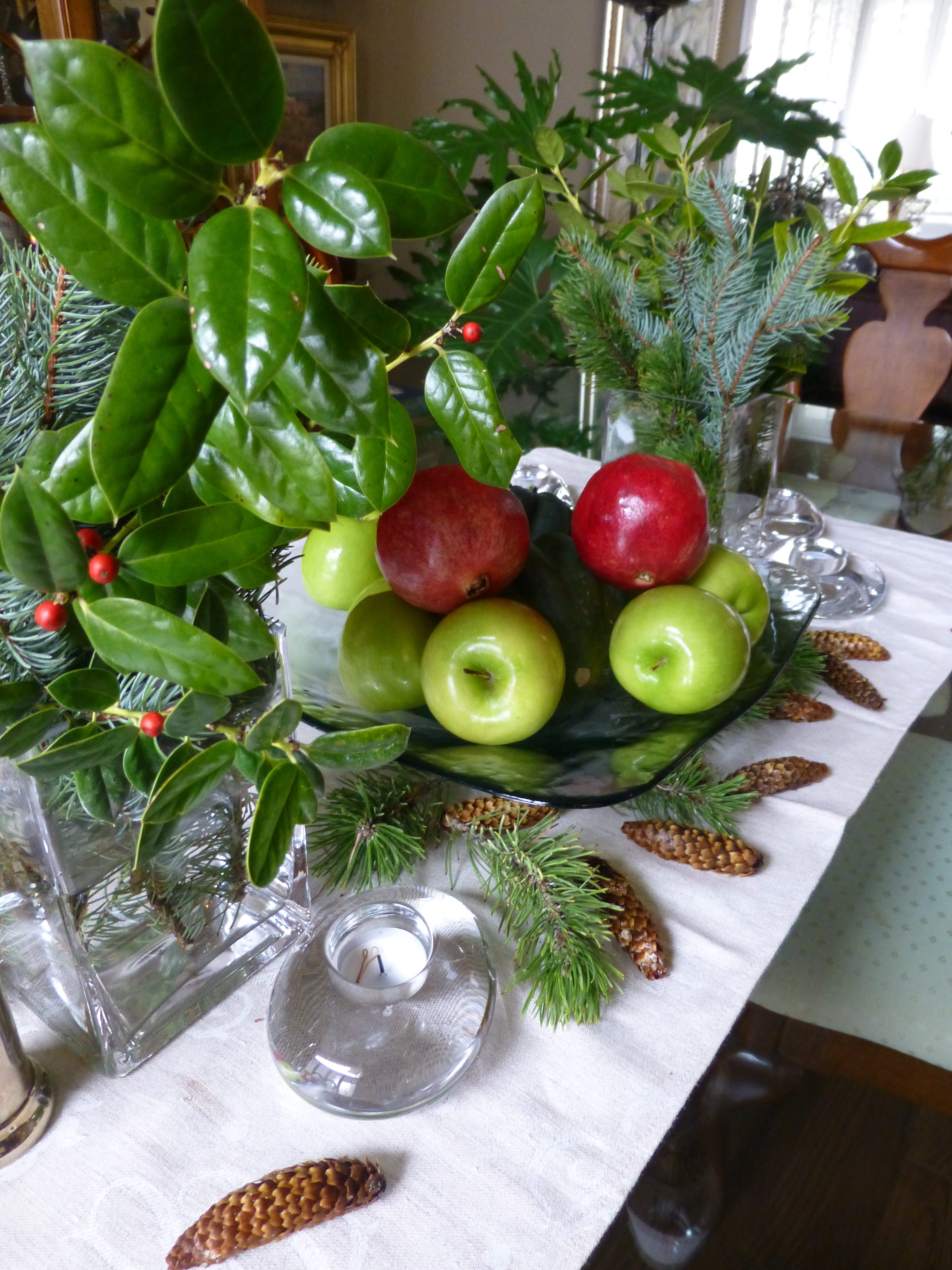
a few holly sprigs from the bushes in front and jammed them into the same freshly refilled square glass vases. In the center, the neutral linen runner remained and on the glass platter I kept the acorn squash, traded the gourds for electric green granny smith apples and a couple of pomegranates ( I had bought three last week and had already picked my way through the many juicy morsels of one – leaving two to do the red thing in my centerpiece today).P1110556

I scattered a few pine cones and Voila – my instantly transitioned tablescape said “Christmas is on its way!”


Valentine’s Dinner at HOME!

Creating a romantic and interesting table for a special Valentine’s dinner offers so many opportunities for presenting your heart-felt feelings. With a little effort to select some key pieces to dress the table and by selecting some simple yet scrumptious delights, you will have a wonderful memory to cherish. Here are some suggestions and a couple of easy menu ideas too!

We’ve heard the truism of “The way to a man’s heart is through his stomach.” But the same can be said in reverse as there is something irresistible about a man in control of his kitchen. Pairing the two is the ultimate love cuisine when a couple cooks together sharing the tasks, sipping cocktails and enjoying the process.

The recipe for a romantically successful Valentine’s Dinner at home is so easy. Realize that you don’t have to drive – thereby eliminating that concern after enjoying your cocktail and bottle of wine over dinner. Not to mention the after dinner sip of brandy or bubbly.

Starting with cocktails and hors d’ oeuvres, go to your favorite online foodie place for recipes for things such as stuffed ripe red cherry tomatoes – luscious and sensuous. For the carnivores, a rich and savory pate with toast points is a delectable treat. Maybe shrimp cocktail – easy cooked shrimp with a spicy valentine red cocktail sauce. It’s fun to have your appetizer someplace other than at the dinner table. If you use different places to enjoy the different phases of the evening, it will create more interest. So perhaps around a coffee table or at a bar counter-top.

Consider taking a walk after the cocktail hour before you progress into dinner. Whether freezing or mild, as long as it is not terribly windy, the temperature shouldn’t matter. Strolling under the darkness of night – perhaps moonlight – is a great way to transition through the phases of the evening.

Candles are a must. There cannot be too many. They don’t have to match. They can be tall tapers, multi-height columns, squat votives or all of the above…Obviously, on the dinner table…but don’t forget other end tables and cocktail tables, fireplace mantles, window sills, bookshelves, counter-tops, bathroom counters or shelves. Watch what’s above – or use artificial candles to avoid burning an upper shelf or art above them. Any light fixtures should be on dimmers. Avoid over-head lighting as it is generally not flattering, casting unpleasant shadows that can ruin the mood. Lighting is like a paint color – it bathes the space with ambient light and also task specific spots – getting the right balance controls the mood.

Image

WE LOVE New Mexico’s own Besito Caliente ! This spicy sauce of hot little kisses is great on grilled meats, drizzled over cheeses for hors d’oeuvres or a dash in a special cocktail concoction! You tell us how YOU enjoy this tasty condiment from the sunny southwest’s Land of Enchantment!

Main courses are easiest by minimizing time in the kitchen. Grilling is perhaps the least complicated. To make it special, select something that is a little different from your norm like lamb chops or bone-in rib-eye steaks. Potatoes are classic in many forms baked, twice baked, mashed with various herbs, but don’t forget something fast and festive like quinoa. It is a fabulous grain-like nutritional bead that cooks in less than 15 minutes! Vegetarians might grill a shish-kabob of goodies like zucchini, mushrooms, cherry tomatoes, sliced turnip…limitless possibilities – great with quinoa too! Salads fit the bill and can be varied according to your taste, sweet cranberry or strawberry laced greens or garlicky Caesars – the possibilities are endless. By putting the salad on the main dinner plate you eliminate the need for a veggie on the plate. If you prefer the more formal setting of a separate dinner salad, the veggie can also be an easy piece of the program with steamed Brussels sprouts or broccoli which take so few minutes, slathered with butter and voila!

Of course you can make the cooking more complex and complicated – but here the idea is to DO IT and not be intimidated or worried about making things too difficult to tackle! Focus evenly on a simple but romantically fun themed table dressings, menu items, and schedule for the evening and it will be easy and successful!!!

Image

Find fun table dressings to create your Valentine’s dinner scene.

So pick up some red plates or smaller dishes or bowls for salad or dessert to layer on your existing white ones, find some fun cocktail glasses, wine stems, clever cocktail napkins, a great serving platter for hors d’oeuvres, heart-shaped confetti or rose petals to sprinkle on the table and dare I say, between the sheets?Image

Find a great vase in which you cluster fresh flowers for the dinner table and perhaps another primary surface like the cocktail table or bar. Buy or make a great card and/or a memorable gift.

An extra thought for this holiday…Can you think of someone with whom you would not usually exchange Valentines’ but who would be cheered by your gesture? Pick out a simple token to mark the day for someone you know.