Hidden talent – that remarkable artwork that appears (seemingly) out of nowhere, on a par with great masters of the medium. I considered this element of surprise – looking back several decades to a local painter, Wilson Hurley, who had more than one very different, distinguished career and diverse life experiences before he delved deeply into his passion for painting in his 40s. Once exposed, his paintings revealed his extraordinary talents and he become a nationally recognized treasure for his sweeping landscapes and a variety of other subjects.
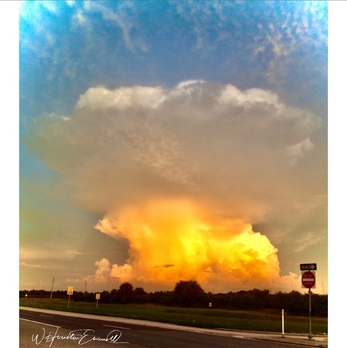
On that note, I have just gotten off the phone with a very good friend, in Florida, Houston Evans. I have recently learned that he is a passionate weekend photographer! An amazing photo appeared in a Facebook post and I was astonished by the enchanting image, color and composition. I was instantly captivated – and curious. Upon closer inspection, his stylish swashbuckling signature made me realize that this hobby was subtly becoming more than that – yes, he had his mark digitally mastered and is probably THE perfect brand for his diverse and stunning work.
“Star Power” is the luminous celebration of a pineapple.
As I quizzed him about his interest in photography, I learned that he attributes his eye for art, color and design to his mother who’s side of the family has spawned other talented artists, in his generation. He has been posting on Instagram for quite some time – hundreds of images. I didn’t know. I didn’t “follow.” He is modest about his photos and does it for his own amusement, pure pleasure and personal enjoyment – that he likes to share. “I don’t do it to imagine it on someone’s wall.” Yet this observer believes that there is where it absolutely should be! Many walls…many places! #houstonevansphotography
He plays with the medium and all the tools and tricks of the trade. He enjoys the freedom of experimentation. The results are controlled, yet spontaneous. From high resolution to fuzzy pixels that require distance to assimilate. Up close for precise detail and soft smears for imagination to take hold, the variety of clarity or lack thereof are a part of the experience and expression.
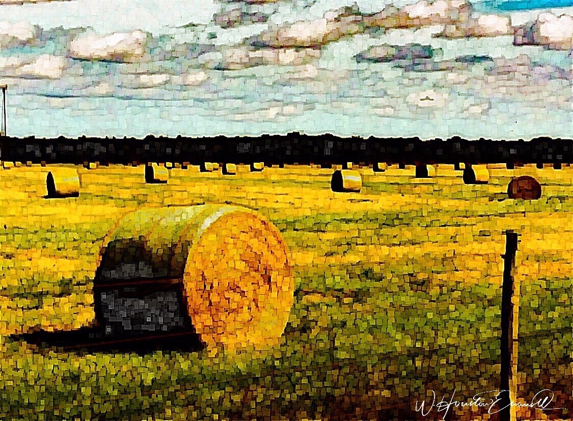
“Makin’ Hay” has an enhanced pointillist treatment – a Van Gogh-esque subject with a twist.
From my interior designer’s perspective, his bold images would be key focal points in the drama of architectural spaces – interiors from Miami to Honolulu and on around the world!!! I can see the towering orchids in hotel lobbies, bars, restaurants and swanky condos everywhere!!! I am eager to find a project, for which his work would be the key to the scheme, unveiling a spontaneous design resulting from the inspiration of the image.
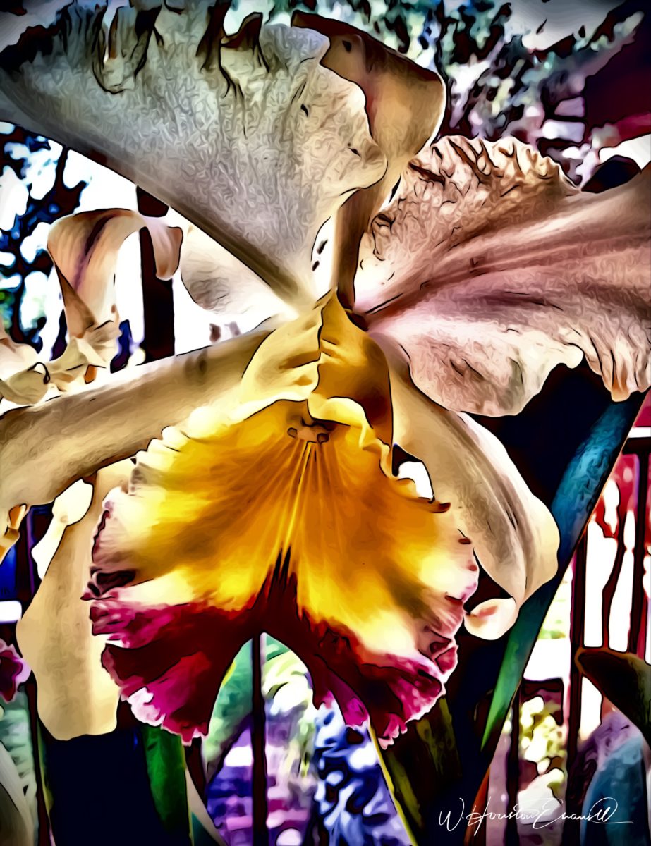
“Oblique Orchid” screams floral superiority as a commanding focal image. “Shooting the Bird” speaks to paradise revisited!!!
In the beginning, the photos stood on their own merits. Evans keeps his originals – some of which remain just that – in their original form, while others are tweaked or more radically manipulated to create stunning subjects and compositions.
This brilliant, fresh simplicity of “Aqua Eye” observes the droplet’s reflection in the center of the cheery chartreuse petal. Coming upon a cool caddie “Daddy Long Legs.”
I can see his limitless fantasies contributing to the imaginative narrative of Meow Wolf, gracing hotel lobbies with larger-than-life orchid explosions and commanding condo walls with magical statements of tropical color, subject and form. Translucent installations of LED illumination could result in magnificent walls of design influence.
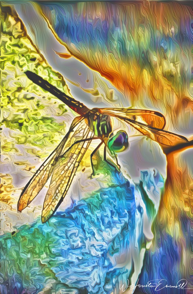
“No Flies on Me” is a fantasy of oozing colors and form melting and melding around the psychedelic dragon fly.
The digital age is advancing with such a pace that we are
all caught-up in photos of food, whacky selfies and sunsets on fire…but
having an artist’s eye, to truly see the potential and master the tools that
are now available – using them to create valid and valued masterpieces of art,
is extraordinary.
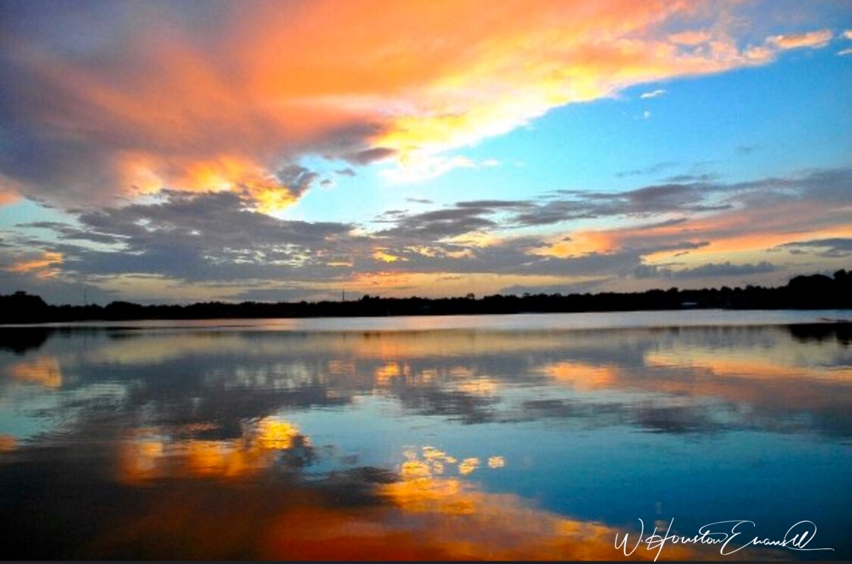
“Copy Cat” reflections mirror a chorus of color from sky to watery impressionistic likeness.This “Roadside Attraction” must have been a startling scene to distract dazzled drivers.
I truly believe that his work is exceptional – full of heart and soul – and spectacular fun!!!!!!!! I’m thrilled to learn of these images and now enjoy the continued progress of his discoveries and creations. Let’s see where this goes!!!!! He just might be coming out of hiding!!
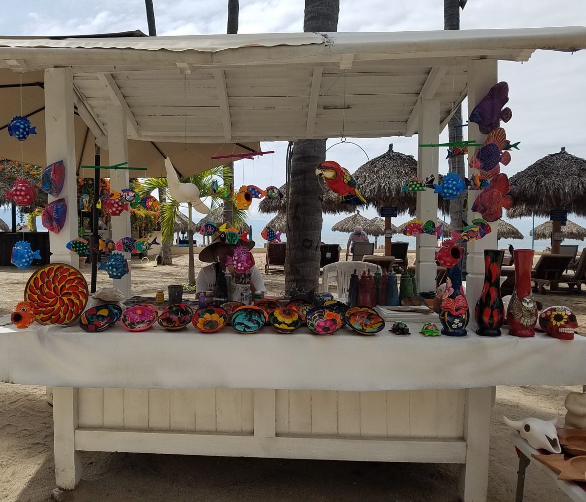
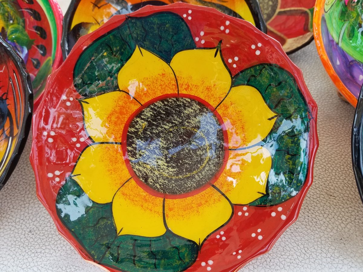
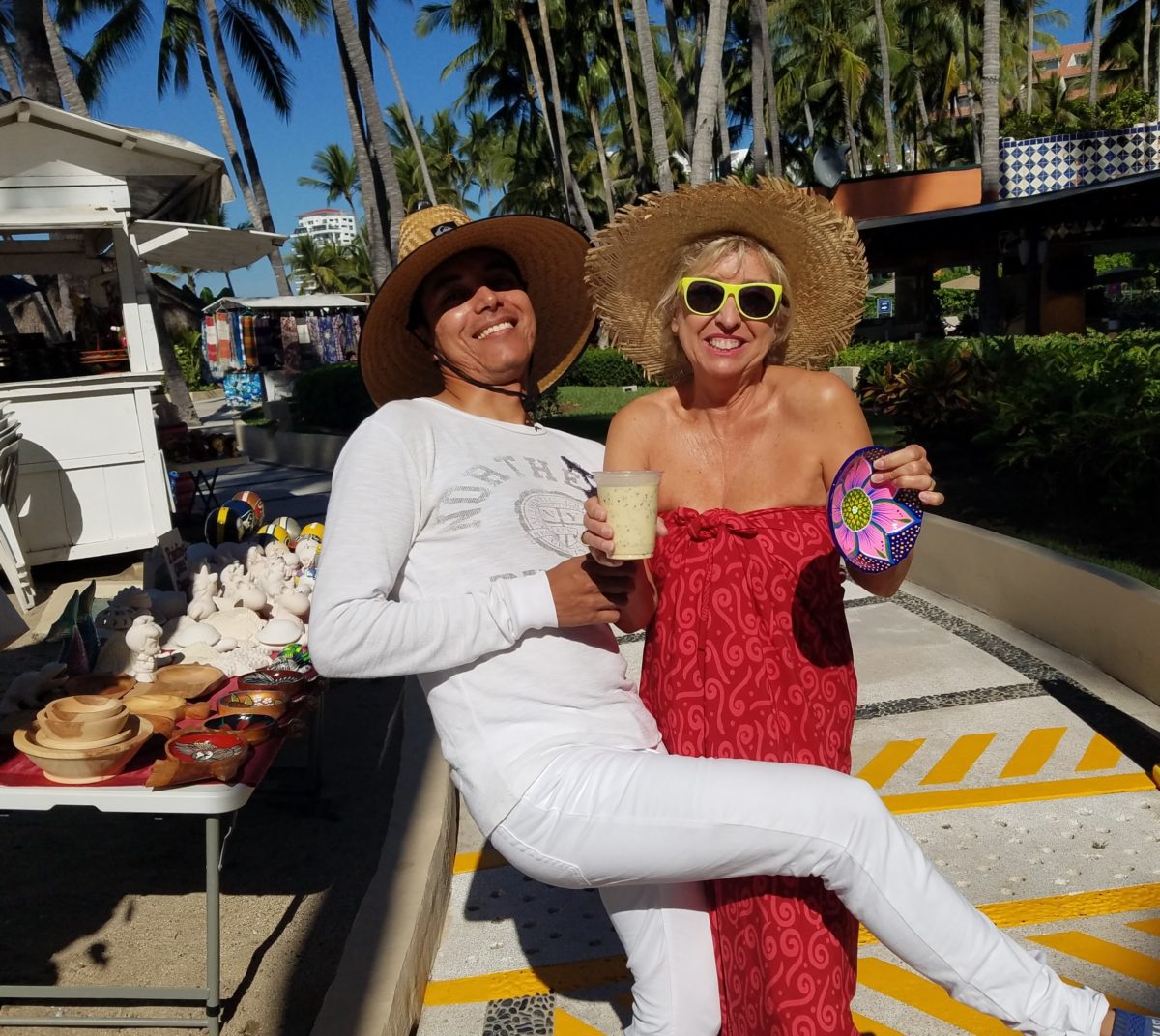
Hidden genius can be found amidst seemingly redundant arts and crafts. Walking by you might not notice. Passing by many beach stands, they begin to look alike – very repetitive. The colorful wares and handcraft are striking and eye-catching and full of fiesta, yet if you pay attention you will notice the nuances. Discovering the true designer/artist.
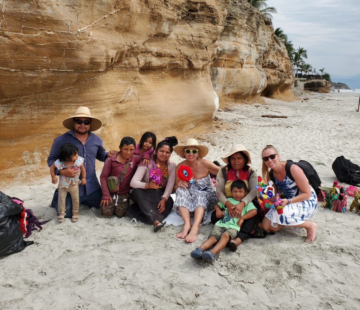
An escape to the tropics and especially to another country offer a reprieve from the cold and add an exotic element to getting out-of-town. Discovering the many indigenous art forms that come from all over Mexico is fun and exciting. Getting to know the makers and the distinctions in their work is another exciting level of appreciation.
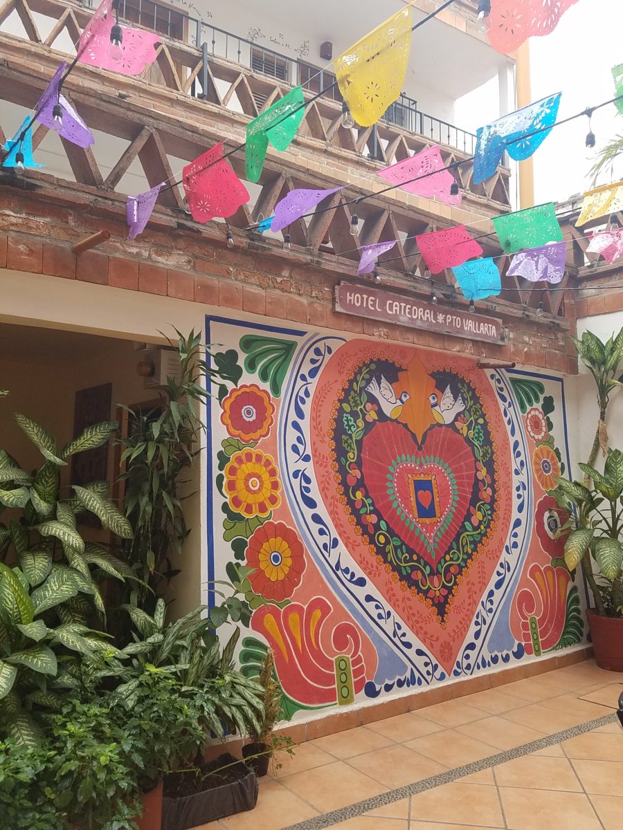
As is true with so many things, detail and design matter. I buy a smattering of things for my gallery/gift boutique. I like to support the local vendors and makers that produce these fantasy-filled folk-art pieces. From fabrics to stuffed animals, painted pottery to murals and mosaics, the art is abundant and deserves to be examined.
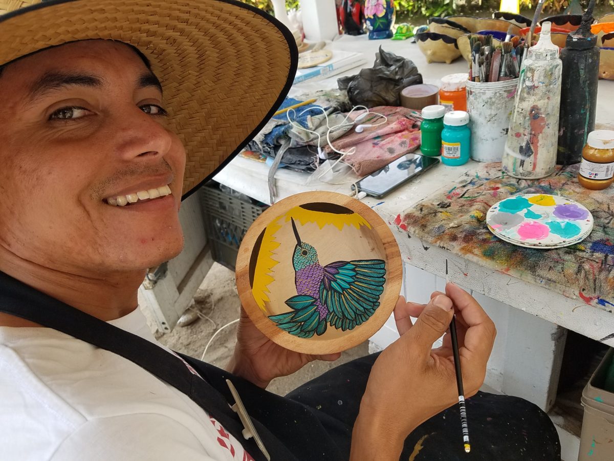
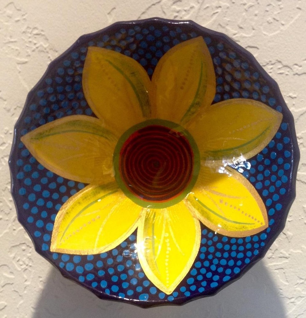
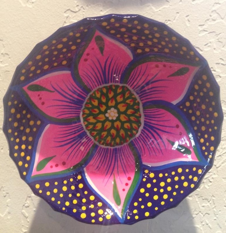
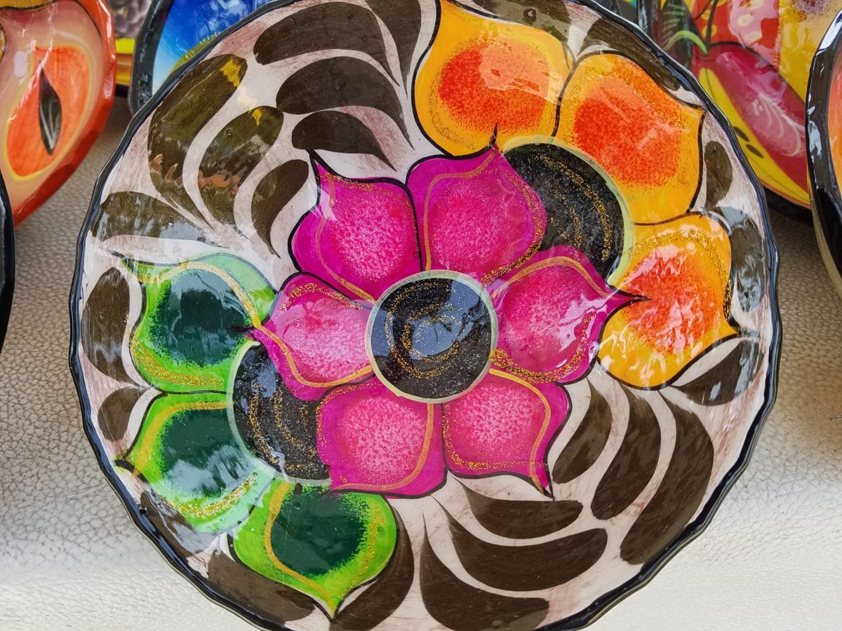
As an example, I am focusing on Victor Rivera. Victor is an artist and more so, an incredibly gifted designer. His sense of pattern and imagery is exquisite. It reminds me of my mother’s love of Marimekko and Lily Pulitzer in the 60s and 70s. Her appreciation was a tremendous influence on me. The joy of color and pattern was a exhilarating celebration to wear and accessorize your home. Victor seems to possess a like-kind of innate sensibility and talent for devising and executing sensational color, pattern, motif and resulting design. He is currently creating, from a modest beach stand, what I believe is clearly different from others doing what might be thought to be similar work.
Like Maija Isola – a peer of my mother’s, having been born in the 20s her designs transcend the many decades in which she influenced color, pattern and bold imagery. Her work continues to live and influence the evolution of Scandinavian artistic direction and its impact on the world of design. https://www.marimekko.com/com_en/world-of marimekko/design/designers/maija-isola
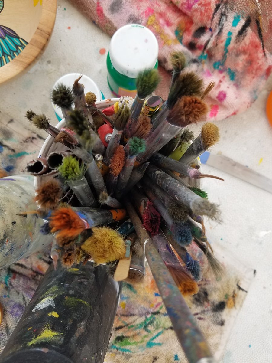
Watching Victor select his brushes, for the various applications and control on his designs, is fascinating and amazing.
The sense of pattern and design is a different category of artistic talent, in my observation and estimation. A master, of pattern, form, design detail and art, is an artist. However, the focus on the repetition and integral connection of patterns – for this purpose in a one-dimensional application – is an intensely different pocket of an artistic brain.
And this brings me back to Victor. I want someone in a position to embrace and promote him, in the world of fabric design and influence, to catapult him to the level to which he can and should aspire. Shout-out to Alegreea and the fabulous designers at Pineda Colavin!!!!!!!
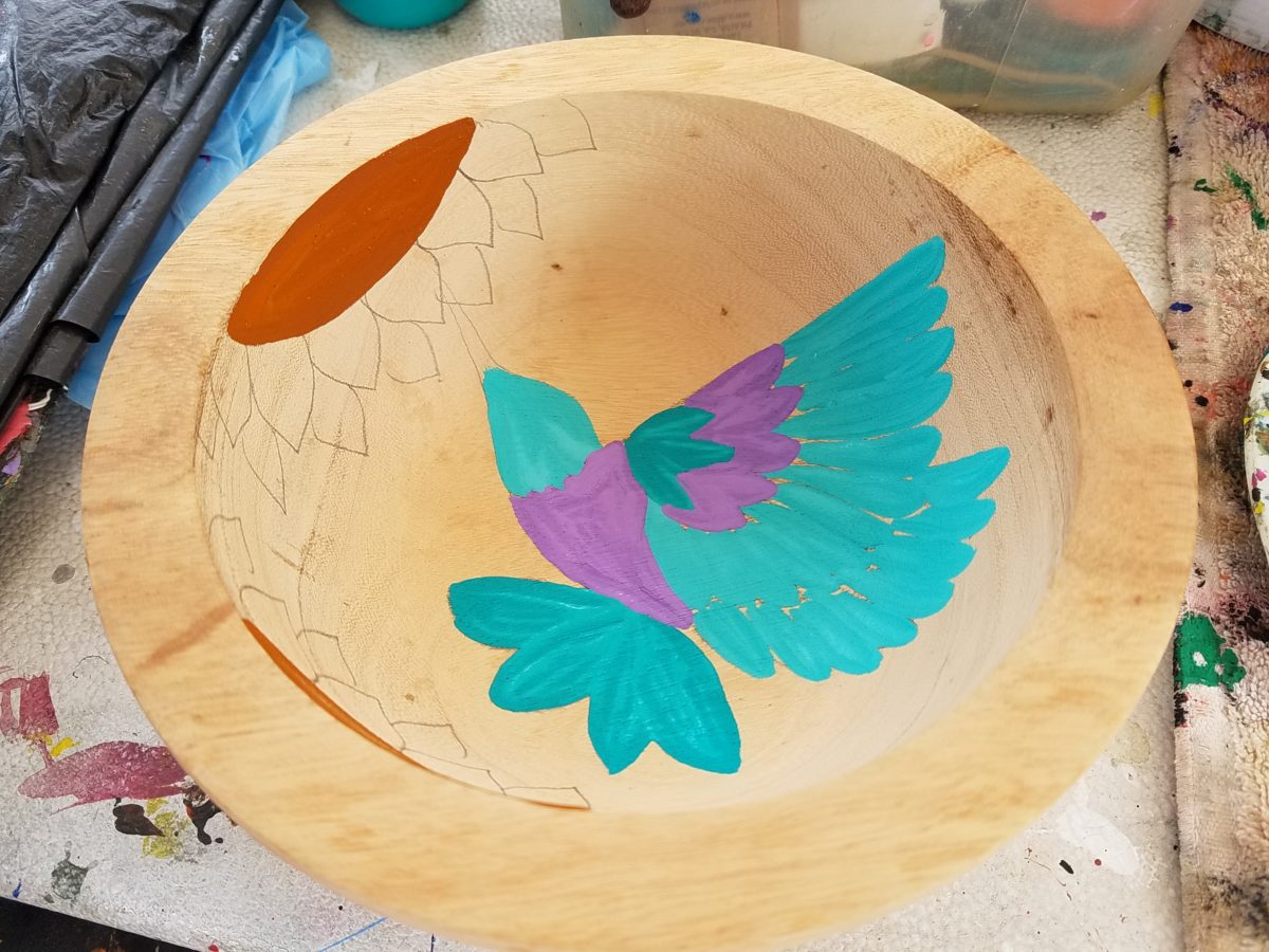
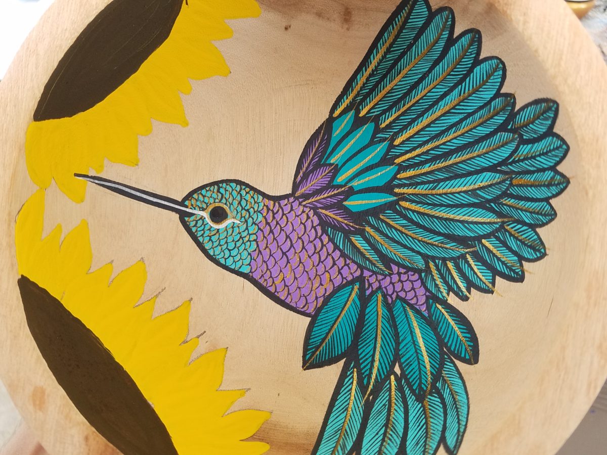
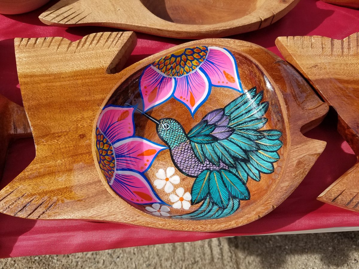
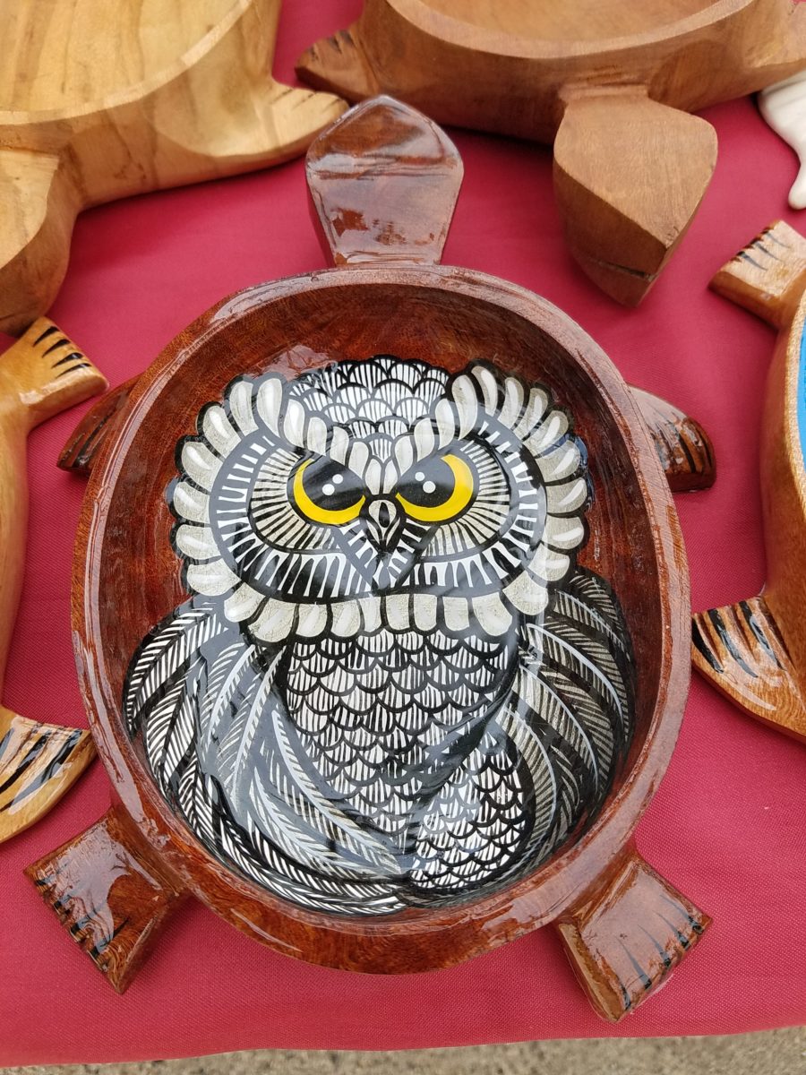
His hummingbirds begin with a pencil drawing and basic “fill” colors at the start. Working on both clay and wood prefabricated bowls by other artisans, his many layers of colors and details take shape.
With myriad, mostly monotonous, Mexican street/beach artists, Victor is a beacon of light that stands out among the throngs. Once you stop to notice – the work he is creating is astonishingly unique and beautiful. His designs are laced with meticulous detail, outstanding color combinations captivating and beautiful.
He will paint expeditiously simple works to satisfy the tourists and keep an inventory at the ready for spontaneous purchase – but when he has quiet time and is caught-up on his table of offerings, he creates amazing pieces that are truly remarkable. It is important to note though, that his more expeditious pieces still have a color combination with strokes of accents that still are above and well beyond the common.
He will paint commissions all day long – but left to his own devices, his creativity is boundless. And, referencing back to the Scandinavian designers, his floral designs are outstanding!
Taking time to examine the world around you and the beauty of detail that awaits, is a joyful experience of great discovery and satisfaction! Not to mention great fun!!!
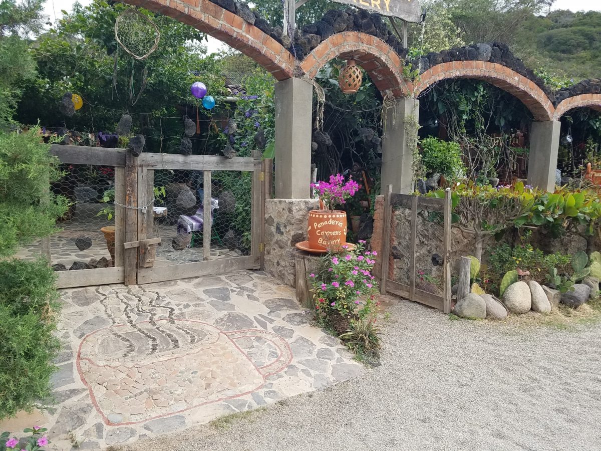
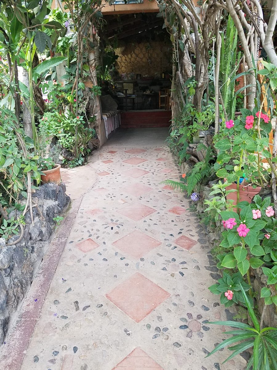
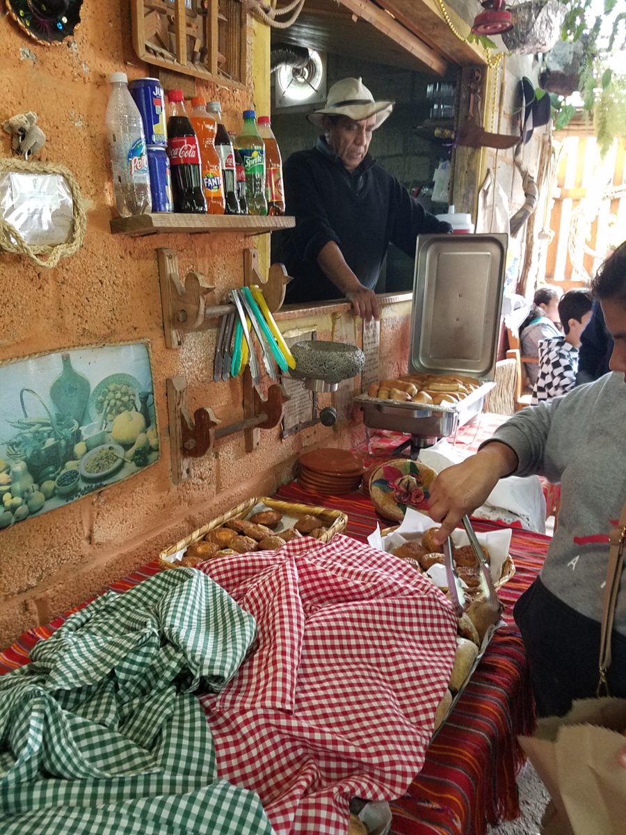
After experiencing and pondering the value of incorporating nature’s elements into architectural planning in the previous blog, I find myself winding into the countryside from sea level to a mile high into jungles and ultimately pine forests, across vast expanses of rivers and towering bridges spanning grand abysses…and stopping at a modest panaderia (bakery) on the side of the road.
You can’t tell a book by its cover as this simple little rural structure – standing alone – looked curiously intriguing and quaint enough, with an unpaved parking area transitioning to well-tended pea-gravel. Traffic cruised by, on the way across the bridge.
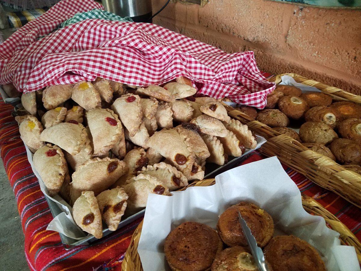
Those that knew, turned in. We pulled off the road and were told that this couple had a wonderful bakery and were promised an exceptional treat! Fresh empanadas that would bring remarkably satisfying mid-morning joy.
Very tidy and thoughtfully eclectic, this little destination bakery is a precious find.
Oh, were we in for a surprise! At the entry, I stopped to shoot the whimsical cup of coffee mosaic set in a field of stone and concrete. I thought – what a fun design element to greet arrivals and set the stage. But I had no idea to what extent I was about to be elated. What unfolded so exceeded my expectations that I wanted to stay all day!!!
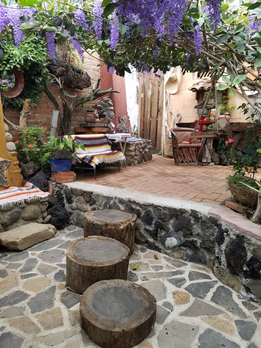
Happy stone and tile-work adorned the pathways. From the textures of stone and brick, tile and wood – it was an organic fantasy – an unexpected design experience.
Simple, yet spectacular – simply spectacular!!!!!
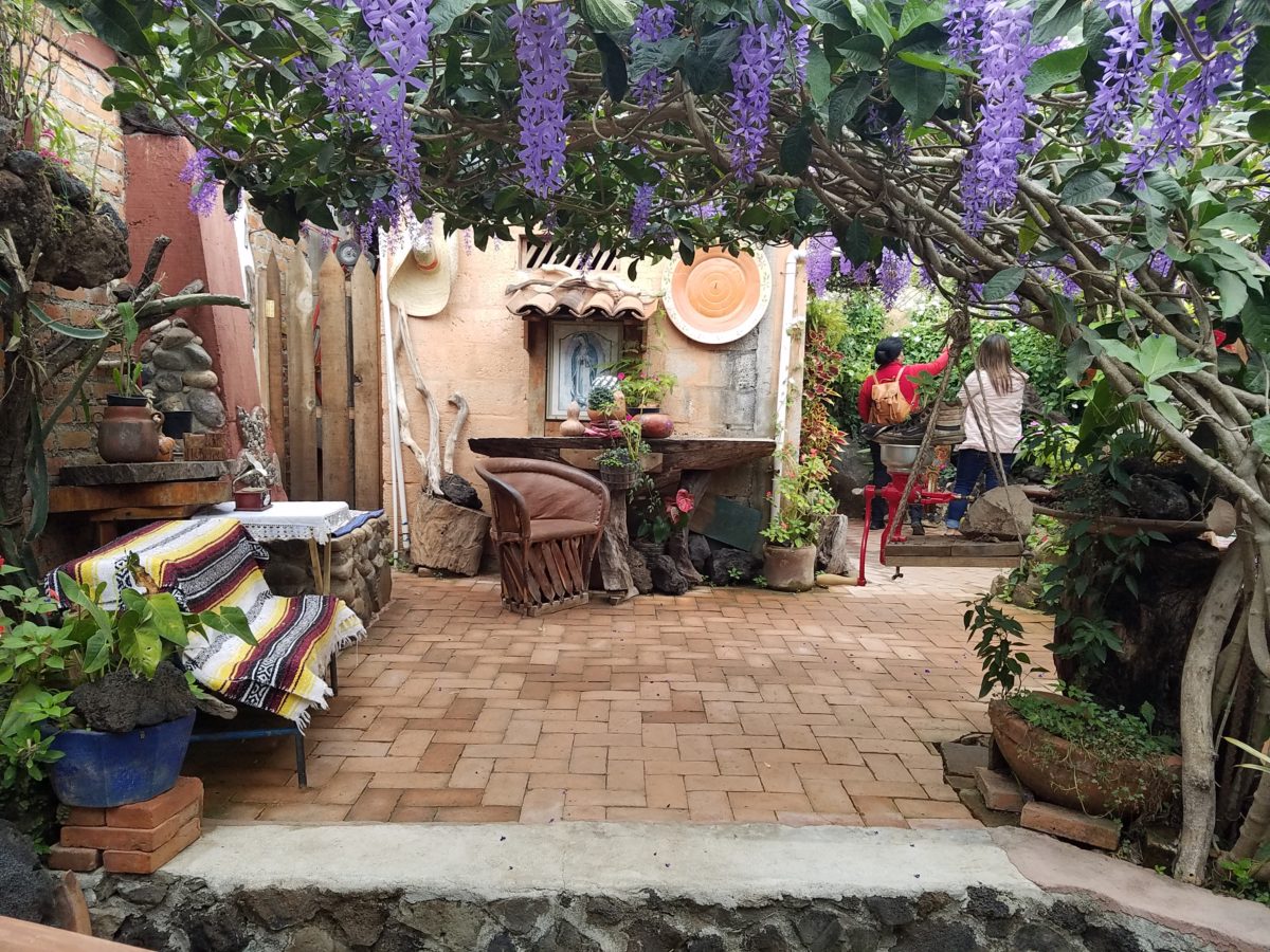
Ceilings of colorful floral blooms – perhaps wisteria – suspended from their vines and other plantings intertwined with the structure.
Spotless and meticulous the eclectic elements were a harmonious creation.Stone walls, wooden slats, vines and adobe all worked together to define the spaces.
The wafting aroma of fresh baked goods – it was more than delightful. From warm savory clouds with mushroom filling and another with chile-laced sausages – and an array of sweet strawberry, cream and pineapple empanadas to corn muffins, banana muffins and more! All nestled beneath colorfully woven cotton tablecloths.
Light and delicious – the best empanadas ever!! With a tiny sprinkles of granulated sugar, for a sweet crunch, before sinking into the fabulous fillings! Muffins challenged any others and savory treats were so satisfyingly delectable. Little buttons of banana slices on top denoted which were the banana muffins!!
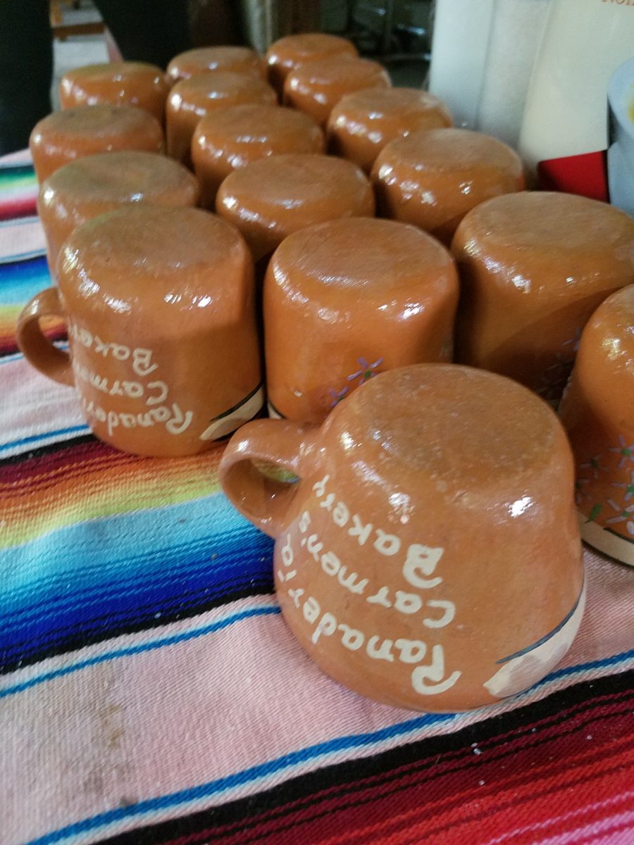
Rich Mexican coffee with a touch of freshly ground cinnamon and luscious hot chocolate were served in custom-glazed “barro ware” complimenting the fresh-from-the-oven confections.
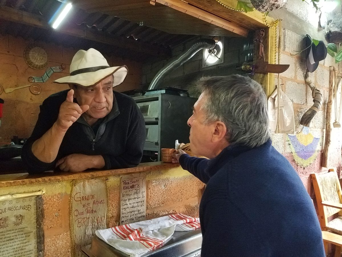
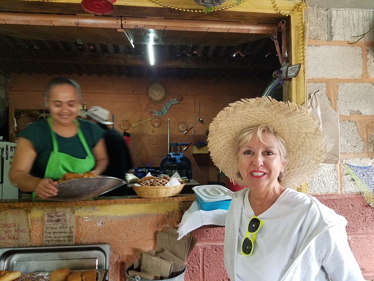
The exhibition baking kitchen overlooked the serving line. The buffet of pastries thoughtfully explained by our gracious and welcoming host, Jesus!
Carmen presents fresh strawberry tarts just from the oven!!! A combination of old and new – tradition and technology meet in this cozy kitchen.
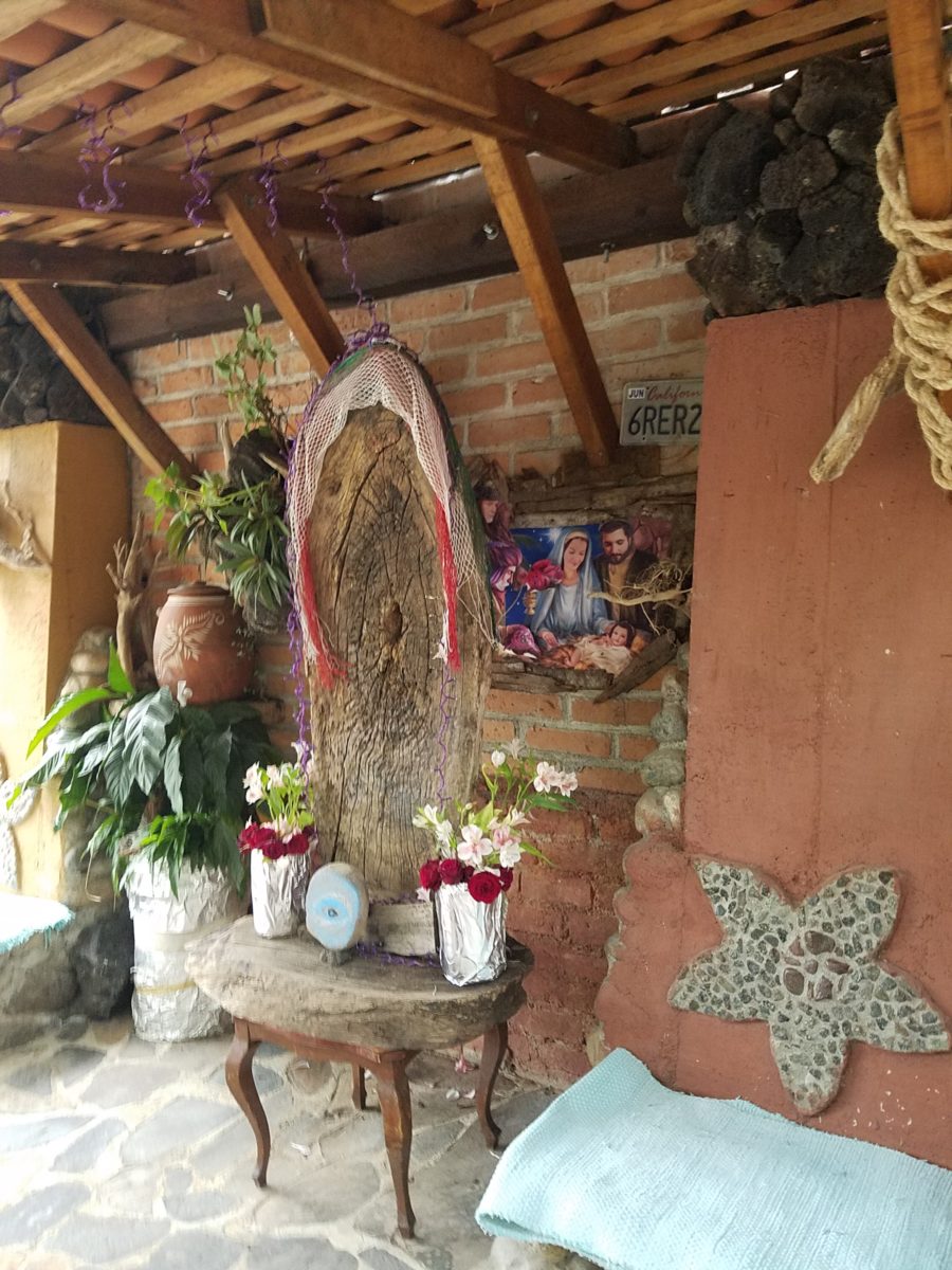
Fragmented spaces open, yet enclosed, offered intimate pockets in which to pause and enjoy.
Color-pops insert themselves effectively around the interior and exterior spaces.Inviting seating areas semi-concealed offer private repose. Tucked away – more areas to enjoy…
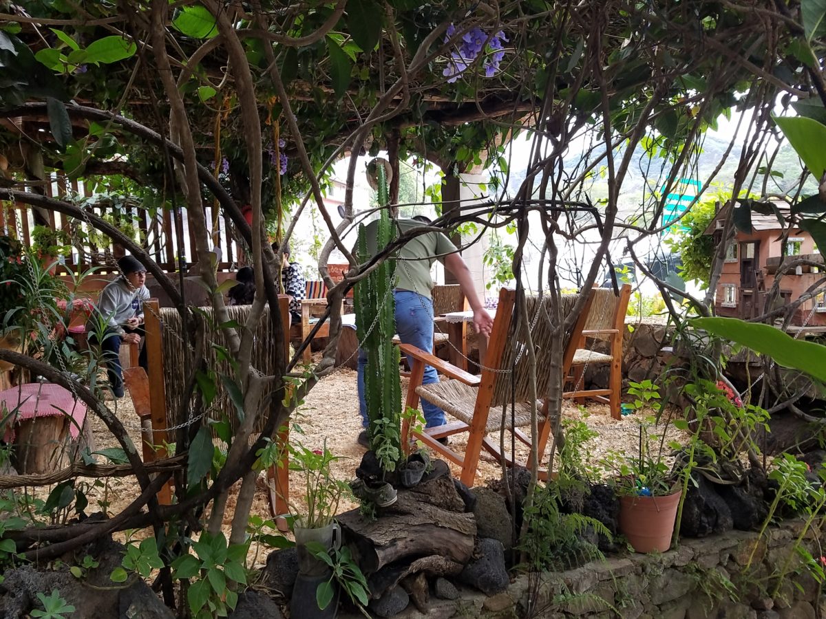
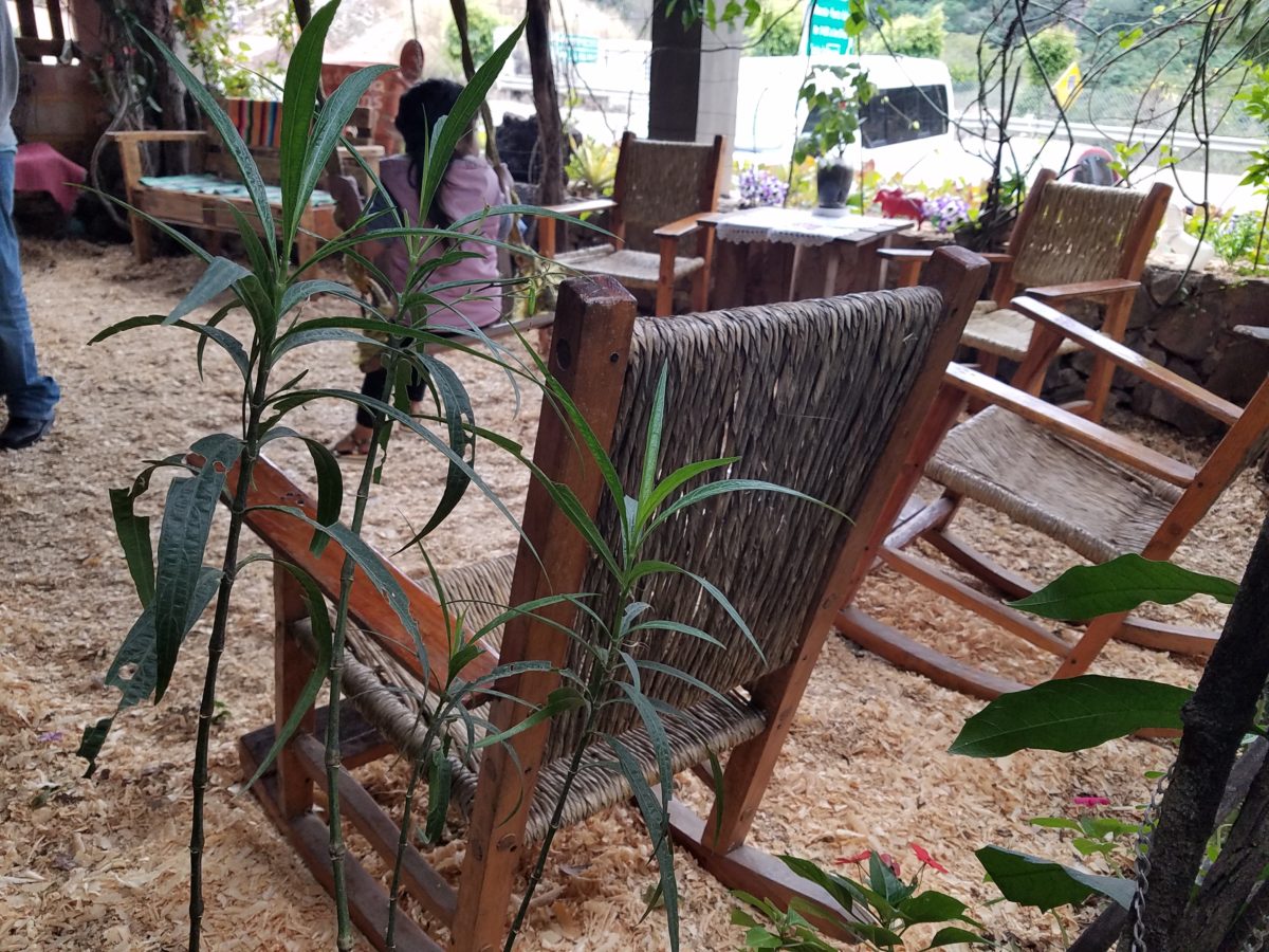
Clever use of clean blond wood shavings on the floor of the main covered patio created a wall-to-wall carpet of fresh aromatics complimenting the inviting aromas emitted from the ovens. Rocking chairs and rigid sturdy versions, with a fun little rope swing, all surrounded by tropical plantings made a cozy area to gather.
Soft underfoot and subtly fragrant – the wood chips make a great shag carpet!!!
As I meandered around exploring all the interesting spaces, textures, colors and plantings, I marveled at the sensitivity with which this had all been crafted and assembled. It was artful interior design with an exterior feel – open air and charming, with a decidedly handcrafted, Mexican sense of place.
Slices of handsome tree trunks make perfect stepping “stones” with graduated heights.
It was an eclectic collage of furniture, structure and organics – living and static – that was welcoming and artful, delightful and so pleasing, that it was a treat for all the senses.
The cool morning air of the mountains mingled, with the comforting fragrances, creating an atmosphere inviting gentle conversations of people gathered around good food and artfully relaxed surroundings.
Peek in places and through doorways to find worlds of design
waiting to be discovered!!!
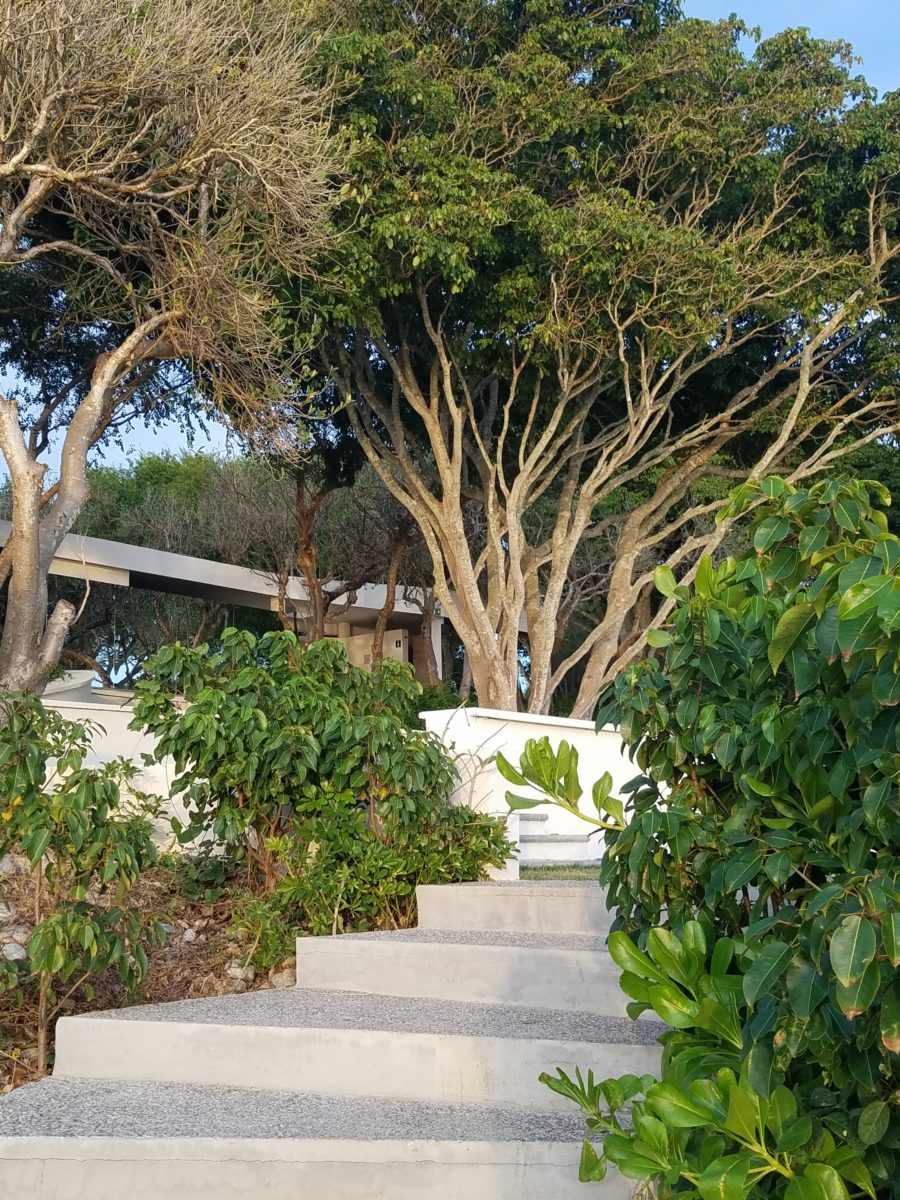
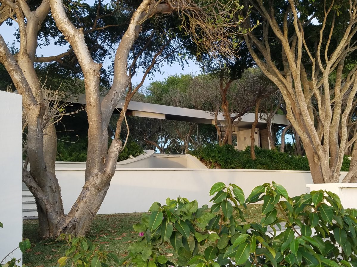
Neighborhood covenants, zoning, physical practicality, budgetary constraints…all enter into whether it is realistic or desirable to save vegetation when clearing land for development. Carving around existing growth can be a tedious and costly addition to a project. But there are times when it is a design asset – an imperative even – to the over-all setting and effect of the scene.
Saving trees when designing a built environment is a challenge
that often pays off.
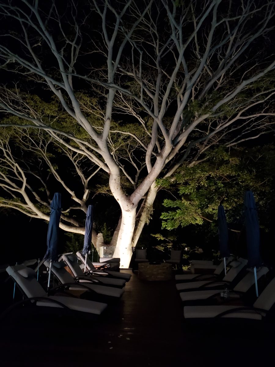
A spectacular backdrop to this seating area – the decades old tree is the focal point.At night – well lit – the same tree towers with dramatic illumination in the darkness as the rear “wall” of this seating area.
Raping acres of woods for barren subdivisions and adding back newly planted saplings the caliper of a quarter is unfortunate and takes years to satisfy. FHA requirements were the tell-tale token of bringing green back after a bulldozer’s brutal removal of all plant-life on a property. That lanky stick standing in the center of a dirt patch, that might get sod or seed…or rock, was a pitiful attempt to give back to the environment. However, in addition to broad-sweeping examples, individual decisions to saver rather than remove can prove valuable.
Years ago, when planning a patio expansion and exterior kitchen, friends brought the plans to me for a quick check before committing to the design from the design/build contractors that they had engaged. The new patio plan meandered along nearly the entire back facade of the house. With all the exciting kitchen layout and bar, seating areas and dining space, I instantly focused on the fact that their beautiful red-bud tree was gone – not in evidence on the pans! I exclaimed about it and was told that they were told it had to go. That was about 10 years ago – or more, yet it still stands today having modified the design to include a tree-well in the patio and opening in the proposed high-ceiling patio cover. The stunning multi-truck tree thrives, in the ground as it had for decades, and climbs skyward through the opening spreading widely toward the second story of the home. A wonderful, living, sculptural element, in the space. Good save!
Warmer climates invite the indoor/outdoor melding of living spaces. We all try to achieve them despite bitter cold transitions and near, if not complete shut-downs “off-season.” But in the tropics, outdoor living spaces become remarkable dimensions to expand living.
Sculptural trees are powerful elements viewed from inside and outside.
This past week, that situation came to mind as I enjoyed several examples of incorporating nature into the design scheme. Yes, landscape design is just that. Landscape architects do just that. They design exterior spaces with organic material. But what I was feeling recently was two complimentary things – one that designing in and around existing growth is so satisfying and in some cases, the living plant material becomes the architecture – not merely compliments it.
In addition to their sculptural beauty, they add balance, scale and a canopy over the exterior rooms.
This past couple of weeks, we have see the results of 2 years of preparation and construction which transformed of a piece of partially vacant land into a seaside resort. Several key palms and a couple other key trees were saved and hundreds more were brought to the site to complete the design. The towering new trees showed signs of shock with their dried frond tips – but will surely survive.
What has been a foreground of some landscaping and virgin jungle ,with houses beyond, was bladed and terraced last year in preparation for a new project. Buildings and pools appeared, jungle growth was removed and a few key organic elements retained. The recently finished scene is dramatically different – incorporating specimen trees throughout the property into the new plan.
When landscaping becomes architecture you know you have crossed an exciting line. What I mean by that is to have the growth become walls – to have the vegetation read as though structural framework.
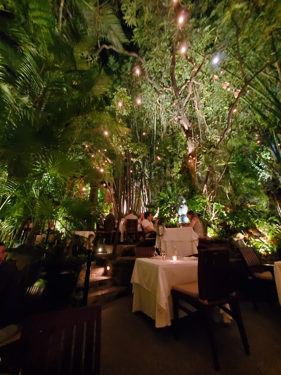
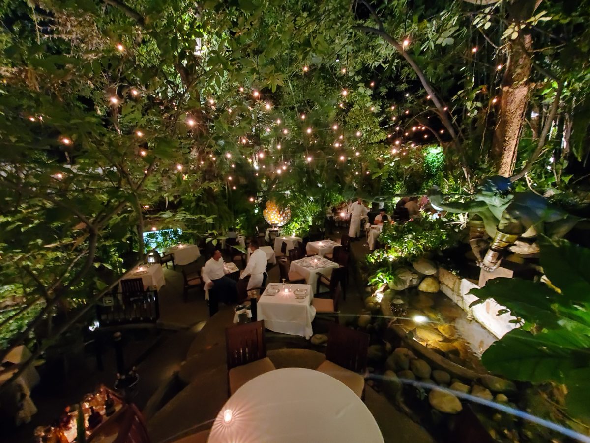
This terraced dining patio is framed by massive bamboo and other large trees and plantings. They are substantial enough to read like screens, if not walls, framing the space. From a canopy of growth, strings of LED lights are suspended as though from the ceiling – a ceiling of branches over this enchanting outside dining venue.
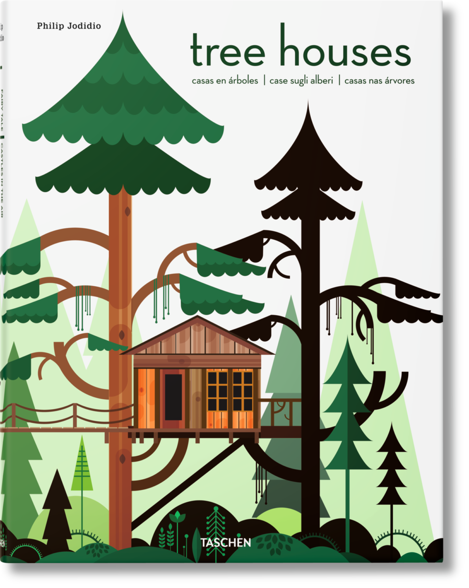
A tree house is another example. The tree is the structure – the framework to begin the additional elements that create a suspended room.
This entertaining and imagination-spurring book by Philip Jodidio is worth investigation. Here. find extraordinary examples of trees as the structure of other amazingly fanciful spaces!
By observing examples in your world, you will see, when designing around and in concert with the natural landscaping, the effects can be dramatic and of great value to the scene. On your next project, consider the possibilities of saving rather than removing – incorporating and celebrating nature’s design elements!
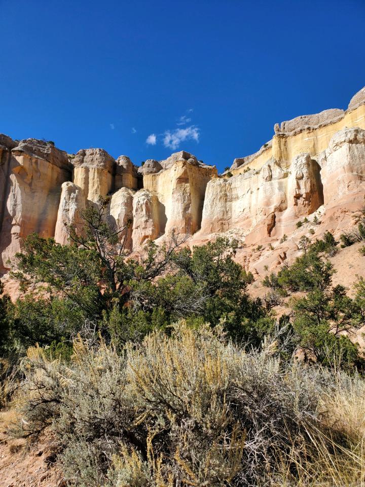
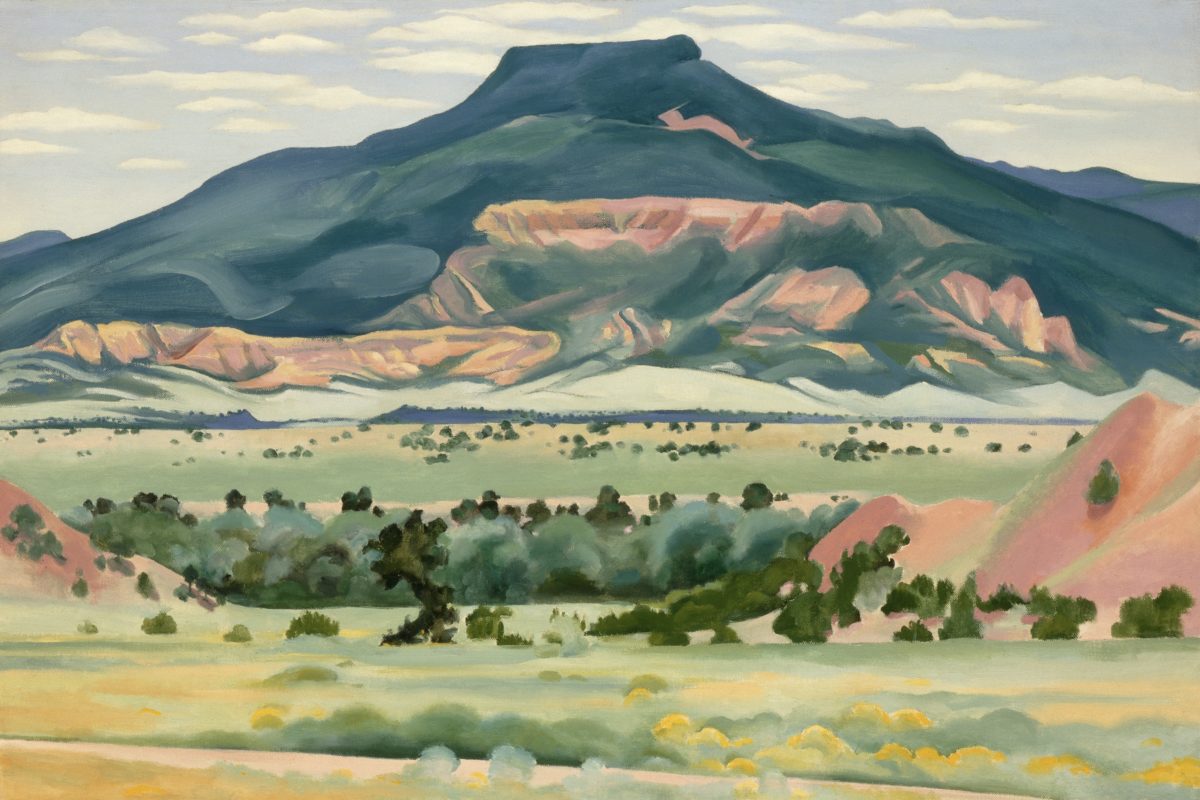
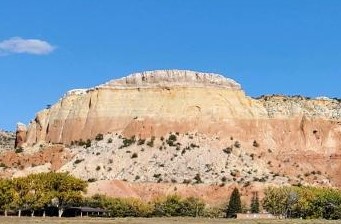
Had I planned this blog, I assure the readers that it would have been more thoughtfully compiled. However, as it is a pure reaction to recent exciting experiences, I am without much fodder that, although was before me, I neglected to document. Such as card racks full of Georgia O’Keefe greeting cards featuring prints of her magnificent work and exact pairings of the amazing landscapes we witnessed with her paintings and her magnified flowers too. Dashing in and out of her distinctive museum just off the Santa Fe Plaza bearing her name and thoughtful work (a MUST see when visiting Santa Fe), to stepping up the steps at the Ghost Ranch Abiquiu property, I didn’t document as I was too busy looking at and absorbing – so much. Yet without prior planning, I seem to have assembled enough that surprises me and therefore has become the body of this blog, about taking time to look…
The striations of color are as though painted – nature and its creator – amazing art and artist.
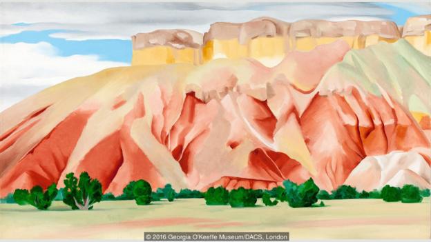
On this recent road trip and surrounding days in our immediate environs, I experienced inspiring images and pairings, beauty and detail, color and form…that evolved into this blog featuring the landscape and expressive paintings of Georgia O’Keefe. Captivated by the remarkable light and surreal landscape as have been so many artists, O’Keefe settled into the colorful backdrop of Abiquiu where the formations of color, sand, rock, and sky were interwoven with sparse, but all the more beautiful vegetation and flowing water carving its way through the enchanting scenery.
Those of you who enjoy taking photos, capturing moments, items and scenes will appreciate the exhilaration and awestruck sense of this humble presentation.
An iconic land form Abiqui, New Mexico
Art and nature. Design and nature. Nature
inspires artists and designers with color and proportion. The natural world is
a limitless collection of examples of perfection, majesty, detail and form.
Living in New Mexico presents amazing opportunities for studying so many
offerings from the natural world – verdant valleys and lush bosques to towering
mountains, contoured mesas, golden plains, glistening rivers and rainbows of
geology rising up from the earth. The sculptural land formations are what seem other-worldly. And yet there they are – majestic sculptures
against the sky.
O’Keefe was keenly aware of the extraordinary
world she encountered and she captured it through her eyes and expressed through
her strokes with fluid sensitivity and sense of color.
Georgia O’Keefe loved and appreciated around the world for her sensitivity and ability, to capture and convey her enchanting surroundings.
Very real and hauntingly beautiful landscape of Ghost Ranch – Abiquiu, New Mexico translated into the sharp, crisp, colors and forms of O’Keefe’s paintings.
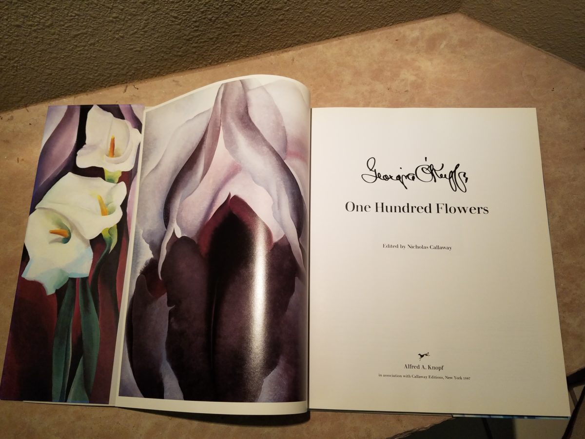
Years ago a very dear friend gave me an exceptional gift, of a book. The farther along I progress in this world and enjoy the vast opportunities to appreciate the beauty of nature, limitless boundaries of design, art and all that is produced by talented, creative, observers, treasures such as this have increasingly greater meaning. One Hundred Flowers a 1987 masterpiece collaboration of photographer, publisher, editor and scholars presents an outstanding collection representing this significant subject matter – flowers – that she took time to observe.
Up close and personal…in intimate detail she saw and rendered sensational studies of flowers. Expanded to enormous scale well beyond their reality, these explosions of color and contrast, fluid form and detail are amazing to encounter. Even in the pages of this stunning book her work is startling. In person it is awe-inspiring.
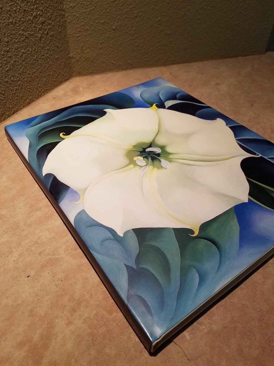
Upon returning from the Abiquiu visit, I retrieved my beautiful book. I took great joy in the dust cover – suitable for framing. A brilliant white squash blossom captivates, before even opening the cover. As I leafed through these large format pages in this lovely, exquisitely bound tome, I realized that, within a week prior to this O’Keefe familiarization trip, I have taken photos of flowers for a similar reason as she – stopping to look and observe their singular beauty amidst all else in the surrounds.
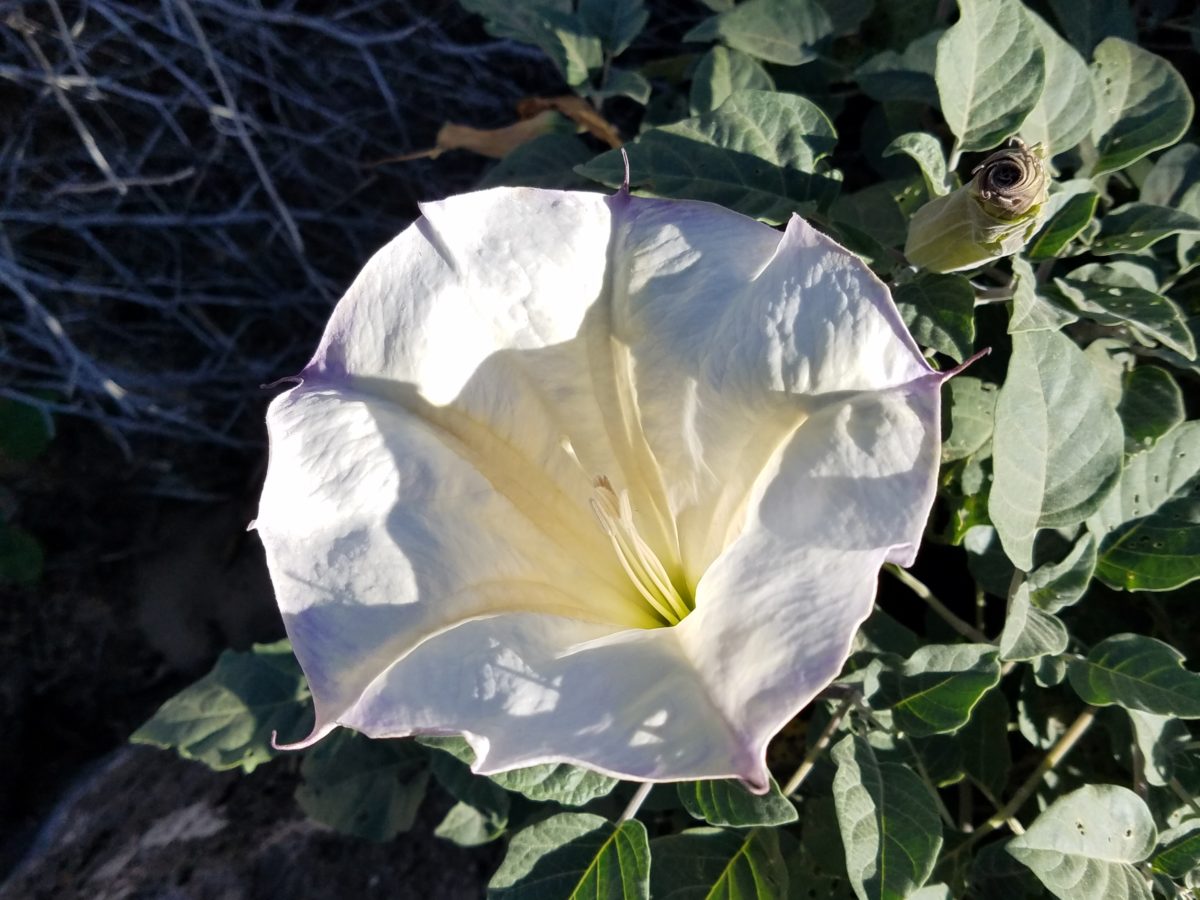
Unknowingly, a couple of days earlier I captured this spectaculalr squash blossom that had survived our first frost.
Just a few days prior to the Abiqui visit, while walking among the petroglyphs at the base of the dramatic black volcanic rock rubble of our west mesa, we came upon a singular, stellar squash blossom. Having survived recent frosts, this one was luminous and brilliant among so many other spent blossoms dried and shriveled away for the season. It was irresistible.
Little did I know, at the time we encountered this beauty of a squash blossom, that I would soon revisit O’Keefe’s studies of this wild and magnificent bloom.
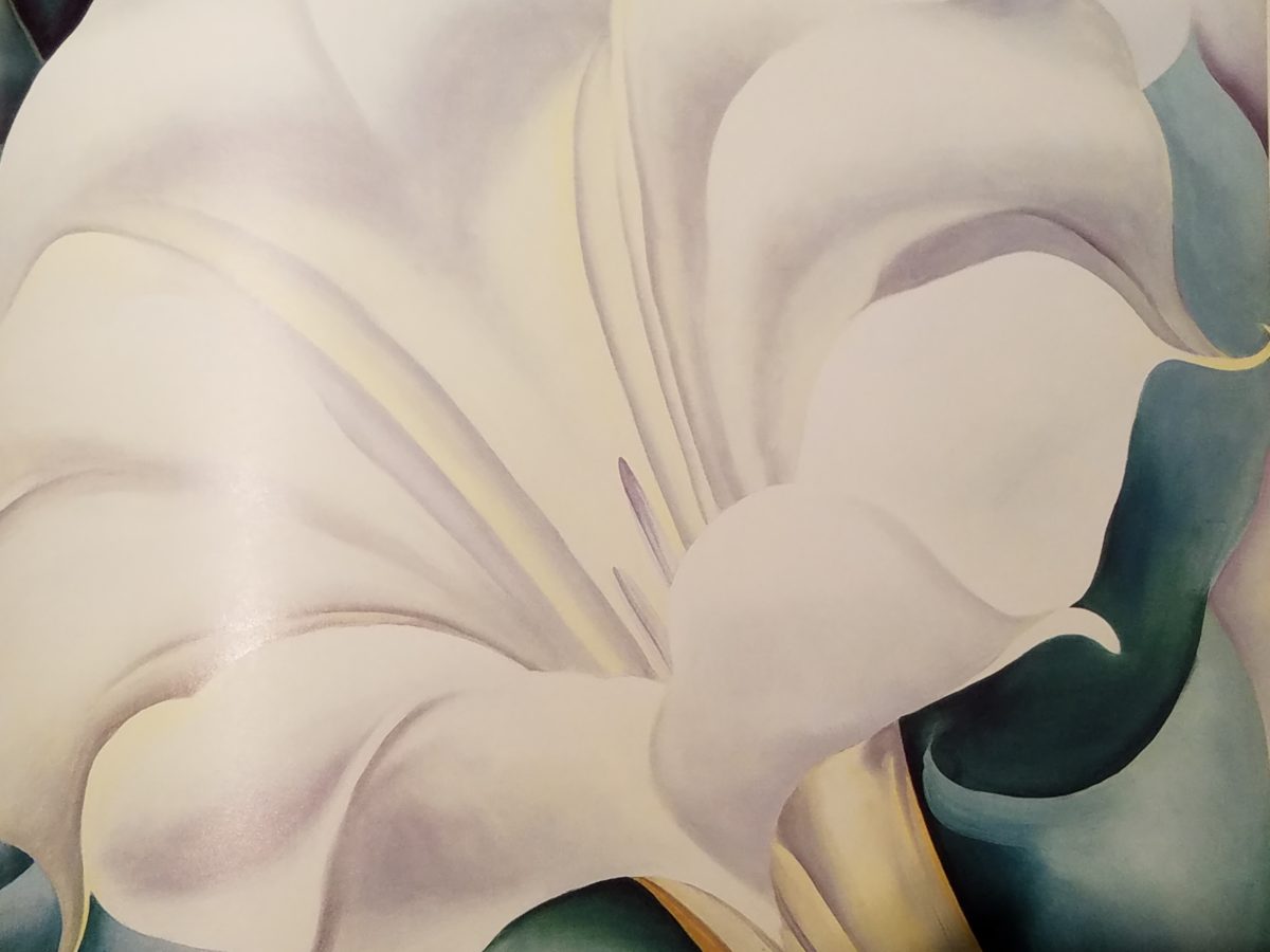
Here more studies from the One Hundred Flowers book featuring this dazzling white squash blossom.
In the design world, we often quote architect and furniture designer Ludwig Mies Van Der Rohe (1886-1969), one of the founders of modern architecture and an advocate for the simplicity of style with his popular phrase “less is more.” I felt that O’Keefe’s interpretations distilled the forms of her subjects to the essential elements that best conveyed them in a manner of simplicity. Her flowers are bold and clear sweeps and contours, of the design of each. Distilling to these essential elements is the practice of “less is more.”
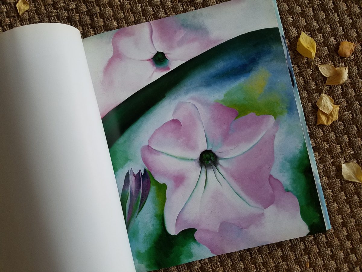
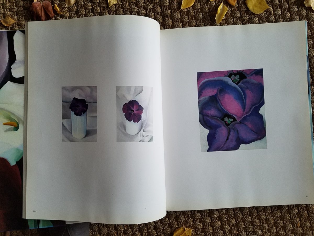
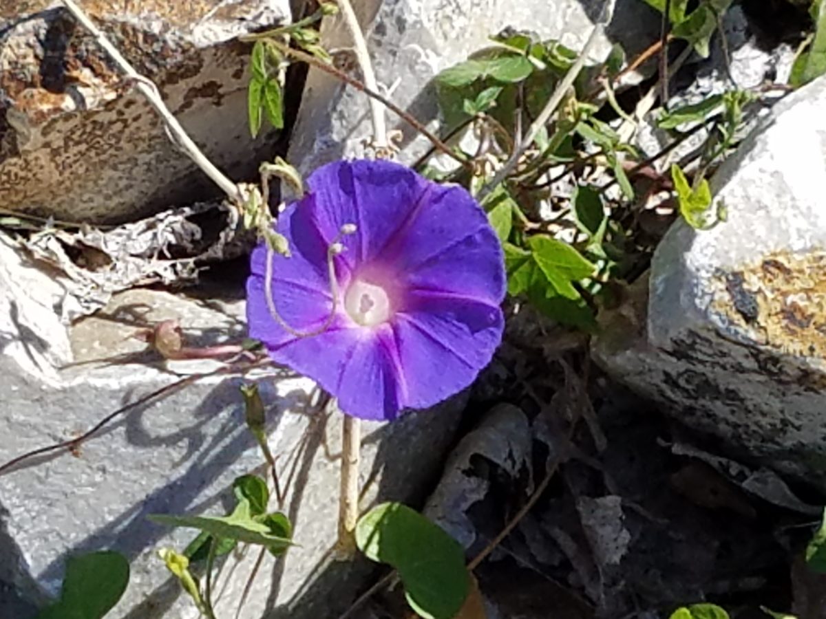
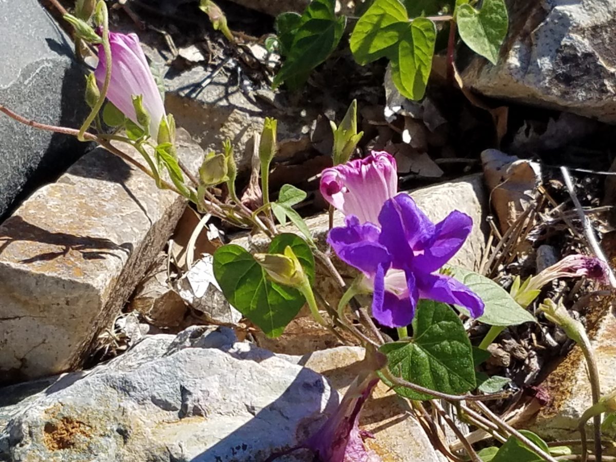
Her bell-flower trumpets of petunias and hollyhocks in purples, pinks and even arresting blacks reminded me of a photo that I took less than two weeks prior to enjoying my book for this study.
However, she was not sparing with color nor scale. Fabulously daring color combinations and contrasts are signatures of her interpretations along with her magnificent sense of magnification – presenting bold gifts to we, her viewers.
The opening of the book quotes O’Keefe about her profound
appreciation for a flower.
“A
flower is relatively small. Everyone has many associations with a flower – the
idea of flowers. You put out your hand to touch the flower – lean forward to
smell it – maybe touch it with your lips almost without thinking – or give it
to someone to please them. Still – in a way – nobody sees a flower – really –
it is so small – we haven’t time – and to see takes time like to have a friend
takes time. If I could paint the flower exactly as I see it no one would see
what I see because I would paint it small like the flower is small. So I said
to my self – I’ll paint what I see – what the flower is to me but I’ll paint it
big and they will be surprised into taking time to look at it – “ Georgia O’Keefe “About
Myself,” 1939
Be surprised. Be inspired. Be aware of your surroundings, for all the beauty of nature and its influence. Embrace color and contrast, punctuations and accents. Take time. How might your next design project reflect observations from nature?
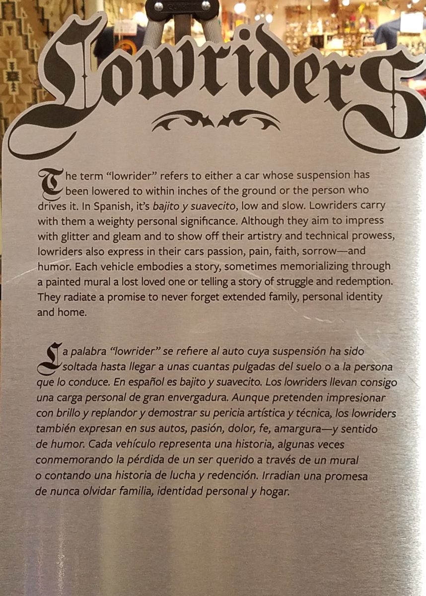
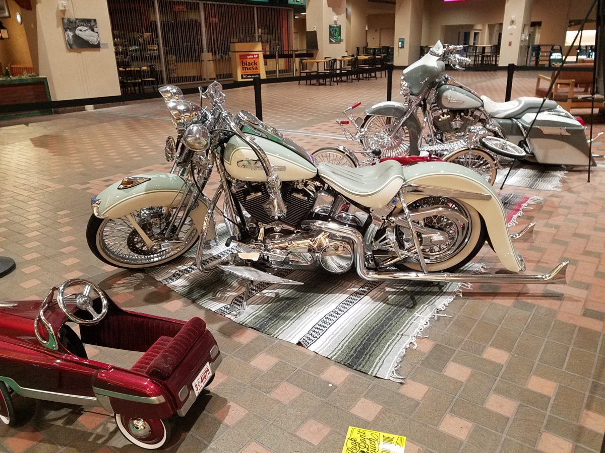
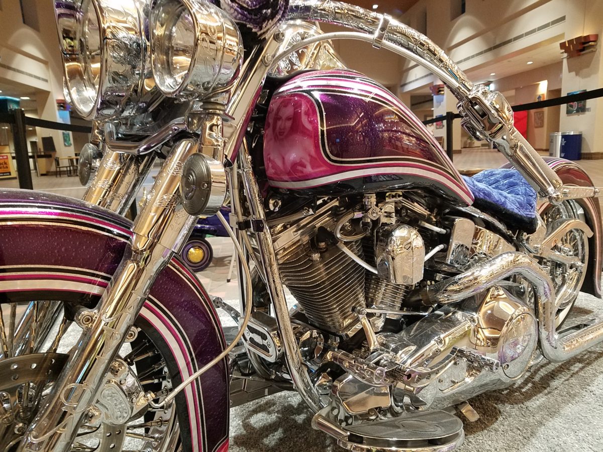
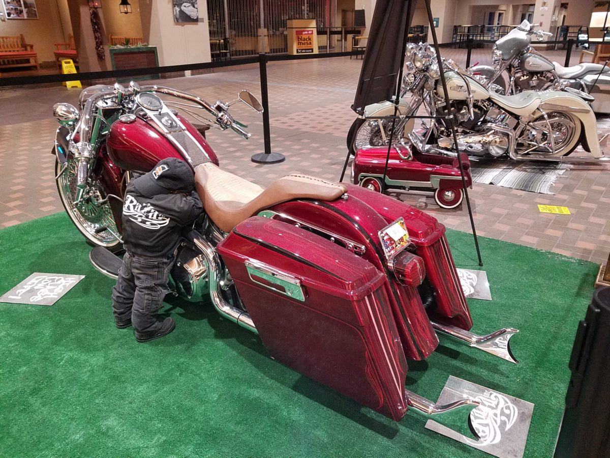
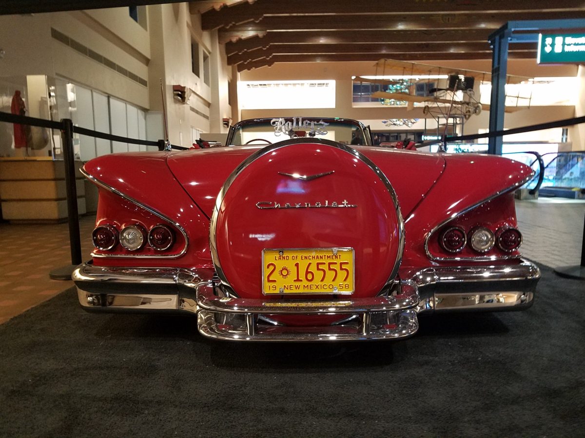
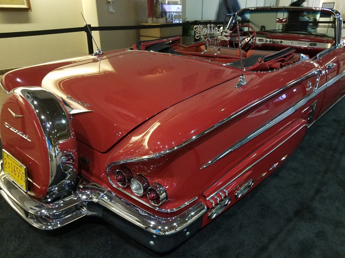
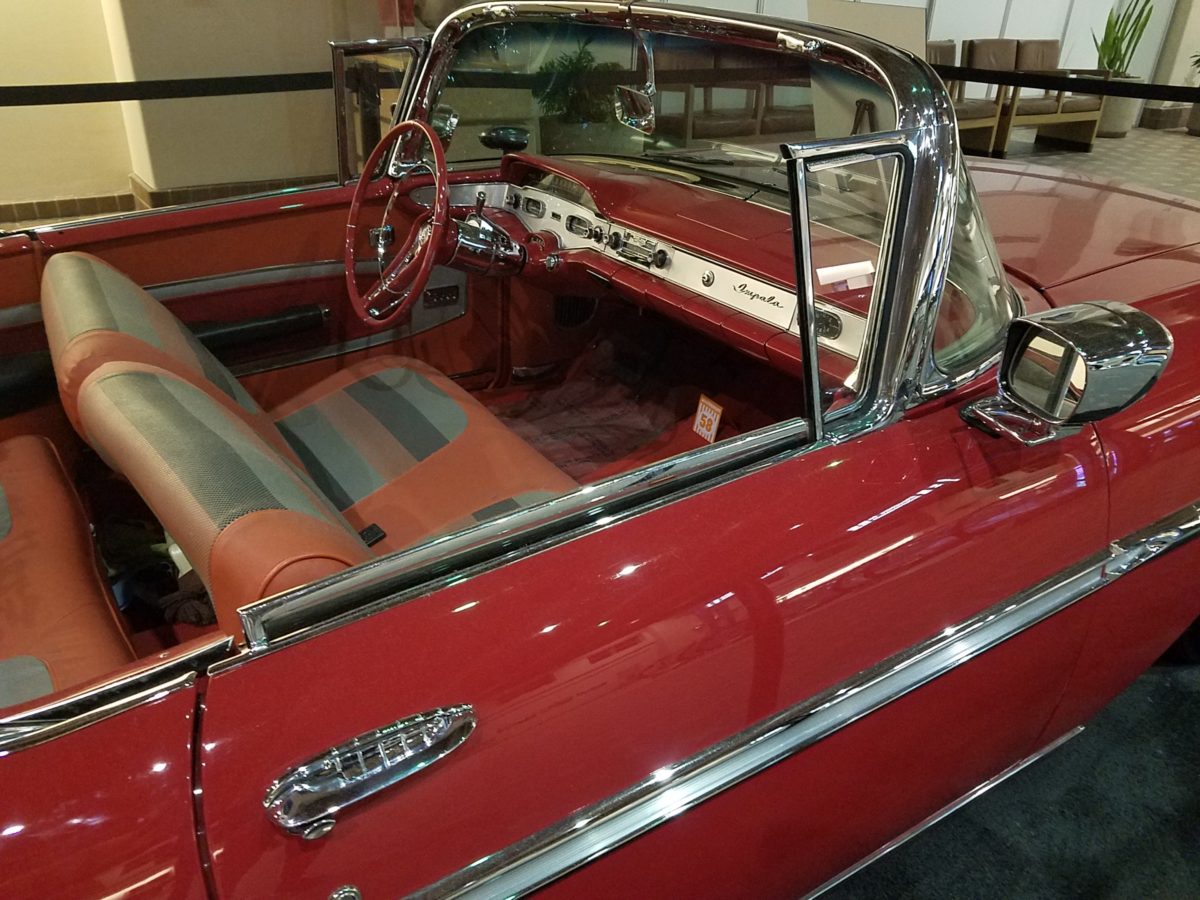
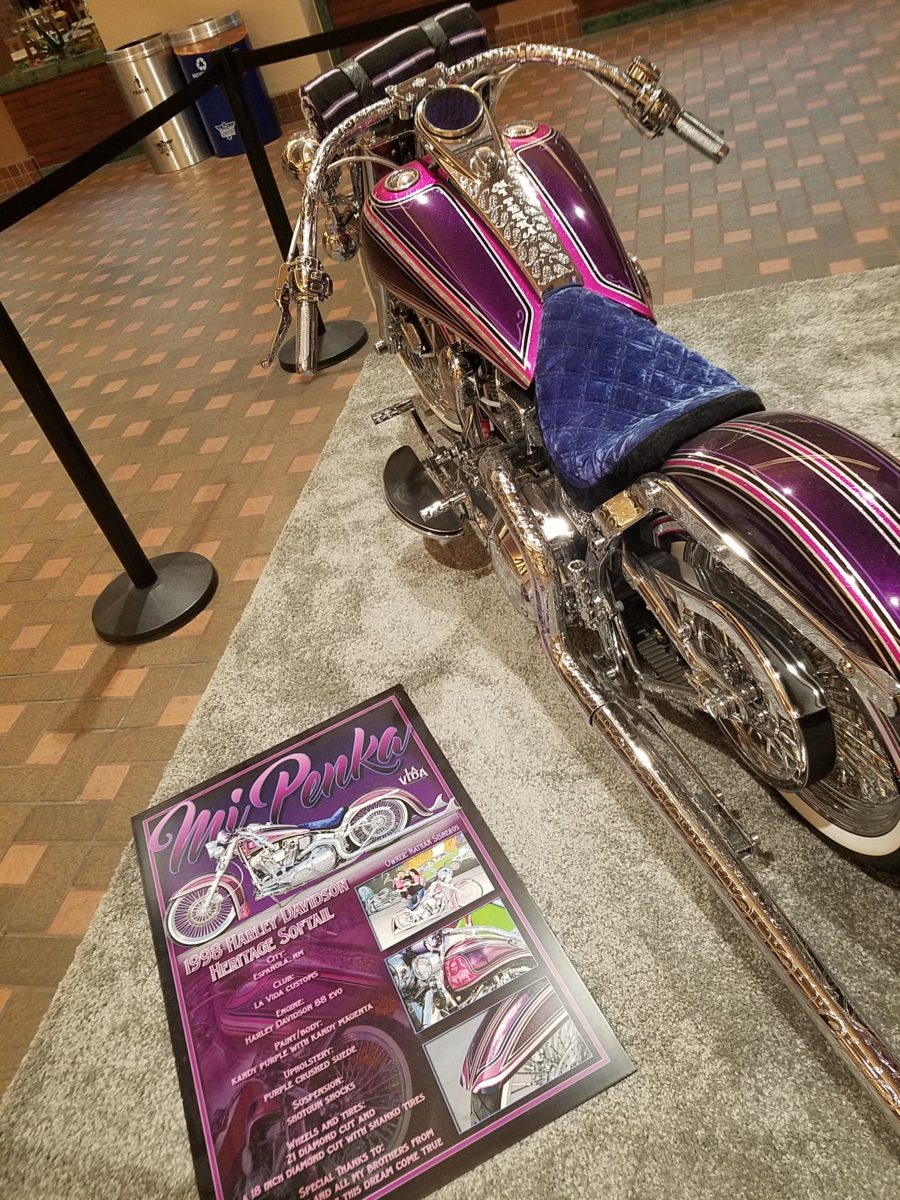
Racing through the Albuquerque Sunport several times this summer, I had seen in swift passing the blindingly brilliant bling of the Low Rider exhibit that had been set-up at the end of June. Last week I had an opportunity, while waiting in the arrival area, to peruse the many amazing rides that commanded the concourse.
This powerful art exhibit of the unique Latino culture of Low Riders represents great personal pride and emotional attachment on behalf of the owners and artists (often one and the same).
These finished products are almost like songs…from memorials to love interests, family and friendships – they express heartfelt emotions to present and share with the world.
Once stereotypically thought to be limited to the bad boys taunting law enforcement with their wild paint jobs, gleaming chrome, bold moves, wild suspension, blaring music in a defiant statement of cultural expression, these amazing art pieces have since been recognized by distinguished museums worldwide for their exquisite attention to detail and the stories they tell.
In this exhibit, these moving statements of artistic expression are all home-grown. Yes, each made here in New Mexico it makes it all the more relevant.
Visitors to the Sunport have this wonderful opportunity – up close and personal – to examine the seemingly flawless machines adorned with sensational color, pattern and design. “Kids” of all ages will appreciate this show!
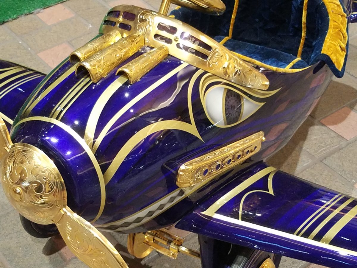
Each as though a canvas for the artist…motorcycles, kid’s versions and cars adorned with glitter, shine, polish and paint colors all contributing to the each unique statement. From airbrush to tedious handwork and limitless patient detailing results in exciting assemblages.
There are also decades of photos featuring the evolution of
the culture here.
By highlighting these fine, local examples the City hopes to elevate the art form on its merits and dismiss some of the stigmas attached with the stereotypes.
And we all will have a little fun imagining the thrill of taking a ride in/on one of these beauties!!!
Artistically embellished
architectural splendor is an understatement for all the wonders that await when
visiting our Nation’s Capitol. Washington, D.C. is my home town. Growing up
inside the Beltway, venturing into the District for work or pleasure was once my
norm. I know I took it for granted. Like
many, when one lives and plays in a place, it often becomes routine. Work the
same place, drive the same route, play in the same spots…unless there is a
special concert to catch or event prompted by others to attend, one often
misses the wonders that are right around the corner.
Therefore, when I visit, I try to
make it a point to investigate and experience things I have never seen or
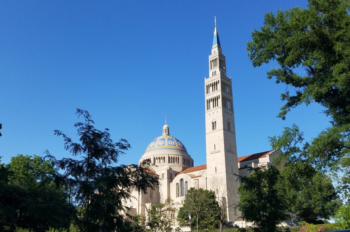
things that I haven’t seen for quite some time. This visit featured the grand
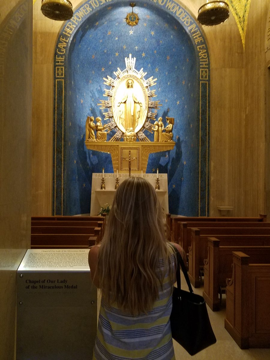
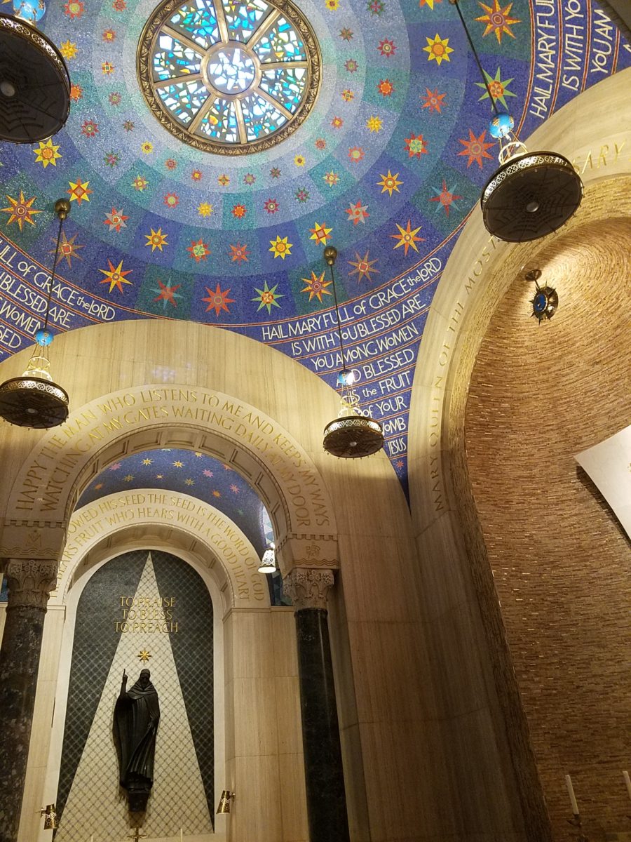
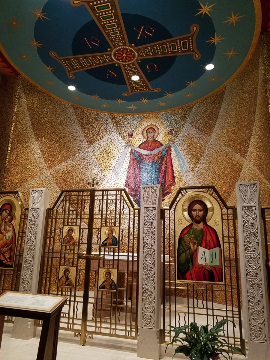
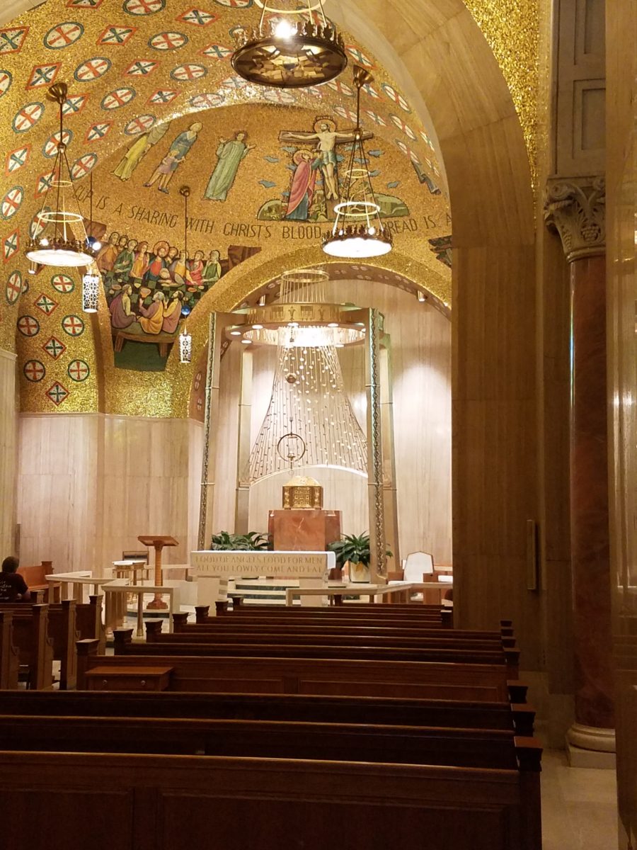
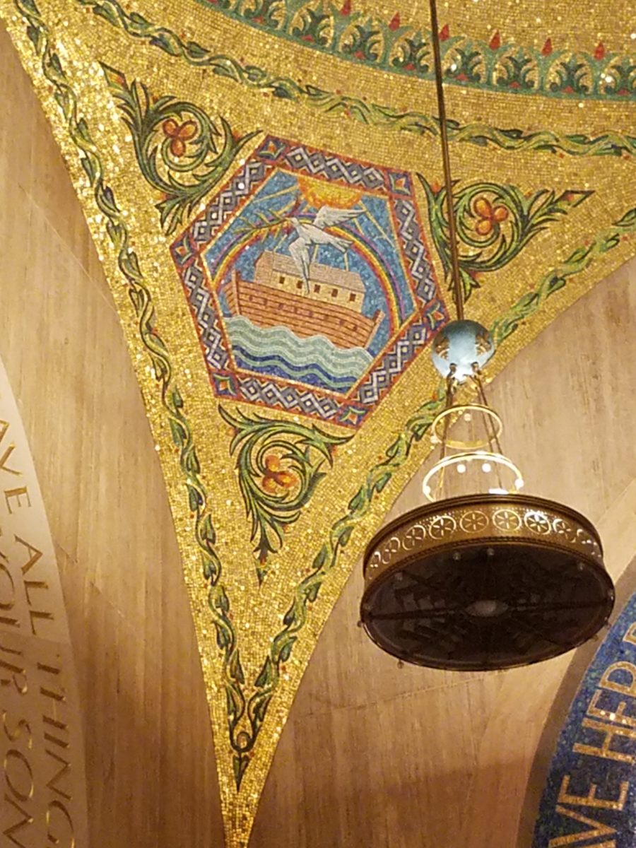
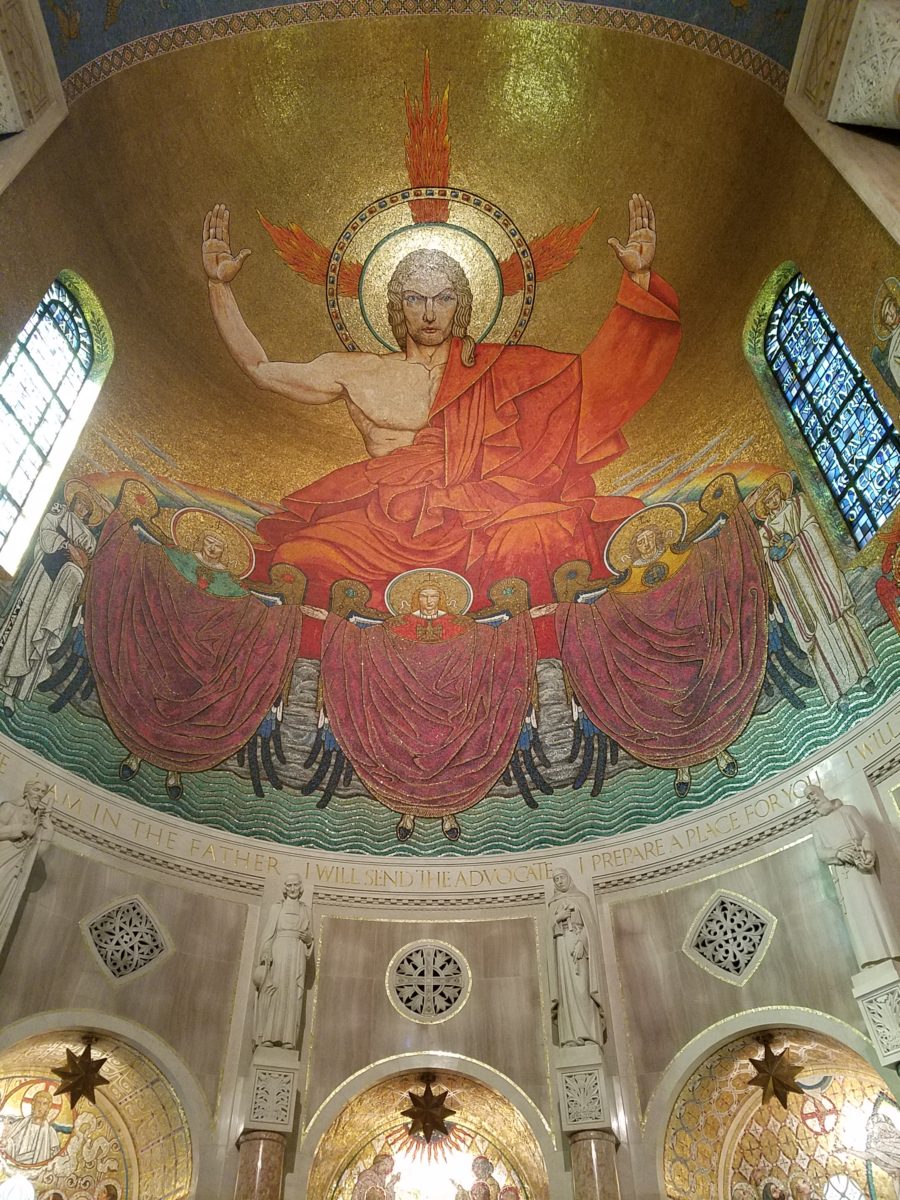
dome of the Basilica of the National Shrine of the Immaculate Conception.
It was the focus of our outing,
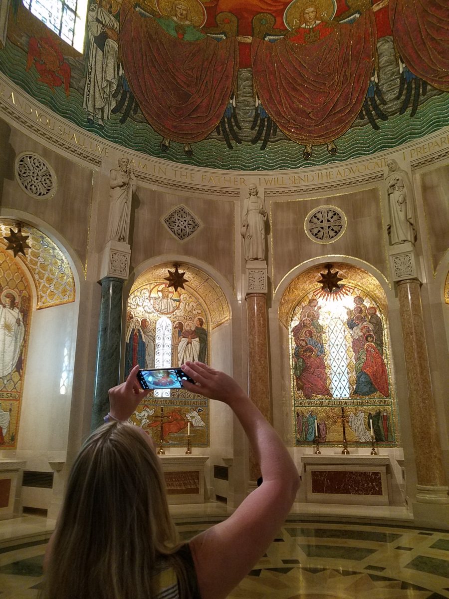
but the surrounding chapels and all there was to see became such an educational
and eye-candy dazzling afternoon of mosaic artistry that our eyes and neck were
fatigued from staring at the details and craning to view the enormous vaulted expanses
of blazing glory.
Lest you think I exaggerate, know that the majesty of the iconic images have been rendered in such exquisite detail and with such amazing colors of tiny, precisely placed tiles that the work makes you gasp and say “whoa” at every turn.
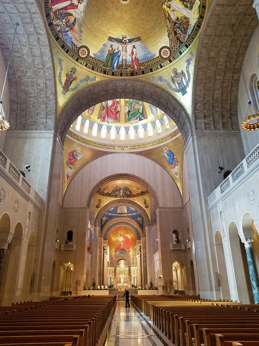
And this is just touring the many spectacular chapels on the way to the nave where the vaulted domed ceilings explode with color, detailed imagery and astonishingly expansive scale! It is then, upon entering this awe-inspiring space, that gasps and whoa fall away to near breathless speechlessness as eyes well with tears at the splendor.
The detail was similar to that of
the magnificent mosques we experienced in Istanbul – but there, we walked in
and BAM the spectacular space was huge and instantly revealed – definite WOW
factor – but here at the Basilica, it was a fascinating process of discovery as
we investigated each chapel and made our way up to the grand expanse of the
vaulted nave.
I am not going to give you a
guided tour of what we experienced, nor am I going to attempt to convey any
aspect of the historical tracings of the biblical references…but I am going
to attempt to impart the beauty and artistry that one doesn’t have to be a
catholic to appreciate. Photos can’t begin to accomplish what it takes to get
the full effect of these amazing designs, patterns, details…
Marble columns throughout the Basilica are identified by place of origin of the stone.
I encourage everyone to experience this majestic edifice and the beautiful grounds towering above the trees in NE Washington, D.C.. It will not disappoint. https://www.nationalshrine.org/
When designing for a vacation rental property, the first order of business is to select things that are durable and easy to maintain. This means finishes to furnishings. I know this from practical life experiences and also working with commercial/hospitality interiors. To do so, one needs time to place and receive the orders with enough contingency for mishap. It is also dependent upon the housekeeping arrangements planned for on-going maintenance.
In this recent project, the work began 12 months out – plenty of time you think…but it was all about the physical remodel. We began with the drawings for floor plan re-configuration and specifications for new lighting, cabinets and finishes throughout. The decision to furnish was not made until nearly 10 months later with a deadline to complete in less than 7 weeks. The delay was partially due to an indecision over how many of the 4 units (all on one floor) were to be short-term or long-term rentals. Then a new city ordinance imposed a moratorium, of sorts, on short-term rentals and while that was tossed about over several weeks…more indecision ensued.
It’s a riot to see overnight design projects transform interiors in 24 hours. That’s due to a free-reign for design decisions, a team(s) and vehicles to pick-up/deliver, all trades on deck, a single director calling the shots and an organized chaos that results in a magical finished project – yes, like magic. Open your eyes, be stricken with awe, cry a little and exclaim repeatedly that you “just can’t believe it!!!!”
Real life is generally not like that. Real life has in-put by owners, limited schedule openings by the various trades, little spontaneous decision-making and fleeting time riddled with unwanted surprises and delays. Real life, in this case, was a theme provided by the owner, a preconceived “look” developed in the mind’s eye and scratch paper of the designer during the selection of finishes and floor plan modifications and vacillation for several reasons, of what units to furnish and when. Over the course of a year, leading up to less than the last 30 days, the project was to be fully furnished and finished – ready to rent!
The good news is that with controlled frenzy, changing
availability of products, focused efforts and teamwork, we are pleased to present
the Lobster! Completed all but hanging the TVs by the requested July 1st
deadline, it is beautifully appointed and offers a colorful and a bit
whimsical, spacious, clean and did I mention enviable location- 2 blocks from Pacific Beach
in San Diego?
This entire project, except the move-in this last week, was done long-distance with the owner in Maine, her management company SHORE on-site in California and we the design team in New Mexico. This is not at all unusual, but Maine prompted the owner’s desire to name the unit Lobster. Not your spiny lobster from the local waters, but the New England version from the Atlantic with the classic recognizable form that accompanies the imagined crustacean – including the brilliant reds of the often appreciated steamed version!!
With fond memories of her childhood helping her elders maintain this property, the owner wanted to commemorate the building with an entry plaque visible from the street on the new redwood gate (soon to be completed). In addition, we suggested an individual name/theme for each of the 4 apartments which were all initially designated as fully-furnished short-term rentals – hence the bold identity for each! I designed the new name plaques and had them fabricated by Artistic Bronze in Florida. The backing was built by our talented Enrique Jimenez, in New Mexico, and all shipped to California. Bronze was selected for its timeless presentation, handsome durability and commanding respect. Parisienne was the font I selected which may now be used to identify the property as though a logo to tie-in with the on-site signage. Subliminal cues that are recognized even slightly are effective reminders and triggers for recognition. The idea was intended to offer a fun, but lasting, introduction and identification which was to be reflected in the interiors. The Lobster was the largest unit with 2 bedrooms. It was ultimately chosen to the be one fully-furnished unit and owner’s second home when visiting the area.
For budget and availability, we sacrificed certain durable
features that would have been better long-term investments, resulting in some
knock-down furniture that was never intended for much abuse. Fragile painted
table surfaces – for example – better in laminate, wood or stone…but time
will tell.
The look is clean and fun, colorful and beachy – with a slightly up-scaled twist. Cool aquas accent a few walls in the otherwise crisp white interior. Red punctuates effectively in lobster accent pillows, decorative accessories and the full-wall mosaic glass tile treatment in the kitchen. Yes, once again, we like to treat tile on the walls as not mere back-splashes, but wall-covering full height and width!
Weathered grey toned LVT (Luxury Vinyl Tile) in the way of interlocking planks were an easy to maintain and durable floor finish. The faux wood adds warmth and is softer underfoot than other hard surfaces. Perfectly matched with all trim pieces, this flooring is fabulous!!
Lighting is key and here we added recessed directional lights to spot the walls and related artwork. Switching was also an important detail to have options for the lighted areas and accents.
The owner found a novel lobster rug with a great textural,
tufted, yarn system that brings fun and great color and warmth to the bunk-bed
room! Busy, colorful bed dressings intentionally selected (over the hospitality
white that is still trending) contrast against the bright white bed frames
stacked for space optimization and a little kid fun!
A cool find in the way of the glass vessel lamp…where
usually the stem with electrical cord feeds down through the center of the base
and of the back, this one feeds from the socket stem with a cork top that
removes allowing the vessel to be filled with treasures – in this case southern
California beach shells and fragments! And for a little more animation, I found
a carved wooden shark to insert cruising above the shells to make the lamp even
more interesting!!!
A pair of vintage photographs of a lobster shack and fishing
boat contributed by a friend in Albuquerque – taken by him in Maine in 1962 –
were enhanced with bright red mats in their original polished silver metal
frames along with a large painting on canvas of a Maine lobster/fishing boat sent
by the owner in Maine provide interest to further perpetuate the lobster theme.
The master bedroom is a comfortable retreat with another
lobster pillow for punch! To give the room the best approach and make it feel
as large as it can be, placing the bed in front of the windows was the
solution. Beds facing the entrance to the room are always preferable to
arriving into the side of them – for visual space and a more inviting
orientation.
The original bathroom layout was all one space with tiny
appointments jammed together…so we removed the tall storage cabinets and sink
vanity allowing more room for the commode beside the tub/shower and added a
privacy door. Then the new cabinets and counter have their own space with
another privacy door resulting in a two-compartment bathroom area for maximum
use and enjoyment. Red mosaic glass tiles were repeated from the kitchen to further
coordinate the theme.
The bold color scheme was thoroughly distributed throughout
the unit which is an intentional design emphasis especially effective and novel
in a short-term vacation rental – where such a thorough scheme might be too
intense for one’s primary place of residence.
Effective design both functionally and visually should be a significant asset in the marketing of rental property. When used consistency in marketing material with logos and repeated features, this and other properties with attention to detail should attract the discriminating guests. Once there, repeated stays are the key to maintaining a strong guest population – of desired visitors.
Please watch for the entire slide show of before and afters of this dramatic transformation in the commercial projects section of our website, in coming weeks, entitled Emerald Green Beach Rentals – Lobster!
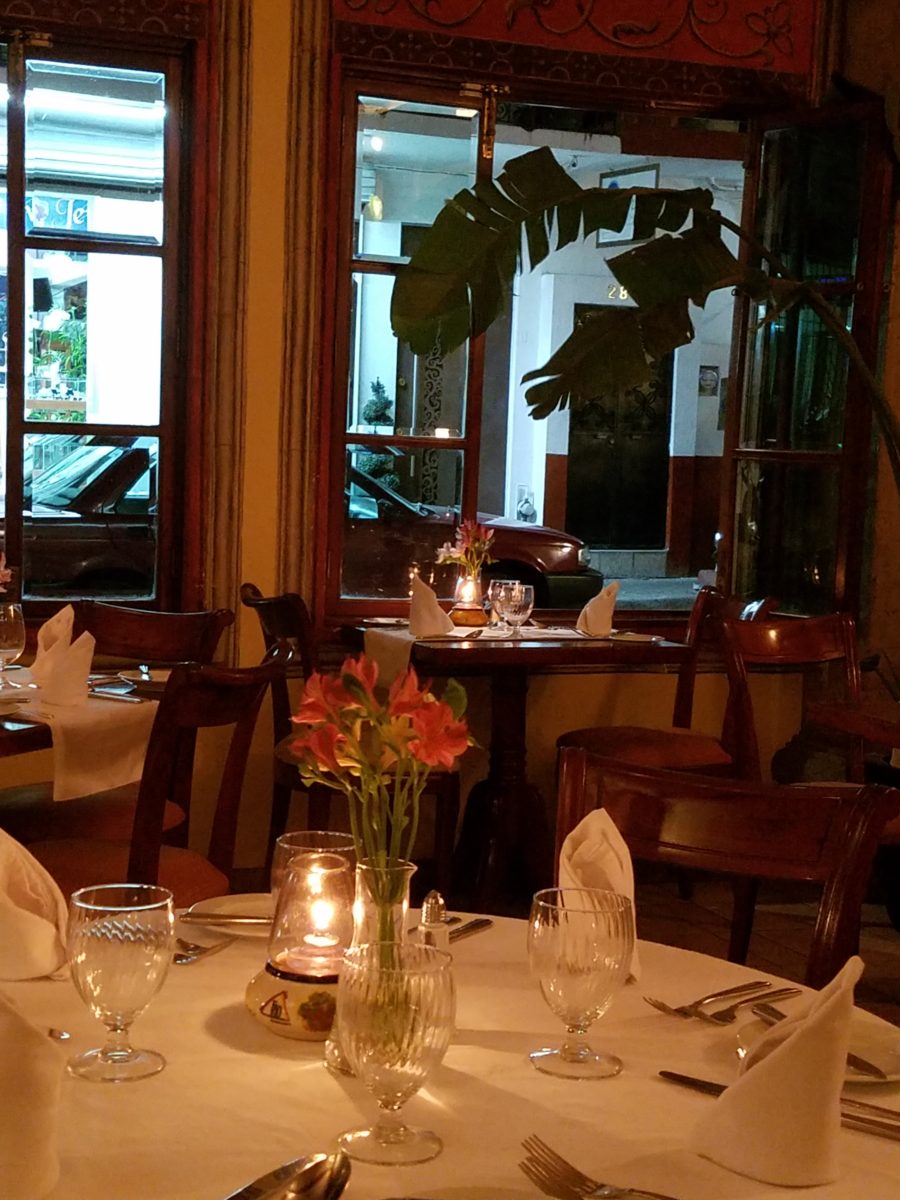
The total sum of an interior…comprised of the shape and volume of a space, the colors and textures, architectural details…then layer the lighting, furnishings and decorative accessories and ta-da! But is that all there is?
The beauty and intrigue of interiors is what keeps us
discovering and creating. Yes, finding intimate pockets or grand expanses that
please and dazzle.
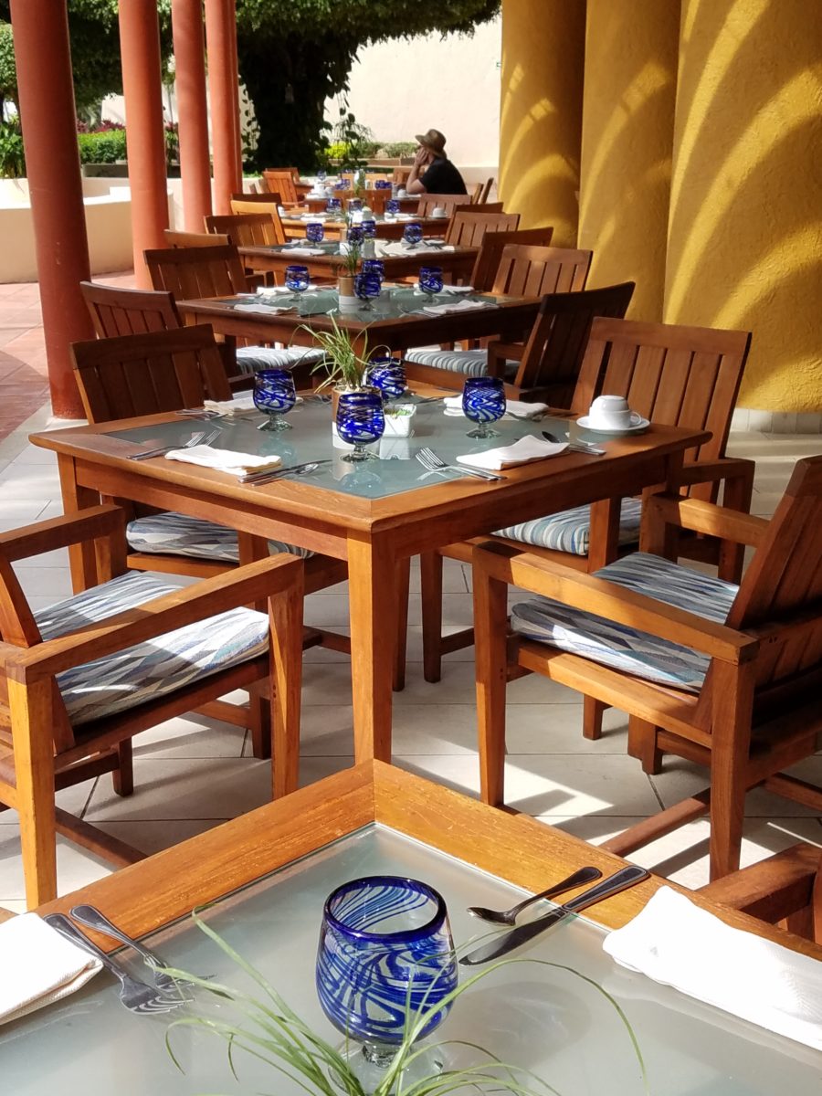
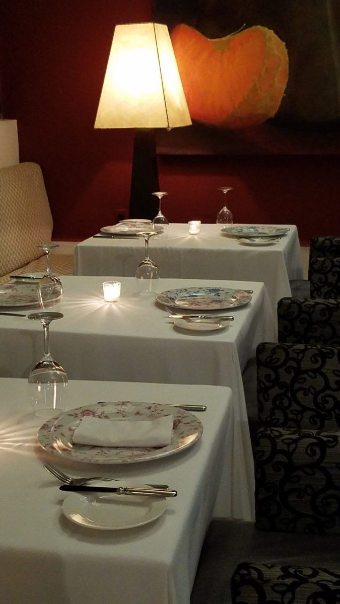
The romance of this setting caught my eye…the far table by the window – set for two seemed a likely scene for a tete e tete to take place!
While traveling in the tropics these last few weeks, I
discovered many interesting places. Oddly, while experiencing all the sights
and sounds flavors and colors of this paradise, I immersed myself in the
unlikely and completely opposite world of early 20th century Russia with A
Gentleman in Moscow.
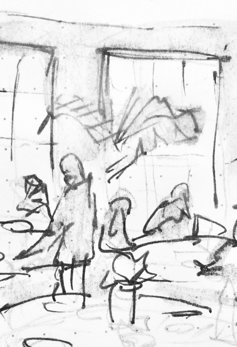
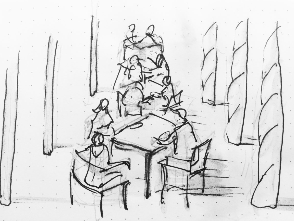
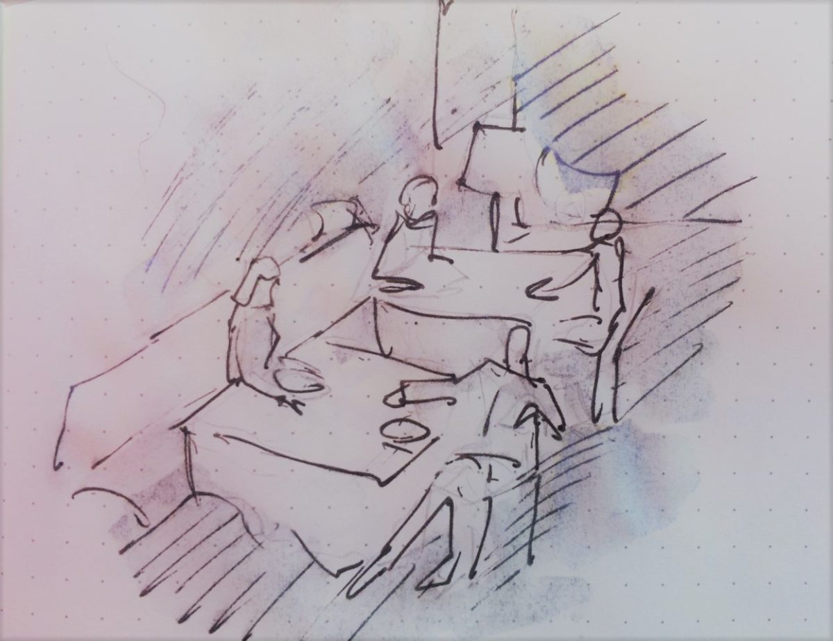
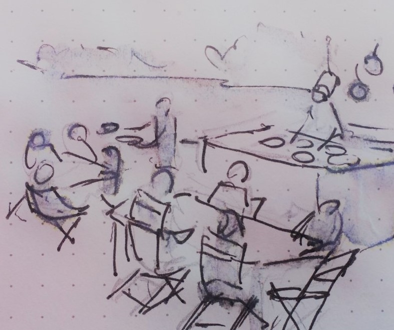
Just for fun, I sat with Federico Leon de la Vega today as he did 4 – minute sketches of some of my photos…needless to say, proper illustrations would have proved more telling of my romanticizing the talents of artists conveying imaginary activities in interiors…but it was fun to play with this today!
The beautifully and artistically articulate writing style of
Amor Towles held me captive. And what a dichotomy to play ping-pong with my
brain as I digest the restricted realm of Count Alexander Ilyich Rostov while
basking in the warm sunshine with fresh sea air and palms rustling overhead…It
seems that the extremes of this pairing suited me well as it was a dual escape
– a vacation getaway while taking me further into fantasy with another dimensional
experience of this incredibly great read!
Although there were many fascinating observations made by
the author, it was this passage regarding the Count encountering a young
artist/architect that prompted this subject for this week’s blog. The
architect, finding himself in Moscow in the post Czar age of socialistic
experimentation and implementation, bemoans the lack of work “The way things
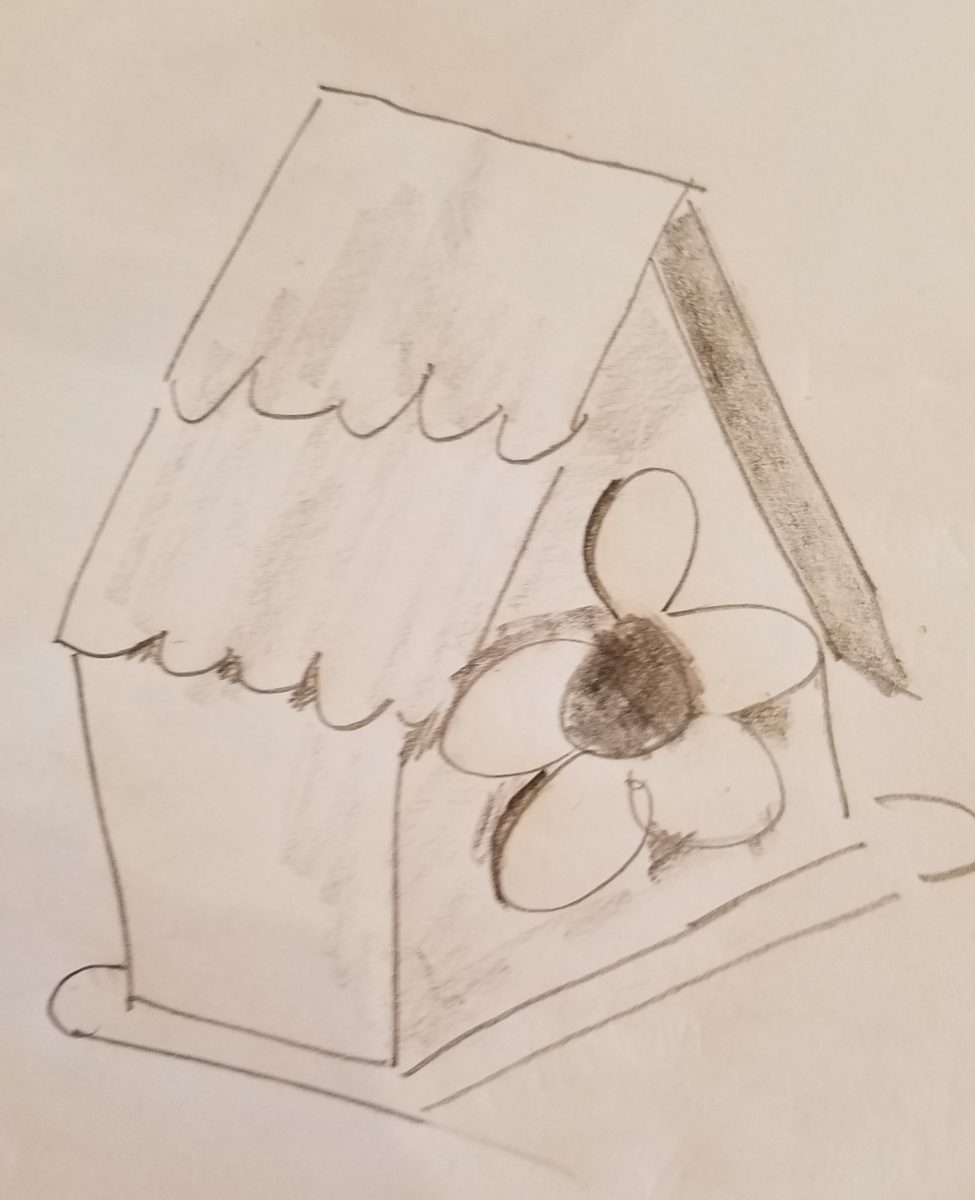
stand, I’d be happy to design a birdhouse.”
“The way things stand, I would be happy to design a birdhouse!” Sketch by PH
The mayor of Moscow has made an observation espousing the birth of “the golden age of the prefabrication, cement-walled, five-story apartment building” – with the very practical “four-hundred-square-foot living spaces with ready access to communal bathrooms boasting four-foot tubs (after all. who has time to lie down in a bath when your neighbors are knocking at the door).” The mayor further emphasizes and rationalizes “So let us not get bogged down with elaborate designs or bow to aesthetic vanities. Let us apply ourselves instead to a universal ideal that is fitting for our times.” A horribly inhuman decree in my opinion, rather than a should-be, truly magnanimous spirit. Humans are designed to design!!
The sentiments of the new regime left the architect with having to find avenues to utilize his talents – specifically sketching as he set forth to illustrate a brochure of the city’s finest hotels as retained by the Intourist department. How sad to possess the talent and passion and be reduced to capturing the grandeur without having the opportunity to design??!!
So three things struck me about this situation…one – that the artist was practicing only a portion of his talents and not the true, complete creativity that beckoned him to pursue his career…two – that renderings not only offer the opportunity to preview the proposed design of a space, but they can use artistic license to animate the space for its intended function and three – that spaces are not truly realized until they are filled with the people that are intended to occupy them.
So much so is a room not really finished until it is occupied by the inhabitants for whom it was intended to function, but Towles observes through the renewed appreciation by his architect, “I suppose a room is the summation of all that has happened inside it.” And that is what I enjoyed being revealed as a result of this simple exchange in this one of many experiences in this remarkable storyline .
Humans are designed to design. Rooms are intended to perform a function. They cannot function until they are animated with whatever they were intended to serve. Sketches allow the preview. Sketches are more spontaneous and artfully creative than computer generated versions of the same. Celebrate beauty, creativity and artists!
With all the New Year buzz about the new color forecasts…I started taking notice of the seeming non-color, white. It is often considered the absence of color when in fact it is a very complex color of many shades and values. Just try to select a white and you will know what I mean.
When you look at white paint samples, you will notice the nuances. There are pink whites and blue white, grey whites and yellow whites. Each white is off-set and contrasting to another. You see the differences by comparison and by context. You think you have just the right white until you place it against another sample and see that it is grey or cream and then second guess yourself again…and again…How do you know which white is right?
Dunn Edwards groups their whites and pastels in a separate section of their fan deck as do other paint companies. What is interesting here is that the background is a sheet of white copy paper. Notice how is reads against the colors in the samples…it seems to be a purple blue color. This shot was taken under a full-spectrum LED lamp. The colors should be true. The range of “white” is amazing.
To intentionally design with white is bold. To have the confidence, to decide that white IS the color and that white IS the scheme, is challenging. To effectively design with white, you not only have to select the right white(s), but you have to know just how much of anything else might be effective yet not detract.
Le Leche in Puerto Vallarta is a fabulous example of designing exclusively with white. Only with minimal punctuation with black lettering on the wall of containers and also by allowing shadows is the white interrupted. But the blacks’ minor interruptions gives depth and fine detail.
White design can be cold or warm. Depending upon the desired effect, mood or function of the space, the whites need to be carefully selected. This is true with lighting as well. Warm whites or cool whites…what gives you the desired result?
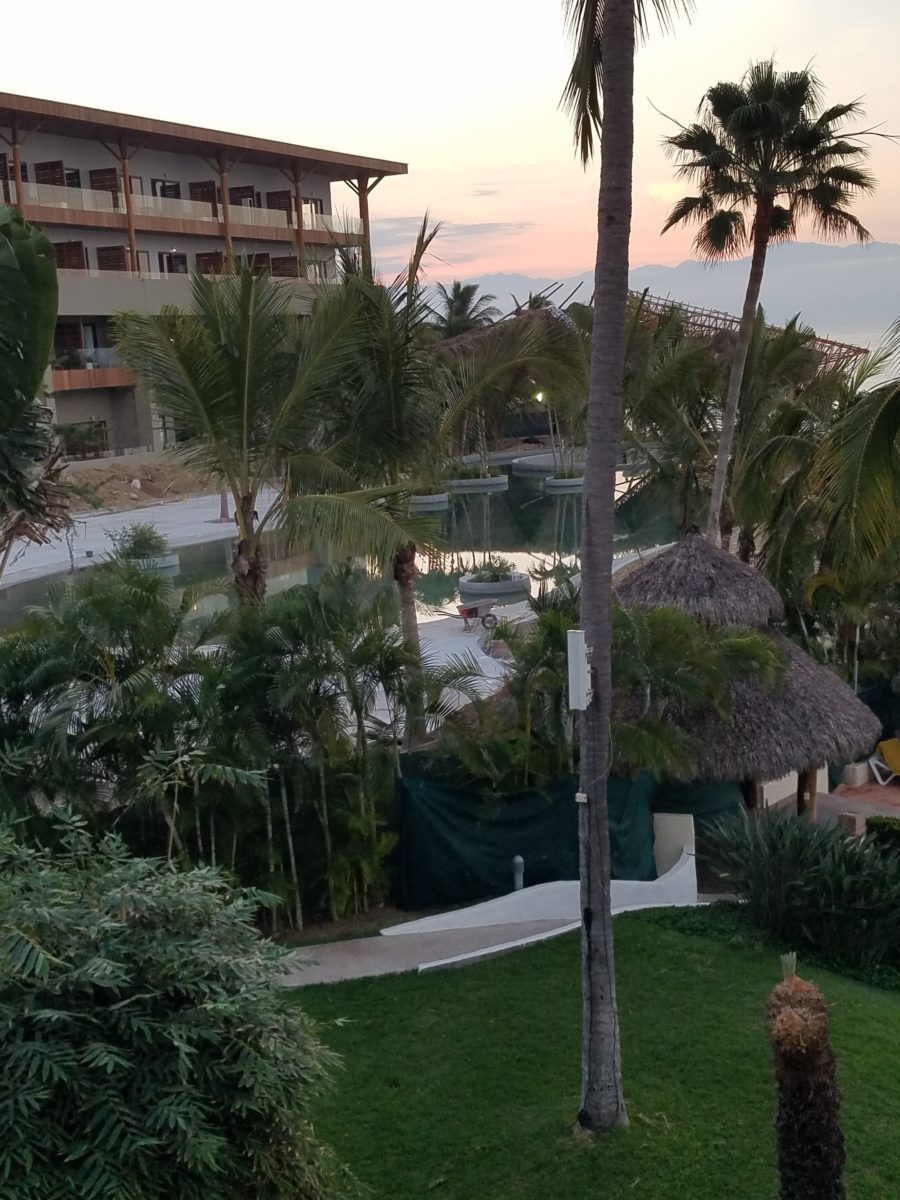
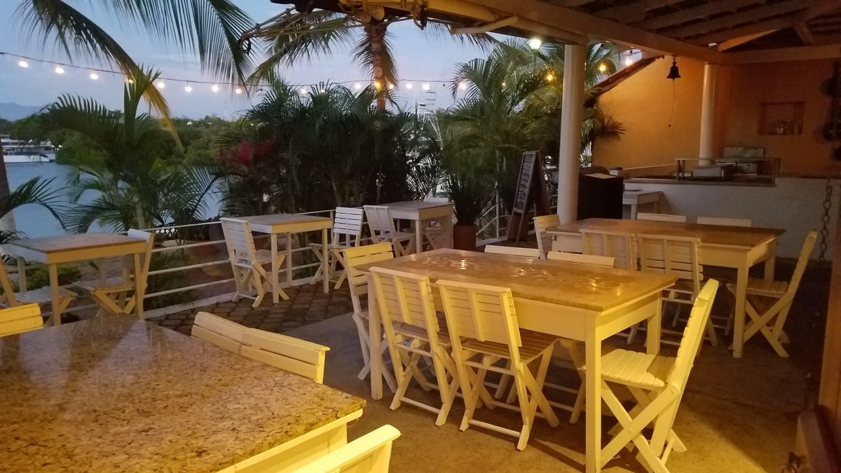
Popular white string lights add festivity and a warm glow to an evening scene.See how many lighting colors you can identify in this scene…Starting on the left, a cool pocket glows through the underbrush. The walkway has a warm pink-ish light. The very cool blues of the pool area give a dramatic read. A bold yellow accent peeks from the far left and also over on the right. The palm trees are wrapped in a warm white tube lights while the far right side illuminates the entry to the dining palapa with a cool white light source. The foam of the surf on the beach is captured with a cool white spotlight that maintains its naturally expected white color.
Knowing when to add color to a white scene to achieve an intentional POP is an art. The color itself, the amount and placement is all part of the success of a good design result. From the fine black detailing in the previous shot of La Leche to this still-life composition of a tropical cocktail that I propped the other day, the minimal punctuation of color is key.
White mosaic shards of tile in the background of this composition featuring a peeled coconut and the POP of a pretty pink party umbrella result in a white-on white scene. Yes, this shot says PARTY with a perky smile!
The bench which served as the backdrop for the coconut cocktail is a dramatic serpentine sculpture of site furniture that plays with the white-on-white of the tile and grout.
Contrasting against the organic wood decking, this white monolithic bench snakes around the periphery of this outdoor lounge area. The sunset is casting a soft pink wash over the all white glazed tile.
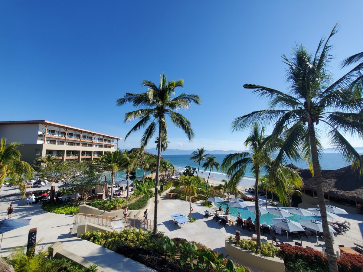
Beach settings using white materials compliment the white sand and greenery of the tropical plants. From wood frame platform cabanas to the sprinkling of umbrellas, white is a wonderful, fresh color for a crisp clean scene.
Whites on whites…creamy sand colors to crisp white terrycloth, the white-on-white scheme is soft, inviting and clean.Greenery compliments the white umbrellas and sunning beds on the lawn by the beach.Palm trunks and other fruit trees are often painted white to protect against insects and what insects insist on climbing the surface are easily spotted by birds who appreciate the help to capture a snack! In this case, they contribute to the white design theme.
The soft creamy off-white folds of fabric offer a soft, inviting scene.
Shadows in the creases and depths of the folds add the dimension to the luxurious feel of the cotton damask fabric.White stucco is dappled by shadows and greenery while given a warm, strong base by the brick pavers. White as an architectural finish is only successful if the context compliments it. This is true in all design.
Architectural color and texture of surfaces is a moving target. A recent discussion about a white building with black detailing would not have proved right for this particular use of white. The hard, commercial read would have been too severe for the intended effect. Yet that same project, with a warm white and an ochre accent, will be just the right combination to achieve the desired result. Watch for this project to be featured in a few months.
Architectural surfaces incorporating tones and textures of white provide interesting opportunities
Block and crumbled edge accent bands on the facade of an exterior wall.
White in design is an exciting selection. Knowing how, when and why to use it is a test of your creativity. Picking the right white is the challenge.
The limitless colors of white found in a pile of gravel…..
So the next time you think white, think a lot about it. Study the context and what you are trying to accomplish. Feel freed by the fact that white is a color to express and enjoy.