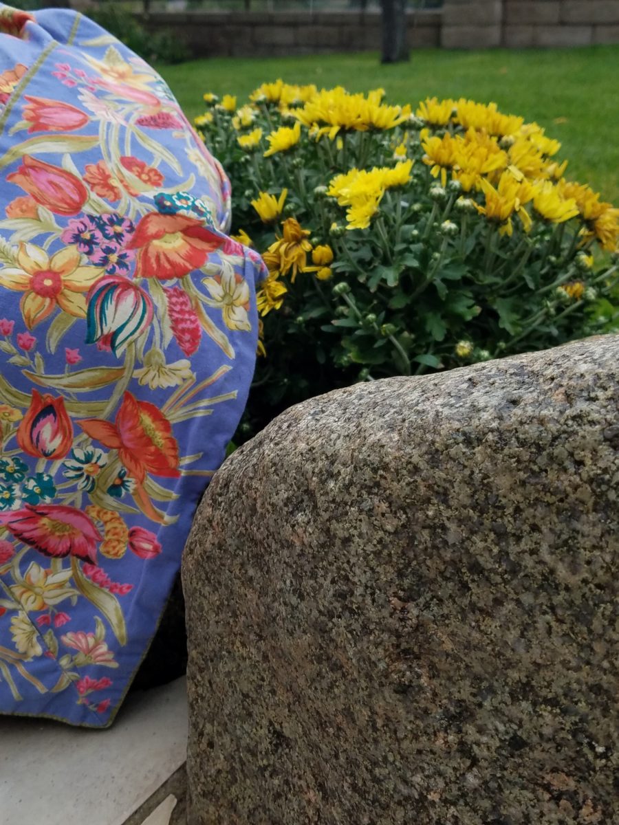
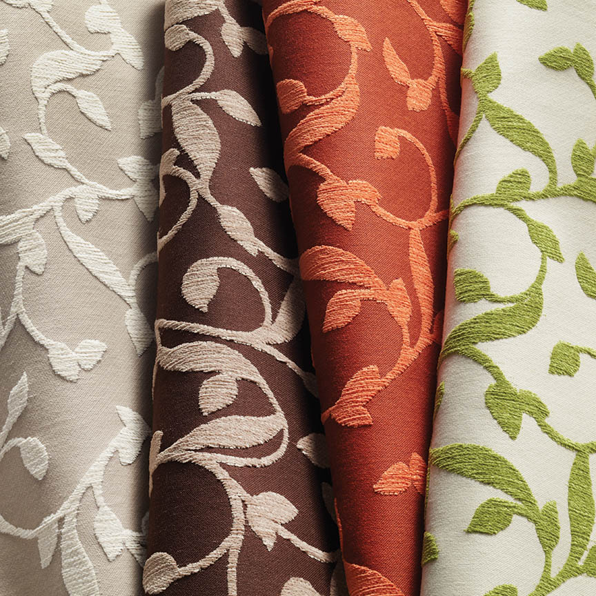
Some fabrics are just so fabulous that they can carry a design scheme. You could wrap a rock with them and feel that they are accomplishing the design statement to set the theme, mood and encourage interest, if not confidence in comfort! Stimulating the senses is a major part of design.
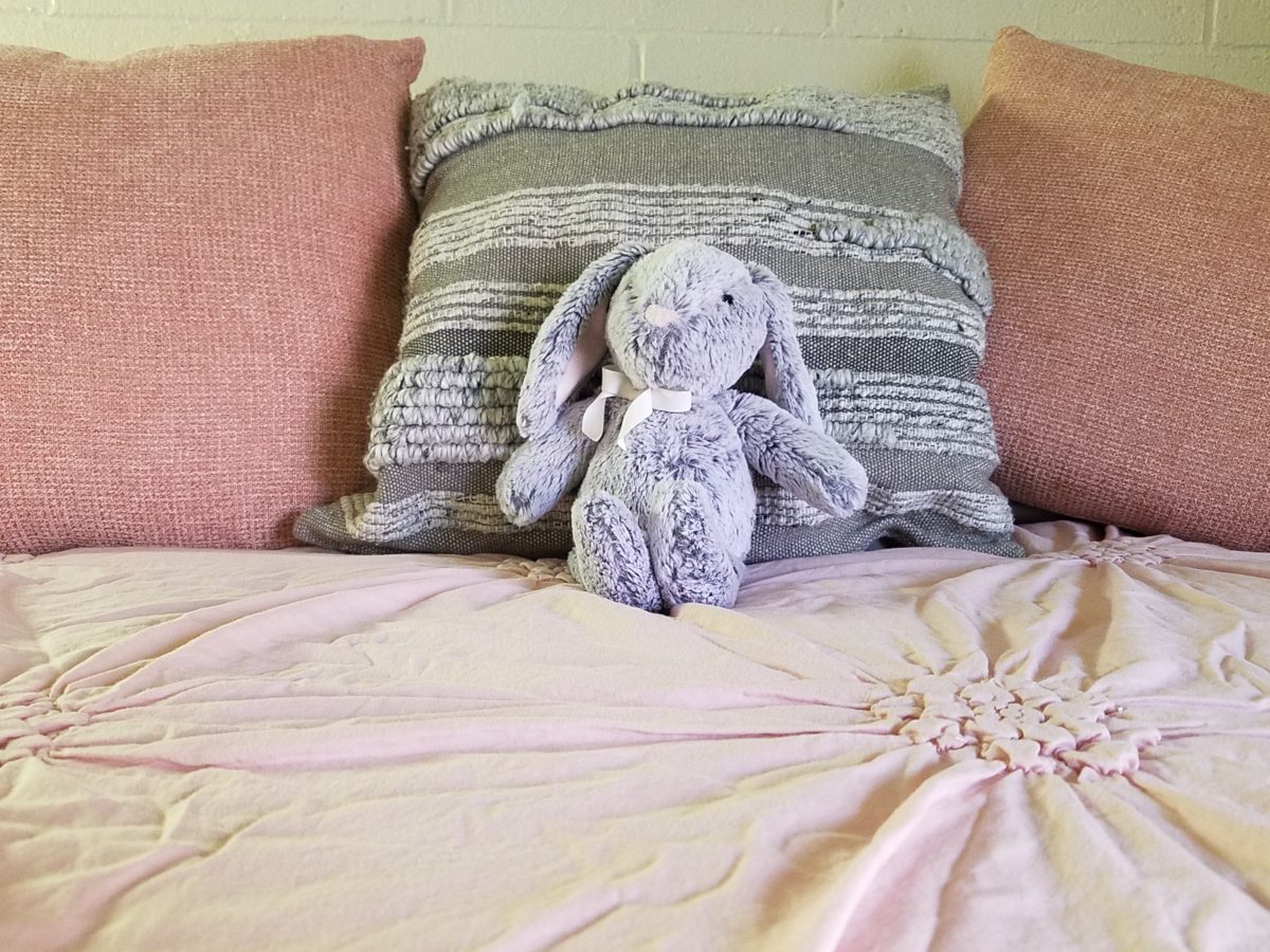
Often, a throw pillow can make an effective accent. We joke often when we find exclusive fabrics in the hundreds of dollars a yard and say “Perhaps a throw pillow?” Knowing that the projects affording such luxury for miles of drapery panels are few and far between!
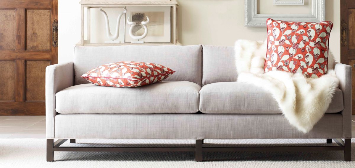
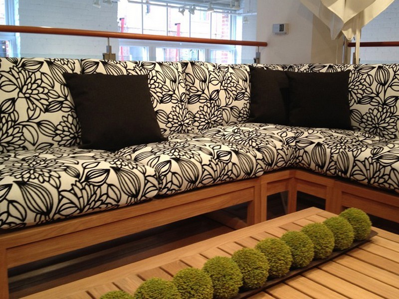
Duralee offers statement furniture pieces of unpretentious luxury and comfort with a collection of fine fabrics that will satisfy any budget. Birds take flight from this delightful Duralee pattern.
Sight Sound Smell Taste and Touch – you know. Colors and textures catch one’s attention. They set the mood.
Upon entering a space you take-in the colors and textures and if fabric is in play.With further tactile examination fabric contributes greatly to these two sensory perceptions – sight and touch.
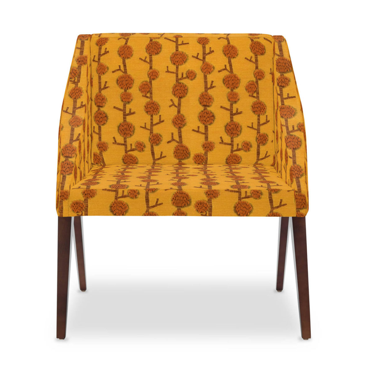
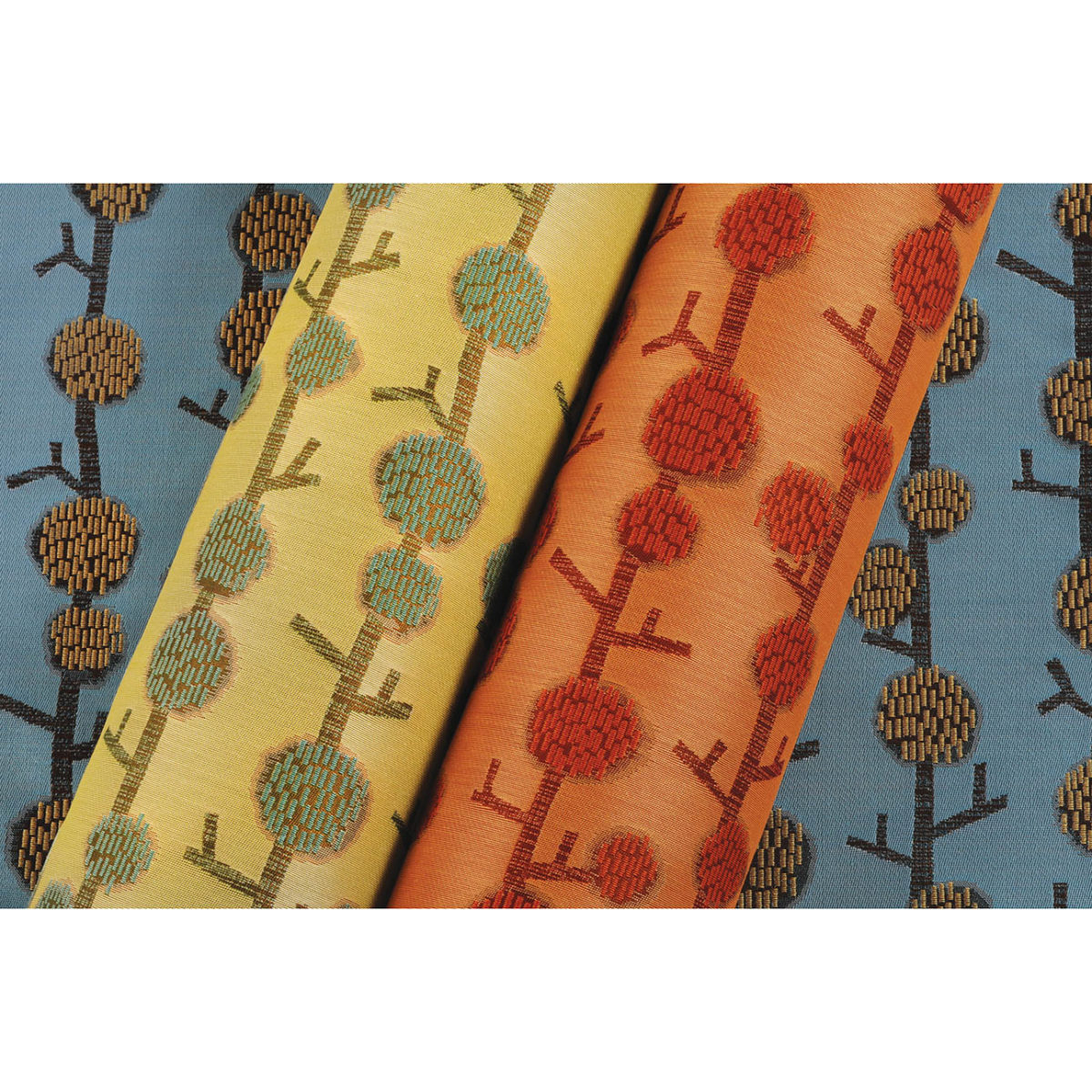
This playful Donghia organic has fuzzy tactile balls sprouting from the linear twigs. From the “ground” to all the intertwining and overlaying weaves, the complexity of textiles is exciting. Come see these exceptional designer fabrics in our studio.Many fabrics have multiple colorways. If you see an intriguing fabric that’s not “your color”, its worth asking about the entire collection.
Juxtaposition can also be an effective technique. When placing a modern pattern on a vintage piece, you breathe new life into the forgotten history – refreshing and capturing the best of both worlds!
You might not have a lot of confidence in someone who wants to wrap a rock to make a design statement. However, my point is, when you love something you want it regardless of the delivery system! Find fabrics that you love and insert them into your rooms – home or office. It’s like your favorite flavor. Sweet or savory – slather it on a piece of cardboard and you’ll be significantly satisfied. You need not struggle with how to do it – just make it happen. So to get a little taste of an exciting textile, make a table runner, simple dining chair seats, select a backing and make a throw or an accent pillow. Bring the joy of exciting textiles into your interiors.
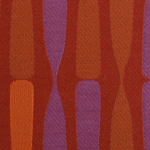
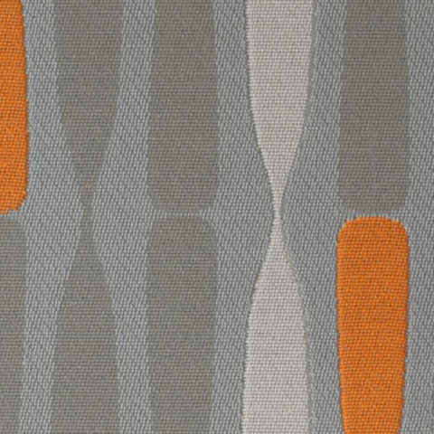
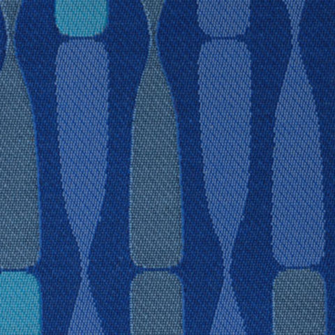
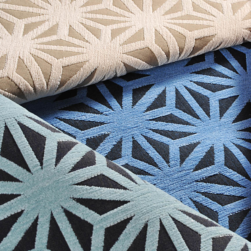
Here are a series of fun fabrics from our source library – tools of the trade. We LOVE fabrics and must touch the texture, feel the weight and evaluate the colors. Seeing images on-line do NOT do justice to the many incredibly creative textiles are available to enhance interiors.
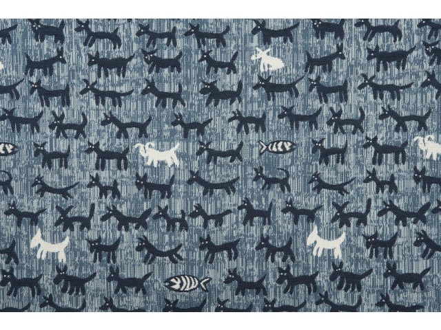
Cute critters march across this sophisticated yet whimsically novel woven.
Other considerations not necessarily in evidence are the wear-ability/durability of a fabric and the resistance to ultraviolet rays, mildew and other elements. Wool is inherently flame retardant, for example. And exteriors have come alive as these amazing performance textiles will often fool you in disbelief that they have the properties to withstand the radiating ultra-violet rays of the sun and damp conditions which invite mold and mildew. These incredible fabrics are truly indoor-outdoor in appearance and extraordinary performance!
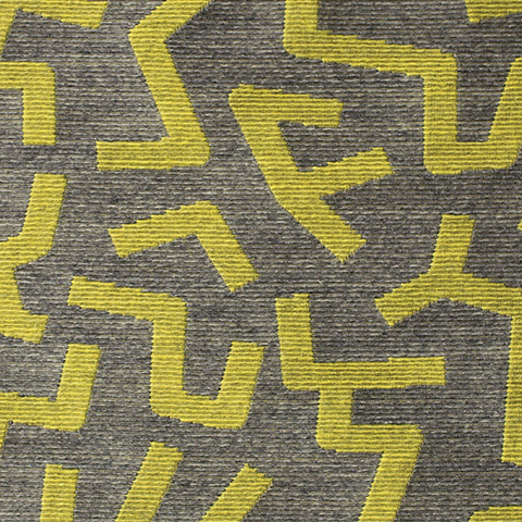
High-performance luxury weaves such as jacquards, piques, tapestries, matelassé, ottomans, damasks and sheers defy their extraordinary performance properties.
Roy Hamilton a recognized designer in many media, brings fresh patterns to Chella. Roy Hamilton, designer of exclusive ceramics, sculptural and textural interior elements and fabrics for over sixty years.
Call for an appointment to explore our source library for the most unique fabrics in the world!
Floor-to-ceiling shelves of samples await your exploration for commercial and residential application!! You can order most textiles by the yard!
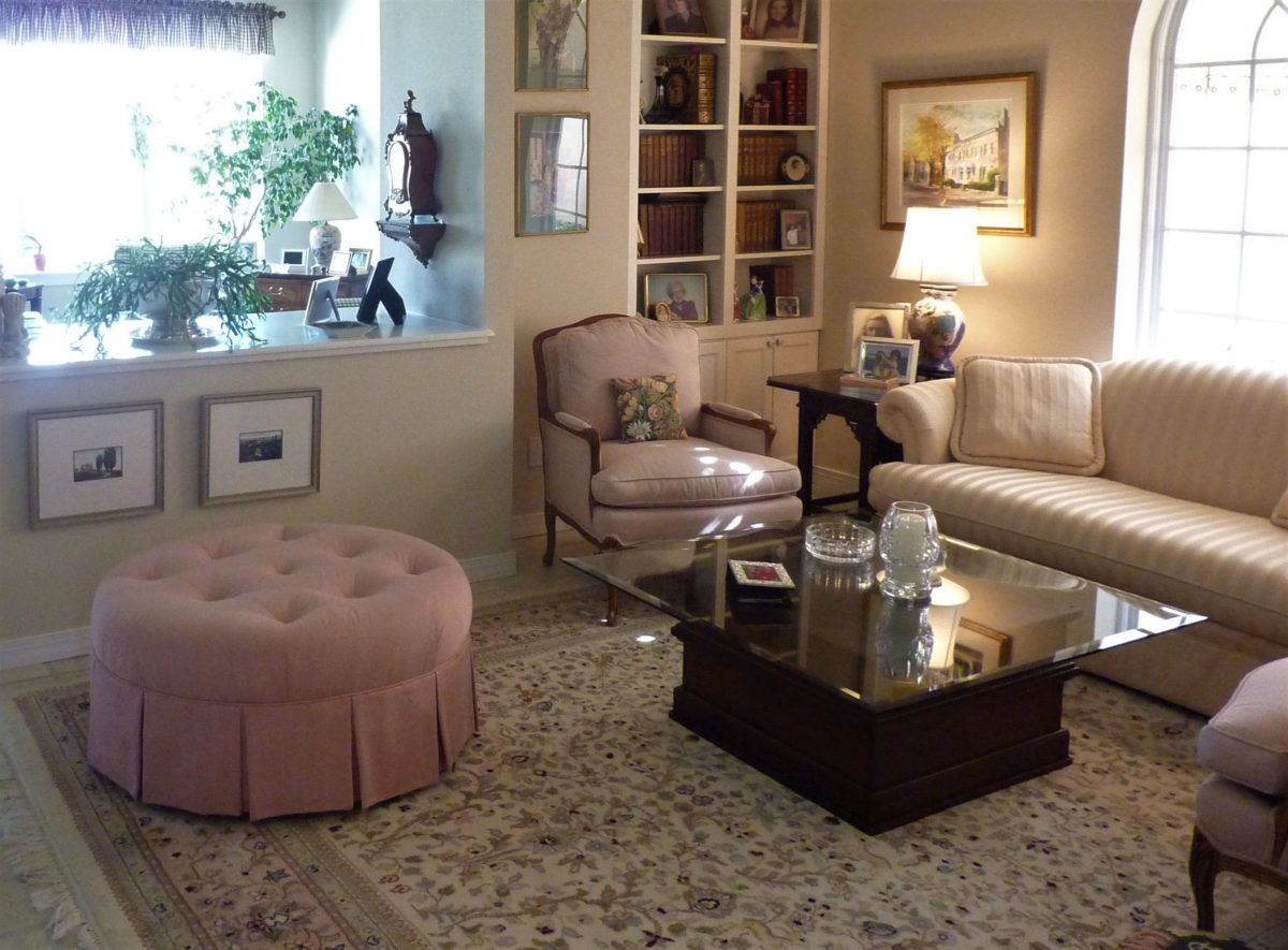
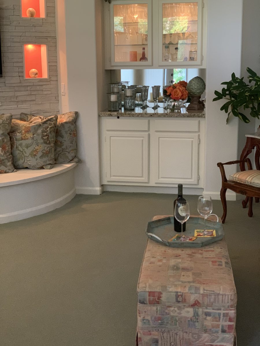
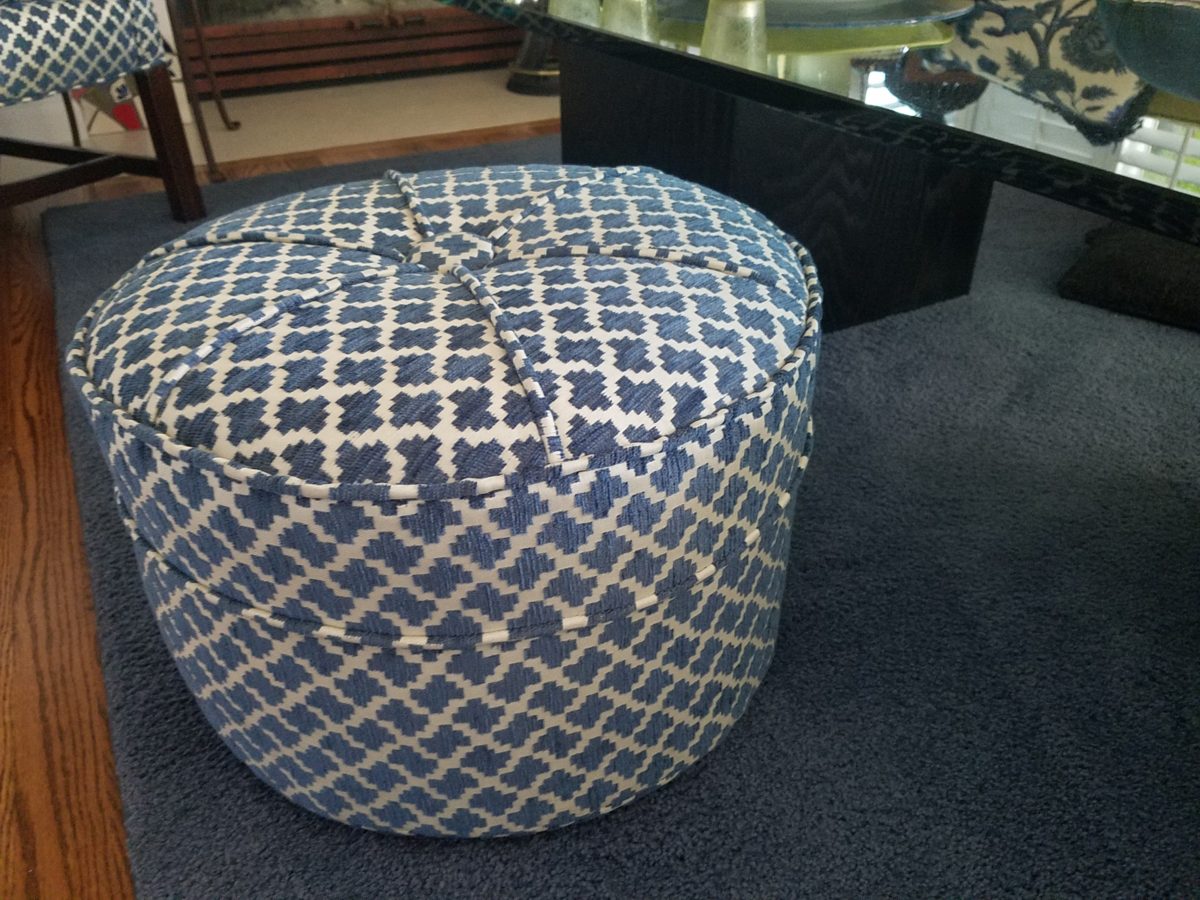
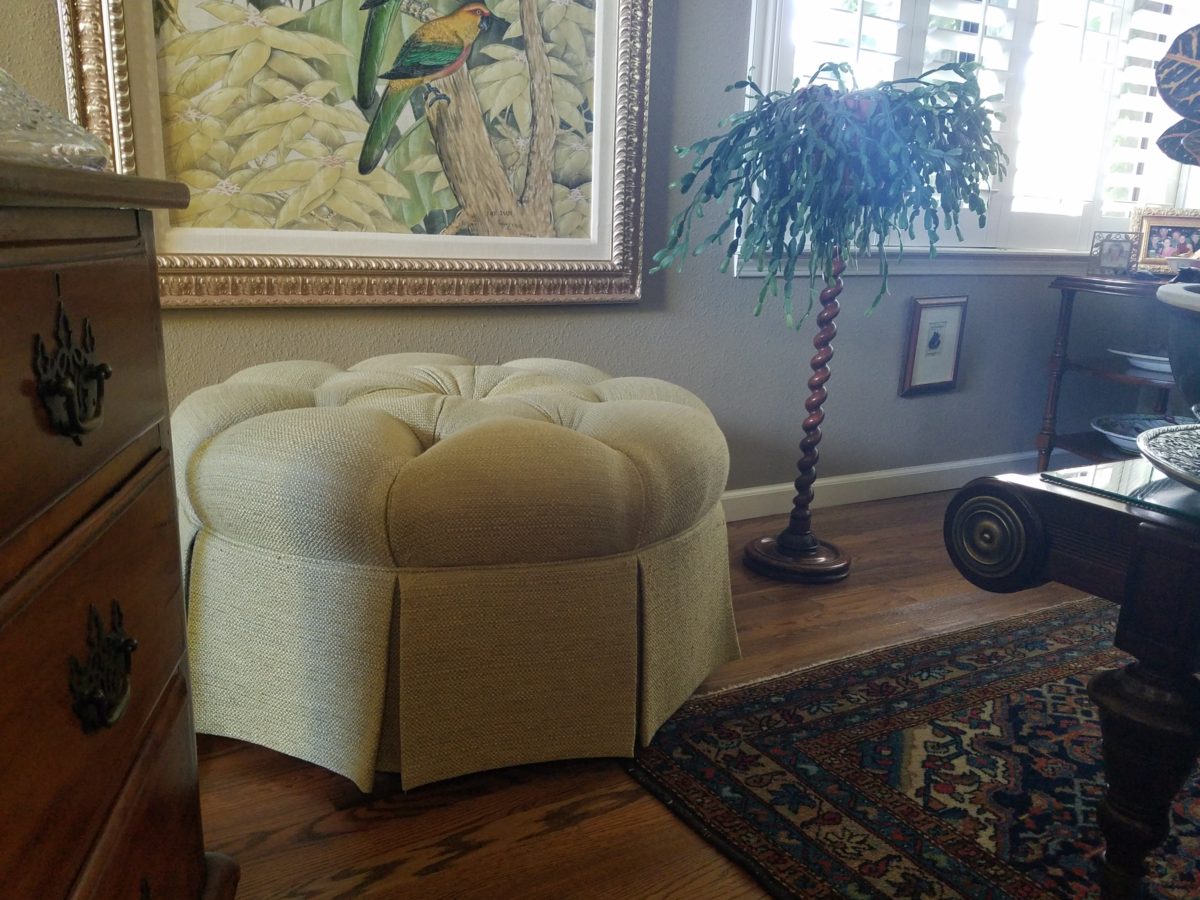
It’s always a good idea to have extra seating, but in small spaces, it’s not always easy to make a room arrangement work. Apartments, lofts, condos…pulling up dining chairs isn’t necessarily the best solution. What is a great solution is something low that does not block the scene and can be easily moved to change the groupings.
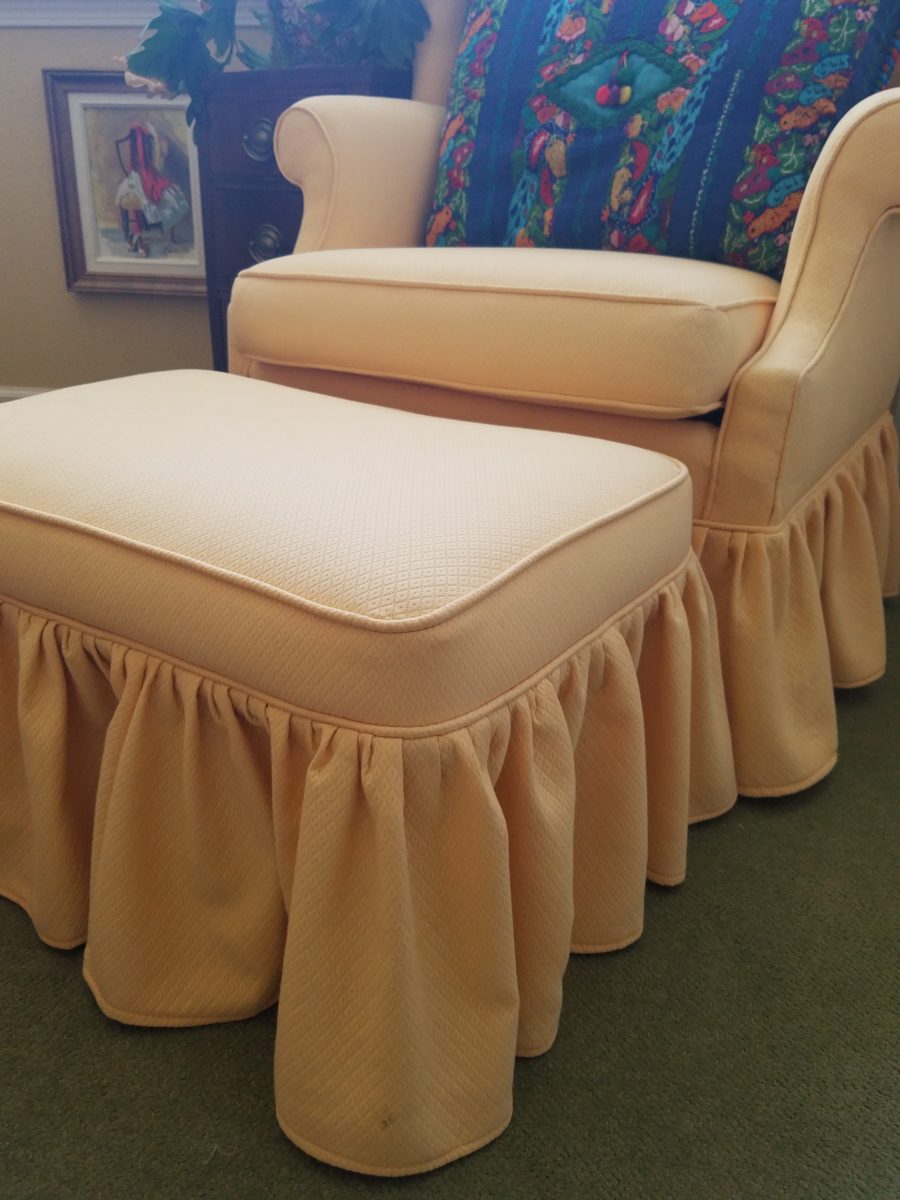
Footstools, benches, poufs, ottomans…as an ensemble with a chair or a stand-alone piece, the options are endless. Trends are often spawned from necessity or convenience of not change for the sake of change.
Bedrooms can also offer footstool/ottomans when there is only room for one chair. For reclining to read or as a pull-up for a second seat.Benches are a great seating option.It’s not a wonder that we have sold numerous of these clever SURYA Cotton Poufs in myriad colors in our shop!
Often used for coffee tables – with a tray for stability beneath drinks, benches or ottomans can double as a foot rest or table-like surface.
An upholstered bench can be pulled in front of the fireplace or used as a cocktail table with a sturdy tray.
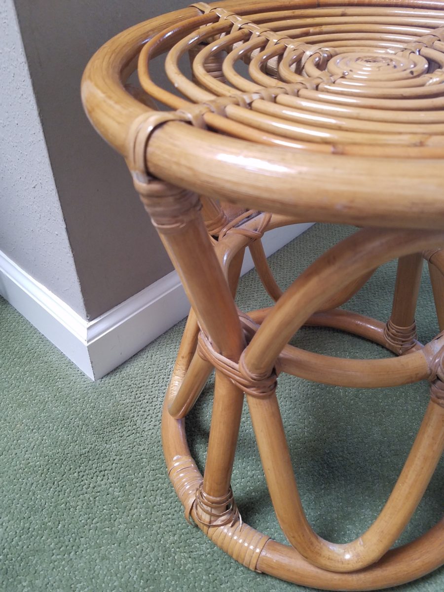
Something as simple as a rattan stool can be easy to pull-up.
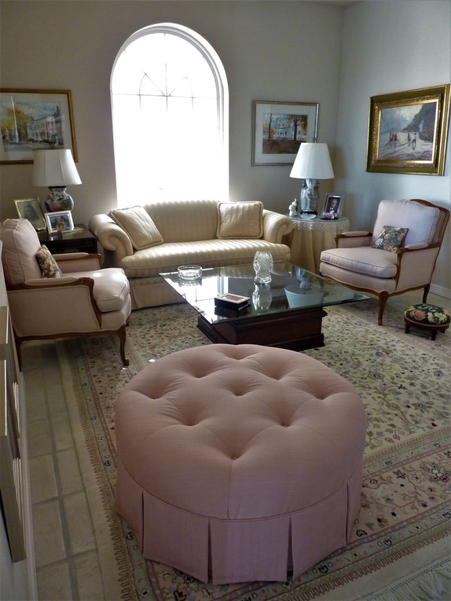
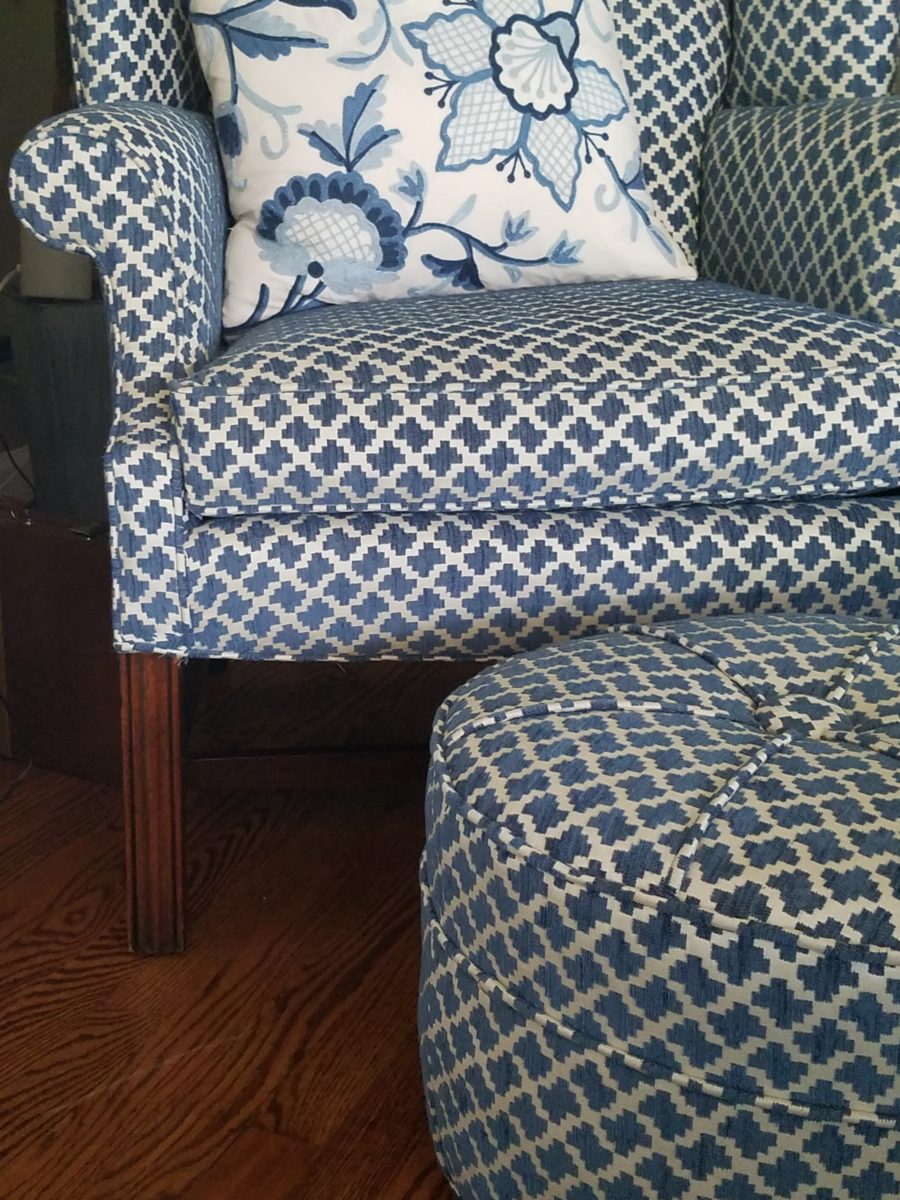
A pair of ottoman frame a seating area. An ottoman never has its back to anyone or anything.
You can seat more than one person on a good-sized piece.
A round one can have guests facing different directions to join in different conversations around the room.
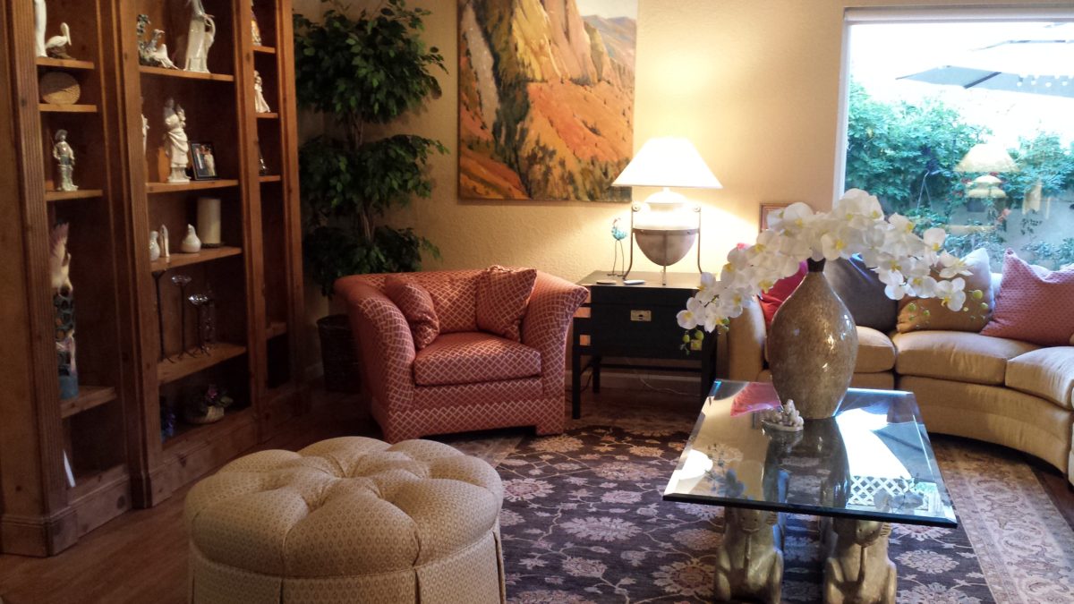
Low in front of a fireplace, tucked beneath a coffee table or a console table, they can easily be pulled out when needed.
Here a pair of square cubes are stowed beneath a console and pulled up to the group for extra seating.
They add a splash of color or pattern.
Or they can meld in with the color scheme.
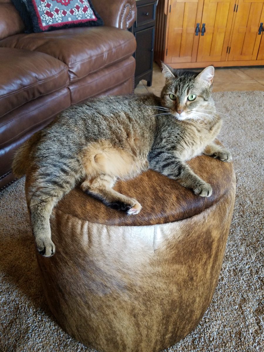
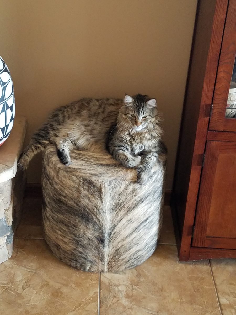
These cats think they are hiding on these custom fabricated cow hide stools. Cow hide camouflage makes the perfect perch for these cats…but they are intended to be handy for guests as pull-up seats around the coffee table in front of the fireplace.
Look at your room and see if it wouldn’t benefit from an extra low-profile seat or two.
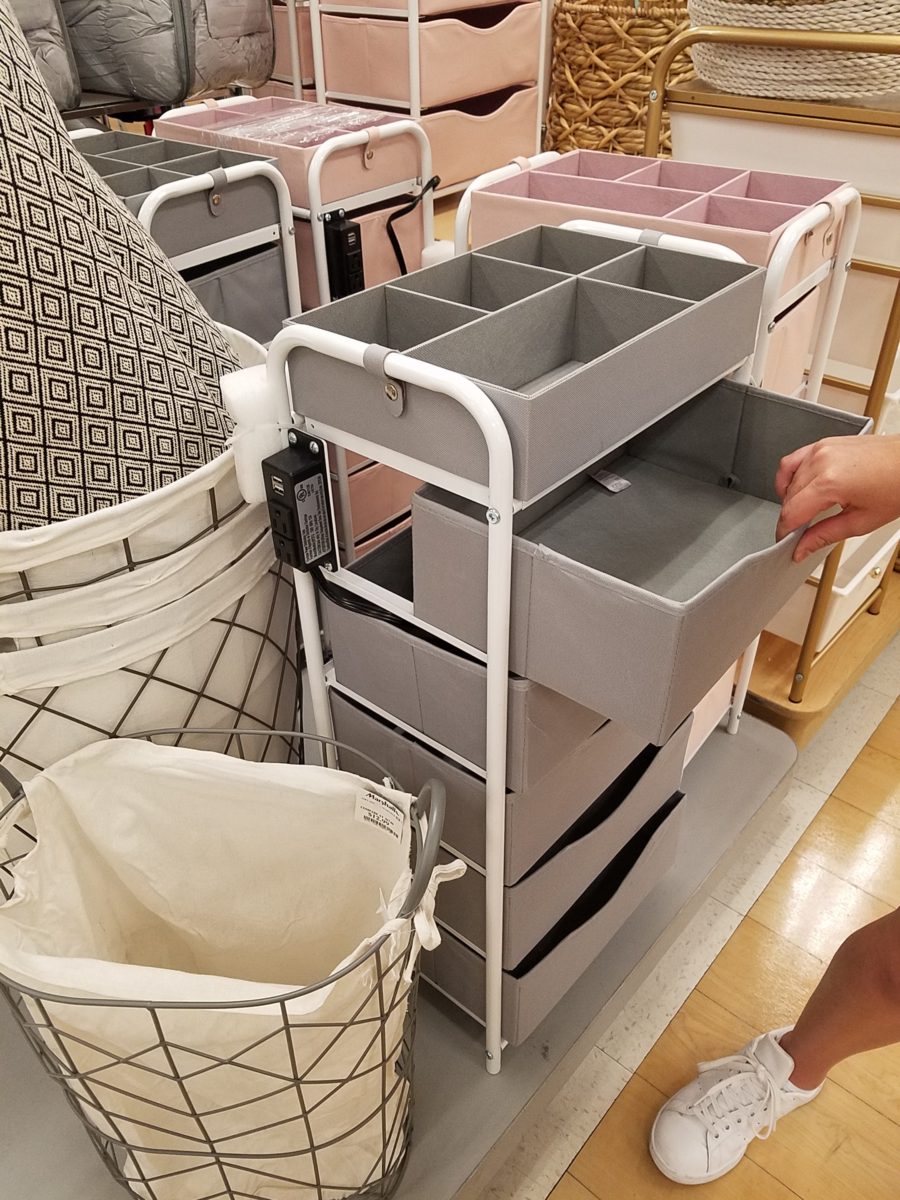
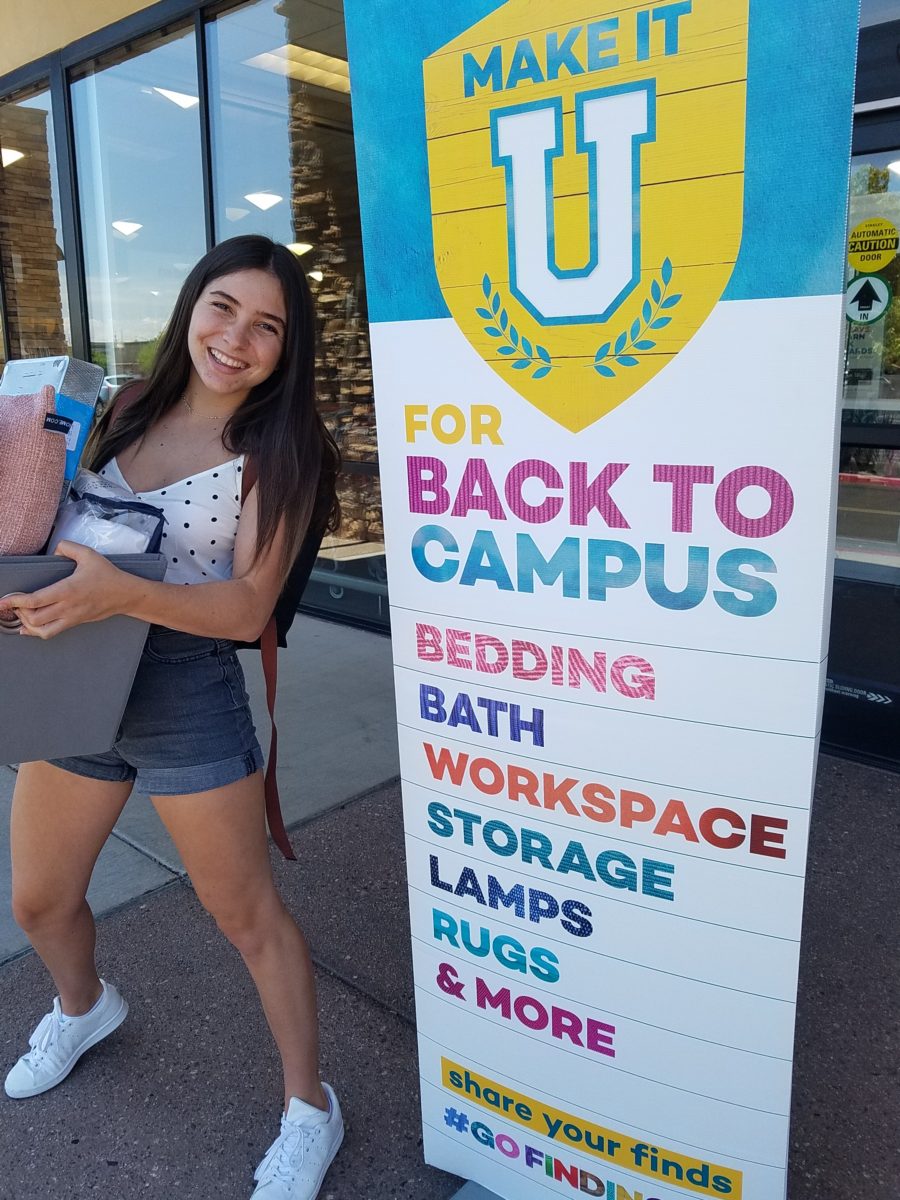
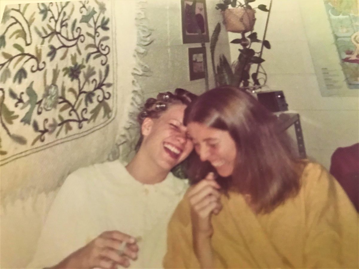
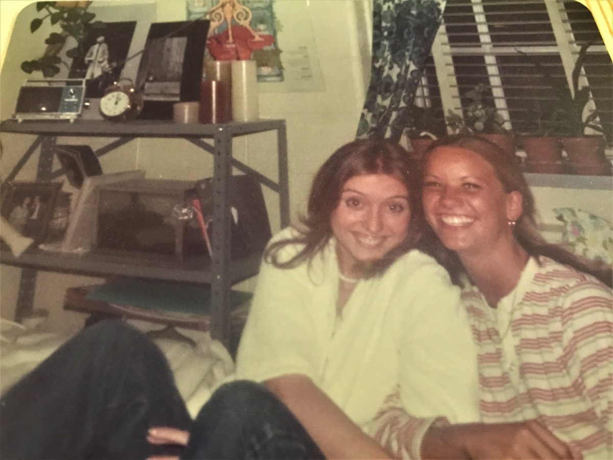
It’s that time again…the end of summer and getting kids back to school…exciting, hectic, a bit stressful and today, very nostalgic. I (who saves everything) still have my little black and white Sony TV, embroidered fiber art that hung on my wall, floral twin bed sheets and bath towels! I remember the white chenille bedspreads that I got – giving one to my bestie/roommate so we’d match – even though she was a red accent person and I chose blues and greens!! We picked each other, our college and designed our neat and tidy package.
Earlier this weekend, as Victoria navigated this information highway that is the lead-up to getting her dorm room assignment, roommate and all the related details, she texted her yet-to-meet roomie and asked what her color scheme was going to be. Victoria, having established her pink (dusty rose) and grey scheme last fall upon entering her freshman year elsewhere, was hoping that she was not going to have to share her intimate space with a shocking orange scheme or similarly discordant color. All of a sudden, from the back seat came a exclamation – “NO Way!” To what, we asked – “What?” And she said “Guess what her color scheme is? Pink and Grey!!! YAY!!! What were the chances?”
Well, strolling through the stores with their piles of offerings displayed in tempting color-coordinated arrangements, pink and grey still carries over from last fall in a big way – so the chances, it seems, were not all that far-fetched!! LOL.
With the prominent pink and grey, popular turquoise and grey and for the boys (if we are being color/gender-esque) black and grey – seems grey is the common denominator facilitating merchandising and keeping everyone in color-trend order.
Pro-tip #1 Make a list of what you’ll need prior to hitting the stores with their limitless temptations for dorm decor! It can be daunting if you go shopping – cold. It can be daunting anyway – but best to attempt to be prepared! As I looked around all the displays leading these trends…leading these kids…I wondered how many – if any – might veer off course and pick an orange and lime green theme or brilliant cherry red…and what does it say about one if they buck the established trends? Some might be oblivious to the trends – despite being bombarded in every store by the “must have” selections. Those independent thinkers who like what they like – if it matches or not. The eclectic ones who are driven by memories, personal expression and acquisitions gathered and honed over the years that were not guided by trending decor influencers.
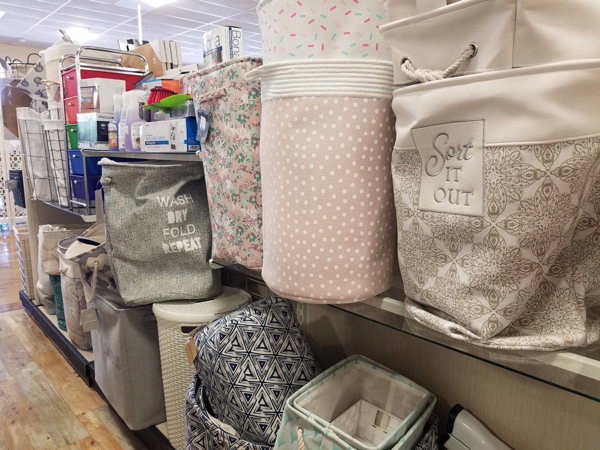
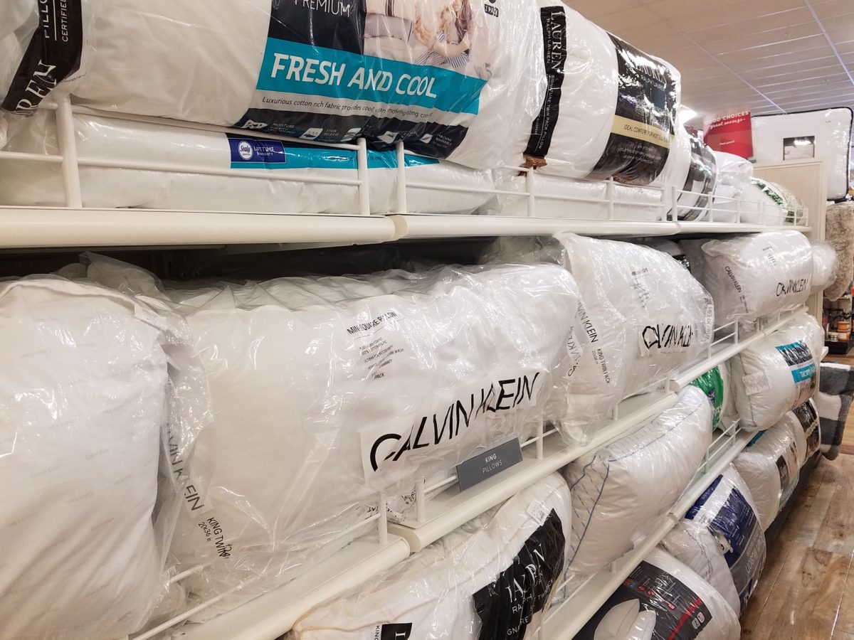
However, it is entirely possible to genuinely LOVE the trends and invest in the colors for more than the first semester of eager dorm room decor! We were living it! What was purchased last fall was saved and expanded upon, with new-found knowledge of the tips learned from the pros! There are boxes, bins, rugs, lamps, staplers, desk organizers, linens, bulletin boards, throw pillows, blankets and throws – all color coordinated making the job relatively easy and swift.
The stores are prepared. Welcoming students – their signs
are out and their shelves are stocked! Rows of pillows, mattress covers, foam
pads, artsy accessories and accents galore…all to enhance the otherwise bare
rooms that will soon come to life!
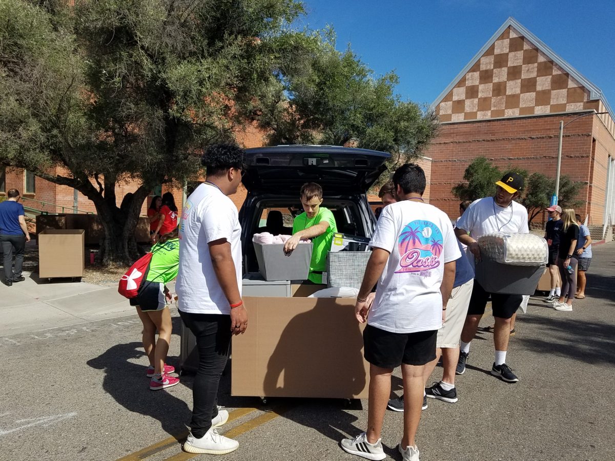
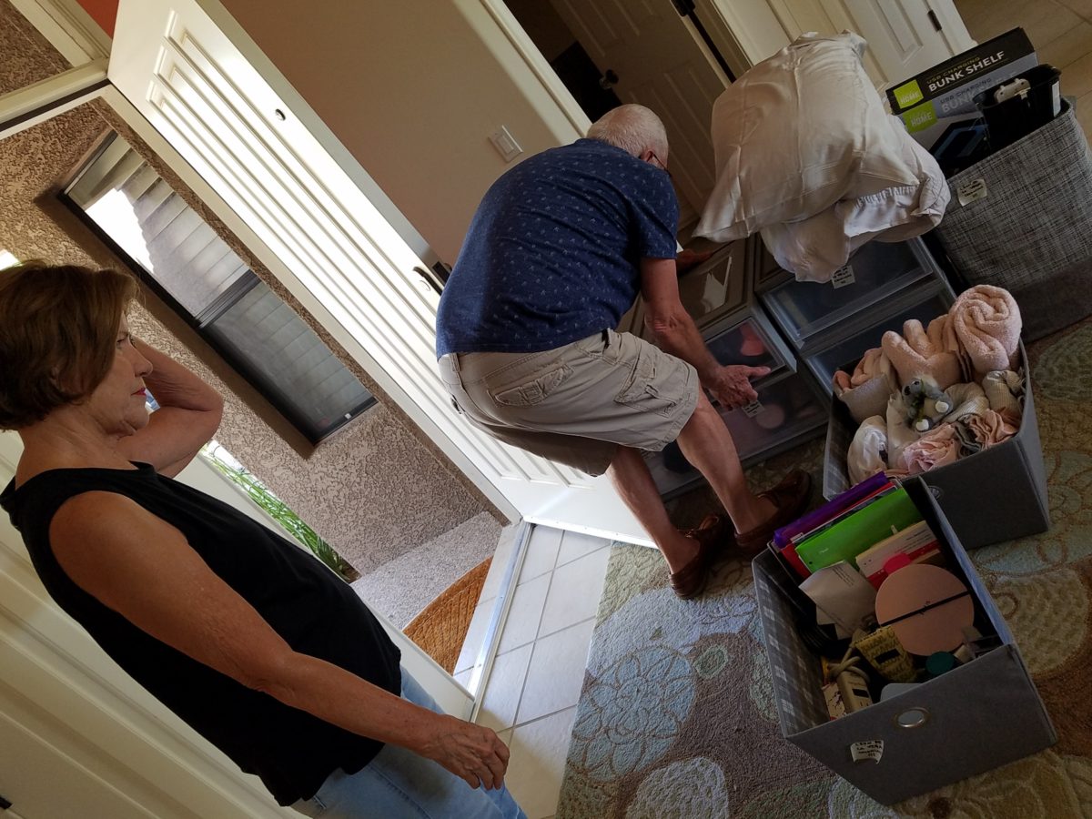
The morning of the move, they staggered the move-in time to insure an orderly point of arrival and processing to the rooms. We were assigned 9:30 and met curbside by a handsome posse of volunteer boys who were armed with rolling cartons cleverly created using carpet-wrapped moving dollies upon which were mounted large, sturdy cardboard cartons. These rolling bins were piled high with contents from the cars and wheeled into the dorm rooms with efficiency. Co-eds in red t-shirts identified them as the RA staff – the ones with the answers to all of your questions.
Being organized is key. Victoria had benefit of a previous semester where she watched the pros and got their tips! Pro-tip #2 Be organized!
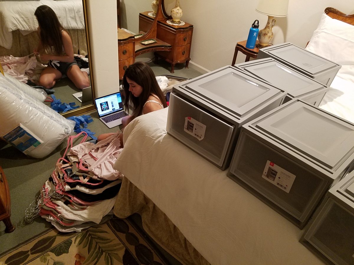
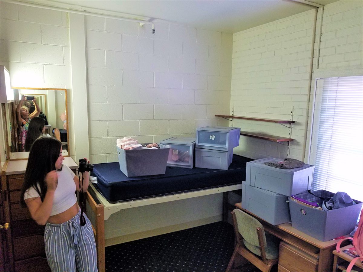
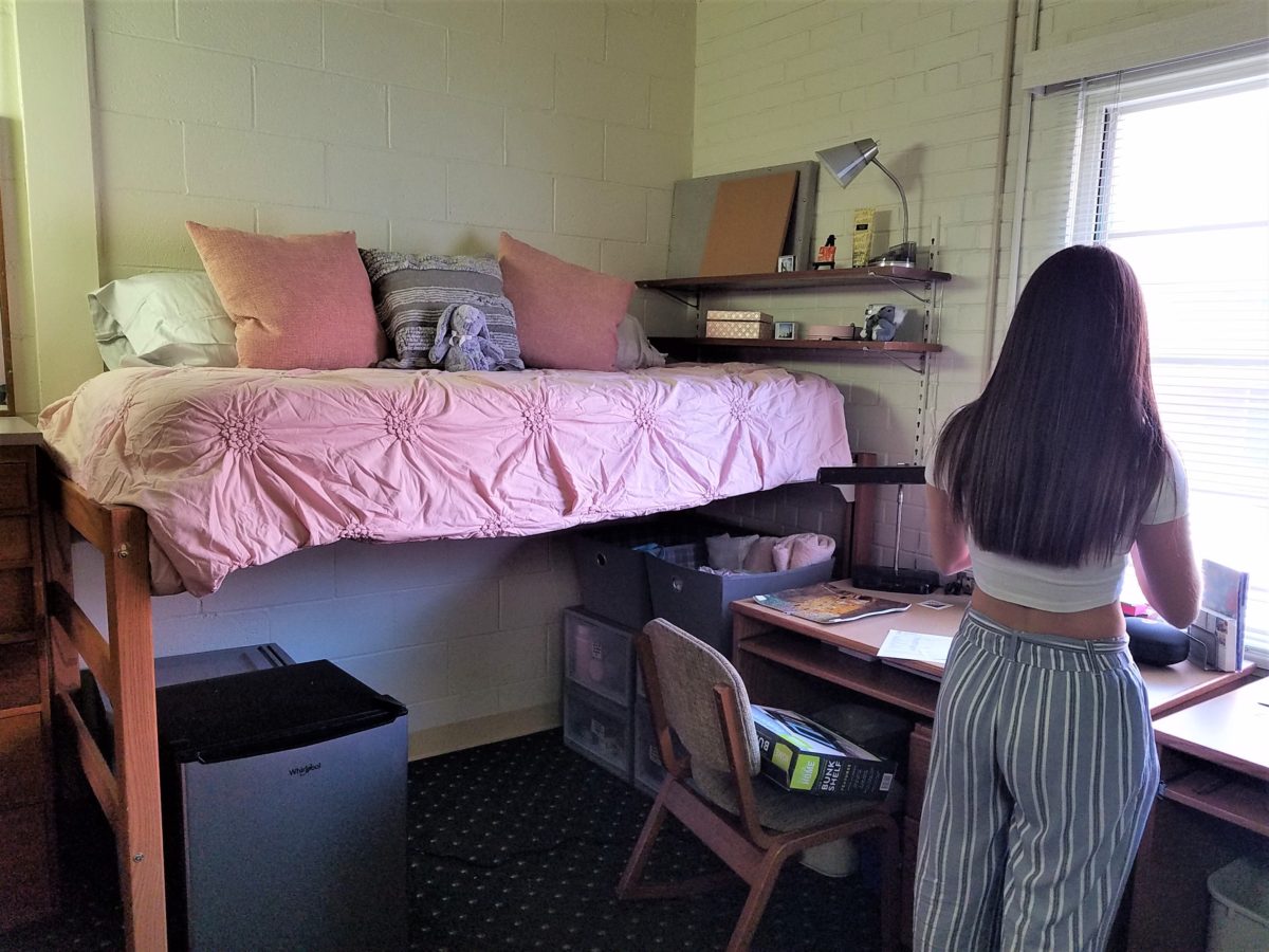
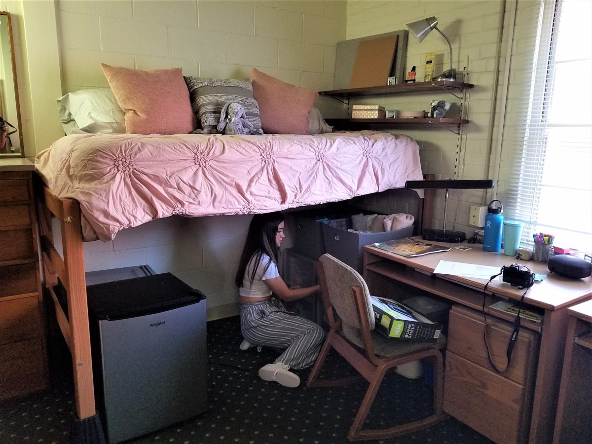
To that end, utilize your limited space to the max! Capture all available real estate! Pro-tip #3 Bed risers. The beds are high – high enough to stack storage drawers/bins beneath them. They can be raised even higher with risers. Pro-tip #4 The plastic stacking drawers are cool because they make easy access to contents just like added dresser storage space.
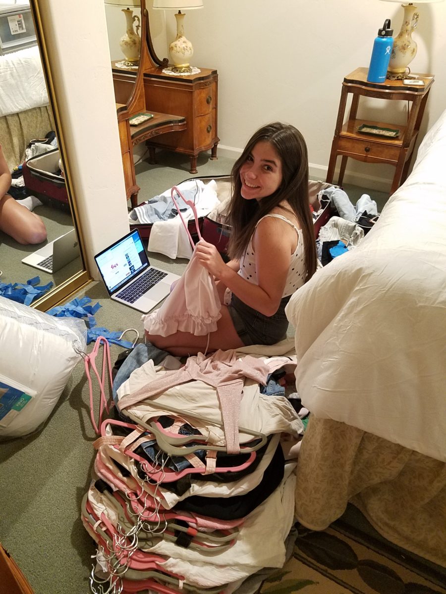
Victoria had it all figured out. Pro-tip #5 To consolidate luggage, she packed a lot of her clothes
in the bins – all in very specific order and folded making it easy to transfer
once in the room.
Once in the room, she raised the bed even higher on 4 cone-shaped plastic riser units that she had purchased. She then placed her new mini frig (Pro-tip #6 Get a mini frig) and bins beneath the bed in an organized fashion. She emptied the bins one-by-one into the chest of drawers thereby freeing the bins for other supplies such as snacks, kitchen supplies and miscellaneous other necessities.
Having a mini frig in the room keeps personal perishables under control and handy instead of having to label things in the shared frig down the hall.
Pro-tip #7 Take
extension cords and multi-plug surge protectors. This was handy for the reading
lamp waaaaay up high above the now super high bed and also to run power to the
mini frig. You can never have enough power sources and another bonus was that
one of the set of four bed-riser units had power outlets and a short cord!
Pro-tip #8 Get a collapsible shoe rack/shelf (for ease of storage and transport). They have nifty wooden ones – but we took ours back as the closet had a tidy set of built-in shelves perfect for shoes.
Once the power was all connected and the bins organized clothes put away, it was time to make the bed and add the finishing touches.
It was beginning to look like a home-away-from-home! Pro-tip #9 With hanging implements that will not harm the wall like Command Strips, the walls will gradually come to life with strings of photos clipped with clothes pins, twinkly lights, bulletin boards and other imagery.
Pro-tip #10 Take photos – the memories are priceless!!!!!!
Everyone loves before and after shots – they are so telling, dramatic and fun to compare. How about during? This week, we are nearing completion of a project that has been in the works for the past few months. Not quite finished, here is a little story about the stages of the design process…
Are YOU planning a remodel…a room an entire house?
Once a project is identified, the options are studied. Usually each party involve has their preconceived notions…images and ideas come to mind. The mind is that arena from which it is tough to articulate images and especially between people. The design process requires that ideas need to be expressed, defined and argued – pros and cons.
This room was dated and fussy. The finishes were tired and needed refreshing. The project was described as a complete makeover to compliment other recent updates in the home.
The scope of work was to remove the tub, replace the cabinets, add a second sink and create an opening into the guest room. At that point, the “what ifs” began.
Healthy arguing ensues – meaning sharing ideas back and forth, explaining the approach and concepts. More like presenting than arguing. It’s actually a fun, creative process – full of choices, ideas and seemingly limitless opportunities. It’s the “What if…” stage. Sketches are used, arm-waving and samples, photos and words all contribute to the compilation of the ultimate design. Each person contributes to the process until a common plan is adopted.
Whether formal plans are needed depends upon the code requirements, if applicable (“cosmetic only” changes requiring no modifications to structure, electrical or HVAC – for example – might not need formal drawings). Therefore, the development of documents is dependent upon the requirements of the municipality and/or methods of the contractors. Regardless, sketches begin the process.
If code requirements necessitate permitting, the process
must proceed through that stage prior to commencing the work. So after weeks of
ideas being tossed about, a plan was conceived, client approved drawings were
made and the process moved forward.
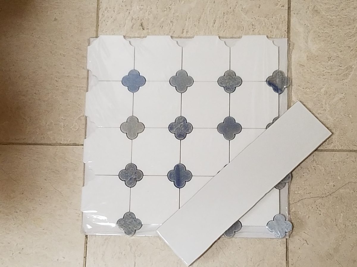
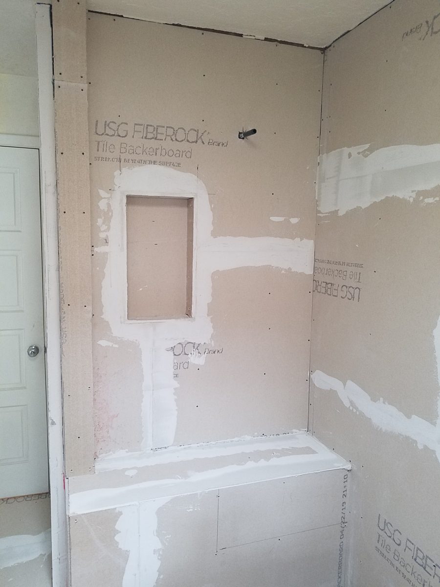
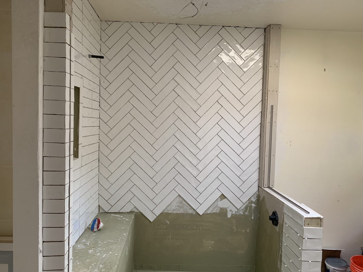
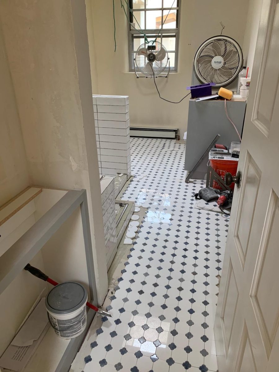
The scheme was set with the first materials selected – glossy glazed imperfect wall tiles for an interesting and textural herringbone pattern with a stone mosaic for the floor.
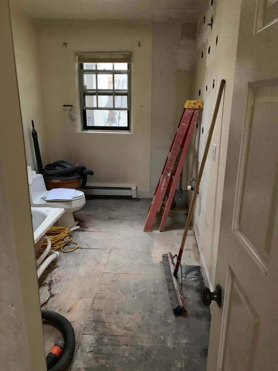
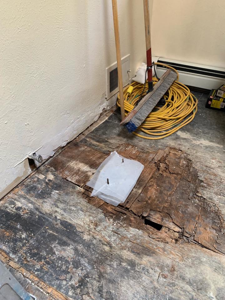
The demolition – always a shock – but “you have to break and egg to make an omelet!” Unbeknownst to anyone, the floor was rotted beneath the toilet and required repair. Mirror, glass block, tile and much sheet-rock was removed.
Old cabinets were removed and after all the dust had settled, the bare bones exposed and a clean slate presented, the new work began.
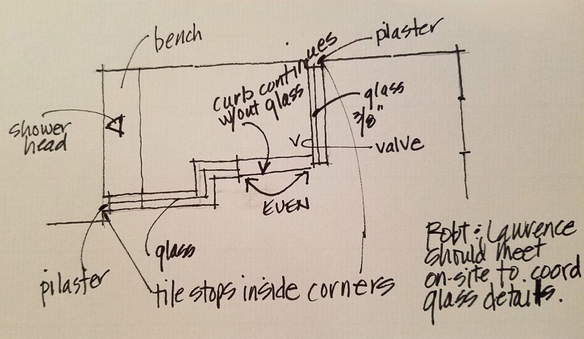
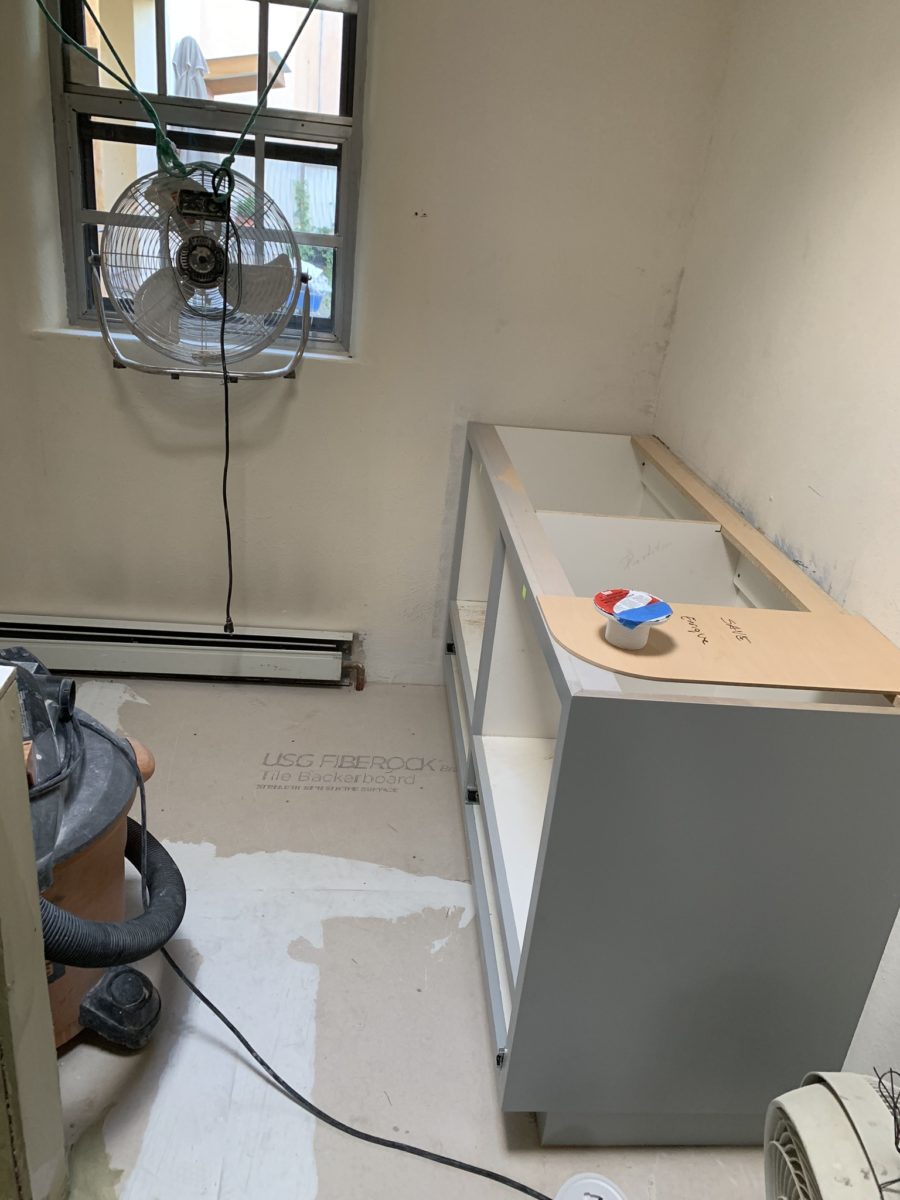
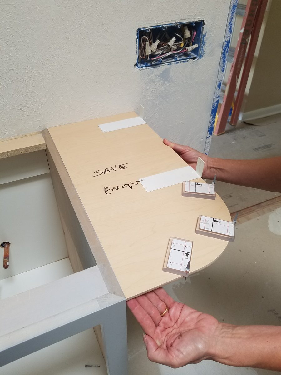
The new cabinets were to accommodate a second sink and slightly longer counter-top. To make sure access between the shower and counter-top was not too restricted, I designed a radius to ease the squeeze. Enrique made a template of the radius that would be represent his end shelving and counter-top. When Rocky Mountain Stone arrived to shoot their lasers to measure for their templates, the radius template Enrique had made was very helpful.
The end of this cabinet will have radius shelves with counter-top following the radius. Until then, Enrique made a template of the shape so that the counter-top could be measured in advance of end piece being completed and installed.The laser process to template the counter-top begins…with the help of the mock-up of the radius!
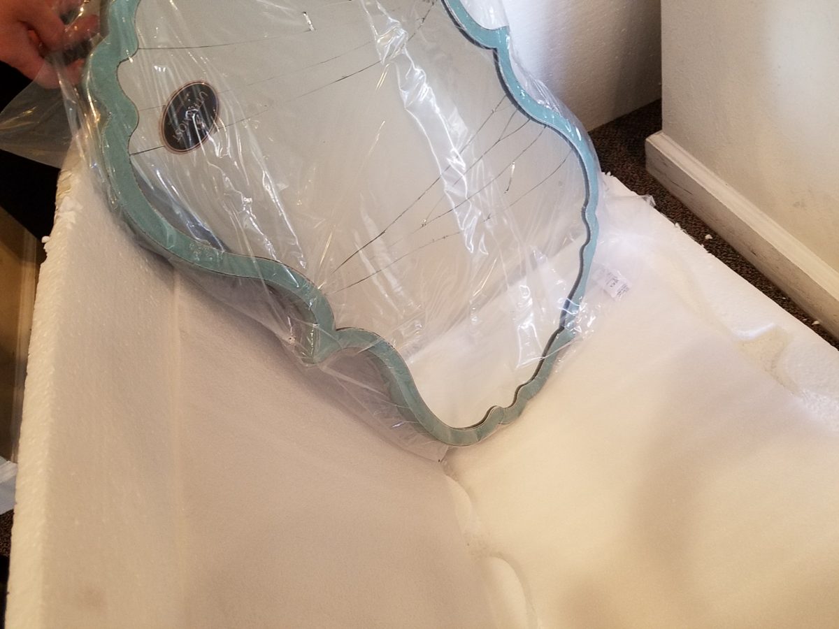
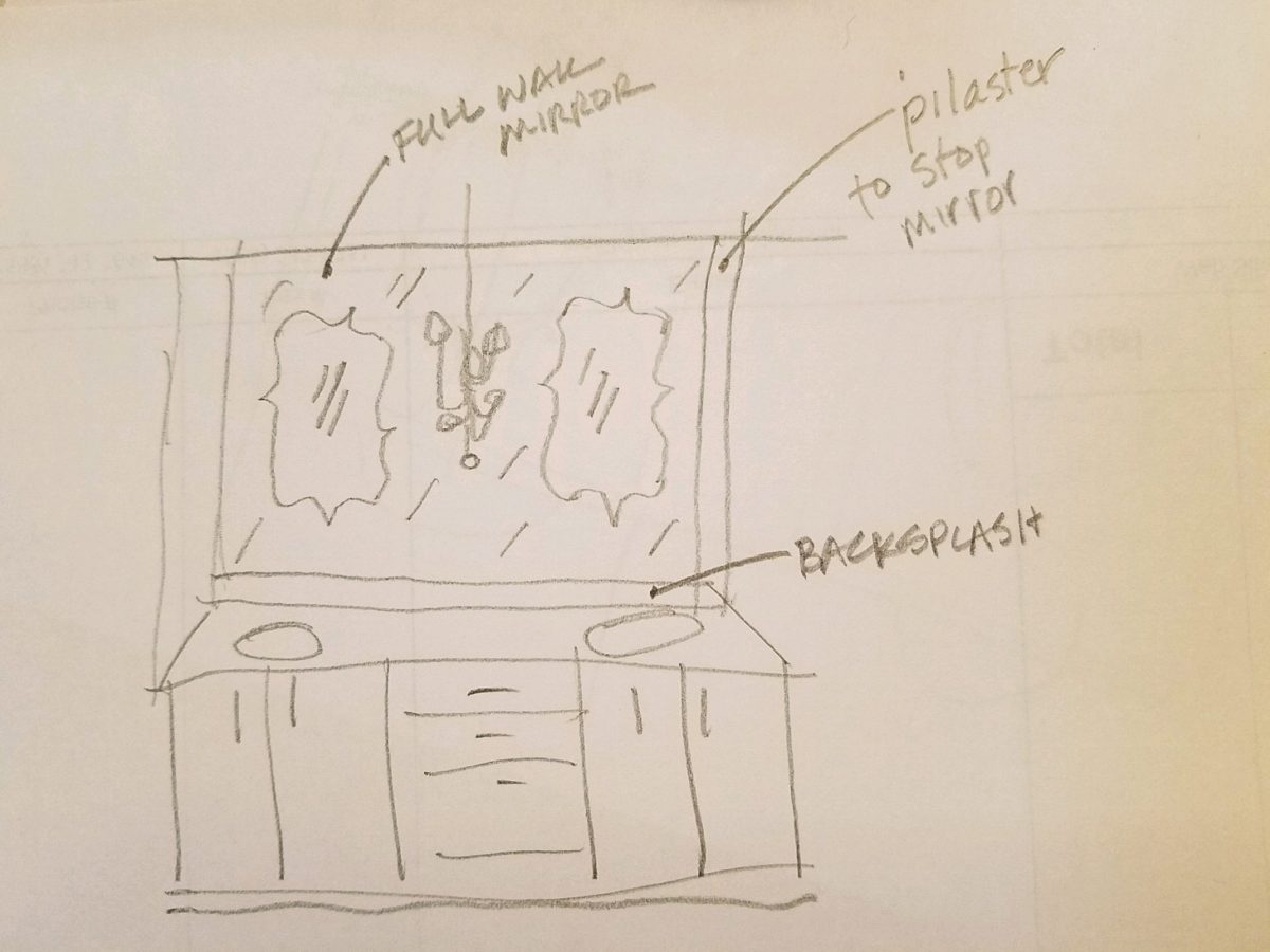
Decisions regarding lighting had not been finalized, with the completion of the plans. Having eliminated the desire to have recessed fixtures, whether to use a center sconce, two flanking sconces or a single pendant in the center between the sinks was still up in the air. Love the pun! Debating a full height panel of mirror versus two wall hung framed pieces, was also undecided.
But here’s an “oops” when we discovered the power for the light fixture off-center for a center-hung pendant.
Taking the risk to be disappointed, but with little investment
to do so, our client elected to buy the
two curvy framed mirrors that almost promised to be too small. Upon arrival one
of the two mirrors were broken. Bummer.
The inevitable, unexpected happens on every project…we had decided not too use these so rather than have the one of the pair replaced, we requested a refund. However, upon further study, we modified the design to accommodate both mirrors – we are re-ordering the second mirror.
But in an effort to determine if we wanted to have the
broken mirror replaced or refunded. We held it up on the wall, as we feared, it
was confirmed that they could not carry the space. We asked that the company
not replace the broken mirror, but refund the cost.
We really loved the
whimsical quality of the curvy framed mirrors and their distressed turquoise finish
was a great addition to the otherwise blue and white scheme. So, a week later,
after pondering the dilemma of the mirrors…I offered what seemed to be a radical
suggestion (but not really), and that was to install a full-panel wall mirror –
backsplash to ceiling – and then mount (over it) the two mirrors. To do so, our
very able and talented glass master, Robert, would have to cut (prior to installing) holes
in the mirror panel located behind where the framed mirrors were prepared for hanging. The result would be the
pair of mirrors hanging on top of the full panel creating a floating, multi
dimensional effect. Watch for “afters” in a couple weeks, of this
completed installation.
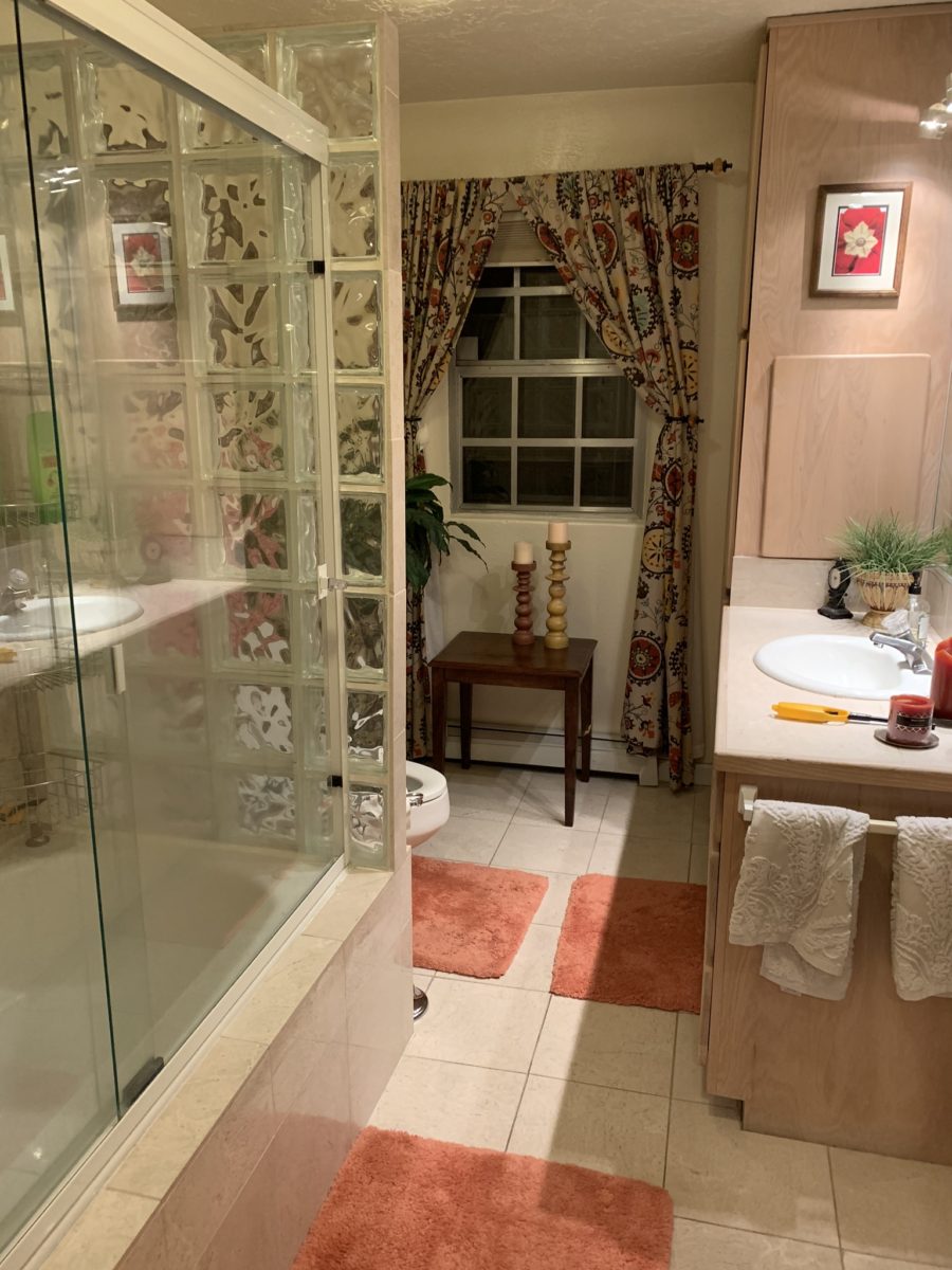
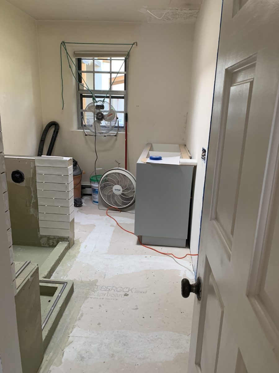
As the project proceeds, the flooring is nearly completed and all but the finishing touches remain.
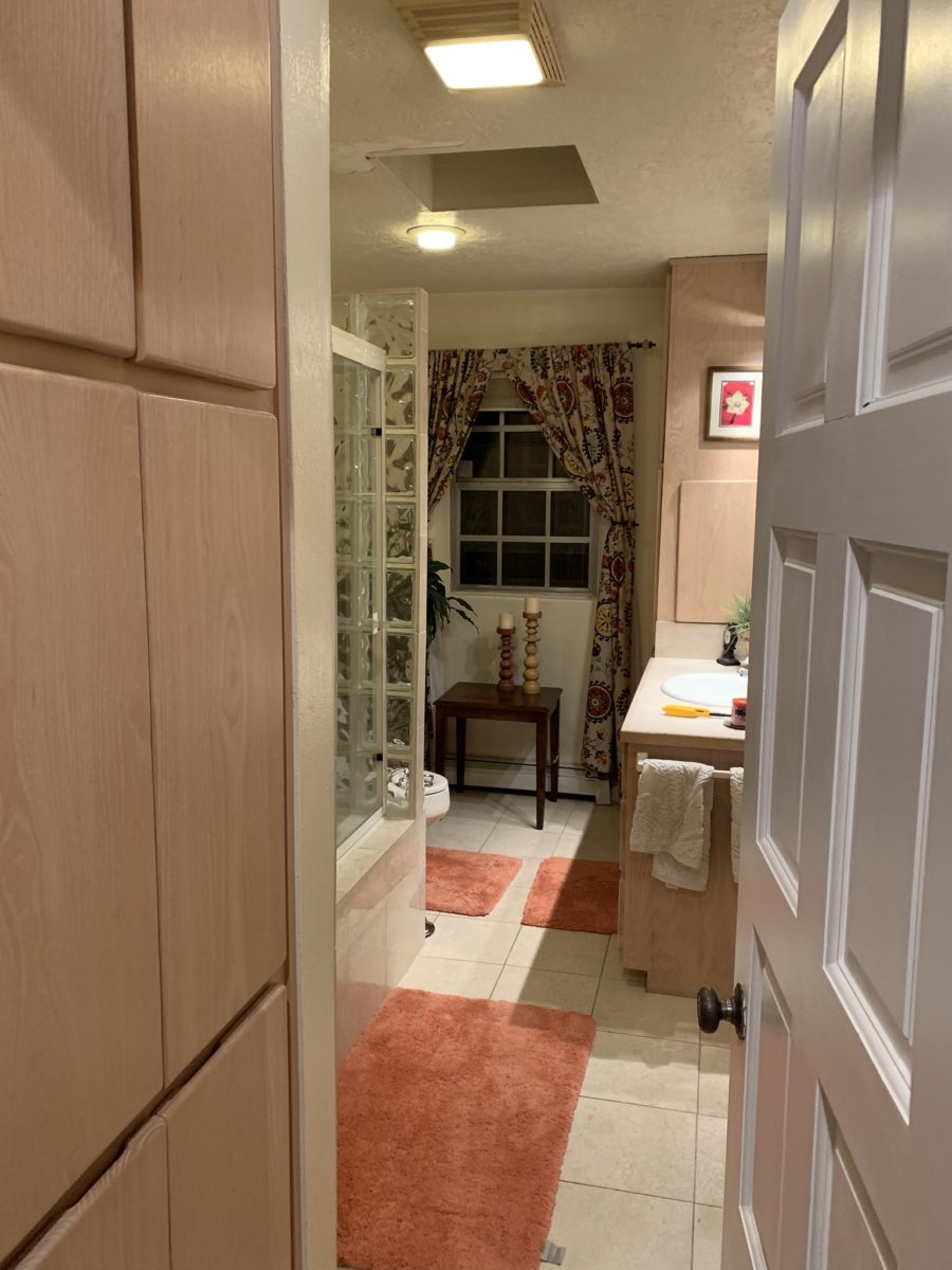
Pilasters were added at each end to stop the tile on an inside corner, rather than having it quit flush on the wall. The shower will not have a door, but nearly encapsulated with frame-less clear glass to give an illusion of a more spacious room.
Best to stop here and reserve the finale for the finished “after” shots as promised.
When designing for a vacation rental property, the first order of business is to select things that are durable and easy to maintain. This means finishes to furnishings. I know this from practical life experiences and also working with commercial/hospitality interiors. To do so, one needs time to place and receive the orders with enough contingency for mishap. It is also dependent upon the housekeeping arrangements planned for on-going maintenance.
In this recent project, the work began 12 months out – plenty of time you think…but it was all about the physical remodel. We began with the drawings for floor plan re-configuration and specifications for new lighting, cabinets and finishes throughout. The decision to furnish was not made until nearly 10 months later with a deadline to complete in less than 7 weeks. The delay was partially due to an indecision over how many of the 4 units (all on one floor) were to be short-term or long-term rentals. Then a new city ordinance imposed a moratorium, of sorts, on short-term rentals and while that was tossed about over several weeks…more indecision ensued.
It’s a riot to see overnight design projects transform interiors in 24 hours. That’s due to a free-reign for design decisions, a team(s) and vehicles to pick-up/deliver, all trades on deck, a single director calling the shots and an organized chaos that results in a magical finished project – yes, like magic. Open your eyes, be stricken with awe, cry a little and exclaim repeatedly that you “just can’t believe it!!!!”
Real life is generally not like that. Real life has in-put by owners, limited schedule openings by the various trades, little spontaneous decision-making and fleeting time riddled with unwanted surprises and delays. Real life, in this case, was a theme provided by the owner, a preconceived “look” developed in the mind’s eye and scratch paper of the designer during the selection of finishes and floor plan modifications and vacillation for several reasons, of what units to furnish and when. Over the course of a year, leading up to less than the last 30 days, the project was to be fully furnished and finished – ready to rent!
The good news is that with controlled frenzy, changing
availability of products, focused efforts and teamwork, we are pleased to present
the Lobster! Completed all but hanging the TVs by the requested July 1st
deadline, it is beautifully appointed and offers a colorful and a bit
whimsical, spacious, clean and did I mention enviable location- 2 blocks from Pacific Beach
in San Diego?
This entire project, except the move-in this last week, was done long-distance with the owner in Maine, her management company SHORE on-site in California and we the design team in New Mexico. This is not at all unusual, but Maine prompted the owner’s desire to name the unit Lobster. Not your spiny lobster from the local waters, but the New England version from the Atlantic with the classic recognizable form that accompanies the imagined crustacean – including the brilliant reds of the often appreciated steamed version!!
With fond memories of her childhood helping her elders maintain this property, the owner wanted to commemorate the building with an entry plaque visible from the street on the new redwood gate (soon to be completed). In addition, we suggested an individual name/theme for each of the 4 apartments which were all initially designated as fully-furnished short-term rentals – hence the bold identity for each! I designed the new name plaques and had them fabricated by Artistic Bronze in Florida. The backing was built by our talented Enrique Jimenez, in New Mexico, and all shipped to California. Bronze was selected for its timeless presentation, handsome durability and commanding respect. Parisienne was the font I selected which may now be used to identify the property as though a logo to tie-in with the on-site signage. Subliminal cues that are recognized even slightly are effective reminders and triggers for recognition. The idea was intended to offer a fun, but lasting, introduction and identification which was to be reflected in the interiors. The Lobster was the largest unit with 2 bedrooms. It was ultimately chosen to the be one fully-furnished unit and owner’s second home when visiting the area.
For budget and availability, we sacrificed certain durable
features that would have been better long-term investments, resulting in some
knock-down furniture that was never intended for much abuse. Fragile painted
table surfaces – for example – better in laminate, wood or stone…but time
will tell.
The look is clean and fun, colorful and beachy – with a slightly up-scaled twist. Cool aquas accent a few walls in the otherwise crisp white interior. Red punctuates effectively in lobster accent pillows, decorative accessories and the full-wall mosaic glass tile treatment in the kitchen. Yes, once again, we like to treat tile on the walls as not mere back-splashes, but wall-covering full height and width!
Weathered grey toned LVT (Luxury Vinyl Tile) in the way of interlocking planks were an easy to maintain and durable floor finish. The faux wood adds warmth and is softer underfoot than other hard surfaces. Perfectly matched with all trim pieces, this flooring is fabulous!!
Lighting is key and here we added recessed directional lights to spot the walls and related artwork. Switching was also an important detail to have options for the lighted areas and accents.
The owner found a novel lobster rug with a great textural,
tufted, yarn system that brings fun and great color and warmth to the bunk-bed
room! Busy, colorful bed dressings intentionally selected (over the hospitality
white that is still trending) contrast against the bright white bed frames
stacked for space optimization and a little kid fun!
A cool find in the way of the glass vessel lamp…where
usually the stem with electrical cord feeds down through the center of the base
and of the back, this one feeds from the socket stem with a cork top that
removes allowing the vessel to be filled with treasures – in this case southern
California beach shells and fragments! And for a little more animation, I found
a carved wooden shark to insert cruising above the shells to make the lamp even
more interesting!!!
A pair of vintage photographs of a lobster shack and fishing
boat contributed by a friend in Albuquerque – taken by him in Maine in 1962 –
were enhanced with bright red mats in their original polished silver metal
frames along with a large painting on canvas of a Maine lobster/fishing boat sent
by the owner in Maine provide interest to further perpetuate the lobster theme.
The master bedroom is a comfortable retreat with another
lobster pillow for punch! To give the room the best approach and make it feel
as large as it can be, placing the bed in front of the windows was the
solution. Beds facing the entrance to the room are always preferable to
arriving into the side of them – for visual space and a more inviting
orientation.
The original bathroom layout was all one space with tiny
appointments jammed together…so we removed the tall storage cabinets and sink
vanity allowing more room for the commode beside the tub/shower and added a
privacy door. Then the new cabinets and counter have their own space with
another privacy door resulting in a two-compartment bathroom area for maximum
use and enjoyment. Red mosaic glass tiles were repeated from the kitchen to further
coordinate the theme.
The bold color scheme was thoroughly distributed throughout
the unit which is an intentional design emphasis especially effective and novel
in a short-term vacation rental – where such a thorough scheme might be too
intense for one’s primary place of residence.
Effective design both functionally and visually should be a significant asset in the marketing of rental property. When used consistency in marketing material with logos and repeated features, this and other properties with attention to detail should attract the discriminating guests. Once there, repeated stays are the key to maintaining a strong guest population – of desired visitors.
Please watch for the entire slide show of before and afters of this dramatic transformation in the commercial projects section of our website, in coming weeks, entitled Emerald Green Beach Rentals – Lobster!
Is your story important? Does anyone care about your story?
And what does this have to do with interior design?
Whether you are marketing yourself or your business, your story has merit. It is about identity, branding and connecting. It is about letting people in a bit. It is about sharing history, experiences and process. It is about your unique reason for doing what you do.
For the past several months, I have been working with a
client on a combination of interior design, graphic design, exterior
design…it is all intertwined. A successful design laces together all these
design elements. And that brings me to “the story.”
Even Facebook features a section to tell “your
story.” Yet, my client resisted
presenting/using the story of this new business venture as a part of the
design. He told me that was “so seventies.” That he had read that it
was a dated concept that was no longer relevant. I begged to differ. For months
I begged to differ! We agreed to disagree.
I believe that this is similar to many interpretations of design. What might be considered “dated” is often the manner in which it is used or done – not the thing itself. Whether a color, a font, a style of furniture, a wall tile or wallpaper, an architectural detail or form…so many design elements are considered dated due to their context. Often, this is fair to observe. But, mix it up a bit and use things differently or with other different elements than the original trend presented and – Voila! You have a perfectly valid, even fabulous design – think outside the box!
The idea of a “story” is not unlike the “mission statement” which became a standard feature decades ago in every company’s presentation on printed media, lobby plaques, conference room walls, break rooms… Some say it is passe, but when something is good and has meaning – re-consider. Like “the story”, “the mission statement” identifies goals and intent…when paired with the story, it provides an overview of the who, what, why that inquiring patrons want to know.
So back to the story…about “the story.” When a business or any concept is respected or
liked, revered or praised, it is natural for people to wonder “How did
they get started?” “How did they come up with this idea?”
“What is their history in this business?” These are common questions
that clever ideas or designs invite. So why not satisfy that interest, create a
buzz…Let’s give them something to talk about!!!
In this world of disconnection, making connections seem all
the more important. What used to be a natural exchange – of communication,
ideas, sharing – is now something that has to be inserted with greater
intention.
So this new business, for which I have been designing, is a barbeque establishment. There are a million. They have certain things in common. Without my enumerating them here – can you envision some common denominators that you might connect with barbeque joints? As is true with any venture, I asked: “What makes this one different? Better barbeque? Maybe. Cool interior? Hopefully. Are those the only unique traits? Is that the memorable take-away? It certainly isn’t a bad one – the idea is to have great food – and a fun environment, but what else might contribute to the experience of this barbecue being unforgettable? What might you have, to tell your friends, to spread the word?”
My opinion was a combination of an intriguing brand and “the story.” But before I go further, they coined a word to express their beer brewing prowess – exbeerience! This will enter into the story as we go along.
Now maybe my opinion about their story was so worthy of consideration because there was so much to this story. That certainly helps. It happens to be a great story with layers of interesting twists and turns – riddled with history and significance. Plus, it had a local interest angle that has the potential to create a buzz far beyond their actual location.
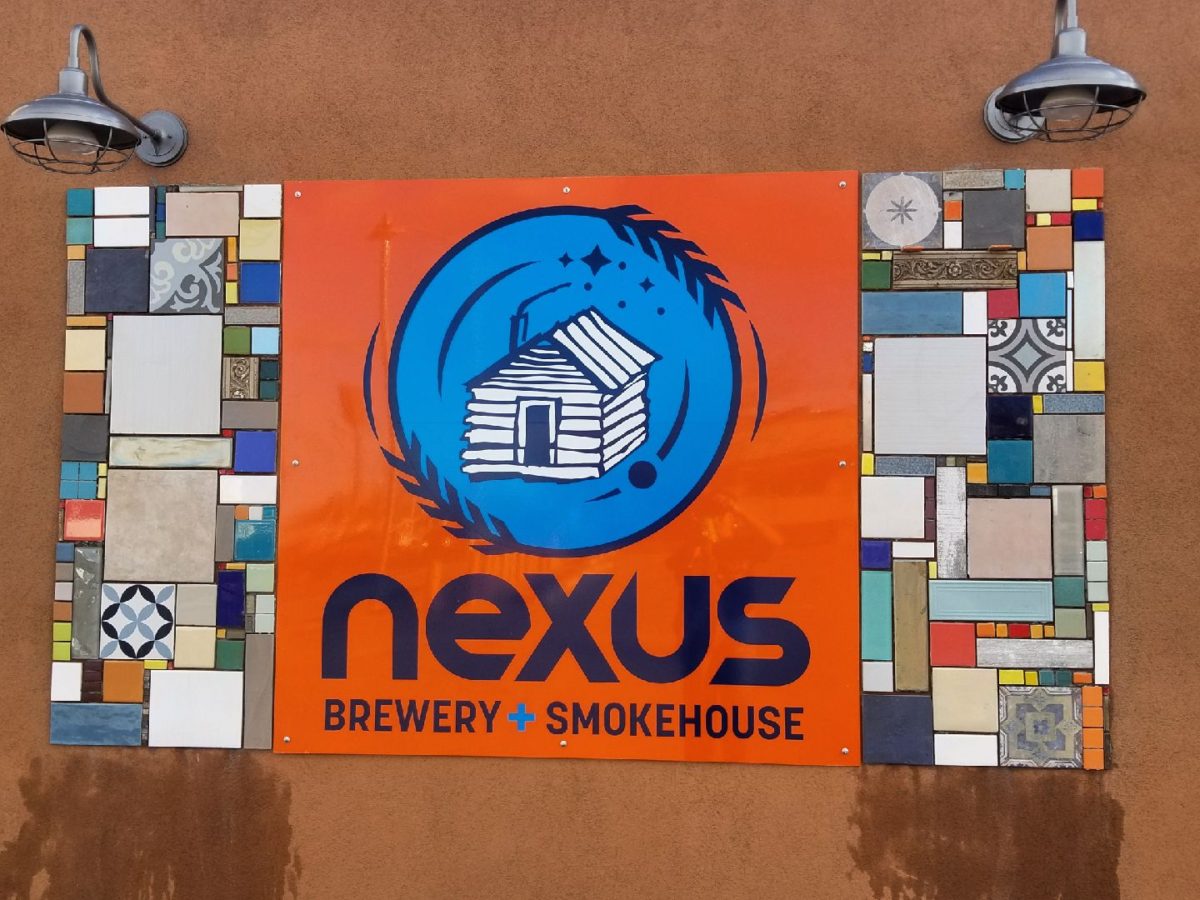
To begin to tell the story, I encouraged the development of
a unique logo for this specific branch of the brand. Taking the lead to design
it, and incorporating it into interior/exterior
design was part of my vision for a complete design package and presentation. Extracting
from the story to create the logo seemed natural. The private persona was
becoming public.
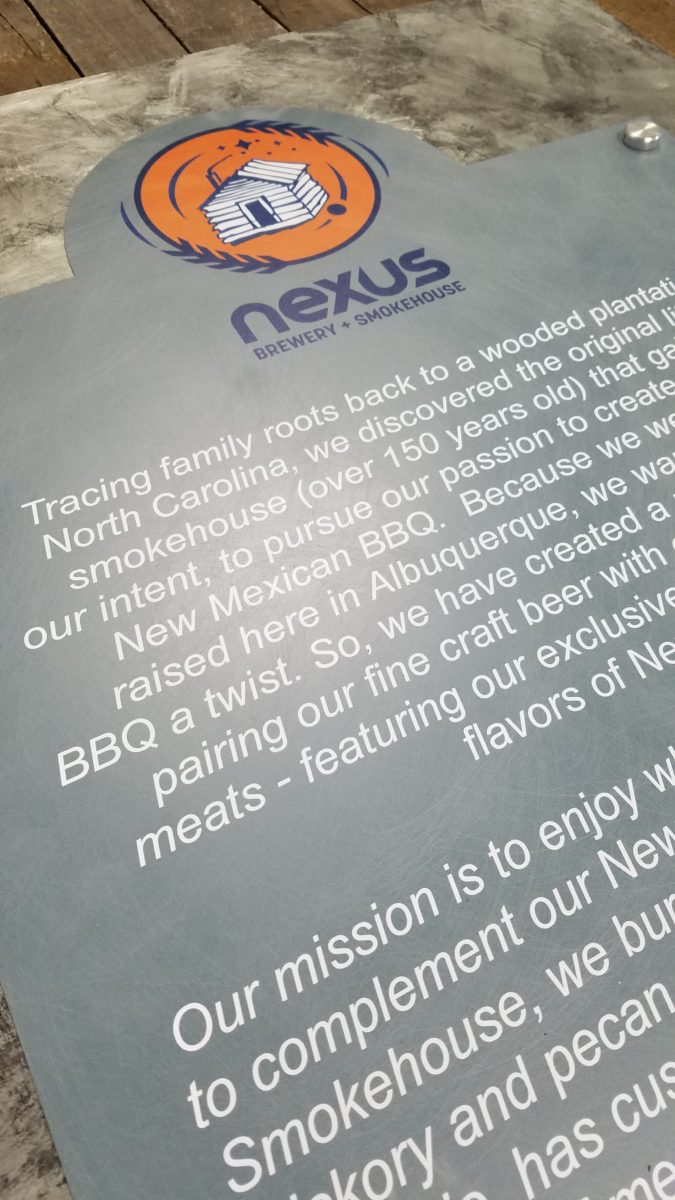
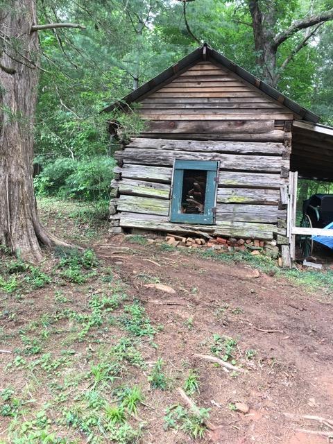
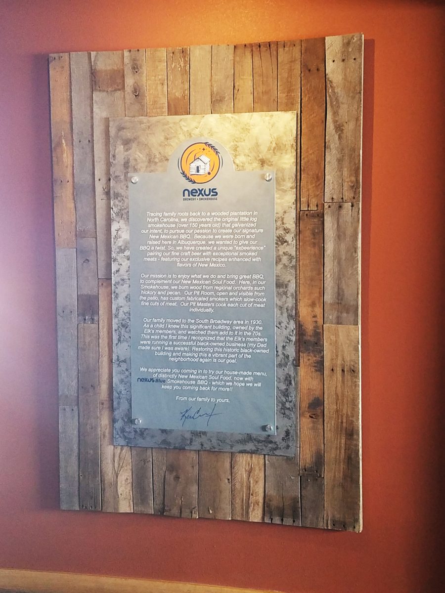
As we developed the logo, featuring a wood-carved graphic of an original log cabin/smokehouse, the story was recorded and edited down to a summarized version.
It was available for printed material, social media, and as art to be presented on walls. Yes, it was intended to become a decorative element too.
The Story became a focal piece in the interior along with authentic, original photos of the log smokehouse and an interpretation of patchwork quilts entitled Urban Piecework made from leftover ceramic and porcelain tiles, glass and clay assembled in wall-mounted panels throughout the interior and exterior spaces.
Photos of the original smokehouse in North Carolina will soon be presented to further reiterate the story on the interior walls.Urban Piecework commands the interior with bold mosaics reminiscent of patchwork quilts – an intriguing backdrop installed both inside and out.
Connecting with patrons, followers, clients, friends, family and acquaintances is valuable. As a business, it wraps who and those elements that are important to you in a familiar cocoon of context. It can instill a level of comfort and confidence in addition to sparking additional interest that might have taken longer to establish, without the introduction of your story.
The final multi-dimensional and multi-textural wall-piece featuring the story and mission is a striking 4’x6′ multi-textural panel. It offers patrons an opportunity to get a few questions answered as they enjoy their “exbeerience” at BLUE.
It was a privilege to promote, extract and produce this story and contribute such an important and valuable element to this business’s marketing and solidifying it’s new, exciting chapter of their brand.
Consider your story. Own it. Share it. Celebrate the uniqueness of your story. Design with your story in mind.
Busy lives in a new town, he in his residency and she working
in a busy OR, they bought a house – their first house – and asked for help
making it theirs.
They have traveled the world and collected art along the
way, a disparate inventory of things that caught their eye, spoke of their
experiences and reminded them of people, places and things to savor once home.
Home, that was the task. Create HOME in this new, old house. Built mid-century, it was simple, clean with some patchy remodeling from previous owners reflecting rather common decisions, with limited funds. We needed to discuss priorities and budget, evaluate what should stay and what needed to be changed.
They both had a love of Guatemala. Their travels there left
them with dreams of color and pattern, handmade functional art and an exotic
sense of place. Having these elements ingrained in their longing, they
expressed a desire to have that sense, but with a bit of a modern twist.
Assembling the colors and materials…
We salvaged the existing natural granite slab countertop and
unfortunate surface-mounted sink. The granite was a practical save and the sink
came along for the ride. In order to integrate the granite as though
intentional, I selected a multi-colored
Talavera tile that specifically had a dollop of mustard glaze in the design
picking up that Dijon field color in the speckled granite. As is my usual
preferred mode of installation, we took it wall-to-wall as a complete wall-covering.
We also saved the cabinet boxes and doors, but needed to
give them a lift from their median caramel stain on oak. Deconstructing the
colors in the design of the Talavera, we
knew we wanted blue cabinets – so the paint shades were fanned and the color
pinned-down. To give the cabinets that wabi-sabi look of loving wear, we sanded
the edges after the painting was finished. We also added cabinets over the
stove for additional storage space and utilization of that blank wall.
We removed all the doors and drawer fronts, filled the holes from the old pulls/knobs and painted them off-site. We painted the boxes in the field. Granite was salvaged along with the sink. New paint, Saltillo flooring, Talavera tile and cabinet pulls along with new appliances gave an updated look to the scene.
In real life, when
practicality rules, certain things have to give way for the good of the
whole. The whole being the pocketbook and other elements that take precedence
at the time. So we live with the radiant heaters, keep the chandelier for now,
until they have one fabricated to their specifications, use a machined rug
instead of a handcrafted piece and know that over the years they will massage
this starting place and truly make it their home.
Continuing to dissect the colors from the new wall tile, our
colorful young couple wanted more color…we chose individual values of bold
paint colors – smoky turquoise, slightly
burnt orange and brilliant golden yellow to intersect the planes throughout the
space.
Typical mahogany doors common to that era of home interiors,
the decision to match the white trim would have been easy, but we labored over
the existing natural, tropical wood and decided to keep it in the mix.
Although the nearly immaculate, original hardwood oak floors
were revealed after removing the wall-to-wall carpeting, the kitchen floor
throughout the rear vestibule and laundry room was an inexpensive and
uninspired sheet vinyl. Saltillo clay
tiles were the answer to furthering the Guatemalan feel. More commonly
associated with Mexico, these clay tiles are historically the plebian choice.
Taking many forms, some artful enough to be the cornerstone of patrician interiors
in fine mosaic installations and other patterns and designs, clay tiles –
glazed and unglazed always add an artful, soulful human element. Speaking to
that, we inserted 2″x2″ glazed Talavera accent tiles into the floor’s
new Saltillo field in the vestibule creating
an almost area-rug-like definition.
The dated floor-plan enclosed the kitchen separating it from the rest of the living area. The very first comment made by our clients was questioning if we could open that wall – connecting with the living room and large picture window beyond.
The mottled cobalt blue light fixtures add another punctuation of color over the bar along with the parrot green barstools that our home-owners spontaneously nailed in an irresistible lust for even more color!!
Rather than trying to continue the existing “Dijon” granite, white Talavera tiles were used on the new pass-through bar counters – both high and low on the new cabinets.
The first phase of this colorful project has set the stage for an enjoyable work-in-progress for years to come as they now have a basis for design, more collectibles to come, and all they enjoy from places near and far. The upcoming annual trip to Guatemala, in April, will reinforce the joy and appreciation for this special place “home base” in their lives.
The dogs look in eagerly, but are limited to their expansive backyard, their vestibule and full run of the master suite.
Although they selected a durable denim twill fabric to reupholster their sofa and loveseat that they were gifted from a friendly neighbor, the primary living area is – for the most part – “off-limits,” but that seems to work for everyone in the family!!!
Blossoms are bursting forth and spring is near…Flowers have a decidedly feminine bent, but due to their organic nature and natural occurrence as the season begins to unfold, I truly believe that they are a gender-less element of rebirth, warmth, optimism and wonder.
In our backyard, these minis are ahead of their more attenuated cousins!
Interior designers welcome floral fabrics as contributing to the pattern mixes, accents and animated offerings amidst other geometric, stripe and solid pieces.
Floral fabrics – here on a textural ground, bring artistic accents to an interior!
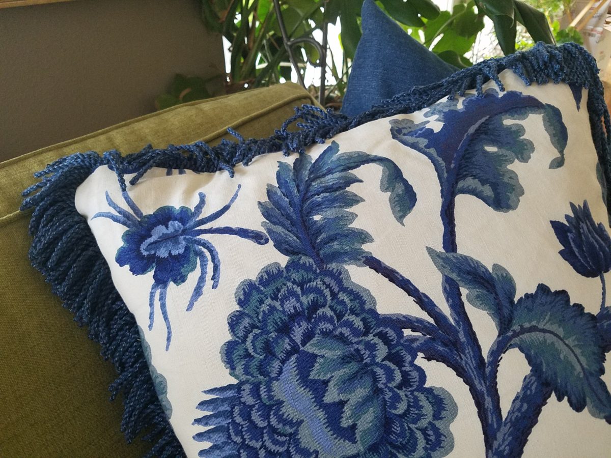
Yet, men don’t gravitate to floral fabrics unless perhaps they sport a tropical shirt in the summer – the uniform of the relaxed, vacay, free and festive escape! You might not find a floral throw pillow on their sofa when batching it. But why not? Spring is spring, flowers are flowers – who doesn’t like them? Embrace your natural instincts! Be brave! Go beyond the aloha shirt and fling a floral throw pillow on your sofa!
Ok…perhaps without the fringe? This denim-blue color on a linen texture is not too flowery – but makes a bright, fresh statement!
Ok – forget the possible gender gap on this subject…
But I did tip-toe outside on the patio tile this morning chilling my toes, to hop across the still dormant grass, in order to take these shots of the first bulbs forced through the crunchy soil to greet the season.
Our daffodils are one of the very first signs of Spring here in the high desert…not indigenous, for sure, but a happy addition to the garden!
In previous spring seasons, I have written about cutting
branches before they bloom in order to “force” the blooms for early bouquets
indoors…and inasmuch as several of the flowering trees have begun to burst,
including Bradford Pears, our is close,
but not quite there.
Bradford pears are early bloomers…go outside and find some flowering tree or bush in your yard and cut a few branches. Leave them tall, long and lanky – if you have the space. Bring them inside and stick them in a bucket of water, or the vase you ultimately intend too use, and watch them bloom practically before your very eyes! It is a fantastic way to celebrate spring in your home or office!
The forecast for the Washington DC cherry blossom peak is early April.
A bit early still, but you can monitor the progress at https://cherryblossomwatch.com/
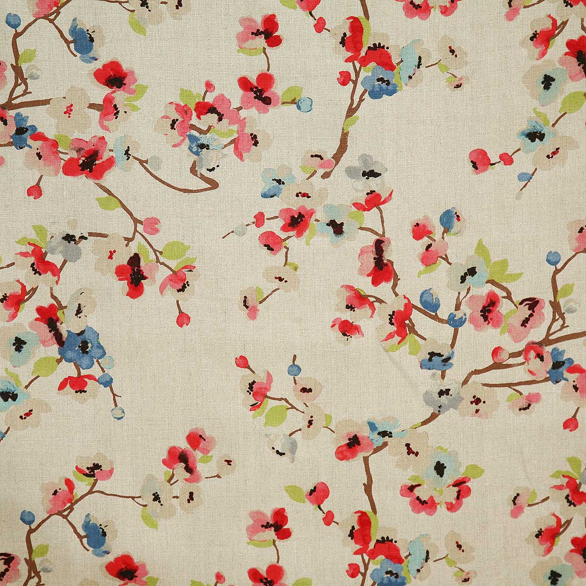
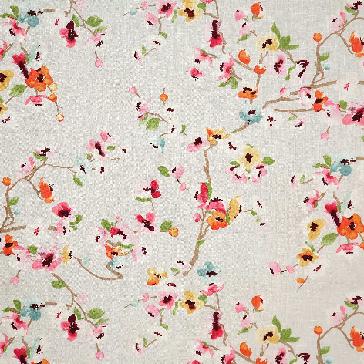
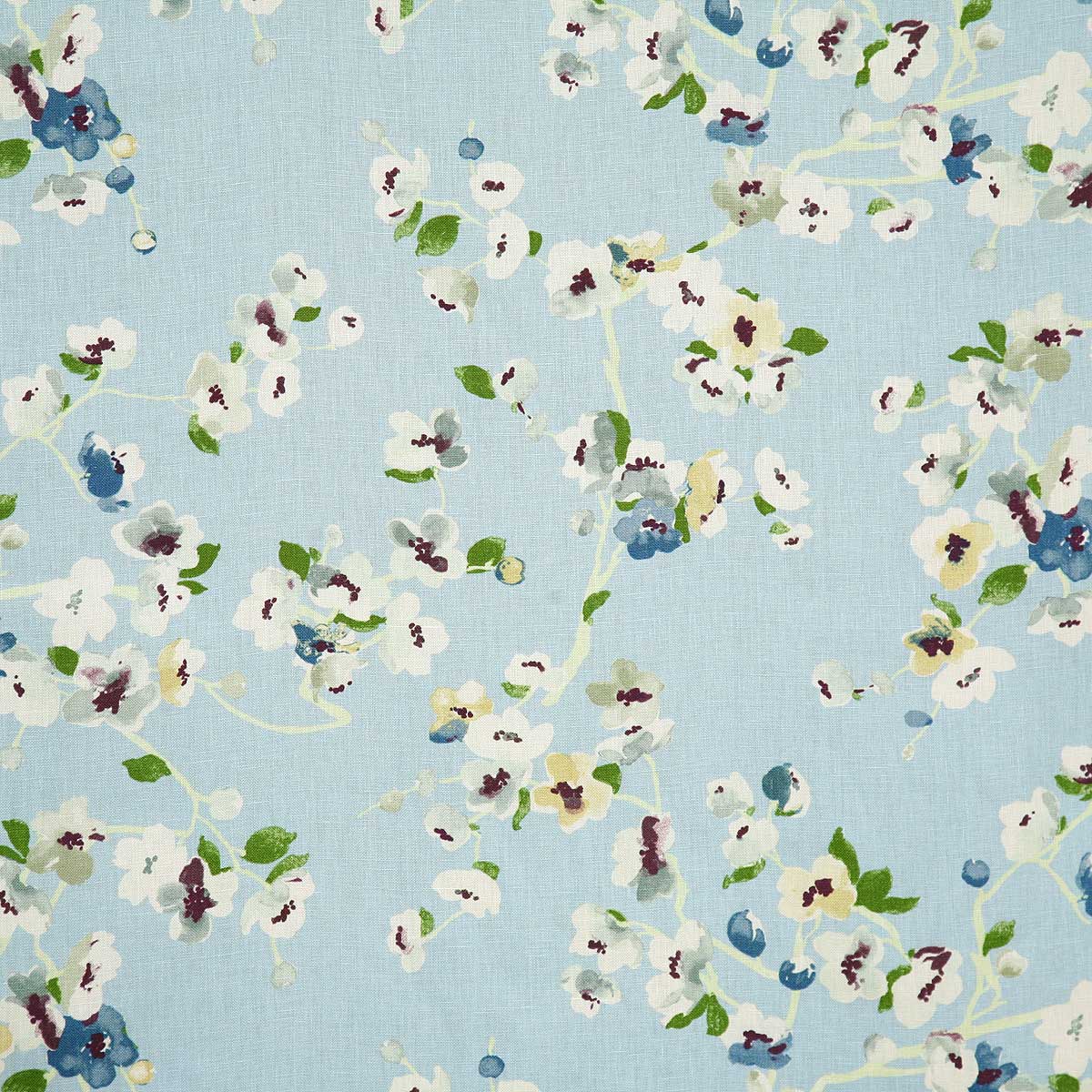
My personal pick for a fabulous floral pattern this season is Pindler’s Cherry Blossom. Floral patterns for Spring – and all year round! I like this one for its linen texture and loose watercolor style. It is relaxed and yet can be crisp – a very versatile print and fabric. It comes in 5 different color-ways and therefore offers many opportunities to incorporate in your interior schemes.
Pindler’s Cherry Blossom on linen – magentaSky, a second of the five color in the Cherry Blossom series from Pindler and Pindler
Artistic accents always a great design detail. We have samples of these fabulous finds at PATRICIAN DESIGN. Come visit our extensive design library for terrific trends, resources, ideas and inspiration!
Collecting art, investing in art, loving art, designing with
art…one aspect or all of the above, art in interior design has many facets. I
have written previously about and presented a workshop about “I want a
piece of art to go with my red sofa,” a kind of raspberry in the face of curators,
collectors, critics and appraisers who would never take or condone that
approach. But the desire and need exists and as a interior designer it is
wonderful to work with artists who can and want to respond to cues, take on
commissions and create for specific parameters.
Contrary to opinions from the high-brows, this is not to say that these artists lack artistic integrity or meaningful self-expression. Their value is as any other – determined by what the market will bear. The basis for this writing is that we work with many artists who love their work. And creating it (even under direction) brings them and their patrons joy.
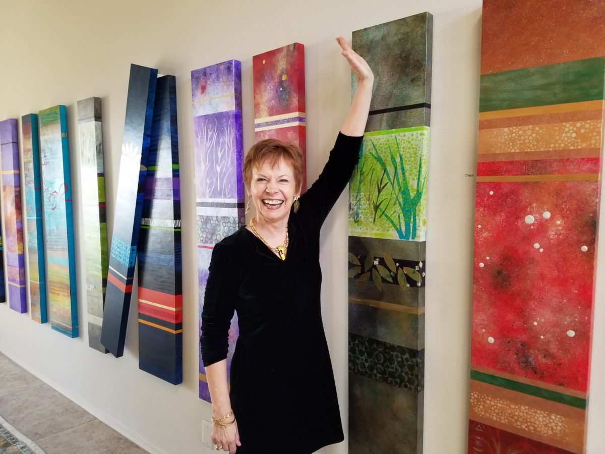
Featured here is the up-lifting, colorful and texturally abstract
work of Patricia Forbes. We have enjoyed commissioning her for specific
interiors over the years and are never disappointed in the quality and creativity
of her pieces.
For scale, diminutive Forbes poses by her Vertical Stick series.
With so many mass-produced art offerings at the trendy home
decor stores, it is refreshing to encounter new clients who are at the start of
their nesting years, establishing their own domains, selecting things that
bring them comfort and identity and who’s appreciation lies in acquiring original art.
Designing an interior is about comfort and personal identity. It is about surrounding oneself with things that work – both functionally and aesthetically. Individual’s requirements, in either of those departments, can vary greatly – but suffice it to say, each person or couple or family unit creates a home environment based upon their likes and needs (and budget).
Enter the interior designer. When calling on the assistance
of someone outside the intimacy of the home, the client is hoping for and
expecting a successful custom-tailoring of their requests based upon the
experience of the professional.
When designing an interior, it is exciting to use existing
pieces already owned by the client. It is gratifying to arrange and place those
items in ways not yet imagined – thereby justifying the investment in design
consultation. After an intense session of rearranging furniture, artwork and
decorative accessories the “ta-da” moment is one of near instant
gratification and satisfaction.
When an interior needs a little something to pull it
together, fill a gap, create an accent or establish a focal point, it is great
fun to engage the creativity of an artist to custom design a piece to fit the
need. Approaching an artist for the express purpose of acquiring a piece of their
work to enhance a space is an exciting
venture. It is a personal connection between artist and patron that creates a
communion, a bond.
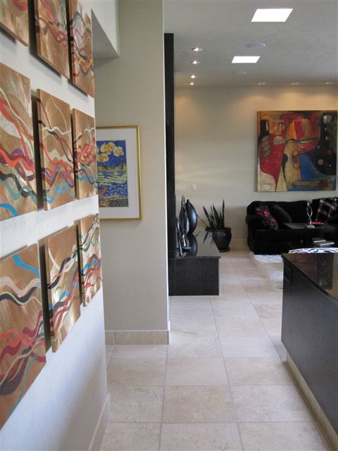
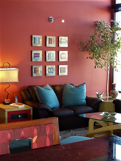
Here I took inspiration from a single panel that Forbes had constructed and requested a series of 9 panels grouped in a grid to make a larger statement on the wall. The interest created from a grid of images adds movement and dimension to this series already complex with sculpted texture and applied layers.
Color, texture, size, style, subject (or not) all are aspects of art that are to be considered for the personal interests of both artist and patron. If the patron has selected an artist to approach about a commission it is as a result of experiencing their work and appreciating it. The artist, in response, is to accept the parameters of the request and enjoy the challenge and process of creating the intended/desired finished product.
The intensity of this rich red wall was decided early in the design process. As we built layers of existing elements and introduced new pieces, the desire for a custom installation became apparent. This Urban Elements series was a collaborative effort between Forbes and me to provide a bit of an edgy, industrial vibe to this eclectic urban loft. Note too that the end table and coffee table were locally crafted for the project by Kirt Kirkpatrick
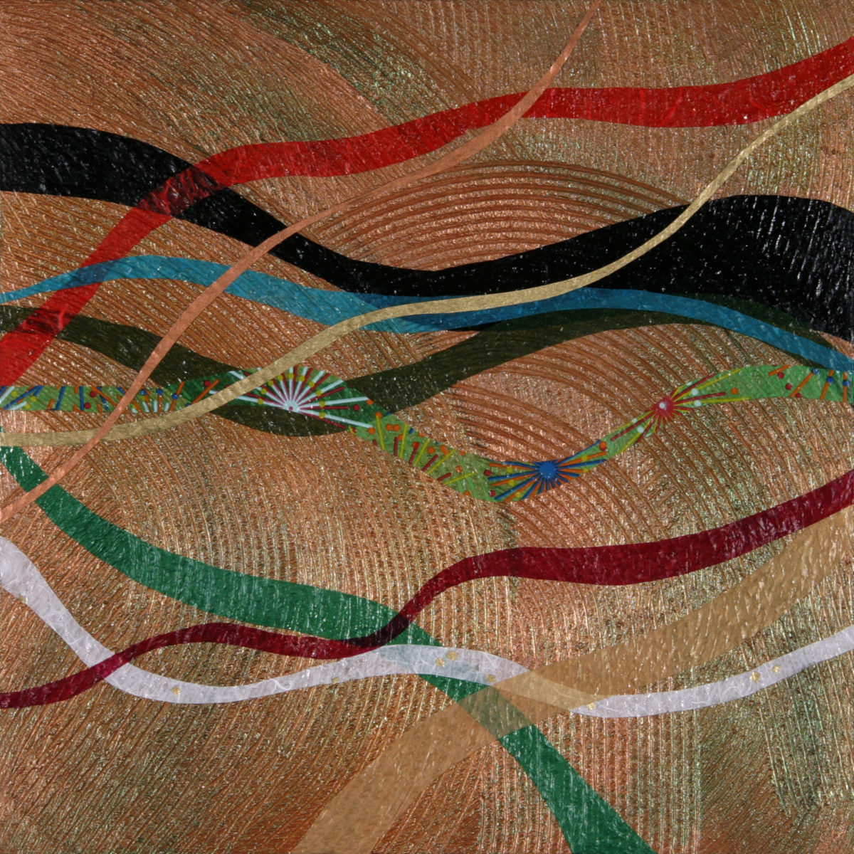
Forbes’ creativity is rooted in pattern, color and texture.
Primarily non-objective, her pieces are compositions of movement and dimension.
Working with a layering technique, she builds her action with a collage of
papers and fibers, paint and stain. Action is key when describing Forbes’ artwork.
She creates for herself, but when called upon to collaborate
on a project, her eager curiosity for what might result is enthusiastic and
ever-promising. About her style and self-expression she states “When I
have created a joyfulness and vibrancy in the work, I know I ahve created an
experience I wish to share.”
When asked…
1. How/when/why did you start your abstract technique of
layering colors and textures?
Forbes has always been drawn to color as a means of her personal expression, once she “experimented with acrylic materials that would hold a texture and started playing with those using combs and rubber spatulas and sticks to mark in the materials” she was hooked. “Metallic and interference paints call to me — so I began to combine the over the textured backgrounds, and then discovered that with acrylic one could imbed paper. It was really experimentation and discovery of what these amazing materials could do…”
2. What is the most satisfying aspect of your art for you personally?
The
element of surprise is what gets Forbes excited! “When something comes
together almost unexpectedly and I wonder how I did that — it’s always a search
for the right combination of elements, colors, textures, feelings.”
When they all come together she experiences great satisfaction. “It’s
like turning over pieces to see what fits. Sometimes I have to turn over a lot
of pieces to get the right combination — sometimes wondering whether to
continue. Seems like it is always worth continuing the work to a happy
conclusion.”
3. Why do you enjoy commissions to create specific pieces
for interiors/patrons?
Forbes
expresses genuine gratitude for her patrons. “I feel honored and
appreciated when someone likes and appreciates my work and invites me to do
something special for their home or office space.”
4. What pleases/satisfies you about this custom commission process?
The
process of working together with her
patrons is positive creative challenge. “I enjoy the collaborative aspect
and going through the process with a client or designer and receiving their
feedback as the work progresses.”
The
satisfaction for a designer in partnering with an artist is designing and realizing
a vision to complete a space. Bringing visions to reality. I often say that my team provides tremendous
support in making my dreams come true. From artists and craftspeople to seamstresses
and all manner of contractors, it is truly a team effort to achieve great
results!
Time to remodel the kitchen!! This charming little bungalow had already experienced its share of remodeling – well, not so much structural – although, many interior design transformations had occurred over the decades. In the mix, the well-used and enjoyed kitchen was feeling a quite tired and dated.
You might remember I have used this now completed project, in the last few months, during its transformation process to identify certain features and design practices. Here is the as-promised unveiling of the before and after photos for further discussion about the design process, intent and results.
We loved the mottled color and organic character of the existing slate floors and opposing green-grey beams with spanning boards of a caramel stain. These were the two elements that went well together as though intentionally planned. Yet in between, the pale, peachy pickled oak cabinets with their radius detailing and red-rose/black matrix of the tiled granite counter-tops, didn’t seem to speak at all well with the ceiling treatment and slate floor’s greens, rusts and charcoal tones. It was a dark, confused space.
When observing and “listening to” the house, it was evident that the current kitchen, in addition to being poorly coordinated, had absolutely nothing to do with the original architectural intent. The new owners had brought a few very fine antique pieces into the home. The mid-century circa 1964 age of the house accepted them on its original hardwood floors also adorned with their fine antique rugs…but something was missing. There was no cohesive thread running through the house. Over the years finishes and decorative elements had been selected and installed without any consideration for original materials or an attempt to introduce compatible and harmonious materials for the good of the home’s overall theme.
In all fairness, had the entire interior been gutted and a
contemporary interior been uniformly installed into the framework/shell of the structure,
I might have considered it a success. However, this multiple decade decor was a
mix of disparate trends and preferences that had no commonality.
To begin the process of bringing this home into a cohesive
design last year, we had redesigned the living room. There we introduced a classic
blue and white color scheme derived from the Persian rug in the adjacent dining
room.
To the corner kiva fireplace, we added a sandstone hearth and
mantle with just enough blue and white Talavera tile trim at the base of the
hearth to subtly coordinate with the new scheme. The Talavera was an
appropriate material for this New Mexican bungalow.
The original fireplace had a dark, broken brick quarry tile hearth and no cap on the mantle.The face-lift replaced the hearth material with broken-edged sandstone slab and matching mantle cap with Talavera detailing at the bottom.
With this living room having been so successfully re-designed, the obvious thought came into the discussion to continue the vernacular of the blue and white Talavera into the kitchen. As a bit of a purist when it comes to application and termination of materials, I was not content for a mere back-splash. No, if the tile were to be effective and commandeer the stage, it had to be used wall-to-wall as though an entire wall treatment.
Treating the Talavera tile as wall-covering, it continues from the kitchen, into the adjacent pocket-space housing a desk and laundry machines.
But wait! The addition of an earthy aqua handmade tile from
Spain offered an appealing and unexpected accent woven intermittently through
the Talavera. It created a coordinating thread from the colors found in the mottled
slate floors and ceiling beams.
Pre-grout shot shows the individually cut 1″ pieces inserted as mosaics into the random field of Talavera
The cabinets were in excellent condition, but the doors were
sadly dated and in no way spoke to the home’s other cabinets, doors and finish
carpentry.
The confused interior finishes we in need of a transformation!
With the white raised panel theme throughout the home’s original appointments, we elected to salvage the cabinet boxes and replace the doors and drawer fronts with a similar raised panel detail. The same red oak was used and, with a glossy white paint applied, the grain “read-through” with a very intentional yet subtle moiré-like pattern. The new raised panel white doors and drawers, with crowning top molding provided a crisp, timeless motif. The random patterned Talavera used as an entire wall-covering was very effective. The kitchen was quite gussied-up!!
The transformation was dramatically successful!
The existing slate floor was beautifully organic and I felt, from a design standpoint, was a must to salvage. Making it look like an intentional selection – part of the new scheme – was imperative. Therefore, selecting a counter-top that communed with the tones in the floor resulted in a selection of concrete-like engineered Italian quartz material – balancing the floor with the next horizontal plane and ultimately with the stained and green-grey boards of the existing ceiling treatment.
The new concrete-like Italian quartz counter-tops coordinate well with the other materials.
Another asset was the connection to the outdoors, however the existing window over the sink was high and small.
The window over the sink was high and small…
By bucking the warranty of the Pella people, we had a new double-hung window made to close down onto the new counter-top that passed through from inside to out. They would not fabricate the window to do what we intended, so we had the contractor remove the bottom of the new window frame, thus rendering the warranty null and void, in order to have a completely open, uninterrupted pass-through when raised.
Amusing and interesting…existing family pieces of blue and white ceramics are being discovered and used as decorative accessories in the new kitchen!
We also captured the opportunity to open the opposing wall into the hallway adding pass-through light and dimension to the space. This exponentially expanded the space and made the encapsulated kitchen feel much less confined.
Before, the kitchen felt small and dark…Opening the wall into the hallway brought in additional light and dimension.
To add drama to the newly created dimension, we discussed having a painting commissioned to pop an accent of yellow into the blue and white scheme on the far hallway wall. Lemons, a perfect citrus for the kitchen, was decided for the theme.
A miniature oil painting by Federico Leon de la Vega was used to Photoshop into the scene to inspire and convey the design intent.
The additional POP of yellow is a dramatically effective contribution to the overall composition. After consideration, the owners selected a local artist to paint the full-scale painting.
A local Albuquerque artist, Thomas Tomlinson rendered the lemons in acrylic with blue and white tile details.
In summary…keeping the original slate floor, existing cabinet boxes (replacing door and drawer-fronts only), with a bling of new chrome cabinet pulls, switching out the stained glass pendants, replacing the island’s surface with a handsome solid walnut top and a new coordinating concrete-like counter-tops on the periphery, with the decorative embellishment of the Talavera tile continued from the subtle introduction at the living room’s kiva fireplace, the transformation of the kitchen is stunning – not trendy – and was truly, uniquely designed for the architecture and forward, on-going contextual design conversation of the home.
Uniquely designed…
Look around and listen to the environment for and in which
you are designing. What makes the best sense for the design direction
considering the function and context of your project?