After experiencing and pondering the value of incorporating nature’s elements into architectural planning in the previous blog, I find myself winding into the countryside from sea level to a mile high into jungles and ultimately pine forests, across vast expanses of rivers and towering bridges spanning grand abysses…and stopping at a modest panaderia (bakery) on the side of the road.
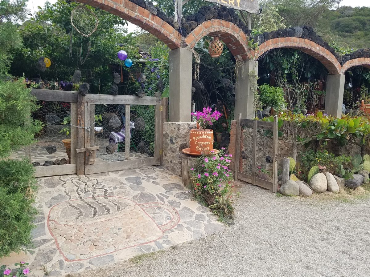
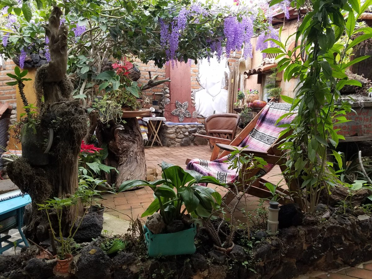
You can’t tell a book by its cover as this simple little rural structure – standing alone – looked curiously intriguing and quaint enough, with an unpaved parking area transitioning to well-tended pea-gravel. Traffic cruised by, on the way across the bridge.
Those that knew, turned in. We pulled off the road and were told that this couple had a wonderful bakery and were promised an exceptional treat! Fresh empanadas that would bring remarkably satisfying mid-morning joy.
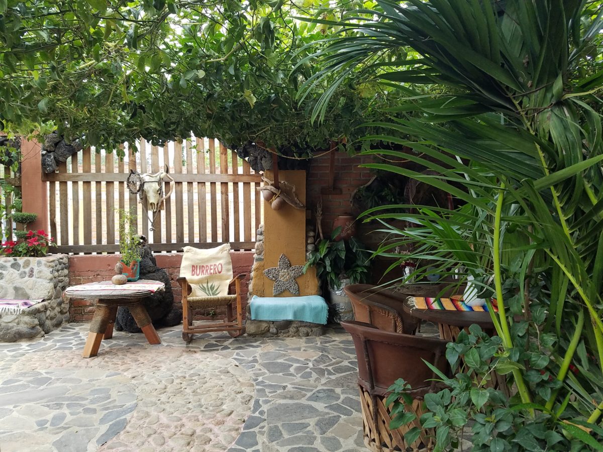
Very tidy and thoughtfully eclectic, this little destination bakery is a precious find.
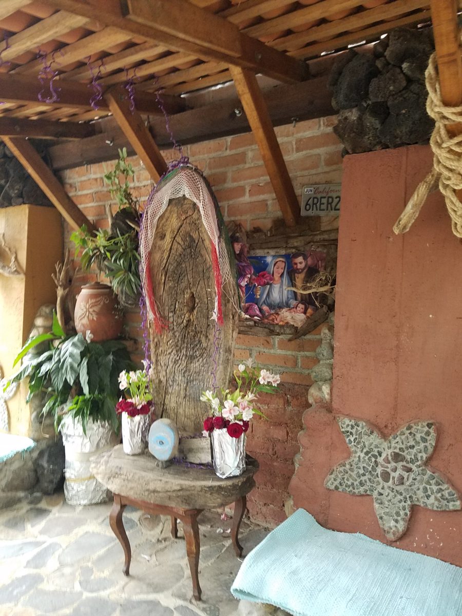
Oh, were we in for a surprise! At the entry, I stopped to shoot the whimsical cup of coffee mosaic set in a field of stone and concrete. I thought – what a fun design element to greet arrivals and set the stage. But I had no idea to what extent I was about to be elated. What unfolded so exceeded my expectations that I wanted to stay all day!!!
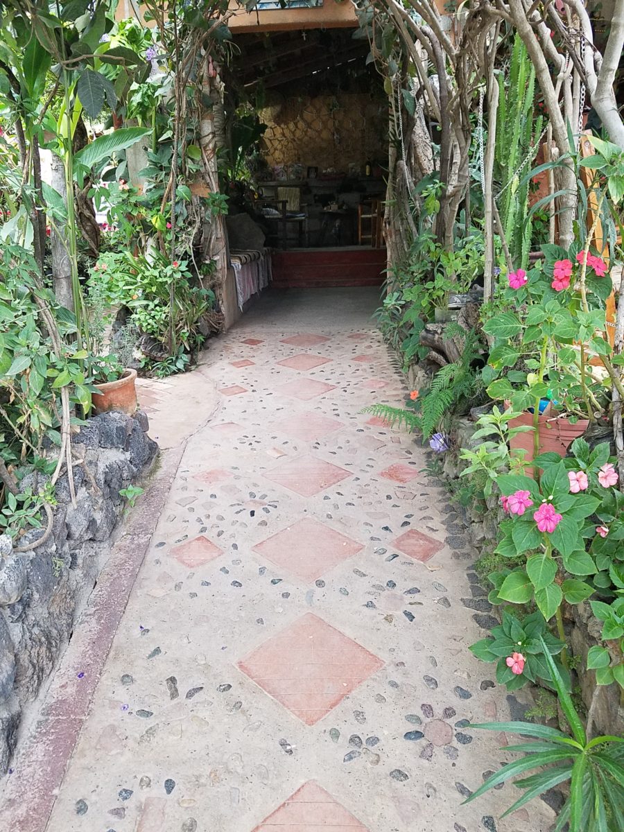
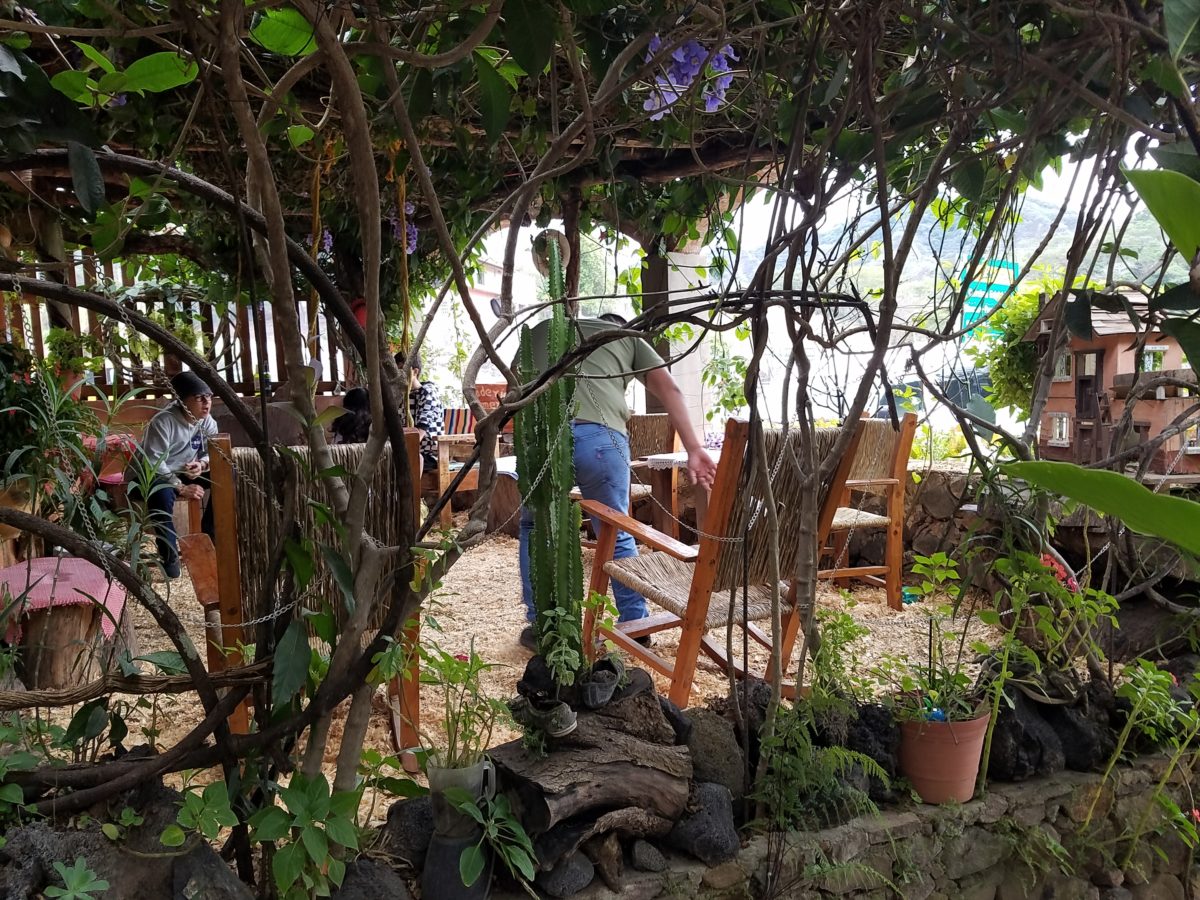
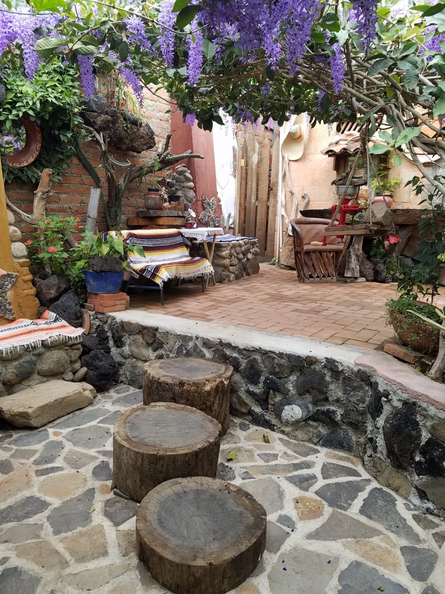
Happy stone and tile-work adorned the pathways. From the textures of stone and brick, tile and wood – it was an organic fantasy – an unexpected design experience.
Simple, yet spectacular – simply spectacular!!!!!
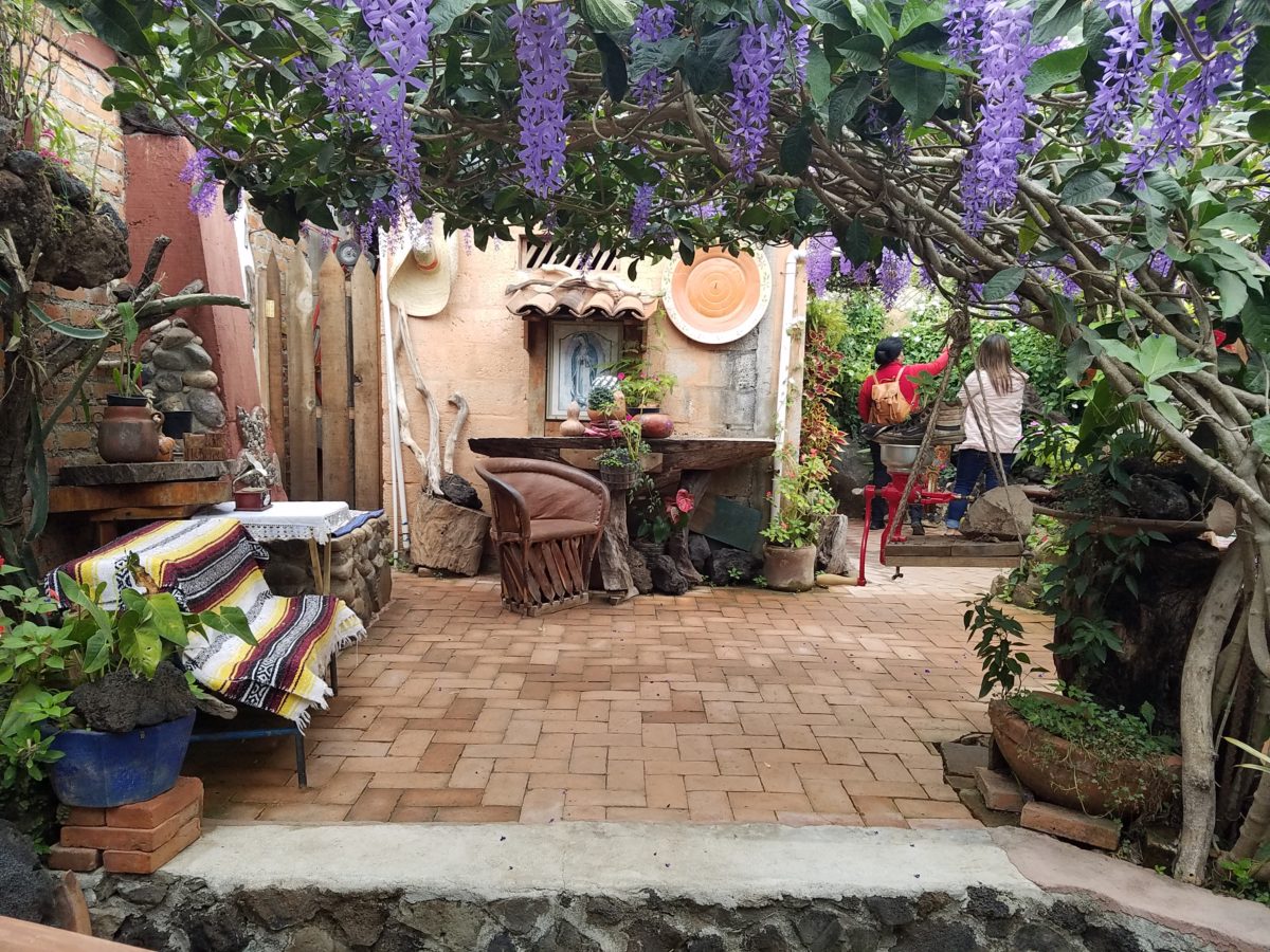
Ceilings of colorful floral blooms – perhaps wisteria – suspended from their vines and other plantings intertwined with the structure.
Spotless and meticulous the eclectic elements were a harmonious creation.Stone walls, wooden slats, vines and adobe all worked together to define the spaces.
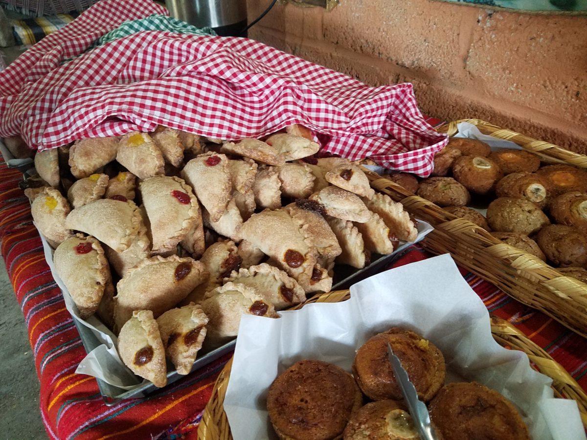
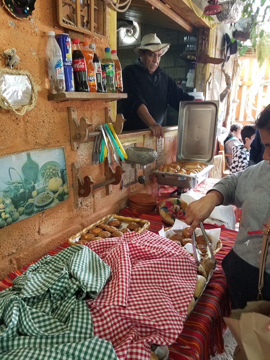
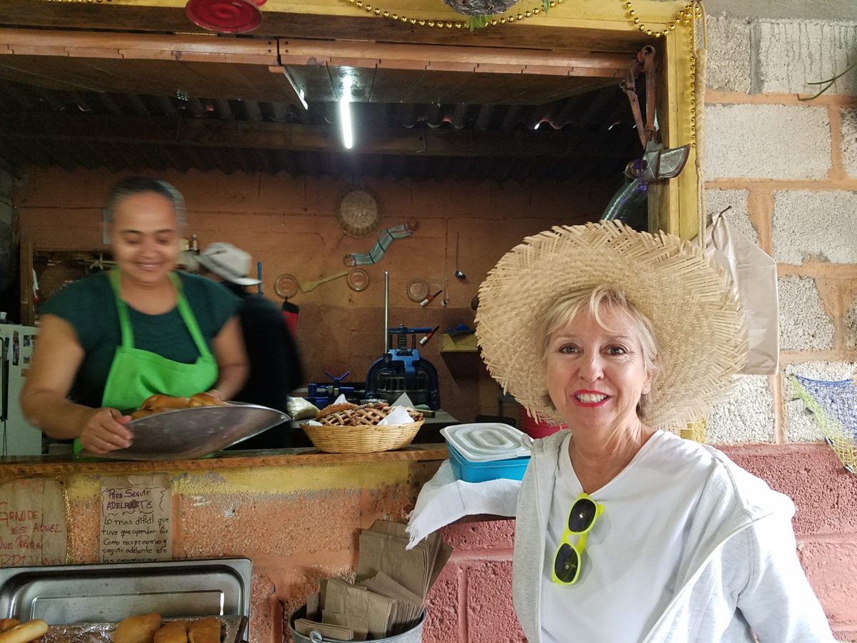
The wafting aroma of fresh baked goods – it was more than delightful. From warm savory clouds with mushroom filling and another with chile-laced sausages – and an array of sweet strawberry, cream and pineapple empanadas to corn muffins, banana muffins and more! All nestled beneath colorfully woven cotton tablecloths.
Light and delicious – the best empanadas ever!! With a tiny sprinkles of granulated sugar, for a sweet crunch, before sinking into the fabulous fillings! Muffins challenged any others and savory treats were so satisfyingly delectable. Little buttons of banana slices on top denoted which were the banana muffins!!
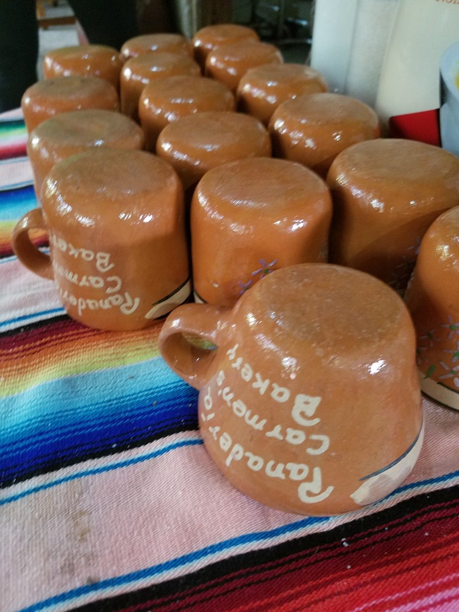
Rich Mexican coffee with a touch of freshly ground cinnamon and luscious hot chocolate were served in custom-glazed “barro ware” complimenting the fresh-from-the-oven confections.
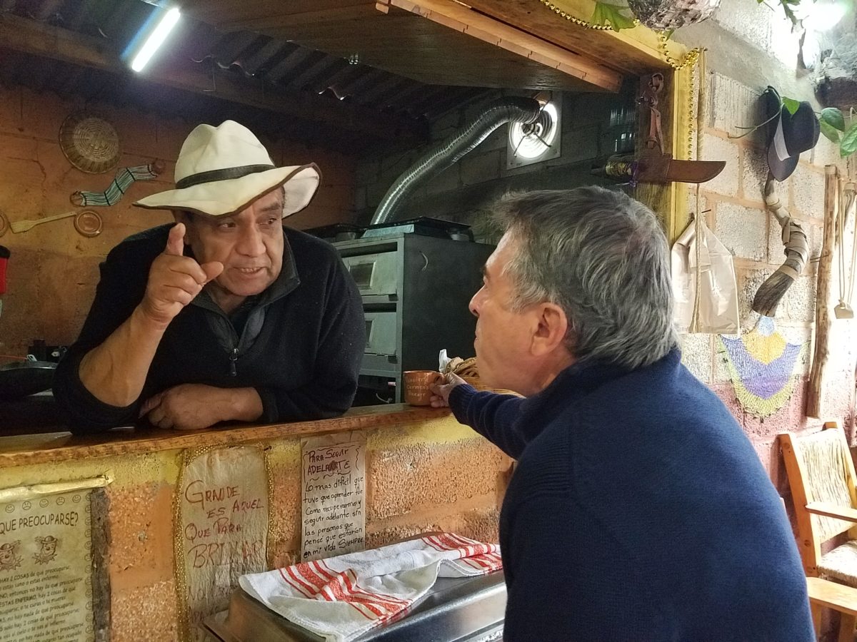
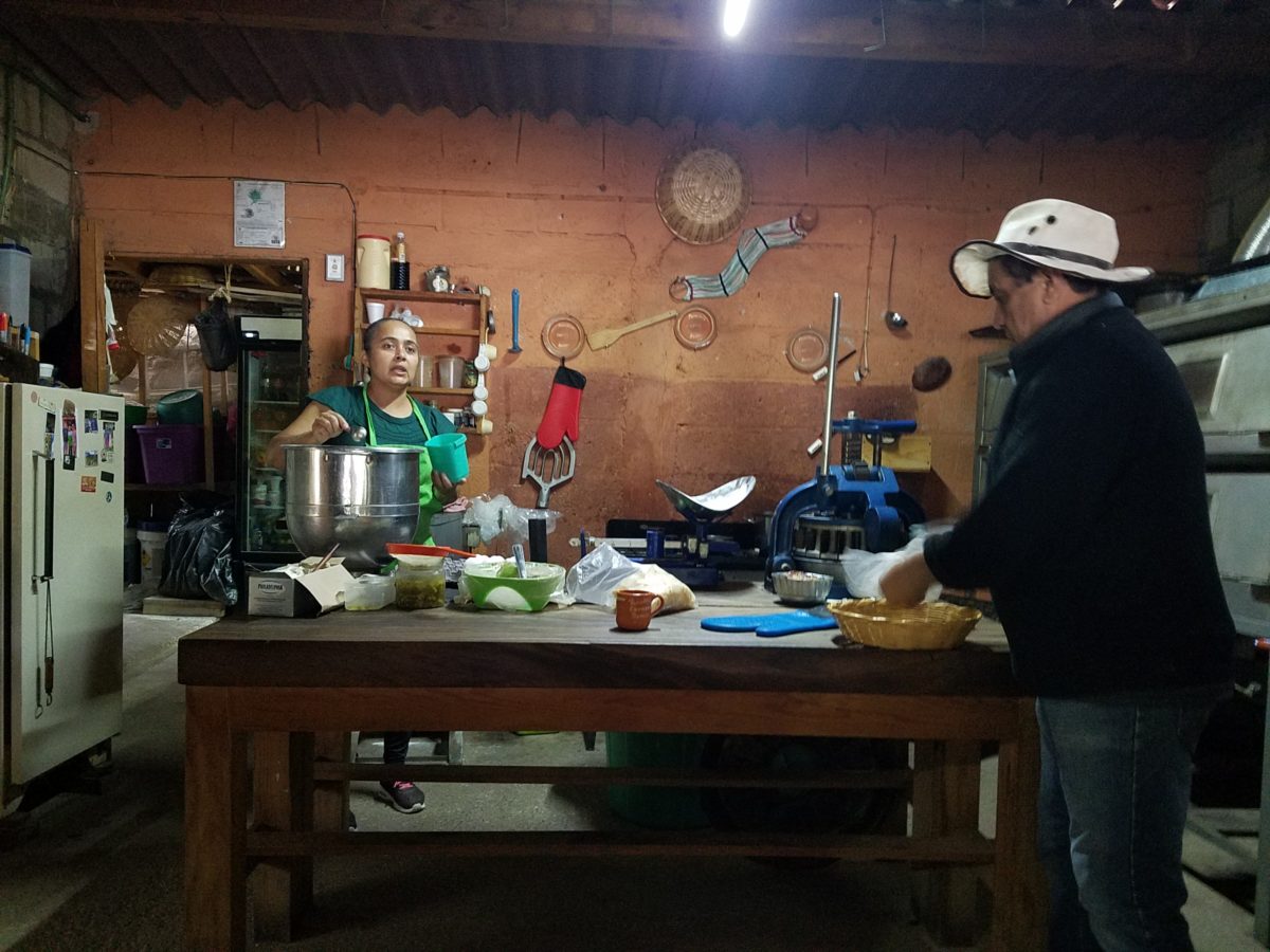
The exhibition baking kitchen overlooked the serving line. The buffet of pastries thoughtfully explained by our gracious and welcoming host, Jesus!
Carmen presents fresh strawberry tarts just from the oven!!! A combination of old and new – tradition and technology meet in this cozy kitchen.
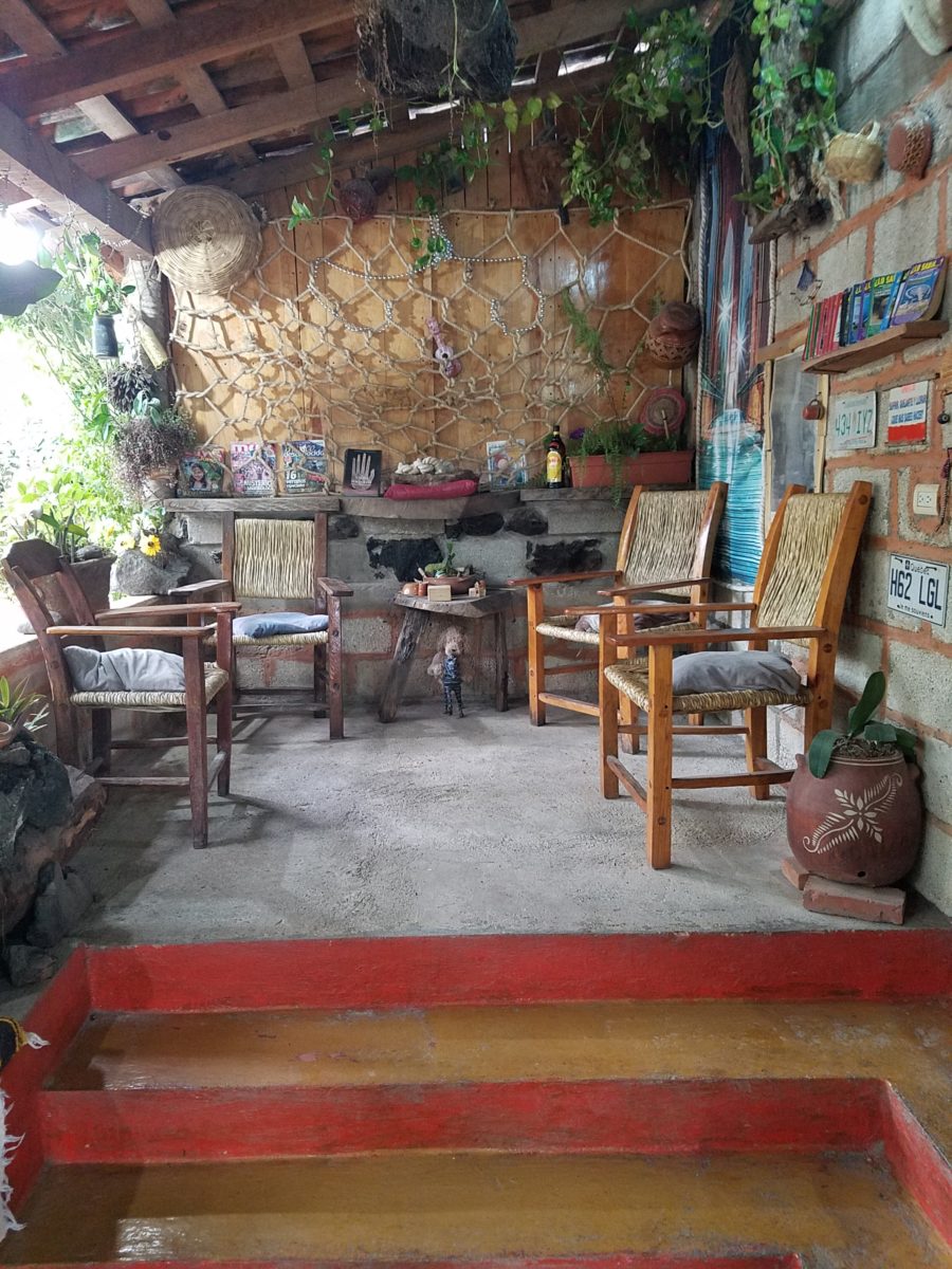
Fragmented spaces open, yet enclosed, offered intimate pockets in which to pause and enjoy.
Color-pops insert themselves effectively around the interior and exterior spaces.Inviting seating areas semi-concealed offer private repose. Tucked away – more areas to enjoy…
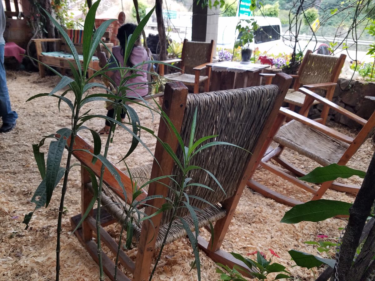
Clever use of clean blond wood shavings on the floor of the main covered patio created a wall-to-wall carpet of fresh aromatics complimenting the inviting aromas emitted from the ovens. Rocking chairs and rigid sturdy versions, with a fun little rope swing, all surrounded by tropical plantings made a cozy area to gather.
Soft underfoot and subtly fragrant – the wood chips make a great shag carpet!!!
As I meandered around exploring all the interesting spaces, textures, colors and plantings, I marveled at the sensitivity with which this had all been crafted and assembled. It was artful interior design with an exterior feel – open air and charming, with a decidedly handcrafted, Mexican sense of place.
Slices of handsome tree trunks make perfect stepping “stones” with graduated heights.
It was an eclectic collage of furniture, structure and organics – living and static – that was welcoming and artful, delightful and so pleasing, that it was a treat for all the senses.
The cool morning air of the mountains mingled, with the comforting fragrances, creating an atmosphere inviting gentle conversations of people gathered around good food and artfully relaxed surroundings.
Peek in places and through doorways to find worlds of design
waiting to be discovered!!!
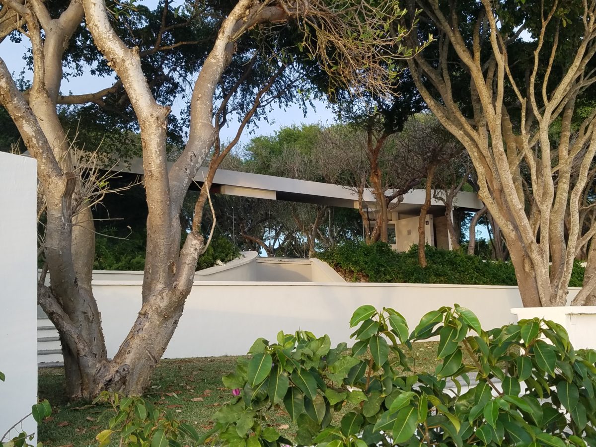
Neighborhood covenants, zoning, physical practicality, budgetary constraints…all enter into whether it is realistic or desirable to save vegetation when clearing land for development. Carving around existing growth can be a tedious and costly addition to a project. But there are times when it is a design asset – an imperative even – to the over-all setting and effect of the scene.
Saving trees when designing a built environment is a challenge
that often pays off.
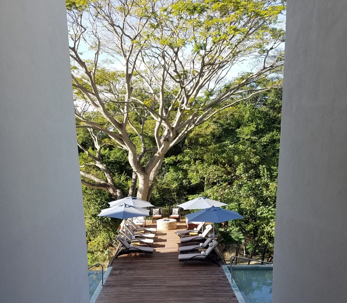
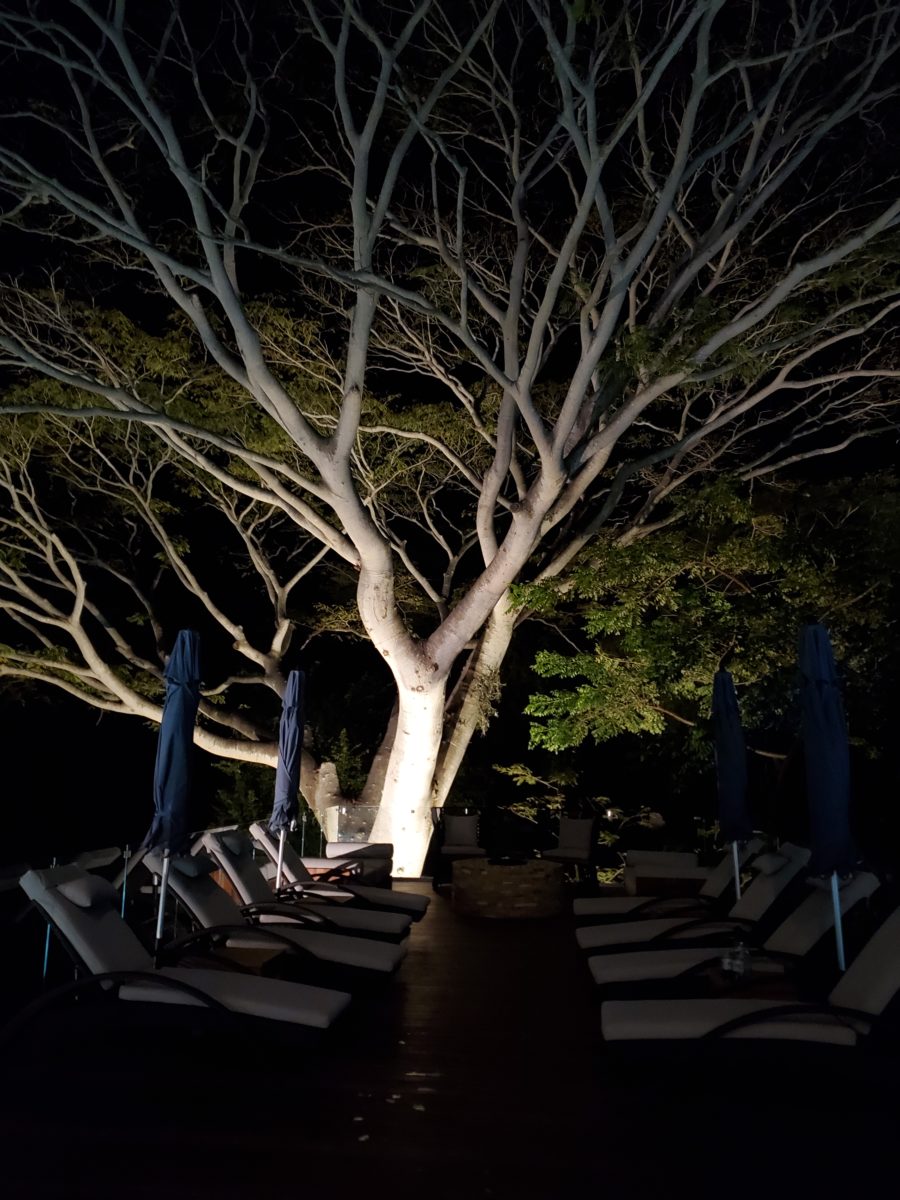
A spectacular backdrop to this seating area – the decades old tree is the focal point.At night – well lit – the same tree towers with dramatic illumination in the darkness as the rear “wall” of this seating area.
Raping acres of woods for barren subdivisions and adding back newly planted saplings the caliper of a quarter is unfortunate and takes years to satisfy. FHA requirements were the tell-tale token of bringing green back after a bulldozer’s brutal removal of all plant-life on a property. That lanky stick standing in the center of a dirt patch, that might get sod or seed…or rock, was a pitiful attempt to give back to the environment. However, in addition to broad-sweeping examples, individual decisions to saver rather than remove can prove valuable.
Years ago, when planning a patio expansion and exterior kitchen, friends brought the plans to me for a quick check before committing to the design from the design/build contractors that they had engaged. The new patio plan meandered along nearly the entire back facade of the house. With all the exciting kitchen layout and bar, seating areas and dining space, I instantly focused on the fact that their beautiful red-bud tree was gone – not in evidence on the pans! I exclaimed about it and was told that they were told it had to go. That was about 10 years ago – or more, yet it still stands today having modified the design to include a tree-well in the patio and opening in the proposed high-ceiling patio cover. The stunning multi-truck tree thrives, in the ground as it had for decades, and climbs skyward through the opening spreading widely toward the second story of the home. A wonderful, living, sculptural element, in the space. Good save!
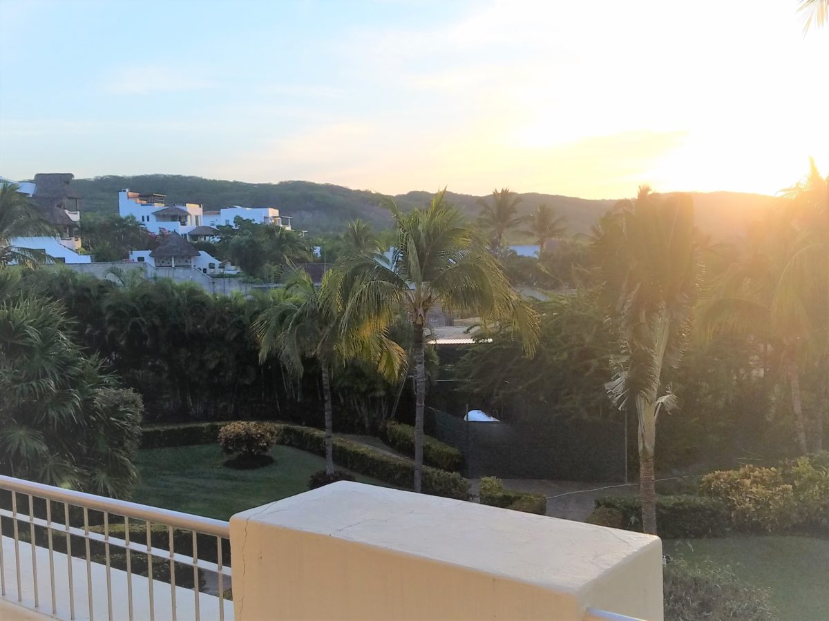
Warmer climates invite the indoor/outdoor melding of living spaces. We all try to achieve them despite bitter cold transitions and near, if not complete shut-downs “off-season.” But in the tropics, outdoor living spaces become remarkable dimensions to expand living.
Sculptural trees are powerful elements viewed from inside and outside.
This past week, that situation came to mind as I enjoyed several examples of incorporating nature into the design scheme. Yes, landscape design is just that. Landscape architects do just that. They design exterior spaces with organic material. But what I was feeling recently was two complimentary things – one that designing in and around existing growth is so satisfying and in some cases, the living plant material becomes the architecture – not merely compliments it.
In addition to their sculptural beauty, they add balance, scale and a canopy over the exterior rooms.
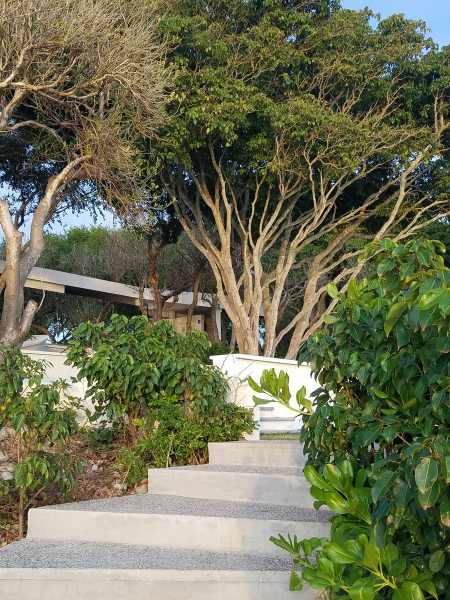
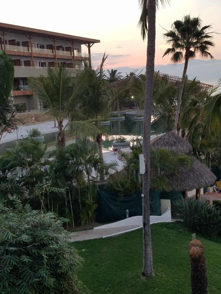
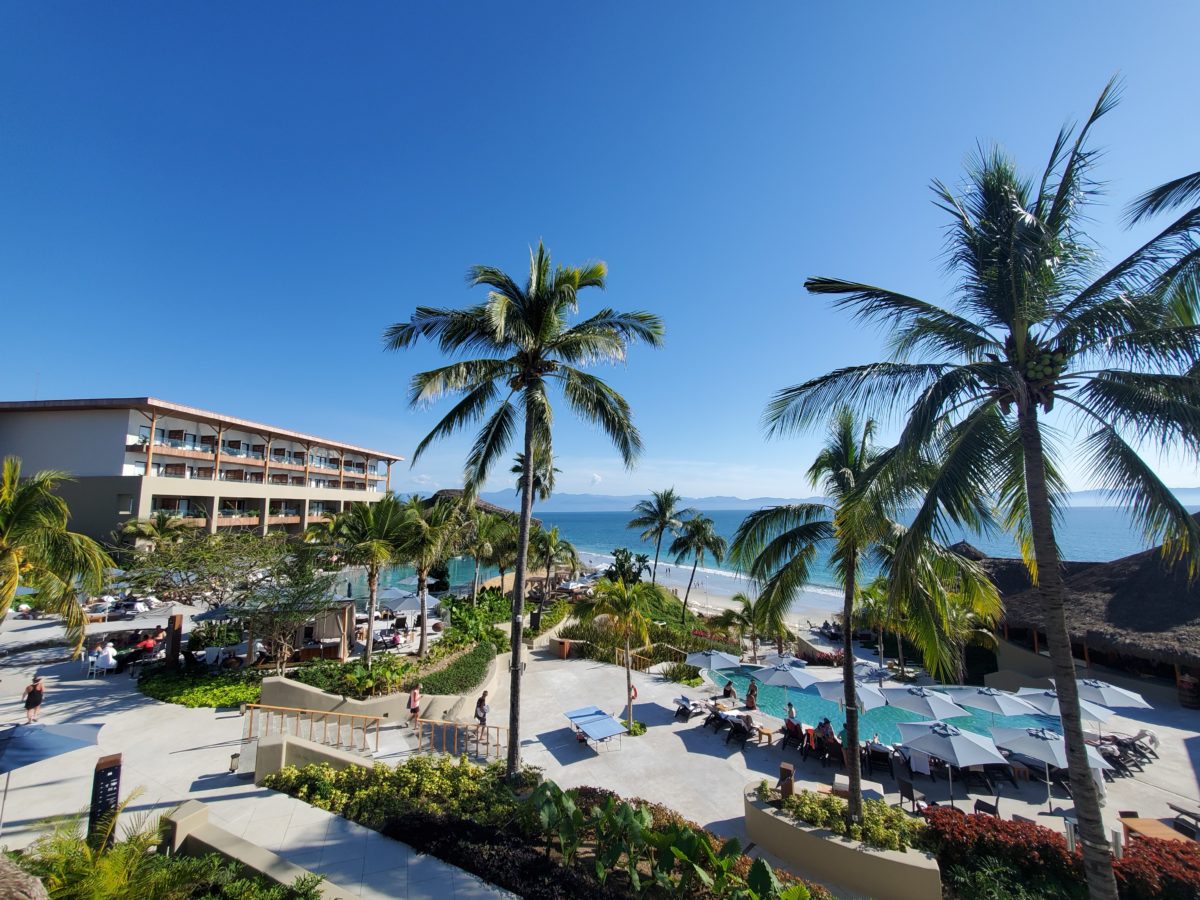
This past couple of weeks, we have see the results of 2 years of preparation and construction which transformed of a piece of partially vacant land into a seaside resort. Several key palms and a couple other key trees were saved and hundreds more were brought to the site to complete the design. The towering new trees showed signs of shock with their dried frond tips – but will surely survive.
What has been a foreground of some landscaping and virgin jungle ,with houses beyond, was bladed and terraced last year in preparation for a new project. Buildings and pools appeared, jungle growth was removed and a few key organic elements retained. The recently finished scene is dramatically different – incorporating specimen trees throughout the property into the new plan.
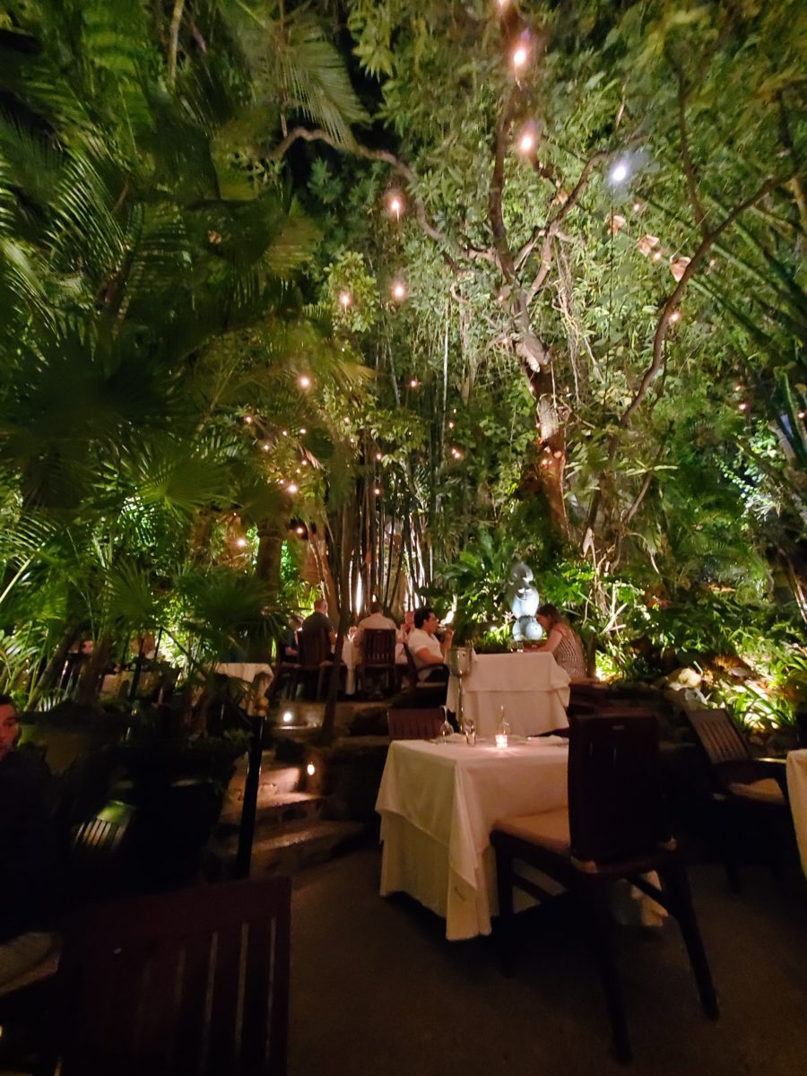
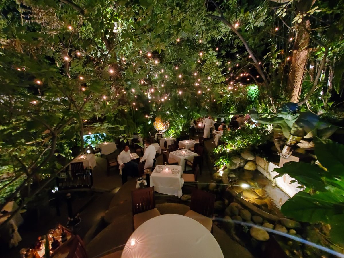
When landscaping becomes architecture you know you have crossed an exciting line. What I mean by that is to have the growth become walls – to have the vegetation read as though structural framework.
This terraced dining patio is framed by massive bamboo and other large trees and plantings. They are substantial enough to read like screens, if not walls, framing the space. From a canopy of growth, strings of LED lights are suspended as though from the ceiling – a ceiling of branches over this enchanting outside dining venue.
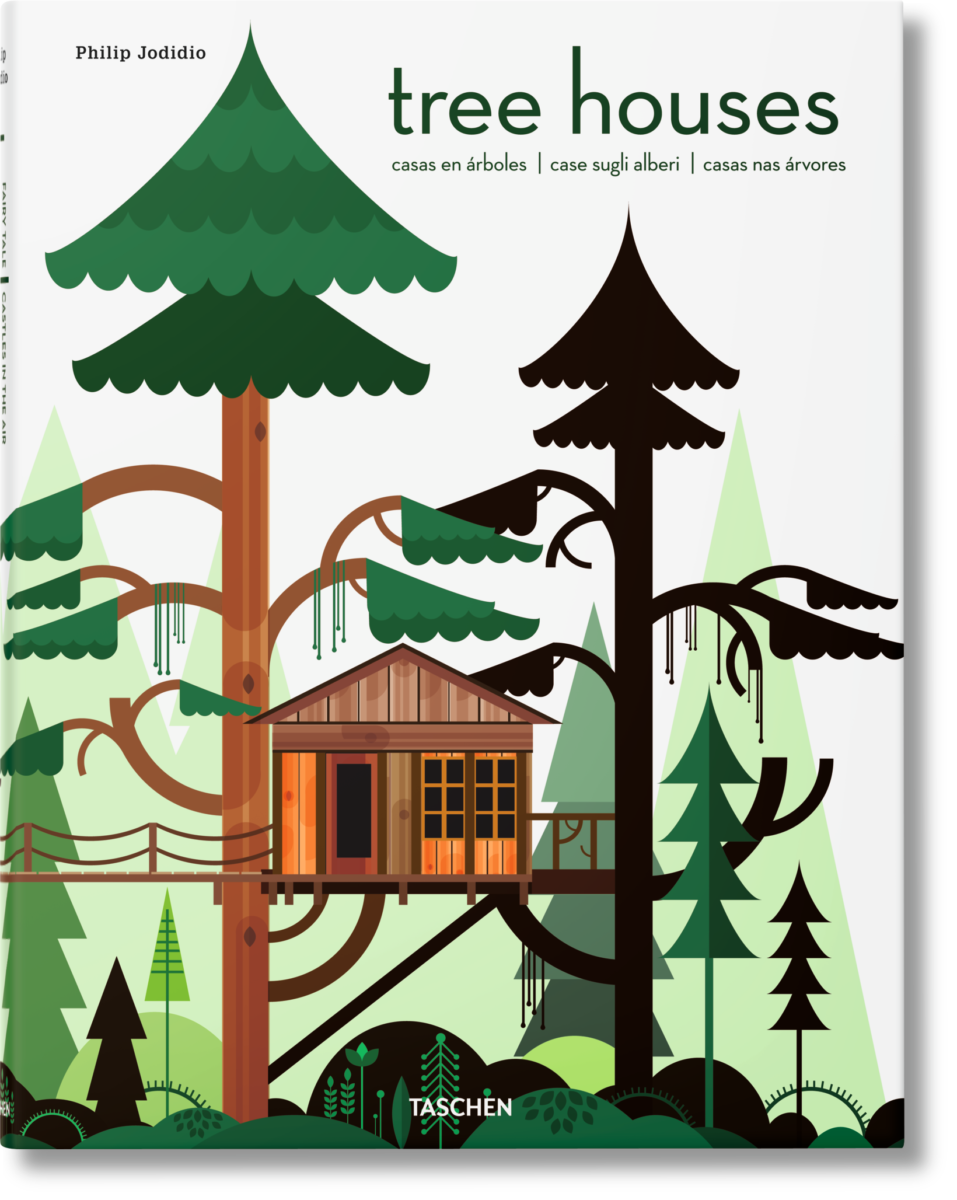
A tree house is another example. The tree is the structure – the framework to begin the additional elements that create a suspended room.
This entertaining and imagination-spurring book by Philip Jodidio is worth investigation. Here. find extraordinary examples of trees as the structure of other amazingly fanciful spaces!
By observing examples in your world, you will see, when designing around and in concert with the natural landscaping, the effects can be dramatic and of great value to the scene. On your next project, consider the possibilities of saving rather than removing – incorporating and celebrating nature’s design elements!
With all the New Year buzz about the new color forecasts…I started taking notice of the seeming non-color, white. It is often considered the absence of color when in fact it is a very complex color of many shades and values. Just try to select a white and you will know what I mean.
When you look at white paint samples, you will notice the nuances. There are pink whites and blue white, grey whites and yellow whites. Each white is off-set and contrasting to another. You see the differences by comparison and by context. You think you have just the right white until you place it against another sample and see that it is grey or cream and then second guess yourself again…and again…How do you know which white is right?
Dunn Edwards groups their whites and pastels in a separate section of their fan deck as do other paint companies. What is interesting here is that the background is a sheet of white copy paper. Notice how is reads against the colors in the samples…it seems to be a purple blue color. This shot was taken under a full-spectrum LED lamp. The colors should be true. The range of “white” is amazing.
To intentionally design with white is bold. To have the confidence, to decide that white IS the color and that white IS the scheme, is challenging. To effectively design with white, you not only have to select the right white(s), but you have to know just how much of anything else might be effective yet not detract.
Le Leche in Puerto Vallarta is a fabulous example of designing exclusively with white. Only with minimal punctuation with black lettering on the wall of containers and also by allowing shadows is the white interrupted. But the blacks’ minor interruptions gives depth and fine detail.
White design can be cold or warm. Depending upon the desired effect, mood or function of the space, the whites need to be carefully selected. This is true with lighting as well. Warm whites or cool whites…what gives you the desired result?
Popular white string lights add festivity and a warm glow to an evening scene.See how many lighting colors you can identify in this scene…Starting on the left, a cool pocket glows through the underbrush. The walkway has a warm pink-ish light. The very cool blues of the pool area give a dramatic read. A bold yellow accent peeks from the far left and also over on the right. The palm trees are wrapped in a warm white tube lights while the far right side illuminates the entry to the dining palapa with a cool white light source. The foam of the surf on the beach is captured with a cool white spotlight that maintains its naturally expected white color.
Knowing when to add color to a white scene to achieve an intentional POP is an art. The color itself, the amount and placement is all part of the success of a good design result. From the fine black detailing in the previous shot of La Leche to this still-life composition of a tropical cocktail that I propped the other day, the minimal punctuation of color is key.
White mosaic shards of tile in the background of this composition featuring a peeled coconut and the POP of a pretty pink party umbrella result in a white-on white scene. Yes, this shot says PARTY with a perky smile!
The bench which served as the backdrop for the coconut cocktail is a dramatic serpentine sculpture of site furniture that plays with the white-on-white of the tile and grout.
Contrasting against the organic wood decking, this white monolithic bench snakes around the periphery of this outdoor lounge area. The sunset is casting a soft pink wash over the all white glazed tile.
Beach settings using white materials compliment the white sand and greenery of the tropical plants. From wood frame platform cabanas to the sprinkling of umbrellas, white is a wonderful, fresh color for a crisp clean scene.
Whites on whites…creamy sand colors to crisp white terrycloth, the white-on-white scheme is soft, inviting and clean.Greenery compliments the white umbrellas and sunning beds on the lawn by the beach.Palm trunks and other fruit trees are often painted white to protect against insects and what insects insist on climbing the surface are easily spotted by birds who appreciate the help to capture a snack! In this case, they contribute to the white design theme.
The soft creamy off-white folds of fabric offer a soft, inviting scene.
Shadows in the creases and depths of the folds add the dimension to the luxurious feel of the cotton damask fabric.White stucco is dappled by shadows and greenery while given a warm, strong base by the brick pavers. White as an architectural finish is only successful if the context compliments it. This is true in all design.
Architectural color and texture of surfaces is a moving target. A recent discussion about a white building with black detailing would not have proved right for this particular use of white. The hard, commercial read would have been too severe for the intended effect. Yet that same project, with a warm white and an ochre accent, will be just the right combination to achieve the desired result. Watch for this project to be featured in a few months.
Architectural surfaces incorporating tones and textures of white provide interesting opportunities
Block and crumbled edge accent bands on the facade of an exterior wall.
White in design is an exciting selection. Knowing how, when and why to use it is a test of your creativity. Picking the right white is the challenge.
The limitless colors of white found in a pile of gravel…..
So the next time you think white, think a lot about it. Study the context and what you are trying to accomplish. Feel freed by the fact that white is a color to express and enjoy.
After
last week’s Color of the Year observations, I furthered the subject regarding
the importance, influence and value of colors.
I
don’t know the science behind how individual’s eyes perceive and translate
color… rods and cones and the anatomy of the eye as it speaks to the
brain…but what I do know is that
COLOR and the context of COLOR MATTERS even if it is not perceived exactly the
same by everyone.
My
parents were coincidentally both apt to notice, remark about and describe color
specifically. To them, and ultimately to me, colors were something to
regard and absorb, for better or for worse, and all colors deserved acknowledgement
and specification.
I distinctly remember their descriptions, “Parrot Green, Sapphire Blue, Lemon Yellow, Fire Engine Red and Brown as a berry” – a compliment which indicated that you had tanned sufficiently! I think it was a result of our island home-away-from-home that prompted many of these titles. We, for sure, had no parrots making their presence known in Virginia! But for some reason, colors in the islands prompted unusual appreciation and scrutiny. This parrot green was like grass green but a bit more intense – saturated – not a dark green and certainly not a spring green – just a brilliant, clear, secondary green! The result of true, primary blue and yellow mated to make GREEN!
Color is a communication tool to convey – color. But what color? What type of color? What specific color? Is your version of a color the same as mine? Do we “read” color the same way? Do we express the description of color the same way? How might you explain a color to a person who is blind?
I’m writing this today from the tropics and it seems worthy to note that colors are abundant here in brilliant evidence through all seasons. Whereas in a decidedly changing seasonal and climate, colors come alive in spring, progress through changes and pretty much crash for the dormant winter months. Contrarily, the topics meld their rainbow of blooming floribunda, bounty of fruits and palette of these brilliant colors year round.
Maybe
it is because we straddled both worlds. The lush, verdant, colorfully blooming
and always reliable tropics countered by the decidedly and distinctly changing
seasons through dormancy in the northern climes. There must be an appreciation
for the change. The lovely, yet possibly monotonous climates that produce
blooming color all year round might dull the senses to the seasonal reemergence
and staggering beauty of new growth and blooming abundance and mute the verbal
expression and appreciation thereof.
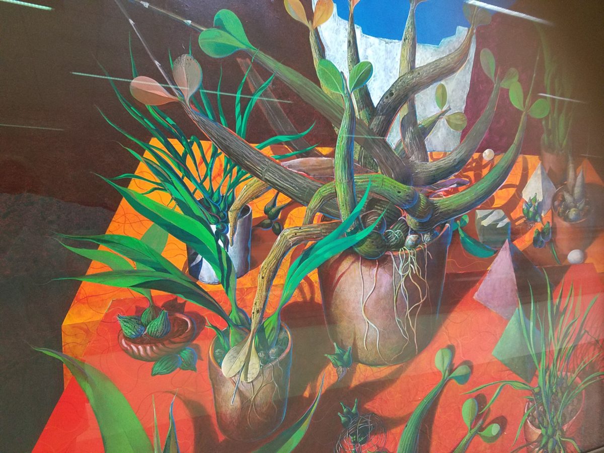
For example, my color antenna is always up and running. As I struggled with my pair of carry-on luggage monstrosities clearly in excess of 75 pounds (good thing there is only a size and not a weight limit!!), I came upon 2 art pieces in the Houston Hobby airport. The colors beckoned me. Although I had noticed them in swift passing, I couldn’t help wanting to see more. So I stopped and dashed back, disassembled my cumbersome haul and quickly took photos of these two paintings on exhibit, in the concourse, in order that I could enjoy them a bit later. Initially attracted by the color, they arrested me allowing and inviting an opportunity for further examination of their subject matter and detail later, when I had the luxury of time.
The wildly organic plant life, featuring an animated orchid that tangled and writhed on the painting’s surface in a variety of verdant green’s set against a perfectly selected fiery orange table surface, was brilliantly alluring and seemed to set the stage as a precursor to my soon-to-be-destination in tropical Mexico. ARTIST: Lucas Johnson Still Life with Schomburgkia
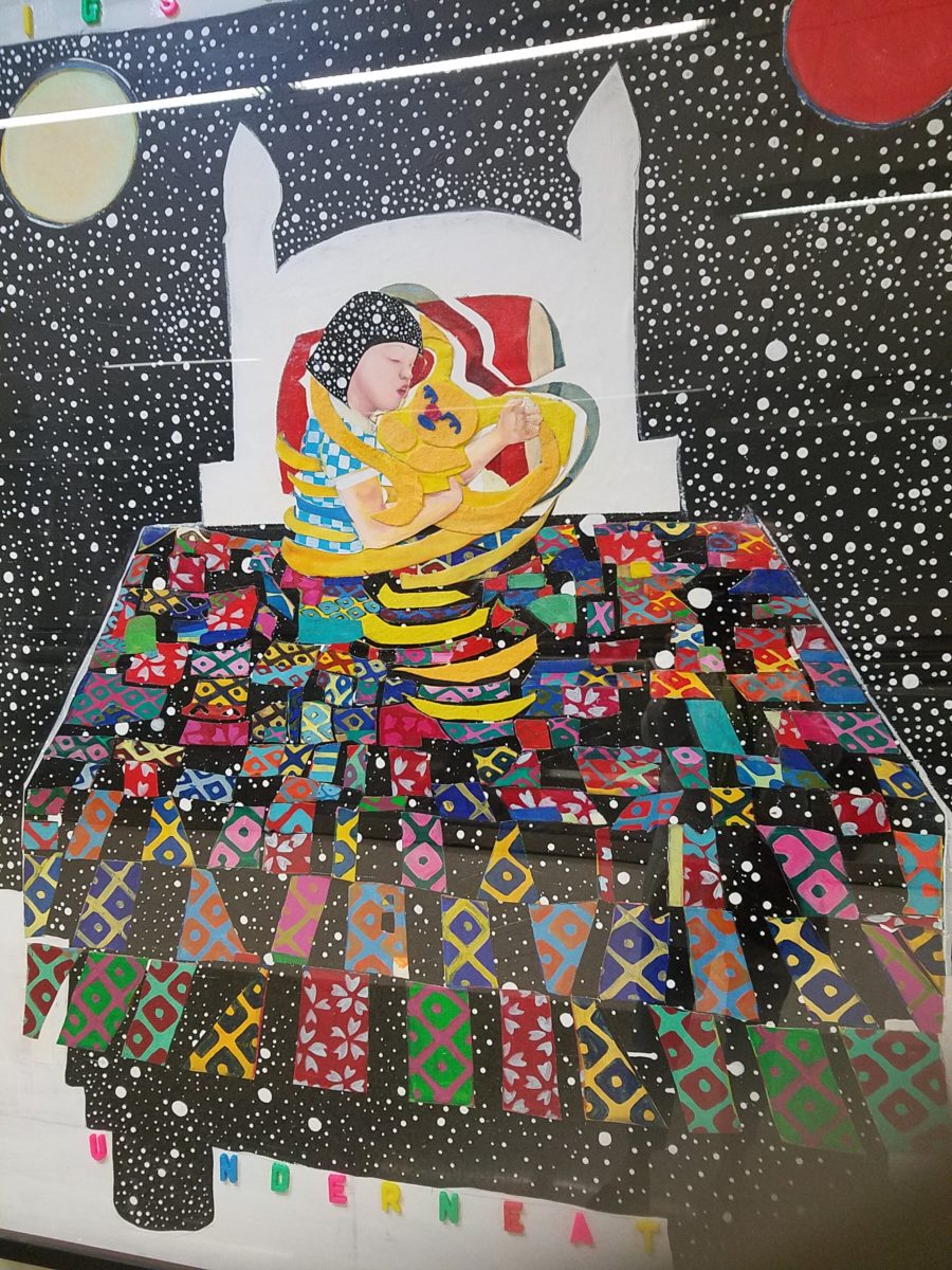
A bit further down the corridor of the concourse another piece caught my attention. Similarly with its colorful invitation, but with entirely different subject matter which upon closer inspection was quite intriguing, a patchwork quilt of batik fabrics and collage with applied letters beckoning the viewer to wonder what might be beneath was magic. The woman or child and beloved pet in the center of the action nestled under a cozy and colorful quilt, wrapped in a cloak of starry darkness which might suggest clinging to each other against the foreboding imaginings of the night.
The intense collection of the brilliant colors contrasting against black was dramatic, mystic and inescapable in this powerful piece, It Helps to Think We’re Sleeping Underneath the Same Big Sky by artist Joo Young Choi.
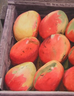
Watercolor
artist extraordinaire, Susan Weeks, captured this crate of mangos at
an exotic market somewhere very south of here. Peru? Ecuador? I don’t remember.
Susan gets around. And, Susan sees color and detail and renders it with
remarkably exacting precision.
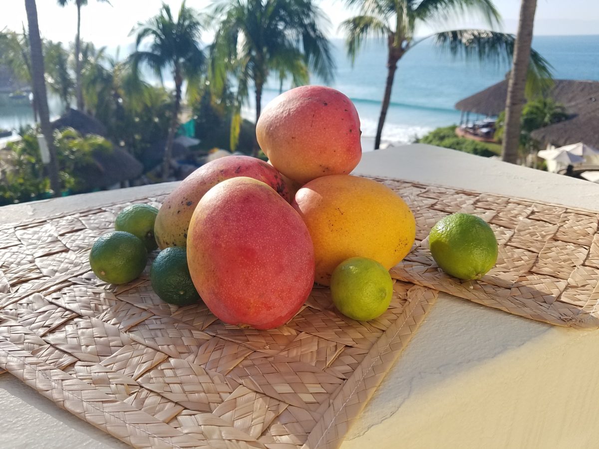
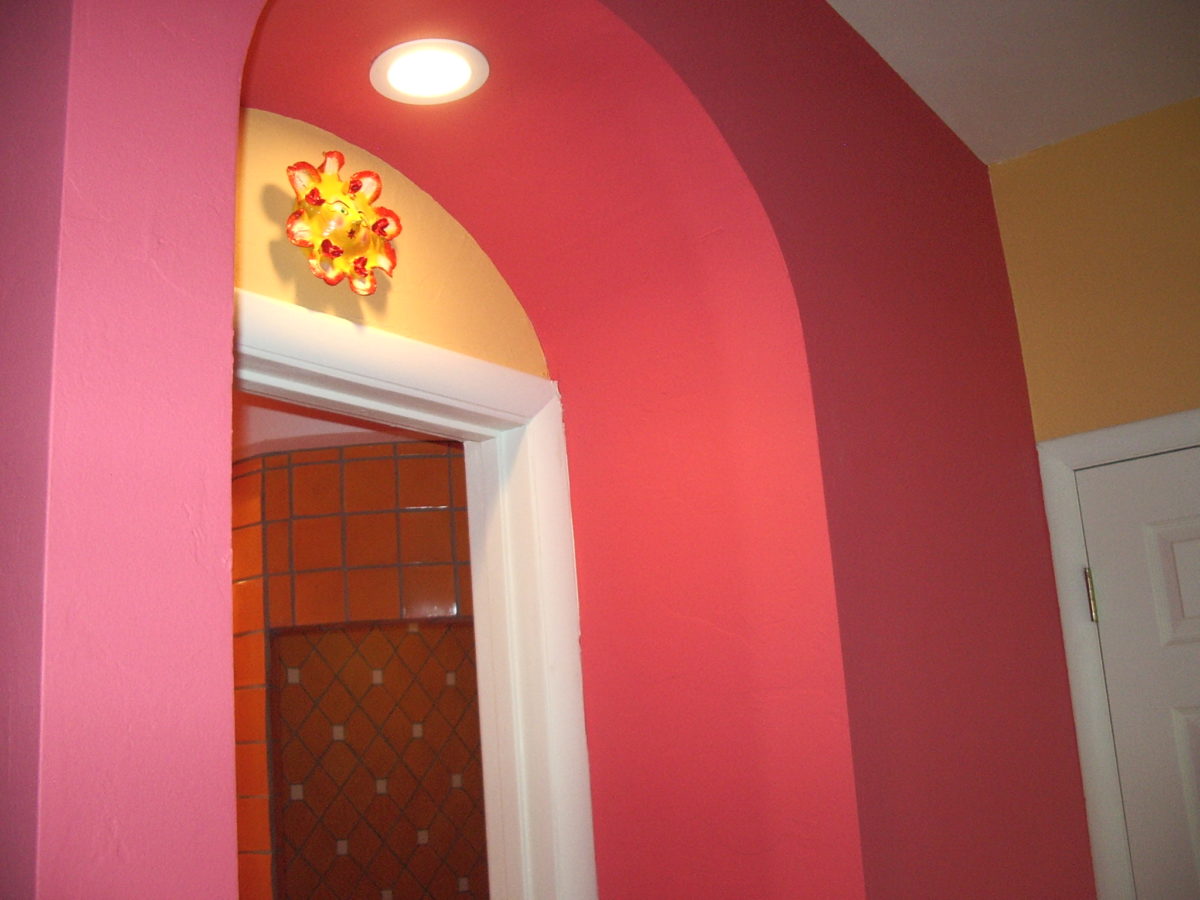
As I greet the day, I’m taking my stash of mangoes out onto the balcony to be seen and photographed in context. Reminded of how Susan rendered this succulent sweet fruit, with the delightfully “hairy pit” (nods to Tricia), I celebrate this colorful collection of nature in a sensational setting! These gorgeous tones of warm golden yellow, baby iguana green and yes, 2019’s rosy warm coral (Pantone’s “Living Coral”) are nature’s color scheme. The orbs are sensuous and the colors are excitingly bright and luscious.
Mango colors of rosy coral and warm, golden yellow are paired in this arched interior entry.
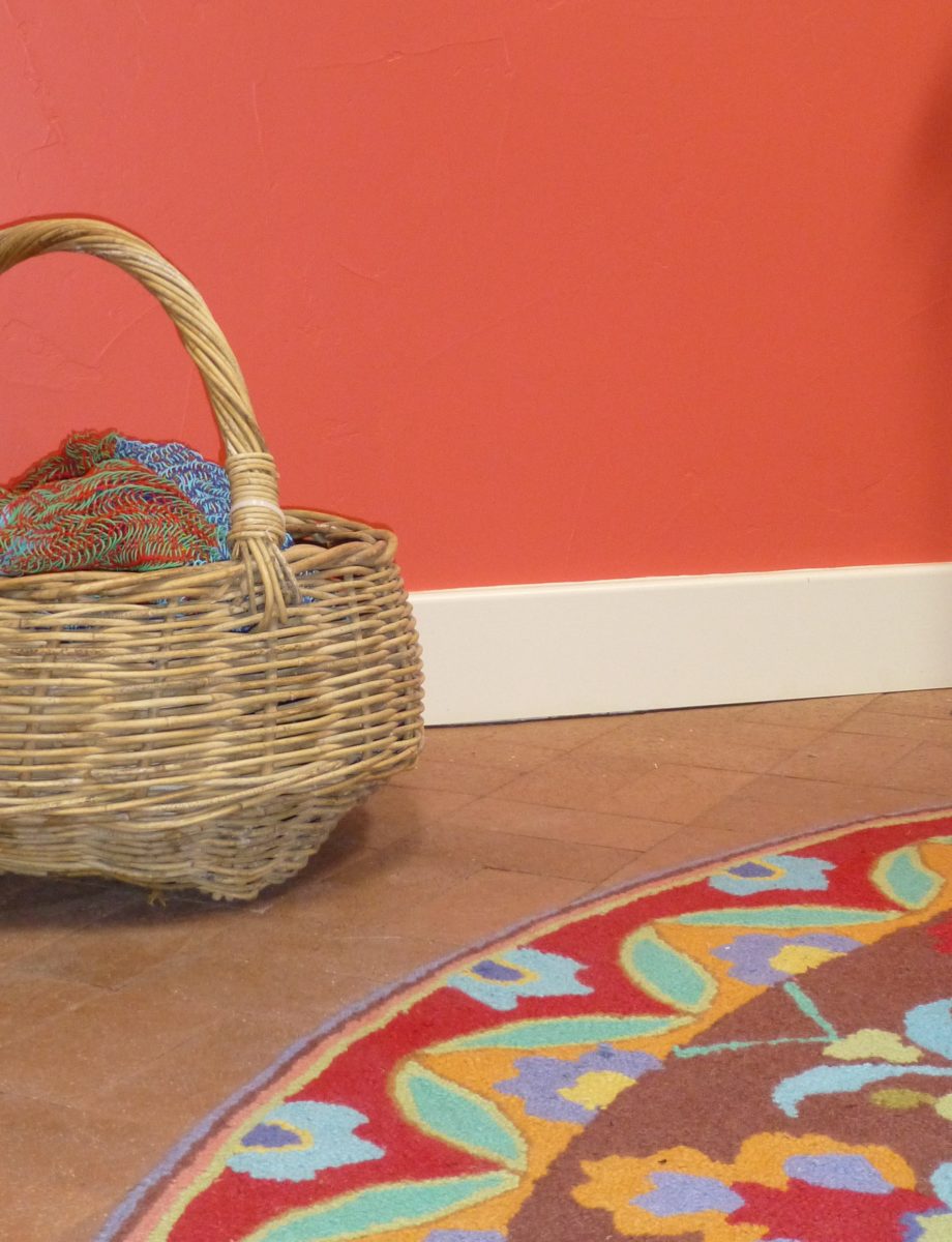
Here a similar scheme featuring one of our favorite Company C rugs illustrates the bold, effective power of color selection.
Try this exercise with color. I have no idea what your eyes see and your brain translates, but walk around and look at things in your world. Notice color. Notice individual items…book bindings to fresh fruit. Evaluate each color’s effect. Does it evoke any emotion…good or bad? If you wanted a painter to paint a wall that color and you didn’t have the paint selected, how would you describe that color in an attempt to get it on the wall as you desired?
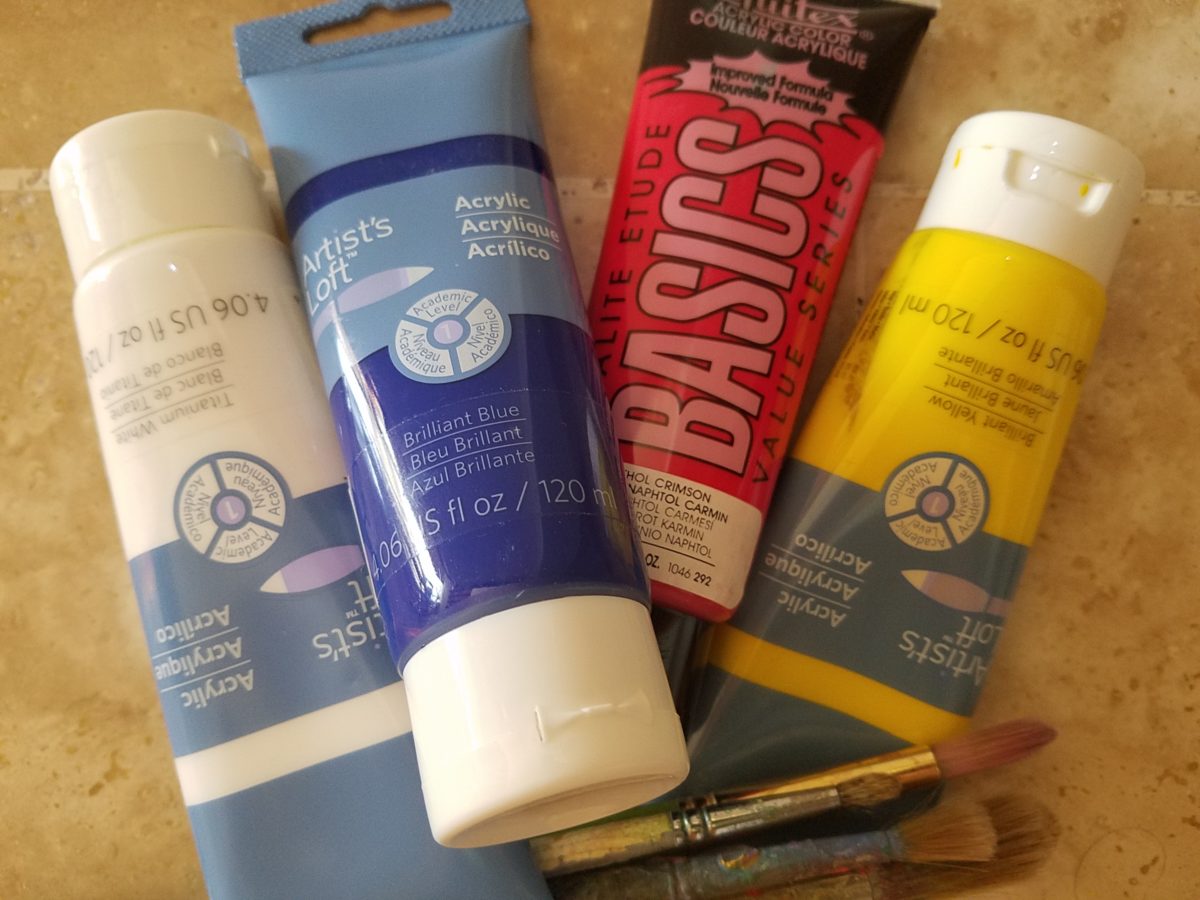
In a more thorough test, you might be prepared with actual paint – like tubes of acrylic from the craft store. Get a print-out of a color wheel to illustrate the primary, secondary and tertiary colors. https://bit.ly/2SVKUMg Buy red, blue, yellow and white and use them to attempt to create the color being described. This could be a party game – but you would need to also have paint chips from the home improvement store or paint store to use as the prompts that would have to be described and used to match the success or failure of the person attempting to create the color.
Noticing color brings appreciation to the details and nuances of our color-filled world. The little exercise/game, to try to convey a color to another person based upon similar life experiences and references, is interesting. Please share your thoughts and experiences, dilemmas and frustrations with this project through the blog’s email.
I hope this encourages you to go forth with a new-found appreciation of color and how it adds layers of depth and interest to all that you see. Examine the natural world, or man-made creations in film, set-design, architecture, graphic advertisements, fashion design or interior design. See why color matters!
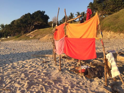
Not as the title suggests…tequila shots and all – but another kind of intoxication…an intoxication from unexpected beauty, sensory overload, inspiration as seen in the following photographs.
Those of you bundled up against the elements this time of year…freezing your booties off in the icy winter climes. Enjoy this escape into your unbridled imagination of design and lifestyle gone wild!
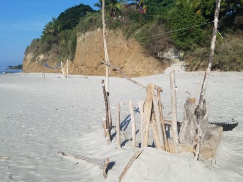
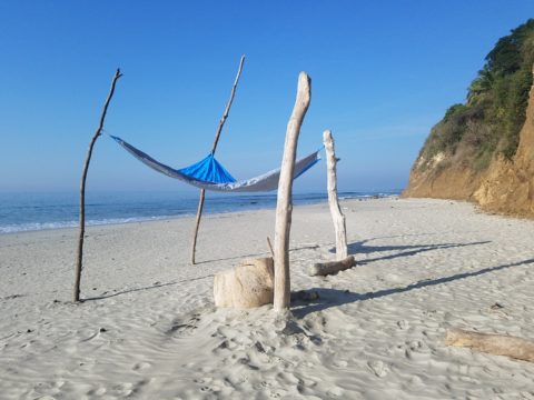
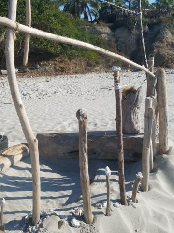
Thought a beachfront condo was out of reach? Think again. With all the DIY out there on the internet today, anything is possible. As evidenced by the inspiring framework of architecture that I have encountered just this week alone, consider the possibilities and have a little fun!!!
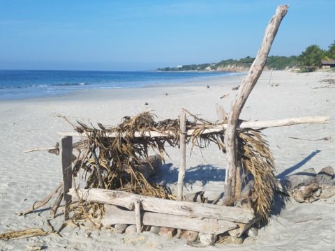
Very simple things trigger design concepts. Beyond the fascination I have had with these beach structures, this particular photo was bathed in late afternoon light. The glow of the orange towels was emitting a warmth that was so tropical, had it not been on a tropical beach, finding the same boldly colored and textured structure in a snow storm would have elicited a startling, contrasting feeling of the same tangible warmth.
This make-shift west-facing beachfront was so beautiful, in its simplicity, that it spurred ideas of bold fresh color, basic found-material furniture possibilities, fabric design and organic architectural solutions for patios both commercial and residential.
Imagine raw elements incorporated with concealed structural support to convey the feeling of spontaneous simplicity.
Then there’s that general calling that speaks to “the natural integrity of the materials.” You realize it is a grounding. It is a starting point of reference to all the embellishments, layers, machinations and manipulations that are possible.
Wood is wood until it is stained, painted, appliquéd…when does it lose its “natural integrity?” Even raw, man-made cinder block – CMU – concrete masonry units have their own natural character. Then stained in the aggregate or applied color, thickly coated…it alters it’s state – losing its material’s natural integrity.
What ignites design thrills? The fireworks of ideas that burst onto the scene illuminating so much that was previously obscured. It doesn’t have to be a remote and seemingly inaccessible tropical beach…it’s everywhere. Look around. See texture and color, shape and frame. Urban, suburban and rural settings in any climate all offer inspiration that can be isolated and appreciated. Design inspiration can be intoxicating.
Why is designing so exciting? Why is it often such a rush? You never know when an idea will appear or from where.
The world around you is a constant stimulation of ideas, inspirations and possibilities. You are thirsty for whatever is out there…whatever is waiting to be discovered, implemented… quench those longings. It is all about the freedom to allow ideas to be spawned from anything around you or in intertwined with your own imagination.
What fun to have come upon these simple structures on a glorious and sparsely populated beach. What fanciful design ideas and story-lines were prompted by the imaginary occupants, their creativity, resourcefulness and problem-solving simplicity. Lest you think they house the homeless adventurers, they are actually sun-shades for creative surfers and affluent sun-bathers seeking a primitive beach experience.
How might these primitive structural solutions play into a future project? Watch for design trends to incorporate more organic materials and nature’s inspirations!
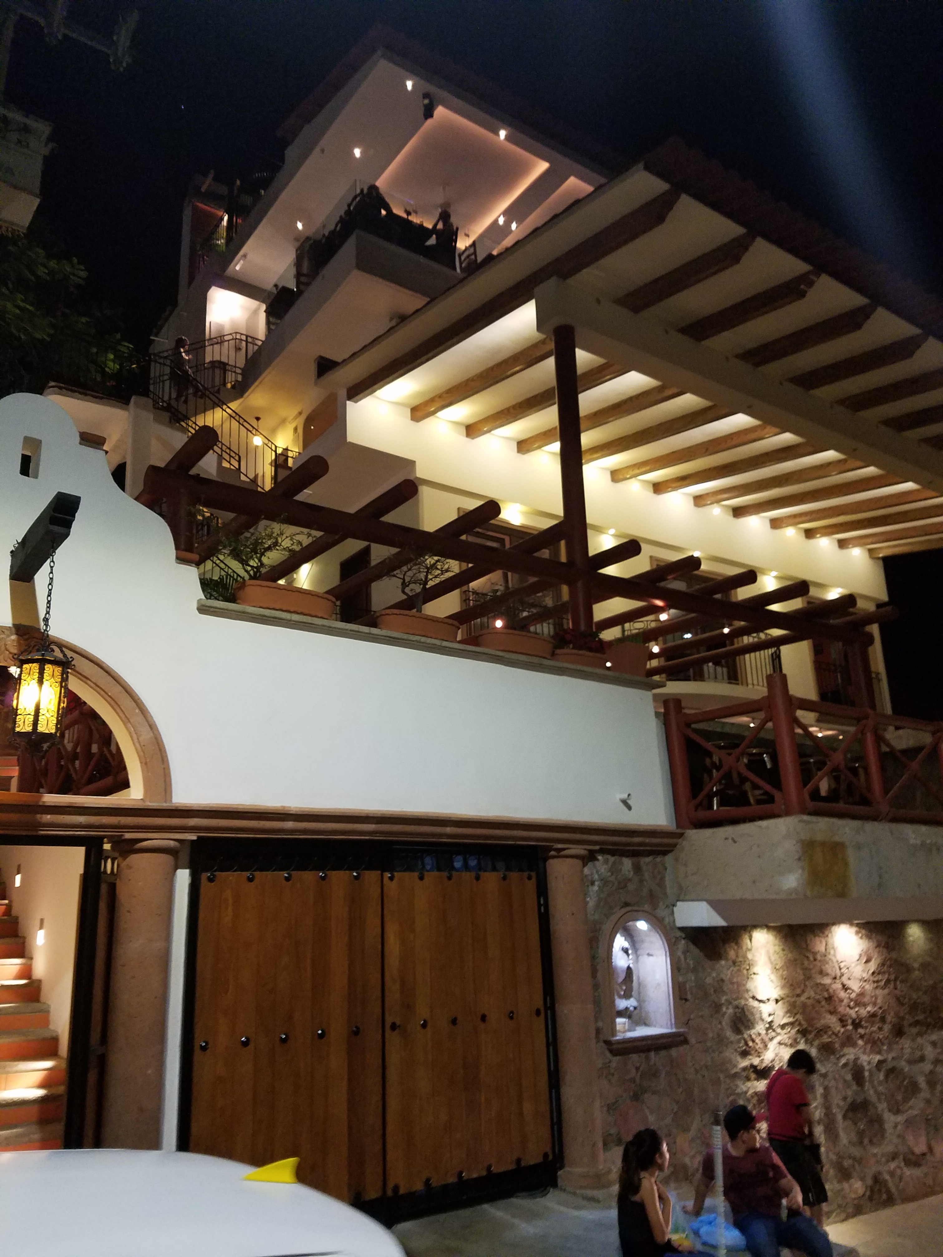
For years, Barcelona Tapas has been a creatively successful culinary and social scene on a quiet cobblestone backstreet in the tropical, seaside, destination of Puerto Vallarta. The vertical profile of the sun-bleached white building is distinctive with its open spaces – dining rooms on each ascending level.
It is a extremely popular, hip and happening, dining venue which has recently had a spectacular face-lift that brings the structure and open-aired/interior environment up to par with the culinary delights.
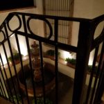
Upon arrival, the familiar, welcoming doorway opens to softly lit aggregate stairs that sweep up each tier of the towering edifice.
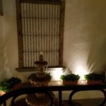
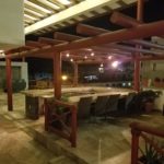
A massive Cantera stone fountain babbles gently amidst tropical plantings and an iron grill-work is indirectly illuminated for a dramatic effect. An expansive patio all with honed stone tile floors begins the layers of available spaces.
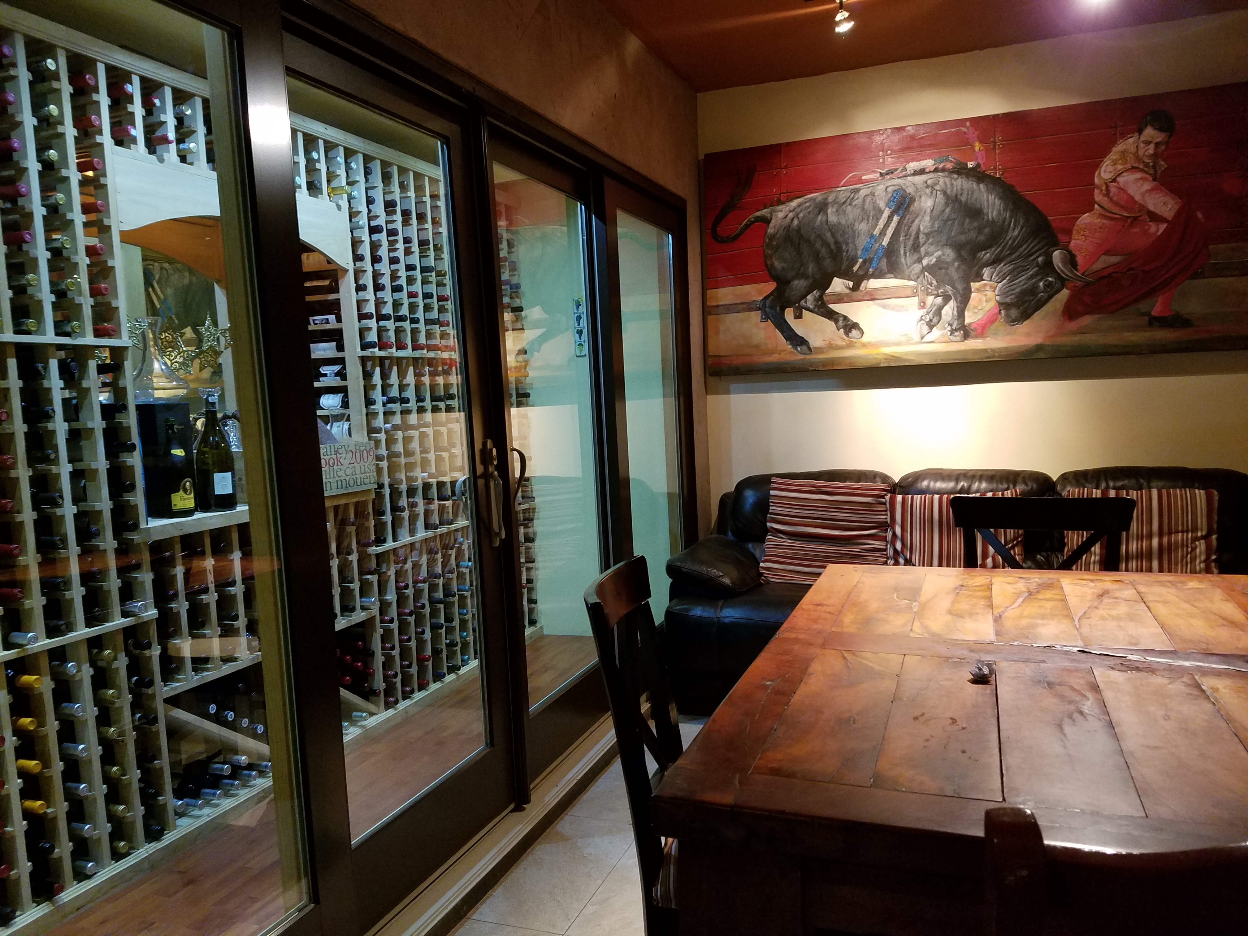
Next an intimate open-aired dining area with an adjacent chef’s table and luminous, full-wall wine cooler beckons with an inviting aura. The intense red drama of a bullfight is rendered in a large painting on the rear wall – a suiting backdrop to the Spanish theme.
Continuing the ascension, the delightful glossy black ironwork railing follows along and up the open-to-the-sky aggregate staircase turning past the last landing. Ahead, the beautiful, warm glow of the new dimensional ceiling treatment accented with wood and indirect lighting draws the eye upward.
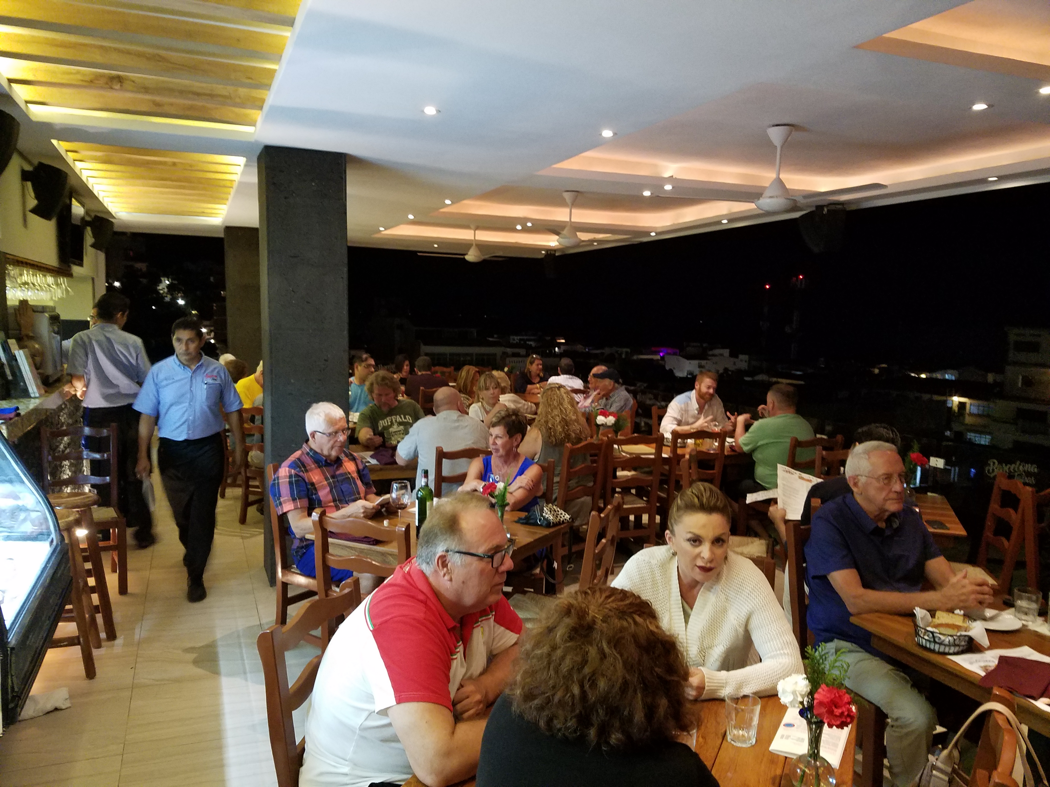
Upon arrival on this rooftop dining platform, what was always an exciting view of the city lights, both in the foreground and circling the bay miles around to the north, now expresses the new architectural features and finishes dazzling the eye.
Effective lighting, recessed ceiling details, a new clear glass railing, and modern ceiling fans dangling like detached white nosecone propellers present a whole new, fresh, modern look. The drama and effectiveness of the lighting paired with the wonderful surround sound, coming from eight Bose wall-mounted speakers and 2 sub-woofers recessed into the ceiling, result in an atmosphere and music that are seductive and sensational.
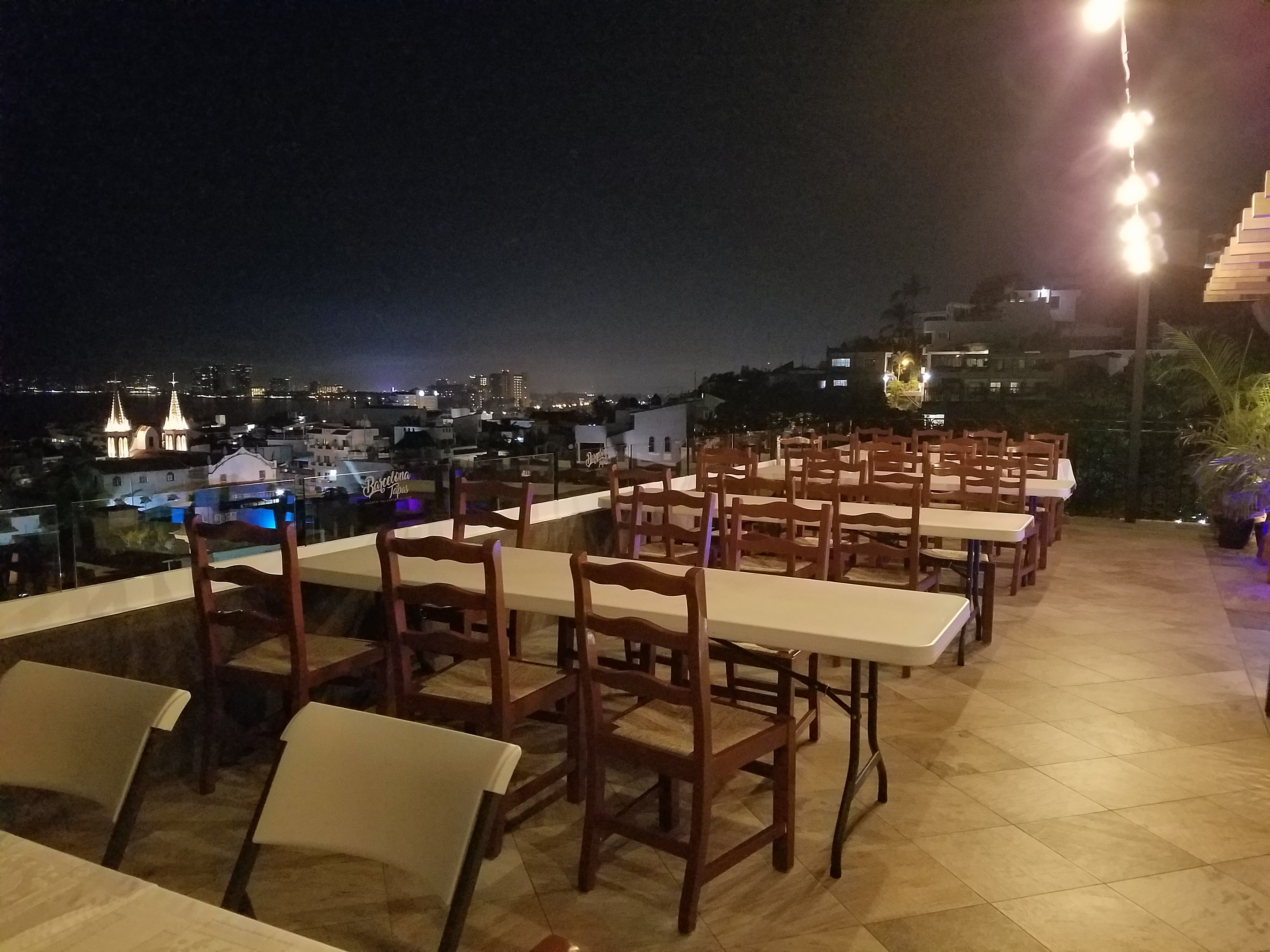
But wait – there’s more!!! Yes, an additional rooftop dining patio is revealed upon discovering the hidden staircase at the far end of the bar. New furniture and a billowing fabric-draped portico are soon to arrive!
This new space not only increases the seating capacity, but offers yet another panoramic view and trendy design-themed open venue – expanding the options even more!
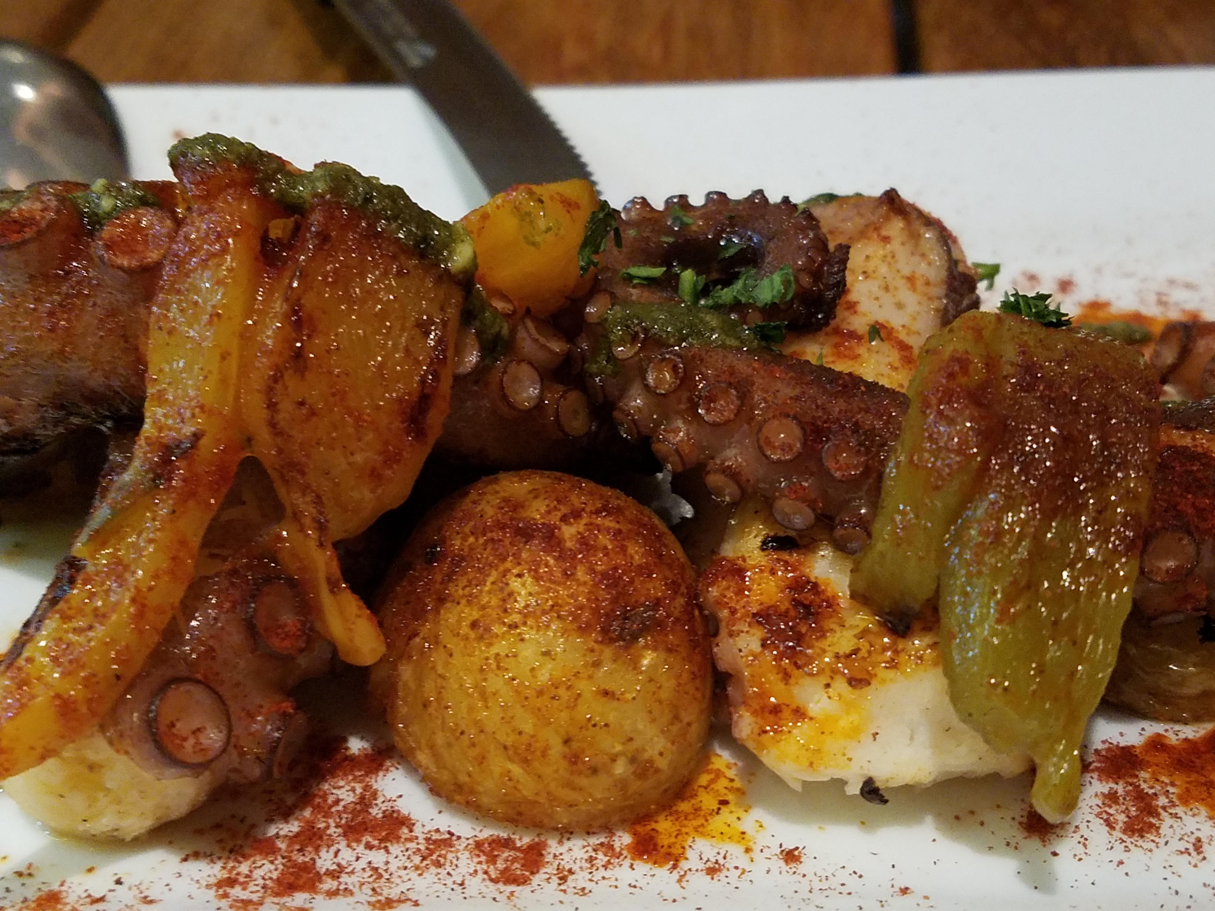
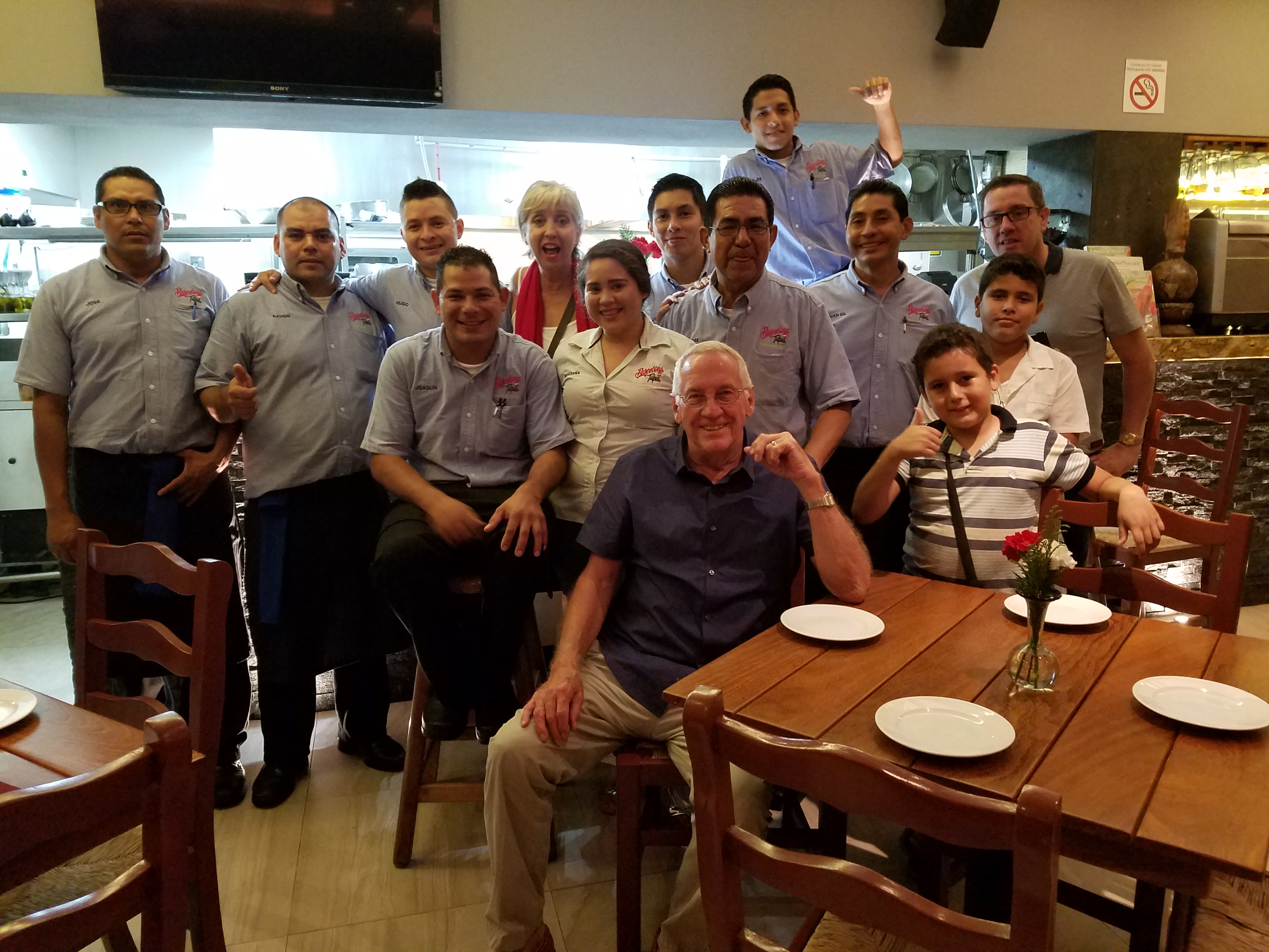
The project is Chef/Owner Bill Carballo’s passion.
He has been at it for years creating deliciously original and traditional Spanish tapas (here his exquisie presentations have been half eaten in the rush to enjoy)
from the immaculate exhibition kitchen at the start of the long bar, with a fine-tuned staff eager to assist and cater to your every need.
This enchanting transformation has attracted new discriminating, trend-setting clients and welcomed the return of loyal fans to experience this exciting new and stylish interpretation of Barcelona Tapas.
The doormen Luis and his affable sidekick are there to greet and assist!
Thank you gentlemen and Buenos Noches until next time!!!!
How can I say that I am too busy to write this week? As Saturday approaches, I realize that I have not stopped long enough to focus on any one thing, of the many that are bombarding me from all angles, about which I might formulate a theme for my story. I have to apologize, for once again, missing my Saturday deadline and hope that this was worth the wait!
Oh, to be so entertained by an onslaught of inspirational design elements as I have seen in the past few days only. And yet not only design – there was more. So I would like to start with an insert about Saturday as I (instead of writing my blog) took one last kayak cruise of the year.
A few people had gathered at the edge of the sand, pointing and remarking that they thought they had seen a whale. I looked in that direction and noticed that a few boats had gathered – often a sign that whales are spotted. I quickly pushed off in my single kayak through the gentle surf out onto the beautiful Banderas Bay and experienced for the first time whales from that most intimate vantage point. Up close and personal, it was thrilling to say the least. The beach was crowded with onlookers oohing and ahhing as they blew mists of water into the air and rose up from and back down, under the bay’s glistening surface. I paddled out and maintained a safe distance, but close enough to hear and feel the graceful power. Hump-backed and for which they are aptly named, the dark, sleek black bodies of the mother and calf were magnificent as they broke the surface and greeted the encircling boats full of eager spectators wanting to catch the show. And a show it was as the mama rolled onto her side and raised her unbelievably long, towering fin to slap the water sending spray high into the air. She slapped again and everyone thought that once was a rush and two was a treat and three and then four and I lost count at 30 times she slapped the water as though to say – “You want a show? I’ll give you a show!” She must have known that it was too dangerous to breach at that point, for a grand finale, as the close proximity of boats could have had deadly results. And I was right on the water with them. Unforgettable. The pity is that I was without camera and have only the memory of this life affirming event . An event that was awesome and outrageous and yet brought a surreal, serene sense of calm, peace and palpable, tingling joy. Friends on the beach greeted me upon my return in awe of what they had witnessed and welcoming me warmly, with enthusiasm, over my good fortune to have been out there for such an amazing display.
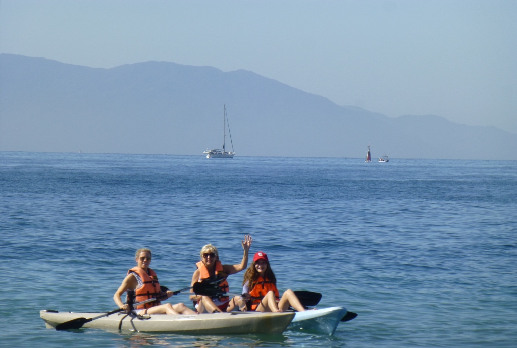
This photo taken a week earlier – a bit choppier seas, with Tricia in the single and I with Victoria in the double, sets the scene of the Bay surrounded by the Sierra Madre range.
Now, having shared that incredible experience, I have decided to focus on one of the many design inspirations that I have encountered this week, but I hope you will visit our PATRICIAN DESIGN facebook page to see the collage of colorful art and texture that I have compiled to represent the many images that I have seen and offer to further stimulate your imagination.
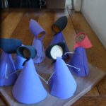
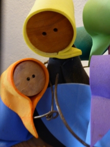
My focus at this seaside gallery of delights today, as we bring to a close a magical month, is a collection of precious little figures made from synthetic foam, wood and steel. These humble little animations represent three shared events, a group hug, the “wave” at a stadium event and a gathering for solemn prayer lead by a figure of distinction – the one in the red scarf.
The spirit of collective participation is conveyed. The spirit of humble expression is conveyed. They present a sense of simplicity of some of life’s joyful moments. These simple figures are happy and content. They are intriguing and relaxing to study from many angles.
Form and movement, color and texture the Spirits of Joy by Federico Leon de la Vega are a wonderful representation of life’s simplest and most basic moments of sharing joy. To see art in such a distillation, such a unpretentious media, execution of mechanics and form is true pleasure. It is not overwhelming or startling, it is not outrageous or provoking – it is moving and modest.
I hope that they bring a sense of joy to the start of your week and create an indelible memory to which you can return in your quiet thoughts to bring you peace and joy.
To experience this glorious morning, on the open patio of a tiny commercial kitchen, in an otherwise residential neighborhood paralleling the river Cuale, in the very foodie coastal city of Puerto Vallarta, is a treat beyond measure—but I will try to share. I will attempt to take you to this special place full of unselfconscious art and function.
The cobblestone streets are dusty and send fine particulates of powder into the atmosphere causing a fairy-dust-like twinkle in the bright morning light. We bump along in a taxi turning and curving along the circuitous route that surely would lead most to believe what they say—that “this place is so hard to find, it has to be good!!!”
The front is shut and obviously closed for business. The taxi driver brings this to our attention, “is closed” he says simply— assuming that he will be continuing along the bumpy calle along the rio back to the bustling scene of the awakening city and return us to our point of earlier departure.
“No,” we tell him “we’re taking a cooking class” “leciones en la cocina” we attempt to convey and with that he beams a broad smile and says “really?” and stops the cab along the wrong side against the opposing traffic on the little street in front of the café.
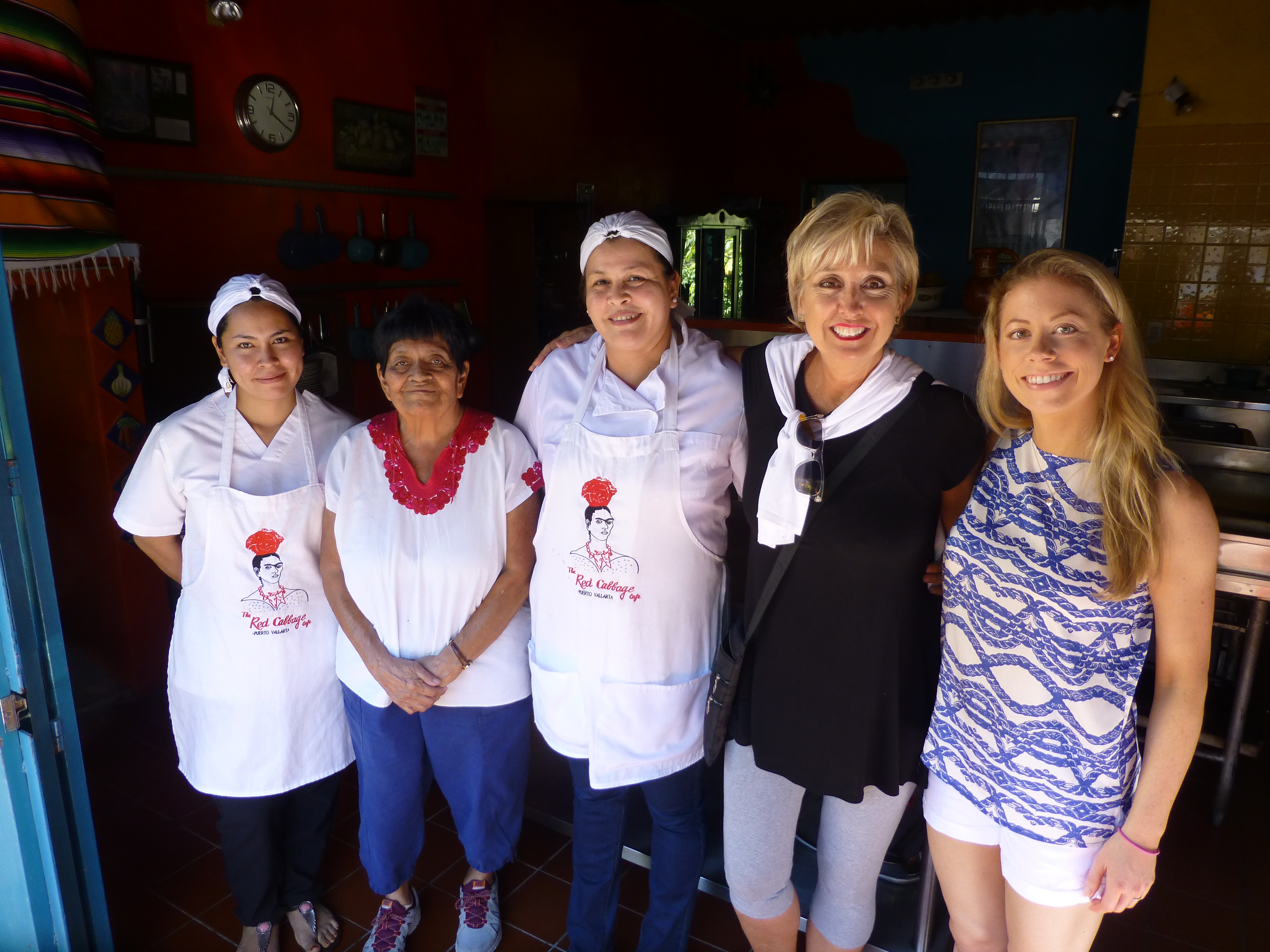
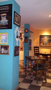
We notice Lola peeking through the door at us as she unlatches the locks motioning us through and welcoming us as we enter the quiet little checkerboard floored dining room. At night this place buzzes with animated conversations and is alive with color and funky memorabilia, art and posters, collages of collectibles all on brilliantly painted walls creating an eclectic artistic interior of fun and festivity. But on this morning, the room is dormant save the three other guests waiting to participate in the morning’s class.
After brief introductions we are escorted through a doorway to a narrow concrete staircase. Daylight streams from above and we ascend past more brilliantly painted walls to a second floor open to the sky onto a patio rimmed with potted herbs and flowering plants. To the right we realize that the rest of the space is undercover, yet always exposed to the elements from that one open east-facing orientation.
Inasmuch as I love cooking and eating and all things related to culinary pleasures, this is not the focus of this story, but rather, it is to describe this artfully inspired space and all the raw style and primitive grace we encounter in this wonderfully entertaining class of good and indigenous fresh foods and their fabulous flavors.
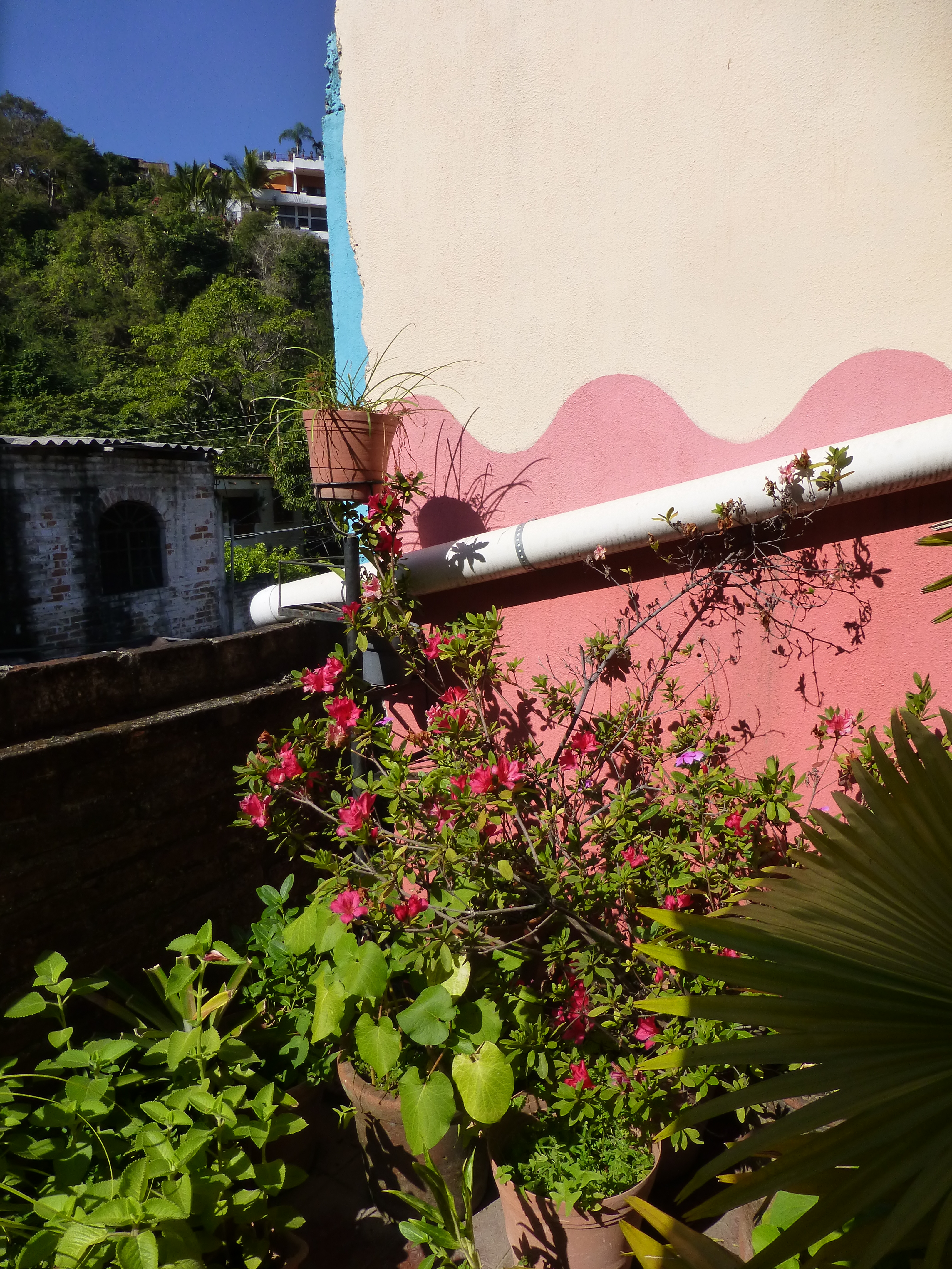
The space is charming and intimate and spotless. The colors are screaming from every direction including a whimsical pink door surround seen over the wall of the patio. The surrounding area is quite run-down and depressed, yet this jewel of a creative kitchen space shines boldly amidst the impoverished surrounds.
The sky is perfect blue and sharply contrasts against the wavy pink paints dividing between pale and happy bubble gum of the stucco wall. A functioning drain-pipe of clean white PVC bisects the wall beneath which is a profusely blooming rose-colored azalea in a clay pot.
Panning into the covered portion of the space, the radiant coral color wall wraps to the back and transitions with gracefully wavy detail to a paint remarkably resembling the sky blue—of the actual sky—that we encountered out front which slams into a dazzling yellow-gold wall half painted and half tiled with the same luminous yellow color. And I have only described the backdrop!
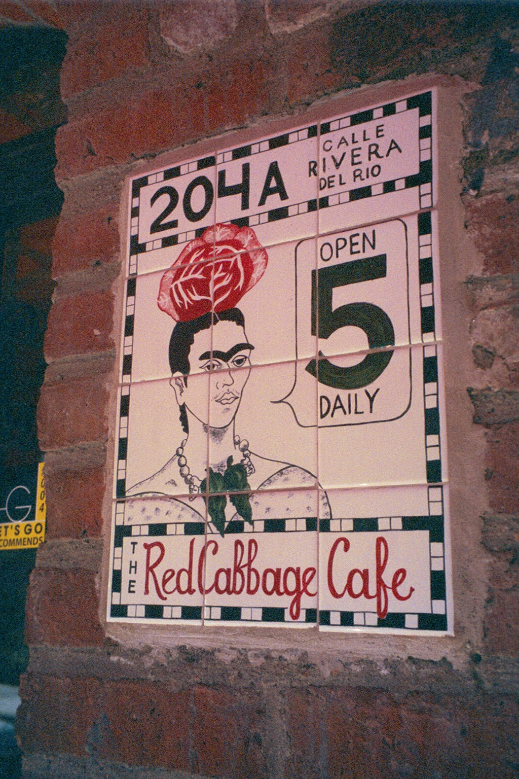
Against these boldly painted and tiled walls are layers of other things that add even more dimension and interest to the kitchen. Blue and white tableware, glazed clay vessels, and a mysteriously faded poster of Frida Kahlo. More of the sky-like blue is hanging in the form of various sized and shaped enamel cooking pots on the coral wall.
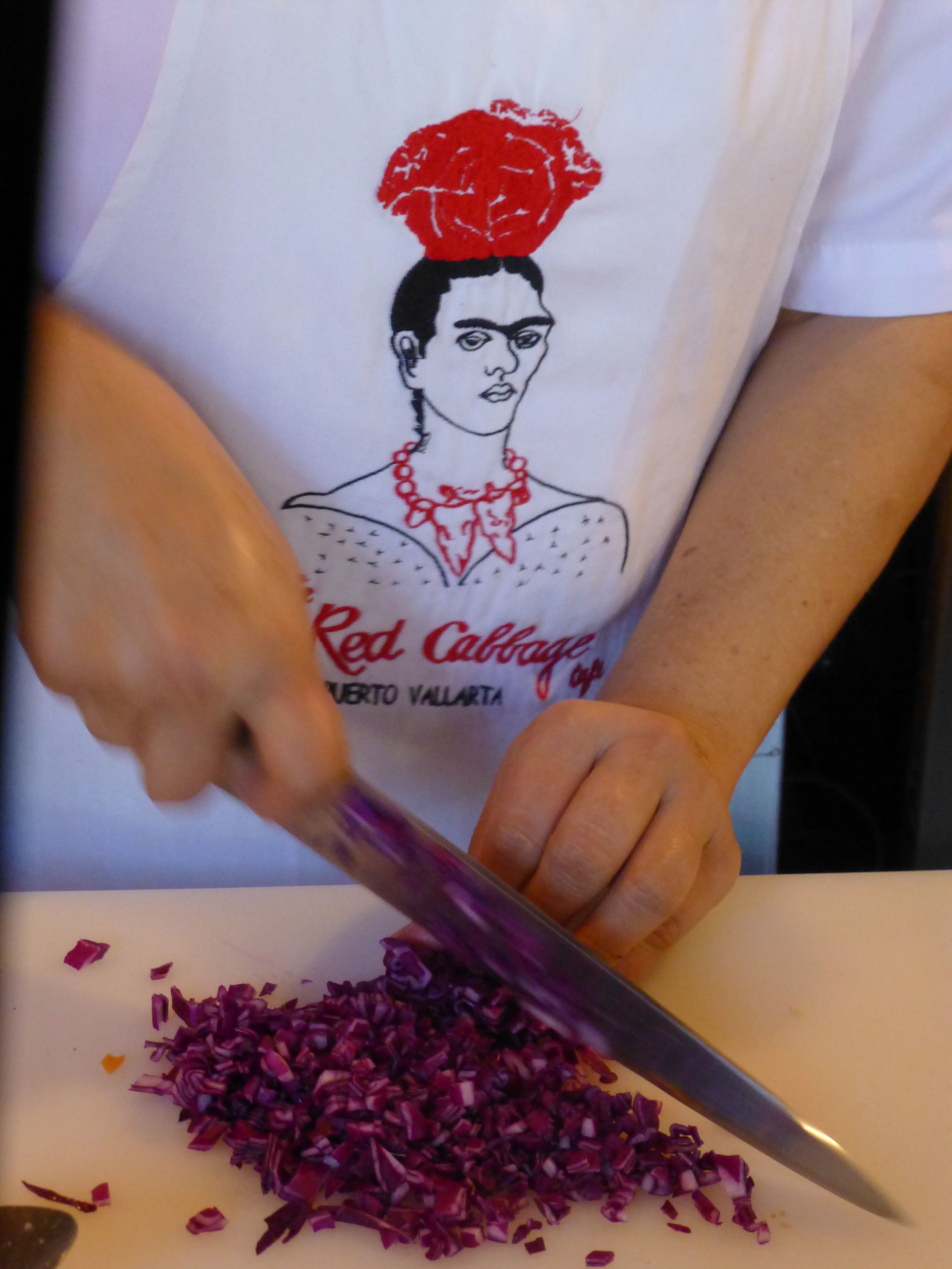
The crisp white aprons of the two chefs pop against the background of multi-colors branded with the embroidered red and black logo of Frida with a red cabbage balanced atop her head.
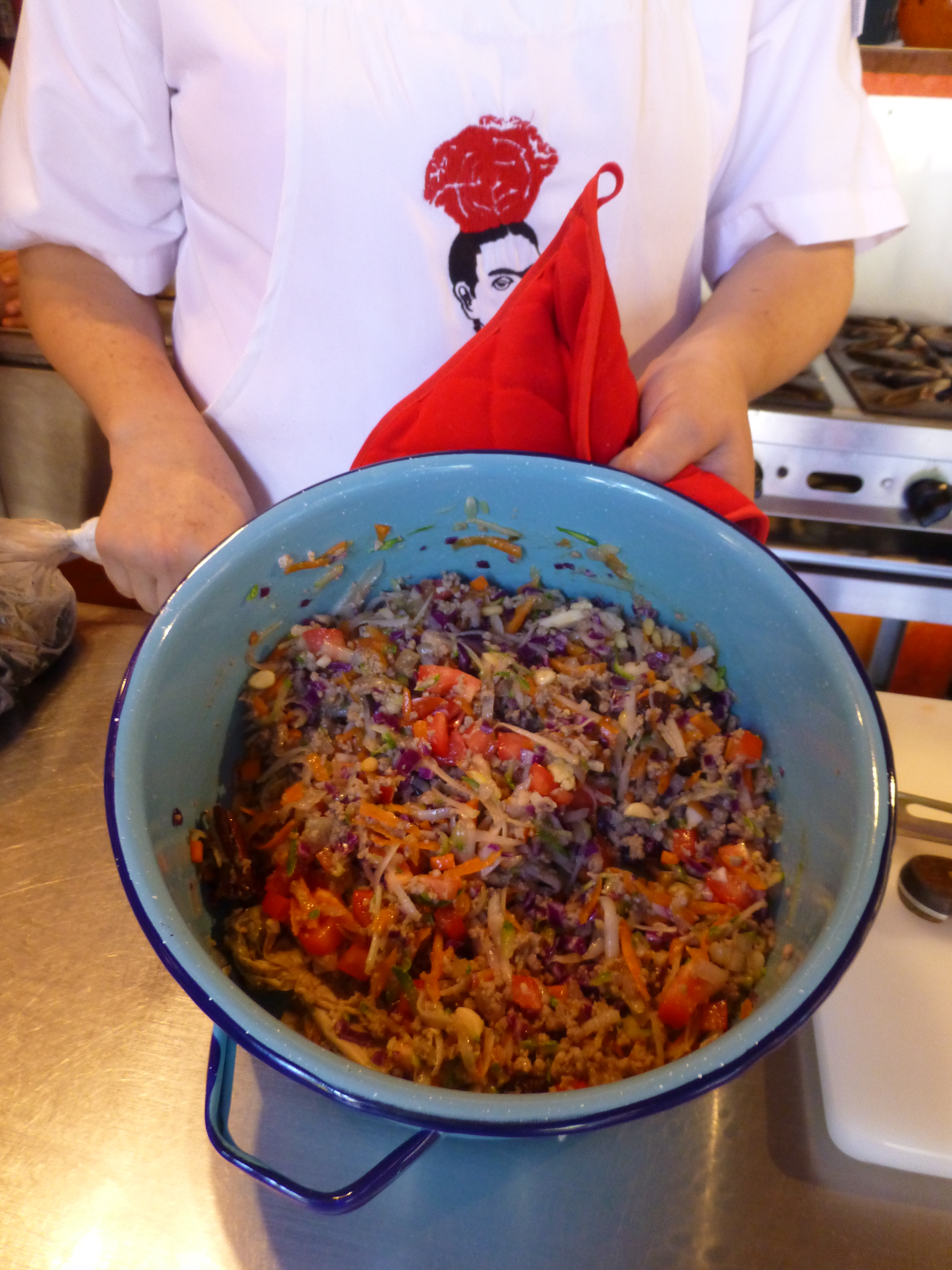
It seems from the murmurs coming from the eager students that this enchanting environment represents the promise of a flavorful feast of color and texture. The food matches the interior. The stuffing for the dark rich green roasted poblano peppers is a colorful collection of shredded carrots, red cabbage, zucchini, tomatoes, raisins and pine nuts creating a seemingly woven fabric of colors and texture.
The finished product, Chiles en Nogada, represents the Mexican flag of red green and white. Plated here on red glass for an artful presentation.
Myriad handmade condiment dishes and traditional serving pieces contribute to the collection of color we are experiencing in this spectacular sensory bombardment. And I mean that in a really good way. The intensity of the colors and layering, the structure and accessories right down to the food and its presentation results in an artistic expression that goes way beyond the sterile experience often connected with the laboratory of a commercial cooking experience.
So we say—why be status quo when you can be individually fabulous, cooking and creating in an unconventional environment that reflects the animation and joy of the flavors that comprise the artful meals?! Thank you Lola for imagining and realizing the Red Cabbage and bringing so many artful, entertaining years and delicious meals to the community of fortunate residents and happy visitors—happy that they were able to find the place!
It could have been a sculptural piece of drift wood or a gnarly tree branch from the woods or a twisted piece of metal from a salvage yard…but the idea is to see things in a different way and once again—as I have done this before— to make something from nothing. And in this case, with no effort or manipulation—just the natural beauty of the found object.
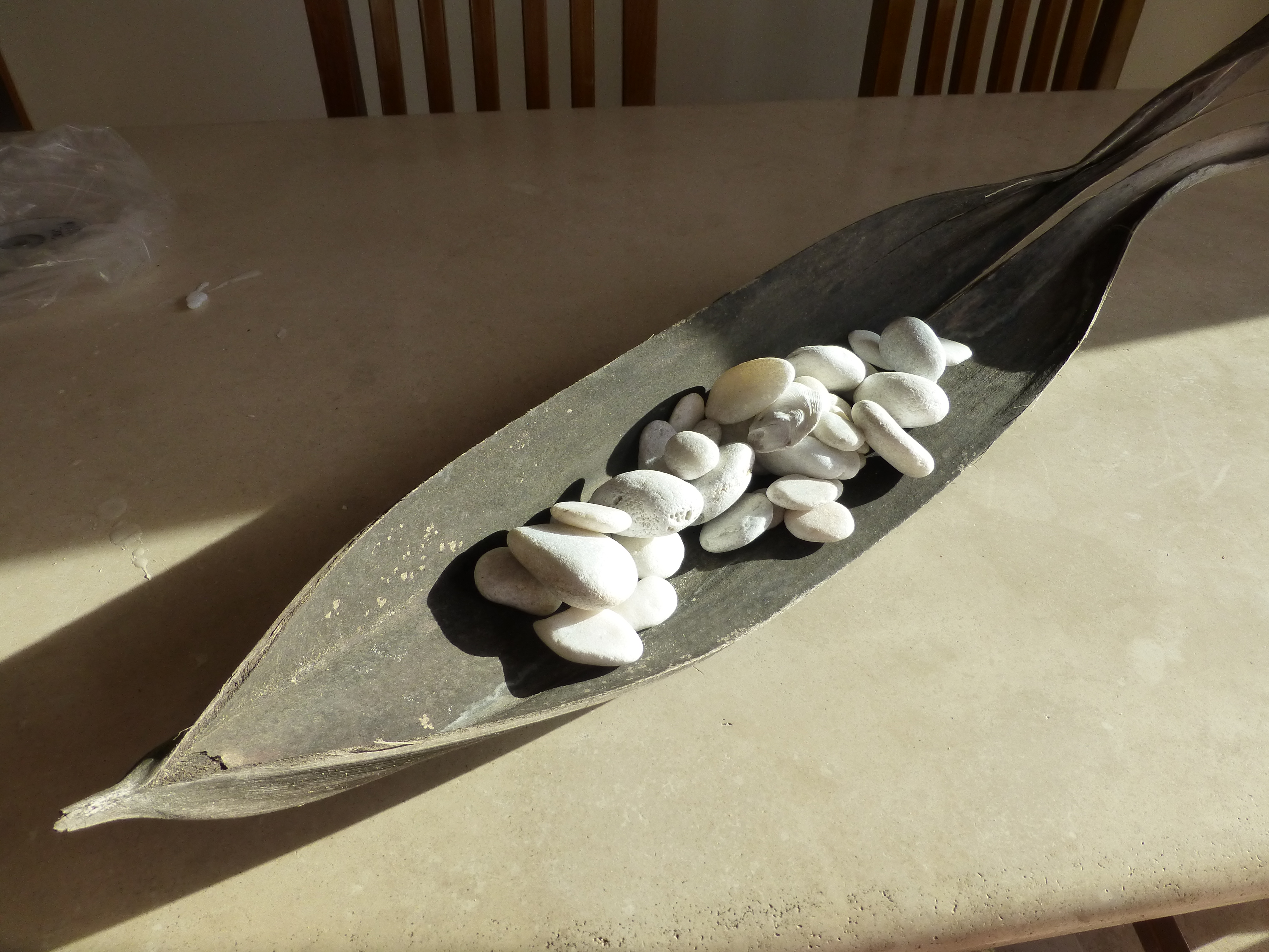
The tide was out making the beach so wide it was like a great runway of wet sand. Scattered on the surface were the leavings of the waves – pieces of shell and polished stones. There amidst the beautiful debris was what looked like the suggestion of an abandoned boat hull—a dried, darkened palm sheath. I instantly knew, this would be another beginning of the tropical table-scape that I am so fond of creating when we are at the beach.
“Creating something from nothing,” my father would often say. He was a great believer in that idea that one man’s trash was another man’s treasure. We loved to beach comb together whenever we found ourselves at the tide’s edge. Sometimes it was tropical and the coral was bleached white and pocked with texture. Fine mesh pieces of purple sea fan and perfect little green “hat” shells would be nestled among the dense collections of heavier piles of white coral.
Then other scenes would find us on northern beaches of the Maryland coast where there was no coral but the ocean would wash multi-colored surf-polished stones onto the shore blanketing the sand particularly at the very edge where the water would curl between the beach and the ocean’s depths. Tiny purple and pink clam shells would peek, being abruptly exposed and quickly bury themselves back into the wet sand moistened with each incoming wave.
On this day, the warm breeze is tropical and the beach is expansive offering rare treasures scattered broadly but sparingly on the pristine surface of sand. It is here that I encountered my centerpiece.
Don of course is saying—”what are you going to do with that? It’s too big. Leave it here.” And I assure him that it is in fact a treasure and that it will be magnificent in the center of our dinner table where we are entertaining 11 for festivities this coming weekend. He, as always, acquiesces knowing that it is futile to stand in the way of my wildly enthusiastic creativity.
Over the next couple of days, he and I both collect white stones and shells on our daily beach walks. At my instruction, we only collect white unless it is a particularly interesting shell. The idea is to have the stark contrast with the dark hull of the palm sheath.
Our dining table is a handsome slab of travertine marble. Laminated to a double thickness and finely finished with a smooth full bull-nose edge, it is the perfect organic surface to build this also very organic centerpiece.
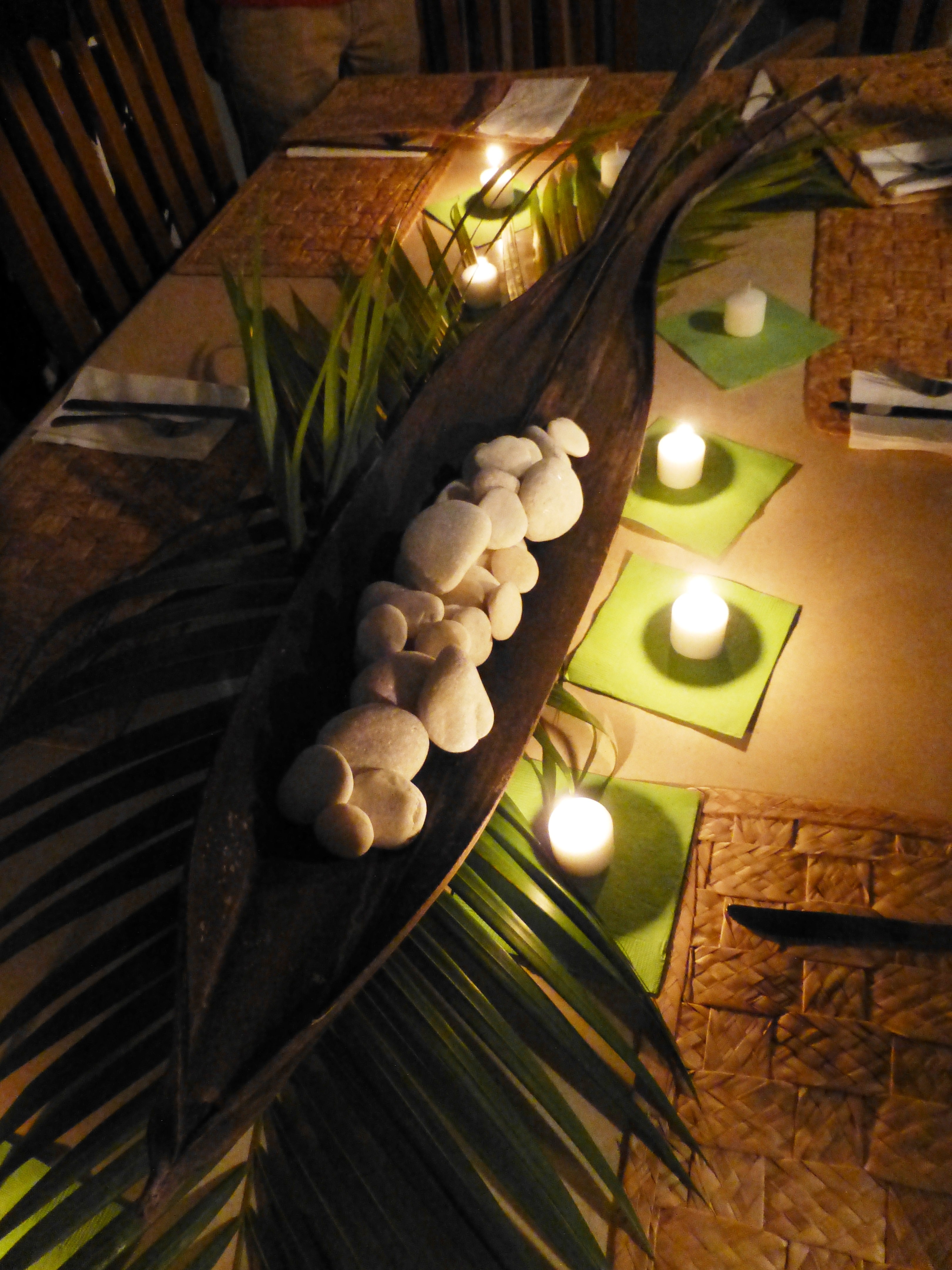
It needs something…the neutral tones are lovely. Yet, the dark espresso brown of the palm sheath with the white of the stones, against the creamy surface of the travertine invites something more. I realize that it can only be enhanced with another layer of organic material – here in the form of the fresh verdant green palm fronds – the perfect punctuation!
Oh would that I had collected more flat oyster shell halves…they work so well for votive candle bases…but alas, parrot green cocktail napkins will have to do for this last minute detail.
Our woven palm place mats, in their natural dried flaxen color, compliment the rest of the organics on our table. And as night falls, the sun drops beneath the sea’s horizon and twinkle of scattered candles finish our scene. Salud!
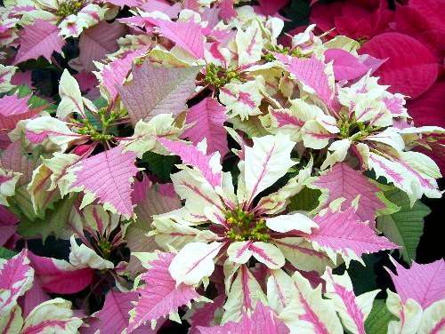
Thank you Joel Roberts Poinsett for bringing this brilliant red and green explosion of color and such a perfect plant to represent the colors of the Christmas season to our northern climes! Upon learning that today was National Poinsettia Day, I set forth to learn a bit about why…
You too can Google it, but in a nutshell, back in the early 1800s, this observant amateur botanist was our first Ambassador to the new Republic of Mexico! Not to mention, his day job was that of a doctor and a soldier! Busy well-rounded guy it seems!
Poinsett sent cuttings of this spectacular and exotic flowering plant from where he was visiting in the Taxco region of Mexico, to his home in Charleston, South Carolina. Once he returned to Charleston, he spread the joy and sent other clippings of his magnificent discovery to friends including a Mr. Buist in Philadelphia who gave a piece to Mr. James McNab who took it to the Botanical Garden of Edinburgh, Scotland founded in 1670. (From “Paxton’s Magazine of Botany” 1837)
The initial botanical name Euphorbia pulcherrima was actually assigned by a German botanist, Wilenow, in 1833, but within 4 years it was renamed Poinsettia Pucherrima by William Hickling Prescott a historian and gardener who had been asked, by someone in authority, to rename it. He did so by selecting to honor Joel Poinsett for his numerous achievements in both government and horticulture.
This dramatic flowering plant comes in many colors – the familiar and original red to creamy off-whites, chartreuse, pinks and various variegated versions such as this fabulous marbled specimen called strawberries and cream.
Poinsett retired from his career in public service as Secretary of War in 1841. He became one of the founders of the National Institute for the Promotion of Science and the Useful – which later became the Smithsonian Institute. I was born in D.C. and raised inside the Beltway and never knew that the Smithsonian which was a memorably mandatory field trip nearly every year of my childhood, was originally named the wordy National Institute for the Promotion of Science and the Useful – but it certainly describes it all in one fell swoop!!
There are many legends and folk stories centering around this “flor de Nochebuena” in Mexico but the thread of this story that has personal interest to me is that the same poinsettia cutting taken to Edinburgh by James McNab is still producing and flowering annually in the Royal Botanical Garden in Scotland to this day.
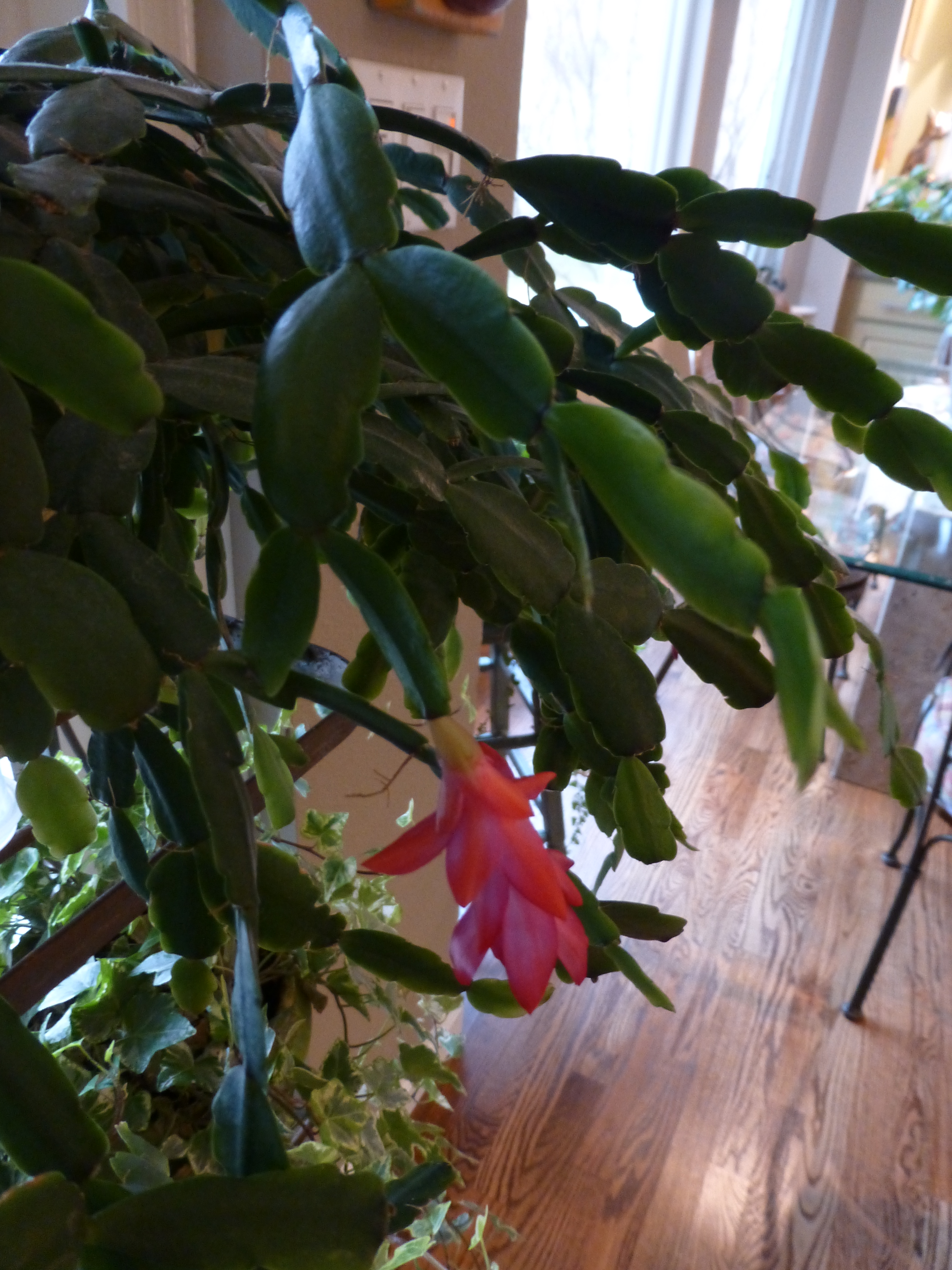
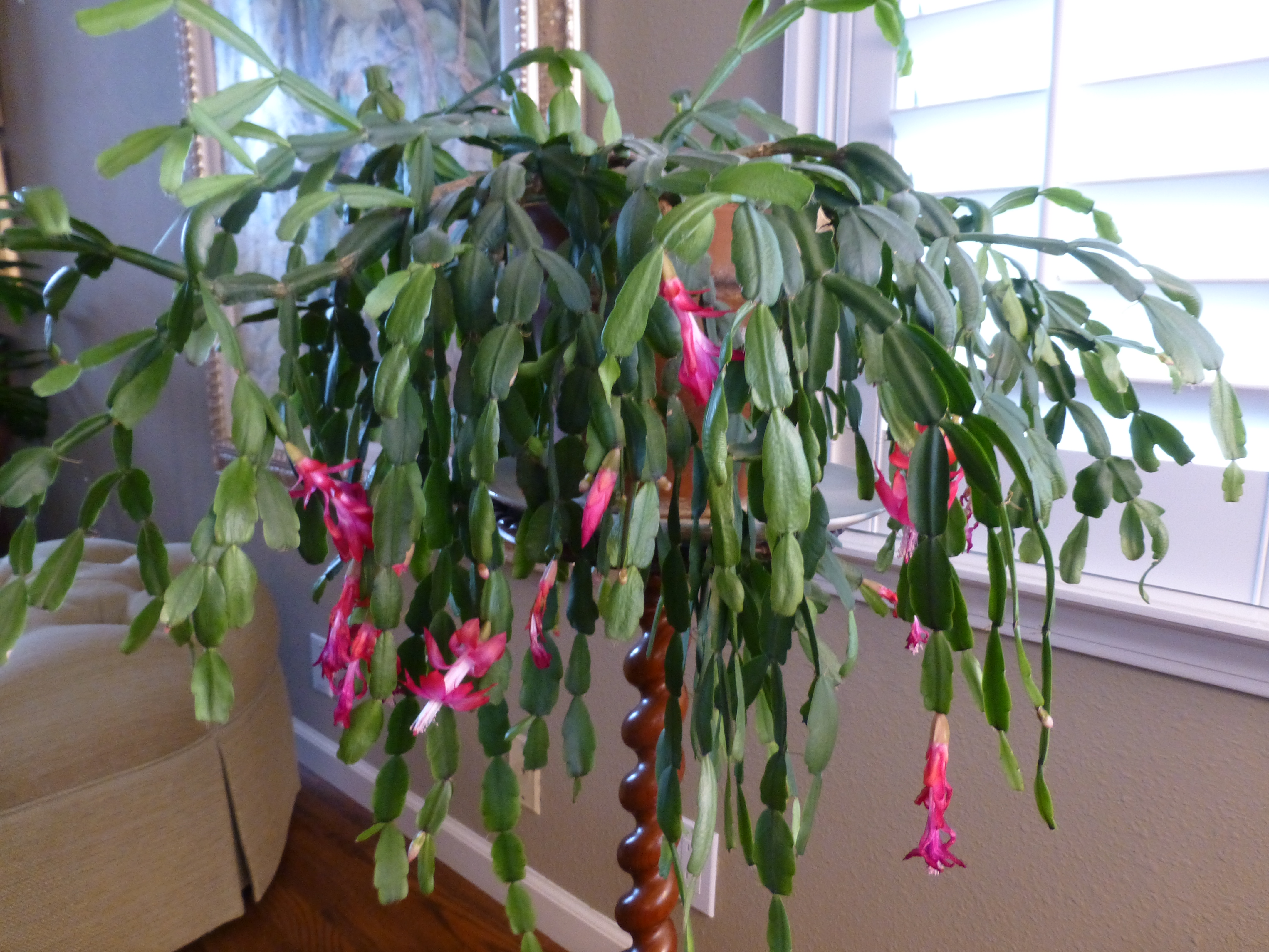
As I read this history, I was excited about this remarkable tracing of the original cuttings. In our family we have what my grandmother , Dee Dee, always referred to as “the family cactus.” This rounded, smooth leafed variation (some have pointy, spiked leaves)with its hot pink blooms is our cactus.
Dee Dee, Anna Ives Wagner, was born in 1892 in Youngstown, New York. She arrived at our house to live with us in the late 1950s. She brought with her a very special plant. It was a cutting off of the original plant that was in her ancestral home – the Root Home, Twin Pines – 830 River Road – then Main Street, Youngstown.
Dee Dee remembered that plant from her childhood and had heard from her mother and aunts that it was there in theirs as well – which without complicated math puts it in the house since the mid 1800s. Unfortunately we don’t know when it started…but the house dates back to our great, great, great grandfather, Dr. Benjamin Root c.1840. The house stayed in our family, passing finally to my grandmother’s aunt Helen Root who lived there with an original cutting of the plant until the 1950s when she moved to Elmira with her niece and her husband, Edith and Ray Hulbert.
We grew-up with the family cactus bursting forth with wild fuscia blooms every fall into winter. It was always an exciting and exotic flowering extravaganza in the colder dark months of the season. It brought a sense of life, growth, and color that was a spectacular contrast to the otherwise drab, dull, dormancy of winter.
I guard my plants, given to me as a cutting by Dee Dee when I first moved to New Mexico, with great responsibility and appreciation.
Last year my Mother’s large family cactus withered before our very eyes…she was so protective of it that she perhaps neglected to give it new soil and nutrients instead favoring watering a bit too much which resulted in its demise. As she witnessed and worried about the failing plant, we carefully cultivated clippings and as weak and depleted as they were – nurtured them in water losing a couple but saving a few so that they now are flourishing in a clay pot in a window with the soft daylight of northern exposure displaying a resiliency, hope, and celebration of life that continues to greet each day. Perhaps metaphors for procreation, family traditions, aging in place…
My mother is 93 and her mother, Dee Dee, lived to be three weeks shy of her 101st birthday.
Joel Poinsett died on December 12, 1851 at the age of 72 – one hundred and sixty four years ago today! Happy Poinsettia Day!! Merry Christmas Joel Poinsett!


 At night this place buzzes with animated conversations and is alive with color and funky memorabilia, art and posters, collages of collectibles all on brilliantly painted walls creating an eclectic artistic interior of fun and festivity. But on this morning, the room is dormant save the three other guests waiting to participate in the morning’s class.
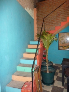 Daylight streams from above and we ascend past more brilliantly painted walls to a second floor open to the sky onto a patio rimmed with potted herbs and flowering plants.
 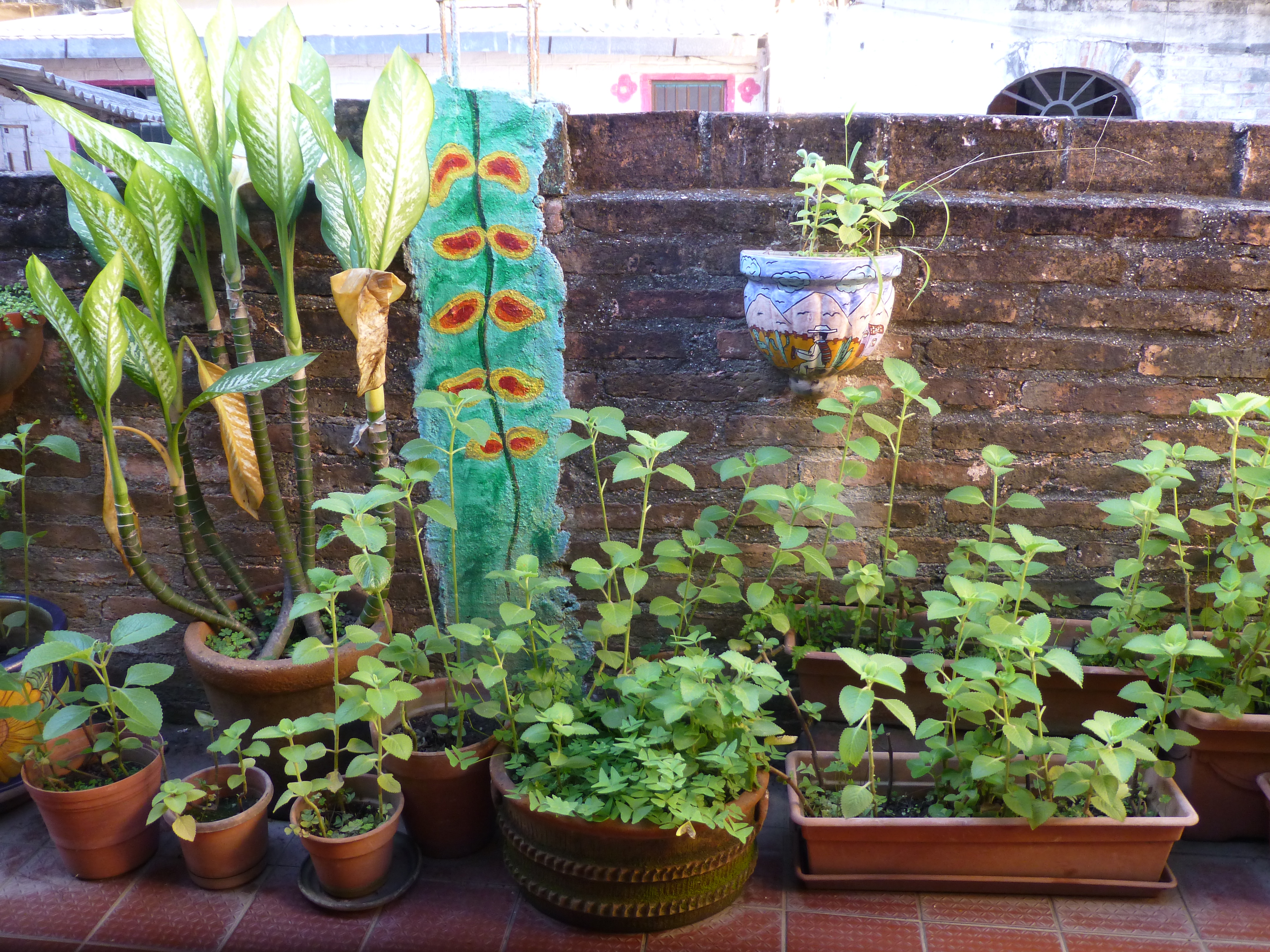 To the right we realize that the rest of the space is undercover, yet always exposed to the elements from that one open east-facing orientation.
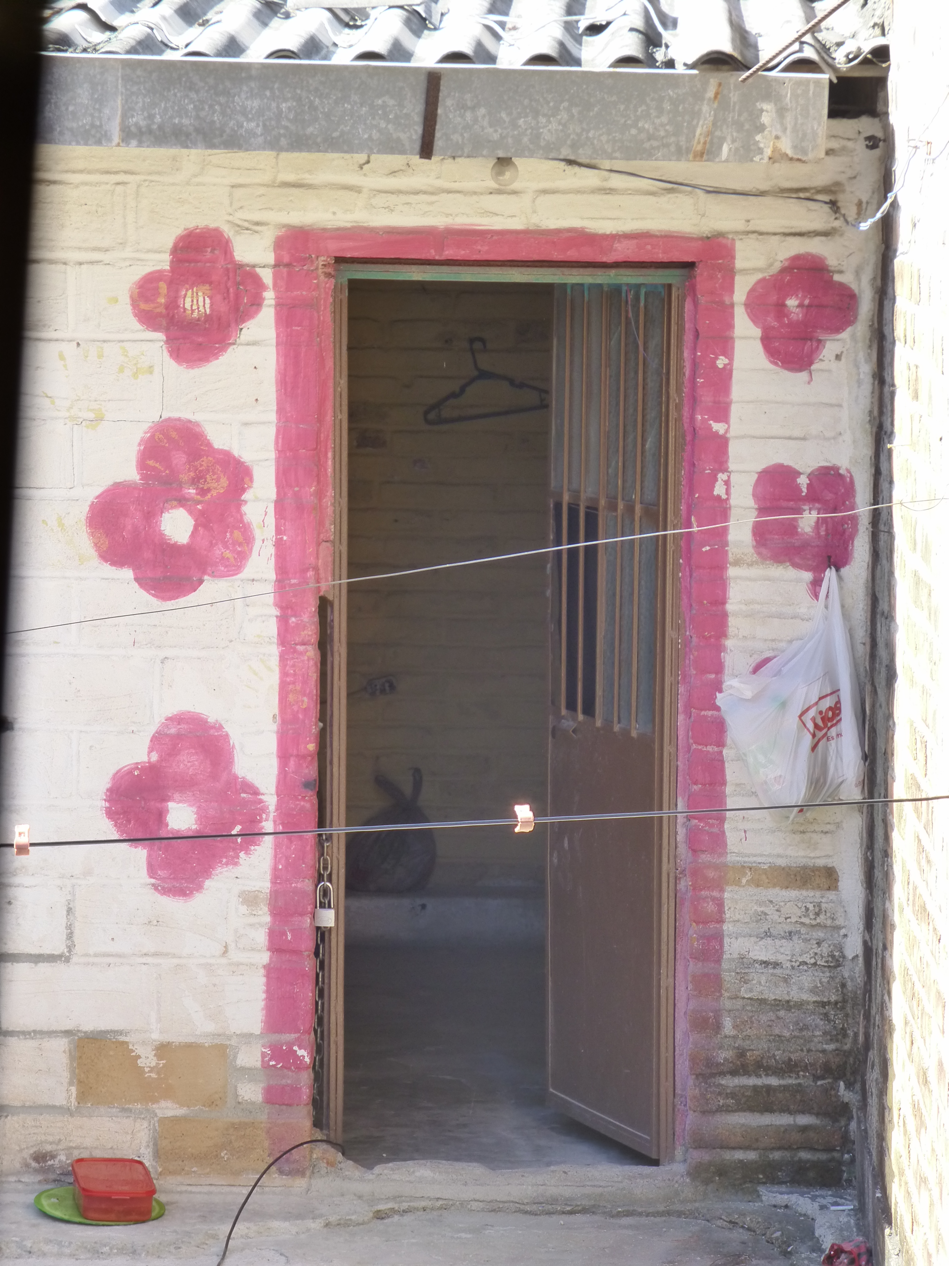 The surrounding area is quite run-down and depressed, yet this jewel of a creative kitchen space shines boldly amidst the impoverished surrounds.