DETAILS Found at Hillwood Estate This Christmas

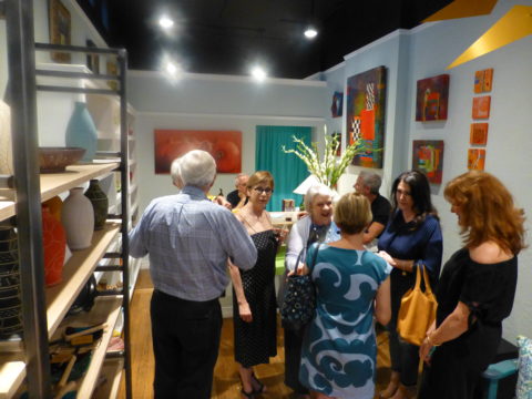
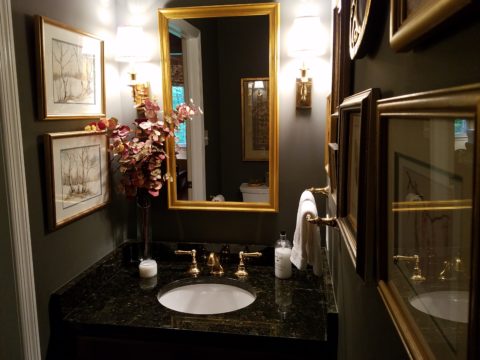
The world is full of detail. From the wonders of nature and the perfection of a flower, to the man-made creations that come from inspiration of all sorts. The combined influences that result, in interesting and good design, are limitless and we now have layers of platforms upon which ideas are presented. The access to creativity is staggering.

Take Etsy and Pinterest. There the ideas abound. Everyone has access to creative ideas unlike ever before in our world. In the past, a keen eye observed and discerned. The clever managed to find inspiration in the most obscure places, analyze observations and interpret them for their own purposes. Creativity was spawned from observation paired with original thought. Yet, that observation was generally first-hand. Therefore, those that got about more, saw more and had greater exposure to more (and there you have it) were creatively stimulated more!

We (perhaps I should say I since it is from my own vantage point and experiences, from whence I speak/write), often are so busy observing that we don’t take the time to dissect and catalog the information we discover. I am so very guilty of that as I am so captivated by design and creativity that I forget to  remember!!! Ha – yes – forget to remember or record!!!!

I constantly find myself regretting to have taken a photo of something (some who know how many photos I take might want to take exception with this point), but it’s true. I regret not taking a photo or studying something which, retrospectively, I recognize as something quite special. In the rush to experience the entire scene, I fail to notice or retain the details. Have you ever felt that you were so caught-up in a new experience that afterward you feel you should have paid closer attention? I forget to remember to store the observations or I forget to take a photo – regretting it afterward.

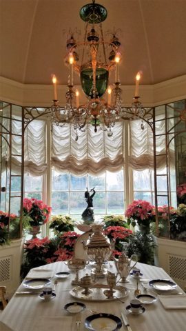
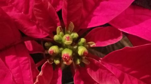
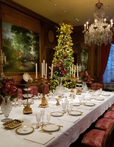
The breakfast room aat Hillwood Mansion where Marjorie Post rarely entertained, but was always set to do so. Pink poinsettias are the seasonal choice.

This can be from a class lecture to a theatrical production. I wish I had focused more closely rather than getting distracted by my own imagination which  often runs rampant with the encounter. However, the stimulation can be so great that the imagination kicks in and causes diversions, in the attention, resulting in a deficit of detail gathering. Hence a clear case of un-diagnosed ADD!!!

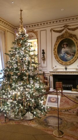
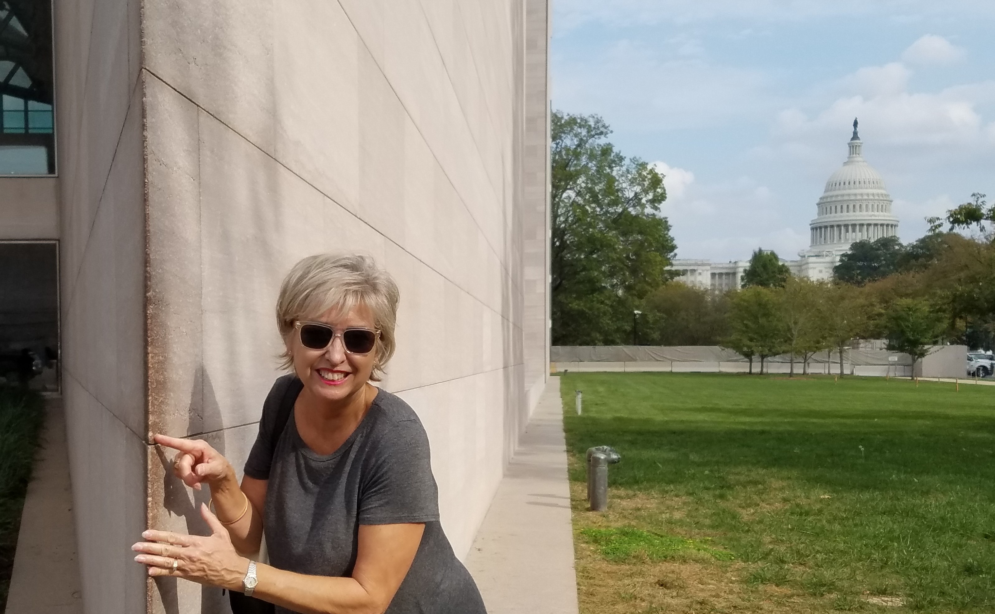
With all of this having been the prelude to my thoughts for the day, I have elected to pick out a few details from a recent tour of the Hillwood Estate and Gardens nestled on magnificent wooded grounds in the heart of northeast Washington, DC. And how wonderful to have had the opportunity this week to stroll through the mansion, now museum, of the late Marjorie Merriweather Post during the Christmas season.

As previously mentioned, I would have, could have, should have taken more photos, but was so enchanted at every turn by the beauty and gracious luxury that unfolded, I was too busy darting from one magnificent scene to the next to capture more than I share here. I apologize.

Her favorite color was pink and this tree greeting visitors upon arrival is a precious jewel among many beautiful Christmas trees and decorations displayed in the mansion.


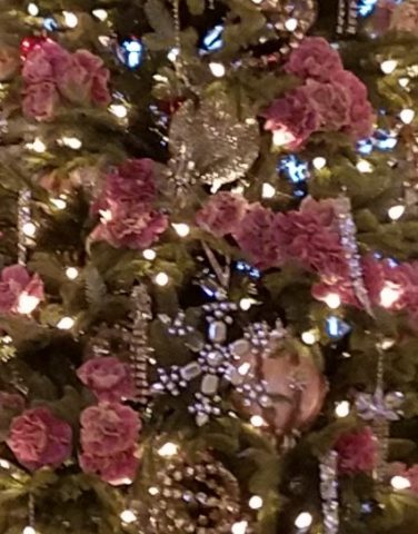
From the reflection on the polished floors of the little white lights to the shimmering crystal punctuated with pink blossoms bedecking the tree was undeniably elegant.

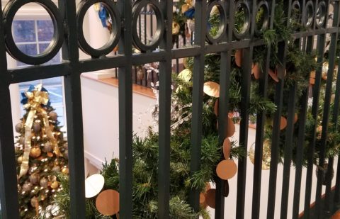
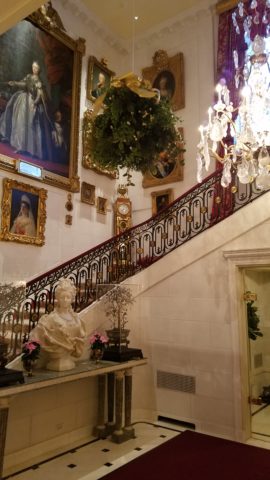
The railings ascending the staircase at the reception desk were draped with garland and strung with simple gold painted discs which were repeated in the coordinating tree which also featured a collection of blue reproduction Faberge eggs.


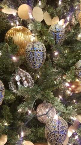
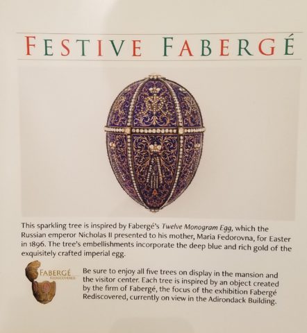
Marjorie Post was a discerning collector of all manner of artistic beauty including exceptional Russian decorative art. The actual exhibit of Faberge currently available for view on the property is nearing its end. Many dazzlingly detailed pieces from her own collection and others on loan for the exhibit are being shown.

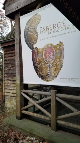
If you are in Washington this month, please treat yourself. This exhibit of Faberge pieces is outstanding.

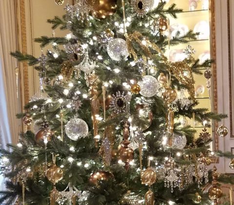
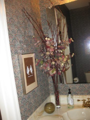
The gold leaves on this magnificent tree in the dining room would be fun to replicate. Could have easily been dipped in gold leaf. Like lime leaves – or from your garden perhaps photinia or laurel even rhododendron – maybe go faux with silk from the craft store – spray ’em gold!!! Paint magic!

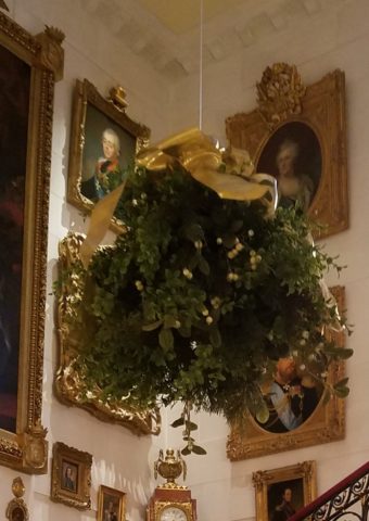
And if you have ever installed a dangle of mistletoe…check this out! This elegant bundle suspended, from the towering heights of the entry hall, puts all other sprigs to shame!!! In the opulent foyer, this grand ball of gilded ribbon-clad mistletoe invites those to tempt the fates of love and superstition, with but a kiss!

Whether it is a theme of gold or a snowy season of white, find details and enjoy the creative opportunities that present themselves to you in passing or from the depths of your imagination and create your own holiday magic!!!

Creating fantasy, festivity or seasonal celebration, gather the details every day from observing all the particulars around you.  It is amazing from where you can collect ideas and be inspired to create your own festive fantasy!!!!!! Then be sure to take some photos!!!!!!!


TRENDS DIE – What’s New for 2018?

I was surfing for fodder about the new color trends to kick-off this first mindful missive for the New Year and the color trends were all over the place – no consistency at all. From Ben Moore selecting Caliente AF290,

“Caliente is the signature color of a modern architectural masterpiece; a lush carpet rolled out for a grand arrival; the assured backdrop for a book-lined library; a powerful first impression on a glossy front door. The eye can’t help but follow its bold strokes. Harness the vitality.” 

—Ellen O’Neill, Benjamin Moore & Co.

to Sherwin Williams in a totally opposite direction proclaiming Oceanside SW 6496 their color of the year.

“A collision of rich blue with jewel-toned green, a color that is both accessible and elusive… A complex, deep color that offers a sense of the familiar with a hint of the unknown, Oceanside, bridges together a harmonious balance of blues and greens that can be found in what’s old and new.”

What? Are we straddling now?  Do we have one foot in one color trend while the other stretches across the color wheel and causes us to nearly do the splits trying desperately to hang on?

The walls of my east gallery space were a spicy version of Caliente for nearly 20 years! Bold at the time and unheard-of for  gallery walls – it was not to be changed for nearly 2 decades!!!

Whew – that was a run. I even named the retail space “Caliente.” And the color-band between the crown and picture molding at the back was a version of Oceanside – a lighter value of the blue-green hue.

The Grand Re-Opening July 2016 presented a dramatic transformation to a pale aqua resulting in a diametrically opposed feeling – a cleansing from what was crowded and hot to spare and cool.

But I digress…

Annoyed by the seeming authority, but weak contrasting rationale that I encountered with the wide range of picks and opinions, I left the paint companies and clicked over to the Pantone site. There I encountered their authoritative, ethereal color forecast of the year – Ultra Violet!!!!!

Yikes – they were coming at me from every conceivable direction!!! How on earth is any eager apartment dwelling or home-owning individual supposed to know how to go forward in sprucing up their space without fear?

Then  I came upon a piece by Mehgan Nesmith Ugh, What’s With These Generational Color “Trends”? From observing the broad reaching trend surrounding millennial pink to snippets from other sources,  I scanned the paragraphs amused, but still not satisfied. Until I arrived at paragraph 6 and there it was – the true fact that keeps the world moving forward – for better or worse – TRENDS DIE.

Yes they do and for good reason. I’ve said it before, take care in making costly selections that will stay with you past their prime. Trends are there for a reason. Designers dabble in creativity every day of the year to come up with things to tantalize, inspire, evoke, and entertain – and most importantly, SELL. Some of these trends stick. Then they are no longer trends, they transition and become classics. But to transcend the fleeting status of trend, “it” must have something very solid about its being.

And when it comes to interior design, with all the style trends for furniture, fabrics, architectural elements, finishes and decorative accessories – colors race through history like no other design element has or will. Colors rule and when they are good, they are very very good, but when they are bad, they are horrid!!!!! Thank you Mr. Longfellow!!

Take the massively graceful modern art piece suspended from the ceiling of the East Wing of the National Art Gallery in Washington, D.C. – classic – both in form and color. Red and black. Strong and simple. Bold and brilliant. Imagine if it were this year’s Pantone pick Ultra Violet  Aghhhh!!!!!!!

Actually, methinks I protest too much. The shade of purple picked, by Pantone, is heavy on the blue rather than the red.  The blue cast gives it a calm. Not whacky like Barney screaming purple – but, rather a royal shade.  Nonetheless, it is better served as an accent – don’t buy  wallpaper in it. Go ahead and paint the walls and have your fun – but know that you can change it without peeling off hundreds, if not thousands of dollars of wall-covering or re-upholstering your sofa like Meghan was tempted to do!!

It’s a color that stands alone – plays better by itself than with friends – like the child’s report card where the box that says “plays well with others” is not checked.  In my estimation, it will read well with clean, crisp white.  However, like Ms. Nesmith aptly says in her piece “if you are  still curious about that Gen Z yellow, buy a vase!”

That’s how we play with  colors and create a bit  of collision, unexpected off-key harmony, intrigue and suspense. But it is not for the faint of heart and the chance of tiring of it is paramount. Trends die and colors are tricky.

So Happy New Year and Happy New Colors in your world to refresh and renew!! Thank you Meghan, for your lively contribution to today’s story.


Loved Loving Vincent!!!!

Last night was a crystal clear starry starry night as we strolled down the quiet urban sidewalk, between the building facades, on our way to what we soon came to realize was an event we would never forget. Once settled in our seats and after way too many previews, the magic began and we were instantly mesmerized by the millions of brushstrokes of over 100 artists recreating the world immediately before and for a year after the death of Vincent Van Gogh.

There, in a cozy theater downtown, we experienced a wondrous film, Loving Vincent. We embarked on a extraordinary journey and were lost in this fanciful world of brilliant color and bold movement as the movie unfolded with an animation unlike we had ever experienced. It was a though we were watching Van Gogh paint this film. The rough deliberate strokes were actually moving as the scenes unfolded – the scenes were alive with the movement of the animation.

http://lovingvincent.com/

This remarkable delivery vehicle to convey a portion of Van Gogh’s world brought colors dancing – even screaming – across the screen in familiar swirls, and deliberate marks that were so identifiably his. What the artists were able to accomplish was astonishing. The focal surface of the theater was busy with the seemingly live brushstrokes of Vincent Van Gogh. Borrowing from his actual paintings, the viewer is transported into the world of his interpretation from street scenes where he experienced the corner with the yellow house to capturing individual’s who appeared throughout the film such as The Zouave in his red hat distinctive of his French military service, to the bearded postman, Joseph Roulin, who was so key in the intimate, mysterious and different story line, the expansive scenery of Provence and the intimate details of daily life.

As a true Van Gogh fan, it  was love at first sight – do you remember where you were when first introduced to his magic? Having grown-up in Washington, D.C. I was fortunate to have had family visits and school field trips to the magnificent National Gallery of Art where, upon each visit starting at a very young age, I would scour the gift shop for postcards of my favorite images – taking home with me memories of the beautiful influences that have continued to shape my appreciation for color and composition, balance and light, contrast and context, subject matter and the power of observation. I must credit my  mother and grandmother for instilling in me this awareness of things of beauty and their importance in our lives.

Fast-forward a bit…way back when…dare I admit…when first studying art history in college, the bible was HW Janson’s HISTORY OF ART. A daunting tome filled with the overview of all that is art as we knew it at the time. Van Gogh and his impressionist colleagues were sprinkled throughout latter portion of the book.

There his genius was once again presented to me stirring a wild appreciation for his rebellious disregard for conventional painting styles. He possessed and fed his own passionate, if not desperate, need to apply paint to surfaces, capturing life and telling stories from his unique and insightfully perceptive vantage point.  The Impressionists have always stirred a passion for the boldly colorful, adventuresome, romantic and sensitively sensual expressions of life for me.

Years later my husband and I were fortunate to attend the National Gallery’s exhibit Masterpieces from the Van Gogh Museum Amsterdam.

It was the fall of 1998 and we were thrilled to be walking toward the oh so familiar edifice with great eagerness for what awaited.

The line wrapped the building, but moved along with efficient, orderly procession as the anticipation grew with each forward step.

Inside we purchased the audio tour tapes and, with headsets on, immersed ourselves for the next few hours in the dazzling world of this remarkable artist.

His unique undaunted expression of the scenes, people and details around him, through his own unschooled techniques, was awe-inspiring.

Tormented and tested he discovered his passion and for a very few years carving out an indelible place that will live, breathe and be enjoyed forever.

The people in their joys and sorrows, fashion of the time, landscapes of bountiful beauty, interiors of keenly observed detail all expressed through his sensitive eye and brought to generations of viewers – a priceless gift to the world.

The take-away…embrace bold expression, fear not color in your world, appreciate the details, and go see this film, Loving Vincent, before it leaves a theater near YOU!!!!

Moody Blues – Moody Rooms

What’s more trendy than an existing word that comes into the mainstream with a new relevance or targeted use? I’m sure you will giggle a bit thinking about some of the trendy words – original or re-constituted – that have come and gone. How do they get inserted in our popular culture? Who started it? How quickly did it catch-on and how? I will have fun with a variety of trending design words in coming blogs – enjoy expanding your design vocabulary with these if they are not already a part of your vernacular.

I’ve written about dark rooms and dark colors in the past…don’t be afraid of the dark! But to now discover that the use of the word “moody” has surfaced and playing a role in describing such spaces is novel. Trending now – “moody” rooms. Or at least describing dark spaces as “moody.”

We recently gave a face-lift to a tiny powder room. It was dark-ish before, but with a printed wallcovering from the 80s. It had stood the test of time and served the owners well, but it was time for new cabinets, countertop, hardware and fixtures.

We decided to run new floor tile from the entry through to this room. It was a large format dark porcelain. This dark chocolate leather-like look was a deep and “moody” selection to recede and add depth  to the space.

Yes, it creates a decided “mood.” A mood of somber elegance. The quiet space is perfect for the duty it performs. As a powder room, it is visited quickly and by many. We selected a velvety dark wall paint Benjamin Moore HC 166 Kendall Charcoal rather than replacing the wall-covering with new.


For interest, instead of one large commanding piece, we  gathered a collection of complimentary wall art from other rooms and even some clever thrifting (always an entertaining and satisfying treasure hunt) to create an interesting grouping to be enjoyed from the intimate vantage point.

The new lighting flanking the mirror rather than coming from a bar above is soft and  in keeping with the  colonial decor of the home located inside the beltway of our Nation’s Capital. New granite is dark and rich, white porcelain adds a crisp contrast and new cabinets coordinate with other renovated casework in the home.

When surfing the internet for design inspiration and subsequently speaking with design professionals, be clear. Picking up new ways of expressing design ideas is fun – but the simple truth is just that – simple. Keep it simple, explain your goals, go dark if you like, be a bit moody if it is the effect that you wish to achieve. Have fun and don’t be afraid of the dark!!


George Washington for President!

While in D.C. last week, in this most unusual season of the American Presidential election, it seemed more than appropriate, if not imperative, to visit Mount Vernon – the estate of our first president, George Washington.

20161024_134051

This historic property has been painstakingly maintained and developed into an exceptional educational facility on unspoiled grounds with uninterrupted, breath-taking views. Experiencing the beauty of the surroundings is magnificent. Learning about the history and minute details of this extraordinary man’s life is fascinating.

20161024_133258

Did you know when Washington was elected our  first President in the initial forming of the United States, presidents were selected only through the vote of the Electoral college, rather than by popular vote? The 69 votes that Washington received in 1789, and the 132 he received in 1792 were all of the available Electoral College votes, and resulted in thereby making Washington the only president in United States history to have been elected unanimously.

Did you know that Washington’s presidency founded the United States Navy, established the nation’s official currency, created the State Department, and established the Supreme Court?

Gary S. Smith wrote in March 2010: While praising his military and political record, many scholars contend that Washington’s genius lies principally in his character. The only other American president who has been so highly extolled for his character is Abraham Lincoln. Since Washington, all presidents have been ultimately measured not by the size of their electoral victories or the success of their legislative programs, but by their moral character. His character helped sustain his troops throughout the travails of the Revolutionary War, convince delegates to the Constitutional Convention to assign significant powers to the presidency, secure ratification of the Constitution, and enable the new republic to survive in a hostile world….He took the standards of his age very seriously and diligently strove to be virtuous. To many, the crowning achievement of Washington’s character was his simultaneous resignation in 1783 as commander in chief o the American army and his retirement from the world of politics. Throughout the western world, his unprecedented relinquishing of power (which he did a second time when he declined a third term as president) was widely heralded. Unlike other victorious generals, he did not expect a political or financial reward for his military exploits. Washington’s character, Jefferson argued, probably prevented the American Revolution from subverting the liberty it sought to establish. The Virginian had a sterling reputation for integrity and honor, dedication to duty and his country, and remaining above the fray.

It is with such depth of character and broad view of his world that he was unanimously regarded as the only man who could effect change of the magnitude required to bring people together.

This many years after his death he still has a powerful effectiveness for bringing people together. The tour of this amazingly preserved property is intimate and familiar – even on one’s first visit. It’s partly scale and partly due to the well-versed guides that are scattered in every pocket of the place. They bring the historic home and it’s people to life.

While attending my Alma Mater, Mount Vernon College (no relation), in the interior design program, we toured this historic interior with rapt attention to decorative art and architectural details. One expects the facade to be white painted wood – but as you see it up close, you realize that it reads like beveled stone blocks. It is actually wood, shaped to replicate stone, with a sanded coating that gives a stone-like texture.

Interior finishes also reveal faux artistry upon closer inspection, with the paneled walls and doors painted with wood grain creating stunning matched patterns. Superficial treatments of faux finishes were elegant touches of the day.

Washington was truly a Renaissance man. He worked with the finest minds in agriculture and technology to develop new techniques for farming, implements and gadgets around the property. He recognized the toll tobacco took on depleting the nutrients in his fields paired with the time it took to grow and harvest and heavy taxes that were levied during trade and changed his operation to grow wheat which had limitless less expensive outlets for marketing and was easier on all counts of growing.

On the advice of his Scottish farm manager he created a distillery which produced more whiskey than any of its kind in his day. You too can purchase a bottle of Washington’s whiskey today for a mere minimum of $100 per.

His sensitivity to art and architecture, entertaining and hospitality, paired with the strength to lead the noble cause of freedom, managing troops, raising morale and keeping promises while always at the helm risking his life alongside his men and participating to the fullest in his every endeavor speaks to the moral character and brilliant creativity of this extraordinary man.

So,  to sum up this unprecedented level of discourse in the current election season and questionable characters on the part of our  candidates, I was left with finding levity in the Mount Vernon gift shop…


Surprise Seasonal Discoveries in the National Gallery of ART

So, in direct contrast to discovering art in unexpected places such as a simple series of brush strokes painted on a course concrete curb, (last week’s pattisays blog) this week, as fall leaves fill the air and pumpkins pop up on every surface, my observations are about discovering art occur in an actual art gallery, specifically the National Gallery of Art in Washington D.C.. Imagine that! The city has been abuzz for months in anticipation of the recent unveiling of the updated East Building.

It was in 1978, the year I left my home town of Washington that I.M. Pei’s exciting new modern edifice was presented to an anxious art-loving public. So very different from the West Building and all others in the historic vicinity, some people were astonished but most were thrilled. This sleek angular sculpture of a building was a statement in and around which to display the growing modern and contemporary collection. An art-piece of its own accord. Yes, the building was at once regarded as its own work of art.  We eagerly raced to touch the famous wedge of geometry that came to such an acute angle that it begged to be touched.

i-m-pei-east-building

Nearly 40 years later that same fine edge is silently showing its age missing little chunks of compound and lovingly discolored with all the hands from around the world that have touched and smiled at the towering stone form in contrast to the rotund, ornamented and domed Capital in the background. Both majestically iconic, but stylistically so very different.

20161020_145510_002-copy

20161020_145320

But wait – this elegant aging beauty has had a three year rejuvenation treatment! New stairways and elevators connect galleries making the flow of exhibits more enjoyable. The tunnel connecting East to West sparkles with light and all the subtle changes result in a seamless passage through and enhanced experience for visitors.

The glassy, crisp, stark, expansive lobby where the enormous Calder mobile is suspended defying its enormity and weight as it gracefully, almost motionlessly, moves silently with the subtle, indiscernible stirring of air is the fulcrum of the building. Exhibit halls tucked away but newly connected are exciting to frequent visitors who know the building so well.

20161020_120055

I naturally had to have a little fun and in keeping with the season made a couple of entertaining discoveries. Here Four Square and oil on Canvas by Franz Kline in 1956 is noted by The Art Story/Modern Art Insight “a fine example of  his gestural approach to painting. The viewer is led to ponder the canvas, seeing as either a close-up of a linguistic symbol, or perhaps, a set of open windows.”

20161020_141429

Really? Linguistic symbol or a set of windows? Well, maybe it’s the season…but I instantly saw a cat – a crazy black cat, an abstraction of James Dean’s “Pete” perhaps, which made me want a mask and to be that crazy cat and prance about for Halloween!

20161020_141522_001

In another piece, Portage, by William Kentridge of South Africa born in my birth year of 1955, a folded accordion-like book with torn  black figures of paper affixed to encyclopedia pages resulted in my seeing another black cat! I do think it was of human figures bearing weight, carrying, moving through various poses. Call me Halloweeny – but this one was decidedly a black cat. Don’t YOU think?

20161020_143546

It was fabulous, exciting, fun and emotional to see the colorful Matisse cut-outs once again in such close proximity with Matisse’s placement marks and rough cut pieces – crude yet refined – rough yet lovely. Seeing these incredible compositions up close again is breath-taking.

Oh, and might this be another seasonal mask?

20161020_143742

From awestruck to silly…to a quiet reverence at coming to the black and white photo of this enormous piece in Hotel Regina in Nice in 1953!!  Seeing it in the setting of its day and captured in a photo all those many years ago was one of many moments of reverence.

20161020_143238

Once again, pay attention to the little things, be surprised, let yourself be amused and enjoy discovering art wherever you might find it – unexpected and very much expected places!


Renwick a must see when next in DC.

As we explored the hidden pockets at the Renwick Gallery (see last week’s blog) where upcoming exhibits were concealed by various obstructions and drapes, we made some interesting discoveries. We peeked behind a barrier where another exhibit was in the process of being installed. There we spied a variety of objet d’art and standing amidst, in the center of the disarray,  was what appeared to be a draped Grandfather’s Clock. My cousin who had previewed the show informed us that it was in fact the drape that is the art – it is not a drape – not fabric – but an exquisitely crafted art piece  of its own accord. P1150073 The ladders and other tools of the installation unintentionally supported the amazing trompe l’oiel effect. It was not a piece under cover at all – but the cover formed to suggest that there was a statuesque clock beneath it WAS the art!

At the opposite end of the staircase that we ascended is a rotund space dedicated to the history of the Renwick. 20160618_114404_resized 
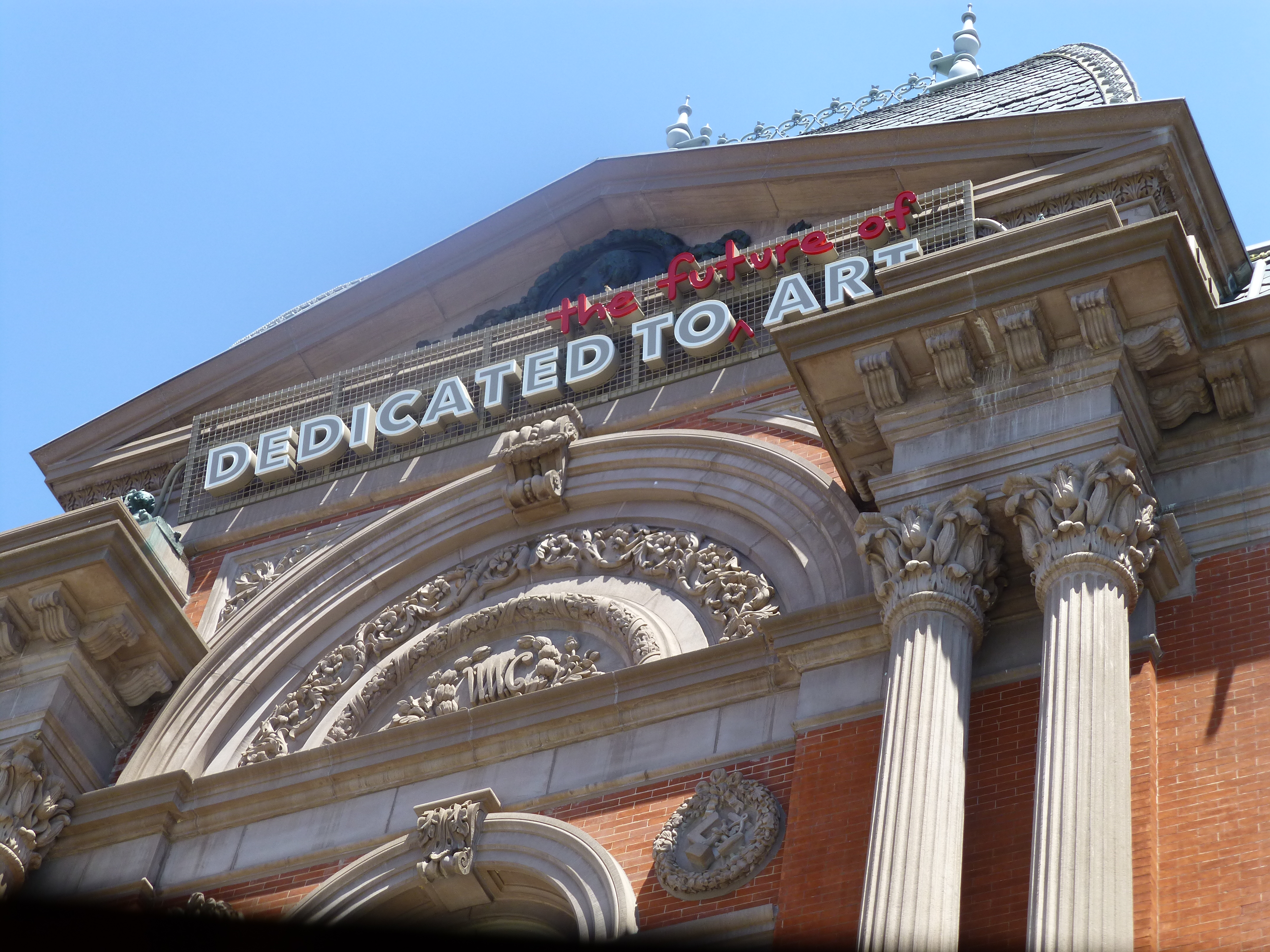
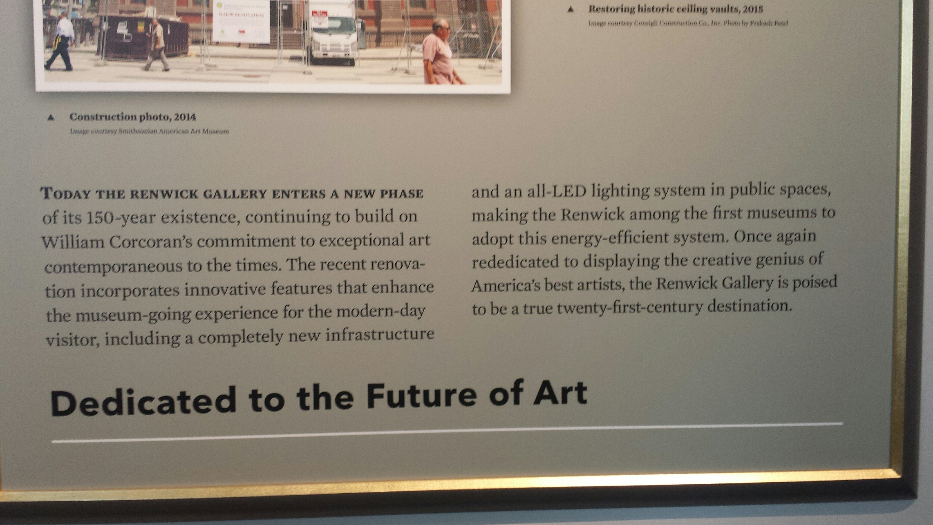
Here we found the story. It is a story of passion for the arts, dedication to preserving and presenting, offering to the public these rare opportunities and during its life it has been confiscated and re-purposed for wartimes, protected by Jackie Kennedy and preserved under the official order of Lyndon Johnson that it be returned to its original purpose to be “Dedicated to Art” as a the unique exhibit space it was designed to be. 20160618_114310_resized

Read along the wall and you will learn about Powers’ Greek Slave 20160618_114122_resized 
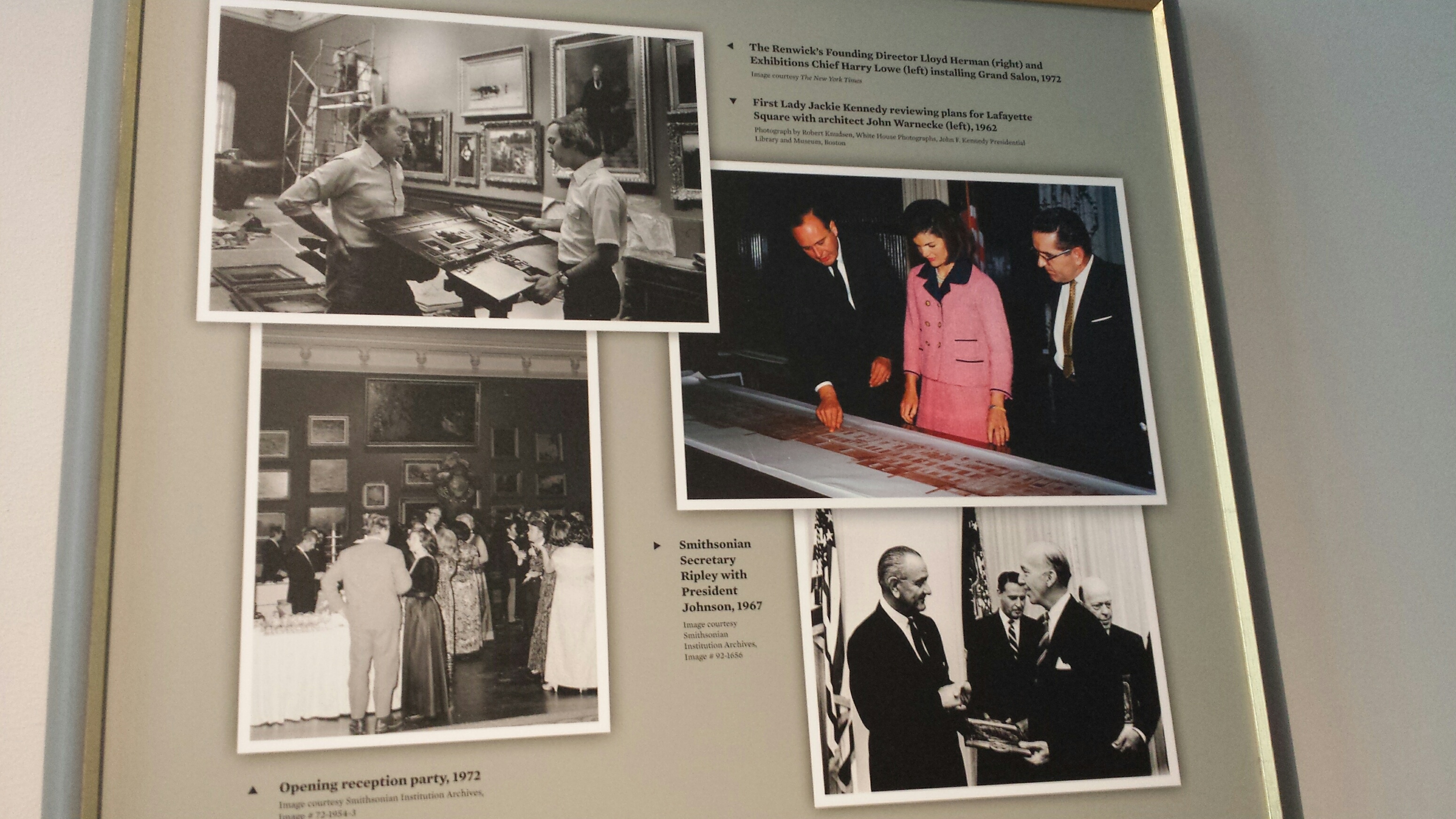
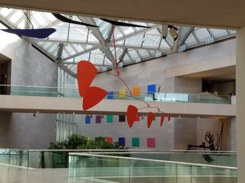
and look up and you will be dazzled by a permanently exhibited Chihuly chandelier dangling with droplets of green glass that looks like it was dispensed from a frozen yogurt machine – soft and spiral, layers of iridescent and luminous forms.

The exterior is also fascinating to examine up close. It has whimsical and interesting details of relief and components, modern wave patterns all topped off by an unfortunately “tacky” sign beneath the upper pediment of the entry facade. P1150085 Oh well…

Please make the Renwick a must see when next in DC.

WONDER at the Renwick

At 4 years old my teeny cousin, Katherine whom I nicknamed Katie-belle, took my hand as we ventured forth with great discovery stepping down into the carport of our beach house. With commiserating whispers, like the two adventurers that we were that night, we exchanged queries about where we were headed and what we might find and she said ” I Wonder…”

“So what?” you might say. What’s such a big deal about that? Well the concept of wondering, being able to ponder with amazement at what might result, was astonishing to me coming from the mouth of such a young child.

When we returned upstairs to join the group, I was eager to share my amazement about her simple phrase, “I wonder.” I exclaimed  “She wonders!” Repeating it incredulously about 5 times!

Today she is a dedicated grown-up pursuing exciting adventures in education as she navigates the University system and teaches students with a creative approach that captivates and engages beyond their expectations.

What is wonder? What is wonderful? Yesterday I visited the Renwick Gallery in Washington, D.C. . The current exhibit is called WONDER. P1150084
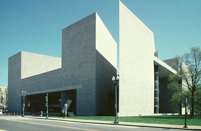
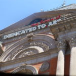
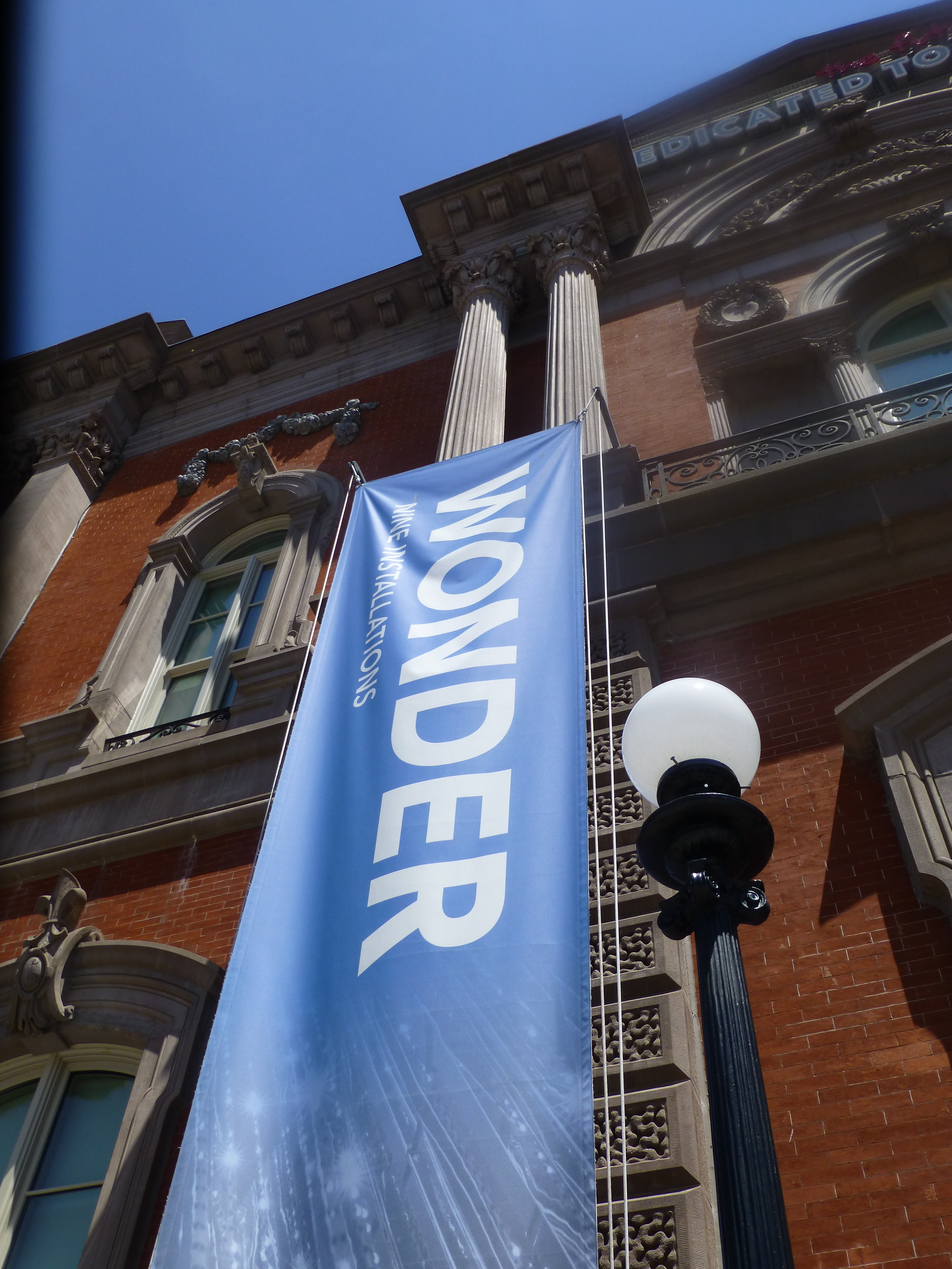
It truly is a wonderment for all ages. This architecturally magnificent building designed in 1859 by James Renwick, in the then chic Parisian Second Empire Style, is the elegant backdrop for a most progressive and creative collection of present day modern artists’ works. Diverse examples, of spectacular displays using simple materials,  brought to life in forms unexpected – of grand proportion and thrilling magnitude. Although my learned and previewer cousin had introduced me to the exhibit in advance, it captivated and engaged beyond my expectations.

This grand yet intimate edifice welcomes and encourages close observation of both itself and its contents. The spectacular main staircase, centered upon entry, presents a brilliant coral red carpet installed with a curvy,  serpentine migration up to the second level. Ooh – if copying is cool and emulating is the greatest form of compliment – I will be looking for an opportunity to specify a similarly whimsical installation. P1150052

Glittering overhead, spanning the entire length of the staircase, is a rectangular chandelier of mirror-like stainless steel punctuated with little LED lights blinking in random patterns. P1150066 
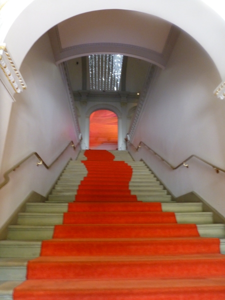
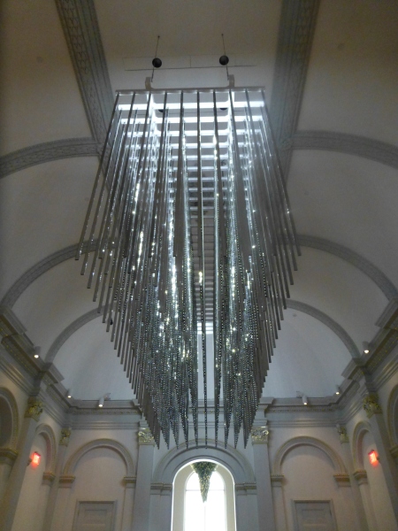
The glitz and bling make such a striking, formal, contemporary statement in this expansive volume that it startles with joyful contrast. The artist, Leo Villareal of whom I had heard in advance, was originally from Albuquerque – where we now call home. A remote desert origination transplanted into the fast pace of the urban centers of the east coast resulting in this shiny experimentation with light, form and wonderfully reflective surfaces. Villareal melds basic high-tech coding to use his own algorithm of the binary system 1s and 0s communicating to the lights when to turn off and turn on – yet sequences that are never exactly repeated .P1150064 
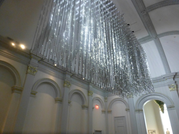
It’s not just your linear code of characters that is read on a screen –  here it is an artistic experience shared by all who look up in this gallery’s exciting exhibit.

Straight ahead, through the massive opening to the next exhibit hall, was the wispy fishnet-like rainbow of woven warm-colored fiber representing both  wonder and danger. Artist Janet Echelman’s inspiration is from a map of the energy released across the Pacific Ocean during the Tohoku earthquake and tsunami on March 11, 2011.  A natural disaster so devastating that it shifted the earth on its axis and cost us a fraction of a second in time. Surreal? Sci-fi? No, it really happened.  Beauty and grace depicting a horrific event. P1150063 
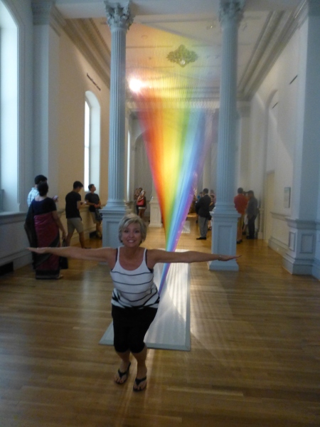
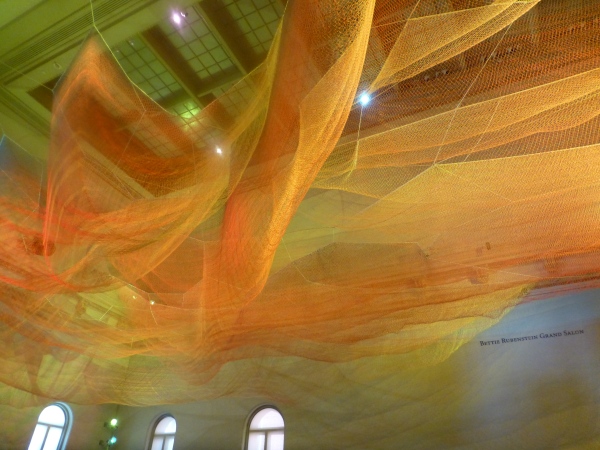
Large scaffolding at the end of the room suggests the manual installation that was required to suspend this wondrous drape catching light and glowing with golden aura. P1150068

The lower level still had wonders to explore starting with the magical woven willow saplings – creations of artist Patrick Dougherty. He has wound these great lengths of supple branches to form Hobbit – like holes of imaginary forest habitats. P1150056 
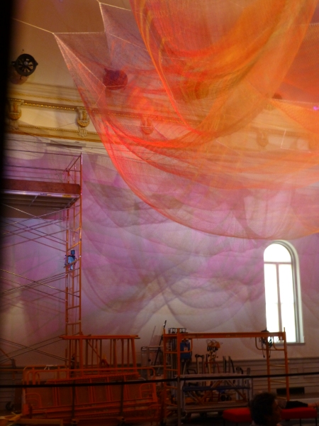
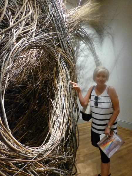
We were at once drawn into these cozy nurturing cubbies of what appeared to be nature – not forms created by man. Nature. Organic and raw, elegant and graceful winding toward the far reaches of the very high ceilings. Like a sculptor who says that the stone dictates what it wants to be and how he carves it – Dougherty knows that the long willow branches have a true will and bend their own way challenging him to work with them toward that goal of partnership with nature. The beauty is in the end result.  People of all ages wandered in and out, peeking through window-like openings pretending to be exploring an enchanted forest of wonder.

Next – stacked index cards- really? P1150061 
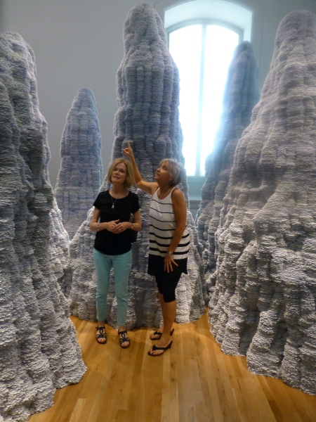
Have you ever experienced Tent Rocks?  8-24-12 Placitas lunch, Tent Rocks Heather, Tricia, Zeke 044
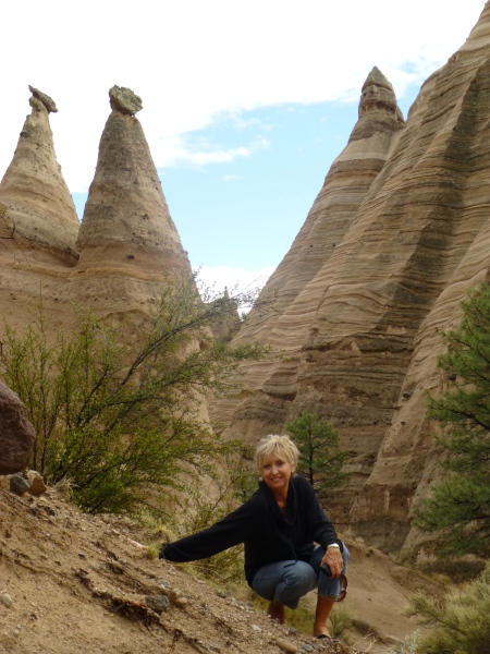
Have you ever looked upward and around and through the magnificent forms created by nature eroding the earth’s strata revealing layers of color and creating spires of rocky towers? It is a magic land just south of Cochiti in a very unexpected pocket of nature’s magnificence in our Land of Enchantment. And the spires that artist Tara Donovan created with stacks of index cards – an overwhelming accumulation of millions of index cards suggest grey spires replicating nature’s wonders in the canyons among the spires of the Tent Rocks. P1150062 
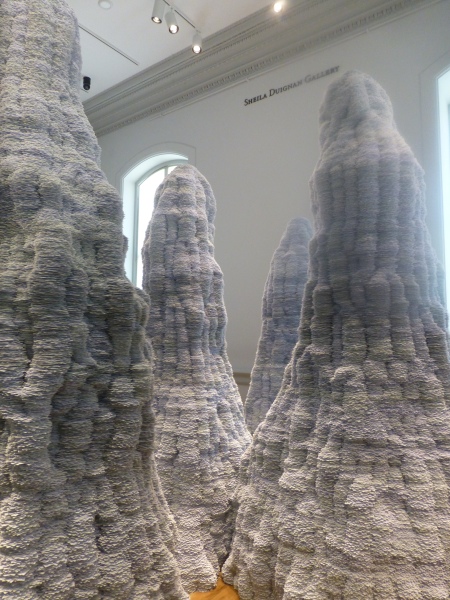
It’s as though a photographer captured this natural formation in black and white.  Donovan’s interpretations are tones of grey as a result of the stacked white index cards with slivers of shadow sucking away light in between each of them. Clustered and staggering in height, the “Untitled” towers are inviting to walk amidst and pass between, winding around them like a  tourist or explorer or perhaps inhabitant in ages past and present as they have stood for ages.

Snap out of it and see what is glowing like a fine fiber sail in the sunset in the next room. Stretching upward and crossing midway are thousands of incredibly fine threads woven from small hooks on the base. P1150059
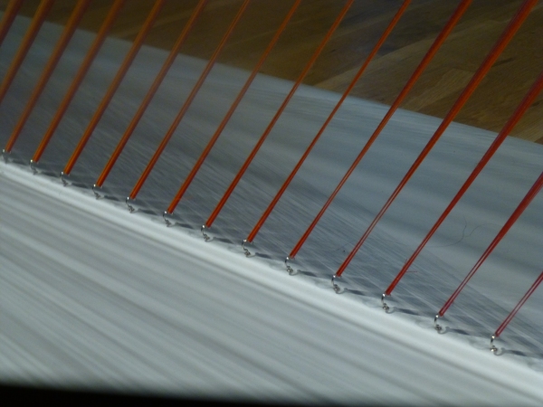
How could a human working only by hand – without computer generated machines digitally fabricating such perfection create this finished piece that we are studying with such wonder? How can this fine tedious seemingly impossible count of thousands of threads be executed with such grandeur and grace by one mere mortal? gabriel-dawe-plexusa1-wonder-renwick-gallery-washington-designboom-03 
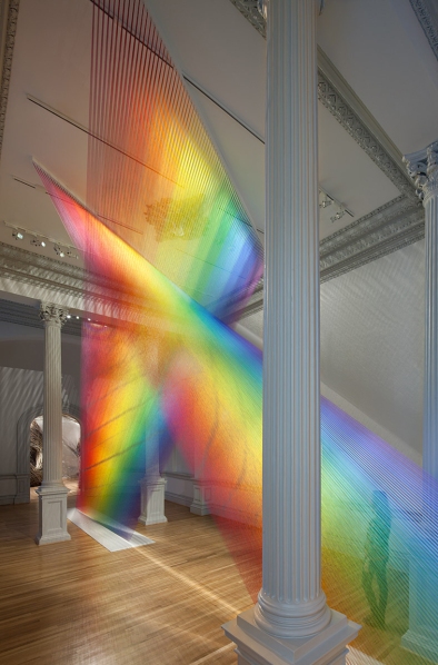
The artist Gabriel Dawe transcends our ability to comprehend the exactness of his beautiful accomplishment with extraordinary patience, precision and creative foresight to imagine the end result and bring it to fruition.  It is a wondrous, luminous sculpture of rainbow colored threads inspired by the skies of his native Mexico and current home in East Texas. The fine weavings also inspired by his Mexican heritage are interpreted, stretched and exaggerated here reflecting the light and spectrum of color from its base to ceiling. P1150060

We missed a couple of early installations of WONDER but were thrilled by today’s adventure. We had many opportunities to wonder…wonder how the artists conceive of their fantastic ideas and actually build their dreams to share with the world. We wondered what it takes to spark that creativity and passion that requires commitment and demands such unfailing determination. We wondered about those who collect these talents and curate these exhibits for the joy of so many. We wondered about the practical side of marketing these concepts to support the artists and this amazing  accommodation started so many years ago by a true visionary William W. Corcoran.

My next blog will trace the history of this wonderful architectural treasure, the Renwick, and share more of the day’s discoveries that you might visit and experience as you tour my birthplace – our Nation’s Capital.