Nexus Brewery
The name Nexus was inspired by a utopian destination featured in the Star Trek series and was selected by the owner to represent this place where everyone would find their joy. The name was in place and the brand was getting well established when PATRICIAN DESIGN’s team was retained to re-vitalize the interior to better reflect the intended brand.
The intent was to be different from other breweries while providing a signature look for this owner’s unusual concept. Harrell Hoech proposed that we celebrate the Star Trek theme in a somewhat subliminal manner. She wanted to project the brand into the future – to create a suggestion that could read as an outer space theme but not thrust the Star Trek brand out front. For those who recognized the name it would be familiar and the theme would be apparent – for others unaware of the Nexus origination, the interior was creative, attractive and intriguing.
The primary challenge was that the business was to remain operational with minimal disruption. The second was to design within a reasonable budget and not rebuild the interior.
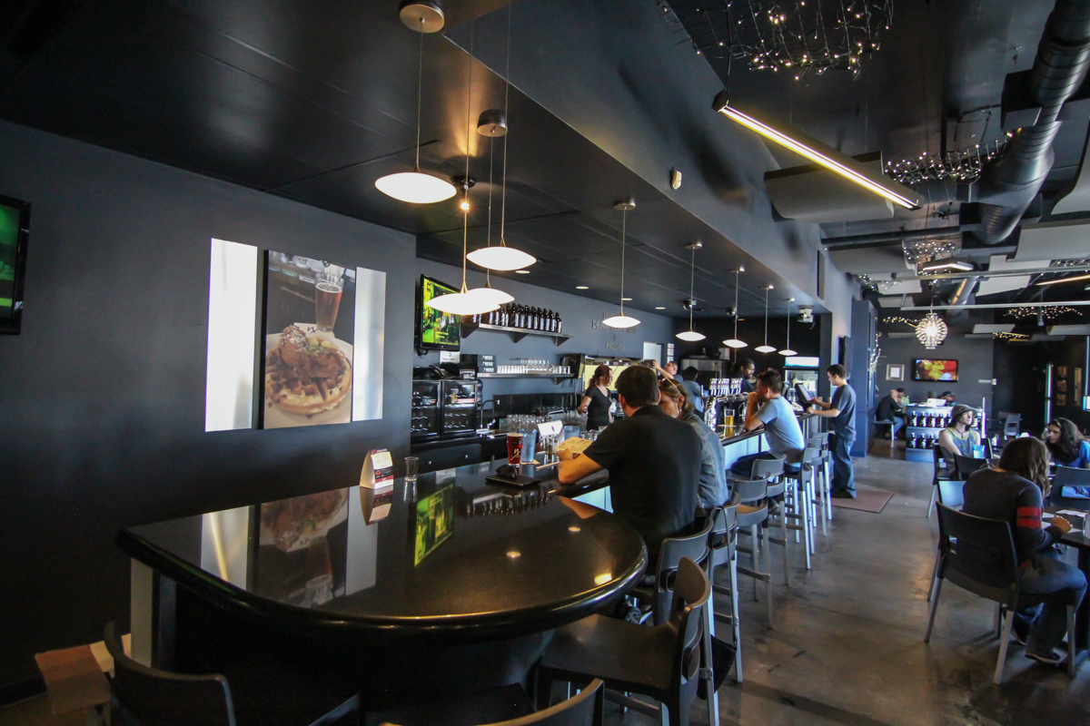
To those ends, the design was primarily superficial. The brand had already established a dark navy-charcoal color theme that was used for uniforms and retail t-shirts and hoodies so Harrell Hoech used that deep space hue to create a back drop to the scene and neutralize much of what was existing that could not be practically changed. All ceilings and walls were painted in this same dark shade bringing a depth of space which could be contrasted with mettalics and lighting.
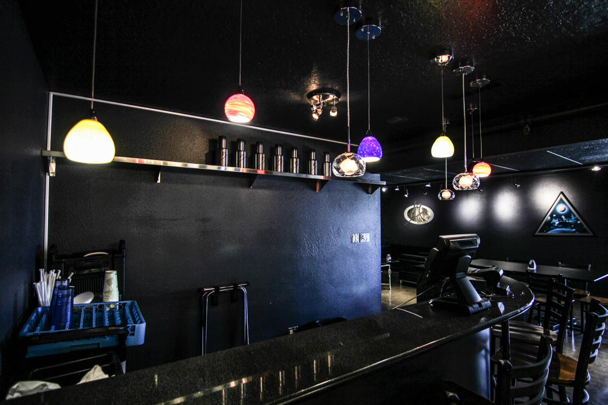
Luminous elliptical glass LED pendants provide a subtle UFO element along the bar. The warm white glow contrasts effectively against the other dark surfaces which include black granite tile back bar and new built-up black granite bull-nosed bar top. “Galaxies” of LED lights twinkle suspended from the high ceiling deck. Bold beams of warm light streak through the upper spaces from long thin tubular fixtures.
New grey and silver aluminum barstools and matching chairs were selected for their color, style and ease of maintenance. The durable molded plastic seats and crisp contrasting metal legs are striking in the deep space interior .
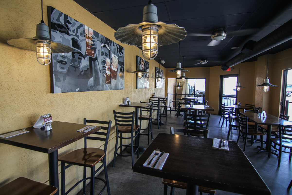
Daytime at Nexus was greatly enhanced with the replacement of a tired garage door with a new aluminum and glass unit bringing fresh northeastern light into the dining room. The nearly forgotten enclosed patio was revitalized with a golden beer color for the walls and re-locating of the previous pendant fixtures from the dining room. The acoustical ceiling and exposed ductwork was darkened with the main color used throughout. An original multi-paneled mural was also re-located from the original dining room to be featured along the main wall of the new “sunroom.”
The exterior patio was enhanced with an accent color of bright coral on the wood trim and two large site planters of durable cast concrete were installed to provide needed greenery to the periphery.
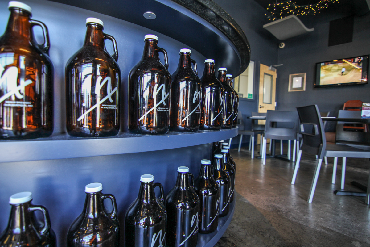
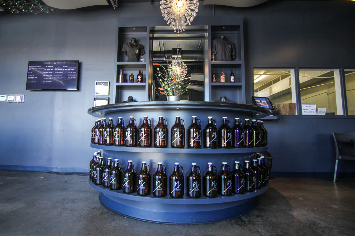
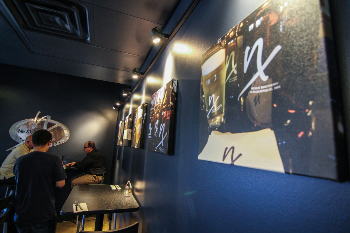
A new point-of -arrival was created as Harrell Hoech designed a prominent semi-circular hostess station straight ahead of the entry door necessitating cutting the prized Guy Fiery painted signature(Food Network’s Diners Drive-ins and Dives series) from his visit a couple of years prior. The signature on sheet-rock was encapsulated in a formal frame and grouped with autographed posters on a wall adjacent to the entry for customers to stand and pose with the celebrity chef. The hostess station is designed with shelves facing the front rimmed with rows of amber glass Nexus growlers sporting their logo. Boldly banding the brewery as customers arrive.
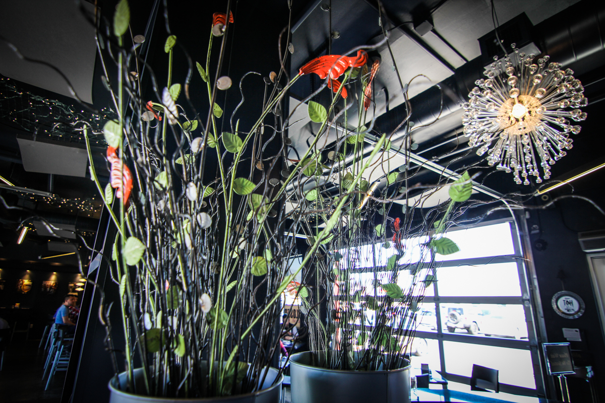
Towering shelving units flank an equally vertical mirror in the center of which is a custom fabricated steel floral arrangement. This custom casework is painted with the main color of the scheme and capped with a sleek black granite slab.
With growing popularity it became evident that more space was needed to handle the lines forming at the entrance. Either for management while waiting for tables or what has now become an additional dining room, the backside/lower level of the space which had been used for offices and private meetings was called into service. With quick and easy solutions Harrell Hoech washed all walls and ceiling with that same dark tone, built a curved wall capped with granite to serve as a bar, reused the existing black leather and chrome lounge furniture arranged around a large flat screen, and re-purposed a stainless countertop to become a high shelf to feature more Nexus amber glass and silver metallic growlers.
A variety of colorful glass pendant fixtures hang whimsically at varying heights over the new bar area suggesting distant plants in outer space. Surface-mounted glass discs further than subliminal suggestion to illuminate the dining area while existing silver track lights were re-used in other parts of the room. The owner’s Star Trek posters are collected down here as the featured artwork for the space.
The used furniture from the original dining room was re-used in this secondary space but reads well in the context of its casual reclusive design. This relatively inexpensive solution created a well-received and much needed intimate and festive alternative dining and gathering area.
Harrell Hoech credits her team led by Enrique Jimenez including Kevin Juno, Travis Vigil, John Fay and the entire staff at PATRICIAN DESIGN for once again making these design dreams come true!