Narrow Townhouse Refreshed with Illusion of Expansion
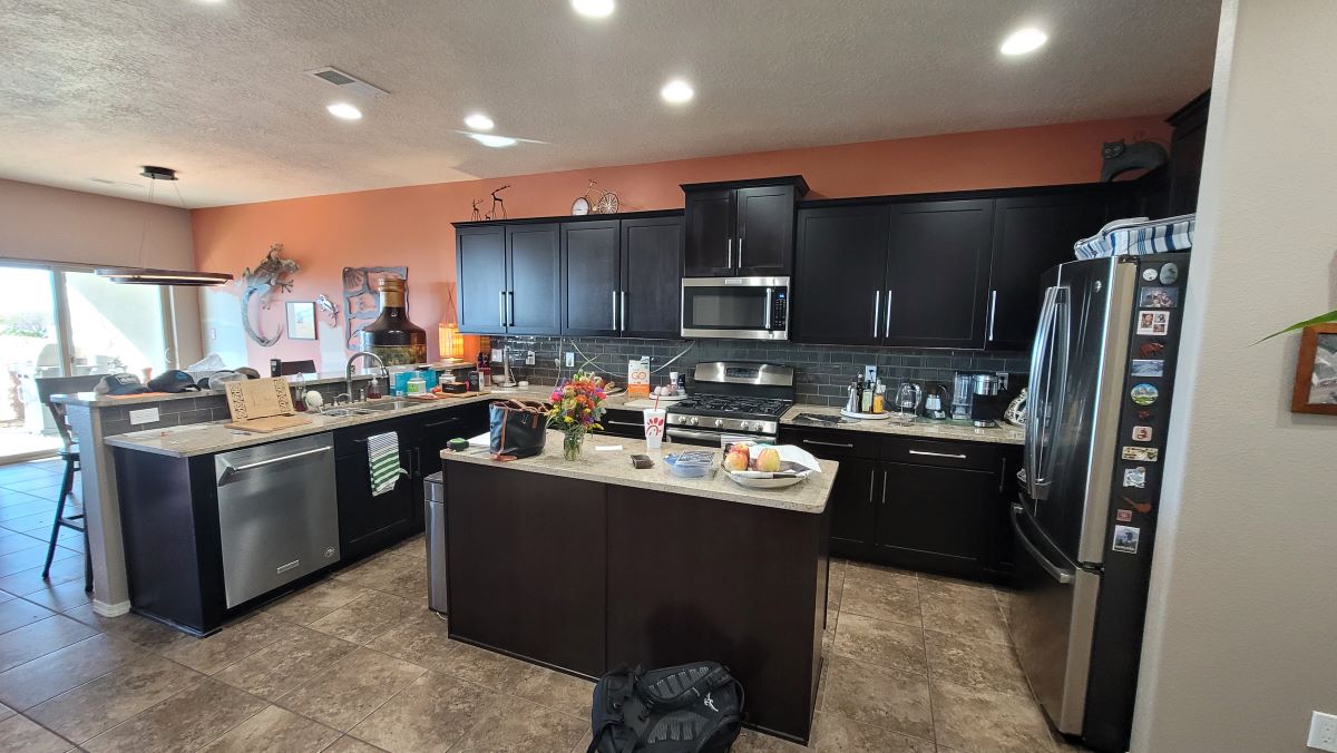
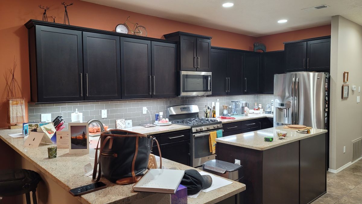
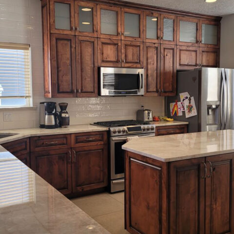
This narrow and vertical residence was in need of a bit of new. The owners were not thrilled with the backsplash they inherited in the kitchen, and between the two of them they had mixed ideas about how to proceed with changing the feel of their space.
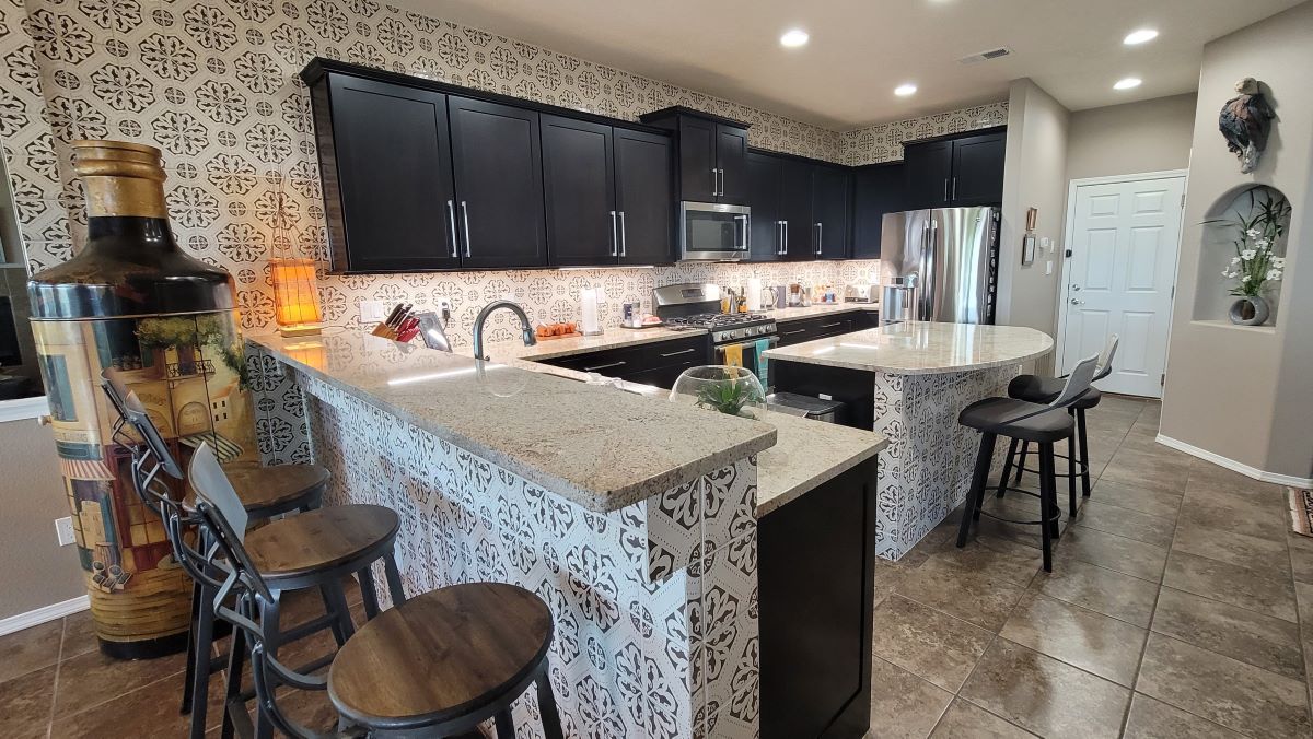
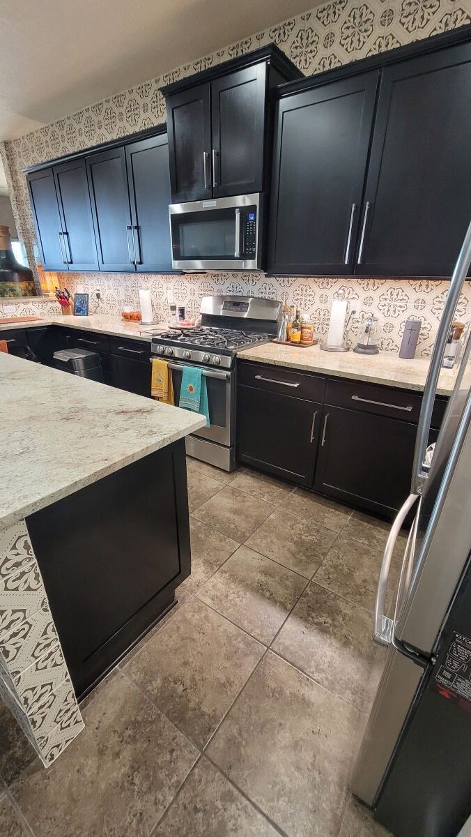
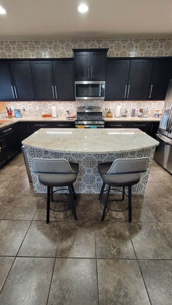
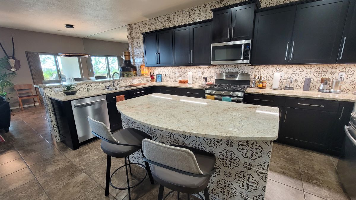
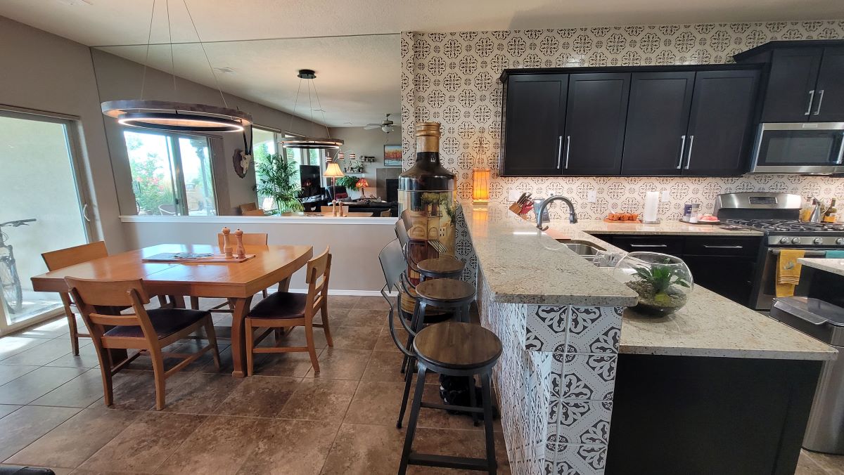
The first order of business was to decipher what about the backsplash they, or at least one of the pair, didn’t like at all. So, we set about discussing options of their many considerations, gathering samples from stacked stone and glass to brighter colors of tile. The favorite of all parties – a large format Talavera – handmade in Mexico, with a traditional design and a rich chocolate brown and cream motif.
The chocolate and cream softened the kitchen and complemented the dark brown – almost black – espresso cabinets! Who doesn’t like coffee and chocolate laced with cream? We digress…
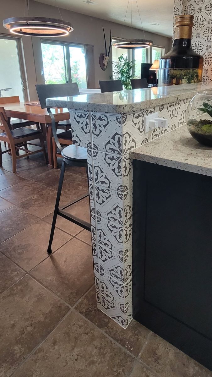
After tedious experiments with a new, larger, more functional countertop for the island, the decision was made to go with a match (for all intents and purposes) to the original countertops rather than an accent-colored slab. End panels were custom fabricated and color-matched to better finish the existing lower cabinet ends and allow a clean termination to the new tile that was to be on the face of the island.
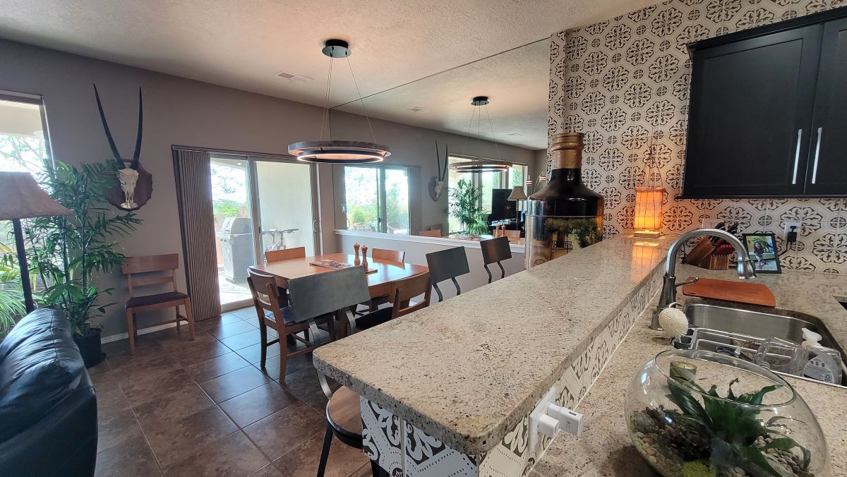
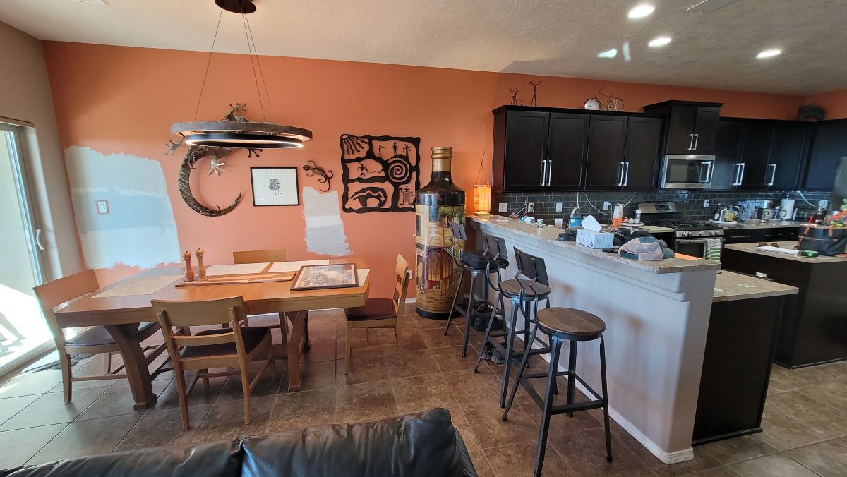
As we further discussed the space, color patches adorned the walls of the dining room as failed attempts at picking a color which further led the two to call us for help! Upon examination, Patti felt that the hard wall/line of the north side of the space was abrupt enough – as is so often the case, in narrow homes. Was this a situation to be remedied merely by selecting a new paint color? Perhaps not.
If we bisected the wall creating a chair rail and wainscotting detail, the upper portion of the wall could be seamlessly mirrored and, with no visible means of support (metal trim or clips), reflect the adjacent sliding glass doors and windows on the perpendicular wall. Imagine looking through to another entire dimension of light and space doubling the size of the area and thereby eliminating the abrupt, narrowing wall of the space! Voila!
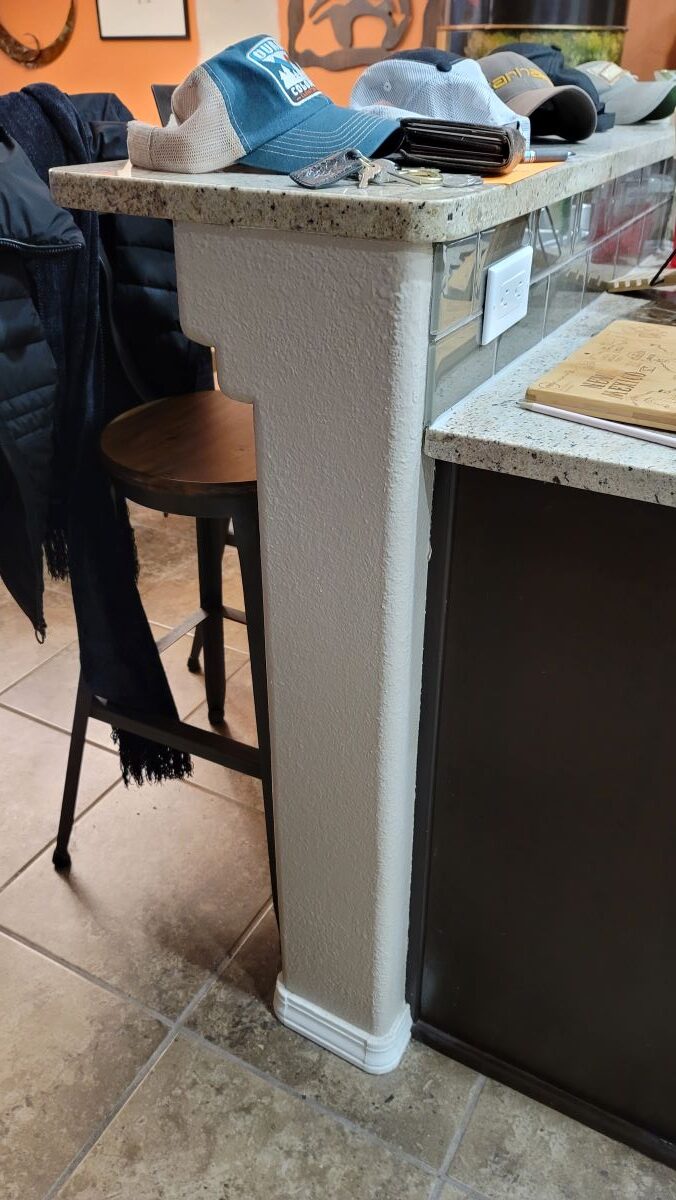
There was a design element that needed addressing. It was their large bottle, of a multi-colored monument of a thing. It was a very clever dry bar when hinged open. This was a special piece and needed to be considered when planning this new installation. The mirrored wall needed to terminate so that the kitchen backsplash could resume from the transition line. Therefore, we built a pilaster to wrap and terminate the kitchen tile and create a clean stop for the mirror, chair rail and painted wainscoting. The placement of the pilaster accommodated the large bottle to be situated on the kitchen side adjacent to the barstools. This is where it initially was located, but we didn’t want it to appear to straddle the new finishes where they transitioned. The solution provided a perfect area to define the bottle’s place on the kitchen/bar side of the space.
The resulting transformation satisfied the unpopular backsplash, undersized kitchen island, unfinished cabinet details, abrupt and narrow-feeling dining room, and entirely refreshed and visually expanded space.

