Its Fair time and it’s a sensory extravaganza! See the sights, the colors and lights! The sounds of kids screaming with squeals of delight! From corn dogs to turkey drums and pizza galore it’s a feeding frenzy for all ages – check your diet at the door!
It’s really so exciting and with the weather cooperating – it’s a must! A combination of New Mexico’s finest, mixed with funky products and crazy food stuffs! The colors and products presented by the vendors create a tapestry of form and fun. There are fine art exhibits and walls of balloon cartoon characters for sale, Rastafarian bananas and white tigers to win. Signs, lights, graphics, music, barkers, animals, vegetables, minerals and more – the festivities are magical. The slogan tells us, “It’s like all the holidays rolled into one!”
The season’s end of summer’s bounty brings feelings of home and hearth as the air takes a turn toward the fall. Harvest time, Indian summer, its flowers and sky, pumpkins and cider. Cinnamon from the German nut roaster wafts through the air. International shows like the incredible flying Chinese acrobats and our own macho cowboys of the rodeo all present fine skill and athletic prowess – defying gravity and displaying artful dance. Big cats and little dogs the lions pace and perform and the dogs dash and leap for joy. It’s a wild time in the old town tonight and for the next few…you have through the 25th!
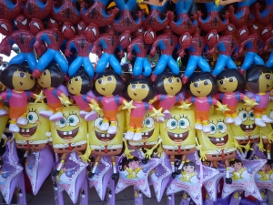
So get out there and eat a turkey leg and bite off some cotton candy, swig a brew and pop fists full of kettle corn then take some photos and blow them up! Wall art – here’s my example. Dora meets Sponge Bob and Spider man creating an animated, inflated collage – this colorful pattern of camp cartoon design! Suitable for framing!
The Stream of Life’s Connectivity…Skinny Girl Meets Octavio’s Whales
 In the woods of Missouri – not the backwoods as they say – but a verdant jungle of deciduous over-growth concealing luxury homes in the quiet gated lake community of Innsbruck near Wright City – I find myself in a whirlwind of peculiar influences, associations, elements and discoveries. For example, I’m sitting here taking my first sip of a “Skinny Girl” margarita after having just read about the Bethenny blast on the scene in Forbes, June 6, 2011 edition while flying here yesterday. My sister-in-law said that she had two bottles of this mix, my other sister-in-law piped up and said “Oh yeah, she just sold her concoction for millions.” I said “I just read about her on the plane…why didn’t I do that – I could have done that – I drink – I make margaritas from scratch – I watch carbs…” I would have, should have, could have – but, sadly didn’t do it! Another FABULOUS missed opportunity!!! And so we drank.
Then that same first sister-in-law said “Oh, here it is – remember this?” (No, I had not seen it during our previous visit). She grabbed this small bronze figure off of her end table where we were gathered in the glassy treetop room – and there before me was one of Octavio Gonzales’ graceful hump-backed whale sculptures!! What a contrast in settings to discover this wonderful miniature done by an artist, whose work we had admired for years and now enjoy the pleasure of knowing, who did the magnificent, enormous art piece at the entry of the marina in Puerto Vallarta, Jalisco, Mexico of a mother humpback and her offspring, here in the deep mid-western woodland. Whoa – where are we? Watch for one or more pieces of Octavio’s work in exhibit in Albuquerque this summer!
So as the day waned and the overcast ceiling grayed to a dim backlit through the trees, we migrated to the Cedar Lake Winery for an evening of fabulous music by a local duo, Kaylor and Tomasino, whose harmony was in perfect sync, guitar strumming robust, punctuated by banjo, harmonica and flute for a lively collection of popular renditions including Del Amitri’s “Roll to Me” and “Matchbox 20’s Breakfast at Tiffany’s” crowd pleasing a range of ages from the college kids collected along the bar to the middle-aged mom’s clapping and dancing in their seats…the wine flowed freely and we closed the place with a satisfying buzz.
Happy Memorial Day Weekend wherever you are gathering with friends and family…
Epazote Restaurant – Santa Fe – Fine Cuisine & Fine ART!
Art and art…food and paintings…a very nice pairing. Tuesday night, at Las Companas in Santa Fe, the Country Club held one of a series of guest chef’s events – this time featuring celebrity chef Fernando Olea from his sensationally intimate Santa Fe restaurant Epazote. If you have not been there, you are missing an extraordinary culinary treat!
This night, a private seating offered the rare opportunity for 40 guess to experience a multi-course meal of beautifully artful presentations and startling flavor bursts of fine subtleties that tantalized the palette. Beginning with a very convivial cocktail hour where guests stood among the tables and shared familiar conversations and new introductions while well-coached wait staff pleasantly presented “hors unique d’ouvres”, the enchanting evening began.
At his restaurant, Epazote chef/owner Fernando Olea offers a relaxed environment where he creates “inspired world cuisine” influenced by the Aztecs. Bringing sensational combinations of flavors and specializing in the unique flavors of the mole sauces of Mexico, Olea continues to surprise.
Each taste is a lovely flavor experience. Each taste is savored for the incredibly imaginative and surprising and pleasing combination that it is. Even if you have experienced savory moles south of our border, the creations that Olea combines are deliciously exquisite. And with that in mind, he has created a very unique mole especially for New Mexico which includes indigenous ingredients including pine nuts, pecans, red chile, apricots, and from Mexico, rich, white chocolate. If you visit his restaurant – he will share this delectable and complex recipe with you!
This signature recipe is depicted in a grand fashion on the primary focal wall of Epazote in the manner of a great oil painting on canvas – by prominent Mexican artist Federico Leon de la Vega. This richly detailed mural – stretching the length of the main dining room, nearly 20 feet in length – re-creates the scene of these marvelous ingredients gathered in preparation for the making of Olea’s own New Mexican mole. As Olea states, “nothing evokes the mystery of fine Mexican cuisine more than mole, a regional dish from the heart of the country.” This “thick sauce of complex flavors” defies one’s understanding of the individual ingredients. The festive spices and remarkable combinations result in astonishing flavors beyond accustomed characterizations.
Paired with his artful cuisine, Olea partners with Michael, a very talented art curator whose last name escapes me (lo siento), to present a gallery of fine-art speaking volumes of various styles and media, from the white-washed plaster walls of this historic convent – now a prestigious exhibition space for well-known New Mexican artists.
It is a must-see to experience an evening of fine dining and fine art in this quiet little structure across from the historic Our lady of Guadalupe church on Agua Fria in Santa Fe. Tell chef Olea that “Patti Says” and you agree that this is an exceptional multi-sensory experience!
COLOR – Be Brave – Take the Step!
How many of you LOVE color when you see it, but shy away when it comes to your own Interior Design? Go ahead, raise your hands!! Now, I appreciate and even embrace the taupe/neutral colors that are some peoples’ version of bold as opposed to standard off-white walls…at least they “pop” off of the white trim creating a contrast for crying out loud!!! I have a few chartreuse accents. But what IF you painted a wall red??????????????
I hosted an Open House this past weekend where the walls were bright yellow accented with blue and white Talavera Mexican tile and punctuated with “lipstick” coral/pink walls all trimmed in white . Sounds daring – doesn’t it? Well, it is – but it works! EVERY single person who came through the house had positive comments. Most were exclamatory and startlingly complimentary. Perhaps the house was too small or they could not use the furniture (without giving up their entire life’s inventory), but over-all the comments were almost those of jealous envy – envy of the nerve it seemed to take to make such decisions to use such festive colors – wishing it were theirs and that they could move in right away.
I spoke to couples who punched at each other saying things like “we could do this,” or “why can’t WE do this?” Seeing the completed project and everything in context makes it all very good. The scary thing is making that first color choice and swishing it on the wall…it’s very scary. But, GET OVER IT!!!! Until you make the decision to take the step – to make the move – to begin to commence to start the process, you’re sunk.
But it IS all about CONTEXT. I’ve seen many “accent” walls disturb a space rather than compliment it. That’s scary – if not unfortunate. It’s a shame to waste the exercise. It’s worse to waste the exercise and not know why it doesn’t work. Color is interactive. Color is dynamic. Color can enhance or detract. Color is powerful.
So think about what you like when you see color. Think about what you have and how color can enhance what you have. Think about what colors make you happy and how (if applicable) those colors can participate in your color scheme.
Have fun. Call me…..:)
Warm Up and Chill Out – Outdoors!
The weather outside is shinin’,
And the warmth is so divine in
Backyards of everyone we know
Let it grow, let it grow, let it grow!
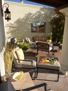
A seasonal twist to a familiar tune, something to hum while you’re gardening or sitting and admiring the work of others in your garden as you sip a refreshment from the comfort of your reclining lounge. I asked the other day about where is YOUR favorite outdoor living space and here is a shot of one of mine! Morning shadows, birds chirping, cool air warming with the rising sun…and tequila as shown here – ha! “Tequila Makes My clothes Fall Off,” which is good to be advised to drink it in a warmer climate – to avoid an unwanted chill!!! The back patio of the Casita de Colores is on the 14th fairway of the Oro Valley country club Golf Course – north Tucson. The Linear Park passes by to the west with easy access to miles of hiking and biking trails! It is quite an outdoor paradise!
Last night we gathered (chillaxin’ – thank you for this fun portmanteau, Shell) with friends and enjoyed the soft evening air…sipping margaritas, munching chips with chunky, freshly made salsa and luscious guacamole with a background of latin guitar wafting from the IPod – the Catalina mountains turned pink to lavender as night descended over the desert…it was magic.
The weather is still variable across most of the country – but certainly heading for a constant that we can count on to enjoy the outdoor living spaces! But I would like to pause to praise the strength of so many whom, in this time of devastation being experienced in the recent destructive path of the tornados, are re-building lives where all they see for miles are piles of outdoor debris where homes once stood. May they find comfort in the knowledge that perseverance will restore a new definition to their lives as they reconstruct what once was…and may it be safe and beautiful.
On my computer I have the gadgets posting the weather in some of our regular haunts from St. Thomas to Puerto Vallarta, Washington D.C. to Tucson – Albuquerque usually falls in the middle of the temperature reports which today range from – ooh, ABQ is the lowest right now at 46! St. Thomas is 83 and we here in the Sonora Desert are climbing up, currently at a mild 66 expecting low to mid 80s as the day progresses! The time difference plays a role though since St. Thomas is out there to the east of our east coast time zone – Atlantic as it’s called…well into their day as we are just greeting ours out here in the west coast time zone! So perhaps you didn’t expect a weather report – but it all centers around appreciating opening the doors, letting the air in and enjoying that spilling out from inside to live outdoors for a good part of the year to the extent that your climate will allow!
So, as it warms up – chill out! Enjoy!
Build IT America
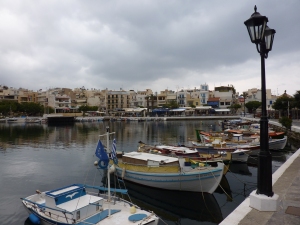
We’ve heard about streets paved with gold – and this is as close as I’ve seen. In Istanbul, we encountered streets paved with what we know it as Porphyry – a granite-like stone quarried in Mexico – billed as a European paving material – we saw it all over Greece and Turkey. Like brick from the standpoint that it is durable, conceals dirt and street soil, these square chunks of non-slip stone give a mottled coloration of reds, grays and dark charcoal tones resulting in a practical, timeless and extremely attractive surface. Not only the pavers, but great tiles of honed granite for sidewalks and shown here, drain channels along the curbs. And we primarily have asphalt and concrete!!!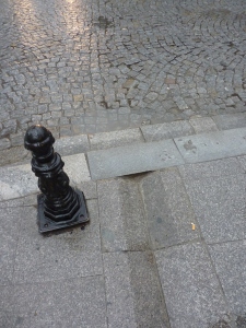
Milestone in Santa Fe brings tons of it in from Mexico to create luxurious driveways, patios, pathways and anything that might require, deserve and be budgeted for this style and quality of material. It’s unfortunate that the cost inhibits many (including the public municipalities) from using it. Not only the material cost (which might be better valued with more competition) but the labor to install.
This comes back to the lost art of many of the trades and the lost interest of recent generations to continue the trades of the generations that preceded them. We have to import stone masons to restore our historic churches and other edifices fabricated from and adorned with the fine craftsmanship of generations past.
Let’s get the AGC (Association of General Contractors) for example to establish, fund, and promote summer camps for kids to pursue the trades. These 2 to 12 week camps could be located all across the country, supported by the many businesses connected to the construction industry – machine, tool, cable, wire, cement, stone, brick, lumber, adhesive, steel, electric, plumbing, and other companies related to the trades. We have cut so many programs in the public school systems that it’s time for the private sector to step-up and contribute to the betterment of our labor forces. To have a leader like the AGC orchestrate a nationwide program that gathers participation from all manner of associated businesses both national companies and local concerns in each region would be a tremendous asset to our students, labor force, and economy. Whether imported workers or home-grown we need the trades – the fine craftsmanship and the sense of pride and recognition that should be instilled and go along with such good work.
The construction industry has taken a large hit with this down-turn in the economy. Yet the unions and non-union alike could and should be more vocal about constructive measures to improve the morale, growth and development of our labor scene. Not everyone is cut-out for college and the intellectual pursuits of higher education. Yet their talent and aptitude is no less important and should be encouraged and honed – and who better than the industry leaders of this great nation? BUILD IT AMERICA!
Less is Enough as Observed by Zorba’s Associate, Boss
When in Rome…or other places, I like to read in context with my travels. So last week while cruising the Greek isles and a couple of neighboring Turkish ports, I explored the timeless novel by Nikos Kazantzakis, none other than Zorba the Greek! What an engaging exploration of the human spirit seen from two distinctly different viewpoints. The detail and descriptions are fantastic. This observation on the part of the narrator, Boss, hit a chord so perfectly within me that it resonated a concept that we all must ponder…what are our needs, our comforts, and our pleasures when it comes to interior design?
“It is a great pleasure to enter a Cretan peasant’s home. Everything about you is patriarchal: the hearth, the oil lamp, the earthenware jars lining the wall, a few chairs, a table and, on the left as you enter, in a hole in the wall, a pitcher of fresh water. From the beams hang strings of quinces, pomegranates and aromatic plants: sage, mint, red peppers, rosemary and savory.
At the far end of the room a ladder for a few wooden steps lead up to the raised platform, where there is a trestle bed and, above it the holy icons with their lamps. The house appears empty, but it contains everything needful, so few in reality are the true necessities of man.”
It seems as we start out in life, that we want to gather things, express our interests, and decorate with the stuff that says who we are…then later, many people want to reduce the clutter, eliminate the maintenance and strive for a simpler life. This too can be said in light of catastrophes like the recent earthquake and tsunami in Japan. The devastation that robbed so many of their things and even their loved ones certainly puts things in perspective.
But healthy consumerism and the capitalistic way of life that encourages, promotes and rewards the buying and selling to keep the machine in motion is a far cry from this simple scene. But for a moment, pause and re-read those two paragraphs and wonder if it doesn’t come back to architect, Mies Van der Rohe’s famous phrase that he adopted from painter Andrea del Sarto that “less is more”? Or in the case of the peasant’s house…less is enough.
A Happy Scene on the Island of Mykonos Inspires Exterior Designs.
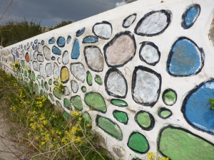
At first glance, this looked like a sacrilege. After encountering so much graffiti in Athens , (see the photo album on PATRICIAN DESIGN’s face book page) anything remotely related in appearance took on that “read.” To see the colors applied to, what was actually large local stone embedded in a plastered wall – which we often found painted all white in the Greeks isles, sometimes with white plaster leaving the natural stone exposed and then this – I was startled. But upon viewing this wall the other day in context on the beautiful island of Mykonos, I appreciated it as a happy scene.
When planning your exterior design it can be fun to release some of the norms associated with restraint. The beauty of the conventional use of materials in the built environment is not to be discounted – but neither is the bold expression of other possibilities.
Garden art can take on many forms. When you punctuate your exterior design with a bold red metal sculpture, dangle a glazed ceramic or glass wind chime or add a painted wooden door or furniture, you are making a colorful statement within the context of your exterior design. More on this later…
For now, know that there are many possibilities – and have a little fun creating a happy scene in your exterior design.
Bartenders Answer Lifestyle Conundrums – Get a Sock Monkey
Where people live, how they live, what they see, how they interact…the “design” of their lives might be more intentional/self-conscious than others. We find ourselves in a place and time…then, we ask, are we comfortable? Could we find the same or better comfort elsewhere? Simple lives, versus lives in the fast lane…Ask the bartenders, the un-certified psychologists around the planet. Ask them about their lives – where they live and why…how they got there and what works and does not. Peter, originally from Philadelphia, now lives in a three bedroom apartment in Manhattan with two other guys with one and a half baths…walking distance from the quiet but regular bar and intimate restaurant in which this bartender pours his creations – and listens to his patrons. That apartment is a median-priced abode in a multi-level building a midst the towers and surrounded by every single piece of home décor for sale imaginable. The sensory overload is unbelievable, the offerings are infinite, and so how does one find themselves and their interior design?
The seasonal trends presented in the flamboyant storefronts – each decorator trying to make the outrageous statement that will surpass the last…scissors, orchids, ostriches – Versace, Armani, William Sonoma, they all compete for the consumer’s attention. If you invest in a decision, the next season will have you second-guessing that decision.
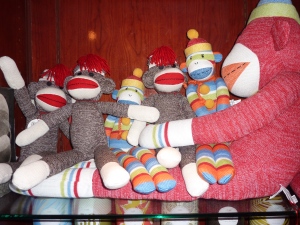
It’s an incredibly fast-paced extravaganza. That’s why when I came upon these sock monkeys at New York City’s Time Warner’s multi-level shopping Mecca – I took their photo. The comfort derived from these familiar faces, textures and colors immediately soothed my energized and exhausted designer’s overload.
Be comfortable and EXPRESS YOURSELF!!!
So in NYC where sensory overload is the primary experience…I found these very familiar little friends.
The Color Purple is Outrageous and Elegant, Whimsical and Fun!
The Color Purple is rich, garish, and outrageous when worn by ladies sporting red hats. Purple is royalty, has liturgical significance and makes tongues brand the color after sucking down a cold glass of grape juice or room temperature bouquet of good – or not-so-good red wine (what a waste).
Alice Walker expressed great symbolism of pain and beauty when writing her novel. It is certainly a complex color which for our purposes of interior design would want to focus on the positive attributes and not the less attractive. Purple continually surfaces in interior design and it’s probably due to be an upcoming trend. Whether eggplant or lavender, it is a wonderful, classic, good color (aren’t they all in some context?), – yes, purple can be quite fun!
In nature, our Sandias at sunset – although said to be “watermelon” red, by their very Spanish name, transition from many shades of pastel colors including pinks, blues, lavenders and rosy reds. Lavender fields, lavender bouquets, periwinkle blossoms, red bud trees…the list goes on… Currently, I am designing a purple scheme in a home that will be all of fun and stunning, whimsical and elegant. It seems that the brighter colors of purple often bring a smile. Extracted from a charming oil painting, of a northern New Mexico calle with brilliant white and purple lilac bushes blooming along a dirt road accented by a royal blue picket fence, that we have selected as a focal point – the colors are enchanting. These will be more robust than pastels but softer than the royals – delineated with crisp white against a neutral backdrop of sage/stone.
I often reference colors in nature influencing interiors – and here captured in the artist’s painting is a scene from nature setting the stage as the focal element of the space.
Meanwhile, take a look around. See the earth and sky, new blossoms and colors in the built environment – and consider the possibilities for building a color scheme or punctuating with accents in your interiors.


