Small Water Features for DIY Projects

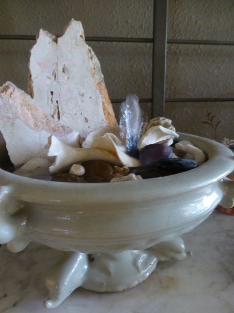
Vintage celadon vessel makes perfect table-top water feature!

Vintage celadon vessel makes perfect table-top water feature!

 Small Water Features for DIY Projects

Large vessels make focal points for fountain features. Large containers or bored stone boulders are perfect sculptural elements for the glistening appearance of running water, the gentle sounds and refreshing effects. While we have had great fun creating dramatic site installations for outdoor living scenes, we realize that there is great merit in the smaller versions that DIY buffs can create for their interiors or patios.
First, find an interesting container. I found a pair that are footed and are dolphin figures to boot – what luck!! This celadon glazed ceramic has a nice diameter of about 12” and is raised up by its three dolphin figurine feet. It’s a perfect aquamarine theme for this table-top water feature.
Select your container and then gather things that you enjoy. You might already have pieces of glass, tokens, stones, shells, coral, miniature figurines…use what you have or collect more for this specific use.
Get a small pump at the local home-improvement store or hardware store. This should be relative to the size of your container. This one is a little smaller than my fist. The cord will drape out of the container, up over the rim and behind the fountain to plug into your electrical source. This will conceal adequately if you place your fountain on a surface that backs up to a wall where the electrical outlet is located.
Arrange your collectibles on and around the pump to conceal it from view placing the more interesting pieces at the surface.
I use distilled water to insure no residue from harsh mineral that might be present in your tap water. Fill the container to the appropriate level. It will cover much of your collectibles in the bowl. Here I have used a couple of vertical slices of local travertine to add height, texture, color and interest. Once your first turn on the pump – or plug it in as this one does (no switch), you will be pleased at the calming, refreshing results.
Send photos of your finished products!!!!!

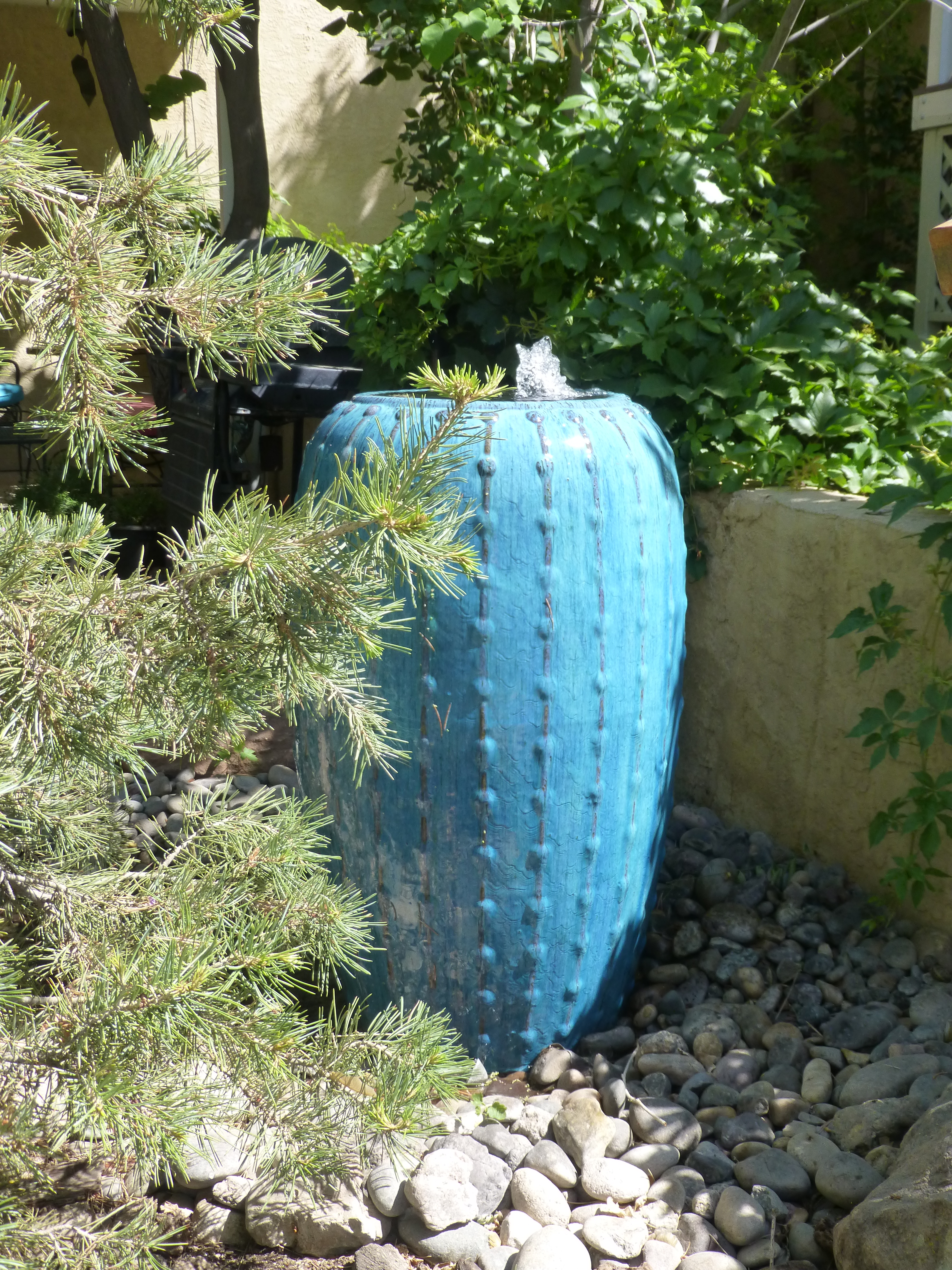
Shown here…Nestled into the landscape, this brilliant blue glazed fountain with interesting textured exterior is tall and splendid amidst the greenery as its water recirculates and flows into a bed of stones.

Tangerine Dreams – a Fresh Design Scheme for Inside and Out!

Inspiration is often a pleasant surprise. It happens with a spark that ignites a theme and the project evolves. In a very dramatic transformation of a simple yet dated living room, we skinned two walls with stacked white stone. The slivers of horizontal texture brought a clean-lined organic feel to the space. Existing sage green carpeting was a cool contrast against the clean bleached stone – we also painted the walls white to mimic the tones in the stone. The perfect punctuation in this sage and white scheme became the fresh pop of orange. Call it melon or coral our color is that somewhat rosy version to slightly soften the contrast. See more of this project at PATRICIAN DESIGN http://bit.ly/YQCyrE

Roll the footage along over the course of this last year and the finished product receives rave reviews. We are encouraged to take the scheme outdoors and continue this project now called Tangerine Dreams. Once outside the orange can be released to express brighter versions melding the coral tones with other shades more bold and brilliant.

Existing white patio furniture provided an open invitation to continue the thread of white that was introduced inside with the white stone wall. Making things look intentional and incorporating existing elements is a cost-effective approach. But the trick is not to let it appear as though the scheme was sacrificed for savings.

So with the lush green foliage of the desert’s semi-tropic offerings that were already mature in this landscaped yard – all we needed was to introduce floribunda of orange to carry through with the tangerine themed color scheme. We planned and prepared, planted and potted for the perfect patio party! Pillows, placements and pottery also brought orange tones sprinkled throughout the design.

A new water feature will replace a lemon tree lost in the last freeze. A brilliant orange trumpet bush will nestle against the towering ceramic urn of luminous green tones where cascading water will re-circulate from beneath the stone bed.

See more photos of this project in our facebook album at http://on.fb.me/13TVGUm and watch for future posts as the plantings mature and the work continues.P1060999

The Value and Variety of Good Lighting Effects in Interior Design

We paint with pigments but we can also paint with light. We can actually color a space or surface with a color of light or we can illuminate a color of a space or surface with the addition of light. Accenting items or areas in a space or exterior environment is an exciting element of interior or exterior design. We know that the fact that light exists in a space allows us to visually “read” that space. It makes me think though of the clever Kohler ad with the blind guy at a party coming back to his date from the restroom and exclaiming something like “Wait ‘til you see that bathroom!” Not the manner that most people experience a room – but like the last blog about lavender…there are many senses that comprise the effective or ineffective design of a room.
So lighting in this instance is of key importance. With short days of winter still ahead, the nights are longer and the need for artificial light is not just a design element, it is a functional requirement for utilizing or experiencing the space. Differently from ambient daylight however, artificial light offers many opportunities to manipulate, accent and create special effects.
Shadow and light the two opposing forces in the drama of lighting. The absence and the presence, the voids and depths versus the illuminations, accents and “pops” all contribute to the balance and effectiveness of the area’s influence. It gives us the opportunity to enhance, accent, draw attention to, and remove from the focus.
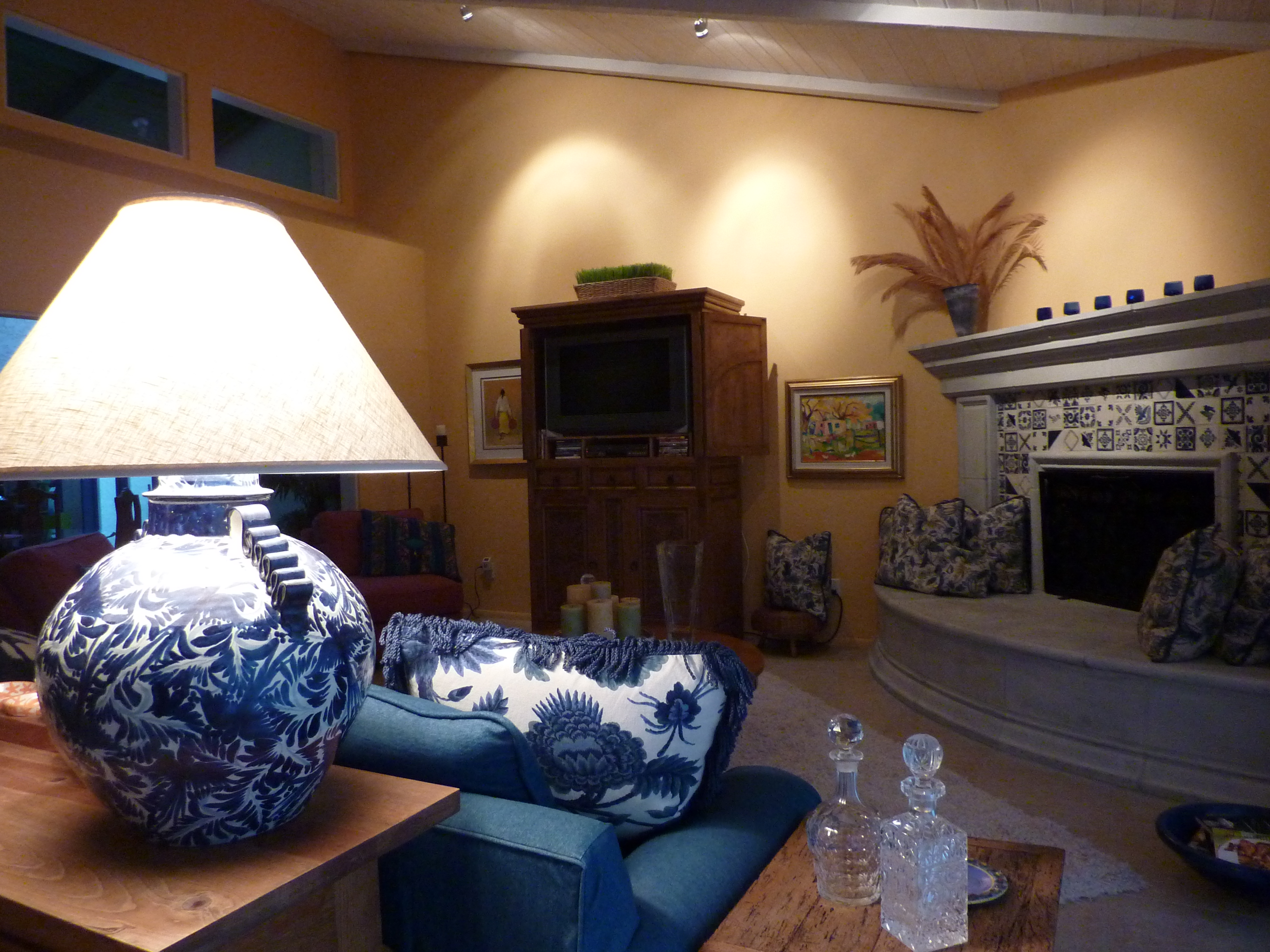
Inside, bring forward the things to emphasize and send back to the recesses of light or the lack thereof those that you choose not to place in importance. Accent a painting on a wall with a spotlight. Cast an ambient glow around the room from a translucent lampshade. Multiple light sources are often the best. They add variety, interest and balance to a scene.
Some light sources are decidedly decorative and they may or may not contribute greatly to the scene. Decorative fixtures can be chandeliers, table lamps, floor lamps, wall sconces, or surface mounted ceiling fixtures. They are selected not just for the illumination that they provide, but for their design influence in the scheme. How they play a part in the illumination of the space is another story – and variable.
People are best viewed from a light source at the face level rather than down from recessed or track lights in the ceiling, which is why table lamps are an asset when creating a setting in which people gather. Social settings differ from display settings. Lighting from above as an exclusive source can be limiting if not ineffective. The shadows cast are not attractive – rather, they can be ghoulish. It’s like the effects of a flashlight either from above or below on your face in a mirror – test this – you will never want to be on a date sitting beneath a light source glowing down from over your table. Scary.
To set the stage of an interior, determine where you want the viewer to go -where you want the destination of the “read” of the space to be. There are these accent spots – points of interest…and then the harmony of the entire area takes shape. Find the attractive features in various parts of the room…a plant in the corner might be lit from beneath to cast shadows on the wall – an inexpensive and dramatic effect. Buy an “up” light at Home Depot or Lowes – a local lighting store might have a greater price range and variety of lamping types and fixture styles. Also, a spot direct down onto a plant or sculpture on a pedestal or vase on a table – the drama of highlighting amidst the otherwise low-light is powerful.
Lighting creates mood, alters perception, and has subliminal as well as obvious effects. Use it to change the feel of a space. You want someone to linger, soften the light – you want them on edge and ready to leave – up the lighting to an unpleasant range. Restaurants and residential dining rooms are perfect examples of soft lighting providing a relaxed atmosphere – in those same rooms where the light levels are higher, notice the less relaxed sensation that is experienced. Likewise, if you want someone to feel welcome, soften the light rather than blasting it.
Light up you life with really good light!

Casita soft and soothing www.casitadecolorestucson.com

Bright and Bold!

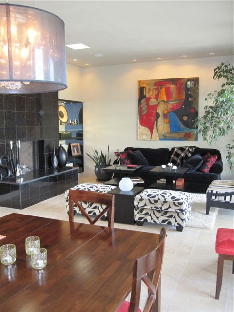
Sheer-shaded chandeliers and wall wash spots

Don’t Be Afraid to Paint Wood!

Really gotta love red – it is passionate, fun, vibrant, warm and here are some cabinets to illustrate all of that! We recently completed an installation of custom cabinets that we designed for a busy family with two kids needing a work area for homework and craft projects. The upper cabinets were in place along with part of the lowers…but they were golden oak…So we designed the completed components and painted the whole thing a brilliant, semi-glossy red! The work-surface is a manufactured material – a durable engineered product, “Caesar Stone,” in a dark charcoal color. The cabinet “jewelry” is a handsome pewter pull with an Asian bent. They read as punctuations accenting the bold color.
Who wrote these rules? Painting wood is a sacrilege! Yet, I can appreciate the natural beauty and integrity of any organic material – oak is a richly grained wood – cut/sliced many ways – rift or quarter, the character changes completely. But to paint a course-grained wood, one gets the details reading through the painted finish and it is almost like a moiré fabric – water-marks dragged through the surface – but in this case reading through with a wonderfully dimensional quality.
Don’t be afraid to paint wood – it’s just another beautiful way to celebrate its magnificent character!

The Price of Personal Style…is Perhaps Priceless?

I came upon an article about weathervanes. It was about Massachusetts artist Edwin Waskiewicz and his 20 year old practice of hammering custom copper and brass art pieces into animated creations to indicate wind direction or just for the charm of them as a decorative embellishment. You can imagine the twinkly shine and patina of these manipulated materials perched atop shingles spinning their eclectic forms into the skies. But how many people are in the market for these fine pieces of art and at what price when layered with other retailers’ representation? By that I mean mark-up – or in the case of a gallery, the sharing of the selling price to cover the cost of said representation. After exploring these channels of selling his work, this artist recognized that he could do better with direct representation – this direct market approach has been the basis for entrepreneurialism for artists (and other manufacturers for that matter), since time began.
People looking for unique pieces of anything are willing to research the myriad sources to seek their private find. Exclusive at the least, these treasures are often regarded as private due to the buyer’s opportunity to intimately create with the artists to achieve one’s desired and very custom results. What is the price of personal style? This is true in Interior Design as well when you strive to create combinations of fabrics and furniture that nobody else has – your own personal statement for your environment. Fashion – look for the finds or create your own – it’s all about personal style.
What a contrast custom commissions are to commodity production. Yet, the mass produced items that flood the marketplace every season to emulate these custom pieces still constitutes a treasure hunt – just not as expensive or exclusive. Whether searching retail firsthand – the tactile and seemingly old fashioned way versus the seemingly limitless offerings available when scouring cyberspace – the hunt is on!
“One man’s trash is another man’s treasure,” says it all as relates to this experience in relativity. Perfectly good wing chairs sitting on the curb for pick-up…NOT because they are no longer useable or even presentable – but merely because there is no room for them. Donating is good – and it’s interesting to see what treasures can be found from curbsides to Goodwill stores, junk shops to antique boutiques. It’s fun and exciting – it’s challenging and satisfying – regardless of the price-range, budget and scale, maybe we’re all just a little bit “pickers.”
The price of personal style…is perhaps priceless?

Earth Day and the Announcement of our Exterior Design division!

What better day to announce our new division PATRICIAN DESIGN Exteriors but Earth Day!! I have said many times that Interior Design spills out-of-doors with the natural progression of expanding our living spaces in the warm weather. The market grows each year with outstanding offerings in UV and moisture resistant fabrics and the decorative accessories are bountiful! Outdoor kitchens, fireplaces and entire living rooms now, more than ever are a must have for anyone who appreciates what the exterior spaces can offer!
So take in this magnificent Spring air and start planning how to maximize your outdoor living spaces!

Exterior Design for the fun of enjoying the outdoor living spaces!

Less is Enough as Observed by Zorba’s Associate, Boss

When in Rome…or other places, I like to read in context with my travels. So last week while cruising the Greek isles and a couple of neighboring Turkish ports, I explored the timeless novel by Nikos Kazantzakis, none other than Zorba the Greek! What an engaging exploration of the human spirit seen from two distinctly different viewpoints. The detail and descriptions are fantastic. This observation on the part of the narrator, Boss, hit a chord so perfectly within me that it resonated a concept that we all must ponder…what are our needs, our comforts, and our pleasures when it comes to interior design?
“It is a great pleasure to enter a Cretan peasant’s home. Everything about you is patriarchal: the hearth, the oil lamp, the earthenware jars lining the wall, a few chairs, a table and, on the left as you enter, in a hole in the wall, a pitcher of fresh water. From the beams hang strings of quinces, pomegranates and aromatic plants: sage, mint, red peppers, rosemary and savory.
At the far end of the room a ladder for a few wooden steps lead up to the raised platform, where there is a trestle bed and, above it the holy icons with their lamps. The house appears empty, but it contains everything needful, so few in reality are the true necessities of man.”
It seems as we start out in life, that we want to gather things, express our interests, and decorate with the stuff that says who we are…then later, many people want to reduce the clutter, eliminate the maintenance and strive for a simpler life. This too can be said in light of catastrophes like the recent earthquake and tsunami in Japan. The devastation that robbed so many of their things and even their loved ones certainly puts things in perspective.
But healthy consumerism and the capitalistic way of life that encourages, promotes and rewards the buying and selling to keep the machine in motion is a far cry from this simple scene. But for a moment, pause and re-read those two paragraphs and wonder if it doesn’t come back to architect, Mies Van der Rohe’s famous phrase that he adopted from painter Andrea del Sarto that “less is more”? Or in the case of the peasant’s house…less is enough.

A quiet morning on the isle of Crete

The Color Purple is Outrageous and Elegant, Whimsical and Fun!

The Color Purple is rich, garish, and outrageous when worn by ladies sporting red hats. Purple is royalty, has liturgical significance and makes tongues brand the color after sucking down a cold glass of grape juice or room temperature bouquet of good – or not-so-good red wine (what a waste).
Alice Walker expressed great symbolism of pain and beauty when writing her novel. It is certainly a complex color which for our purposes of interior design would want to focus on the positive attributes and not the less attractive. Purple continually surfaces in interior design and it’s probably due to be an upcoming trend. Whether eggplant or lavender, it is a wonderful, classic, good color (aren’t they all in some context?), – yes, purple can be quite fun!
In nature, our Sandias at sunset – although said to be “watermelon” red, by their very Spanish name, transition from many shades of pastel colors including pinks, blues, lavenders and rosy reds. Lavender fields, lavender bouquets, periwinkle blossoms, red bud trees…the list goes on… Currently, I am designing a purple scheme in a home that will be all of fun and stunning, whimsical and elegant. It seems that the brighter colors of purple often bring a smile. Extracted from a charming oil painting, of a northern New Mexico calle with brilliant white and purple lilac bushes blooming along a  dirt road accented by a royal blue picket fence, that we have selected as a focal point – the colors are enchanting. These will be more robust than pastels but softer than the royals – delineated with crisp white against a neutral backdrop of sage/stone.
I often reference colors in nature influencing interiors – and here captured in the artist’s painting is a scene from nature setting the stage as the focal element of the space.
Meanwhile, take a look around. See the earth and sky, new blossoms and colors in the built environment – and consider the possibilities for building a color scheme or punctuating with accents in your interiors.

Spring’s Bevy of Bountiful Floribunda – Prune It and Bring It Inside!

What’s the first sign? We had purple leaf plum trees at the entrance of the parking lot across the street from our shop for years. They always “popped” on a chosen, surprise day in late February/early March with an explosion of pink flowers. Then the trees died due to a change in the irrigation system – it was cut off! We missed our cheerful “first sign” of Spring.
But thankfully, a couple of years ago, the Mayor answered our request to re-plant the areas with new trees and Voila! Yes, it’s that time again – Spring is springing and it’s time to go out and prune those flowering trees and bring them inside for spectacular sprays!
Now, we don’t prune these City trees – and they’re still too small to prune anyway – but look around…in all regions of the country when the time comes that those early buds can be cut away from mature trees without harm to the tree and brought inside for incredibly brilliant displays – do it!
So Purple Leaf Plums are early as are Bradford Pears…apples, peaches – forsythia come along…there are so many wonderful colors and blossoms that at urban floral shops they are sought-after treasures of the season! The idea is to cut them early so that they are not yet opened and bring them inside where the warmth and natural progress of the water wicking will force the buds to bloom and bring Spring inside a bit early – connecting your interior design with nature’s renewing seasonal change.
So Edward Scissorhands – get out there with your pruning shears and have at it – in a good way – go attack those trees and bring in a bounty of bouquets! Share with friends and take an armful for a hostess gift (making sure that you bring a bucket so as NOT to impose upon your hosts at their moment of receiving guests to tackle this beastly beautiful bevy of floribunda!).
The photo here is from one of my favorite furniture companies – Pearson – celebrating their 70th anniversary!!! They brought these incredible pink flowering branches inside for their celebratory photograph!
So we’ve sprung forward…the days are getting longer…Happy Almost Spring!!

Luminous Margolin Sculpture Dances Above Anatole Atrium

Look…up in the sky, it’s a bird…it’s a plane, – no, it’s a magnificently suspended sculpture, the Nebula, by artist Reuben Margolin. Last week, on a recent trip to the Dallas Design District to research interior design elements with clients, we stayed at my favorite local environment, the Anatole. Oh, there are many options when visiting Market, but not only location, this magnificent facility has always been my favorite. A favorite because, after spending hours inside the showrooms, often without windows to the outside, the circadian rhythm of dedicated designers and their seemingly tireless clients is confused and way out of whack. Returning to the Anatole after a long day presents an interior environment that is open, spacious, interesting, airy, and at once welcoming. There are multiple venues in which to relax and review the work of the day. Large spaces with expansive atrium volume and other spaces more intimate and private – it’s all there under towering roofs, connecting passages with comfortable seating areas, shops, bars, cafes, and exquisite restaurants.
After decades of excellent and reliable service, the Anatole – under new management by Hilton – underwent extraordinary renovation. Yes, for years the Lowe’s Anatole and more recently the Wyhdham Anatole, is now a Hilton signature property. With this exciting series of improvements new water features and seating areas, bars and eateries appear – and above it all in the main atrium is Reuben Margolin’s startling aerial display – a dance of sorts – a wave-like motion of 4,500 amber crystals – are they petals, butterflies, or fragments…? Spectacularly suspended from a complex amalgamation of cables – 10 miles of them – and a staggering number of pulleys, this sensual motorized art piece undulates with luminous shimmering facets high above the scene.
Mobiles – art suspended – add magic to an interior. The penetrating of the space, the pleasant intrusion paired with beauty and grace, movement and fantasy – the perfect contribution, by design.

The Nebula Undulates in Interior Space