What’s Trending? Do YOU Need An Interior Designer?

As we move forward into this new year…the story is the same – only some details have changed or been added to past stories. By that I mean if you search for trends – they are ALWAYS all over the place.

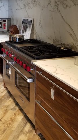
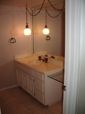
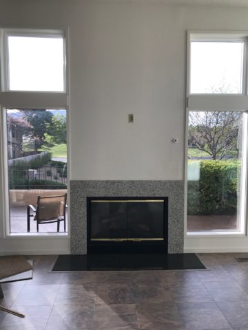
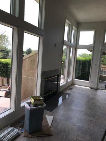
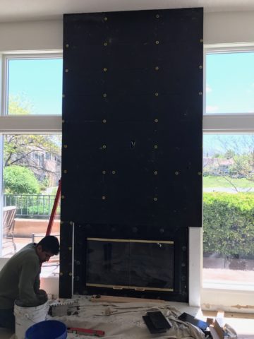
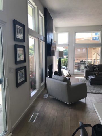
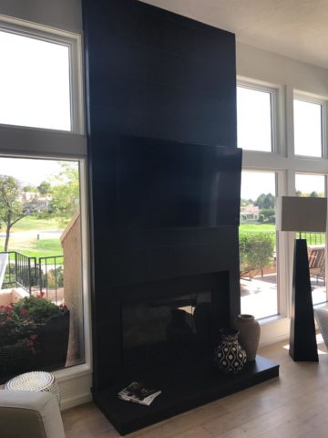
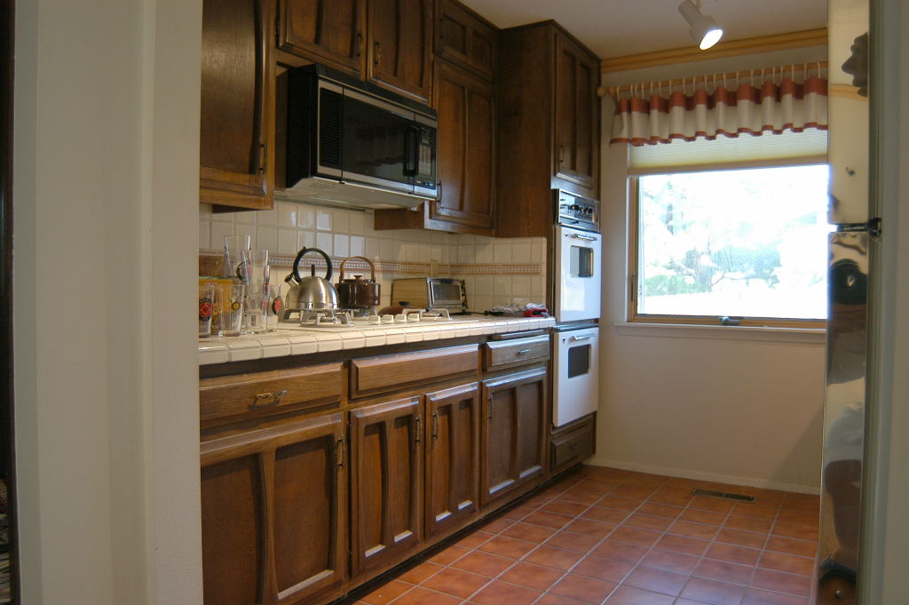
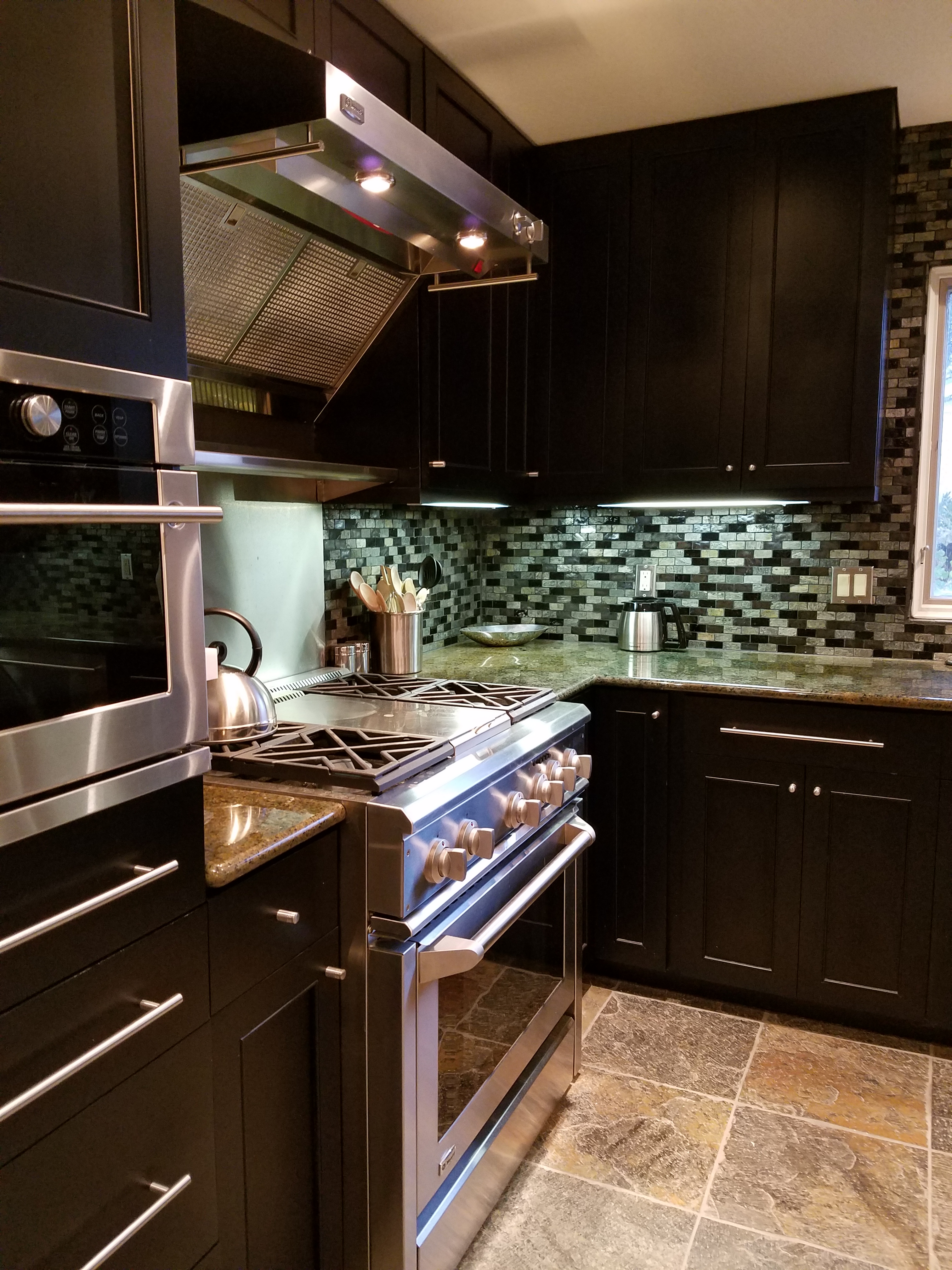
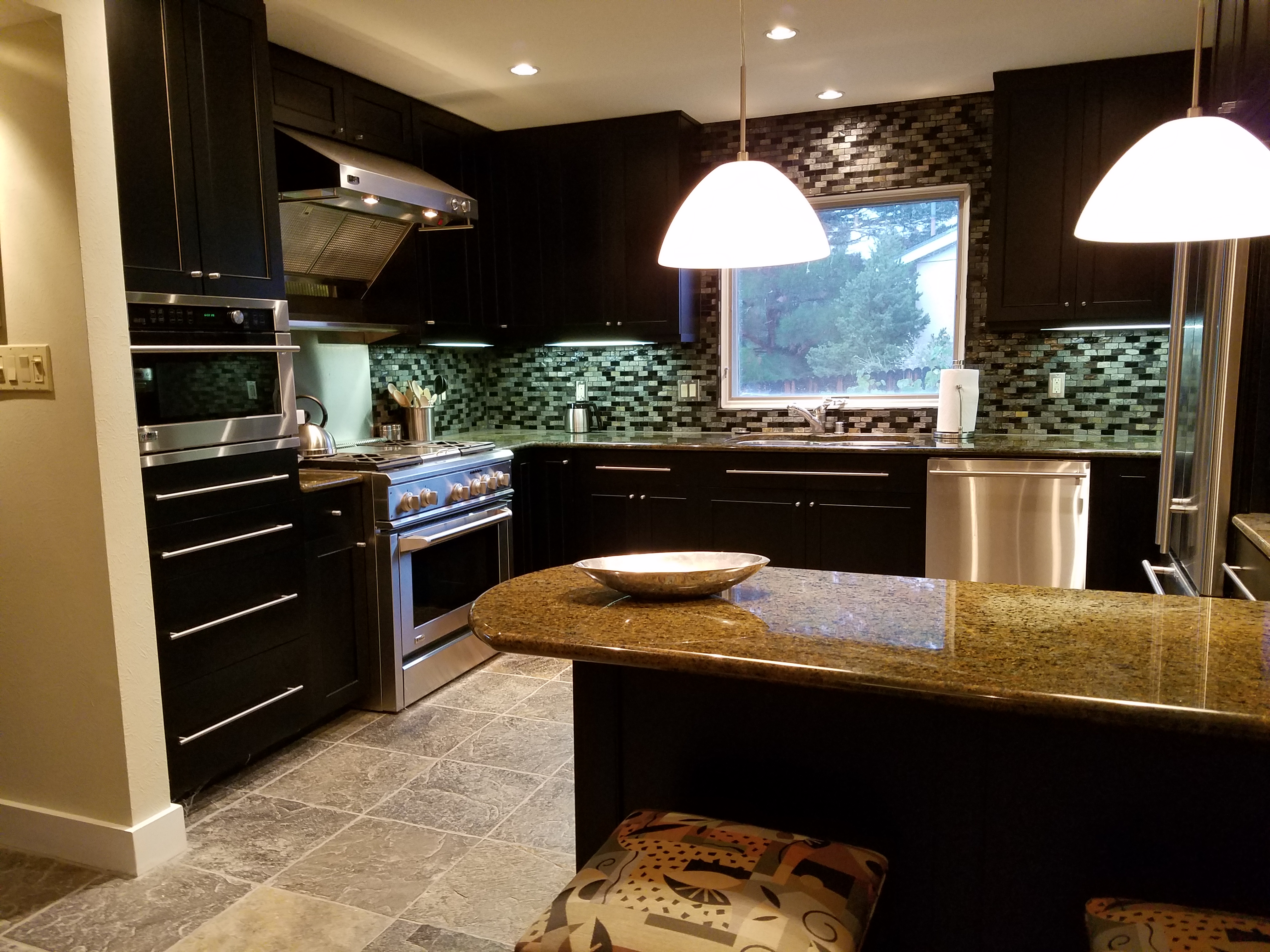
We do find years when really new ideas take the stage – like when the shift from plastic laminate to stone slab counter-tops became a valid trend.  It was a trend brought about by improved technology, shipping,  cost and ultimately availability. After that, the engineered surfaces that grew from this trend broadening the offerings – explored color, texture and pattern and continue to introduce new options.

Myriad surface materials mimic natural stone – when is it preferable over natural stone?


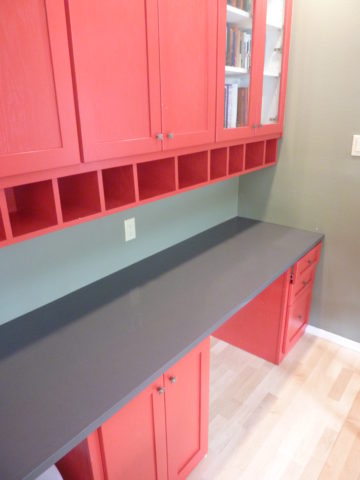
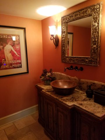
Engineered stone products offer many bold, solid colors from pure white to amazing primary colors.

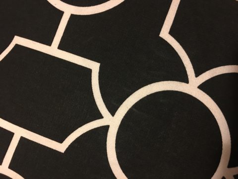
So right now bold color accents are in,  wall covering that made a come-back a couple of years ago is sticking for the time being and with newer bolder prints. Fabrics too – prints are bold and large scale!

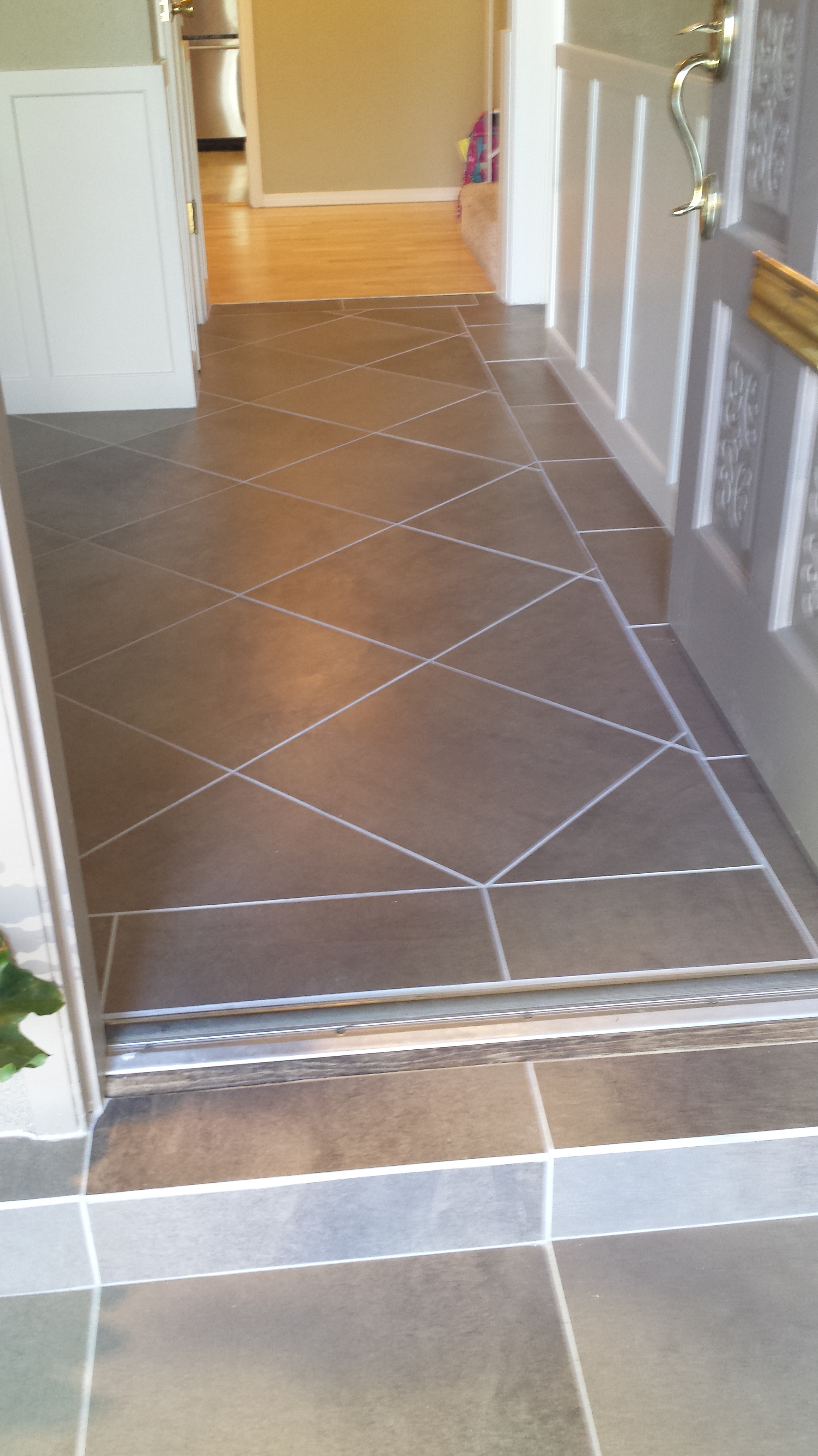
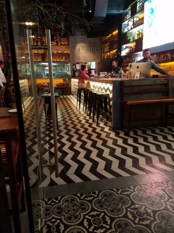
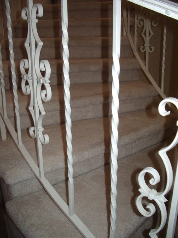
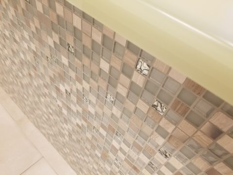
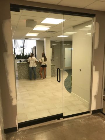
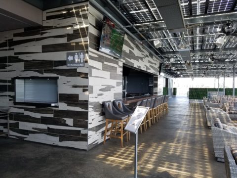
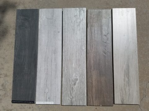
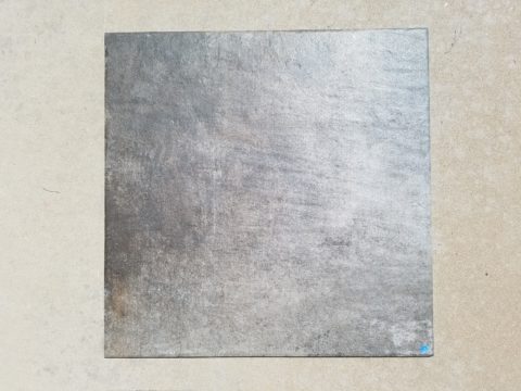
Wood on walls is trending. Printed concrete tile is the big thing. Farmhouse sinks – in different finishes than customary stainless or white.  Vintage light fixtures – enhanced with new technology and lamping.

So, does that mean I can’t have a white sink or shouldn’t have a stainless one?  I should use printed concrete tiles in my kitchen or bathroom? If my home lacks a bold print wall covering am I missing something? If  I’m not sporting some raw concrete, am I out of style? Is the wall full of family photos in my bedroom passé?

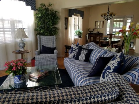
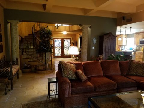
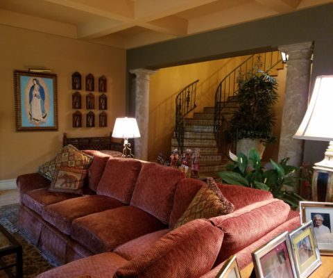
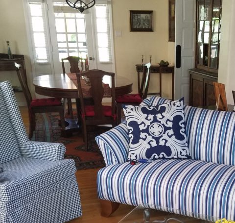
Surrounding by existing vintage pieces and family heirlooms, the new living room pieces added some contrasting, contemporary lines with clean, crisp, classic, blue and white fabric patterns.

Oh, the pressure to get it right!!!! Oh so many choices – how do I decide? Do I have to start over? I want to be in style – but I don’t know what that even means between today and 6 months from now. I like neutrals – am I dating myself?

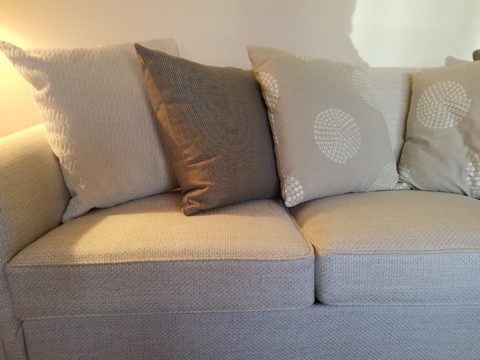
Neutral fabrics in a variety of textures and subtle patterns on a recently re-upholstered sofa.

Be calm and carry on…that’s why interior designers exist!!  Sorting through all the conflicting, changing information and choices can be exhausting! Just get on Pinterest and look for any subject about an interior – window treatments, living rooms, bedrooms, wall treatments, flooring…with each year, the choices expand. The permutations seem endless. HOW does one ever decide?

Mark my word, we will be flooded with interiors plastered with printed concrete tiles, faux printed concrete tiles, filament light bulbs and jarring color contrasts, in the coming months and perhaps even years…These trends have already made their mark. But it will be the creative manner, in which the various printed concrete tiles are used and when the vintage style of filament fixtures is appropriate and effective. What colors are used (where, how and with what) is what will set a few exceptional installations apart from myriad uninspired, if not confused, versions.

An effective interior designer knows what is trendy versus a trend designed and positioned for lasting impact. This is a major part of the equation. Existing conditions with regard to architectural style, existing furnishings, personal preferences, budget, priorities, all play roles in the design process.

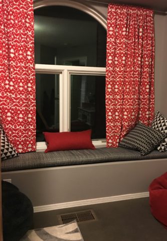
A young teen’s bedroom was recently redesigned to reflect her developing tastes and preferences. Bold color and a variety of geometrics and patterns make a bold, fresh statement.

You don’t want to be coerced into making changes just because new style suggestions are being presented. Trends DON’T RULE – despite the fact that the design community wants you to think they do, in order to continually change things up! Don’t be a victim of too many directives regarding what is in style. It’s intimidating and mostly due to access. We have access to so many opinions, on-line sites, magazines and advertisements that the pressure, conflicting information and choices can be ridiculous.

It’s YOUR interior, your style, your comfort and functionality. Yes, it’s all about YOU and yours.

Do YOU need an interior designer?

Adding Personality & Panache – Before & Afters

Everyone loves befores and afters. Last week we featured a project that received a dramatic transformation. The trick is, you have to think thoroughly about taking “befores” before you tear into it!!! Hindsight is so often 20/20 when delving into a remodel.

I dashed over to Phoenix last month to celebrate the Grand Opening of an exciting new clinic that we have recently completed. While there I visited great friends and re-visited a wonderful residential project that has stood the test of time.

Here we have two restrooms in that same project. Rich colors of warm coral, brick and golden tones with natural materials from stone floors to counter-tops and wall treatments. It is a Spanish theme – albeit eclectic with art and decorative accessories, of this well-traveled couple.

What was plain 80s’ vanilla receives a new-found richness and warmth, depth and interest. Do not be afraid of dark colors in small rooms – I’ve said that many times in the past. I’ll bet that you have seen spaces exactly like these “before” shots. Clean slates, but so uninteresting it is remarkable to think owners are content to live without personality in their anemic interior spaces. We added powerful personality and panache throughout this residence.


The master bath had dated surfaces and uninteresting configuration. We transformed the area by connecting, with a glass panel, the tub and shower areas. However, we elected to use a shower curtain instead of glass door. I often suggest this alternative. It is softening, less expensive, easy, minimal maintenance – less wiping!!! Watch for another new master bath with a shower curtain and glass combo.

Full wall treatments of stone or ceramic are wonderful, substantive ways to suggest architecture over mere decorative appliqué. The material suggests structural forms. It never should stop on an outside corner, lest it defeat the purpose. It is to be a mass.

So take those “befores” and enjoy the “afters.” Don’t be afraid of dark colors in small rooms, and use stone and ceramics generously without fear.

P.S. Last week and this today are of a fabulously enjoyable and successful remodel transformation done 12 years ago!!! Yes, revisiting a couple of weeks ago,  I took these afters of exactly the interior that we designed that long ago. It has been a virtually timeless project. The owners have enjoyed the spaces so well that they have maintained them without any modification. So we thought that you as readers would get a kick out of the long-term success of these design decisions.


SPANISH STYLE BRINGS INTERIOR SPICE

Fabulous clients – turned great friends – bought a good-sized townhome in Phoenix. It was plain vanilla inside with wall-to-wall broadloom and everything painted the same creamy neutral. They stood in the center of this bland slate and called me saying we think we want to clean this up and go with a mission-style simplicity.

They saw the ornate cream-painted wrought iron ascending the curved staircase and wanted it gone!

I flew over and saw for myself this dated interior with very good bones. Layout had great flow, nice lines, handsome coffered ceiling and other interesting features. I pondered the elements and the context of the exterior architecture. It was stucco with red clay tile roof, and iron railing details. Sure, we could slick it up, remove the embellishments…but should we?

The desert heat can be oppressive.  Some choose to embrace the glories of the sunshine and design bright airy interiors with plenty of refrigerated air to compensate for nature’s blistering temperatures.  This approach we were about to take was to be quite different, in that it offered a shady reprieve from the elements.

Therefore, despite the initial suggestion, for the style of the remodel, by my clients I offered another design direction . Why not spice it up with Spanish? Here we are in Phoenix, with architecture suggesting this genre. Knowing their bent for traditional interiors, from two past residences that we had designed together, and with a detailed discussion of the possibilities and evaluation of the elements, we agreed on the Spanish theme and began the transformation.

This is a perfect example of isolating the existing features and determining what to salvage and what to remove. Of the things to be salvaged, how can they be revitalized? So, with that in mind, the staircase was stripped of its carpeting and solid wood treads were added with custom-designed glazed ceramic tile, for the risers. A Moorish influence was the basis for the geometric motif.  The staircase’s semi-ornate railing  was  painted a dark, nearly black, charcoal. The result was startling.

Throughout the home, colors changed, stone columns and fireplace details were added, a wet bar was abandoned in favor of opening into the kitchen. Travertine stone floors were installed throughout the lower level with hardwood upstairs.

An open loft area was compartmentalized into a narrow gallery-bookcase with isolated and fully closed office beyond. Bold colors over-lap and contrast on layers of interior planes.


The result is a cozy retreat from the desert heat incorporating design elements suggestive of Spanish Colonial, transitioning to other modern elements complementing the overall design. To begin a remodel, look at the existing elements, the style of the architecture, the context of the structure and see if you can find a story.

This house now tells a story of intentional decisions, cohesive finishes, a directional theme and a finished product that represents the owners’ giving personal identity to their home.


Designing with the Brand in Mind

The grand opening of a project is always fun. Months of planning and construction resulting in a finished scene.

It’s not an easy path nor is it always as planned, but this project, conducted mostly long-distance, with only two field visits, is a great success.

Great clients make great projects. It’s a team effort and it helps that everyone is on the same page. The designer is a navigator, lighting the way to get to the end result. It can be a circuitous path. Like all projects, there are decisions and modifications, priorities and compromises.

Arizona Facial Plastics, having created a brand and provided a concept with which they wanted present their practice, sought an interior which instilled confidence, with the refreshing, pampering atmosphere of a spa, but with the aura of a conscientious, progressive medical environment.

In the fast-paced ever-expanding world of aesthetics, it is important to emphasize the quality and experience of service offered. In this clinic the services range from complex surgical procedures (performed off-site) to all of the cutting edge procedures and treatments desired by today’s discriminating clients. World-class products and state-of-the-art equipment and procedures are provided here, in the clinic, with quiet confidence and confidentiality.

To achieve their goals, we first focused on the brand and its style and colors. A crisp, serif-style A underscored with an elegant scroll, warm, soft charcoal compliments the bold cool gradated turquoise set against a fresh white ground.

Selecting finish materials began with the flooring and cabinetry. As is true with all interior projects, it is best to begin with the items that have the least options. There are fewer carpets and cabinet finishes than there are paint colors, for example.

We found the perfect carpet with a broadloom that provided a forgiving pattern, multiple textures and yarn colors. The complex product had an organic pattern of plush cut turquoise pile set in relief from a loop comprised of a grayed lavender and pale green citrine. Having made this selection, we then extracted individual colors of vinyl tile to compliment the carpeting in adjacent exam and procedure rooms. Gradated white porcelain tiles were used at the point of entry set against the contour of the carpeting in the waiting area creating a fluid, curvaceous transition and guiding, directional flow to the interior of the suite.

Once the flooring was selected, the cabinet and counter-top materials were next. A translucent yellow-green citrine engineered solid surface material was selected for the transaction counters at the reception desk and medical assistants’ work area. Dark charcoal plastic laminate was used for casework and select counters while exam room cabinets had a pencil-sketched floral patterned soft green laminate playing across the counter-tops.

An accent of sparkling glass and stone mosaic tile face the reception counter at the point of arrival.

Behind the receptionist, an elevated planter of succulent “sansevieria trifasciata”, regarded for it’s exceptional oxygen-producing properties, is a refreshing organic backdrop. Above, custom drapes filter light from the sloped ceiling atrium windows.


Non-representational expressions of color were selected for the wall art  throughout the space.

For the waiting room, we commissioned photographer, Katie Barry Councilor, of Smoketree Photography, to create a custom collection of abstracted body forms in grey scale. We then enhanced each image with their brand’s cool turquoise color, in the negative spaces, creating a series of artful stretched canvas images flanking their logo.

The take-away for clients is a serene, yet reverential  experience which instills confidence and promotes relaxation and rejuvenation. The subtle reiteration of the AZFP brand’s turquoise color throughout insures that the clients will be refreshed and reminded of their pleasing experience when they encounter that color even after leaving the clinic.

Hope you enjoy these before and after shots!!


Fireplace Facelifts

The warmth of summer is still here…but it’s time to plan for fireplace season!! Officially fall begins on September 22 – just a few more days. It will be too late once the chill is in the air – so, be ready! If your fireplace needs a facelift – start thinking now!! The materials available, the accents and pizzazz, dimensional modifications and trim carpentry all contribute to the array of options to make your fireplace a fabulous focal point.

Whether a traditional-ish style, a southwestern kiva or a contemporary statement, there are certain steps that will transform instantly…or reasonably soon!!

Here are some examples of finished products AND works in progress…perhaps some ideas for your lifestyle!!! First we have a fairly contemporary home that was recently acquired and needed an update. The fireplace wall was flat and had no dimension or personality. Usually viewed as a focal point, a fireplace should command some respect.


This flat, non-dimensional, facade was weak at best. Under the guise of upscale, the granite surround provided little impact – if any. It was a non-commitment, to making a statement.  In order to give it some presence, we brought it forward – just a touch – only a couple of inches, to provide dimension and mass.


By encapsulating it in black porcelain tile, it added strength and emphasis. The blank wall above it – with the outlet – probably housed a TV. Naked – it was surrounded by white painted sheet-rock walls above the weak granite surround.

To have added the dimension and contrast of materials and to have COMMITTED to the entire wall – it now commands respect. It has structure. Not to mention, the black TV melds into the facade and is not naked in the room.

In a completely different scenario, this quiet corner kiva was simple, yet lacked detail. The original 40+ year-old broken red quarry hearth was a bit dingy in its newly refreshed interior.

The new color scheme is blue and white and therefore, with the New Mexico context, we added Mexican Talavera tile to the face of the hearth (could have been Portuguese or Greek – classic navy and white is worldwide in its history of classic style). In addition, for depth and detail, we placed a creamy, broken edged sandstone on the top of the hearth and also on the upper mantle ledge.

The result is fresh and classic – a simple, timeless update that will stand nicely for decades to come.

This next example is still in the process of transformation.  An attempt at a traditional statement of wood molding –  the golden oak, insipid tile and flanking brick were in dire contrast – not the good kind of contrast. The entire statement was weak, yet screaming in its ability, to call attention as the focal point that it was, to command the space – albeit, ineffectively.

To begin – as a band-aid for a temporary fix, we painted the wooden mantle and surround and even the inset tile. Knowing this was temporary, it was an inexpensive, non-structurally modified, place-holder.


This project is currently taking another step to modify the fireplace. As time and budget allowed, the hearth was squared – eliminating the angels and some of the over-generous depth. Flanking brick walls were painted a contrasting gray.

Soon to be completed….watch for this finished product.

The idea of this missive is that there are subtle changes that can take the “curse” off of a design dilemma. And there are certainly many transformative changes that will take things up a notch.

The next challenge in this department of fireplace facelifts will transform this dated design element. Currently in the design phase, this flat-faced and dated surround has great promise. The modifications will be remarkably easy and dramatically effective.

How does your fireplace speak about your interior design and living area’s focal point? Stay tuned!!!!


Commercial Finishes – What They Say – What They Convey

When planning a commercial project, how do you separate your personal taste from an objective view of the program for the business? This situation has occurred twice in the last year with my practice. Well, there can be blurred lines. There can be design elements that work in both environments. There certainly are offices that mimic residential living rooms – contemporary or traditional – modern or historic, but it should directly relate to the type of business and the brand of that business. What does the space say with regard to conveying the intent of the business?

The selection of materials comes first. The bones of the building – what’s exposed, what’s concealed, flooring, wall treatments, etc…The first project was a medical related business – corporate office for a product line. The neighboring space was a physician’s office and treatment suite. The common space had existing concrete floors. The woman leading the design decisions for the medical corporate offices wanted to continue the concrete into her waiting area and throughout the offices with area rugs in each room. A small-scaled water feature, in the form of a grey box, is located adjacent to the seating and a distressed chest and metal sculpture are also part of the scene. Her selection of chairs were heavy, gold tapestry, over-stuffed and tufted. They were placed around a round table in the center of the room. All I could see was a setting for a Victorian séance. It in no way reflected the clean, crisp, fashionable brand that they had established to represent their rejuvenating medical product line. Rugs invited tripping hazards and the look was in no way speaking the language, of the intent of the business or its brand. It spoke directly of the woman’s home, from which she replicated her eclectic taste in the office.

Next door, nearing completion, the physician’s group was being strong-armed into going the same route with the concrete floors. We love concrete floors in so many applications, but here – in these two spaces, they were existing, did not take the stain well and looked dark and dirty in the final polished presentation – NOT the fresh look of a sleek medical group. Not the finish to convey confidence and cleanliness. Treatment rooms had vinyl flooring for necessary maintenance, corridors and physician’s office had carpeting, but the docs rejected the contrasting finished product in the entry and restrooms and went back to the light tile flooring that was originally specified regaining the professional appearance of the intended design.

Faux wood porcelain boards are a fantastic contribution to the design offerings for both residential and commercial finish materials. Shown here on the exterior of a building by the ocean, the artsy peeled bark variegation of the pattern is striking and makes a commanding design statement.


It is carried through into the interior and back outside on the rear dining patio.

The idea is that a wooden building by a seaside is traditional – this is a stunning twist on that which was once a customary building material revisited with an invincible, high-design version. The use of wood for such a place would have been historically accurate.

The same is true when faux porcelain planks are used on the floors in the produce section of a grocery store – replicating a produce market or barn where fresh produce is collected and sold. Some high-traffic food-service establishments, bars or breweries often want the look of wood floors – to convey a context or scene – but are not durable and therefore not advisable. A home – almost anywhere including the obvious – in the woods or by the shore, with wood flooring might not be practical, but by using the wood planking porcelain, the look is conveyed while the durability and maintenance is made effortless.

Recently an owner wanted the “look.” That sleek modern look of grey porcelain planking. His business was one that dealt with automotive repair and restoration. In evaluating his brand and the nature  of the business, real wood floors would never be the material of preference. So to use even a durable, invincible, porcelain version seemed out of place.

Concrete would be more the material of a garage environment. To make a corporate statement, concrete can be dressed-up. Porcelain tiles simulating concrete is an appropriate faux finish option – either way, preferable to creating an interior of grey weathered wooden planks. Watch for the completion of these projects in the coming months.

Adopting the use of materials merely because you like them or they are in vogue is not always the best approach. Consider the context, the intent, the statement materials make – how they “read,” what they say – what they convey.


Color Schemes and the Complex Simplicity of It All

Color schemes are many. Color schemes evoke a mood or convey an atmosphere. They certainly can and often are responsible for imagined temperatures and/or seasonal sensations. What constitutes a pleasing color scheme? What constitutes pleasing? It all comes down to balance, layering and subsequent interest. It takes a enlightened eye and usually cannot be achieved by accident.

We are nearing completion of a living room that incorporates many design elements. Family heirloom antiques add a vintage touch along with the architectural style of the bungalow home.  Contrasting these pieces is a sleek-lined, modern, sofa that we found and reupholstered. And while not driven or influenced by current color trends, we selected a scheme derived from the existing Persian rugs. By extracting the blue and white from the patterns to refresh the interior – a classic, timeless color combination – we blended a wonderful scheme. Finding the common denominator(s) blue and white, we sought to anchor all with this consistent theme. Differing patterns provided additional layering and interest.

Then, just last week while dashing through the DCA terminal for SWA, my eye caught the attention of several magazine covers all featuring blue and white schemes!  Always in vogue, but not always featured as the cover story, this coincidental (or not) collection of blue and white photo images was a riot! I was forced to snap a few shots to send to my happy blue and white client.

If I described a new master bath remodel project as all white, I wonder what might come to mind. All whites are not created equal and the variation is startling when you see them in context, adjacent to one another. So here is the easiest example. A fan-deck from Sherwin Williams shows a collection of whites. They “read” very differently from one to the next. Yet taken one at a time – isolated from the rest – each would seem to be just plain white. Notice too how they differ from the white paper upon which they are printed – it is the spacing between the color chips – and even the white fabric upon which they were placed for the photo!

But there is really no such thing as “just plain white.” Once seen next to another, their unique qualities of hue come into play. A yellow white is creamy, while a cool white reads blue. It’s the context that makes the  color more legible. Without that they could be assumed and accepted to be merely “white.”

So, in this recent color scheme nearing completion, whites in context show their many colors. At first glance and if asked, one would say “the room is all white.”

Upon closer inspection (photos taken from a different angle seconds apart), that simplicity is replaced by a more complex, heightened level of awareness. This complexity is what adds interest and results in a better finished product than a true monochrome. What was a collection of white materials, in this master bath, is truly revealed as shades of white varying from ever so soft celadon to cream and grey to what might be read as actual “white” white.


Don’t trust your eye when it comes to color. Discover how paint on walls changes all through the day. Artificial light-sources alter the way a color appears.  Context with other colors alters the way one perceives color. Color is fun! Colors are fun! When designing interiors, enjoy the process of layering and the varying effects colors have on each other. Simplicity is usually not really simple. That term can be deceptive. Making it look that way is an art. Encourage the enjoyment of discovery.

Don’t Be Afraid of the DARK!!

For a while in the world of design trends, dark colors intimidated. Bold designers dared to apply dark eggplants,  chocolates, charcoals and black to surfaces of their projects, but only a rare few clients would take the leap. Now it seems that we are seeing people accept the dare and more dark surfaces and intense envelopes of color are appearing on the scene.  I have often been asked – “Won’t it make it small?” or “Will it be too dark?” and the reason I am making the suggestion is because I already know that it won’t!!!

I’ve blogged about small rooms with dark walls in the past, but two recent projects featured my recommendation for dark cabinets. Not dark walnut or the market-saturated “espresso” which is the trendy generic for “whatever the wood – or pretend wood, we’ll make it dark brown” – very dark.

In this first case, my client – friend after many years of consultations – brought me into their home that they had occupied for a couple+ decades. It began with the  “pickled” wood cabinets that were in vogue at the time – stained red oak with a white-wash that resulted in a peachy finish. When we first did a “punch-up” we added steel cut-outs of Mimbres designs affixed to the soffit. We also added a black table and chairs with a splashy fabric as a valance in bold colors intertwined with black. The drama lifted the anemic peach theme to new heights.

Fast-forward another 15 years and my dear client was ready for a change. She called and brought me into that familiar kitchen scene and announced that she thought she wanted to re-purpose/paint her cabinets white. l looked around the adjacent family room and beyond and pondered this request.

What you might like in a magazine spread or a Pinterest post is not necessarily applicable to your context. I visualized the dramatic change. Looked at her floor (oh, we had upgraded to a large format stone-textured porcelain from the original 8×8 glazed ceramics in the last 15 years – perhaps a decade ago), looked at her family room furniture and finishes and said “I’m not so sure that’s where you want to go.”

I knew she was fairly thorough in her investigations and would not have called me prior to doing quite a bit of research and trend monitoring so I tread a bit softly when I said “I think you should go black.”  And her response was EXACTLY what I expected as she repeated the color in complete quizzical surprise.

“Yes” I said and continued to explain why. She loved her fabric that had been hanging over her breakfast nook window for years. The table was virtually unused and the steel cut-out art was one of their favorite design elements. Black was a natural. “Don’t be afraid of the dark.” I laughingly said.

Black on oak gives a wonderful moiré effect to the grain texture as it reads though the painted surface. It’s a bit exotic, rich in texture and interesting to boot. So with a bit of hand-holding and massaging the description of the intended finished effect, she took the leap – husband in cautious adgreement – they braved this bold departure from the norm.

We first selected a granite to coordinate with the floor tiles and the soon-to-be black cabinets. A swirly geology of glorious goop featuring the rose-clay tones of the mottled stone floor with black tracing through and clear quartz for pizzazz. We then set forth creating the back-splash which began with her love of glass – but to depart from the off-the-shelf 1×1 offering we cut away sections and punctuated it with 2x2s and some 1×1 domed bullets that added further interest to the multi-toned field. 20160906_173401

With those complimentary materials selected, we began the process of painting the cabinets. Boxes in place and door and drawer fronts finished off-site. All flawlessly sprayed, with many coats of conversion varnish tinted black, the transformation was dramatic.

20140418_10474120160906_173522

The second example, of this fear of the dark when it comes to finishes, was another kitchen which was a small galley-styled golden walnut stained oak 70s model. To which, we added a rough iridescent slate floor to complement the existing stone fireplace – of the same material – only in boulder form. Seemed at this point, for this sophisticated bachelor, the perfect complement to the handsome slate would be striking black cabinets. In this case –  new, without the character of the oak in the previous project, as the cabinets were completely replaced and the new selection was made from a factory fabricated series. Similarly dramatic, the sleek black was perfect against the slate’s rugged grey/golden iridescence.

kit10-resized20160906_183640

The galley footprint was greatly expanded, by carving out of the garage work-bench  area. And again, the transformation was daunting. Here we selected a mosaic of horizontal stones and glass for the backsplash – one of the stones was exactly the same iridescent grey-golden slate as the original fireplace and stunning new floors throughout.

20160906_18371520160906_183747

Be bold, be brave and consider your context. You might just find that black is your best bet to transform your cabinets into stunning statements.


A Joyful Fireplace for All Seasons

Where were YOU last Sunday morning? As the day dawned, the clouds over the mountain yawned – breaking open to expose various shades of sky beyond their shroud blanketing the morning. Soft grey waves curled over the crest and wrapped around the peaks on violent wind gusts thrashing the new green growth below.P1140149

Imagine…birds are chirping over the roar of Mariah in protest or defiance of this late blast of Mother Nature interrupting what had been spring’s warm welcome. Hooray hooray it’s the firsts of May and the forecast is a high of 50 degrees after overnight lows of a chilly 37 degree rain. This now after having seen record-breaking 70s in February and 80 degrees several days since.

Ah…the fluctuations of spring. With this awakening comes the want, on this Sunday morning, to climb back under the covers and hunker down.  P1140158 
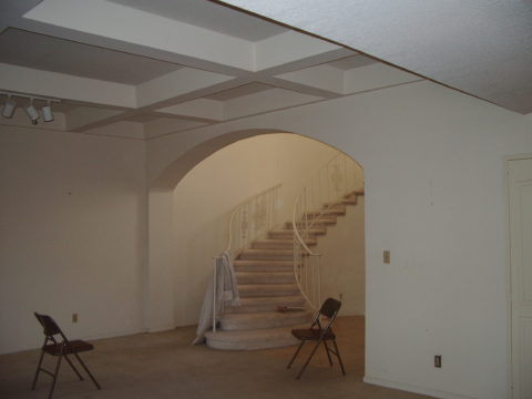
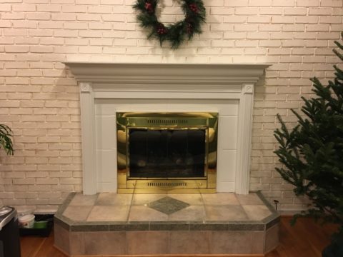
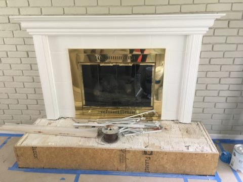
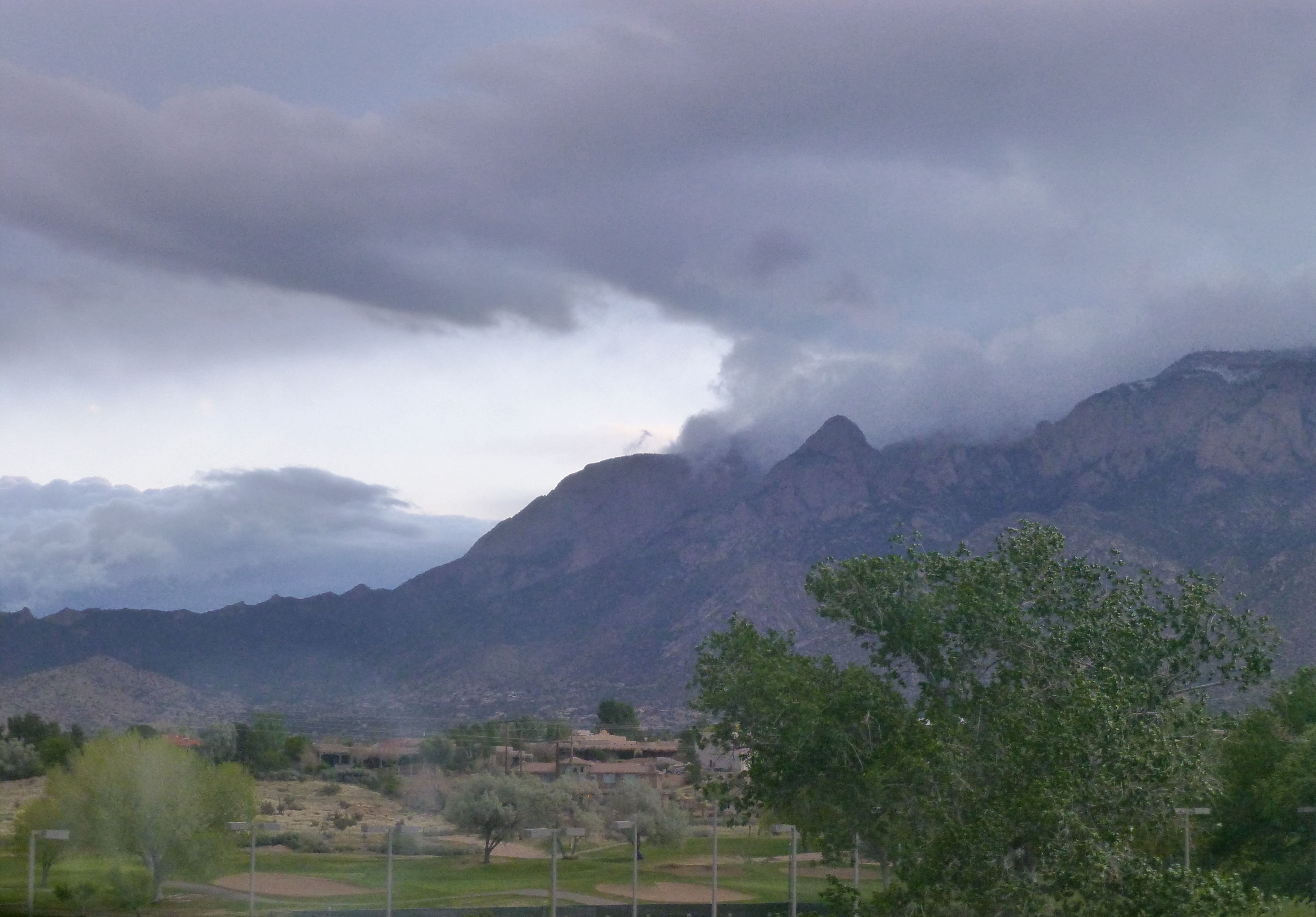
However, while the wind wildly whips our towering 30 foot plus blue spruce tree and all the other new green growth from tentacles of wisteria vines to our precious peach tree and fragile red buds, we ascend to the kitchen and talk about building a fire.

Yes, building a fire. With only one fireplace, I have not succumbed to the instant gratification of igniting fake logs or worse a digital image of a burning fire. Albeit I am not the one venturing out into the elements to retrieve the wood from the stack of fragrant local pinon on the side of the house. Nor am I the one shoveling the ashes to make way for a well-ventilated new pile perfectly placed to assure a good burn.

But I did painstakingly sit cross-legged in front of the fireplace for hours that turned into days breaking tiles in sturdy zip-lock freezer bags with a hammer and fit myriad shards into place creating this wild art-piece that is the focal point of our family room.

We didn’t have a mantle nor did we have a surround. We had found a tin mantle to affix to the wall at one point and later three resin plaques to mount beneath it on the painted sheetrock face creating an attempt at dressing that end of the room. But it never was quite right, never brought joy and every changing season resulted in compounded frustration for this unsatisfactory situation. The shoemaker who has not shoes was I, the designer with a sadly neglected fireplace with no design. P1080268

After more than 15 years, the day came when I enlisted Enrique Jimenez to finally make yet another of my dreams come true. With barely a breath of space on the window side of the fireplace protrusion available for a mantle return, he took the measurements and delivered a few days later a nearly fully assembled mantel and trim.20130731_181349

Once painted glossy white by dear John, the space surrounding the firebox opening begged for a finish material. I considered the usual suspects –  granite slab, harlequin glazed ceramic and glass mosaic when the whacky thought hit me – go nuts with fragments of color using treasured pieces I had collected over the years. From a shard I picked up off the street on Peace Valley Lane P1070814 
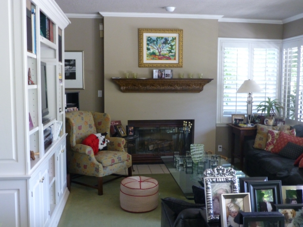
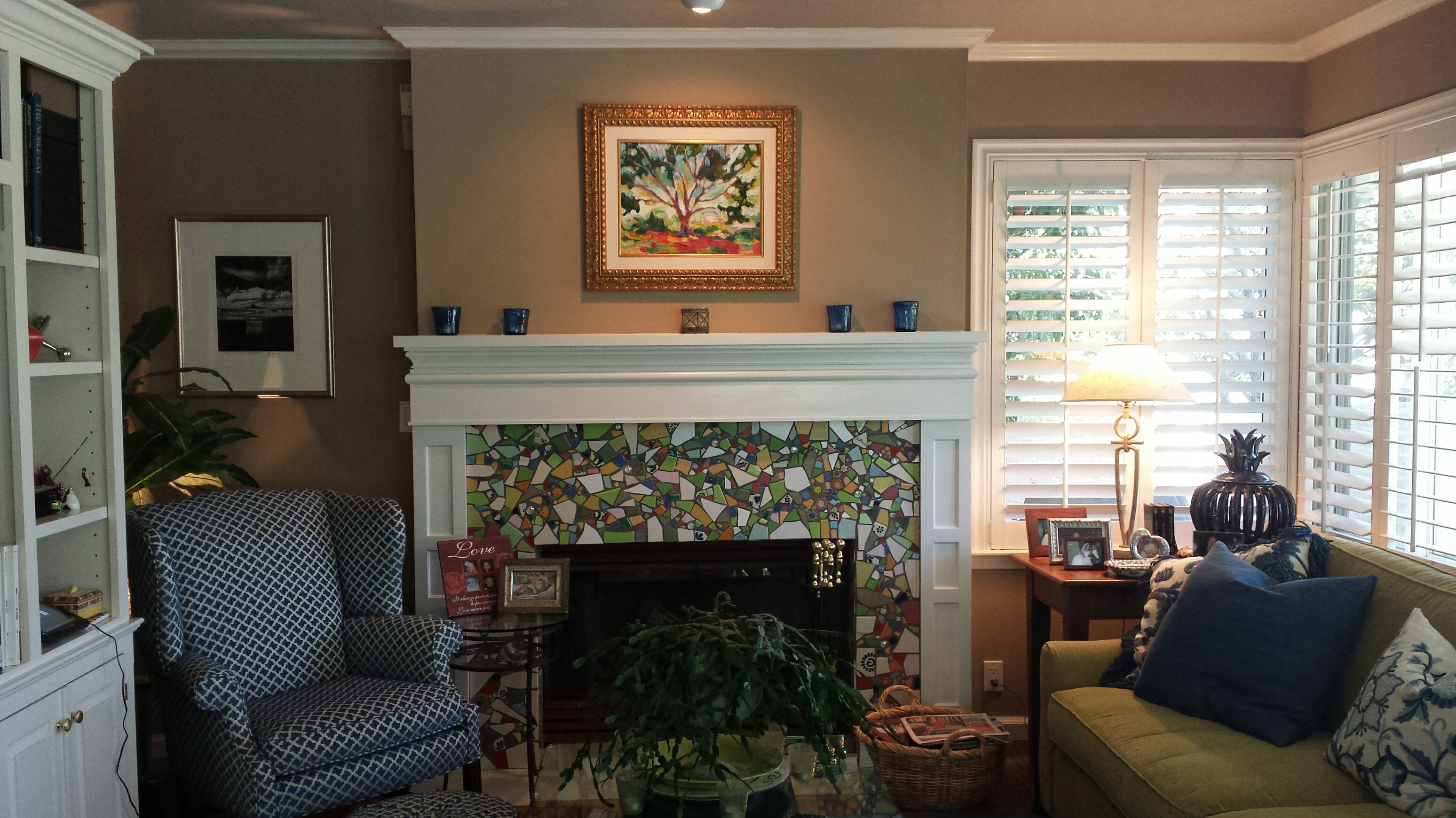
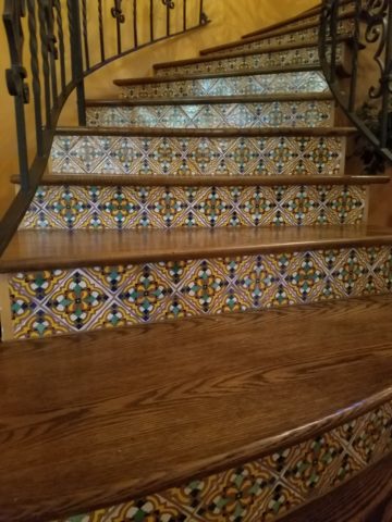
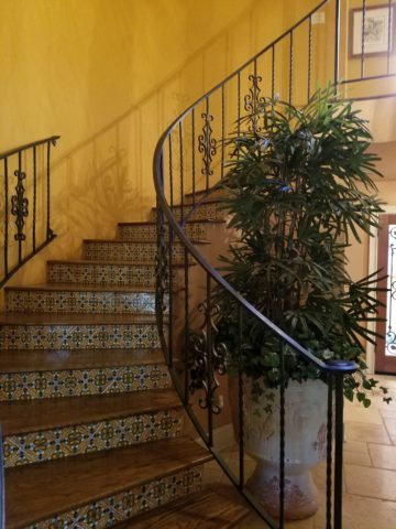
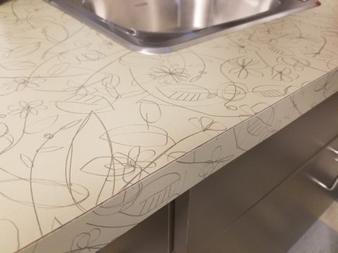
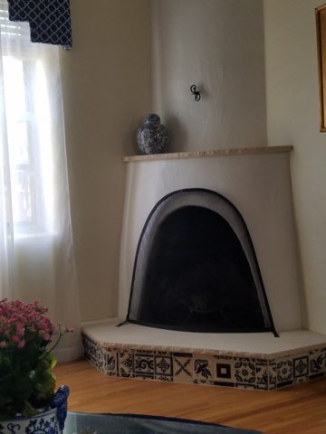
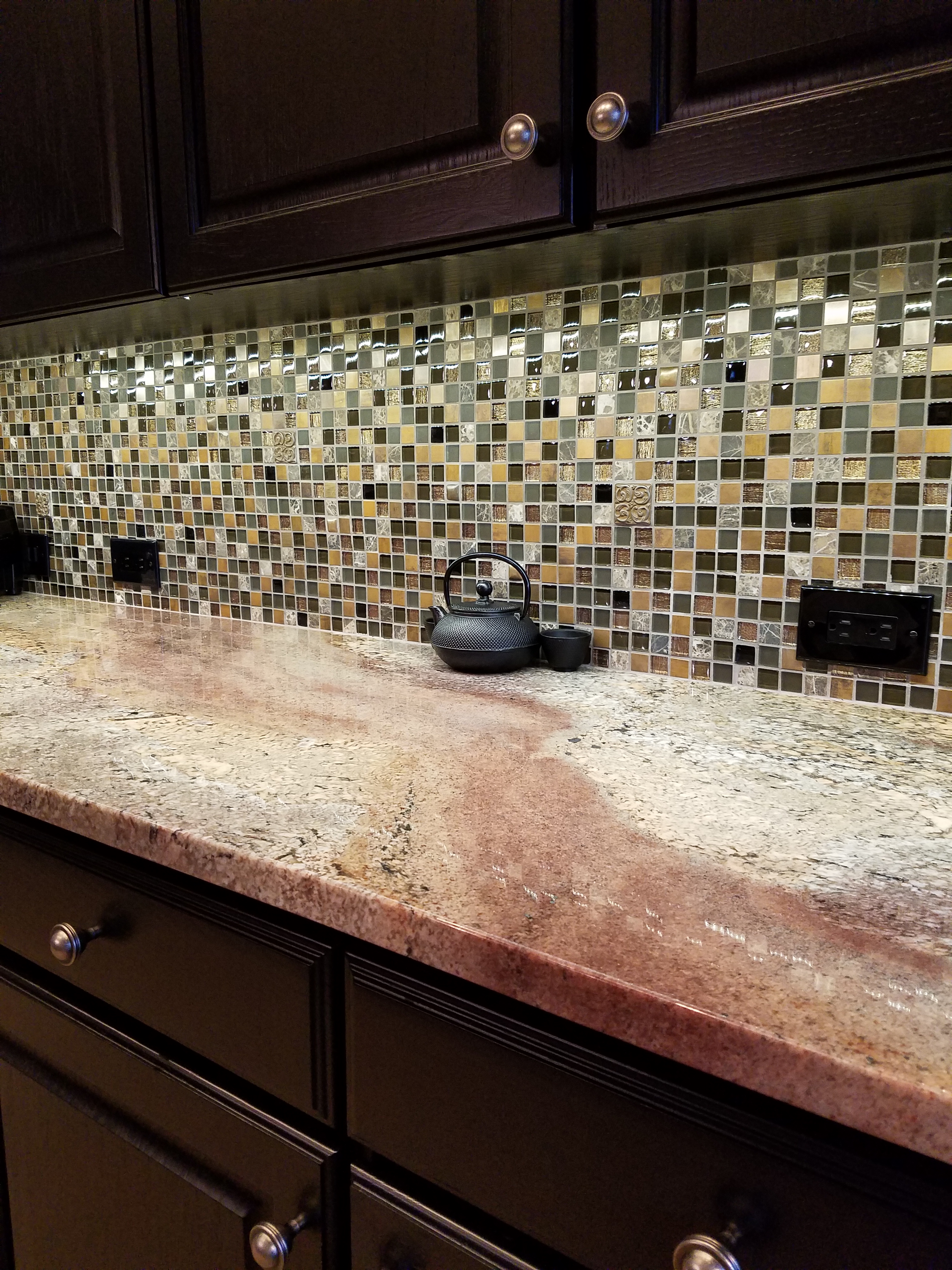
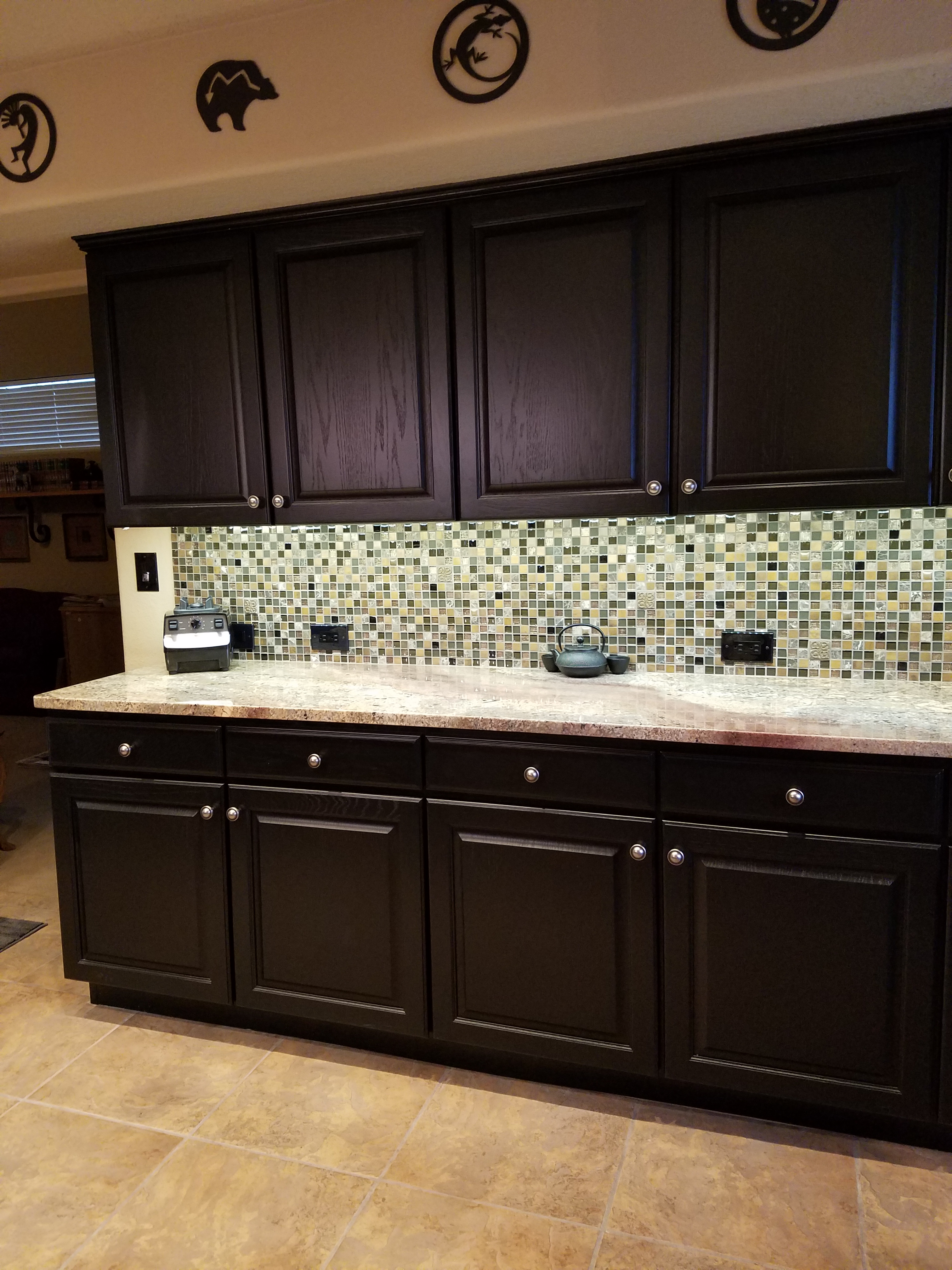
the weekend of Matthew’s graduation from Stuart to little flowers and birds leftover from samples we commissioned for a donor wall at the Albuquerque Community Foundation by artist Meg Butler to chucks of Mexican Talavera and brilliant colors from other pieces and places the palette and random pattern began to take shape.

So the hours and days sitting cross-legged on the floor paid off as this multi-seasonal mosaic of color makes me happy and brings as much great joy in May as it does in December. It is a fireplace for all seasons and a happy finished product and satisfying solution to years’ old dilemma. 20160507_092036_resized

So here’s to the first day of May (last week) that came in with a chilly blast belying spring’s arrival giving us the opportunity to have a cozy Sunday by the  flames of a real fire flashing from the happy mosaic of our a bit frantic, but friendly, family room fireplace.


Effective Staging & Improvments Clinch the Deal

We staged a house this week.  We TRANSFORMED IT! Wonderful clients for several years, who I regard as friends too, called to say they were moving out-of-state and they needed to quickly  get their house ready for sale. So many things that we had planned to do and more, deferred due to life getting in the way, all of a sudden got put on the fast-track to get finished in less than a month!

When you think of staging a house for sale, you might think of a fall scene scented with stove-top cinnamon sticks warming in a pan. In the spring, as it is now, fresh flowers with floral fragrances wafting on breezes through open windows and doorways.  We had the floral bouquets – just a couple – as centerpieces in the dining room and another game table in the family room.

But in order to really make this house attractive to the prospective buyers – millennials and their families – experience tells me that we needed to install profound punctuations of exciting  new trendy finishes and colors.

I critiqued the kitchen for its old but good-as-new solid surface countertops with a dated, tell-tale sandwich of speckled forest green in between the bull-nosed edge of solid white. The cabinets were plain slab birch yellowed by time, with hand-crafted wooden handles. To place the emphasis where we would get the most “bang for the buck,” we kept the countertops, refinished the cabinets and added new mosaic tile and paint accents. 20160424_162546

A few years earlier, we had stripped adjacent identical cabinets in the dining area and re-finished them with multiple clear-coats of conversion varnish. In place of the two-screwed wooden handles, we installed three small conical-shaped  brushed stainless pulls. By adding the third holes at each, between the existing two of the wooden pulls, the detail looked intentional and contributed to a modernized interpretation of the cabinet design.  We now finished the kitchen cabinets to match which had been  slated for the same improvements, but put on the back-burned until now. P1140111

The end wall of the kitchen, with a large pass-through opening into the dining room, leaving no significant wall space for art or other accessorizing, was the perfect element for a dramatic, eye-catching full-wall treatment. A mosaic of horizontal glass tiles in earthen blacks and beiges balanced the warm cabinets and maple flooring with a strength, pattern, interest and glossy bling.  The same mosaic tile wrapped the room filling the back-splash  between countertops and upper cabinets. 20160424_162701

Outside we painted the garage doors, wall sconce and patio trim with a new organic neutral mushroom green shade. The landscaping was enhanced with new river rock and a couple of large ceramic planters were placed by the front entry with mature plants creating a sense of establishment. The plain concrete entry porch was tiled with a dark earthy porcelain continuing up the step and into the entry foyer replacing the burnt  orange tile that had been  neglected from the decades old original finishes. 20160424_164027

Additional planters were purchased to scatter about – but a more effective idea to have a strong showing of them at the end of the pool anchored that setting with a stunning blue ceramic colonnade bursting forth with brilliant contrasting yellow Celtic Broom. Massing things can often create more powerful statements rather than sparse, weak distributions of the same.

The master bedroom suite had been remodeled a couple of years prior. Pre-fabricated white melamine closet components were replaced with custom fabricated birch closets and cabinetry to continue the theme of the original cabinets in the main level of the home. Updated granite countertops, new lighting and mosaic tiles jazzed the dressing scene and brought order for the young parents running this busy family.

Staging a home requires thinking about clearing the clutter and dressing the scene. But beyond that, looking at more powerful elements to repair and update can make an enormous difference in the appeal to potential buyers. This was evidenced by the comments that we overheard specifically about the more dramatic installations like the new mosaic wall, welcoming entry tile and effective row of blue patio planters that we decided to employ really clinched the deal.