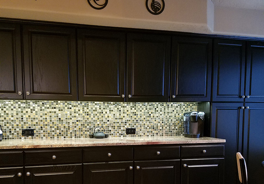
For a while in the world of design trends, dark colors intimidated. Bold designers dared to apply dark eggplants, chocolates, charcoals and black to surfaces of their projects, but only a rare few clients would take the leap. Now it seems that we are seeing people accept the dare and more dark surfaces and intense envelopes of color are appearing on the scene. I have often been asked – “Won’t it make it small?” or “Will it be too dark?” and the reason I am making the suggestion is because I already know that it won’t!!!
I’ve blogged about small rooms with dark walls in the past, but two recent projects featured my recommendation for dark cabinets. Not dark walnut or the market-saturated “espresso” which is the trendy generic for “whatever the wood – or pretend wood, we’ll make it dark brown” – very dark.
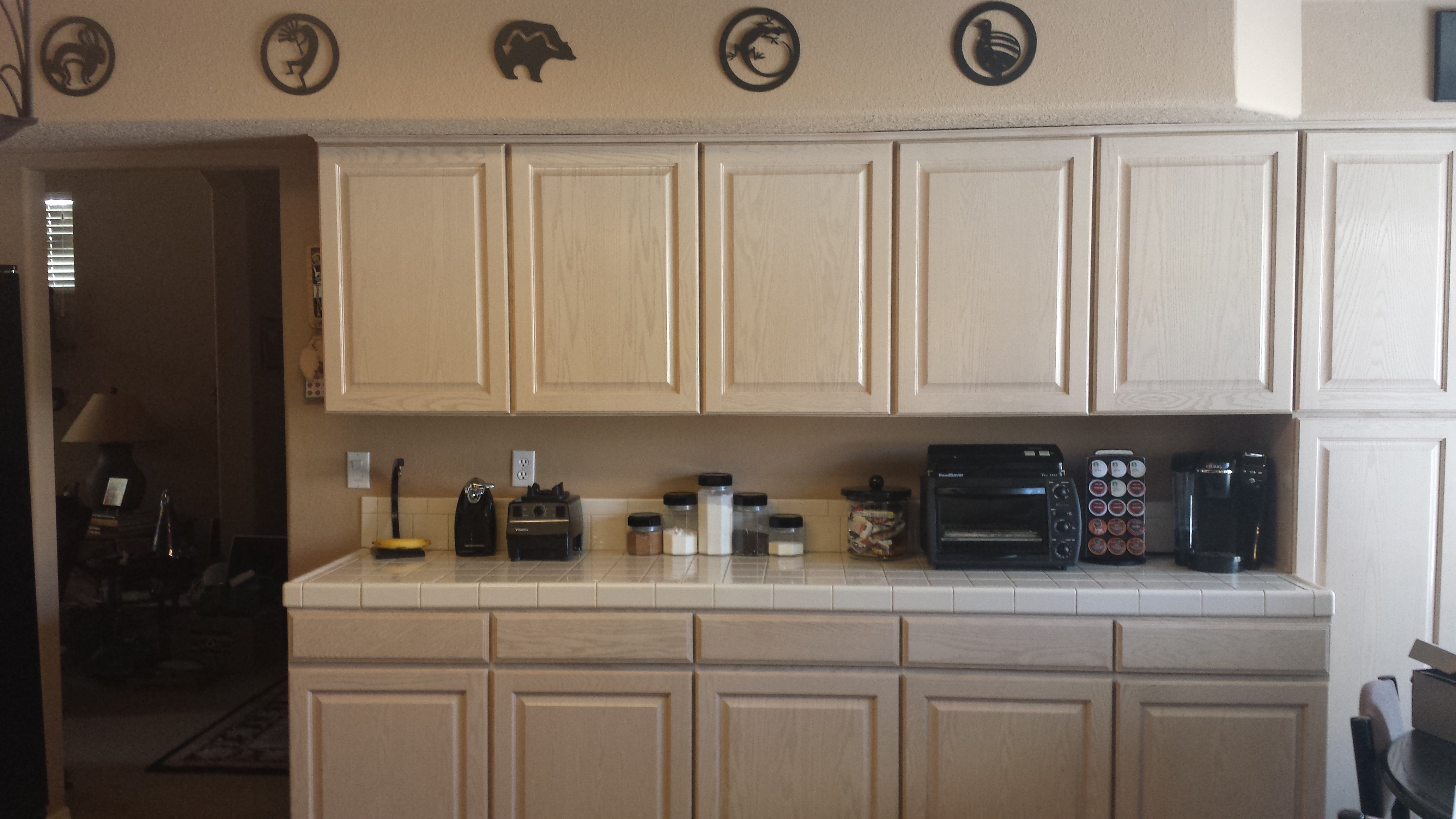
In this first case, my client – friend after many years of consultations – brought me into their home that they had occupied for a couple+ decades. It began with the “pickled” wood cabinets that were in vogue at the time – stained red oak with a white-wash that resulted in a peachy finish. When we first did a “punch-up” we added steel cut-outs of Mimbres designs affixed to the soffit. We also added a black table and chairs with a splashy fabric as a valance in bold colors intertwined with black. The drama lifted the anemic peach theme to new heights.
Fast-forward another 15 years and my dear client was ready for a change. She called and brought me into that familiar kitchen scene and announced that she thought she wanted to re-purpose/paint her cabinets white. l looked around the adjacent family room and beyond and pondered this request.
What you might like in a magazine spread or a Pinterest post is not necessarily applicable to your context. I visualized the dramatic change. Looked at her floor (oh, we had upgraded to a large format stone-textured porcelain from the original 8×8 glazed ceramics in the last 15 years – perhaps a decade ago), looked at her family room furniture and finishes and said “I’m not so sure that’s where you want to go.”
I knew she was fairly thorough in her investigations and would not have called me prior to doing quite a bit of research and trend monitoring so I tread a bit softly when I said “I think you should go black.” And her response was EXACTLY what I expected as she repeated the color in complete quizzical surprise.
“Yes” I said and continued to explain why. She loved her fabric that had been hanging over her breakfast nook window for years. The table was virtually unused and the steel cut-out art was one of their favorite design elements. Black was a natural. “Don’t be afraid of the dark.” I laughingly said.
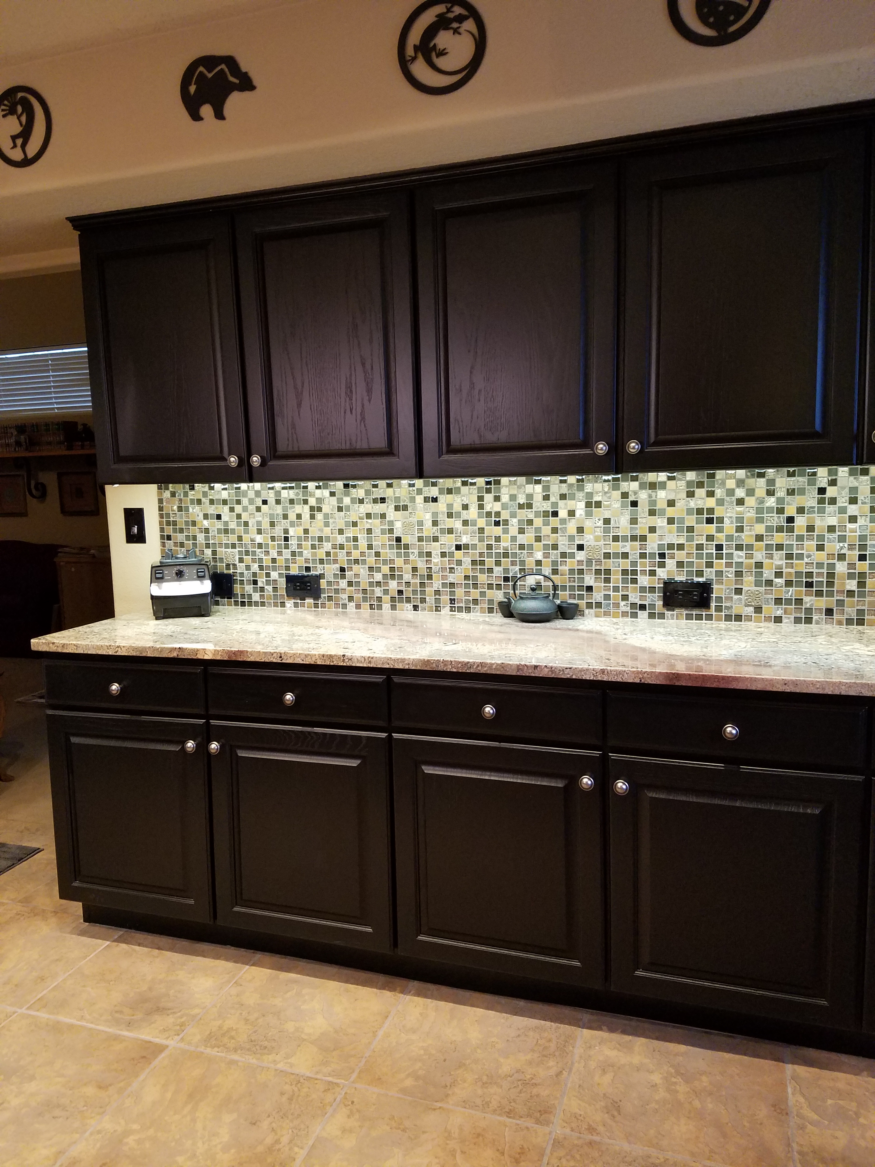
Black on oak gives a wonderful moiré effect to the grain texture as it reads though the painted surface. It’s a bit exotic, rich in texture and interesting to boot. So with a bit of hand-holding and massaging the description of the intended finished effect, she took the leap – husband in cautious adgreement – they braved this bold departure from the norm.
We first selected a granite to coordinate with the floor tiles and the soon-to-be black cabinets. A swirly geology of glorious goop featuring the rose-clay tones of the mottled stone floor with black tracing through and clear quartz for pizzazz. We then set forth creating the back-splash which began with her love of glass – but to depart from the off-the-shelf 1×1 offering we cut away sections and punctuated it with 2x2s and some 1×1 domed bullets that added further interest to the multi-toned field. 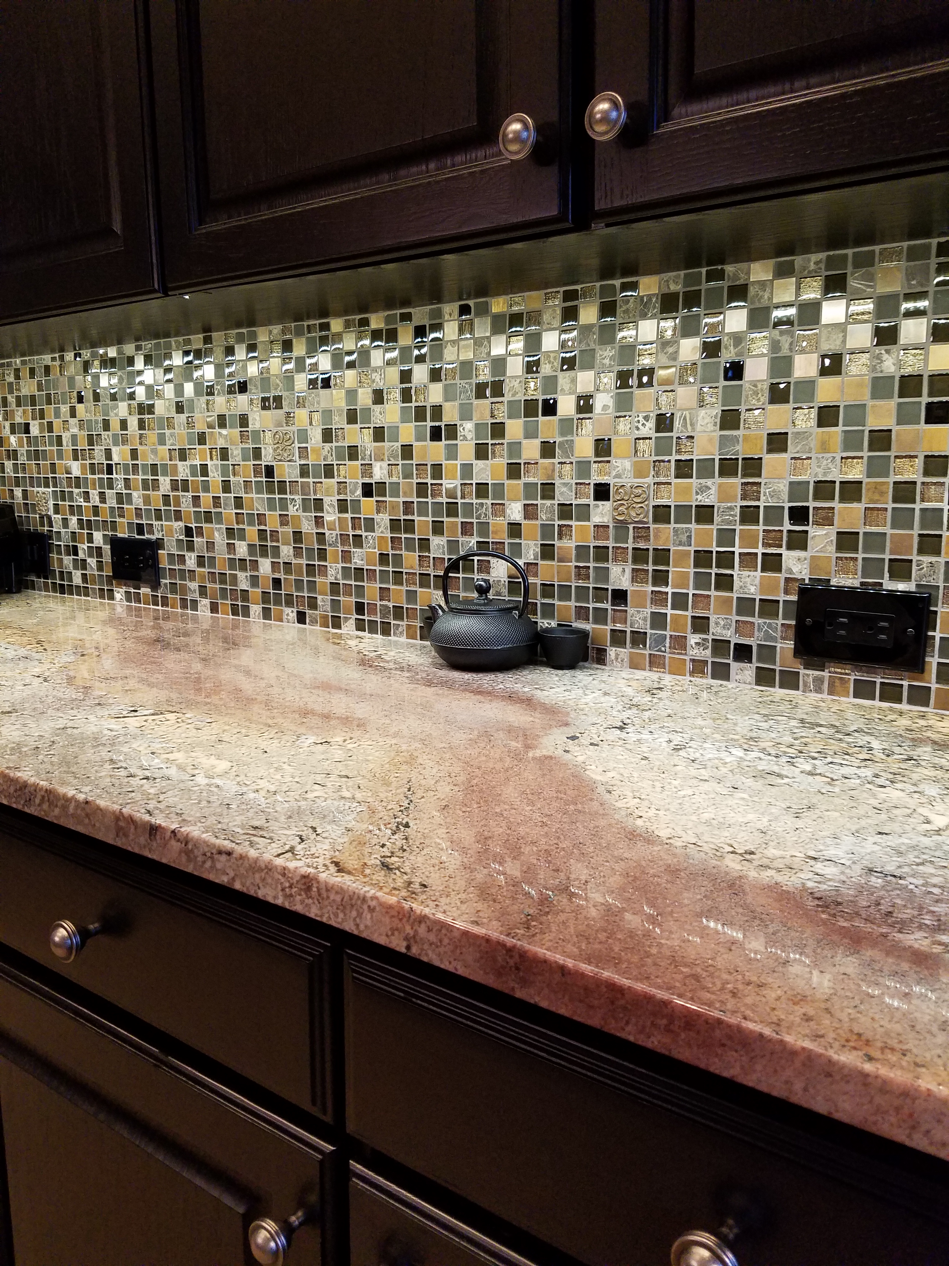
With those complimentary materials selected, we began the process of painting the cabinets. Boxes in place and door and drawer fronts finished off-site. All flawlessly sprayed, with many coats of conversion varnish tinted black, the transformation was dramatic.
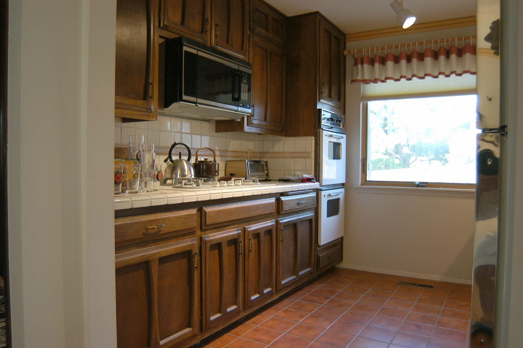
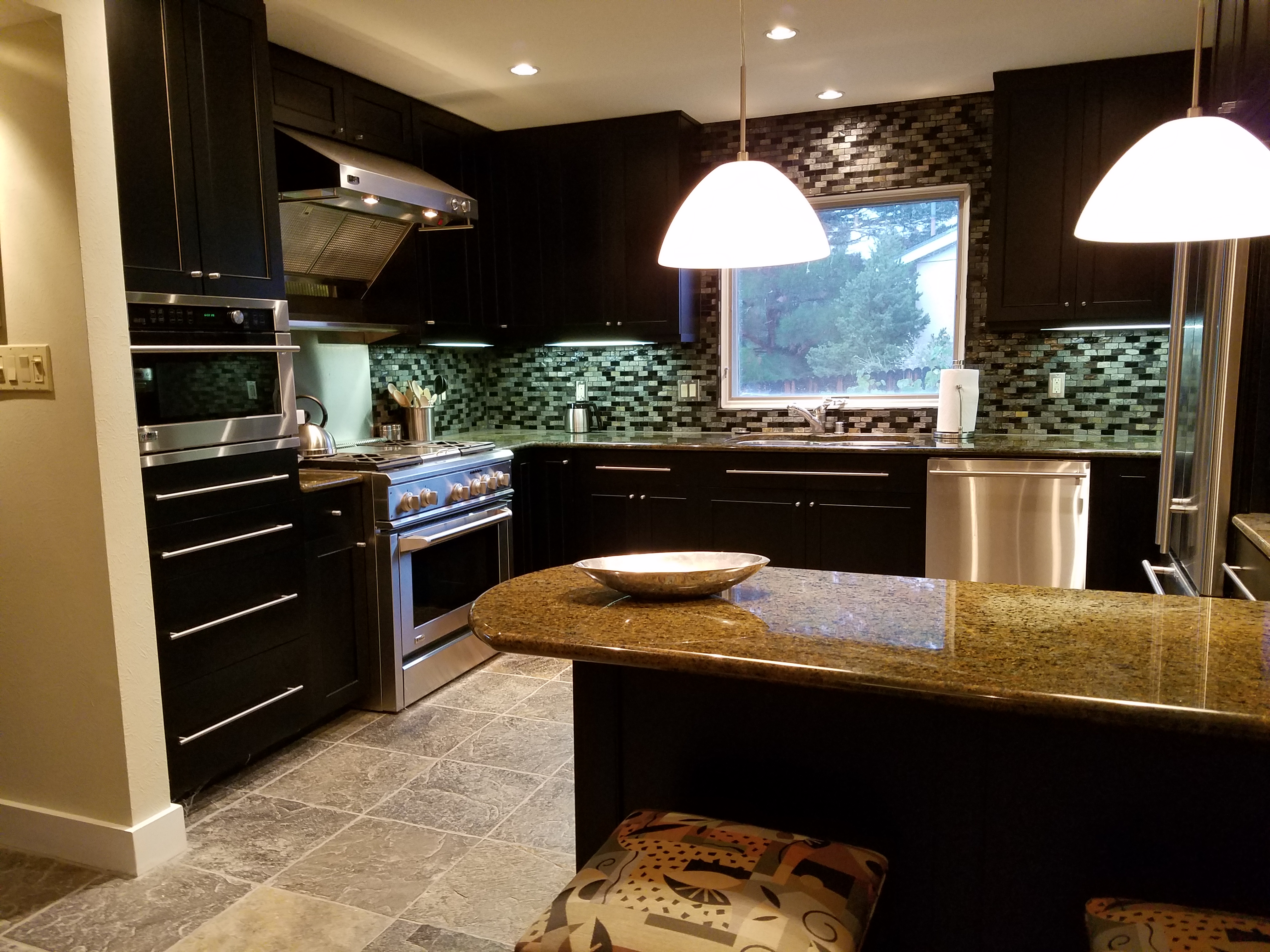
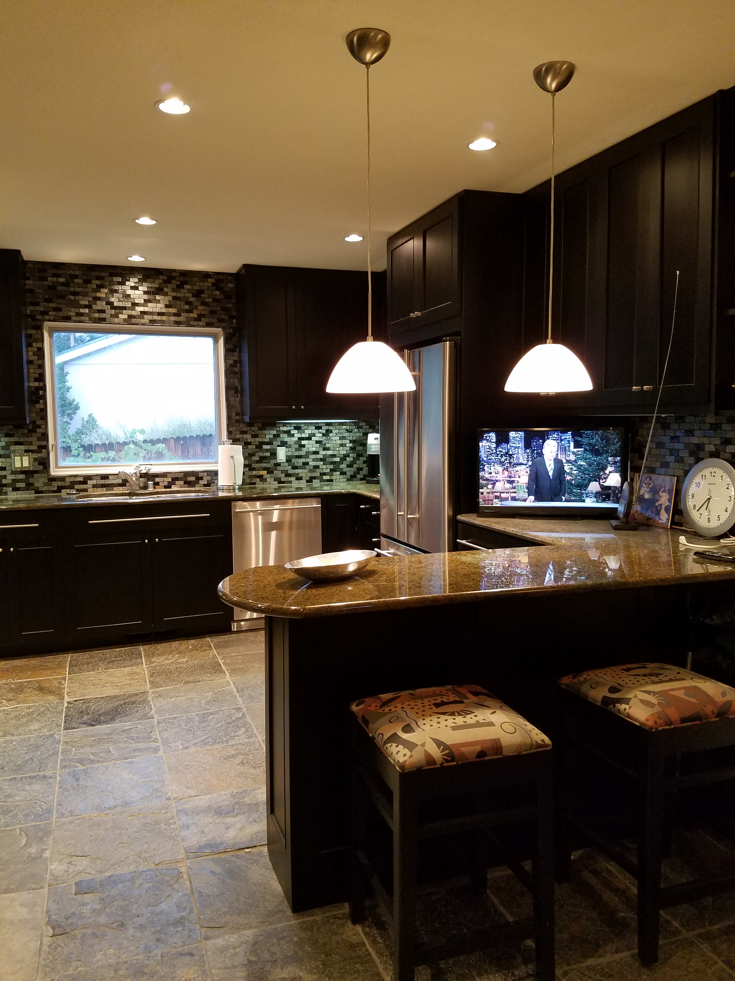
The second example, of this fear of the dark when it comes to finishes, was another kitchen which was a small galley-styled golden walnut stained oak 70s model. To which, we added a rough iridescent slate floor to complement the existing stone fireplace – of the same material – only in boulder form. Seemed at this point, for this sophisticated bachelor, the perfect complement to the handsome slate would be striking black cabinets. In this case – new, without the character of the oak in the previous project, as the cabinets were completely replaced and the new selection was made from a factory fabricated series. Similarly dramatic, the sleek black was perfect against the slate’s rugged grey/golden iridescence.
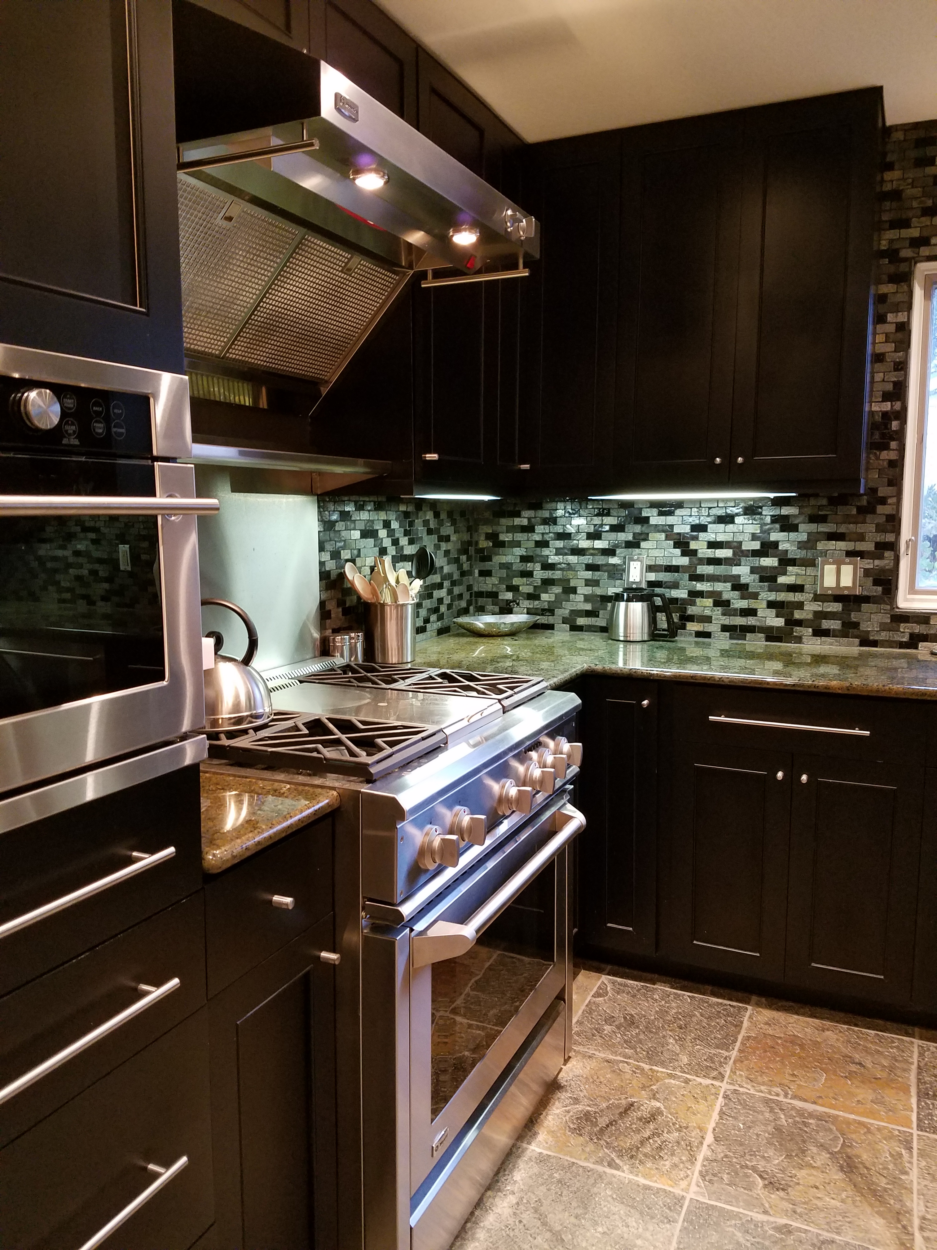
The galley footprint was greatly expanded, by carving out of the garage work-bench area. And again, the transformation was daunting. Here we selected a mosaic of horizontal stones and glass for the backsplash – one of the stones was exactly the same iridescent grey-golden slate as the original fireplace and stunning new floors throughout.
Be bold, be brave and consider your context. You might just find that black is your best bet to transform your cabinets into stunning statements.

