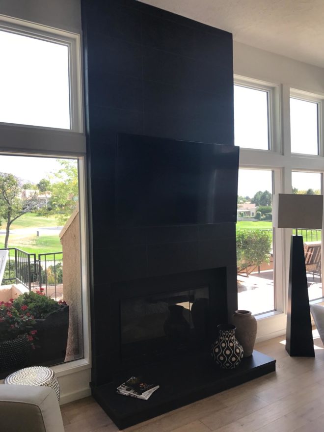
The warmth of summer is still here…but it’s time to plan for fireplace season!! Officially fall begins on September 22 – just a few more days. It will be too late once the chill is in the air – so, be ready! If your fireplace needs a facelift – start thinking now!! The materials available, the accents and pizzazz, dimensional modifications and trim carpentry all contribute to the array of options to make your fireplace a fabulous focal point.
Whether a traditional-ish style, a southwestern kiva or a contemporary statement, there are certain steps that will transform instantly…or reasonably soon!!
Here are some examples of finished products AND works in progress…perhaps some ideas for your lifestyle!!! First we have a fairly contemporary home that was recently acquired and needed an update. The fireplace wall was flat and had no dimension or personality. Usually viewed as a focal point, a fireplace should command some respect.
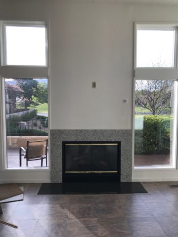
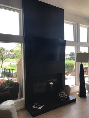
This flat, non-dimensional, facade was weak at best. Under the guise of upscale, the granite surround provided little impact – if any. It was a non-commitment, to making a statement. In order to give it some presence, we brought it forward – just a touch – only a couple of inches, to provide dimension and mass.
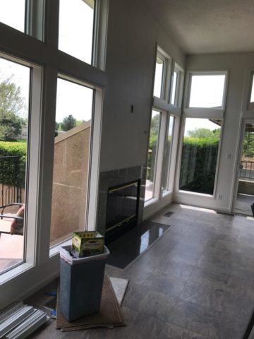
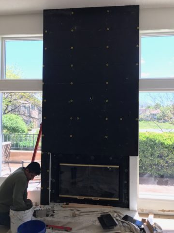
By encapsulating it in black porcelain tile, it added strength and emphasis. The blank wall above it – with the outlet – probably housed a TV. Naked – it was surrounded by white painted sheet-rock walls above the weak granite surround.
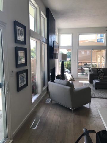
To have added the dimension and contrast of materials and to have COMMITTED to the entire wall – it now commands respect. It has structure. Not to mention, the black TV melds into the facade and is not naked in the room.
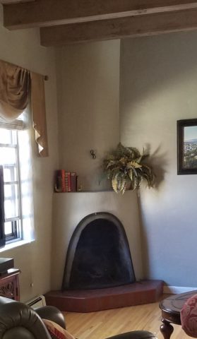
In a completely different scenario, this quiet corner kiva was simple, yet lacked detail. The original 40+ year-old broken red quarry hearth was a bit dingy in its newly refreshed interior.
The new color scheme is blue and white and therefore, with the New Mexico context, we added Mexican Talavera tile to the face of the hearth (could have been Portuguese or Greek – classic navy and white is worldwide in its history of classic style). In addition, for depth and detail, we placed a creamy, broken edged sandstone on the top of the hearth and also on the upper mantle ledge.
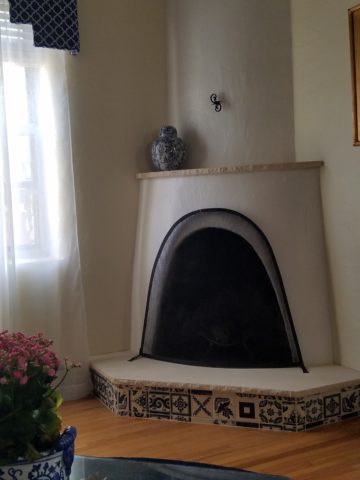
The result is fresh and classic – a simple, timeless update that will stand nicely for decades to come.
This next example is still in the process of transformation. An attempt at a traditional statement of wood molding – the golden oak, insipid tile and flanking brick were in dire contrast – not the good kind of contrast. The entire statement was weak, yet screaming in its ability, to call attention as the focal point that it was, to command the space – albeit, ineffectively.
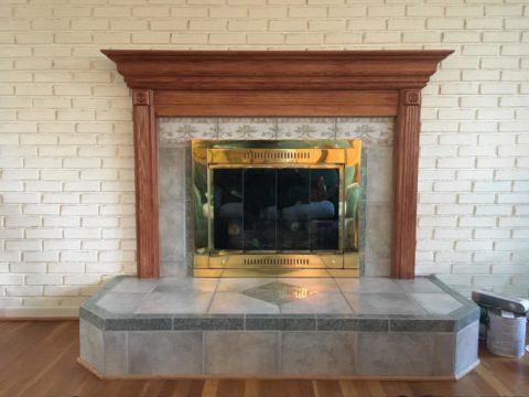
To begin – as a band-aid for a temporary fix, we painted the wooden mantle and surround and even the inset tile. Knowing this was temporary, it was an inexpensive, non-structurally modified, place-holder.
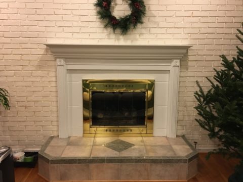
This project is currently taking another step to modify the fireplace. As time and budget allowed, the hearth was squared – eliminating the angels and some of the over-generous depth. Flanking brick walls were painted a contrasting gray.
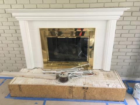
Soon to be completed….watch for this finished product.
The idea of this missive is that there are subtle changes that can take the “curse” off of a design dilemma. And there are certainly many transformative changes that will take things up a notch.
The next challenge in this department of fireplace facelifts will transform this dated design element. Currently in the design phase, this flat-faced and dated surround has great promise. The modifications will be remarkably easy and dramatically effective.
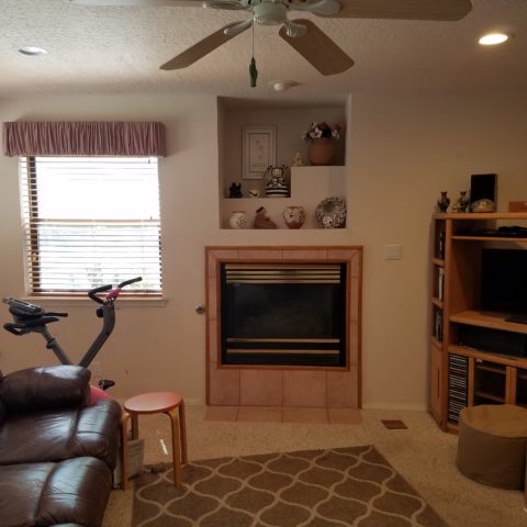
How does your fireplace speak about your interior design and living area’s focal point? Stay tuned!!!!

