Currently finishing a project that has provided a great theme for incorporating metal, it seemed a worthy blog subject for it’s fun and flexibility! Perf is the product – a perforated steel that comes in several percentages of perforation.
We have used this many times for rolling window shades in a flexible coated nylon material. It is great for filtering for sunlight and privacy while allowing a certain amount of “see-through.” It has been used as an architectural screening material for years. You have probably seen it and not realized it on building storefronts and bus wraps – the perforated vinyl coatings are often used for advertisement because they read as though a solid from the one side and are transparent from within.
Here we are playing around with the steel to create cool elements that compliment the theme of this new taproom. The theme is silver and what material does bring to mind? Metallic. So by dressing raw steel with paint – we apply the silver finish and there we have it!
The required outside patio fencing was constructed with very generic square stock. I called it a hamster cage. It was a bland beige when we first arrived and, without notice, the shopping center management had it and the other structural columns lining the canopy/portico painted chocolate brown.
The plan had been to screen it with perforated panels. The darker paint color created a little better contrast and aided in providing a depth of detail to set-off the silver painted perf.
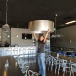
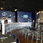
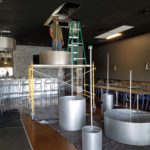
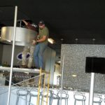
Inside we needed to fill the volume of this most uninteresting dropped ceiling. Already painted black and looking quite voluminous – but not in a good way – the empty space needed some mass. So in one of those restless, middle-of-the-night design sessions of insomnia the idea to create large drums for lighting shades came to mind.
Drums have been in vogue for several years now. Nothing original from the initial use for table lamp shades except their use was broadened to include suspended fixtures and halved for wall sconces. You’ve seen them – hip and happening – and these were quite over-sized and carried the space.
We needed to fill the void of the 12′ high ceilings in this room that had little or no comfort. All hard surfaces, it was a challenge to maintain the silver theme and edginess of a popular taproom while creating comfort. Seemed an oxymoron of a task. But the mass of the perforated drums in three different sizes grouped in the near center of the room did just that.
The addition of multiple warm white lamps inside will be the crowning touch. (photo to be added here in a week or so)
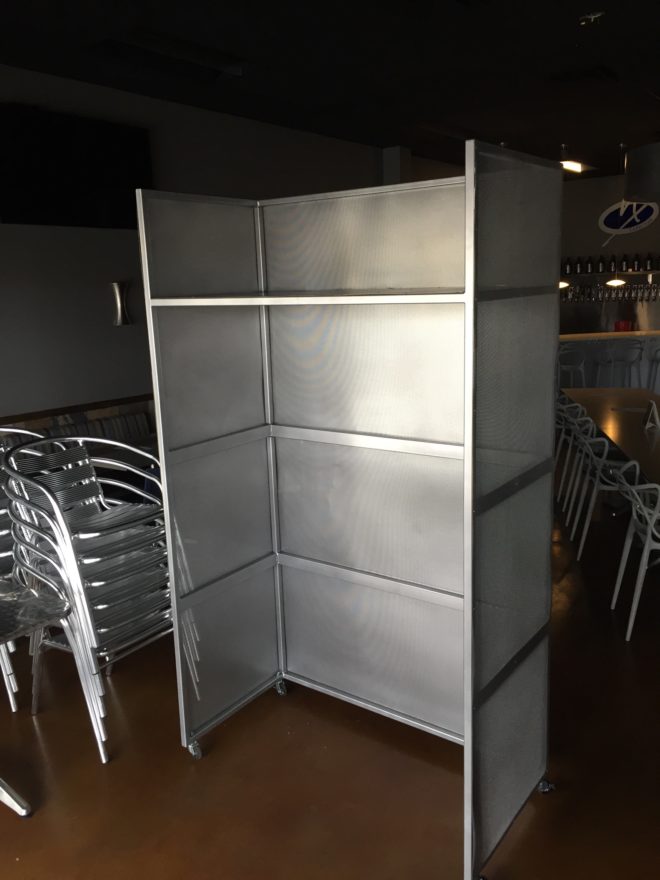
Then a third use of the perforated material came in the idea for a room-divider/hostess station.
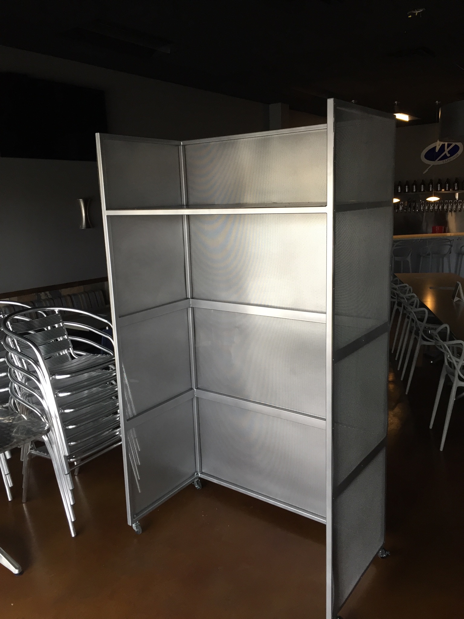
We needed a place to create a point of arrival. Whether manned or unmanned, this unit can have a chalkboard or other signage identifying special events or beer tastings, with a podium in front creates a translucent backdrop to partially cordon off the rest of the space until the customers are greeted and it also can divide the space for special events and table groupings. to accomplish all of those various purposes we designed it with heavy duty commercial casters complete with brakes so that it could be moved easily for its grand height and weight and placed where needed for the best advantage.
Stay tuned for the complete un-veiling of this cool new interior in the coming weeks. And meanwhile dream of all the fun you can have with perf!


That looks like an exciting project! Is this for the big new brewery on Coors? 🙂 Or are you at liberty to say? Looking forward to seeing the finished product.
You’re close…a taproom, not a brewery location!! Keep watching for finished product/project!! Thank you!!!!!!