Ken Brudos – Insurance Agency
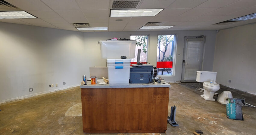
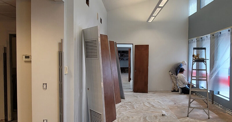
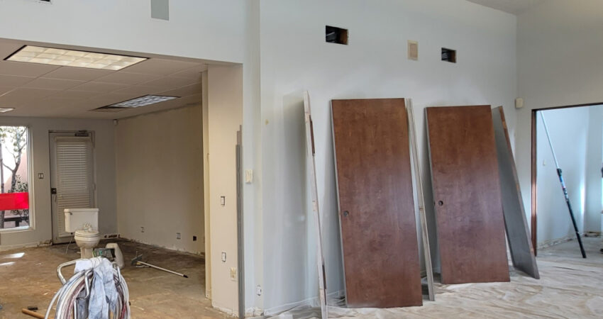
This well-established Insurance Agency had cultivated an effective working environment with basic, efficient systems furniture cubicles and related open plan. Having been in business for decades, the interior was neutral and didn’t really relate a message of the brand in signage or any other cues except for a few articles and commendations of recognition from over the years.
Ken Brudos and his management decided that they needed an update. They researched other agencies and came up with a newly neutral plan that in our opinion did not provide the significant, appropriate transformation that they needed at this juncture. So, when we were invited in to assess and recommend our ideas for their new “look,” we took a more bold approach.
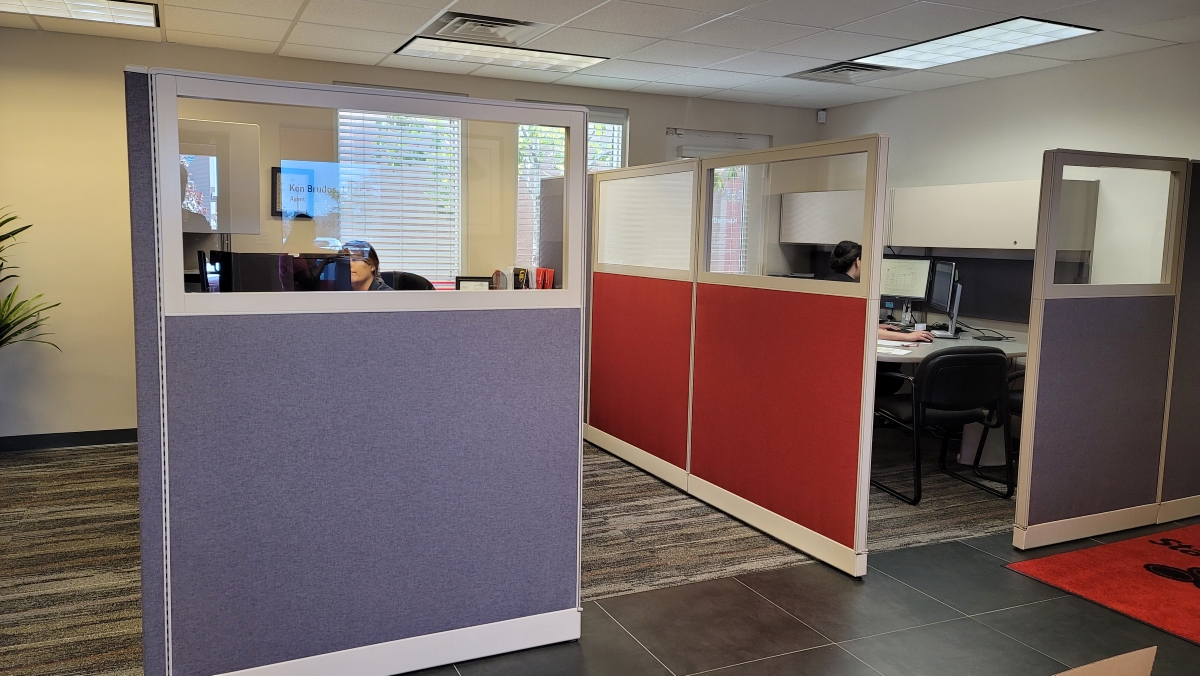
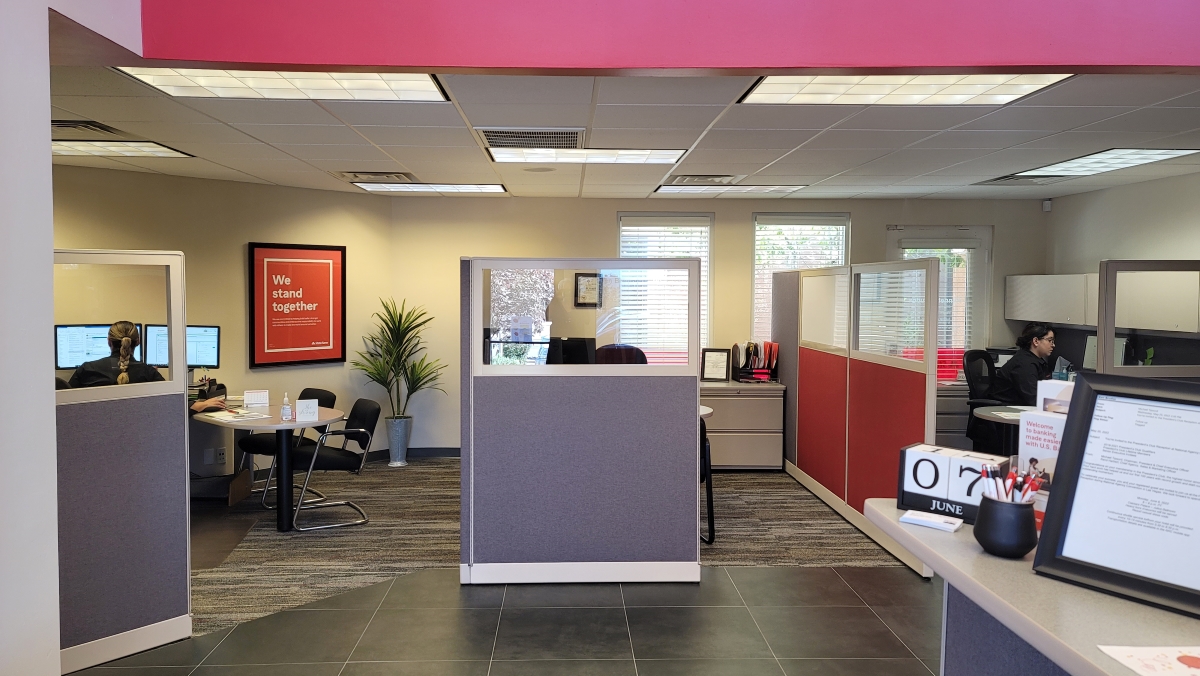
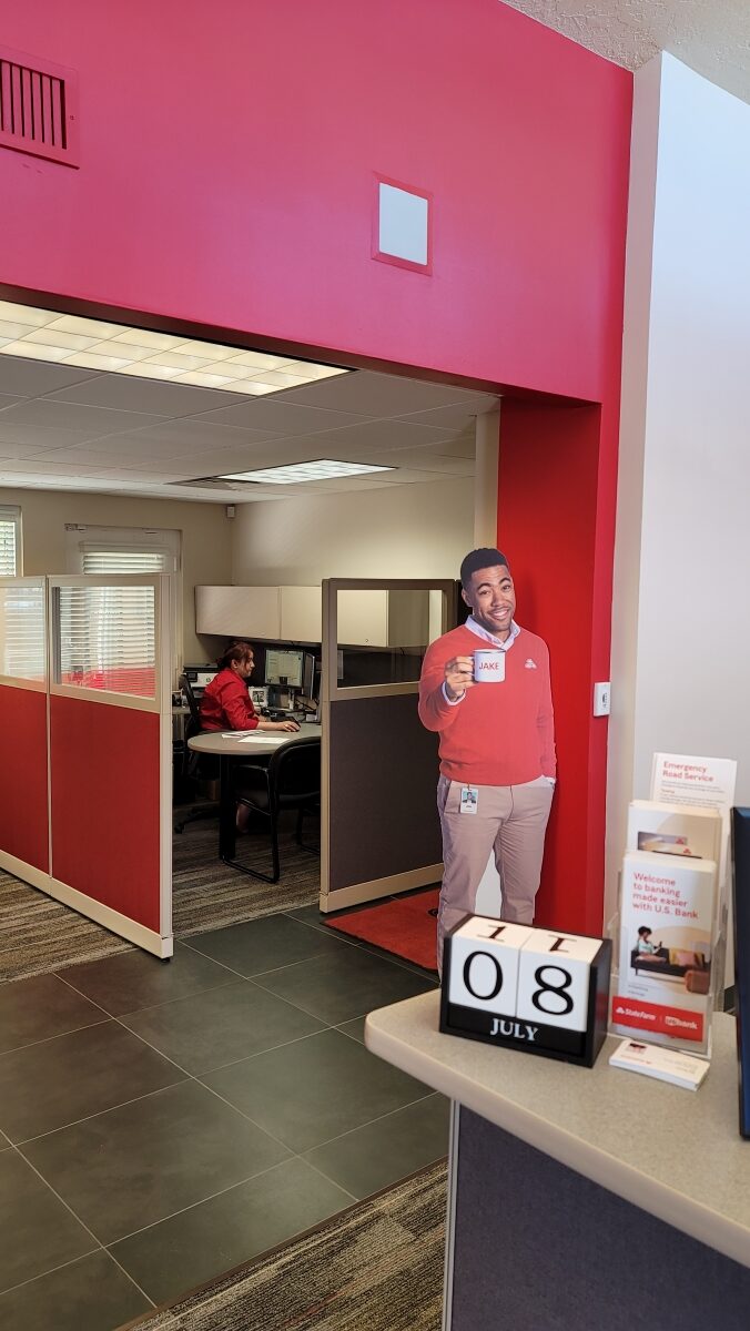
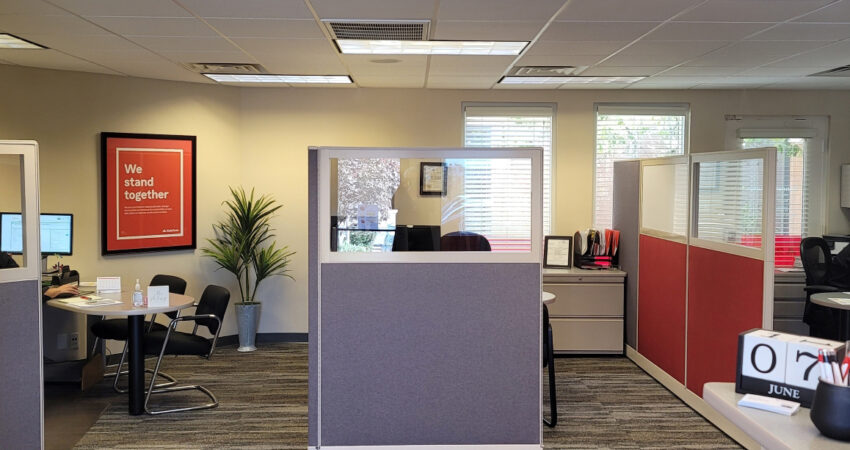
We established that the flow of the office and the systems partitions worked well, but that the fabrics were tired and could easily be reupholstered. The flooring was also tired and worn – and they sought a popular grey vinyl plank style. We begged to differ favoring the combination of more substantive porcelain tile paired with carpeting for sound absorption but also for the interest and zoning that the two disparate materials offered.
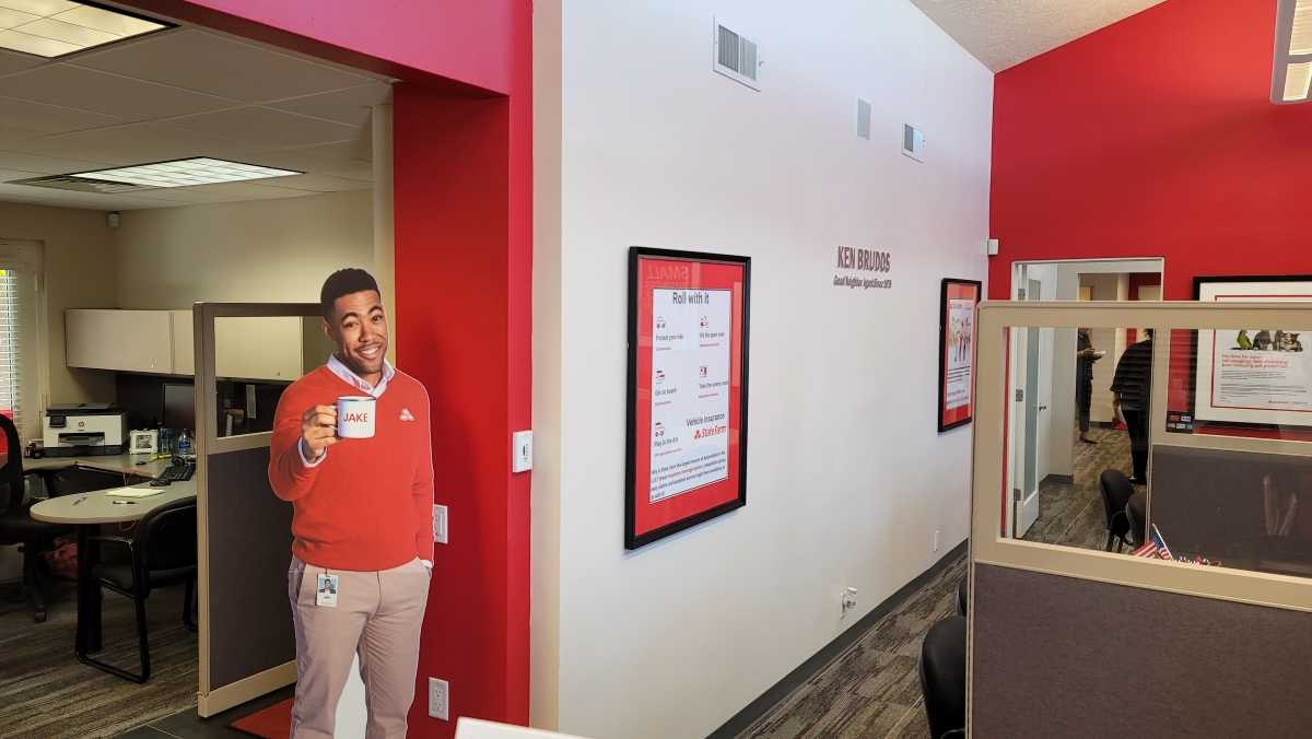
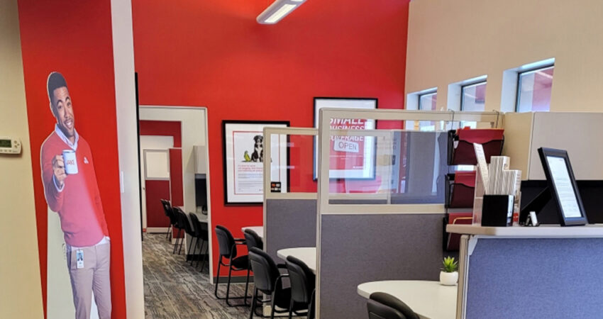
Because this office was one of efficient customer service with a friendly down-to-business attitude, we believed that a direct design approach to emphasizing and celebrating the brand was the way to go. Red comes to mind with the well-established agency brand, and we set out to give that center stage.
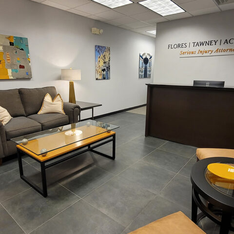
The entry flooring, we selected was a dark, warm, large format, square, porcelain, charcoal tile. It provided strong contrast and a grounding upon entering. The walls were to be a fresh, neutral beige to coordinate with the existing panel frames of the systems furniture.
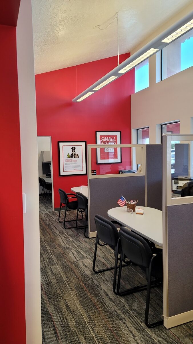
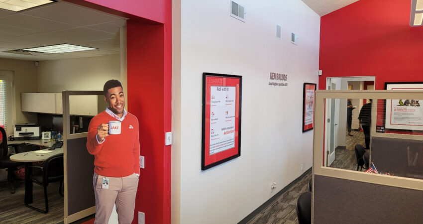
New carpeting tied the new dark charcoal floor tile in with warm neutrals punctuated with red accent streaks. And then – for the truly bold of the scheme, we selected key walls to paint entirely in red – bold, branded red!
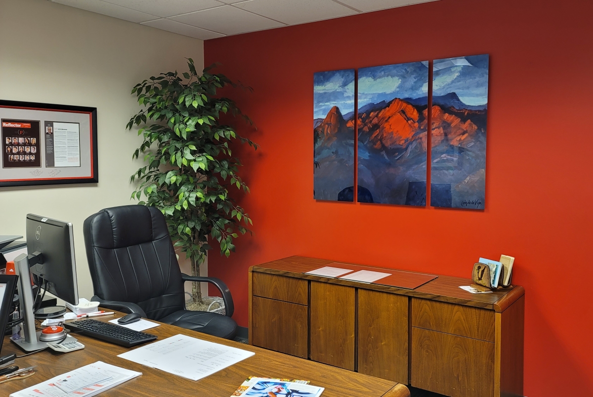
But wait – there’s more! Scattered miscellaneously framed articles and prints were not strong enough to carry the walls. We reframed and matted special pieces and hung the collection in Ken’s office. We visited the agency website and gathered marketing posters to have custom-framed and matted to make very bold statements on the walls. We even “tweaked” some of the images to better suit the needs. This provided two important elements – first they answered the need for bold color and coordination to the blank vertical spaces, but of added value, they conveyed important services and features offered at this agency. We killed two birds with this stone. The decision to simplify the wall art and make it large and bold plus informative was a great bonus to the space and the business in general. It spoke to the agents, and it spoke to the clients.
An exception to the branded wall posters, a triptych of the Sandia Mountains by Federico Leon de la Vega reproduced from the privately owned, single original oil on canvas painting – now here on three aluminum panels – commands the space behind Ken Brudos’ desk. The bold red fiery sunset glow of the Sandia ties in with the red theme and celebrates the community with this iconic landmark.
With striking new signage on the head wall in a brushed aluminum lettering flanked by two of the branded posters, the Ken Brudos insurance agency established in 1986 now greets boldly and unmistakably without imposing, reinforces company values and purpose, while instilling confidence in their clients that this place and its employees know what and who they are and why they are there.

